6 Controversial Logo Redesign Fails, As Pointed Out By This Guy On TikTok
Interview With AuthorDo you ever find yourself just looking at some products and immediately knowing who made them without even seeing the brand’s name? That’s the power of logo designing. Making sure that the picture will be stuck in people’s minds and be recognizable wherever they go. While good designs bring awareness and financial success, a bad logo design can make the business as far as an object of ridicule. For those who are interested in graphic design, creative director and digital creator Zachary Winterton (@zacharywinterton) shares his knowledge by making TikTok videos where he reveals smart and floppy logo design ideas, explaining why they work or not in reality. The man who now has more than 63k followers on the platform and receives hundreds of thousands of views invites others to discuss certain design choices.
Which one of these do you find the best and the worst? Don’t forget to leave your thoughts in the comments down below!
More Info: TikTok
Zachary Winterton is an art director and designer who is known for his TikTok videos that analyze various logo designs
Image credits: zacharywinterton
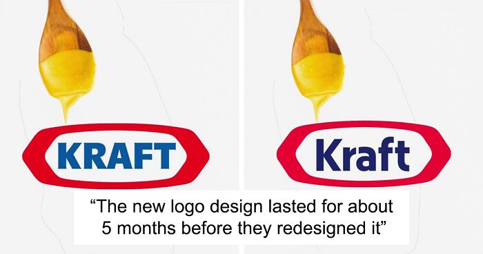
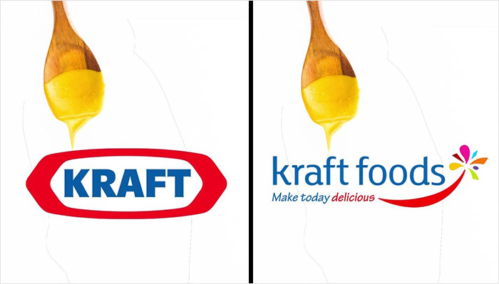
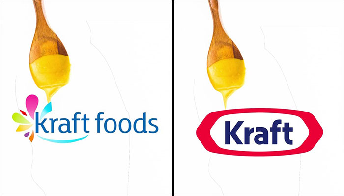
In his videos, Zachary gives some context about the brands and how or why they decided to change their logo, briefly showing the before and after results. The brands featured in the specialist’s videos were food, clothing, technology companies, and car manufacturers. What is interesting to notice is that some of these “failed” attempts were either changed or haven’t been used much, for example with the American food manufacturer Kraft Foods.
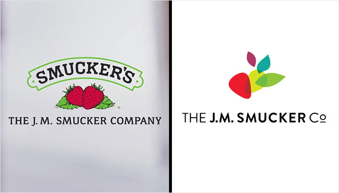
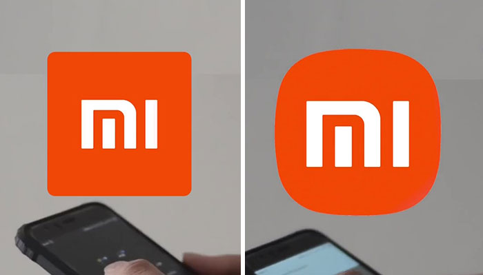
While usually change is a good thing, the logo updates that the specialist shared didn’t exceed the original versions
Image credits: zacharywinterton
Image credits: Eddie~S
Bored Panda contacted the creator of these videos to find out more about logo designing as he has been creating content on the internet for many years now and has some interesting insights and unheard knowledge. Zachary revealed that despite years of making such content, he is very happy with each response from other people. “I am having a blast making design content and meeting all kinds of amazing designers and artists along the way,” said the specialist.
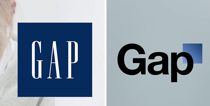
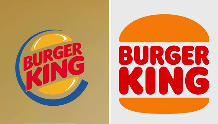
Some examples included logos that were changed back after seeing that the new version didn’t gain much success
Image credits: zacharywinterton
Image credits: zacharywinterton
Image credits: Mike Mozart
The art director and designer who lives in Portland also revealed the process of how he came up with the idea to start making videos like these. The best thing that works out for Zachary is simply trying his ideas out and seeing where they will take him: “I keep a running list of ideas and formats, and then it’s trial and error. I have been testing quite a few different formats to see what would resonate well with a design audience on TikTok, and this most recent series on logo design has really taken off!”
Zachary shared that it’s important to have in mind the industry in which the brand positions itself to create a suitable and distinct logo for it
Image credits: zacharywinterton
Image credits: Open Grid Scheduler / Grid Engine
Image credits: zacharywinterton
Image credits: Mike Mozart
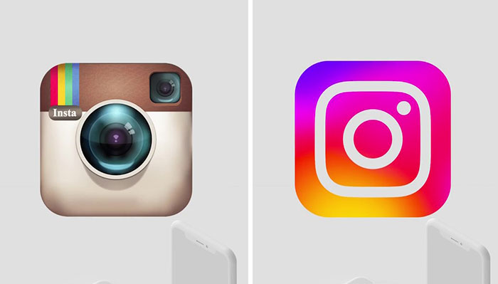
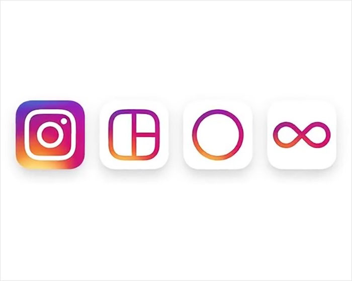
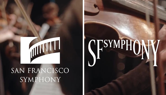
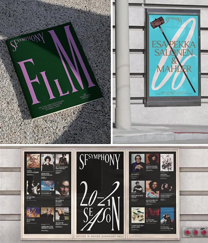
In his videos, the TikTok user doesn’t only talk about bad designs, but also shares some eye-catching and successful examples of brand identity symbols. These include the updated version of Instagram’s and the San Francisco Symphony’s logos. Zachary also answered a question about what a distinctive logo should look like by distinguishing 3 basic things when starting to create it. “A great logo should make sense, or feel cohesive, within the industry,” stated the expert, giving an example of the minimalistic yet well-known logo of Apple products. While the minimalism card works perfectly in the technology world, the same trick won’t work in some other industries, such as sports.
The TikTok creator believes that the logo should “stand the test of time”
Image credits: zacharywinterton
Image credits: zacharywinterton
“A great logo design is going to stand the test of time,” continued Zachary. While some people like to chase trends and this way stay relevant, it’s also important to create something more meaningful that will not need too much change over time. And lastly, “balance. A great logo is going to feel balanced between the logo mark, the logotype, and the color palette.” It’s easy to get lost while creating something to reflect the company’s many great aspects and values. What Zachary suggests, in this case, is to stay clean and simple, and use no more than 3 colors. “Great brands incorporate a strong use of color as a branding element as well,” shared the specialist by adding some great and easily recognizable logo examples that we all know. “Think Tiffany & Blue, Starbucks & Green, or Target & Red. These brands have built something that is recognizable by both shape, and color, and I think more and more brands are going to carry this concept into the future of logo and brand design.”
According to Zachary, the logo should consist of clean lines and shapes, and have no more than 3 colors
Image credits: zacharywinterton
Image credits: James Case
You can watch one of the worst logo design videos down below!
@zacharywinterton This is such a chaotic logo redesign 😂 #logidesign#designfail♬ original sound – Zachary Winterton
In his TikTok, the specialist also shares eye-catching and successful logo changes
Image credits: zacharywinterton
Image credits: JJBers
The art director advises those who are aspiring graphic designers or those who are racking their brains trying to think of the best possible logo idea for their brand to ask why they want to change it as it will “bring up a discussion around brand strategy or market positioning, or they might just have a tactical need for a more well-designed logo.” For already established brands, the man recommends “keeping any modifications subtle or making simple improvements over time. Especially if their logo is on retail shelves.” While a logo is only one little detail of the whole brand’s identity, it is an important one. However, the specialist reminds professionals to focus on the brand itself rather than on how great its logo is.
Image credits: zacharywinterton
Image credits: zacharywinterton
Image credits: zacharywinterton
Image credits: zacharywinterton
63Kviews
Share on FacebookThere is nothing new whatsoever in what this guy says compared to what we knew in the advertising business 20 years ago, someone please tell me he's not a Millionaire because I will cry
Clearly growing a social following is more than just knowing something. Its the convergence of knowledge in one sector and the ability to know how to communicate. Never understand why some people are so bitter towards other's possible success. Support victory
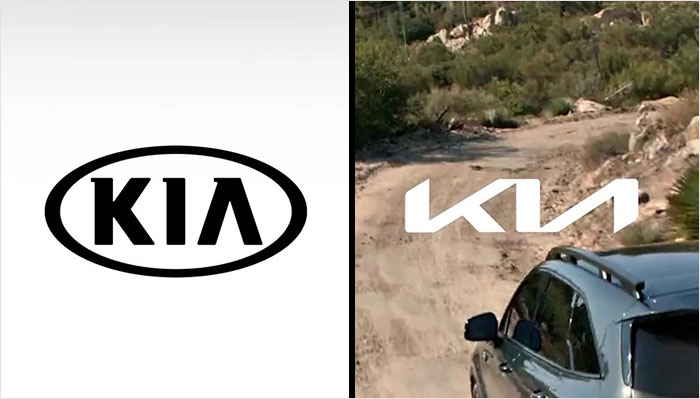
Load More Replies...I will never like the new kia logo. Thought it was for a new car brand when i first saw it.
I love it...For the more angular, futuristic bodied vehicles. For more bubbly shapes, they need to keep the classic logo.
Load More Replies...There is nothing new whatsoever in what this guy says compared to what we knew in the advertising business 20 years ago, someone please tell me he's not a Millionaire because I will cry
Clearly growing a social following is more than just knowing something. Its the convergence of knowledge in one sector and the ability to know how to communicate. Never understand why some people are so bitter towards other's possible success. Support victory
Load More Replies...I will never like the new kia logo. Thought it was for a new car brand when i first saw it.
I love it...For the more angular, futuristic bodied vehicles. For more bubbly shapes, they need to keep the classic logo.
Load More Replies...
 Dark Mode

 No fees, cancel anytime























32
14