Unless you’re a graphic designer or a person with an eye for arts and, well, design, you don’t think too much about it. We mean about the fact that the milk carton you have in your fridge was actually designed by someone or that the writing on your toothpaste tube is actually the product of somebody’s meticulous work. That is, you really don’t think about it until you encounter a case of bad graphic design. Then, the failed designs are glaringly obvious and utterly hilarious, making us think our thoughts sequencing around the key phrase, How on Earth did it pass the inspection? But, since most of us are human here and share the same passion for laughing at incredibly hilarious design fails made by someone else, we invite you to laugh at them together with this awesome list full of graphic design fails from hell.
So, the fact is you’ll find such crazy examples of bad design here, you wouldn’t have thought they were possible in the first place. After all, they are the fruits of somebody’s work; then someone had to approve them, then do the final layouts, and release these poor graphic designs into the wild. Again, How on Earth? Well, sure, some human errors can always slip through the cracks unnoticed, but these are just poor excuses for doing the job you were supposed to be good at. Anyway, more laughing stock for us!
Now, our top picks of the funniest design fails await you just a teensy bit below, so scroll on down and check them out. However, you probably shouldn’t check out this article while working, because once you start soaking in these bad designs, you won’t be able to stop until you’ve finished with the whole bunch - a hundred and five submissions!
Oh, right, before you start - don’t forget to give your vote for the Bad Graphic Design contest winners and share this article with your graphic designer friends; we’re sure they will appreciate this cringefest.
This post may include affiliate links.
Why Are They So Excited By This
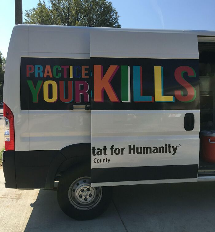
This Habitat For Humanity Van
The Land Is Blue And The Water Is White. I Am Not Proud To Say That I Spent Multiple Minutes Trying To Figure Out Why All The Cities Were Underwater
Speak No Evil, See No Evil
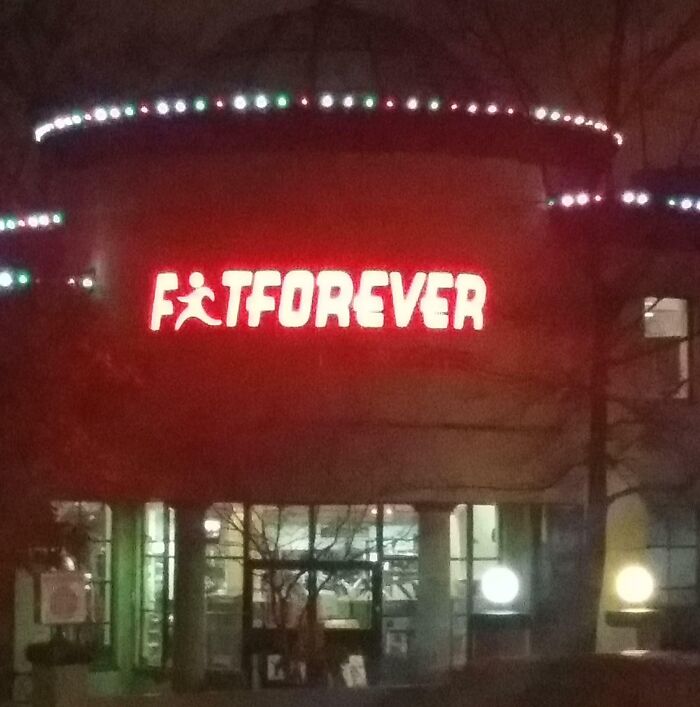
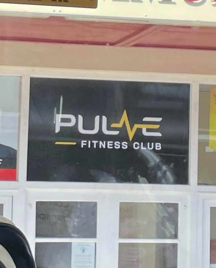
An Unfortunate Logo For A Fitness Center
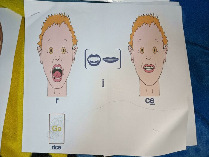
My Son Is Too Terrified To Learn Anything From These Speech Therapy Worksheets, And Frankly I Don't Blame Him
It's Pretty Good Advice
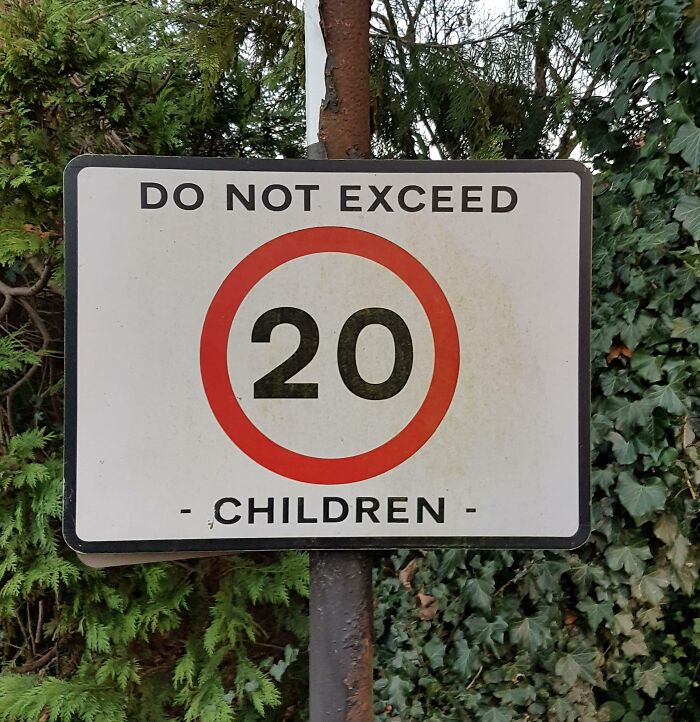
Do not exceed 20 children. Do not exceed 20, children. If you do have 20 children, for God's Sake don't let them drive.
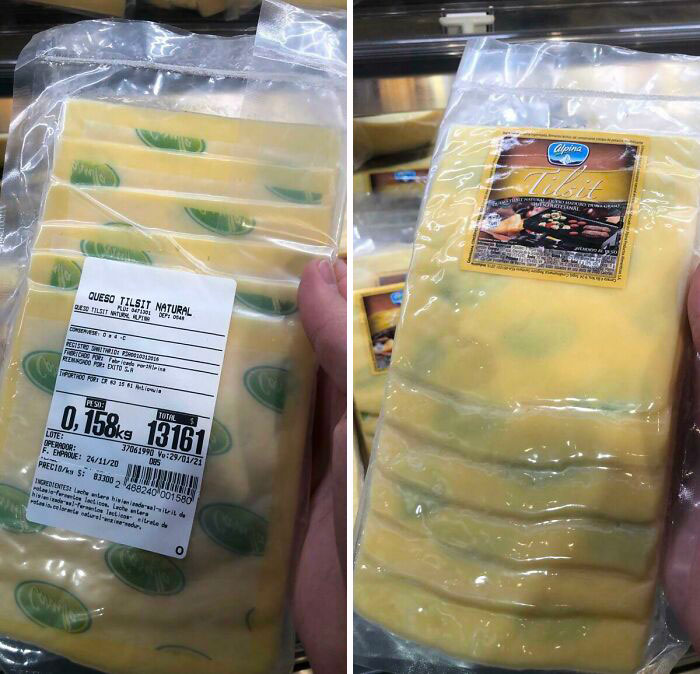
The Paper In This Sliced Cheese Makes It Look Like It Has Mold Spots
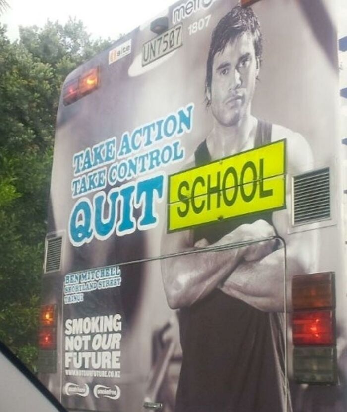
This Bus
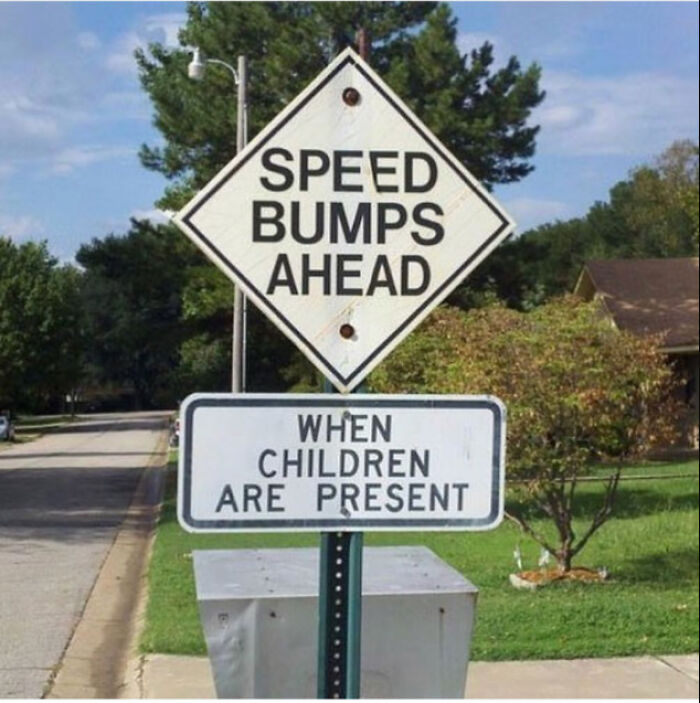
Do The Children Lay On The Road?
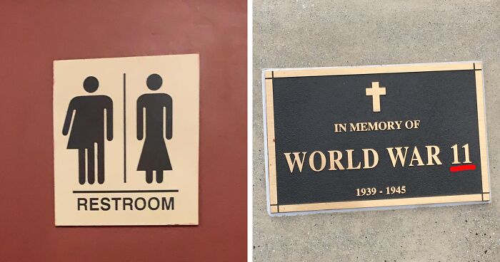
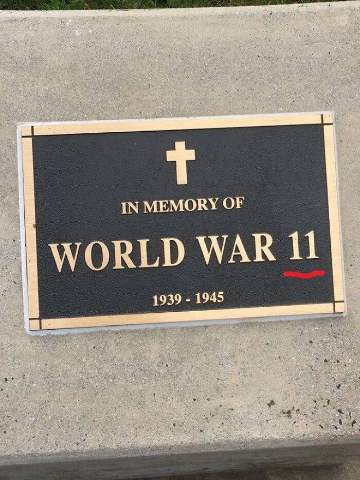
I Guess My World History Class Skipped Quite A Bit
It Almost Seems Intentional
Who Thought It Was A Good Idea To Put An Image Of 7 Churros For The Sign Of 3 Churros
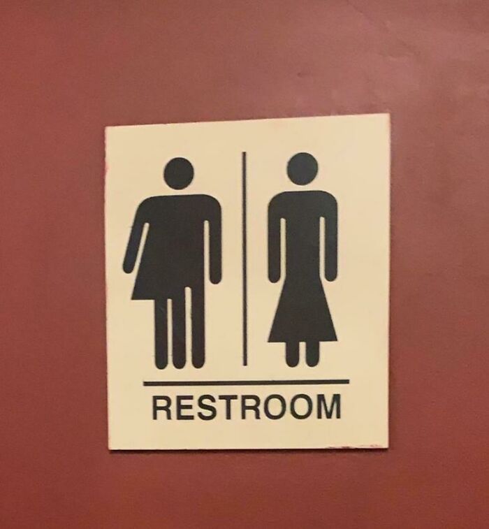
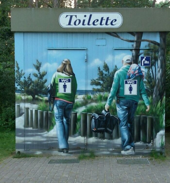
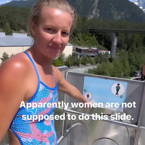
I Feel Like This Is Meant To Be Inclusive But
This toilet is exclusively for trans people with 3 legs or very short legs
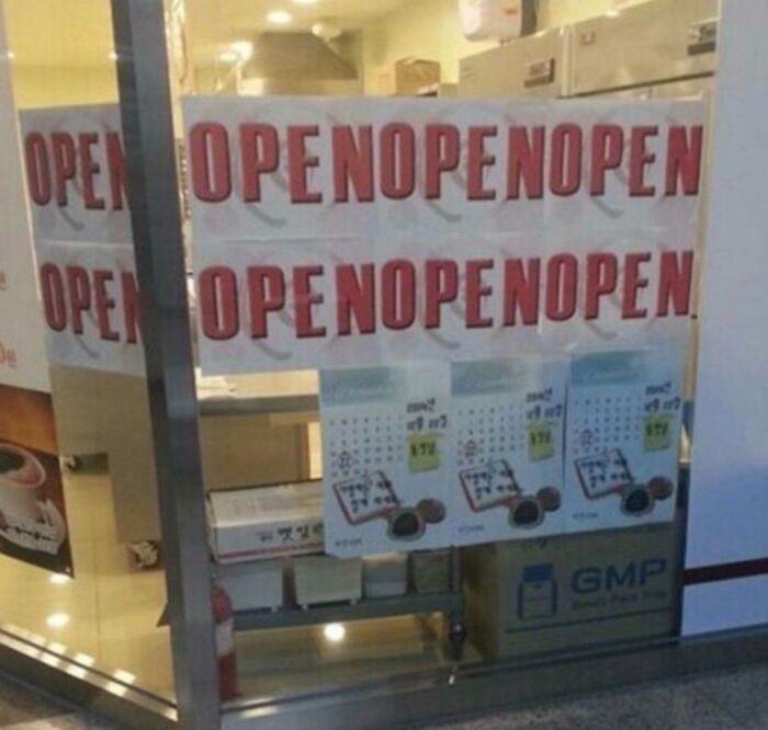
So Are You Open Or Nope?
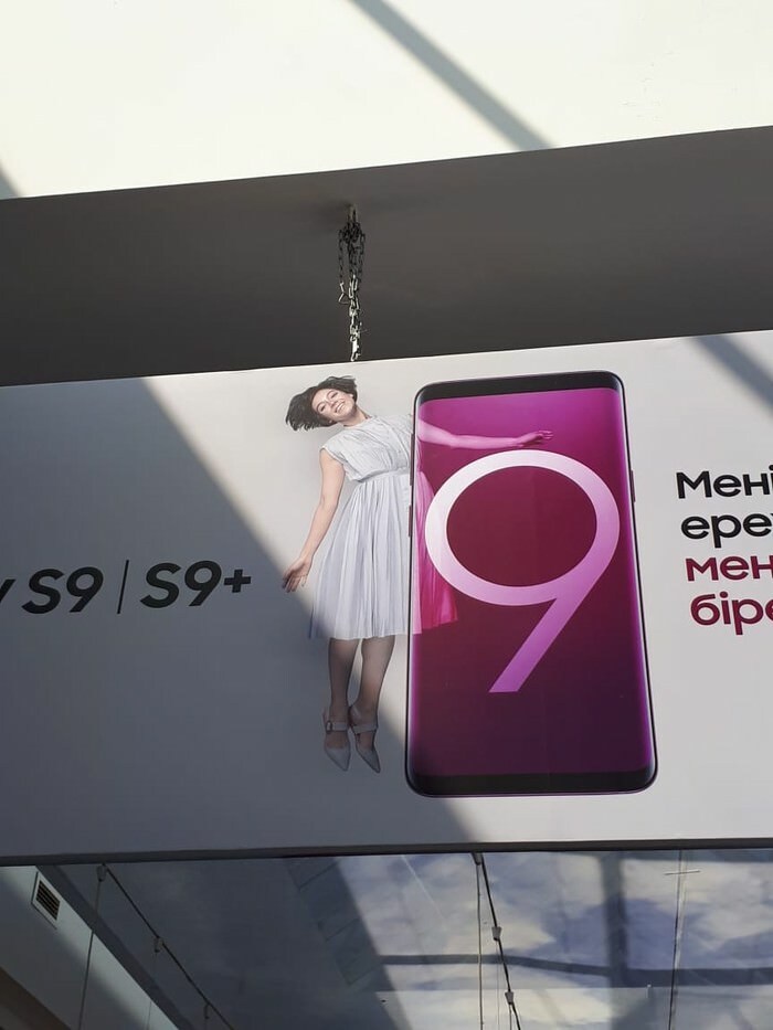
This Woman Turning Into Fish Roll
I Mean It's Self Explanatory And They Failed
Wow! What A Bargain!
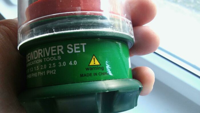
I See Your "Use Before: Made In China" And Raise You "Warning - Made In China"
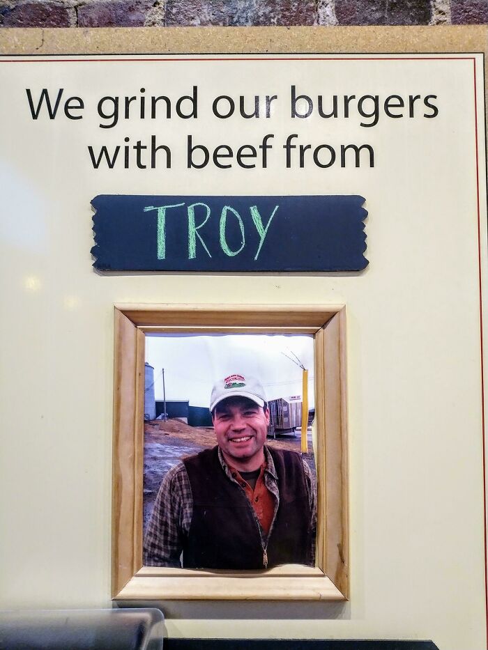
Rip Troy
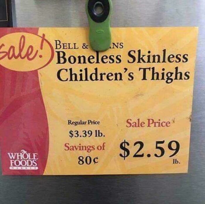
But Do Not Leave Children Unattended At Whole Foods
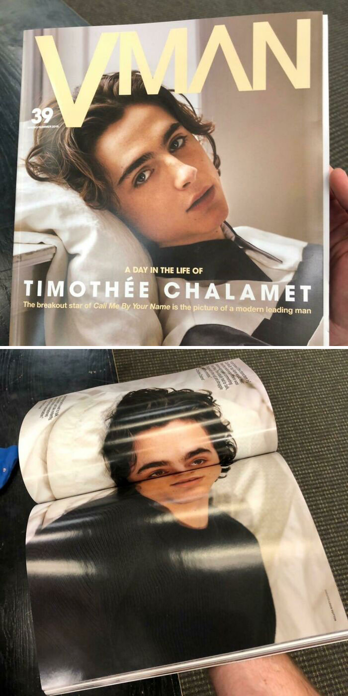
Bold Choice Of Layout For This Type Of Magazine Binding
My boyfriend finds timothee chalamet attractive (I think he needs to take better care of his hair) and I really want to send him the second pic
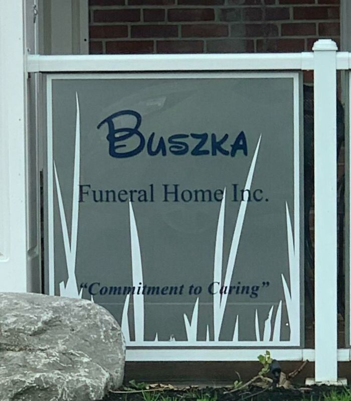
Disney Font Puts The Fun In Funeral
This was not created by a graphic designer, who would have immediately realized that (1) the background needed to be less opaque to increase contrast for legibility, (2) three different fonts is one too many, (3) the tagline does not need quotation marks, (4) having all the text centered looks amateur, (5) the logo needs to be more coherent, and (6) the graphic is weird, badly cropped, and not relevant in any way to the product. Did I miss anything?
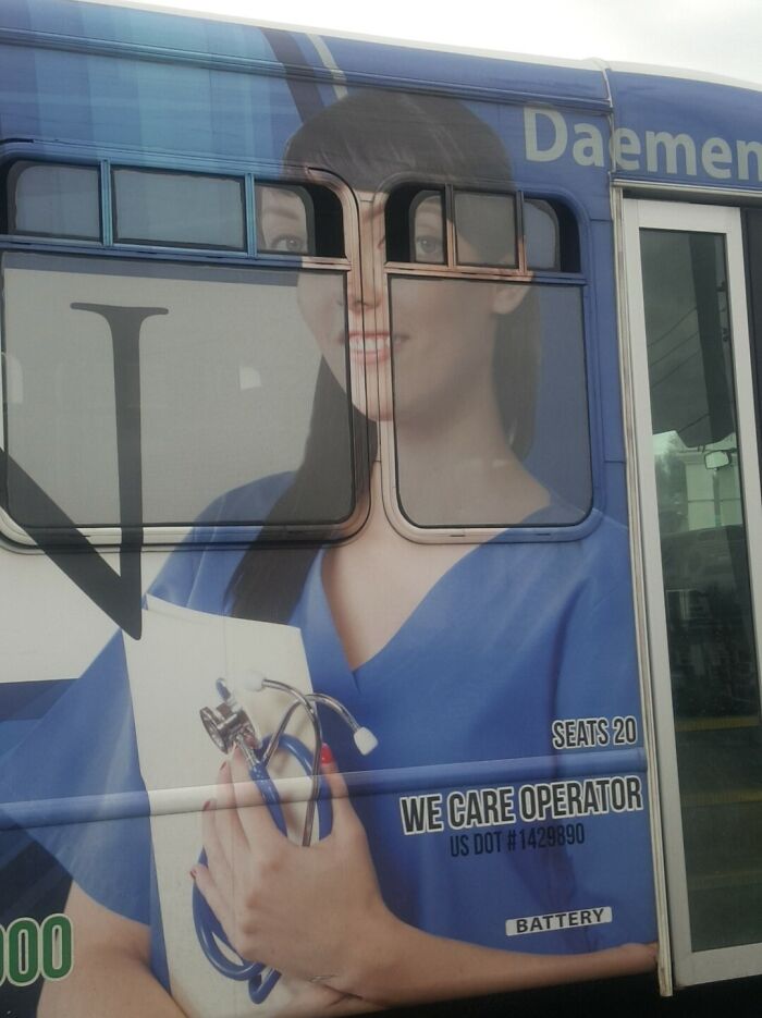
I Followed This Bus For 4 Blocks To Wait For It To Pull Over To Share This Beautiful Work Of Art
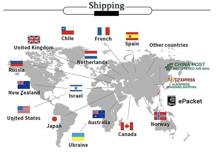
This Map Showing Where A Seller Ships Items To, Where Nothing Is Even Close To Correct. Also, French Is A Country Now
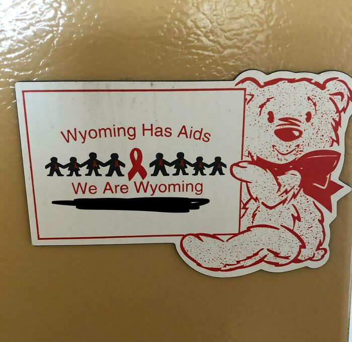
Everyone In Wyoming Has Aids Now. Sorry, I Don’t Make The Rules
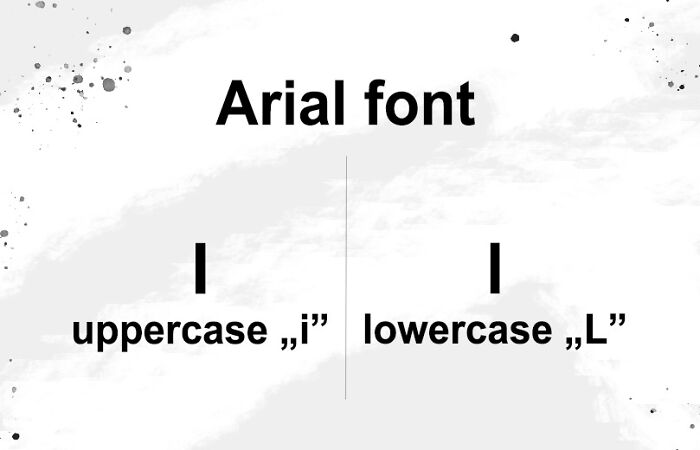
"Arial" May Be Simple, But It Has One Significant Flaw
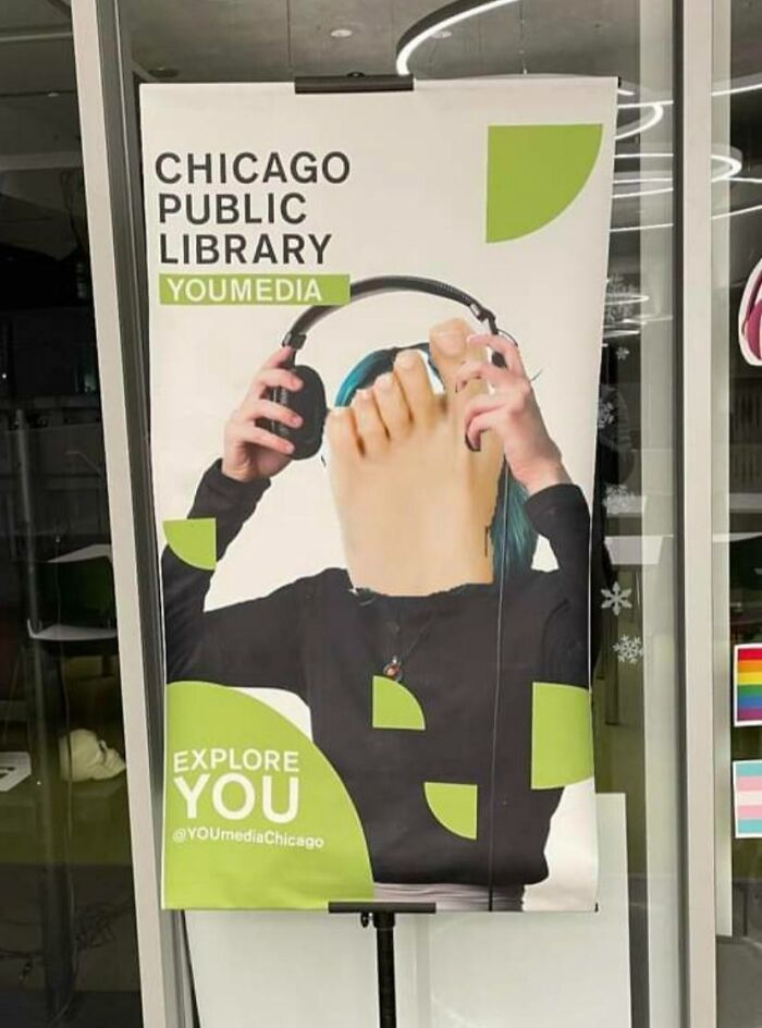
At A Local Library. Have No Idea What’s Going On
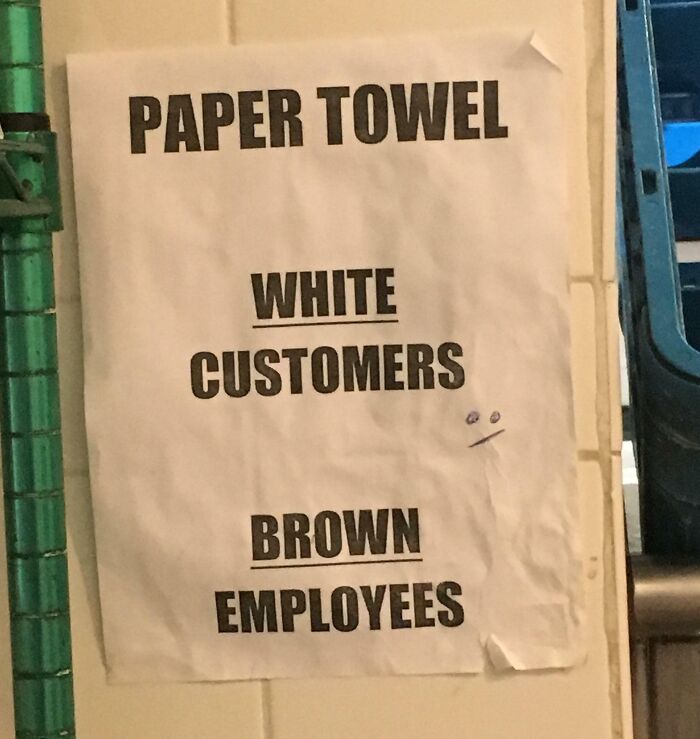
This Paper Towel Sign
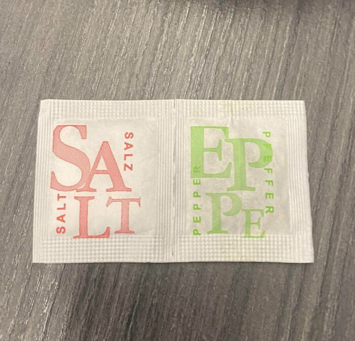
Ah Yes, Popular Condiments Salt & Eppe
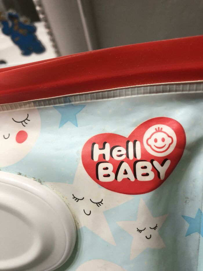
My Son Who Just Started To Read, “Hell Baby. Hell Baby. Hell Baby!!!”
I Can't Even Figure Out What They're Trying To Say
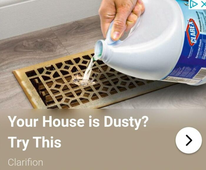
Dusty House? Why Not Breathe In Chlorine!
It's A Trap!
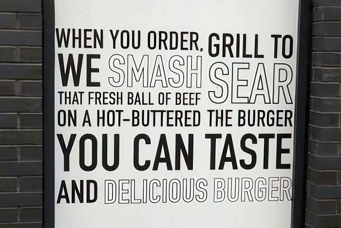
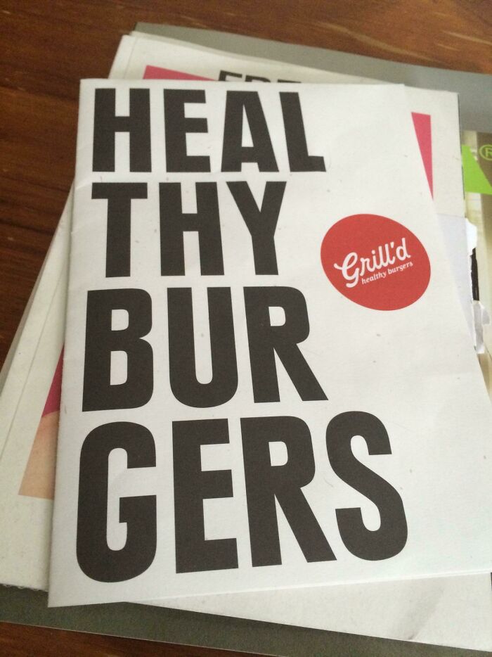
All Ye Shall Come To Me For The Healing Of Burgers
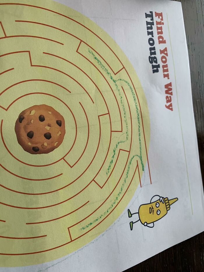
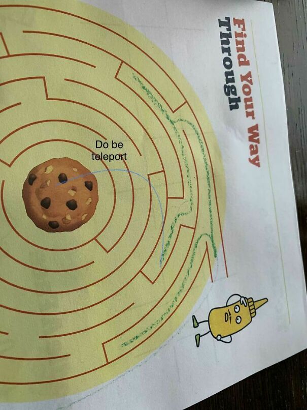
The Maze On The Kids Menu Is Impossible To Get Through
This Bag That You Don't Want A Child To Come Across
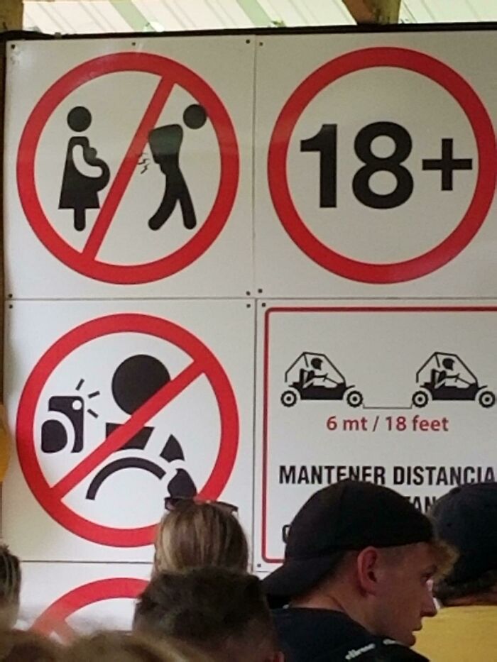
No Farting On Pregnant Women
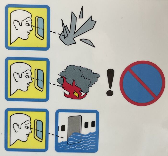
This Entirely Nonsensical Airline Safety Warning
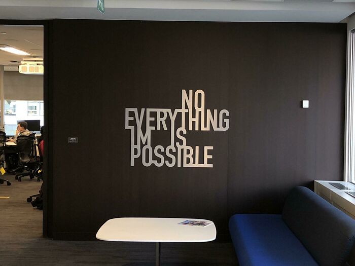
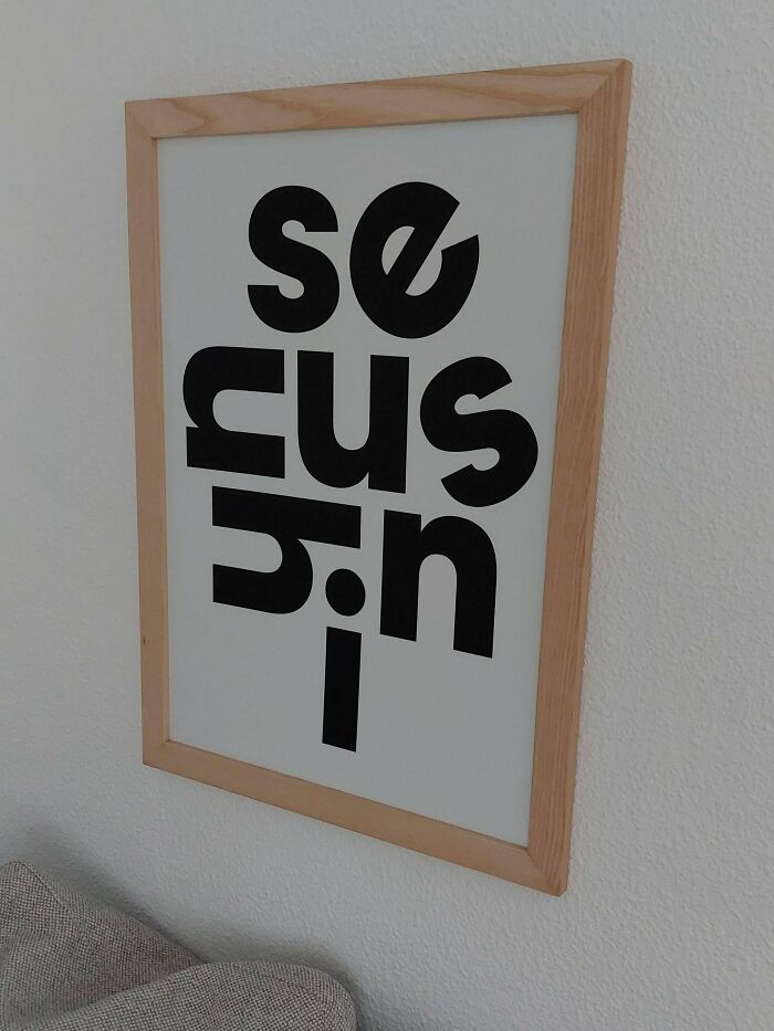
This New Wall Art In My Office
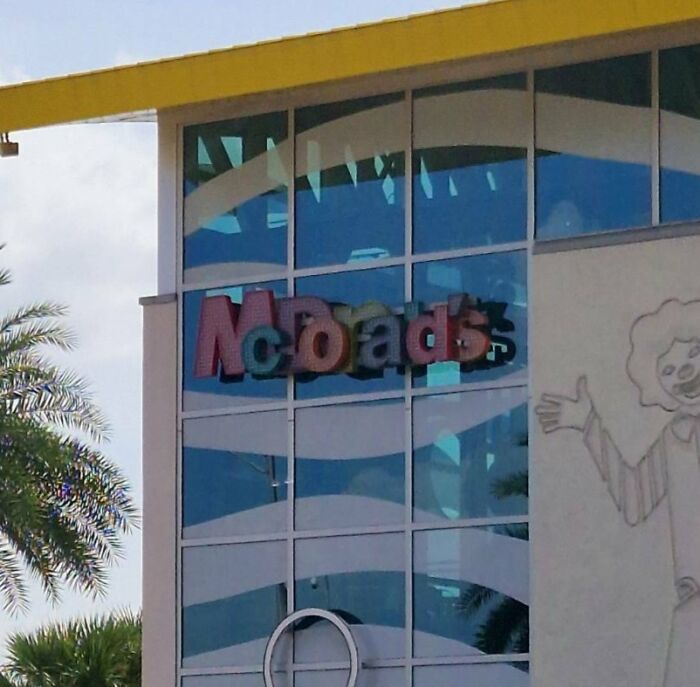
I Dont Think I've Been To A Mcoads Before
Can U Read It Properly?
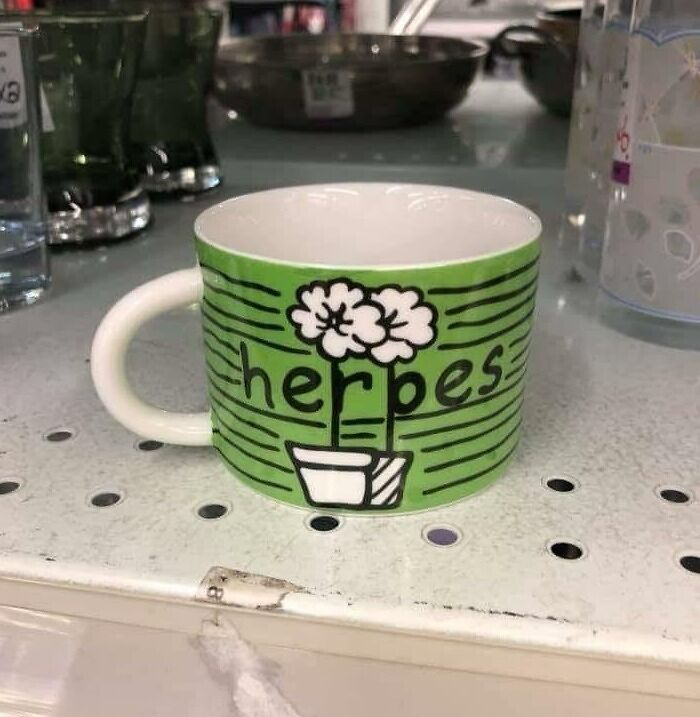
Herpes!
I Had To Create An Account Just To Share This Here!
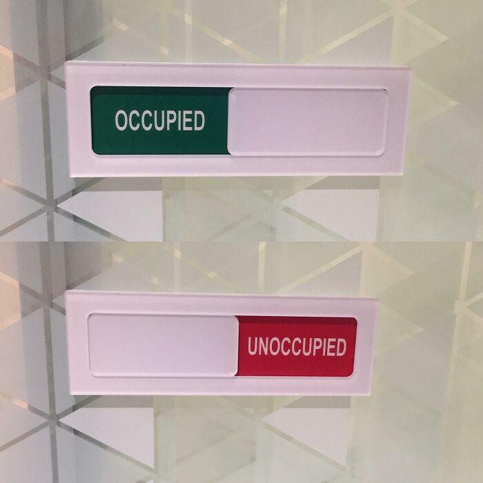
Someone Chose The Wrong Colors On My Boardroom Doors At Work
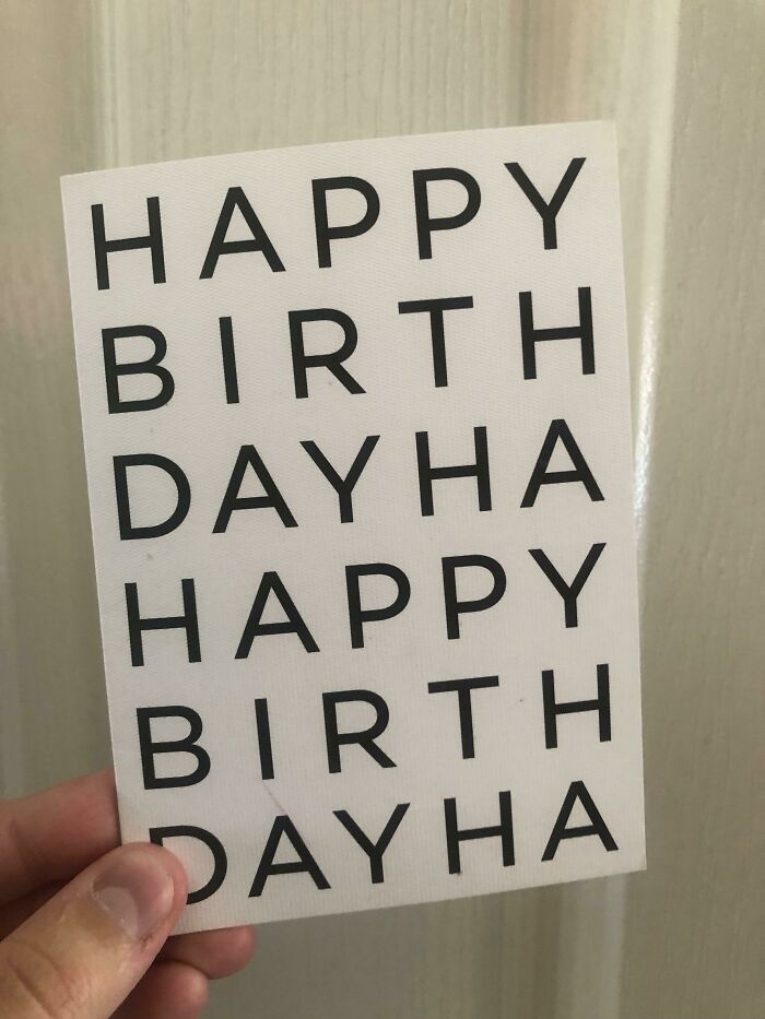
Happy Birthday Ha
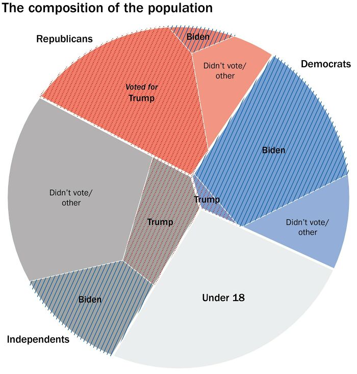
Taking Bad Graphs Into A New Dimension
That's painful, but at least they did not try to make a venn diagram out of it.
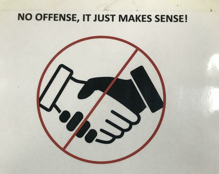
The HR Departments Attempt To Discourage Human Contact At My Work
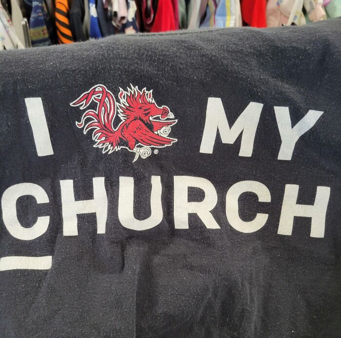
Found In A Thrift Shop, You Are What?
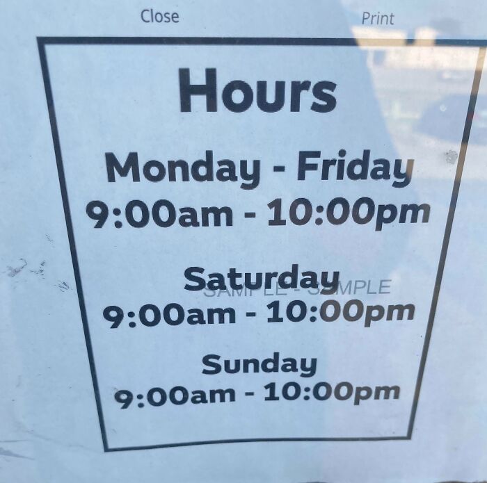
Hours At My Local Subway
This Is A Poster By A Design School
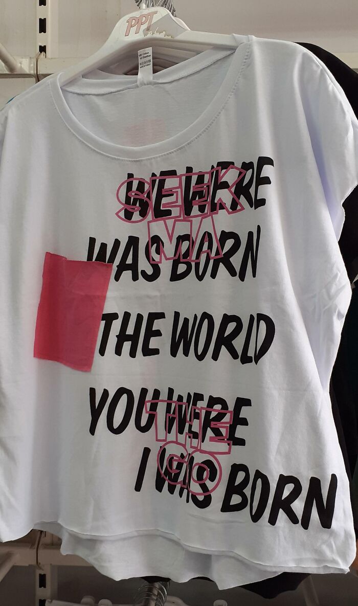
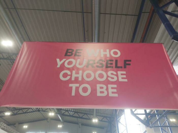
Be… What?
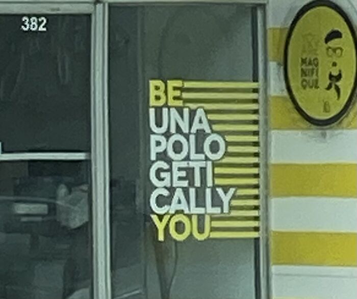
Be Una Polo Geti Cally You = Be unapologetically you and cringe hard
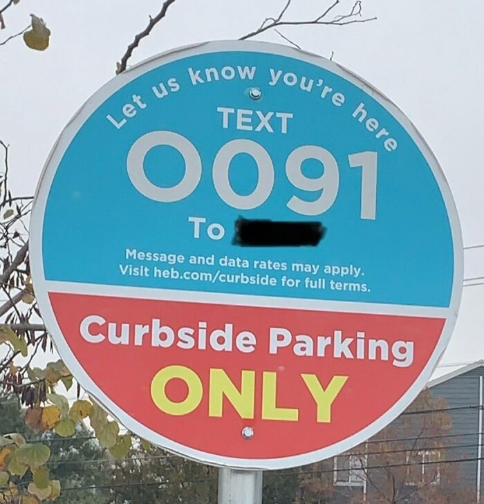
I Texted Two Zeros Multiple Times Before I Realized That Was An O
The Color Coding For This Graphic
“Thou Shalt Use 24 Point Font. Thou Shalt Not Use 23 Unless Immediately Proceeding To 24. 22 Is Right Out!
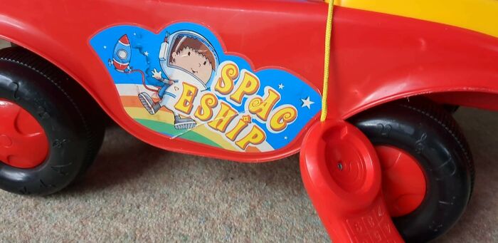
Ride On Spac Eship
guess they figured... "Nah, let it go as is. The kid can't read yet anyway".
This Is In Our Hotel Room. Sunshine?
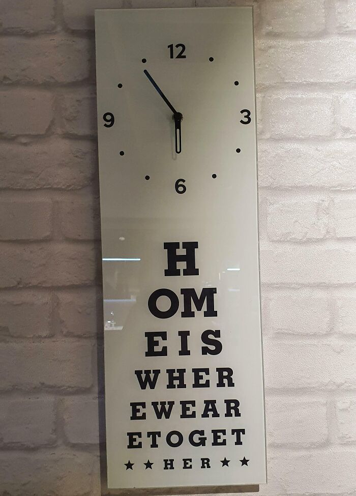
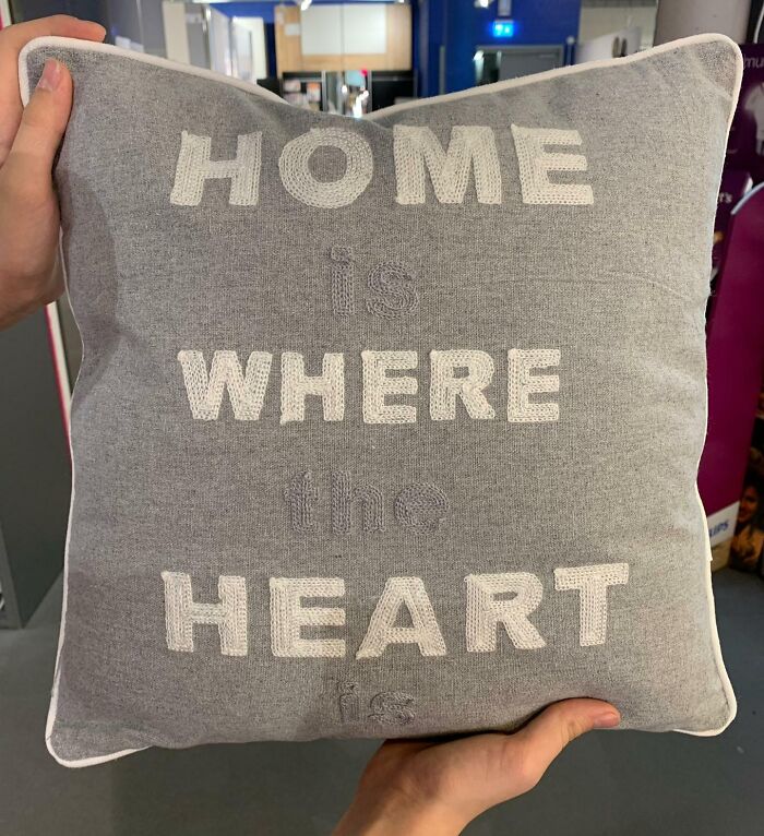
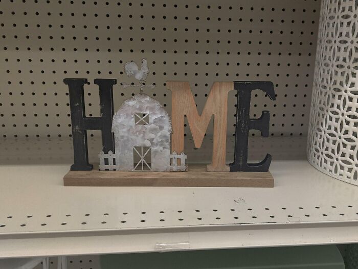
Home Where Heart
I Don't Think Someone Thought This Through
A Fast-Food Place Signboard (With A Poor Choice Of Word Layout)
Pibu zzarger? I am personally offended by this statement about my hedgehoggy mother in my planet’s language!
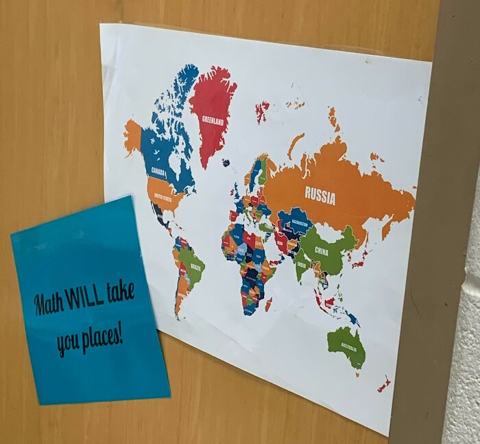
Math Will Take You Places, But Not Mongolia
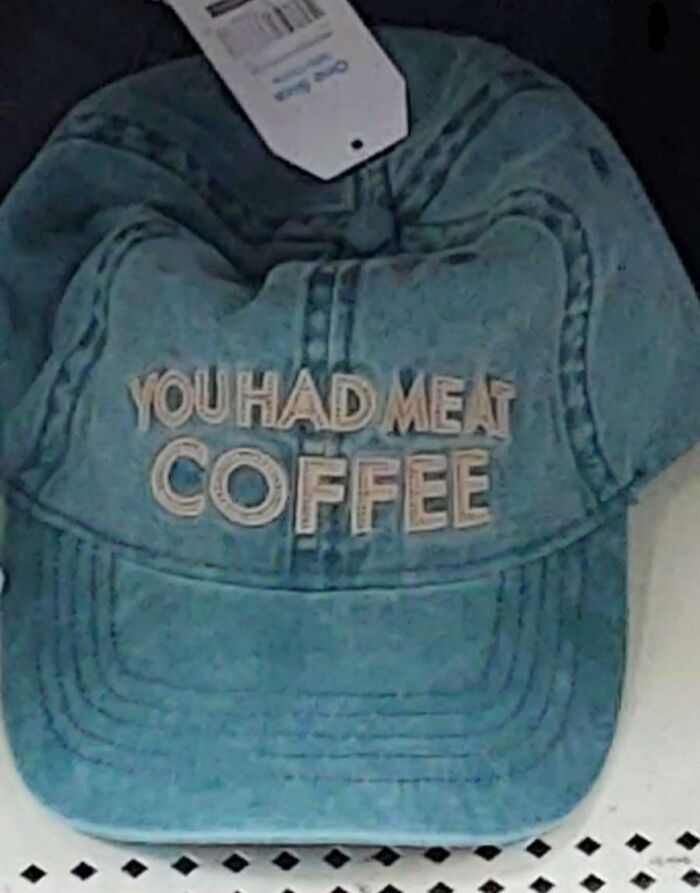
Meat Coffee, Anyone? Seen At The Clearance Section At Martwal
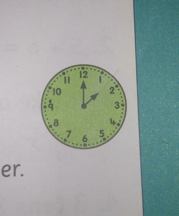
This Clock In A Maths Book Is Showing 1:30 O'Clock
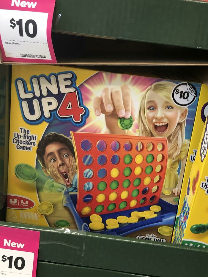
She Already Won, And 3 Pieces Are Floating. Epic
There's No Place Like Hame
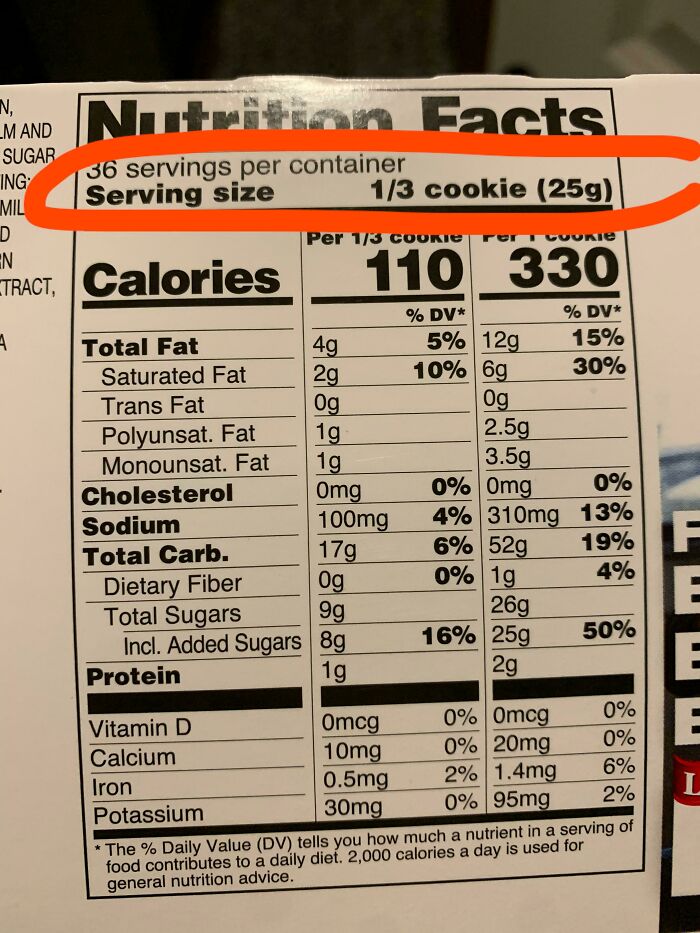
The Serving Size On These Oatmeal Cookies Is A “1/3 Of A Cookie”
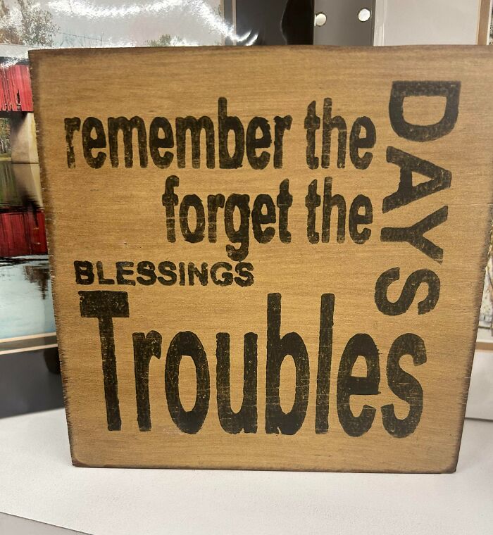
I’m Having A Hard Time Figuring Out What I Should Remember And What I Should Forget…
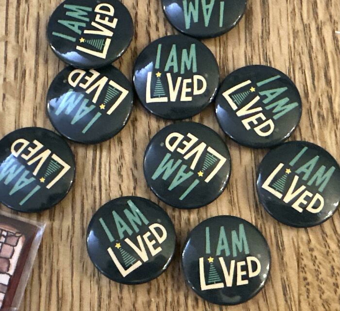
I Am Lived
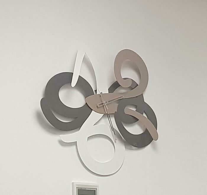
It's Supposed To Be A Clock
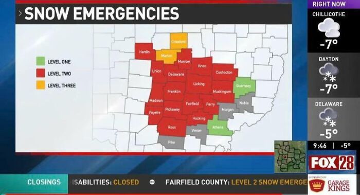
Central Ohio Emergency Map, Shouldn’t Red Be Most Severe?
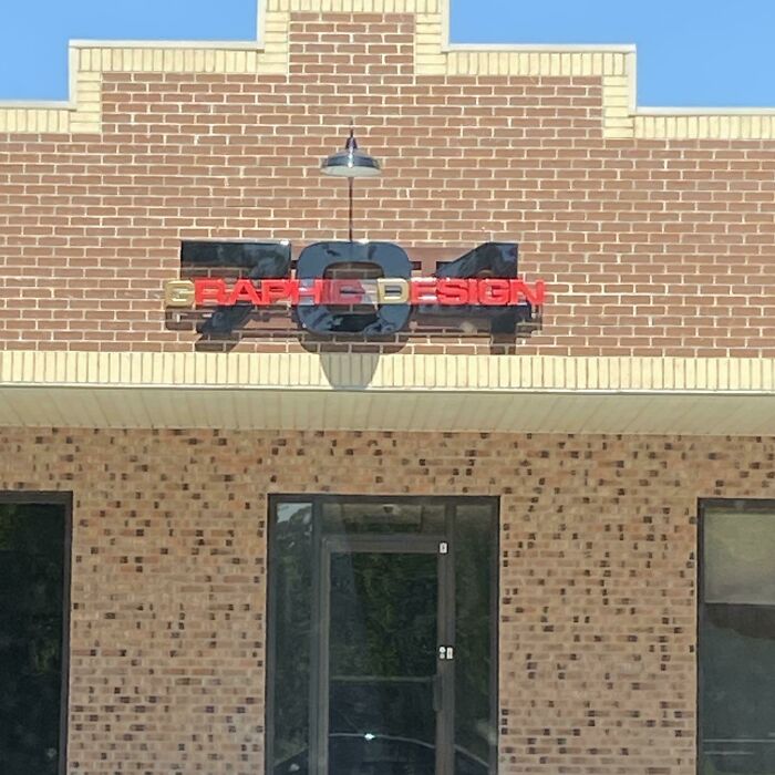
I Don’t Understand Why Graphic Design Companies Don’t Have The Best Logos
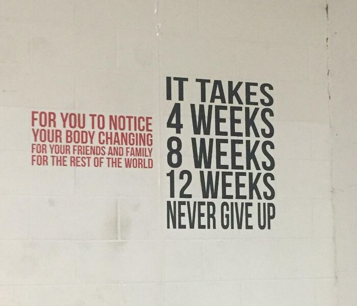
New Paint On The Wall At My Gym
My brain insisted on singing the righthand part in Harry Belafonte's voice.
This Pub Is Supposed To Be Called “Bunch Of Grapes” And I Saw This Unreadable Logo And Asked My Mate “How Far Is The Pub Then?”
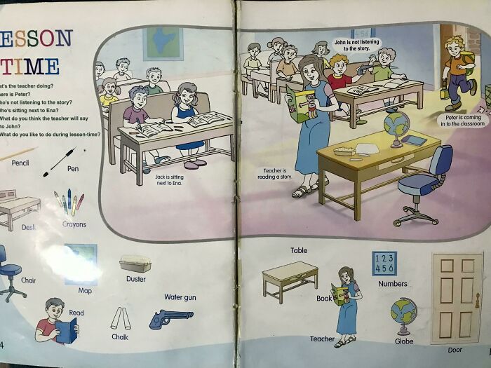
John Is Not Listening To The Story In The Classroom
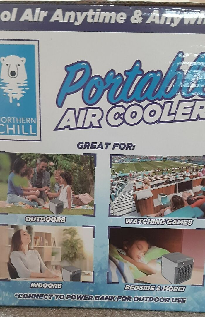
This Horribly Photoshopped Portable Cooler
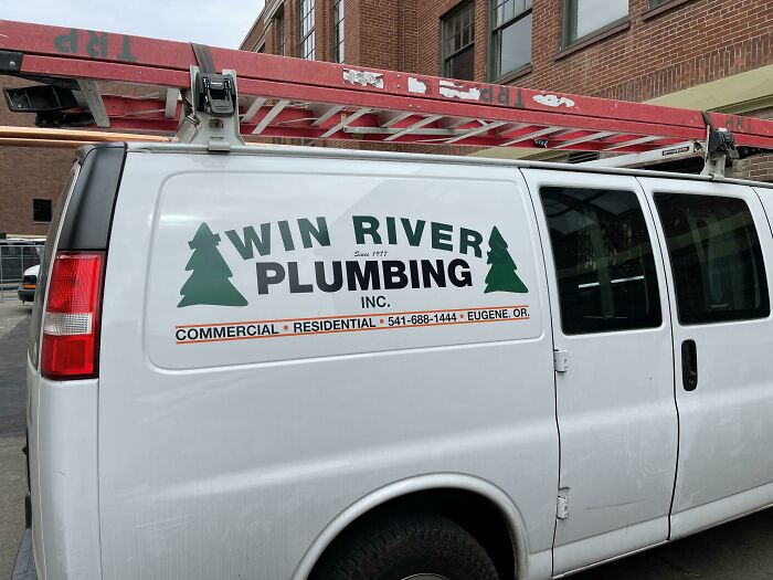
Win River Plumbing
Took me a minute to realize “Win River Plumbing” was not the intended name.
When you realise it say 'Twin Rivers' you can magically see the 'T' & the 'S'.
Brace For Inter Wwith?
Pulve Fitness Club?
…Are you sure the person is still alright? That pulse looks ominous
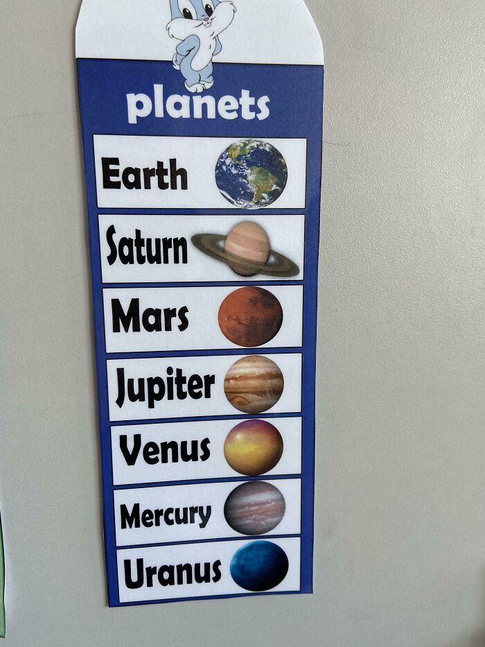
Never New Mercury Looked Like That
Probably in a castle at the bottom of the ocean
Load More Replies...Here's Earth. Jupiter. Saturn. Jupiter. Mars. Jupiter. Hey, have I told u I like jupiter
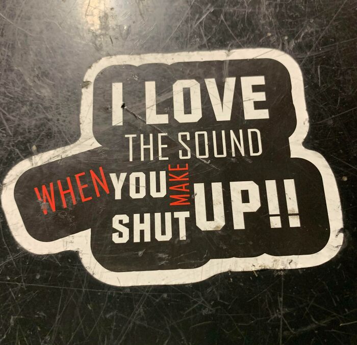
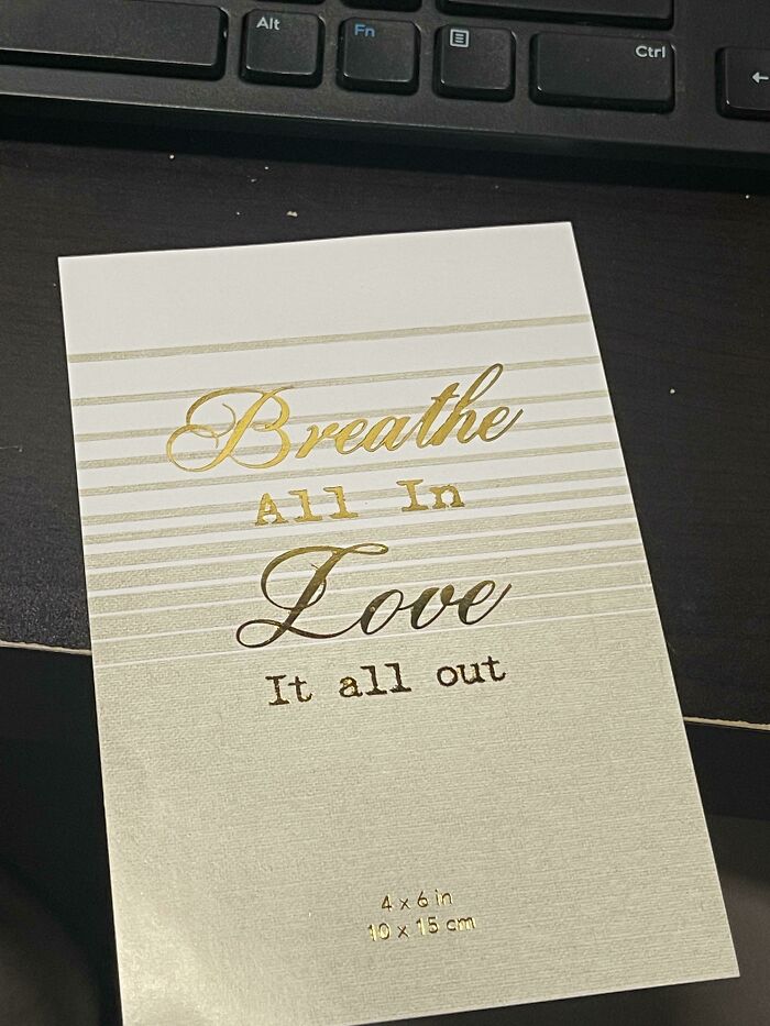
I’m Not Even Entirely Sure What This Is Supposed To Say
My Mom Showed Me This Cause She Didn’t Get It… And I Don’t Really Either??
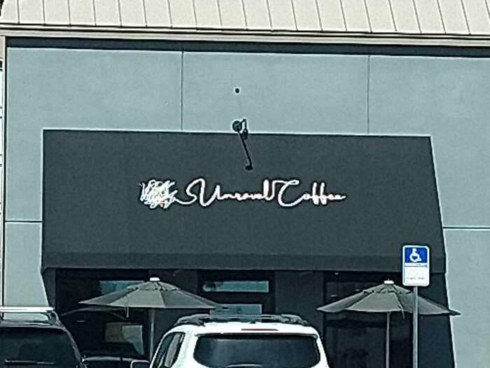
The Sign On This Coffee Shop Is Terrible. I Can't Even Read The First Word. I Can't Imagine They Thought This Through
Owner: "The sign will be this *scribbles*" Contractor: "Say no more*

 Dark Mode

 No fees, cancel anytime


