ADVERTISEMENT

Design is all about striking a balance between practicality and aesthetics. That sentiment is even more true for public spaces: functionality might trump the visuals of a space. Sadly, not every designer sticks to these core principles, hence why we sometimes get questionable but hilarious fails.

This time, we've put together a list of the most disappointing design decisions in public places that might have many of you asking: "Who came up with this?" Bathrooms with no doors, non-functioning recycling trashcans, seats with a blocked view, and other absurd fails await you down below!

RELATED:

    Access to public spaces for people differs around the world. According to the UN, Europe boasts the biggest share of the population (70.73%) that has access to open public places. Oceania comes in second place with 68.79% of people having convenient access to shared spaces.

    North America is doing pretty well: they're above the world average of 44.21% with 56.84% of spaces being conveniently available to the public. Developing countries in Sub-Saharan Africa, Northern Africa, and Asia have it slightly worse, placing below the world's average.

    #4

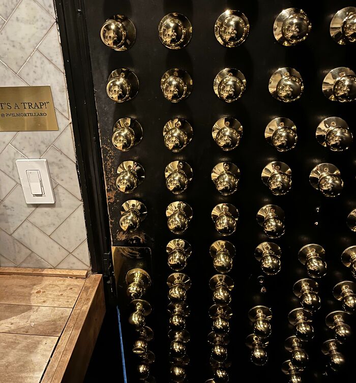
    This Is The Inside Of The Bathroom Door At A Bar In NYC. After Some Cocktails, It Is Impossible To Pick The Right One On The First Try

    Door covered in numerous gold doorknobs, exemplifying unfortunate public interior design choices.

    jwstoner86 Report

    #5

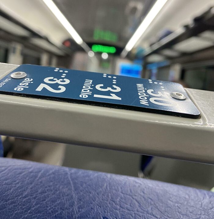
    Braille Script Instead Of Being Embossed, Is Just Printed In Vande Bharat

    Unfortunate interior design with mixed-up seat numbering in a public transport setting.

    Serving no purpose at all. What kind of people are taking decisions for Indian Railways?

    lemniscaterr Report

    ADVERTISEMENT
    #6

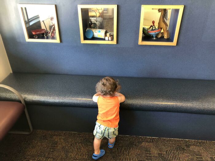
    Waiting Room At Pediatric Clinic Has Toys Secured Behind Plexiglass For Display Only - No Actual Toys For The Kids To Play With

    A child in an orange shirt stands before unfortunate public interior designs with awkward wall shadowboxes.

    choirdudematt Report


    It's strange when we think about how much we and our moods are influenced by the environments we're in. Apparently, visually unpleasant environments can make us feel more lonely. A 2024 report by the UK's Centre for Social Justice, for example, revealed that ugly buildings contribute to the epidemic of loneliness.

    The respondents in their survey claimed that architects and city planners don't know what the local people really want. And they want green spaces; three-fifths of people with access to green spaces said they never felt lonely. And two-fifths thought that urban planners aren't designing public spaces with community spirit in mind.

    #7

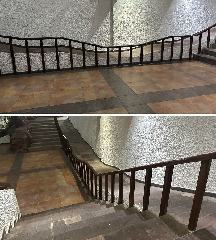
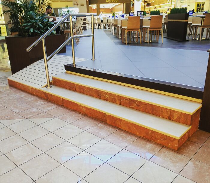
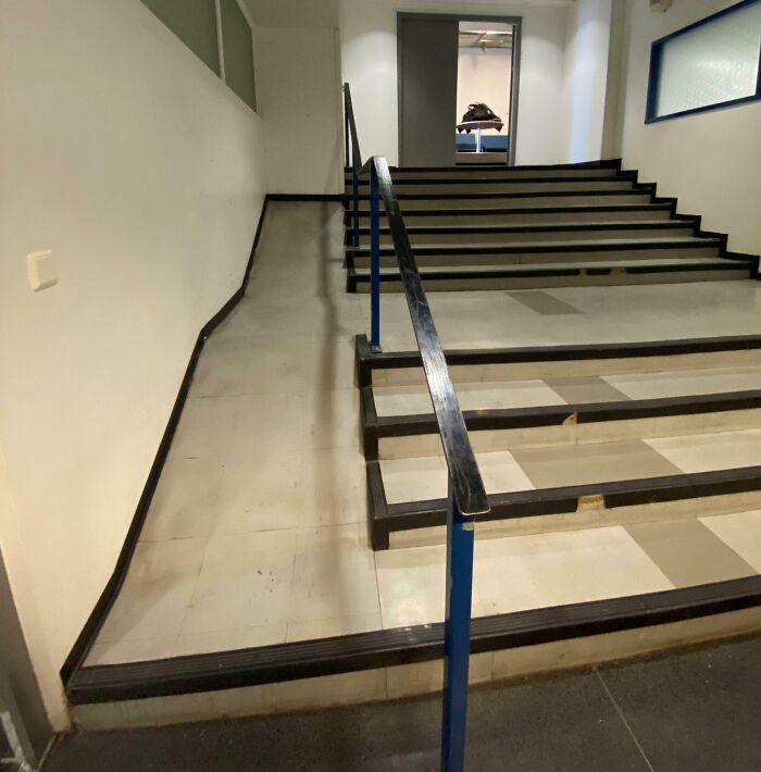
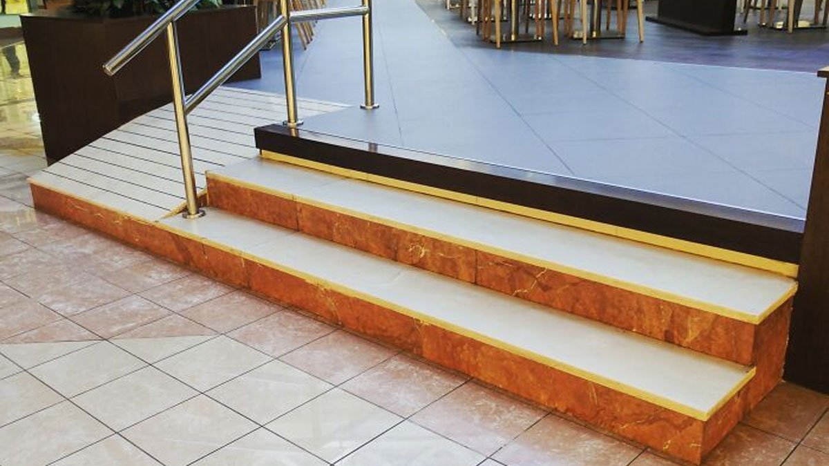
    Accessibility Ramp At The Resort I’m Staying At In Mexico

    Uneven staircase with railings in an unusual public interior design.

    There are a bunch of other awful ramps around the premises, but this is definitely the worst one.

    Boring_Customer4982 Report

    Add photo comments
    POST
    BeepBoop is Lonely (she/they)
    Community Member
    2 days ago DotsCreated by potrace 1.15, written by Peter Selinger 2001-2017

    weeee! (this would actually be really scary I've experienced something like this while on a knee scooter- do not recommend 😭)

    View more commentsArrow down menu
    ADVERTISEMENT
    ADVERTISEMENT

    The senior researcher at CSJ, Josh Nicholson, said the the UK government's new policy to build 1.5 million new homes should take into consideration that people want more communal and green spaces. "The country urgently needs more homes, but this should not mean cutting corners, degrading the built environment, or concreting over green community space," he observed.

    #10

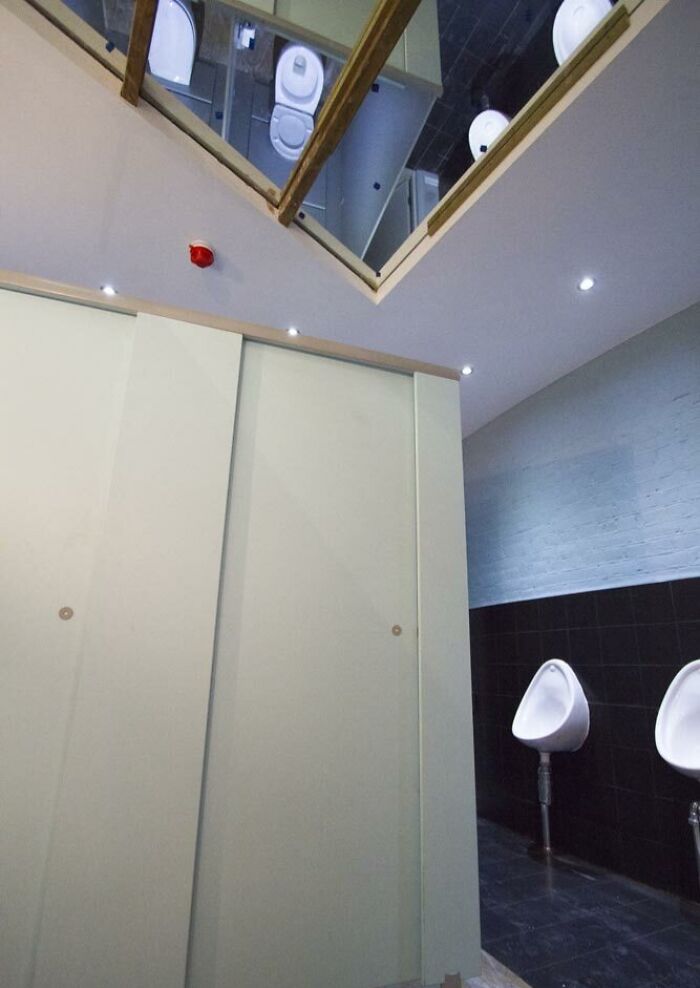
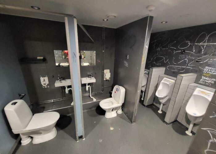
    "That's What's Missing - A Ceiling Mirror! Why Hasn't Anyone Thought Of This Before?"

    Unfortunate public interior design showing restroom with mirrors on the ceiling reflecting toilets and urinals.

    TheNMP Report

    #11

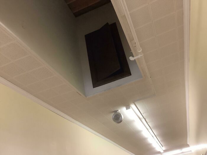
    There Is A Door In The Ceiling Of Our School

    Ceiling with an unexpected open hatch, illustrating unfortunate interior design choices in a public space.

    No one knows where it goes (including teachers and janitors), no one has ever used it. It mysteriously opened a few days ago, and no one knows how. You can’t see anything in it, it’s just darkness. No one has an explanation. Our school is 98 years old.

    House_turtles Report

    In the U.S., people also believe that good public spaces should have a positive influence on people's mental health. Approximately 86% of the respondents in the State of Community Facility Design survey said that mental health and wellness should be a high priority in the design of community buildings.

    ADVERTISEMENT
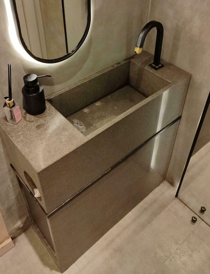
    #14

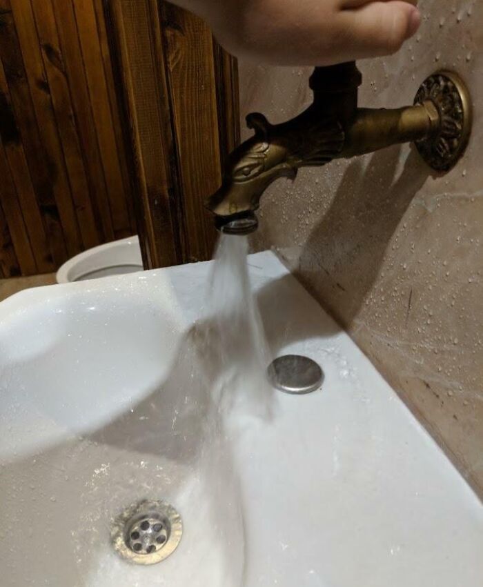
    It Took Me Five Minutes To Figure Out How To Activate The Water (You Had To Spin The Golden Tip)

    A narrow bathroom sink with a high curved faucet, showcasing unfortunate interior design.

    reddit.com Report

    Add photo comments
    POST
    Sara Frazer
    Community Member
    2 days ago (edited) DotsCreated by potrace 1.15, written by Peter Selinger 2001-2017

    That would make me incredibly furious but I admire your dedication to hand washing, most people would've given up .-. I've been in restrooms where all you have to do is put your hand under a sensor to turn on the water and seen women still walk out without washing 💀

    View More Replies...
    View more commentsArrow down menu
    #15

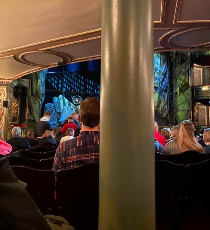
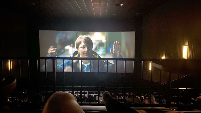
    When Booking My Ticket, I Was Told I Might Have A Slightly Restricted View. ‘Slightly’ Is A Bit Of An Understatement

    A theater view obstructed by a large pillar, highlighting unfortunate public interior designs.

    broccoliboi989 Report

    So, what do public spaces need in order to be successful? The Project for Public Spaces has a few ideas. They offer some features that a public place should have for it to be functional, aesthetically pleasing, and well-liked among the people who are using it. Let's go over some of them.

    #16

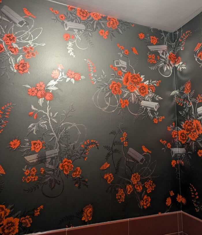
    The Wallpaper In The Women's Restroom At The Hotel I'm Staying At

    Floral wallpaper featuring red flowers and security cameras, showcasing unfortunate public interior design.

    hybridginger Report

    ADVERTISEMENT
    #17

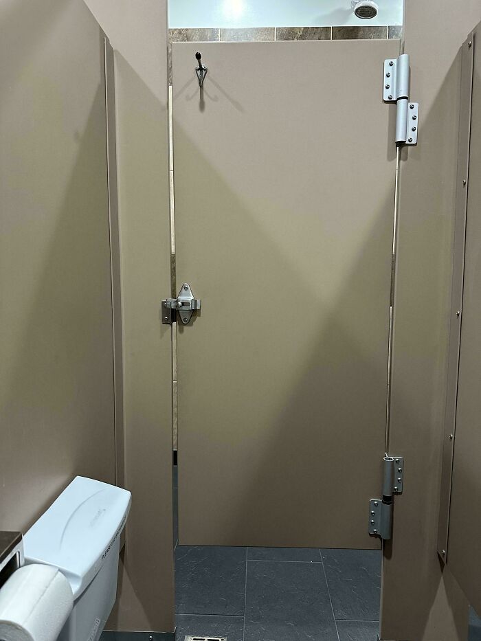
    All Public Restrooms In America Seem To Be Like This - Why Bother Having A Door If It Doesn’t Cover You?

    Public restroom stall with large gap in door, showcasing unfortunate design.

    This isn’t the worst I’ve seen/used. I’m just tired of it and mildly infuriated.

    thinkIgotitbutIdont Report

    Add photo comments
    POST
    Lavern Defazio
    Community Member
    2 days ago DotsCreated by potrace 1.15, written by Peter Selinger 2001-2017

    The best ones have the dirty graffiti in them. The poetry and prose are amazing in the ones I've come across.

    View More Replies...
    View more commentsArrow down menu
    #18

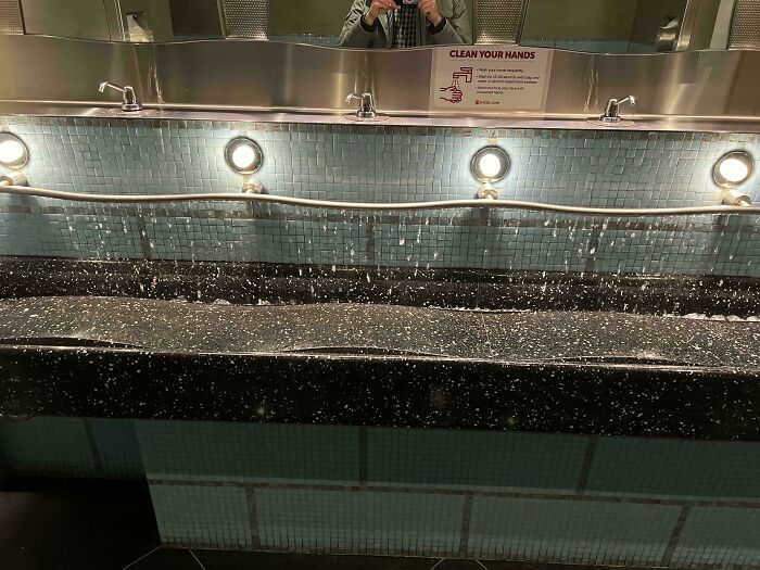
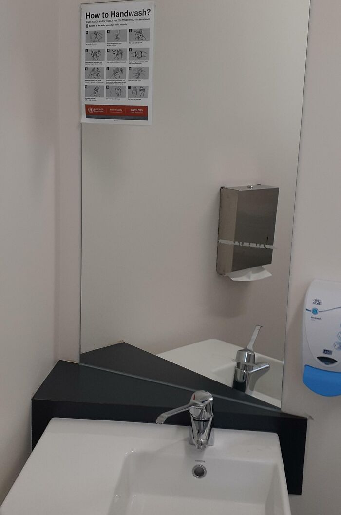
    This Sink Drips Water Like Rain, It Is All One Pipe With Holes So If One Person Uses It Wastes Enough Water For 5 People And Doesn’t Even Provide A Steady Stream

    Unfortunate public interior design with a sink causing water to splash onto the floor due to poor faucet placement.

    Toxic_Don Report

    They start with places to sit. Nowadays, many public spaces use hostile architecture to deter people from sitting or sleeping there. Others are planned poorly, with no places to sit in the shade or the sun (depending on the climate), not near a playground, and not close enough to other activities. A good public space should have all these things, allowing people to sit down and spend some time there.

    #20

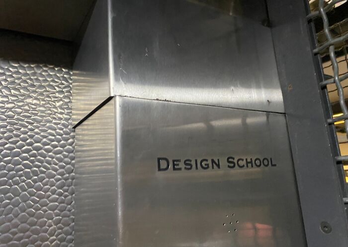
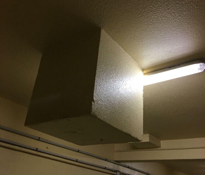
    No Need To Measure ... This Also Isn't A Installation Problem It Appears Multiple Times Throughout The University

    Metallic box labeled "Design School" showcasing unfortunate interior design.

    izzybee799 Report

    ADVERTISEMENT

    A good public space should also have a place for people to gather around. That can be a food cart, some seating, or even a bus stop. The PPS gives the Parc de la Villette in Paris as a bad example; the seats force people to sit far away from each other, and the signs ask them not to climb the sculpture. A good gathering place should have food, activities, and lots of places to sit.
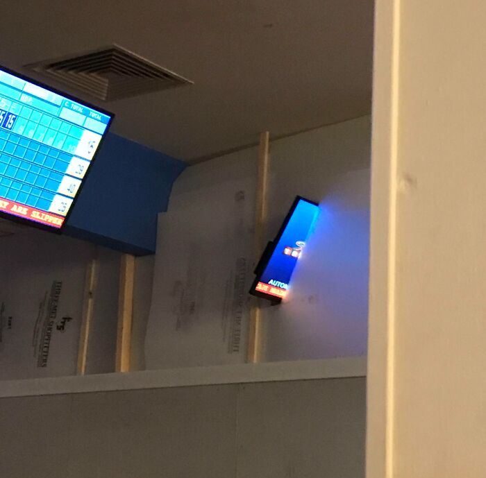
    #24

    You Could Have At Least Put The Bowl Under The Faucet

    Unfortunate interior design with misaligned faucet pouring water onto the bathroom floor.

    george76904 Report

    People decide if they want to enter a public space depending on its entrance. If it's narrow, not inviting, and you can't see what's inside, you likely won't want to come in. Bryant Park in New York City, for example, has coffee and sandwich kiosks at the entrance, making it that much more inviting. You can also see the inside of the park from the street, so you're more inclined to come in.

    ADVERTISEMENT
    #25

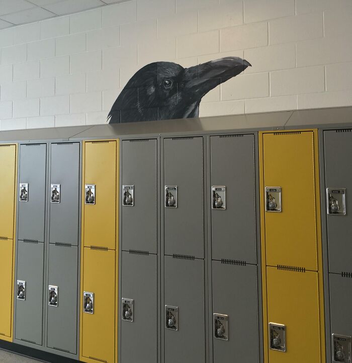
    This Stunning Mural Painted In My School Was Covered Up By Lockers Recently

    Crow mural seemingly emerging from the top of mismatched yellow and gray lockers represents unfortunate interior design.

    nottheeskimo Report

    #26

    Men's Room Door At A Local Hospital. I Had To Turn Sideways To Get In, I Am Not A Large Man

    Men's restroom door awkwardly placed with minimal space, depicting unfortunate public interior design.

    reddit.com Report

    There's much to be said about how car-dominant cities are nowadays. However, the experts at the PPS note that a good public space shouldn't be dominated by vehicles and traffic. Streets have to have crosswalks, and not be too wide, and people need to be able to cross them comfortably, even if they have to wait for a little while.

    ADVERTISEMENT

    What public design features get a rise out of you most, Pandas? Do you see any of them on this list? Share your thoughts on public space design with us in the comments! And while you're here, don't forget to check out our previous posts about questionable design choices for communal spaces herehere, and here!

    #32

    "Microwave Ovens" Sign At My Local Electronics Store

    Microwave and oven display with misspelled labels, illustrating unfortunate public interior design.

    timejumper13 Report

    Add photo comments
    POST
    Multa Nocte
    Community Member
    2 days ago DotsCreated by potrace 1.15, written by Peter Selinger 2001-2017

    🎶 We got to install microwave ovens - custom kitchen deliveries - we got to move these refrigerators - we got to move these colour TVs 🎶

    View More Replies...
    View more commentsArrow down menu
    #33

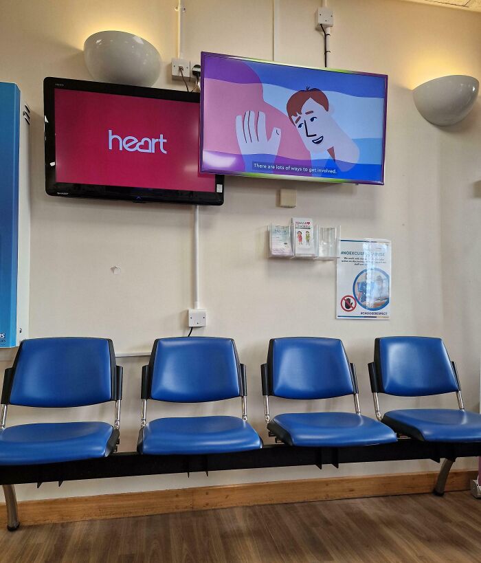
    Both Of These Overlapping Tvs Have The Volume On In The Hospital Waiting Room

    Unfortunate public interior design with mismatched screens and blue chairs in a waiting area.

    Cotton-Collar Report

    ADVERTISEMENT
    #37

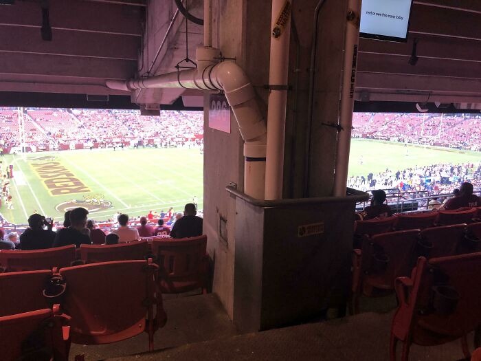
    Imagine Spending $300 For NFL Tickets, Just To Sit Behind A Pillar

    Stadium seating obstructed by a large structural column, showcasing unfortunate interior design.

    PapaAleks Report

    #38

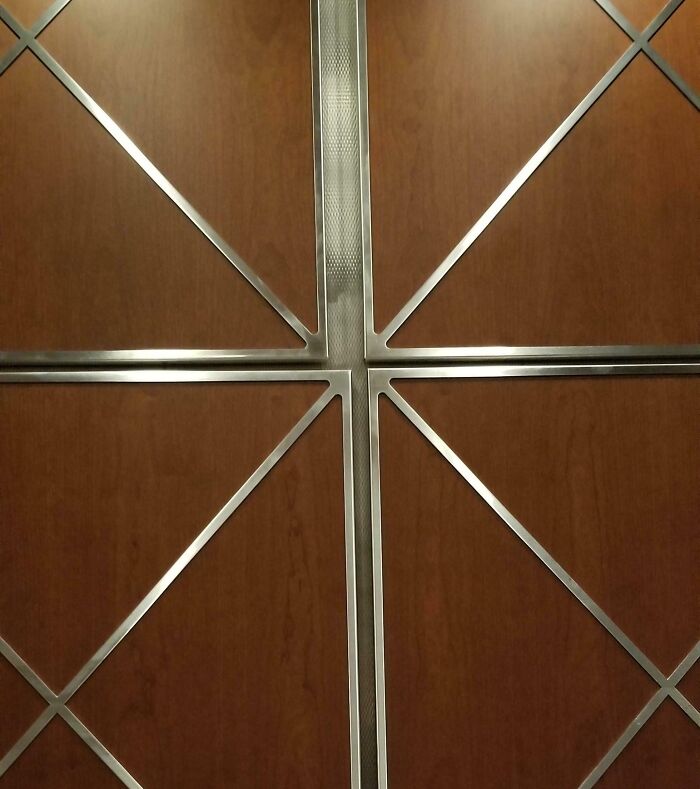
    The Alignment Of The Panels In This Elevator

    Unfortunate public interior design with awkwardly placed metal trim over wood panels, creating an uneven appearance.

    Inamanlyfashion Report

    #39

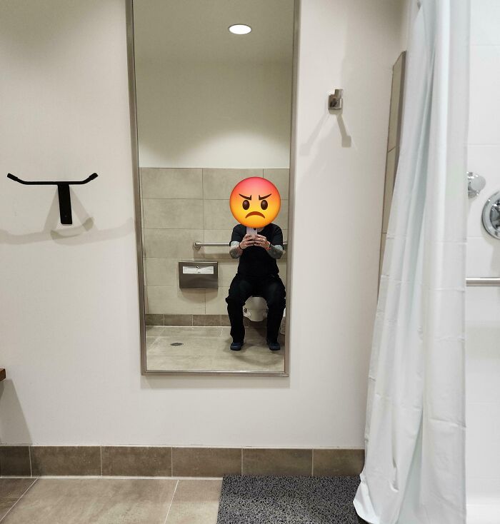
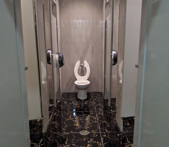
    Remodeled Bathroom At Work. I Guess There Wasn't A Better Place To Put The Full Size Mirror

    Unfortunate public interior design with a bathroom mirror reflecting a person on the toilet.

    Cool_Atmosphere_9038 Report

    Continue reading with Bored Panda Premium
    Unlimited content
    Ad-free browsing
    Dark mode
    ADVERTISEMENT
    #47

    I've Had To Stare At It For A Four Hour Layover. Its Just Off Center

    Unfortunate interior design with Southwest Airlines logo on a blue background.

    yourinnernarcoleptic Report

    #49

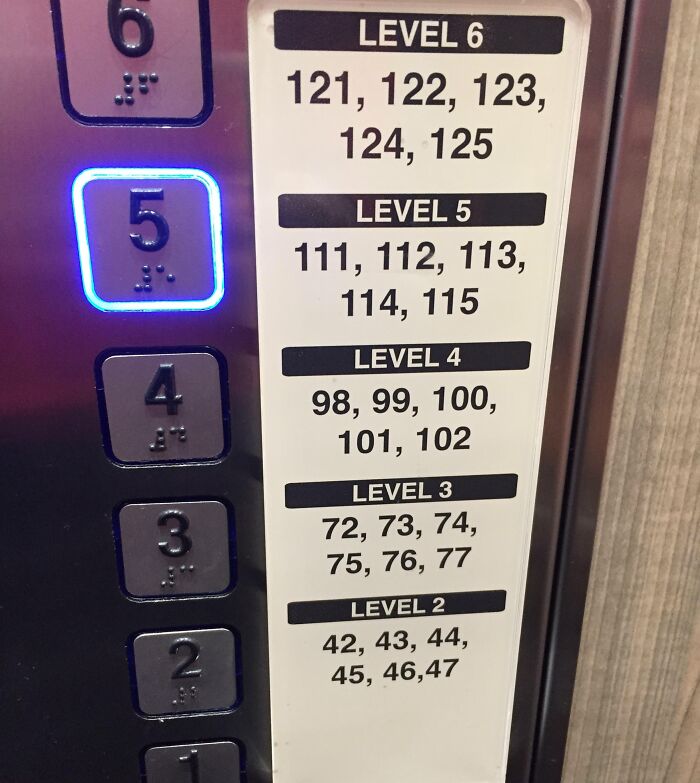
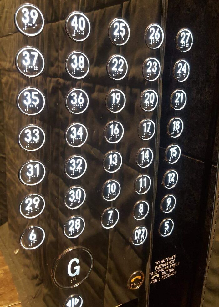
    Installed Those Elevator Buttons, Boss

    Elevator button panel with random floor numbers displaying unfortunate public interior design.

    compuryan Report

    Add photo comments
    POST
    Patrick H
    Community Member
    2 days ago DotsCreated by potrace 1.15, written by Peter Selinger 2001-2017

    Also, imagine unintentionally pressing every button while trying to feel for the braille for you floor number.

    View more commentsArrow down menu
    ADVERTISEMENT
    #51

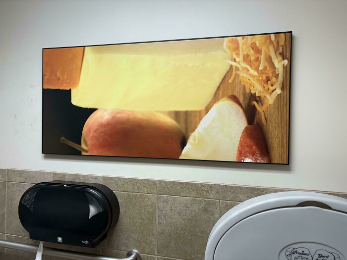
    A Blank Wall Would Have Been Just Fine

    Unfortunate public interior design: large kitchen-themed artwork in a restroom above a toilet paper dispenser.

    PassageEastern Report

    Add photo comments
    POST
    Mother of Giants
    Community Member
    2 days ago DotsCreated by potrace 1.15, written by Peter Selinger 2001-2017

    Are they trying to be "artsy"? Cuz all I see are sideways apples and floating cheeses.....

    View More Replies...
    View more commentsArrow down menu
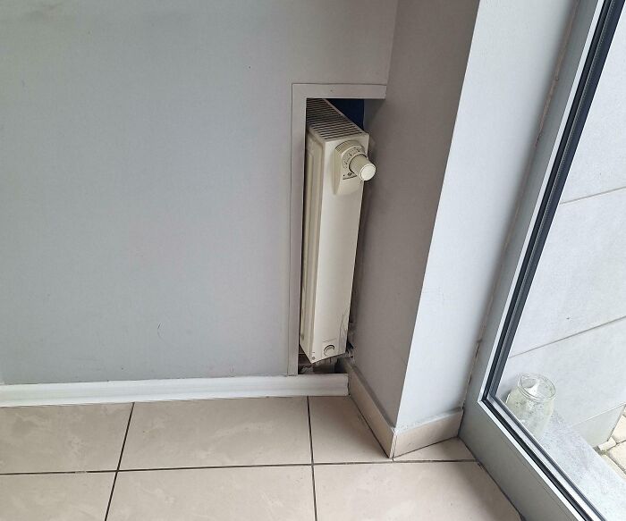
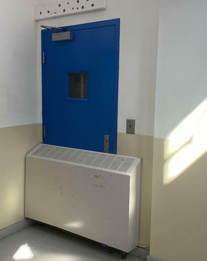
    #53

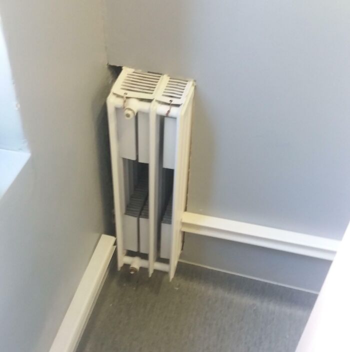
    Just Typical Classroom

    Uneven radiator placement in a corner, highlighting unfortunate public interior designs.

    popcio2015 Report

    Add photo comments
    POST
    #55

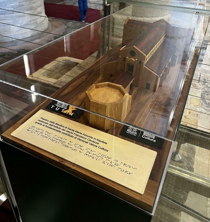
    Useful Braille Text

    Scale model in a glass display, featuring public interior design, with an informational plaque in front.

    context: This small representation of the Basilica of Santa Maria Assunta in Aquileia, Italy was created by the Francesco Cavazza Institute for the Blind, its purpose (I presume) was to help blind people understand the shape of the historic church (obviously without success)

    Mat_serpe06 Report

    Add photo comments
    POST
    Reviewer01
    Community Member
    2 days ago DotsCreated by potrace 1.15, written by Peter Selinger 2001-2017

    My dad was once told they have covered the models to stop them being damaged but "if you see any you want a closer look at, just come and find any of us in the red vest and we'll open them". 1. How might he knows what's inside to know if he wants it opened? 2. How the heck is he supposed to go find anyone? 3. What's red?

    View more commentsArrow down menu
    #56

    This Snow White Sign At The Local Supermarket

    Snow White cutout in a store, surrounded by bags of potatoes and carrots, illustrating unfortunate public interior designs.

    Embarrassed_View_887 Report

    Add photo comments
    POST
    WindySwede
    Community Member
    2 days ago DotsCreated by potrace 1.15, written by Peter Selinger 2001-2017

    It's a warning, eat potatoes and carrots instead of apples!

    View more commentsArrow down menu
    #57

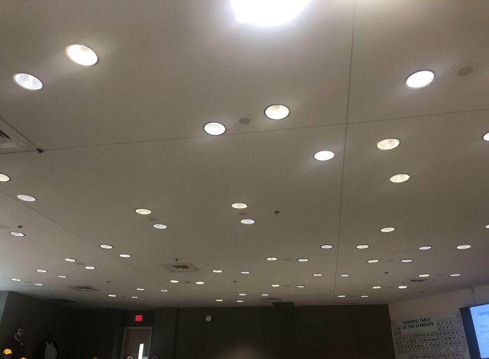
    Wallpaper In Our School Is In German, We Neither Are In Germany Or Learning German

    Periodic table poster slightly misaligned on wall, illustrating unfortunate public interior design choices.

    trimedozine Report

    ADVERTISEMENT
    See Also on Bored Panda
    #58

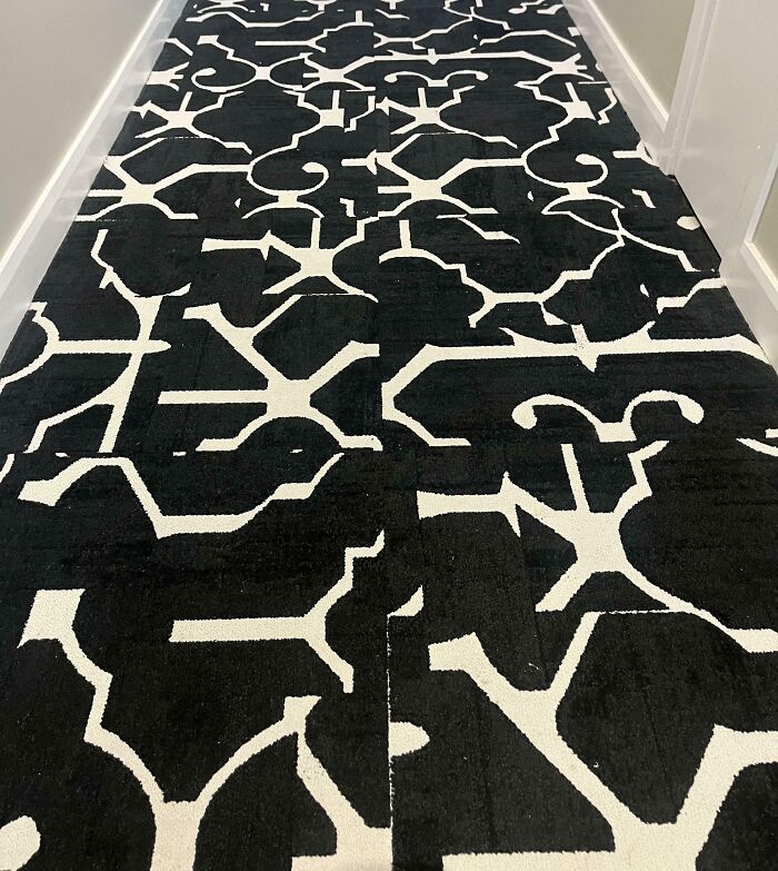
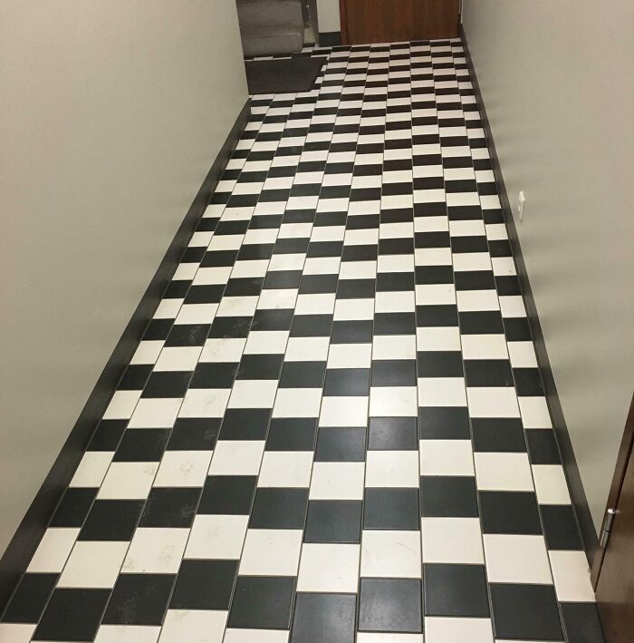
    They Way They Laid The Carpet In Our Hotel

    Confusing black and white carpet pattern in a hallway, showcasing unfortunate interior design.

    Aaaaaaarrrrrggggghh Report

    Add photo comments
    POST
    #61

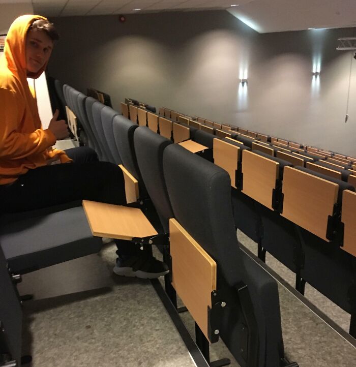
    Auditorium Desks At The Top Row Are Very Practial

    A person in a hoodie gives a thumbs up in a poorly designed lecture hall with obstructed desks.

    Elias_Jen Report

    Add photo comments
    POST
    Chris B
    Community Member
    2 days ago DotsCreated by potrace 1.15, written by Peter Selinger 2001-2017

    Good way of discouraging students from sitting in the back row.

    View more commentsArrow down menu
    #62

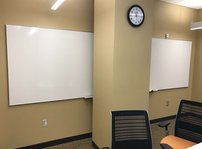
    In A Conference Room At My Work. Yes, The Whiteboard Extends Fully Behind The Beam

    Unfortunate interior design with whiteboards on separate walls divided by a pillar, highlighting layout issues.

    totalbangover Report

    #63

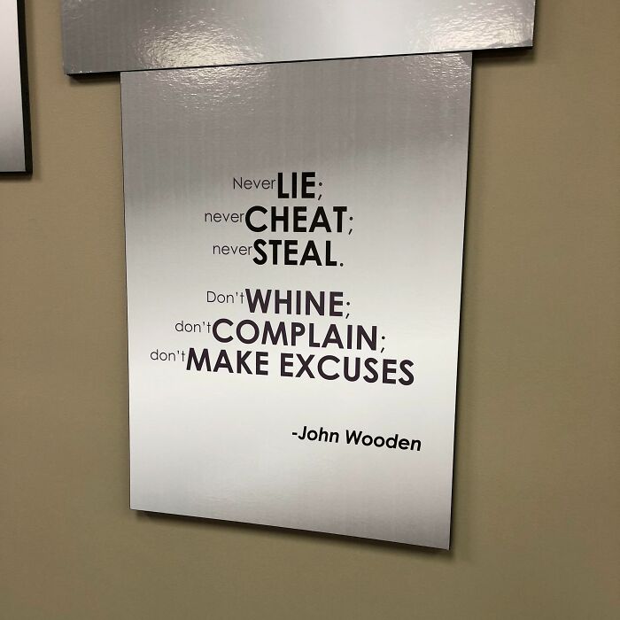
    At Glance, The Sign In This Conference Room Looks Like It’s Encouraging Bad Behavior

    A badly placed inspirational poster in an office setting, highlighting unfortunate public interior designs.

    JusticeTaco Report

    ADVERTISEMENT
    See Also on Bored Panda
    #67

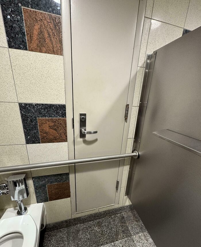
    One Way To Hide The Tp

    Restroom with unfortunate interior design, door obstructed by toilet and handrail, highlighting design flaw.

    Noticed this bit the ATL airport

    RickBlane42 Report

    Add photo comments
    POST
    M O'Connell
    Community Member
    1 day ago DotsCreated by potrace 1.15, written by Peter Selinger 2001-2017

    It's maintenance access for the wet wall. The bar is required by ADA, so on the rare chance they need to access the plumbing, they can just remove the 6 screws.

    #68

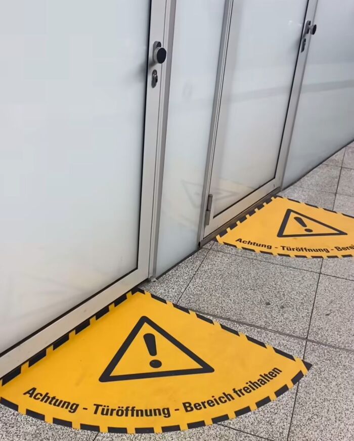
    The Doors Open The Other Way Around

    Warning signs on the floor in front of unclear glass doors represent unfortunate public interior designs.

    tschaki__ Report

    Add photo comments
    POST
    #69

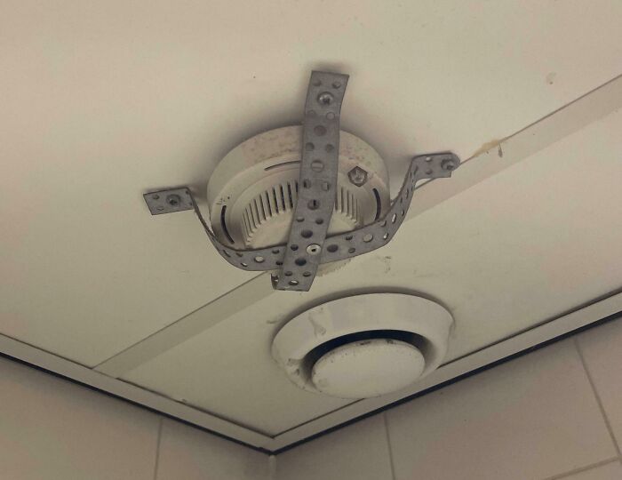
    The Way My Work Hung This Smoke Detector? In The Toilets

    Ceiling with unfortunate interior design showing awkwardly installed smoke detector with metal straps.

    ActiveAfter3127 Report

    Add photo comments
    POST
    Carl Roberts
    Community Member
    2 days ago DotsCreated by potrace 1.15, written by Peter Selinger 2001-2017

    There has to be story behind this. I'm guessing people were disabling the detector so they could smoke in the bathroom

    View more commentsArrow down menu
    #70

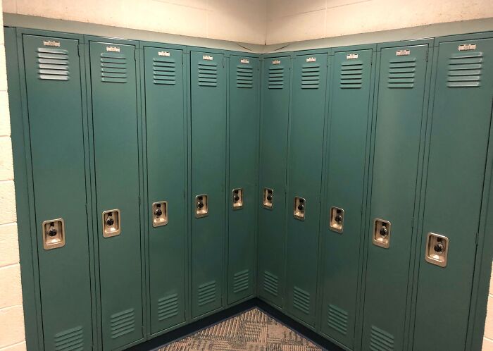
    There Are Several Of These At My School And I Am Unlucky Enough To Be Right In The Corner

    Unfortunate interior design with lockers positioned at a right angle, creating an inaccessible corner.

    klaus2506 Report

    #71

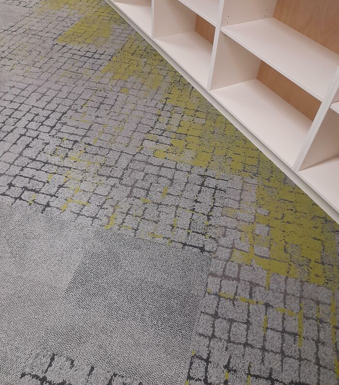
    Carpet Design At My School That Looks Like Moss!

    Unfortunate public interior design with mismatched carpet tiles and white shelving unit.

    Accidentally_Lee Report

    Add photo comments
    POST
    Multa Nocte
    Community Member
    2 days ago DotsCreated by potrace 1.15, written by Peter Selinger 2001-2017

    I thought it looked like urine, so looking like moss would be an improvement.

    View More Replies...
    View more commentsArrow down menu
    ADVERTISEMENT
    See Also on Bored Panda
    #72

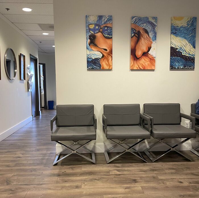
    I’ve Been Sitting In The Waiting Room Of This Doctors Office For Over An Hour And This Painting Is Really Making Me Mad

    Gray waiting room chairs and dog art highlight unfortunate interior design choices.

    dylanisA1 Report

    #73

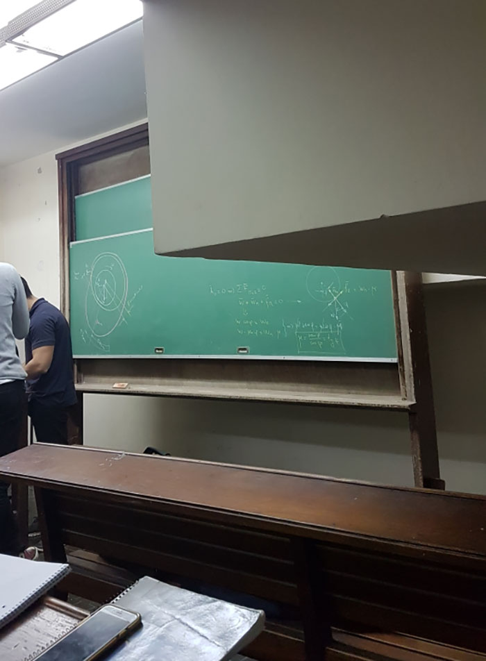
    One Of The Classrooms At My University

    Unfortunate public interior design with an obstructed classroom chalkboard and seating.

    MrSilbarita Report

    Add photo comments
    POST
    #74

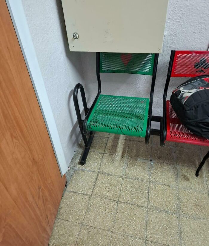
    Location Of A Bench At My School

    Chair obstructed by wall cabinet in a public space, highlighting unfortunate interior design choices.

    Eyal-M Report

    #75

    Not Sure If It Counts, But This Restaurant Put Rocks In Their Sink For -=*aesthetic*=-

    Stainless steel sink filled with white rocks, showcasing unfortunate interior design choices in a public space.

    WolfieVonD Report

    #76

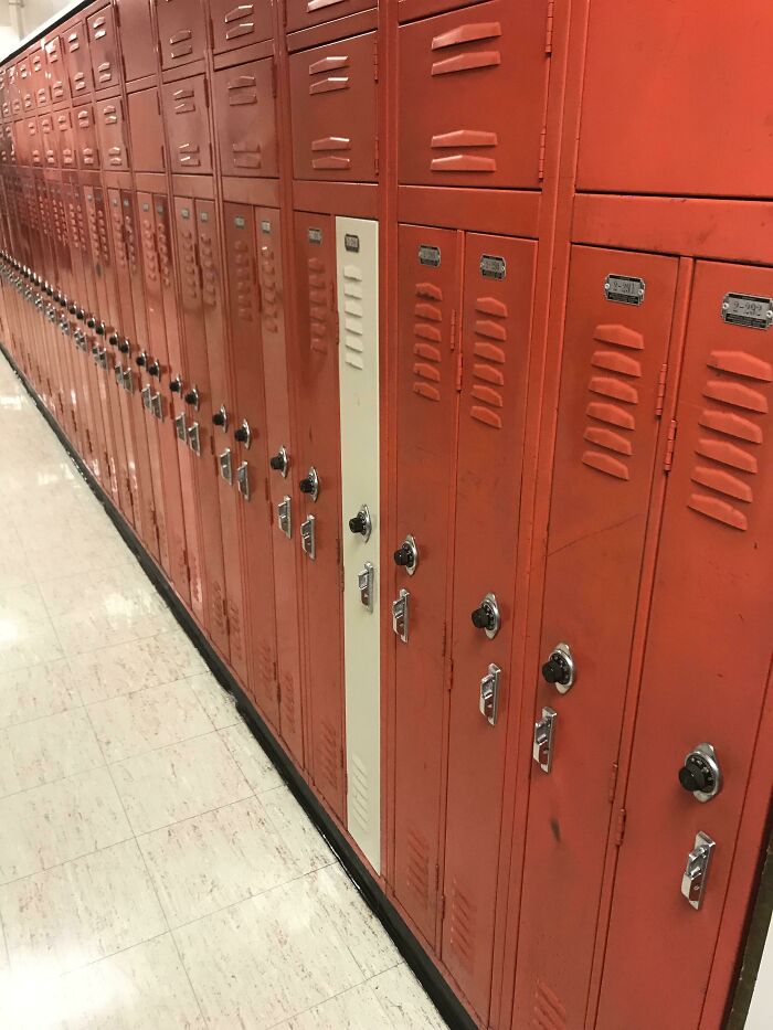
    But Why Tho

    Row of red lockers with one mismatched white door, showcasing unfortunate interior design.

    purplepitperson Report

    Add photo comments
    POST
    maxsunity‍
    Community Member
    2 days ago DotsCreated by potrace 1.15, written by Peter Selinger 2001-2017

    Hmm what could we fit in that? (yes I notice the square lockers on top BUT WHAT THE F**K DO WE PUT IN THE RECTANGLE ONE)

    View More Replies...
    View more commentsArrow down menu
    #77

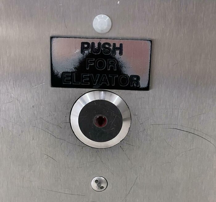
    Instead Of Pressing The Button, People Pressed The Instructions

    Elevator button misaligned under sign, an example of unfortunate interior design.

    Firebones676 Report

    Add photo comments
    POST
    Samantha Shah
    Community Member
    2 days ago DotsCreated by potrace 1.15, written by Peter Selinger 2001-2017

    this isn't bad design this is alot of dumb people. wowwww how do that many people not understand elevator buttons lol I'm so confused

    View more commentsArrow down menu
    #78

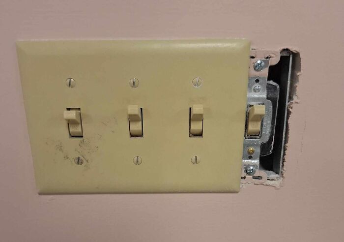
    Construction Going On At My Office. As Far As I Can Tell They Installed A New Lightswitch But Just Slapped The Old Plate Over It

    Unfortunate public interior design with a misaligned light switch plate revealing wall gap.

    Beaster_Bunny_ Report

    Add photo comments
    POST
    Corvus
    Community Member
    2 days ago DotsCreated by potrace 1.15, written by Peter Selinger 2001-2017

    Coffee? Nah, the best way to wake up in the morning is to get a nice electric shock :)

    View More Replies...
    View more commentsArrow down menu
    ADVERTISEMENT
    See Also on Bored Panda
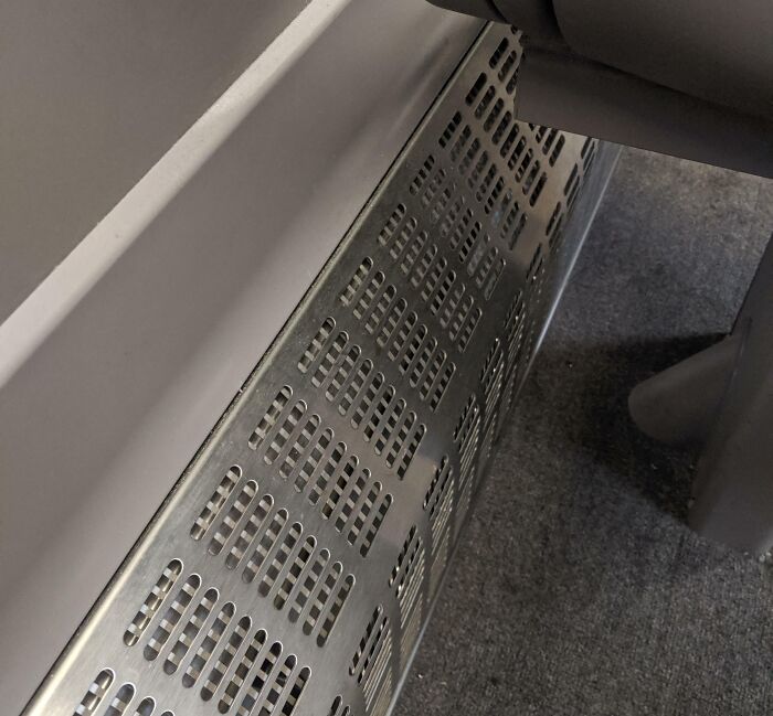
    #79

    Whoever Designed These 45° Angle Things For Gwr Trains Is Evil. Where Am I Supposed To Put My Foot?!

    Metal grate misplaced under a public bench, showcasing unfortunate interior design.

    cosyrelaxedsetting Report

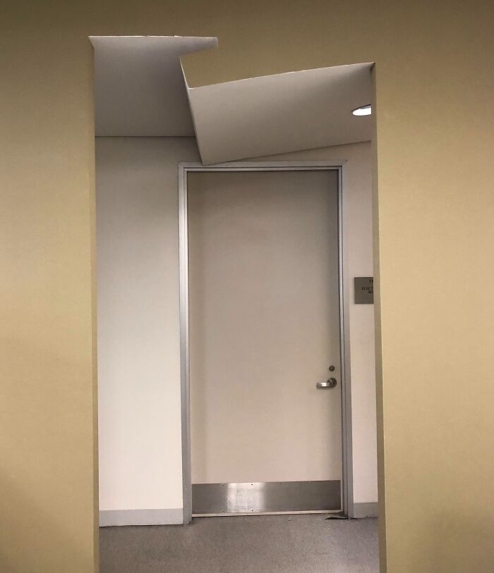
    #80

    Odd Doorway Left After Office Reconfigurations [glass Wall Removed, Custom Ceiling Not Restored]

    Unfortunate public interior design showing a door with a misaligned ceiling panel above it.

    Nyx710 Report

    Add photo comments
    POST
    painttheyellowsubgreen
    Community Member
    2 days ago DotsCreated by potrace 1.15, written by Peter Selinger 2001-2017

    Can I start a war? This is what happens when you use Roblox instead of Minecraft.

    #81

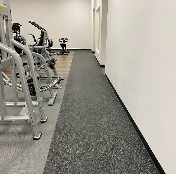
    Our Gym Has Been Promising Us A New Gym With A Running Track. After An 8 Month Delay, We Finally Got The “Track.”

    Gym with unfortunate public interior design; narrow walkway between exercise machines and a wall.

    2013nattychampa Report

    Add photo comments
    POST
    WindySwede
    Community Member
    2 days ago DotsCreated by potrace 1.15, written by Peter Selinger 2001-2017

    Dis they say how long it would be? Then this is according to specs.. 🤷‍♂️😿

    #82

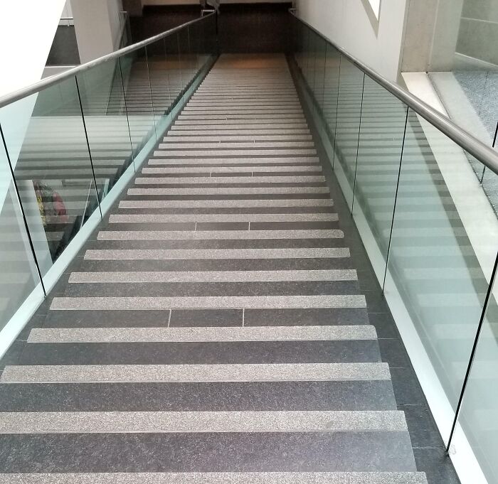
    These Stairs At An Art Museum Are Horrible. I Have Difficulties In Depth Perception Even If My Eye Sight Is Perfect And I Had To Keep My Hands On The Ramp At All Time. Not The Museum's Fault

    Staircase with irregular striped steps, an example of unfortunate public interior design.

    oiseaufeux Report

    #84

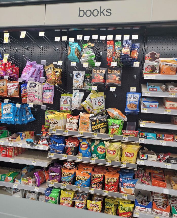
    Spent A Little Too Long After A Sleepy Drive Trying To Find The Snacks Section

    Snack section mistakenly labeled as books, illustrating unfortunate public interior design.

    Permanent_Kat Report

    Add photo comments
    POST
    WindySwede
    Community Member
    2 days ago (edited) DotsCreated by potrace 1.15, written by Peter Selinger 2001-2017

    I have no complaints about your book selection!

    View more commentsArrow down menu
    #85

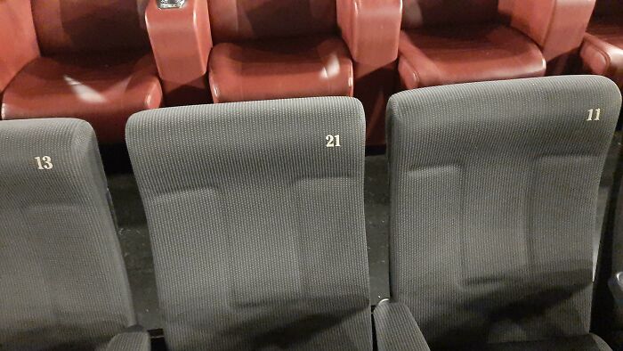
    Yes Boss, I Put The Seats In The Correct Order

    Unfortunate interior design with cinema seats numbered inconsistently, showing 13, 21, and 11 in a row.

    taglia01allinot Report

    ADVERTISEMENT
    See Also on Bored Panda
    #86

    I Love Being Forced To Watch Ads Before Being Able To See What Drinks A Store Has…

    Unfortunate public interior design with mismatched drink labels on refrigerator doors.

    Zebrakiller Report

    Add photo comments
    POST
    Gwyn
    Community Member
    2 days ago DotsCreated by potrace 1.15, written by Peter Selinger 2001-2017

    This is so useless I can't even. I think if I saw this in an actual store it's turn around and walk out.

    View more commentsArrow down menu
    #87

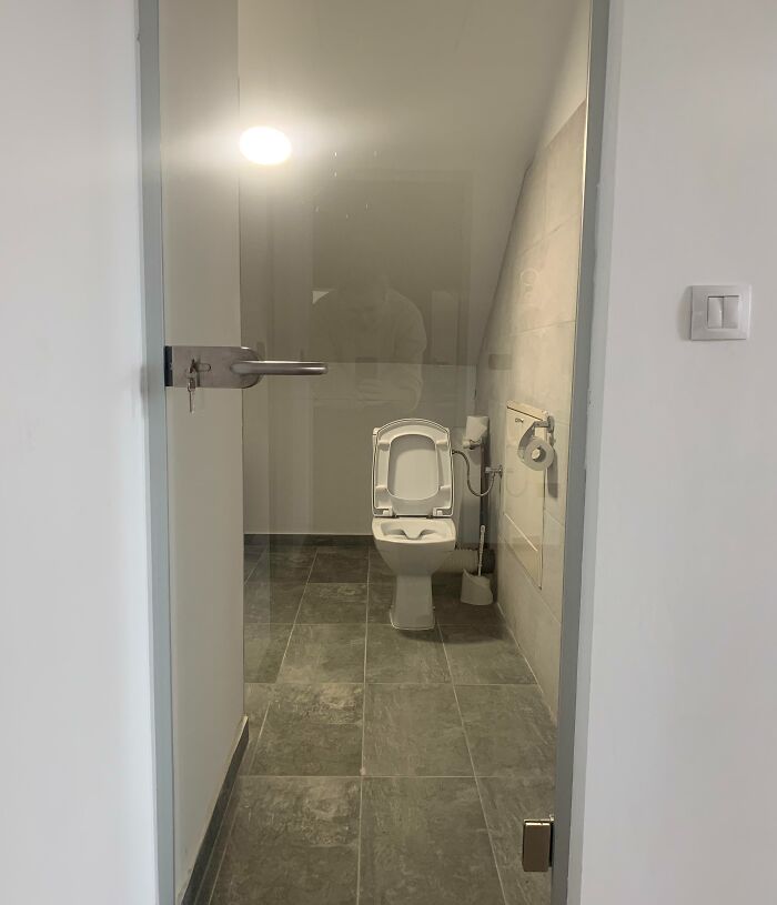
    This Transparent Toilet Door In An Office Building. No, It’s Not One Of The Fancy Ones That Go Opaque When Closed

    Transparent bathroom door highlighting unfortunate public interior designs.

    anamihai Report

    #88

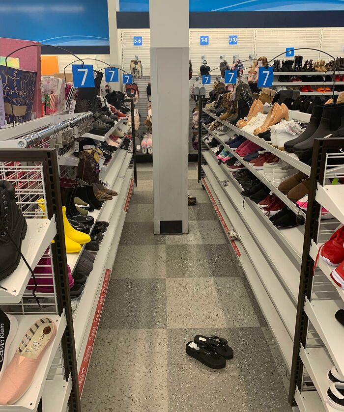
    A Pole Blocks This Aisle's Path, Meaning You Have To Go The Other Way Around Or Just Don't Even Bother

    Store aisle with a column blocking the path, illustrating unfortunate interior design.

    BruhMomentum510 Report

    Add photo comments
    POST
    Johnnynatfan
    Community Member
    2 days ago DotsCreated by potrace 1.15, written by Peter Selinger 2001-2017

    Its a support column that has to be in that location. They should have planned the shelving better.

    View more commentsArrow down menu
    #89

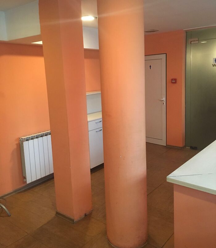
    In A Chinese Restaurant

    Orange room with poorly placed column blocking access to a cupboard, showcasing unfortunate interior design.

    POOTISSWAG Report

    Add photo comments
    POST
    Talis
    Community Member
    1 day ago DotsCreated by potrace 1.15, written by Peter Selinger 2001-2017

    When the architect can't make up their mind whether they want round or quadratic pillars.

    View more commentsArrow down menu
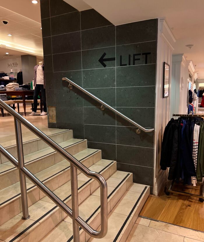
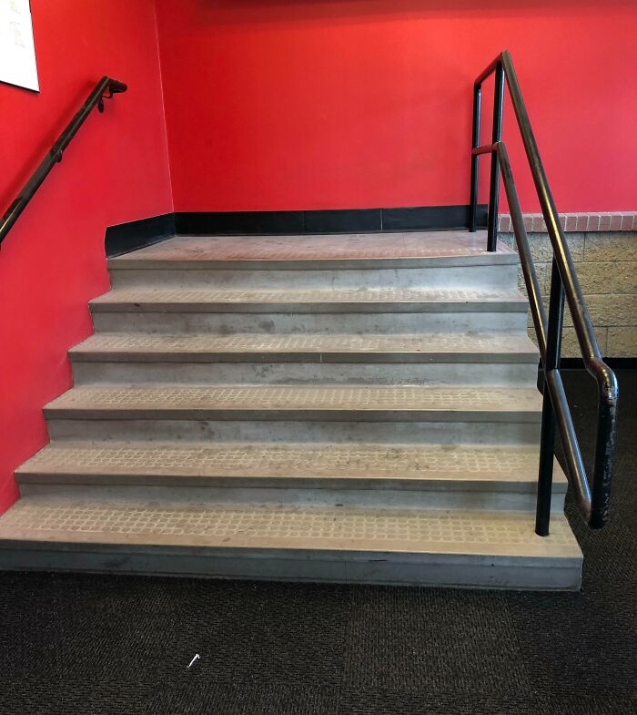
    #90

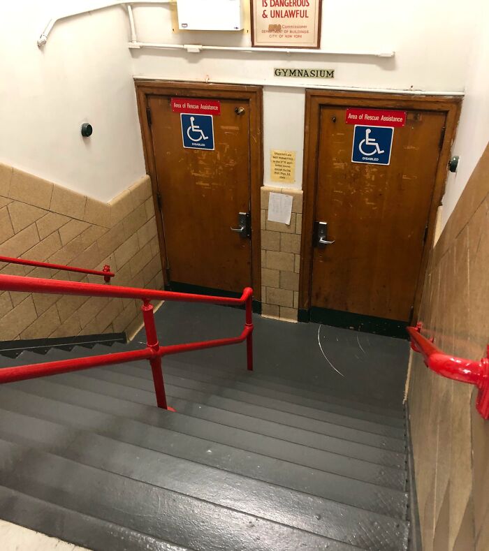
    This Department Stores Accessible Lift Is Up A Set Of Stairs

    Stairs leading to a wall labeled "Lift" in a clothing store, showcasing unfortunate interior design.

    kiddsky Report

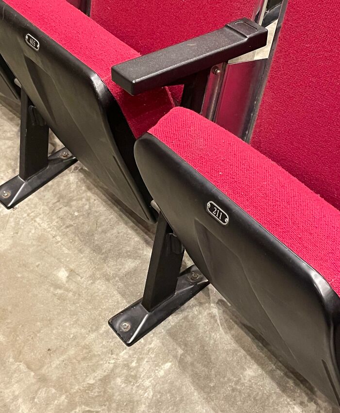
    #91

    This Chair Is 211 And Not 404

    Unfortunate interior design featuring misaligned theater seats with red upholstery and black armrests.

    Aero2627 Report

    Add photo comments
    POST
    S P
    Community Member
    2 days ago DotsCreated by potrace 1.15, written by Peter Selinger 2001-2017

    Well, when they 404 wasn't found, they used 211 instead

    View more commentsArrow down menu
    ADVERTISEMENT
    See Also on Bored Panda
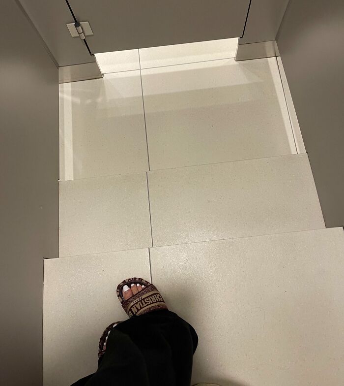
    #95

    Big Steps In A Toilet Cubicle In A Mall. Safe To Say I Fell As I Was Walking To The Door After Turning To Flush

    Unfortunate interior design with a door opening to stairs, highlighting awkward public architecture choices.

    noodle-girl Report

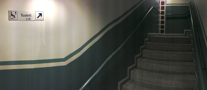
    #97

    (Oc) Toilets For Disabled People Are Located Upstairs In A Restaurant In Stockholm

    Unfortunate public interior design showing a wheelchair sign directing to stairs.

    reddit.com Report

    Add photo comments
    POST
    Skogsrået
    Community Member
    2 days ago DotsCreated by potrace 1.15, written by Peter Selinger 2001-2017

    I think this is illegal in Sweden and i hope they get reported and shut down.

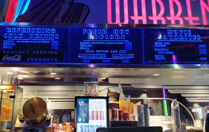
    #98

    This Movie Theater Makes The High Prices Of Its Concessions Impossible To Read, Even From The Counter

    Unfortunate public interior design at a concession stand with difficult-to-read neon menu and cluttered counter space.

    idekl Report

    #99

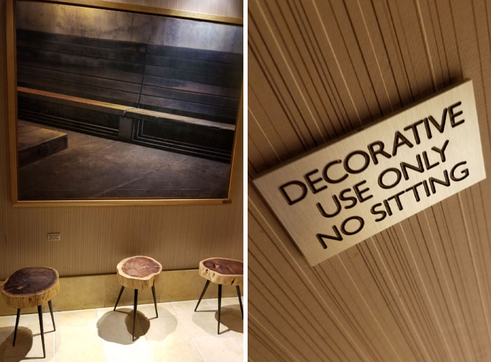
    This Is Right Outside A Hotel Lobby Bathroom. The Painting Is Even A Wooden Bench

    Unfortunate public interior design with decorative stools and a no-sitting sign.

    TrevorJordan Report

    ADVERTISEMENT
    See Also on Bored Panda
    #100

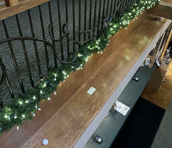
    Questionable Outlet Placement

    Misplaced handrail on a stairway with decorative lights, showcasing unfortunate public interior design.

    Ampppz Report

    Add photo comments
    POST
    Patrick H
    Community Member
    2 days ago DotsCreated by potrace 1.15, written by Peter Selinger 2001-2017

    I don't see anything wrong with this other than aesthetic. That seems to be a ledge that is not meant for anybody to be on. It's probably meant to hold decorations, and sometimes, those decorations may need electricity. If anything, being on the horizontal party of the ledge hides it better that being on the vertical side. People on the floor below can't see it, and people in the floor above wouldn't be able to see it if it's covered by decorations.