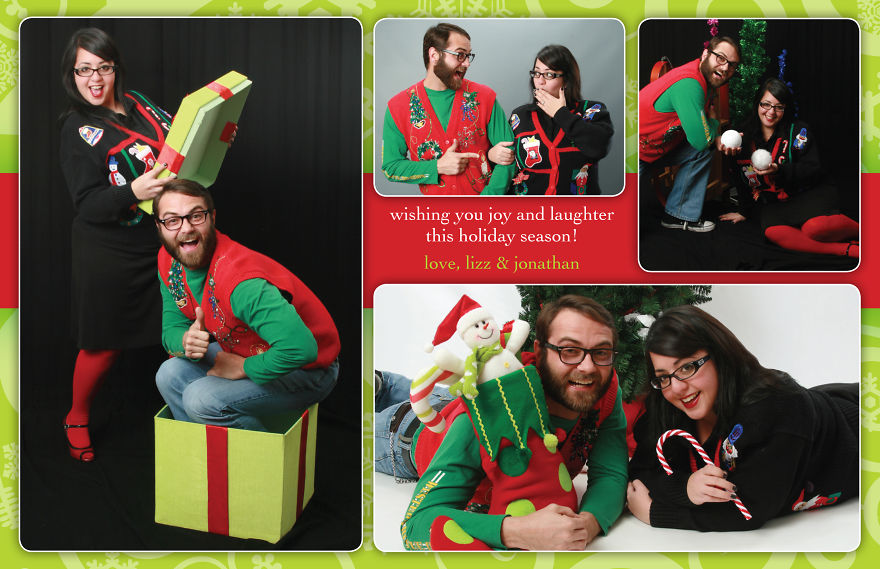
It all started one day in 2010 when my fiancé Jonathan and I walked into the Avenues Mall in Jacksonville, Florida wearing ugly Christmas sweaters that we found at the thrift store. We were looking for a “photo place with the cheesy backdrops” and stumbled upon The Picture People studio. They were able to take us in right away and do our photo shoot. We spent 30 minutes doing funny poses and utilizing their props in different ways. Everyone was laughing hysterically. It was one of the most fun times we’ve ever had. I used those photos to design a fun Christmas card, and it was received with much praise. That was the birth of our creative Christmas card tradition. Since then, we’ve had a blast coming up with new ideas for our holiday cards. Everything from concept to envelopes to stamps to calligraphy is customized by yours truly to create a different and unique experience. Our friends and family look forward to receiving them every year. We hope you enjoy them, too!
2010 – Ugly Christmas Sweater Theme
We know that EVERYONE is doing ugly-Christmas-sweater-themed photos and parties nowadays, but back in 2010 I don’t remember seeing it as much. This was our first official card as a newly engaged couple.
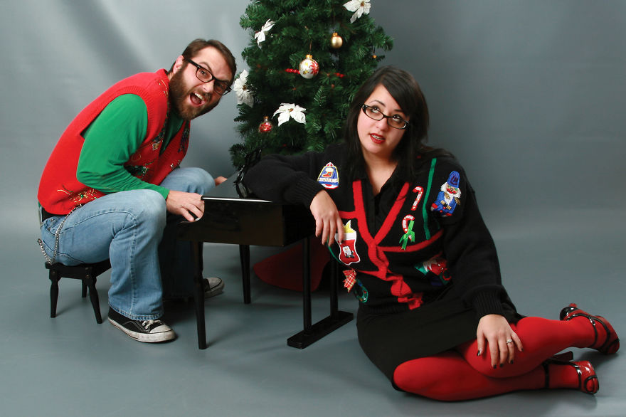
Outtake:
We had a LOT of fun during this shoot! Here’s an example of another photo that didn’t make the card. It was hard to choose!
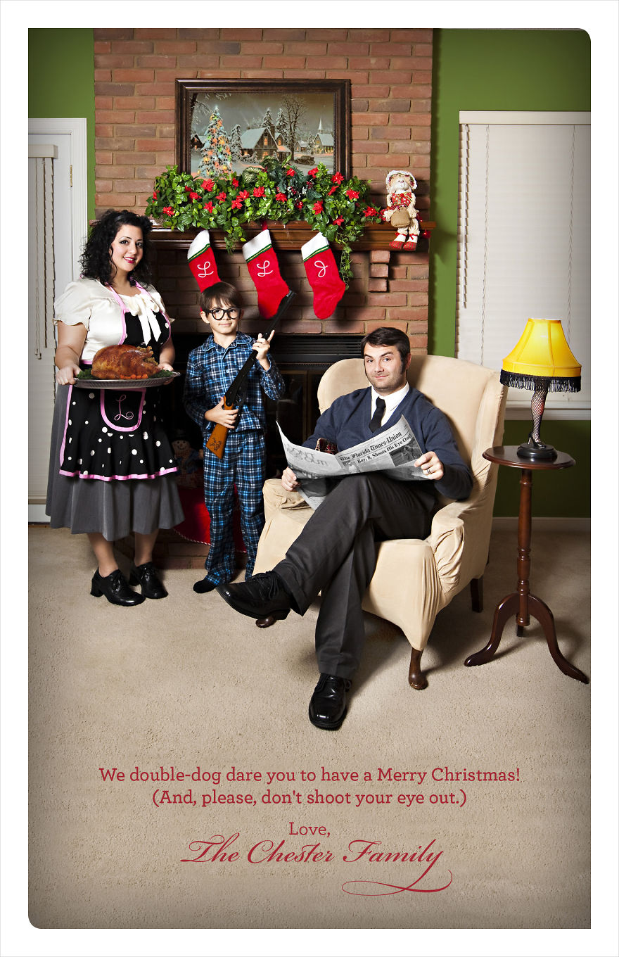
2011 – A Chester Christmas Story
This was our first official family card after we were married. My stepson was 8 at the time. Photo was taken at my parents’ home. Lots of Photoshop work was done to accomplish this theme: I changed the color of the walls to add some vibrancy, added our initials to the stockings, added a freaking turkey on that silver tray, modified the newspaper articles… Whew! To this day, this is everyone’s favorite concept. FUN FACT: My husband still has that leg lamp on the nightstand next to our bed. He loves it because it has three dimmer settings and he can keep a subtle light on during the night.
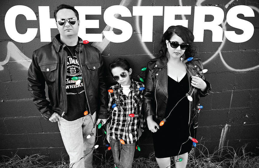
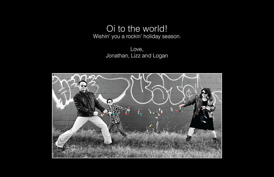
2012 – Punk Rock Christmas
Our inspiration for this card was the iconic RAMONES self-titled album cover that debuted in 1976 (the year my husband and I were born). We got some really great family photos from this session. It was a hot day in Florida, so it was especially hard to keep (and look) cool…
Back of 2012 Card
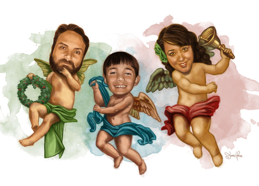
2013 – Chester Cherub Angels
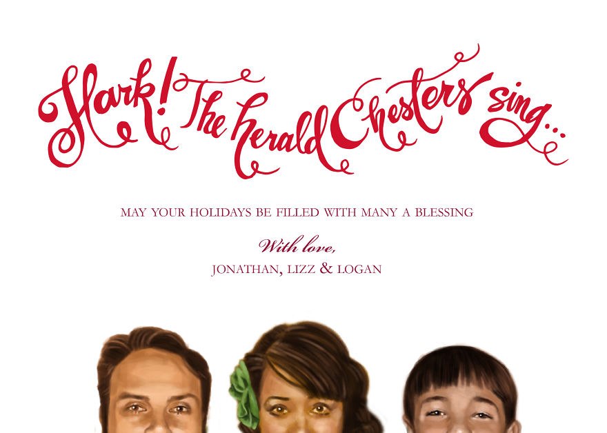
Sooooo I have this amazing friend who is a SUPER talented artist and has done work for famous people and he lives right here in town and he’s really an inspiration to me. I had this funny idea and commissioned him to do this drawing of us. It turned out hilarious, yet kinda creepy at the same time. We like to keep things interesting! I did the hand-lettering on the back myself. Please check out the The Relentlessly Cheerful Art of James Hance and support him. I am SO lucky to know him and hope we can work together again soon.
Back of 2013 Card
Custom calligraphy by me!
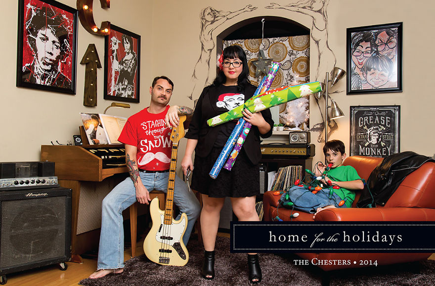
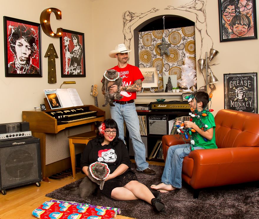
2014 – Home for the Holidays
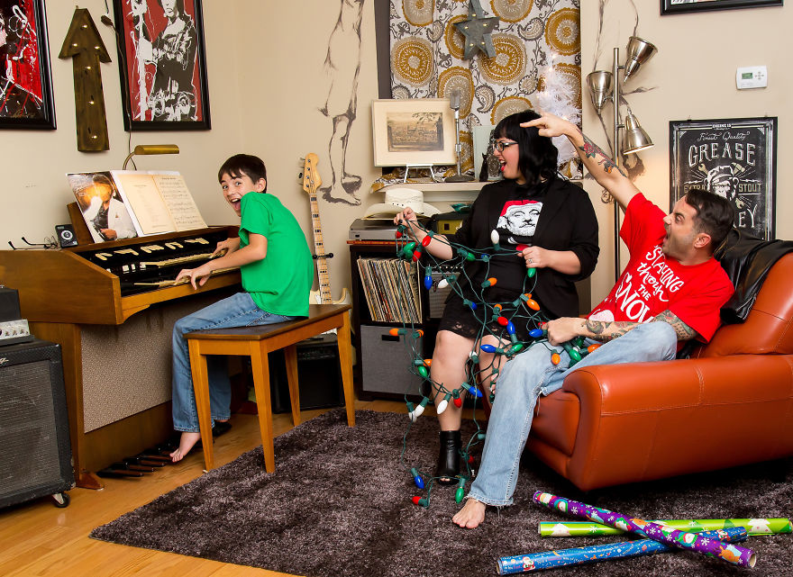
For this card, we decided to stay home and use my husband’s music nook as the backdrop. We have a lot of cool things crammed into our small condo, so it made things visually interesting. I hand-painted my husband’s “‘Staching Through the Snow” shirt, and we just posed naturally for these. We caught my stepson being his normal silly self, which was super cool.
Back of 2014 Card
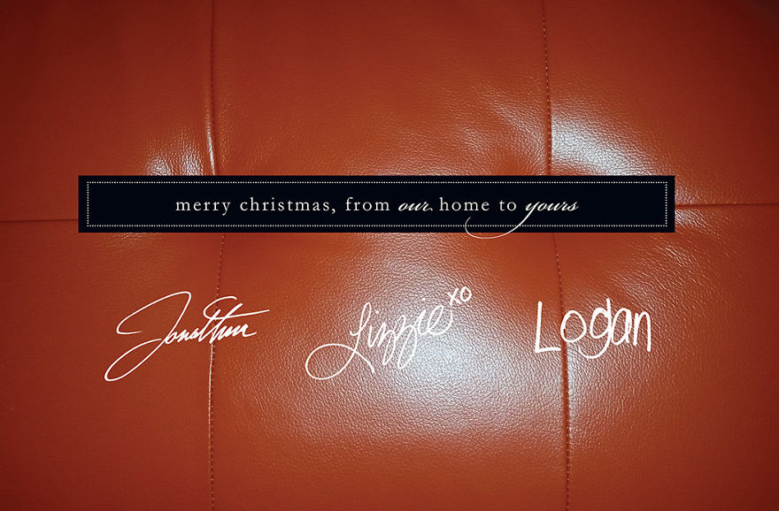
Close-up detail of the orange chair from the front of the card. Made it personal by signing our names on the back.
Outtakes:
We tried to include our cats in this photo shoot but they weren’t having it!
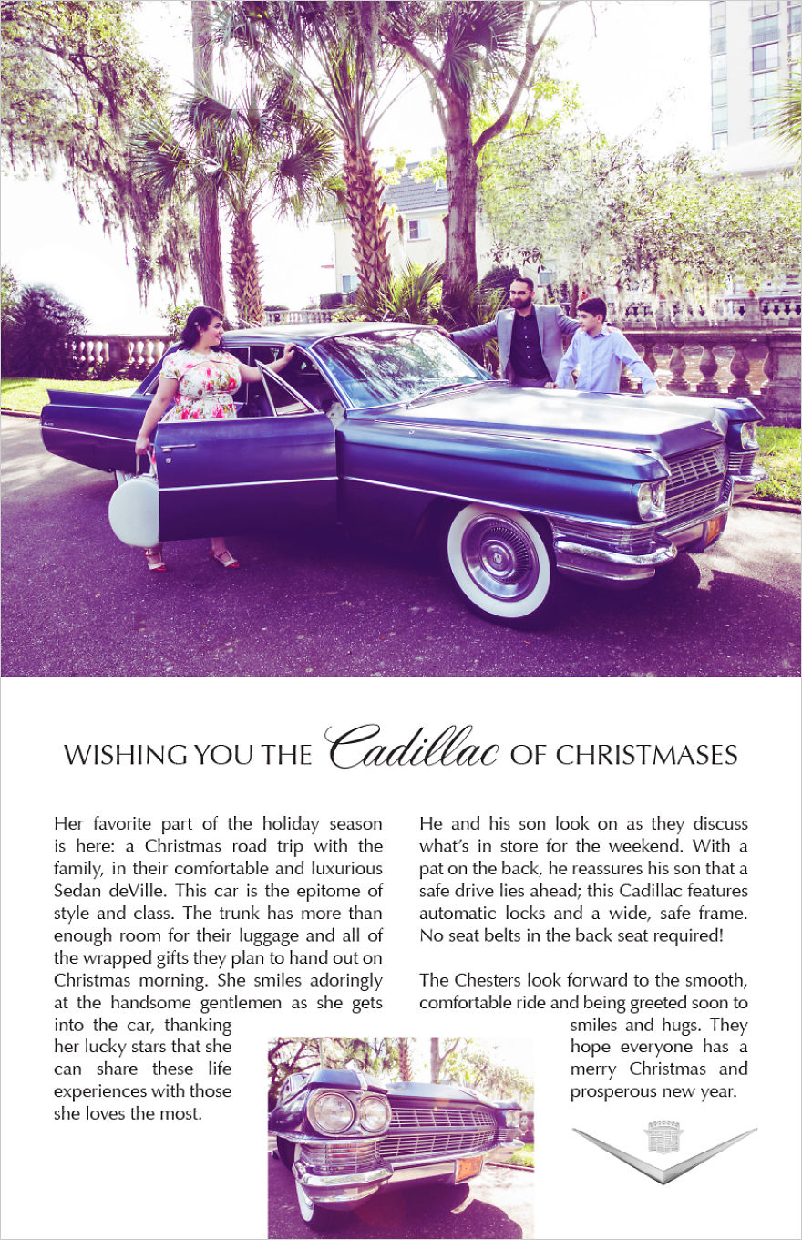
2015 – Vintage Cadillac Ad
My husband owns a 1964 Cadillac. We wanted to use it in this year’s Christmas card, but wanted to make it unique. So he came up with the genius idea of making it look like a vintage Cadillac ad. So a quick Google search led us to something like what you see here. A photo of a family interacting with the car somehow — totally unposed. A headline in what looks like Optima font, and a nice little story tying the image and the selling points of the car together. I wrote the copy myself, and I am not a strong copywriter so don’t judge! Haha.
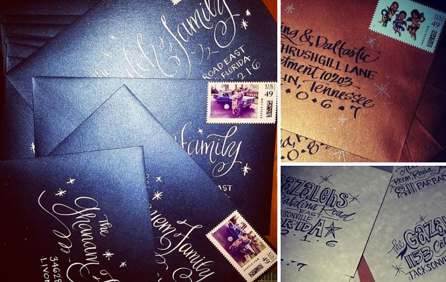
The envelope sets the tone…
These are examples of envelopes that our cards have mailed in. I choose a custom color that coincides with the card design and concept. I do all calligraphy by hand, and we order custom stamps as well. It’s such a personal touch. And it means a lot when our friends and family are super excited to just get our ENVELOPES in the mail.
2016 – Coloring Book Theme
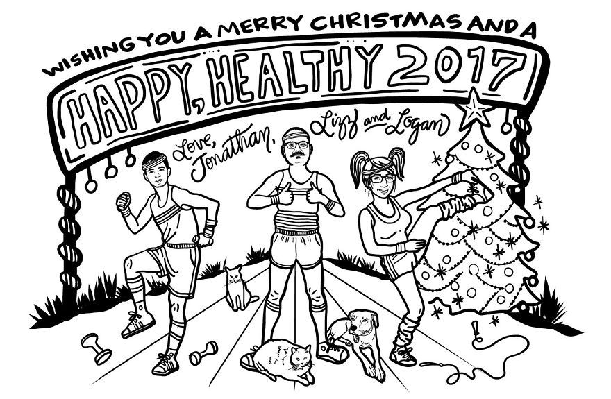
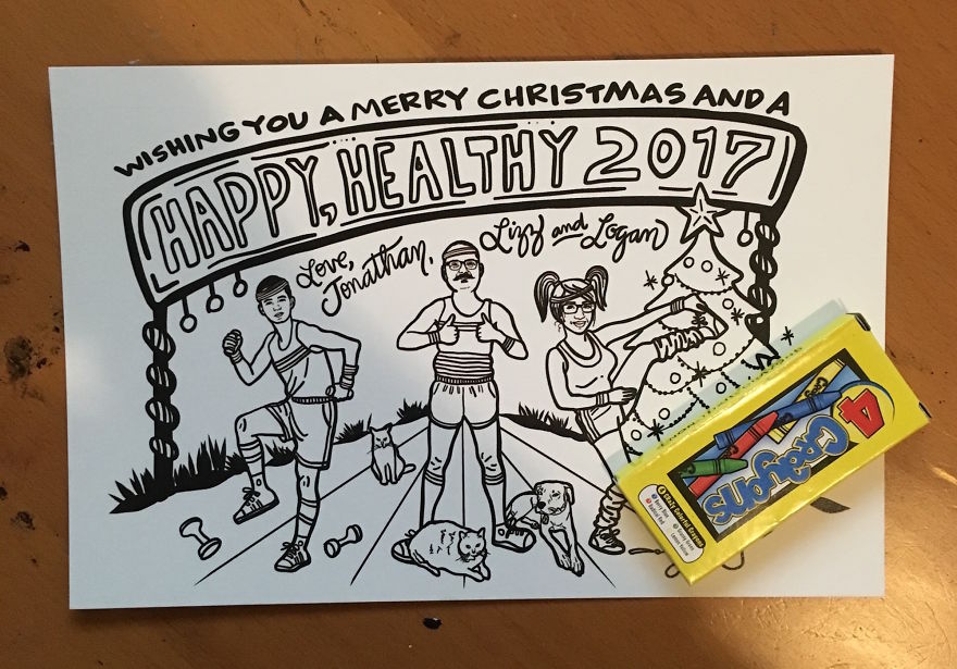
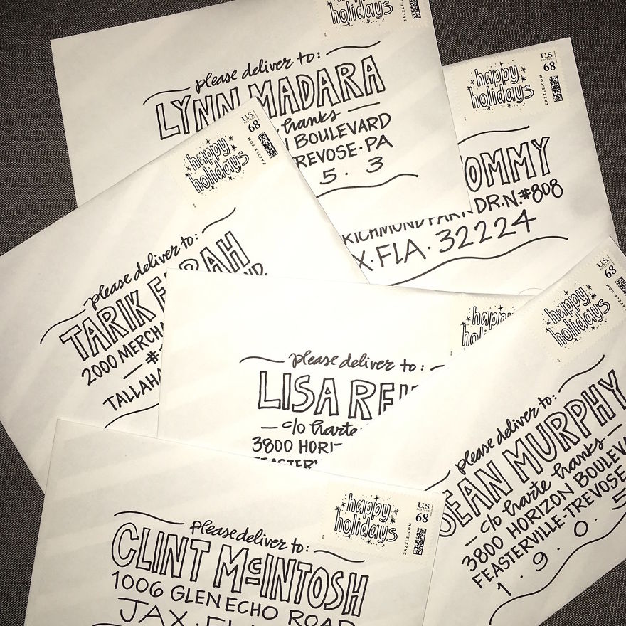
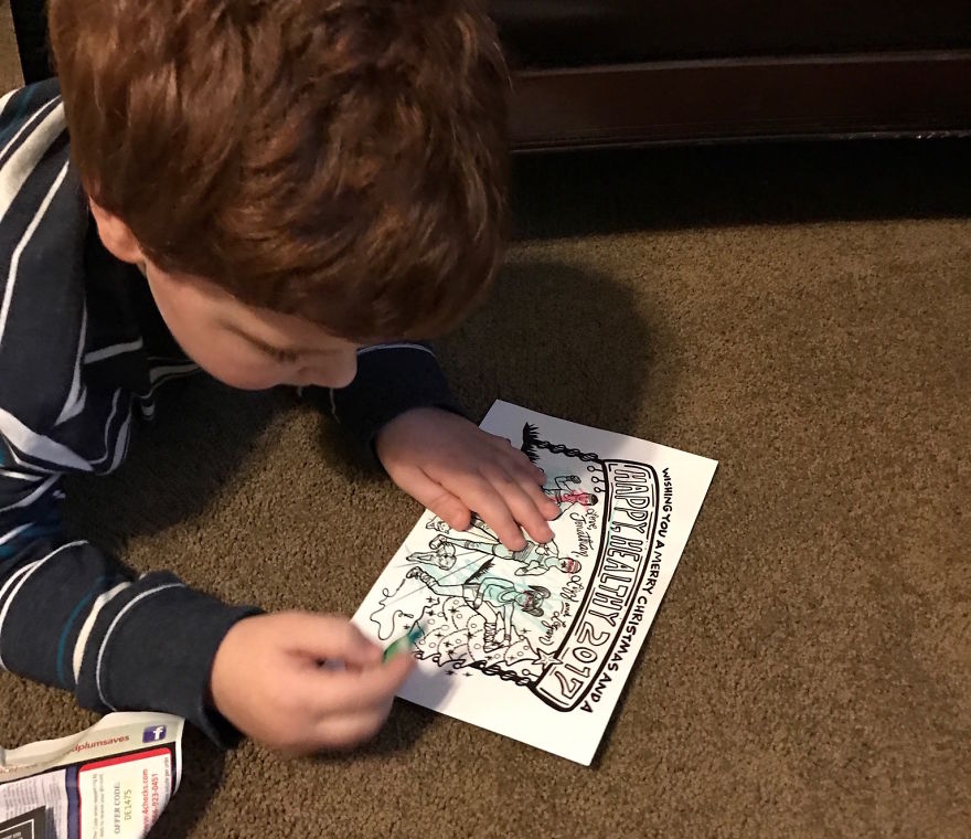
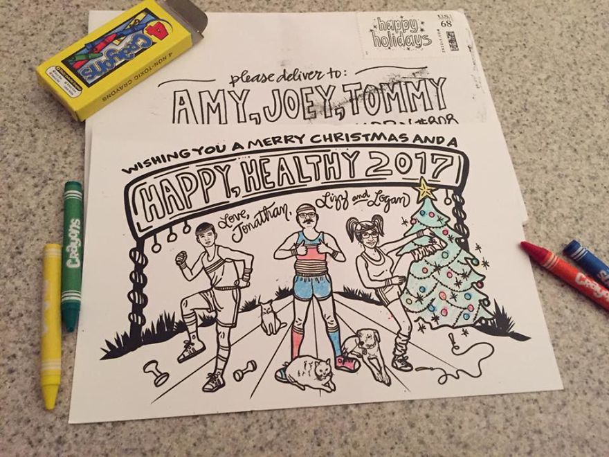
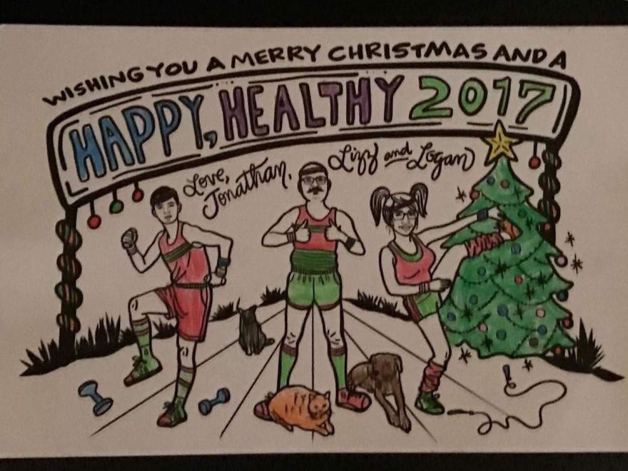
My stepson had the idea for this year’s theme, except that we were going to take actual photos on an actual track in actual vintage tracksuits. Unfortunately, I didn’t plan ahead and it ended up being too late to get our outfits ready and book our photographer. I decided that the next best thing was to draw us in that theme. As I was in the middle of this illustration, I had the idea to keep it in black and white, and do it like a coloring book (or a “coloring card”). We mailed them in a white booklet-style 6″ x 9″ envelope and I illustrated custom B&W stamps to go along with the card. The added bonus was a 4-pack of crayons included with each card. Immediately after people started receiving the cards, I was getting texts showing them being colored in. I also got a message from someone who had recently lost her father, and she thanked me because the card actually made her laugh and it’s been a while since she did that. I am so thankful we could add cheer to peoples’ lives every year during the holidays.
Back of 2016 Card (I kept it simple.)
2016 Envelopes
Fun for all…
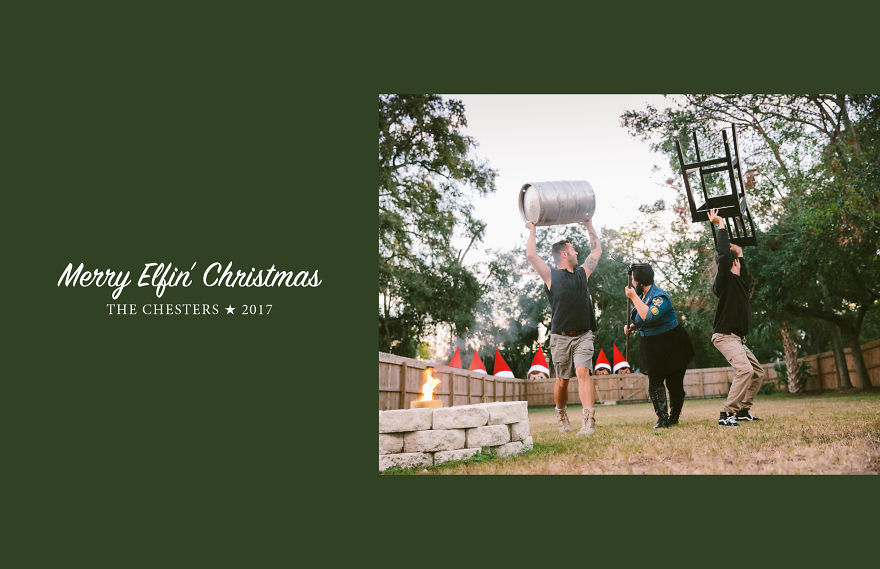
2017 – Elfin’ Christmas
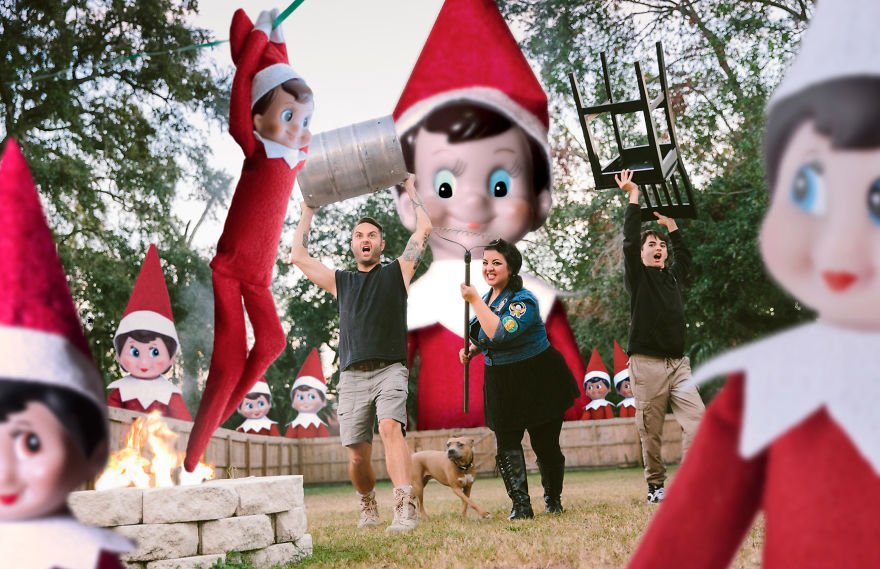
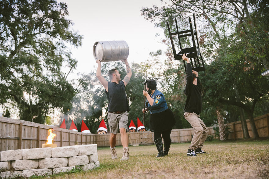
Guys, I honestly think all of your Christmas elf photos are creepy, so I came up with this idea one night while brainstorming card ideas. This was another year where my husband and stepson thought my idea was “so dumb” and the photographer thought the photo shoot was a bit odd, but I begged them to “TRUST ME!” I had this vision from the very start! We shot this in our backyard. I told the guys to grab a chainsaw or baseball bat or anything else that could be used as a “weapon”, but they grabbed an empty beer keg and a chair. Both items were left over from our neighborhood Halloween party. I admit, it came out pretty funny! Our dog was in the very back of the yard for this shot, so I Photoshopped her in from another photo. I think the final result is fun, and soon after they were mailed out, I started receiving appreciative text messages. Special thanks to Corinna Hoffman of Corinna Hoffman Photography for always going with the flow and letting me alter her images! :)
*NO ELVES WERE HARMED IN THE MAKING OF THIS CARD
Back of 2017 Card
At the start of the “invasion”.
Back of 2017 Card (Full Image Only)
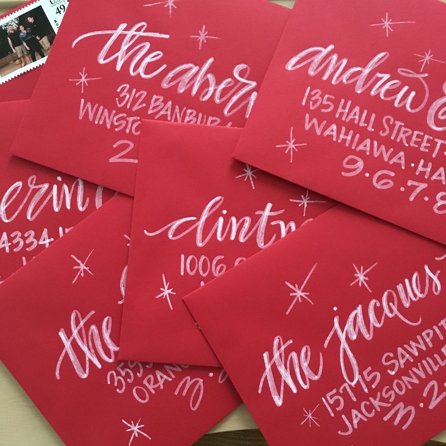
2017 Envelopes
Hand addressed in white ink.
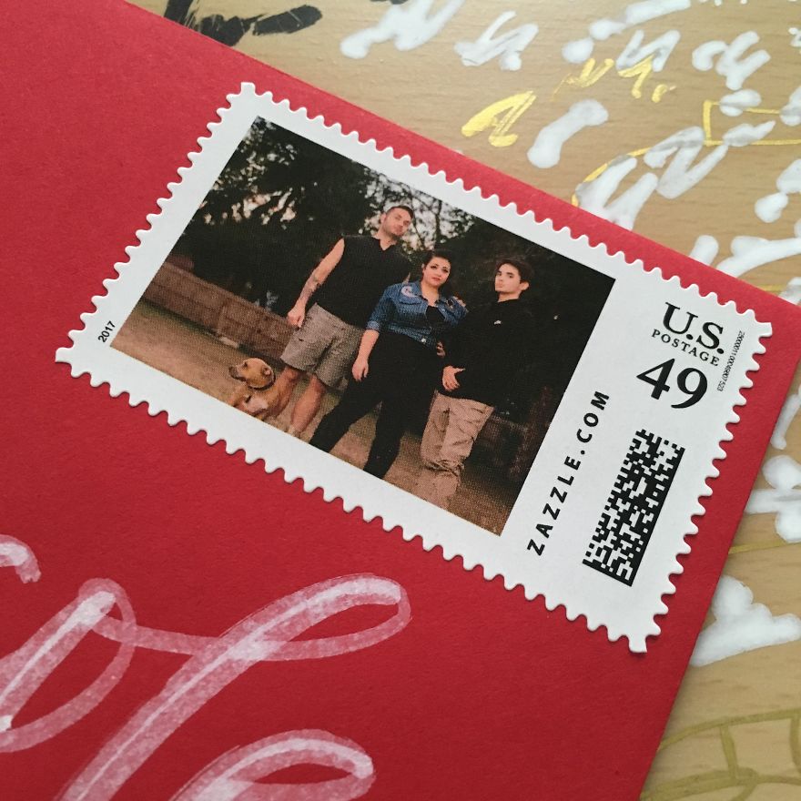
2017 Custom Stamps
Just us tryin’ to look cool by not smiling.
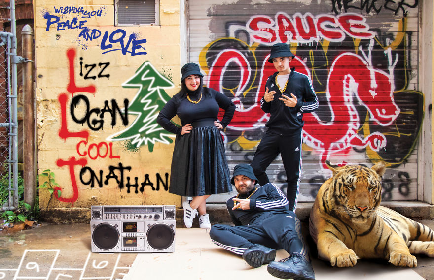
2018 – LLCoolJ
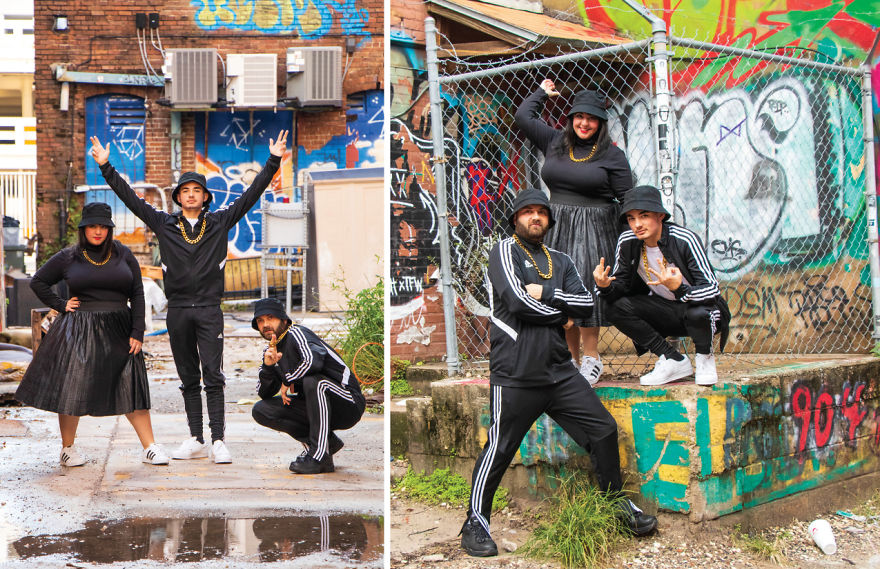
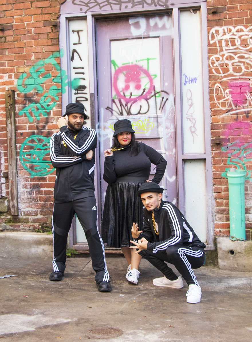
It was November 26th and we didn’t even have an INKLING of an idea for our Christmas card theme this year. I was at work one day and my friends were talking about what their “rap name” is, and I said, “My family’s rap name is LLCoolJ for Lizz, Logan and Cool Jonathan.” That’s when the idea hit me! So after a last-minute scramble for outfits, finding the perfect location, and booking the awesome photographer that I work with, we were able to pull this off in just a few days. I did my “thing” in Photoshop to add the personalization and “accessories”, and hand-addressed over 120 of them in a day. Whew! It’s completely ridiculous and silly and we had fun doing the photo shoot. Logan was even into it this year and normally he groans through the entire process!
The good news is that we already have an idea for next year’s card.
DISCLAIMER: no tigers were injured in making this card.
Back of 2018 Card
This was going to be our 2018 custom stamp but I didn’t order them in time!
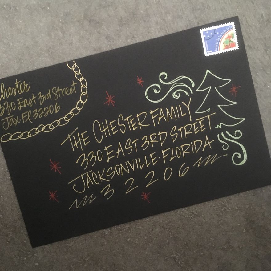
2018 Envelopes to match the theme, per usual! I had to do these quick or they would’ve been much nicer!
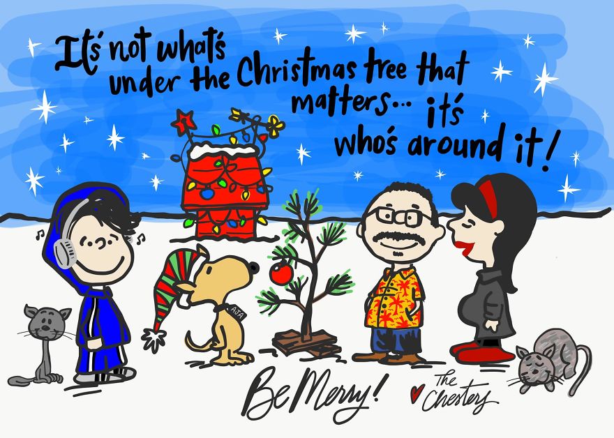
2019 – It’s a Chester Family Christmas
2019 was a year full of suprises — including the BIGGEST one of all! We’re having a freakin’ baby at 43 years old! Gone are our plans to travel the world in 2020. Now we’re planning a baby registry and decorating a nursery! By the time the holidays came around, I had NO IDEA what to do for our cards this year and it was way too late to book a photographer. I woke up in the middle of the night with this idea, so I drew it on my iPad then fell back asleep. The next morning I showed my husband, who actually like it, but wanted to art direct me on his shirt design. Cute, huh?
I normally like more edgy things, but we thought it was appropriate for this year. Next year we’ll have much bigger plans with our new addition — a daughter! We’re looking forward to this fun adventure!
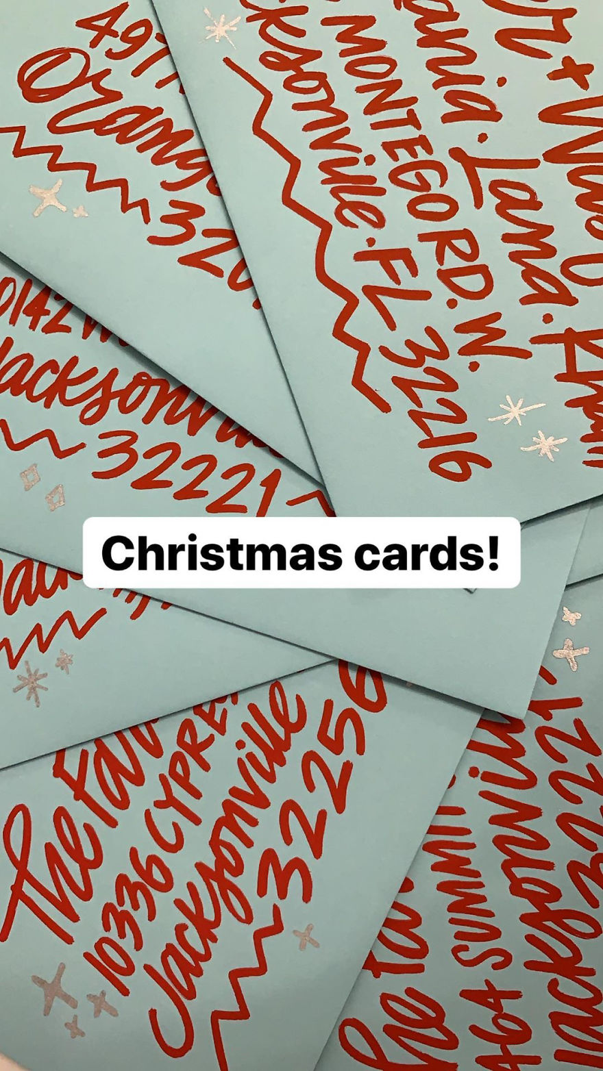
2019 Envelopes (photo from Instagram stories)
Hand addressed with really BIG red lettering on light blue envelopes. I didn’t do custom stamps this year because honestly they are more than twice the price of regular stamps and I think I’m getting to the age where I pinch pennies! Haha.
932views
Share on Facebook
 Dark Mode

 No fees, cancel anytime










3
0