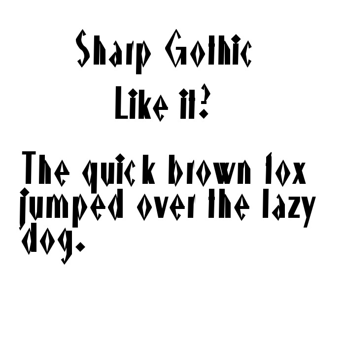
These fonts are ranked from worst to best, but they’re still terrible, so don’t use them. And I made my OWN font, aka Sharp Gothic!
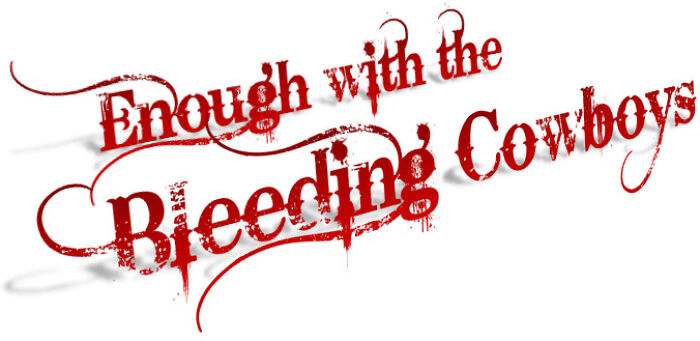
#1 Bleeding Cowboys, Bleeding Eyes (Bleeding Cowboys)
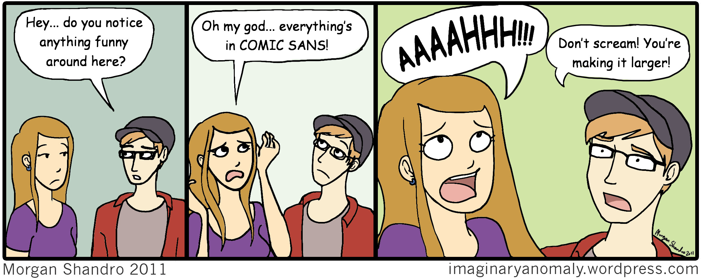
#2 Relatable! (Comic Sans)
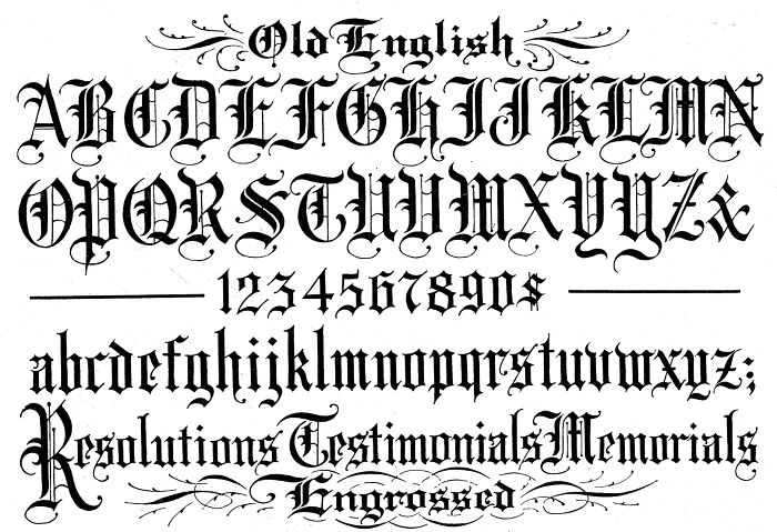
#3 SO. MANY. LINES. (Old English)
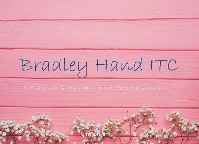
#4 Worse than MY handwriting (Bradley Hand)
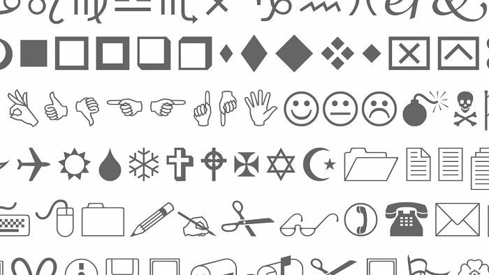
#5 I dare you to read this. (Wingdings)
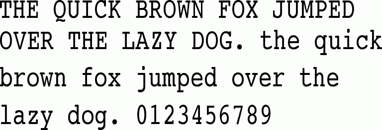
#6 Typewriter.
Bonus: My new font!
266views
Share on FacebookOn the sharp gothic...I like it, but I think it could use a bit more definition on the cross pieces to distinguish letters like r and t from l . On my screen now, the letters are between 1/4 to 5/16 (6.3 to 7.9 mm) and I had trouble recognizing letters without context. Edited to say the Bradley hand is much better than my handwriting.🥴
On the sharp gothic...I like it, but I think it could use a bit more definition on the cross pieces to distinguish letters like r and t from l . On my screen now, the letters are between 1/4 to 5/16 (6.3 to 7.9 mm) and I had trouble recognizing letters without context. Edited to say the Bradley hand is much better than my handwriting.🥴

 Dark Mode

 No fees, cancel anytime











1
1