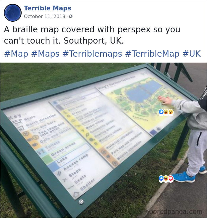
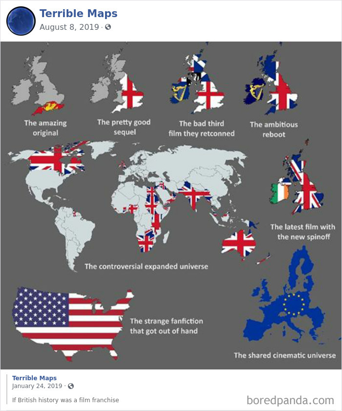
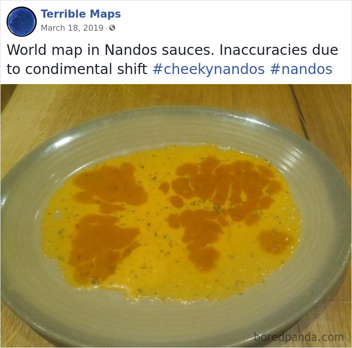
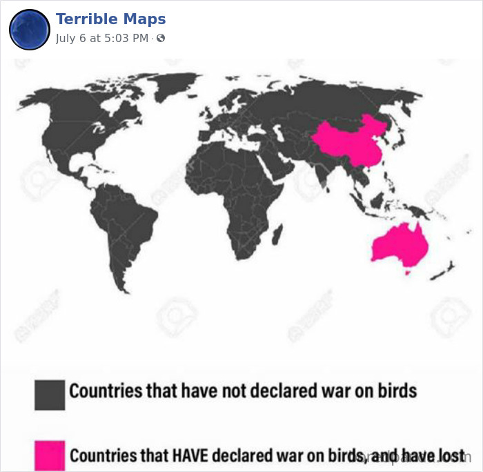
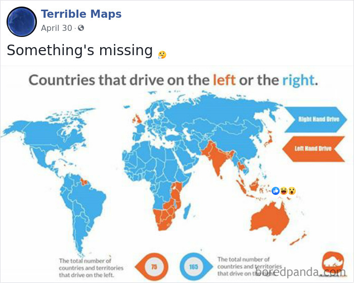
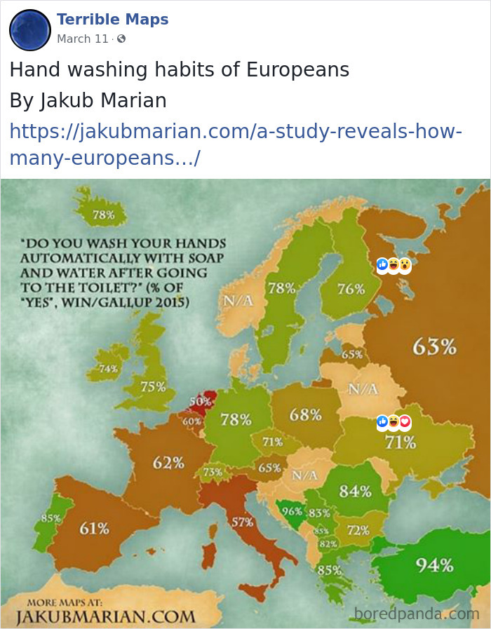
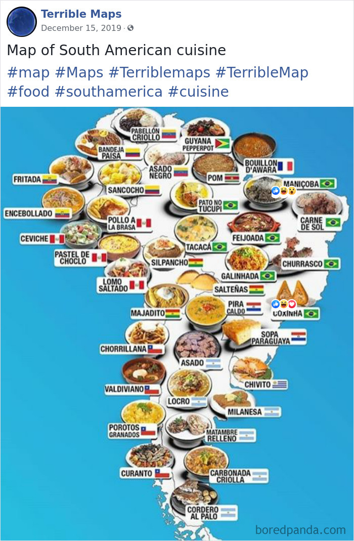
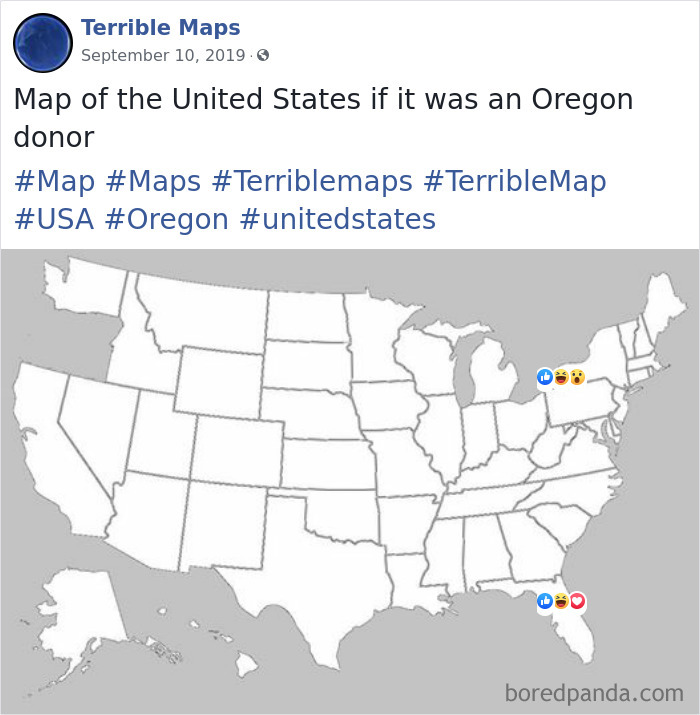
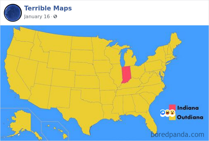
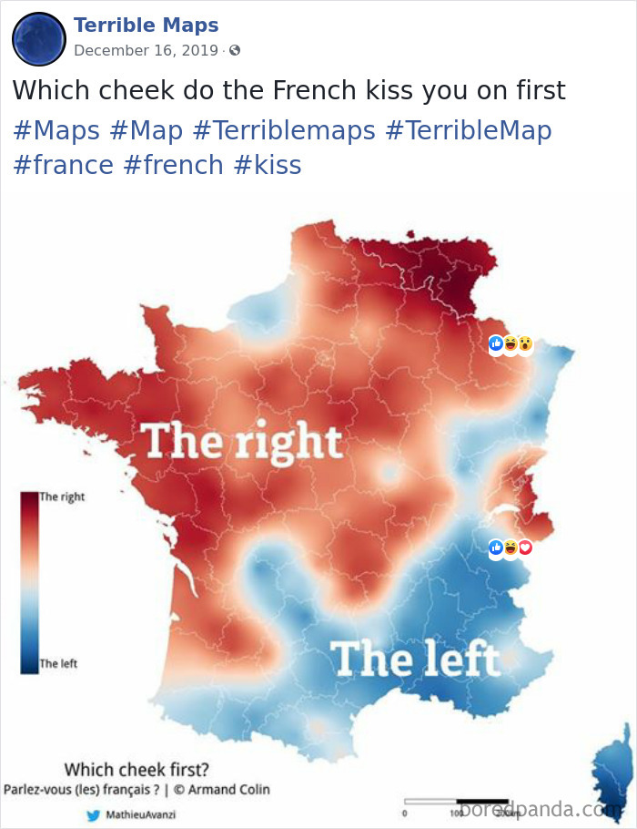
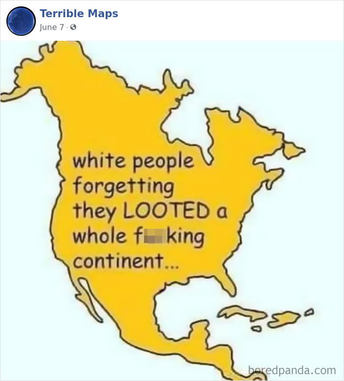
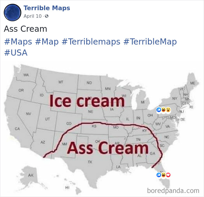
Since the last time we wrote about Terrible Maps, a project that is dedicated to sharing maps no one asked for or needs, they've kept themselves rather busy. So it's only natural we created a follow-up article about the cartographers who are so bad, they're actually good. After all, what is the Internet for if not to poke fun at politics and our geographical illiteracy?
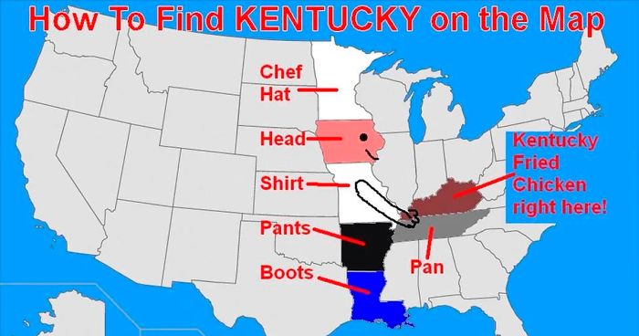
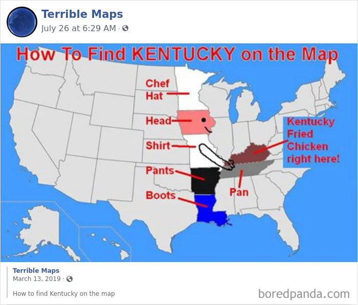
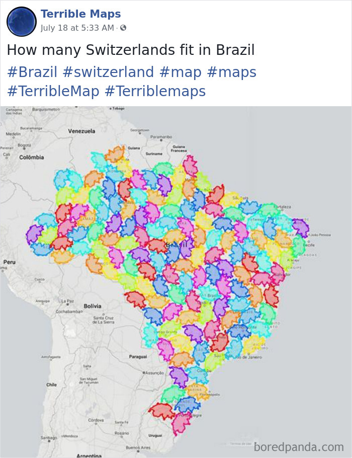
From hilarious guides on how to find the state of Kentucky to showing how many Switzerlands fit in Brazil, continue scrolling and check out these gems and tell us which one would you hang on your office wall!
More info: Facebook | Instagram
This post may include affiliate links.
OK. We can clearly see these are bad maps. But how to know you're looking at a good one? Brant Scheidecker, a sales engineer at Cartegraph, highlighted some of the main essentials for accurate and easily interpretable map use.
"Every map should have a title. It allows the user to assess the purpose of the map quickly; allowing them to determine if it meets their needs," Scheidecker wrote.
Next, origin. A fancy name for a compass or the North arrow. "This allows the user to determine the maps reference to the earth. While most maps these days have North being straight up, occasionally you will encounter a map that has a skewed orientation, perhaps to better fit it on the physical medium it's presented on (i.e. paper), or simply because it’s easier to interact with the map in that orientation."
When it comes to the source, it's a two-fold element. "It allows the map maker to provide the map viewer an idea where the data the map is representing is from; a necessity in determining the accuracy of a map. It also allows the map maker a way to cite the source of their data, avoiding all those pesky cries of plagiarism and the ensuing lawsuits," Scheidecker explained. "You have better uses for your time, like ensuring the rest of the T.O.S.S.L.A.D. elements are on your maps."
Let's not forget the legend (the area where a user can determine what a particular color or symbol represents on the map). "Without a legend, a user cannot successfully interpret what your map is trying to represent, 'Does the red skull and crossbones over my favorite restaurant mean what I think it means?'"
You should also know when was the map that you're analyzing made. If it was created in 1962 and shows commuter levels in Chicago—it might not be such a valid source for the traffic data you are looking for today, unless you are feeling nostalgic, Scheidecker joked.
There you have it. You may now have become a cartographic genius, but you should be able to tell if you're looking at a terrible map or not!
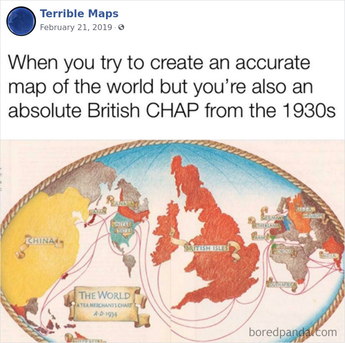
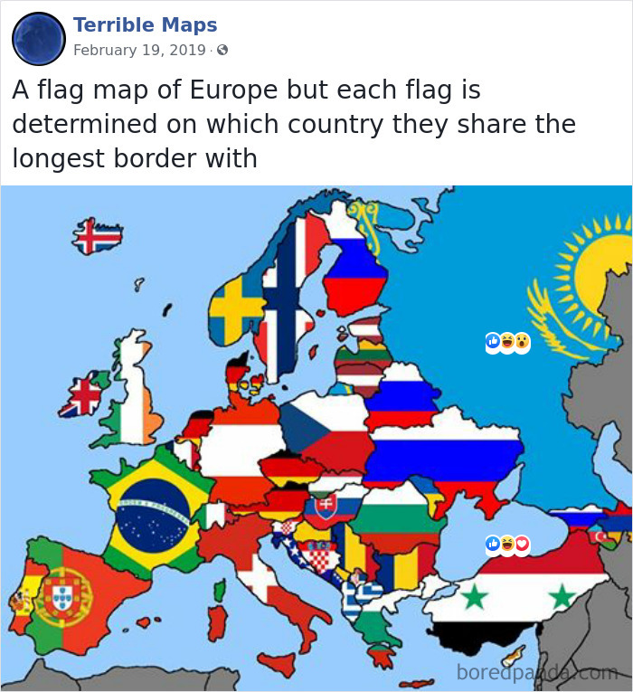
I don't understand why Iceland is not green, but Spitsbergen is
No surprise, if the person with this opinion is a believer, that the Earth is flat...
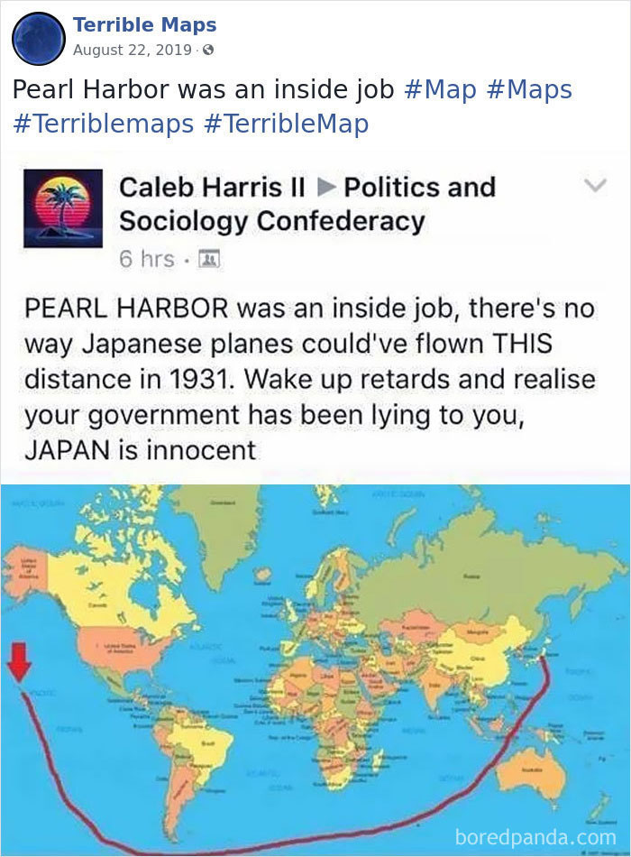
I wonder whether the year 1931 is part of the joke or an actual mistake.
Is it just me that cringes when someone says "retards" to describe someone? Like is that necessary...
It's not like there are other words you can use to describe willfully ignorants idiots. Wait.....
Load More Replies...That is funny. Some are not the sharpest pencils in the box, but this one is not even in the box.
Hello, didn't you know they had aircraft carriers? Duh..... (You have to speak their language)
"Was it over when the...Germans bombed Pearl Harbor??" - Bluto, "Animal House" (1978)
Winner of the Betsy DeVos Award for Historical Insight from Trump University.
This has to be a joke, right? Also, terrifyingly, some of the comments here don't seem to understand fully what the problem is.
I had to reread this three times to get the stupid point being made since I had to process the stupid
While this is true, it doesn't really matter how you draw the line between Japan and Hawaii, no fighters or bombers of that era could have made the flight from Japan to Hawaii -- it's ~4000 miles, and while the Zeros had a 1600 mile range, the heavily laden bombers only had a 600 mile range. So it's theoretically possible that the Japanese aircraft carriers could have taken the marked route. (though I'm not sure they had the range to do so without refueling, even if the carriers had the range, probably a lot of the smaller support ships did not)
He didn't know that they had aircraft carriers - that's what makes it so funny.
Load More Replies...The japanese had planes, so why should they suround earth the water way as matked in the map? The could easy fly to their ally germany. Refuel and continue to hawaii. Proplem solved.
but actually they could because japan had meth and would give it to their pilots
have you heard of limited fuel supply they were light bombers so you also have to factor that in because they have weight and they are stored on the outside, therefore, increasing the drag and making the planes having to use more fuel to maintain an airspeed fast enough to stay in the air.
Load More Replies...I deeply "hate" people who use the slur "retard". Are you speaking down because you are lesser than?
He clearly has never read a history book in his life. Not to mention taken any geography coursed. Nor has he ever considered the fact that aircraft carrier ships exist.
What is frightening is that the person who made this map and theory is allowed to drive a car. Think about that.
How 'bout 1941 when that actually happened? So, you're saying that the Japanese did not attact Pearl Harbor ten years before they attacted Pearl Harbor. Alrighty then.
This is a joke. I know this not because there aren't people stupid enough to think the world is like in the map but because even those idiots would have made a straight line East to West from Japan to Pearl Harbor.
That is probably the DUMBEST thing I've ever read! I honestly hope this person is being sarcastic...But, I doubt it!
Well they are right about that not being possible in 1931....so they got something right
I realise this is comedy but even so... the LONG way round? REALLY?
This is without doubt one of the absolutely stupidest things I have ever seen, must have been created by someone with zero knowledge of the historical event!!!!!!!!
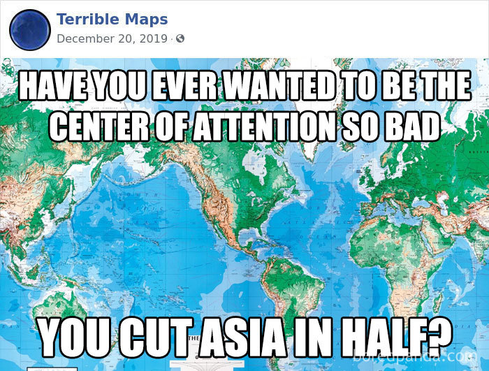
Many people do this same thing with statistics, too. The old saying is, "Figures don't lie, liars figure". This is as good a map as the one that cuts Asia in half because of where the paper map is folded. Whoever drew this map knew exactly what he or she was doing. And that's what we're seeing a lot of today in the news - and people fall for it, like so many of the comments. These maps really need a better name than "Terrible". They are TERRIFIC!!
Many people do this same thing with statistics, too. The old saying is, "Figures don't lie, liars figure". This is as good a map as the one that cuts Asia in half because of where the paper map is folded. Whoever drew this map knew exactly what he or she was doing. And that's what we're seeing a lot of today in the news - and people fall for it, like so many of the comments here. These maps really need a better name than "Terrible". They are terrific!
They went east young man and it was in 1941, one month before I was born. My mom must have been scared silly.
I think the tinfoil hat is too tight on this one. The date, though!!
Must have gone to the same school as IQ45 and had the same geography teacher.
Might be a fake, but if it's not, such a level of stupidity is quite fascinating.
This idiot: 1) Doesn't know that Japan sent their planes to Pearl Harbor on aircraft carriers; 2) Doesn't seem to know that Pearl Harbor was bombed in 1942, not 1931; 3) calls other people "r******d" for not going along with his cockeyed view of history and geography. And he's not joking.
Load More Replies...My bad phone a jerk last comment pay no mind lol.. how about flying the other way around? Or I'm no pilot ticket scientist astronaut but possibly fly over land? I mean you know 30,000+ feet in air would be enough to surpass the giant skyscrapers lol
Interesting that they also apparently only flew over open ocean rather than dry land...
Also the Japanese aircraft flew from captured Pacific territories or aircraft carriers iirc
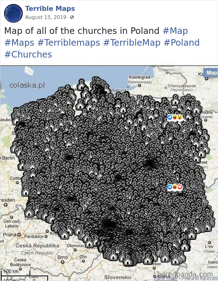
Nah. We see a giant a*s bible for most of those middle states. Oh and guns. Lots and lots of guns.
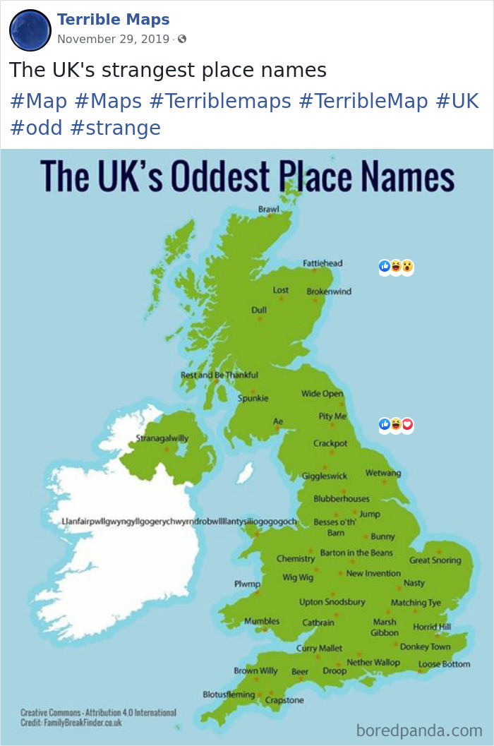
i don't even want to try saying that one. you know which one I'm talking about.
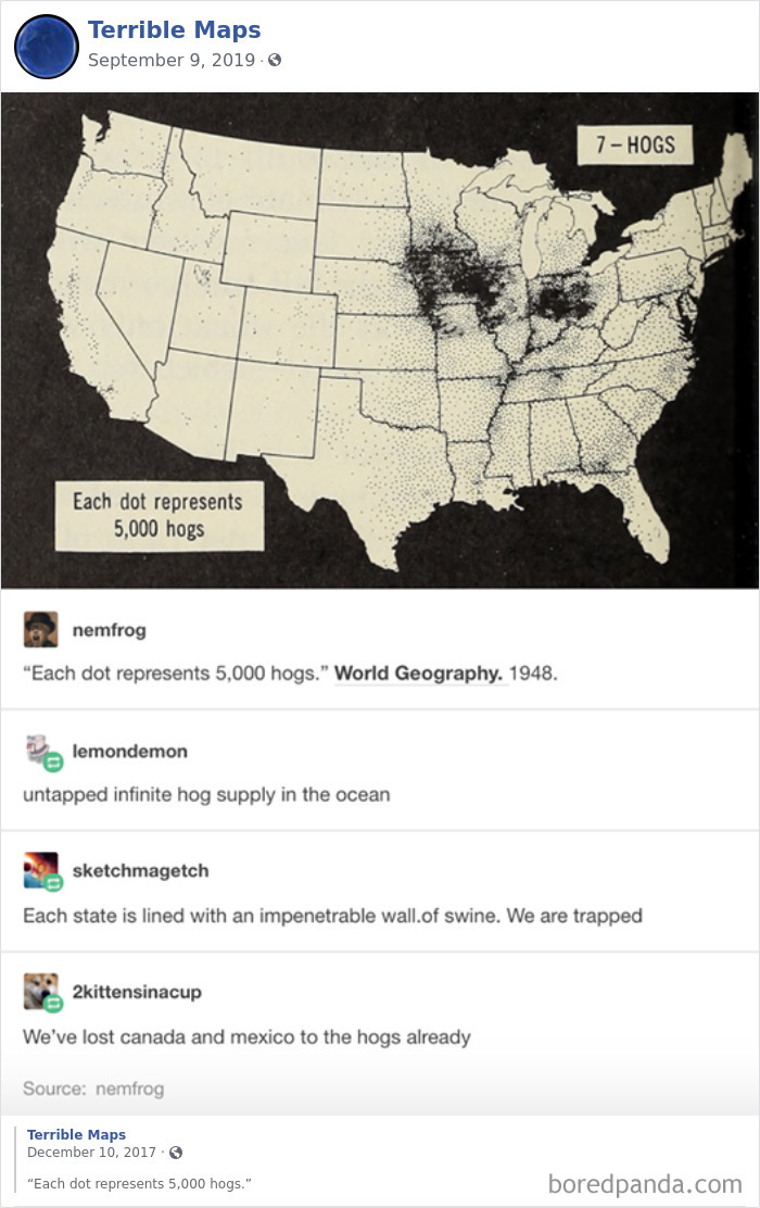
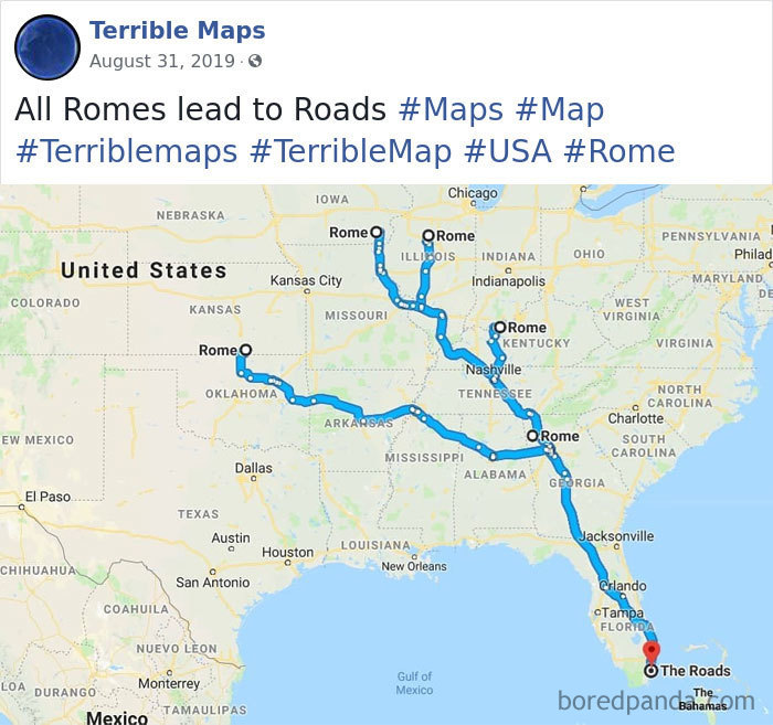
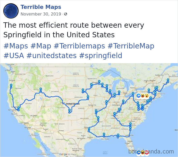
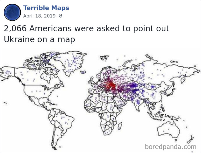
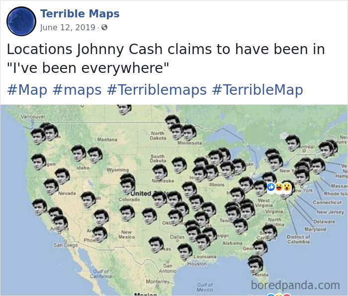
According to my dots in MS Paint over each: 132. Might be wrong, but I am not doing it again. EDIT: Did it again and Beto River is right, I missed 10 at some point. Thank you Beto!
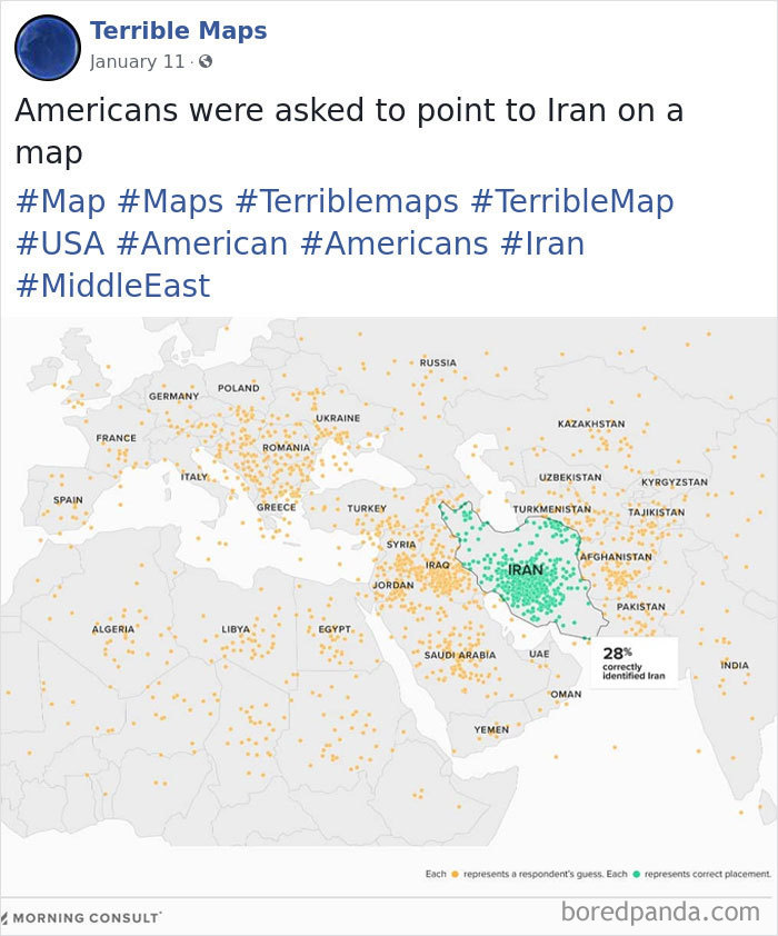
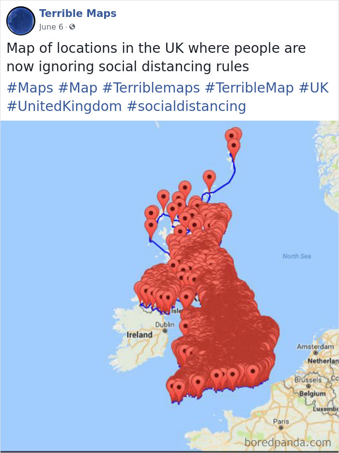
I understand mistaking it with Iraq or Afghanistan, but how the f**k did they go to Africa and the Balkans? A couple are even in the UK, for crying out loud.
The main reason almost all of these maps are so terrible are the emoji, which (apart from they're extremely annoying) sometimes cover text.
I can now recognize Rokas Laurinavičius' posts after the first three entries.
Many of these maps would only be considered terrible from a geological point of view. A lot of them are demographic which, I find fascinating.
Found the anti-intellectual, liberal-hating conservative crusader who’s going to change us all by mocking us...
Load More Replies...The main reason almost all of these maps are so terrible are the emoji, which (apart from they're extremely annoying) sometimes cover text.
I can now recognize Rokas Laurinavičius' posts after the first three entries.
Many of these maps would only be considered terrible from a geological point of view. A lot of them are demographic which, I find fascinating.
Found the anti-intellectual, liberal-hating conservative crusader who’s going to change us all by mocking us...
Load More Replies...
 Dark Mode

 No fees, cancel anytime


