360Kviews
Italian Graphic Designer Finds Pantone Colors In Natural Landscapes And Cities
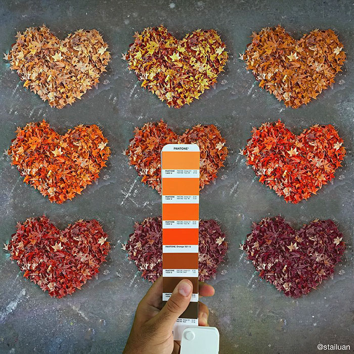
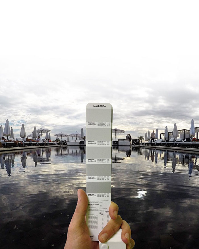
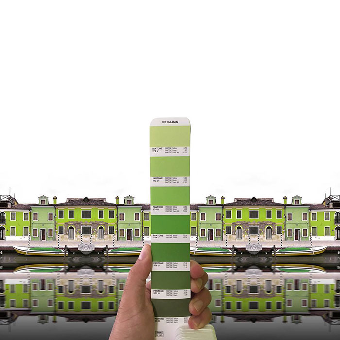
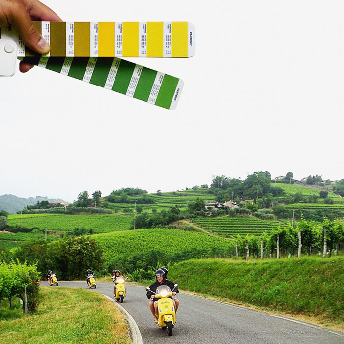
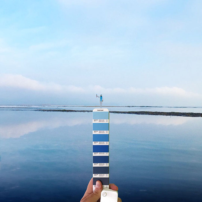
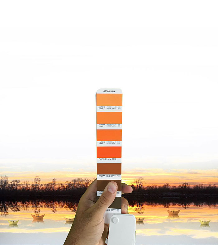
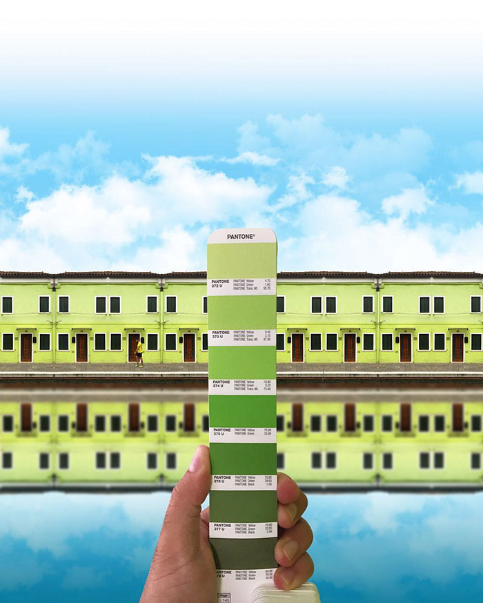
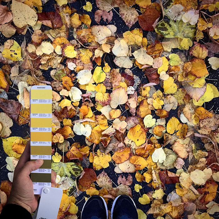
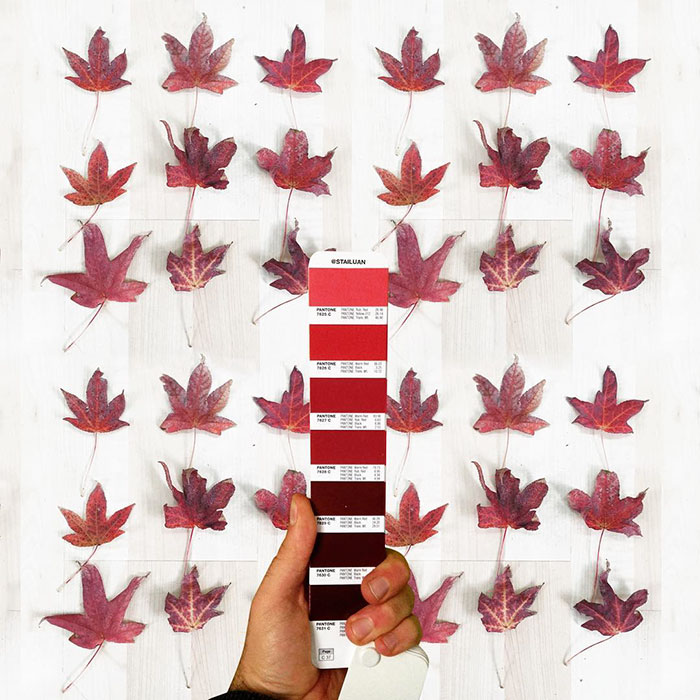
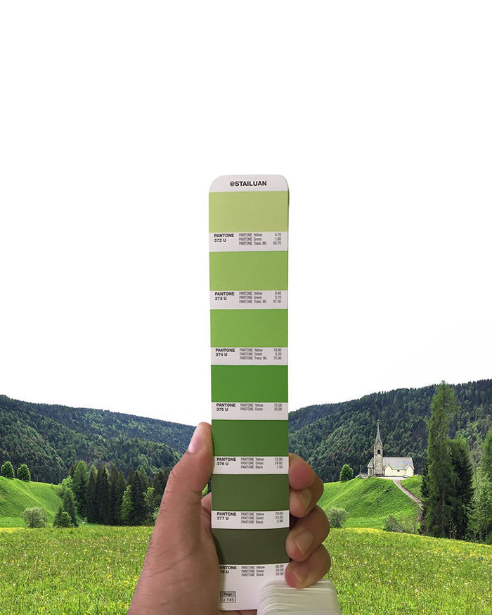
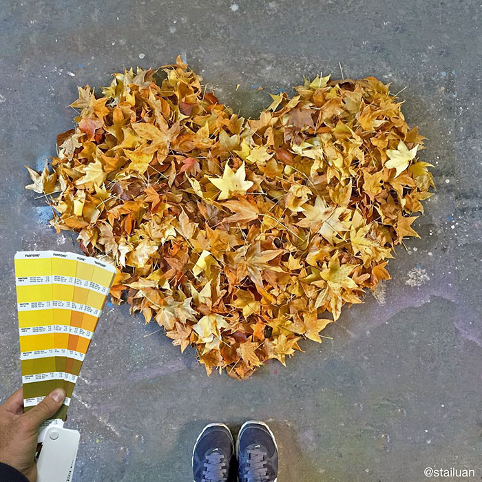
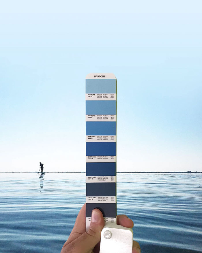
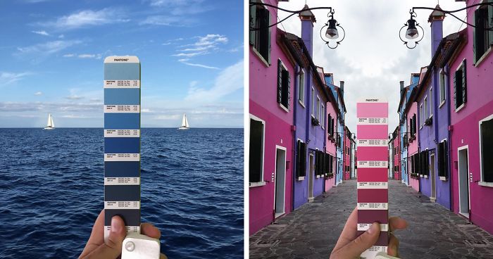
Italian graphic designer Andrea Antoni searches the world for Pantone colors, reminding us to embrace the colorful nature of our surroundings.
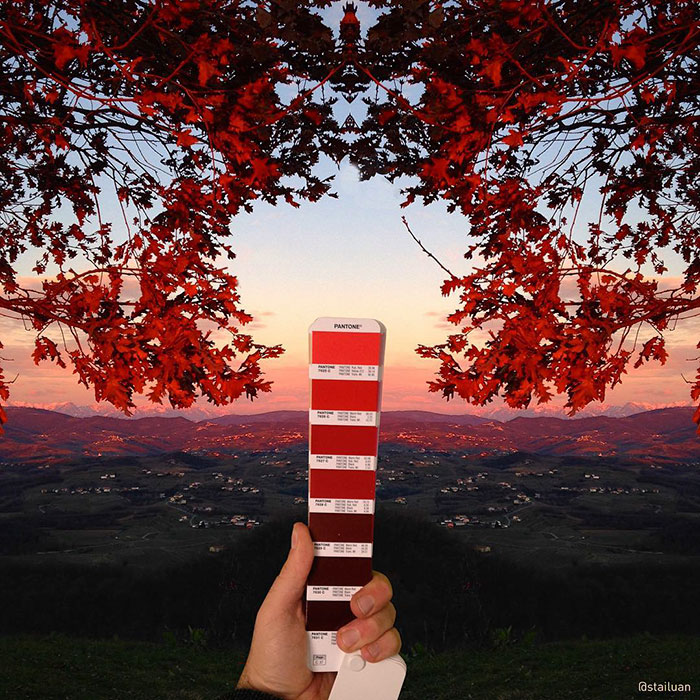
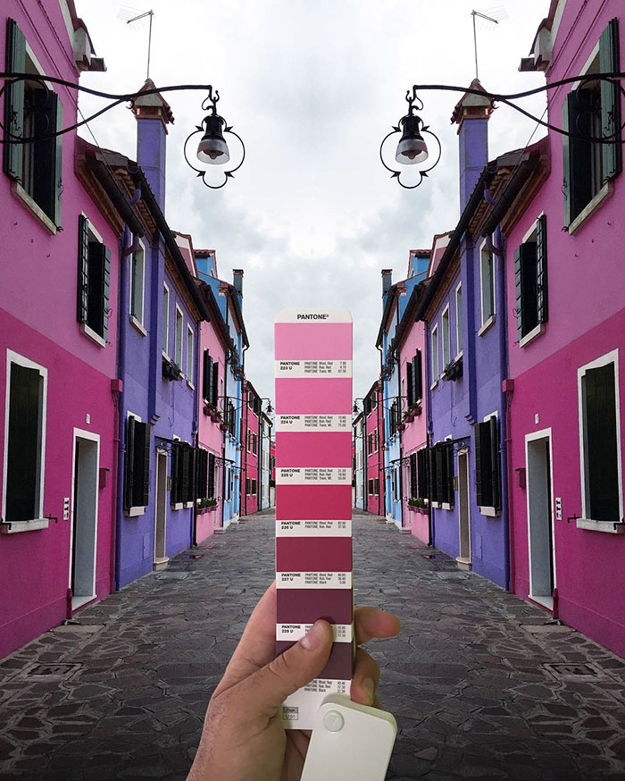
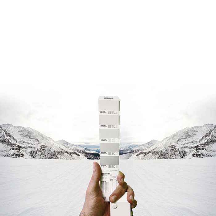
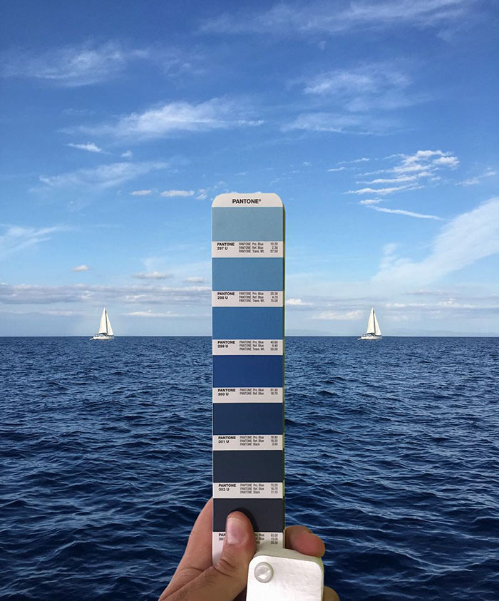
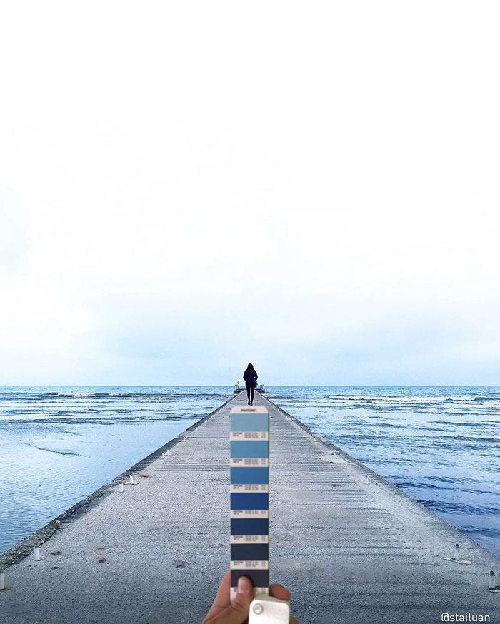
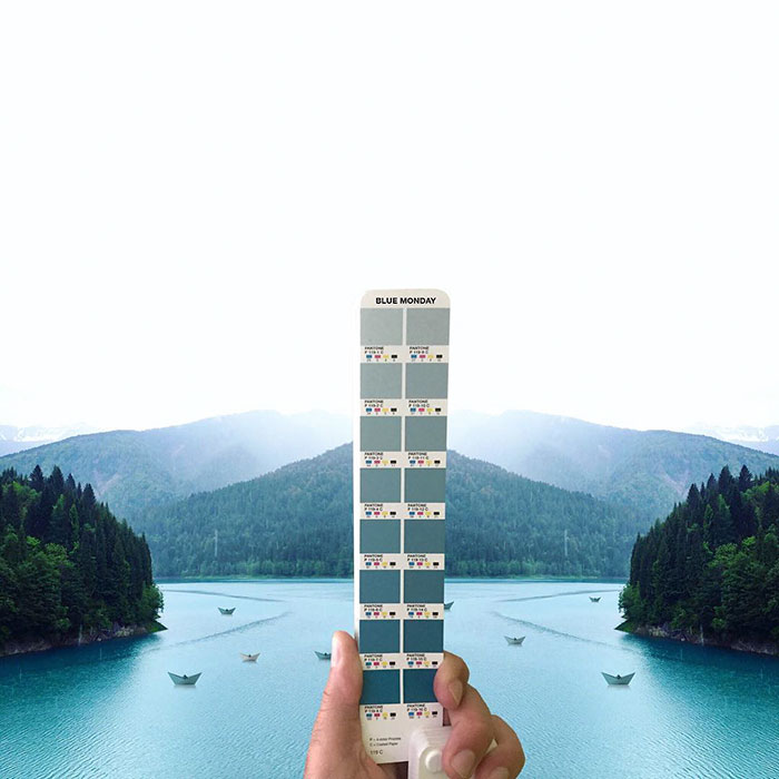
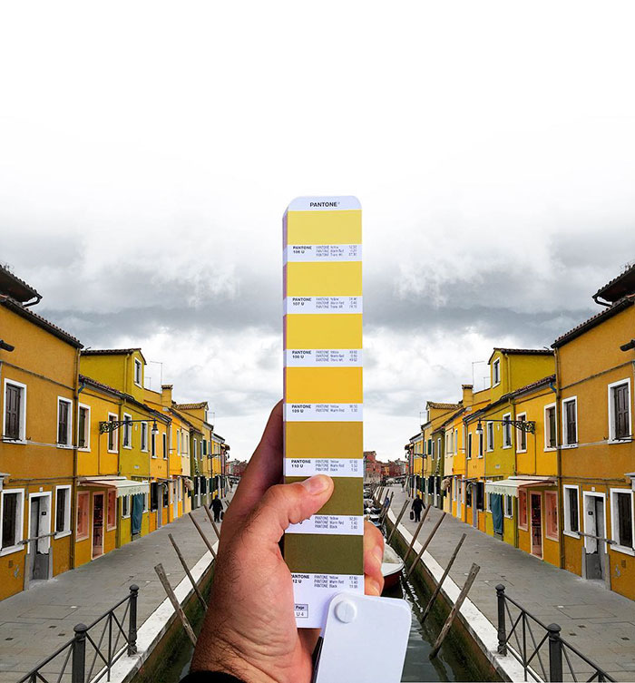
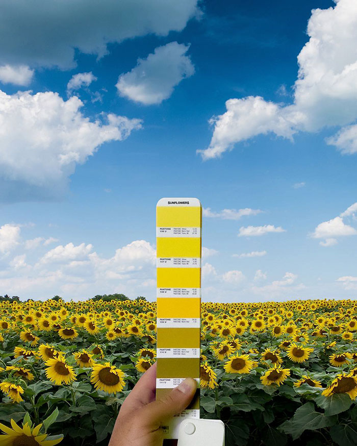
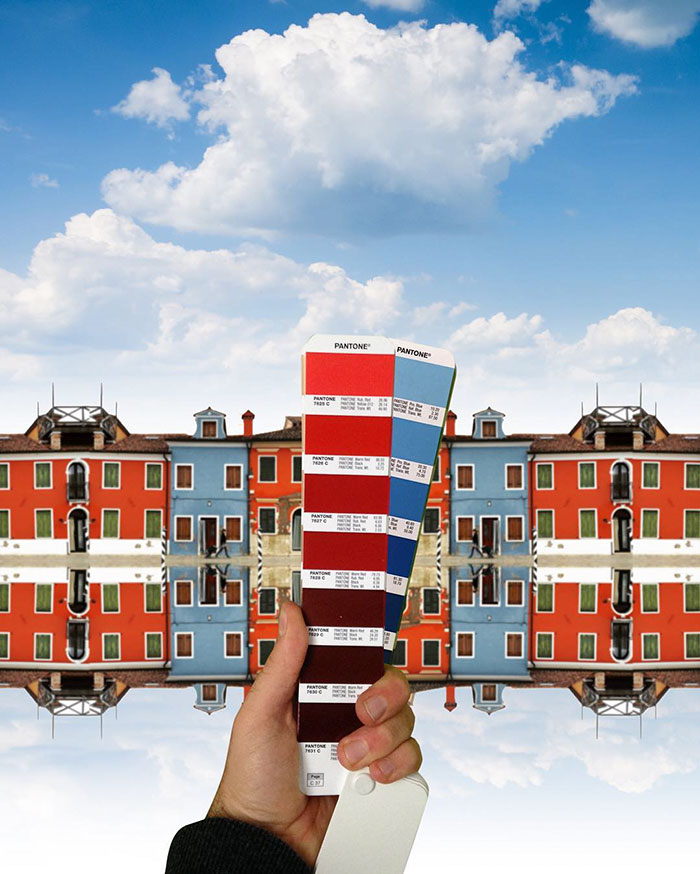
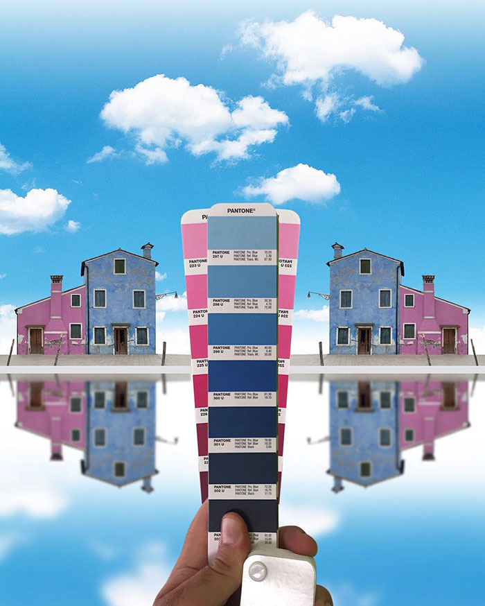
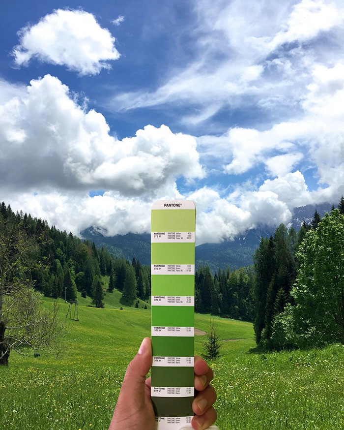
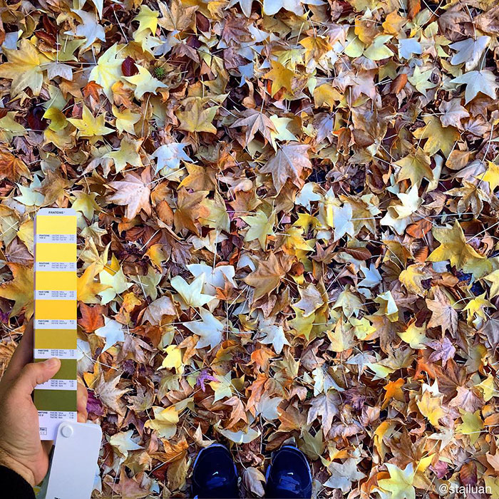
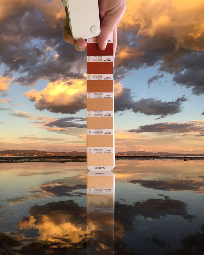
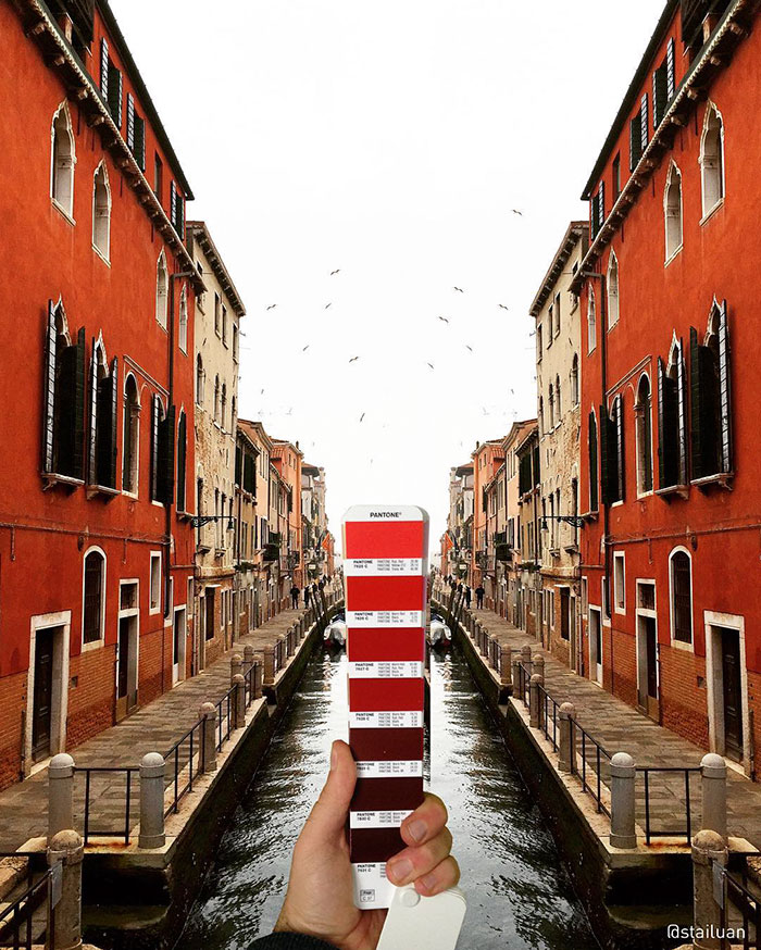
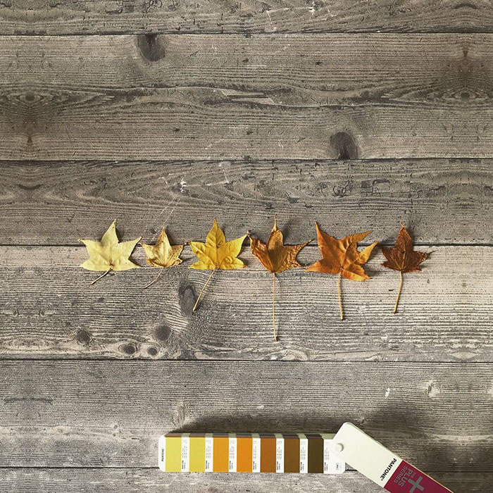
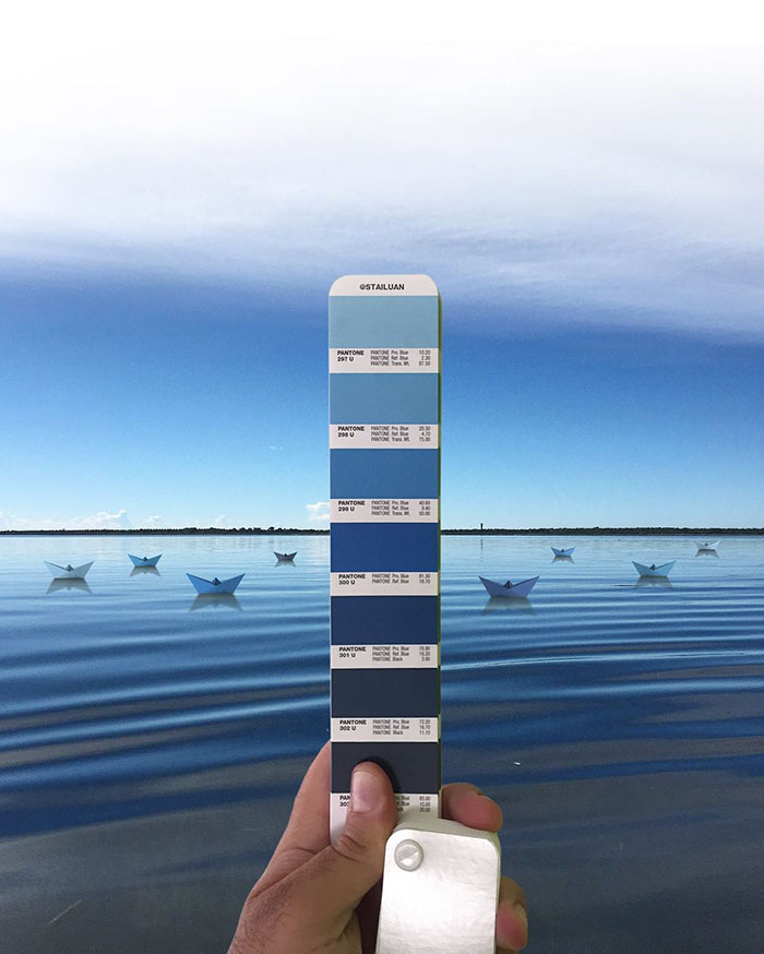
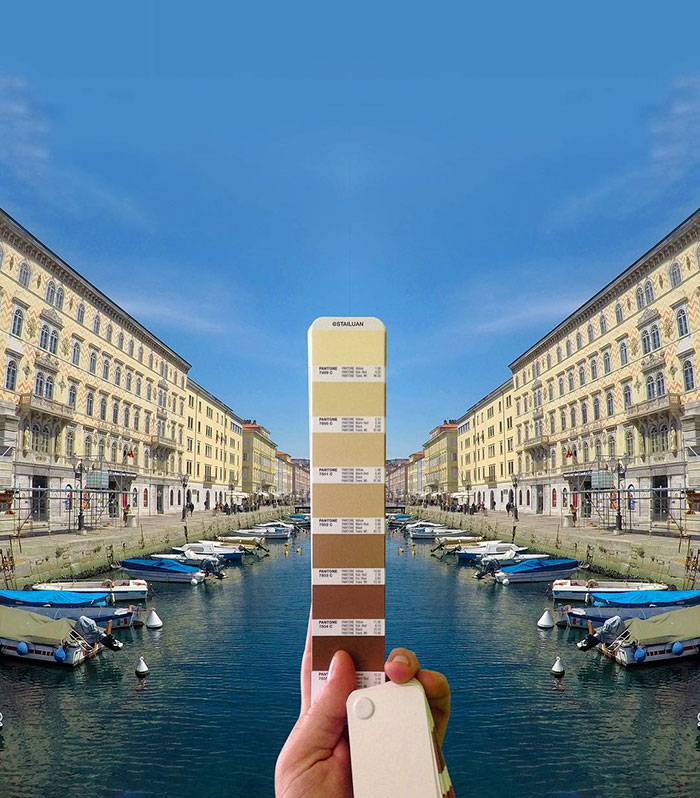
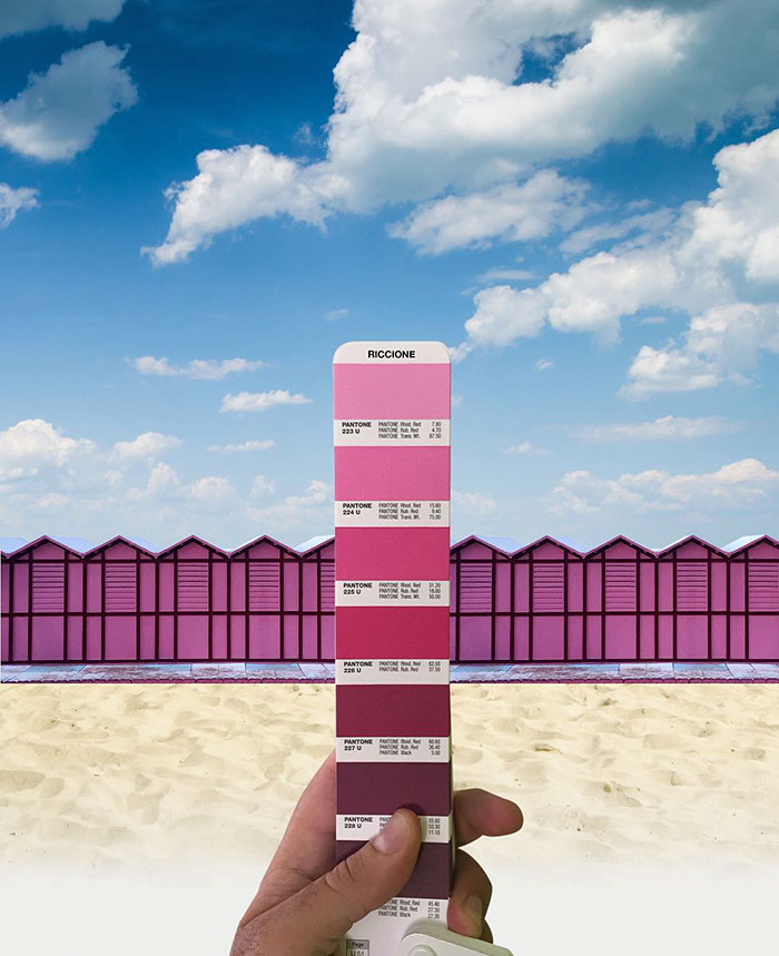
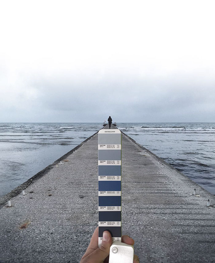
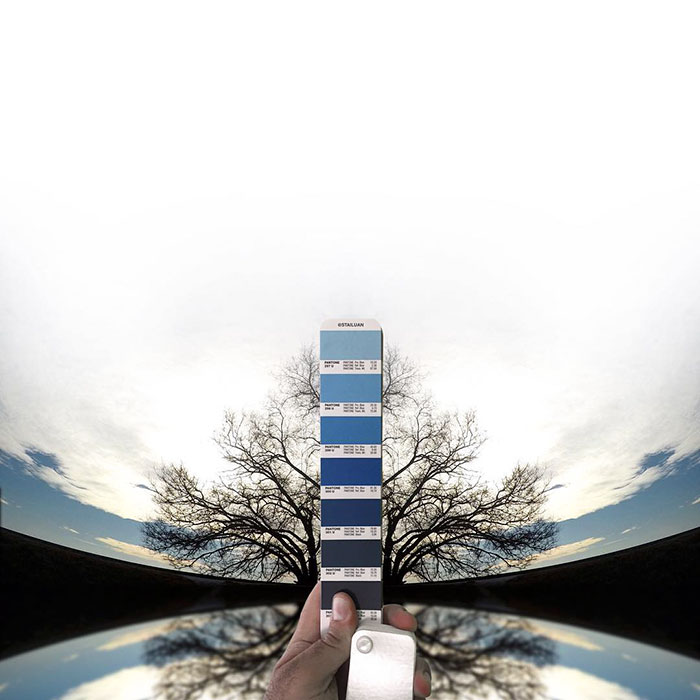
In each of his landscape photos, Antoni digitally inserts his hand with a swatch, containing complimentary Pantone shades that are represented in the background. From an orange tone, popping up in a melancholic sky, to playful collection of greens, flourishing in the freshly cut grass - these color schemes illustrate how Andrea sees the world. For a more dramatic effect, Andre sometimes mirrors the image or manipulates it in other creative ways, making the photo compositions more appealing.
"As a graphic designer, I've always loved the Pantone fan decks, although more for their joyfulness and color combinations than for their intended purpose," Antoni told Creators. "So it happened one day that I took a particularly colorful picture and tried to combine it with the related Pantone color. Initially, I would publish the occasional picture once in a while, but now about one-third of my published photos are produced this way."
Through these interesting photos, Andrea also tries to preserve the nostalgic emotion, associated with a particular place. "The images reflect the way I see the world, or the memory I have of some places. Some show the sensations that these beautiful viewa evoke in me," the artist said.
Texas-based artist Inka Mathew has created similarly beautiful photos, pairing tiny everyday objects with Pantone swatches, and it looks just as vibrant.
More info: anreaantoni.it | Instagram (h/t: creators.vice)
This post may include affiliate links.
I believe they only mean most of his works or images so this was included. Also...most materials come from nature anyway and being built in natural landscape itself. The writer must have noticed most of the images were taken from natural setting and so on...
I made the same observation as N G. Many of the images are simply mirrored to be perfectly symmetrical. This would have been a much more impressive series if the swatch were actually held up in front of a landscape while taking the picture live. :(
With natural light the chromatic effect would not have been just as fitting, not to mention the depth. He had more control this way
Load More Replies...Could be very cool if were real pictures, but as a photoshop work it is not very impressive to me.
It somehow appears that Pantone LLC is supporting viral marketing campaigns. Considering that the Pantone Matching System is disputed for economical, legal and technical reasons, it is astonishing to find every other week a posting where someone is surprisingly happy with it. Aesthetic value nonewithstanding, I do not think these are coincidental postings.
This is a complete lift from the dutch artist Allard van Hoorn who did these in 2008 http://allardvanhoorn.com/biography_matchmaker.asp

 Dark Mode

 No fees, cancel anytime


