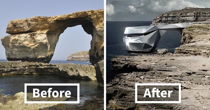
After The Iconic Azure Window In Malta Collapsed, This Russian Architect Proposes A Flashy Mirrored Building In Its Place
This March will mark the two-year anniversary of the collapse of one of Malta’s most famous landmarks – Azure Window. The arch had certain celebrity status, as not only was it a popular tourist attraction but it was also chosen as a backdrop for the Dothraki wedding scene in the Game of Thrones and featured in Clash of the Titans and The Count of Monte Cristo.
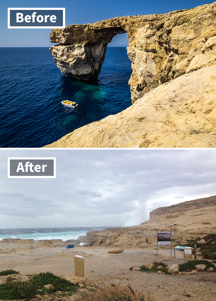
Sadly, the limestone arch that dominated the Dwejra coastline in Gozo no longer stands ashore of the Mediterranean – it collapsed into the sea in 2017 after a heavy storm. While a study conducted back in 2013 showed that the collapse of the Azure Window was not likely, concern over the natural landmark grew over the years with experts warning people about its erosion and fining tourists for walking over it.
Merely a day after the collapse, an international call was announced urging architects and artists alike to propose ideas to commemorate the iconic landmark. A number of proposals were being evaluated by the government, however, one of them stood out the most. Times of Maltawrites that the controversial proposal to build a metal structure on the site of the former Azure Window has been covered by over 100 news outlets from all over the world.
More info: The Heart Of Malta | Vimeo | Instagram
As Malta’s famous landmark collapsed in 2017, this architect proposes reviving it in a modern way
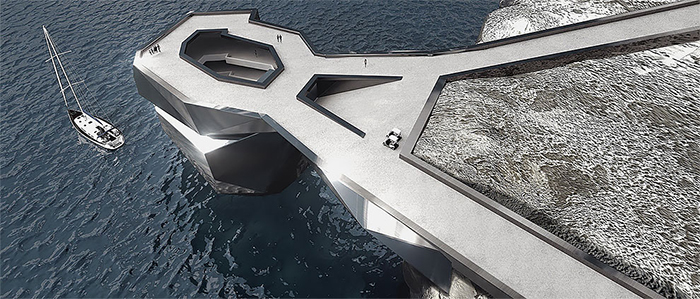
A Russian architect named Svetozar Andreev teamed up with Elena Britanishskaya and proposed transforming the collapsed Azure Window into a steel exhibition space. As the famous landmark known as tieqa żerqa among the locals has collapsed into the sea, this project suggests reviving it in a modern way.
In the project ‘Heart of Malta,’ Svetozar Andreev proposes re-making the arch into an exhibition space
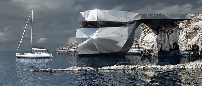
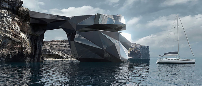
The architectural form is supposed to mirror the shape of the natural arch
The ‘Heart of Malta’ project aims to revive the visual landmark by creating a polygonal architectural shape with mirrored steel. The structure is supposed to mirror the shape of the natural arch and is supposed to blend into the landscape seamlessly, as it is designed to have the same size and proportions of the original Azure Window.
And blend into the landscape harmoniously
As it is designed with the same proportions as the original Azure Window
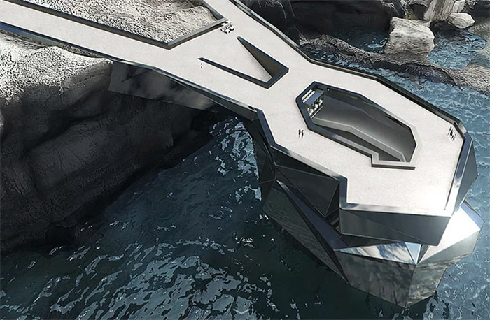
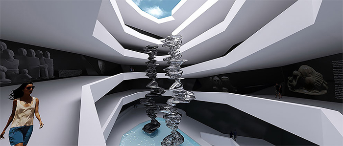
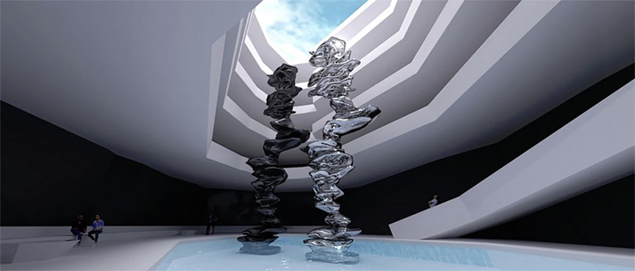
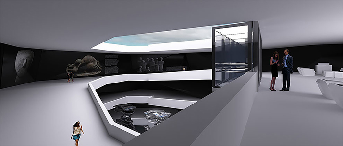
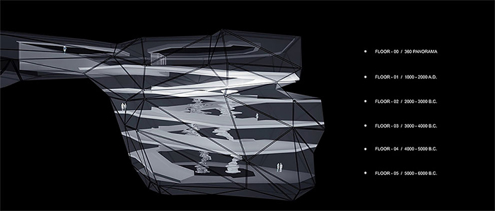
The architectural proposal comprises of over 5,000 square meters of exhibition space laid out through five floors “with a dynamic laser show in which each spiral step represents one thousand years of Maltese history,” architect Svetozar Andreev writes on the official project website.
The building is designed to have five floors
And would comprise of over 5,000 square meters
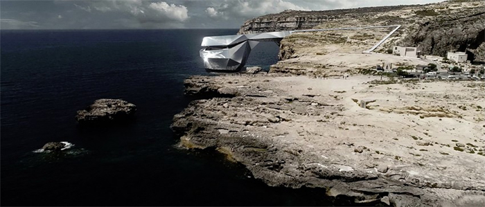
The Russian architect describes the project as ‘a perfect monument and symbol of the fusion of modernity and nature, of time and history, and a testament to the tenacity of the human spirit.’ One of the goals of the project is to create a new architectural and cultural space to draw tourists again to this area of Malta. Svetozar Andreev proposes using the latest techniques and materials available in order to not spoil the natural beauty by interfering with the natural coastline landscape.
The architect hopes that the new cultural space would draw visitors to Goza
However, the ‘flashy museum’ has also been widely criticized
However, not everyone finds the project attractive. “Nothing can rival the splendor of billions of years of naturally occurring brilliance that is the earth and its inhabitants,” one woman writes on Facebook. “Indulgent rubbish, pretentious and vulgar,” another man describes the project. “Nature needs protection and conservation not camouflage,” someone else said.
As some suggest the natural landscape should be left as it is
Nonetheless, it still attracted the attention of over 100 media outlets and people from all around the globe. We can either love it or hate it, but they say that bad press is better than no press at all… But most importantly, what do you think? We’re eager to hear your opinion so tell us in the comments below!
Watch the full video of the project below
46Kviews
Share on FacebookI was just about to write how ugly this abomination is.
Load More Replies...I don't understand, the article said that the artist designed it to "blend into the landscape seamlessly". How in the world does a giant shiny building "blend in" to anything? That's like saying "I bought this 52 carat diamond ring, because it really blends into the shape of my hand! I just really don't want to call attention to myself". Maybe if it was inside a giant mirrored fun house it would blend in? lol
Mirrors do blend in to the landscape because they reflect the world around it, taking on the colors and textures of things around it. Ever seen the Cloud Gate (aka The Bean) in Chicago?
Load More Replies...It looks cool as a concept artworks, but an actual mirror exterior at the shore would probably look a bit dirty and shabby very fast. It's constantly exposed to the elements and it looks like a nightmare to clean from the outside. Also, having it situated like that and not taking advantage of the ocean view from inside seems like a waste. Ps: Is that a water spout in the background of the after picture or am I imagining things?
I agree, the shape is not that bad, it's the finishing that kills it. I'd either use the stone from the area, or I would use something that plays with the elements and the erosion, something that is meant to change with the exposure to the sea.
Load More Replies...I was just about to write how ugly this abomination is.
Load More Replies...I don't understand, the article said that the artist designed it to "blend into the landscape seamlessly". How in the world does a giant shiny building "blend in" to anything? That's like saying "I bought this 52 carat diamond ring, because it really blends into the shape of my hand! I just really don't want to call attention to myself". Maybe if it was inside a giant mirrored fun house it would blend in? lol
Mirrors do blend in to the landscape because they reflect the world around it, taking on the colors and textures of things around it. Ever seen the Cloud Gate (aka The Bean) in Chicago?
Load More Replies...It looks cool as a concept artworks, but an actual mirror exterior at the shore would probably look a bit dirty and shabby very fast. It's constantly exposed to the elements and it looks like a nightmare to clean from the outside. Also, having it situated like that and not taking advantage of the ocean view from inside seems like a waste. Ps: Is that a water spout in the background of the after picture or am I imagining things?
I agree, the shape is not that bad, it's the finishing that kills it. I'd either use the stone from the area, or I would use something that plays with the elements and the erosion, something that is meant to change with the exposure to the sea.
Load More Replies...
 Dark Mode

 No fees, cancel anytime



















45
41