
We Made Giant Mirror Letters In San Francisco To Show That Design Is All Around Us
We at Character recently developed “Look Closer”, the campaign for the 2015 edition of San Francisco Design Week.
The festival is getting larger every year. To accommodate this growth they moved the opening events to Pier 27, which can hold over 2,000 people, allowing them to hold lectures, exhibitions, and design-related events, all at a much larger scale. To take advantage of this, we wanted to develop a visual narrative that can be intriguing when you see it in print or online — but really reinforced once you visit the festival.
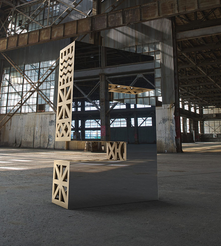
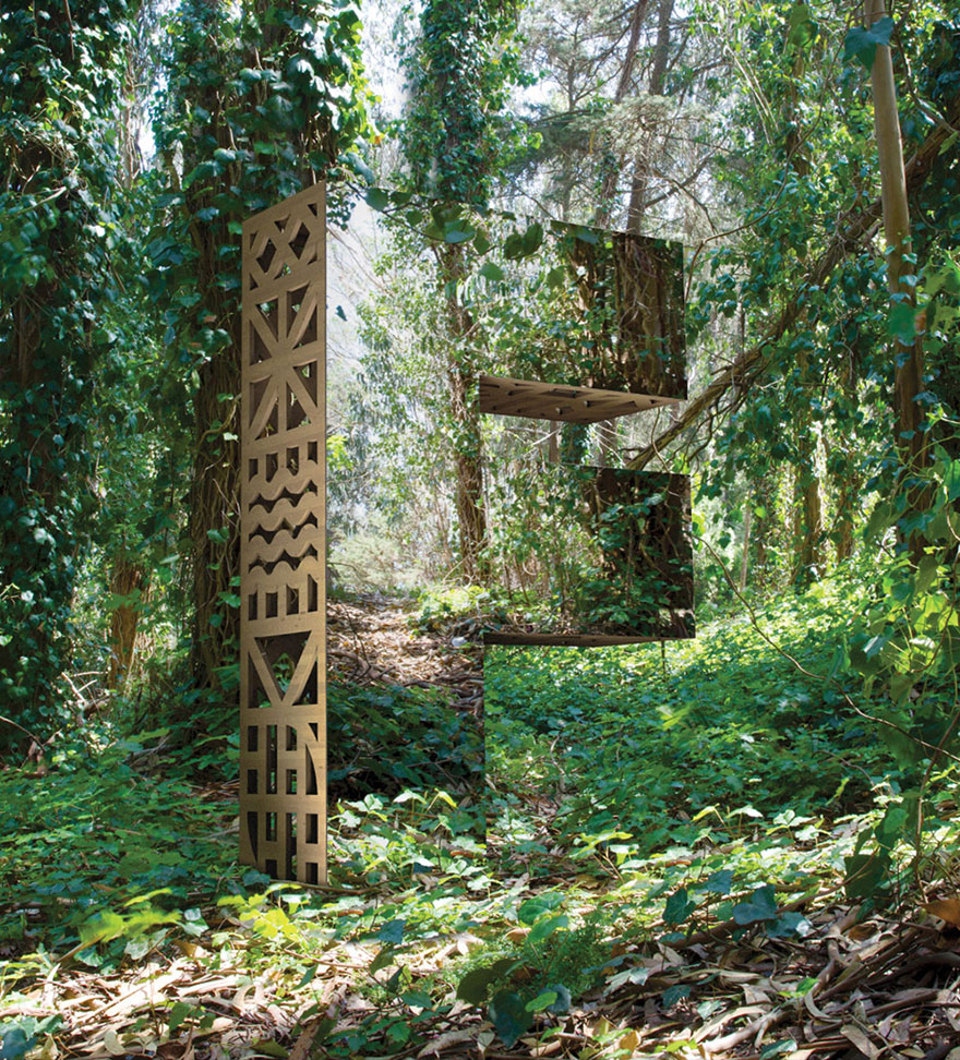
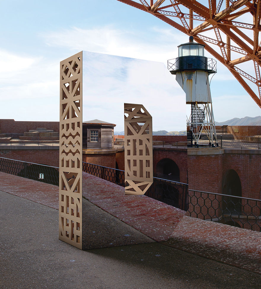
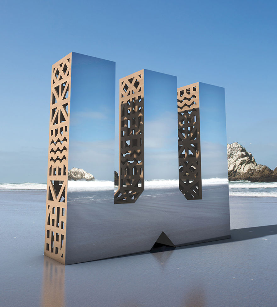
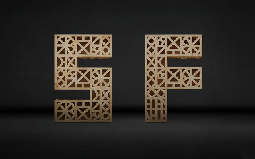
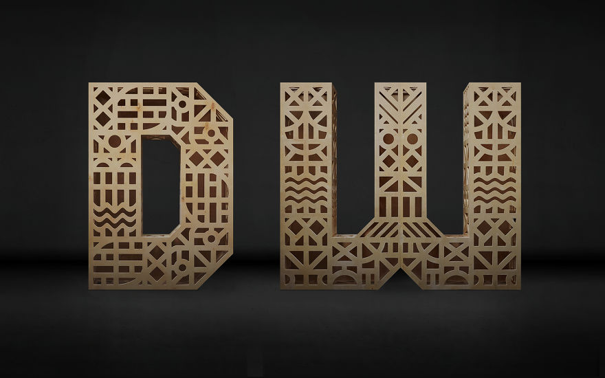
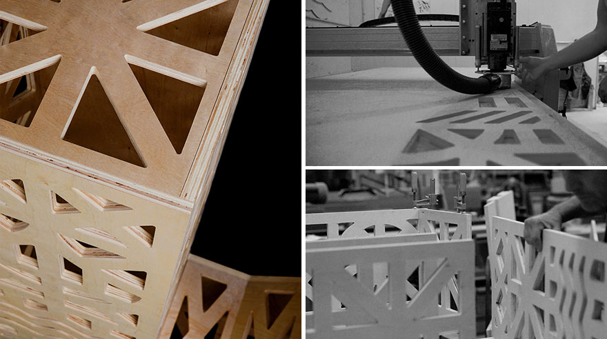
For our primary campaign images, we constructed monolithic letter-forms from mirrors and intricately crafted wood. Each of these installations appear to recede into their environments, but on a closer look, they give a glimpse into their intricate frameworks. This idea, that design is all around us shaping our environments, but often goes largely unnoticed was a great jumping off point for the discussions, talks and events of the event. There’s a thoughtful process and structure behind almost everything if you look closer, and we wanted to create imagery to reflect that.
More info: charactersf.com
4Kviews
Share on FacebookIt has nothing to do about their intelligence, they see their image in the glass and in other glass buildings , the get disoriented and fly into the glass
Hard to get a sense of scale, though that's not super important. I take it that these designs are roughly human height?
It has nothing to do about their intelligence, they see their image in the glass and in other glass buildings , the get disoriented and fly into the glass
Hard to get a sense of scale, though that's not super important. I take it that these designs are roughly human height?

 Dark Mode

 No fees, cancel anytime






46
3