Get Premium
Dark mode theme is available exclusively for premium users. Learn more about the benefits of subscribing.
No fees, cancel anytime.

 Dark Mode Ad-Free Browsing Unlimited Content
 Ad-Free Browsing Unlimited Content Dark Mode
Join 1.2 million Panda readers who get the best art, memes, and fun stories every week!
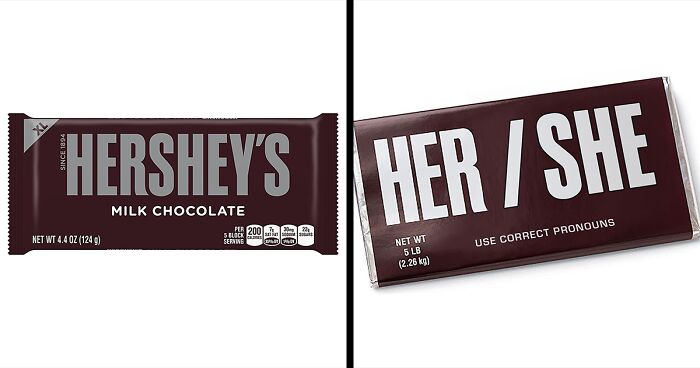
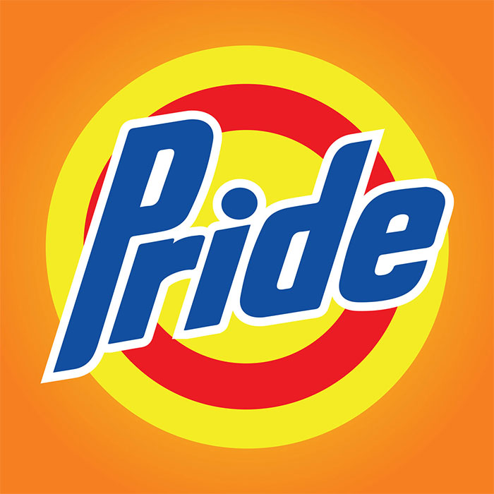
Brand logos are very easily recognizable and easy to spot. So it's quite smart to use them to send a message or tweak them a little bit to represent something else. That's exactly what Lydia Cambron, a New York designer, did.
Lydia used her skills in art to transform famous logos into messages of protest. The messages support Black Lives Matter and the LGBTQ+ community. With this protest, Lydia wants to show her disagreement with police brutality, injustice, homophobia, racism, and other horrible things affecting not only America but the whole world.
More info: Instagram | lydiacambron.com
This post may include affiliate links.
Ya... do it, boys... why is racism even a thing LIKE FOR GOD's SAKE WE JUST HAVE DARKER SKIN
LOve the message, but it seriously looks like Black lives matter trans, or black lives trans matter
i can't bring myself to agree with this. yes, police brutality is a thing, and yes, directed police violence exists, but cops also protect us and do quite a bit for the safety of the world. generalizations are what brought us to this point, and making new ones isn't going to do anything.
these were all amazing! It was nice that they didn't clump all of LGBTQIAA+ together, that they made separate ones for nonbinary, trans, lesbian, gay, bisexual.. i felt loved tbh! love you all <3
I feel lik i would have been bette rif some of them had to do with the environment, as well as having less of the bi/trans stuff
Nice, but a few with the police were contiversal. Especially the FTP one, not all police are bad!
Do not get rid of prisons, make them more humane. Help people leaving prison Re establish a life outside of the walls. Many offenders end up committing crimes again because they cannot find a real job, and end up right back in prison again.
Maybe less bi/trans themes and more larger issues like the environment or war(not that I don't agree with the original messaging)
Good God man. Is there nothing that you aren't just painfully woke about?
Simply putting other words or letters with familiar logos isn’t creative. Like the one for Tide/Pride, there ought to be SOME connection to the original. For example, the Amazon logo was designed to convey the company’s message: the arrow shows you it has everything from “A to Z.” Putting “Abolition Time” in the same typeface with the arrow doing nothing is just lame. Same with many of the others.
Y'all do know that if you want racism to go away we need to stop talking about it.
I don't support it, but it's nice that this guy is caring about other people :)


 No fees, cancel anytime