
Someone Optimized Famous Logos To Use Less Ink And Be More Environmentally Friendly – What Do You Think?
Visibility is hugely important to brands, which is why they want to see their logo everywhere, but there’s a price to pay for such widespread exposure, not just financially but ecologically as well.
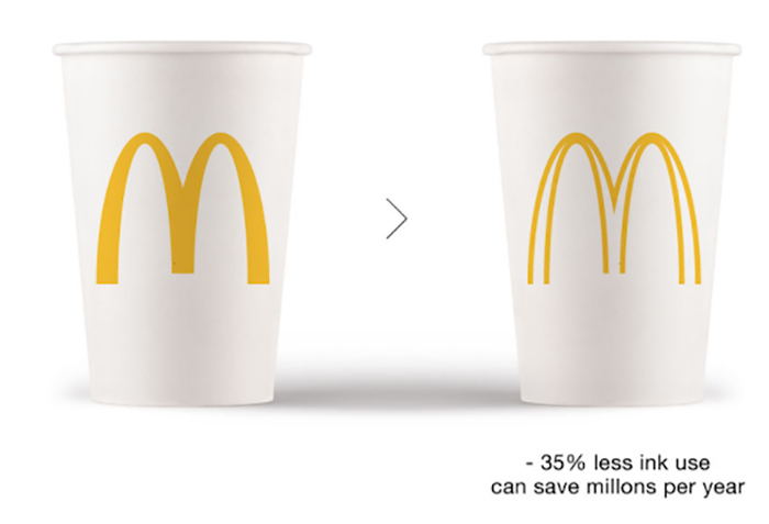
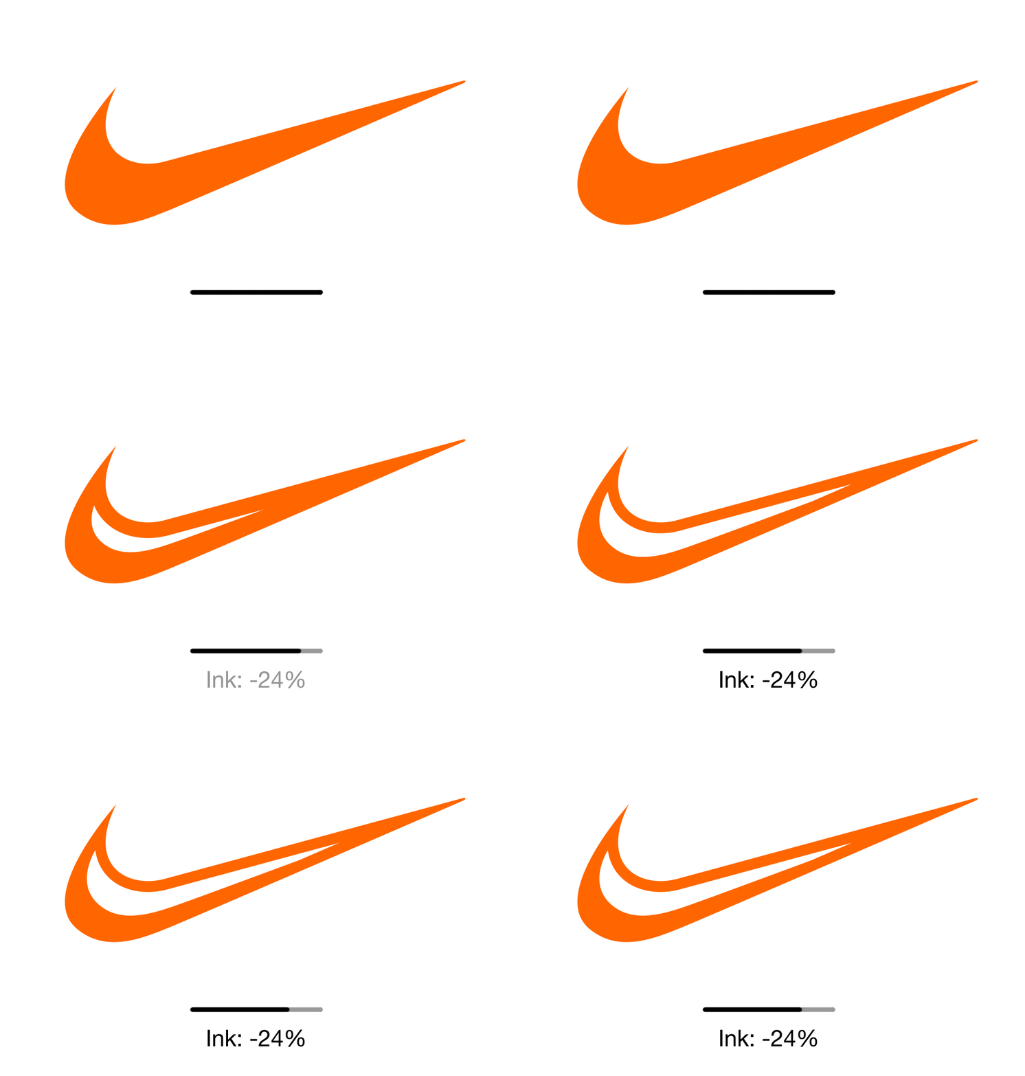
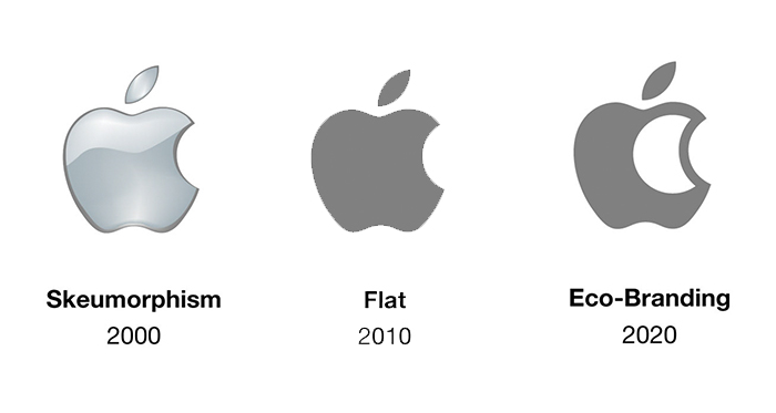
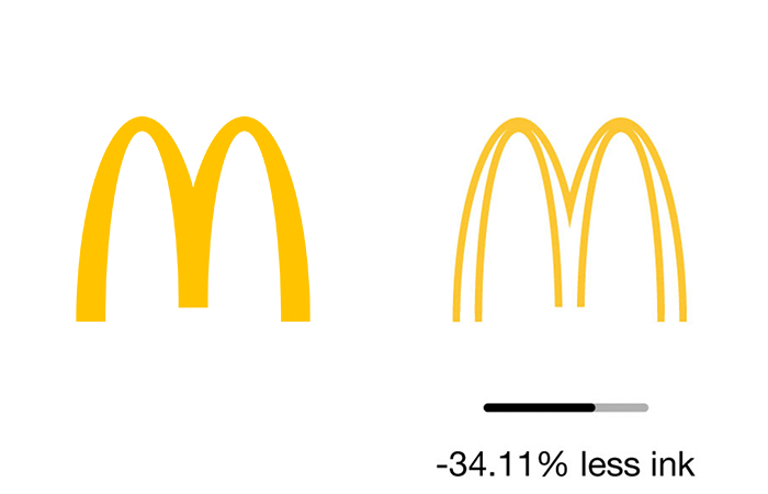
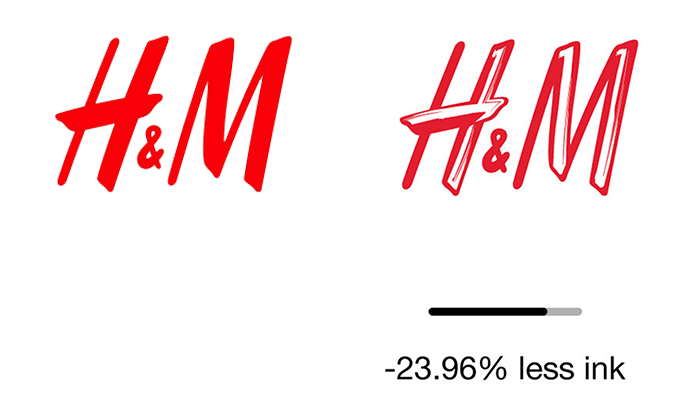
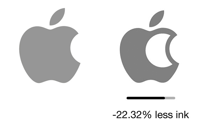
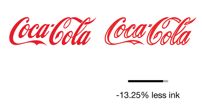
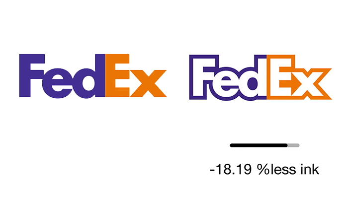
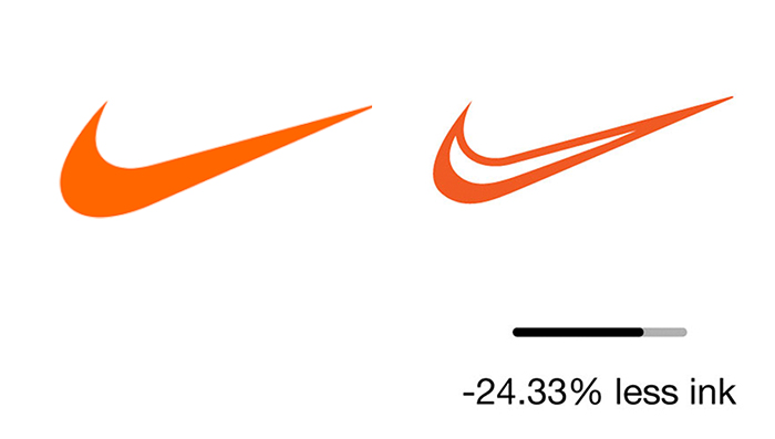
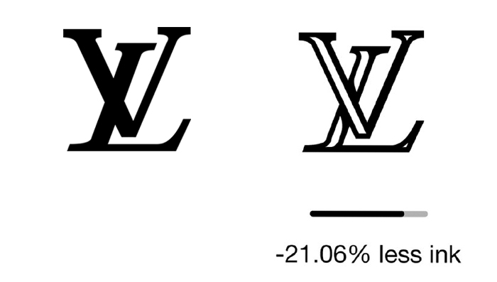
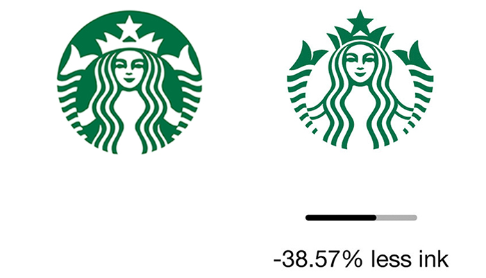
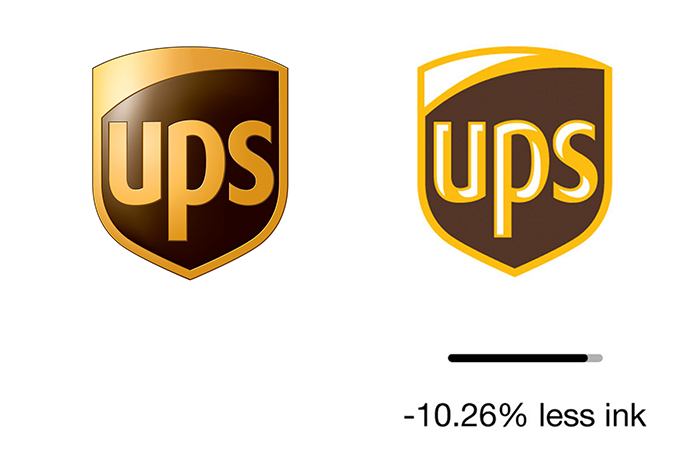
As you can see below however, there’s a simple way to reduce these costs, and that’s by using less ink. The idea, called Ecobranding, is a new conceptual experiment aimed at making brands more eco-friendly while at the same time saving millions of dollars in production costs. From McDonald’s and Apple to H&M and FedEx, the streamlined examples you can find here maintain the essence of each specific logo while simultaneously making it more cost-effective for both the manufacturer and the environment. How do you think they compare to the originals? Let us know in the comments below.
More info: Ecobranding (h/t: designtaxi)
Did you know that printer ink costs twice as much as Chanel N°5?
Ecobranding aims to reduce that cost by using less ink in logos
This will also reduce the environmental impact of printing millions of logos
McDonalds
H&M
Apple
Coca Cola
Fedex
Nike
Luis Vuiton
Starbucks
Ups
How do you think these examples compare to the originals?
1.1Mviews
Share on FacebookThis will never fly. Nice idea though. Corporations spend millions of dollars and decades to establish an recognizable logo and they won't go changing it without more millions of dollars and more years of research to decide if it's worth it.
I think you are right Ben. We humans resist change once we are accustomed to something we can identify with. I did not see any of the above that I would appreciate better than the existing labels.
Load More Replies...They look way better with the eco friendly touch to them! Like did you see the coca cola one!! LOVE IT!!
They look better, but it is nightmare for graphics and if you will optimalised it for small object, it would dissapear...
Load More Replies...UPS, H&M, Coca-Cola, and Luis Vuiton will not print right at a smaller scale. Some of the lines are too fine and too close to other parts of the logo, so the thin lines will end up running into the rest of the logo during the printing process.
Very good point. Companies use to want clean logos when printed small on stationary and business cards, and now they create logos that will scale down and look good in the icon for their apps.
Load More Replies...Wow less ink on a mcdonalds cup. Maybe there might be better things to demand from mcdonalds. Like maybe demand they don't allow rainforrest to be cut down for croplands to feed the beef on there burgers.
don't blame the game ,blame the player. No demand then no supply !
Load More Replies...Someone is an environmetal idiot. Optimizing out the ink, which is often water-based pigment inks, while not giving the plastic or styrofoam container a thought... Talk about having the priorities right..
It would be far more eco-friendly if consumers stopped buying so much of the unnecessary products that most of those companies churned out. I don't buy anything from any of the above.
Wow GENIUS! Like, not coloring in the tracework..? How DO they come up with this stuff!? Lol. Ok, with that unnecessary diss out of the way, this is something I've thought of quite a lot. Except with those enormous posters that are everywhere. Damn they gotta use a lot of paper and ink. All the stores around the globe that uses posters with special offers and what not, new ones every week!? Dizzying.
Except your reply doesn't address thinning out logos, but instead focuses on thinning out advertisement altogether.
Load More Replies...There are better ways to be more eco-friendly than this one, for example reducing plastic bags and use more ecological materials to pack products.
I wholeheartedly support this and love most of the results, especially McDonald's, H&M, and UPS. Apple and Starbucks need some more work ... they lose too much impact.
Logos are about visibility from a distance. These alterations make the logos less identifiable form a distance. It's like calling a car with one wheel removed better because it uses less gas.
Seems like a token change to me, especially in case of those huge companies, but I guess it's better than nothing.
How about leaving the symbols as is and branding, embossing, raising, engraving, or imprinting them without ink period. I'm pretty sure everyone would recognize the symbols and it'd probably look pretty damn cool for s**t to be branded or raised instead of colored.
frankly rather they keep the logos bold and strong. this idea of washing out is another wussification move.
Whoever thought that destroying a brand by altering its logo was a good idea? If you answered "yes," then don't ever expect to get a job in marketing (or last long if you do)!
OH, and what about the whole transparency issue when placing logos on top of imagery? The logos would simply melt into the backdrops. Bad branding, bad branding!
Load More Replies...Nice idea in principle, but even if the like of McDonalds could be persuaded to change their logo, they would obviously want a complete re-brand of the company. How many resources would it take to change every sign, every letterhead, business card, poster and other signage? Plus there's the wastage of disposing all the existing items bearing the old logos.
total waste of time. There are other techniques that can reduce ink and there are organic inks that can be used.
I love them! They are not only eco-friendlier, they are also much cooler than the original logos.
Rather misleading. "Printer ink" and ink used by printers on large presses is not the same thing, or the same cost, Additionally many commercial printers use plant based inks, which are eco-friendly,
They all look way cooler now! The FedEx one makes me wonder why it's not like that in the first place...
Really?? instead of worrying about the Ink you should be worrying about how to make the food more healthy.
The creator never thought of the process of actually using this advanced signed. The process of sewing them would be longer and harder using more energy. So... it's not that ecological in that sense.
That's interesting. You made an very important factor in your article, “Visibility is hugely important to brands…” Yes, that's so important but from a logo or brand identity design perspective, scalability (how well a logo can scale without losing details) at all touch-points of the brand is what's most important for achieving the former (visibility). So that scalability factor has to be considered as well.
Marketing decisions require more data points than just cost and environmental impact. Unless, of course, you have established those two things as your priorities.
One problem i see (besides the fact that I don't think they look as good) is that if you reverse them out amid a solid color or image, you're actually then using more ink. Negating the effect of the ink saved elsewhere. I don't know about all these brands, but with the brands I work with I find myself using the logo reversed out of a color or image just as much if not more than a 1 or 2 color job on white.
I don't often print out Logos so this doesn't apply to me, but I do wish that when companies give you coupons to print out from their web pages they aren't so bold that uses up a lot of black ink even if made smaller for a 5x8 index card size. They could certainly use a change like this to lessen the use of ink.
honestly i think the ones with less ink look better, stand out more, and are more eye-catching while remaining completely recognizable
Seems like a cool idea, some look better than others. We'll have to wait and see if it catches on.
I much prefer all the new eco versions. I'd go as far as saying that I don't think many people would actually notice the difference.
These logos all look fine backlit against a white background, but they need to work on many different surfaces against many colors. Silkscreen, printed, and embroidered are all applications that the logos have to work.
Its super nice, but branding just doesnt work like that. And its a very veeery basic idea of saving ink "just use less space", it doesnt work like that. How can you make them use less ink? make a type of print that uses less ink!
A logo is out there for simple reason that it is simple to relate to as a simple glance can make us think of the product and where the nearest store might be all from an image instead of a large section text to read. A picture speaks a thousand words, so they ecofriendly versions do look good, it'll probably not take off.
These look much nicer, AND they're more eco friendly?!?! This is an awesome idea!!!
I see other more consequential ways in which brands like McDonald's, Starbucks, H&M, Apple and Coca-Cola could be more environmentally friendly...
It would be more eco friendly if McD spend more money in eco friendly packages then a new logo-designs.
Most of these honestly look more modern and stylized in their reduced-ink version!
This will never fly. Nice idea though. Corporations spend millions of dollars and decades to establish an recognizable logo and they won't go changing it without more millions of dollars and more years of research to decide if it's worth it.
I think you are right Ben. We humans resist change once we are accustomed to something we can identify with. I did not see any of the above that I would appreciate better than the existing labels.
Load More Replies...They look way better with the eco friendly touch to them! Like did you see the coca cola one!! LOVE IT!!
They look better, but it is nightmare for graphics and if you will optimalised it for small object, it would dissapear...
Load More Replies...UPS, H&M, Coca-Cola, and Luis Vuiton will not print right at a smaller scale. Some of the lines are too fine and too close to other parts of the logo, so the thin lines will end up running into the rest of the logo during the printing process.
Very good point. Companies use to want clean logos when printed small on stationary and business cards, and now they create logos that will scale down and look good in the icon for their apps.
Load More Replies...Wow less ink on a mcdonalds cup. Maybe there might be better things to demand from mcdonalds. Like maybe demand they don't allow rainforrest to be cut down for croplands to feed the beef on there burgers.
don't blame the game ,blame the player. No demand then no supply !
Load More Replies...Someone is an environmetal idiot. Optimizing out the ink, which is often water-based pigment inks, while not giving the plastic or styrofoam container a thought... Talk about having the priorities right..
It would be far more eco-friendly if consumers stopped buying so much of the unnecessary products that most of those companies churned out. I don't buy anything from any of the above.
Wow GENIUS! Like, not coloring in the tracework..? How DO they come up with this stuff!? Lol. Ok, with that unnecessary diss out of the way, this is something I've thought of quite a lot. Except with those enormous posters that are everywhere. Damn they gotta use a lot of paper and ink. All the stores around the globe that uses posters with special offers and what not, new ones every week!? Dizzying.
Except your reply doesn't address thinning out logos, but instead focuses on thinning out advertisement altogether.
Load More Replies...There are better ways to be more eco-friendly than this one, for example reducing plastic bags and use more ecological materials to pack products.
I wholeheartedly support this and love most of the results, especially McDonald's, H&M, and UPS. Apple and Starbucks need some more work ... they lose too much impact.
Logos are about visibility from a distance. These alterations make the logos less identifiable form a distance. It's like calling a car with one wheel removed better because it uses less gas.
Seems like a token change to me, especially in case of those huge companies, but I guess it's better than nothing.
How about leaving the symbols as is and branding, embossing, raising, engraving, or imprinting them without ink period. I'm pretty sure everyone would recognize the symbols and it'd probably look pretty damn cool for s**t to be branded or raised instead of colored.
frankly rather they keep the logos bold and strong. this idea of washing out is another wussification move.
Whoever thought that destroying a brand by altering its logo was a good idea? If you answered "yes," then don't ever expect to get a job in marketing (or last long if you do)!
OH, and what about the whole transparency issue when placing logos on top of imagery? The logos would simply melt into the backdrops. Bad branding, bad branding!
Load More Replies...Nice idea in principle, but even if the like of McDonalds could be persuaded to change their logo, they would obviously want a complete re-brand of the company. How many resources would it take to change every sign, every letterhead, business card, poster and other signage? Plus there's the wastage of disposing all the existing items bearing the old logos.
total waste of time. There are other techniques that can reduce ink and there are organic inks that can be used.
I love them! They are not only eco-friendlier, they are also much cooler than the original logos.
Rather misleading. "Printer ink" and ink used by printers on large presses is not the same thing, or the same cost, Additionally many commercial printers use plant based inks, which are eco-friendly,
They all look way cooler now! The FedEx one makes me wonder why it's not like that in the first place...
Really?? instead of worrying about the Ink you should be worrying about how to make the food more healthy.
The creator never thought of the process of actually using this advanced signed. The process of sewing them would be longer and harder using more energy. So... it's not that ecological in that sense.
That's interesting. You made an very important factor in your article, “Visibility is hugely important to brands…” Yes, that's so important but from a logo or brand identity design perspective, scalability (how well a logo can scale without losing details) at all touch-points of the brand is what's most important for achieving the former (visibility). So that scalability factor has to be considered as well.
Marketing decisions require more data points than just cost and environmental impact. Unless, of course, you have established those two things as your priorities.
One problem i see (besides the fact that I don't think they look as good) is that if you reverse them out amid a solid color or image, you're actually then using more ink. Negating the effect of the ink saved elsewhere. I don't know about all these brands, but with the brands I work with I find myself using the logo reversed out of a color or image just as much if not more than a 1 or 2 color job on white.
I don't often print out Logos so this doesn't apply to me, but I do wish that when companies give you coupons to print out from their web pages they aren't so bold that uses up a lot of black ink even if made smaller for a 5x8 index card size. They could certainly use a change like this to lessen the use of ink.
honestly i think the ones with less ink look better, stand out more, and are more eye-catching while remaining completely recognizable
Seems like a cool idea, some look better than others. We'll have to wait and see if it catches on.
I much prefer all the new eco versions. I'd go as far as saying that I don't think many people would actually notice the difference.
These logos all look fine backlit against a white background, but they need to work on many different surfaces against many colors. Silkscreen, printed, and embroidered are all applications that the logos have to work.
Its super nice, but branding just doesnt work like that. And its a very veeery basic idea of saving ink "just use less space", it doesnt work like that. How can you make them use less ink? make a type of print that uses less ink!
A logo is out there for simple reason that it is simple to relate to as a simple glance can make us think of the product and where the nearest store might be all from an image instead of a large section text to read. A picture speaks a thousand words, so they ecofriendly versions do look good, it'll probably not take off.
These look much nicer, AND they're more eco friendly?!?! This is an awesome idea!!!
I see other more consequential ways in which brands like McDonald's, Starbucks, H&M, Apple and Coca-Cola could be more environmentally friendly...
It would be more eco friendly if McD spend more money in eco friendly packages then a new logo-designs.
Most of these honestly look more modern and stylized in their reduced-ink version!

 Dark Mode

 No fees, cancel anytime
















376
109