Most of us have a general idea of how we learn best. Some might retain information better by listening or taking notes, while others may prefer being hands-on with the topic or looking at tables and diagrams. When it comes down to it, there’s no one size fits all.
Today, visual learners are in luck because we’re looking at a subreddit called “Infographics,” a collection of data visualizations in various forms, like bar charts and heat maps. Full of colors and creative imagery, they’re both educational and fun. Scroll down to find the best ones that might change the way you see the world.
This post may include affiliate links.
Evolution Of The Alphabet
If I'm not mistaken it has to do with which direction text was written in. Ancient greek was originally written right-to-left like for example Arabic is today. It was also written in boustrophedon style which is when you alternate direction each line and mirror the letters too. Then some day Athens standardized left-to-right for some reason (including the flipped letters), and the romans took after during their time. Correct me if I'm wrong here. I am no historian unless we're talking Middle Earth.
Load More Replies...Ok, so just to correct something: This chart should be read from bottom to the top, because it's evolution of the modern WESTERN alphabet. So you can backtrack modern letters through older versions, but not all modern alphabets followed this route. As a result we ended up with a lot more letters and characters than what is shown here. Obvious examples would be various Asian characters, Arabic etc., but even within so-called Latin scripts of nowadays there are letters not listed here but widely used. The actual evolution of "alphabet" depends on the location and not always includes what this chart is showing.
Yes!! Exactly! Does not reflect the Norman invasion, or German!! This is not accurate…
Load More Replies...Worth remembering too, that even those countries using the Latin alphabet don't necessarily use all the letters. Welsh has no J (although it does appear in loanwords like jîns (jeans)), no K, no Q, no V, no V and no Z. Scottish Gaelic only uses 18 letters, although I can't remember what they are.
Absolutely. And many have characters not listed here, like Ł, Ó, Ś, ẞ, Ç, Ï, Æ and many many others
Load More Replies...Hmmm. I can finally hide that treasure and scatter clues everywhere properly now.
The Average Cost Of Insulin By Country
The bottom few are the only acceptable ones on the list. Makes me embarrassed for Canada.
$2 to 4$ to produce, as it is written on the bottle. Add to this other costs: transportation, maintain cold chain during transport and stock, margin for producers/distributor/reseller (salaries, taxes...)... I think $8 to 10$ is probably fair EDIT: I just talk about the price, not the other problem: "who will pay for it"
Load More Replies...Yeah, but at least the USA doesn't have that goddamn socialist universal health care.
No, we just make sure to bankrupt our citizens entirely, then complain when they have to resort to Medicaid. Yep, sounds better to me. 🙄
Load More Replies...It is disgusting that Americans have to choose between insulin or food in order to live.
The UK is incorrect. It's only in England where people pay prescription fees, and even then if a person has diabetes they get all of the prescriptions free of charge. (The prescription fee is what people in England pay to have medication dispensed. There is no fee for visiting the doctor, or for the medication.)
The graph doesn't state that the price is paid by the patient though. It is the price per vial, it can either by paid by the patient or by pharmacy/hospital for later distribution at no additional cost to the eventual user.
Load More Replies...I assume this is the cost that the labs are selling it because, in France, this is 100% covered by public health insurance.
In the UK it is free full stop. If you are an insulin dependant diabetic (IDD), then you are entitled to free prescriptions - even those not related to your diabetes.
Load More Replies...Something isn't right...Something isn- oh there's the USA at the very top. I thought it was just a red line for the label...
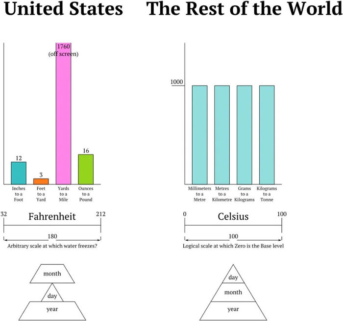
Measure System In The United States And In The Rest Of The World
The date format is worse in Canada because it is supposed to be day/month/year but because of how much we trade with the US, you'll see a combination of the 2 formats being used. So fun trying to guess the date for the 1st-12th of the month
The UK still uses an odd combination of metric and imperial. Most of us will give our weight in stones and our height in feet. Distance is in miles, unless you're running, in which case it's kilometres. Liquids are measured in millimetres unless it's milk or beer, in which case it's pints.
Very true, I know my height in feet and inches, my weight in Kilos..
Load More Replies...Not quite "arbitrary" Zero degrees Fahrenheit was chosen because it was the freezing point of a saturated salt brine solution, and 100F was chosen because it was human body temperature. Of course human body temperature is 98.6F but the instruments they had at the time were very poor and inaccurate.
"Not quite "arbitrary" Zero degrees Fahrenheit was chosen because it was the freezing point of a saturated salt brine solution," - so arbitrary then...
Load More Replies...I hope you've had time to read the book before it burnt, one of the best I've ever read
Load More Replies...We should have switched to the metric system long ago. It would make things so much easier.
To be fair, the farenheit scale isn't totally random: The 18th-century physicist Daniel Gabriel Fahrenheit originally took as the zero of his scale the temperature of an equal ice-salt mixture and selected the values of 30° and 90° for the freezing point of water and normal body temperature
Year month day is the actual format that makes the most sense. It's eminently sortable it's very easy to tell what comes before something else and it really is The Logical way
Listen, Fahrenheit was based on how humans feel while Celsius was based on how water feels.
Infographics are a creative way to display data that breaks up complex information into bite-sized pieces. For this reason, it can be a great learning tool in education.
For one, such visualization can hold a person’s attention for longer. As people are exposed to more and more information every day, it’s hard to keep them focused and prevent them from quickly moving on to the next shiny piece of statistics.
Just for us to imagine how distracting it can get, 2.5 quintillion bytes of data were created daily in 2021, according to The Next Tech. Therefore, infographics can help by taking an overwhelming amount of facts and presenting them with engaging images and colors.
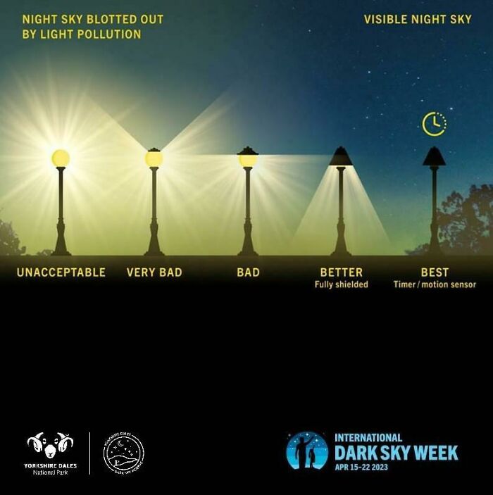
Best Kind Of Street Lamps
I wonder if OP has ever walked alone in a dark street under one of the "best" street lamps and hoped for her life that the next lamp would be working and then the next and then the next...
I personally prefer to walk in the dark without any street lights or in very dim lights...because then my eyes are adjusted to the dark and it's much easier to spot someone hiding in the dark if there is no difference in lighting between the person and me. The regular street lamps basically just light my path and me and make me easy to spot while making everything outside the path harder to spot, which doesn't make me feel safe *at all*.
Load More Replies...How this is affecting bird migration in the world it's incredible. There are a few research showing how just a simple light can change the ecosystem
And other animals. Lacewings, moths, fireflies, scarab beetles, crickets, grasshoppers, ant lions, some flies and mosquitoes. All migration patterns that were governed by moonlight have been destroyed by house and street lighting. Even turtles, I've been told. Sports stadium lighting is also awful.
Load More Replies...Those "best" lamp are freaking me out. They signal to everyone with bad intentions hiding in the shades "here I am, come get me".
Maybe but I still prefer these ones over the extreme light pollution we have in the Netherlands these days
Load More Replies...We’ve a lot of very important telescopes on the top of our tall mountain, so have always had very weak LPS street lamps. This past decade saw every lamp on our island switchover to LEDs, but they’re even dimmer than the old sodium. We’ve no air pollution and hardly any light pollution, which gives us amazing & unparalleled night skies.
It has been found in the UK that when street lights are installed in a village without them the crime rate increases, The safest streets are dark ones.
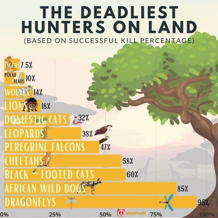
The Deadliest Hunters On Land (Based On Successful Kill Percentage)
They pretty much were once upon a time. Bigger, even, I think
Load More Replies...Dragonflies eat upwards of 100 mosquitoes per day, so they're cool by me. We always had them at our koi ponds that I built with my dad, in our backyard. They are so beautiful and fun to watch, too. AKA, Devil's Darning Needles.
We have a koi pond too, and loads of dragonflies every summer. I rarely, if ever, get mosquito bites.
Load More Replies...Cats kill birds like mass murderers. Keep your cats in doors and don't feed feral cats, try to send them to a rescue center.
If your area has feral cats, look at a catch, neuter, vaccinate and release scheme. Removing the cats from the area has no effect on the overall population as more will move in from elsewhere.
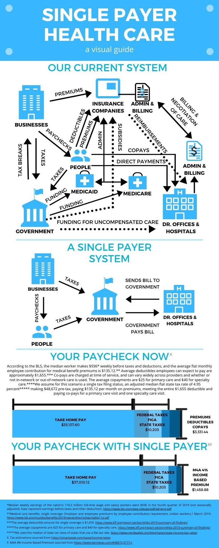
Load More Replies...The Current Us Healthcare System vs. A Single Payer System
Yeah we have a terrible system and its not likely to change anytime soon.
So long as the people I'm charge benefit from it, no, it won't. There's too much money flowing into campaign coffers for the government to have any incentive to change the system. The real difference between capitalism, communism, and socialism is which wealthy person takes all your money.
Load More Replies...Is this a USA bashing thread? I was hoping it'd be facts about the rest of the world and not how depressing the USA is. WE KNOW lol
Just imagine what would happen if even half of the people working in the medical insurance, medical billing, and medical debt recovery areas were instead re-trained to work in patient care, medical laboratories, as nurses, doctors, dentists, physios, ....
You couldn’t convince them. They wouldn’t get paid enough. Government workers have great benefits, but it’s kind of well-known that they pay less than private industry.
Load More Replies...Fixing our system would put a lot of people and companies out of work. The lobbyists for all those people and companies have a lot of pull and a lot of money behind them. And we all know that when money talks, ethics walk.
So is ANY welfare, such as unemployment benefit. Socialism isn't the problem (cf: Scandinavia); the demonisation of the term is.
Load More Replies...I opted out of the private health care system years ago when I found that the largest private hospital in the southern hemisphere was owned by the medical profession. Time was if there was cause to seek emergency treatment there, for a relatively small payment, immediate attention was provided and should hospitalisation be necessary, that payment was credited back to you.. Sadly this payment was increased by almost 4 times and was not credited back to you. Sort of made me feel that when the profession knew they had someone who was "insured for all treatment and services", the word spread around like s**t on a blanket with the result that bills would be sent for services provided that weren't provided. Even though I bought top family medical "insurance", I was always out of pocket. Now that I am older, wiser and closer to shuffling off, I am a pensioner with the best medical/hospital/ambulance services in the world, totally free of charge.
Besides, most people process visual material much faster and tend to recall it better.
Neuroscientists from MIT found that the brain analyzes an image in 13 milliseconds, making these visuals a great learning aid. Our mind also tends to attach emotion to pictures, which explains why the average person remembers 65% of visual information ten days later, while they can recall only 10% of something they heard ten days ago.
Furthermore, they often prove effective in education because they use images to highlight, explain, or enhance text-based information, which also encourages data retention for many learners.
15 Famous Cats In The History Of Mankind
Poor Oscar "Unsinkable Sam" must have wondered why they kept bringing him back onto boats!
Morris the 9 Lives cat was mega famous in the 70s and 80s! He should be on this list. morris-65c...14f748.jpg 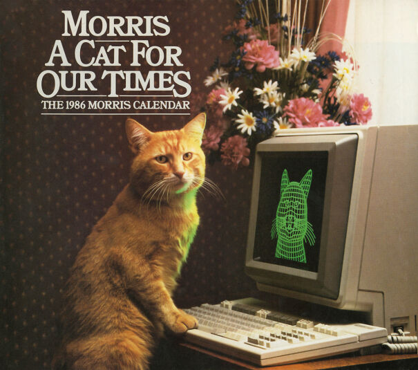
Poor Felicette! I am happy that she survived but she must have been filled with so much fear during her space travel. It is horrible that they did this to her. If humans want to travel into space let them take the risks and keep cats and other animals out of it!
It's worse than this. Look her up. Warning: It is sad.
Load More Replies...Audi and I are the most famous cats. We're on BP and everything!
Is this the cat that outlasted the employee who wanted him removed from the library?
Load More Replies...In 1999, I went to Hemingway's house in Cuba. It was overrun by polydactyl cats, like his place in Key West. The house was beautiful. It was decorated with books and trophy heads. (See photo) Picture-07...5b626d.jpg 
Dont't forget that Turkish cat that used to hang out in a certain position. They made a statue of him.
Tombili - Turkish for chubby - was a street cat from Istanbul. That statue shows him in the position he liked to sit in. So cute
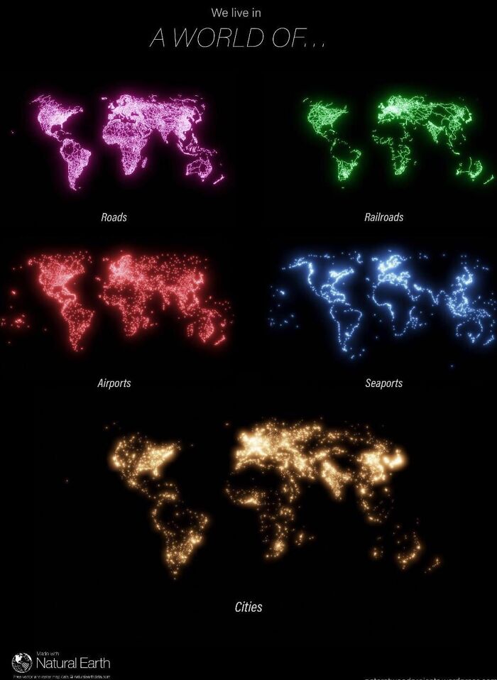
Load More Replies...We Live In A World Of
Yeah, but none inland. I mean, are they even trying?
Load More Replies...ATTENTION ALL PLAGUE INC. PLAYERS: GREENLAND NO LONGER HAS A SEAPORT, WE ARE ALL DOOMED.
What??? How the hell are we supposed to infect Greenland then???
Load More Replies...Meh, everybody should know that we're living in a world of fools, bringing you down.
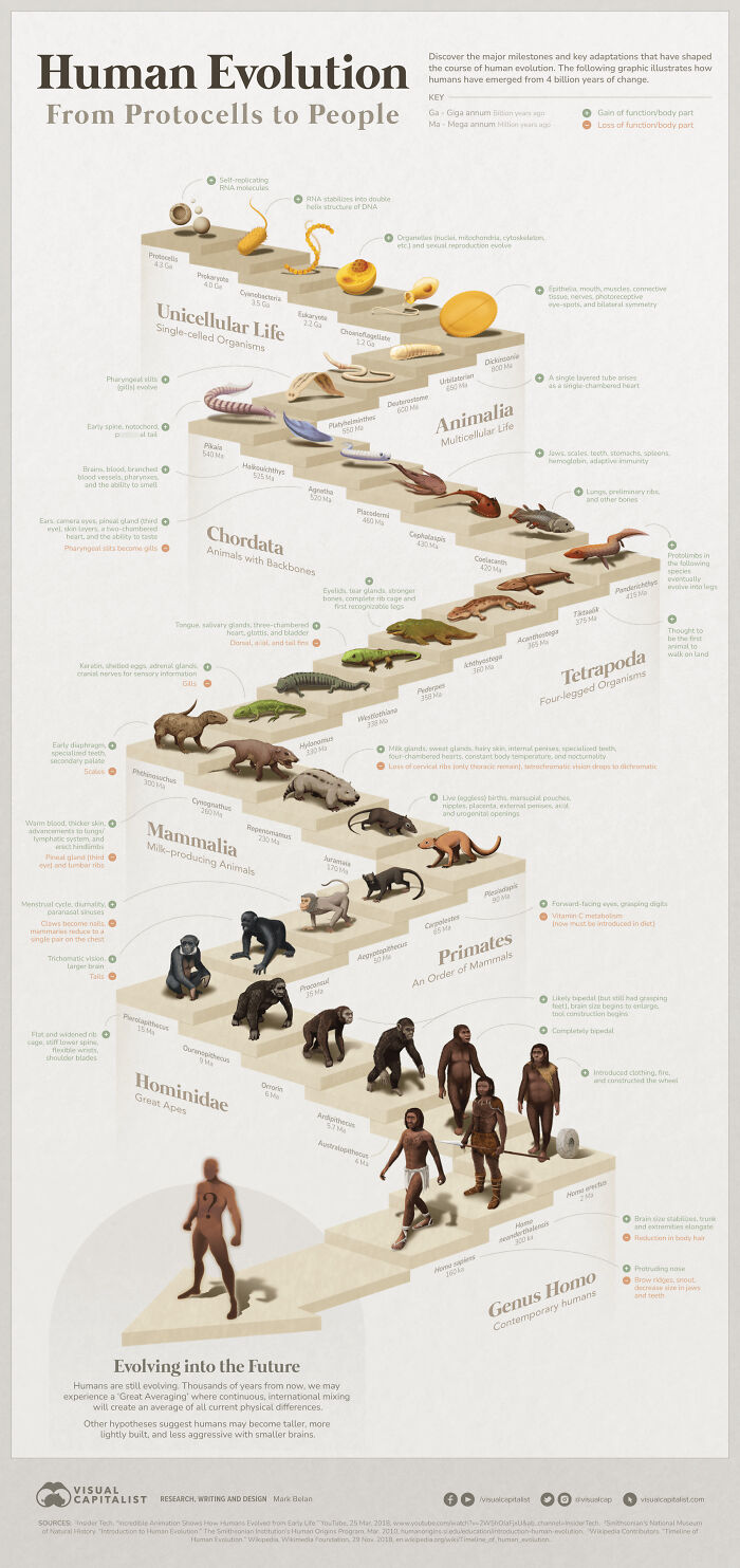
Life From Single Cell To Naked Ape
What about Jews and Muslims? They also believe the creation myth. Ohhh..... I forgot, you're only allowed to mock Christians on BP. Note: I am not a Christian, but I despise selective bigotry.
Load More Replies...Eep! Those apes are naked! *covers her eyes with her tail*
It would be better if we could actually read the fuzzy lil letters.
https://www.visualcapitalist.com/path-of-human-evolution/
Load More Replies...This is brilliant! I love how it weaves back and forth from Domain(ish) through Kingdom, Phylum, Superclass, Class, Order, Family and Genus.
Looking at it in detail, it is startlingly accurate. There's still a big jump between 170 million years ago and 90 million years ago. We need a few more fossils there to help fill in the gap.
Load More Replies...Hmm I don't think this is very accurate 🤔 Neanderthals were a sister species to homo sapiens, not its direct ancestor. And well, homo sapiens interbred with homo erectus, denisovians (another sister species) and neanderthals so modern day humans tend to have some genetic mix from all of them. It's really not the straight walk forward like this portrays.
There are a lot of inaccuracies and straight-up incorrect information in this. Many of these 'ancestors' may have had nothing to do with our lineage at all. Tiktaalik was not the first animal to walk on land, it is the first *known* *vertebrate*animal on land. Millipedes and other invertebrates preceded it by a huge margin.
Load More Replies...In addition, these visuals can be applied for a variety of uses. They are ideal for foregrounding important events in a historical period. They help us understand how certain occurrences interconnect and influence each other and how they have affected the world.
By using infographics, number-heavy statistics can be made more interesting, and adding diagrams and short text makes them easier to process and remember.
Everything Owned By Nestle
Saved the image for future reference in store (what to avoid).. 👍
Load More Replies...I've been boycotting Nestle for over 25 years. It's good to be reminded of how far their reach is.
I don't think this graph shows it all. There's likely something you've bought that is either Nestle owned or owned by a parent company.
Load More Replies...At least twice I had the thought, "wow, that's a lot of companies...oh wait, there's more" as I slowly kept scrolling.
I am so glad, out of this list I've only bought 2 in the last several years. But now I will mark diogornios and hot pockets off my shopping list ✌️
Getting away from their pet products was the hardest for me. I pay a lot more for pet food but I don't care. It's worth it.
Shouldn't it be illegal for a company to get so big? They keep acquiring brands as well. I used to take Minami fish oil, it was a decent Belgian company which harvested the fish in an environmental safe way, but I recently discovered they're part of Nestle now. Can't find anything anymore where the fish is cought and if it's done environmental friendly way. So no more Minami
I'm testing krill oil right now, don't know if better for [insert any word]. (me, animals, environment, etc cetera). I'm thinking it's a swe company, bit who really knows if someone owns that company in the background..
Load More Replies...It’s why boycotting them is so hard. a lot of people’s only fresh water and baby formula comes from them.
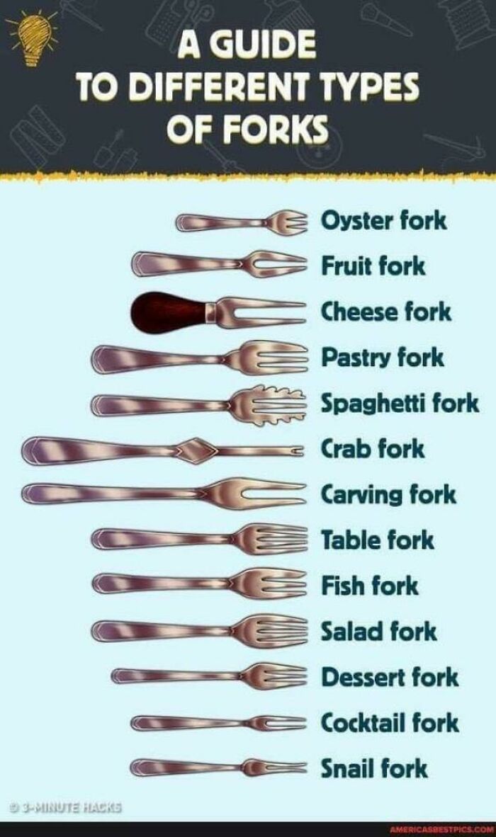
Guide To Different Types Of Forks
Like Rose told Jack in Titanic, "Just start from the outside and work your way in".
It was Kathy Bates' Molly Brown, not Rose. Brown had been a commoner who had come into money and had to learn, much like Jack was, how to behave in upper society.
Load More Replies...Must be caught up in legal limbo with the spoon people.
Load More Replies...I don't see right-side-up forks, upside-down forks or parallelogram forks. This makes me sad, as it may lead to the believe that eatery is the only field of forkery. Which ain't.
I prefer to call the 'forks' with 3 tines "threeks" and those with 2 tines, 'two-ks.'
The Best Company Name Changes
Fun fact, a Swedish hydraulics company was until 2010 named Nike Hydraulics. The other Nike once tried to make them change, but couldnt do anything due to the fact that the Swedish company had that name since 1924.
I'm also wondering, since Nike is the name of a Greek goddess, how anyone could own that name...
Load More Replies...I worked for a company called MGM Assurance. We had a letter from the film maker MGM who told us to cease and desist using "their name". We had to write back telling them we were the oldest British registered company dating back to the 1850's. Just a bit longer than them! Didn't hear from them again. Sadly after many rebrands the original company no longer exists.
"Who want's a cold, refreshing sip of Brad? C'mon, Brad's Drink and Pete's Meat Sandwiches. The combo of dudes. It tastes much better than it sounds. I am not a deviant, please quit screaming. Why are you running?"
I didn't know LG stood for Lucky Goodway. I thought it meant Life's Good
It's a good thing Blackberry didn't do search engines using their old name. We'd be R*****g a lot otherwise.
Teachers can also use them as assignments for homework. Giving students a long text and letting them transform it into something more appealing provides them with the opportunity to be more creative and shakes up the ordinary routine.
While doing it, they also conduct research and try different applications of information. As a result, learners demonstrate critical thinking by filtering data, identifying patterns, and presenting carefully curated projects.
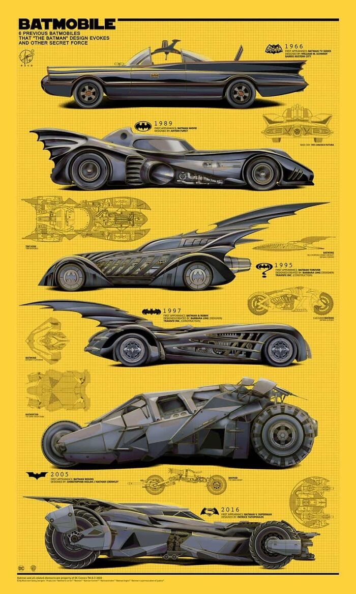
Batmobile, From 1966 To 2016
For me '89 version. Others are very nice too but that one for the win.
they kind of came back to it with the 2016 version. '89 is more elegant
Load More Replies...The original ‘66 is the absolute best no question, that was a hell of a design. If we’re being pedantic tho there was another Batmobile back in the 40s
It was a sharp change in direction. Nolan went for a "gritty and realistic" style and the car had to reflect the choice. They went for a style that mimicked the military design, and the Tumbler was conceptualized from the ground up as a vehicle that could realistically do the stunts it was designed for (and it did, they built a rolling chassis that was almost fully functional). The older designs were visually cool but insanely impractical (excessive wheelbase, jet engine, weight balance all over) and could not fit into the new direction of the franchise.
Load More Replies...I will love the '66 version forever. It's the comfort food of Batmobiles for me.
I'd love to have the theme music when I rode around in the Adam West version.
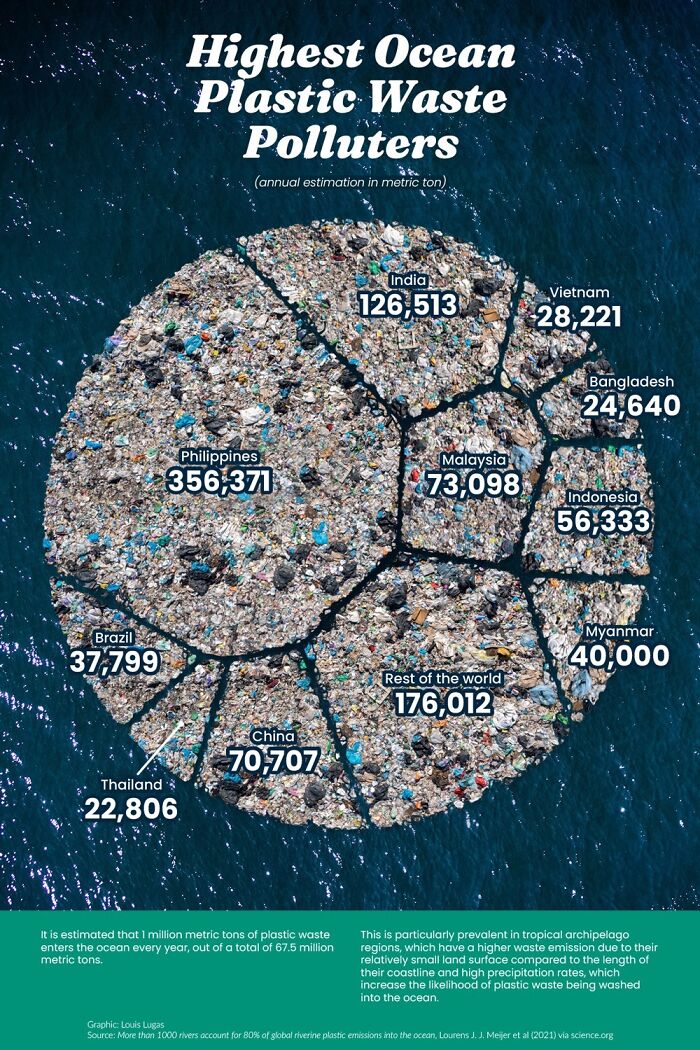
Highest Ocean Plastic Waste Polluters
Most large economies export their trash to these "highest polluters". The USA sold millions of tons of trash to the Philippines in 2020, most of which ends up in the ocean and the US doesn't have to take any responsibility for their own waste.
I assume we're not selling them the trash, but they're selling us the service of taking the trash? Seems a poor economical idea to buy something you're intending on just dumping into the ocean.
Load More Replies...https://worldpopulationreview.com/country-rankings/plastic-pollution-by-country - in 2016, USA was the country that produce the most plastic waste in the world (34 million tons), India was second (26 million tons), and China third (21). Per population, in 2026 USA was one of the biggest plastic polluter in the Worlds.
That doesn't change the facts of how much of that plastic ends up in the ocean.
Load More Replies...Yeah right. That's what I used to believe. Until I looked at a survey of plastic waste actually collected from the middle of the Pacific Ocean. More than half of all ocean plastic waste is washed off fishing vessels. Floats, buoys, nets, ropes, crates. The amount that came from Pacific Island Nations including the Philippines is small by comparison.
Complicating that, though, is that there's a survivorship bias in ocean plastics: floats, buoys, nets etc are made to survive in the oceans without breaking down, while consumer-grade plastics degrade into fragments and ultimately microplastics, which escape the survey nets. The ocean garbage patches are like minestrone soup, not floating island masses.
Load More Replies...Good thing we banned plastic straws in Canada and saved the oceans from 0.0000000001% of plastic waste
Thank god disabled people can't get plastic straws to drink with anymore. Their contribution is massive! /s On a more serious note. Taking responsibility for our plastic use is good, but we need to hold the companies that produce it responsible too, and we need to stop exporting our problems to poorer countries instead of dealing with it ourselves.
Yet the U.S has the highest plastic waste output per capita, at 130kg per person ( 43,550,000 metric tons) per year, most of which is shipped off to other countries under the guise of "recycling" but as BTDubs has said, the real purpose is to shuck responsibility for it. The image gets the amount of plastic that ends up in the ocean, wildly incorrect, the actual estimate is OVER 14 million metric tons....out of the over 400 million metric tons being produced, globally, per year.
History Of Rising Temperature
xkcd has an even better representation of this: https://xkcd.com/1732/
What's really scare is the ones found standing with food still in their mouths and/or undigested food in their bellies.
Load More Replies...This is an old outdated map NASA no longer uses because it relies purely on the discretied work of Michael Mann which the IPCC now has fully disowned. For more accurate info look here http://www.atmo.arizona.edu/students/courselinks/fall12/atmo336/lectures/sec5/controversy.html
or at the graph attached courtesy of the U of Arizona loehle_fig...26924e.jpg 
Well, the last glacial period ended 10,000 years ago so there's that. We can play devils advocate and show history of temperature, not just rising temperature, over the past 1,000,000 or 500,000,000 years to present and the chart would look very different. I'm not a human impact climate change denier, though the earth has been much warmer and much colder throughout its existence than it is today.
128 Years ago, two scientists, Arvis Högbom and Svante Arrhenius, calculated how much carbondioxide was emitted by combustible fuel and how much that contributes to global warming. Those calculations are still grosso modo valid.
Load More Replies...NOT saying there isn't a problem currently, but always question the timespan used on any graphs like this. Why does it stop at 22,000 years? Below is a link that shows a longer period. Pretty cyclical BUT still concerning! Do your research - always! https://www.researchgate.net/publication/356606430/figure/fig3/AS:1095462799060993@1638190092136/Global-mean-temperatures-over-the-last-500-000-years-11.ppm
Interesting. Thank you for that. So then I need to ask what were those conditions like on Earth during the peaks seeing as that graph seems to show we are back at a peak? Were they liveable for humans? Will they be survivable if we have not got to the next peak and it will be going higher? Were large chunks of the Earth uninhabitable for those peak periods? Were there extreme weather events just swinging from extreme drought to flood and back until cooling started to "even things out" a bit more? Genuinely curious
Load More Replies...If it so happens that children are only taught through lectures or text, teachers are neglecting 65% of visual learners, and they miss the opportunity to increase retention rates, which are essential in the assessment strategies of schools.
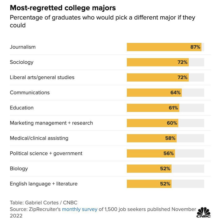
Something To Consider Before Enrolling
Journalist student here, I wasn't sure what I wanted and it was very diverse, also I always loved writing. Do I regret it? No, it was interesting and really fun adventure as we worked for local radio and did many fun projects. Was it useful for my future career? Also no xD
So over 50% of graduates of the more popular degree courses regret their choice? It's almost as if asking 18year olds what they want to do with the rest of their lives might be a bad idea? Maybe real world jobs are so niche that most peoples degrees are practically worthless but somehow necessary for entry level positions in unrelated career paths. The system can't be wrong though ...right??
It's almost like treating 18 year olds as adults.
Load More Replies...Can confirm. I have a wildlife biology degree from a top school in that field. I make way more money as a welder.
It all come down to : do you work for money or because you like what you do? Pretty sure wildlife biology is more fun than looking at light that can blind you all day...
Load More Replies...For job satisfaction, you may want to skip higher education altogether and learn a trade. Especially if you aren't that bookish to begin with, and you learn best while doing things. ▪️▪️▪️Here in the Netherlands companies are begging for builders, electricians, metalworkers, installation technicians, and lots of other hands-on jobs. They offer on-the-job training, and their starting salary is better than that of a college graduate.▪️▪️▪️There are also many learning on-the-job projects for people who want to go into healthcare. It doesn't matter if they quit school or are switching careers. There's a big shortage of nurses, caregivers, and assistants. You can choose how theoretical you want your job to be. Love the technical part of the job? Become a specialised nurse. Like a hands-on job where you mean a lot to people? Become an assistant who helps people with their daily life tasks: getting dressed, making breakfast, grooming.
Certain trades do require quite a bit of math, mine does (tool and die maker)
Load More Replies...I am a journalism graduate and I've never regretted it. First of all, it gives you lots of skills that are useful outside of journalism itself (writing, graphical design, working with certain software). Second, it stimulates creative thinking and improvisation. And lats but not least - journalism majors were the coolest people at the uni and it was an honor to be one of them :)
Kind of like History, it give you a better critical sense, and amore rigourous way of approching facts, something desperately needed in those times where fake news are KINGS!
Load More Replies...I have a polisci degree. I don't work in the field, but I learned a whole lot of info that is helpful for pretty much any field. I love that I understand the intricacies of how government works. I regret that so few others do.
I’m a multi-hyphenate creative with degrees in each field and my career encompasses all of my specialties. I was told I would regret it and to choose something more sensible, like one of these majors listed here. Ha! Thank god, I didn’t listen. Now I’m building a career that I truly absolutely love with an amazing network from my studies!
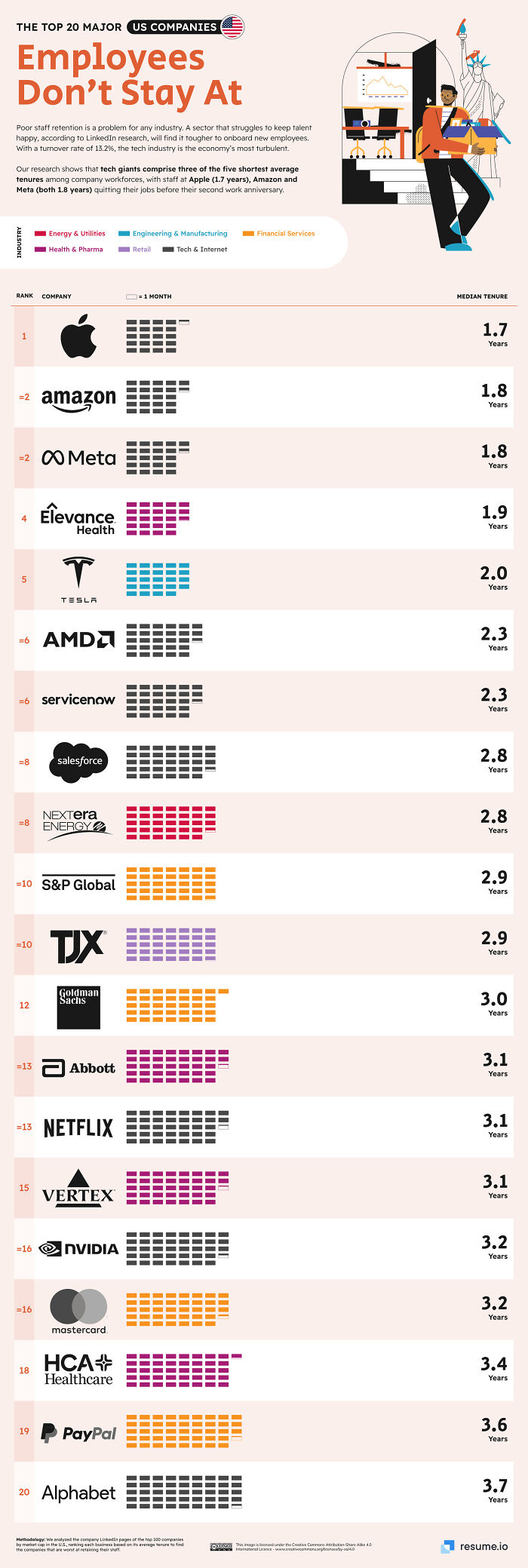
Top 20 Major Companies In The Us With Worst Employee Retention
I can attest to the #1 spot. I worked there initially on a business team and then in retail. Horrible and verbally abusive. Age discrimination as well. Told them to pound sand after less than a year.
So it's almost like if staff are treated poorly then they're less likely to stay and then fewer people will apply to fill those vacancies once word gets round. Interesting. 🤔
Except all this companies have a lot of people applying. It’s more of a case of tech companies poaching/giving raises to new hires instead of to older employees so job hopping is rampant
Load More Replies...I think a lot of this has to do with MBA-having managers. They have zero concept of what the employs they manage actually do.
A lot of it is poaching amongst these same companies for talent, instead of giving real raises to existing talent
Load More Replies...When there is no management support or any effort made by management, yeah you'll leave pretty fast.
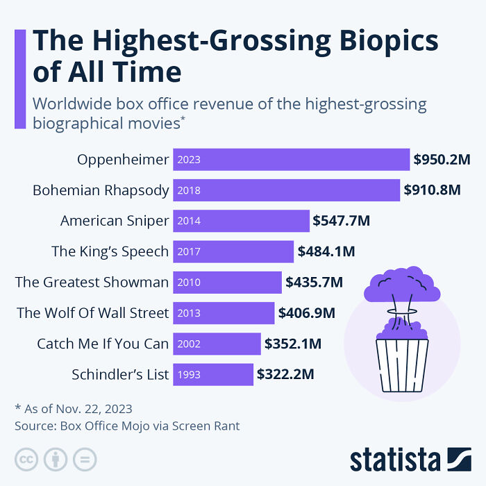
The Highest-Grossing Biopics Of All Time
I'm surprised Schindler's List isn't higher. Does this list account for inflation?
The total for Schindler's List is the worldwide box office from 2001 data, so definitely not. Also doesn't count the 25th anniversary rerelease which grossed 500m USD.
Load More Replies...Hasn't Catch me if you Can now been found to have been mostly fabricated by Frank Abagnale Jr?
is this the real life is this just fantasy? caught in a landslide no escape from reality.
Open your eyes, look up to the skies and see....
Load More Replies...American Sniper shouldn't even be on the list with all the misinformation it perpetuates.
The greatest showman is my favourite film but would you really call it a biological movie. I know it's about a real person but how factual is it?
Love it too but it compresses too many of his life events into a much shorter timeline, and fabricates some events while glossing over some of his less-than-desirable qualities. But the soundtrack is awesome and the performers are amazing! Especially some of those dancers!
Load More Replies...Even though infographics might seem intimidating, there are plenty of tools online that can be helpful, such as Infogram, Canva, Easelly, and Edraw.
Their designers advise having an outline before starting the creative process. Try to decide which points are essential. Then, you can move on to ensuring that the readers are guided through the visuals and that the story you’re telling is coherent and has a gradual ending.
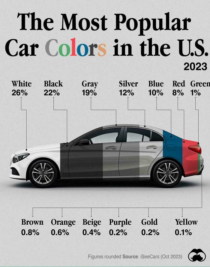
The Most Popular Car Colors In The Us
I miss the look of cars in the fifties- seventies. Not the pollution though. All those white, grey, black cars are so boring. Ours is bright blue and I never have problems to find it at the parking lot 😀
That's because manufacturers only SELL cars in white, black, gray and silver! It's getting quite long in the tooth, but I love my dark green Subaru.
I make car paint and red is very expensive to make and white is the most inexpensive to make
Anybody noticed how colour options changed in last 15-20 years? It used to be white, black, silver, and the bright, vibrant colours - green, yellow, blue, red. Nowadays you got three shades of primer grey, two indistinguishable whites, with odd blue or red.
I've never bought a new car, so other people are deciding this for me. I'd probably go for more unusual colors if I could.
Surprised red isn't more popular. Also surprised black is so popular. I can't imagine owning a black car here in Texas. It would get so hot inside one.
I can't understand why so many people here in Texas have black cars. And roofs! All my neighbors are getting black roofs. They are annoyed with me for getting a light colored roof because we all won't match!
Load More Replies...My cars have been red, tan, silver, silver, green, and white, in that order.
Green, light blue, grey/silver, dark blue, red, silver.
Load More Replies...Silly gauge. Personally I've bought cars that were available.....and most of the options are black, white, gray & silver.... sooooo guess what colors I've always gotten. Betcha lots of folks are the very same.
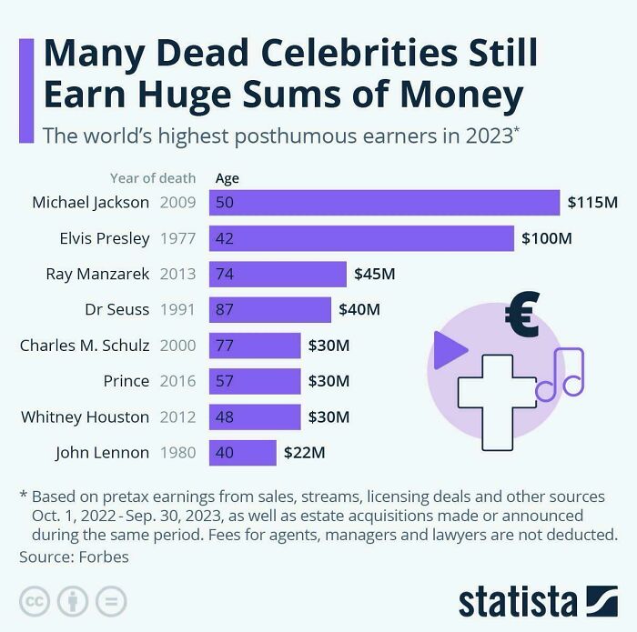
The Highest-Paid Dead Celebrities Of 2023
Hey! Elvis isn't dead! He's retired and living the quiet life in Erie, Indiana.
Elvis lives on through the impersonators. A group of these are called Elvi. ELVI-65ccb...5-jpeg.jpg 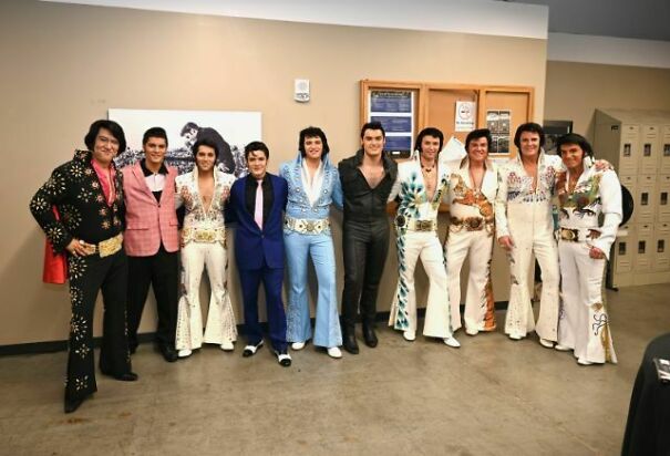
I had to Google who Ray Manzarek was. Haven't heard of him and he's #3 on the list!
I was going to ask how anyone could not know who Ray Manzarek was. Then I realized how old I am. Interesting that he's on the list though. The man was a musical genius.
Load More Replies...Same for Charles M. Schultz of Peanuts fame.
Load More Replies...Would have to have been to put up with Jim Morrison.
Load More Replies...why do we have to pay to the family members of dead artists? they successfully lobbied for a kind of income protection that nobody else has (think inventors or just ordinary people), without any kind of effort from their side. 70 years after the dead of the artist or 90 years after the release of the original art... We would still be paying royalties for the invention of the jet plane...
It's the same thing as giving someone your will, yes they earn passive income but so do many people from their dead relative's wills
Load More Replies...Coca-Cola vs. Pepsi Revenue [oc]
This is across all brands though and Pepsi has a ton of brands that aren't Pepsi. Not just beverages like Mtn. Dew and Gatorade, but they own DORITOS and Frito Lay. They own Rice-A-Roni and Quaker Oats. They are a massive food conglomerate.
Another example of how the presentation of data/statistics can be very misleading.
Load More Replies...I prefer US Pepsi-- BUT Pepsi where I live now in Australia is owned by another company (Schweppes) and it's just not as good. So I prefer Coke... in Aus, Even though it's at a higher price point. In fact, Coke is winning in Australia pretty hard, i'd say.
I have no idea why! I drink Pepsi Max, as I am diabetic, which I MUCH prefer to Diet Coke or Coke No Sugar. My niece, who is also diabetic, prefers Pepsi Max. I have bought several Pepsi varieties in the US, but I still prefer Pepsi Max in Australia. USA Pepsi Max is OK.
Load More Replies...Out of the two, I prefer Pepsi. My go to drink is Dr Pepper (Coke product... so kind of funny).
Kinda misleading since PepsiCo has a ton of non-beverage brands making up that huge yearly total.
As for the aesthetic part, a step in the right direction would be choosing the right fonts. Two are more than enough – one for the title and one for the body text. A more fun and decorative one can be used for the header, while the remaining information can be formatted with a simpler one so it’s easily readable. The typeface should also reflect the topic. Storytelling that’s more youthful and entertaining deserves a font that portrays this.
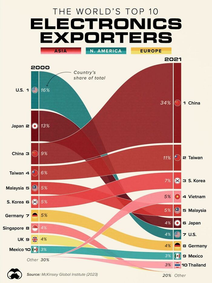
The World’s Top 10 Electronics Exporters
This chart is brought to you courtesy of US corporations who exported all their labour to Asia because it was cheaper. The CEOs keep getting their million-dollar bonuses while the workers get screwed. How's that end stage capitalism working for you?
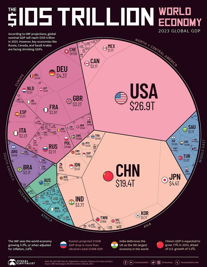
World Economy
The USA's national debt is $34 trillion, China's is $370.7 billion. So technically the USA is losing money and their main competitor is making a profit.
Chinas debt is far far higher than that. It's a faked number. I suspect they're real dept is double the USA.
Load More Replies...The largest market is the US. Most of its products are now made in China. Harking back to the 1950s, most products were made in the US; leading to its economic standing. This has now been handed on a plate to China. Result?
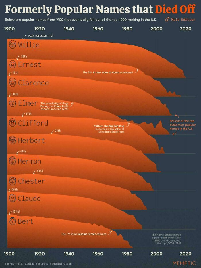
Popular Names That Died Off On The Us
I live in the U.S. and met a German Shepherd dog their owner named Adolf....didn't know how to feel about that.
Load More Replies...Some of these might actually come back pretty easily. All you need is a succesful series with a popular character named Chester, or Herbert, or Claude or something and a whole bunch of babies will be named after them.
MIght not be true everywhere, but usually names die off and then come back after 3-4 generations. Noone wants to name their child the same names their own parents' generation go by. Once the name is associated mainly with one's great-grandparents its again free to use.
Load More Replies...It says male edition in the top right corner, so there's probably a female edition somewhere.
Load More Replies...Willie as a given name (not an abbreviation) hasn't gone away, it's morphed into William and Will.
Yep, my dad's names are Wilhelm Angela Carolus. They ran out of male family members to name him after, so he was named after an aunt whom he hated. She was a real battleaxe 🤭▪️▪️▪️I was the firstborn on both sides of the family, so I got both my grandmother's names. They abbreviated them into Marie-Ceciel. My sister had to make do with Wilhelmina.
Load More Replies...These days, most young people name their kids some form of "tragedeigh"
Quoting Steps (I think). When your a**e is tight and you need a shite its tragediegh.
Load More Replies...For my BP friends, please enjoy playing with one of my favorite online pages - used to be the Baby Name Voyager, now is NameGrapher (https://namerology.com/baby-name-grapher/). You can see how a name's popularity waxed and waned since the 1800s.
Tried it for D**k, following another Panda's comment. It gave me a big, thrusting peak in the 20s and 30s with "D**k" written across it. Subtle!
Load More Replies...I always think of Clarence Worley from True Romance. In the voice of Drexl Spivey...
Load More Replies...🎶 Vera, Vera, what has become of you? Does anybody else in here feel the way I do? 🎶
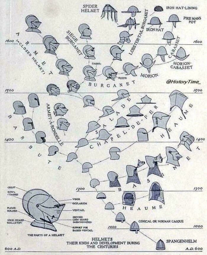
Load More Replies...Evolution Of Helmet Design
The implication seems to be that the helmet was invented in 600 CE. Did the Romans and Greeks wear tam-o'-shanters into battle, then?
They wore metal hats not helmets. Big difference
Load More Replies...The same goes for colors – try to keep them visually appealing and stick with three or four that work well together. Finally, the goal with these visual aids is to portray data in a simple way, so don’t overcrowd it. Leave plenty of space between images and statistics, and use as little text as possible.
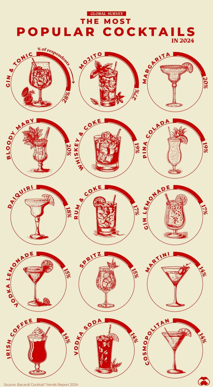
The World’s 15 Most Popular Cocktails
Jynnan tonnyx. Other versions of the name include gee'N'N-T'N-ix, chinanto/mnigs, tzjin-anthony-ks, jinond-o-nicks and gin-and-tonics.
That's enough Beeblebrox, you'll give the game away.
Load More Replies...I never considered combos like G&T, rum&coke etc as cocktails - only those with 2 or more different alcohols in them.
I ordered an Irish coffee in Dublin. Did not realize the "Irish coffee" I made at home (with Bailey's) was not the same as the bar's (with whiskey). It was...educational.
I've always made Irish coffee with whiskey. USA here, but then I am of Irish descent.
Load More Replies...I am a bit confused about the percentages. And G&T for the win. They are so refreshing and hard to mess up.
Unfortunately some people can mess up the good old GnT.
Load More Replies...Nvm, just saw BookFanatics comment, I thought it referred to the Irish coffee "coffee with a dash of Bailey's" style
Load More Replies...With all-you-can-drink mimosa brunches, this is surprising. Never been to an all-you-can-drink gin and tonic dinner.
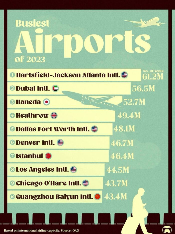
The Busiest Airports In 2023
I remember when O'Hare was busiest in the world. Doesn't seem that long ago.
According to sources that was from 1963 to 1998. It's funny how 25 years ago can feel like yesterday.
Load More Replies...I'm sure this is where Delta are based and it is also main cargo hub for them
Load More Replies...Someone once told me it doesn't make any difference if you're going to heaven or hell, you will have a lay over in Atlanta.
!@#$%!!! You beat me to it. :-) Except that I heard it as "if you die in the South..."
Load More Replies...There are so many different ways and metrics to calculate "busiest" - seats, flights, tonnage, destination, layover, etc.
According to Wikipedia, Haneda was the world's fourth busiest airport in the world in 2018 but not even in the top ten in 2022. Perhaps it was closed for Covid?
I'm really surprised Haneda is on this list but not Narita. Haneda is the older Tokyo Airport, and I had thought it mostly handled domestic flights.
Load More Replies...Had a stopover in Atlanta in 1998 at 4AM on a Tuesday... possibly the only time you could find that place silent.
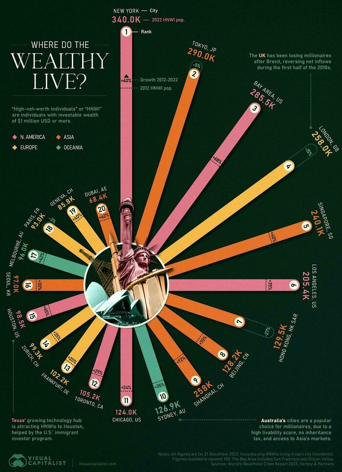
Cities With The Most Millionaires In The World
That's where I'd want to live! I think. I've never been
Load More Replies...Unless you're earning that annually, being a millionaire just ain't what it used to be.
When a townhouse of 1400 square feet (130 square meters) goes for over a million dollars, you realize that a million dollars isn't "rich" anymore. It tends to be "comfortable", but not what most people would think of as "rich".
Load More Replies...This is such a stupid chart, almost anyone who owns a home outright in Toronto is a millionaire even if their income is negligible
These are all cities that are expensive to live in, ofc people will be richer there. It doesn't mean they're more well off, because I'm sure their percentage of money spent on food, rent, healthcare, insurance, and more would be the same as ours
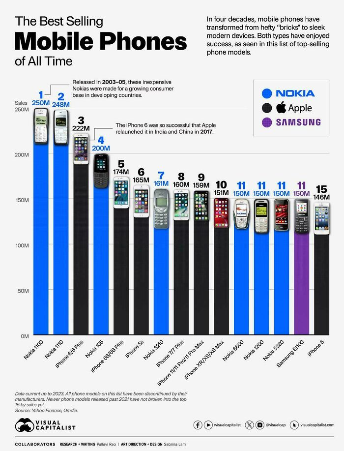
The Best-Selling Mobile Phones Of All Time
Good to see the old Nokia bricks still at the top of the list.
Well, yeah the Nokia 1100 is the highest. It was one of the only cell phones available at the time.
Nothing can defeat Nokia. Time, running them over, dog eating it, nothing.
Where... Is the 3310? Judging by the amount of memes made in it's honour I'm surprised it didn't make the cut
I actually had a customer today, an old guy, with a Nokia phone, still working.
My daughter and I used to have one of the brick phones, they lasted through everything: the washing machine, the dryer, being thrown against a wall, being stepped on by a horse, cow and sheep.
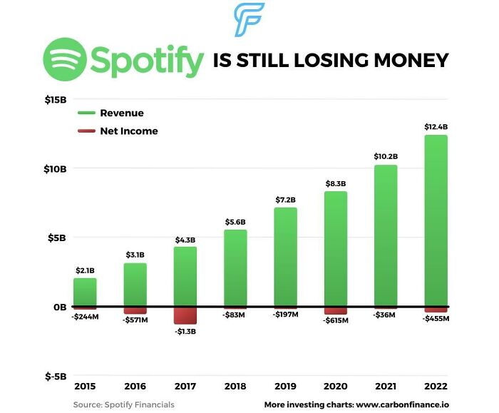
Spotify Still Can't Make Money
Yet their founder is a billionaire and now they won’t pay anything if you get less than 1000 streams even though they pay next to nothing per stream.
The payment rates are negotiated with distributers / labels, so blame those, too. Without those agreements Spotify can't stream (legally).
Load More Replies...Switched to Tidal long ago. It may cost more, but it is well worth it if you are an audiophile.
Is this complete revenue? As in advertising as well, or just subscription revenue?
Good - some company named itself Spotify and was based in Sweden and started started charging my credit card. I had never signed up and still don't really know what it is.
Major Earthquakes In 21st Century
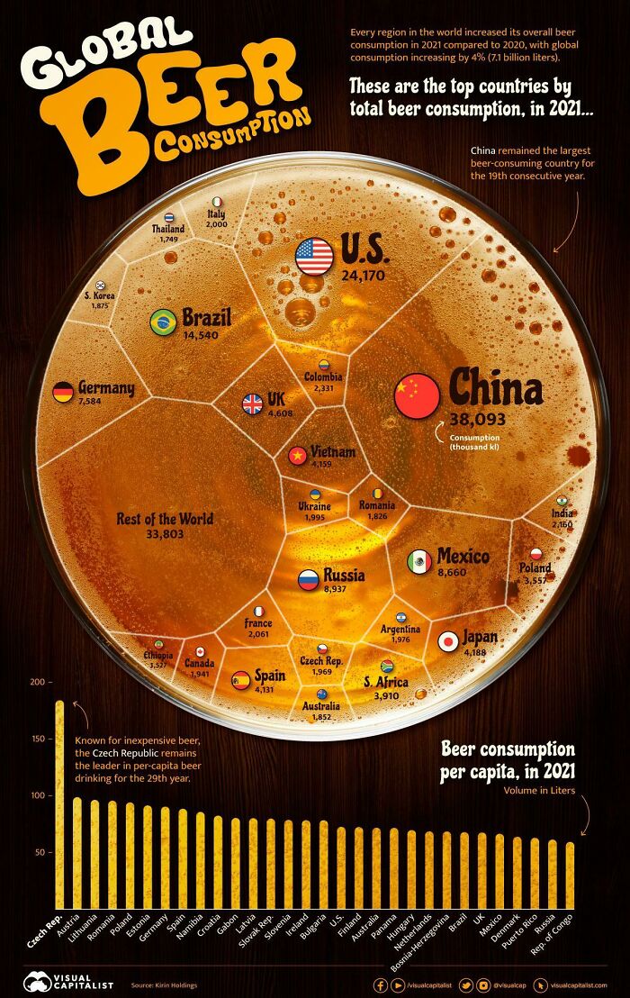
Global/Per Capita Beer Consumption In 2021
I think the Spanish quota is raised by the UK, Germany and the Netherlands tourists 🤣
So the Americans drink more than twice the beer per capita than china
I thought so. Australia's per capita beer consumption is much less than Austria's.
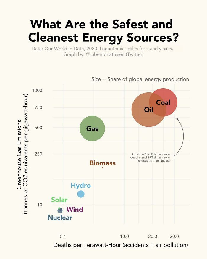
The Safest And Deadliest Energy Sources
while nuclear energy may be safe and pretty clean, it bears a very high risk, because if something goes wrong, you know... also what about the nuclear waste? a hazard even when our grandchildren's grandchildren are no longer alive. so why should we waste tons of money on building/maintaining nuclear power plants when we can just invest in better, renewable energies like solar or wind energy? it just doesn't make sense saying nuclear is great, because it isn't and there are better alternatives
Load More Replies...We should have abandoned coal decades ago. It's so dirty and pointless. Almost as bad and burning straight garbage for power.
Burning trash can be a positive (as in, the least bad) option in the life-cycle assesment of some types of garbage. The real issue is the type of garbage we produce, i.e. too much plastic.
Load More Replies...They only take in account accidents and air pollution, but the byproducts can also be a big problem (looking at you Nuclear)
I would rather have the dangerous byproducts confined to a very small area than spread evenly over the entirety of the planet.
Load More Replies...Nuclear would be at the top is this list were to measure the damage caused over thousands of years.
So, correct me if I am wrong, but isn't coal used to create electricity, which is used in "cleaner" cars that run on electricity?
Yes, e-cars don't care where that electricity comes from. We're not limited to cleaning up our waste products to one source; no reason we can't have both e-cars and clean energy production. But some people would rather we remain in the dark ages of power.
Load More Replies...Years ago, I temped for the head of the Nuclear Engineering department @ MIT. He had a sign in his office that read "You are a guest of nature. Behave." and treated his profession accordingly. Talking with him changed my mind from "all nuclear is bad".
Nuclear fusion is promising. It generates power by fusing Hydrogen into Helium, so it is clean. On December 5, 2022, the National Ignition Facility in the U.S. created more energy via nuclear fusion than they originally put in, for the first time.
Sadly misleading headline, much repeated at the time. There was a net positive of the actual reaction, i.e it generated about one and a half times the energy of the lasers that were fired at the target, BUT the overall amount of energy used to make it happen was many times higher. They're still a very long way away from a feasible fusion reactor.
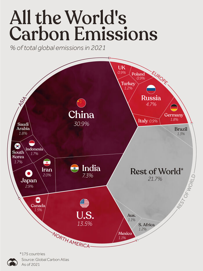
Load More Replies...All The World's Carbon Emissions In 2021
https://ourworldindata.org/co2-emissions. "More populous countries with some of the highest per capita emissions – and therefore high total emissions – are the United States, Australia, and Canada which on average have emissions that are around 3 times higher than the global average."
Yep! And no comment about "third party CO2 emissions". Like: all CO2 emissions due to all importations, things which are manufactured in another country "just for us",...
Load More Replies...I hate the spread of this stat, this measurements should always be done per Capita, it tells the wrong story when presented like this. And I assure you is intentionally misleading.
China, has a population of over 1,400,000,000. The U.S population is 335,000,000. China has 4.17x the population of the U.S yet is only responsible for 2.28x more emissions. 10% of china's emissions are from manufacturing goods for the U.S, while another 6% are the result of manufacturing goods for Europe, which means that their actual, homegrown emission share is closer to 25.9%, putting the average american at over 4x the emission out put of the average Chinese person
These really should be per capita, to get a better view of the impact of a countries behaviour
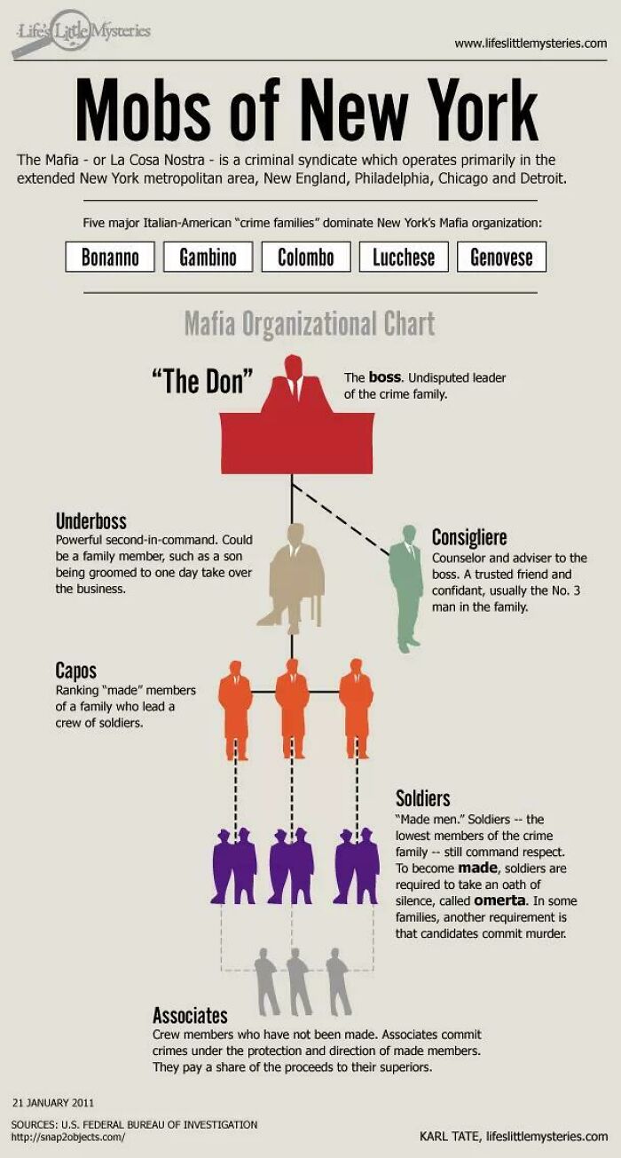
New York's 5 Families
I once made friends with an older man over the garden back fence because I took his gardening advice and tended the basil and mint he gifted me. It turned out he was a local high-level mobster and made sure no one messed with me as an outsider in his neighborhood. I did get followed by authorities in unmarked cars, though.
Awesome! I think this could convert nicely into a short story. :) and also, I love it when mobsters have interests and hobbies that have absolutely nothing to do with their criminal lives. Gardening is one, unless he grows poisonous plant to get rid of his enemies. But then again, it's my impression that mobsters deal more with shootings and that poisonings are more of a lady-way of k1lling ppl. (Sorry for letting my mind wander.... hehe)
Load More Replies...The Don is sometimes referred to as the "Capo di tutti Capi" (which means "the head of all heads" or "boss of all bosses").
Actually that would be the individual that is over all of 5 families not a single family
Load More Replies...Turns out mafia bosses are really fun to chat with in c.ai..my friend put a man eatting forest lizard on one for putting onions in pasta
Showering Habits From Around The World
I'm really feeling sorry for the skin of the people who shower so much. If you don't roll in mud or do an activity where you sweat a lot, you don't need to do a full body shower everyday. It f***s with the natural defense nechanism that your skin is.
It is HOT in Brazil. If I lived there, I would definitely need to shower twice a day.
Load More Replies...Why is everyone showering so much? I get working out every day, being all sweaty but I doubt all of these people are working out every day. Most people don't need to shower every day.
I can vouch for Australia - it's bloody hot here! In the middle of summer, I will wake up sticky in sweat, and I have to shower before I get changed. To be honest, I probably shower a bit more than average, probably 10-12 times a week, more when it's really hot or I'm on my monthlies.
Load More Replies...Dutch here: I wash myself with a washcloth daily, and take a shower when I need to clean my hair (once or twice a week). It was plenty for our grandparents, and it's better for your skin and the environment. ▪️▪️▪️My hair has become LESS oily since I stopped showering every day. I also have less damage to my hair, so it's more useful for donations. It grows really quickly, so I cut it off every 3 years or so.▪️▪️▪️I've had hair problems just once because a hairdresser butchered it. It was very embarrassing, but at least I knew that my hair would grow back. Many people don't have that kind of luck. Donate if you can, it really makes someone happy!
OP seems surprised that 2% shared a shower in SA. I used to share with my wife regularly, and fail to see the problem.
Having an imaginary argument with Simon Cowell after my performance of course.
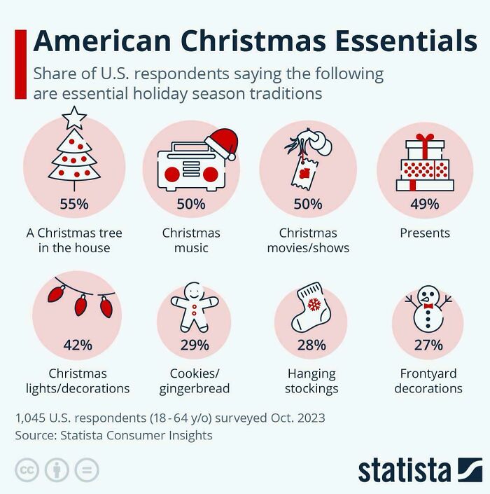
Load More Replies...American Christmas Essenntials
I hate the inflatables on the lawns. The Nativity ones are the worst, even Jesus would be embarrassed. seriously-...5c69bd.jpg 
I need the Christmas music and store decorations to start *AFTER* Thanksgiving, please.
As long as the family is assembled and we are having fun, I could easily go without any of these things :)
Presents are less important than music? All Christmas music is awful
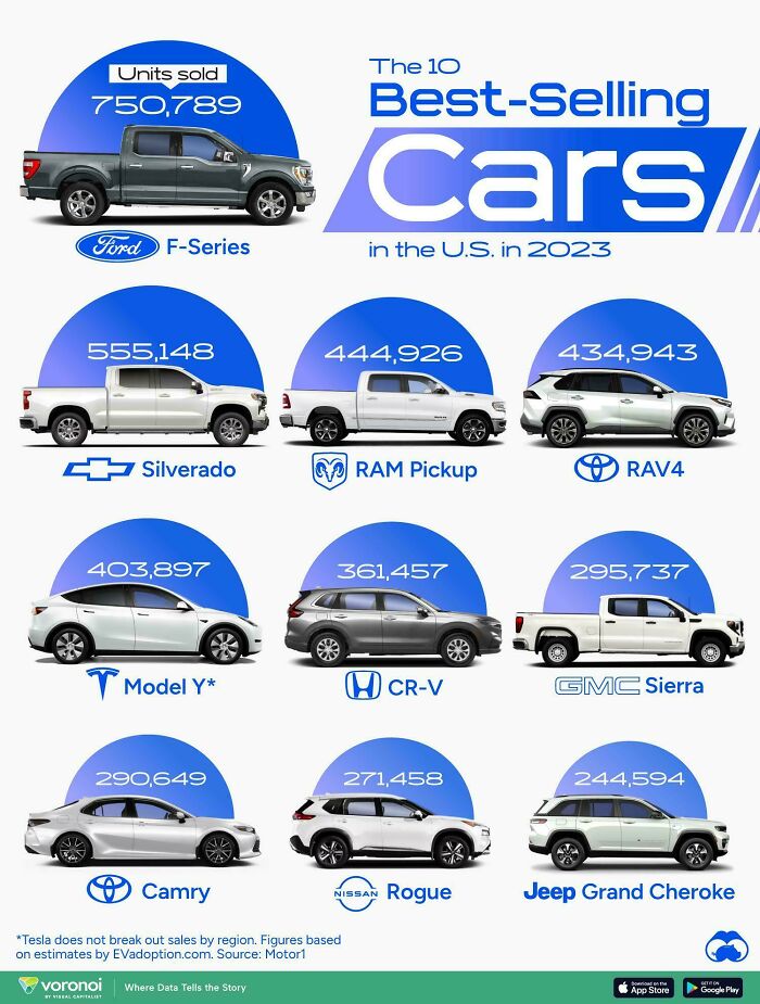
The 10 Best-Selling Vehicles In America In 2023
I love my Rogue. Excellent cargo space, user-friendly control panel, and the HUD is red, which seems to be less and less common these days.
Load More Replies...I can't speak for these SUVs, but I was very against one, because of gas use, but needed one for practical reasons. I did my research and mine gets better gas mileage than the car I had, and in general is about the same as a car in general.
Load More Replies...yeah because America is the only country with cars
Load More Replies...I wish people would realize that not everywhere has public transportation. Maybe you only have to work, shop, and eat a couple miles from your house, but not everyone has that luxury. Many places are spread out and don't have public transportation, so you have to have a car.
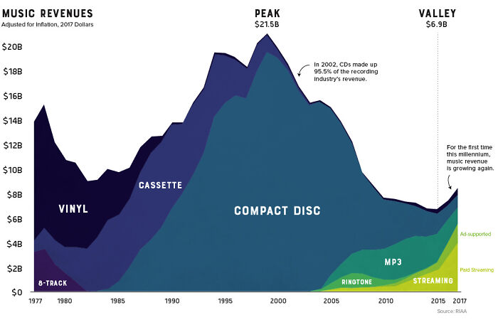
Load More Replies...Thirty Years Of Music Revenue, Categorized By Type Of Media
I like how vinyl has made a comeback. I have about 1000 that I bought for $1-2 each at swapmeets in the 80s. I listened to two of them today.
but why though? compared to modern media they sound like c**p.
Load More Replies...Ah, 8-track. We hardly knew ye and how you'd change tracks in the middle of a song...
"Streaming" sucks. If you don't have a copy (CD, vinyl, tape, or even HDD) then you don't own it and will eventually get ripped off. [ ................................................ ] I had to get rid of all my LPs and cassettes when I moved abroad. Digital is lighter, but that doesn't make it better. No, I'm not a sound snob, but when music becomes "easy" (i.e. someone makes a "playlist") you stop paying attention to it. Playing physical media is as involving as reading a book.
People With Higher Education In 2022 (Europe)
The data comes from EuroStat and the United Kingdom does NOT provide information to EuroStat so it does not appear on the map. Please read the map legend
Load More Replies...Here in NL almost half of all people have a higher degree because people look down on trades. Parents really push kids to get into uni or college. Many people have studied something that isn't needed on the job market. They "want to work with people", but won't do a hands-on job. ▪️▪️▪️We're swimming in lifestyle coaches, sleep coaches, parenting coaches, and career coaches, but severely lacking nurses. They've even started programs where people who want to switch careers can learn on the job. Really hoping that the attitude will change: we desperately need healthcare workers and technicians.
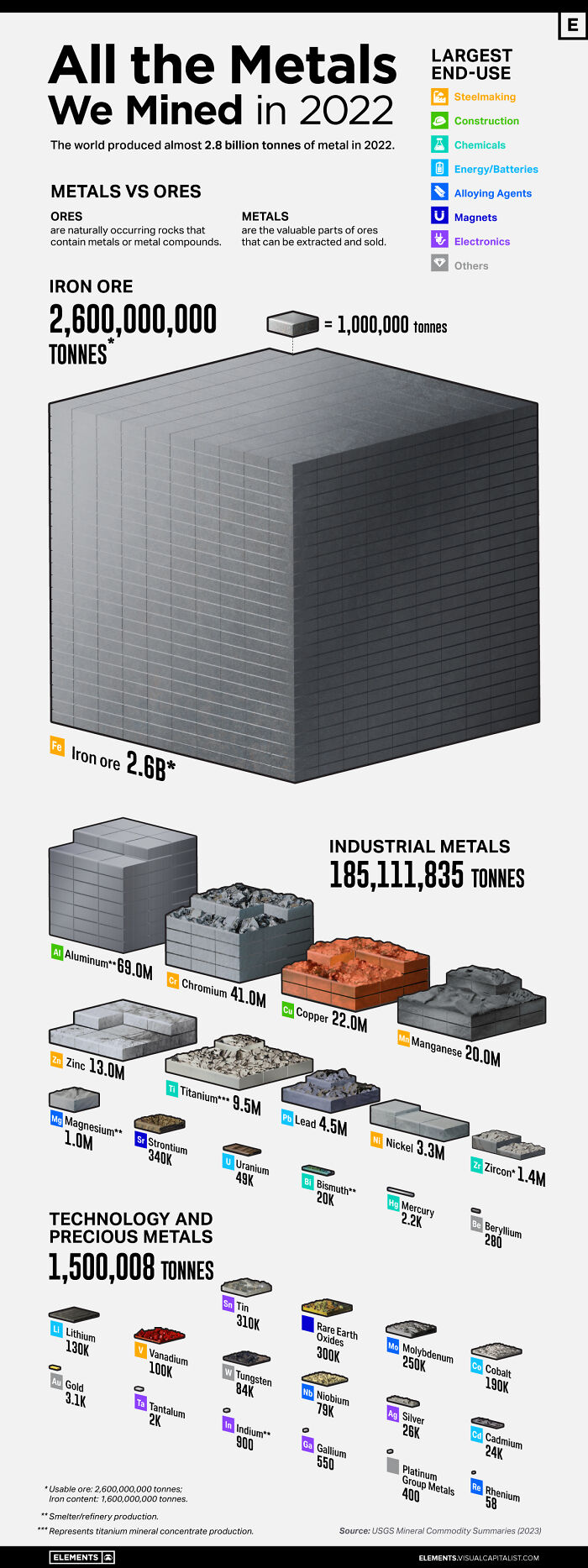
All The Metals We Mined In 2022
I'd love to see a chart with the human and environmental impact of all this mining. Reading about Prokorov's nickel mines made me realize I could wait for a new computer/phone/tablet until I really needed a new one.
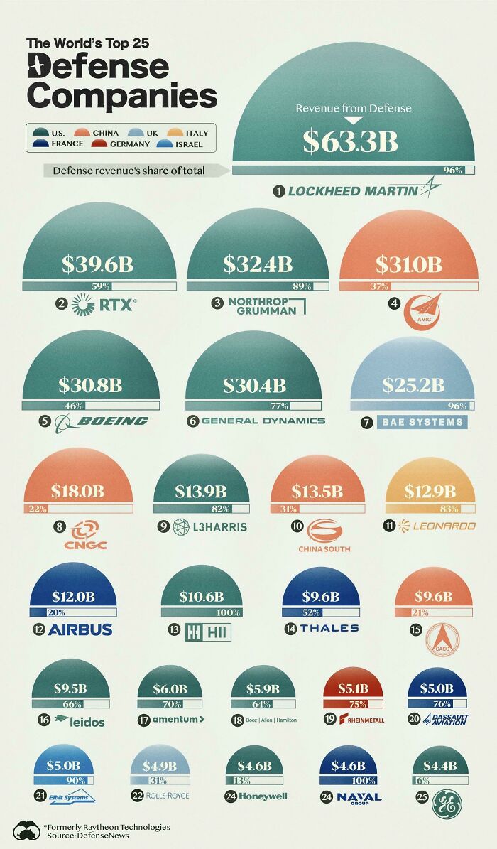
The Industry Of War: The World’s Top 25 Defense Companies By Revenue
Hopefully the dumb asses in the Senate pass the security bill so Boeing can hire more people.
Load More Replies...All making weapons that are protecting Ukraine and defeating the katsaps.
You aren't on the list unless your company profits are measured in the billions. And most of the stuff these companies makes gets destroyed in war.
That's kinda the point of missiles, glsdb and whatnot.
Load More Replies...I just realized that stark industries logo has a passing resemblance to Lockheed Martin, not a coincidence I'm sure.
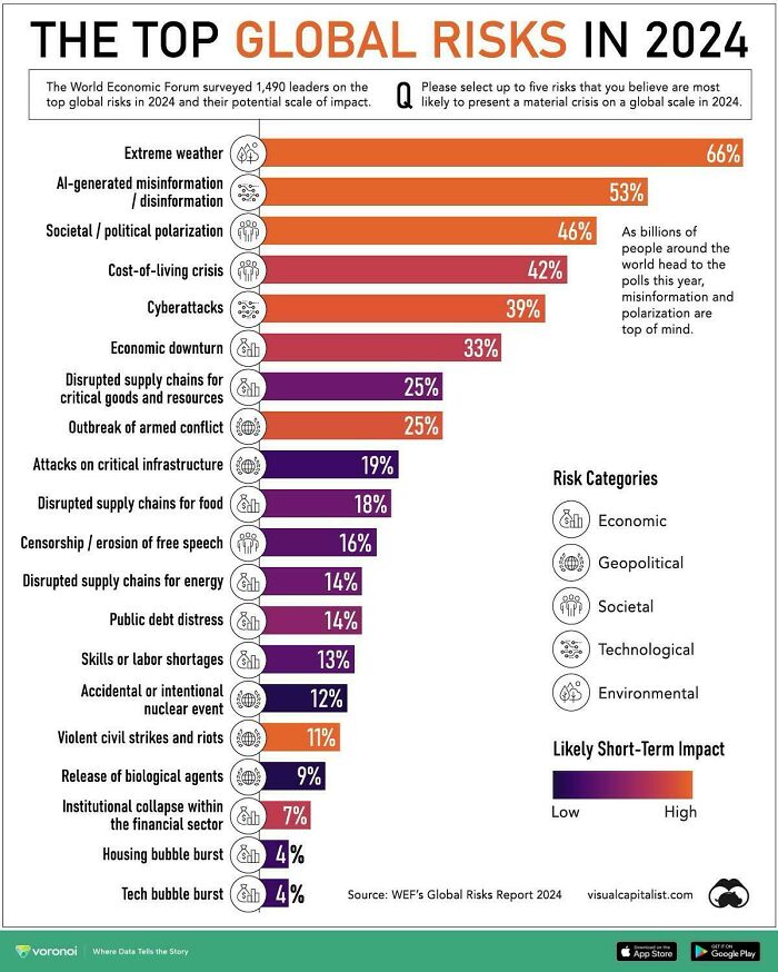
The Top Global Risks For 2024
To clarify for those who don't read, this are not actual risks, these are the things people think are concerned about right now. the title is misleading.
Today's risk: Will I get down to the cafeteria before all the turkey chili is gone?
Both in 1938, must have been a very young Nazi.
Load More Replies...And so many Americans are buying guns because for protection because they think immigrants and liberals are the major threats.
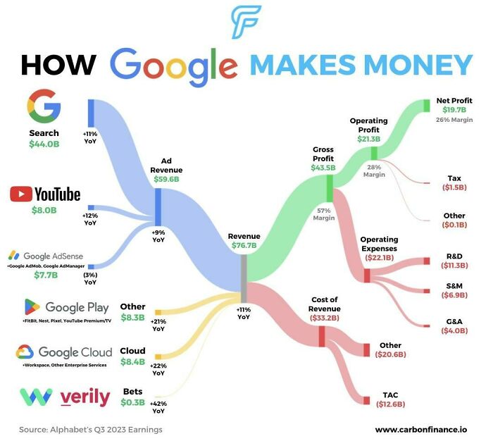
Visualizing How Big Tech Companies Make Their Billions
OP forgot the "buy them and bury them" part of Microsoft's business plan for dealing with disruptive startups.
Which Of The World's Richest People Inherited Their Wealth?
I wonder how many of them genuinely believe that they have worked hard for everything they've got and talk about how lazy the lower classes are.
They all need to see Warren's "You Didn't Build That" speech repeatedly until they stop hoarding. https://elizabethwarrenwiki.org/factory-owner-speech/
Load More Replies...Can you imagine having 94 billion dollars? You could fund 93 charities with a billion dollars each and still have a billion dollars left over. Think of what that money could do for hunger, homelessness, helping people kick drug and alcohol addiction, health care, and so many other things.
So many billionaires with not a single cell in their brain devoted to sharing their wealth or paying decent wages to their employees.
Elon Musk isn’t on here? Or did I miss his listing? I read that he inherited most of his start up wealth. But then I figure he earned the rest through Tesla and SpaceX, Twitter, etc…. So he is the richest person, globally, but he didn’t inherit all that. Lol. See! I just answered my own question. LOL!
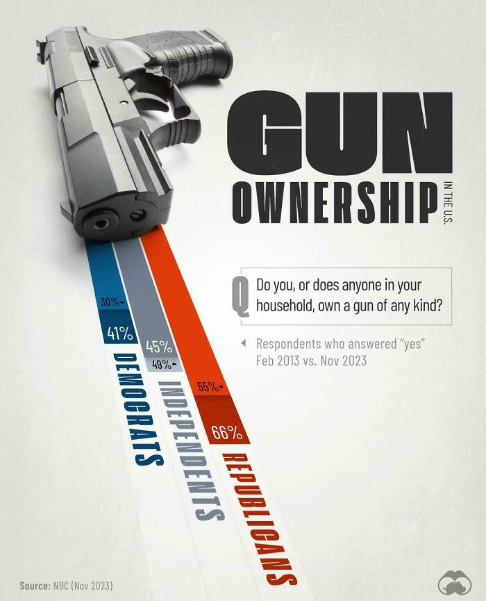
Gun Ownership In The U.S
I feel I have to have one. I do DoorDash in a terrible neighborhood. Basically, it's a ghetto. I'm huge. 6'3" and 300lbs. These people in this neighborhood do not care. I have been held down and robbed before I got a gun. I look strong, but I'm not. I need the gun to keep my job, life, and profit
Of the ten places I lived though my 69 years, I never once felt the need to own a gun for my safety. I feel sorry for all those people who bought conservative media's fear mongering and now live in permanent fear with their arsenal of guns. The only place I would actually be afraid to live is in a state where it is mostly white racists who own those guns.
Trust me, if you lived in a dangerous city you would own a gun.
Load More Replies...Because republicans are hypocritical bags of sh!t. They couldn't imagine having any kind of gun restrictions or regulations, yet are more than happy to restrict and regulate a woman's right to choose. Hypocrites. They're also the ones that commit the vast majority of mass shootings. With their precious little toys. They are garbage humans.
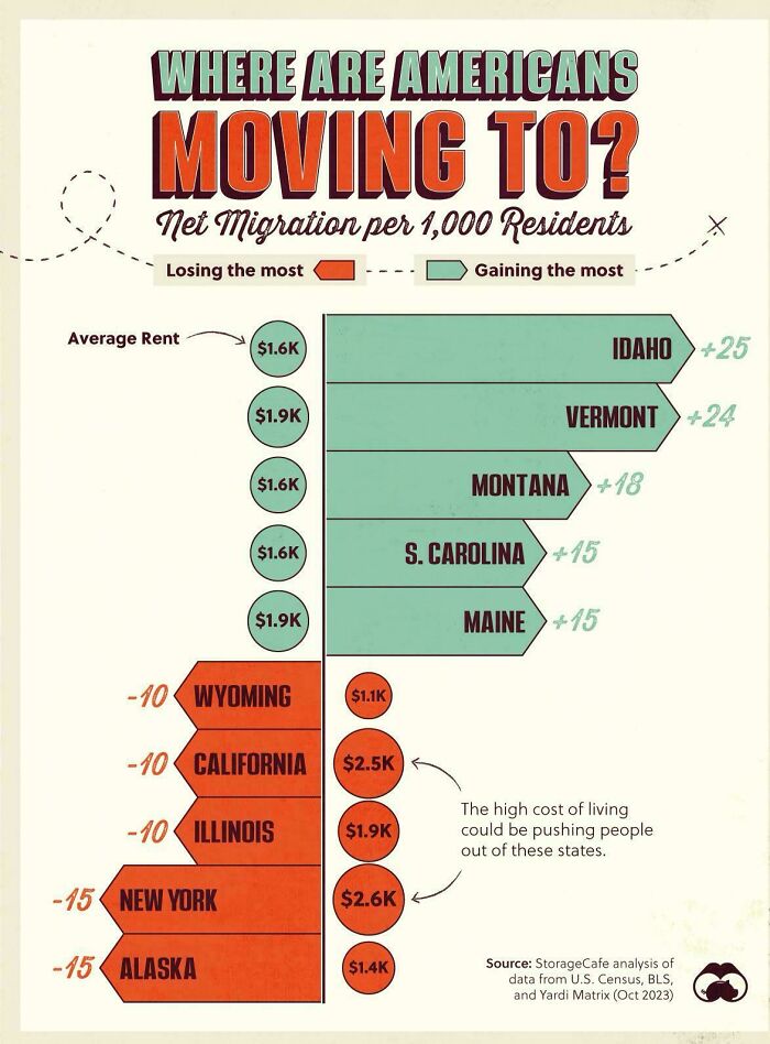
Load More Replies...Where Are Americans Moving To?
10 years ago, Idaho was one of the cheapest states to live in. Then, a bunch of Californians moved there and drove home prices through the roof, pricing out many Idaho natives.
Californians didn't raise the prices. Greedy real estate agents and landlords did.
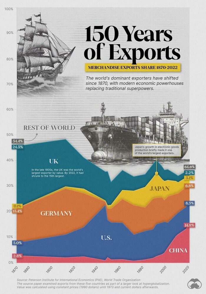
Load More Replies...150 Years Of Exports For Top Economic Superpowers 🚢
The 20 Best Franchises To Open In The U.S
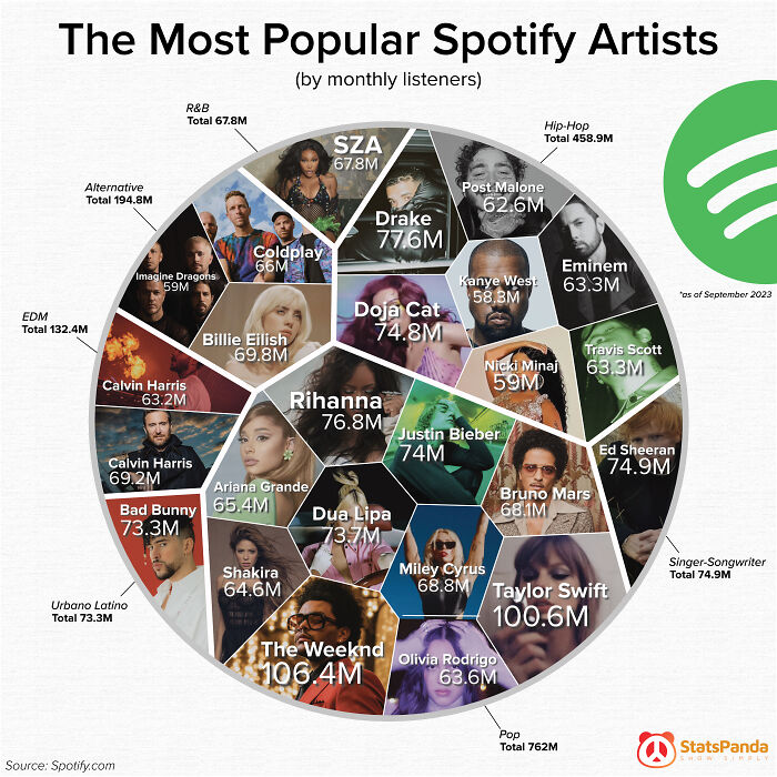
The Most Popular Spotify Artists
For the entire alternative genre, all it shows is Billie, Imagine Dragons, and Coldplay??? A CRIME
I have heard the names of 14 of these. I have heard the music of 3 of them. Not sure what that says about me.
I cannot name a single "song" by any one of them. I don't say that with pride or arrogance, I say that because it's all commercial c**p.
Some of it is good music, also I very highly doubt you've never heard any of these songs, unless you've never watched YouTube, TikTok, the radio, or been in a store with music on
Load More Replies...How Google Makes Money
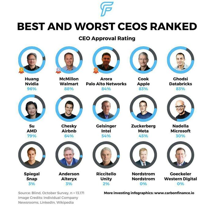
Best & Worst Ceos
Probably a negative rating so wont make it on to the infographic.
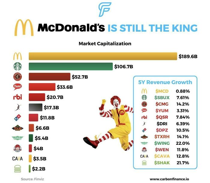
Load More Replies...Top 10 Restaurant Stocks Ranked By Market Cap
Chipotle is 3rd on the list. The first store opened one mile from my house at the time.
There are like 12 Starbucks in my city but only like 8 McDonald's. Starbucks winning St. Louis.
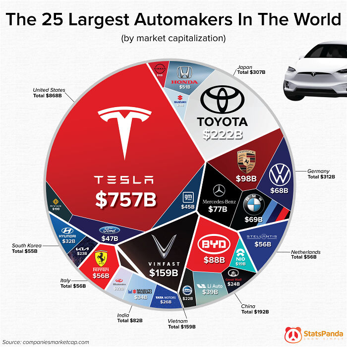
The 25 Biggest Automakers In The World
What a big bias... need to use number of car built or other metrics. Market capitalization is just b******t, because it is just "investors who believe in the company"
I wish I could upvote this comment multiple times.
Load More Replies...Nope. In Sheer numbers the toy company Little Tykes is the largest manufacture--- the "Cozy Coup" is the best selling vehicle, ever.
It says by market capitalization, not by number
Load More Replies...“By market capitalization” = investor balloon juice
Load More Replies...If I remember correctly, Geely is supported by the Chinese government, so it wouldn’t have such a presence in a chart showing market capitalization
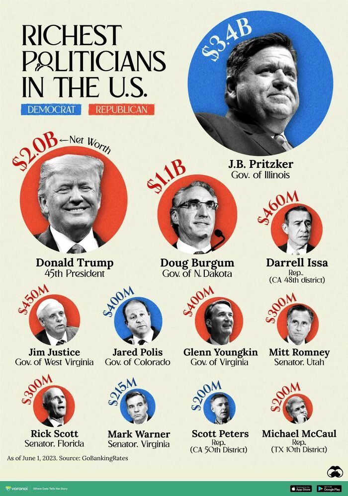
Load More Replies...The Richest Politicians In The U.s
He was never worth as much as he claimed. He's been so heavily in debt since the 80s, which is why he's in the Russians' pockets
Load More Replies...Show this to the fools who think Trump cares about the poor and the blue-collar workers. People don't become that rich by being charitable.
He cares about no one but himself. He's pond scum. asshole-3-...a846c2.jpg 
Why, why, why doesn't BP do more of these type of posting and a whole lot less of the Gossip column nonsense.
Why, why, why doesn't BP do more of these type of posting and a whole lot less of the Gossip column nonsense.

 Dark Mode

 No fees, cancel anytime







![Coca-Cola vs. Pepsi Revenue [oc] Coca-Cola vs. Pepsi Revenue [oc]](https://www.boredpanda.com/blog/wp-content/uploads/2024/02/65cb14f79c1fc_0ubop32cakyb1__700.jpg)
