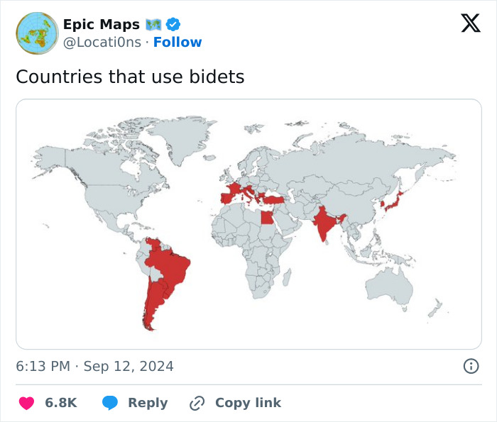
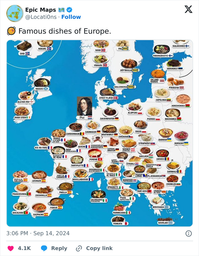
Maps can look absolutely incredible, but they require a lot of focus and dedicated effort. Whether you’re an artist, adventurer, geographer, engineer, statistician, or just a fan of good design, quality cartography can bring you a whole lot of joy.
The ‘Epic Maps’ account on X (formerly Twitter) is a fabulous project that celebrates great examples of cartography. Many of these designs are unique, creative, and unusual, so we wanted to share the very best ones with you, dear Pandas. Scroll down for a look, and don’t forget to upvote your favorite ones!
More info: X | Instagram | YouTube | Newsletter
This post may include affiliate links.
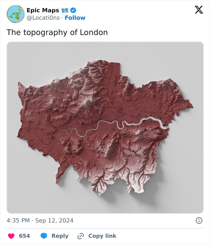
The Earth may not be a perfectly round sphere for space football, but it would be an amazing sensory widget for stimming. What I mean is, I want to touch this map.
The curator of ‘Epic Maps’ states that their goal is to share “educational and informative” world maps. This hasn’t changed over the years since the account was created in December 2020.
Currently, around a million X users follow the project on the social network. The curator also has a weekly newsletter you subscribe to and runs a YouTube channel, as well as an Instagram account.
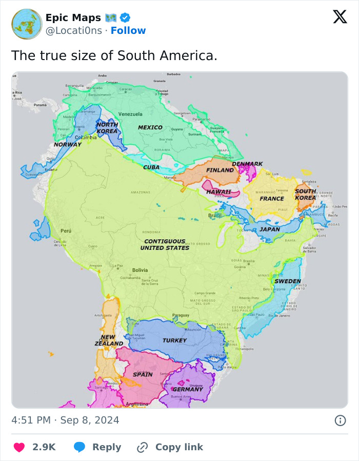
I wish we learned in school that the Mercator projection and the actual size/shape of the Earth's landmasses are often wildly different
The difference between great maps and subpar ones lies in the balance between function and form. Obviously, a proper map needs to provide some sort of relevant and practical information for the user. It needs to be detailed enough to be useful, but not overwhelmingly so to the point of confusion.
Visual clarity is massively important, from the fonts and symbols you use to the overall aesthetic. Deciding not to feature certain information can be just as important as what you do decide to showcase. Simplicity is key. Clutter is bad (unless it’s extremely aesthetic and intentional). The clearer and simpler a map is, the easier the information it features is understood, the better.
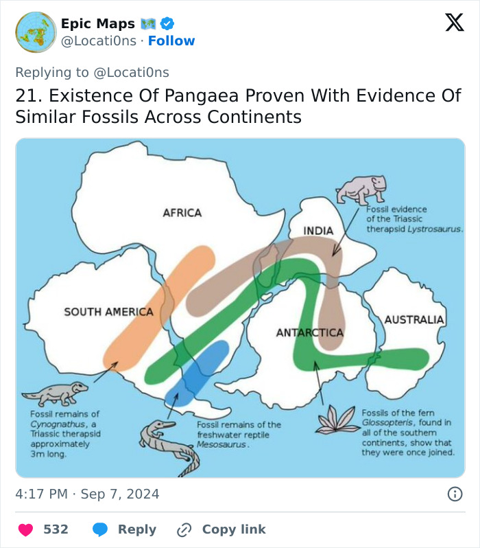
And matching rocks, and seafloor spreading rates and directions as determined by magnetic orientations of oceanic rocks. And radiometric dating.
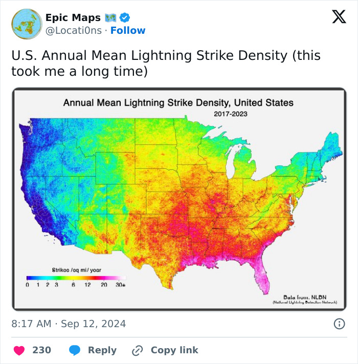
Living in San Francisco for 48 years and I've seen lightning here less than 10 times.
A good-looking map that serves no actual purpose will be just that—a nice decoration. There’s nothing wrong with that, of course. Many people frame maps from fantasy and sci-fi worlds and give them a place of honor on their walls and shelves. You probably know some people who have detailed maps from The Lord of the Rings, The Witcher, and A Song of Ice and Fire at home.
Meanwhile, a map that is overwhelmingly functional and loaded with super-relevant info might help you with your job. However, if there’s no flow to the design and no clear aesthetic, it’s probably not something you’d be rushing to show off to others. Unless they’re in the same professional field as you are.
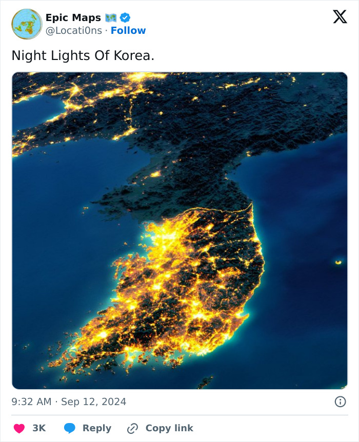
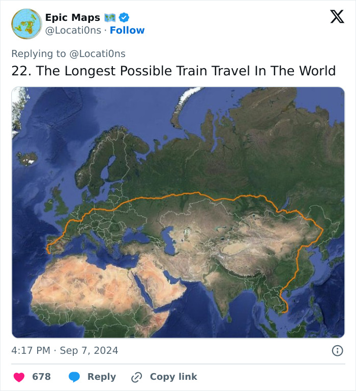
I looked at doing this back in 2019. The plan was to try and get to Japan without flying- you can get the ferry from Korea at the end. However I talked to someone who had done the Trans Siberian express and found it really dull and testing. Day after day of looking at pine trees drives you a bit mad, and I have some dietary issues so would worry about not being able to eat any food they sold. Might be good as a meditation or writing retreat! In the end I took the train from London to Bologna in Italy, visited a friend there, and then flew to Tokyo. This year I did my first sleeper train (London to Penzance) and really didn't enjoy it, so I think I made the right choice!
Blend the two—good design and practicality—and you have the foundation for something that’s not only appealing to the eyes but also useful and informative. In our experience, the maps that tend to go the most viral are either incredibly unique looking or they blend an artistic look with some truly good information.
With so much content on the internet and especially on social media, even very educational maps probably won’t get as much attention as they deserve if they lack the aesthetic oomph. They simply wouldn’t be able to stand out from the crowd.
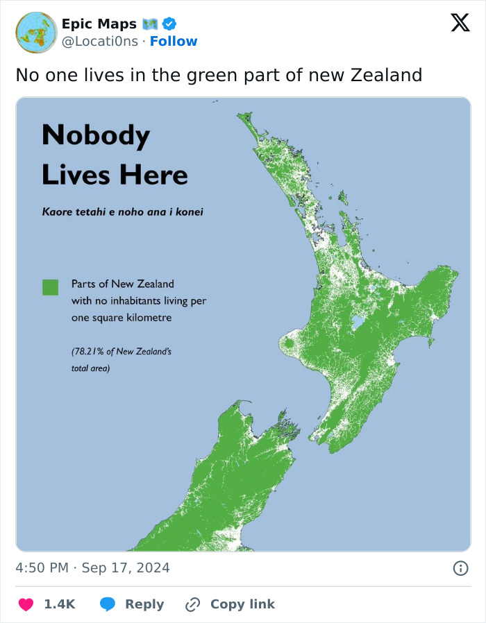
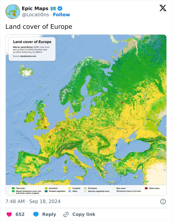
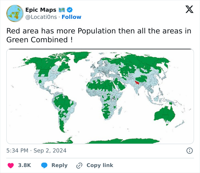
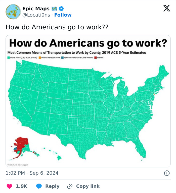
Not quite true. More like no cities, or big towns, in the green zones. But there are lots of little communities or farms in there.
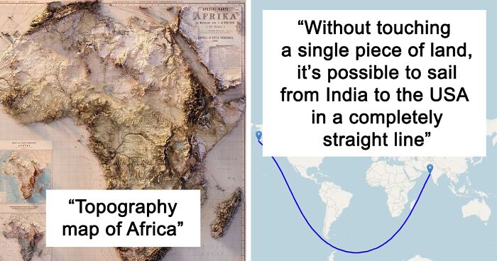
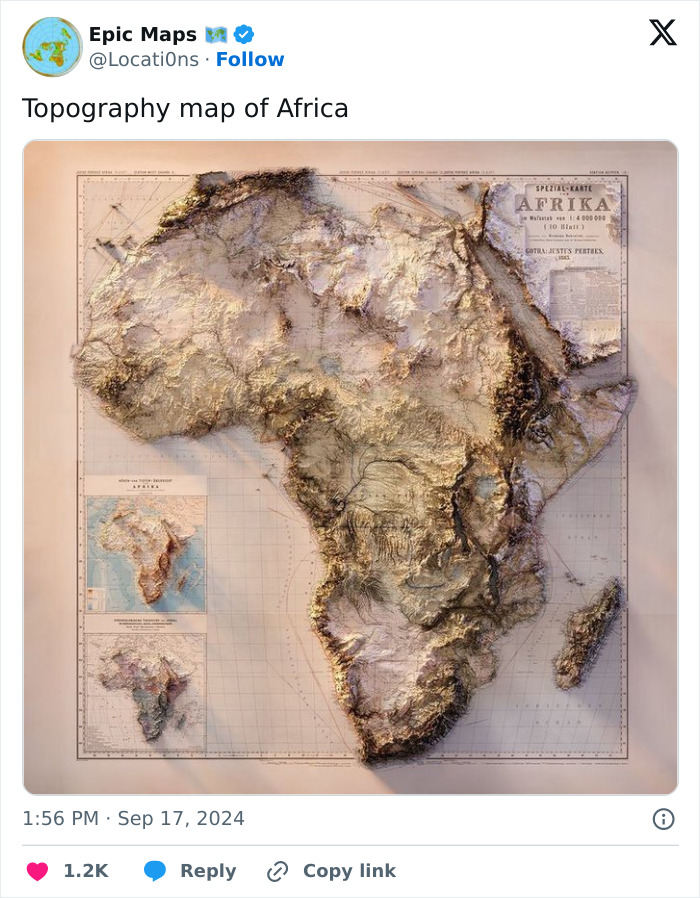
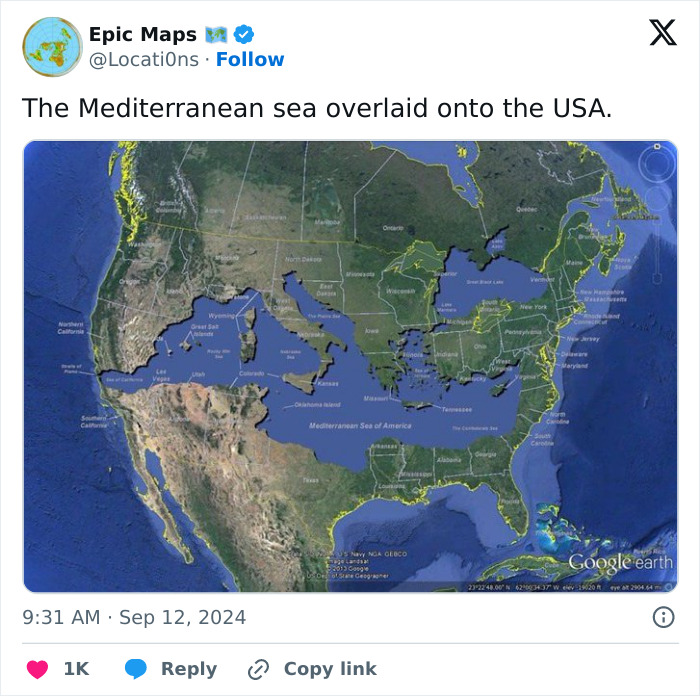
Africa is a continent, so why would it be in any way surprising that it should fit many countries in it? That's basically what a continent is, after all. (And yes, Europe is also a continent, but it's very small).
There’s a ton of proof that the internet is madly in love with cartography (even if many people just like looking at cool and pretty pictures). ‘Epic Maps’ is far from the only project that brings the best and most interesting maps to the forefront of the internet.
There are many others, often boasting hundreds of thousands and even millions of dedicated fans. And there are lots of truly talented cartographers out there, both amateur and veteran alike.
For example, the founder of one globally famous cartography-oriented online community, Patrick who also works as a land surveyor, previously explained to us why people decide to make maps in the first place. According to him, there are many possible reasons.
“Sometimes for navigation, sometimes for showing statistical phenomena, and sometimes for fantasy. While artistic skill helps, it is not absolutely necessary,” he said. “The important thing is to make it easy for users to glean useful information. Most maps should have a thesis or a story it is going to tell and this needs to be told through the map.”
Many people feel inspired to go on more adventures in life after poring over a particularly good map. But that hype, energy, and motivation can fade once you start considering how tough it can be. You can get a tad overwhelmed. According to the land surveyor, there’s no alternative to seizing the day and following your dreams ASAP.
“I've noticed, especially as I've gotten older, that you only have so much time on this planet and every day that is wasted is a day that you'll never get back. If you want to get out and explore the world you just have to do it,” he told us earlier. “Some adventures will cost time and resources, but the real question I ask myself is can I afford not to do some goal I have my heart set on. There are so many opportunities in this world that it may be hard to choose, but if you wait too long those opportunities will be gone forever.”
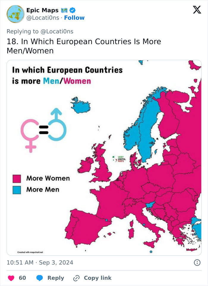
This is a fascinating topic. There are several factors that mean in most of Europe more males.are born than females (distance from the equator being one); but differences in migration and life expectancy change that balance when you look at everyone.
Meanwhile, the co-founder of another popular cartography-focused social media project, Erik, previously told Bored Panda that a map can be very powerful. “It is an effective way to communicate a phenomenon that has geographical or spatial relevance. From demonstrating the obvious of how neighboring countries see each other, to conveying complex information about the state of nature using remote sensing data," he said.
"In an ever-complex world, with apparently ever-complex challenges, from climate, nature, geopolitics, war, energy security, and human rights issues—maps enable us to understand and navigate the ever-evolving complexity of our societies.”
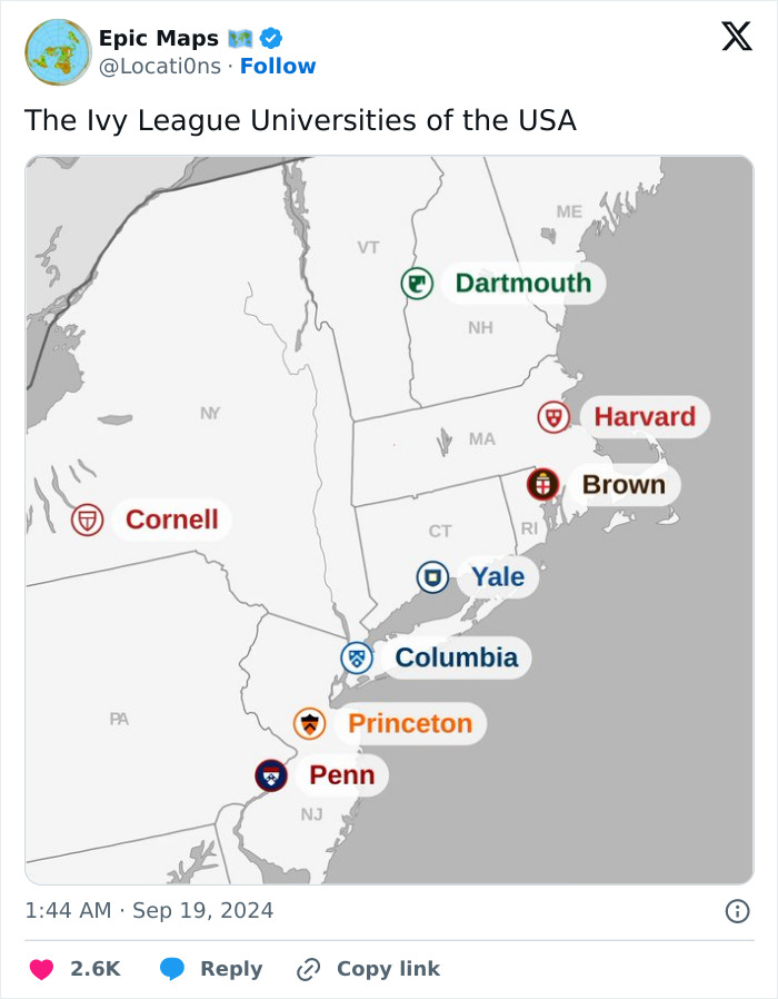
It was originally called the "IV League" because of football - Harvard, Yale, Princeton, and Dartmouth - that played together.
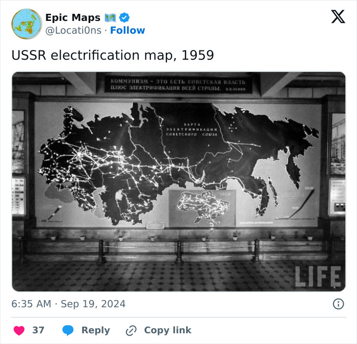
Russia.....also a repressive communist dictatorship...(USSR) Nothing has changed since the 60s.
Many social media content creators who share maps put in the effort to double-check at least some of the information featured in the images. They might do a general review of the data, but verifying every single tidbit can be quite impractical.
However, those people who actually end up making (and selling) their own maps go even further, using data and satellite data from trusted sources.
I love these kinds of maps. I'm a very visual person, maps and graphs are my love language!
These maps give an insight into the internal structure of how our world is constructed.
I love these kinds of maps. I'm a very visual person, maps and graphs are my love language!
These maps give an insight into the internal structure of how our world is constructed.

 Dark Mode

 No fees, cancel anytime


