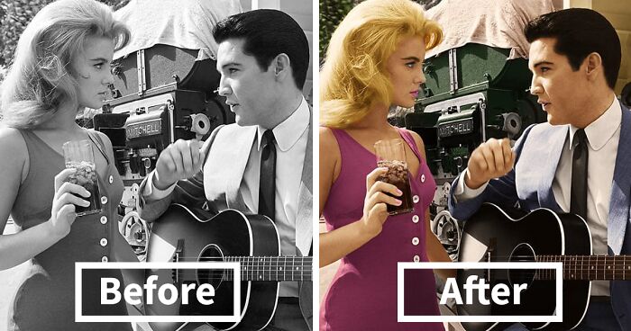
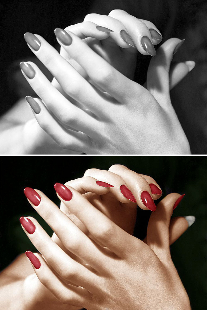
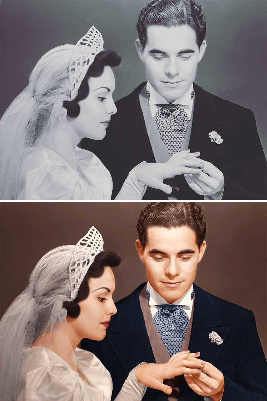
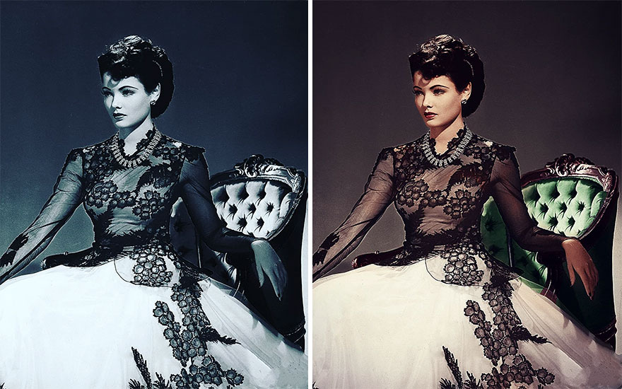
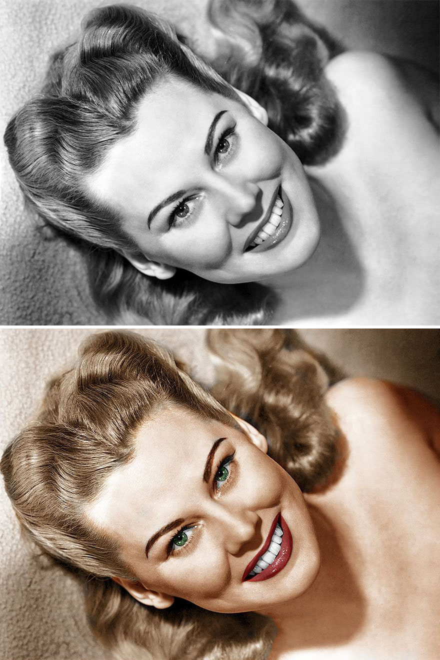
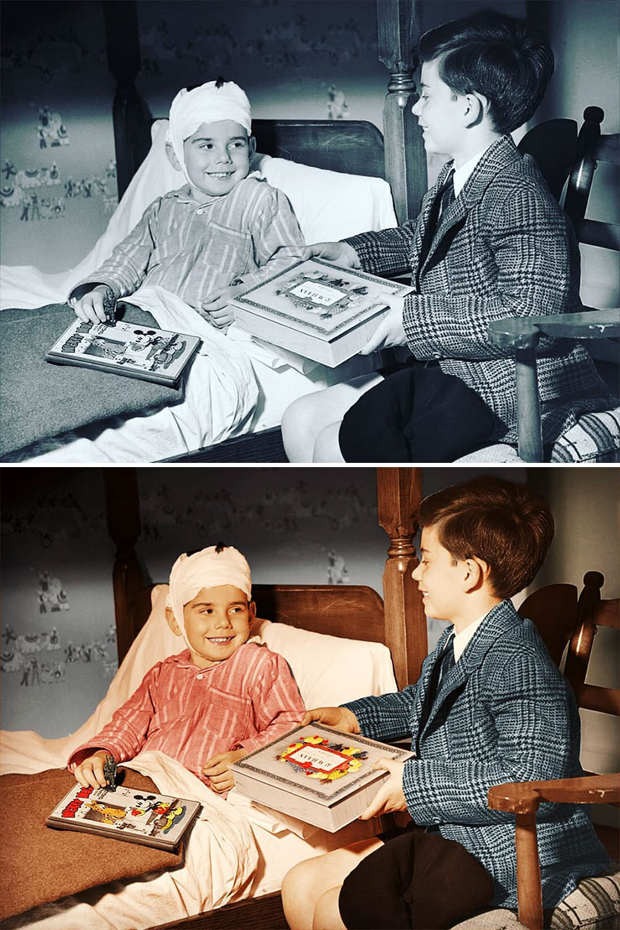
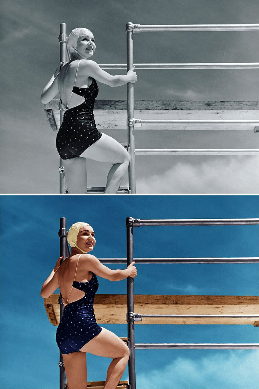
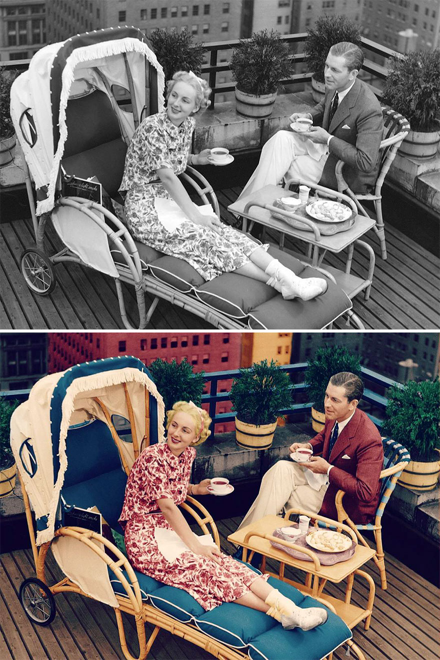
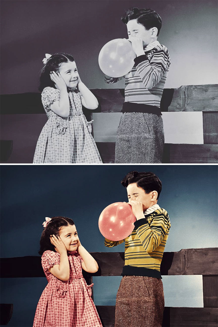
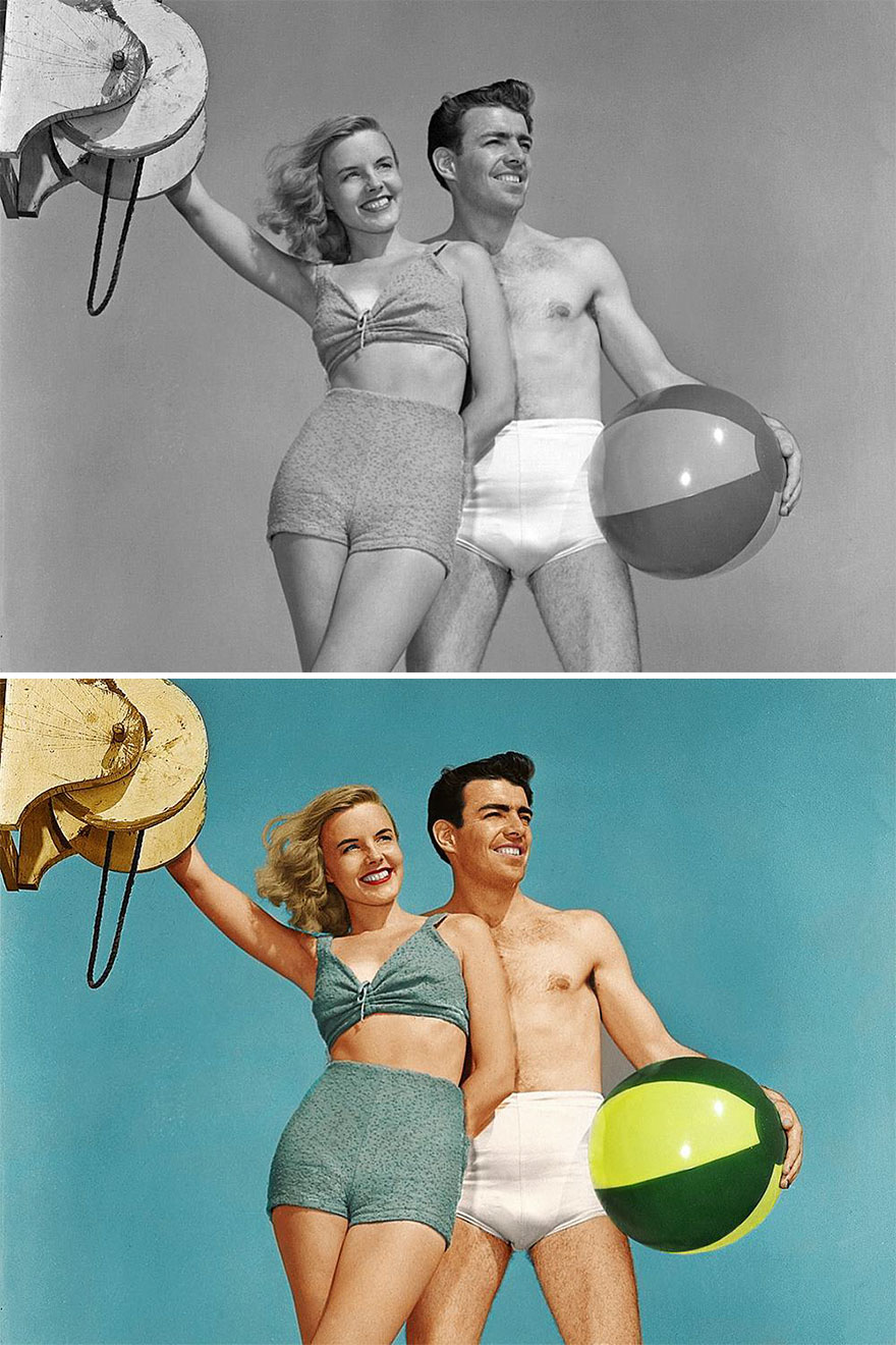
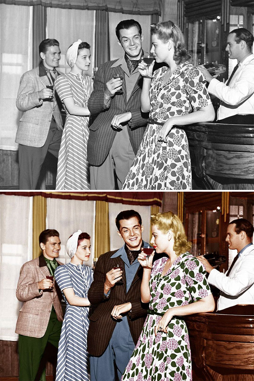
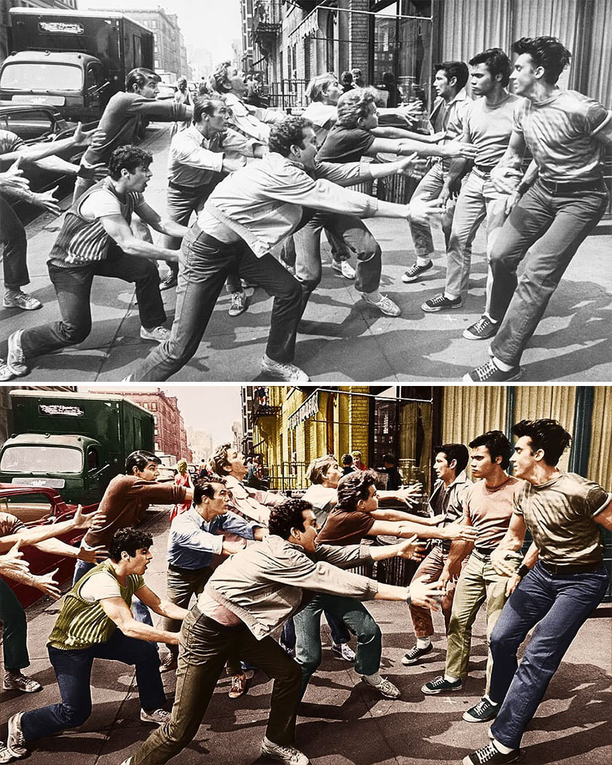
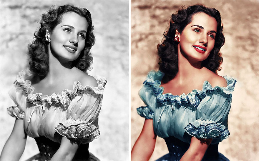
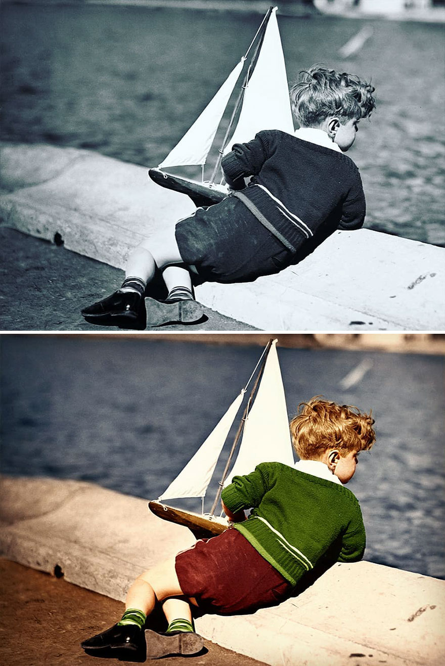
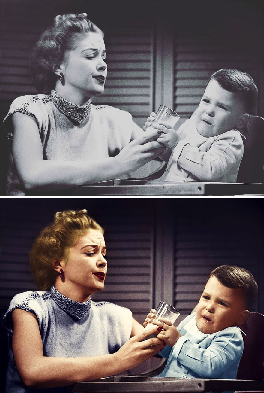
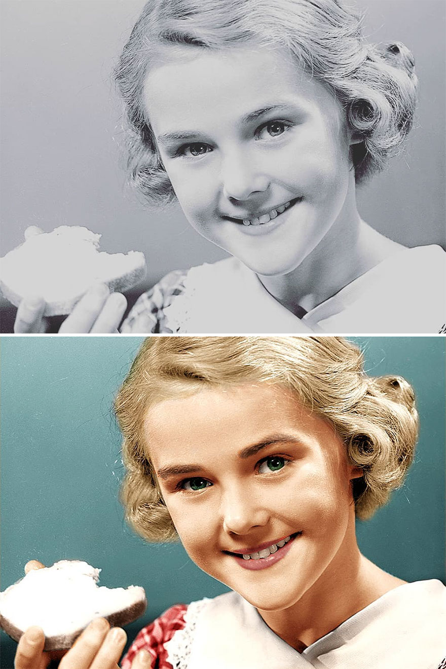
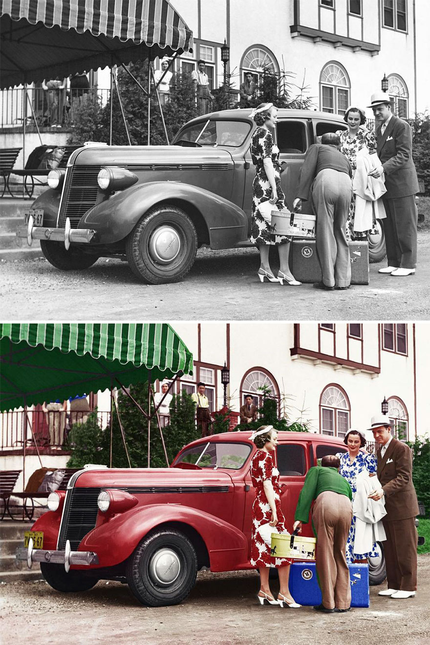
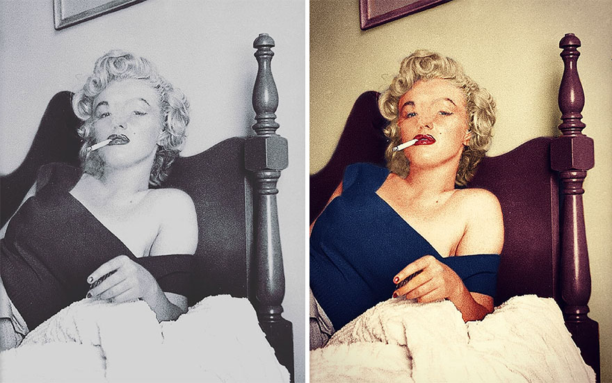
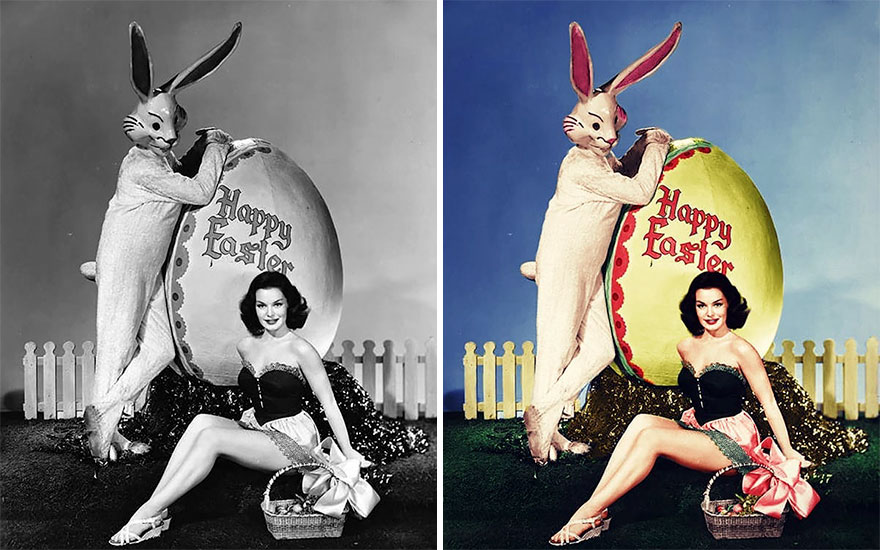
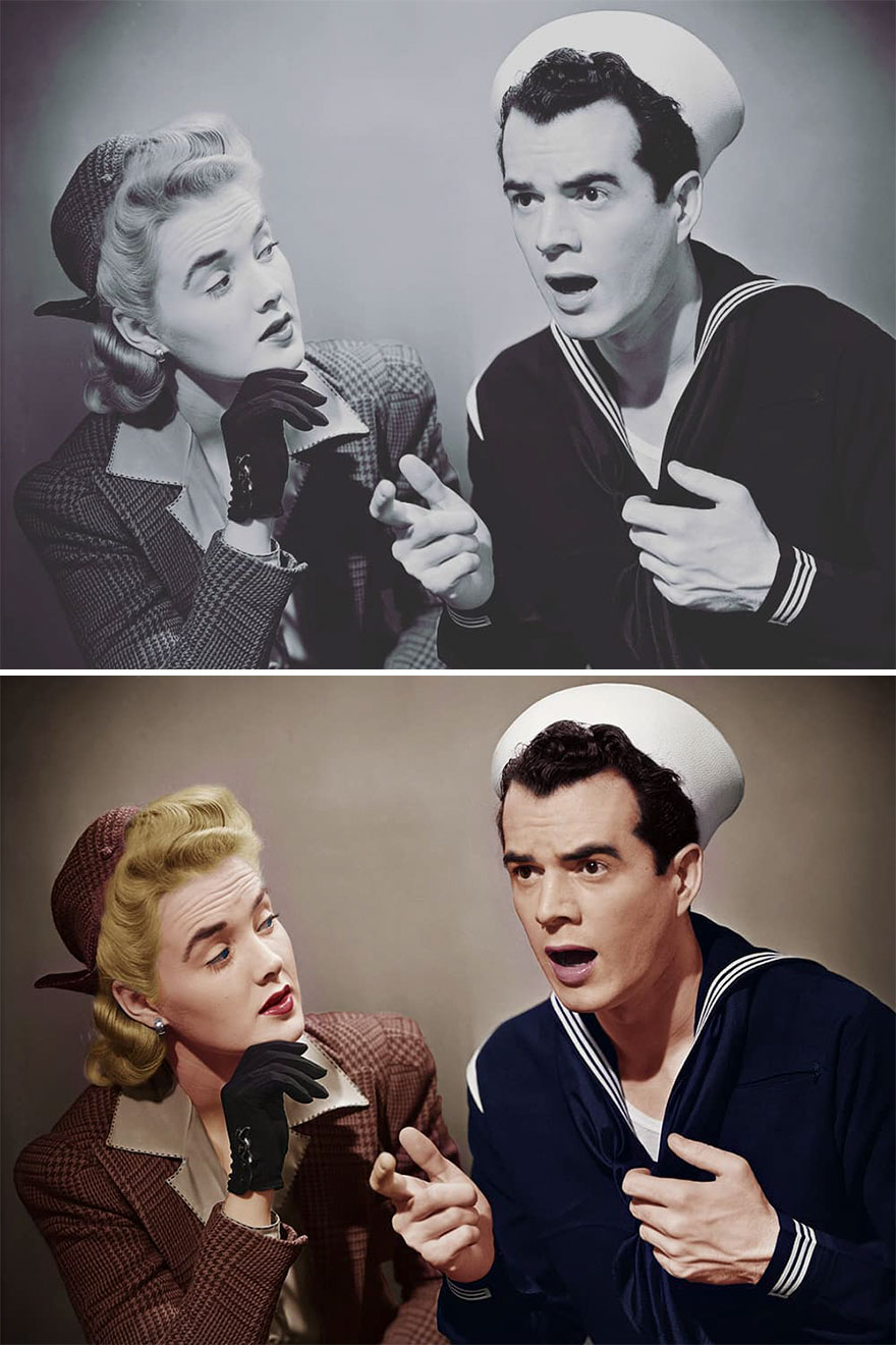
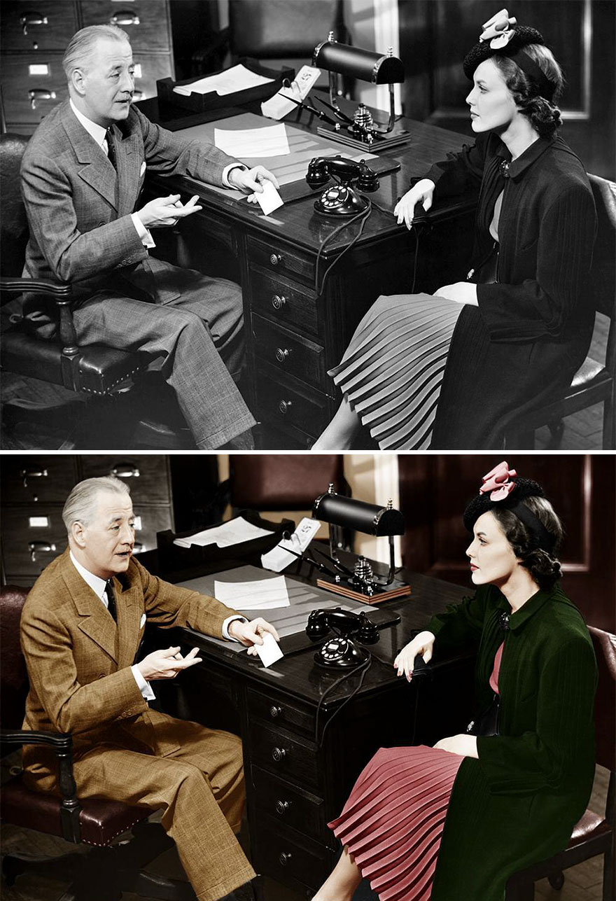
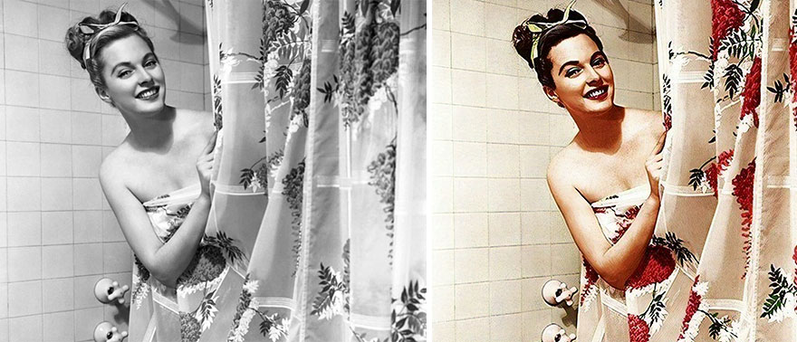
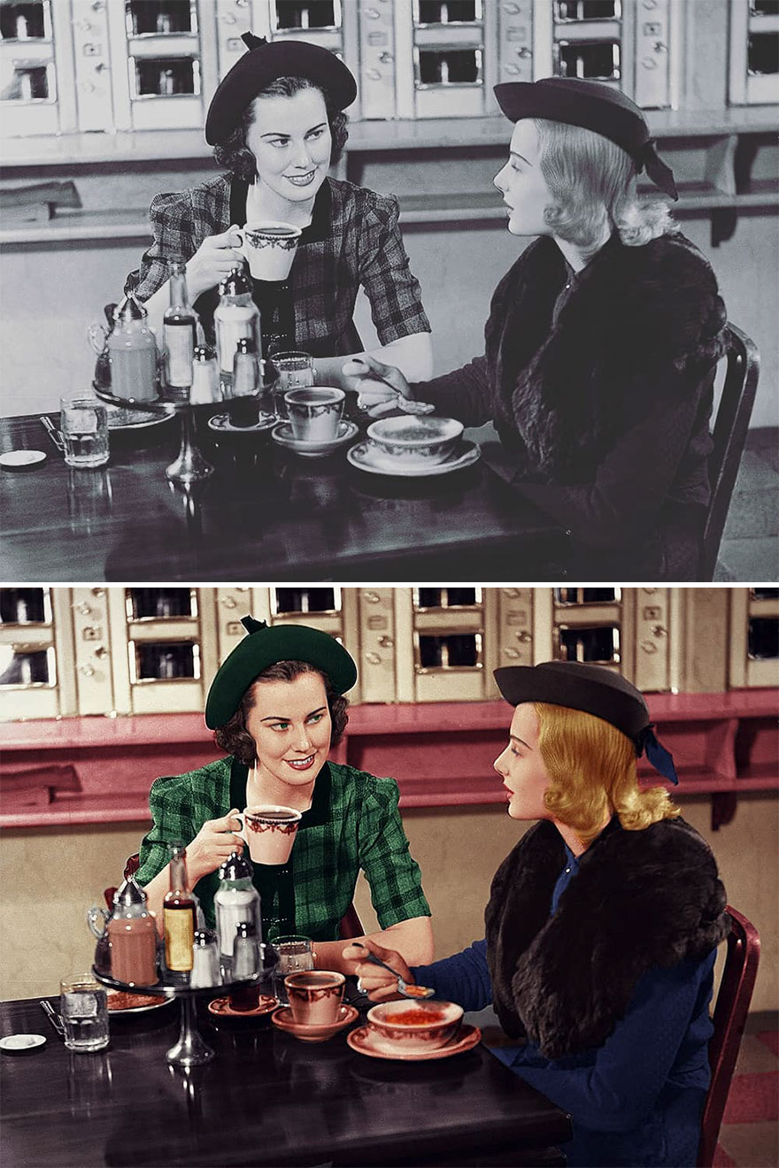
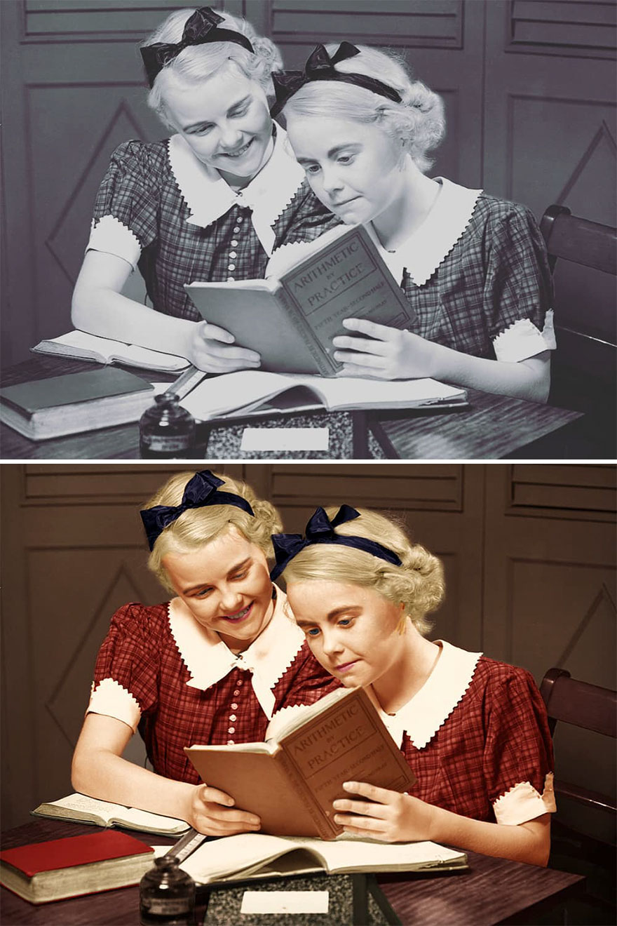
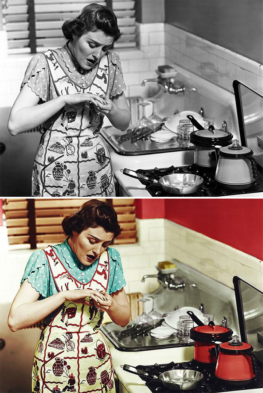
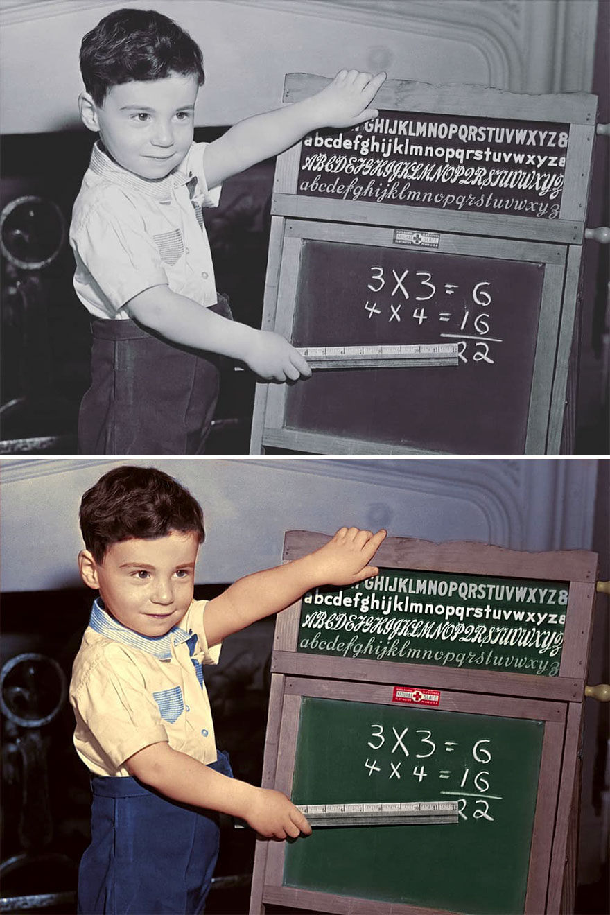
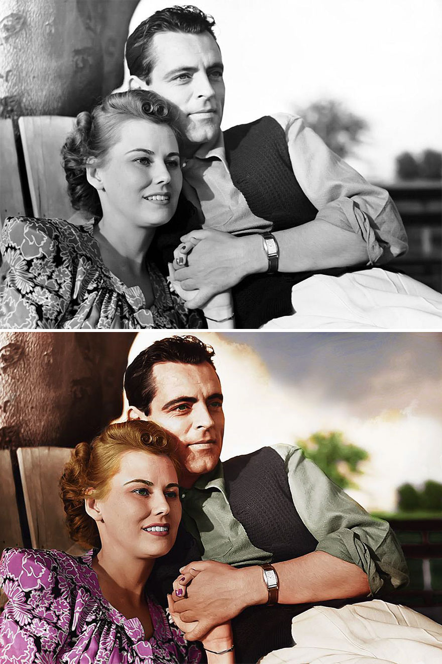
I’ve been doing graphic and web design for over 10 years. During my free time, I started coloring old photos. I am a “good old times” person. I like old movies, vintage photos, and everything related to the past – distant past.
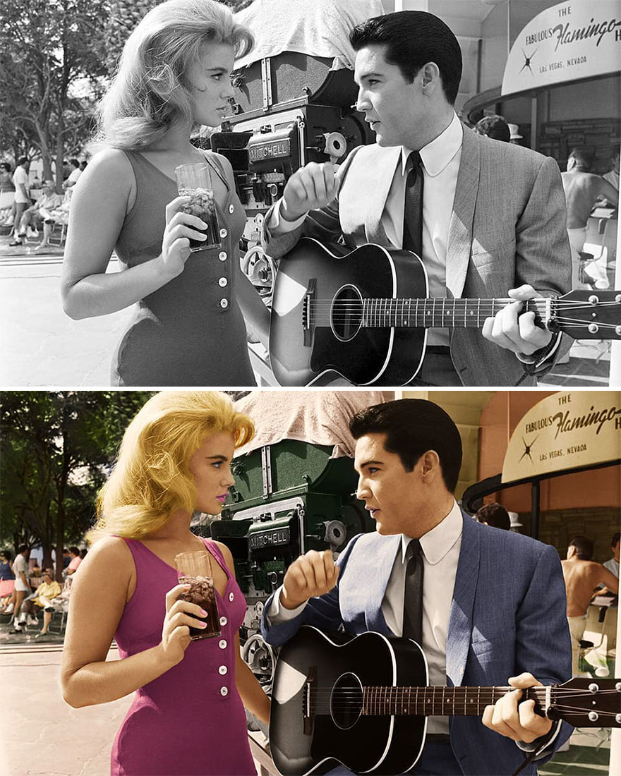
I’ve always been wondering how things looked like before. How colors looked like. These retouched photos came from that curiosity. This is just an idea to bring to life that time captured in black and white photos. So, I took my pen and decided to make them alive. The quality of colorizing photos depends on the original photo itself. Older and poorer photos are harder to work with and the final result is not so realistic. When I posted my work to the Bored Panda I had no idea that there will be so many reactions to these historical pictures. There are positive and, of course, negative ones, like with everything that ends up online. Both make me smile. There are people that are very excited, some are not and some are even offended. The last ones are the most interesting photos to me. I like to see reactions and emotions, no matter what kind. Currently, I am working on a new set of beautiful photos, even better and in higher quality. There is a rule in this business – the more you work, the better you get.
More info: Instagram
This post may include affiliate links.
That bunny looks like he'a about to murder her and then go rob a bank.... terrifying
Isn't that whisteria on the shower curtain? Aren't those a pale purple color?
An Automat! I would have loved to have visited one of these-alas, I was born too late.
The guy making these has to pick. Is he making art or trying to recreate historical photos. Because if it's art, ok w/e. But if this is supposed to be historically accurate? Like . . . wow. This seems really, really, amateurish. All I can say is, regardless, please stop with the saturation abuse. It looks so artificial and strange. Just because most people don't know any better about what good colorization looks like, that doesn't make it right. (I mean, ffs, the Ann-Margret one is from a COLOR film! How is it so wrong?? Purple nail polish? Bright red, solid color building??)
The guy making these has to pick. Is he making art or trying to recreate historical photos. Because if it's art, ok w/e. But if this is supposed to be historically accurate? Like . . . wow. This seems really, really, amateurish. All I can say is, regardless, please stop with the saturation abuse. It looks so artificial and strange. Just because most people don't know any better about what good colorization looks like, that doesn't make it right. (I mean, ffs, the Ann-Margret one is from a COLOR film! How is it so wrong?? Purple nail polish? Bright red, solid color building??)

 Dark Mode

 No fees, cancel anytime


