27Kviews
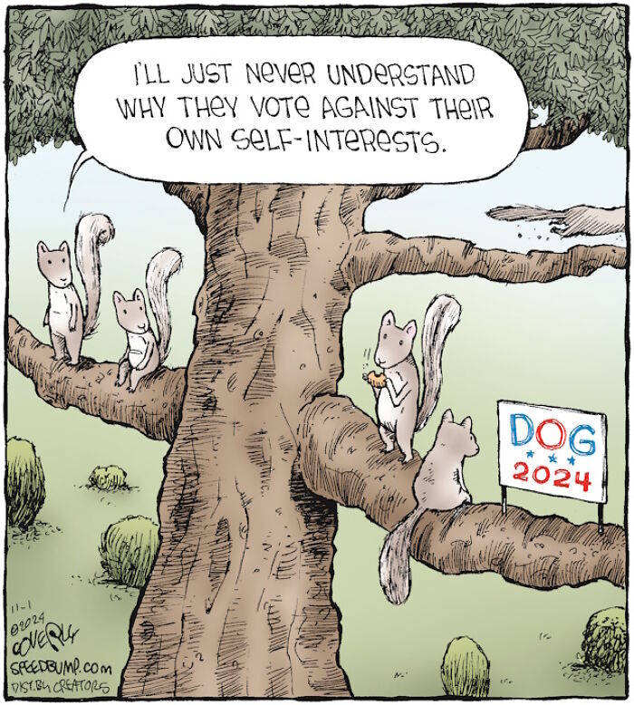
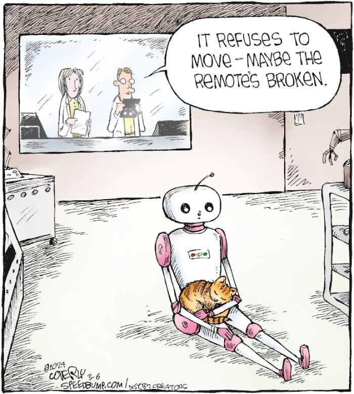
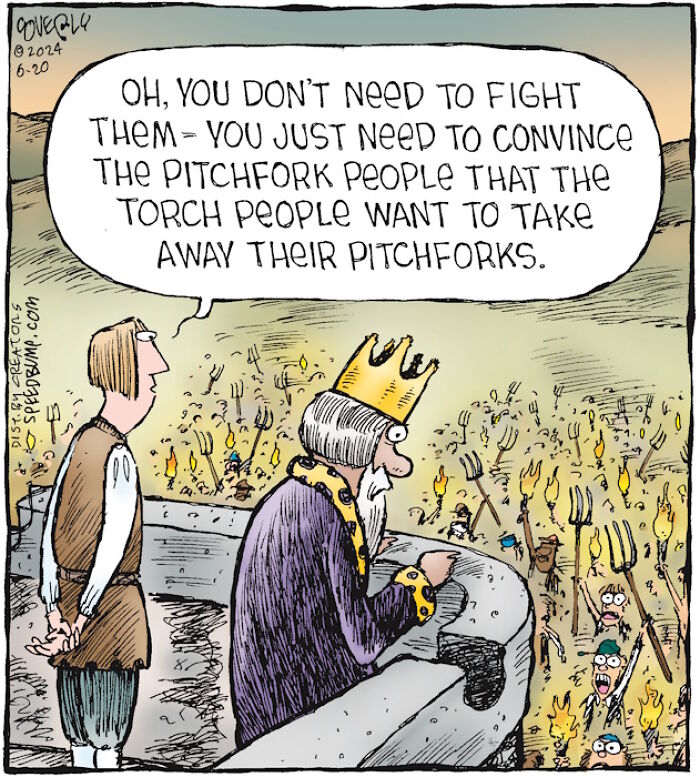
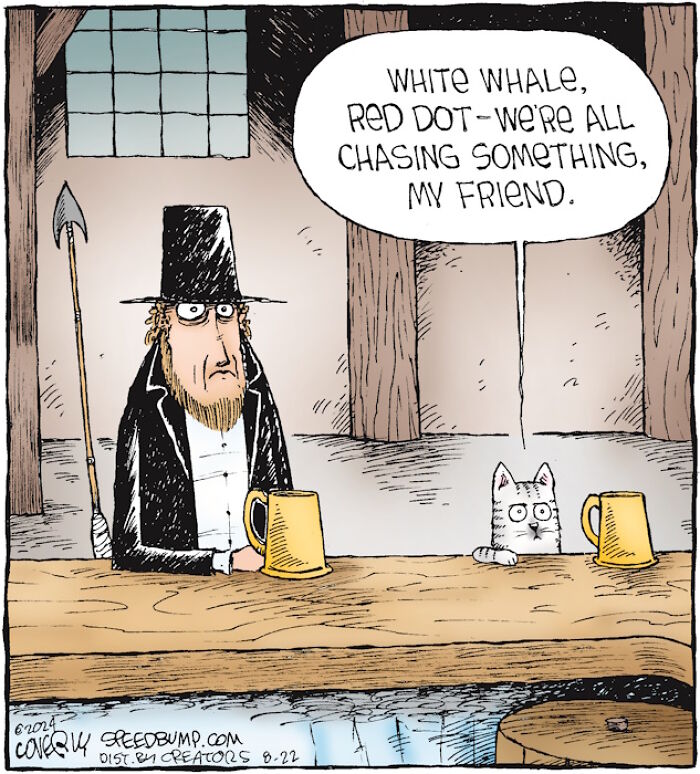
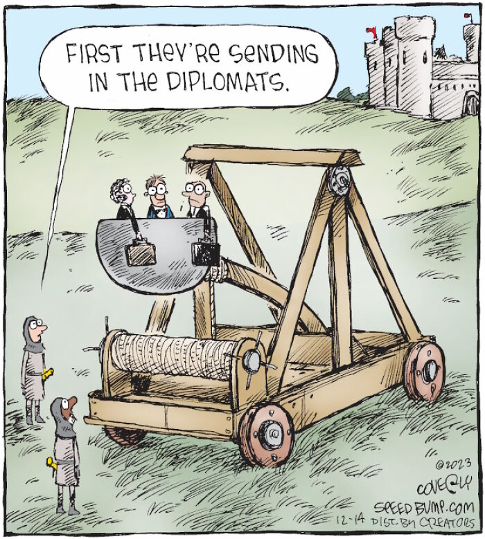
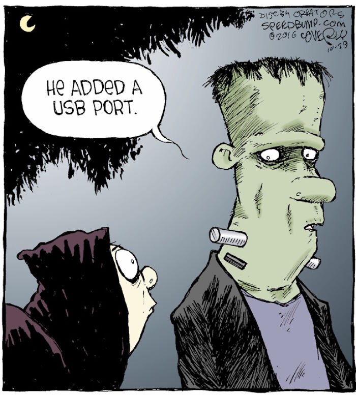
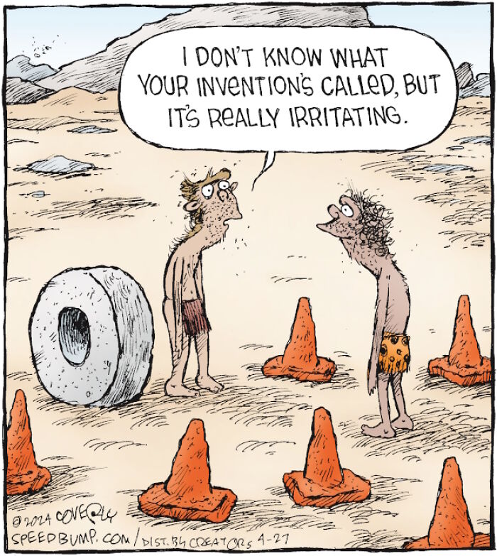
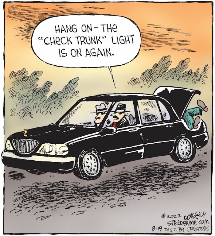
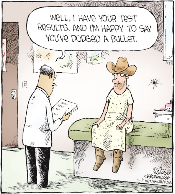
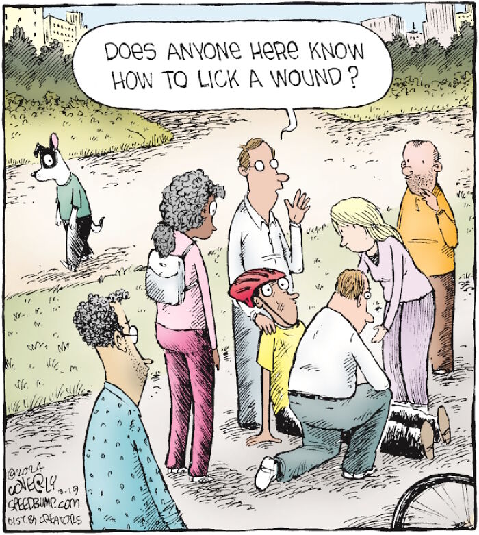
36 New One-Panel Comics About Funny Everyday Situations By Dave Coverly
Interview With ArtistWe’re excited to present the newest cartoons by Dave Coverly. Do you remember this artist and his brilliant single-panel series Speed Bump? For those of you who missed our previous posts featuring earlier strips from the series, we highly recommend checking them out—you won’t regret it and will definitely improve your mood!
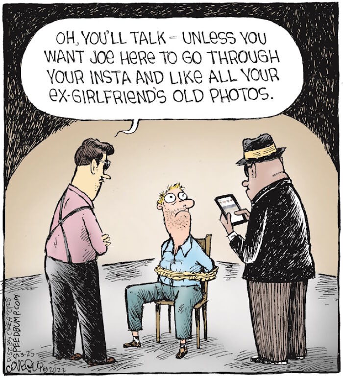
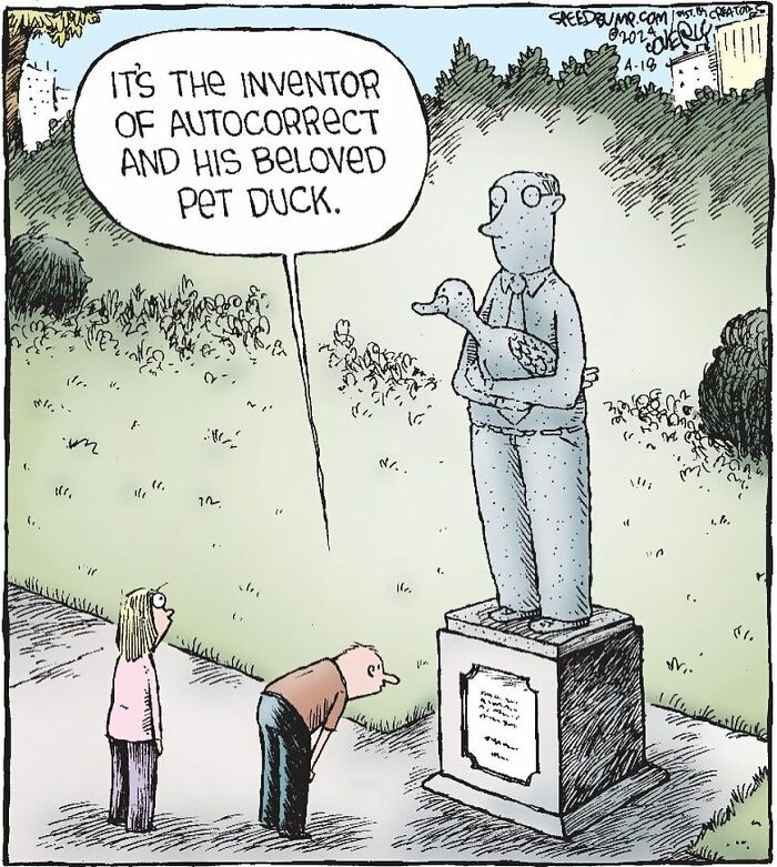
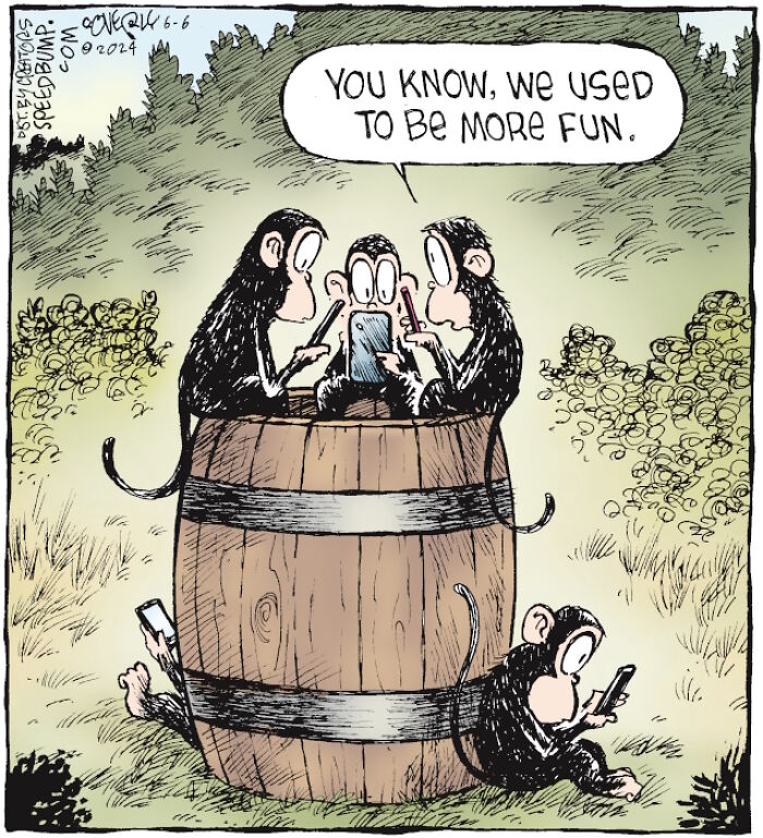
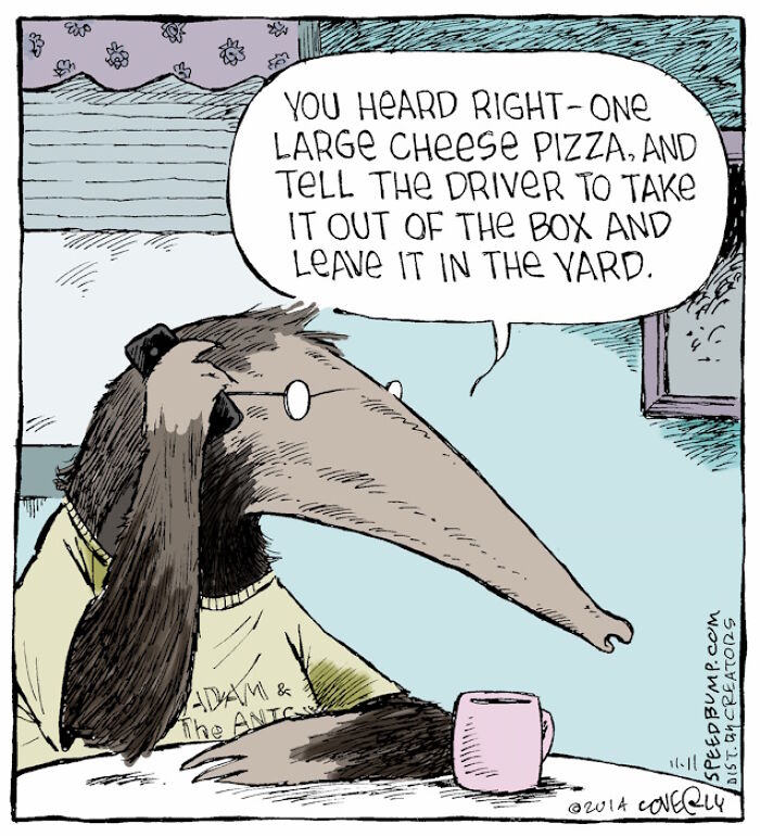
We contacted Dave again to ask him some follow-up questions and discuss his work further. This time, we were curious to learn more about Coverly’s approach to character design. The cartoonist shared with us the considerations he takes into account when creating characters for a new cartoon: “It might sound either dumb or counterintuitive because single panel cartoons like mine (the joke-a-day variety) don't use continuing characters like comic strips do - but character design is actually crucial for that very reason.”
Scroll down to see the new selection of cartoons we curated for you today, and to read our full interview with Dave.
More info: Instagram | speedbump.com | nobleworkscards.com | woodmansterne.com | calendars.com | calendars.com
This post may include affiliate links.
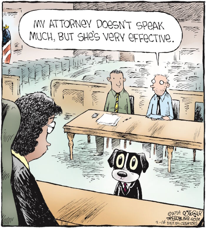
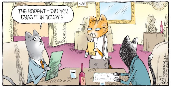
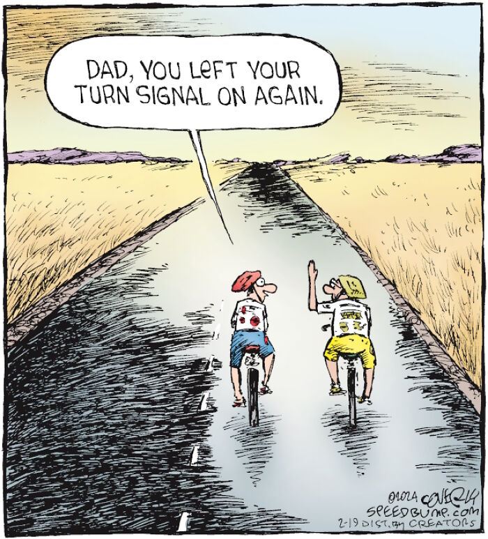
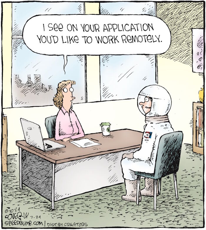
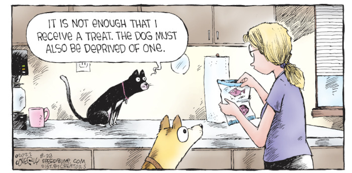
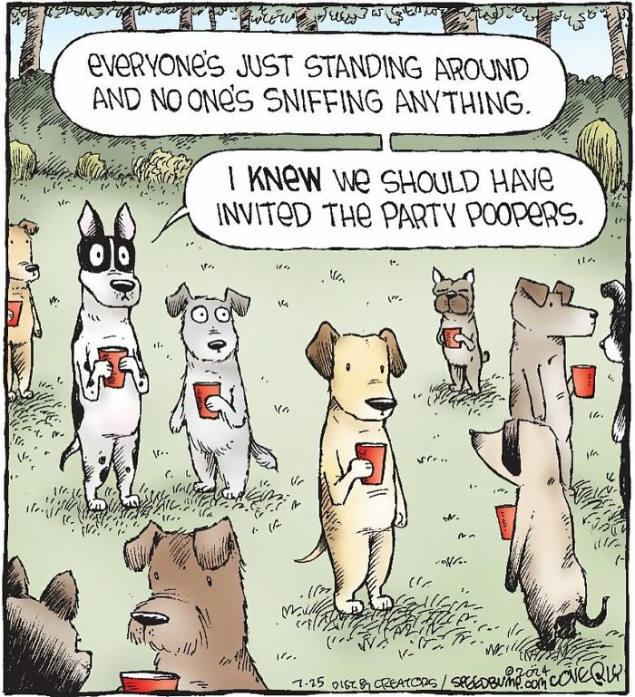
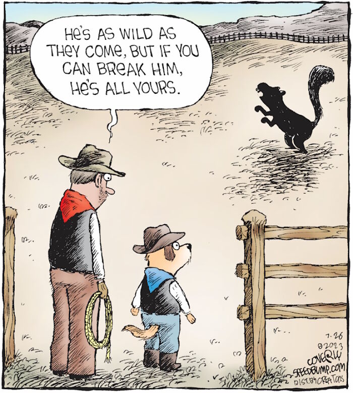
The artist went on to give us a glimpse into his creative process: “Single panels create a whole new world every day so the cast of characters changes every day, but those characters have to be drawn to fit that day's particular world and particular gag. The people and animals must have a look, and more importantly a facial/body expression, that best tells the joke. For instance, sometimes a character needs to look passive or deadpan, so they'll either have dot eyes or glasses (even the animals), while other times the eyes need to express a reaction. Getting that wrong can spoil a joke, but getting it right can add an important element of visual humor to a verbal gag. The best cartoons are when the idea and the words (when there are some) and the drawing work together to make it humorous on all levels. Of course, I'm not always successful, but that's the goal!
The other aspect of design is that single panels without continuing characters can only differentiate themselves visually from other single panels by having a style that's all their own. When people read Garfield, they don't think 'oh, that's a Garfield cartoon because I recognize the drawing style,' they simply recognize Garfield the character. So we single-panel weirdos really need to establish our own style to allow people to immediately think 'oh, that's a Speed Bump' or 'that's a Rhymes With Orange,' etc.”
When asked which comic artists and comedians he admires for their work and style, Dave responded: “Oh, so many, too many to list them all,” before mentioning a few and encouraging us to look up their work—because they’re all brilliant! Coverly listed artists like Quino, Liniers, Mr. Pants, Lucie Arnoux, Nick Galifianakis, Jim Borgman, Ed Steed, Richard Thompson, and Ann Telnaes, and added: “...these are all pro's pros. I'd say I'm tending to really enjoy quirkier cartoons right now that don't feel as though they're influenced by any other cartoonist in particular. To be candid, I don't read a lot of single-panel cartoons because if I see a joke that's perfectly executed that subject matter feels lost to me forever - my brain knows I'll never top that idea. I prefer to work in more of a creative vacuum with my ideas influenced by the real world and not other people's ideas.”
Next, we wanted to discuss the idea of a "good comic" and were eager to know Dave’s opinion on common mistakes comic artists should avoid. The cartoonist kindly responded: “I know this isn't in the spirit of the question but you've raised a good point that should be addressed: artists should never be afraid to make mistakes. In fact, I don't know that mistakes exist in the creative world, and if they do, they're personal and based on what the artist expected of themselves.” Coverly had some compelling arguments to back up his thoughts: “Art (and cartooning) isn't math, it's a conversation and a connection; sometimes one person's 'mistake' is another person's insight into a new perspective. If you're happy with your comic, you should put it out there. If someone says something negative about it, the only real reply is ‘feel free to make your own art.’
But to answer the question more practically, a big mistake I see artists make is to think that all you need to do is make great art and an audience will find you. You really have to put yourself out there and do a bit of promotion.”
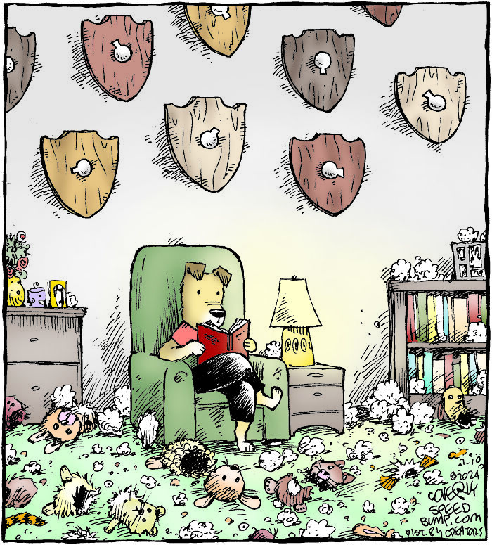
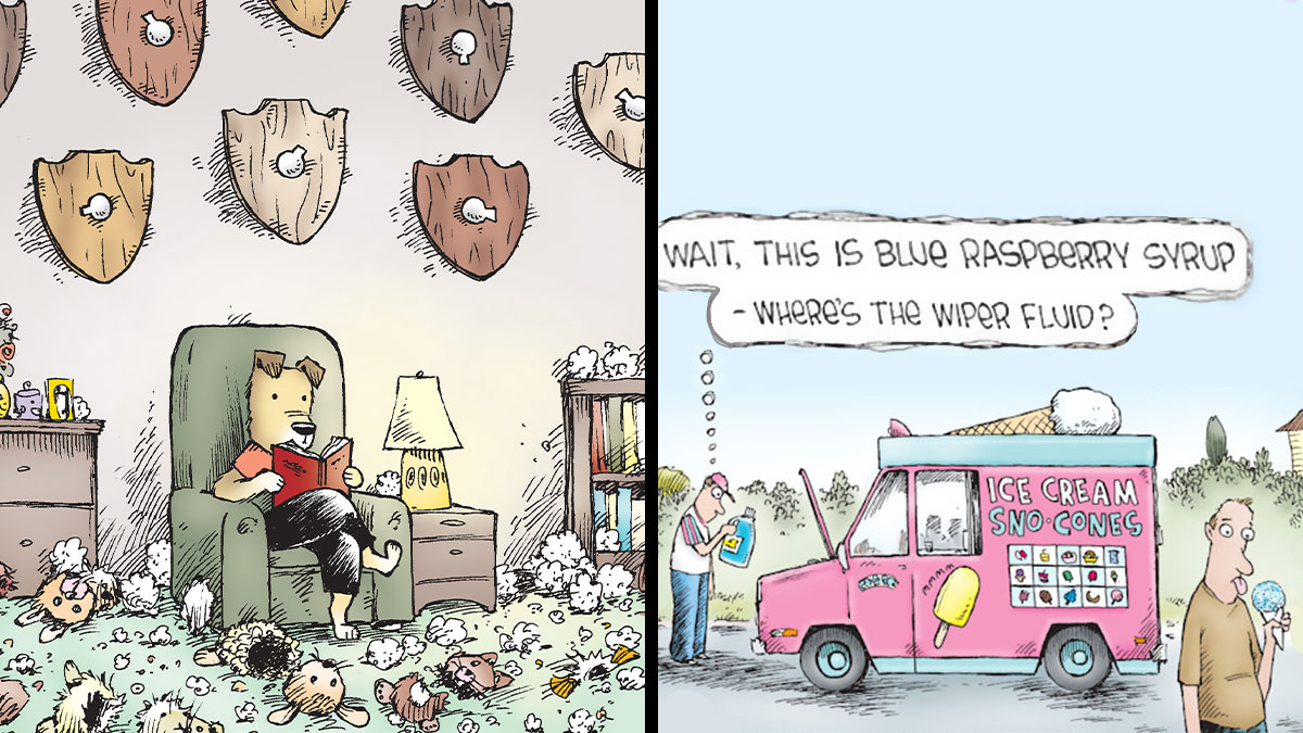
“‘What makes a good comic’ is a great question and one that would likely be answered in 100 different ways by 100 different cartoonists, but since you asked...I think it always starts with the idea, and the best ideas contain a truth or an insight. I think it's true that a great drawing can't save a bad idea but a great idea can save a bad drawing. And this may sound simplistic, but I think a comic should feel like the artist had something to say and had fun saying it.”We asked Dave to share his personal favorite cartoons that he’s created. Here’s what we learned: “I love LOVE drawing dogs so I'll have to pick one of those. I had a blast with this one.
The casual dog taking a break from destroying the toys, the room full of fluff and the squeakers as trophies - I loved the implication that this pup is just taking a break but he's been pretty manic about tearing those things up just before this moment in time. It seemed to have struck a chord with dog lovers, too - this is such a common activity!”
Lastly, Coverly mentioned that these three comics are also among his favorites (1, 2, 3), so be sure to check them out.
Very important part of the healing process. Dog licks and kitty purrs are the best medicine.
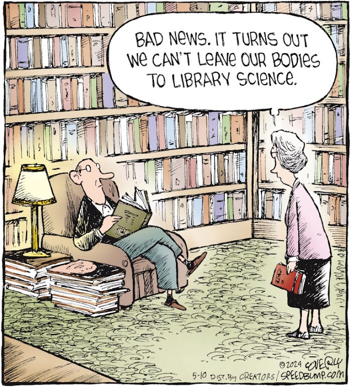
Well... There *are* books bound in human skin, so that sort of qualifies.
I need to read this comic more often. It's not quite "The Far Side," but there are plenty of gems.
I need to read this comic more often. It's not quite "The Far Side," but there are plenty of gems.

 Dark Mode

 No fees, cancel anytime


