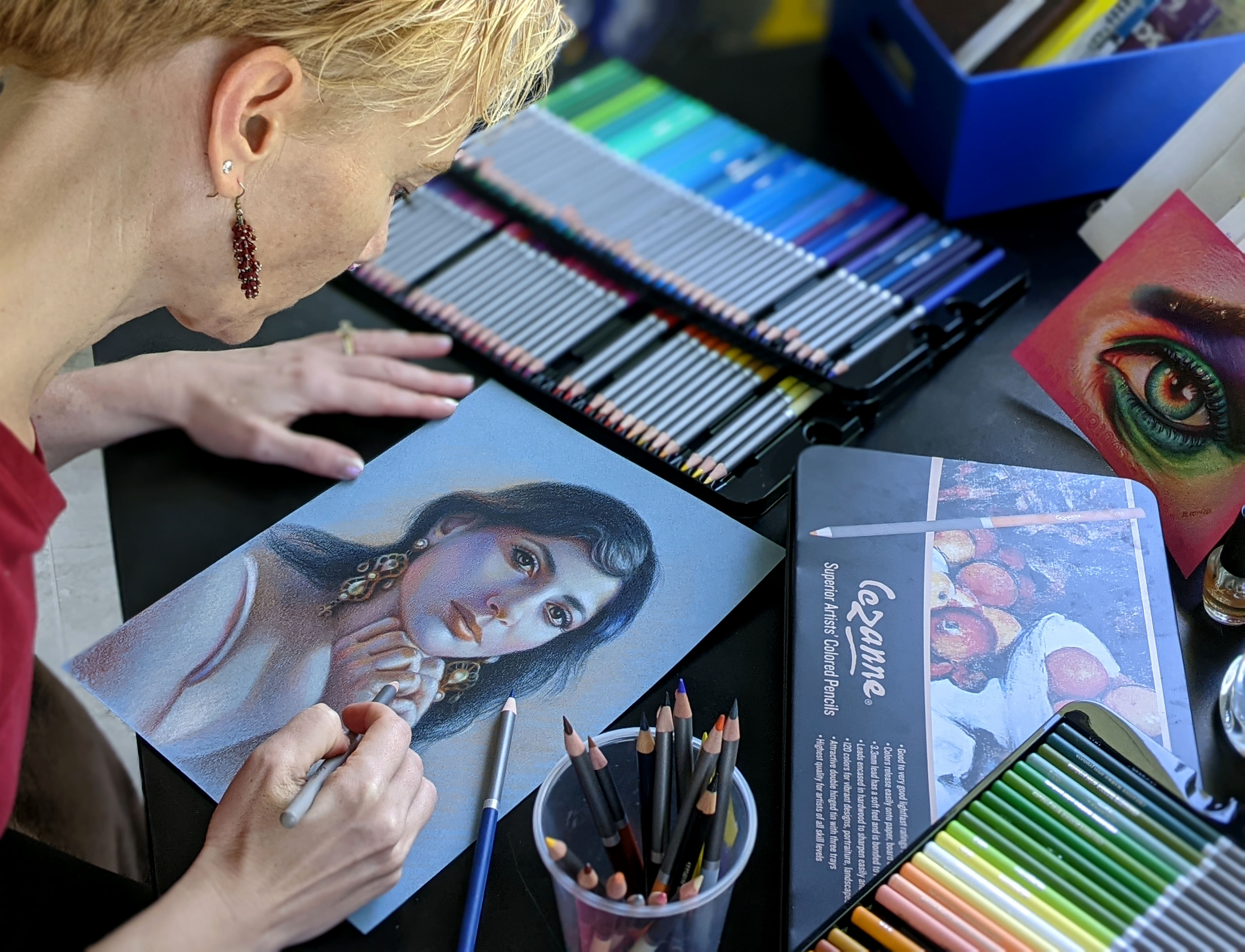
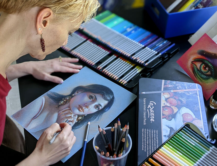
I often draw on colored paper instead of using the white one. Main reason is that it takes much less time to shade everything because colored pencil drawing is a very time-consuming process. My second reason is that I love to push colors to the beautiful extreme using few colored pencils. The result is always surprising even for me :)
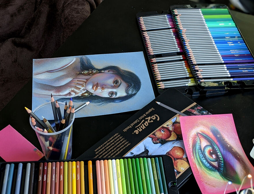
Basic Art Supplies:
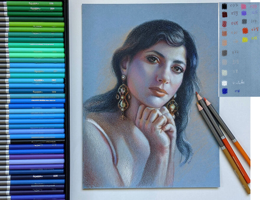
While I used Cezanne colored pencils, I don’t endorse this brand. Rather use my basic color chart to match your colors with mine.
I used Sarah Transfer paper to transfer the image.
I used Canson Mi-Teintes Pastel drawing pad, 9×12, assorted colors pad. I used blue sheet of paper, smooth side. I strongly recommend to buy a range of colored papers from Canson Colorline brand instead. These are 19×25 sheets of paper that can be subdivided to many pieces to create drawings. They’re much smoother and more vibrant than the pastel paper.
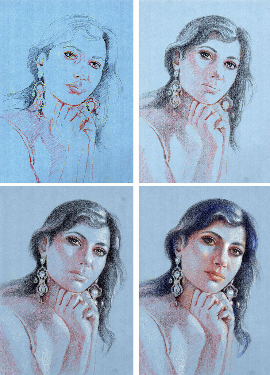
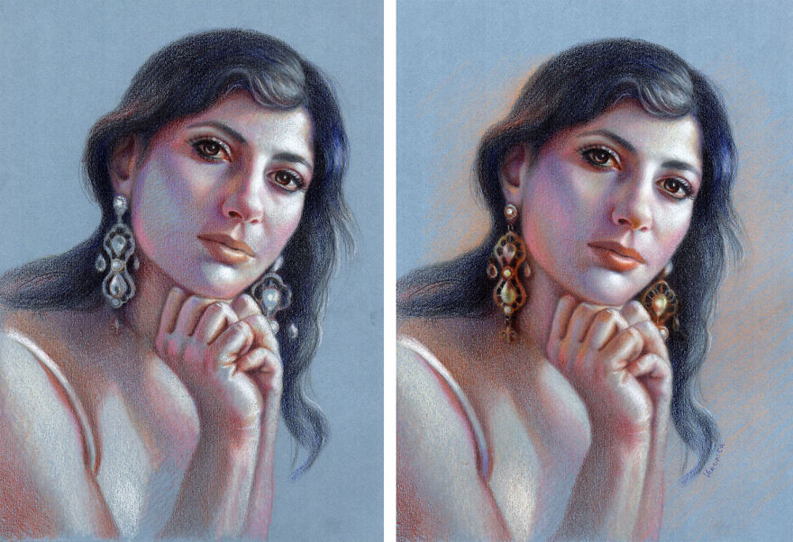
Step1: Use your favorite way of transferring the image onto your drawing paper. Don’t sketch with graphite pencil on your drawing paper because the surface must be very clean to accept colored pencils. If you have lots of pencil work on drawing paper and layer colored pencils over it, the colors look dirty and lose luminosity, especially when you work with light colored pencils. So I like sketching on my sketch paper and then transfer the outlines onto my colored paper using off-white transfer paper. In this image you can still see the transfer lines. After that I place the darks.
Step2: I work on the division of space between light and dark using just two colored pencils- black for hair and warm brown-for the skin. I create volume by placing shadows first.
Step3: I mark the highlights with white colored pencil (Prismacolor premier). Budget colored pencils have weak whites and I find that Prismacolor or Luminance colored pencils have the strongest whites.
Step4: I begin to introduce color, shading the hair and eyes with deep blue hue. I also find the light color to shade light areas around white highlights.
Step5: This is the fun part. I bring more colors in finding subtle differences in color, temperature and tone both in the shadows and the lights. I always overlap colored pencils considerably. It allows for smoother transitions and darker tones to occur.
Step6: I didn’t use a solvent or blender. Rather I used a very heavy pencil pressure to get rid of the paper’s texture. I used the same colors shading the earrings as I used on her skin. What’s different is the pencil pressure that makes colors look much darker. Also I outlined some of the edges in the earrings, which I didn’t do shading the skin (trying to keep it soft and smooth). I worked on the face the most making it a focal point, so everything else has a sketchy look.
I hope this demo is helpful and you’ll have much fun drawing on colored paper. If you’d like to learn more about my portrait drawing in colored pencil I have a whole video class devoted to it. Good luck!
More info: veronicasart.com

 Dark Mode

 No fees, cancel anytime
















4
0