50 Times Designers Deserved A Raise For Their Genius Ideas (New Pics)
Interview With ExpertGood, well-thought-out craftsmanship tends to click intuitively—typically, you instantly know whether a thing has been designed well. You look at it, you use it, and you can tell if it feels natural or if something’s off, even if you can’t put your finger on exactly why. Though the world is full of blunders and misfires, there are also lots of brilliant examples of products, furniture, graphics, and packages.
Quality things garner huge online follower counts. Case in point, this online community, which counts its members in the millions, wows the internet by sharing really cool designs. We’ve collected some of their freshest featured posts to show you what’s possible when you think outside the box. Scroll down and don’t forget to upvote the pics that impressed you the most. We have our favorites. Which ones are yours?
Bored Panda reached out to Matt Johnson, PhD, to learn about the importance of product aesthetics, as well as getting the intended message across better through graphics and packaging. He was kind enough to answer our questions, and you'll find our interview with him below. Johnson is a marketing psychology expert specializing in topics such as consumer psychology and serendipity.
This post may include affiliate links.
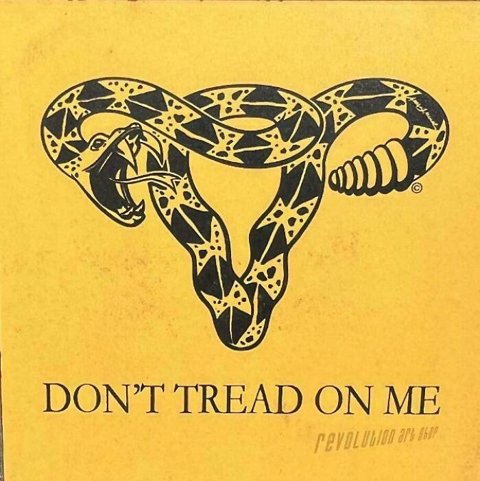
Clever Design I Just Saw For An Abortion Campaign
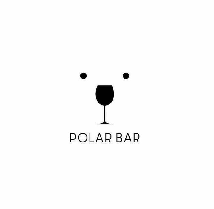
Polar Bar
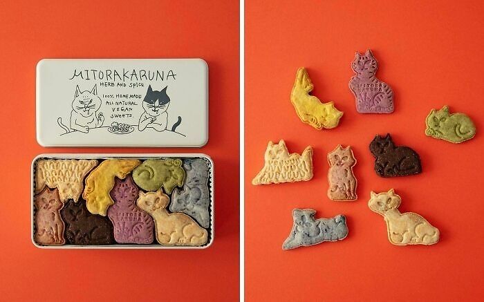
A Wonderful Package Of Japanese Mitorakaruna Cookies
Johnson noted that product aesthetics play a "surprisingly significant role" in consumer behavior. They often influence decisions in ways that people don't consciously realize.
"Our brains are wired to respond to beauty—when a product is visually appealing, it activates reward centers, creating a positive emotional response. This initial impression can set the tone for how we evaluate the product’s functionality, quality, or even value. Importantly, aesthetics can also build trust; a well-designed product suggests care and attention to detail, which we subconsciously associate with reliability," the marketing psychology expert told Bored Panda in an email.
"However, the effect of aesthetics goes beyond attraction—it also plays into self-expression. People often choose products that align with their personal style or identity, making aesthetics a critical driver in everything from impulse buys to brand loyalty. In essence, aesthetics aren’t just about looking good; they tap into deep psychological needs, shaping how we connect with what we buy."
Damn.... How Creative
Stop War
by Polish artist Barbara Galińska.
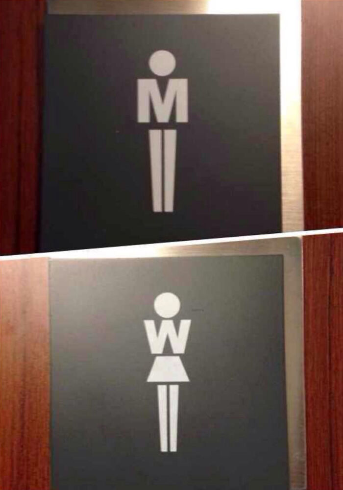
Found This Impressive Toilet Sign In Bratislava
Bored Panda also wanted to get to grips with how designers who work with graphics and packaging can get their message across better. The important thing here, according to Johnson, is to focus on the essentials.
"Graphic and packaging design is all about creating an immediate connection with the consumer, and the brain plays a big role in how these designs are perceived. Simplicity and clarity are key—our brains are wired to process visual information quickly, so designs that are clean and focused tend to be more effective," he said.
"Color psychology is another powerful tool; specific colors can evoke emotions and associations that align with the product’s message. For instance, green often signals health or sustainability, while red conveys urgency or excitement. It's worth noting that while some of these associations appear to be universal, others are culturally contingent. It's important, therefore, for the designer to carefully consider the audience when making these color and design choices," Johnson explained the importance of cultural context.
"Additionally, leveraging visual hierarchy—using size, contrast, and placement to guide attention—helps ensure the most important elements stand out. Designers should also consider how the design feels emotionally; tactile elements, like embossing or texture, can create a memorable sensory experience. Ultimately, the best designs balance functionality with an emotional hook, making the product both intuitive and irresistible."
Salvation Army Advert For Spotting Signs Of Domestic Abuse
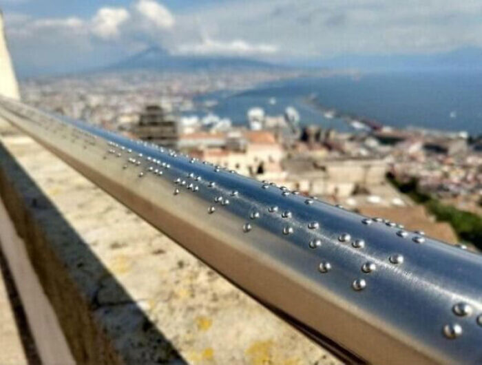
Railing With Braille On It To Describe The View
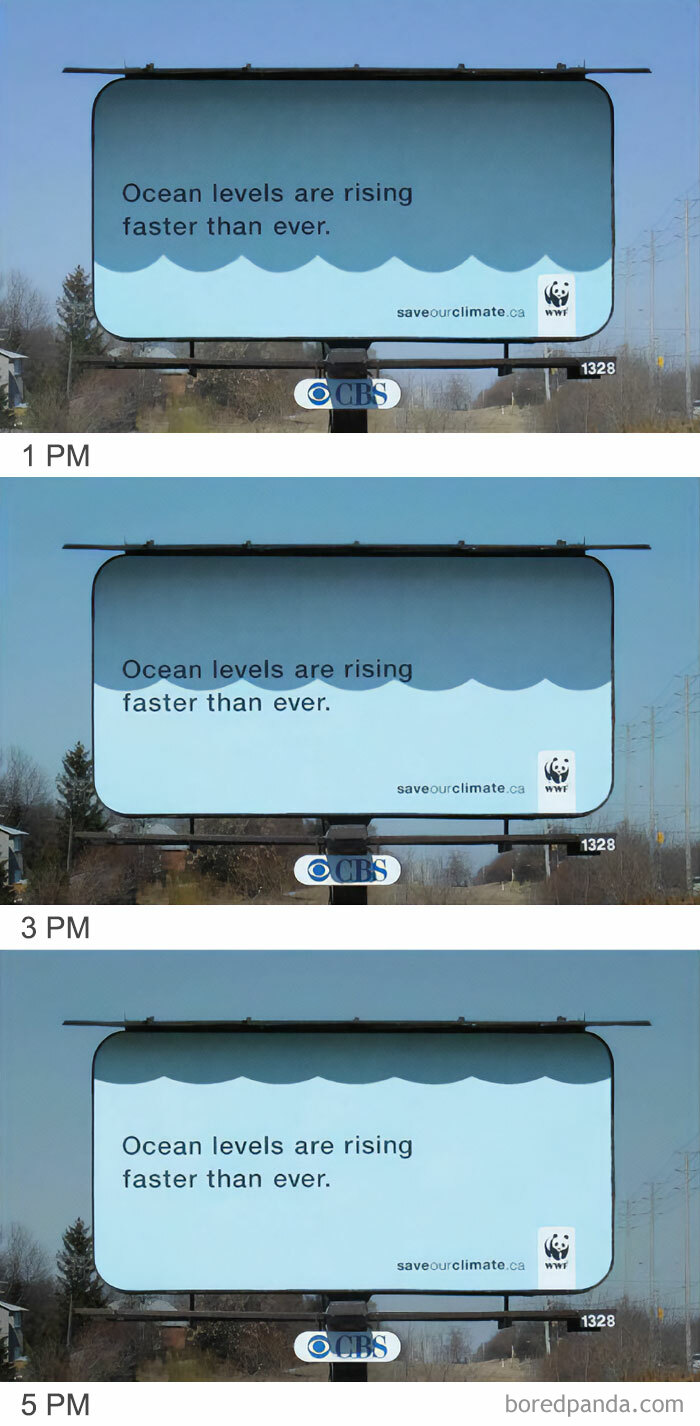
An Awning On The Top Of The Billboard Creates The Illusion Of Of The Ocean Rising
Technologies and aesthetics change, consumer preferences and cultural attitudes shift, but no matter how much time passes, some design philosophies continue to stand the test of time.
For example, German industrial designer Dieter Rams, who has had a profound impact on the world of design, is still relevant with his ideas and approaches today. Some ideas are simply fundamental.
Designer Rams came up with his 10 principles of good design which are sometimes known as the 10 commandments of design. Rams saw truly good design as innovative, making a product useful and understandable, aesthetic, unobtrusive, honest, long-lasting, environmentally friendly, and thorough down to the last detail.
And, lastly, good design should—paradoxically—involve as little design as possible.
Posters For National Theater Of Korea's Production Of Macbeth, Designed By Yuni Yoshida And Photographed By Noh Juhan
Aussie Advertising Is Usually Extremely Direct
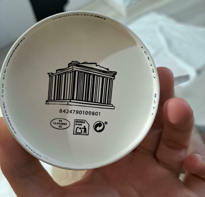
This Parthenon Barcode On A Greek Yogurt
Here in my country, barcodes are ending shortly and will be replaced with QR codes.
Load More Replies...Have the Americans searched for oil underneath yet?
Load More Replies...That last bit—about how designers should design less—is essential. At the core of ideas that balance function and form, you’ll often find simplicity.
There’s a high level of self-editing and refinement involved where you let go of what is, basically, clutter. Of course, there’s no arguing about taste, but over-designed products can either end up looking like works of art that barely function, or they have so many functions it’s unclear what they even do. Less really is more. And from a creative perspective, it takes a lot of courage and discipline to throw out the fluff.
Another Take:
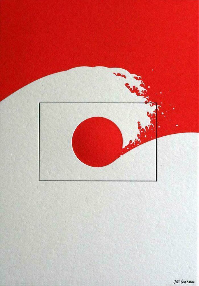
A Deconstructed Flag
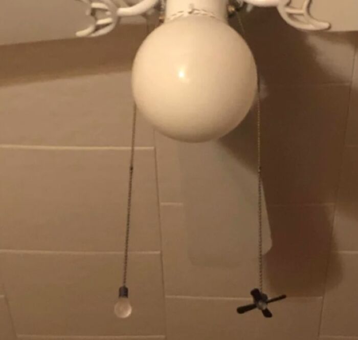
The Strings On This Fan Show Which String Does What
I need this. I keep pulingl the string in the dark and wonder why the room keeps getting colder
The online community that we’re featuring was created way back in mid-2011. Over the past 13+ years, it grew from strength to strength. Currently, there are a jaw-dropping 2.3 million members on the subreddit.
It’s a testament not only to the fact that people like looking at unusual and aesthetic things, but also that creativity and quality—when done truly right—will always find an audience.
The moderators who make sure that the group runs smoothly explain that it’s a space to share “amazing design images,” as well as renderings and models.
Everyone’s encouraged to post high-quality pics of interesting designs, including—but not limited to—architectural, graphic, industrial, furniture, and product designs.
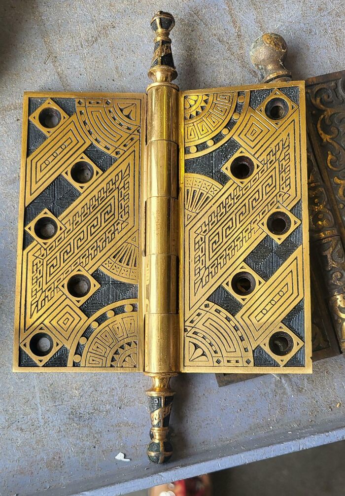
This Art Deco Door Hinge That Came Through The Salvage Store I Work At
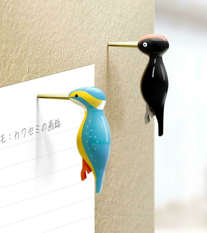
Kingfisher Thumbtacks
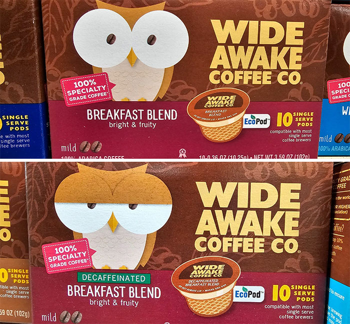
The Owl On The Regular Coffee vs. The Decaf Coffe
However, this is not an art-focused community. For instance, even though gorgeous and painstakingly created artwork and sculptures are a pleasure to look at, they’re a better fit for other communities. When you create an online group, it’s important to carve out a niche for yourself and to be consistent with it.
This Lotr Poster By Phantom City Creative
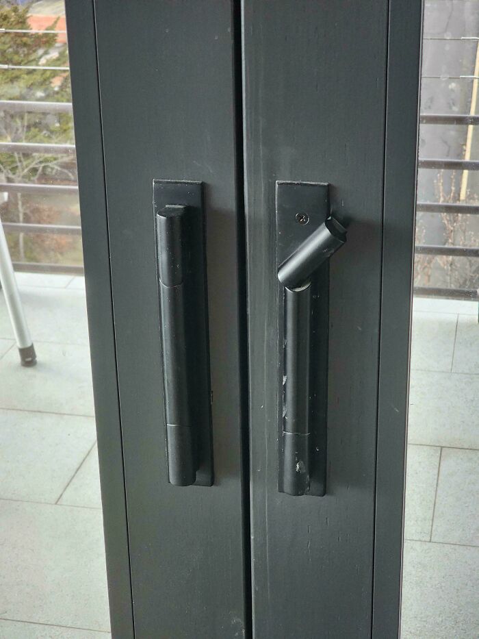
House Number Matching Door Handles In Vienna’s 19th District
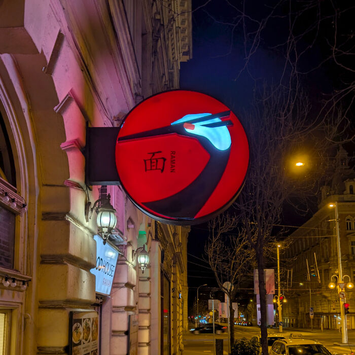
Ramen Restaurant In Budapest
Doing a bit of everything can be fun for you, but your audience likes to know what they’re in for. So, it only makes sense that a design-focused community focuses on… design!
It’s what keeps groups like this one popular and active years and decades after they're created. That, and a group of hard-working volunteers who help moderate the entire thing.
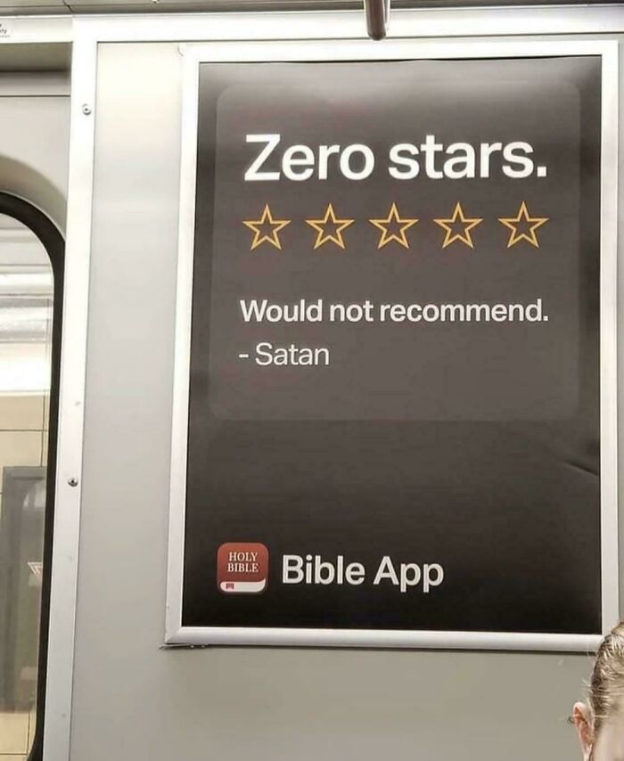
Ad Placement On A Subway
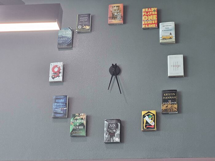
This Clock At My School Library Replaced The Numbers With Books
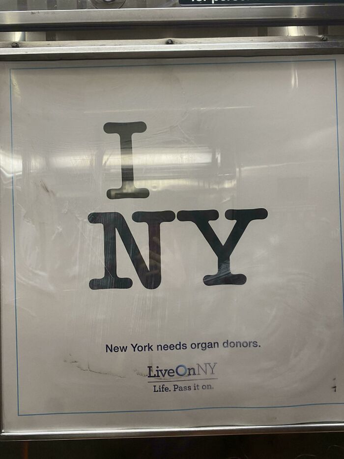
Organ Donations Advertisement In NYC Subway
The subreddit’s name, which we can’t directly mention here, is an artifact from the days when the internet was a very different place: naming conventions were laxer, users were more at ease with sarcasm and irony, others enjoyed being super edgy and maybe took themselves a little bit less seriously, and everyone was less worried about being censored on the internet.
Now, things are far more strict online, leaving less room for jokes and weirdly-titled groups. The silver lining? No matter what a group is called, the proof is in the pudding: quality content is quality content.
A Perfume Bottle From 1925
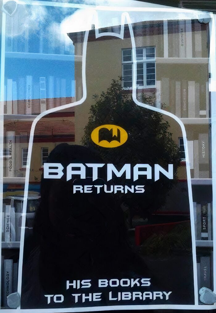
Batman Returns... His Books To The Library
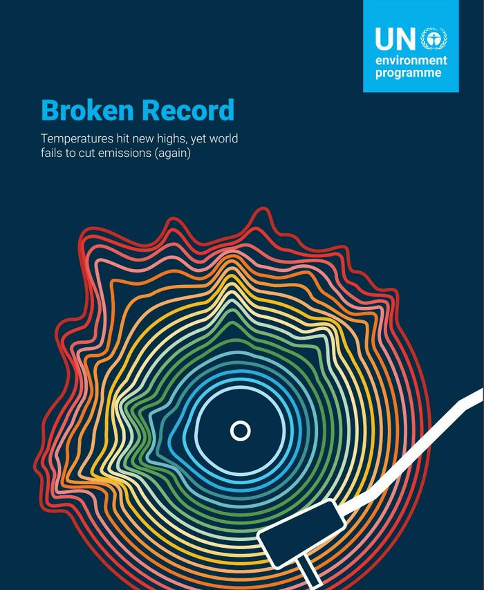
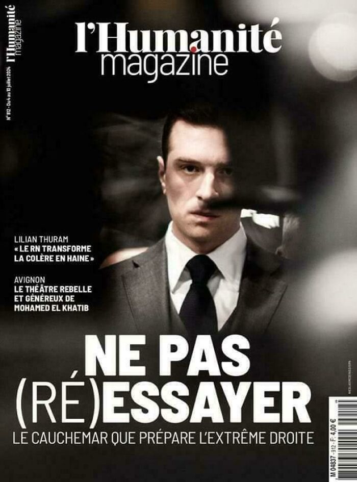
Another Cool Time Magazine Cover
We’re huge fans of design, dear Pandas, so if you have a moment, we’d absolutely love to hear which of these pics you enjoyed the most. Which designs did you personally think were the most creative?
Were there any that you genuinely felt sad you didn’t think of first? What's the worst design you've seen recently? Let us know what you think in the comments!
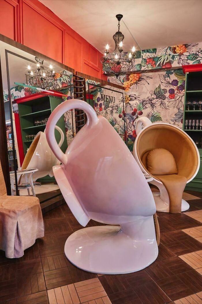
Coffee Shop Chairs
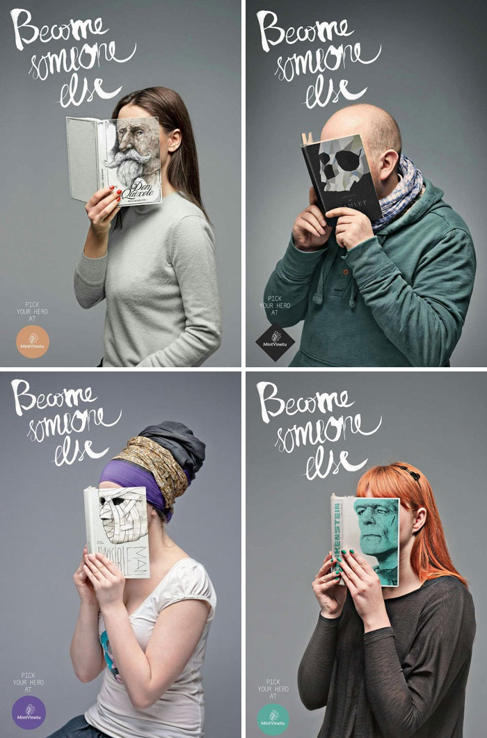
“Become Someone Else” Ads For The Mint Vinetu Bookstore, Lithuania
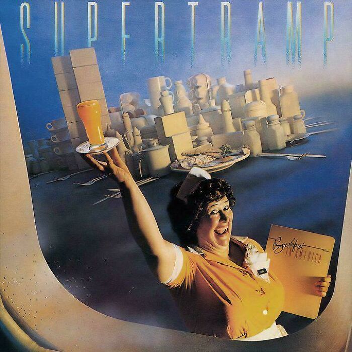
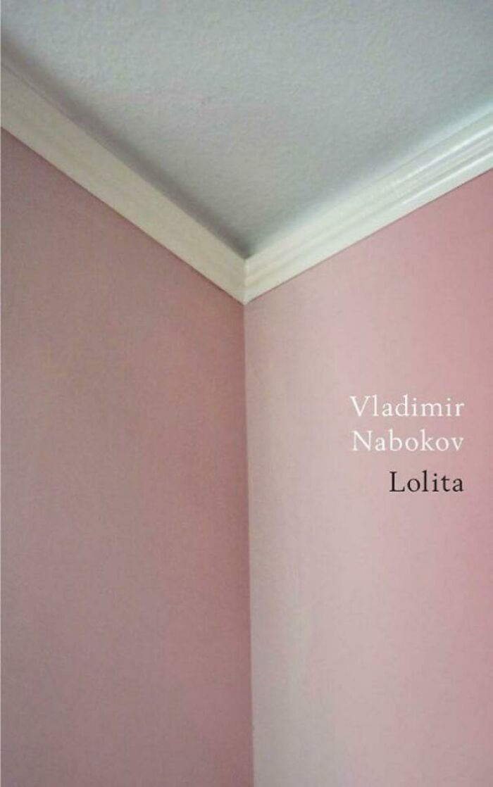
That's The Absolute Peak Of Cover Designs
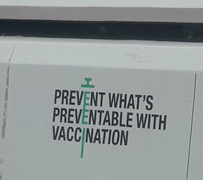
The Typography Found In The Call-To-Action Of This Vaccination Campaign
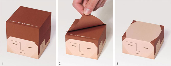
A Notepad From Japan
Indian (Kerala State) Tourism Post For Christmas
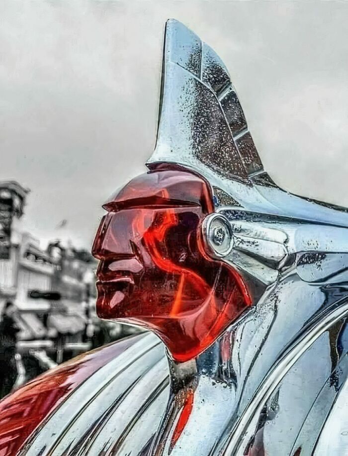
Pontiac Hood Ornament, 1950s
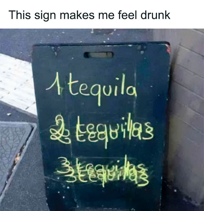
Drunk Alcohol Sign
Lion King Poster Concept
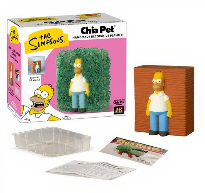
A Simpsons-Themed Chia Pet That Recreates One Of The Show's Most Famous Memes
Vet Clinic’s Previous Front Design
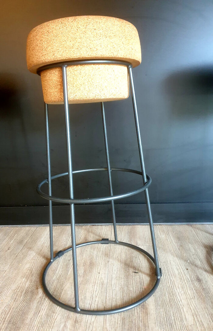
Bar Stool Shaped Like Wine Cork
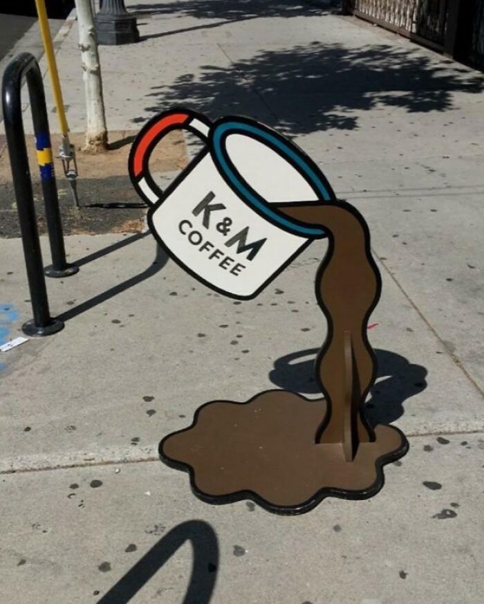
A Coffee Shop Sign In A Cartoonish Style…
Bar Sign In Japan
1,900 Year Old Stepwell In Rajasthan, India
Manhole Cover At Nikon's New Headquarters That Looks Like Nikon's Front Lens Cap
Air Serbia Graphic On In-Flight Brochure
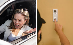
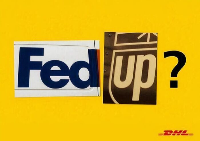
DHL Advertisement
Now take the missing letter of the brand on the right (UPS) and the missing letters of the brand on the left (FedEx) and merge them to also make a word.
Time Magazine Cover
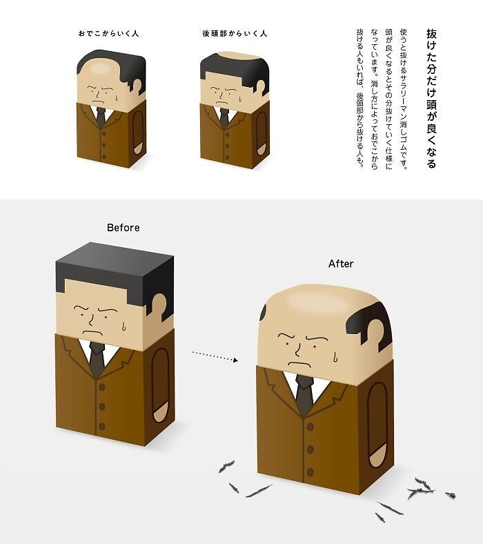
Japanese Artist Kazuya Ishikawa Creates Hilarious Erasers That Slowly “Bald” As You Use Them
Karolis Strautniekas
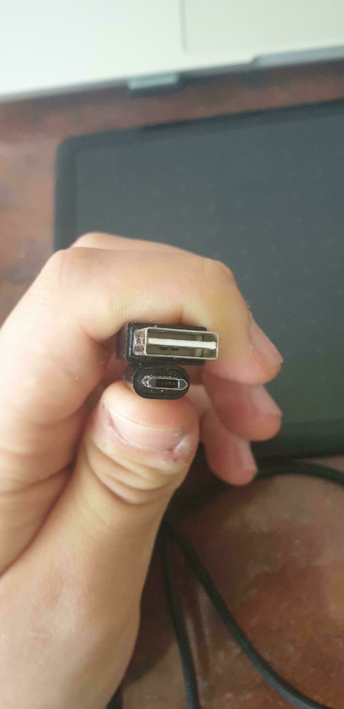
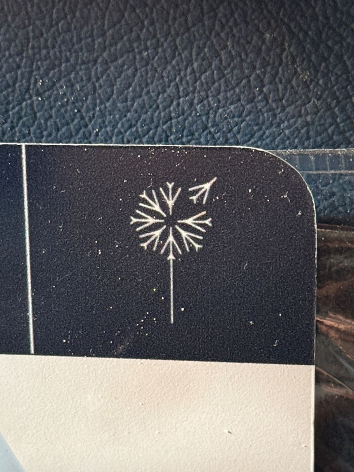
Dip [or] Squeeze Condiment Packet
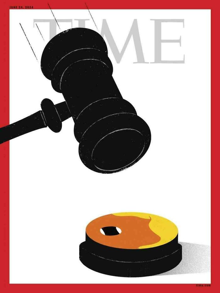
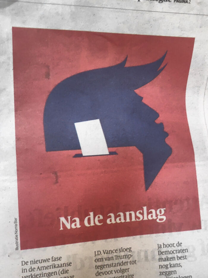
Clear American Design On The Outcome Of A President's Trial
Has anyone else lost the ability to check notifications? I can’t find an option to check mine at all, it’s been replaced with an “upload post” button. If you reply to this I won’t be able to see a notification lol but just wondering if anyone else has this going on.
Press the 3 bars on the top left.... it's now hidden right down the bottom of the list....
Load More Replies...Has anyone else lost the ability to see the additional posts beyond those based on user votes? I keep clicking on the link but nothing happens. Is this another feature now reserved to premium users? If so, why don't say that?
It usually says to get premium to see the rest, but yeah, it sucks. And if someone comments on a comment youve posted, if the post is hidden under the paywall you can’t even access your own content or respond.
Load More Replies...Has anyone else lost the ability to check notifications? I can’t find an option to check mine at all, it’s been replaced with an “upload post” button. If you reply to this I won’t be able to see a notification lol but just wondering if anyone else has this going on.
Press the 3 bars on the top left.... it's now hidden right down the bottom of the list....
Load More Replies...Has anyone else lost the ability to see the additional posts beyond those based on user votes? I keep clicking on the link but nothing happens. Is this another feature now reserved to premium users? If so, why don't say that?
It usually says to get premium to see the rest, but yeah, it sucks. And if someone comments on a comment youve posted, if the post is hidden under the paywall you can’t even access your own content or respond.
Load More Replies...
 Dark Mode

 No fees, cancel anytime






















![Dip [or] Squeeze Condiment Packet Dip [or] Squeeze Condiment Packet](https://www.boredpanda.com/blog/wp-content/uploads/2024/04/6628e247308c3_mpp037itt6ub1__700.jpg)
