“That’s It, I’m Architecture Shaming”: 30 Buildings That Look So Bad, People Just Had To Shame Them
InterviewArchitects have given us the most gorgeous and impressive creations throughout history, such as the Eiffel Tower and the Notre Dame Cathedral, or more recent wonders like The Guggenheim and the Sydney Opera House. However, architects also create some real doozies sometimes.
In these cases, their creations usually end up in the "That's It, We're Architecture Shaming" group. From weird commercial buildings to uninviting homes, this group has everything. Bizarre-looking and serving no functional purpose? Shameworthy! So, if you're looking to have a laugh at some of the most ridiculous and aesthetically infuriating buildings, this is the right place!
Bored Panda got in touch with the group's administrator, social marketing specialist and media master Alicia Mariah Elfving. She kindly agreed to tell us more about the inception of the group and how buildings that get shamed the most can be great conversation starters. Read her thoughts below!
More info: That's It, We're Architecture Shaming | Alicia Elfving | The Moto Lady | Women's Moto Show
This post may include affiliate links.
Here is a classic Michigan architectural gem - the Ypsilanti Water Tower.. AKA the Brick D*ck!
The group's administrator, Alicia, tells us that the "That's It, We're Architecture" shaming is a second iteration of the iconic "That's It, I'm Architecture Shaming" group on Facebook. "I got a lot of joy out of looking at the hilarious snarky commentary and ugly buildings," she tells us.
"Then one day my comments were getting declined. They didn't say why, but I was guessing maybe the term 'ugly' was no longer allowed, so I re-wrote my comment. Long story short, the group became overrun by spammers, bots, and scam-type profiles. People were reposting spam posts that had reposted themselves... like a robot spam inception."
"So, I saw the writing on the wall and created a new group called 'That's It, We're Architecture Shaming' to give people who really loved the old group, like me, a place to resurrect the amusing content we once loved," Alicia recounts.
Alicia tells us that while the group's primary goal is to make people laugh, true architecture lovers come here as well. "The more time you spend in the group, the more you see how invested people are in these buildings. Architects, architecture lovers, photographers... people can be really passionate," she explains.
Windows, windows everywhere! Chata Otulina - Radków, Poland (rental property close to a national park)
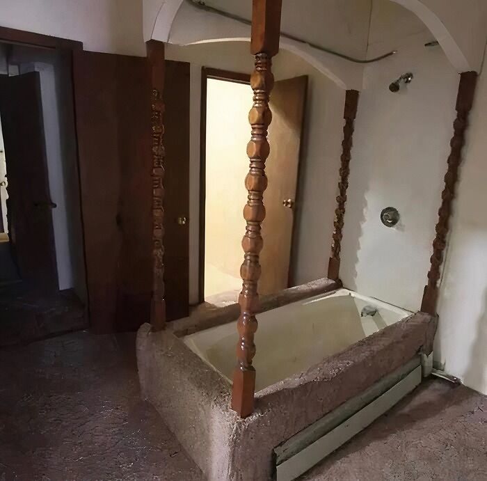
Yall I found another interior thing why do people put carpet in bathrooms or anywhere in houses. please burn it with fire, why does this bath tub have the bed posts on it so many whys…
So, what makes a building truly shame-worthy? Alicia thinks it depends on the person. "The more 'out there' a design is, the more it elicits an emotional response. So, usually, buildings that are unique and different get the most shame, just because they give everyone something to talk about. They're real conversation starters."
Alicia also tells Bored Panda that groups like "That's It, We're Architecture Shaming" are a great way for people to be exposed to other opinions. Perhaps it can even change the way people think about architecture.
"[It gives] people an opportunity to explore people's opinions on topics outside their usual echo chamber. That means they have more opportunities to see things from other cultures and perspectives... and for that, I think, it's changed it for the better. Maybe not a lot, but a little better is good, right?"
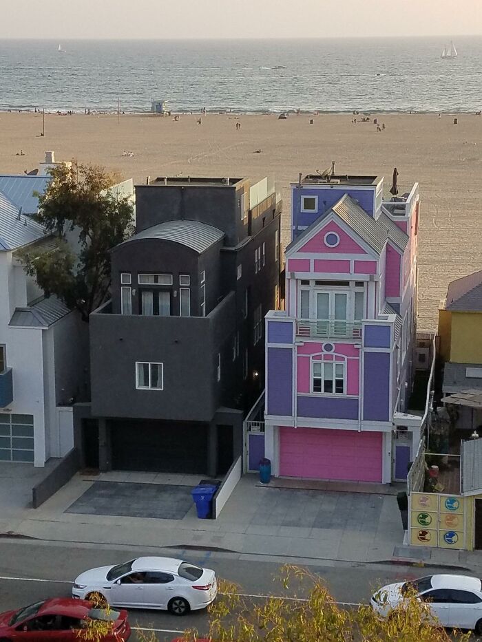
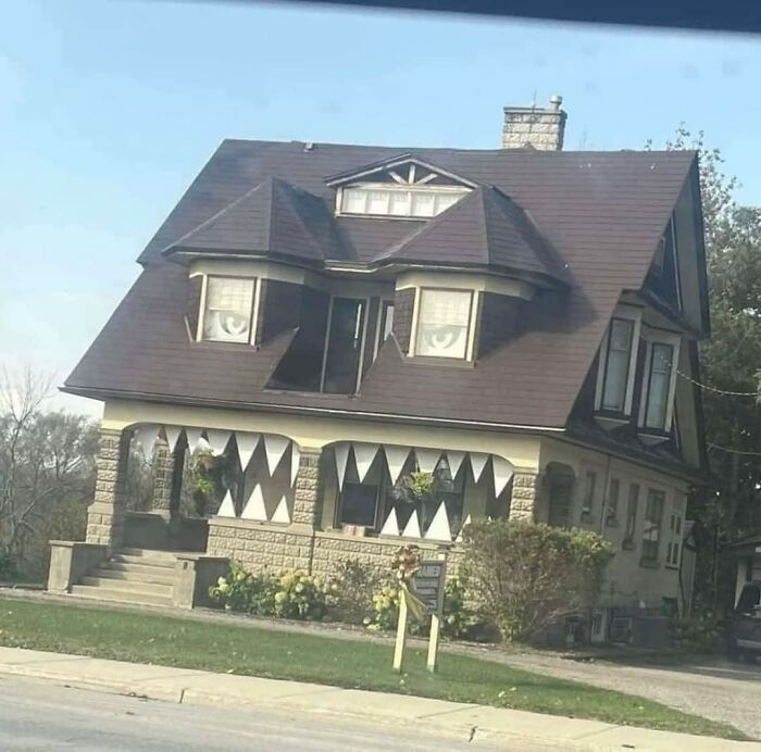
I’ve made these houses into memes before because, well, look at them! So full of personality. So much to shame or love, depending on your personal tastes.
Got shown this in class today on what not to do.
We can all point and laugh at what we think are ugly buildings and houses. But what does make architecture bad? Aaron Betsky, columnist for Architect Magazine, claims that today, good architecture should be sustainable, functional, enhancing, and, of course, beautiful.
"Architecture should be neither weird nor boring, neither alien nor alienating, neither wasteful nor wanting in the qualities that make us human," he writes. "I think that we rather, first, have to ask the question in all cases: 'Do we really need more buildings?'"
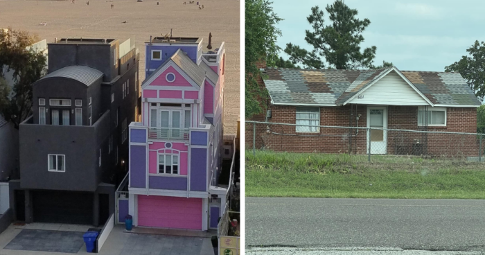
I wonder if his wife is a quilter.
Building on a budget? Buy remainders and patch them together like this. Person even managed to make it aesthetic. Good on them!
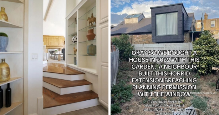
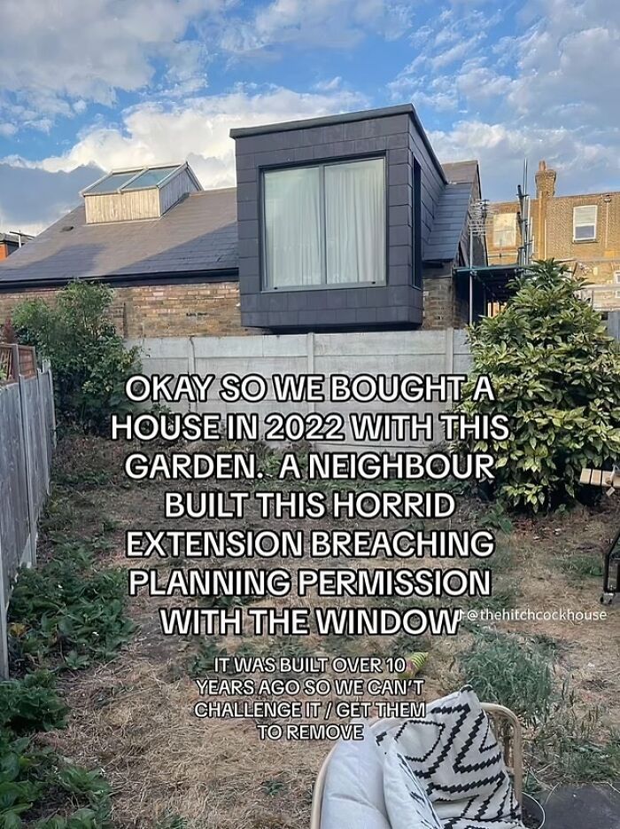
In Leytonstone, east London, UK
The couple who owns the garden ultimately decided to plant some trees and hide the window.
According to Arch Daily, good architecture needs to have a purpose. It needs to serve its environment, spatial, and human factors. The magazine claims that we should build infrastructures because we need them, not just because we can. "A considerate project is one that is both supportive and nurturing—of people, of place, and of society."
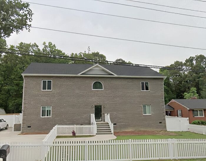
House I pass every time I visit my parents- it’s on a busy road, hence the Google Maps pic. Was built a couple years ago and they’ve since added some plants… as you can surely visualize, that helps none.
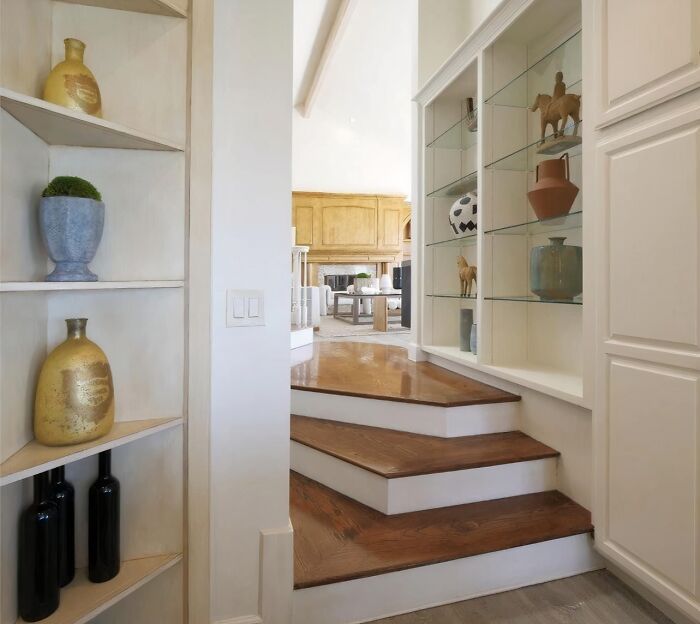
Pretty sure I’d trip on these steps every single time.
If there's another doorway at a 90° angle on the left I can maybe understand it; otherwise this is a Mr. Bean sketch waiting to happen.
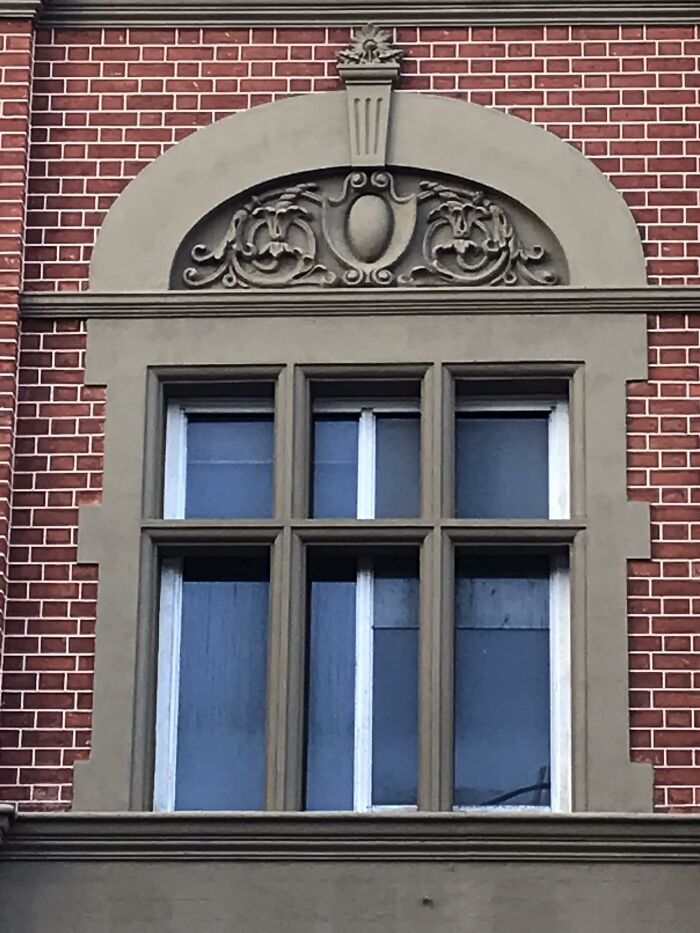
Need some heritage window frames replaced? No worries, call these guys!
To an outsider, the world of architecture may seem unproblematic and borderline boring. However, they do have their fair share of Kanyes—revered architects so controversial that their peers and critics hated some of their buildings with a passion. Or, more accurately, the buildings themselves became the Kanyes. Some of them we've learned to love, others... well, they're still standing, so maybe we will someday?
This abomination of a driveway.
At the Rasskazovka Metro station in Moscow, as captured by a passerby in August 2018
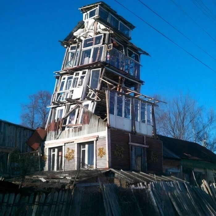
A really wonky building somewhere in Russia.
Looks like the treehouse I built as a kid............minus the tree.
Did you know that people originally hated the Eiffel Tower? Upon its completion in 1889, Parisians called it a "tragic giant lamppost," "iron monster," and "watchtower skeleton." Writer Guy de Maupassant claimed to like only its ground floor. "It's the only place in Paris where I can eat and not see that hideous tower," he said.
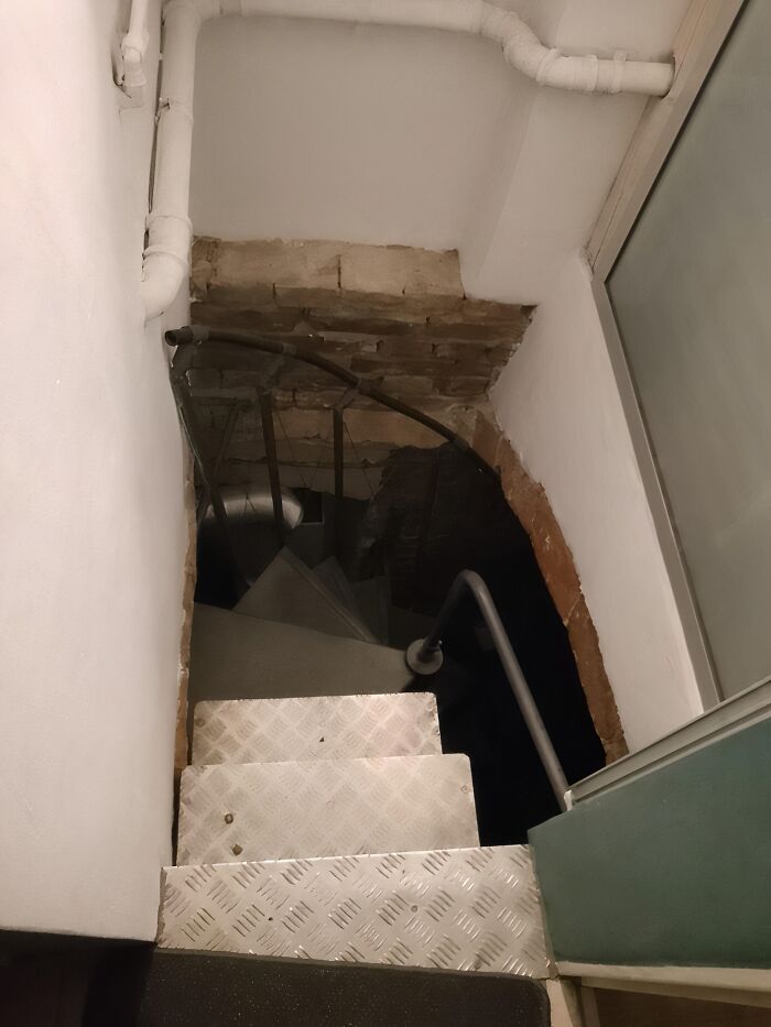
Part of the brick ceiling was chipped away to make room for the stair railing. It's so narrow that one must cling to the center of the spiral staircase to avoid brushing up against the brick as you go up or down. There's a single light at the top, and no light switch for it downstairs.
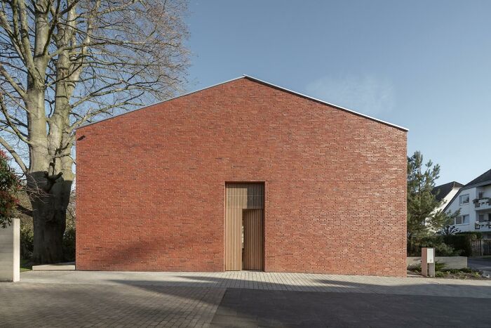
Hi. I'm new here and just wanted to say hello. And let you know that in my hometown, Cologne, you get an architecture 🏆 for this.
‚Guten Morgen Blutbuche‘. Don’t worry, it has windows on the other sides and is actually very bright inside. I actually really like the way the door is inviting you to go inside.
The Guggenheim, which we already mentioned as one of the triumphs of architecture together with the Eiffel Tower, also wasn't received so well in its first years. In fact, some people remarked that it looked like a giant toilet bowl. Back then, critics accused architect Frank Lloyd Wright of creating "architecture for architecture's sake," as the museum's curved walls were terrible for hanging artworks. Some other colorful descriptions include "inverted oatmeal dish" and "hot cross bun."
Although I initially found the image labelled as a building in Makhachkala in Dagestan, I spotted Arabic writing on a store sign on a less-cropped version. I also found some info saying it was in Egypt. I also replaced the OP image with the second version I found.
If you find more reliable info about it, please add it to the comments.
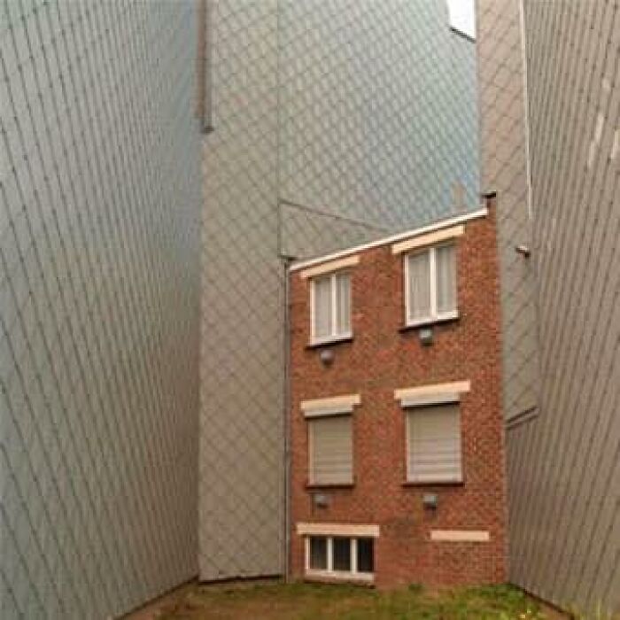
This house is in Belgium, built in the middle of idk what. Which came first, the house or the industrial apocalypse plaid walls?
My guess is the homeowner refused to sell so they built that monstrosity adjacent.
La Sagrada Familia basilica in Barcelona by Antonio Gaudí is still one of the most controversial buildings to date. Although it's not finished yet (the newest finish date is 2026), almost five million tourists every year visit the church and bring in €125 million into its budget. Half of it they use for finishing the project, and where the other half goes—no one knows.
This one I feel like they're playing Jenga with building material. 34th and 8th in Manhattan.
To be fair, it looks like the upper half is under construction still, so there's no way for us to know what's going to look like yet.
The street view of the bulging Gehry building. It never gets better.
The National Library in Kosovo is often called the ugliest building in the world. With its metal lattice exterior and 99 varying sizes of white domes, it was supposed to blend Islamic and Byzantine styles. At least that's what its author Croatian architect Andrija Mutnjaković was going for.
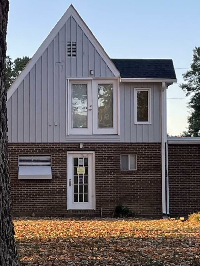
I still can’t figure out what this door is for!! Anyone have any clue what it’s for?
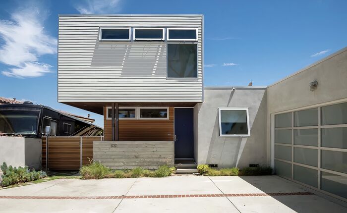
I'm undecided if this one is shame worthy.
Deffinitely a bizzare structure.
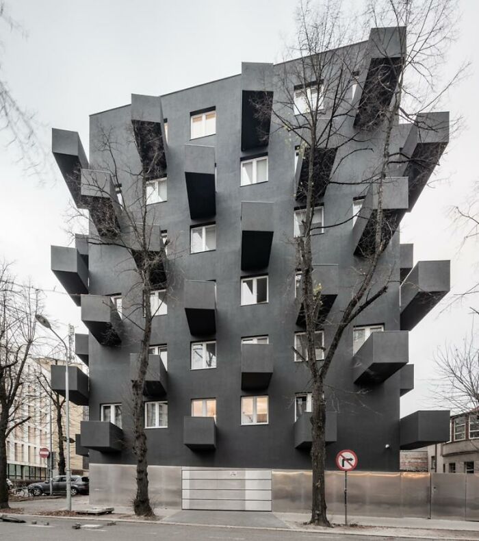
The Unikato building in Katowice, Poland
One of the most controversial architects of our time is perhaps Frank Gehry. The Canadian-American often gets accused of treating architecture as sculpture. In his work, strange shapes and curves trump the practicality and efficiency of space. Herbert Muschamp, an architecture critic for The New York Times, called Gehry's Museum of Pop Culture in Seattle "like something that crawled out of the sea, rolled over and [passed away]."
It looks like someone gave a bunch of pinterest references to a random "contractor" (not an architect or engineer) and a very rough sketch or a stack of Lego blocks stuck together
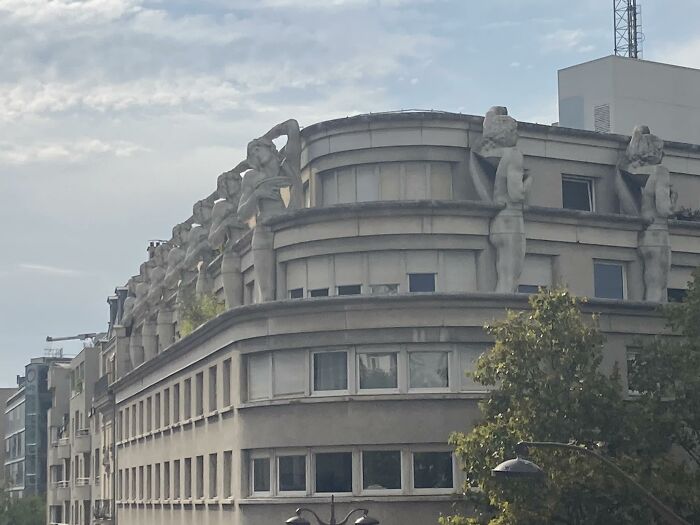
I wanted to share and shame a photo that I took of a block of flats in Paris adorned with multiples of Michelangelo’s Dying Slave.
a new Museum of Modern Art has recently been opened in Warsaw, Poland (the building might have been inspired by a shoebox or a block of styrofoam /s), which has an extremely minimalist post-modernist look.. some people do not appreciate this kind of architecture (or plainly take the mickey out on it) and post "critical" comments (ironically/satyrically or not) - just imagine the level of aggravation of the MoMA's new building sympathisers/enjoyers..
Looking it up, my comment would be that the interior spaces border on boring. And the total mass could have a more recognisable identity. A waste of opportunity, imo.
Load More Replies...a new Museum of Modern Art has recently been opened in Warsaw, Poland (the building might have been inspired by a shoebox or a block of styrofoam /s), which has an extremely minimalist post-modernist look.. some people do not appreciate this kind of architecture (or plainly take the mickey out on it) and post "critical" comments (ironically/satyrically or not) - just imagine the level of aggravation of the MoMA's new building sympathisers/enjoyers..
Looking it up, my comment would be that the interior spaces border on boring. And the total mass could have a more recognisable identity. A waste of opportunity, imo.
Load More Replies...
 Dark Mode

 No fees, cancel anytime


