40 Times People Didn’t Think Their Message Through And It Resulted In These Fails (New Pics)
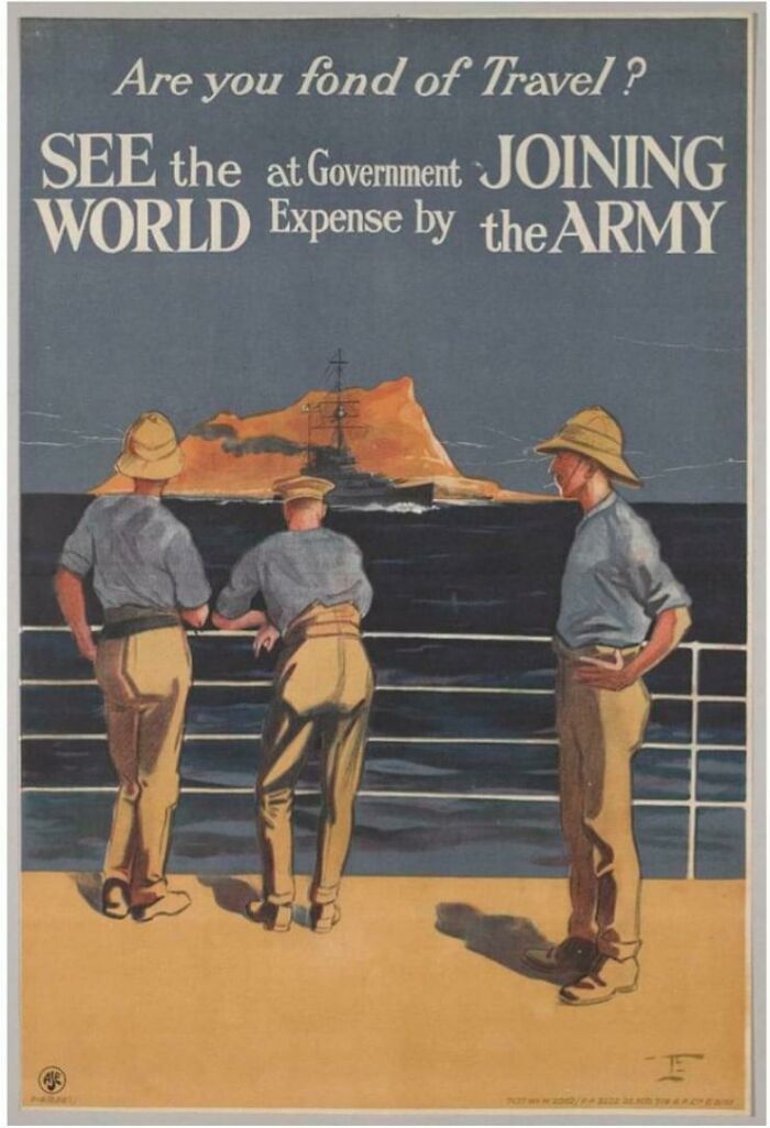
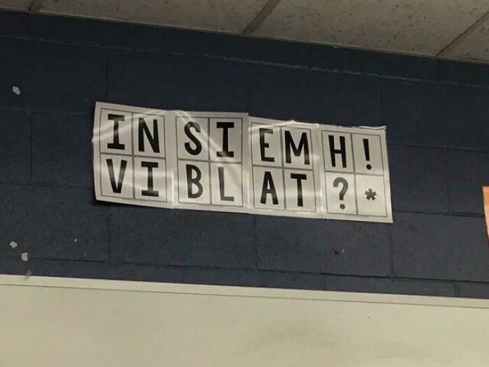
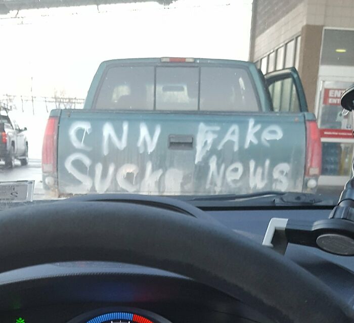
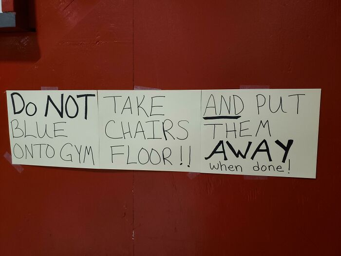
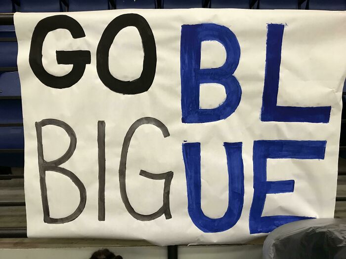
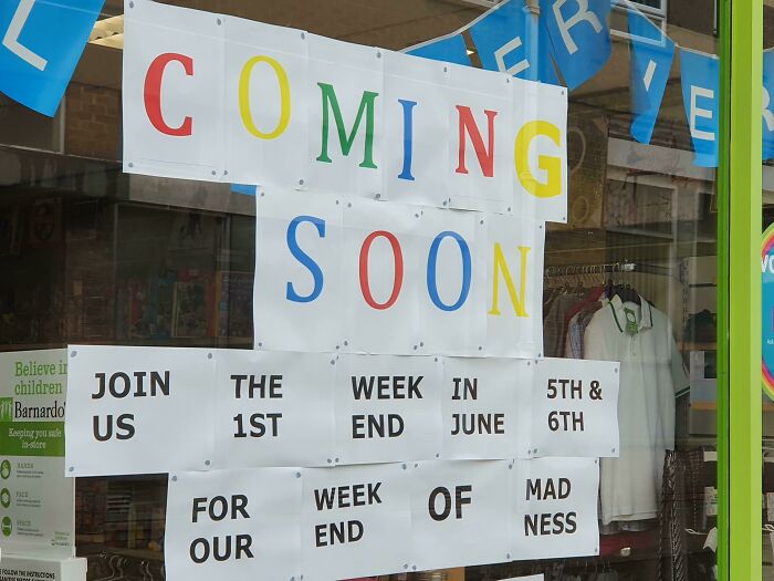
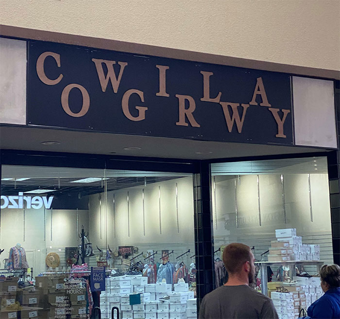
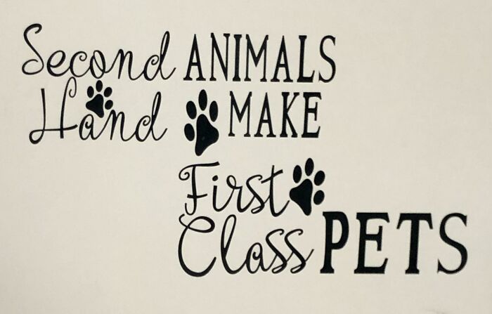
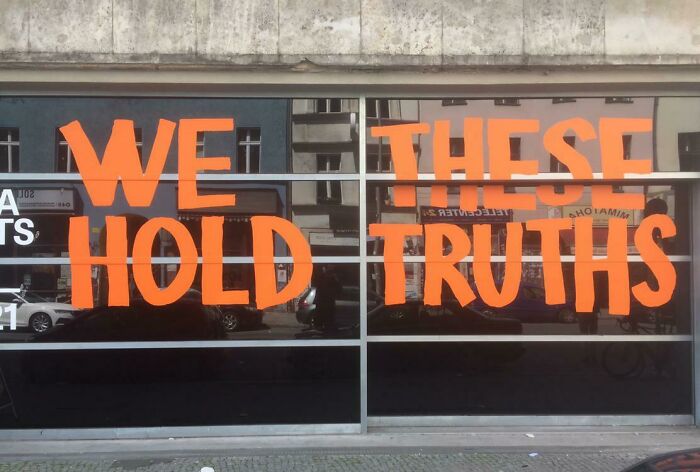
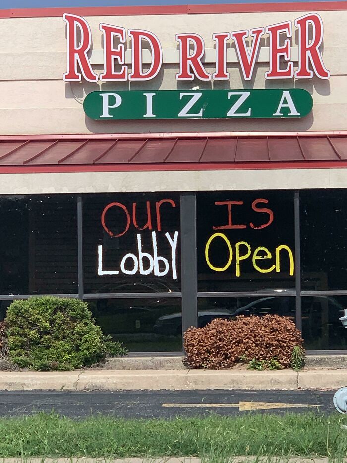
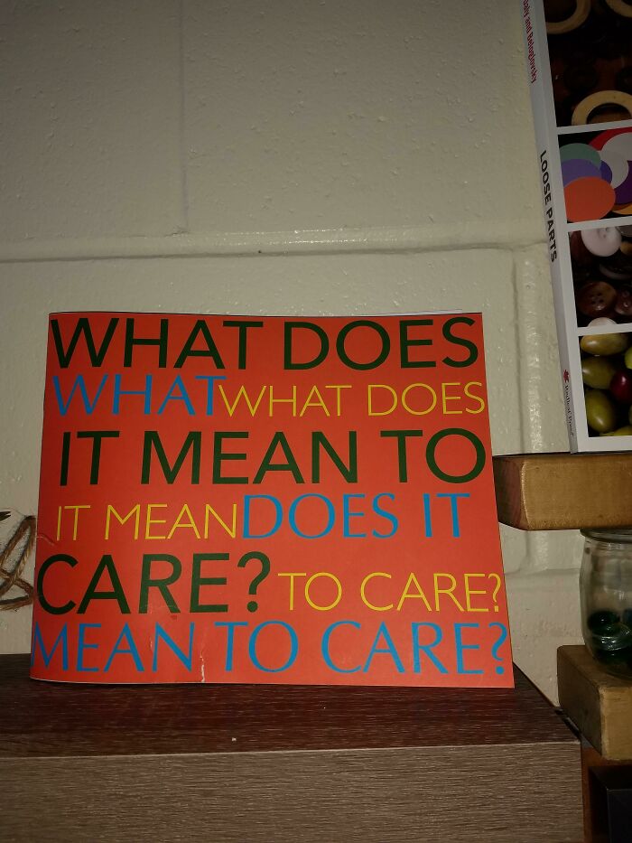
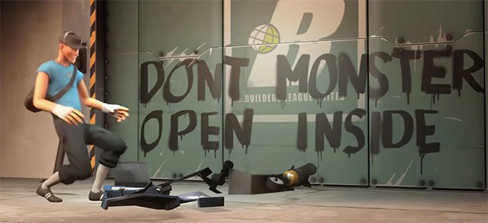
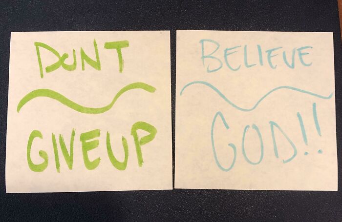
The trope “Don’t Dead Open Inside” came to the internet’s spotlight more than ten years ago when it was first used in a promo poster for The Walking Dead. The line, which initially made zero sense to anyone reading it line by line, perfectly captured ensued hilarity. It stirred a whole trend of memes featuring posters, boards and signs that played on the brink of making sense (if read counterintuitively) and making no sense (if read intuitively).
There’s a whole Reddit community dedicated to such oddly amusing linguistic mishaps known as r/deadopeninside. So get ready to roll your eyes, turn your head, read it twice and thrice, calling a friend and looking for answers on Google, because we have selected some of the most head-spinning examples below.
And if there’s anything we're gonna learn from this post, it's how not to overcomplicate your message. At any cost. Psst! Our previous post with hard-to-read signs can be found right here.
This post may include affiliate links.
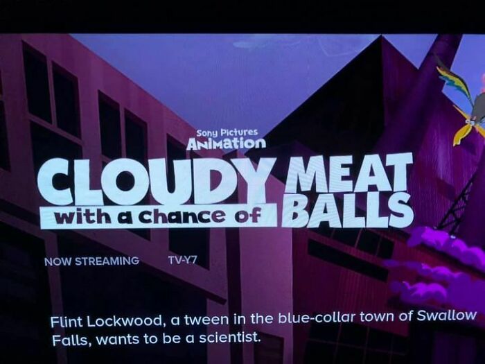
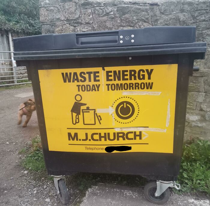
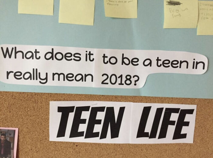
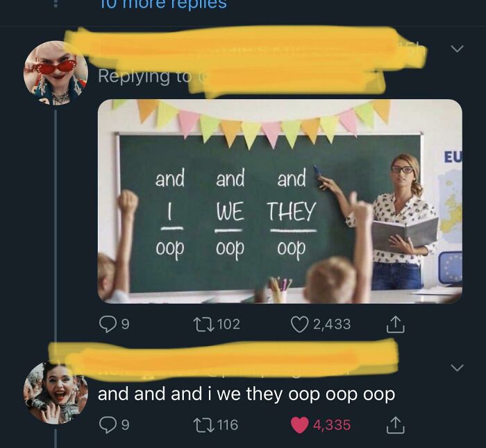
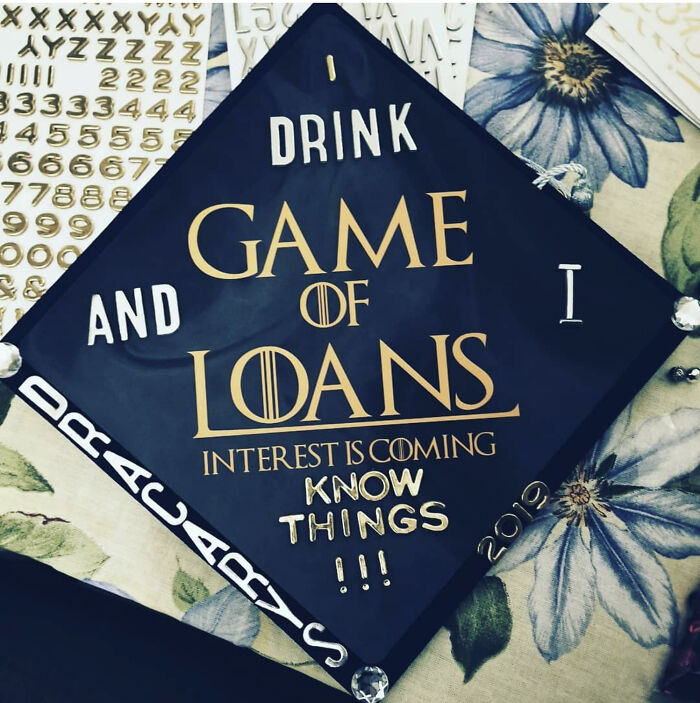
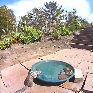
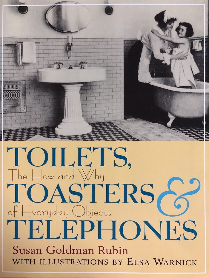
Cloudy Meat With A Chance Of Balls
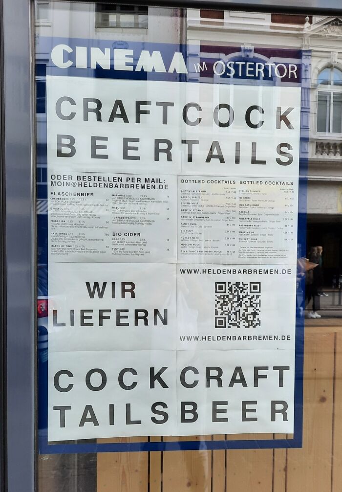
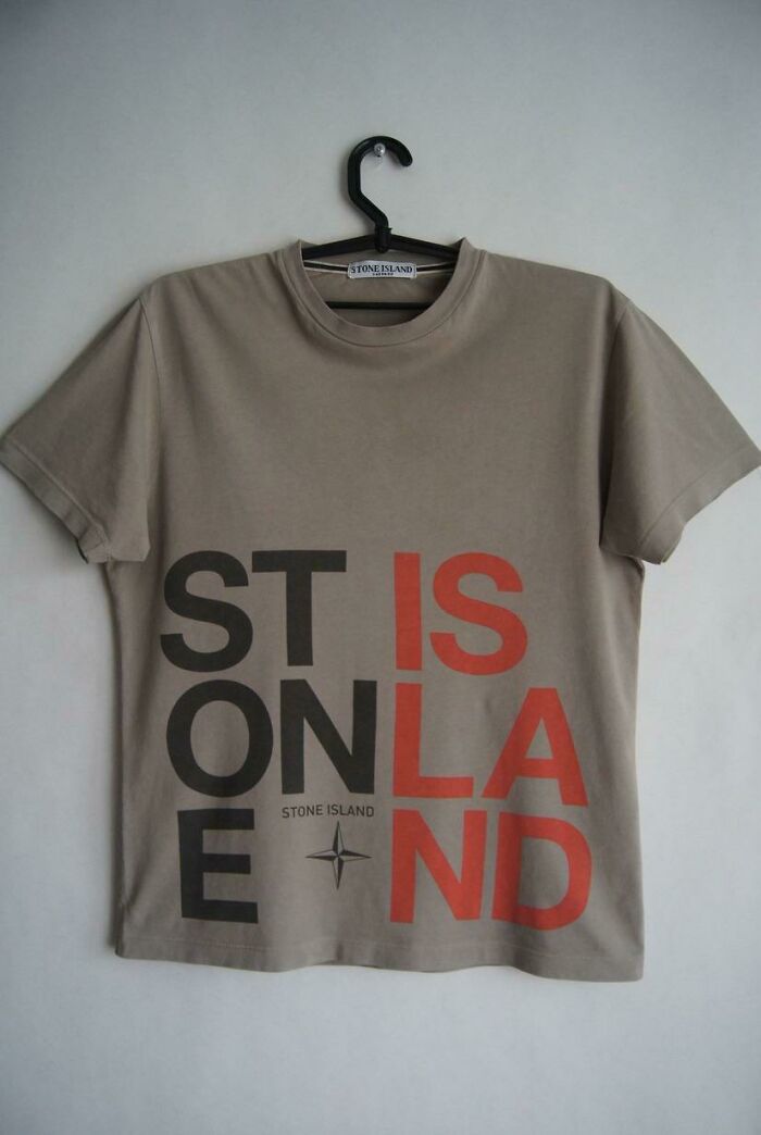
Craftcock Beertails
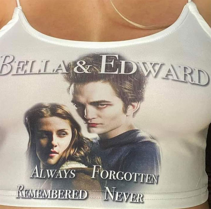
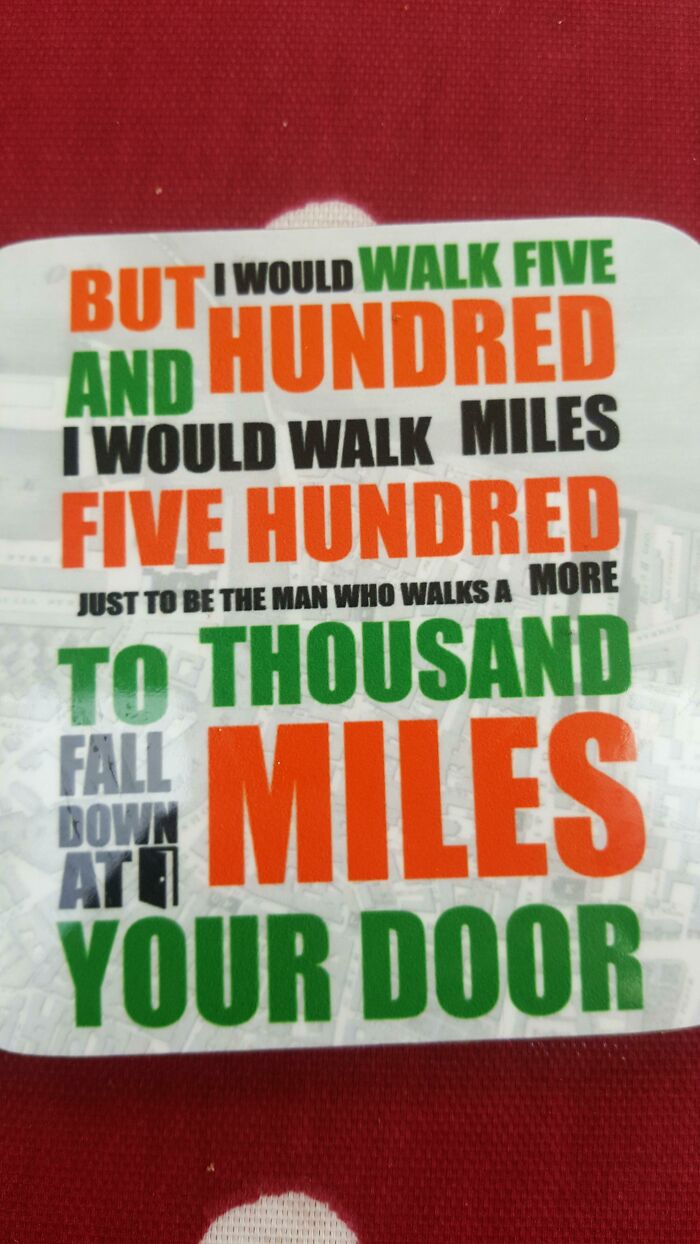
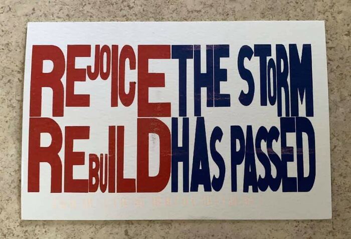
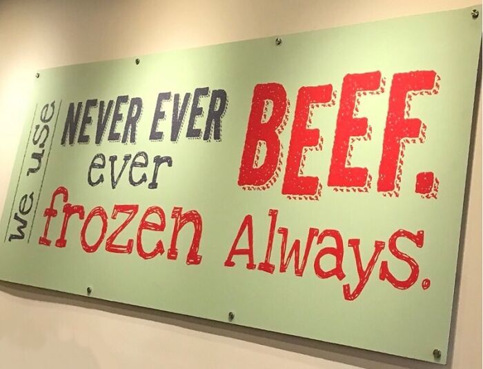
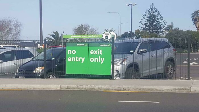
Always Forgotten. Remembered Never
Although signs and posters collected in this list follow the internet’s trend of obsessing over the “Don’t Dead Open Inside” trope, in reality, such designs speak little to people and fail to deliver their message. By not communicating their message clearly, brands, products and companies are losing their potential clients. So in order to see what an expert had to say on such hard-to-read designs, Bored Panda reached out to Portugal-based graphic designer Laura Vanagaite, who specializes in branding and illustration design.
Laura said that when it comes to advertising, whatever format it may be, it has to be clear to the potential client. “It needs to be catchy, which means the brand needs to introduce their product and actually make the person get interested in it. So normally designers can play with font sizes, but still keep it simple and readable.”
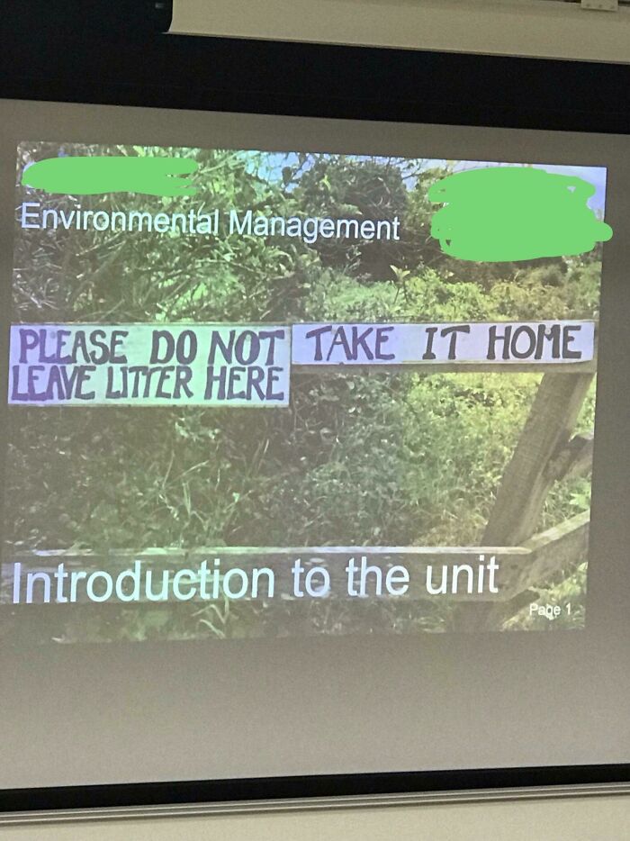
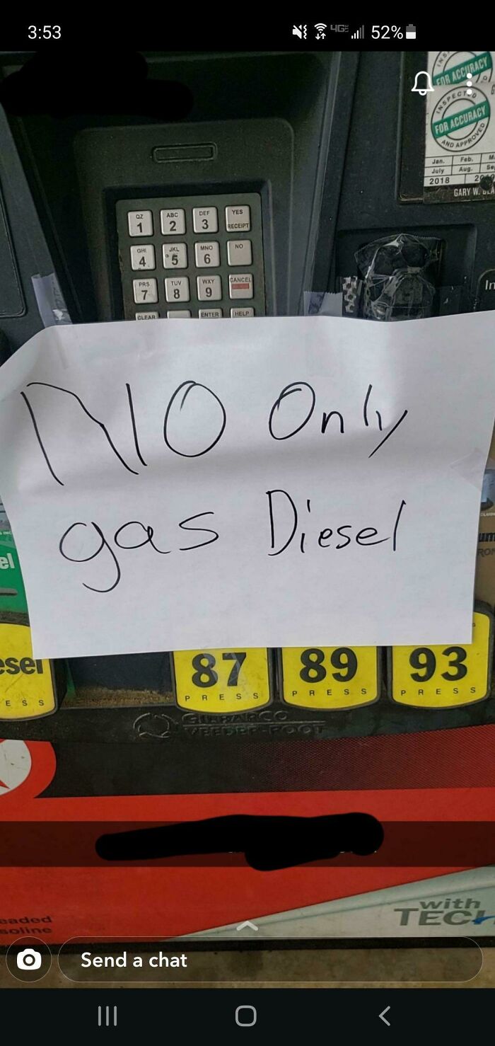
Please Do Not Take It Home. Leave Litter Here
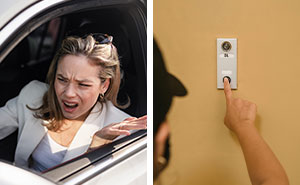
They Must Have Added The Arrows After Realizing How Steamy It Was Originally
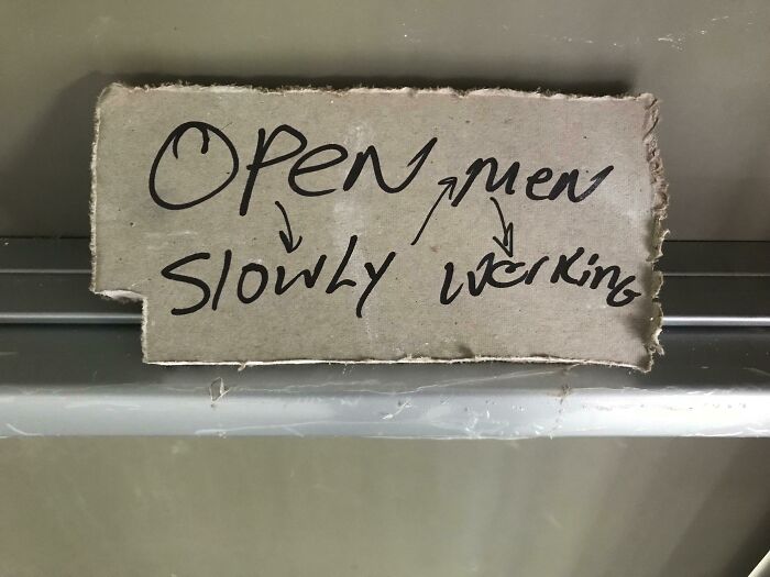
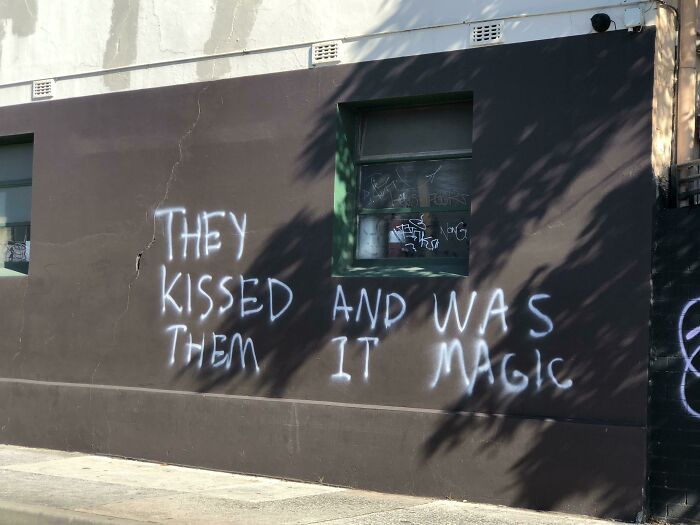
Took A Wee While To Design This Masterpiece
The graphic designer explained that sometimes a style that is too modern can be understood wrongly and the whole project will lose its value. “Type of font, letter size, spacing between the letters and positioning the text” all play a crucial role in a good sign design.
Moreover, “colors play a huge part as well. Red, as we know, catches our attention immediately but yellow, green, or black and white combinations are equally eye-catching.” Whatever the design, it’s crucial “to keep it simple but sophisticated since balance is the key,” Laura explained.
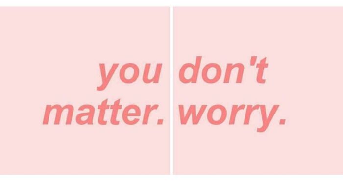
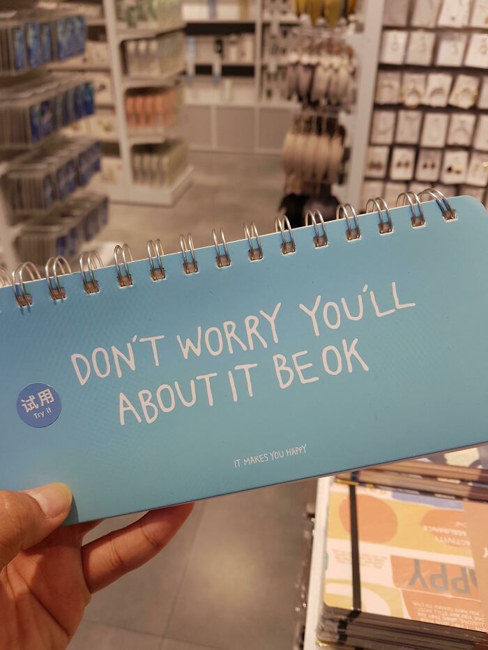
You Don't Matter. Worry
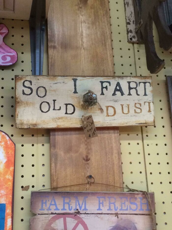
So I Fart Old Dust
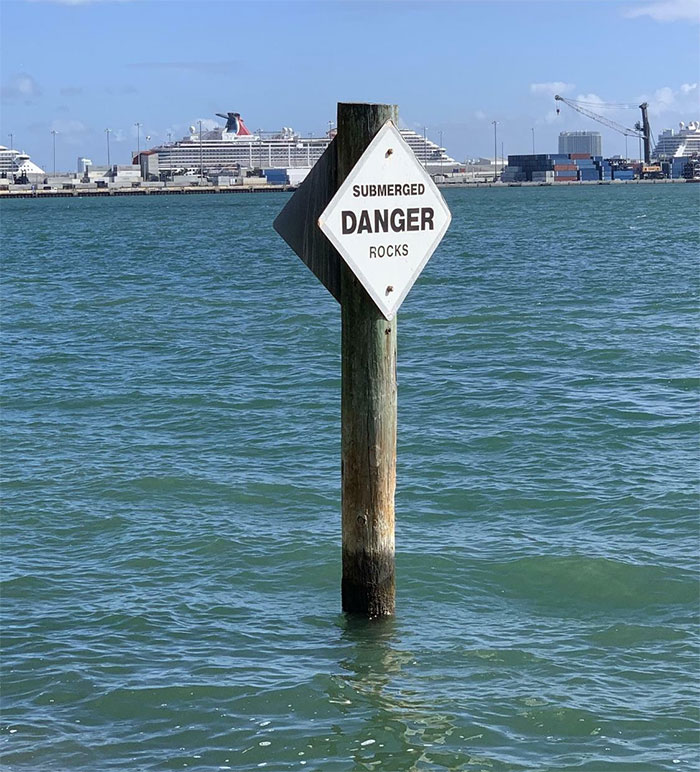
They Are, In Fact, A Particular Sub-Species Of Rock
When it comes to readability, Laura said that making sure it works and conveys the intended message has to be done prior to handing the sign to the production. “The designer is the one that handles the project but if there is a chance, always represents the rest of the team. It can be tricky when different opinions come, but try to ask if it is easy to understand. Teamwork is a very important thing.”
If you’re working on a project alone, Laura suggests “printing the work on an A3 paper (I know, it is not the same size) so you can get a good look at the text and determine if it’s readable, also if the colors are well-combined.” But tight deadlines, client’s requests, and too many opinions put huge pressure on graphic designers and in these cases it’s best to “take a 5-minute break and then return to the project and see if it still looks good,” concluded Laura.
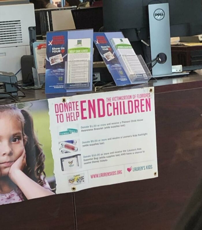
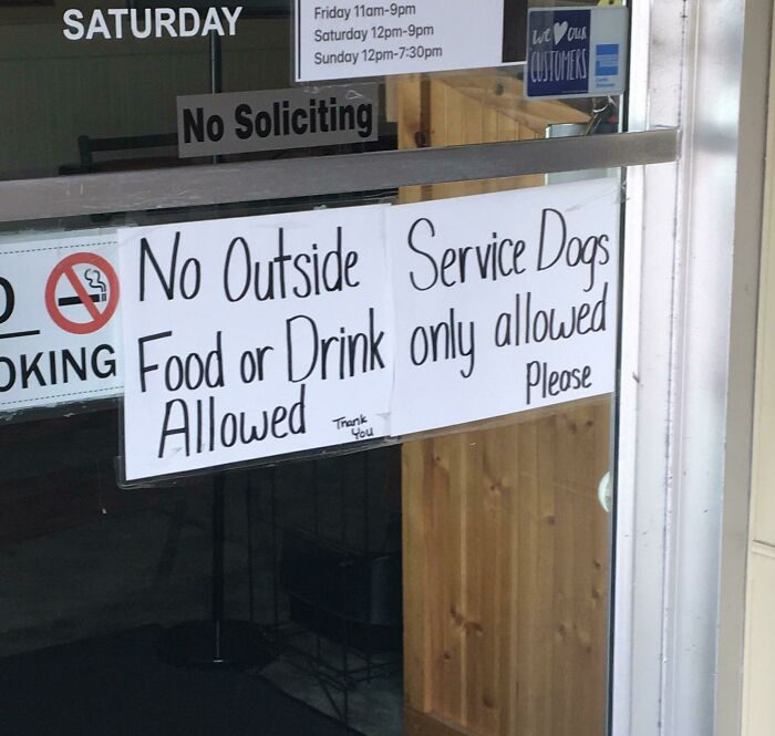
Who Else Is Donating To End Children?
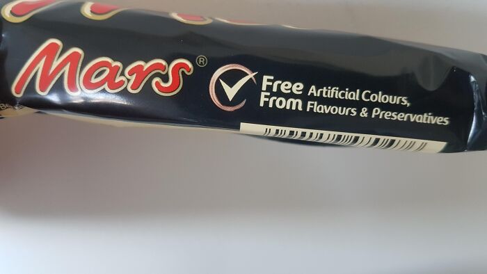
Free Artificial Colours, From Flavours & Preservatives
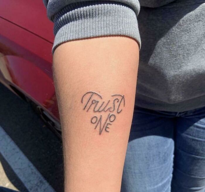
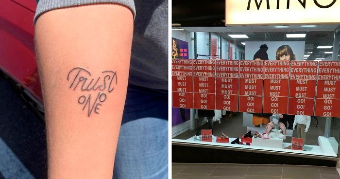
Trust Onoe
Don't Forget High School Buy A Yearbook
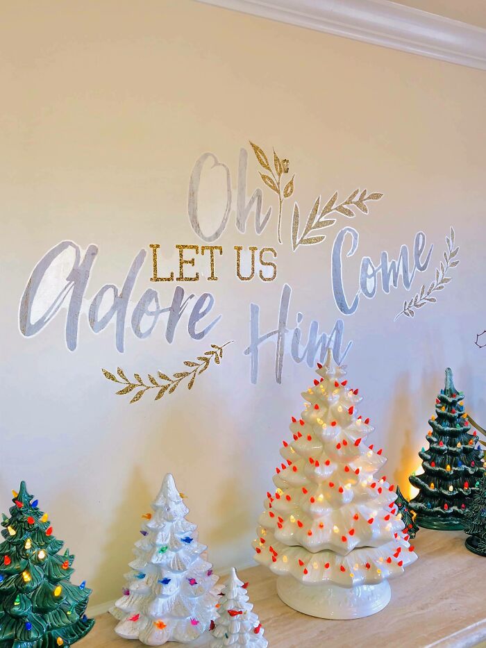
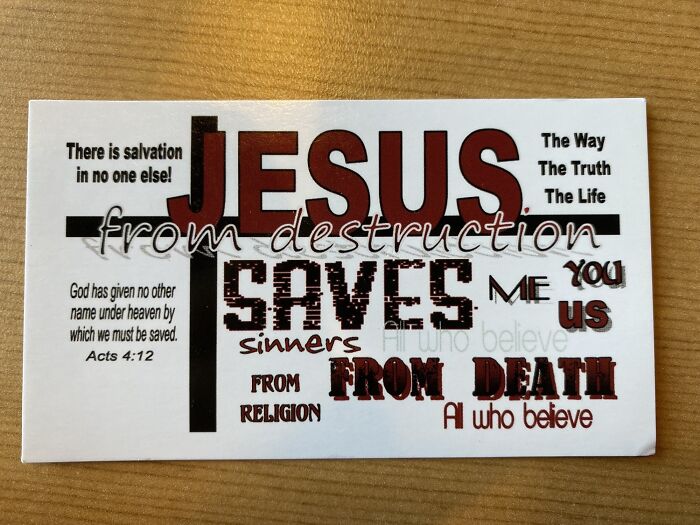
Jesus Christ
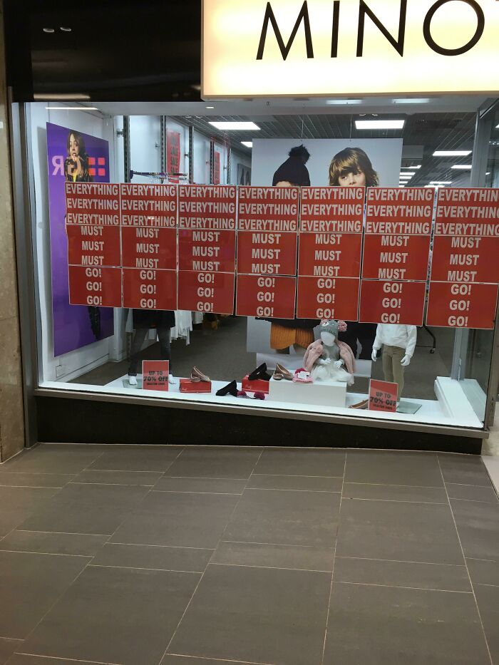
*inhales* Everything Everything Everything Everything Everything Everything Everything
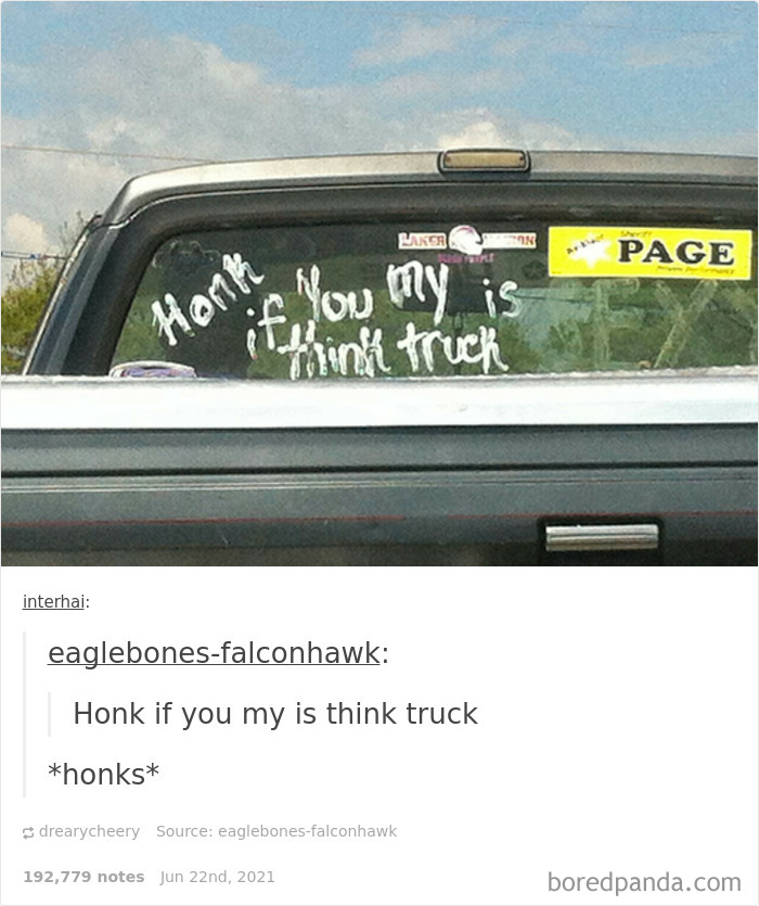
Honk If You My Is Think Truck
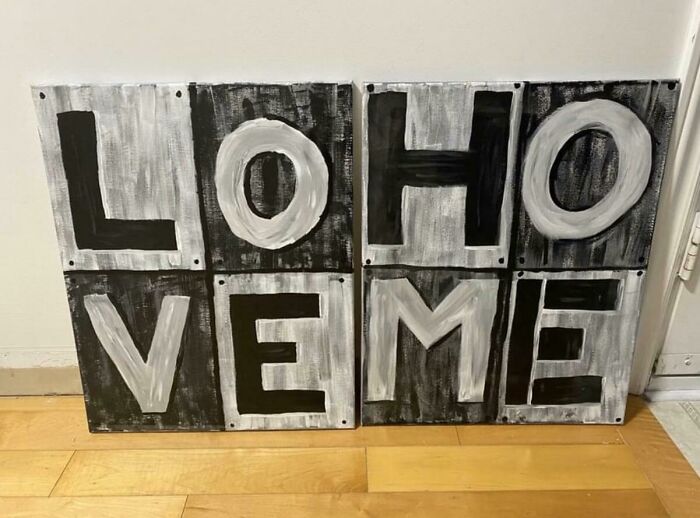
Loho Veme
Smash Immigrants Welcome Racism
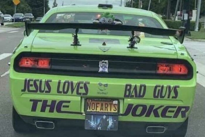
The Nofarts Joker
This Is This Is Meme
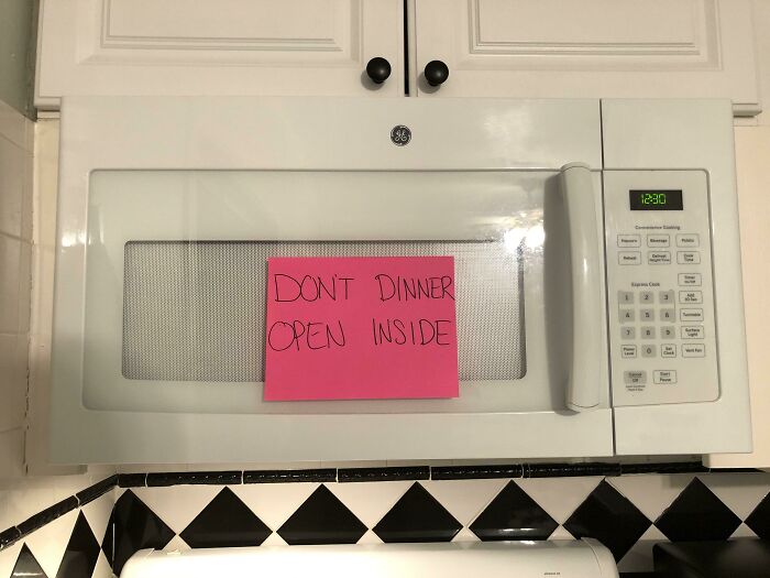
The Way I Let My Boyfriend Know His Dinner Is Ready For Him In The Microwave When He Gets Home From Work
My Local Takeaway Is An Eye Test
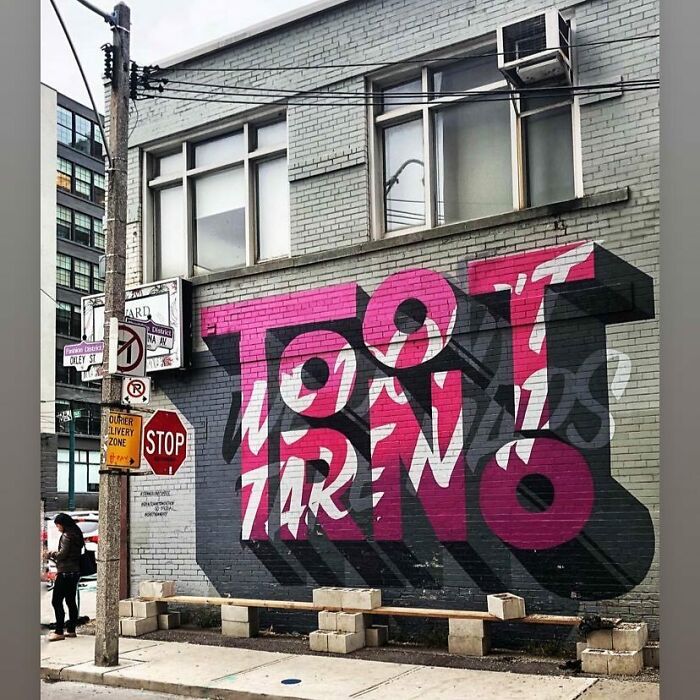
I Live In Tootrno
Does This Belong Here? Took Me Multiple Tries To Figure This Out
My Wife Said, “People Will Get It.”
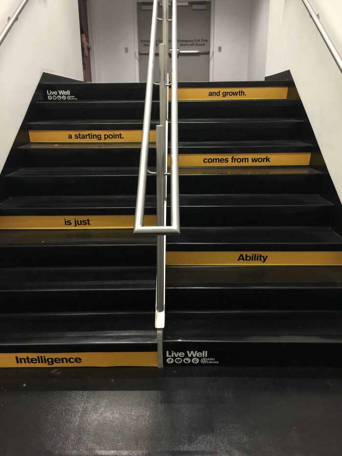
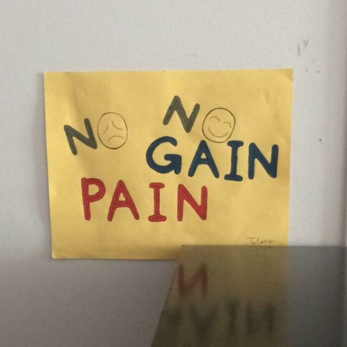
No No Gain Pain
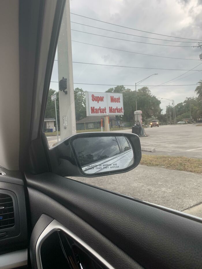
Super Meat Market Market
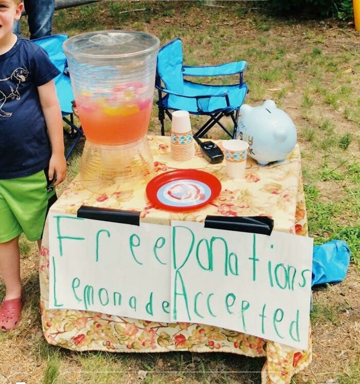
I Would Like A Free Donation. Also, Here's My Lemonade...
Come ooon... it´s a kid and he gives lemonade for free. Not nice to make fun of him.
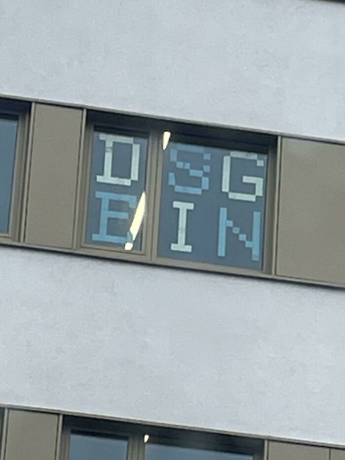
Dsgein
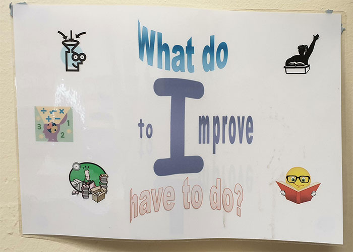
What Do?
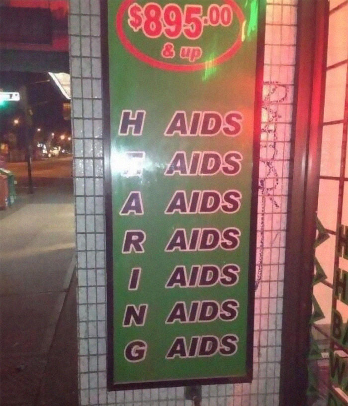
Hearing Aids?
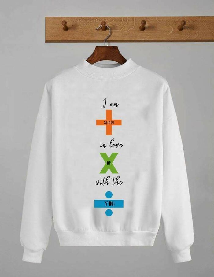
I Thought This Might Belong Here
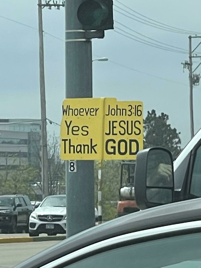
Hoffman Estates, Il. I Can’t Even Figure Out What It’s Supposed To Say
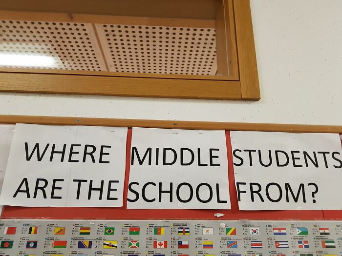
This Sign At My International School
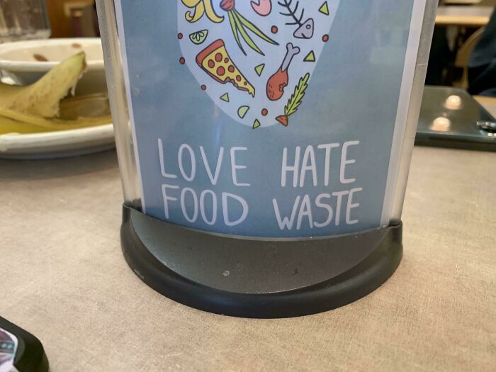
In My School Dining Hall
What can we say? Food waste really is a love-hate relationship!
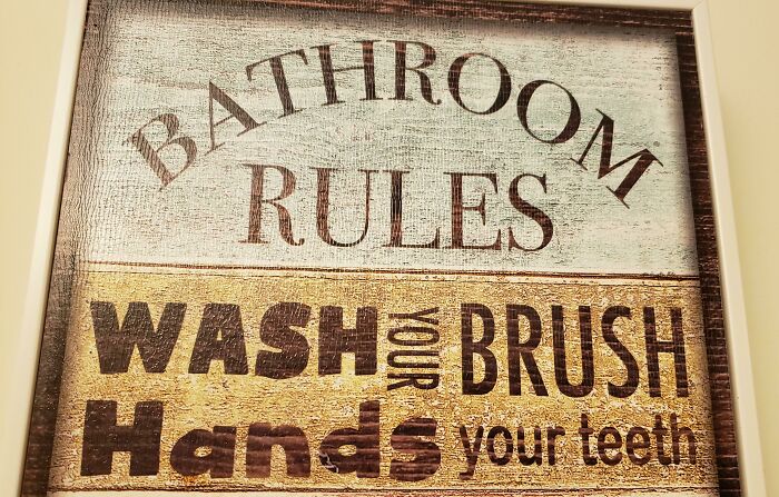
Wash Your Brush Hands Your Teeth
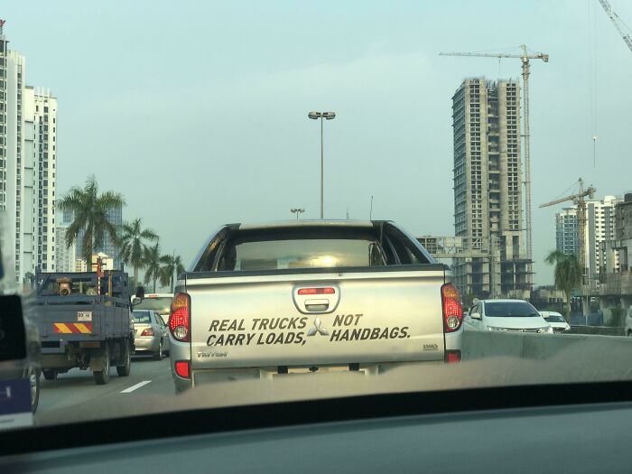
Real Trucks Not Carry Loads, Handbags
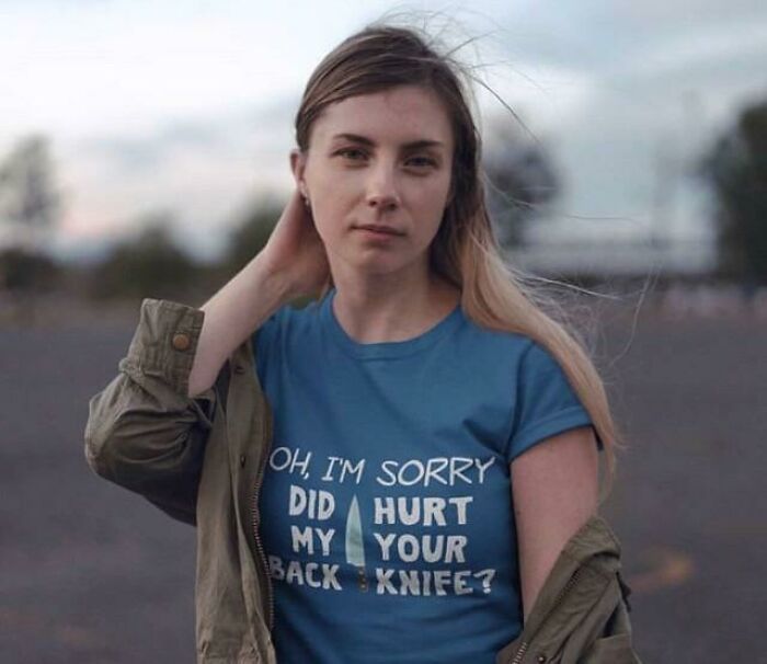
Did Hurt My Your Back Knife?
Say 5g No To Vaccines
Who's The Goat??!
This is the best thing I've seen in my life. The full version says something like "Holidays courses 'Maćko' (Just a name)" The second says more or less something like "f**ing hell" 1484591810...d5f252.jpg 
Since these are all written in English, I have to wonder - who the f**k are these morons that they don't know we (english speaking people) read from left to right? WTF?
Takeaway: Don't write vertically if there is a sign beside it
This is the best thing I've seen in my life. The full version says something like "Holidays courses 'Maćko' (Just a name)" The second says more or less something like "f**ing hell" 1484591810...d5f252.jpg 
Since these are all written in English, I have to wonder - who the f**k are these morons that they don't know we (english speaking people) read from left to right? WTF?
Takeaway: Don't write vertically if there is a sign beside it

 Dark Mode

 No fees, cancel anytime


