
20 Composition Techniques That Will Make Your Photos Look Better
There are no unbreakable rules when it comes to how you should compose your photographs After all, who likes rules except for your old school principal or heads of H.R. departments? There are however, several guidelines you can use to help improve the composition of your photos. In this tutorial, I’ve listed 20 of these guidelines along with examples of each. I’ve started with the most basic ones and finished with some of the more advanced composition techniques.
First of all we have to define what is meant by ‘composition’. Composition refers to the way the various elements in a scene are arranged within the frame. As I’ve already mentioned, these are not hard and fast rules but guidelines. That said, many of them have been used in art for thousands of years and they really do help achieve more attractive compositions. I find that I usually have one or more of these guidelines in the back of my mind as I’m setting up a shot.
We’ll start with probably the most well known composition technique: The Rule of Thirds.
More info: bocphotography.com
1. Rule of Thirds
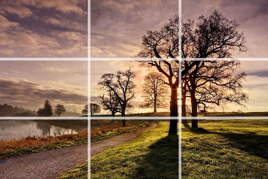
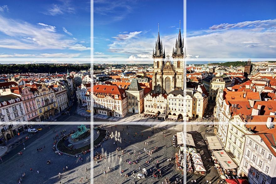
So I’ve just told you that there are no hard and fast rules when it comes to composition and then the first thing I write about is the ‘rule’ of thirds. In my defence, I didn’t come up with the name. The rule of thirds is very simple. You divide the frame into 9 equal rectangles, 3 across and 3 down as illustrated below. Many camera manufacturers have actually included the capability to display this grid in live view mode. Check your camera’s manual to see how to turn on this feature.
The idea is to place the important element(s) of the scene along one or more of the lines or where the lines intersect. We have a natural tendency to want to place the main subject in the middle. Placing it off centre using the rule of thirds will more often than not lead to a more attractive composition.
In this photo, I’ve placed the horizon roughly along the bottom third of the frame and the biggest and closest trees along the line to the right. The photo wouldn’t have the same impact if the larger trees had been placed in the centre of the frame.
In this photo of the Old Town Square in Prague, I’ve placed the horizon along the top third of the frame. Most of the buildings sit in the middle third and the square itself occupies the bottom third of the frame. The spires of the church are placed near horizontal line to the right of the frame.
2. Centred Composition and Symmetry
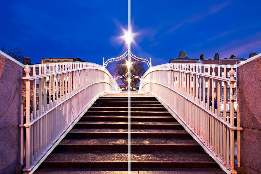
Now that I’ve told you not to place the main subject in the centre of the frame, I’m going to tell you to do the exact opposite! There are times when placing a subject in the centre of the frame works really well. Symmetrical scenes are perfect for a centred composition. They look really well in square frames too.
This photo of the Ha’penny Bridge in my home city of Dublin was the perfect candidate for a centred composition. Architecture and roads often make great subjects for a centred compositions.
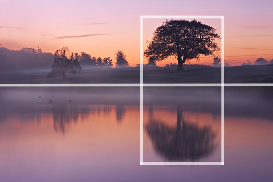
Scenes containing reflections are also a great opportunity to use symmetry in your composition. In this photo, I’ve actually used a mix of the rule of thirds and symmetry to compose the scene. The tree is positioned off centre to the right of the frame but the perfectly still water of the lake provides the symmetry. You can often combine several composition guidelines in a single photograph.
3. Foreground Interest and Depth
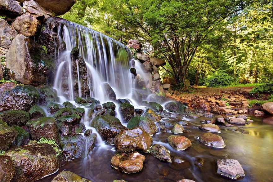
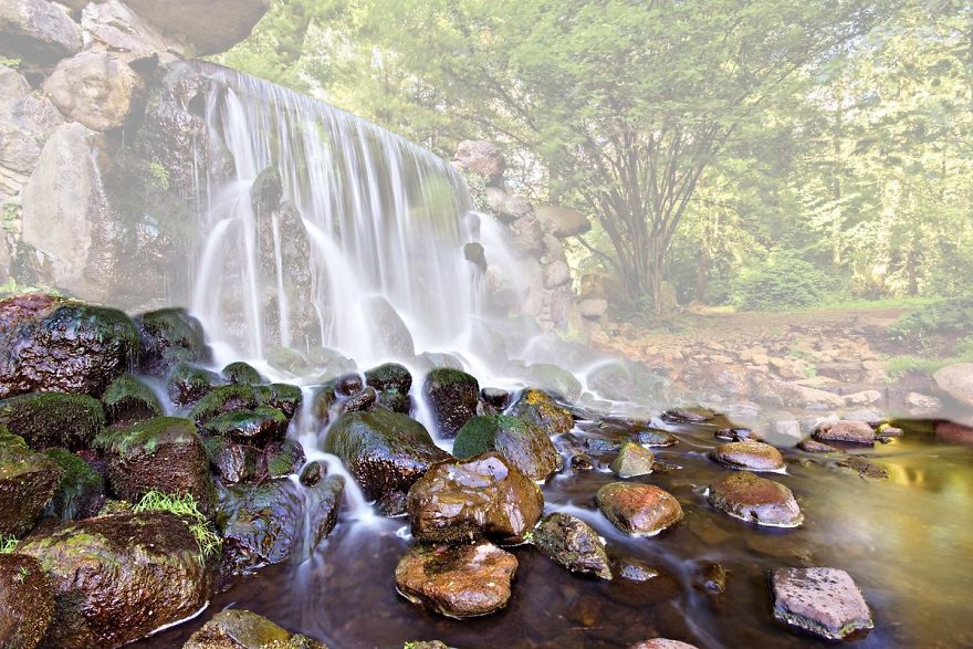
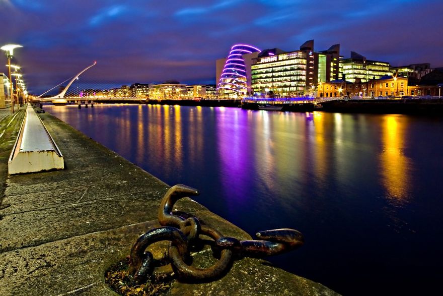
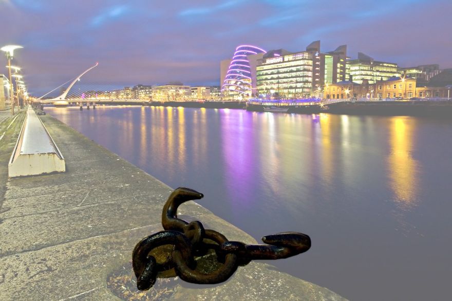
Including some foreground interest in a scene is a great way of adding a sense of depth to the scene. Photographs are 2D by nature. Including foreground interest in the frame is one of a number of techniques to give the scene a more 3D feel.
In this photograph of a waterfall in The Netherlands, the rocks in the river provided a perfect source of foreground interest. Adding foreground interest works particularly well with wide angle lenses.
I took this photograph in the Dublin Docklands. The dock cleats along the quay provided the foreground interest in this shot. I think it adds a real sense of depth to the composition. The dock cleat in this scene was only a few metres in front of me when I took this shot. Including it in the frame portrays a sense of depth in the scene by including an element that I was quite close to as well as the bridge and buildings in the distance and everything in between them.
A friend who was with me that evening tripped over one of the cleats and almost ended up getting a very close up view of the River Liffey. That’s one way of adding depth to the scene I guess.
4. Frame within the Frame
Including a ‘frame withing the frame’ is another effective way of portraying depth in a scene. Look for elements such as windows, arches or overhanging branches to frame the scene with. The ‘frame’ does not necessarily have to surround the entire scene to be effective.
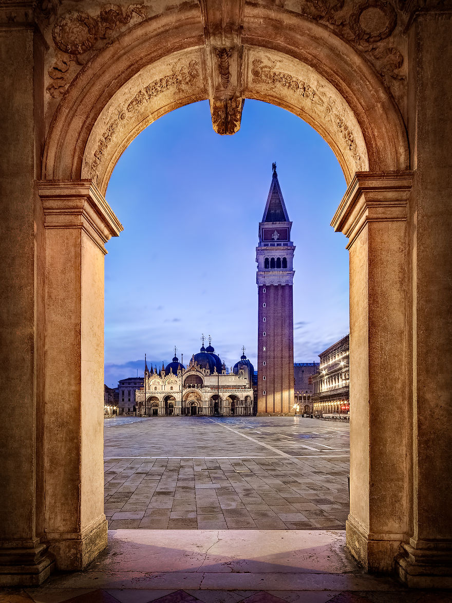
In the photo taken on St Mark’s Square in Venice, I used the archway to frame St Marks Basilica and the Campanile at the far end of the piazza. The use of scenery viewed through arches was a common feature of Renaissance painting as way of portraying depth. As you can see, the square was completely empty when I took the shot. This is one of the benefits of getting up at 5am. Early morning is one of my favourite times to get out and about with the camera.
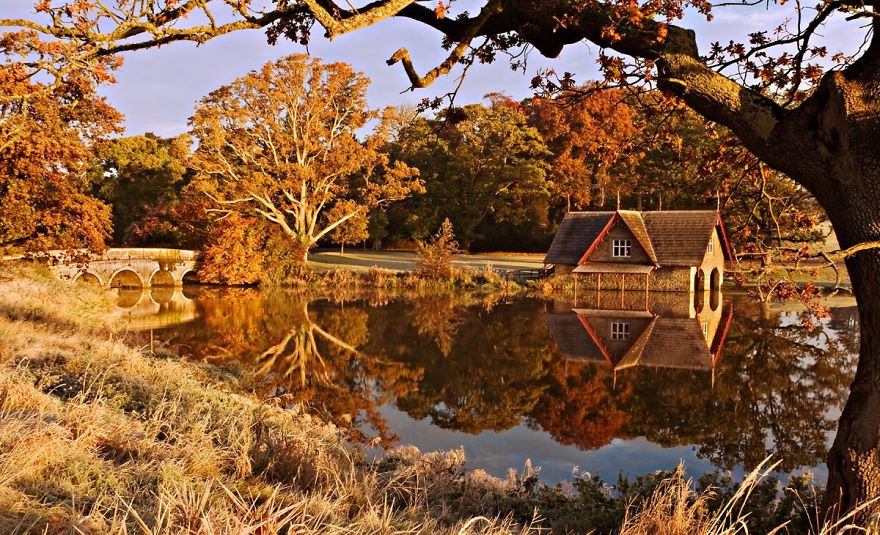
Frames don’t have to be man made objects such as arches or windows. This photo was taken in County Kildare in Ireland. This time, I used the tree trunk to the right and the overhanging branch to create a frame around the scene containing the bridge and boat house. Notice that even though the ‘frame’ doesn’t actually surround the whole scene in this case, it still adds a sense of depth.
Using a ‘frame within a frame’ presents a great opportunity to use your surroundings to be creative in your compositions
5. Leading Lines
Leading lines help lead the viewer through the image and focus attention on important elements. Anything from paths, walls or patterns can be used as leading lines. Take a look at the examples below.
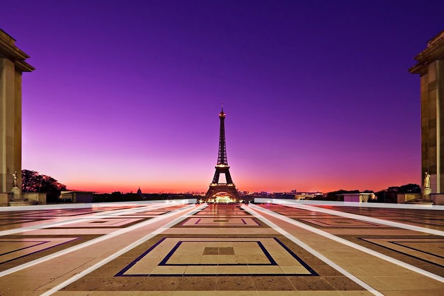
In this photo of the Eiffel Tower, I used the patterns on the paving stones as leading lines. The lines on the ground all lead the viewer to the Eiffel Tower in the distance. You’ll also notice that I used a centred composition for this scene. The symmetry of my surroundings made this type of composition work well.
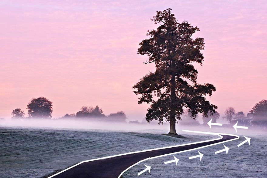
Leading lines do not necessarily have to be straight as illustrated by the picture above. In fact curved lines can be very attractive compositional features. In this case, the path leads the viewer to the right of the frame before swinging in to the left towards the tree. I also made use of the rule of thirds when composing the shot.
6. Diagonals and Triangles
It is often said that triangles and diagonals add ‘dynamic tension’ to a photo. My mother in law also does an excellent job of adding tension to any scene. What do we mean by ‘dynamic tension’ though? This can be a tricky one to explain and can seem a bit pretentious. Look at it this way, horizontal lines and vertical lines suggest stability. If you see a person standing on a level horizontal surface, he will appear to be pretty stable unless he’s stumbling out of a pub at 2am. Put this man on a sloping surface and he’ll seem less stable. This creates a certain level of tension visually. We are not so used to diagonals in our every day life. They subconsciously suggest instability. Incorporating triangles and diagonals into our photos can help create this sense of ‘dynamic tension’.
Incorporating triangles into a scene is a particularly good effective way of introducing dynamic tension. Triangles can be actual triangle shaped objects or implied triangles. I’ll explain this in more detail in a moment.
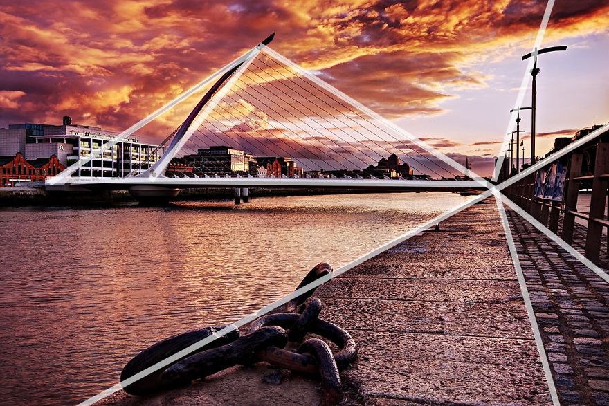
This picture of the Samuel Beckett Bridge in Dublin incorporates plenty of triangles and diagonals into the scene. The bridge itself is an actual triangle (It’s actually supposed to represent a Celtic Harp on its side). There are also several ‘implied’ triangles in the scene. Notice how the leading lines on the right of the frame are all diagonal and form triangles that all meet at the same point. These are ‘implied triangles’. Having diagonals going off in different direction adds a lot of ‘dynamic tension’ to the scene. Once again you can see how I have combined two techniques to compose the image: leading lines and diagonals.
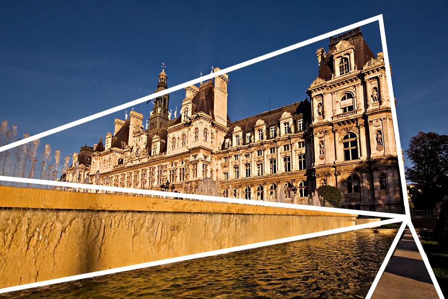
In this photo of the Hotel de Ville in Paris, the implied triangles and diagonals create sense of dynamic tension. We are not used to seeing buildings leaning at such angles in our everyday life. It is slightly jarring to our sense of balance. This is what creates the visual tension. You can also talk about dynamic tension to sound intelligent (or annoyingly pretentious) in front of your friends.
7. Patterns and Textures
Human beings are naturally attracted to patterns. They are visually attractive and suggest harmony. Patterns can be man made like a series of arches or natural like the petals on a flower. Incorporating patterns into your photographs is always a good way to create a pleasing composition. Less regular textures can also be very pleasing on the eye.
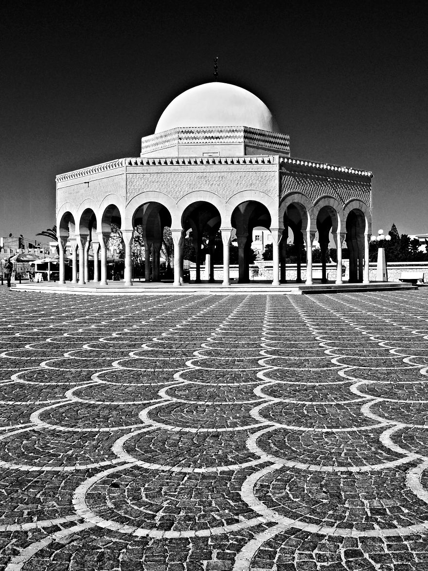
These two photos were both taken in Tunisia. In this one, I’ve used the pattern in the paving stones to lead the eye to the domed building. The building itself incorporates a pattern in the form of a series of arches. The domed roof also compliments the rounded arches below.
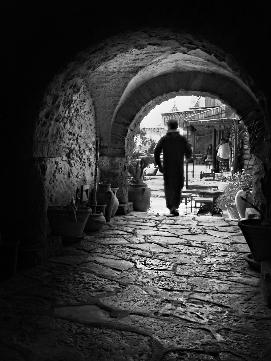
In this photo, I really liked the texture of the stone work on the ground. This is less regular than the pattern in the first photo but the play of light and shadow on the surface is very pleasant. There are also interesting textures to be on the walls and roof of the passage. You may also have noticed that the arch creates a ‘frame within a frame’ around the man and cafe on the other side of the archway.
8. Rule of Odds
In the world of photography, there are certainly plenty of ‘odds’ but the ‘rule of odds’ is something different entirely. The rule suggests that an image is more visually appealing if there are an odd number of subjects. The theory proposes that an even number of elements in a scene is distracting as the viewer is not sure which one to focus his or her attention on. An odd number of elements is seen as more natural and easier on the eye. To be honest, I think there are plenty of cases where this is not the case but it is certainly applicable in certain situations. What if you have four children? How do you decide which one to leave out of the shot? Personally, I’d go by future earning potential.
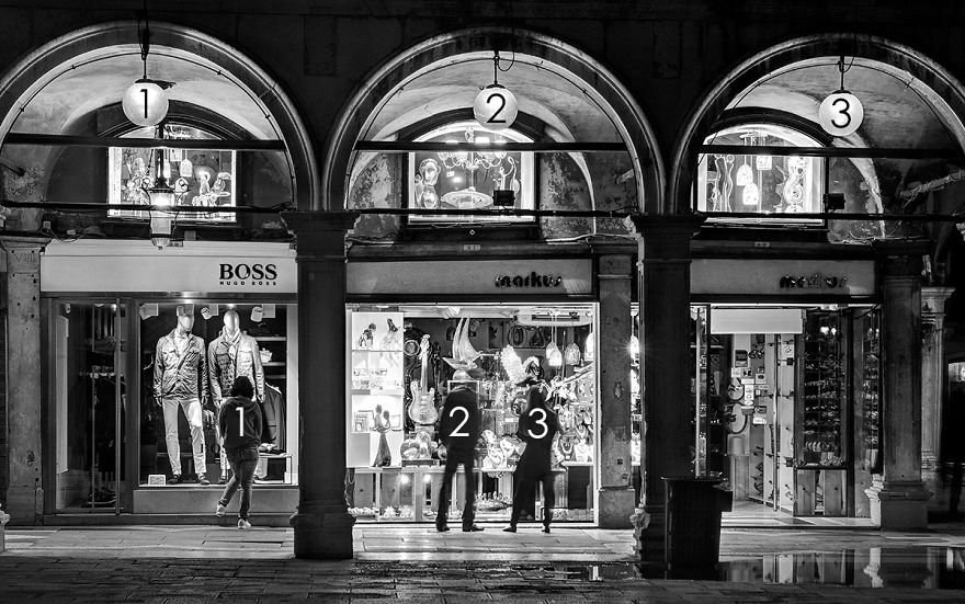
This photo is an example of the rule of odds. I deliberately framed the scene to include three arches. I think that two arches would not have worked as well and may have divided the viewers attention. It also so happened that there were three people in the scene. This composition also makes use of patterns and ‘frames within a frame’.
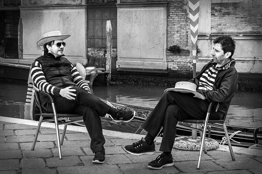
In this photo of two gondoliers in Venice, you will see that I’ve completely ignored the rule of odds. It is true that your attention may shift back and forth between each gondolier. However this is exactly what a conversation between two people is like, a back and forth. For this reason, I think the even number of subjects works in this case.
9. Fill the Frame
Filling the frame with your subject, leaving little or no space around it can be very effective in certain situations. It helps focus the viewer completely on the main subject without any distractions. It also allows the viewer to explore the detail of the subject that wouldn’t be possible if photographed from further away. Filling the frame often involves getting in so close that you may actually crop out elements of your subject. In many cases, this can lead to a very original and interesting composition.
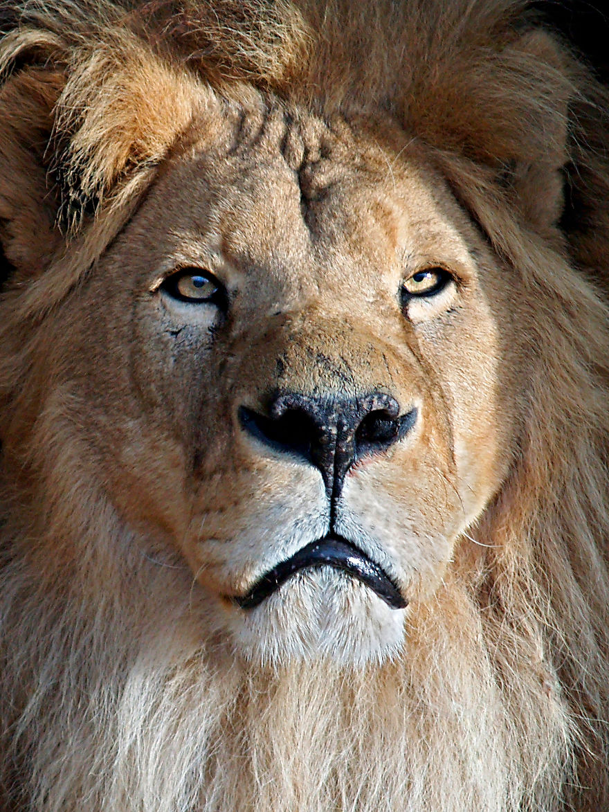
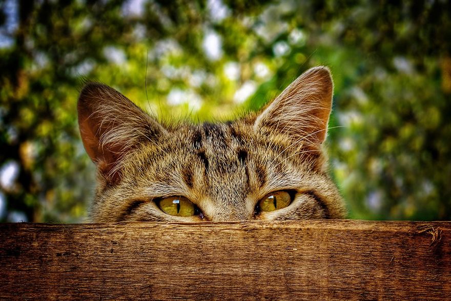
In this photo of my pet cat, you you’ll notice that I filled the frame completely with his face, even cropping out the edges of his head and mane. This allows the viewer to really focus on details such as the eyes or the textures in his fur. You may also notice that I used the rule of thirds in this composition. He is a lovely pet but you should see the state of our furniture. He also loves children but he couldn’t eat a whole one.
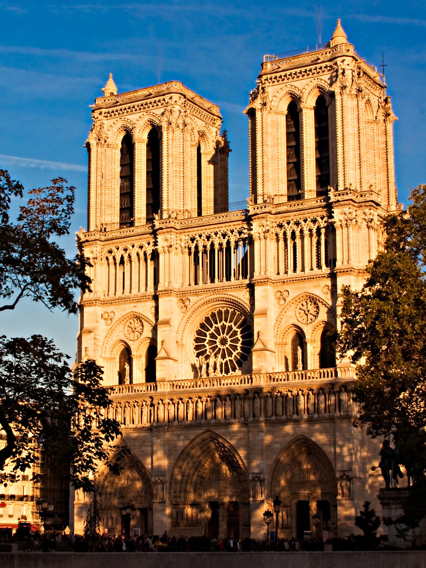
In the second shot of Notre Dame Cathedral in Paris, I have left very little space around the edges of the building. the point of this photograph is to showcase the architectural detail of the front facade of the building.
10. Leave Negative Space
Once again, I am going to completely contradict myself! In the last guideline, I told you that filling the frame works well as a compositional tool. Now I’m going to tell you that doing the exact opposite works well too. Leaving a lot of empty or ‘negative’ space around your subject can be very attractive. It creates a sense of simplicity and minimalism. Like filling the frame, it helps the viewer focus on the main subject without distractions.
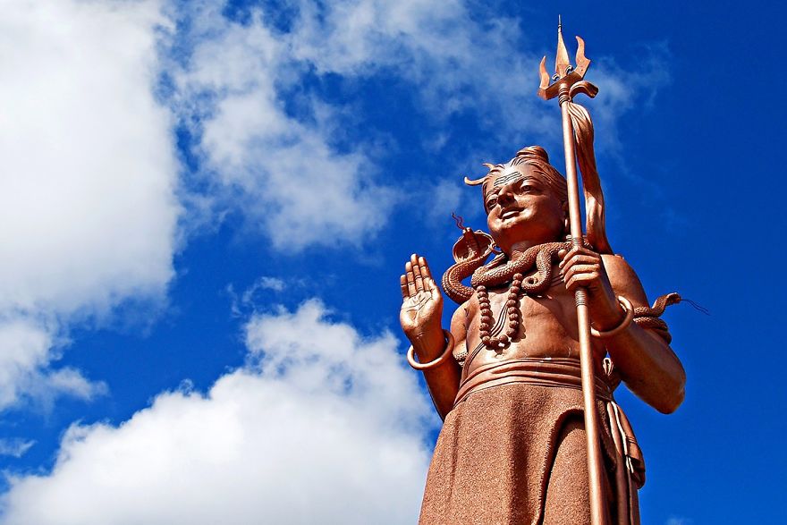
This photo of a giant statue of the Hindu god Shiva in Mauritius is a good example of using negative space. The statue is obviously the main subject but I have left plenty of space filled only by sky around it. This focuses our attention on the statue itself while giving the main subject ‘space to breath’ so to speak. The composition also creates a sense of simplicity. There is nothing complicated about the scene. It is the statue surrounded by sky, that is all. I also used the rule of thirds to place the statue to the right of the frame.
11. Simplicity and Minimalism
In the last guideline, we saw how leaving negative space around the main subject can create a sense of simplicity and minimalism. Simplicity itself can be a powerful compositional tool. It is often said that ‘less is more’. Simplicity often means taking photos with uncomplicated backgrounds that don’t distract from the main subject. You can also create a simple composition by zooming in on part of your subject and focusing on a particular detail.
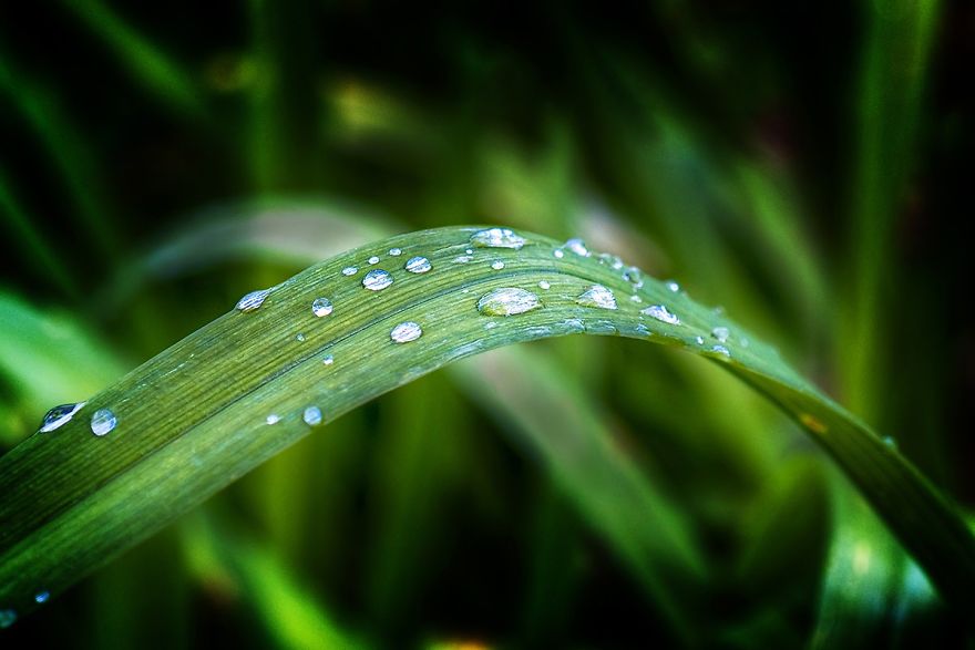
In this first photo, I zoomed in on some water droplets on a leaf in a garden. It’s such a simple subject but is also very beautiful because of its simplicity. A good macro lens can be a very useful tool for creating these types of photos.
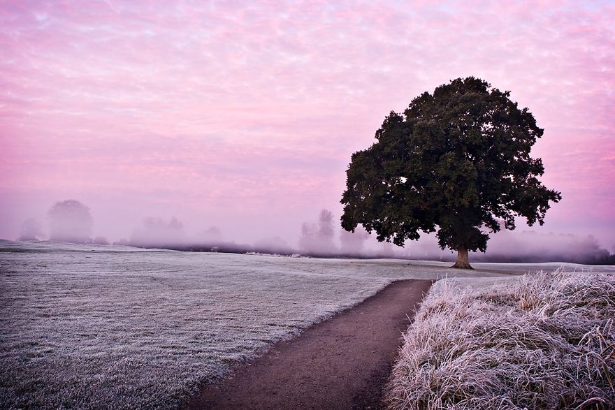
In the second photograph of a tree at dawn, I made use of a very simple and uncluttered background to focus attention on the tree. This photo makes use of ‘negative space’ to create a sense of simplicity and minimalism. I’ve also used the rule of thirds and leading lines in the composition.
12. Isolate the Subject
Using a shallow depth of field to isolate your subject is a very effective way of simplifying your composition. By using a wide aperture, you can blur the background that might otherwise distract from your main subject. This is a particularly useful technique for shooting portraits. You can learn more about how to use different aperture settings in my tutorial on Aperture, Shutter Speed and ISO.
In this photo of a cat hiding in a box, I set an aperture of f3.5 which is very wide and results in very blurred background. This focuses attention on the cat as the blurred background is now less distracting. This technique is an excellent way to simplify a composition. You may have noticed that I also used this technique to focus attention on the water droplets on the leaf in the last guideline.
13. Change your Point of View
Most photos are taken from eye level. In my case, that’s barely 5 feet! Getting high up or low down can be a way of creating a more interesting and original composition of a familiar subject. I’ve often seen wildlife photographers in particular lying in the mud on their bellies to get the perfect shot.
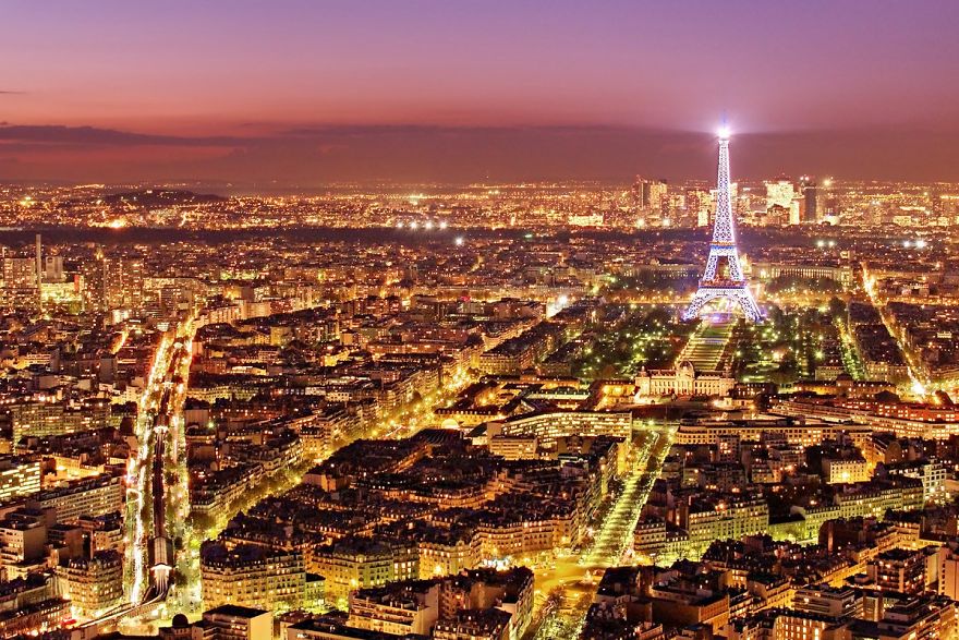
This shot of Paris at night was taken from the roof of the Montparnasse Tower in the 15th Arrondissement. Whenever I visit a city,I always try to see if there are any buildings with viewing platforms to allow to photograph the city from above. Getting high up gives you the chance to capture spectacular views of a city, especially at night.
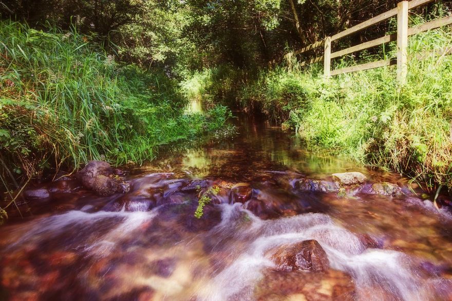
Sometimes finding that perfect point of view means getting your feet wet. Above is a shot I took while standing in a stream in Ballyhoura, County Limerick, Ireland. I actually had to wait quite a while for a rain shower to pass and the sun to come back out. It was worth it though to get low down and capture the motion of the water as if flowed over the rocks. I needed several hot whiskeys after to warm myself back up though.
14. Look for Particular Colour Combinations
The use of colour itself is an often overlooked compositional tool. Colour theory is something that graphic designers, fashion designers and interior designers are all very familiar with. Certain colour combinations compliment each other well and can be visually very striking.
Take a look at the colour wheel to the right. You can see that the colours are arranged logically in the segments of a circle. Colours that are opposite each other on the colour wheel are said to be ‘complimentary colours’. As photographers, we can look for scenes that incorporate complimentary colours as a way of creating attractive and striking compositions.
Have you ever noticed how many movie posters have blue and yellow/orange colour schemes? This is done quite deliberately to create eye catching adverts.
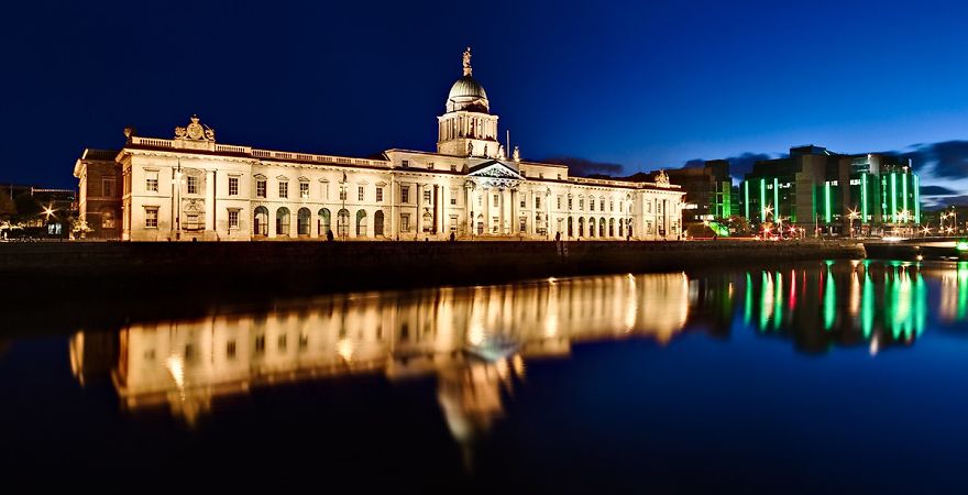
I made use of the striking blue/yellow colour combination myself in this photograph of the Custom House in Dublin. The yellow hues of the illuminated building contrast beautifully with the deep blue of the blue hour sky.
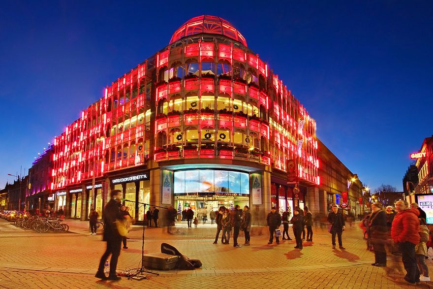
Red and blue are also complimentary colours on the colour wheel. The Stephen’s Green Shopping Centre in Dublin was lit up red for Christmas last year. This was very striking against the deep blue of the early night sky. I love photographing cities during blue hour. The deep blue of the sky at this time a very attractive backdrop to the city architecture and lights. The pure black of the late night sky is not as striking and contrasts too sharply with the lights of the city.
15. Rule of Space
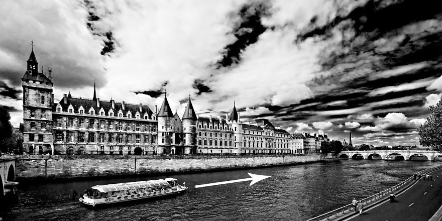
The rule of space relates to the direction the subject(s) in your photo are facing or moving towards. If you are taking a photo of a moving car for example, there should be more space left in the frame in front of the car than behind it. This implies that there is space in the frame for the car to move into. Take a look at the example of the boat in this photograph.
In this photo, the boat is placed on the left hand side of the frame as it moves from left to right. Notice how there is a lot more space for the boat to move into in front of its direction of motion (to the right) than behind it. We can mentally imagine the boat moving into this space as it sails along the river. We also have a subconscious tenancy to look forward to where an object is heading. If the boat was right up at the right hand side of the frame, this would lead us out of the photograph!
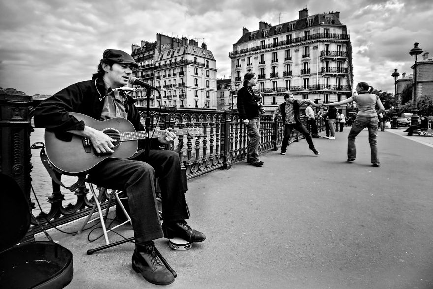
This can also be used for pictures of pictures of people. The rule of space suggests that the subject should be looking or facing into the frame rather than out of it. Take a look at the musician in the photo above. I composed the shot with him sitting on the left hand side of the frame. He is facing to the right (as we look at him) into the area of space between him and the right hand edge of the frame. If he had been facing the other way, he would be looking out of the frame and this would look odd. By looking into the space in the frame, he leads our eye past the man leaning on the railing and to the couple dancing on the right hand side.
16. Left to Right Rule
There is theory that says we ‘read’ an image from left to right in the same way we would read text. For this reason, it is suggested that any motion portrayed in a photograph should flow from left to right. This is all very well but it assumes the viewer is from a country were text is read from left to right. Many languages are read from right to left such as Arabic for example. To be honest, I’ve seen plenty of fantastic photographs that ‘flow’ from right to left.
I was once criticised by a judge for the fact that a woman in a photo I took was walking from right to left. He told me it didn’t follow the ‘left to right’ rule. I reminded the judge that the photo was taken in Tunisia where people read from right to left. I didn’t win.
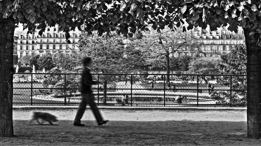
The photo above follows the ‘left to right’ rule. The woman walking her dog in the Tuileries Garden in Paris is walking from the left to the right of the frame. This photo also adheres to the ‘rule of space’. You will notice that the there is much more space in front the woman than behind her. She has plenty of ‘space’ to walk into in the frame. I also used the rule of thirds and a ‘frame within a frame’ to compose this photograph.
17. Balance Elements in the Scene
The first compositional guideline we looked at in this this tutorial was the ‘rule of thirds’. This of course means that we often place the main subject of the photo to the side of the frame along one of the vertical grid lines. Sometimes this can lead to a lack of balance in the scene. It can leave a sort of ‘void’ in the rest of the frame.
To overcome this, you can compose your shot to include a secondary subject of lesser importance or size on the other side of the frame. This balances out the composition without taking too much focus off the main subject of the photograph.
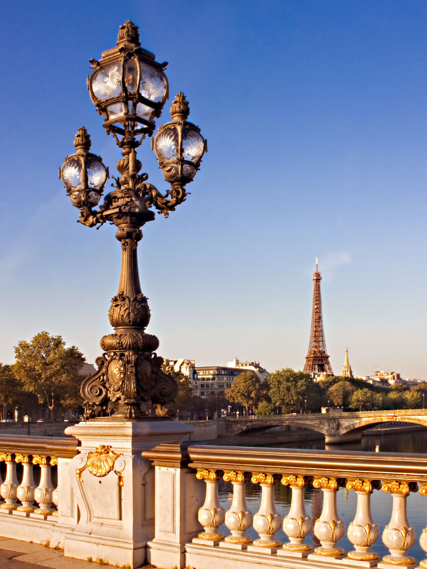
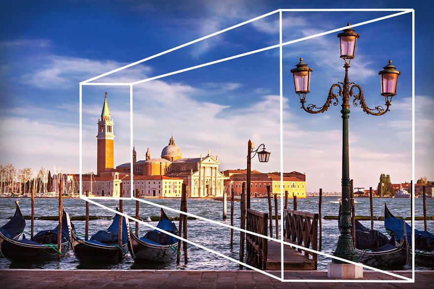
Take a look at the photograph of the ornate lamppost on the Pont Alexandre III in Paris. The lamppost itself fills the left side of the frame. The Eiffel Tower in the distance counter balances this on the other side of the frame.
You may have remarked that this seems to go against the idea of negative space mentioned in guideline number 10. It also contradicts the ‘rule of odds’ as we now have an even number of elements in the scene. As I said at the very beginning of this tutorial, there are no unbreakable rules in photographic composition. Some of these guidelines contradict each other and that’s ok. Some guidelines work well for certain types of photographs and not others. It’s a question of judgement and experimentation.
This photo was taken in Venice. Once again, a decorative lamppost dominates one side of the frame. The church tower in the distance provides balance on the other side of the frame.
This also has a secondary effect on the composition. The church tower in the distance is obviously much bigger than the lamppost in real life. It appears smaller in the photograph as it is far away. This helps add a sense of depth and scale to the scene.
18. Juxtaposition
Juxtaposition is very powerful compositional tool in photography. Juxtaposition refers to the inclusion of two or more elements in a scene that can either contrast with each other or compliment each other. Both approaches can work very well and play an important part in enabling the photo to tell a story.
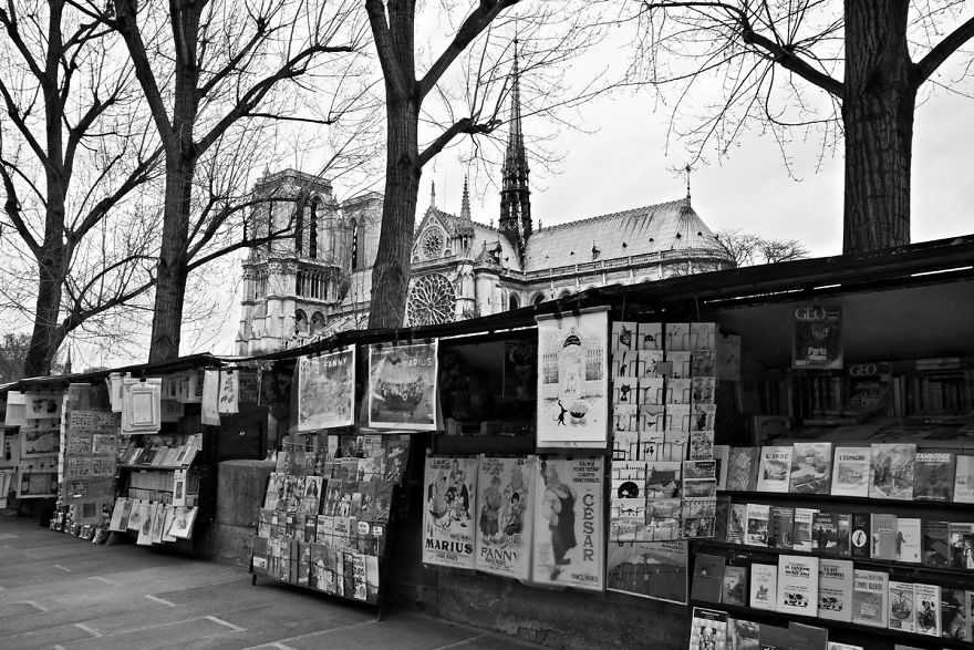
Take a look at this photo taken in Paris. In the bottom half of the frame, we have the slightly rough and ready book stands full of clutter and posters hanging from the tops. Rising above all of this however is the magnificent medieval Notre Dame Cathedral. This architectural gem is the epitome of order and structure unlike the unsophisticated but attractive book stalls below. They seem to be in direct contrast with each other yet they work well together. They both represent the city of Paris in different ways. They tell a story about two different elements of the city.
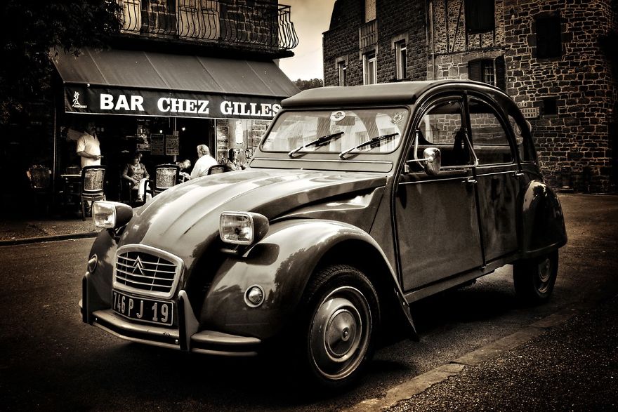
The photo above was also taken in France, but this time in the picturesque little village of Meyssac in the South West. In this shot, the old Citroen 2CV car looks perfectly at home in front of the typical French cafe in the background. The two elements compliment each other perfectly. The man with his back to us in the cafe is the owner of the car and he seemed surprised when I asked if it was ok to take a picture of his car. He asked why I’d ever want to take a photo of ‘that old thing’. He didn’t seem to realise that he had unwittingly set up a quintessentially French scene by parking in front of that particularly cafe.
19. Golden Triangles
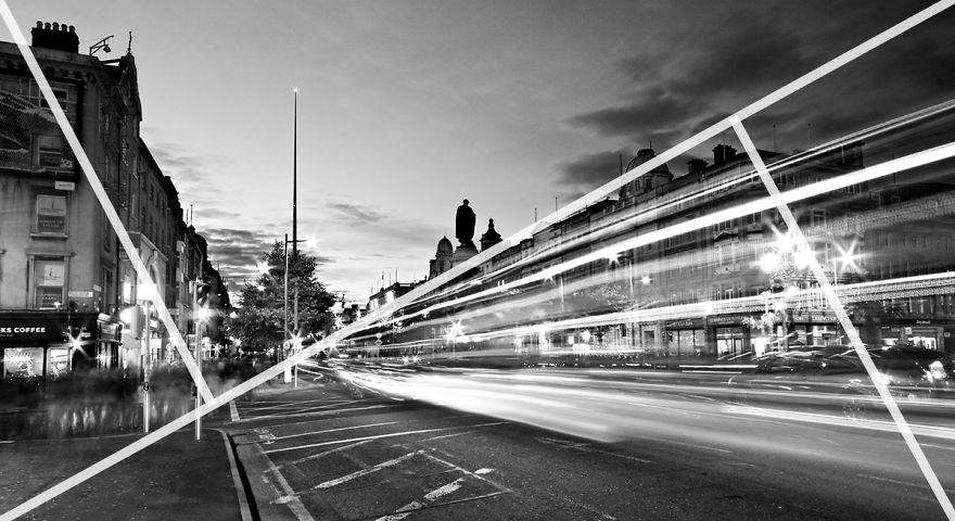
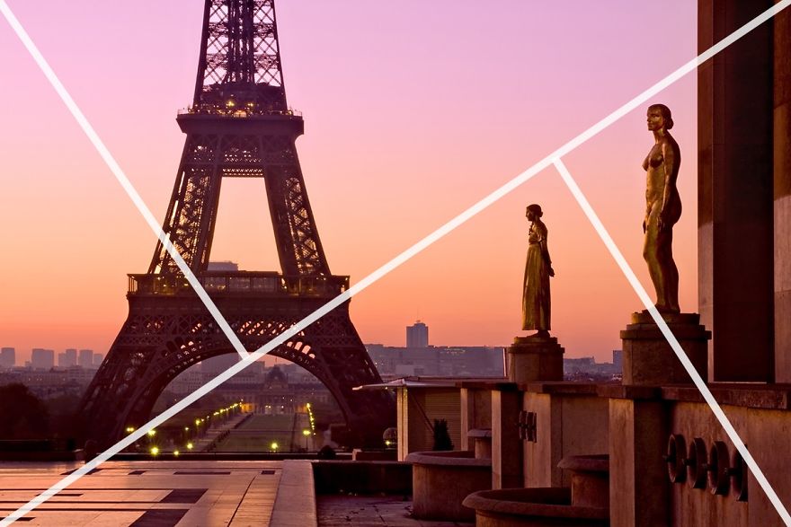
Are you still with me? We’re almost there…. I promise. The golden triangles composition works in a very similar way to the rule of thirds. Instead of a grid of rectangles however, we divide the frame with a diagonal line going from one corner to another. We then add two more lines from the other corners to the diagonal line. The two smaller lines meet the big line at a right angle as is illustrated below. This divides the frame into a series of triangles. As you can see, this way of composing helps us introduce an element of the ‘dynamic tension’ we learned about in guideline number 6. As with the rule of thirds, we use the lines (of the triangles in this case) to help us position the various elements in the scene.
The photo above contains strong diagonals that follow the lines of the ‘golden triangles’. The light trails from the traffic perfectly follow the diagonal line running from the top right hand corner to the bottom left hand corner. The tops of the buildings on the left are close to the smaller diagonal on the left. The small line on the right meets the larger line at the top corner of the buildings.
This photo makes use of the ‘rule of triangles’ in a more subtle way. The heads of the statues create an ‘implied triangle’. This line leads us to the Eiffel Tower in the distance. The smaller line on the left meets the longer line right at the halfway point of the Eiffel Tower. The smaller line on the right goes right between the two statues. The rule of triangles can seem like a complex way of arranging a photo but it can result in some really striking compositions.
20. Golden Ratio
What is the golden ratio? Well it’s actually very simple: two quantities are in the golden ratio if their ratio is the same as the ratio of their sum to the larger of the two quantities. Wait, what now?
What do you mean you’re even more confused now?
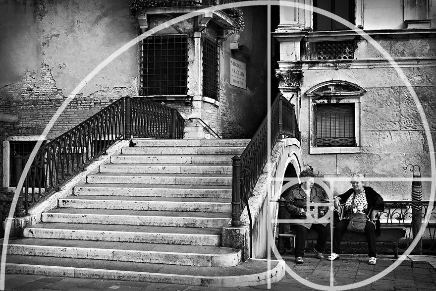
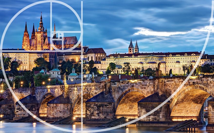
It’s true that the golden ratio method of composing a photograph can seem very complex at first. In reality it’s quite simple. It’s like a slightly more complex version of the rule of thirds. Instead of a regular grid, the frame is divided into a series of squares as in the examples below. This is known as a ‘Phi Grid’. You can then use the squares to draw a spiral that looks like a snail’s shell. This is called a ‘Fibonacci Spiral’. The squares help to position elements in the scene and the spiral gives us an idea of how the scene should flow. It’s a little like an invisible leading line.
It is believed that the golden spiral method of composition has been in existence for over 2,400 years having been devised in Ancient Greece. It is widely used in many types of art as well as architecture as a way of creating aesthetically pleasing compositions. It was particularly well employed in Renaissance art.
Ok, I have to admit something here. I have never actually purposely set out to compose a photograph using the golden ratio. When I looked back through my photographs, I did notice that I had unintentionally used it a few times.
I took this photo in Venice. The bridge and steps on the left occupy the large square to the right. The Fibonacci Spiral then leads us from here across the top of the bridge and down to the two women sitting next to it. It may have been a lucky accident but it seems to work!
The golden ratio can be set up in different directions. In this photo taken in Prague, the spiral leads us across the bridge to the castle on the far bank. Another lucky accident!
Obviously, it would be impossible to have all of these compositional guidelines in your mind as you are out shooting. Your brain would melt! However, a good exercise is to make an effort to use one or two of them each time you go out. You could do a photo session where you look for situations to use a ‘frame within a frame’ for example.
After a while, you’ll find that a lot of these guidelines become ingrained. You will begin to use them naturally without having to think about them. As you can see from the golden ratio, I even used one of them without even realising it!
Another good exercise is to look at some of the photos in my galleries(bocphotography.com/galleries) or any collection of photos and try to see if you can tell which compositional techniques have been used.
I hope you found this tutorial useful and that it will help you bring your photography to the next level.
200Kviews
Share on FacebookI have been wanting something like this for a LONG time. I have saved this article and will continue studying the tips until I have them memorized. THANK YOU for the visuals an the easy to understand tutorials!
I am really bad when taking pictures my husband says. I want him to take it back. This is what I needed. Thanks you for all these tools and rules to follow. They are very creative.
Hey. Could you tell me what do you think about these photos: https://www.eyeem.com/u/kacperziba These photos are one of my first photos I've ever done and all of them I did using only phone camera :P (Sorry if my english is terrible)
While it is very interesting and I've learned quite a few new things, basically you can do what you want and it will fall within one or more of the rules :) You can always say "that's not a bad photo, that's artistic freedom!" I enjoy taking photos of wildlife mostly so there's not a lot time to think about composition as the subject has moved on/away but I do try and keep some of the rules in mind. Lovely kitty, you need a scratching post to save your furniture. A centenary oak should do.
Wow ! This is really .. really .. absolutely useful ^_^ thanks for sharing ^_^
this is going to be my pocket tool for a very long time where ever i go when ever i go will be in mine
Thanks for your tutorial. I think that as profi must it to know these rulls. I'm not and now i learned many interesting things from you.
First, I learned a lot of basic and much needed things about composition. Thank you! Second, I laughed a lot. Thank you for that, too! Send my love to your pet cat and mother in law. Not necessarily to the judge who ignored your explanation of the right-to-left photo. The third thing is, I want to go to Ireland now. Very much. And I'm one of those people who generally are not into traveling.
wow wow wow! Ireland is the heaven on earth, specially when you photograph it! not a photographer, but I loved the article...
Definitely something I'm going to use to learn to improve my skills with my camera.
Absolutely i will use some of those techniques especially symmetrical and 9 pieces
Thanks for sharing your techniques! Detailed explanations and good visual examples with helpful lines drawn :D
This are great information... reminds me of the "bigger picture cards" for photographers.
I've always wanted to find a tutorial like this since I love taking photos and really want to get better and better. To my surprise, however, I found out I know most of these tips and even use them without learning about them before... I really want to thank you for explaining WHY exactly all these rules are good to follow! Not to mention your stunning pictures. It really helped me understand my own photos a lot. And also thanks for beautiful pictures of Prague, my hometown :)
Wow, what a marvelous read! It shows the writer took a great deal of effort and time to concise everything into one article. I will try to use these when composing a picture. Thank you!
Been using the rule of thirds in taking shots on my phone. Thanks for introducing other methods!
Thanks a lot for the tipps! I will definitely use some of these techiques in my next trip! :D
Great tutorial!! Thanks for sharing your knowledge with such passion !
Thank you for sharing you knowledge and skills. Im surely level up my photo-ops. Tnx again. - Mel
In the beginning of the school (photography),we learn all of this rules.After when we pass to advance photographers,they say to us to forget all the rules,and to find our personal style.I really love photography and honestly,you did a great job with this post,to give it for free to the people who want to learn photography.:)
In other words: do whatever the f**k you want. Sometimes you are lucky and it will look good.
I have been wanting something like this for a LONG time. I have saved this article and will continue studying the tips until I have them memorized. THANK YOU for the visuals an the easy to understand tutorials!
I am really bad when taking pictures my husband says. I want him to take it back. This is what I needed. Thanks you for all these tools and rules to follow. They are very creative.
Hey. Could you tell me what do you think about these photos: https://www.eyeem.com/u/kacperziba These photos are one of my first photos I've ever done and all of them I did using only phone camera :P (Sorry if my english is terrible)
While it is very interesting and I've learned quite a few new things, basically you can do what you want and it will fall within one or more of the rules :) You can always say "that's not a bad photo, that's artistic freedom!" I enjoy taking photos of wildlife mostly so there's not a lot time to think about composition as the subject has moved on/away but I do try and keep some of the rules in mind. Lovely kitty, you need a scratching post to save your furniture. A centenary oak should do.
Wow ! This is really .. really .. absolutely useful ^_^ thanks for sharing ^_^
this is going to be my pocket tool for a very long time where ever i go when ever i go will be in mine
Thanks for your tutorial. I think that as profi must it to know these rulls. I'm not and now i learned many interesting things from you.
First, I learned a lot of basic and much needed things about composition. Thank you! Second, I laughed a lot. Thank you for that, too! Send my love to your pet cat and mother in law. Not necessarily to the judge who ignored your explanation of the right-to-left photo. The third thing is, I want to go to Ireland now. Very much. And I'm one of those people who generally are not into traveling.
wow wow wow! Ireland is the heaven on earth, specially when you photograph it! not a photographer, but I loved the article...
Definitely something I'm going to use to learn to improve my skills with my camera.
Absolutely i will use some of those techniques especially symmetrical and 9 pieces
Thanks for sharing your techniques! Detailed explanations and good visual examples with helpful lines drawn :D
This are great information... reminds me of the "bigger picture cards" for photographers.
I've always wanted to find a tutorial like this since I love taking photos and really want to get better and better. To my surprise, however, I found out I know most of these tips and even use them without learning about them before... I really want to thank you for explaining WHY exactly all these rules are good to follow! Not to mention your stunning pictures. It really helped me understand my own photos a lot. And also thanks for beautiful pictures of Prague, my hometown :)
Wow, what a marvelous read! It shows the writer took a great deal of effort and time to concise everything into one article. I will try to use these when composing a picture. Thank you!
Been using the rule of thirds in taking shots on my phone. Thanks for introducing other methods!
Thanks a lot for the tipps! I will definitely use some of these techiques in my next trip! :D
Great tutorial!! Thanks for sharing your knowledge with such passion !
Thank you for sharing you knowledge and skills. Im surely level up my photo-ops. Tnx again. - Mel
In the beginning of the school (photography),we learn all of this rules.After when we pass to advance photographers,they say to us to forget all the rules,and to find our personal style.I really love photography and honestly,you did a great job with this post,to give it for free to the people who want to learn photography.:)
In other words: do whatever the f**k you want. Sometimes you are lucky and it will look good.

 Dark Mode

 No fees, cancel anytime










737
38