
People Are Posting Google’s Design ‘Mistakes’, But There Is A Good Reason Behind Them
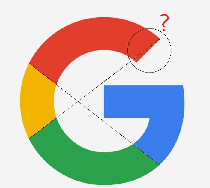
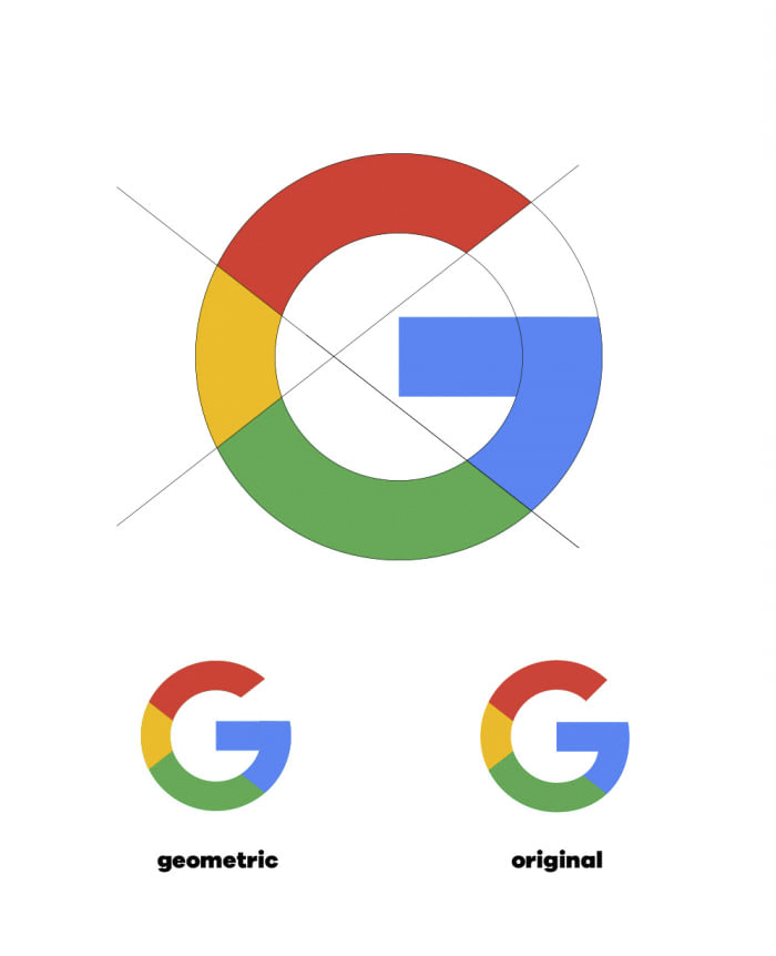
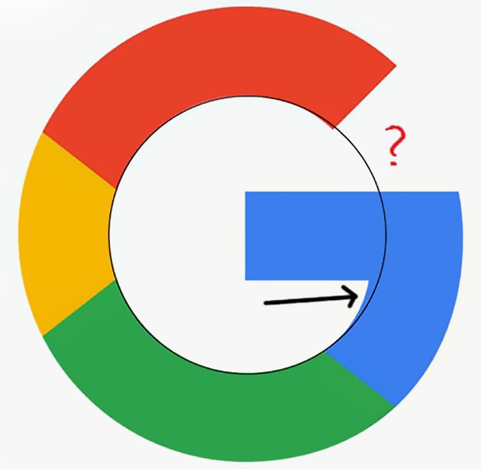
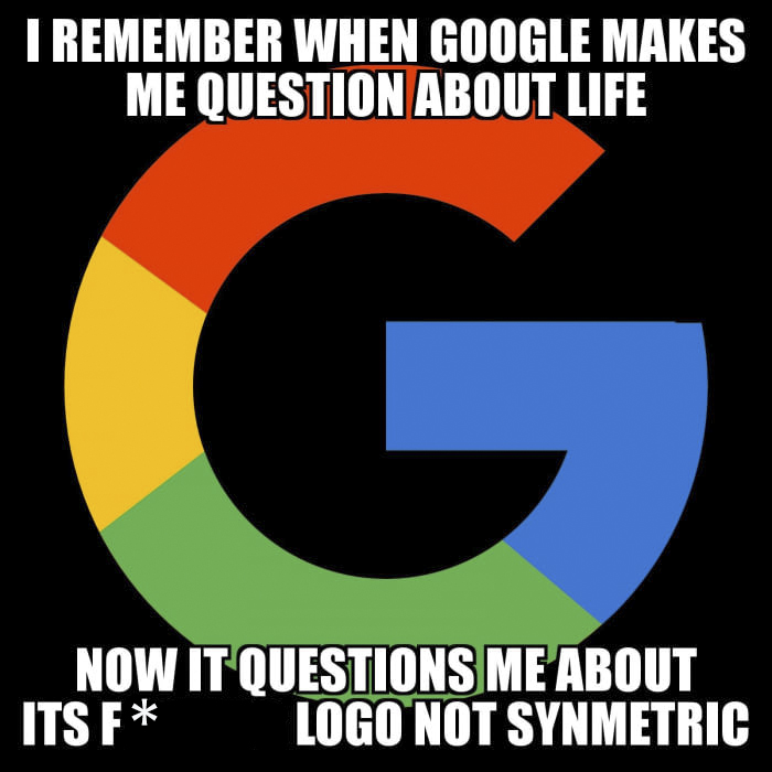
The perfectionists of the internet have pointed out how imperfect Google’s ‘G’ is and all hell has broken loose. Turns out, it’s not only the ‘G’ that’s a problem, even a bar in Chrome’s search box has imperfections. Although the logo was redesigned only 2 years ago, the internet is buzzing and people are questioning Google’s visual decisions, but there are actually very simple reasons behind them.
“The Google logo has always had a simple, friendly, and approachable style,” the company describes its identity. “We wanted to retain these qualities by combining the mathematical purity of geometric forms with the childlike simplicity of schoolbook letter printing.”
“The final logotype was tested exhaustively at various sizes and weights for maximum legibility in all the new digital contexts.” It is set in a custom sans-serif typeface and maintains the multi-colored playfulness, a reminder that Google always tries to stay unconventional.
This explanation, however, will never satisfy true geometric perfectionists. But what about you?
More info: design.google
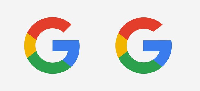
Google logo is triggering some perfectionists
So they started fixing it
But while people are questioning Google’s visual decisions
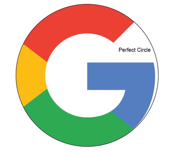
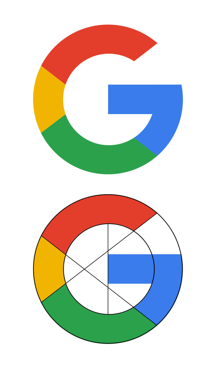
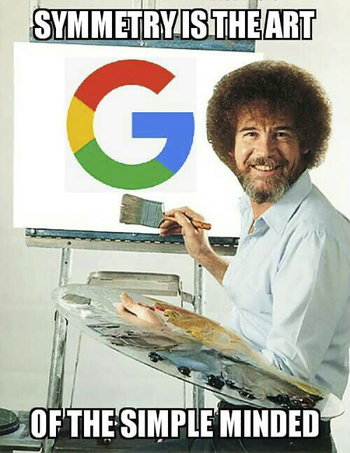
For example, the asymmetrical form of their logo
Image credits: r/mildlyinfuriatingIt
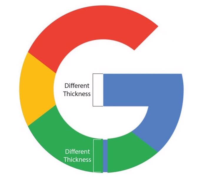
Its varying thickness
Image credits: r/mildlyinfuriatingIt
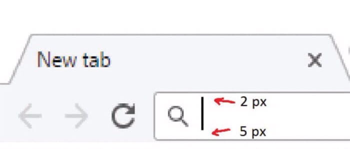
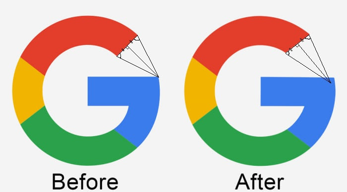
And other not-so-visible mistakes
Image credits: r/mildlyinfuriatingIt
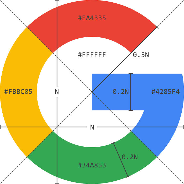
There are actually very simple reasons behind them
“The Google logo has always had a simple, friendly, and approachable style”
Image credits: theloneplant
“We wanted to retain these qualities by combining the mathematical purity of geometric forms with the childlike simplicity of schoolbook letter printing”
“The final logotype was tested exhaustively at various sizes and weights for maximum legibility in all the new digital contexts”
It is set in a custom sans-serif typeface and maintains the multi-colored playfulness, a reminder that Google always tries to stay unconventional
This explanation, however, will never satisfy true geometric perfectionists. But what about you?
Explore more of these tags
When I see the Geometric and the Original logos, side by side, I still prefer the Original. Symmetry is not always the best solution.
Wow....I know Bored Panda is for bored people, but studying the google logo is a whole new art form of boredom
Not for logo designers. Regardless... asymmetry does not mean it's wrong. So I feel this is something rather silly to get all in arms about.
Load More Replies...When I see the Geometric and the Original logos, side by side, I still prefer the Original. Symmetry is not always the best solution.
Wow....I know Bored Panda is for bored people, but studying the google logo is a whole new art form of boredom
Not for logo designers. Regardless... asymmetry does not mean it's wrong. So I feel this is something rather silly to get all in arms about.
Load More Replies...
 Dark Mode

 No fees, cancel anytime





177
66