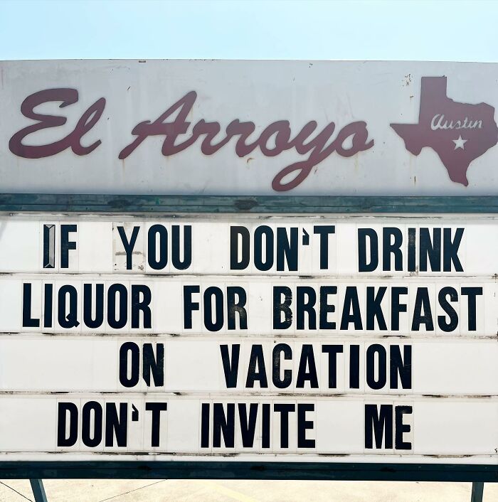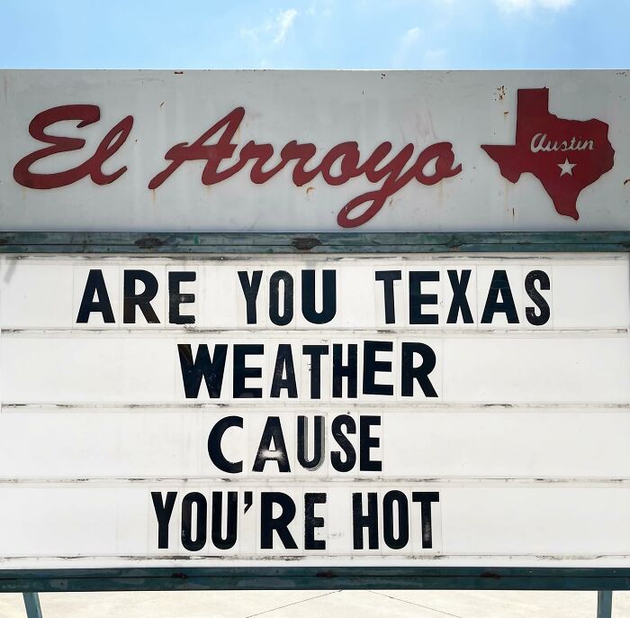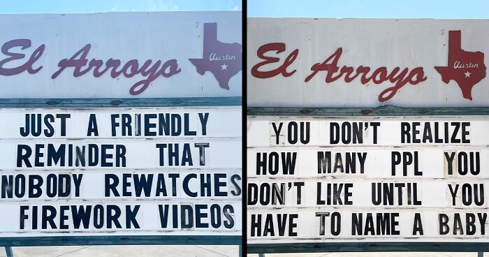
This Restaurant’s Signs Are So Funny, You’d Probably Go Back Just To Read Them (50 New Pics)
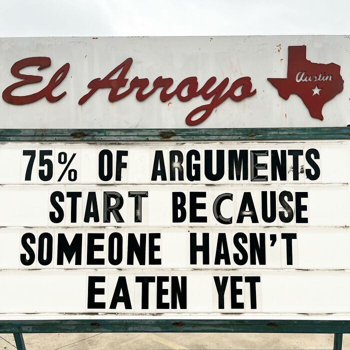
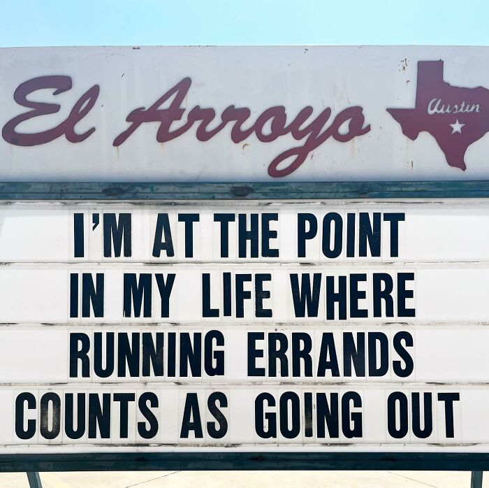
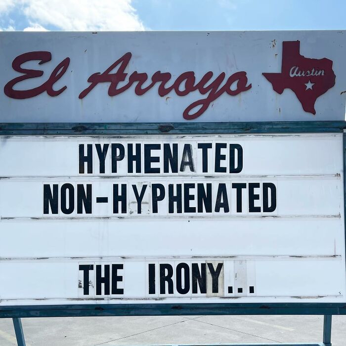
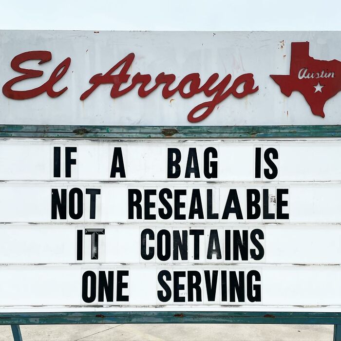
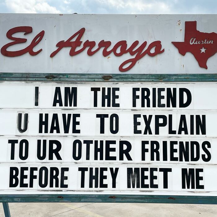
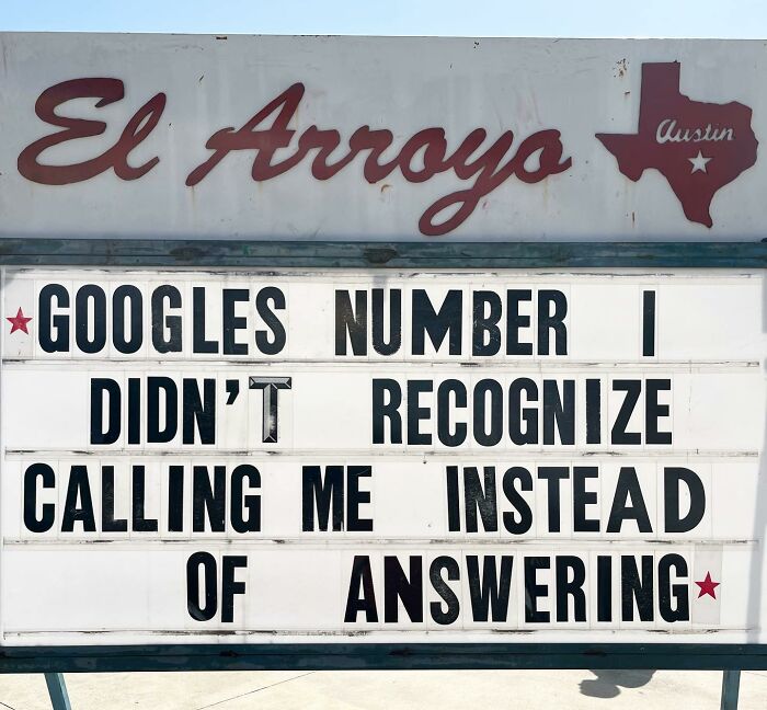
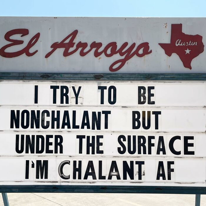
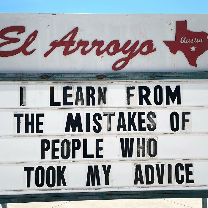
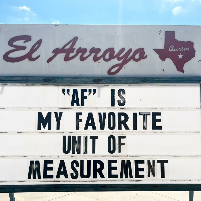
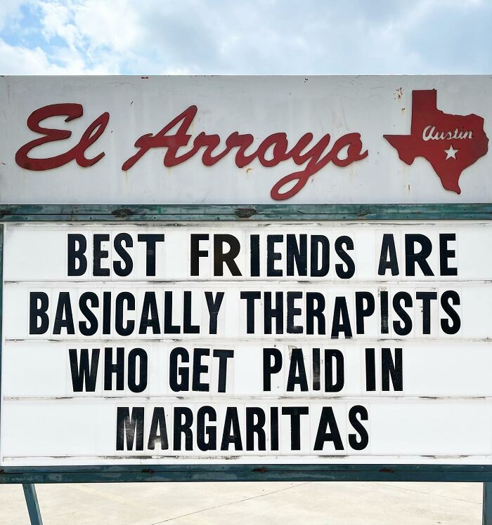
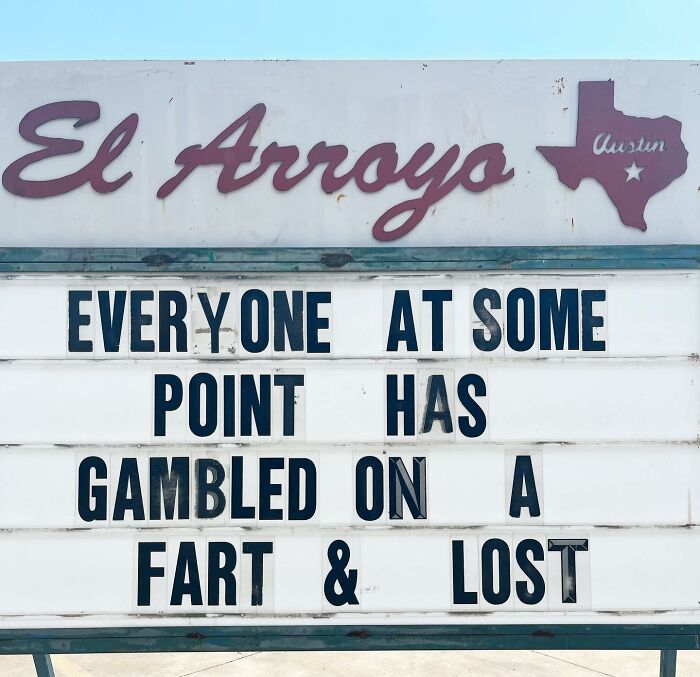
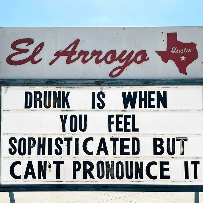
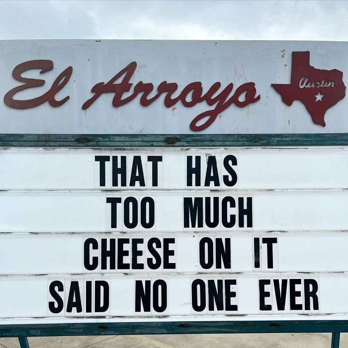
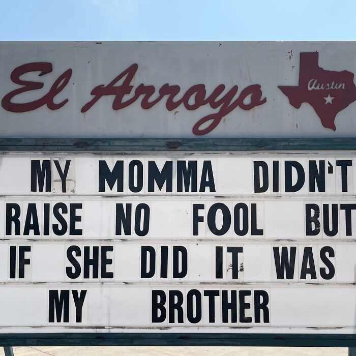
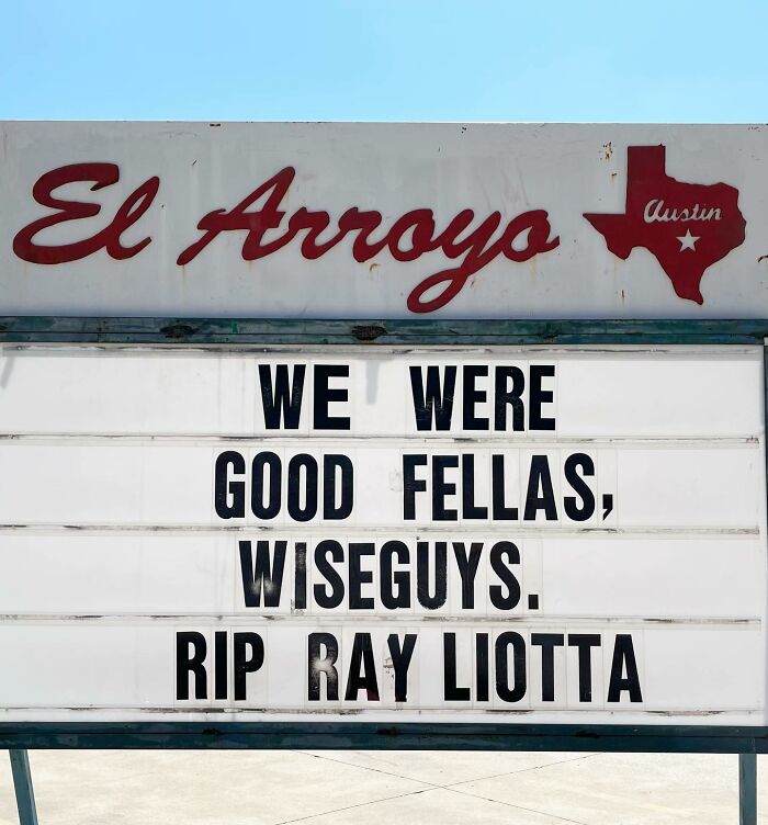
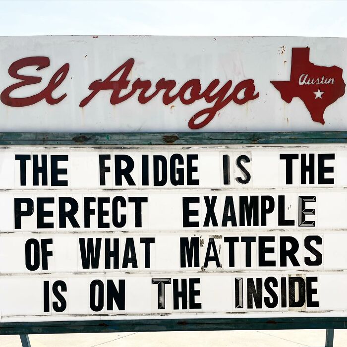
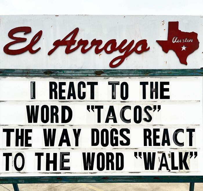
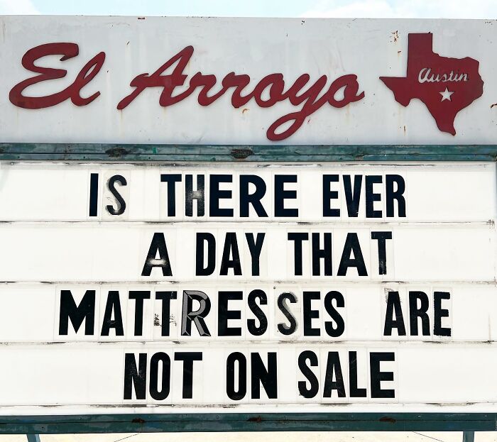
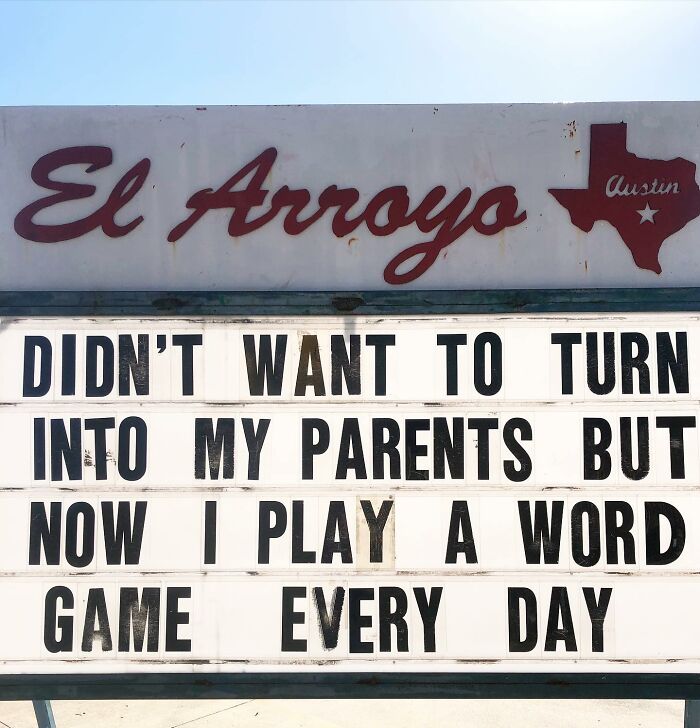
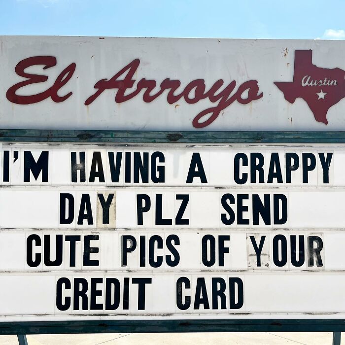
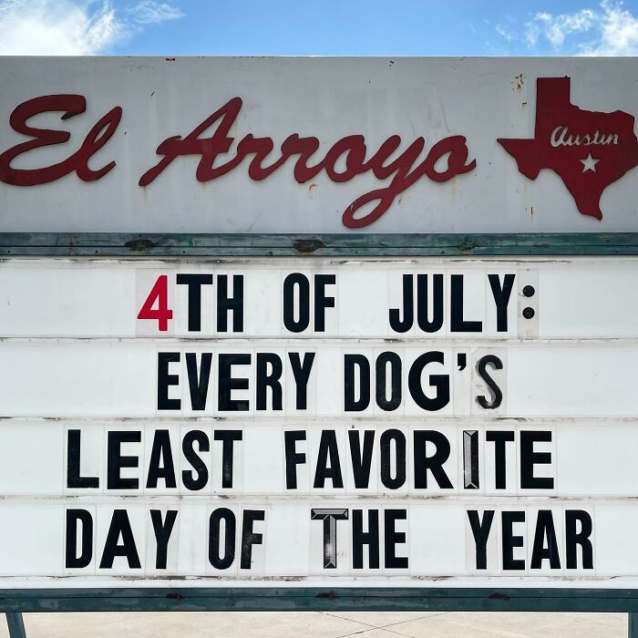
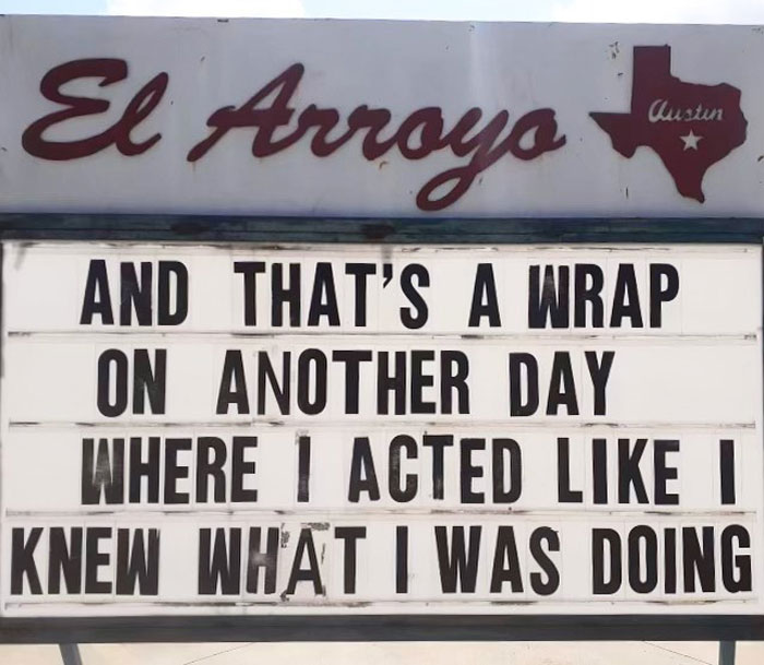
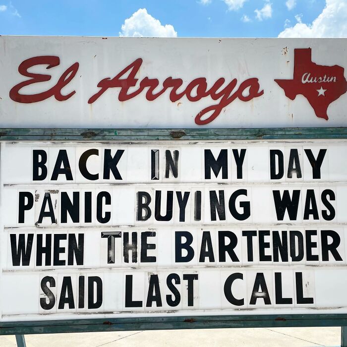
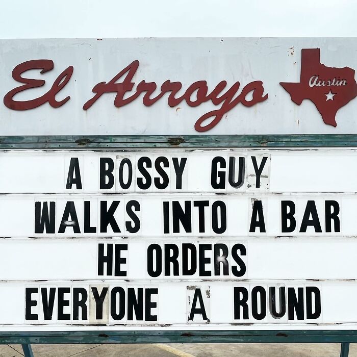
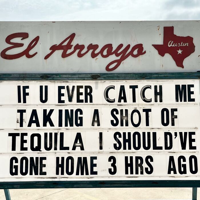
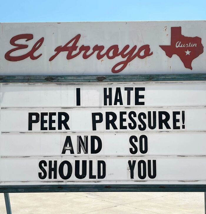
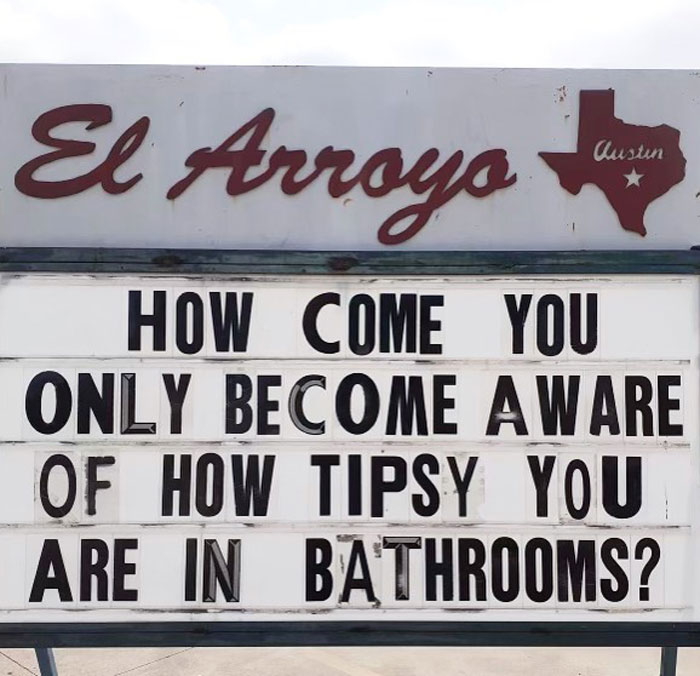
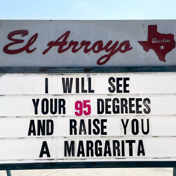
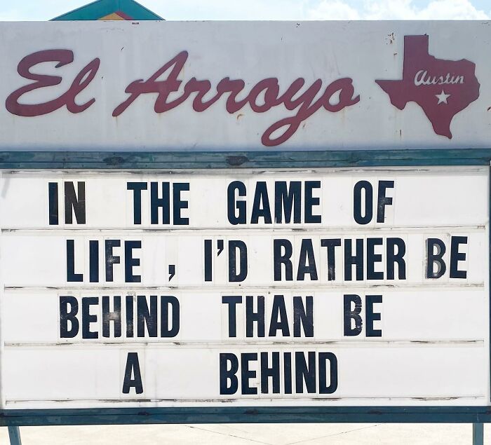
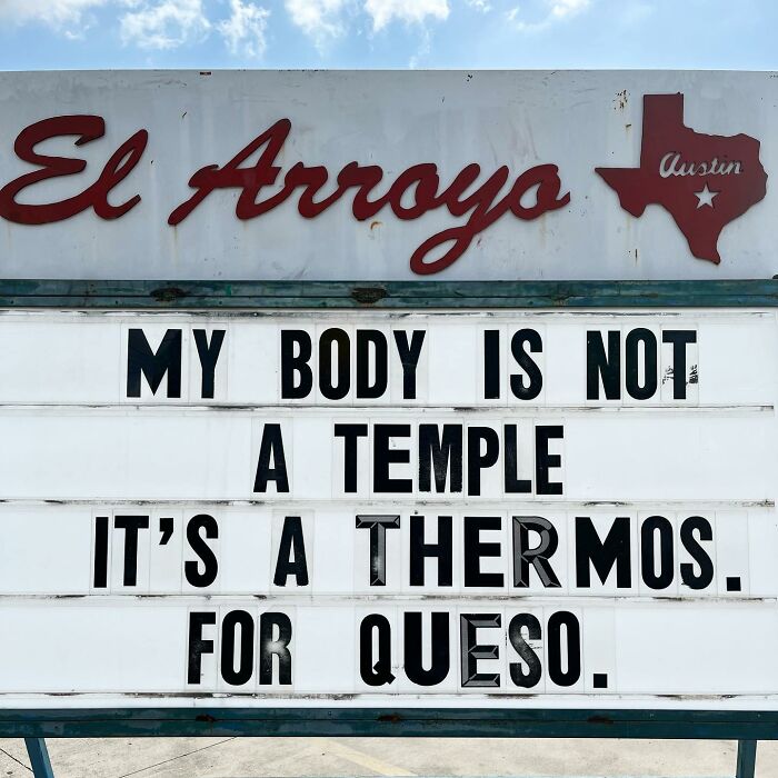
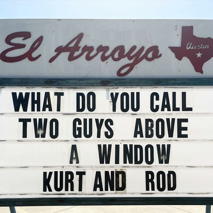
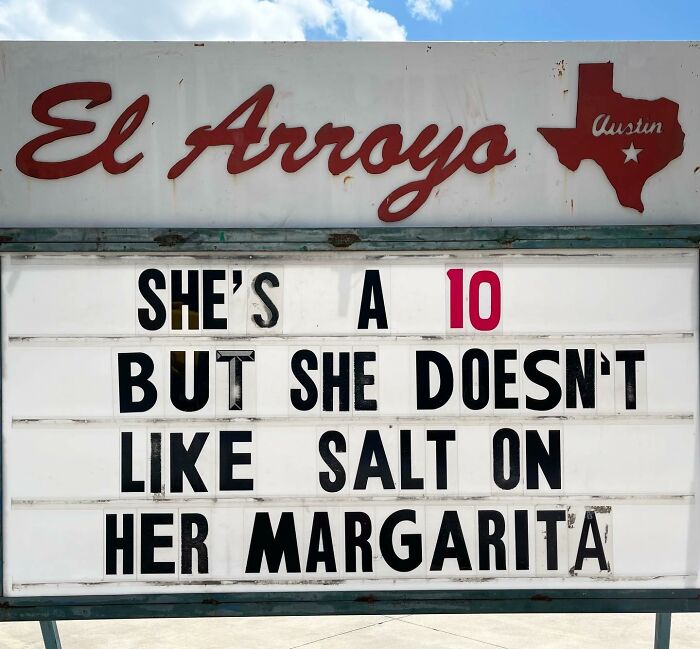
Humor has the power to change people’s lives for the better—and also get a bunch of new customers interested in what you have to offer! There’s hardly a restaurant that’s more known for its love of comedy than the El Arroyo, in Austin, Texas.
It’s a Tex-Mex place that’s been winning the humorous sign game since forever ago. And we couldn’t wait to share their freshest and tastiest signs again with you. Upvote the pics you enjoyed the most as you’re scrolling down, and let us know in the comments which of these quips made you laugh harder than you should’ve. Are you a native Texan? We’d love to hear your thoughts about the now-legendary El Arroyo marquee sign, as well as the restaurant itself.
And for dessert, dear Pandas, you might want to consider having a few servings of Bored Panda’s recent features about the restaurant. You’ll find them here, here, and here. The lists are all delicious and might put you in the mood for Tex-Mex for lunch.
More info: ElArroyo.com | Instagram | Facebook | Twitter
This post may include affiliate links.
The El Arroyo has been serving up Tex-Mex “with a side of laughs” on their famous marquee sign since 1975. The Austin phenomenon has grown into a global phenomenon. People from all around the world tune into the restaurant’s social media feeds for the latest quips and witty remarks.
The brilliant thing is, you can be a part of that. You can send the restaurant your suggestions for their next sign, whether you’re an actual customer or an internet user who’s got a wicked awesome sense of humor.
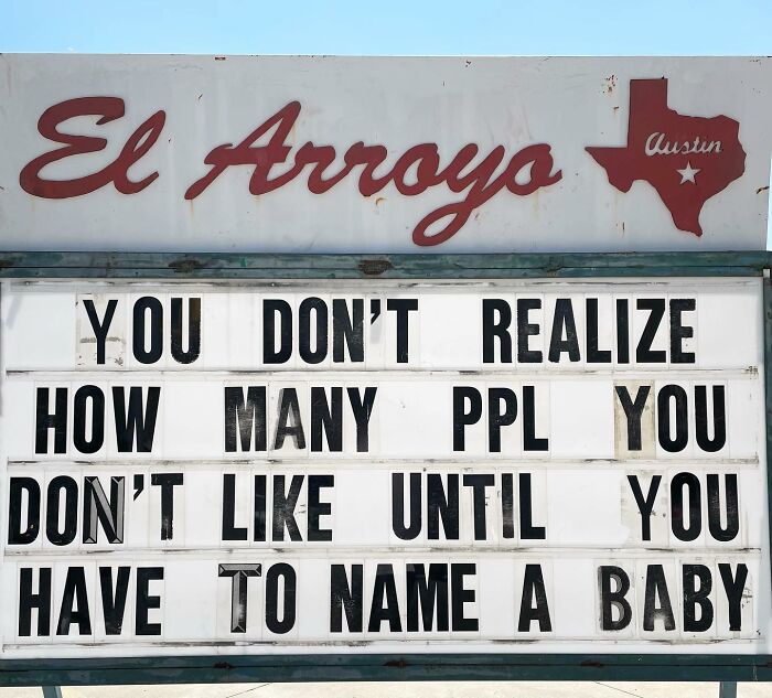
I don't have a baby (not sure of I will), but I know the names I'm not picking.
Even if you’re not a fan of Tex-Mex cuisine, you’ll probably enjoy the restaurant’s consistent hilarity as the main course. They’ve got their finger on the pulse of comedy, and we love it.
One thing’s for sure: the next time we’re in Texas, we’re going to drop by and see the sign in person. We hope it’s as big as we think!
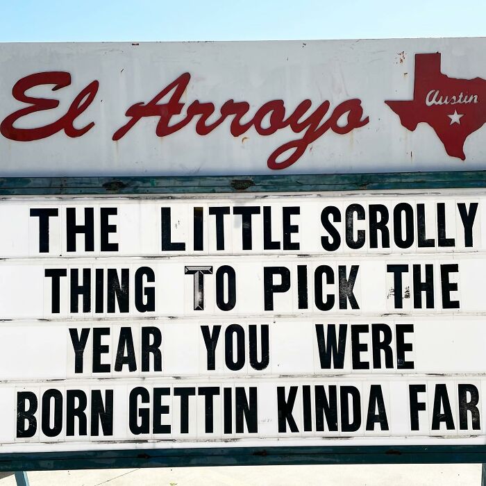
Why is it that sites that require you to be 18+ have those scroll things starting at 2022?
A while back, we spoke about comedy, brevity, and shortening attention spans with British comedy writer Ariane Sherine. As it turns out, the fact that the El Arroyo has a very limited amount of space for its quips can actually work out to its advantage.
“There's a saying: 'Brevity is the soul of wit'. Often, keeping things short and snappy is the key to making them funny. Even more so these days, as people have short attention spans and there's so much content competing for their attention,” the comedian told Bored Panda earlier.
That doesn’t mean that all short and to-the-point jokes will land. The format alone won’t guarantee that your audience will laugh until they’re crying (or rolling on the floor). There’s a balance to be found between brevity and being informative.
“It's great to be concise, but when making a short joke or one-liner, ensure you've included all the information necessary. There's no point in making your quip short if it doesn't contain enough info for the joke to work!” Ariane shared.
“Also, it's all the more important to make sure you don't stumble over your words when delivering the quip, as there are fewer of them,” she said that clarity is an important element in comedy.
“Some comics love telling long rambling stories, and others tell snappy one-liners. I personally like one-liners but I find that watching a comic come out with 20 minutes of them can get a bit wearing. Each to their own!” she noted that different people enjoy different forms of comedy. So if someone’s not a fan of the particular brand you’re delivering, it’s not the end of the world. It’s impossible to please everyone, after all.
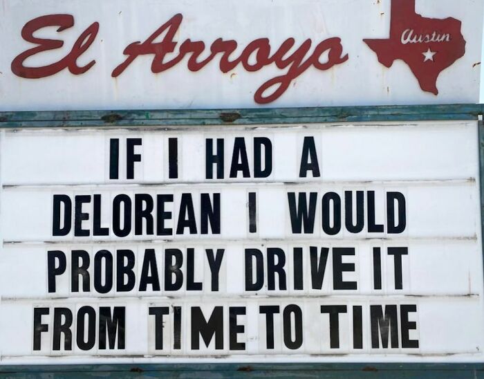
This reference probably went over the head of anyone that has not watched back to the fueature (sorry I’m spelling tired) we’re they make a Delorian into a Time Machine. (Edit: a Delorian is a car from the 80’s) (edit: I am not that old to have watched it I just like old stuff I’m a teen)
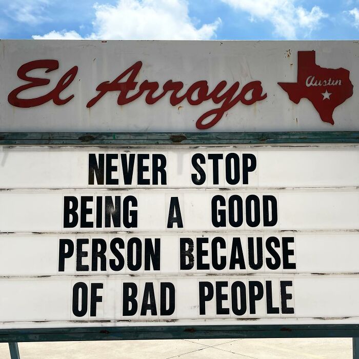
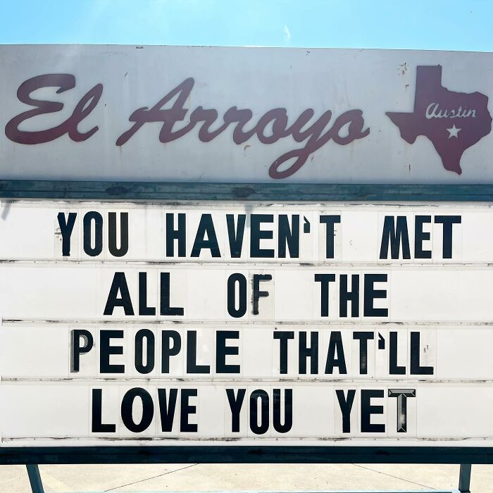
And yet, you still don't understand them, even though they are just like you
Some time ago, my colleague spoke to Laura Schulte, the brand partnerships and social media manager at the El Arroyo restaurant. Laura told Bored Panda that the sign was “first put out by the street in front of the restaurant by our original owner over 25 years ago to promote restaurant specials and write funny quotes.”
According to her, the staff picks out what to put up on the sign by looking at what makes them all laugh and what makes sense to draw attention to, regarding current events in the US and the world.
Laura, from the El Arroyo team, said that the most popular signs are the most that are “relatable and funny to large groups of people.” She added: “We've seen a lot of success with our signs about past elections, and current events such as commentary on the pandemic.” A sign has to be genuinely funny to do well. It also doesn’t hurt if a celebrity shares it on social media!
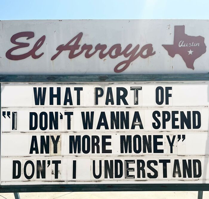
I think when I've spent it all till it's gone, that's when I'll know to stop
Recently, Bored Panda spoke about ads, fonts, and the fluency effect with Matt Johnson, Ph.D. He’s a professor of consumer psychology at Hult International Business School and Harvard University, as well as the author of 'Branding that Means Business.’
Professor Johnson explained to us that it’s contrast that really grabs our attention due to how our brains are wired to notice differences in our environments. What this means is that, essentially, the context in which an ad (or in this case, a sign) is placed really matters. If you want to get noticed, you have to stand out from your competitors.
"If the content can’t grab attention and stop the consumer in their tracks, they won’t have the opportunity to appreciate the ad’s quality. This is especially true in the digital environment, where the first job of any piece of content is to stop the thumb. Only after this first step can the quality of the content shine through,” the consumer psychology expert said.
According to the professor, people also find text and faces appealing. "These are special visual stimuli because they drive the brain’s automatic processing. You can’t look at a face without automatically processing its emotion, and you can’t look at a string of words without automatically processing their meaning. Because of this automaticity, these naturally drive attention and are often processed quickly within a visual scene," he said.
Johnson said that when the words are written in a font that’s legible enough, our brains access their meaning first. “Sometimes even before simple features like color,” he said. So a good (i.e. legible) font means you can get your message across as intended, as per the fluency effect.
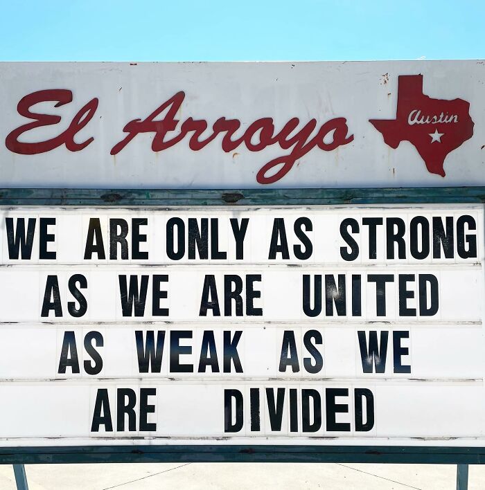
Anybody pick up a picket and start yelling, 'Workers, united! We'll never be divided!'
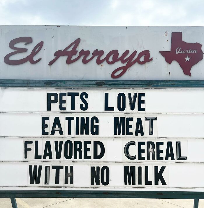
When people ask why my dog doesn't eat kibble, I ask them if they'd like to eat cookies for the rest of their lives. Sure, it sounds nice at the start, but then it's years and years of only dry same-tasting cookies EVERY. SINGLE. DAY. TWICE. (My dog eats wet canned or fresh food)
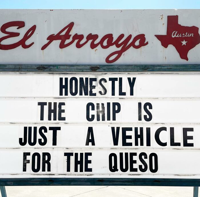
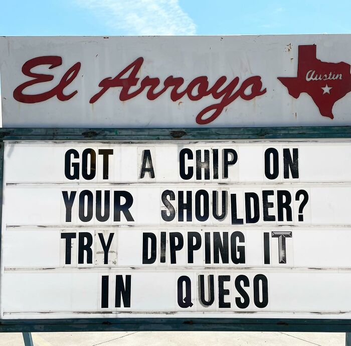
And for our UK friends, this is a basket of tortilla chips, not golden fried skinny slices of potato chips!
Give me a seven-layer chip dip any day- The solution for somebody who isn’t picky and loves them all!
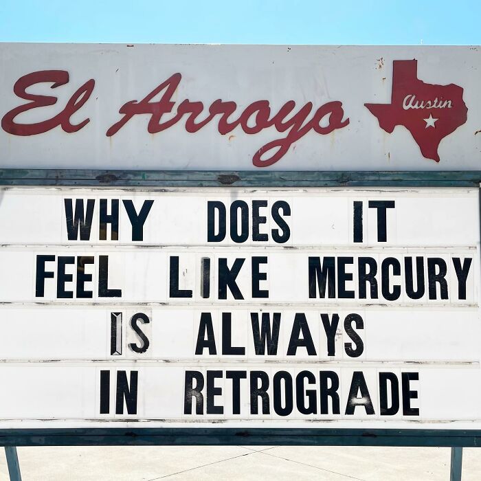
2022's retrograde dates being: 13 January to 3 February 3, 10 May to 2 June, and 9 September to 1 October.
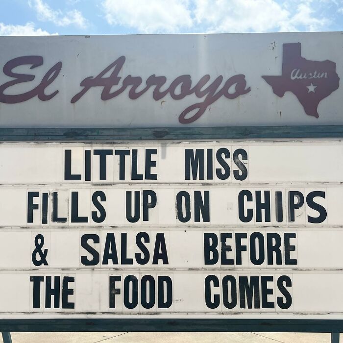
Little Miss is guilty of this more than she cares to admit she is! She has no shame, however, as the indulgence is rare.

 Dark Mode

 No fees, cancel anytime


