184Kviews
Woman Mocks 13 Iconic Logos By Comically Redesigning Them, Some End Up Being Used By The Brands Themselves
Creating a company logo is a fine art in and of itself. Just imagine: trying to generate something that should represent a company’s entire history and personality—which would translate into thousands of pages in length—but it should also be able to fit on a single business card. It’s like shoving 9 gigabytes worth of memes onto a single 3.5 inch floppy disk. It’s ridiculously hard, so getting creative is key.
Well, designer and TikToker Emily Zugay has been getting super creative in redesigning famous logos… with a twist… that twist being “improving” upon said logos in ways that make them… well… definitely something, all right!
Emily’s redesigns have been going quite viral lately, so we’ve compiled a list of her redesigned logos below. And while you’re down there, why not vote and comment on the ones you liked the most!
This post may include affiliate links.
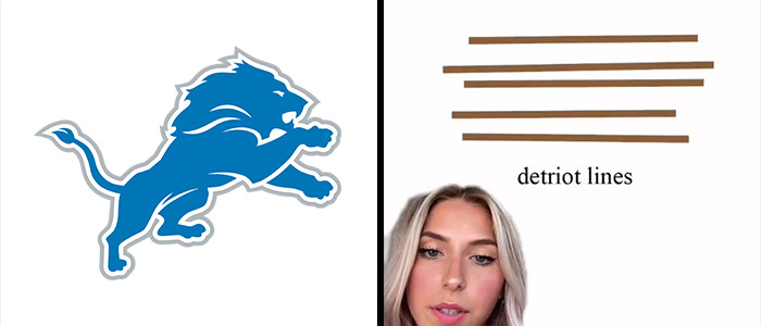
"Next I did Detroit's football team the Lines and I don't really understand your logo. It needed to be simplified quite a bit, sorry, just clean it up. And this will look a lot nicer on jerseys, helmets merchandise."
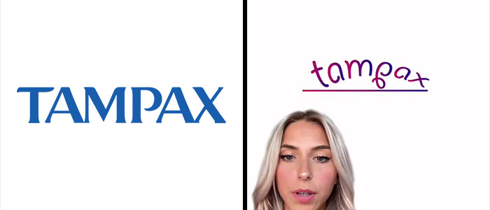
"Next, we have Tampax. An awful logo, but we really need a stronger one, especially for competing with Trojan and Magnum. With that being said, I chose a stronger, more masculine font to fit my vision. And I also added a line underneath it."
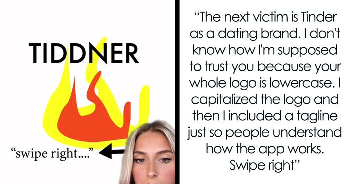
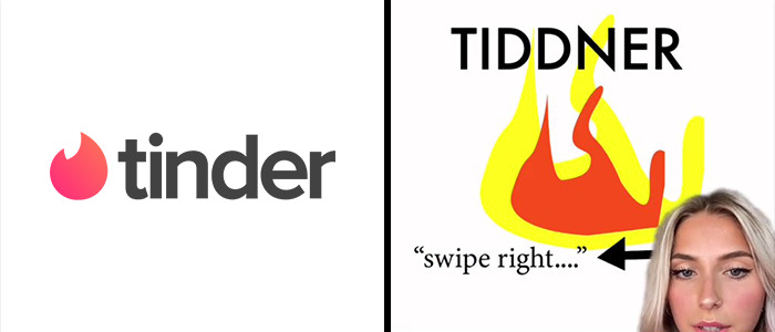
"The next victim is Tinder as a dating brand. I don't know how I'm supposed to trust you because your whole logo is lowercase. And that doesn't sound very confident to me. I capitalized the logo and then I included a tagline just so people understand how the app works. Swipe right."
Okay she’s definitely joking but I guess I don’t get why it’s funny.
So, Emily Zugay is a designer and an established TikToker from Michigan who posts a variety of content. Fairly recently, she started a series of videos that introduce her revamps of famous company logos that I’d say are a sure improvement on their previous counterparts.
Namely, she seemingly aims to break every possible logo design rule there is to create the most ridiculous logos out there. Bright neon colors? You got it! Sexy cursive font? Slap that on there! Overly-minimalist symbolism? It’s there and more, making for some entertaining results.
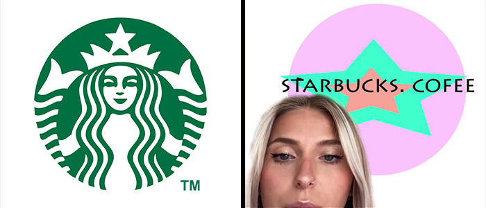
"The first logo I chose to work on was Starbucks. I don't like anything about it. I hate this green color. I don't like this figure. I don't even know who that is. Maybe the president or something. The font is also just tacky and outdated. So I redesigned it with more of a happier feel. I wanted to maintain the integrity of the stars and the original logo because I truly think that's the only good thing about it. And then I chose this nice contemporary font that pulls it all together."
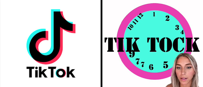
"The second contestant is Tik Tok. Nothing about this logo resembles time or a clock. This is my redesigned logo of TikTok, I kept the same colors because they were okay. And then I chose this font because it reminds me of cops."
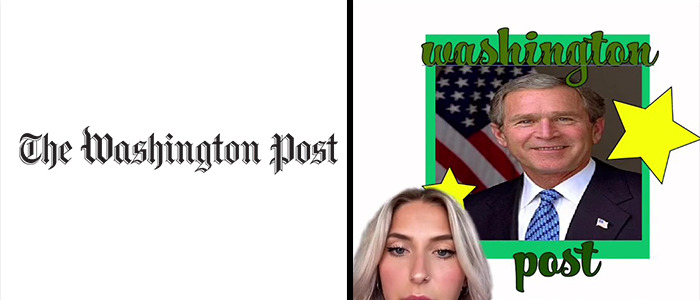
"The next brand who needed help was the Washington Post. Need I say more? So I added George W. Washington. We also added some props of color, some stars and a more fun font that appeals to a wider group of people. I couldn't even read the previous one."
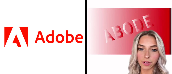
"Last and certainly, maybe certainly, least we have Adobe. I kept the red but chose a way nicer font. This is such a refreshing logo overall and I really think I blew it out of the park."
The logos she has covered thus far are of brands known across the globe. These include Apple, NASA, Starbucks, Nascar, and a bunch of others.
Believe it or not, some of these companies have actually seen Emily’s designs and have proceeded to use them as their avatars. I kid you not, Emily has posted a video of seeing her logo being used by these companies’ official TikTok accounts.
Adobe also asked their logo to be improved. However, instead of using it as their profile pic, their sign at their headquarters has been vandalized with Emily’s redesign, as seen here. And that's not all. Tinder, Tampax, Washington Post, among others have actually switched up their logos to these on TikTok! Talk about taking it to the next level.
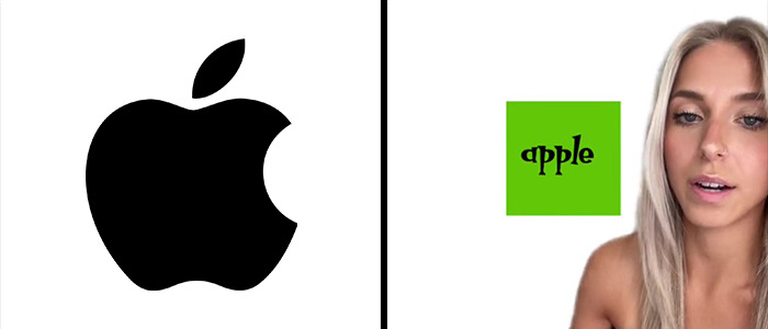
"The last victim was Apple. I hate this logo. There's no symmetry going on. There's not even any words indicating which brand this is. You just have to guess, so I don't like that. This is my redesign of Apple's logo. I thought they needed a type that was fun and appealed to the youth, like me, and I enjoyed it a lot. I also did start to miss the block from H&R block so I reincorporated it into this logo."
*sigh - there's a reason for the apple logo to be what it is. But she's young... and also this thread is wonderfully pointless.
Load More Replies...Not sure why this is witty or comical. The art of the logo is lost on so many. When you have an iconic logo that speaks without words your brand is legendary. Cute tacky fonts are not iconic.
Was it supposed to be worse / horribly done? I can’t tell if this is a joke to be funny or someone actually trying?
“the apple logo has no symmetry” Look at the damn logo you made!! it’s off by so muuuuuucch
Still my OCD sees NO SYMMETRY! UGH! I'm ruined! Life has no balance!
They're all AWFUL. Stay in kindergarten, you still have a LOT to learn.
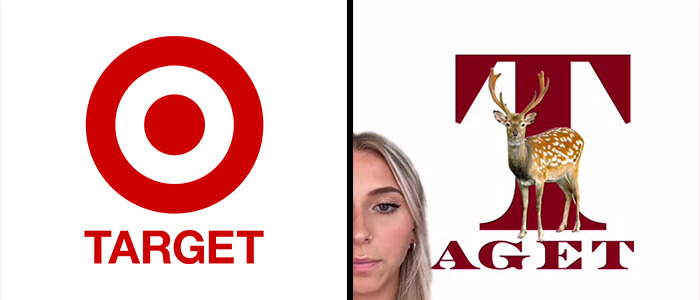
"First we have target, who doesn't make any sense, it feels outdated and very childish to me. I wanted to draw inspiration from its predecessor, KMart, I love KMart, and I'm very upset that there's no KMart anymore. So this is my version of Target's new logo. I chose a darker tone of red because it's a little bit more mature, and I chose a nicer font to elevate it. I included the deer because this made more sense to me than the circles."
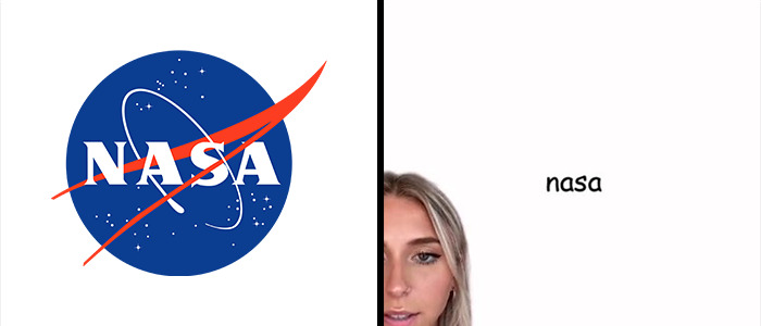
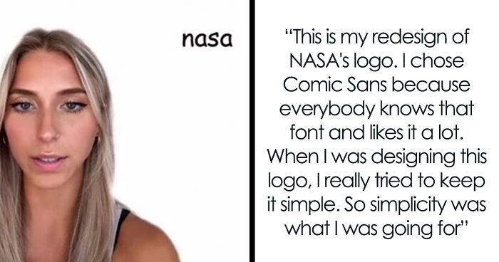
"Lastly, this is the most highly requested one. It's NASA. I know that they have a lot to do with outer space and stars. I don't like the colors. I don't like the font. I don't like anything about it. I don't know why they tried to like include a bird to this doesn't work for me. So this is my redesign of NASA's logo. I chose Comic Sans because everybody knows that font and likes it a lot. When I was designing this logo, I really tried to keep it simple. So simplicity was what I was going for. And I think I did a really good job. Here's a side by side comparison. So you can see how much of an improvement that mine is compared to whatever that is."
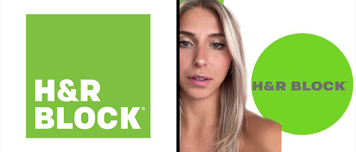
"Second contestant was H&r Block. I just hate the block. Now I put it in a circle instead."
Emily has had a pretty significant following on TikTok for a while now, currently standing at nearly 880,000 followers and a whopping 24.4 million views across her entire channel. However, these particular logo videos have been blowing up, garnering over 36 million views and 5.7 million likes across just three videos. Her videos also made some headlines in online news outlets.
Be sure to follow Emily on her TikTok and Instagram, and if you want more logo goodness, we have covered multiple artists who create logos for a living, like Gary Dimi Pohty and Sander Designs.
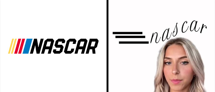
"First of all, starting with NASCAR, I don't like this whole tilt that's going on. And these lines are all very inconsistent. I just think, overall, it's a really bad logo. This is my redesign. I wanted to make it look like the words were flying through the air at a very fast speed. This font overall is just more sophisticated as well."
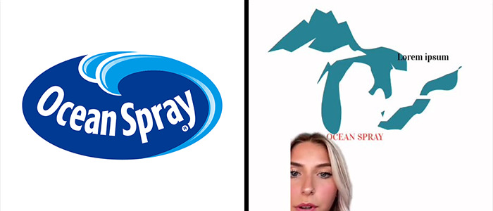
"Next was Ocean Spray, the juice company. There's a rule in graphic design where you only need one blue and a logo. I don't know why you have basically three. So I took a more artistic approach and have a solid color blue that contrasts with a nice orange."
But before you go, why not let us know what you thought of these designs, and what logos would you want improved in the comment section below!
I get that she’s joking but her jokes are super boring and bland. She’s bad at comedy.
Unless this is the day job. Then please quit, yesterday.
Load More Replies...I'm with the folks who get that this is supposed to be funny/ironic/sarcastic redesigns, but even with that, they aren't good and they aren't funny. Sorry, Emily
Another example of how Bored Panda staff pay little attention to the headlines they post and the actual content. The headline suggests that these are real creative attempts to improve the logo, not "mock" designs. Its a disservice not only to its readers, but unfair to the artist Emily Zugay who is getting a lot of sh*t in the comments.Other sites where her work is posted clearly state this is satire.
It’s pretty obviously a joke. Super frustrating as someone who likes to make logos though. Still I enjoyed thinking about how I would redesign them if I had to.
The fact there are people on the comments hating on the logo redesigns that are obviously jokes is hilarious to me
Wow. Look, as a fellow designer, this was hilarious to me! You guys don't get it and that doesn't mean she's "bad at comedy" it means that she's got a niche audience and you're not it.
This was amazing. Her dry humor got me up this morning. Her explanations for the logos were almost better than the actual logos, and that fire for TIDDNER was pure perfection
stupid, ugly, not funny, lame... so many words to properly describe this post. I have studied design. My father is a designer. This ! Is ! Not ! Redisign ! Nothing to do with design at all !!! Nothing to do with funny...etc. Pure waste of time!
I bet your dad would find the satire funny. She used key design and typography no-nos. That's *why* it is so funny.
Load More Replies...Please give up on being funny and creative. You can still be useful. There is always a need of workers at fast food chains. The negatives this post is getting prove it.
Of all the clickbait, I've ever clicked... This is the most boring.
Wow. All these negative comments. I got the jokes and they are hilarious. I’m not sure why so many people don’t recognize sarcasm.
Stupid and dumb. I feel like I should be ashamed for falling for click-bait like this crap. This woman's design skills (if this is even real) are about equal to Stevie Wonder's accuracy with a pistol.
I laughed so hard. Oh my goodness these are amazing and I'm in love with her.
Ya’ll in the comments are complete boneheads. I’ve seen some comments who don’t know it was a joke, so, IT WAS A JOKE!! And for the people who are just saying it’s dumb, you clearly know nothing about graphic design.
She made them worse each horrifying than the other. Unless it's a joke,which she definitely is
I found it funny. I'm from the UK and we tend to be attracted to dry humour and I can see why i might not appeal to a US audience as much. There isn't any craft quality in the content (like some other BP posts of logo redesigns) which is a slight disappoint on BP's usual creative and constructive ethos. Also, I agree that featuring herself in every logo may be about something else as well
The insulting comments on these post make me laugh omg
Load More Replies...As I read this I realized it looked like a 4 year old recreated these logos. It took me a minute to realize they wasted a webpage on this
I wasted a whole 5 minutes in my time on this junk. Why in the world was she featured?
You also took the time to scroll all the way through the article and comment this 2 times
Load More Replies...These are horrible. I hope they were jokes. Poor spelling too? And for Ocean Spray her logo had the Great Lakes?!
This was a waste of 10 Minutes! Why would you even write an article about these ridiculous logos? You're gonna make this poor girl actually think she's got a talent for this & she's gonna continue making a fool of herself because of it.
This was a complete waist of my time. What company would end up using one of these half assed logos in the end?
Solid gold - I am a graphic designer and this is DRY. Bland? Unfunny satire? Geez, whoosh... you've missed the point. Bad design is forever humorous
I'm so shocked at the comments...haha, nobody seems to understand sarcasm... Fabulously dry sarcastic humor ftw 😂
So many people on here just didn't get it.. I've seen several of her videos and I think they're hilarious - part of the problem I think is that it gets lost in translation a bit. Her delivery makes up a huge part of the joke... I'd suggest going and watching some of her videos. Also, the number of brand name accounts commenting and requesting a redesign from her is insane and makes it even funnier! Many that she's already done have actually switched their profile pics to her new 'improved' design...
This is by far and away the least funny thing I've ever seen on Bored Panda. Whoever posted this should be hanged, drawn, quartered, shot and then really badly hurt.
This woman should have all of her social media accounts cancelled for showcasing her stupidity and lack of creativity.

 Dark Mode

 No fees, cancel anytime


