198Kviews
Cringeworthy Design Mistakes That Turned These 50 Signs Into A Hilarious Mess (New Pics)
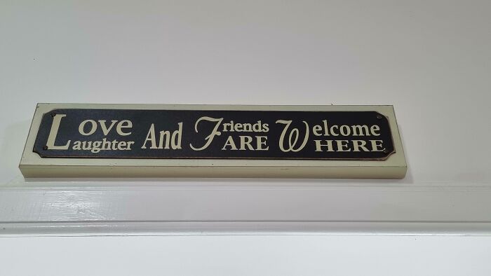
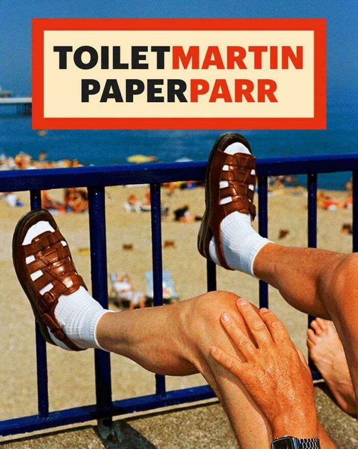
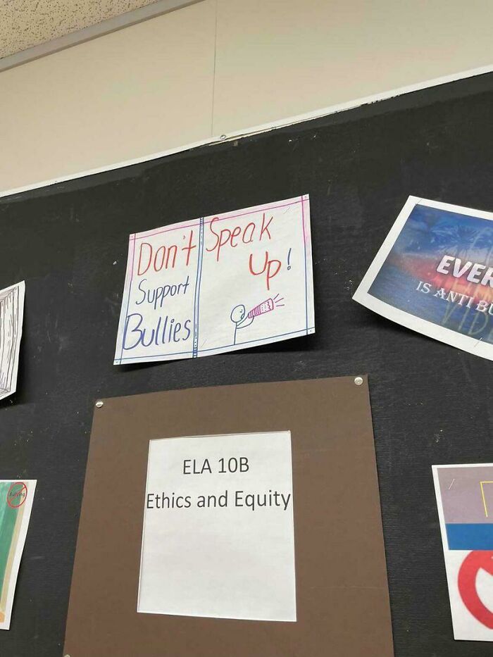
The world of signs is hilariously entertaining, isn't it? You know what we mean — phrases that raise more questions than answers, muddled sentences that make you rack your brains, and designs that leave you wondering, "what in the world happened here?" Let's be honest, far from everyone's an expert in writing, and getting a message across is way harder than you'd think.
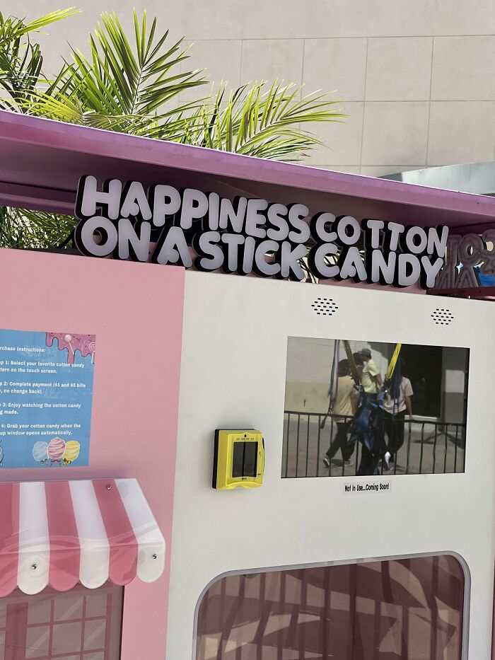
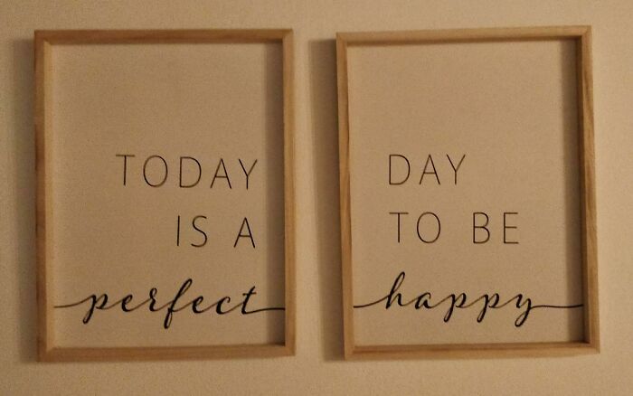
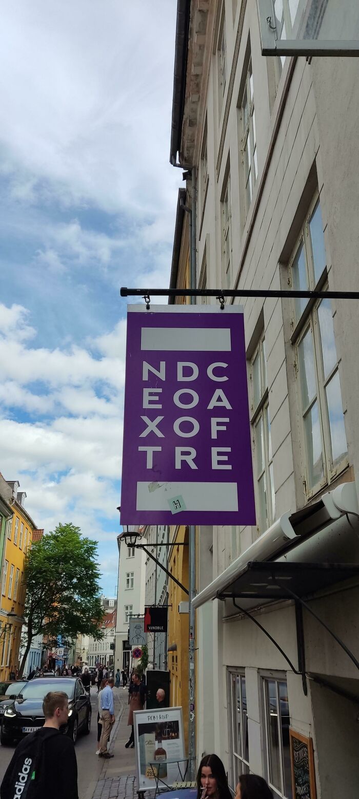
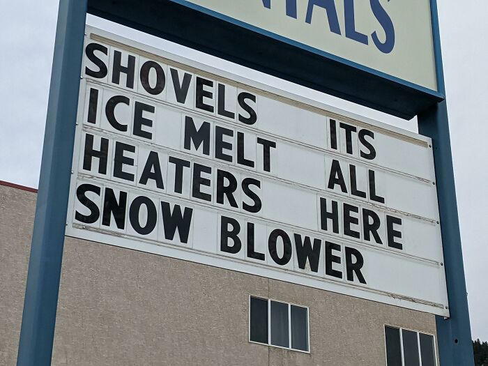
But taking up the endeavor to decipher signs that make zero sense can lead to utter hilarity. So let us introduce you to an online community called 'Don't Dead Open Inside' that's dedicated to poking fun at these linguistic mishaps. With over 657k members, it's a place for "signs/media that read as nonsense if read normally: from left to right."
Sounds confusing? Well, just take a look down below at the newest batch of examples we at Bored Panda have gathered from the community. Chances are, you'll be laughing in no time! Be sure to upvote your favorite posts and let us know what you think in the comments. After you're done scrolling through this list, check out even more hard-to-read signs in our earlier pieces here, here, and here.
This post may include affiliate links.
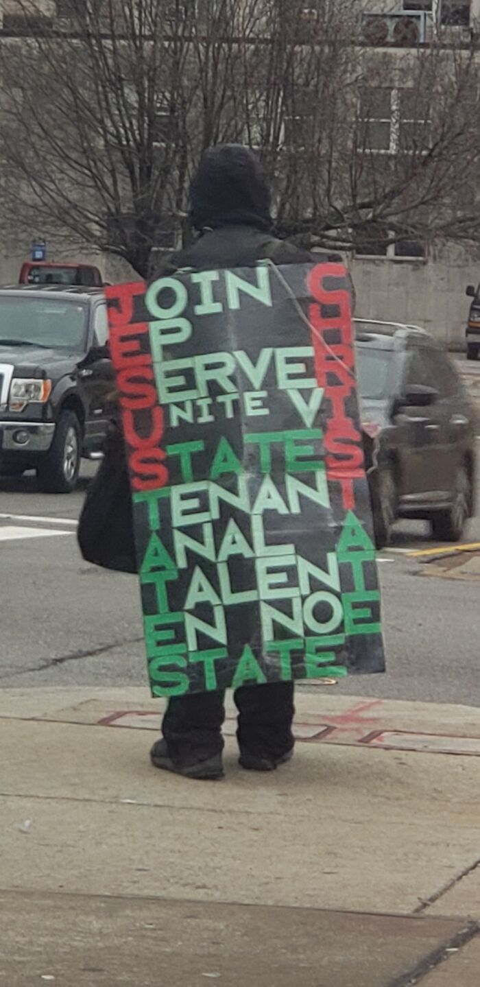
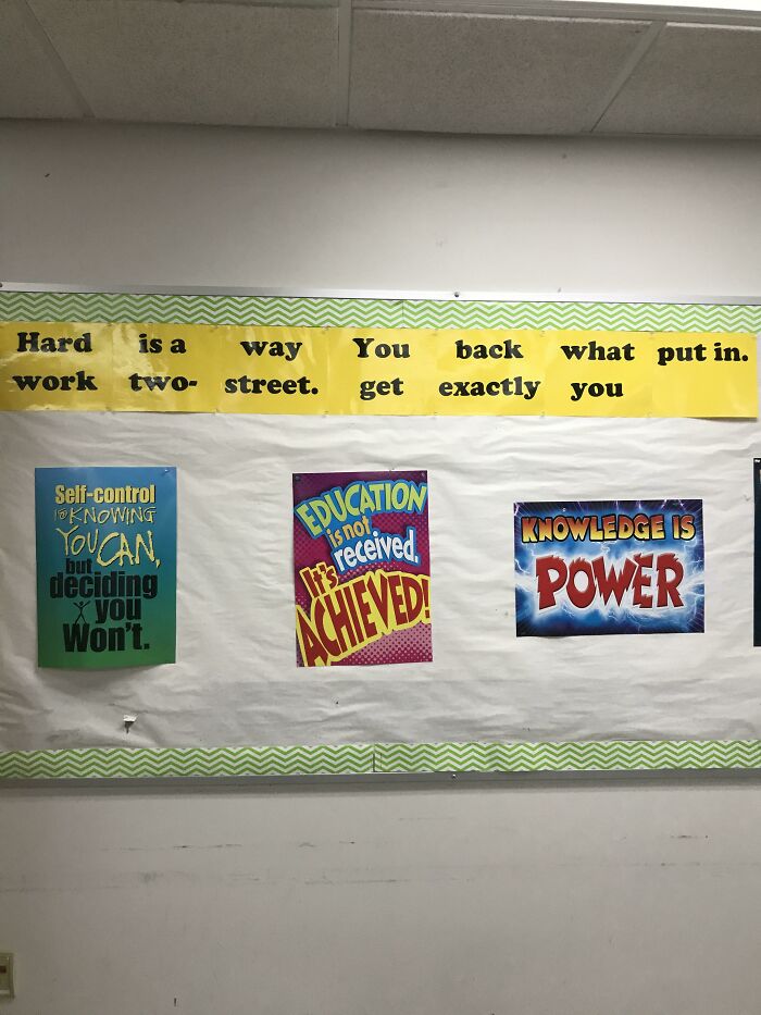
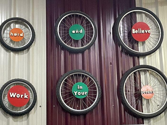
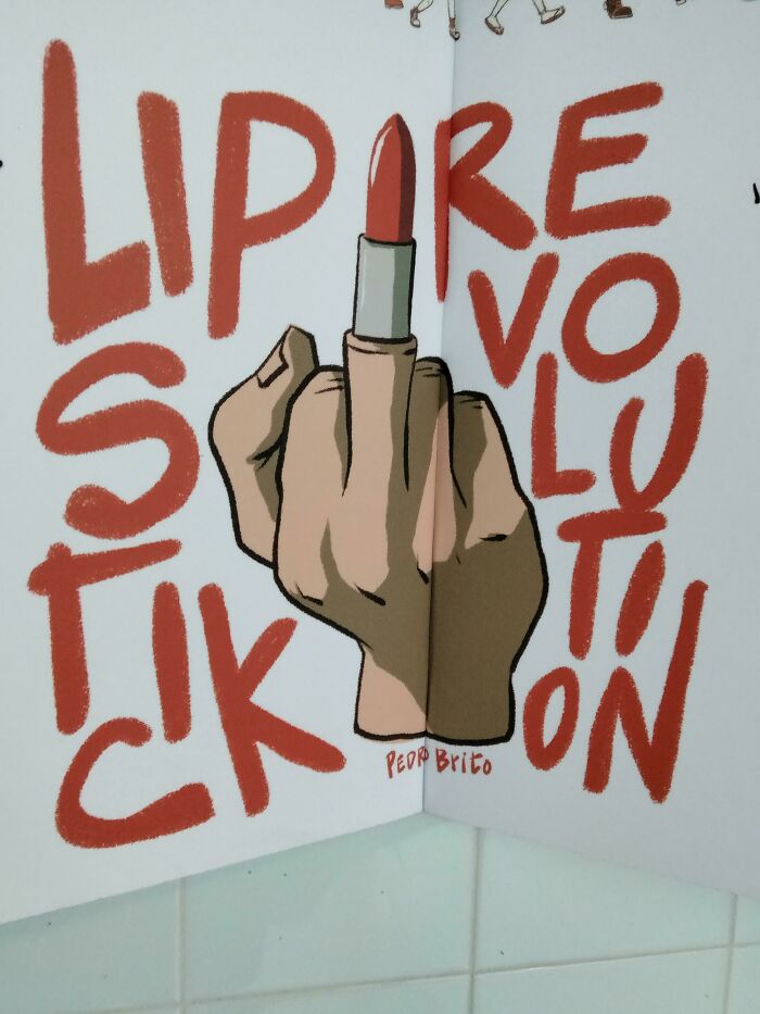
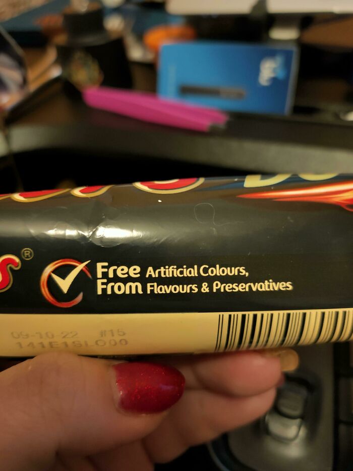
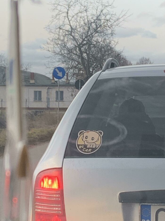
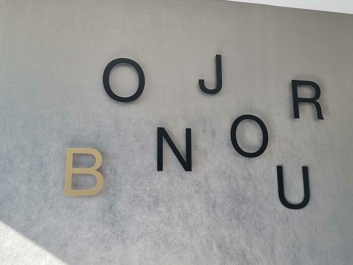
Abort Jesus
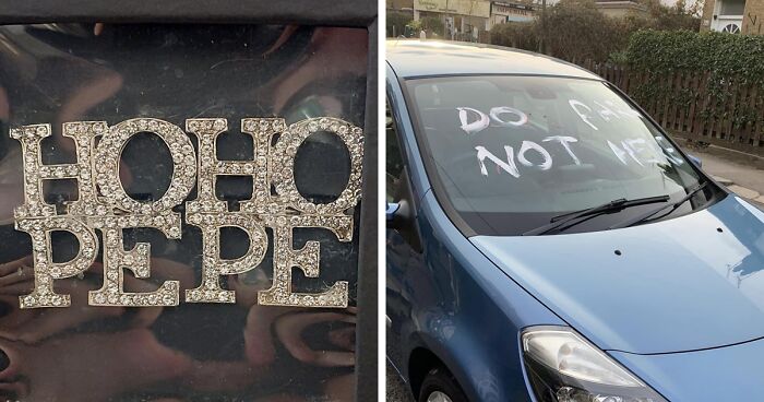
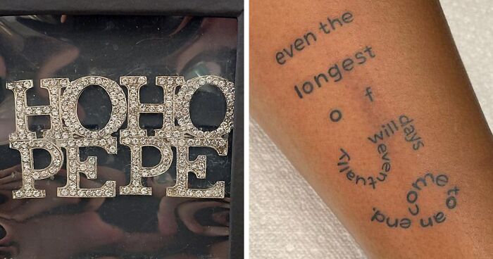
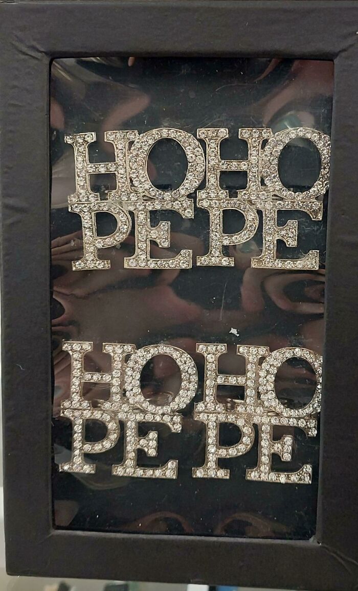
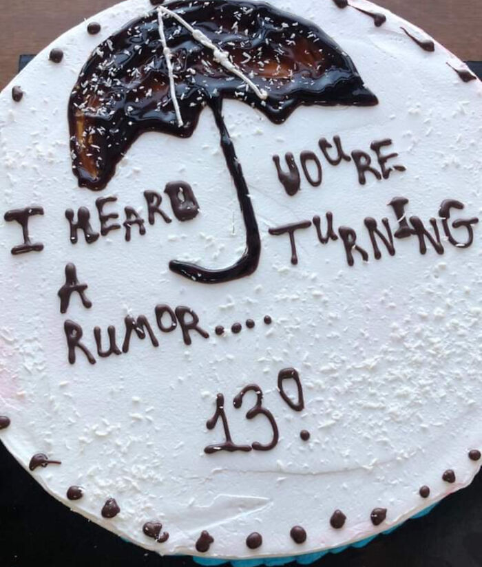
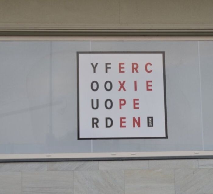
Hoho Pepe
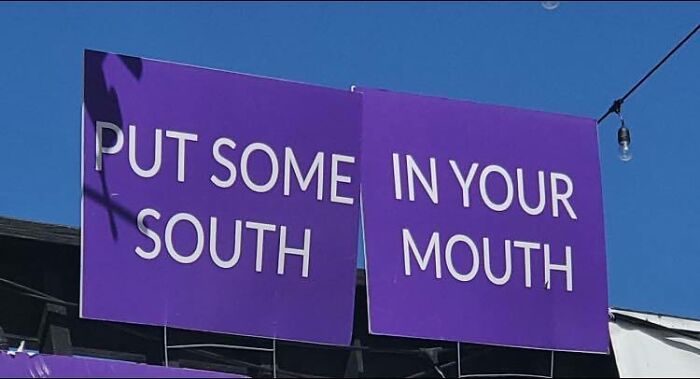
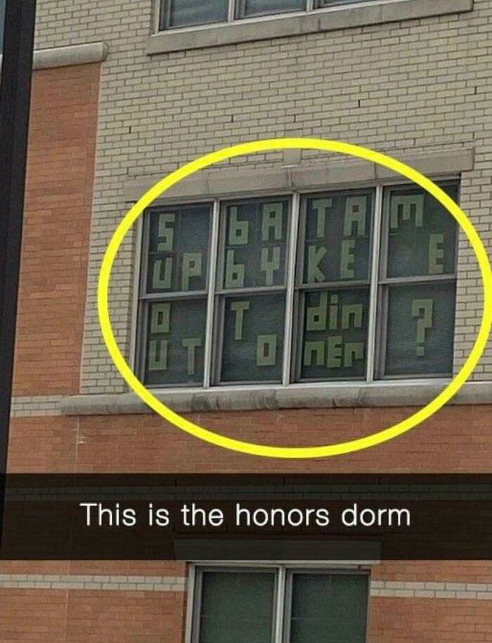
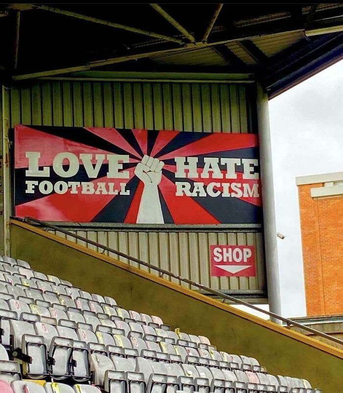
South Mouth
Ever since it was created in 2014, the 'Don't Dead Open Inside' subreddit, or DDOI, has invited people from far and wide to share and laugh at the numerous cases of painfully hilarious design fails that make signs, posters, and messages almost unreadable. But even though there’s no shortage of entertainment in the group, the moderators ask its members to follow a strict set of guidelines for submissions.
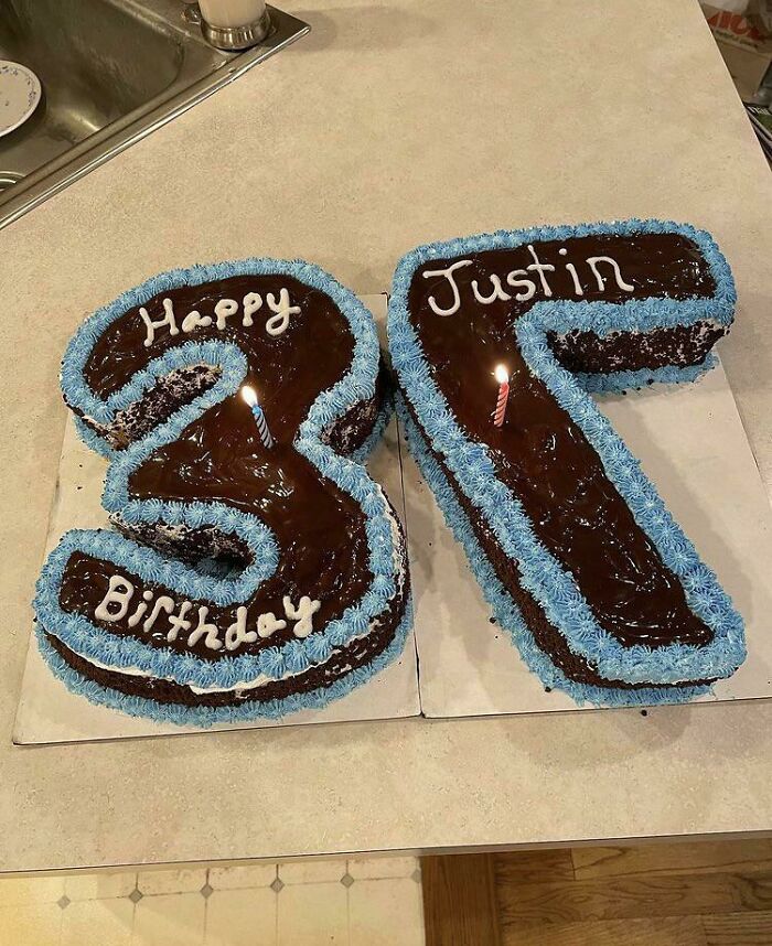
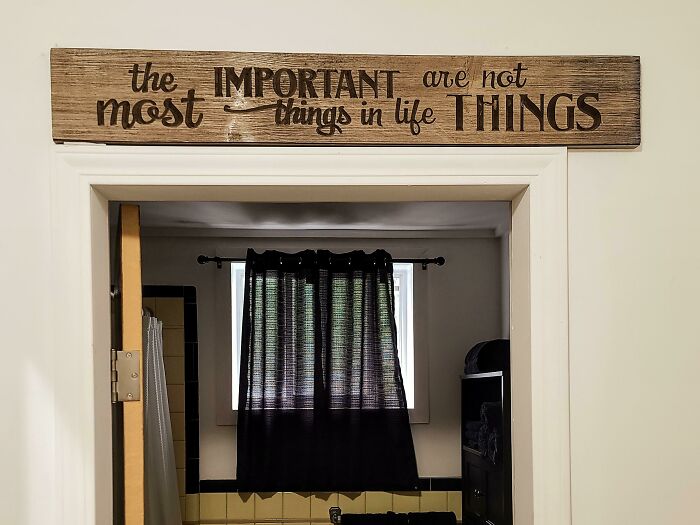
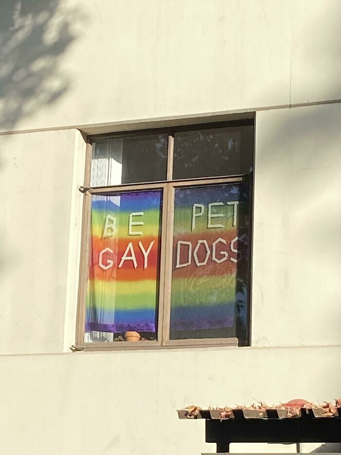
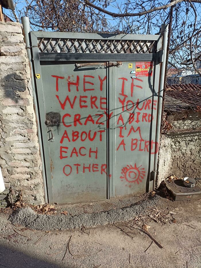
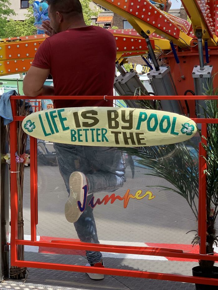
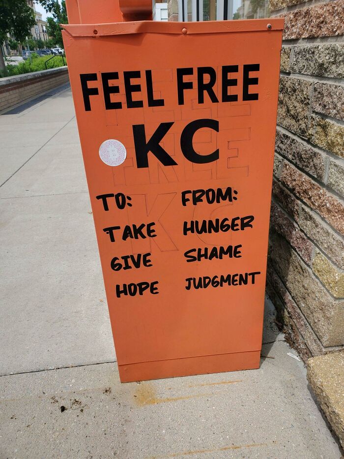
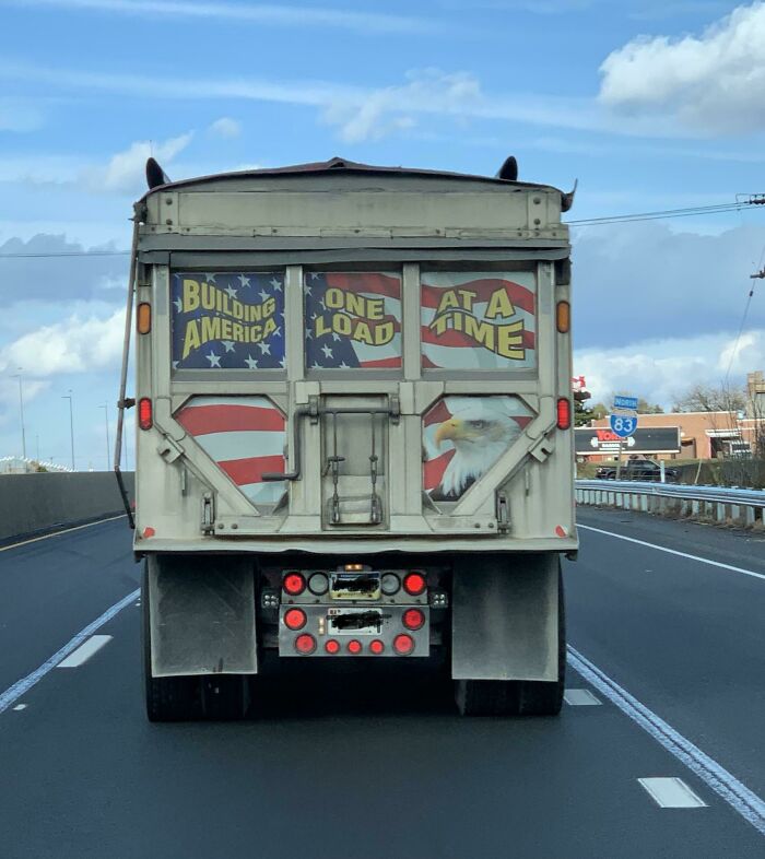
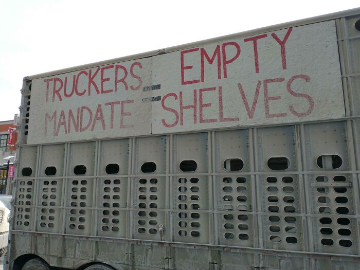
The first (and most important!) rule is that every image has to comply with the DDOI format, meaning the phrases must be read correctly from top to bottom, and incorrectly as if read "normally", from left to right. "Though it does not matter how easily you can read them, it is highly encouraged to only post images with little separation or spacing between the columns of words," the mods added.
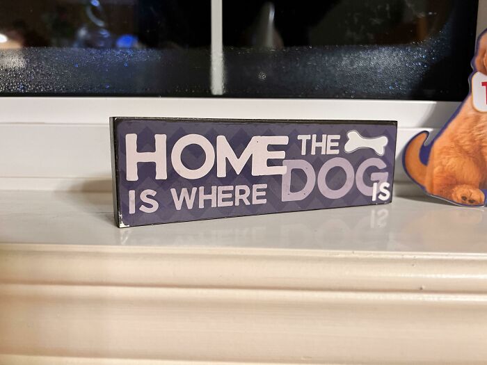
There's No Planet B
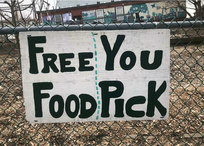
W Fart Free Water
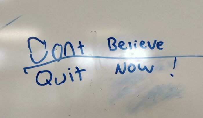
Don't Believe. Quit Now!
Redditors who look after the page make sure it’s filled to the brim with quality content, so reposts and memes are not welcomed in this community. The moderators also ask people to make sure the content is original. "Don't force it!" they write. "Don't post anything that is forced or easily staged/faked." And lastly, they encourage people to add even more hilarity to their pictures by following the DDOI format in the caption: "We may remove posts that don't follow this format and have an exceptionally bad title."
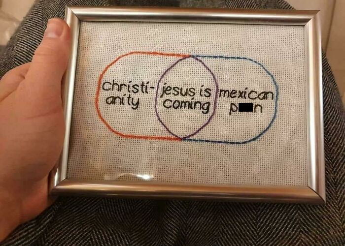
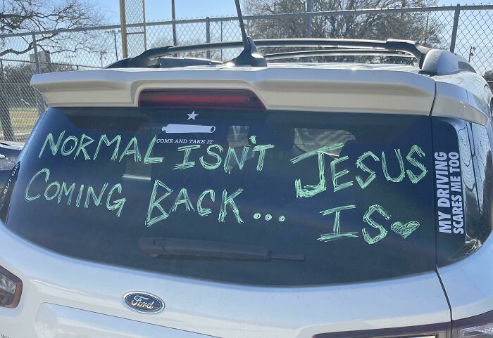
Christi-Jesus Is Mexican Anity Coming P**n
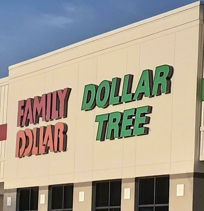
Family Dollar, Dollar Tree... Wait
Never Comeback Give Up Robert
To understand the meaning behind this online community, let’s take a closer look at the origin of its name, shall we? Know Your Meme describes 'Don't Dead Open Inside' as a trope "which involves incorrect interpretation of various writings and labels which include two or more lines of text and have no clear way to tell the order in which the words should be read." Or, in other words, it’s badly constructed designs and misaligned phrases that can lead to seriously hilarious word-arrangement fails.
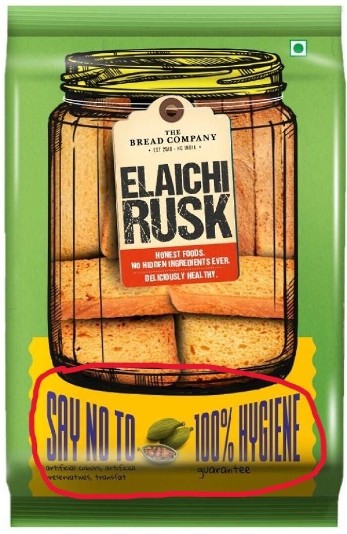
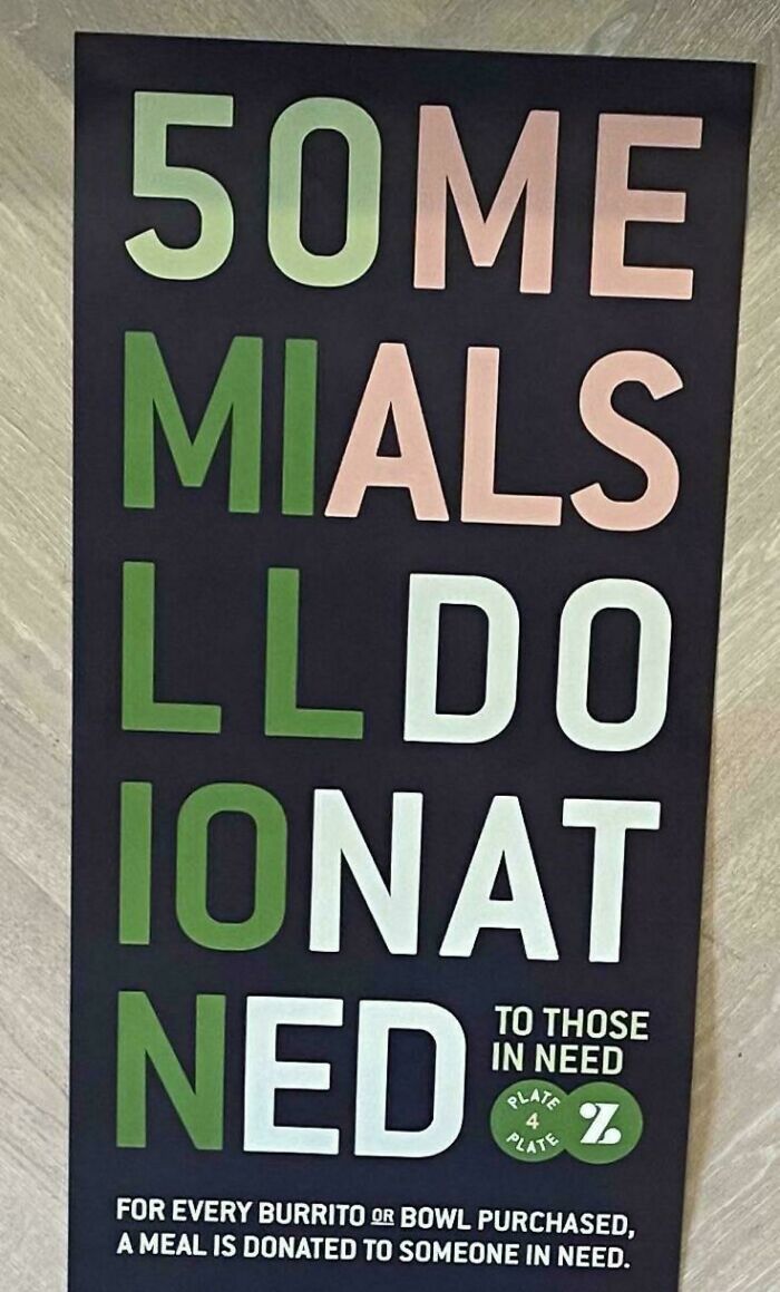
Say No To 100% Hygiene
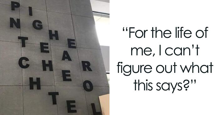
For The Life Of Me, I Can't Figure Out What This Says?
It Doesn’t Look Good Either Way
According to the internet database, it graced our feeds after it was used in a promotional poster for The Walking Dead TV series on July 2nd, 2010. Even today, it’s still one of the most known examples of the meme, almost like a textbook guideline of how these images need to look. The notorious poster showcased a photograph of a double door with the words "Don't Open" on the left, and "Dead Inside" on the right. While the intention was to read "Don't open, dead inside", well, that wasn’t the case. Thankfully! Otherwise, the internet culture would be seriously deprived of such well-liked content.
As soon as the poster came into daylight, it started spreading all over the internet like a virus. While memes and jokes started seeping onto Twitter, more similar posts followed. And it didn’t take long for the trope to be honored by its own subreddit, where people are dedicated to collecting examples of the trope in advertising, design, and popular culture.
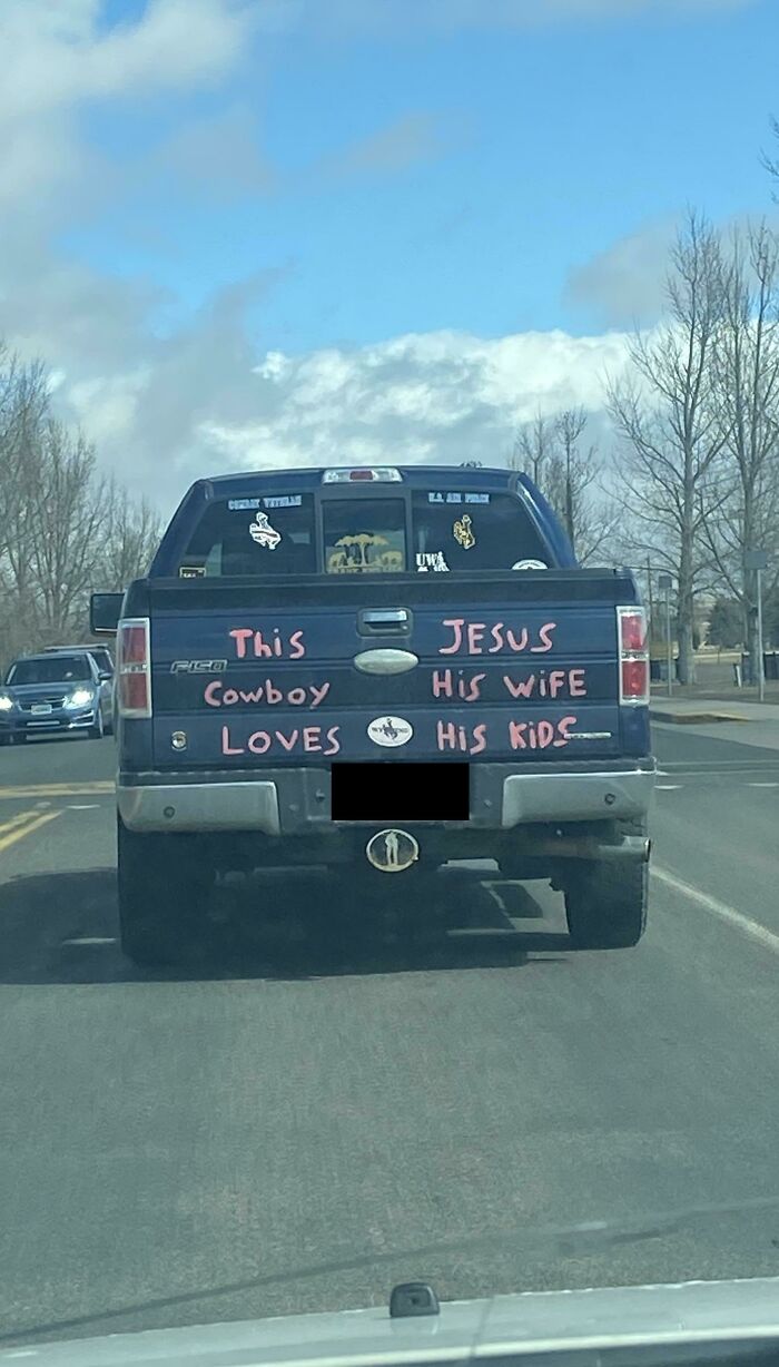
This Jesus Cowboy
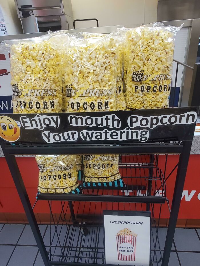
Enjoy Mouth Popcorn Your Watering
We Are Fried. Hiring Chicken
“Special Chicken. We Are Fried. Hiring Chicken”. Is that a “special chicken” you’re hiring, or is the “hiring chicken” special and fried”?
If it’s the very first time you encounter this meme, chances are that you’ll start noticing it taking one form or another everywhere you go. After all, awful sign designs are all around us. It may be amusing to poke fun at them for us general folk, but for the companies that aim to deliver a message and fail in the funniest way, it can be bad for business.
A blog post on Medash Signs, a UK-based company that designs and produces signage for over forty years, shows that poor-quality signs can have serious financial consequences. There’s a general expectation from the public that a message should be clear, logical, and build trust for anyone who reads it. "It’s a simple fact that customers are unlikely to want to do business with you if your signage gives a bad impression," they write.
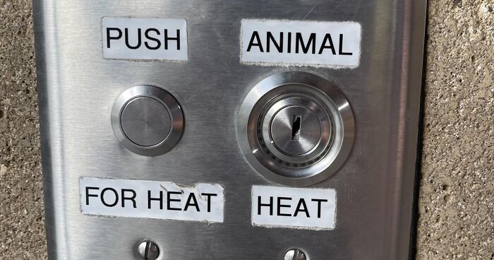
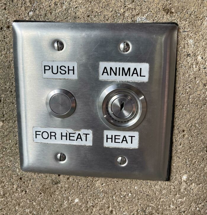
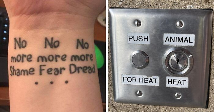
Push Animal For Heat Heat!
Ok, what is with the Animal Heat? What does it do? Why is there no button? Who has the key?
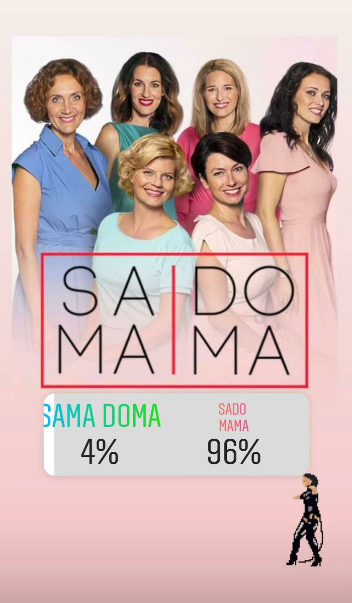
In Czech: "Sama Doma" Means Home Alone, "Sado Mama"...you Probably Know
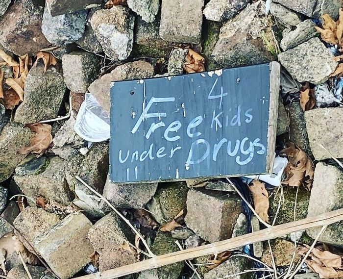
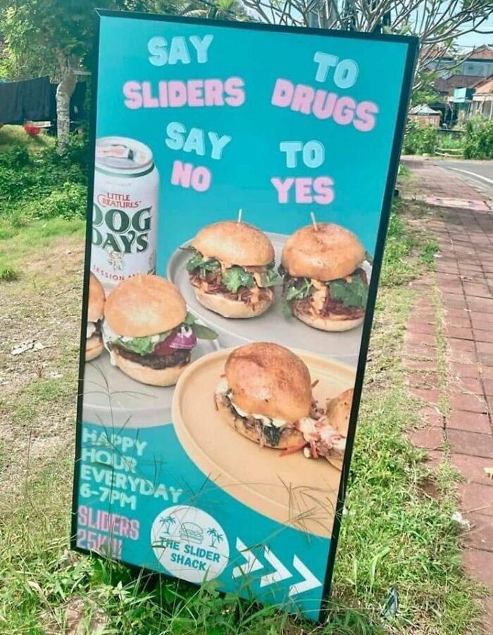
Say To Sliders Drugs To No Yes
Moreover, it can affect the brand’s image. "Your signs ultimately reflect on your business and your brand — so what does it say about the company if the signage is badly designed, broken, dirty, or outdated?" Well, it certainly gives out a wrong impression. The reality is that customers will feel puzzled and won’t put much energy into staying long enough to grasp what you’re trying to convey. "Your use of typography, colors, imagery, slogans and other design elements can all work together to give your customers a distinct impression of your business and its character — whether it’s approachable, trustworthy, eco-friendly, responsible, luxurious, and so on," they added.
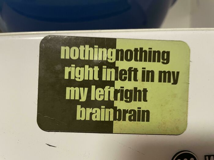
Nothingnothing Right Inleft In My My Leftright Brainbrain
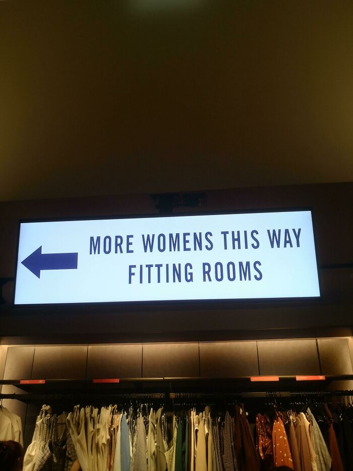
This Sign At A&f
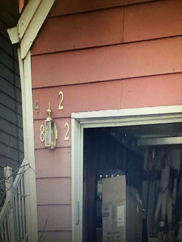
I’m A Delivery Driver. The Address Is 4822
In a previous interview with Bored Panda, Portugal-based graphic designer Laura Vanagaite, who specializes in branding and illustration design, explained that the most important aspect of advertising is clarity to the potential client. "It needs to be catchy, which means the brand needs to introduce their product and actually make the person get interested in it. So normally designers can play with font sizes, but still keep it simple and readable."
The graphic designer pointed out that color also plays a crucial part. "Red, as we know, catches our attention immediately but yellow, green, or black and white combinations are equally eye-catching." Whatever the design, it’s important "to keep it simple but sophisticated since balance is the key."
Shackled By Jesus, Lust Sets Free
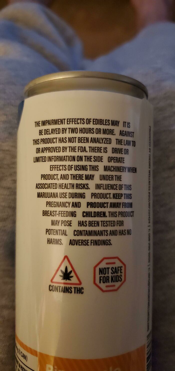
I Feel Like This Doubles As A Sobriety Test, Lol
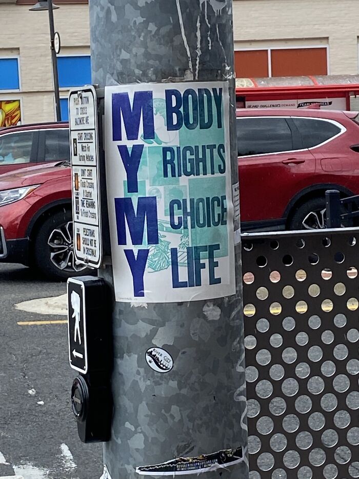
Stop My Body, Man Ate My Choice, Freedom
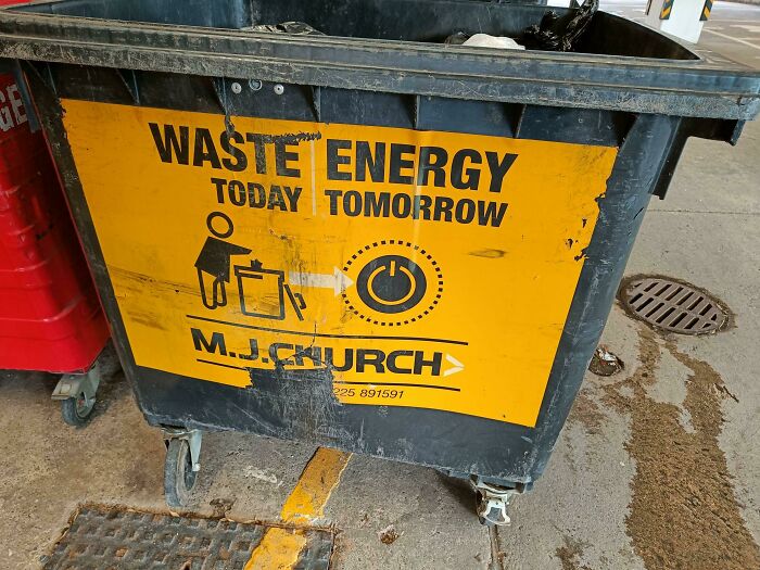
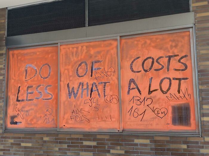
Waste Energy Today Tomorrow
Laura explained that when it comes to readability, you need to make sure your work represents the intended message before handing the sign to the production team. "The designer is the one that handles the project but if there is a chance, always represents the rest of the team. It can be tricky when different opinions come, but try to ask if it is easy to understand. Teamwork is a very important thing," she concluded.
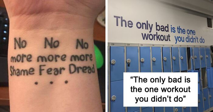
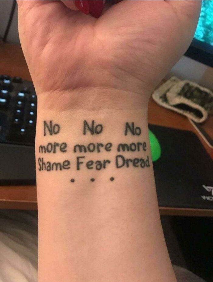
No No No More More More Shame Fear Dread
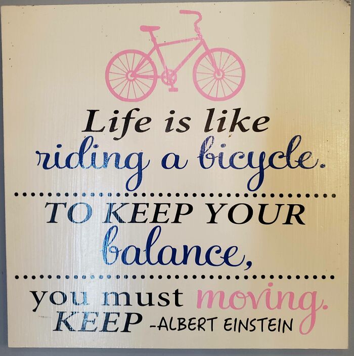
You Must Moving. Keep
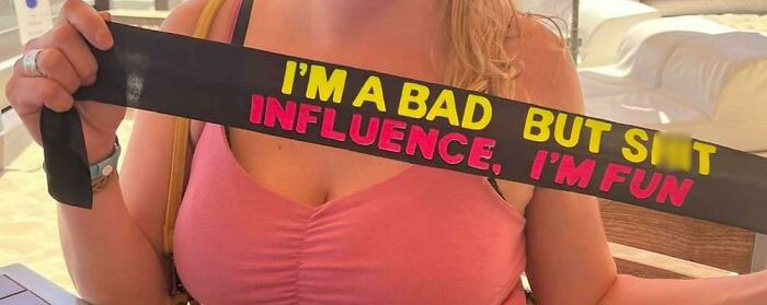
I'm A Bad, But S**t
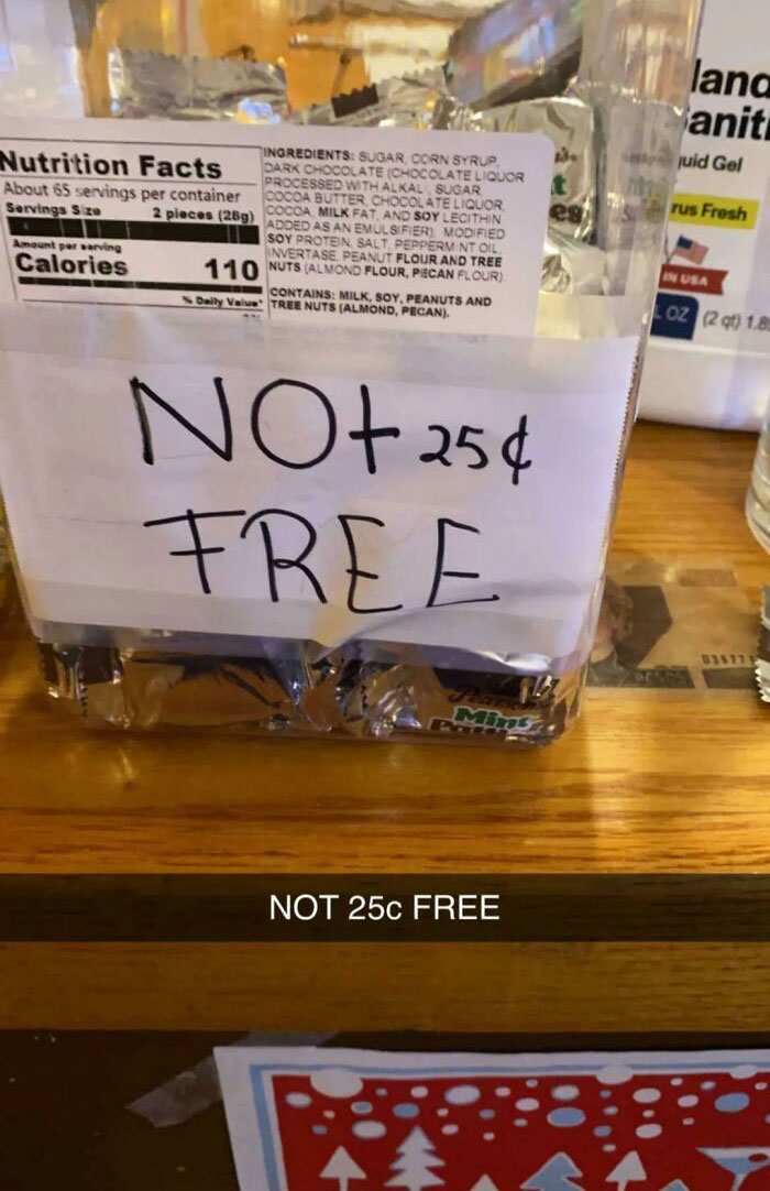
Not 25c Free
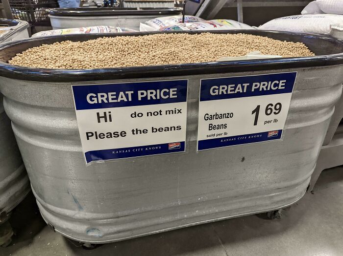
Hi Do Not Mix Please The Beans
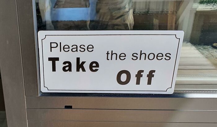
Please The Shoes, Take Off
Redneck Ukraine Stand With Yacht Club
How nice of them, with the terrible war going on, to still consider the yacht club.
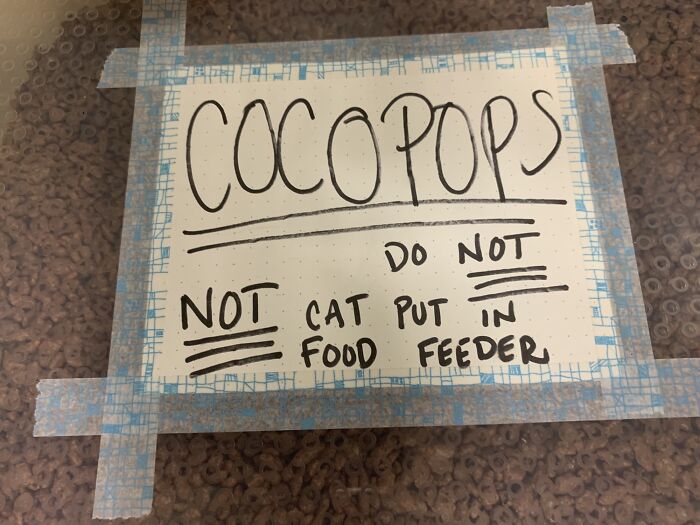
Do Not Not Cat Put In Food Feeder
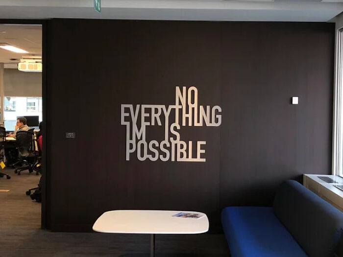
No Everything Im Is Possible
"Everything is possible" and " nothing is impossible" The 'no' and 'im' get use to create the second message. Really bad design.
Load More Replies...Took a while but I think they meant to say everything is possible, nothing is impossible. Or something like that.
Everything is Possible, Nothing is impossible. Except maybe reading this sign correctly.
everything is possible, nothing is impossible, but who thought it was a good idea to blend the words like that?
It is impossible to understand this, hence this may be a self-contradiction. It may not be of course if you could understand it - or maybe it ...
My brain filled in the glitches. It's supposed to read "Not everything is impossible". Still doesn't make a lot of sense though.
I don't have a long enough attention span to try to figure this out.
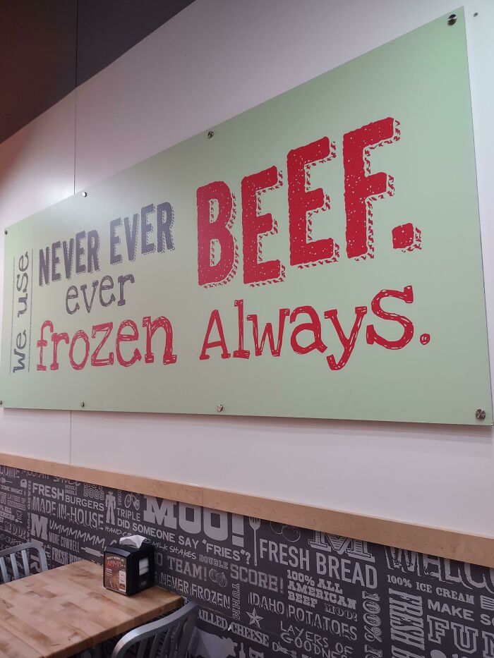
Use Never Ever Ever Beef. We Frozen Always
Eh
Ddoi: This Guy Is On This Corner Every Day & Has A Bunch Of Similar Signs
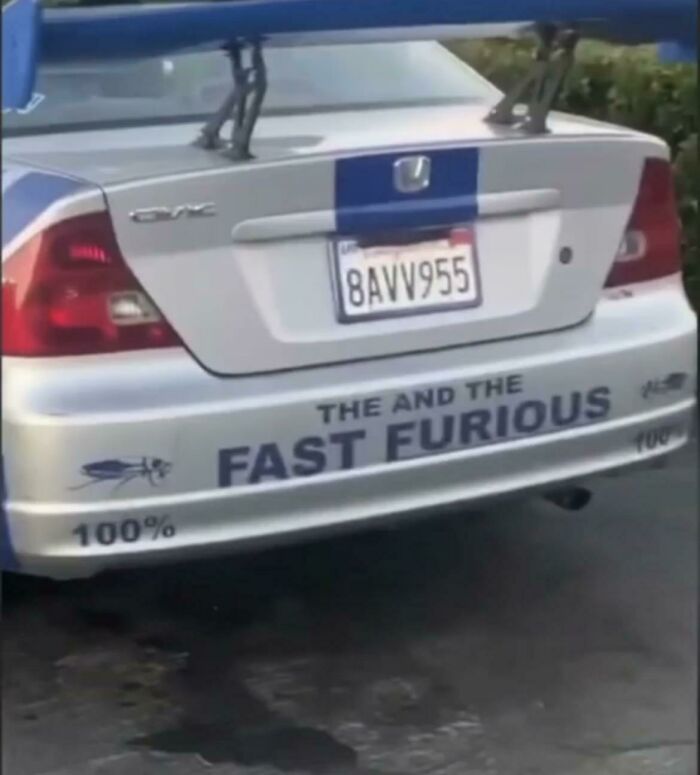
The And The Fast And Furious
With pictures of cockroaches bookending it too! Says a lot more than you think.
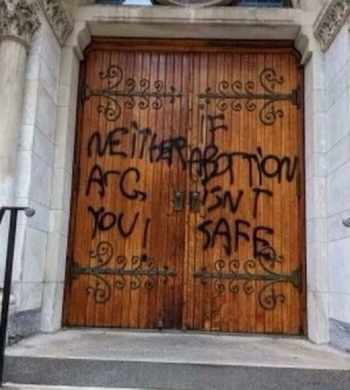
If Neither Abortion Are Isn't You Safe
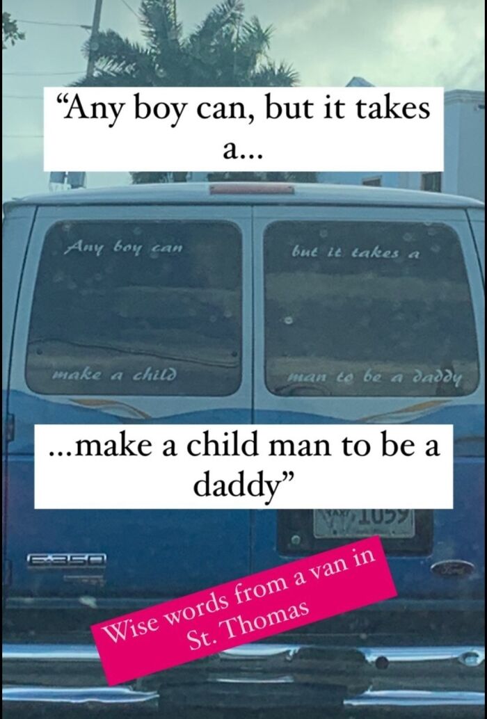
Any Boy Can, But It Takes A Make A Child Man To Be A Daddy
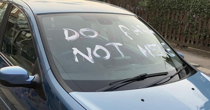
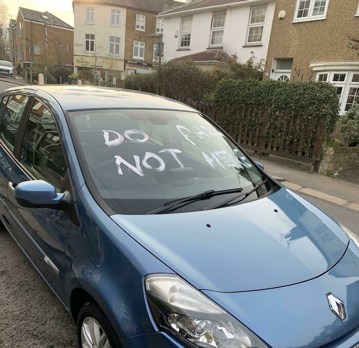
Do Park, Not Here
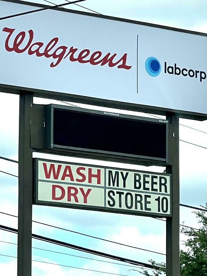
Wash My Beer. Dry Store 10
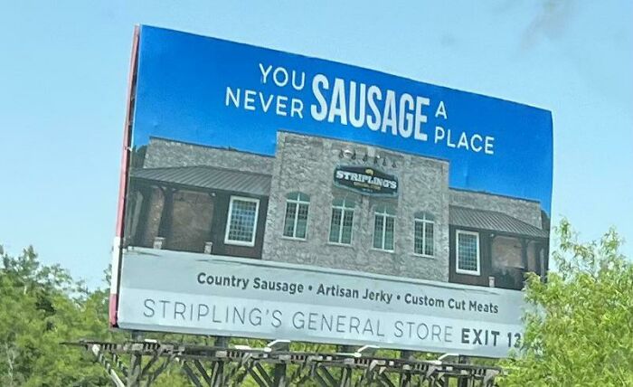
You Sausage A Never Place?
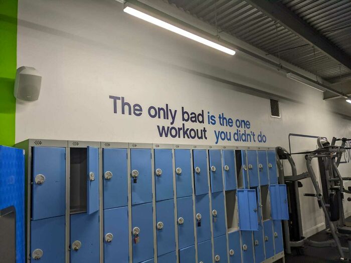
The Only Bad Is The One Workout You Didn't Do
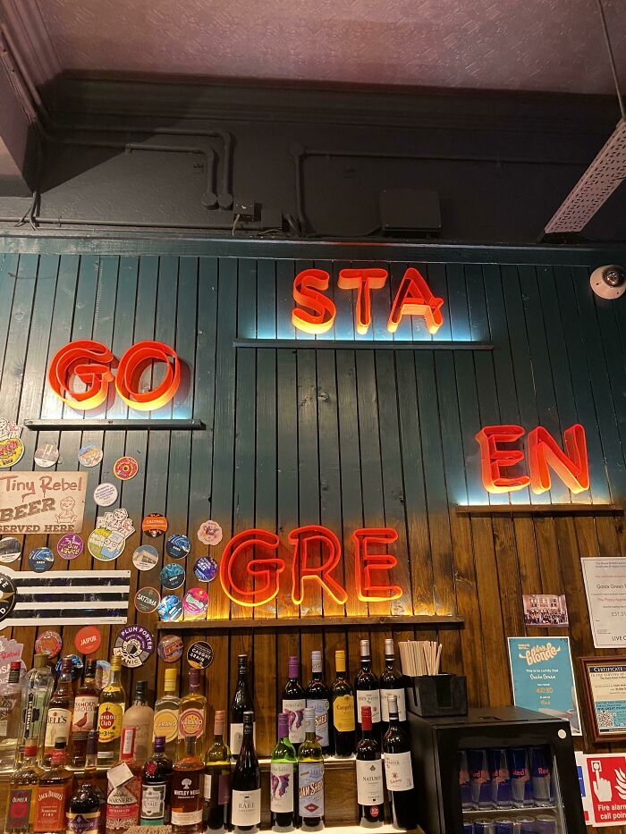
Sta Go En Gre
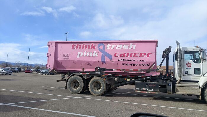
Think Trash Pink Cancer
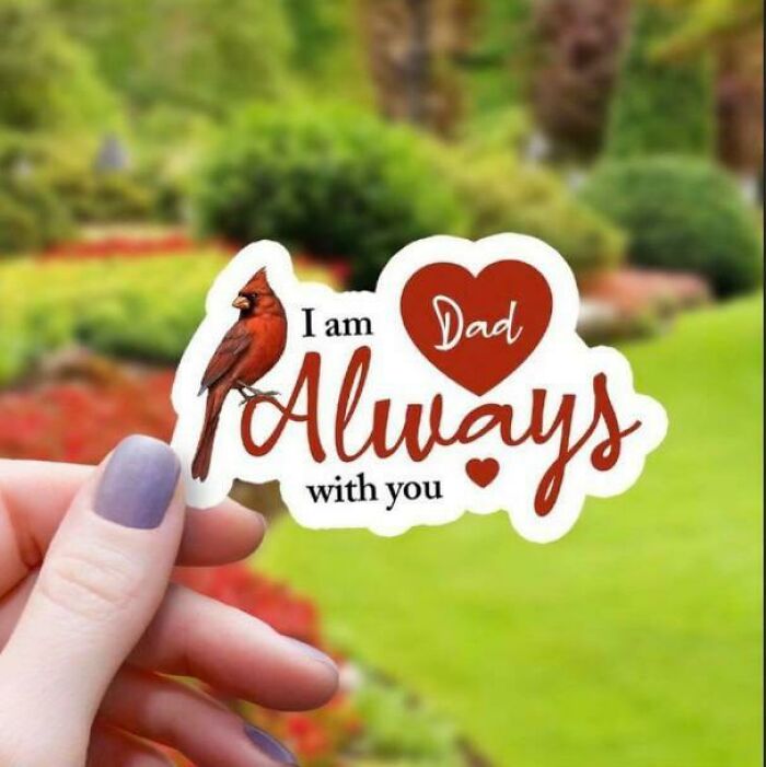
I Am Dad
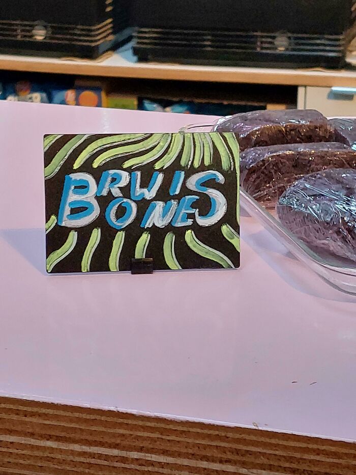
Rwi Bones
Mryer Xms(Lion)a
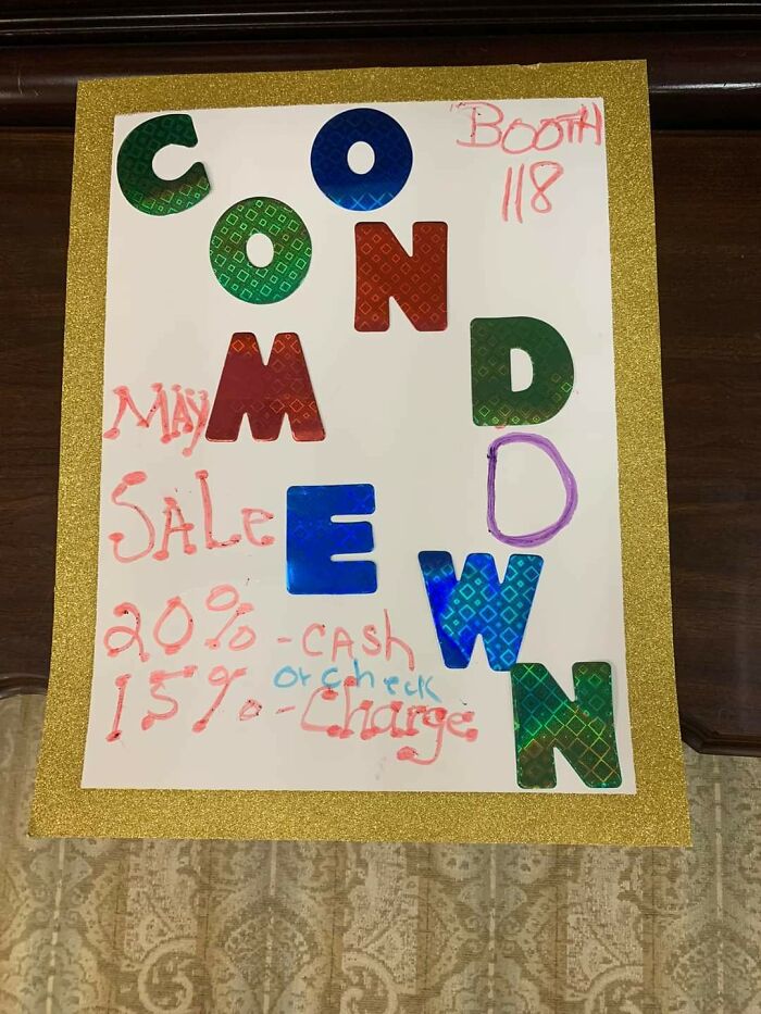
Coonmdewn
Got to laugh at the irony of BP's error in the heading (which no doubt they'll change rendering this comment inaccurate) but it currently talks about sings, not signs! For this thread... lol
Delicious irony is a great way to start the day. Thank you, headline writer!
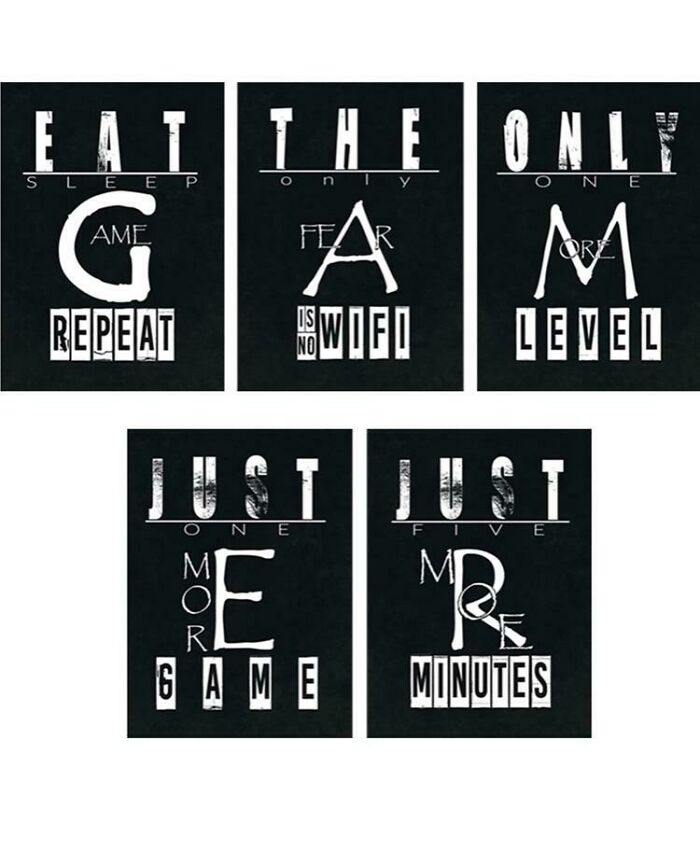
Load More Replies...#66 says "eat the only gamer" and now I know my strategy for the zombie apocalypse
some (actually, most) of these aren't that bad at all & are just people reading them wrong on purpose. some are a bit unclear, but after looking for more than a second you know how it's meant to be read, which isn't that much of a fail compared to the past lists with truly indecipherable messages. disappointing, seeing as i love design fails, but there were only a handful of actual fails here.
Most of these are based on the maker of the sign somehow not understanding that people read left to right rather than top to bottom.
Exactly. I found myself yelling "stop stacking words" about 1/2 way through this list.
Load More Replies...Got to laugh at the irony of BP's error in the heading (which no doubt they'll change rendering this comment inaccurate) but it currently talks about sings, not signs! For this thread... lol
Delicious irony is a great way to start the day. Thank you, headline writer!
Load More Replies...#66 says "eat the only gamer" and now I know my strategy for the zombie apocalypse
some (actually, most) of these aren't that bad at all & are just people reading them wrong on purpose. some are a bit unclear, but after looking for more than a second you know how it's meant to be read, which isn't that much of a fail compared to the past lists with truly indecipherable messages. disappointing, seeing as i love design fails, but there were only a handful of actual fails here.
Most of these are based on the maker of the sign somehow not understanding that people read left to right rather than top to bottom.
Exactly. I found myself yelling "stop stacking words" about 1/2 way through this list.
Load More Replies...
 Dark Mode

 No fees, cancel anytime


