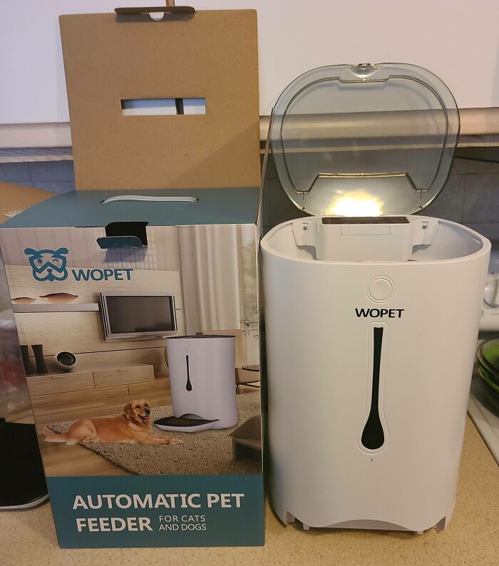
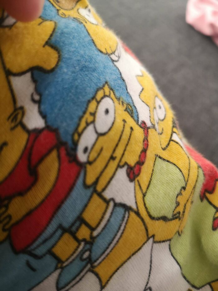
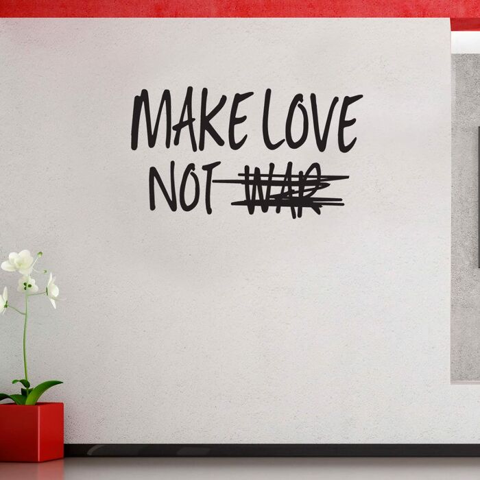
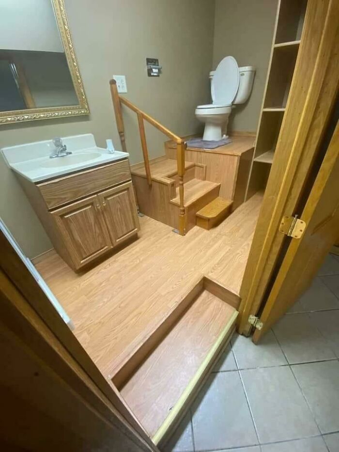
Ugly. Lame. Disastrous. This list of descriptions for epic design fails might not be exhaustive, but it’s enough to get you up to speed with the thought bubbles you can expect to pop into your mind as you’re scrolling through the images in this post, brought to you by us from this online group that's dedicated to bad design. Good taste might seem like it’s common sense, but we’ve got all the proof in the world that this isn’t the case. Unfortunately, what looks awful to you and us and obviously doesn’t function well isn’t always apparent to the designers behind the disasters.
Remember, upvoting a photo here means that you love how fantastically horrid it looks. Be sure to let us know which of the worst design mistakes caught your eye the most, dear Pandas. In need of more proof that your own sense of taste is actually really, amazingly good? You’re in luck. You can find our other posts about truly awful design decisions right here, here, as well as here. Got any photos of bad designs around your house? Drop us a pic in the comment section.
Bored Panda spoke about the principles of good design, the line between quality and bad design, as well as human beings' intuition to automatically feel what's designed well with Tim Antoniuk, an Associate Professor of Design Studies at the University of Alberta.
This post may include affiliate links.
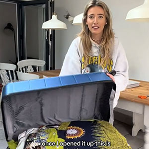
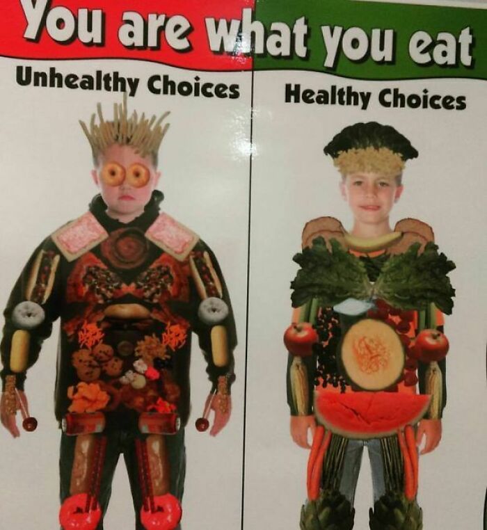
To Motivate
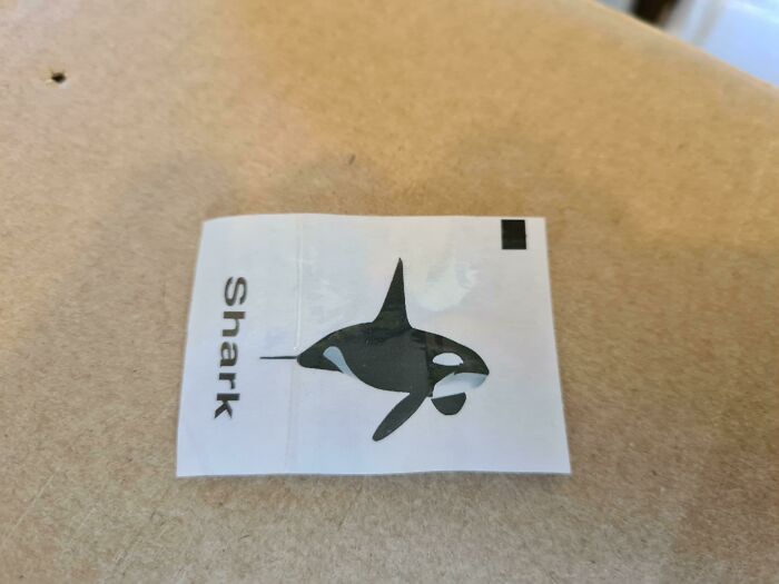
Spoiler
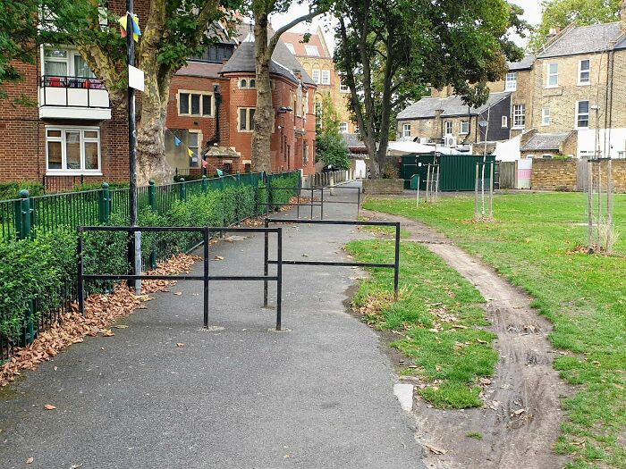
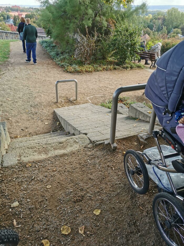
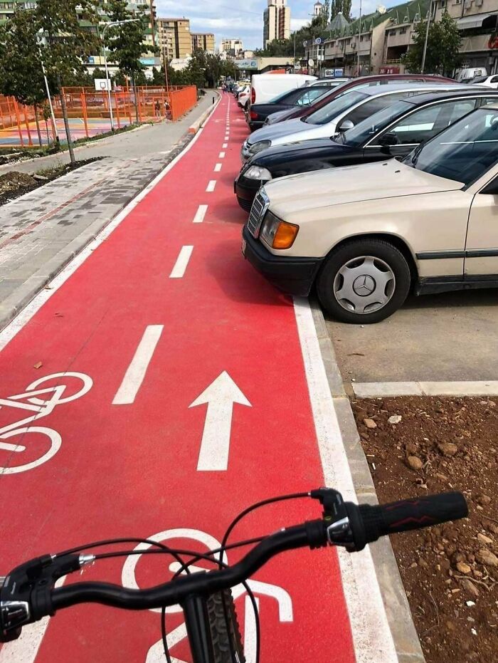
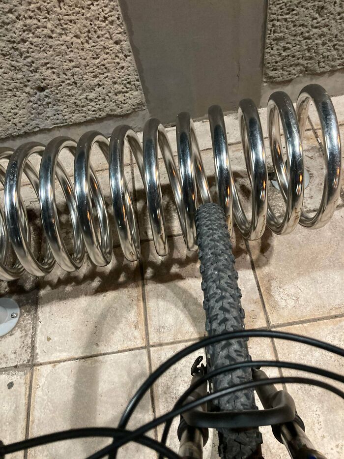
These Barriers Designed To Prevent Cyclists From Passing Through
We’ve spoken about Dieter Rams’ 10 principles for good design before. And even though we wholeheartedly agree with them and believe they’re timeless, some of them could be adapted to better reflect how much the world has changed over the last few decades. In short, there are some new nuances that designers should take into account.
According to Antoniuk from the University of Alberta, Rams "does a great job" determining what makes design great. However, this doesn't mean that Rams was able to foresee exactly how the world would change.
"That said, given the speed of change that we encounter today in our lives in the digital environment that we live in, I believe that some great design is not necessarily timeless. One example is seen in Interface Design, Ux Design, and in-service design. As new layers get added into our lives, things naturally have an evolutionary cycle. This is different from furniture which naturally can be more ubiquitous and designed to fit the human body. There is a great deal of fuzziness in this discussion but I do believe that the essence of this idea is true," the Associate Professor explained.
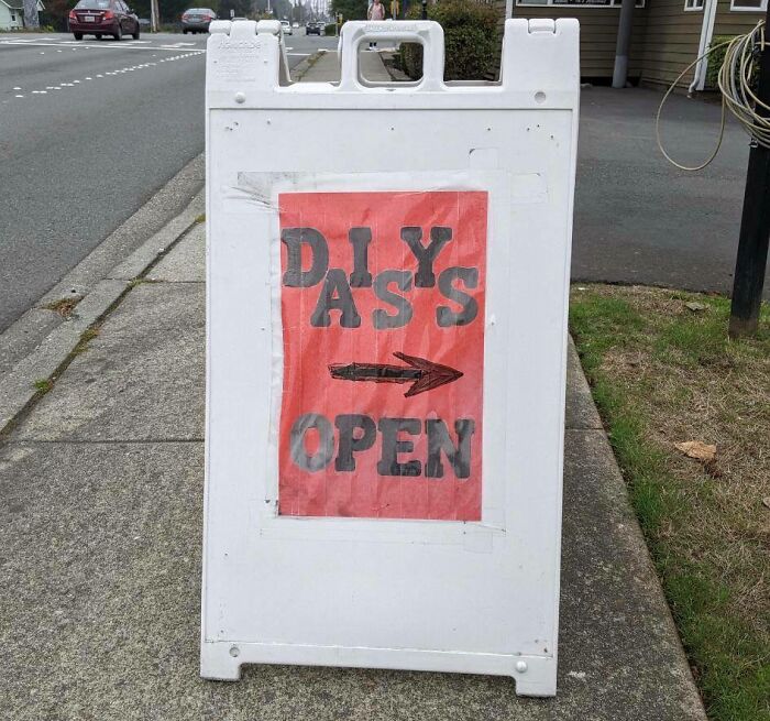
'Daisy's' Might Want To Reconsider That Layout
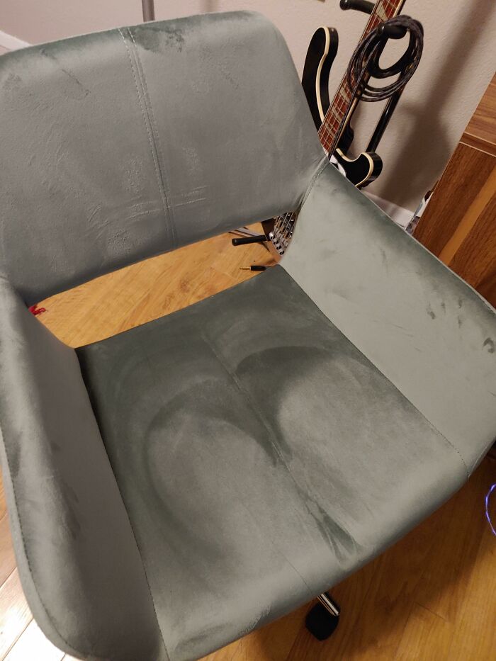
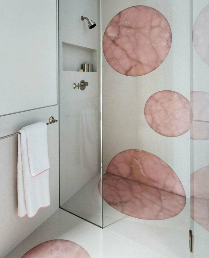
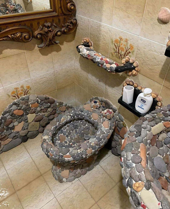
Oooh, I need a new ass. I am pretty artsy fartsy and love a bit of diy. Address please.
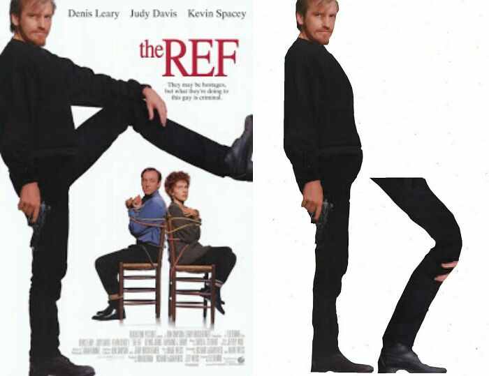
Honey, You Really Shouldn't Have
He Was Fined For Speeding, When The Car Was On A Tow Truck
In Antoniuk's opinion, there is such a thing as good and bad product, furniture, and interior design. But degrees of preference create a gray area where a clear line between quality and a lack thereof should exist. "The gray area comes in when people start to talk about taste and about degrees of aesthetic. I may love the design of Bauhaus furniture, for example, while somebody may feel that it is too cold and void of personality. Not unlike great art, I believe that much of what came from this era is ‘great design,’ in part because it represents an era and a philosophy. When we start to mix in discussions of taste and preference, that is where the gray areas of good and bad design get blurred."
Antoniuk also believes that people can intuitively "feel" and sense good design. "Quite often, this relates to ergonomics and the usability or functionality of the products and services and systems. Having said that, I think far too many people expect poor design that doesn’t really work well," he told Bored Panda.
What's more, he believes that good and bad design are skills that can be learned, especially when we start diving deep into the realm of aesthetics. "For me, great design is what Dieter [Rams] talks about—it is also intuitive, it is deeply sympathetic and empathetic to the user at all levels, and at some level, it is emotional. It is a catalyst for giving us feelings."
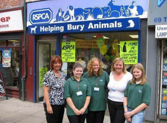
What Not To Name Your Animal Charity In Bury, UK
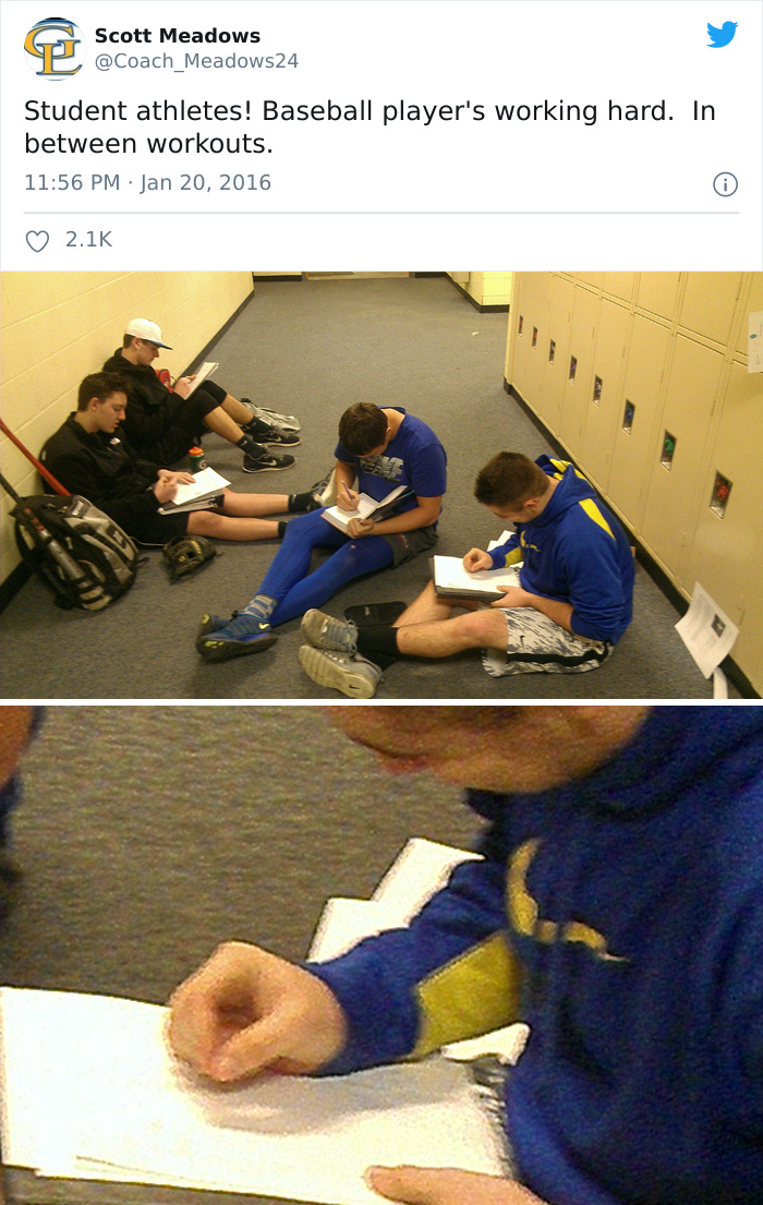
I Can't Even
That fact that they misspelled “players” is proof enough for me that they uh don’t exactly educate amazingly
My Son Just Asked Me Why This Lady Is Reading Poop Magazine. I'm So Proud
Suzanne Labarre of Co.Design has a similar take in that she also believes that Rams’ principles could be updated. While Labarre has the IT and tech industry in mind, the principles for good design are pretty much universal, no matter if you’re designing an app, setting up a building’s interior, or creating a brand new product.
In Labarre’s opinion, good design has to be transparent, easy to understand, and done in a way that empowers its users, instead of overwhelming them. Furthermore, Labarre puts a lot of emphasis on each designer’s responsibility for what they create: they have to be aware of the possible consequences their creations might have, both on the consumers and on society.
For Labarre, design is inherently political. Product design (whether physical or digital) has the ability to change how power is distributed in society. This feeds back into the point about how we should all be aware of how our designs can change the world. Naturally, this extends far beyond just chuckling at epic design fails—but even that’s great to wind down after a long day at work! Or… at your work desk (don’t worry, we won’t judge).
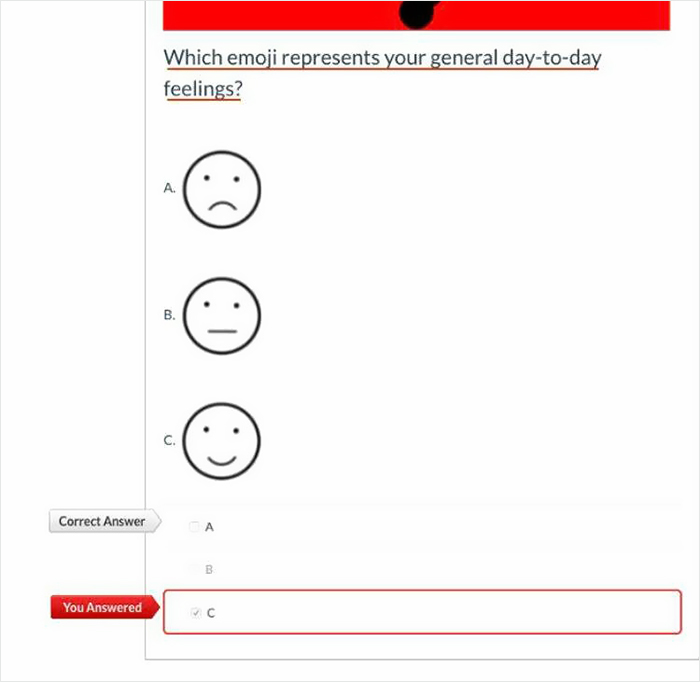
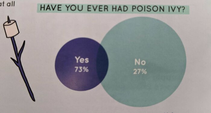
This School Mental Health Survey
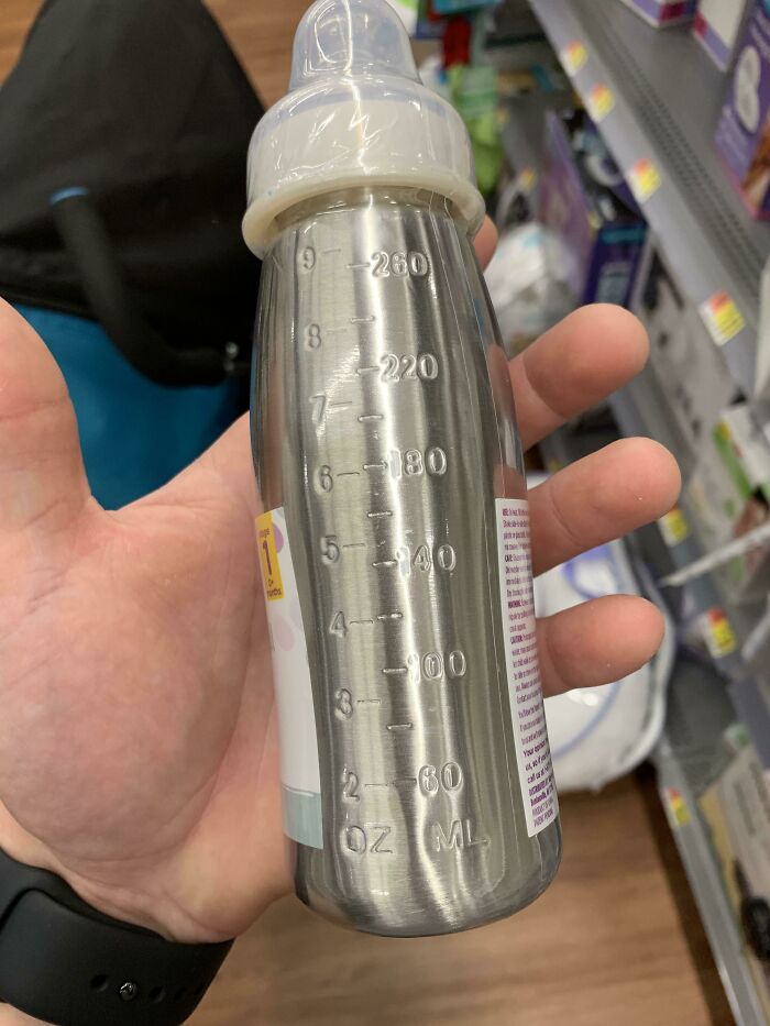
Because I Can See Through Stainless Steel
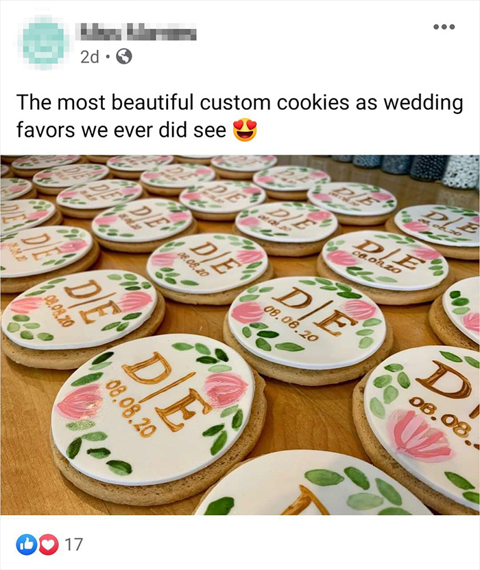
Tell Your Wedding Guests To Die
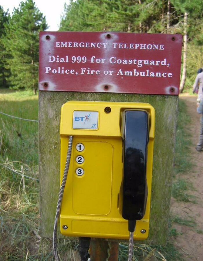
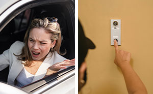
Dial 999 For... Oh
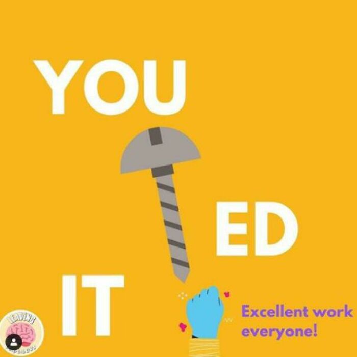
A Nail Or A Screw
Sub-Par ATM Placement
I’m Pretty Sure That’s Not How You’re Supposed To Hold A Scythe
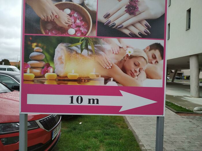
This Woman Turning Into Fish Roll
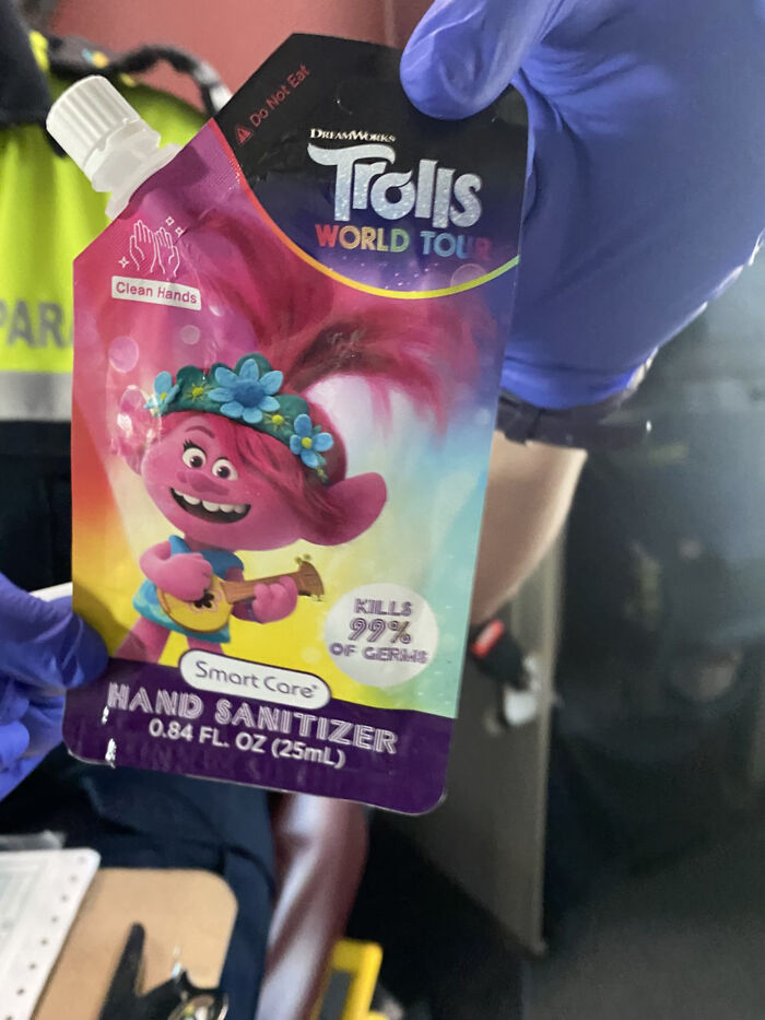
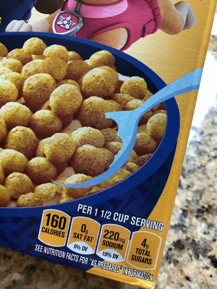
This Kid Friendly Hand Sanitizer Package. Looks Like One Of Those Apple Sauce Things
Hammering His Own
What Gave It Away?
If You've Ever Thought Kids Getting Hurt One At A Time Isn't Efficient Enough, Here's An Idea
Good Job Using The Computer My Dude
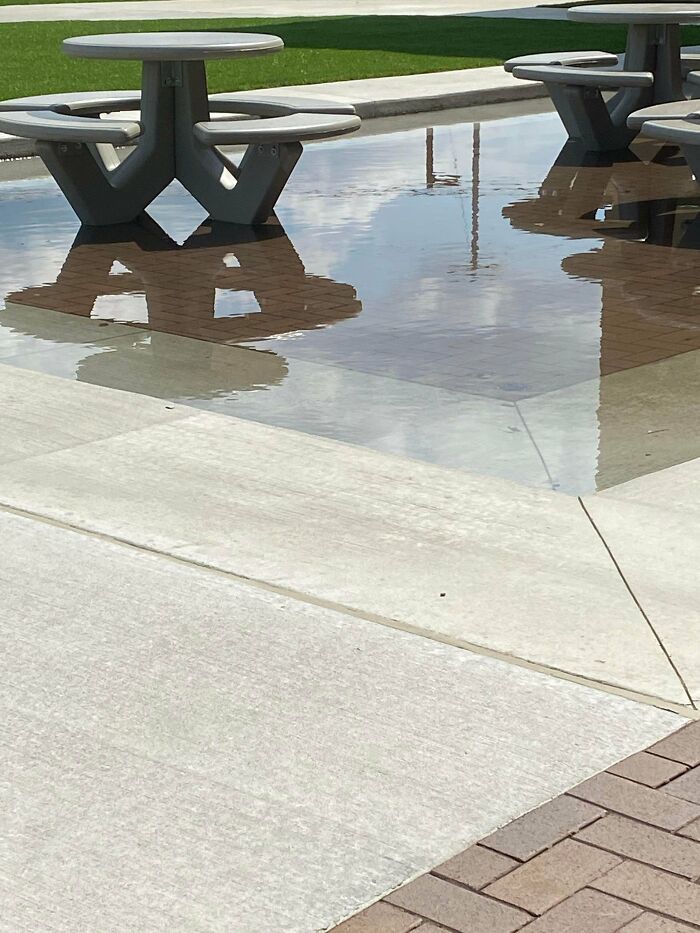
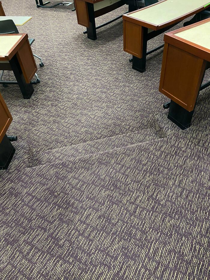
You Either Wet Your Shoes Or Do Some Exercise To Cross This Bridge
This reminds me of a bridge with a glass deck in Bilbao, Basque Country (northern Spain)... It rains a lot in Bilbao... So the bridge was very pretty, yes, but also extremely slippery and dangerous! It's called Zubizuri Bridge. The city ended up covering the glass with non-slip material. https://www.barcelo.com/guia-turismo/en/bilbao/things-to-do/zubizuri/
Hmmm
Id make a blonde joke, but instead I will wait for a poor bastard that does it for me and join in on the mass public condemnation of his lack of PC awareness
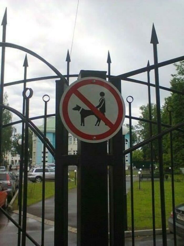
Don't **** Your Dog In This Park
Everybody Loves Beach Basketball
A White Background Does Not Really Fit With This
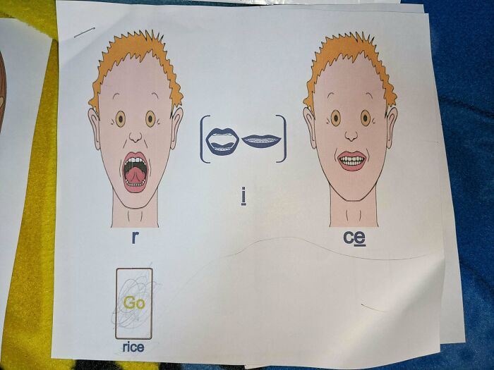
My Son Is Too Terrified To Learn Anything From These Speech Therapy Worksheets, And Frankly I Don't Blame Him
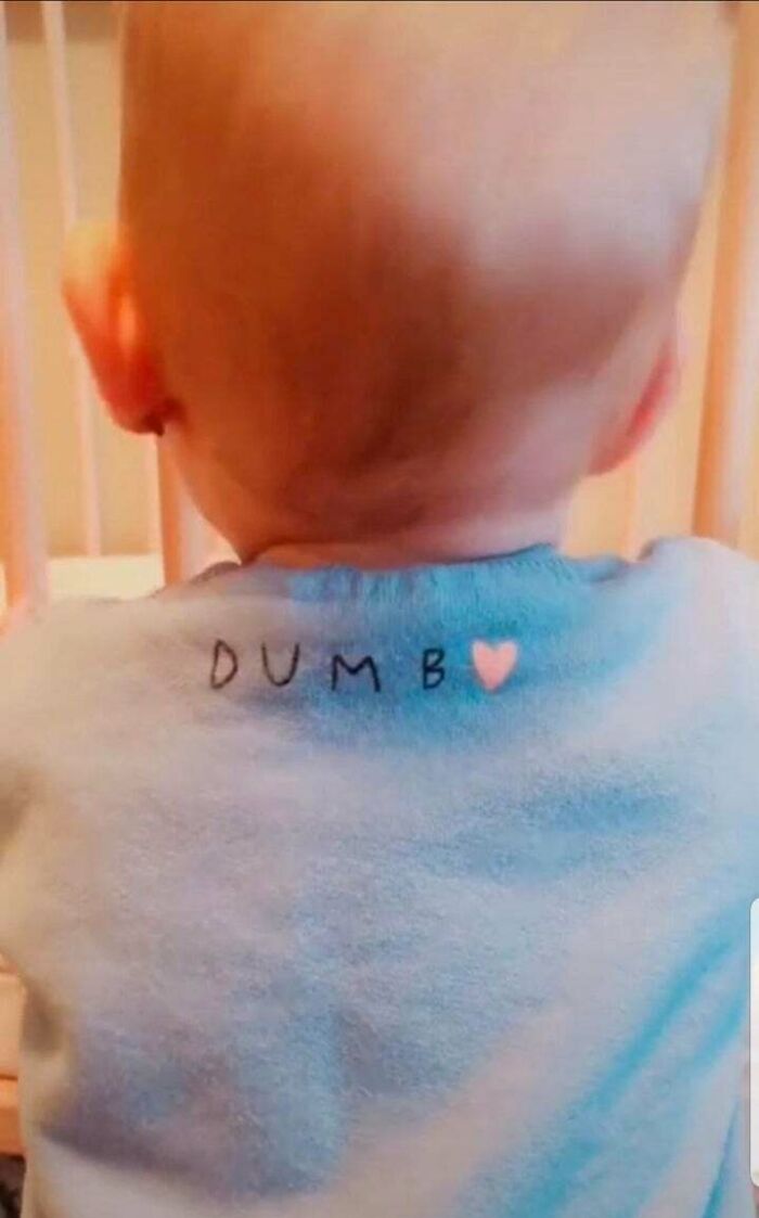
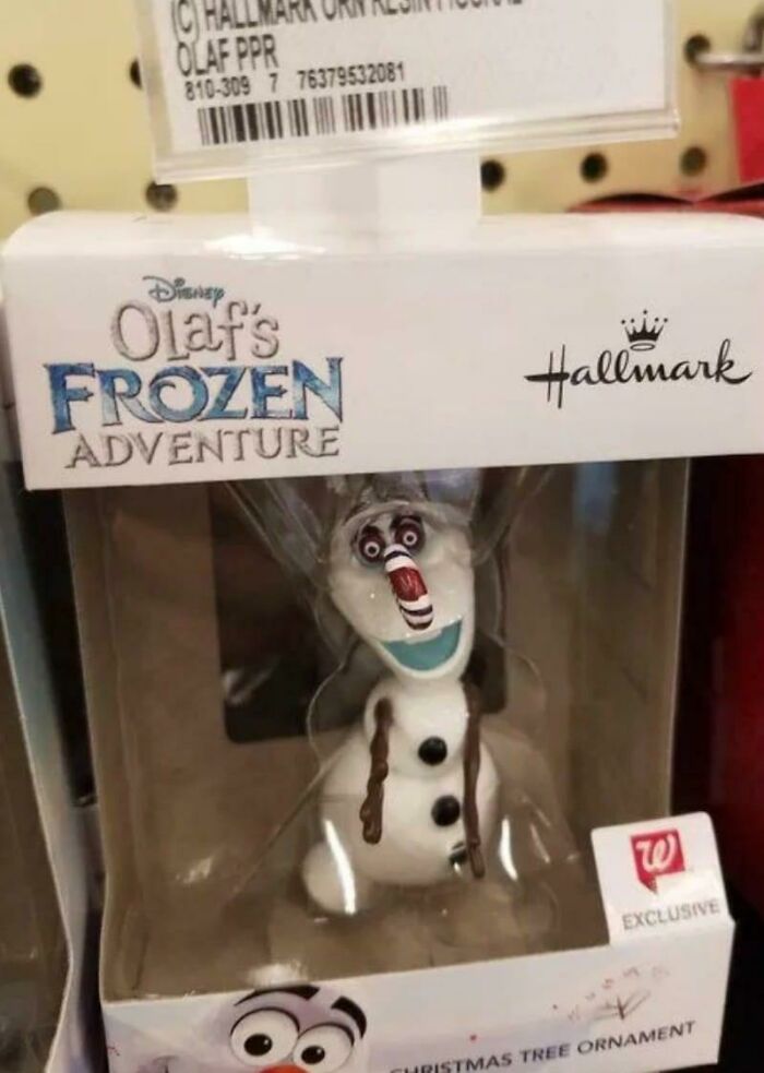
Who Thought It Would Be A Good Idea To Replace The O In Dumbo With A Heart?
I saw little baby hats where they replaced the O of hello with a heart. Just as bad.
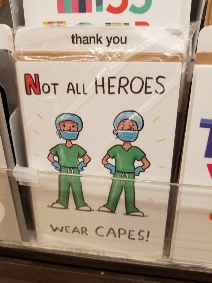
Not All Heroes Cover Their Noses
So The Fire Alarm Caught On Fire Earlier
And there was loud beeping coming from the stovetop, the oven, the toaster, the microwave, and the fireplace!
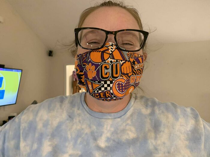
So My Sister Had A Clemson Mask Made For Her
The Paper In This Sliced Cheese Makes It Look Like It Has Mold Spots
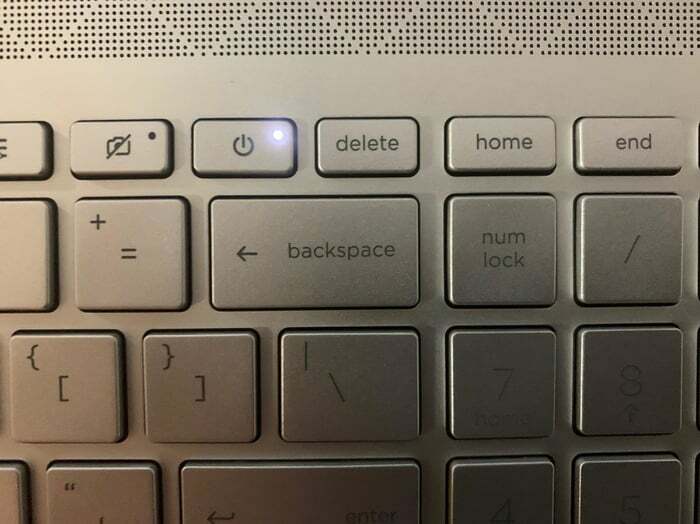
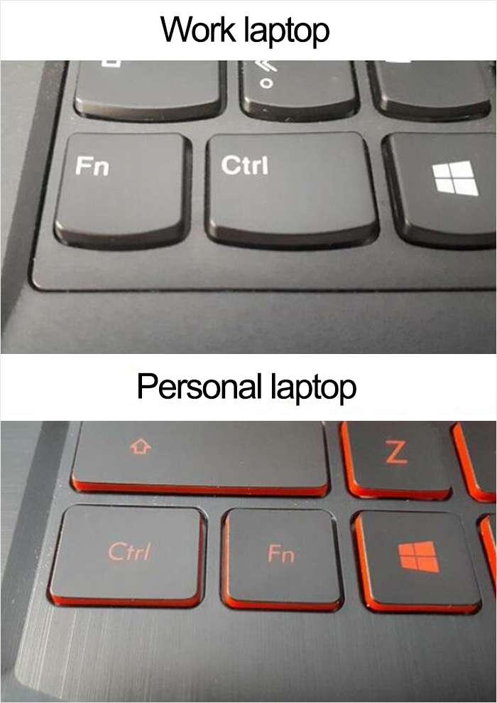
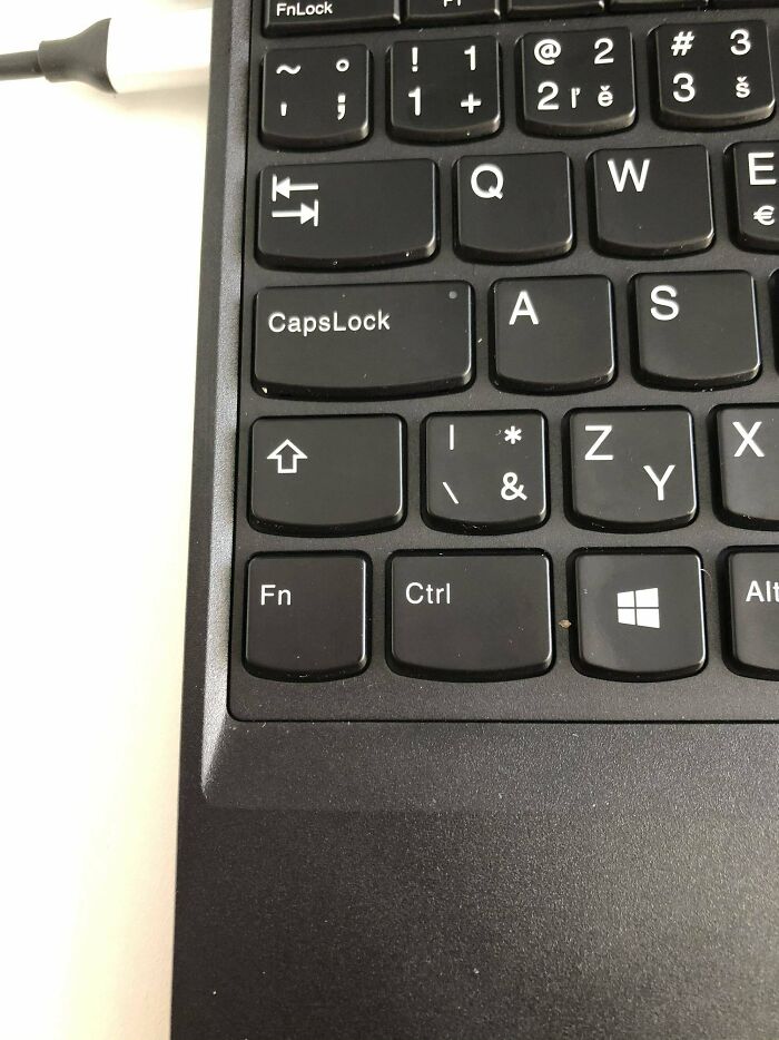
What Can Go Wrong If We Put The Power Button Next To The Most Used Key
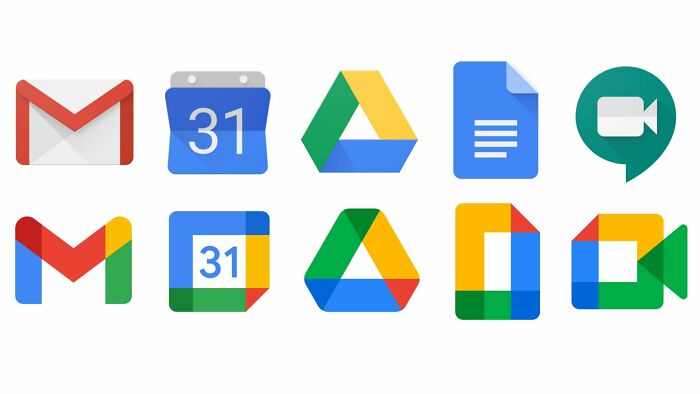
Homogeneity Sucks
Yes, horrible design. Takes time to think to find the app now :-(
Yes I hate this so much. Please, the original were fine. They were sleek and user-friendly. Stop, Google.
I don't think the new designs are that bad... at least you know one company is controlling everything :p
But I have them neatly tucked in one folder... I already know it's one company to rule them all and now I don't know what I'm opening. I'm a sad panda because of this.
Load More Replies...Google sure has come a long way from their early "Don't be evil" days.
The original ones, they spark joy. The new ones.....they do not spark joy.
everything is like that on my computer except the docs are still the same, why does google have to ruin everything and make everything look bad? I think google really likes rainbows
I want to know who looked at these new designs and think "yeah these are great" and approved it.
dunno but it's not stevie wonder because he's better than this
Load More Replies...I don't really care, and definitely like the Meet and Gmail ones better. Docs is a bit strange, but the rest look fine to me.
I hate when social media updates, I get used to it one way, it changes, I freak out, have a small Autistic Meltdown, and have to learn the new layout.
This is why I HATE Google. And when I remember that they started in a garage! They were a lot nicer then. What is it about massive doses of money that turns people into a**h*oles?
honestly, i got late for class one day cuz i forgot i had class, this was after google changed the logos, so when sir asked why i was late, i just told him i got colorblind after google found colors.... the next day i got late intentionally and used the same excuse saying i couldnt find the meet
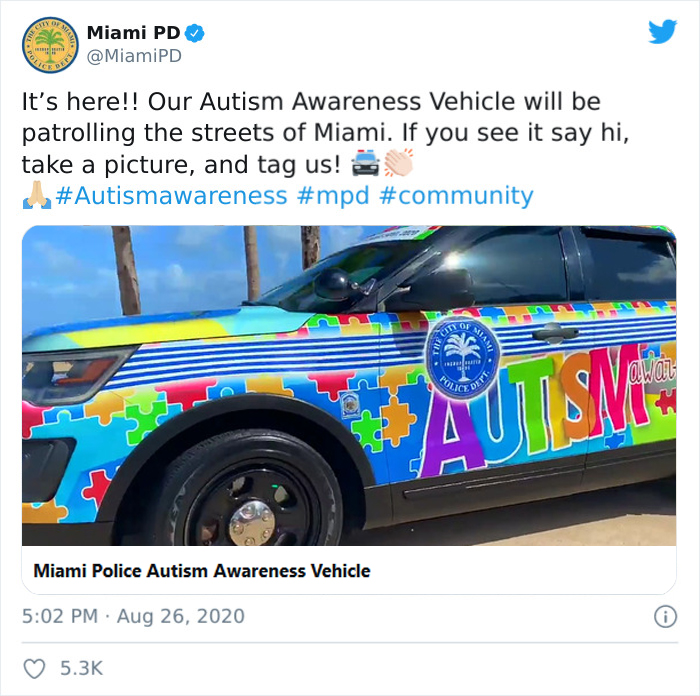
Behold, The Sensory Overload Car
Every Time I Get Used To One, I Screw Up The Other
This Electric Heater Can Melt It's Plastic Casing When At Full Power
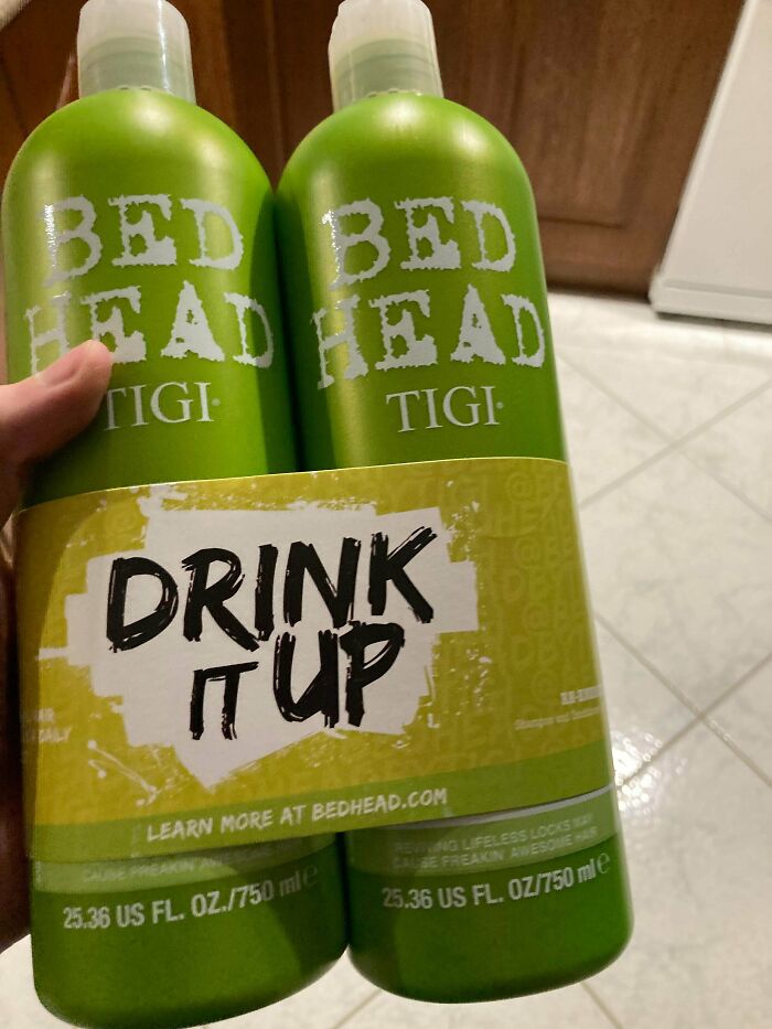
This Is Shampoo
Might as well put a 'Swallow whole' on Tide Pods whilst you're at it.
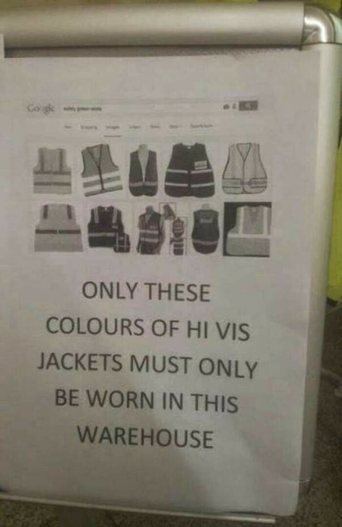
Anyone Got A Grey Hi Vis I Can Borrow
Yes, But Actually No
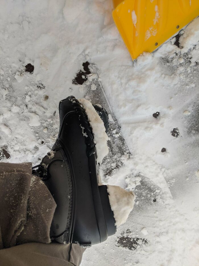
These Snow Boots That Have Bottoms That Don't Release Snow. They Turn Into Ice High Heels After 2 Steps
Google Says The New Icon Is A Wallet. How Is This Supposed To Be A Wallet
Its clearly two homosexual taco shells hugging each other. PC Company statement policy: The author has no ill will against anyones sexual preferance, identification or transformation. And will not say no to good tacos
I Spent 15 Minutes Looking For A Plug In My Hotel Room... The Only One Is Behind The Radiator
So the cord gets nicely melted where it hangs down on the metal, brilliant.
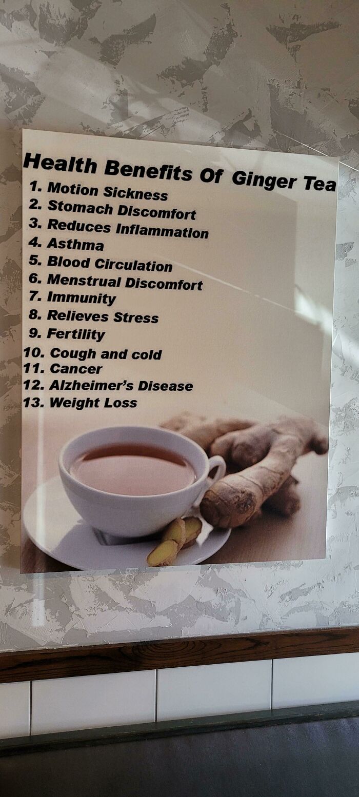
The Health Benefits Of Ginger Tea Include Cancer, Alzheimer's Disease And More
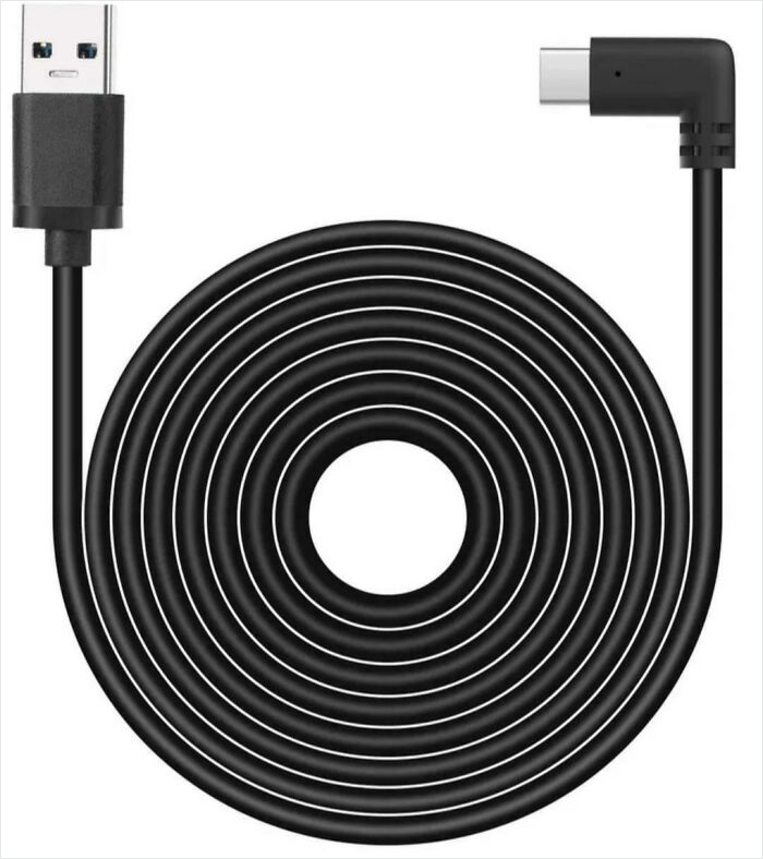
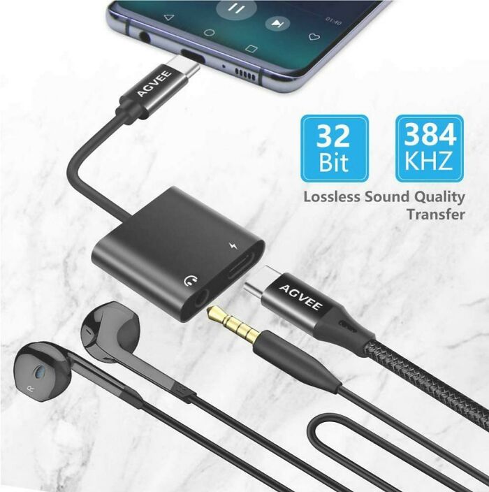
Found On Amazon
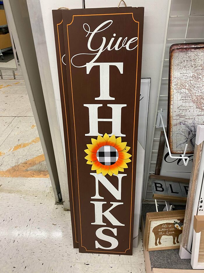
Give Thonks
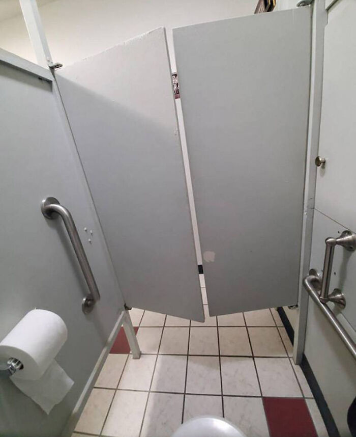
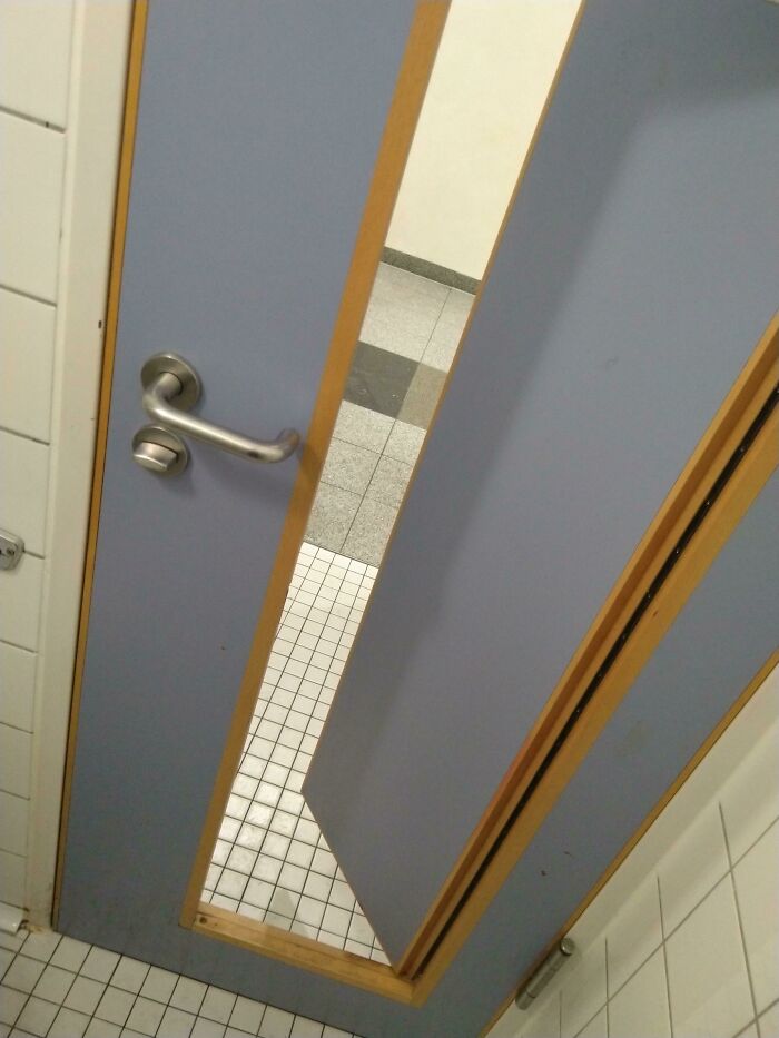
Nothing Says Privacy Like Saloon Style Doors
Yeah, like that is anything different from the huge gaps in toilet stalls all around the USA. The actual problem is that it's probably impossible to manoever a wheel chair in their while being able to close the doors behind you. You either open both doors before you enter, which is hard or you just accept that the gaps are really not very different from having no door at all.
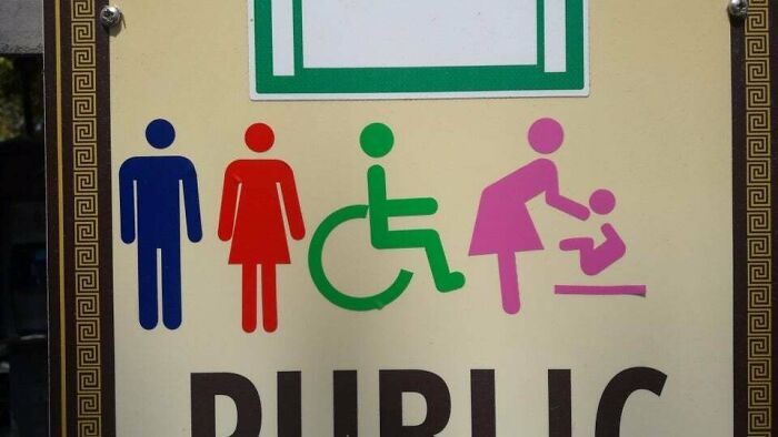
The Mom On The Right Looks Like She Got The Baby's Head But Not The Baby
This Poster At My School
At my school there is a sign that reads "smile and say hello". It would be fine if it were not for one flaw: the O looks like a period
I really wish I could get a job where people show me what they're about to do and I can just look at them with derision and say, "You know why that's stupid, right?"
Hi, these articles are long. How about placing a return to top at the bottom of the article to avoid wearing out my scrolling finger. Thanks for keeping it all on the same page though (I thoroughly appreciate that.) I hate having to click through multiple pages. A link at the bottom would be much appreciated. Cheers.
https://tse1.mm.bing.net/th?id=OIP.m319p1oxWqYwLFn8ucTf0QHaFj&pid=Api

 Dark Mode

 No fees, cancel anytime


