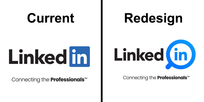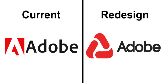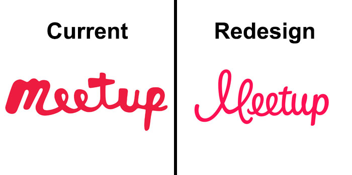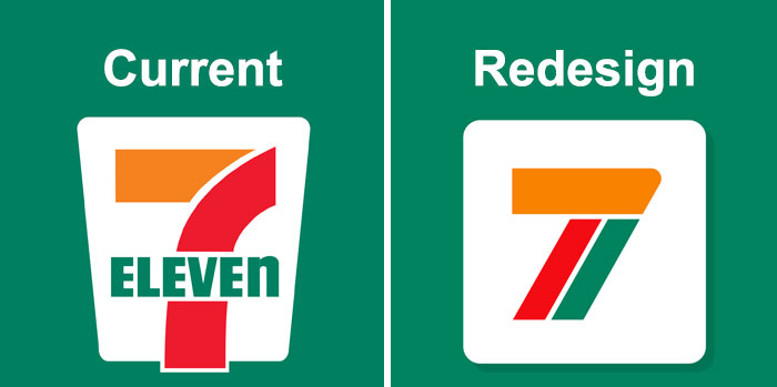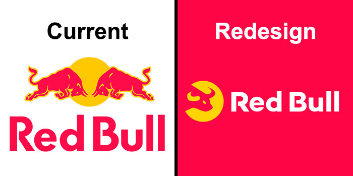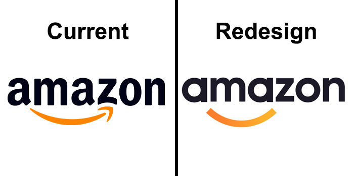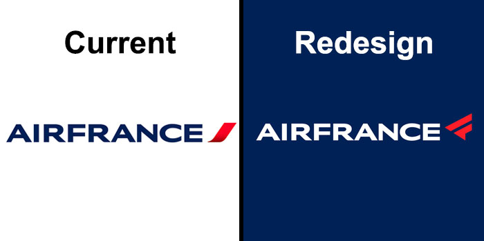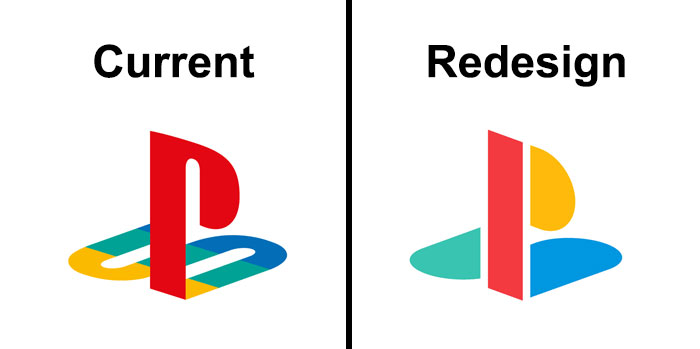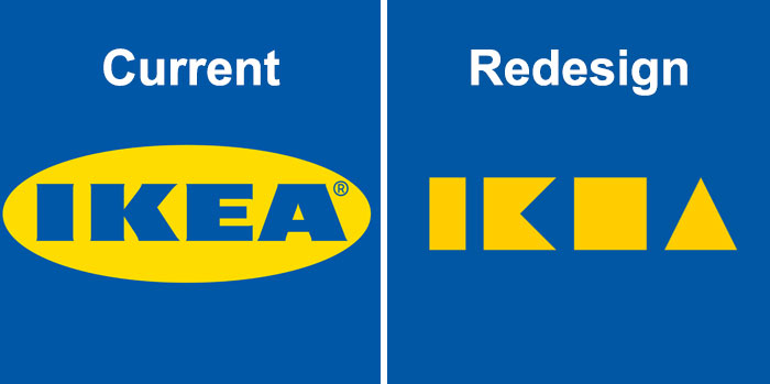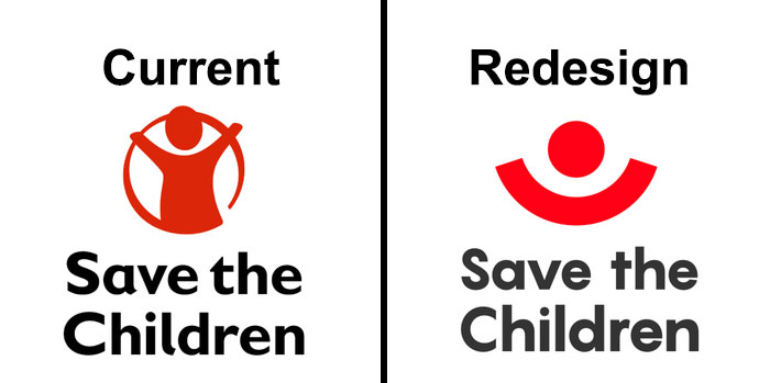
Designers Share How They Would Redesign Famous Brand Logos And Some Solutions Are Really Creative (25 Pics)
Top companies spend big bucks on their logo. After all, it's the visual representation of their character. An easily digestible display of their core values. In other words, a company's logo is its face. And you bet your wallet they want to look appealing.
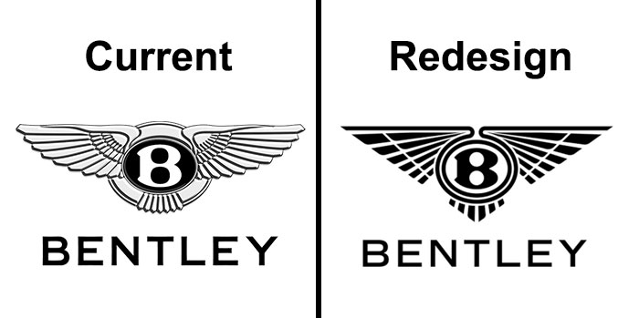
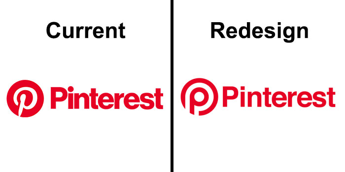
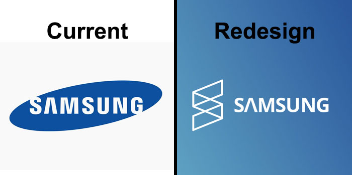
So it's only natural when up-and-coming designers try to prove their worth by recreating famous logos. "These guys get paid millions of dollars but I can do it better for a fraction of that cost." The ultimate power move.
Take a look at some of these recreations we found on sites like dribbble and Behance. Upvote your favorites and let us know what you think about them in the comments! Enjoy.
This post may include affiliate links.
I thought that the three black lines were imitating a sound wave, therefore the current one is more appropriate. Also, IMO, the ''S' in the redesign just doesn't look right.
I like that the redesign is cleaner - if they could just make the G a little more obvious
I don’t like the redesigns that take away all the detail in the originals. They just look lazy and untalented.
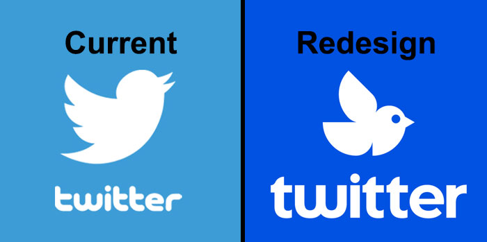
or a run-over pigeon, depending what angle you look. Or a bird just about to pick up an insect. But not tweeting, at all, which is what it's supposed to do.
Load More Replies...Isn't it supposed to look like a bird? This looks like something from Chernobyl
Why can't we just get a cute little fat bird like this? download-6...54d4d.jpeg 
If you had the bird dropping the dot on the i - then it would be better.
The trouble here is that some of the redesigns are ok, but the currents are iconic and recognizable and should not be changed, in my opinion...
the bird looks stupid. Not the design, that's fine. the bird looks like if you imagine a not so smart cartoon bird, it would look like that.
Most of those just changed the font from something original to something completely generic. Meh.
Sucked out any little smidgen of soul that might have been in it :/
Load More Replies...All of the"redesigns" are terrible. Every single one of them, not one offers any improvement whatsoever.
I did professional graphic design for years and I can tell you that is takes a lot to design a logo. You have to design a small visual that in the few seconds someone looks at it, portrays your company's brand, style, personality, industry, etc. It also has to work across al media types including a computer screen and on paper as well as being reproduced in color and black and white. It's actually really hard. Especially when top executives think they know better just because they want to say that part of it was their idea.
terrible job! waste of your time. sorry, mate. don't quite your day job.
Anyone can redesign a logo, what matters though is understanding what the client actually wants, what their wider design principles are, how their brand influences their style and what elements they want to include or change in a redesign. It's never just what the designer can redesign where big brands are involved
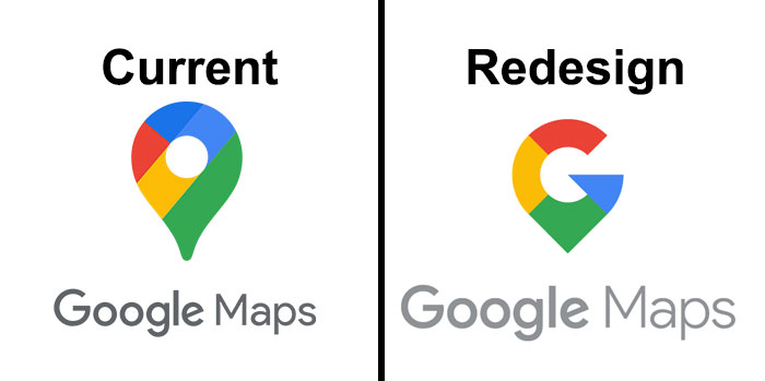
The only one I like is the Google Maps one but I think it is obvious it's Google Maps with the current logo anyway.
The only good one was the Google maps one. If I was the client and someone came to me with these as redesigns, I’d ask them how they got past security.
These are nearly universally terrible. Almost all lose the meaning of the logo in pursuit of forgettability. F-.
This post was never going to land well because we all prefer what we already know (see: outcry each time Facebook changes design). Having said that, some of them really do seem like a big step back.
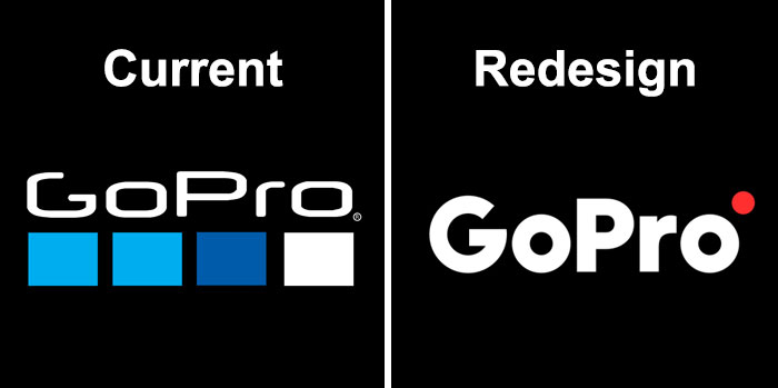
a few were actually cool (like gopro and maps) but most were generic and boring
Bet some of these are taken for new designs, let hope they are paid for
Hey i'm curious, but what makes a design work? what makes one good, or bad?
What a pointless exercise. These are all solutions in search of a problem, every last one of them.
Well, there's a reason they paid professionals vast sums of money to create the originals....
I feel like there was at most two I preffered the redesign of (like the google maps one). Most of these just overslimplify it to the point where my eyes just start to blur them together because of how similar they are.
As a graphic designer, I really dislike the trend of oversimplifying logos to the point that they no longer have character. Also, why are we reverting from 3D to 2D?
These are all utterly pointless. It could be argued that so am I, but it's all my own original work.
Having worked in the design industry for over 30 years, I know that top dollar clients will pay ridiculous sums of money for the tiniest unnecessary alteration to a logo. And often it's just because someone on their board thought, 'well, it's time for a change'. And also, clients are ALWAYS better designers than, you know, the designers. *rolls eyes*
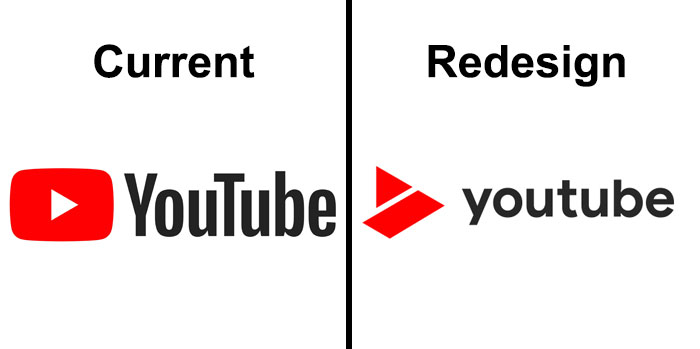
Every single one looks really generic or bad except for the YouTube one that one is good.

 Dark Mode

 No fees, cancel anytime


