1Mviews
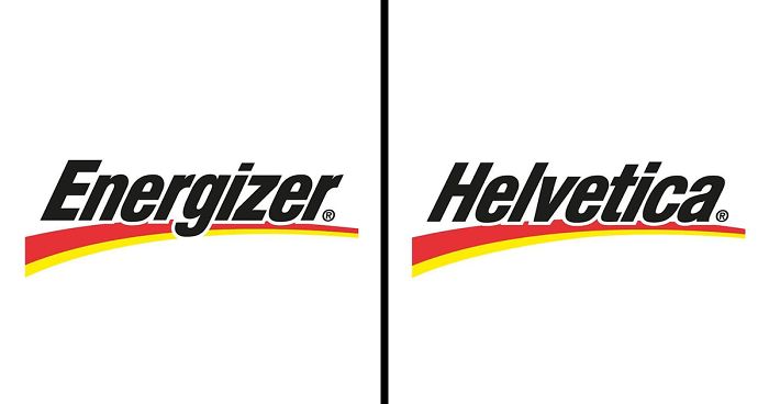
Artist Reveals What Fonts Were Used To Design Famous Logos (30 Pics)
Interview With ArtistThere is no doubt that a logotype is the face of the company; that‘s why each element of some of the most iconic and well-recognizable logos is carefully thought out, even though they might seem simple. Often, simplicity is the key. Selecting the right typeface and font for a logo is crucial and combined with size, color, and graphic elements can help you stand out in a competitive environment. Each font can communicate a specific personality and tone—this is why it‘s particularly important to go with something that perfectly represents the brand‘s identity. Some brands use well-known and time-approved fonts such as Helvetica, Arial, and Gotham, while others create their custom designs often based on or inspired by classic fonts.
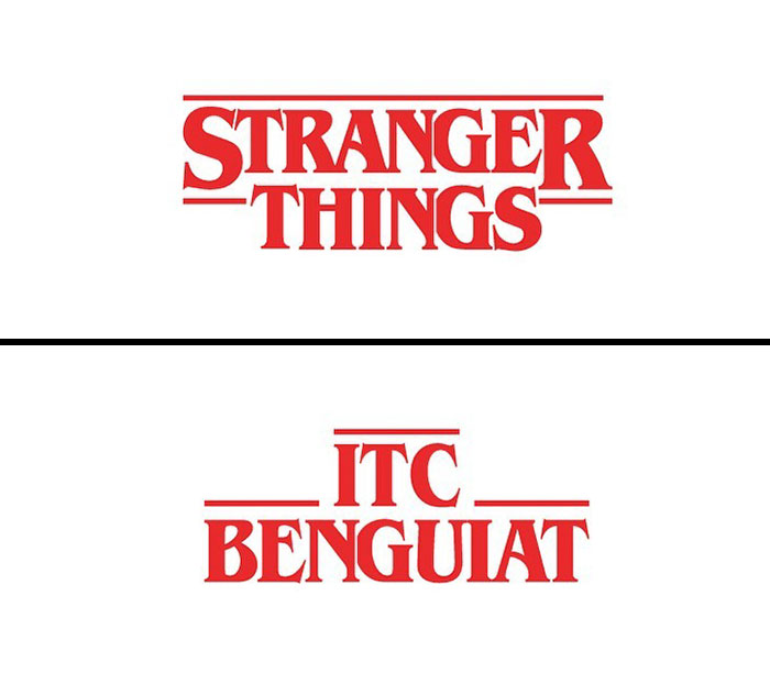
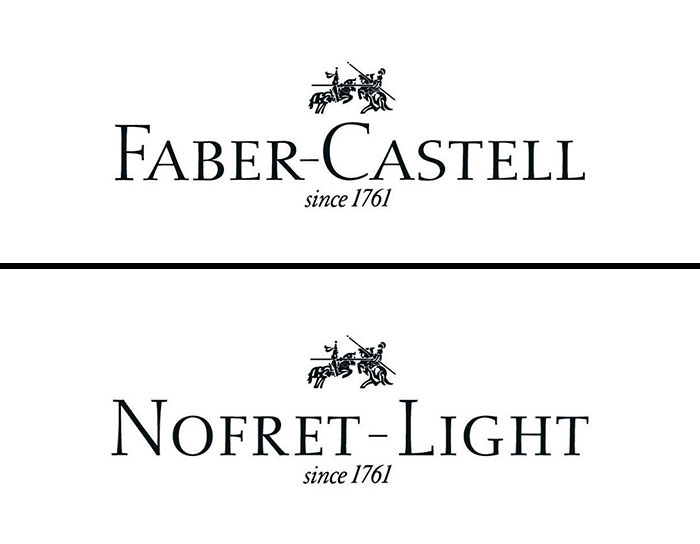
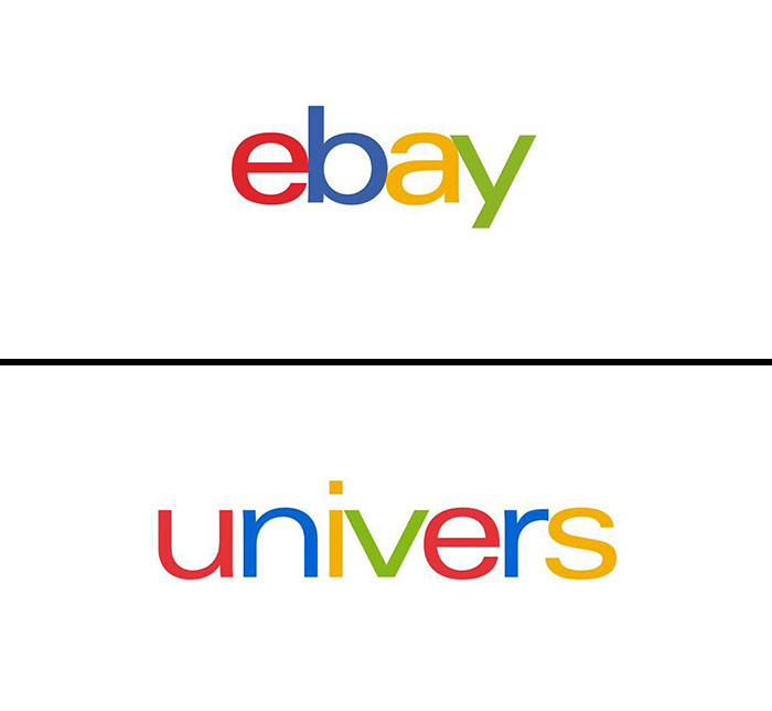
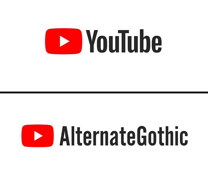
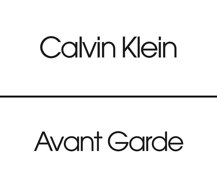
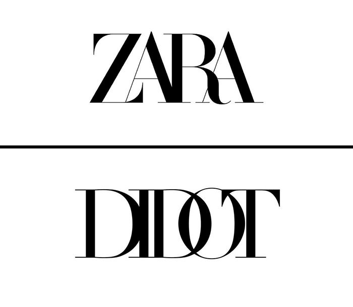
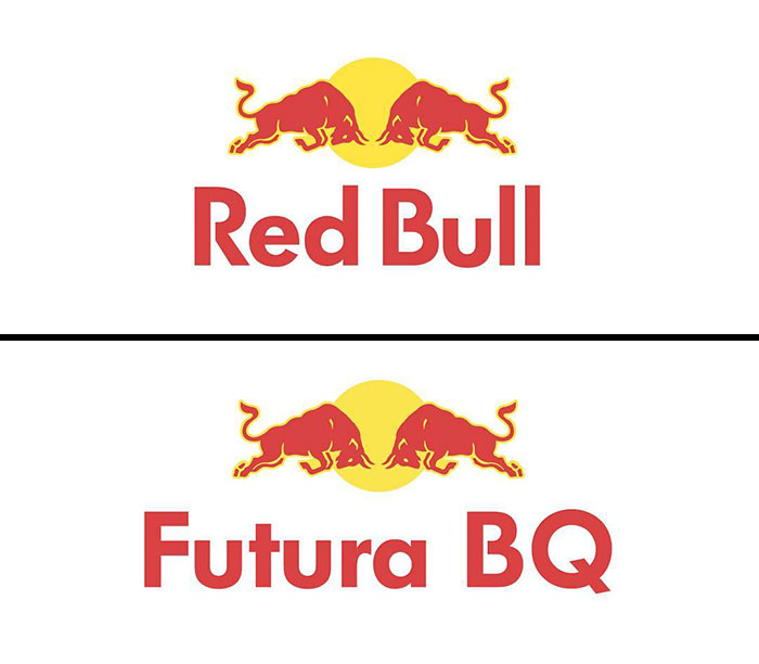
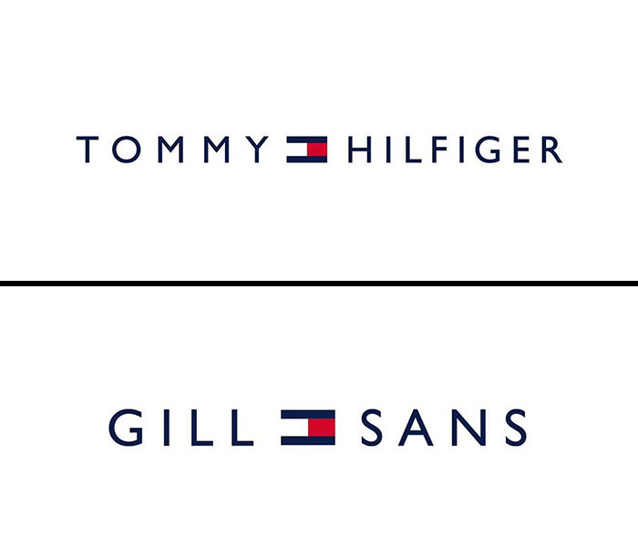
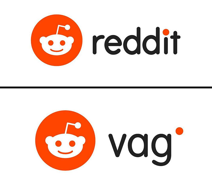
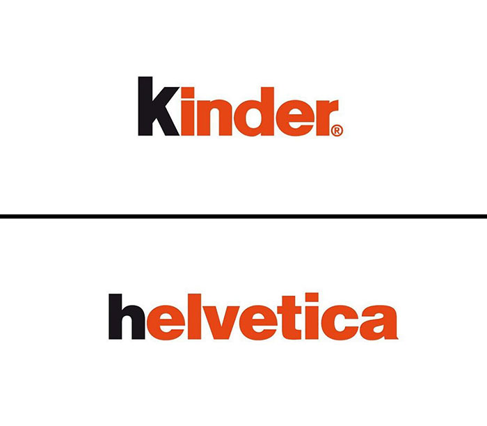
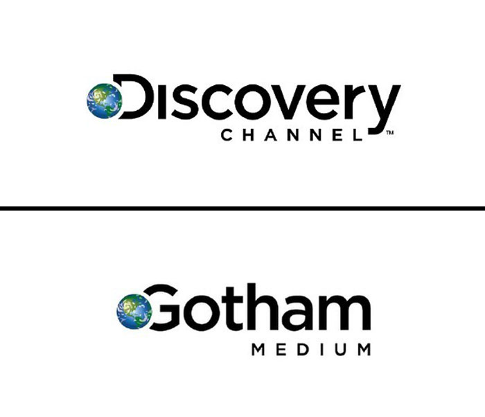
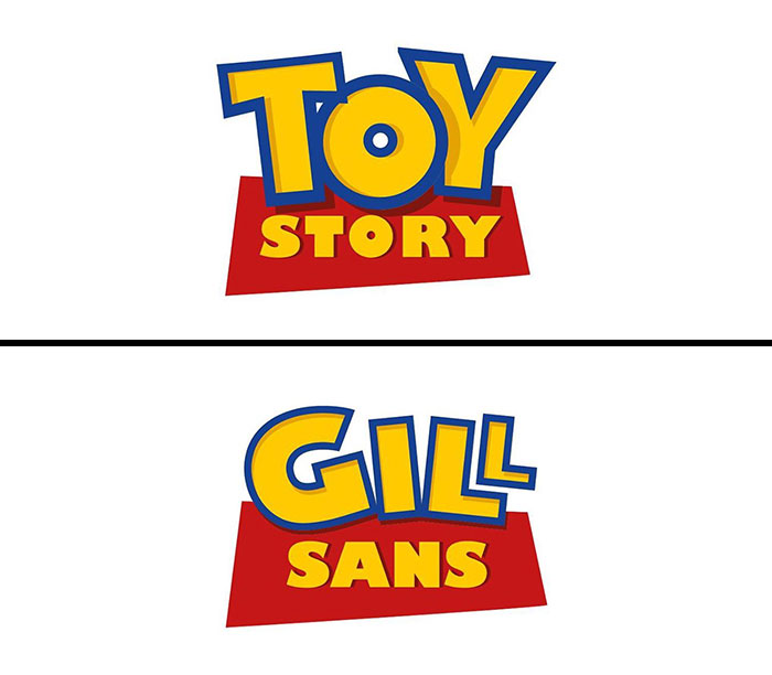
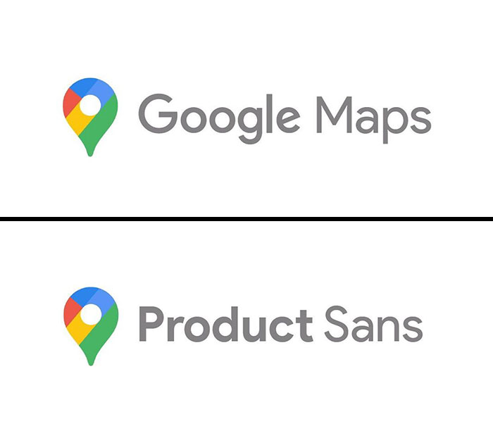
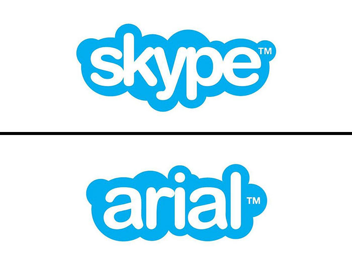
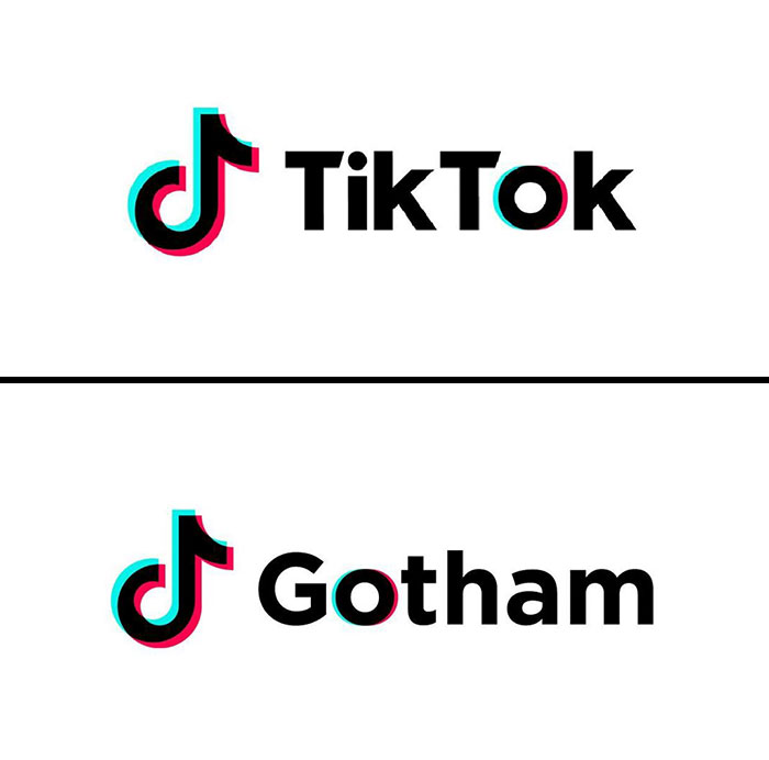
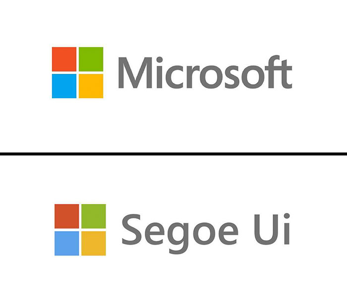
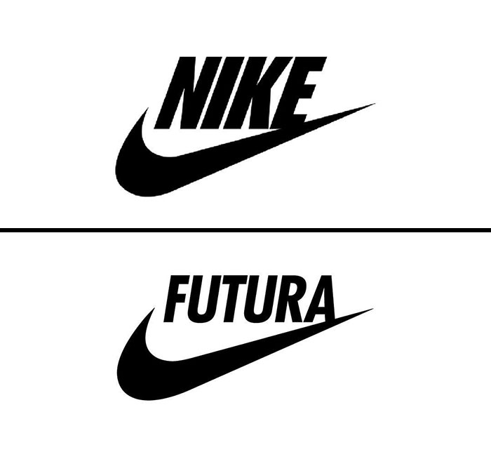
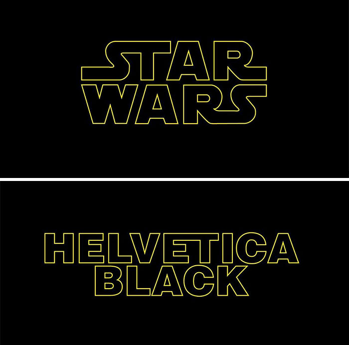
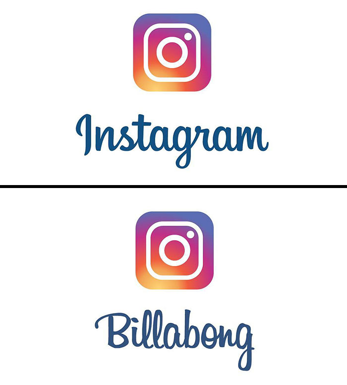
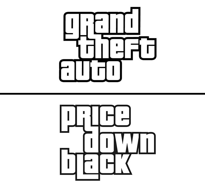
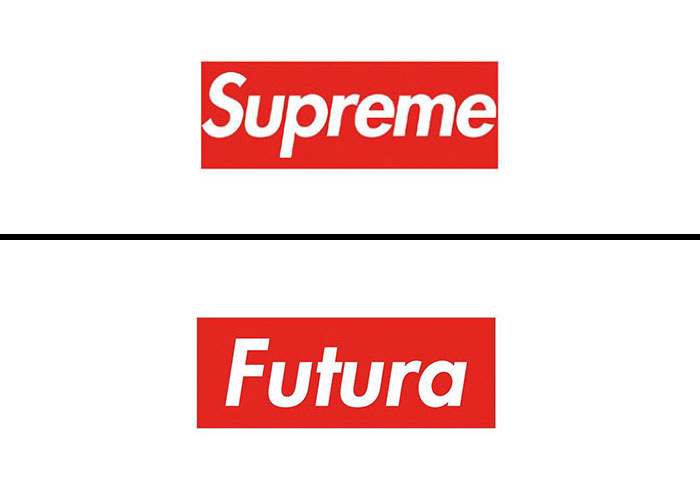
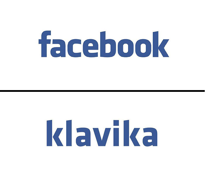
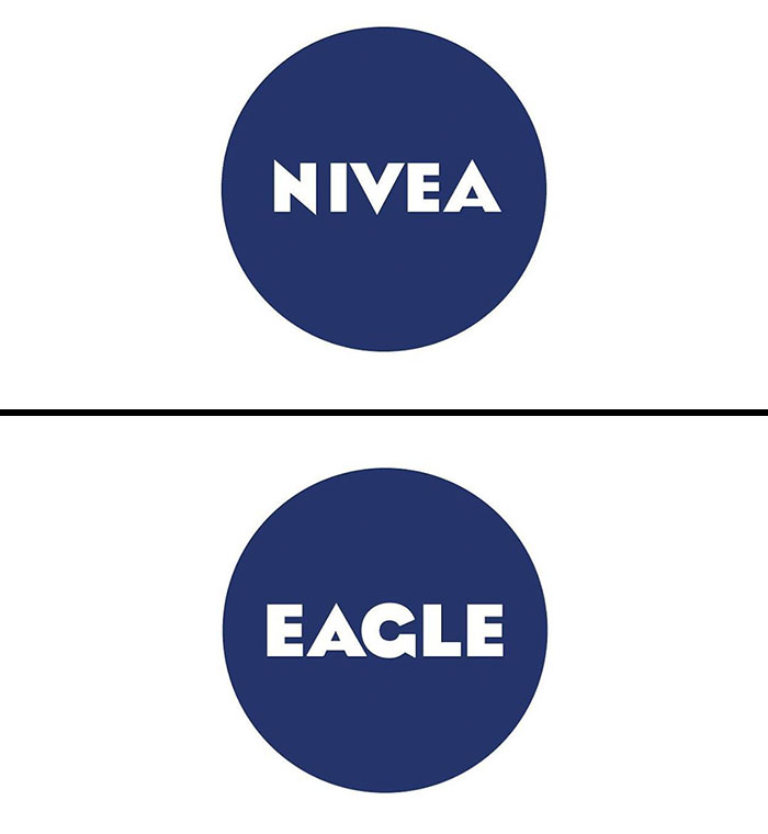
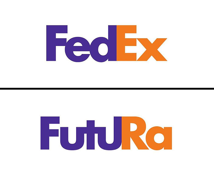
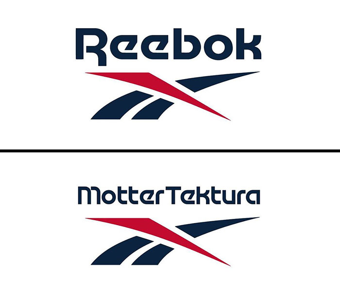
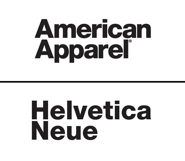
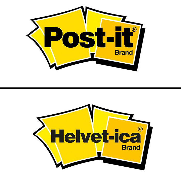
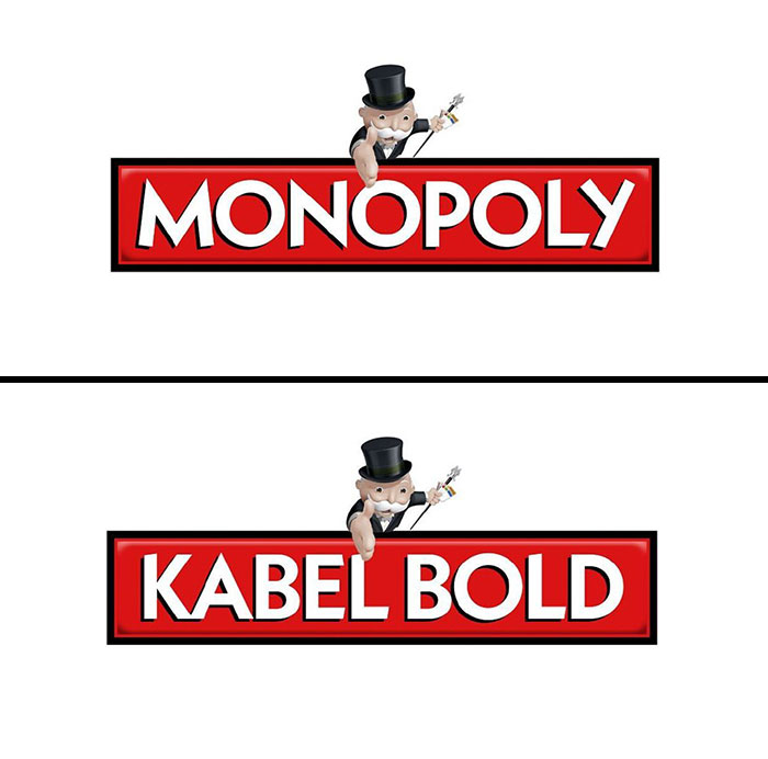
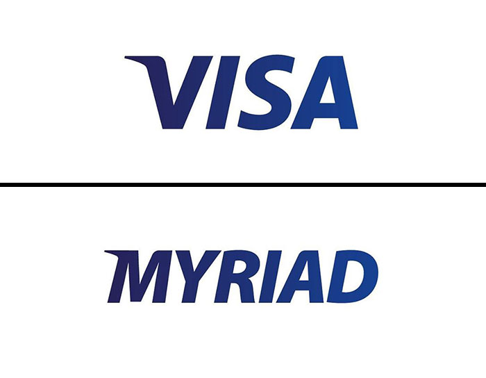
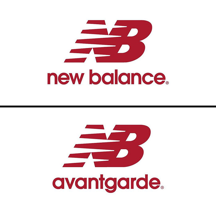
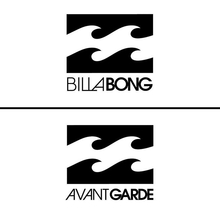
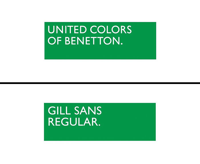
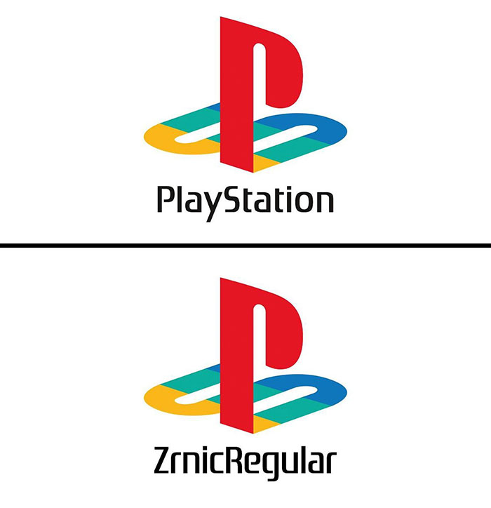
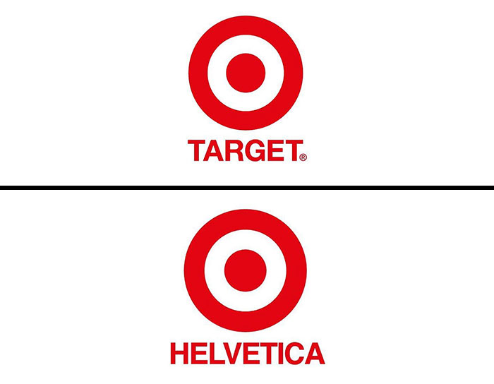
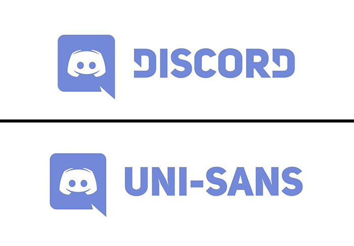
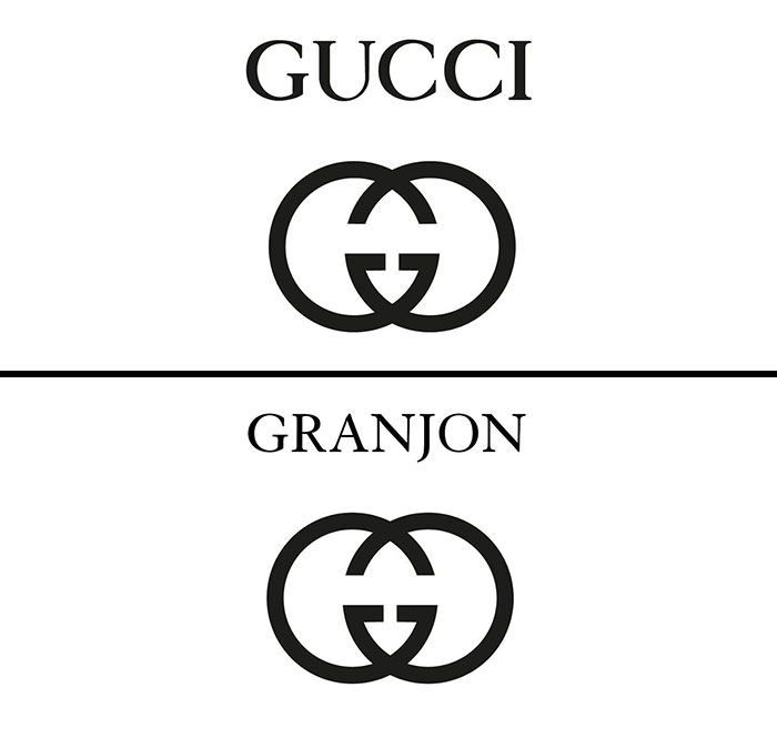
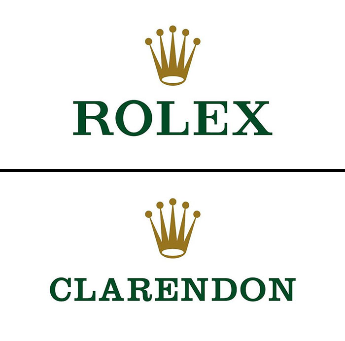
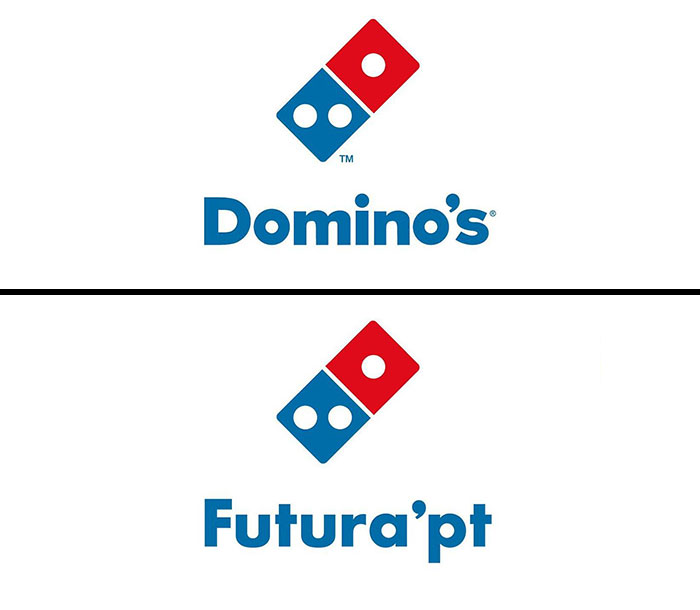
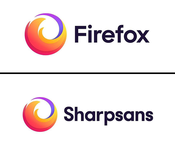
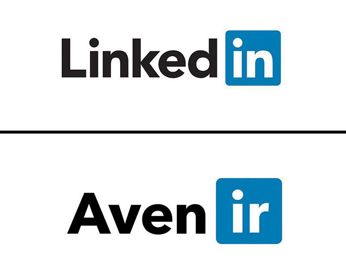
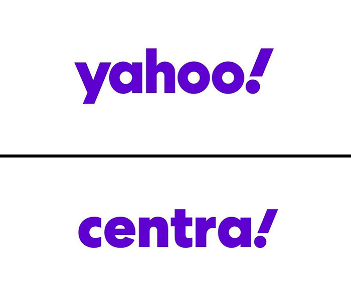
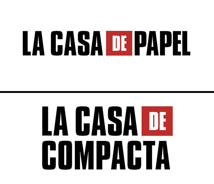
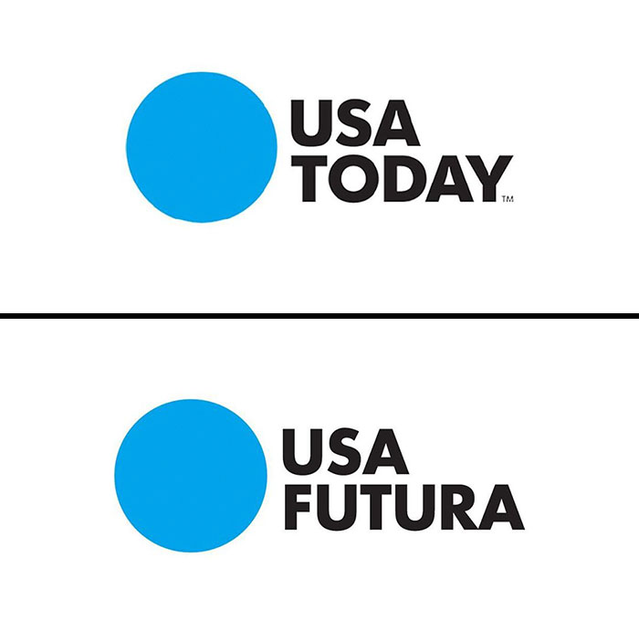
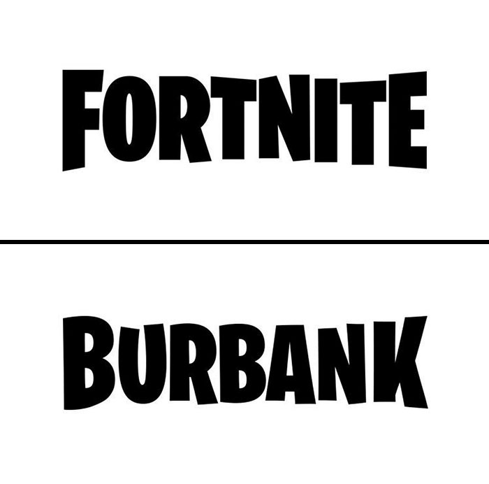
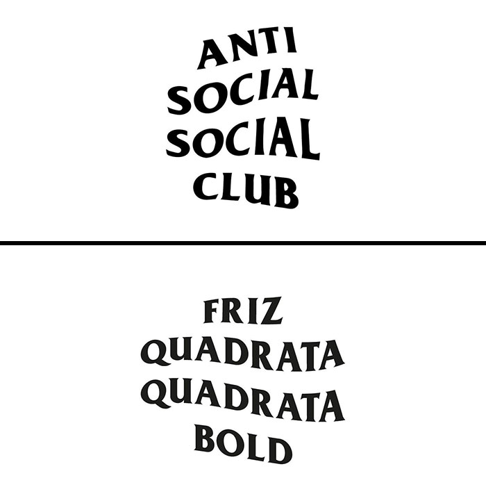
The Italian graphic designer, or logo guru, as one might say, Emanuele Abrate, runs an Instagram account all about logotypes. Last time we featured the artist on Bored Panda, he fixed the "World’s Worst Logos" (disclaimer: some of them are pretty ambiguous) by redesigning them in a more appropriate and sleek way. This time, he shows what fonts some of the most popular brands chose to represent them by replacing names in logos with logo fonts.
More info: Instagram | behance.net | Facebook | emanueleabrate.com
This post may include affiliate links.
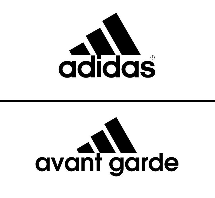
Always wondered why Adidas had the chimneys of the sinking Titanic as their logo.
This personal project called “Logofonts” is a simple and fun way to learn about some of the world’s best logos. In fact, there is no such thing as a good or bad font—it always depends on the story you want to tell and the voice you want to use for this purpose. And graphic designers exist to masterfully balance all the elements of the logo to achieve the best result.
Bored Panda reached out to Emanuele to find out about the idea and the process behind this project.
“The idea came spontaneously by observing the most frequent questions of graphic designers. I noticed that the most common question when looking at a logo is: ‘which font was used?’ So I decided to create a project that would answer this question in a simple and immediate way,” said the artist.
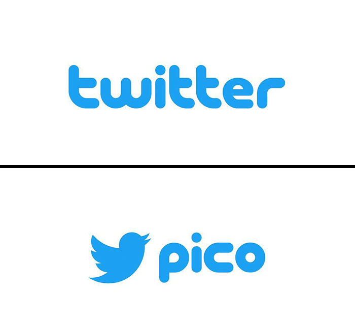
Ha! What an appropriate font name! (Pico in Spanish means "beak", among other stuff. If you ask a Chilean you may have a faaar different translation, haha!)
“Most famous logos use a custom typography (designed from scratch, or from a font to customize it). My goal is to find out which font is used at the start and then modify it to get the final result. For this, I do a search by consulting the brand manuals and then visually comparing the original font with the logo. I also often use tools like 'whatthefont.' I always try to be as precise as possible.”
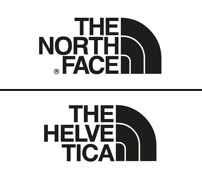
And is this the same font that was used on the cover of Needful Things as well?
The main goal of “Logofonts,” which has 45.1K followers on Instagram, is to show how a typographic choice can be extremely identifying when designing a logo.
“The font is very important because typographic forms are able to generate emotional sensations in the observer and can represent a highly distinctive element in a logo: think of the Coca-Cola logo or the Instagram logo.”
For everyone who might think that using only a font in your logo is cheating and doesn’t require much knowledge, the artist says that the subject is not as easy as it may seem.
There are some basic tips on how to choose the perfect font to represent the tone of your company. In one of his Instagram posts, the graphic designer explores the importance of colors and typography in logos that, even without the use of images, can convey messages and feelings.
“Do you want to express luxury? Then better a serif font or an elegant script. Do you want to express innovation? Then a sans serif and neutral typography may be the right choice.”
Abrate says that the biggest mistake a brand can make when selecting the right font for a logo is to rely exclusively on their own taste or following the customer’s taste: “I love Futura, but when I design, I put my personal tastes aside in favor of the concept I want to enhance.”
This designer is wrong... It looks like Knockout HTF-49 Lightweight. Look at the weight on the lowercase e and o...
My current favorite font. I think the Obama presidential campaign used this font. It symbolizes modernity, clarity.
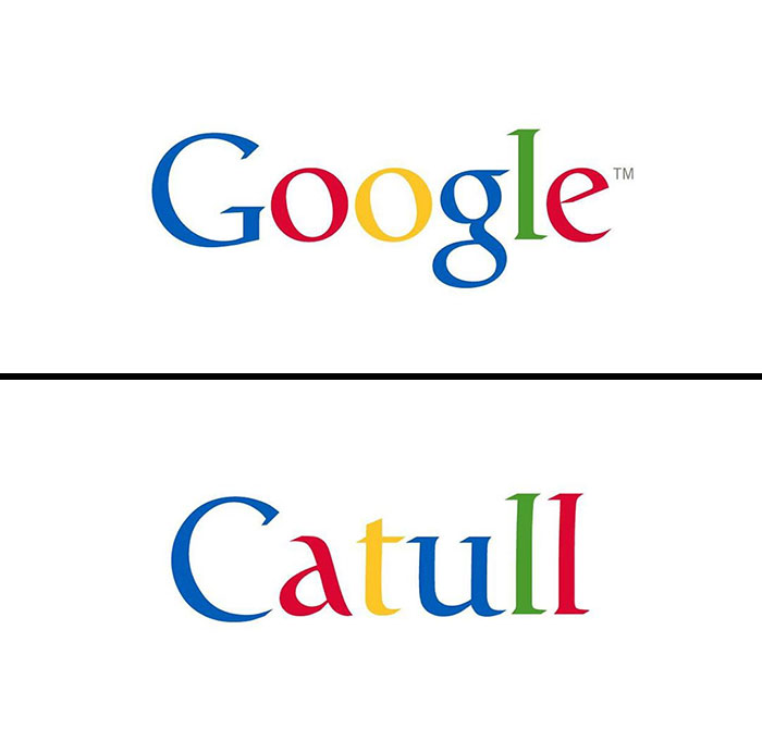
Google created product Sans, so does that really count? Also it was based off Futura with a few minor tweaks.
The kerning is made so all the letters are the same width apart. but how much incline?
Not exactly. Klavika a top curves downward, k shows daylight between strokes.
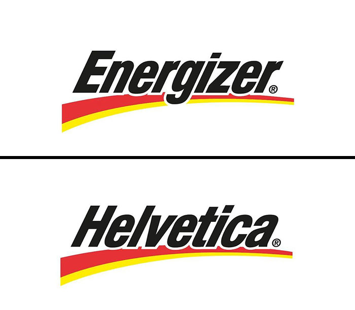
Um... no its not. I feel like FedEx is pointed to as one of the best examples of Helvetica in logo usage.
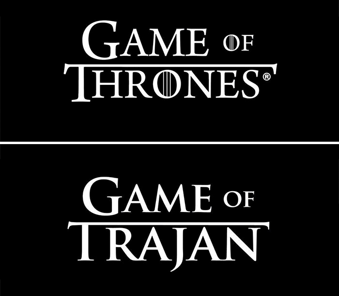
No, it's not. The GoT logo has heavier serifs, with serifs at the top of the M and N.
I think a lot of people saying "not even close" or "close but not quite" need to understand that graphic designers rarely use a font as-is when it comes to title and logo design. At a minimum, the kerning and leading will be adjusted - usually to avoid awkward white space- but then come effects like drop shadows, beveling, custom serifs, and whatnot. As you can see by the reveals, the fonts on their own read just like what they are: FONTS. They're not intended to be logo-ready, and a lot of design is actually pretty necessary to avoid the type looking flat or lifeless. Heck, even non-logo type gets designed like crazy for body-type heavy entities like books and magazine. I personally have spent years studying design and typography, and have even done my own book design and editorial pieces. Type is truly an art form and you can't take this post so literally.
I was gonna say this. They're rarely ever just left alone. So small tweaks (or even large ones!) can be explained by the designer of the logo messing with the typeface to make it more interesting. I've done it several times to make a letter more striking within the logo. Also this is accomplished by having the type rendered out as vector shapes. Lets you completely mess with it. :3 (There I go, giving away secrets!)
Load More Replies...Hi! Graphic Designer here. I DO enjoy this piece. I wish I was still teaching college, this would be perfect for the intro to design kids.
Load More Replies...Wow. A lot of work. The ones that are not perfect have been customized. How anyone could criticize is beyond me. Have worked with fonts. You have a lot of patience to do all this research. Thanks. Very interesting.
"how anyone could criticize"? 🤣 Look where we are! But I agree with you -- good research and interesting.
Load More Replies...Piping in one year late, but I'm a bit confused. I'm no graphics designer, and certainly *not* a font designer, but over time I had to redo a lot of logos — mostly because the originals were _not_ digital, or were ancient bitmaps that wouldn't scale well, or (more frequently) all I've got is a fairly decent PNG, but I _really_ need a vector image as a new 'master' to generate the logo in different resolutions without loss of quality... so I spend a reasonable amount of time figuring out how a specific logo has been designed, especially what font has been used. Oh yes, I use all those clever AI-based online font discovery tools; it might take hours and hours, but very often I can find close matches — and then it's just a question of tweaking things until I get them 'right'. That usually takes quite a lot of time with many, many trial-and-error attempts to get as close to the original as possible.
Now, clearly, Emanuele Abrate has a very different approach. Instead of starting with a font already close to the final result, he starts several steps before, usually from a more 'generic' font (Helvetica, Gill Sans, Futura...) that will not only be available on many different platforms, but which allow a lot of tweaking (by design). Then, with some font-fu, he seems to be able to coerce what seems to be a quite different font into the desired, final outcome. The examples shown do *not* show this behind-the-scenes 'morphing'. We only see the end result — the original logo as it stands — and what font Abrate started with. We can only take his word for it that he's able to turn that font in what the logo actually has. In some cases, it's quite clear that he is very, very close to the final result. In most cases, however, he seems to be so many steps away from the final result that it's worth asking if he'll ever be able to get there...
Load More Replies...I cannot believe the number of pretentious a******s commenting. 'Oh, no it's not Arial, it's Arial Round. And I know big words like kerning so I'm better than the person who spent all this time & effort into making this article'. Like so many have said, actual designers will pick a font then their client might say, I want the letter k a bit different & the font gets adapted. The font will rarely stay exactly the same now that it is so easy to manipulate it.
Excepting for Game of Thrones, it's dead-on. Neato! Someday, I hope to be the Mayor of Fontana, just for the name.
Sorry, but this seems very sophomoric. Most of the "reveals" aren't even a match. Furthermore, these are word marks not typeset words and have been heavily modified. People who can tell the difference between Helvetica and Arial will be impressed.
I thought these big companies had designers for there logos. They must have good lawyers to fight copy right infringements. A logo should reflect the companies business and it should be unique to the business.
I'd say that if you own a license of the font, there is nothing wrong with using it in your company's logo...
Load More Replies...Good idea because is persons who love creating fonts. Big company would if they could order their own signature font, but they don't. Commercialism has this phenomenon, LOOK CHEAP. Hard to understand, think reason why be common keep it normal or somthing ....
good idea because is persons who love creating fonts. Big company would if they could order their signature font, but they don't. Commercialism has this phenomenon, LOOK CHEAP. Hard to understand, think reason why be common keep it normal or somthing ....
People whinge about Comic Sans, but it looks like Helvetica is used way more, and is boring af.
He really went to a lot of trouble doing this. However, he needs to take a look at the kerning/letterspacing on every single one. Nearly none of them are consistent. One of the worst problems in "design" today. Bring back the typehouses!
Great article. But, now I wonder how many scammers are going to use these fonts to mimic the real companies when they send their phishing emails.
... as if this article would make a difference at all...
Load More Replies...There are some fonts in this post like the GOT font that were made after the logo and not the other way around.
The amount of people who can't even read the title. Smh. This is not a redesign, it is a reveal of what kind of font were use by the designer when they design these logos.
Also the first title this article got spoke of redesigning. But it really doesn't matter.
Load More Replies...I think these are bogus! Why would a company let out that information!? It's a cool thought and something to do while being bored but this isn't true. I would say 97% of them aren't even true or all!
_Some_ companies state very clearly the font type they use on their design guidelines; some companies are even nice to publish them publicly! Why, you'd ask? Because for some companies, corporate identity is crucial to the point that you do _not_ want others to talk about your company and refer to your logo but just cook up something on the spot that has the wrong font or the wrong colours...
Load More Replies...May I suggest you read the above comments from graphic designers.
Load More Replies...Maybe read the input from the graphic designers on this post, then?
Load More Replies...I think a lot of people saying "not even close" or "close but not quite" need to understand that graphic designers rarely use a font as-is when it comes to title and logo design. At a minimum, the kerning and leading will be adjusted - usually to avoid awkward white space- but then come effects like drop shadows, beveling, custom serifs, and whatnot. As you can see by the reveals, the fonts on their own read just like what they are: FONTS. They're not intended to be logo-ready, and a lot of design is actually pretty necessary to avoid the type looking flat or lifeless. Heck, even non-logo type gets designed like crazy for body-type heavy entities like books and magazine. I personally have spent years studying design and typography, and have even done my own book design and editorial pieces. Type is truly an art form and you can't take this post so literally.
I was gonna say this. They're rarely ever just left alone. So small tweaks (or even large ones!) can be explained by the designer of the logo messing with the typeface to make it more interesting. I've done it several times to make a letter more striking within the logo. Also this is accomplished by having the type rendered out as vector shapes. Lets you completely mess with it. :3 (There I go, giving away secrets!)
Load More Replies...Hi! Graphic Designer here. I DO enjoy this piece. I wish I was still teaching college, this would be perfect for the intro to design kids.
Load More Replies...Wow. A lot of work. The ones that are not perfect have been customized. How anyone could criticize is beyond me. Have worked with fonts. You have a lot of patience to do all this research. Thanks. Very interesting.
"how anyone could criticize"? 🤣 Look where we are! But I agree with you -- good research and interesting.
Load More Replies...Piping in one year late, but I'm a bit confused. I'm no graphics designer, and certainly *not* a font designer, but over time I had to redo a lot of logos — mostly because the originals were _not_ digital, or were ancient bitmaps that wouldn't scale well, or (more frequently) all I've got is a fairly decent PNG, but I _really_ need a vector image as a new 'master' to generate the logo in different resolutions without loss of quality... so I spend a reasonable amount of time figuring out how a specific logo has been designed, especially what font has been used. Oh yes, I use all those clever AI-based online font discovery tools; it might take hours and hours, but very often I can find close matches — and then it's just a question of tweaking things until I get them 'right'. That usually takes quite a lot of time with many, many trial-and-error attempts to get as close to the original as possible.
Now, clearly, Emanuele Abrate has a very different approach. Instead of starting with a font already close to the final result, he starts several steps before, usually from a more 'generic' font (Helvetica, Gill Sans, Futura...) that will not only be available on many different platforms, but which allow a lot of tweaking (by design). Then, with some font-fu, he seems to be able to coerce what seems to be a quite different font into the desired, final outcome. The examples shown do *not* show this behind-the-scenes 'morphing'. We only see the end result — the original logo as it stands — and what font Abrate started with. We can only take his word for it that he's able to turn that font in what the logo actually has. In some cases, it's quite clear that he is very, very close to the final result. In most cases, however, he seems to be so many steps away from the final result that it's worth asking if he'll ever be able to get there...
Load More Replies...I cannot believe the number of pretentious a******s commenting. 'Oh, no it's not Arial, it's Arial Round. And I know big words like kerning so I'm better than the person who spent all this time & effort into making this article'. Like so many have said, actual designers will pick a font then their client might say, I want the letter k a bit different & the font gets adapted. The font will rarely stay exactly the same now that it is so easy to manipulate it.
Excepting for Game of Thrones, it's dead-on. Neato! Someday, I hope to be the Mayor of Fontana, just for the name.
Sorry, but this seems very sophomoric. Most of the "reveals" aren't even a match. Furthermore, these are word marks not typeset words and have been heavily modified. People who can tell the difference between Helvetica and Arial will be impressed.
I thought these big companies had designers for there logos. They must have good lawyers to fight copy right infringements. A logo should reflect the companies business and it should be unique to the business.
I'd say that if you own a license of the font, there is nothing wrong with using it in your company's logo...
Load More Replies...Good idea because is persons who love creating fonts. Big company would if they could order their own signature font, but they don't. Commercialism has this phenomenon, LOOK CHEAP. Hard to understand, think reason why be common keep it normal or somthing ....
good idea because is persons who love creating fonts. Big company would if they could order their signature font, but they don't. Commercialism has this phenomenon, LOOK CHEAP. Hard to understand, think reason why be common keep it normal or somthing ....
People whinge about Comic Sans, but it looks like Helvetica is used way more, and is boring af.
He really went to a lot of trouble doing this. However, he needs to take a look at the kerning/letterspacing on every single one. Nearly none of them are consistent. One of the worst problems in "design" today. Bring back the typehouses!
Great article. But, now I wonder how many scammers are going to use these fonts to mimic the real companies when they send their phishing emails.
... as if this article would make a difference at all...
Load More Replies...There are some fonts in this post like the GOT font that were made after the logo and not the other way around.
The amount of people who can't even read the title. Smh. This is not a redesign, it is a reveal of what kind of font were use by the designer when they design these logos.
Also the first title this article got spoke of redesigning. But it really doesn't matter.
Load More Replies...I think these are bogus! Why would a company let out that information!? It's a cool thought and something to do while being bored but this isn't true. I would say 97% of them aren't even true or all!
_Some_ companies state very clearly the font type they use on their design guidelines; some companies are even nice to publish them publicly! Why, you'd ask? Because for some companies, corporate identity is crucial to the point that you do _not_ want others to talk about your company and refer to your logo but just cook up something on the spot that has the wrong font or the wrong colours...
Load More Replies...May I suggest you read the above comments from graphic designers.
Load More Replies...Maybe read the input from the graphic designers on this post, then?
Load More Replies...
 Dark Mode

 No fees, cancel anytime


