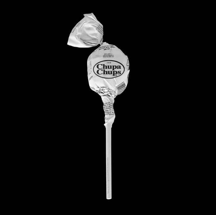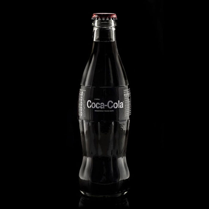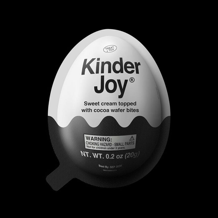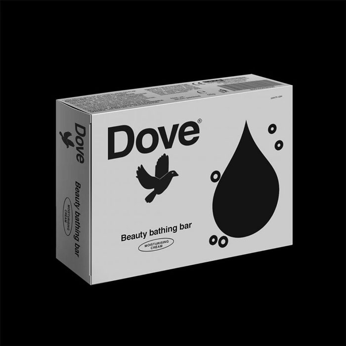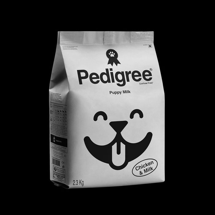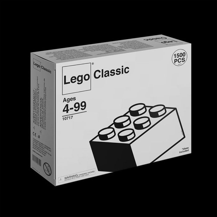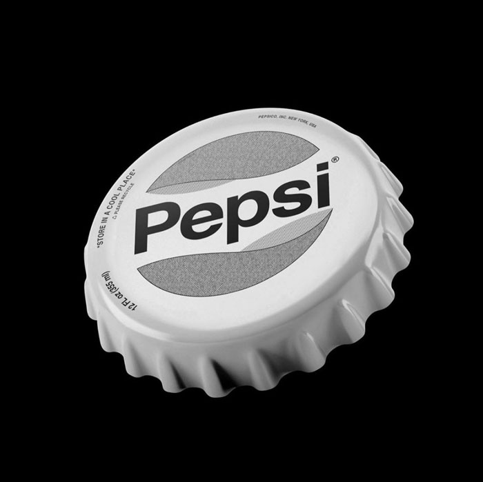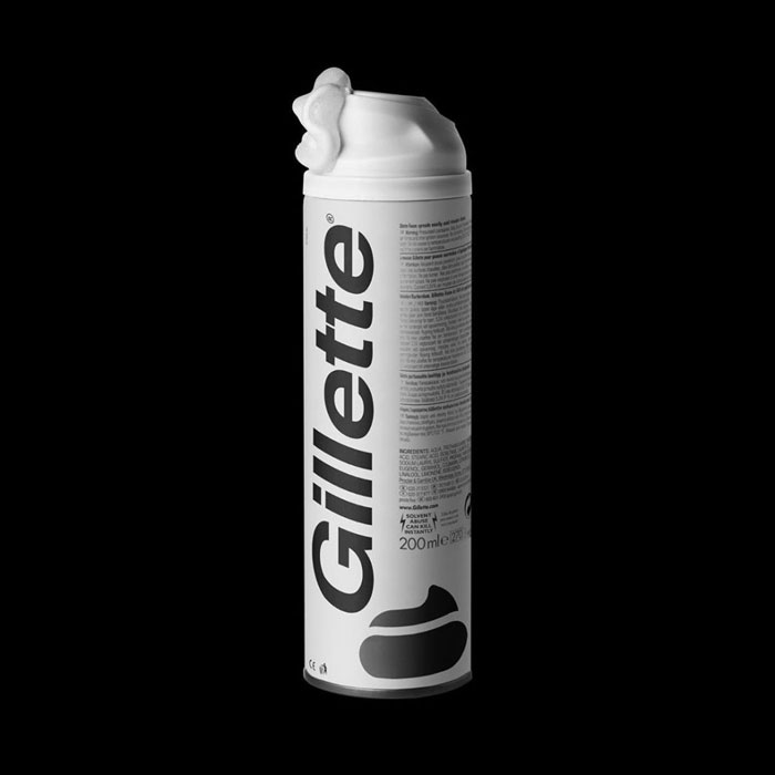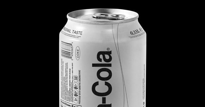
These 53 Brand Products Were Redone In Monochrome And They Look Surreal
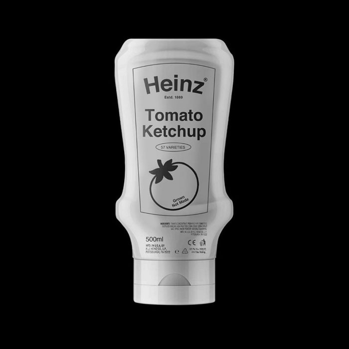
When it comes to selling a product, companies go out of their way to make theirs as attractive as possible. The marketing, the package design, and even the product itself scream in hopes of drawing your attention, whether they’re on your phone screen or on the store shelves. And thus we are constantly engulfed by the noise that these products make.
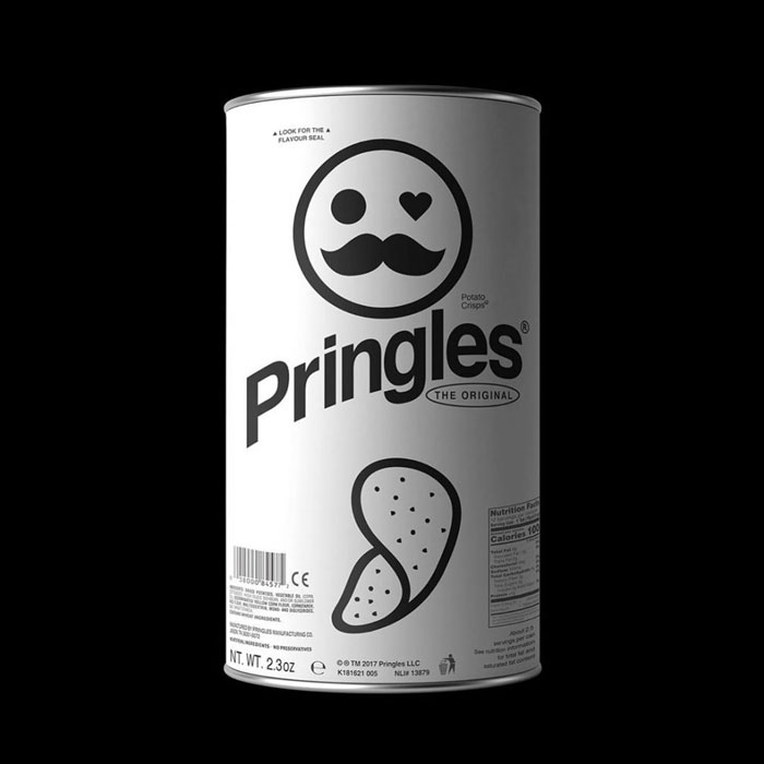
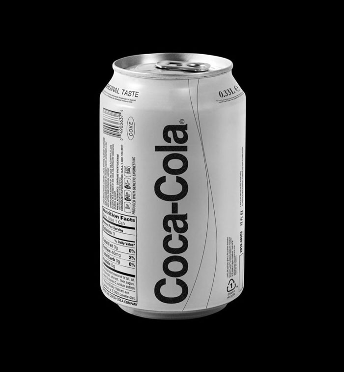
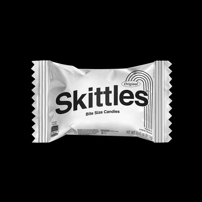
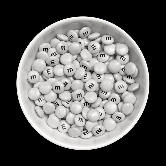
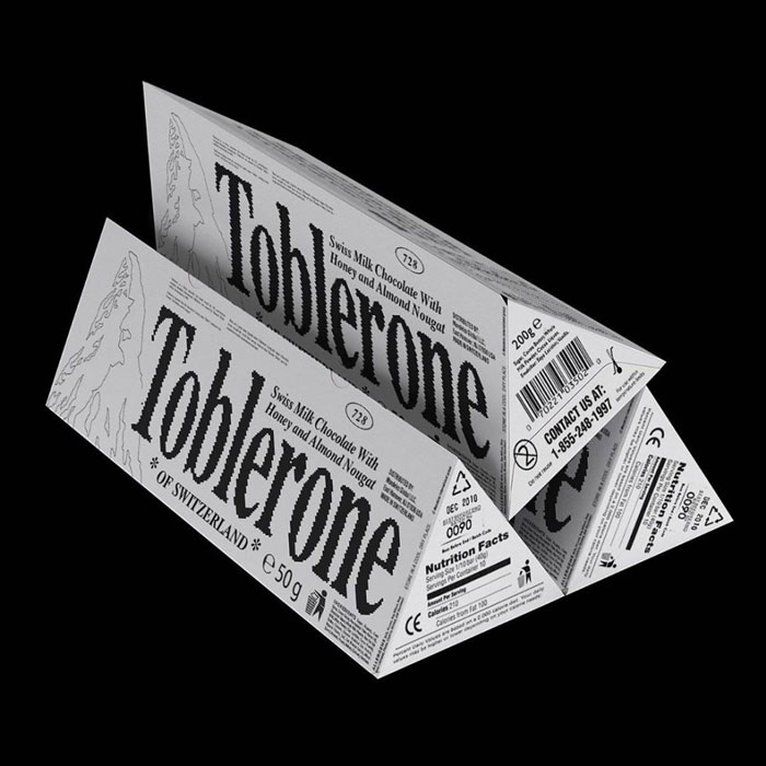
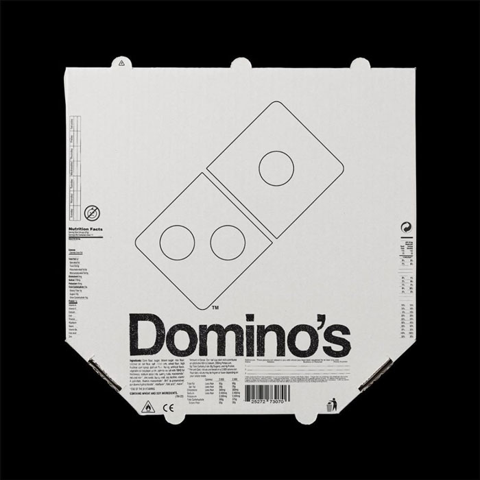
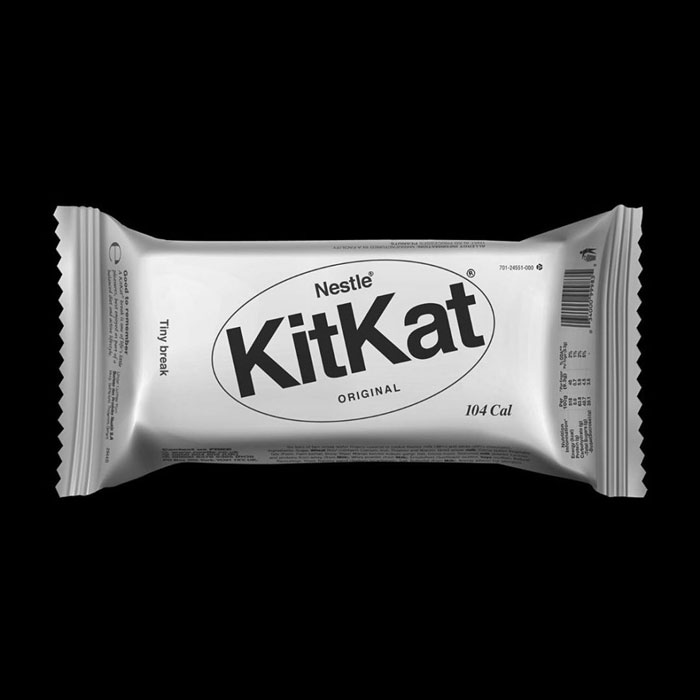
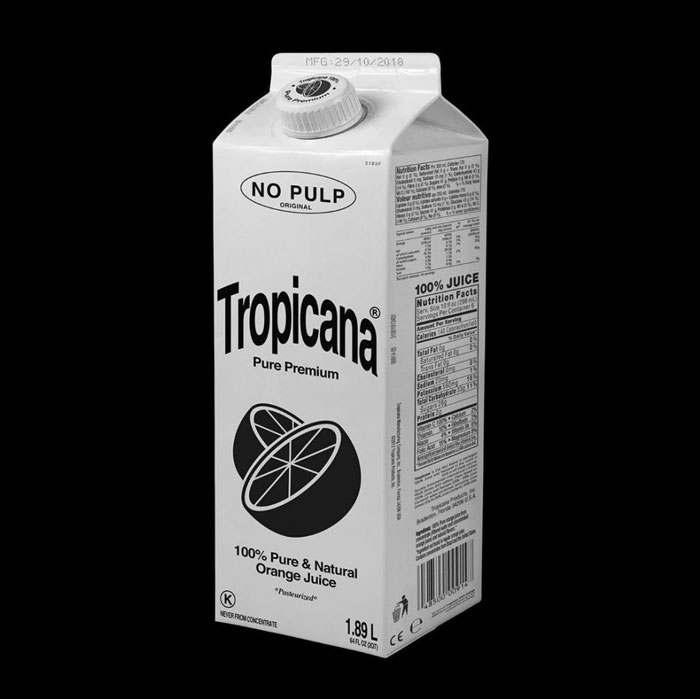
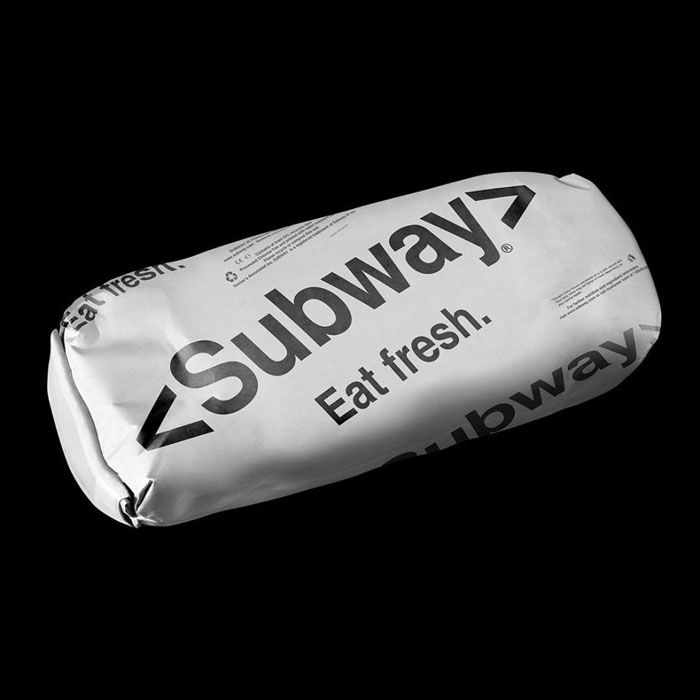
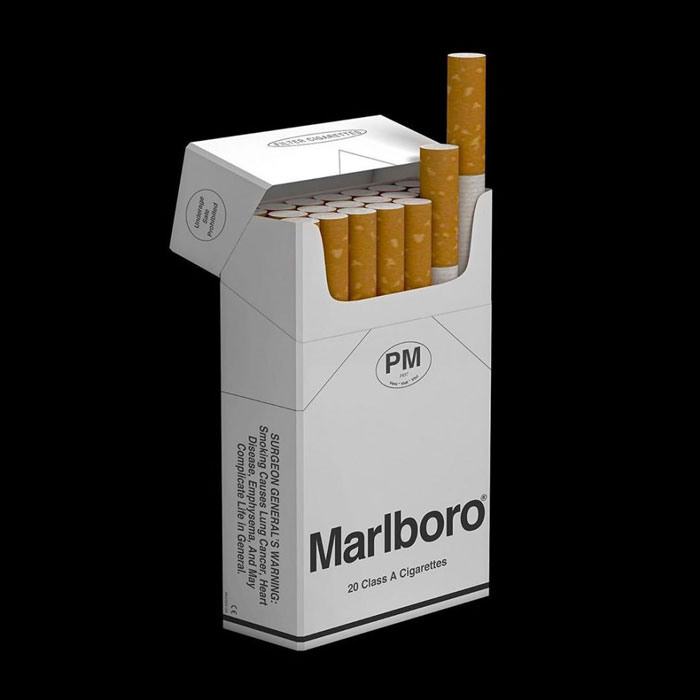
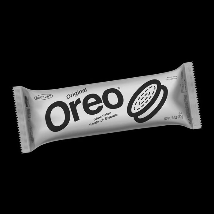
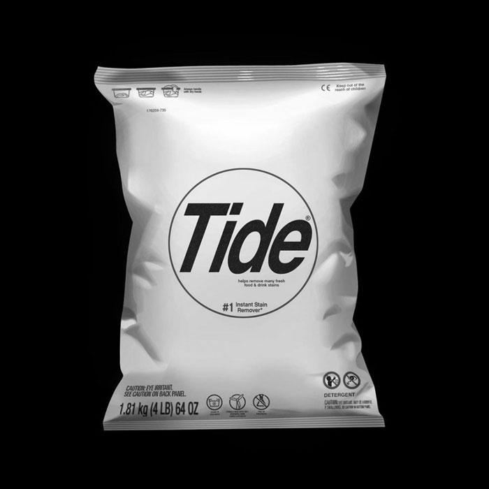
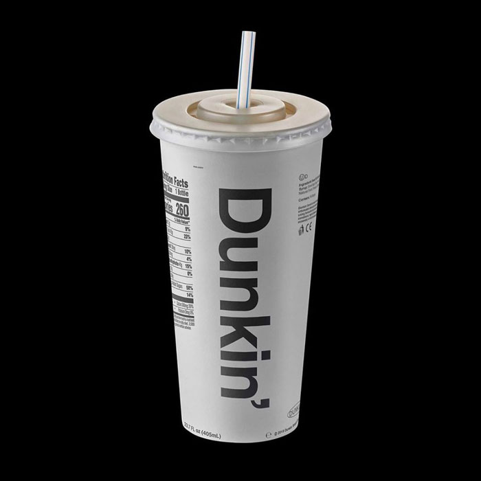
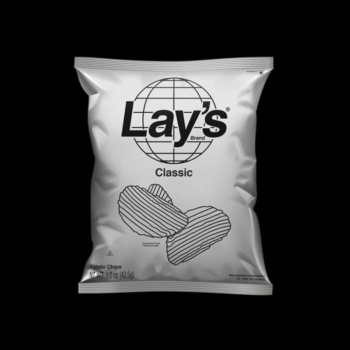
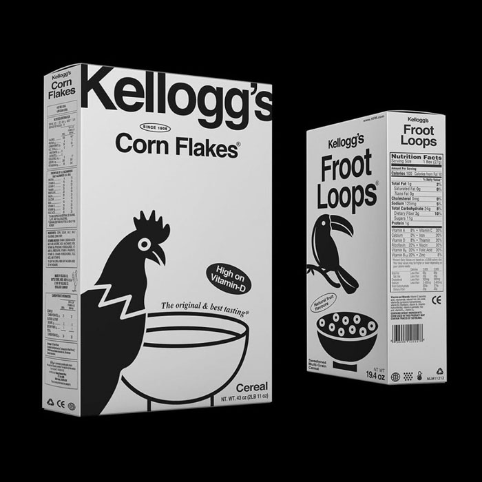
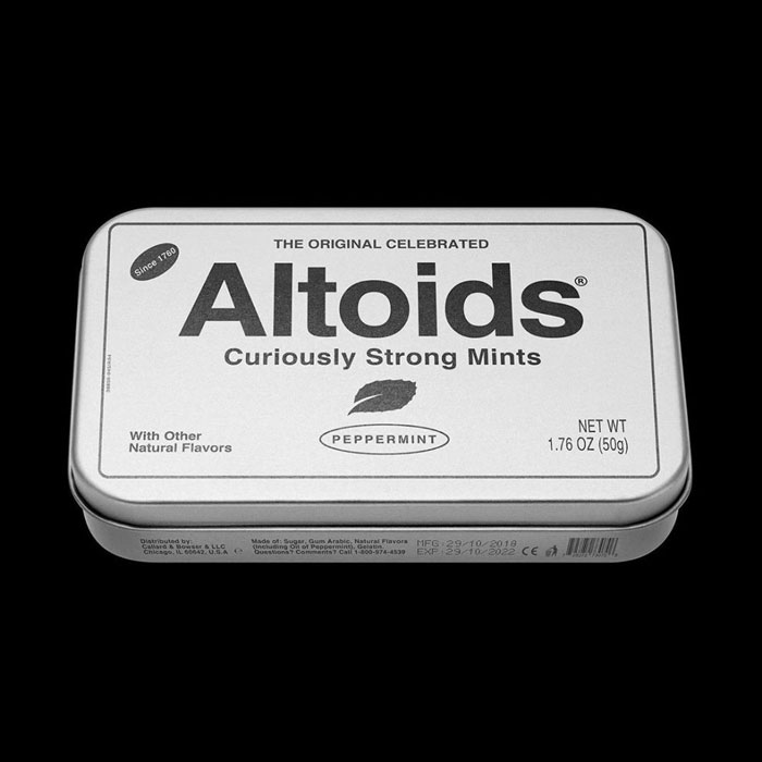
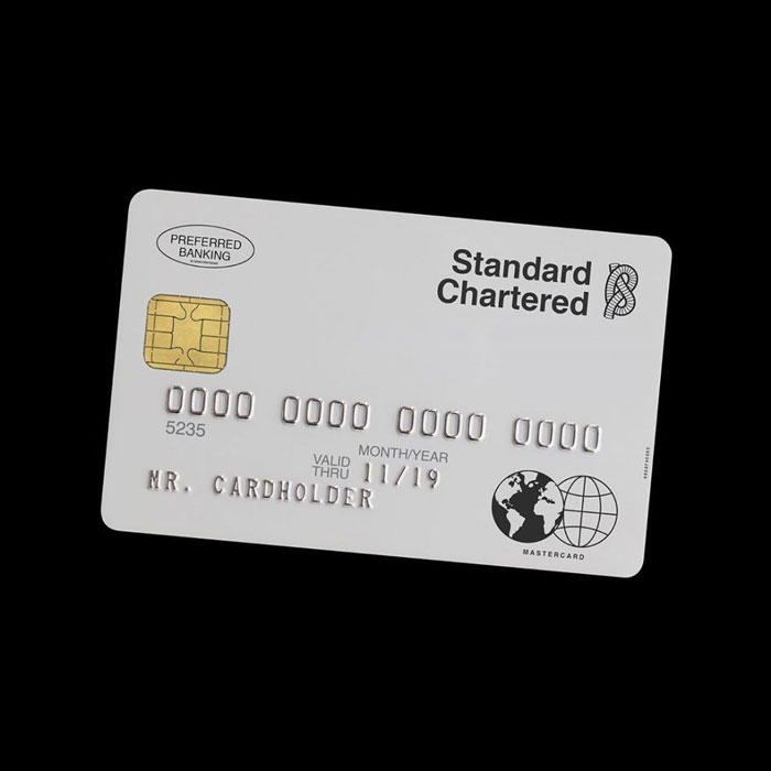
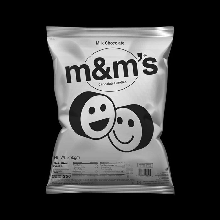
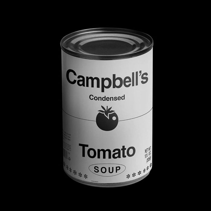
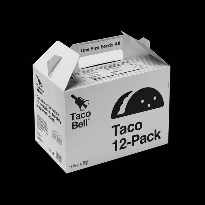
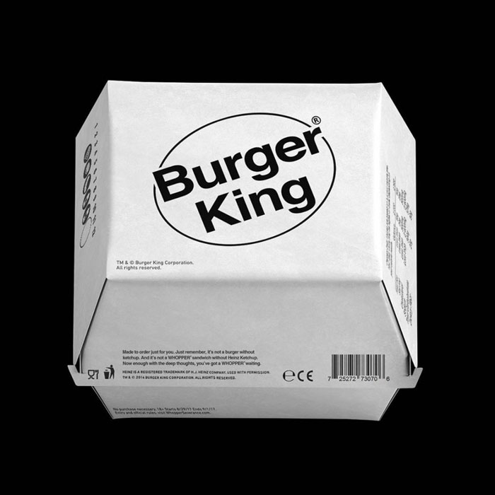
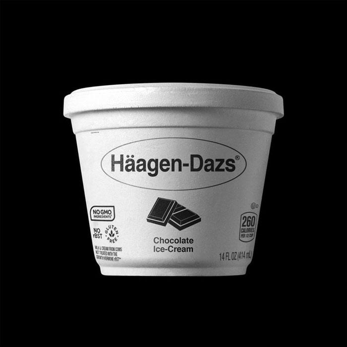
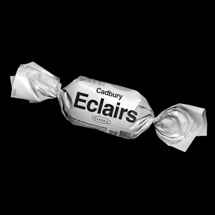
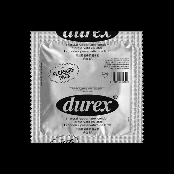
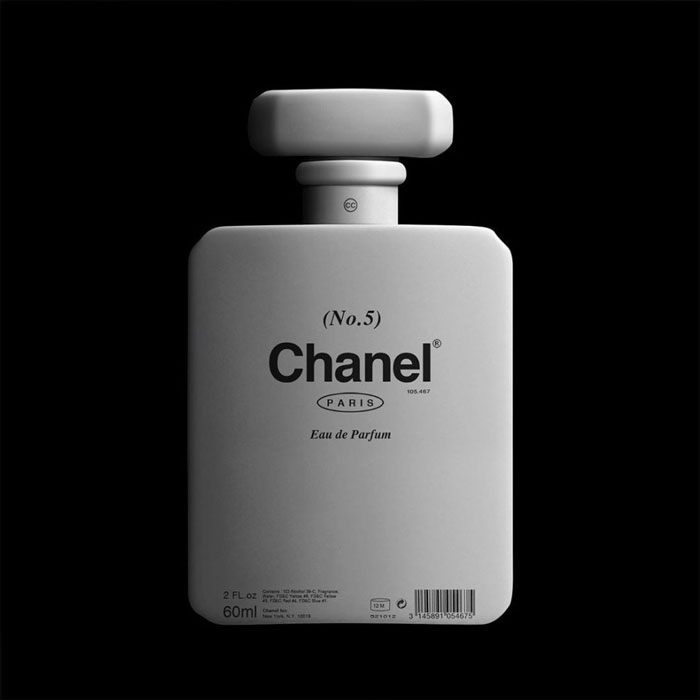
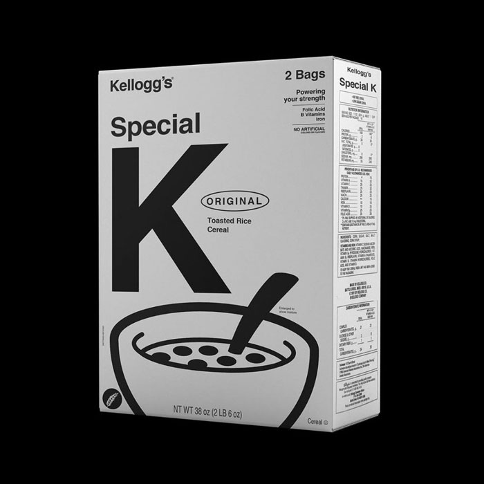
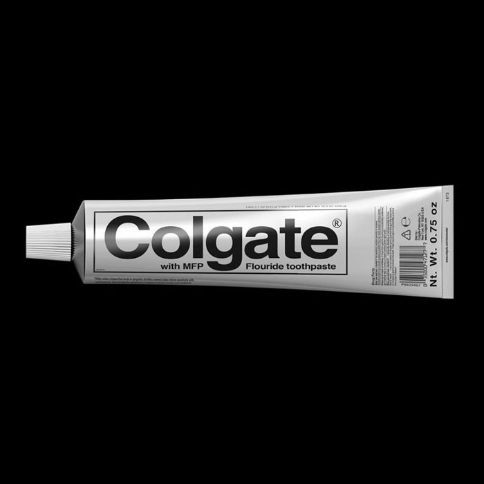
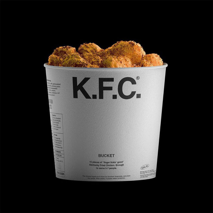
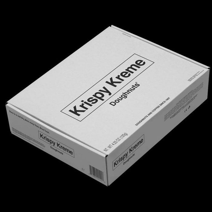
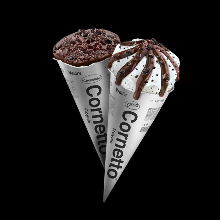
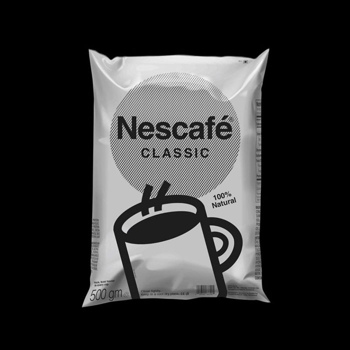
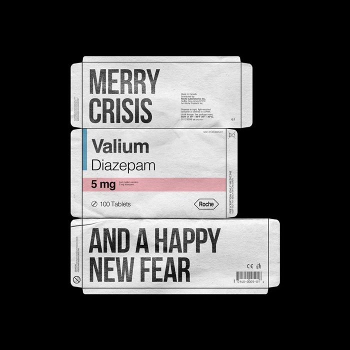
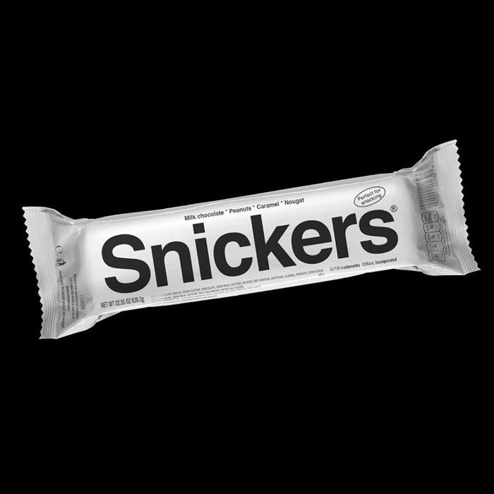
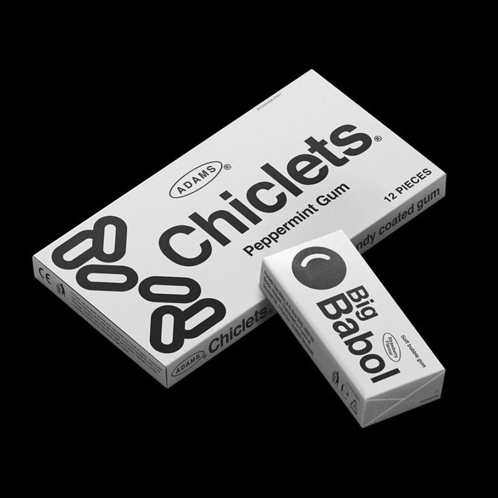
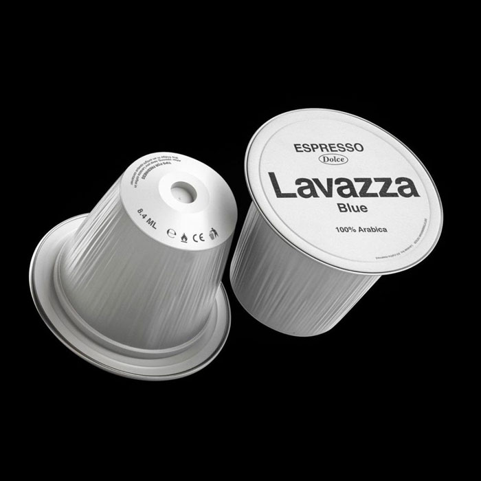
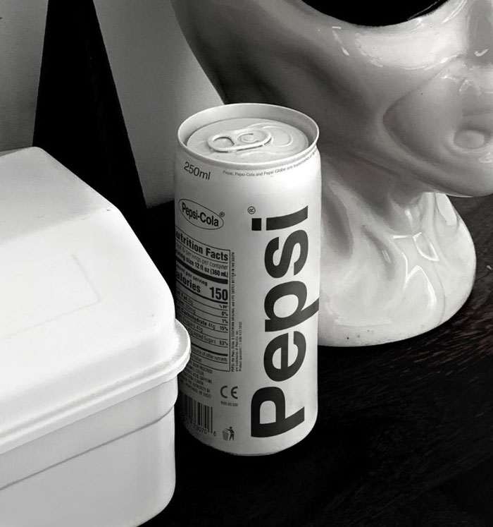
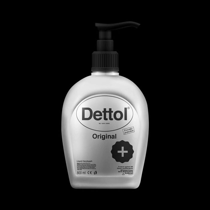
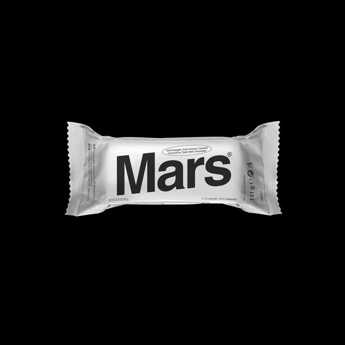
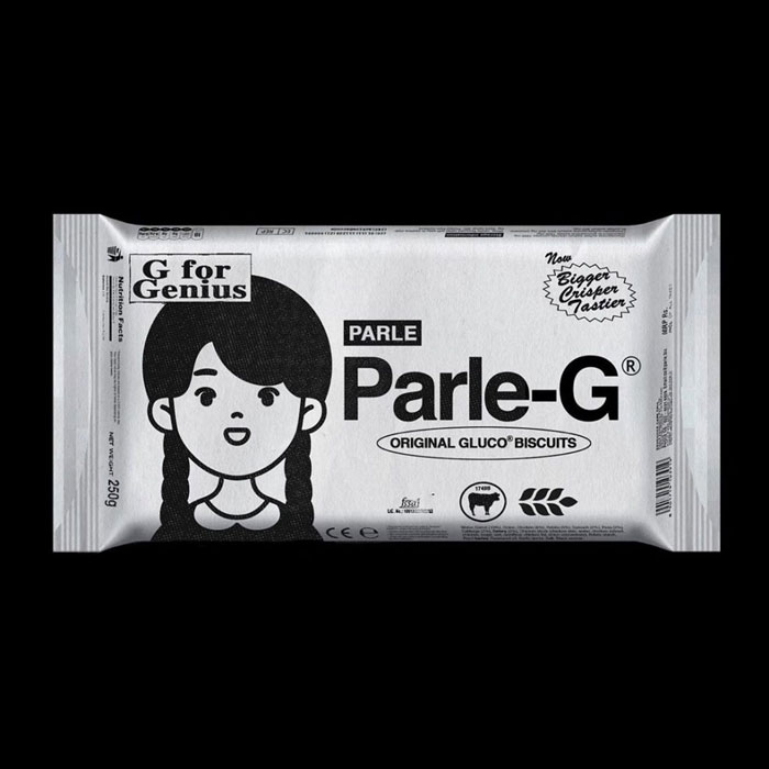
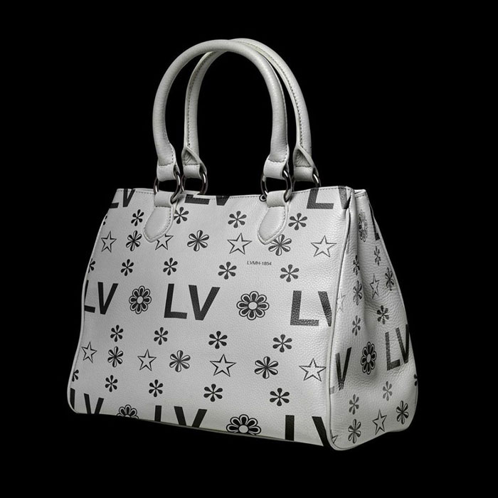
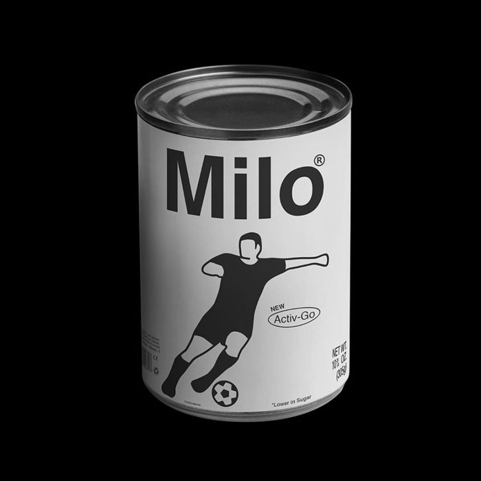
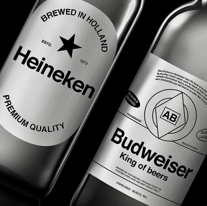
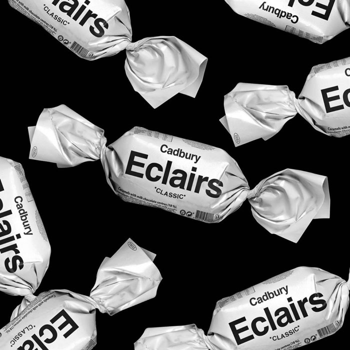
Kunel Gaur, an Indian artist and founder of the Animal advertising agency with whom Bored Panda got in touch for an interview, has decided to transform some of the well-known screaming global brands into generic, less noisy ones by giving them a dystopian brutalist design—a style that intentionally attempts to look raw and unadorned.
The artist seeks to experiment with this somewhat minimalist way of brand communication. By having blank brands that aren’t forcefully trying to draw people’s attention, these products might possibly lead to establishing a stronger connection with their target audience.
Bored Panda invites you to take a look at what the brands we all know and love would look like from a generic brutalist perspective. Below you will also find our conversation with artist Kunel Gaur.
This post may include affiliate links.
Do u mean it has good aesthetic? Aesthetic is not a adjective
Load More Replies..."The series is an ode to functional design inspired by Brutalism," explained Gaur the inspiration behind this idea. "In a world where all brands are trying to get your attention, I wanted to experiment with stripped down, product level communication behavior of known brands, sans the embellishments they're typically identified with."
I think they actually had a white skittles package at some point, I don't remember why though...
For pride month to “give up their rainbow for those who needed it” or something of that nature
Load More Replies...But theses are fruity chewy candies, were they once chocolate???
Load More Replies...But but I only like the blue ones how am I supposed to know which ones are blue if they’re all white? ToT
they taste the sa.... you know what, my favorite is the green and red
Load More Replies...Gaur also explained the symbolism and the purpose of these brutalistic designs: "The objective was to try and start a conversation about consumerism—the role it plays in our lives and the way we perceive it. Being a founder of a design and advertising agency, working with brands on an everyday basis, where it's part of the job to build one, this was also a meta-perspective on my professional work."
I don't see bad packaging or sadness. I see TRUTH on packaging and information easier to find. I see people making decisions on foods and products based upon facts and quality. Not flashy slogans. I see a more recyclable product container as some recyclers can't handle many colored inks.
It bothers me that dominoes are literally black and white, and do not look like the modified logo (ie you don't get an all white domino). At least fill the whole circle in black to resemble a domino??
A number of universally well-known brands are included in this experiment. We've asked Gaur if there was a specific reason why these particular brands were chosen. He said the following:
"I selected brands that have great recall, or contribute to the popular culture in some way or the other. Recall helps in being able to re-adjust the existing perception of the brand purely on shock value, followed by reason. The most interesting part of the project is the different challenges that each brand comes with. Some brands have mascots, while others use abbreviations (or monograms) as their brand name. To simplify the mascots or characters that are an integral (often most identifiable) part of some of these brands, I used pictograms keeping them close to the original form and proportions on the packaging."
Lastly, we've asked Gaur about his future plans regarding this project: "I plan to produce life-size versions of few of the brands from the series. They will be made in limited quantity in materials like marble dust and resin. Apart from this, I'm working on creating some work out of my writings—either as street art or installations where I want to explore this style further."
Strange, because Marlboro lights have white filters.
Load More Replies...They are both owned by Mondelez international. And some of the variations are sold under cabury brands. But considering this says “original” it is normally sold under Nabisco as you say.
Load More Replies...same.....maybe thats why people eat them....lol
Load More Replies...If not properly labeled, someone might mistake it as a bag of chips or ration.
Yeah! What if I'm 100 and wanna play with Legos? Rude!
Load More Replies...I can't give this to my nephew because he's 3 y/o and my grandpa is 100.
You're right! It sorta does! LOL! I'm not buying that for my brother the next time I go grocery shopping again!
Load More Replies...Wait why are there nutrition facts if you can fill the cup with different things
That’s what I said about the Domino’s pizza box, it had a Nutrition Facts panel & barcode... that makes no sense.
Load More Replies...There's a reason for all the air in the bag of chips. Unless you like your chips stale and not crunchy.
Load More Replies...Same to the first part. (I was the kid of parents engaged in overseas human welfare stuff)
Load More Replies...Their packages were cardboard rolls. It is really cool when you look into it! I had to do a whole project on m&m’s in sixth grade
Load More Replies...?? they're just taking the color from logos and packaging not the food itself, you can't fry white chicken
Load More Replies...I keep thinking of the vine with the jewish kid going merry chrysler, crisis, etc. anyone else?
Very true.. We have a shockingly bad history. And yes, I am English and I cringe with shame when I read about our history.
At least your not American! We have to cringe whenever we look at the CuReNT news!
Load More Replies...I honestly think designer hand bags, belts and clothes should just have "brand whore" written boldly on everything. Luis Vuitton is one of the worst offenders.
ESPECIALLY GUCCI!!! its bad because ist WAYYY overpriced but it’s also UGLY AF.
Load More Replies...How is generic white packaging....like counterfeit products you'd find at a dodgy "discount" store "dystopian"? Please, someone explain that.....because I'm fairly sure that the word doesn't mean what the author thinks it means.
"A dystopia (from Ancient Greek δυσ- "bad" and τόπος "place"; alternatively, cacotopia, kakotopia, or simply anti-utopia) is a community or society that is undesirable or frightening." This products don't look particularly desirable to me.
Load More Replies...I find them quite bad as brutalism is concerned. He just went all black and white and didn't remove much "adornments". The design is cool but let's call it "cool", "simple", "monochrome" but not brutalist.
Totally agree. Brutalism from MCM is fascinating. Strong, craggy, well-developed. These are more like the plain wrap products from the 1990s.
Load More Replies...I'm good with all of these, except that Tide bag that looked like a bag of chips/crisps
I think they used chip bags because they're easy to print upon or they only had equipment to print on those. I totally agree with you. I have zero problems with packaging being about information and not bright colors.
Load More Replies...Brutalist. "You keep using that word. I do not think it means what you think it means.”
The whole exercise reminds me of the generic packaging that was popularized in the 70's [USA] and still exists in some retail outlets.
Actually this is exactly like the design work for "Better Living Industries" (BL/ind) the evil corporation in My Chemical Romance's concept album "Danger Days: The True Lives of the Fabulous Killjoys", especially their "Na Na NA" video. https://www.youtube.com/watch?v=egG7fiE89IU
Growing up in the late 70's/early 80's, our local grocery store(King Soopers) in Colorado had an entire aisle of "generic" products in black and white packaging and there was a hamburger restaurant, I think it was called The Great American Hamburger Stand, that had all black and white packaging like this!
How is generic white packaging....like counterfeit products you'd find at a dodgy "discount" store "dystopian"? Please, someone explain that.....because I'm fairly sure that the word doesn't mean what the author thinks it means.
"A dystopia (from Ancient Greek δυσ- "bad" and τόπος "place"; alternatively, cacotopia, kakotopia, or simply anti-utopia) is a community or society that is undesirable or frightening." This products don't look particularly desirable to me.
Load More Replies...I find them quite bad as brutalism is concerned. He just went all black and white and didn't remove much "adornments". The design is cool but let's call it "cool", "simple", "monochrome" but not brutalist.
Totally agree. Brutalism from MCM is fascinating. Strong, craggy, well-developed. These are more like the plain wrap products from the 1990s.
Load More Replies...I'm good with all of these, except that Tide bag that looked like a bag of chips/crisps
I think they used chip bags because they're easy to print upon or they only had equipment to print on those. I totally agree with you. I have zero problems with packaging being about information and not bright colors.
Load More Replies...Brutalist. "You keep using that word. I do not think it means what you think it means.”
The whole exercise reminds me of the generic packaging that was popularized in the 70's [USA] and still exists in some retail outlets.
Actually this is exactly like the design work for "Better Living Industries" (BL/ind) the evil corporation in My Chemical Romance's concept album "Danger Days: The True Lives of the Fabulous Killjoys", especially their "Na Na NA" video. https://www.youtube.com/watch?v=egG7fiE89IU
Growing up in the late 70's/early 80's, our local grocery store(King Soopers) in Colorado had an entire aisle of "generic" products in black and white packaging and there was a hamburger restaurant, I think it was called The Great American Hamburger Stand, that had all black and white packaging like this!

 Dark Mode

 No fees, cancel anytime


