Get Premium
Dark mode theme is available exclusively for premium users. Learn more about the benefits of subscribing.
No fees, cancel anytime.

 Dark Mode Ad-Free Browsing Unlimited Content
 Ad-Free Browsing Unlimited Content Dark Mode
Join 1.2 million Panda readers who get the best art, memes, and fun stories every week!
Architectural visualizations are crucial to the design and planning phases of a project. They help communicate ideas, gather feedback, and make informed decisions before construction begins.
However, when you compare the finished building with its initial representation, sometimes you don't see the shining sun reflecting in its windows and the greenery around it that's more lush than that in the Garden of Eden.
So to remind you that what we see isn't always what we get, here's a collection of pictures that exemplify the contrast between the promised ideal and reality.
This post may include affiliate links.
This is the fish's younger brother who was dropped on his head as a child.
Load More Replies...The actual ones looks much better, less agressive and pointy. The back end of the planned was fine, but even though I don't believe in feng shui etc. the head of the top one messes with my energy and give me an uneasy feeling at the back of my neck. Stressed anxious feeling. The bottom ones gives calming vibes.
the architects designed a colossal monumental space with a billion dollar budget, unfortunately the library budget only allowed a few millions on a much smaller site, and wanted big office-style windows to look out over the neighbouring carpark
Load More Replies...Finally an "after photo" in approximately the same angle as the first one. And yes, it looks indeed like an evil spaceship full of stormtroopers 😬....
I see a long forgotten, failed, game-console.
Load More Replies...The exterior is quite disappointing. The interior is well done. Spacious and comfortable. The giant wraparound display is a hit with kids.
I want something light, airy, modern, welcoming…Look, the best I can do is a dry-docked Zumwalt-class Destroyer…Umm, okay?…
At this point, the phenomenon in these pictures is virtually a trend. In one of his articles for The Guardian, British architecture and design critic Olly Wainwright explains how he tends to find himself observing thesis projects produced by the best and brightest students of the UK.
But what he is struck by the most isn't the technical skill or imagination, but rather the sheer lack of connection these projects have with actual, built, imperfect architecture: "Time and again, the projects seemed intent on fleeing the real world of people and places, scale and context; retreating instead into fantasy realms of convoluted forms with no seeming purpose."
Its not ( and almost never is ) incompetence of designer or builder but budget cuts and changes made because of them
either an unskilled architectural firm couldn't figure out how to make construction detailing for the complex façade in the original design, or the contractor value-managed the hell out of the project.
Almost looks like they decided that reflective panels were not a good idea. Was it the Guggenheim in LA where the sidewalk temp was like 140 degrees due to reflective panels?
Walt Disney Concert Hall. The shiny steel outer panels were reflecting the sun into the windos of surrounding office towers.
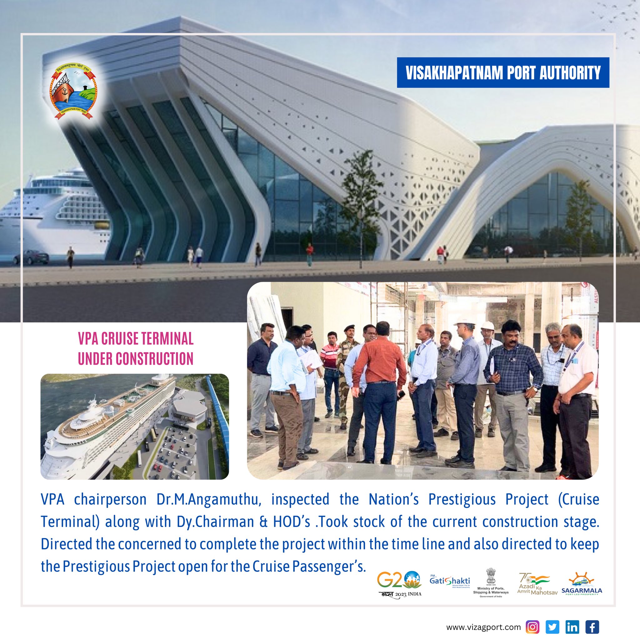
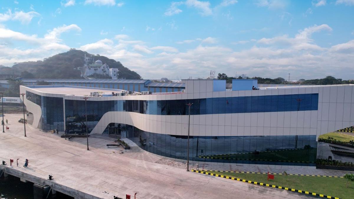
Load More Replies...Ugh…this is so misleading. The terminal was supposed to launch this fall and has been delayed. The first picture was one of several submitted and not the final design. There are no actual cruise ships that currently visit Visakhapatnam yet. The delay is until March and the angle of this photo is also misleading. It’s a beautiful building and once landscaped and after construction is completed, it will be exactly what was ordered.
That building is not beautiful, let's be real. I worked in engineering and construction in India for 5 years. This is typical, sorry mate! :)
Load More Replies...too bad they didn't go with that design; plenty of tall bamboo on each side can hide it
TBH, if I hadn't seen the first version, I would've thought it was great.
Why do these renders look so futuristic and the actual buildings so downsized and bland? 😩
Using things that are not standard shapes such as 90º angles adds huge costs. Most will have to be specially ordered and manufactured and that will be very expensive. If it's a privately financed building then it doesn't matter but when it's a public one paid for by the community it's pretty silly to expect they'll spend that money.
To be honest many of these are the perspective and angle of the picture plus building are not shiny and alone as in the design
We dream big here but reality crashes us to the ground!
Load More Replies..."There [are] scaleless worlds of splintered shards and riverine landscapes, in which forlorn mechanisms had been implanted like post-apocalyptic ruins of a distant-future race," Wainwright explained.
"Clouds of lines and layers were regularly employed as a smokescreen to disguise the fact that there wasn't really an idea at all: visual complexity masking conceptual thinness."
It's a design engineer who draws these buildings in Revit. Graphic designers focus on print media and multi media designs.
Load More Replies...All the "reality" pictures are taken in the worst lighting. The poor lighting doesn't even give it a chance. How about better lighting in the reality pictures or have the concepts rendered in suboptimal conditions like the real images.
The artist drew completely modern buildings around it, whereas in real life they're quite awful.
Load More Replies...I don't get either one. Is that the same Turkey whose leader recently said (the equivalent of) that the Earth is flat ?
another sad, too bad, they didn't built it per that design; and why couldn't the architect make it look better instead of this
In order to sell projects, they brighten up the facades and exaggerate the number of pedestrians and cyclists in their render. They also invent greenery that doesn't exist.
It's the brightening. So many of these are so dark in reality. The tinting on the windows, the material of the outside, etc, add darkness to the buildings once they are complete, and they look like sad versions of the rendering.
Most of it is what is termed 'brutalist' architecture. They looks so damn plain and sad.
Load More Replies...Ok what's the problem? I don't get it! As they could control people to walk by or cycle through while pic is taken! And what how old is the building when the pic was taken? If it's like a few years old then what do you expect in a city environment to happen with bare concrete? Yeah right! it gets dirty really quick. 🤷
Its actually only a few years old and has looked like this the whole time. It´s like a big grey boring box unfortunately. The "dirt" is supposed to be a flowery ( i think) design that shows only when it rains and they totally messed that up. But I agree on your point.
Load More Replies..."they brighten up the facades ... also invent greenery that doesn't exist." Some things to consider are the real pictures should not be photographed in the worst possible conditions and it's not the architechs fault they don't use the greenery suggestions. They could absolutely do that and make it look better, but dont.
Both ugly. About the greenery "that doesn't exist': that was probably also meant to be planted.
Yes. A tree somewhere.... anywhere! would soften it so much.
Load More Replies...Did they get fed up and just chuck an enormous fishing net over a random building?
Urbanist Vanessa Quirk agrees that it's a trap many architecture schools have fallen into, not just in the UK but around the world.
"It's not just a symptom of the misguided nature of architecture education. It's also symptomatic of architecture's obsession with the image of architecture, an image completely detached from reality," said Quirk, who is the interim president of the board at Urbanist Media, a non-profit trying to elevate underrepresented voices and preserve the places that matter to them.
if the photo was taken from the same angle it would be about the same. also a pic at night would show the highlights when its lit up and have a similar look.
It is the same angle. Better lighting would certainly help, but it is quite an ugly color in any event.
Load More Replies...Why would you build a building with windows, for people to be in, and then put it in some kind of cage so people can't look outside?
There's quite a few of these in London and I always wonder the same thing!
Load More Replies...I don't understand what do graphic designers have to do with architectural CAD renders... lol. I am a graphic designer.
Load More Replies...Odd. I suppose it comes down to budget but there's a building in a city that starts with a B in England that looks remarkably like the illustration, very futuristic, curvy and with shiny metallic circles I love it so much.
a horrifying result -- at least the trees look better IRL than the render
Right? The trees don’t look real in the render 🤷♀️
Load More Replies...Those little 'house silhouette' structures on the top floor of the smaller buildings are so cute! It sucks that they got rid of those.
I build brutalist structures like this specifically to make my depressed Sims lives even more miserable.
This is pretty standard high-rise in Moscow. And they are far from safe
If you spent millions putting up a building I think you'd want it to meet your expectations.
Load More Replies...Quirk believes the idea of the "perfect" architectural image is not only propagated by professors who prioritize the rendering over its practical implications (causing students to spend hours perfecting visuals instead of perfecting the design).
In her eyes, the architectural media shares the blame. "[It] presents a flood of glossy shots that 'sell' an idealized architecture to the public and, frankly, architects themselves."
Let's be honest.... Who is making 100x80ft chunks of glass for designs like this?
Someone who makes an obscene amount of money.
Load More Replies...those design architects did a nice visualisation, but have zero clues about the depth requirements of roofs, let alone a green roof or mature tree planters.
Contractor- looks at rendering ones, tosses away. THIS will look MUCH better.
my eyes tell me the architect draw something that could not be built as designed and what they got was as close as the engineers could do
This is just horrible. Ever watched the movie Coma with Michael Douglas (1978) ? You're welcome
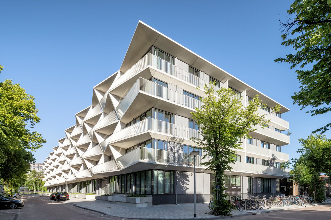
The real building doesn't shine very much, and the reality is painful. Söders Höjder in Helsingborg is Sweden's third ugliest new building in 2023 and also the building with the year's worst fake view.
does it look any better at night? any better? cuz daylight looks like it's just got up from a bender
Looks like a modern rendering of Old Mother Hubbard's shoe.
That's what I was going to say a little work and it would looks so much better as a shoe.
Load More Replies...hahaha - like a modern 'old woman in the shoe' and then they built it even worse, omg
the real building at least has character, which the rendering truly lacks, albeit somewhat dystopian.
🤣 the building isn't even finished yet. What is this article? Let's bag on Swedish architecture? LOL
The danger of this is that the image exists independent of the concept, to be evaluated as a graphic, or as Quirk put it, "The architecture itself is erased, eclipsed by its image."
The proliferation of such pictures could lead clients and the public at large to expect from architecture and architects a degree of quality, perfection even, that is impossible to deliver in the real world, and thus, disappointment.
I drove past it a number of times, it looked terrible, thankfully it has gone
I don’t understand why it was ever approved. I saw it on TV not in person but wasn’t it just an incredibly expensive, artificial hill / viewing platform.
Load More Replies...When you are trying to distract the populace with Bread & Circuses, only to find out the bread is moldy, and all the elephants died.
I don't understand the purpose of it even being built. It's not a real tourist area. There isn't much to see there. Elevating people isn't going to make the scenery around it more exciting. It's an extremely busy traffic junction.
Here is not only the time of day but also the surroundings (people versus other things) make it look totally different, but without that, it's rather similar.Still, very ugly.
London summer of 2021, it cost 6 flipping million pounds
Load More Replies...This one is really true to the design though. Or do we really expect the contractor to hire people to dance in front of the building all the time and to build trees and to make sure people never take pictures from other angles? Apart from the reddish balcony thingy and lighter coloured walls, it's the exact same. Really cool building by the way, I love those wavy lines.
I like it, too. Painting the building would help immensely. Aquatic murals optional
Load More Replies...If they painted it, this would be great. I like the scallops and the little happy face!
I kinda like the second one better. doesn't look as angry as the top one
Maaaaaan, WTF happened here? It's like, somebody went to the cheapest discount store they could to get building materials then hired a C grade construction company and said "we want this, but we have this."
Horsecrap article...misleading...here's how it actually looks in late 2023 hofbrau-65...98ee87.jpg 
Upper: Classically European and elegant. Below: A Mexican restaurant in the American Southwest.
That's the problem with most of the pics in this sub.. and no info about how old the buildings are when pics where taken. It seems this one is still in the "building up- phase"...
Load More Replies...It definitely deserves more landscaping on those balconies level, but it's not really that far off the render 130-Hawtho...85-png.jpg 
The glass rail on the balcony would've made a big difference.
Slightly idealized renderings are often seen as necessary means to sell the idea of a design to a client, in which case a bit of artistic leeway becomes an unavoidable evil.
However, as Quirk asked, once that idea is sold, "what happens when a more realistic rendering, one which shows as truthfully as possible how the building will look (air conditioning units and all) is presented?"
OK. Not gonna lie. The finished product may not look the same, but I am really liking the way that facade turned out.
Who gets to go out every morning and sweep up the little bird corpses?? I hope that it's not in the path of any migratory birds, that could be tragic.
Agree. I think the actual version turned out much better than the concept.
Load More Replies...I think they did an admirable job of keeping the form close to the concept, perhaps the glass could have been more reflective to get that mirror effect, but it shows how s****y a rendering can be.
This, to me, looks like an oversized air traffic control tower. In both images.
If they used the copper colored cladding, this would actually be close to the rendering.
BP have really vacuumed all things from https://www.arkitekturupproret.se/ 🎅
Load More Replies...Everything looks better on a sunny summer day than on a dreary winter day. The biggest difference in several of these is the presense/lack of lush vegitation
It seems that the photos are all from overcast days whereas the renderings depict lots of sun. The renderings should depict the way it will be seen most days of the year, but the photos should be taken in similar sunlight for fair comparisons.
goes to prove that some people cannot think in 3 dimensions -- as a design professional it's worse crime than being a colour-blind air force pilot.
I've been to this museum a few times, and I had never seen the rendering. From the street, it is interesting, although the space inside the new wing gets a little weird when trying to navigate through exhibits. I don't hate it.
Why? Why taint a beautiful old building with "Hyper modern" additions like this?
The ROM extention is so poorly built that the floor shakes when people are walking on it. Imagine the damage to the display.
But how many times does someone look on top? Anyone who walks or drives by, just sees a boring block, in both pics
I keep thinking (when I look at the front) that it’s the high school from Miraculous!
When the rendering sets expectations far higher than anyone can achieve, does the realistic one become useless?
Is the stylized version of the rendering actually bad for architecture in general?
Should everyone just stick to models and forget renderings altogether?
I guess, time will tell.
If the architect would take into account how the exterior will look on gray overcast days, it might improve the appearance of these modern stark structures.
The "magnets" wouldn't be there if it were not for advertisements. Without them it would look very much like the rendering. Except that's also just a big block.
Also they used black and not white for the base for...reasons? But yes, most buildings just need a good washing.
Load More Replies...In rendering it's white, and probably not concrete but marble or something similar. They probably ran out of funds. To be honest, if they just painted the bottom concrete white, it would be even worse.
I think this one turned out remarkably close. It might be even closer if we saw the real building from the same angle as the render.
Most of these building look like they decided to add many more floors/rooms (£££ - I don't have Euro symbol on keyboard, sorry), and I think that is why many of them have ended up with reduced slopes/planes/cutouts. Also, 'concrete grey' colour has always been dire, imo.
Honestly, compared to the others, this is not *that* different...
Again at a different time and angle. But this turned out rather neat. Certainly for a court, I like it.
I honestly don’t either of them, but the top one is better compared to the bottom.
Maybe because the actual render depicts an unsafe building. That blade-shaped portion hangs over with no support. The actual building is actually a very successful and much safer version. It even looks halfway decent!
Load More Replies...It was designed by Daniel Libeskind, very famous architect. And when you get it in the right angle it's basically the same as in the render. Of course most of examples here looks bad because of poor lighting. When we are looking at the renders we always have very bright light, almost unreal. 179_zlota-...a8c69a.jpg 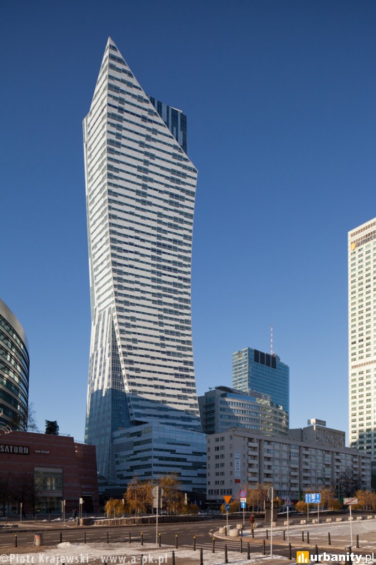
Maybe it turned out this way because the rendering was unrealistic, as far as construction is concerned?
This one is pretty close. Just not as steep an angle at top and the base is bigger than the rendered version.
It looks fully erect and powerful in the rendering; the actual lost the whole effect and affect
Yet if you didn't knew that rendering than the actual building is quite pleasant.
You have an unusual concept of "pleasant". Rendering and reality are both ugly as hell.
Load More Replies...I don't like the colour of the finished building. Looks like they got mustard all over. And why those randomly placed balconies? Or are they working on them still?
If I didn't know what the building supposed to look like, I don't think the bottom ne looks that bad.
The architect rendering looks like a plastic bag slapped up against the building
Yes, it had potential to be as grotesque as the rendering and I think it succeeded.
There is something similar in Prague, for years I thought it was just unfinished
Yes, the after was taken from the worst possible angle.
Load More Replies...The 3D effect of the orange wall is there. But seems like they give up on it half way through the project
Pune is like 10 years in the past as infrastructure and public transportation sucks so of course they’d not be able to construct a proper metro station
The designers dream big but the constructors must stick between materials limitations
Exactly! And most of the time the building owners make changes and cutbacks when the pricing comes in. They end up making so many changes that it often sacrifices the beauty of the original design. Champagne taste with beer pocketbook.
Load More Replies...whoever chose these pictures for comparison should have taken them from the same angles
According to the vision, the place would suddenly become much brighter when the hotel will be completed. Unfortunately, they were wrong.
Still a pleasant looking building. Hardly the worst I've seen on here.
The real one finally has the impressive window features shown in most renderings...
Load More Replies...They are both big blocks, but the real one is easier on the eye.
Given the difference in lighting they actually got really close with this one.
I think they look very similar, but I don't like either one. Wouldn't want to live there!
Done right in Groningen, the Netherlands. Here's the render. http://tinyurl.com/47r4j62b And this is what was actually made. http://tinyurl.com/243dmse2
Please stop taking pictures from different angles and in different day times to compare and then say "they not delivered what they promised"...
The first one isn't an actual picture, it is the artist rendering of what is promised. Are you going to volunteer to go out and try to match an imaginary angle with a real camera?
Load More Replies...The result angered the residents who had expected a white house. Those responsible replied that they saw no problem with the illustrations: "We have done what we said we would do. Not everyone can love a house."
How about instead of painting the balconies those sad brown and beige colors, they paint them in the brighter shades of the render? No, they can't, as that'd make things too pretty. 🙄
Another one that pretty much looks the way it’s supposed to
A big difference is that somebody forgot about the sun causing shadows, duh
The artist forgot that the sun creates shadows. Otherwise, the reality looks good.
Not that bad, I actually like the real building. They should merely change the color of the light, to blue or white for instance.
There is at least 4-5 changes as I can see on a glimpse, but they both look good, just a bit different
Load More Replies...Why do these buildings end up looking dingy? Is it the lighting the reality pictures are taken in? Is it choosing a darker building material? Photoshop?
In many cases, I think it's weather or weathering.
Load More Replies...This is not what was promised, but I think it's cool. I actually like the contrast between the bottom and the top.
Actually, it's hard to believe that they pulled that off...
Load More Replies...The actual building is much better imo! The rendered one is really ugly, but the real one looks goods.
It’s the same. Designers always light it up. Reality isn’t like that.
I like the real one better. It's cleaner/tidyer. The rendered building is too chaotic.
The tower is very similar, it goes downhill from there, literally. I hate the smallest one sticking out askew to the other buildings
I think the real one is more chaotic. More contrast and especially, the strange position of the smallest building. I don't like that at all
Load More Replies...It's an ugly building either way but as far as similar this one looks pretty good compared to others
Actually close to the rendering. Just the render is made more dramatic.
Maybe the modern technology is not there yet to produce such mesmerising materials and visual effects
Well, it would have helped to use pictures of the finished building
Load More Replies...We have been to a concert there. It is FANTASTIC with 110% focus on sound. And the building blends perfectly into the surroundings. 👍 to Hamburg
Here are some better pictures. The finished building is actually really beautiful. https://www.nord-luftbilder.de/m/7874864/elbphilharmonie?l=de
It would help to use pictures of the finished building instead of the construction. Also the reality looks quite similar to the plan. The biggest problem withe the Elphi is not how it looks but how MUCH MORE it cost 🙈 Edit: I think it's a beautiful building. I tried to insert a pic of the correct angle for you all but I somehow can't get it to work... sorry.
It is in Hamburg, Germany. And there are many many better pictures of the finished building. Hamburg loves its Elbphilharmonie.
Am I the only one who couldn't give fewer figs about the people in the renderings? The proposal is for a building. Not a park. Not a sidewalk. Not a bright future where everything is carbon neutral, and there's no pollution. It's a building. And this one seems remarkably dead-on compared to some others on the list.
Yeah...if the complaint is that people are too lazy to walk anymore thus the picture is wrong, than I'd say it's doing pretty good considering.
Load More Replies...Whoever wrote this article cant seem to grasp that an artistic render is not a blueprint, nor a final version. In real life they need to take into account materials and physical limits. And in the examples where the buildings match pretty well they just b***h about the amount of people in an ARTISTIC RENDER.
Wait is this Copenhagen? I have seen these in person... whoever took this picture must have a cheap phone because it looks better in person....and in reality there were a ton of people on the street
yup, duh. and at least in the 2nd one, the picture is in proper lighting
Load More Replies...Architect: Here is a very pretty design! Civil Engineer: Here is what is structurally possible to build.
Civil engineer addition: And what is within building codes.
Load More Replies...This list is telling me one thing if I ever need to have a building built avoid Sweden.
Many are disappointments because the projections are on a sunny day, all lights turned on, thinner, and taller. Also, glass buildings are imagined almost transparent, which seems impossible at least in daylight.
I think that's sort of false advertising. Window tinting/coating is definitely a thing that needs to be done for the sake of all the people working in the building (and maybe birds), so I would consider it a problem that buildings are portrayed as being transparent when they literally can't be.
Load More Replies...The reason could be that swedish design plans are available online. Easy to get.
Load More Replies...So many of them are really nice and I don't get why people would complain about the lack of people or bikes in the real image. And so many of them are photographed from a different angle and a at a different time of the day or maybe season. For sure it looks different.
Article writers still hasnt figured out that foot traffic isnt always constant lmao
Load More Replies...Most of these look like they had massive building costs cuts. Where the architects dream encountered the reality of available money.
That's also an explanation for some... maybe they couldn't get the materials they wanted in time and had to take what they can get in time...
Load More Replies...So we learn there's two questions clients have to ask when seeing architect renderings: 1. What material is the building made of that's going to give it this cool glow? 2. How about showing me a drawing where the interior lights are turned off?
Exactly. 3. Can you give me a drawing without trees and people, on a cloudy day, from a less flattering angle?
Load More Replies...This list makes gottenburg, Sweden a place with ugly buildings everywhere. Looks like architects in Sweden have no clue about reality when it comes to building materials. Not the builders fault.
My sense is that most of these are merely early concepts and design exercises vs final design. The builder didn't just "build them differently" as is implied. Sloppy and lazy article BP.
Architect: Here is a very pretty design! Civil Engineer: Here is what is structurally possible to build.
Civil engineer addition: And what is within building codes.
Load More Replies...This list is telling me one thing if I ever need to have a building built avoid Sweden.
Many are disappointments because the projections are on a sunny day, all lights turned on, thinner, and taller. Also, glass buildings are imagined almost transparent, which seems impossible at least in daylight.
I think that's sort of false advertising. Window tinting/coating is definitely a thing that needs to be done for the sake of all the people working in the building (and maybe birds), so I would consider it a problem that buildings are portrayed as being transparent when they literally can't be.
Load More Replies...The reason could be that swedish design plans are available online. Easy to get.
Load More Replies...So many of them are really nice and I don't get why people would complain about the lack of people or bikes in the real image. And so many of them are photographed from a different angle and a at a different time of the day or maybe season. For sure it looks different.
Article writers still hasnt figured out that foot traffic isnt always constant lmao
Load More Replies...Most of these look like they had massive building costs cuts. Where the architects dream encountered the reality of available money.
That's also an explanation for some... maybe they couldn't get the materials they wanted in time and had to take what they can get in time...
Load More Replies...So we learn there's two questions clients have to ask when seeing architect renderings: 1. What material is the building made of that's going to give it this cool glow? 2. How about showing me a drawing where the interior lights are turned off?
Exactly. 3. Can you give me a drawing without trees and people, on a cloudy day, from a less flattering angle?
Load More Replies...This list makes gottenburg, Sweden a place with ugly buildings everywhere. Looks like architects in Sweden have no clue about reality when it comes to building materials. Not the builders fault.
My sense is that most of these are merely early concepts and design exercises vs final design. The builder didn't just "build them differently" as is implied. Sloppy and lazy article BP.


 No fees, cancel anytime


 In Buffalo, But Failed To Be Built Correctly Or Finished At All")


 In Gothenburg, Sweden. Those Windows Look Really Different")

")
")