443Kviews
Artist Colorizes 30 Old Photos, And It Might Change The Way You Perceive History
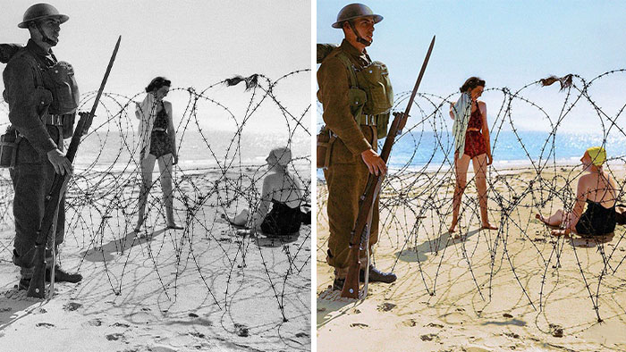
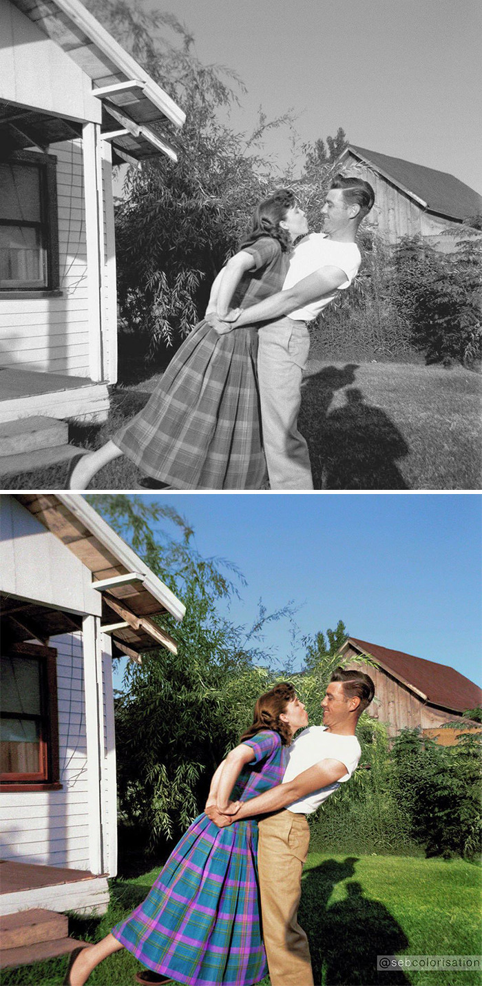
Interview With ArtistKeeping memories alive can be done in many ways, but photographs are probably one of the most common ones. Photos capture a moment in history, memory and serve as a reminder of how it used to be. However, really old photographs are in black and white, so it's often hard to relate to them and see yourself in that time.
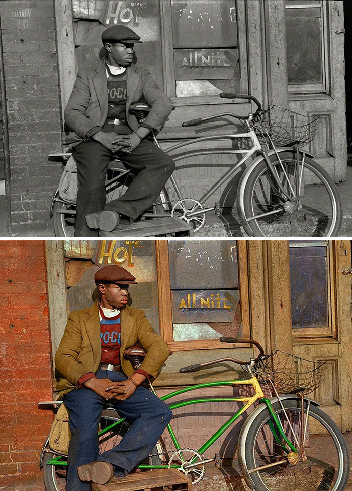
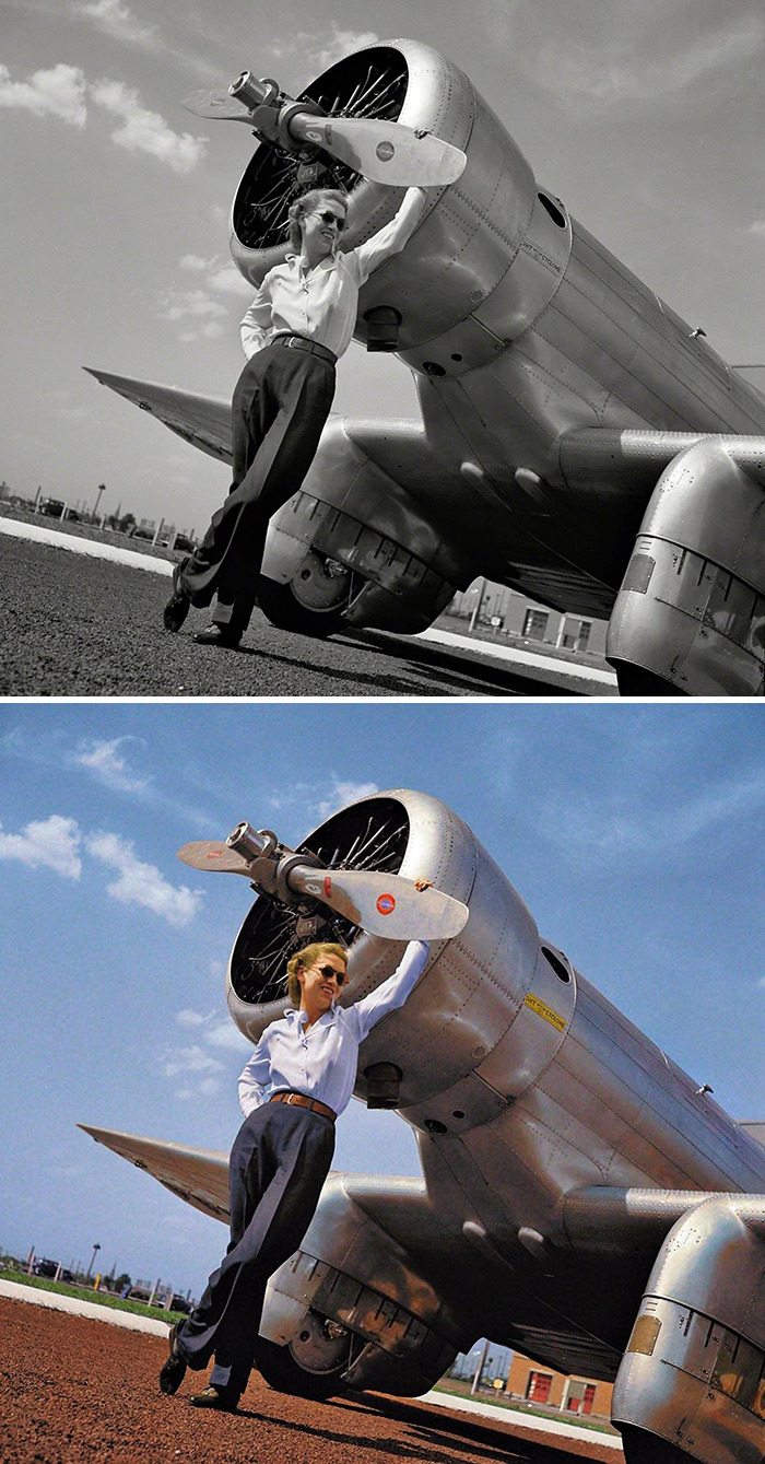
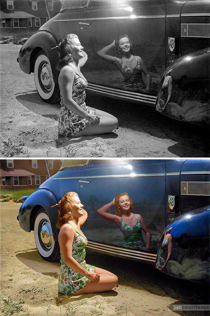
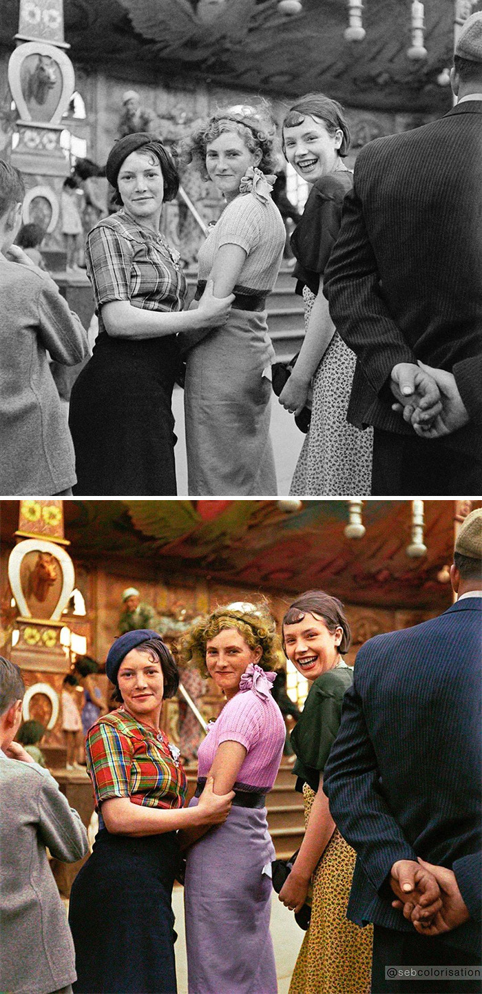
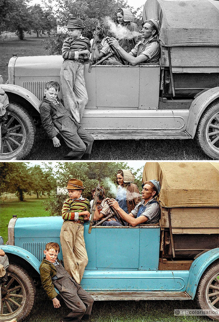
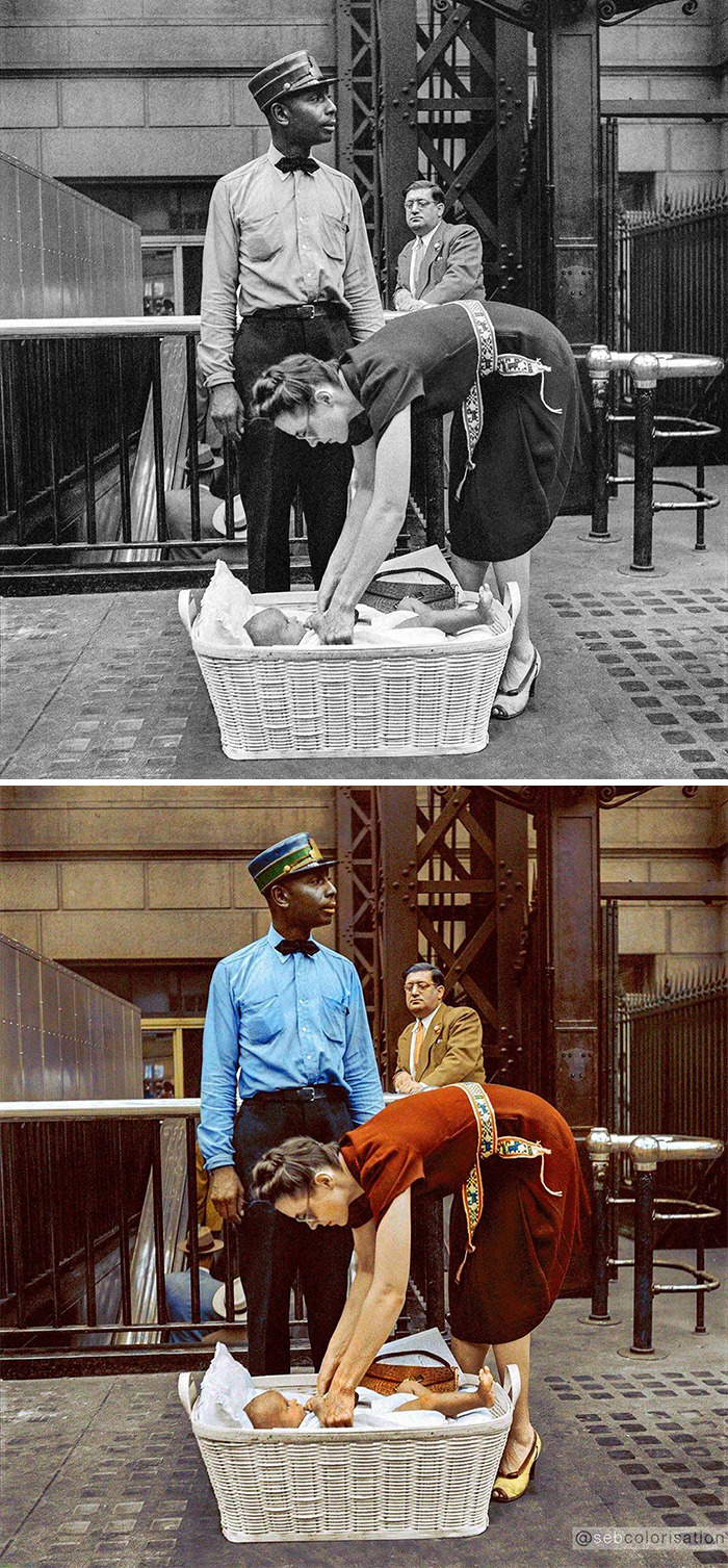
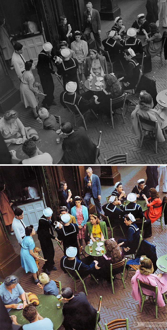
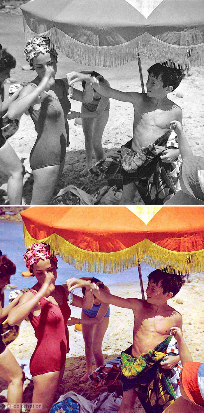
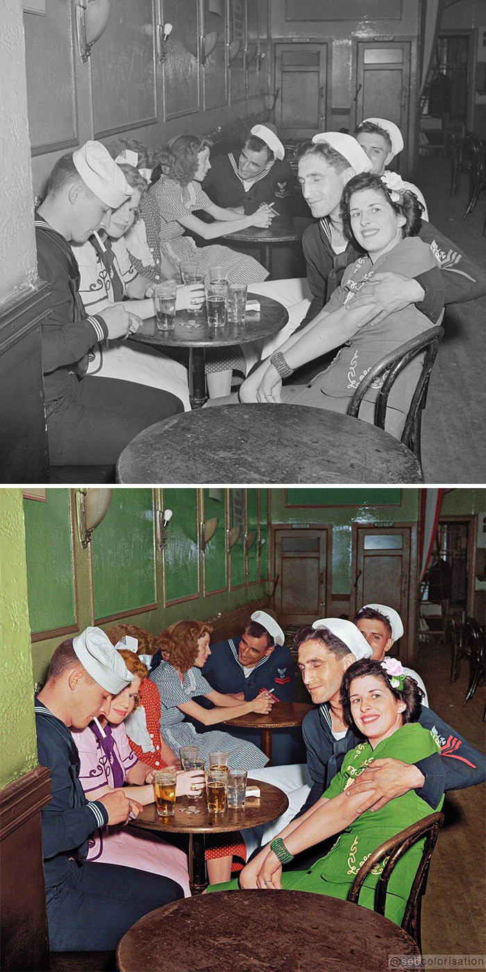
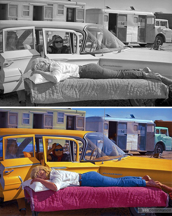
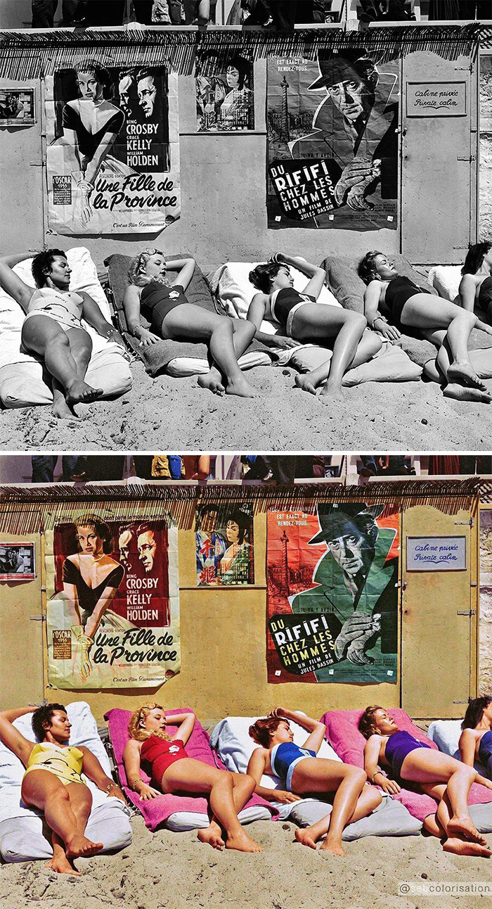
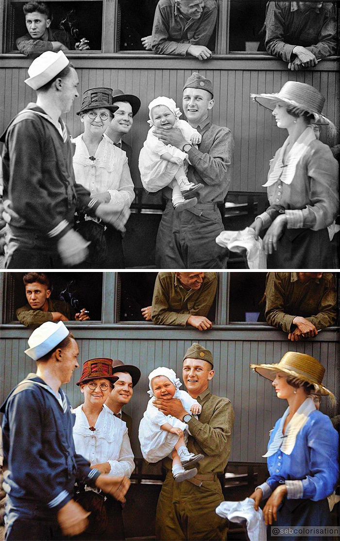
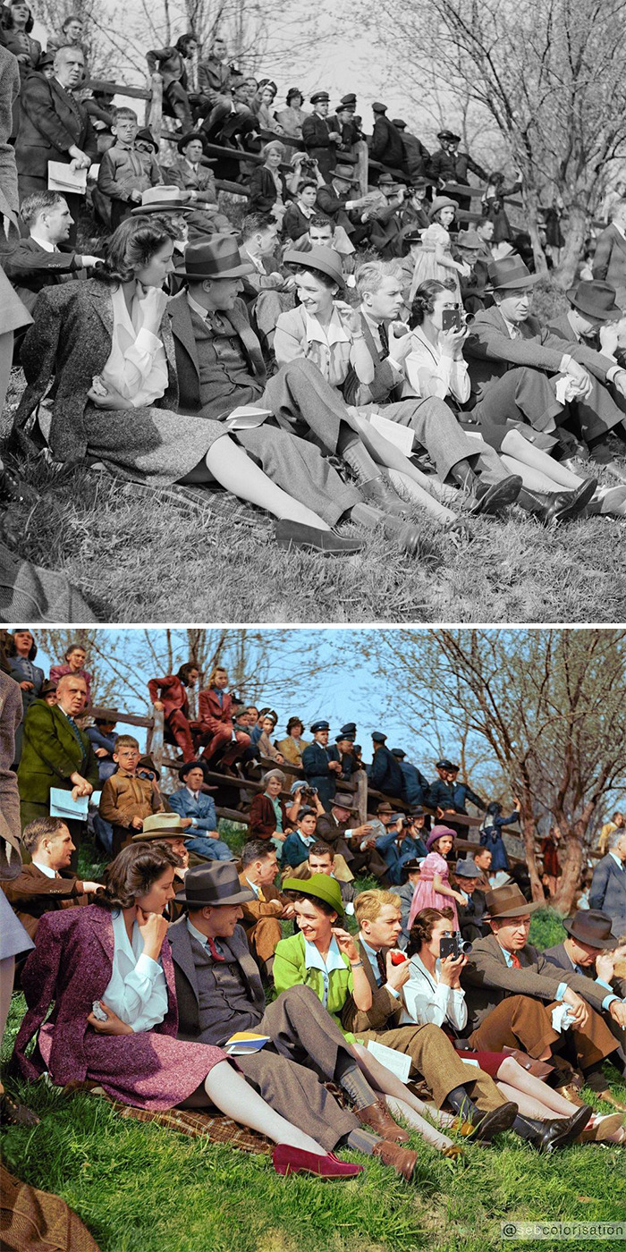
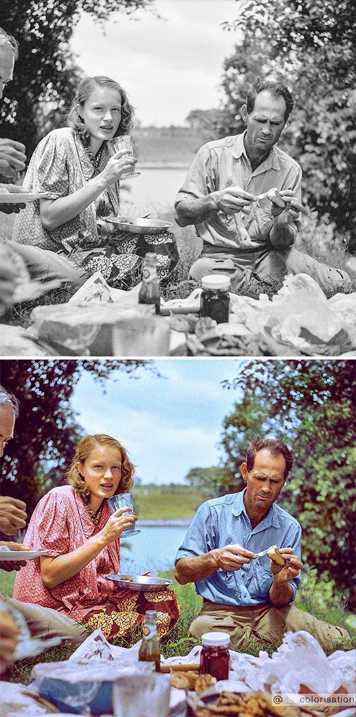
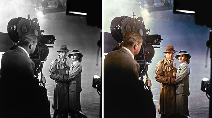
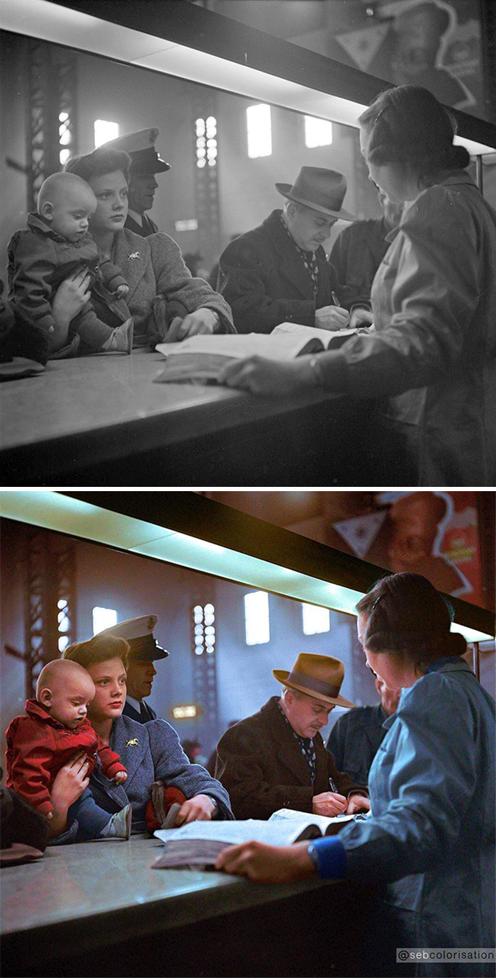
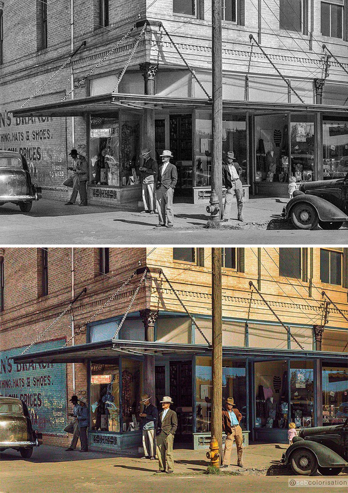
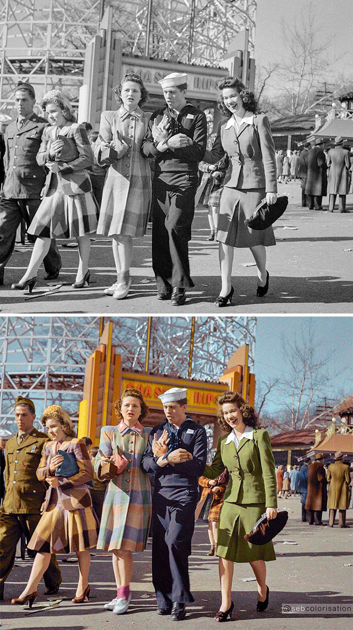
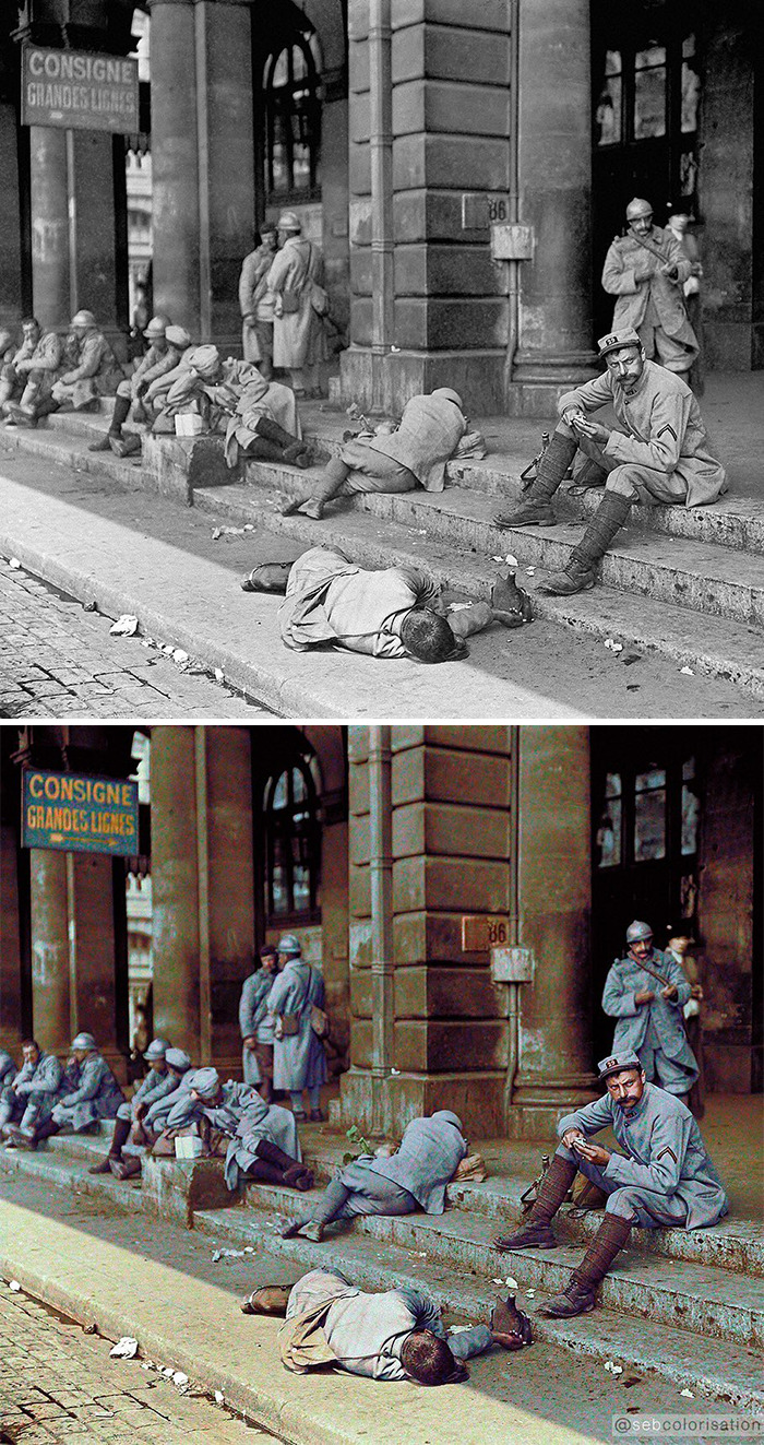
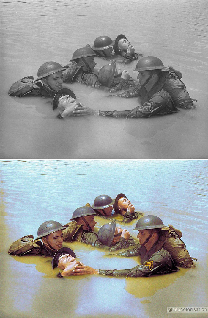
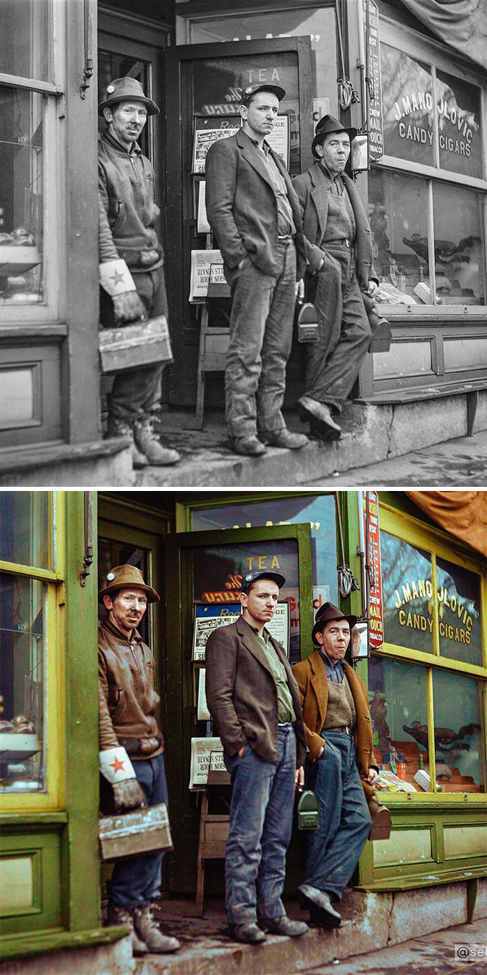
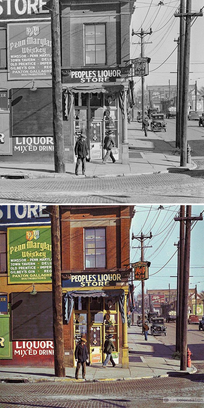
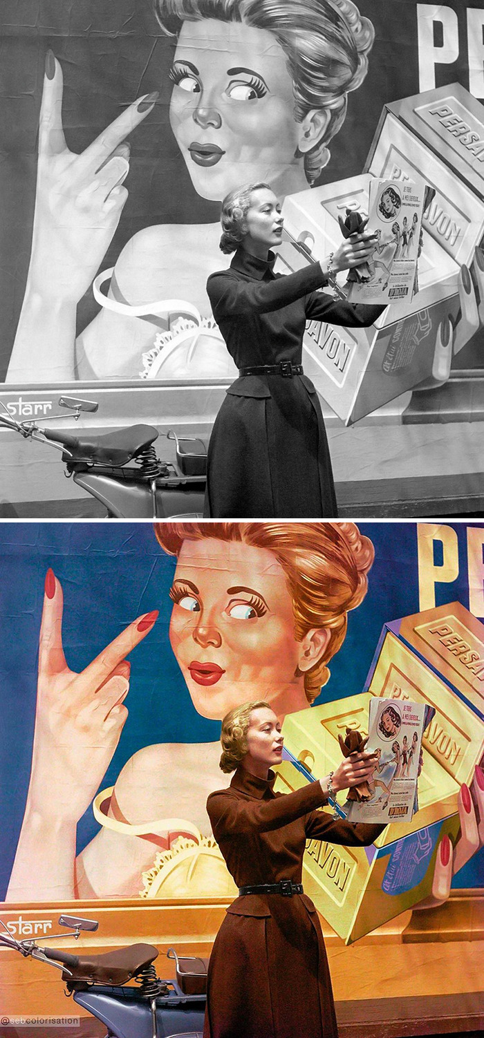
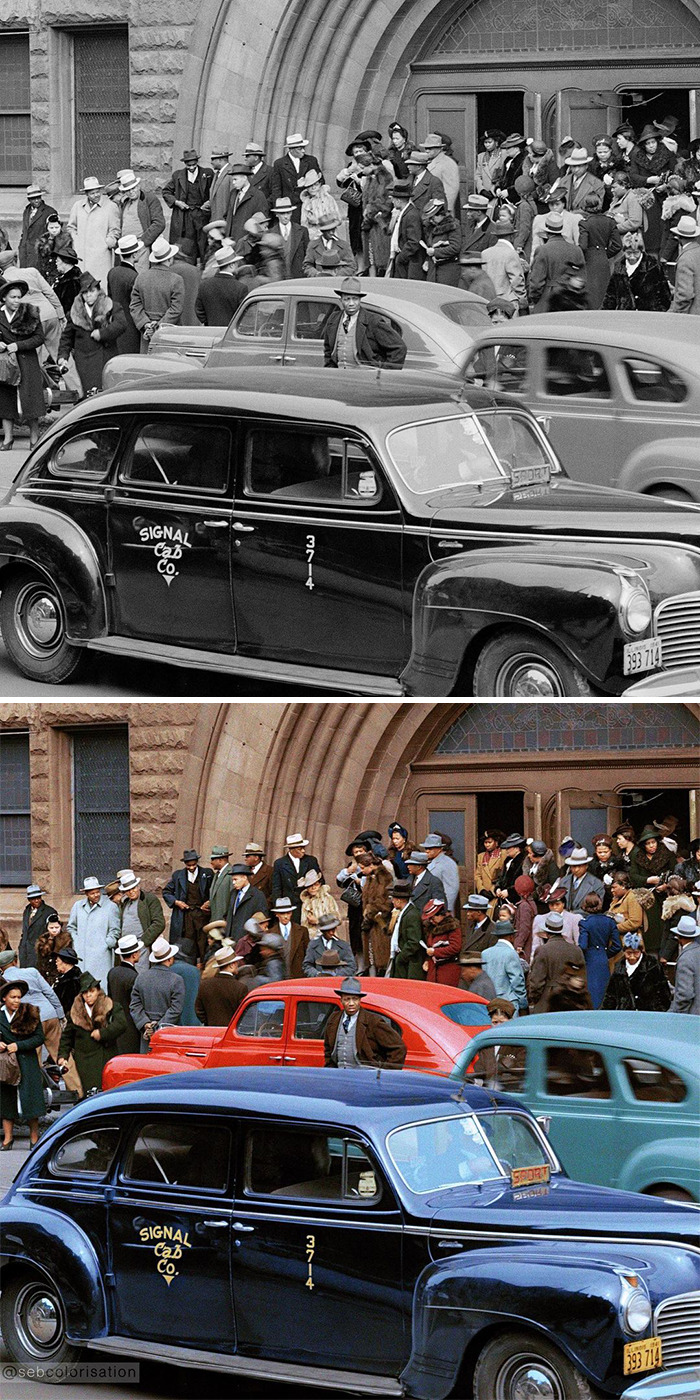
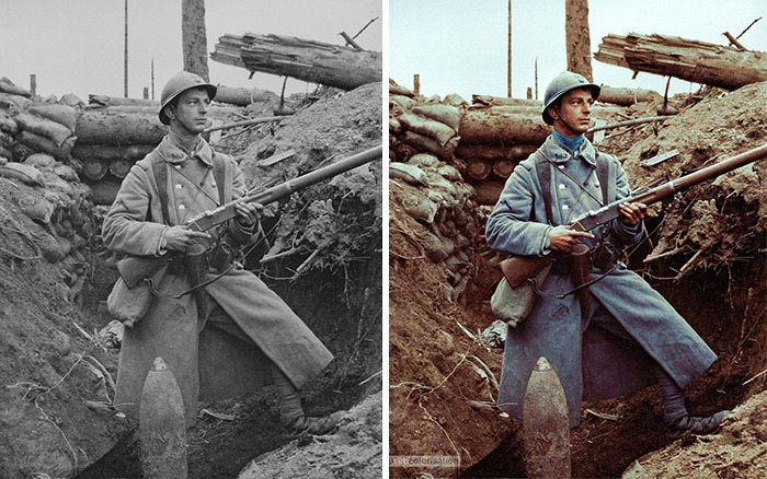
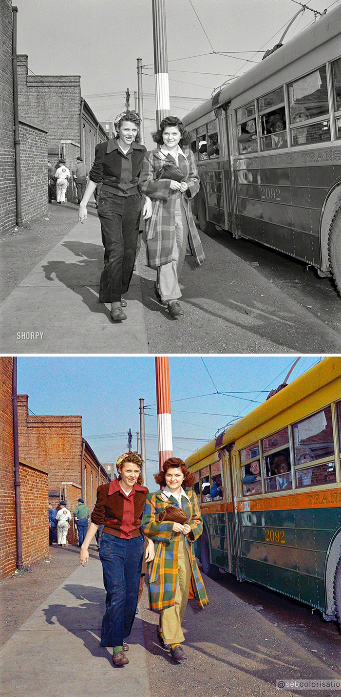
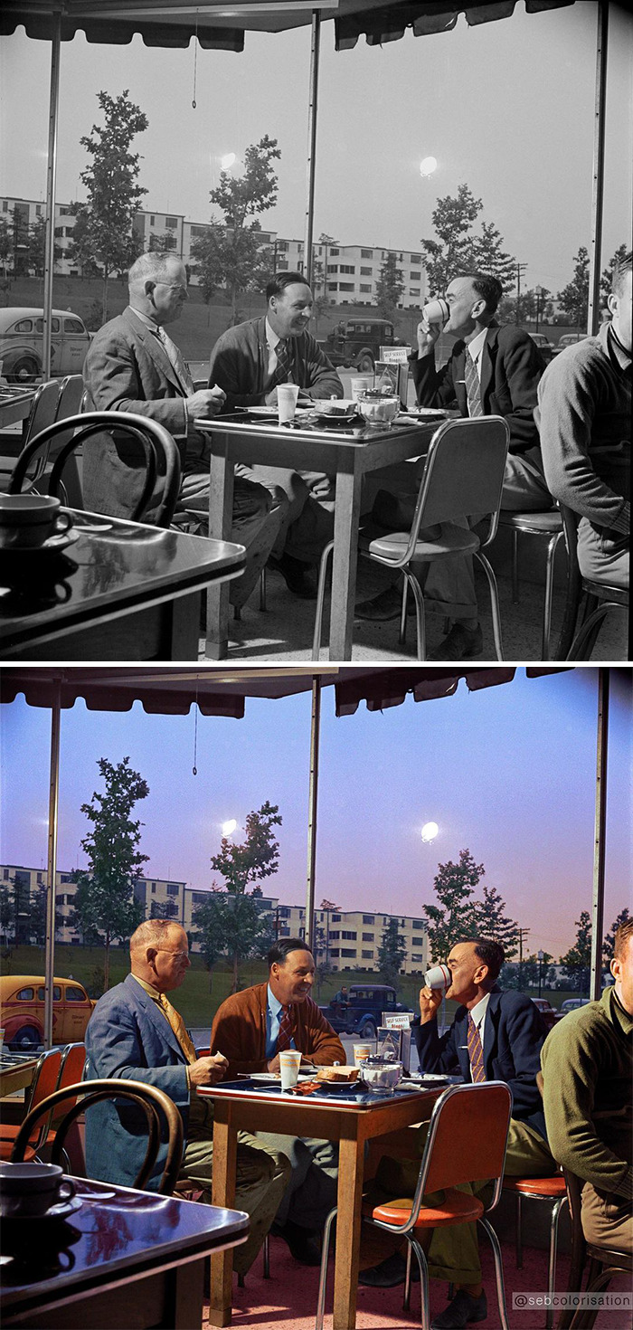
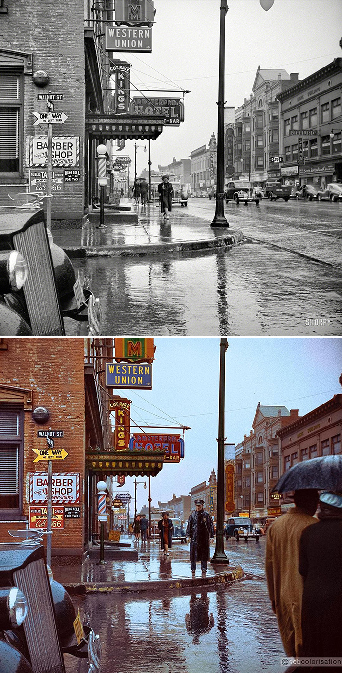
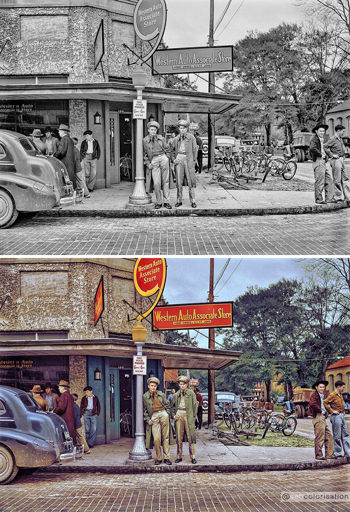
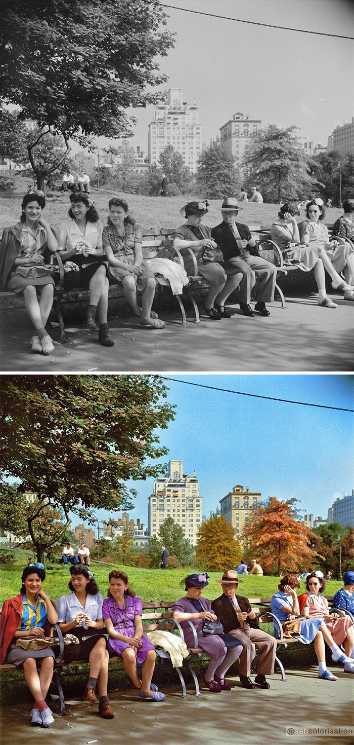
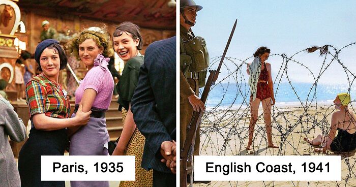
That's where digital artist Sébastien de Oliveira comes in. Sébastien uses Photoshop to color old photographs and give them more life. The people in the photos look much more realistic and the pictures become so much more inviting.
Sébastien told Bored Panda: "Sébastien de Oliveira, French, father Portuguese and mother French, I live in Paris, married, two daughters. For my background, I studied in a school of fine art in Orléans, with my specialization in illustration and photography, then I moved to Milan where I lived for 7 years and worked as an illustrator for architects and as an assistant for a fashion illustrator. I moved to Paris 17 years ago to become a retoucher for the fashion industry."
More info: Instagram
This post may include affiliate links.
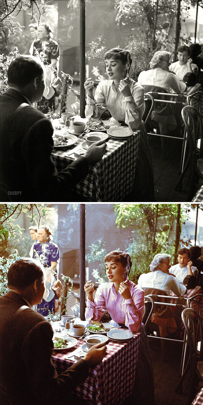
"I began 5 years ago to colorize some images and it became unstoppable. My three passions can combine themselves in colorization: painting, photography, and history. I spend lots of time finding images that tell a story. After spending some time on WW1 and WW2 images, now I am more interested in simple street views or peaceful 'tranche de vie' (pieces of everyday life) or colorizing portraits of actors from the golden age of Hollywood. I like to get into all the details that can be found in a photo and try to give my own interpretation."
"I collect old color photos as references to inspire me and to avoid anachronisms, but my colorizations are more a dreamed version of the reality than a will to give the perfection of what would have been seen by a modern camera. My references are more the saturated colors of the cinema from the ’50s, or the Autochromes of the Lumière brothers, where the color is more impressionist than realistic. I recently worked for the Vuitton book Extraordinary Voyages, where 20 colorizations were published. I mounted an exhibition in Dunkirk with 40 colorizations of photos of a woman photographer from the town during the German Occupation in WW2. I began to share my work only 3 months ago on Instagram and already have encountered really good feedback."
Sébastien de Oliveira told us why he colorizes photos and how he got into it: "At the beginning, it was my hobby, but it is becoming a big part of my activity now, I am a photo retoucher and I work for the fashion industry in Paris. I have a background in Fine Arts studies so I paint and I take photos. My other passion was history, so I found a way to combine my three passions in one."
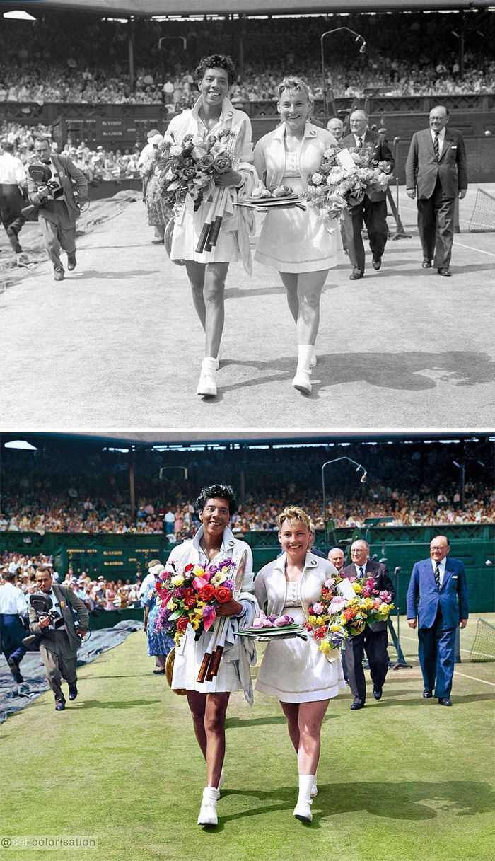
I THINK this is Althea Gibbs the first great female Black tennis champion.
The artist shares the most difficult part of colorizing photos: "I have a method so all the different stages are under control and not really difficult by themselves but the most difficult is always to choose a color for people's clothing, because of the immensity of choice."
Sébastien shared his favorite and least favorite time periods to work with: "I love the street views from the ’40s and ’50s with rounded cars and people wearing costumes, it is always so cinematographic! My favorite time period is the American ’40s and I don’t know why, but I like that era for the lack of plastic, the beauty of the cars and clothes, and the link it makes with the cinema of this period. My least favorite would be the beginning of the century 1900, you never know how to color the people's clothes!"
"I started these colorizations 5 years ago and don't want to stop any time soon. I inspire myself with old color photos, autochromes, cinema pictures from the past, so my style is quite saturated, with vivid colors. My research is not realism, it is more pictural, impressionist, the subjects are often happy and peaceful. What also inspires me is the immensity of the black and white photos, great photos, beautiful photos, that are fantastic as they are but can also get rediscovered with the process of colorization."
Sébastien gives advice to people who want to colorize pictures as well: "My advice would be to observe the reality, the light, the reflections, the effects and interaction of the colors in the real life to collect old color photos from the past and use them as references, but also open your eyes to the painters that have already done this work and transposed it in their paintings."
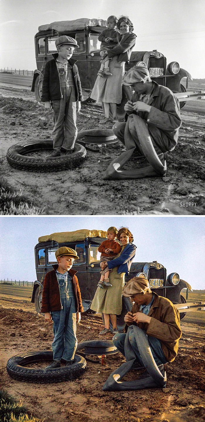
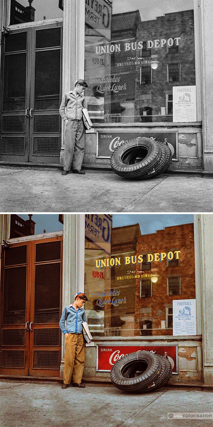
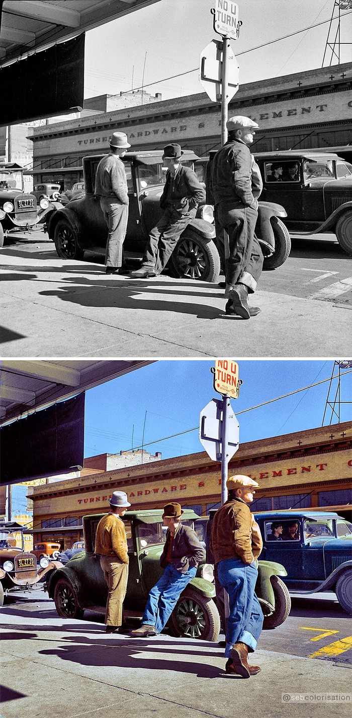
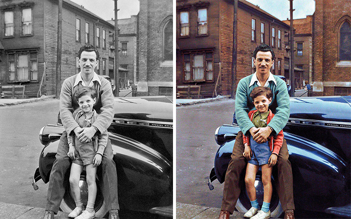
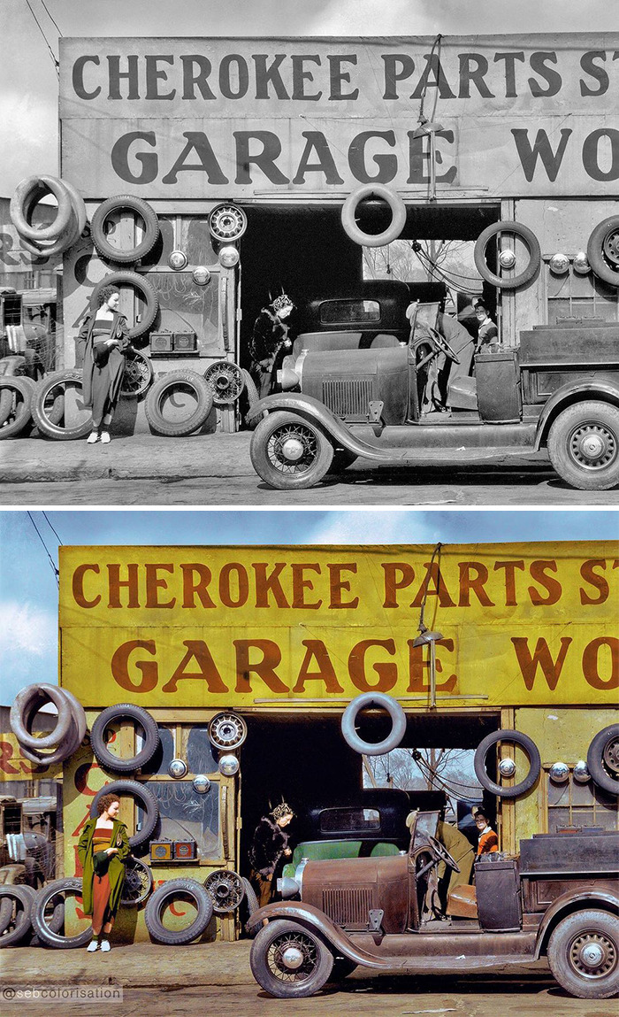
Intrigued as to what the metal band is between them. You can see the tyre and innertube and the wheel rim is still on the car behind them. I run innertubes on wire wheels on my classic (which is probably 30-40 years younger than this) and the tyre goes straight on the rim.
Sébastien shares what he looks for in a photo before deciding what to colorize: "I look for a story to tell, like a moment of a movie, and also a good composition, but also a good definition because the better the definition is, the more beautiful the colorization will be."
The artist tells us more about himself: "I come from the French countryside near Chartres, completed art studies in Orléans, I moved to Milan and lived there for 7 years. I found my future wife there and we moved to Paris. I now have two daughters. I worked as an illustrator for architects, assistant of a fashion illustrator and now as a photo retoucher. I would be pleased if I could do colorization as my main activity!"
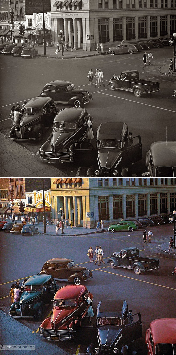
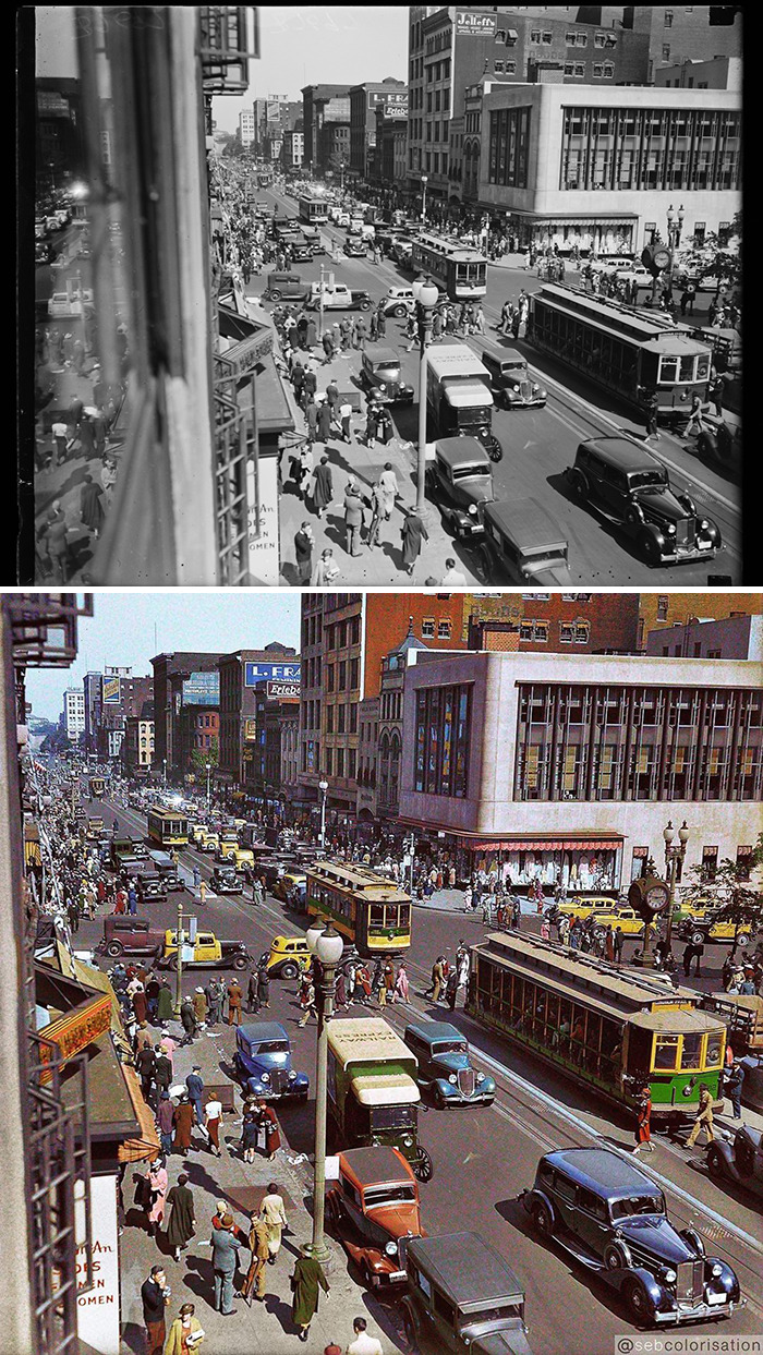
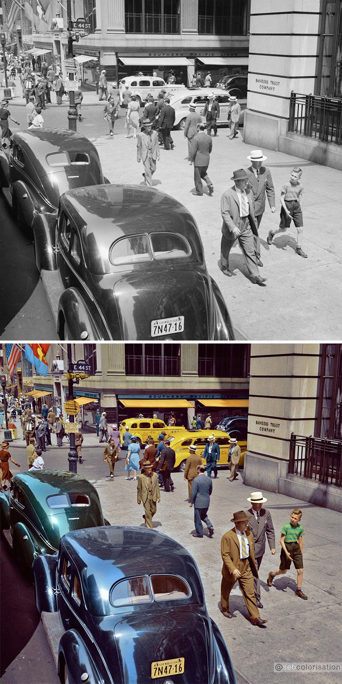
OK, so I see here that D.C. traffic has always been insanely congested.
"I worked recently for a Vuitton Book 'Extraordinaries voyages' where 20 colorizations were published and for Oppo and Getty Images for collaboration with Wimbledon, where 9 images were produced. I have done already 4 different exhibitions, the most important was in Dunkirk where 40 colorizations were shown. The project was colorizing images from a woman photographer called Adeline Debaene-Kiscoms who photographed her city Dunkirk and the habitats during the German occupation of WW2."
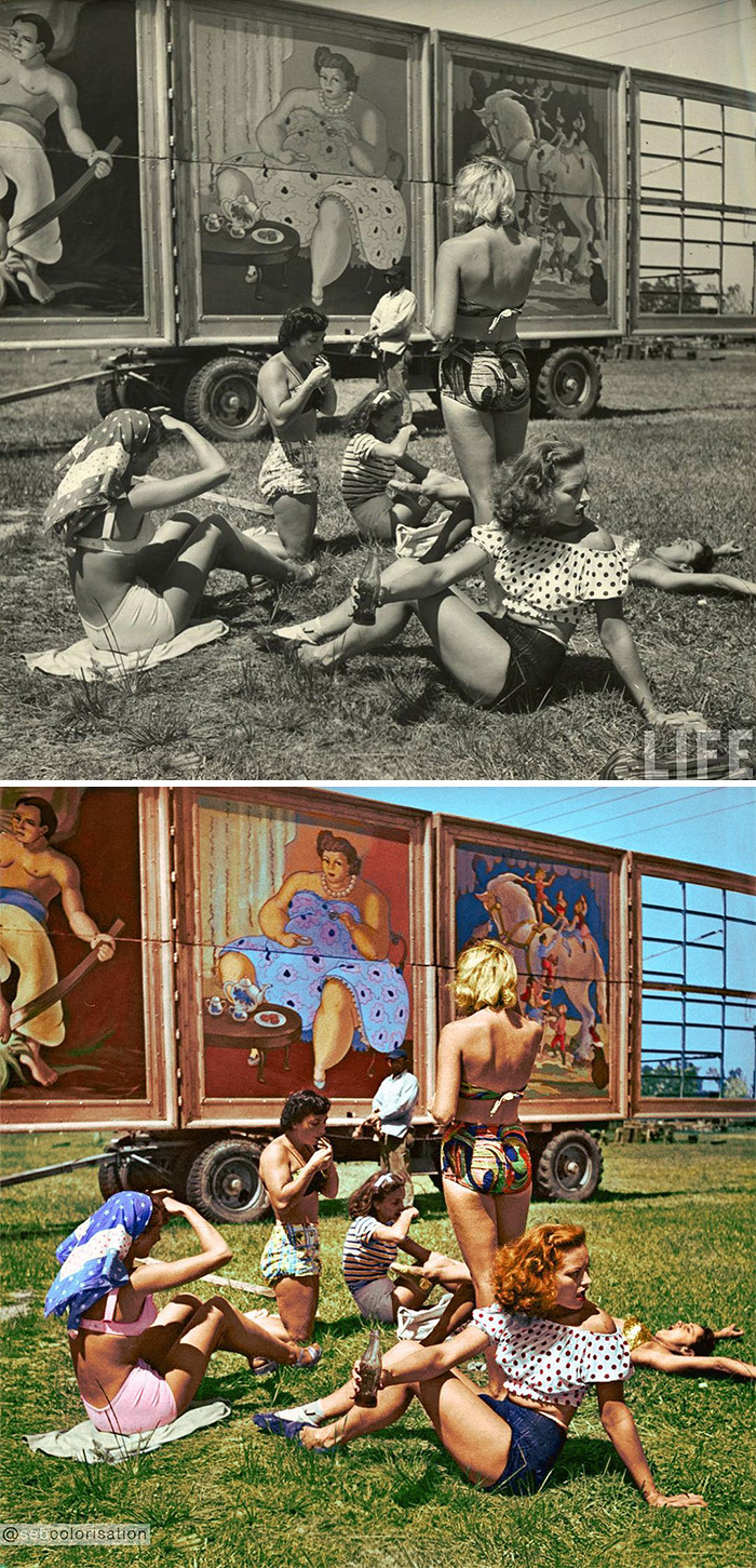
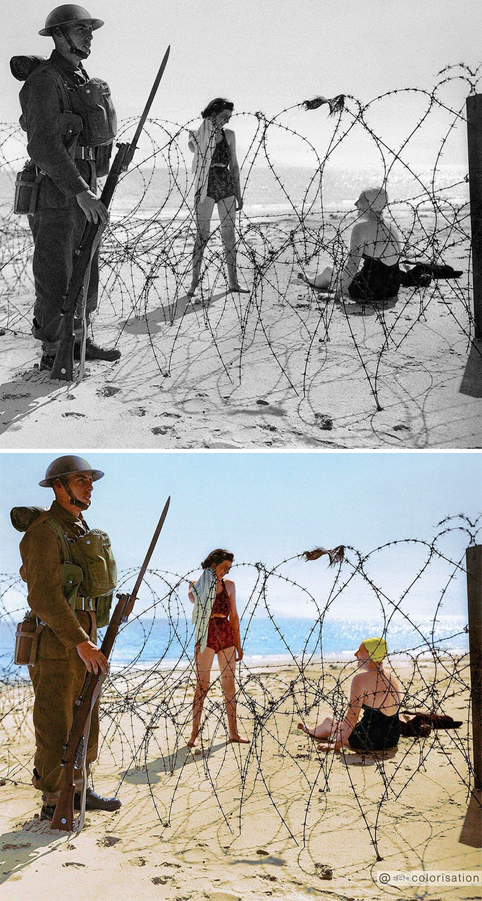
I like the coloured version, and the way the posters come to life because of that use of colour. Grace Kelly is in the poster on the left, wonder if she posed with all these sun bathing girls?
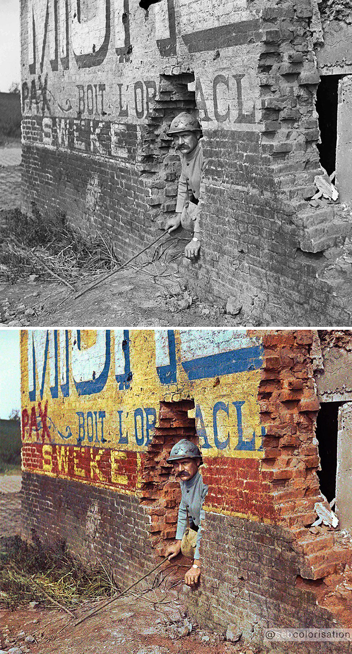
When you come home from war after three years to see your one year old daughter :P
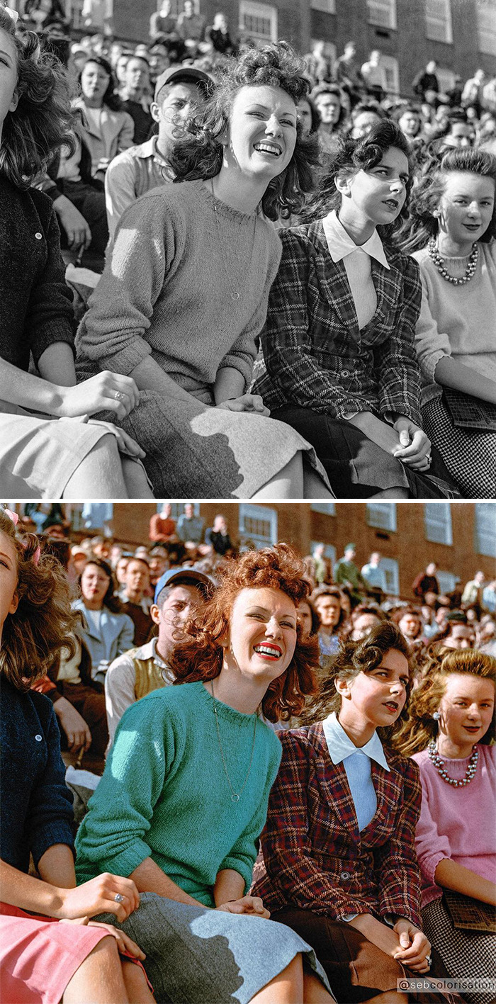
I like the colour version. Loving this crowd photograph and the colour makes it live!
I'm torn on these. I know some people find it easier to relate to images from the past if they see them in colour. It is a valuable reminder that the past was just as colourful as the present, not not literally sepia-toned. But it's easy to overcompensate. I feel the colours in these particular images are just a shade too intense. They look a little stylised, as though put through an instagram filter. And colourizing black and white movies is wrong. Those films were lit and composed to work in black and white. Adding colour loses the true beauty. If possible, try to see at least one black and white movie in the cinema, rather than on TV. No TV can ever reproduce the look of film on screen - you'll see why it's called the Silver Screen.
I prefer the black and white---but it's interesting to see what they might have looked like and he did a good job. He's not ruining any of these photos (I believe)because he's not colourizing originals. Many of these are famous, published photos. That said, I feel the same as you do about black and white films--they should never be colourized.
Load More Replies...What strikes me is how 'in shape' everyone is, at least compared to today's standards. Interesting how much the us population has changed
Well, also consider that the photographers likely wanted to photo people who were young and attractive, according to society's standards. Notice how there aren't many old people either.
Load More Replies...I feel like these images help make history more real. Making these people and times more relatable, seeing how it may have looked through their eyes, not an old camera.
This was definitely one of the best articles of the last few days. I love old photos.
I really enjoyed looking at these, especially the fashion! would be nice to know where and when they were taken.
They look so much more real in color, much like smartphone photos
This is interesting - you don't tend to think of things having color prior to the 1930s-50s, so it's cool to put that in perspective. (On a side note, I used to think the world really was black and white until around the 30s-50s... didn't have trouble believing renaissance and middle ages were in color, though.)
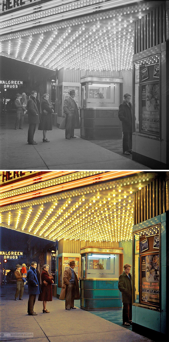
I think some of these suit the B&W more than the colour versions. Although the movie theatre one is my favourite colour version!
I love the faces of these beautiful women! Each one unique in its own way, no plastic surgery, no make-up mask.
Very interesting, but the colour doesn't do anything to change the way I perceive them, that makes no sense to me. Think it might just be a gimmick, sadly...
They're comparison pics. It wouldn't really work any other wat
Load More Replies...I'm torn on these. I know some people find it easier to relate to images from the past if they see them in colour. It is a valuable reminder that the past was just as colourful as the present, not not literally sepia-toned. But it's easy to overcompensate. I feel the colours in these particular images are just a shade too intense. They look a little stylised, as though put through an instagram filter. And colourizing black and white movies is wrong. Those films were lit and composed to work in black and white. Adding colour loses the true beauty. If possible, try to see at least one black and white movie in the cinema, rather than on TV. No TV can ever reproduce the look of film on screen - you'll see why it's called the Silver Screen.
I prefer the black and white---but it's interesting to see what they might have looked like and he did a good job. He's not ruining any of these photos (I believe)because he's not colourizing originals. Many of these are famous, published photos. That said, I feel the same as you do about black and white films--they should never be colourized.
Load More Replies...What strikes me is how 'in shape' everyone is, at least compared to today's standards. Interesting how much the us population has changed
Well, also consider that the photographers likely wanted to photo people who were young and attractive, according to society's standards. Notice how there aren't many old people either.
Load More Replies...I feel like these images help make history more real. Making these people and times more relatable, seeing how it may have looked through their eyes, not an old camera.
This was definitely one of the best articles of the last few days. I love old photos.
I really enjoyed looking at these, especially the fashion! would be nice to know where and when they were taken.
They look so much more real in color, much like smartphone photos
This is interesting - you don't tend to think of things having color prior to the 1930s-50s, so it's cool to put that in perspective. (On a side note, I used to think the world really was black and white until around the 30s-50s... didn't have trouble believing renaissance and middle ages were in color, though.)
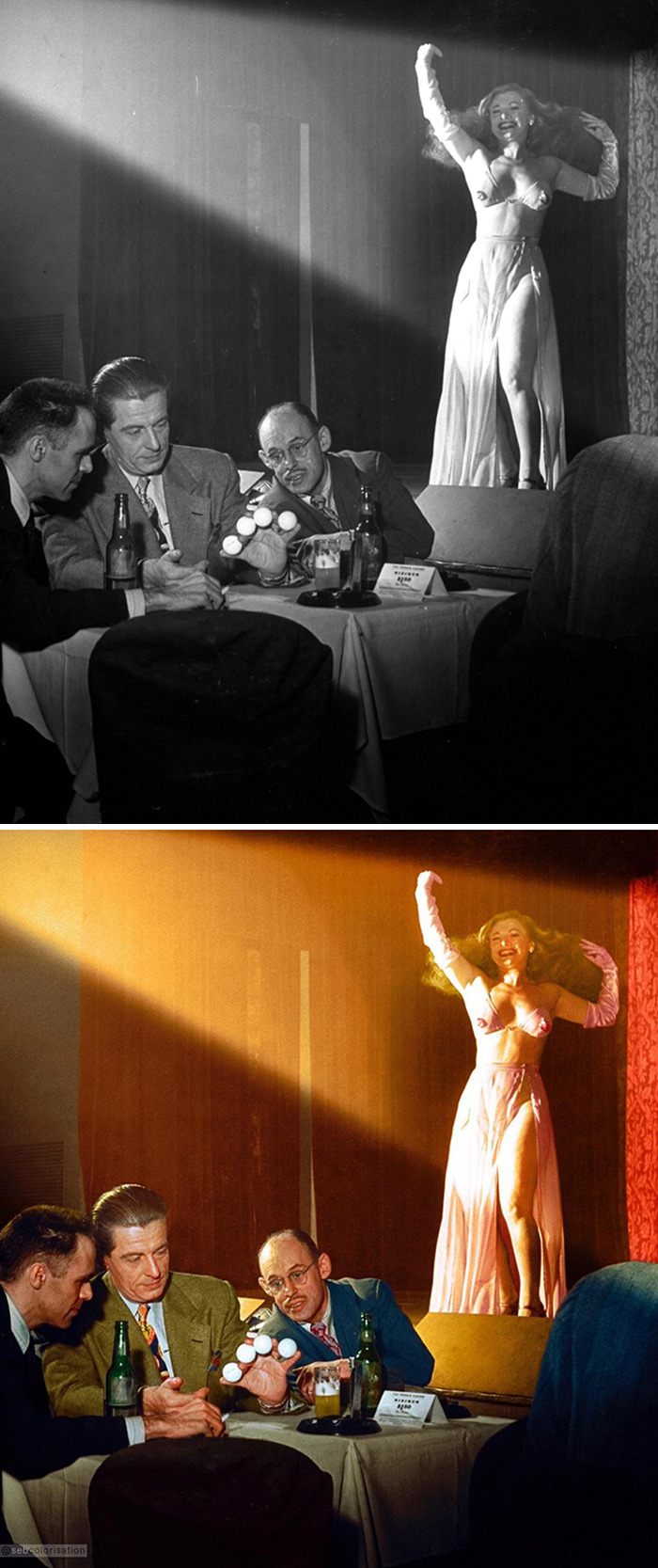
I think some of these suit the B&W more than the colour versions. Although the movie theatre one is my favourite colour version!
I love the faces of these beautiful women! Each one unique in its own way, no plastic surgery, no make-up mask.
Very interesting, but the colour doesn't do anything to change the way I perceive them, that makes no sense to me. Think it might just be a gimmick, sadly...
They're comparison pics. It wouldn't really work any other wat
Load More Replies...
 Dark Mode

 No fees, cancel anytime


