Revue Cinema is Toronto's oldest actively running movie theatre. It's member-run by a community of movie lovers who support the upkeep of the cinema and enjoy amazing film programming by passionate programmers who introduce their screenings before the show. It's everything good about the movies!
I'm a graphic designer who primarily works in the entertainment sector. The creative direction and design of movie posters are what I typically work on. It's a task that involves combining a director's vision with what sells, what an audience will respond to, and what a distribution company will approve. It sits on the border of art and design, inspired work, but shaped by a lengthy list of requirements.
I was beginning to branch out and explore and define my art style when Revue contacted me in March of this year. What was to be a poster for a 4/20 screening of The Big Lebowski turned into creating 28 posters in 9 months! It sounds like a lot, but I was given complete creative freedom and no revision notes. As long as I included the screening info and Revue logo, I was good to go. It was an opportunity at the perfect time for me to experiment and define my style, knowing that there would be no creative limits, and the films were the perfect prompt to let my mind run free.
More info: johngodfrey.com | Instagram | Facebook | twitter.com
This post may include affiliate links.
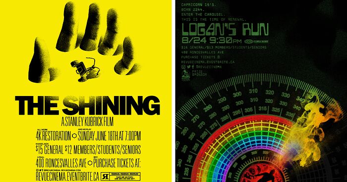
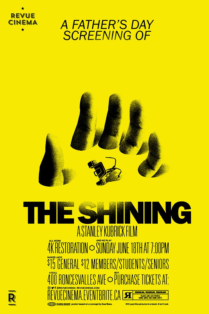
"The Shining" Movie Screening Poster (Inspired By An Early Saul Bass Sketch)
I learned a lot about my artistic process, my strengths and weaknesses, and my preferences. I experimented with different techniques, a range of digital and traditional mediums, color, and typography that encouraged me to work outside of my comfort zone (being "professional"), and explore new visual paths that were distinctly "me". These new developments in my artwork also bled over to my professional work, benefitting me there through new processes and more willingness to push creative boundaries and try new techniques.
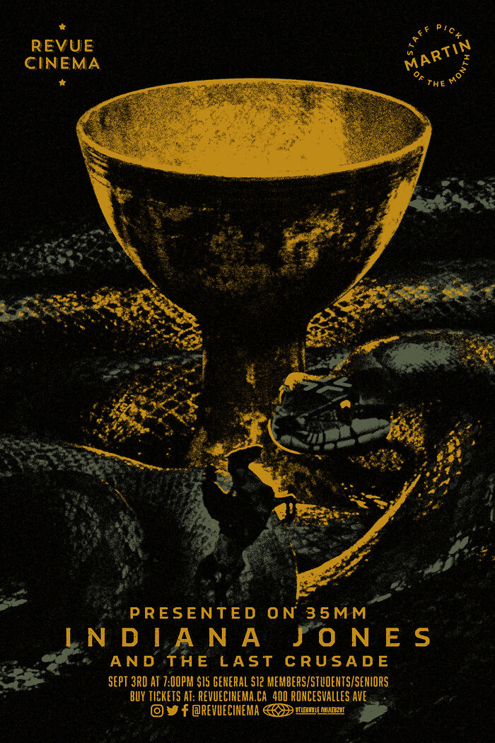
"Indiana Jones And The Last Crusade" Movie Screening Poster
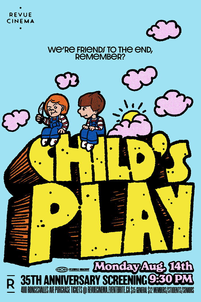
"Child's Play" Movie Screening Poster
I discovered new movies that I had never seen before, some that I'd never heard of, and some that I was meaning to see. I was experiencing the programming of the theatre firsthand, and being exposed to classic and cult films that I would not know of or possibly even choose to see helped open my mind creatively as well, finding inspiration in new ideas and imagery from a range of diverse films. The ideas began to come quicker and get executed faster as I refined my style and had no worries about revisions... 9 months later, 28 posters.
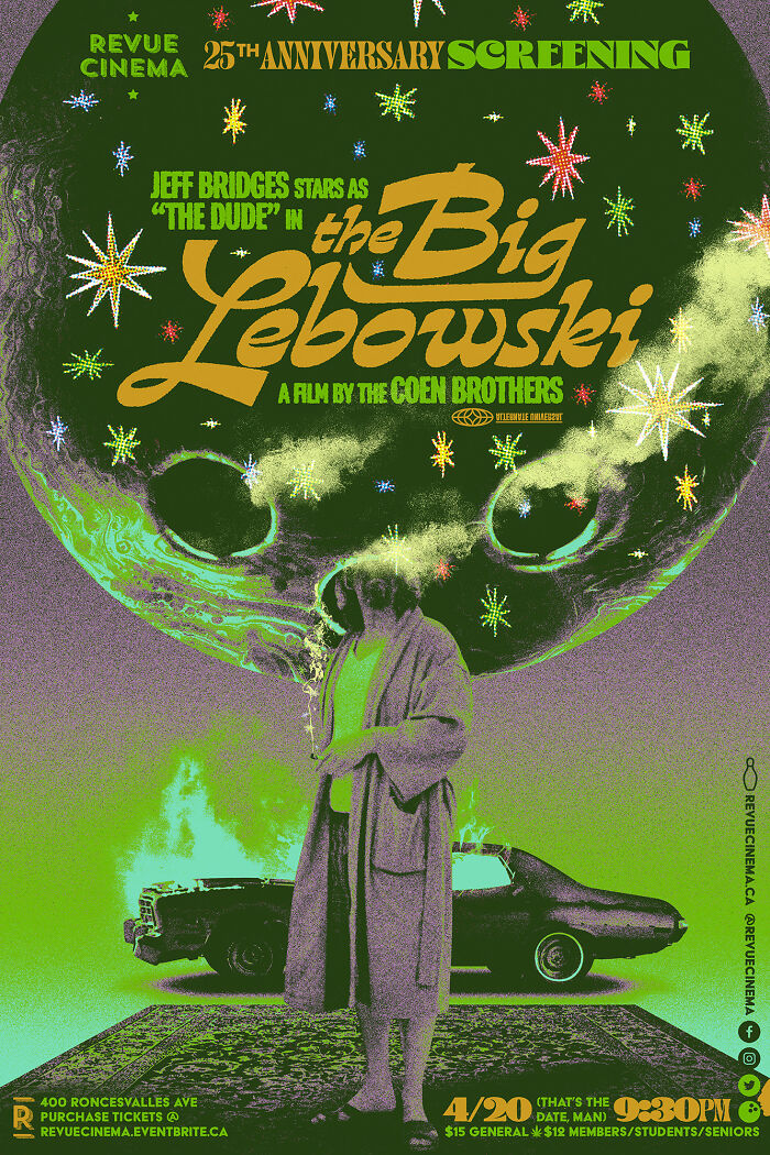
"The Big Lebowski" Movie Screening Poster
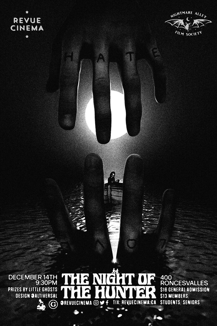
"The Night Of The Hunter" Movie Screening Poster
"The Night of the Hunter", one of my favorite movies, is the last poster I made for Revue Cinema this year. I'm not done yet, though! I already have two more posters planned for screenings early next year. In the meantime, you can check out all the screening posters I made this year!
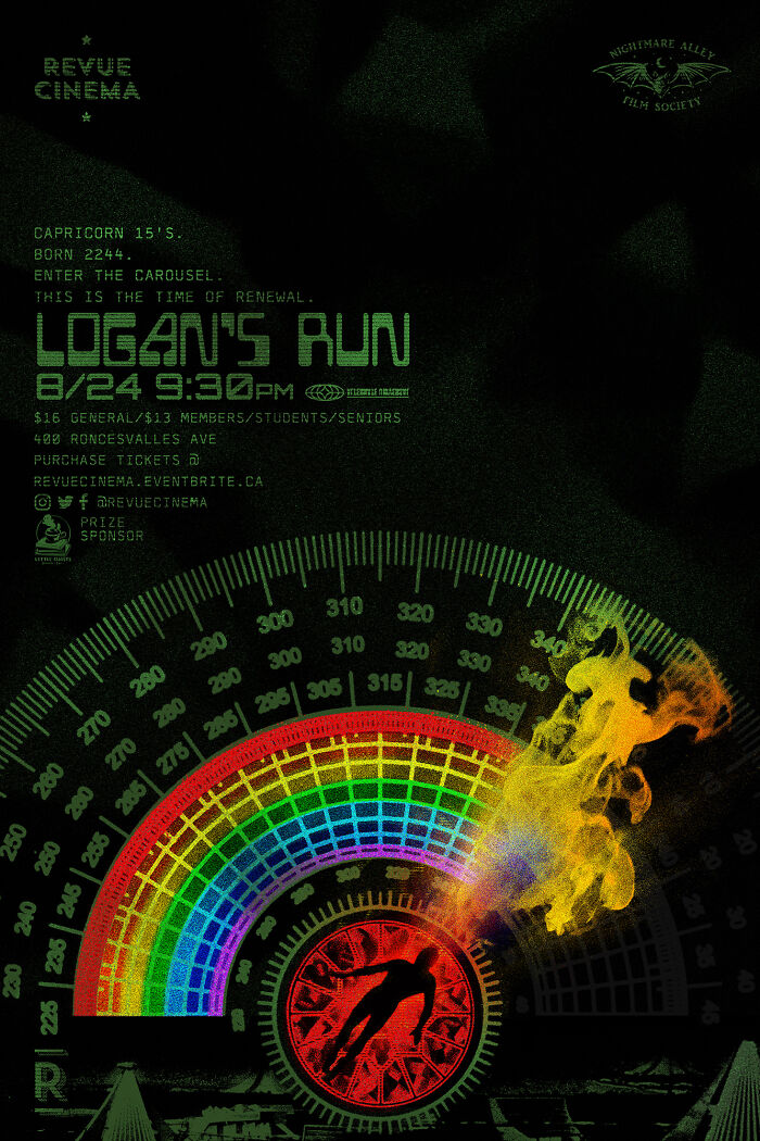
"Logan's Run" Movie Screening Poster
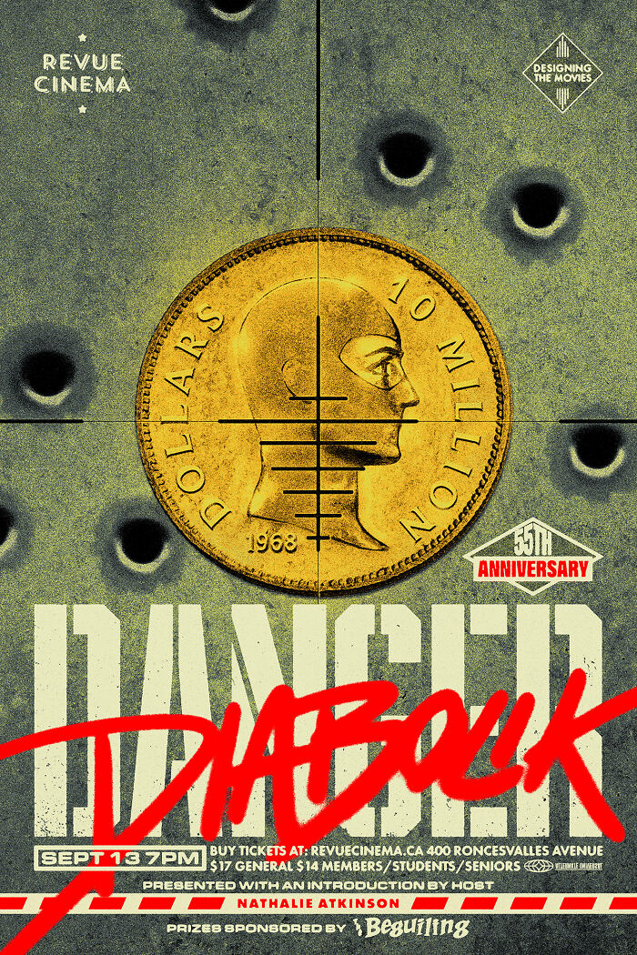
"Danger: Diabolik" Movie Screening Poster
As a kid, I always noticed the movie posters displayed in the convenience store window under the apartment building where my family was living. I wasn't given much access to TV and movies when I was younger (I never knew what the other little kids were talking about watching last night), so the posters gave me a window into how exciting these movies, and the world at large, must be, outside of the immediate radius of my home.
I also found the combination of type and images interesting as well. The titles were usually stylized, like the logos I'd see on packaging in the kitchen, but it wasn't packaged food, it was a packaged experience, and the typography was used as a tool to inform you even more about this experience.
Film is such a compelling medium, and as a child, when you can't watch the movies, imagining it from the poster became my next best thing. So I think that's where my love of design began, and why movie posters (and film) hold so much importance to me. I started using Photoshop and making club flyers in high school, went to college for graphic design, and worked at studios for 6 years before deciding to dedicate a website to the movie posters I would occasionally do, and then movie posters became my full-time job from there.
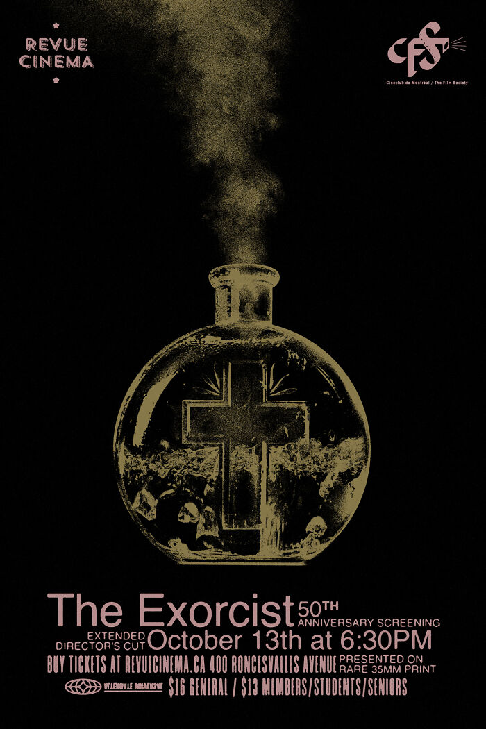
"The Exorcist" Movie Screening Poster
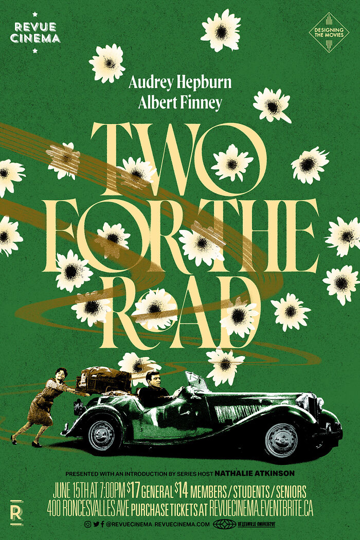
"Two For The Road" Movie Screening Poster
The only challenge I encountered when creating these posters was very early on, trying to get my mind to shrug off 18 years of adhering to brand standards manuals or trying to predict a client's response to design concepts, and letting that imagined response shape how I designed. It was like re-learning to color outside the lines. I was developing my personal art style simultaneously, so I just had to bridge the art/design gap once with my first poster, and then continually tried to push the envelope as far as my mind could for all the subsequent posters.
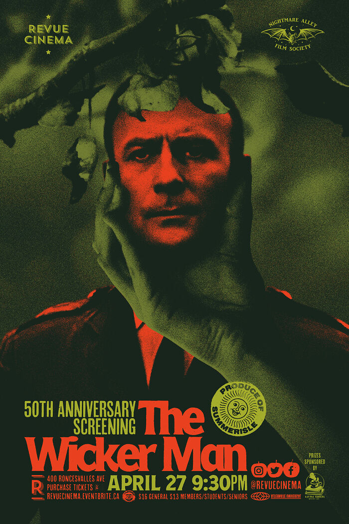
"The Wicker Man" Movie Screening Poster
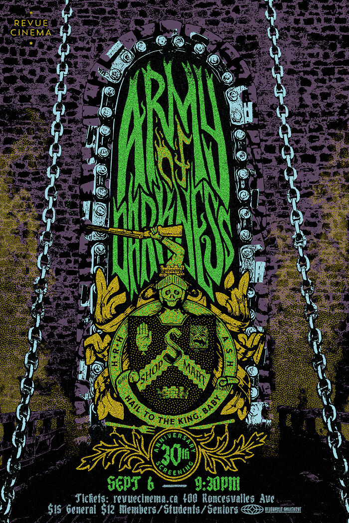
"Army Of Darkness" Movie Screening Poster
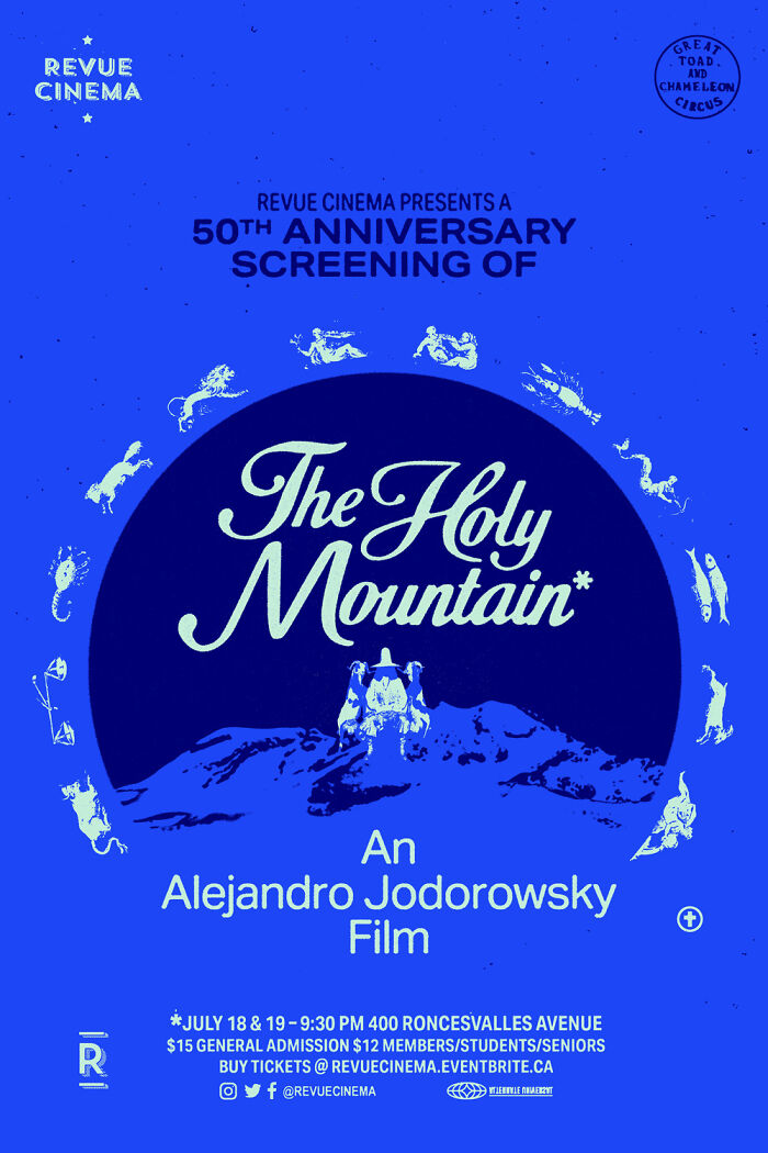
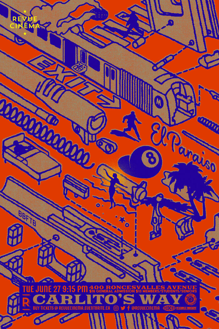
A favorite work for me is the Child's Play poster (and ones like Carlito's Way, Q, The Holy Mountain), as I feel like they're unexpected by the audience, while also being quite true to the film upon closer examination. When designing screening posters, I base them on the film (of course) but also how the film sits within society, how it's remembered, pop cultural references that relate to it, either pre- or post-release, and how it may have influenced culture. What pop culture elements are adjacent to it, and if I can pair those elements to make something unique? My personal artwork is very much about pop culture, ads, and brands, and how those elements are omnipresent in our everyday lives, a part of our visual dictionary that can be exploited with art to create new messages (or just have fun).
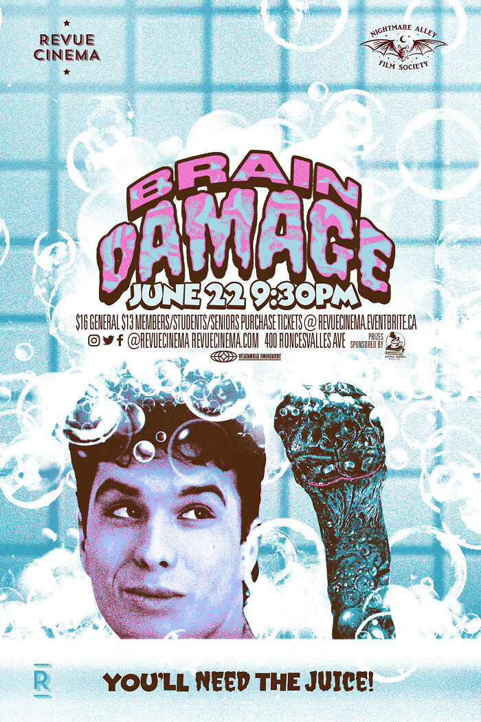
"Brain Damage" Movie Screening Poster
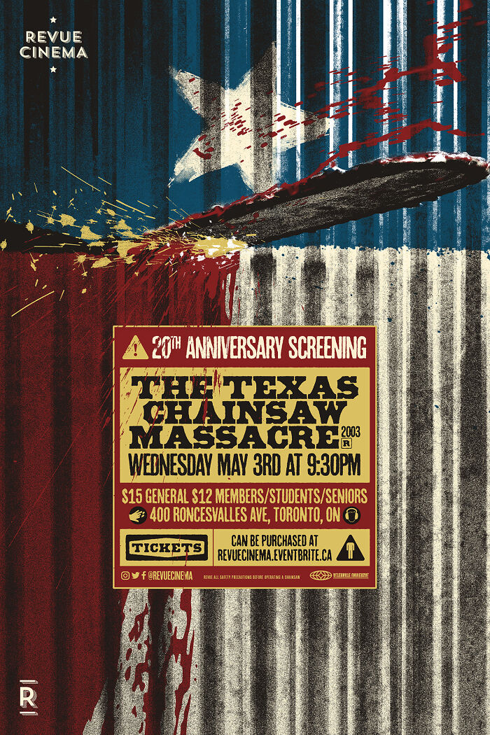
"The Texas Chainsaw Massacre" Movie Screening Poster
When designing for modern-day film releases, there isn't always a lot of room for subtlety or play. You have to convey your message immediately and as big as you can since the artwork is used everywhere from small thumbnails to billboards, and audiences have to connect with it immediately (we're talking 13 milliseconds). But I also know that audiences are clever and like to spend time with art when they choose to, so a real highlight for me was adding little details, references, subtle themes, and things like that for the viewer to (hopefully!) explore.
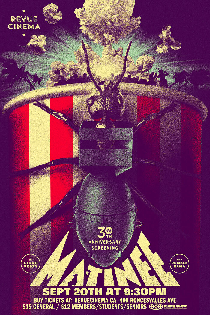
"Matinee" Movie Screening Poster
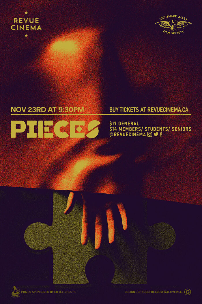
"Pieces" Movie Screening Poster
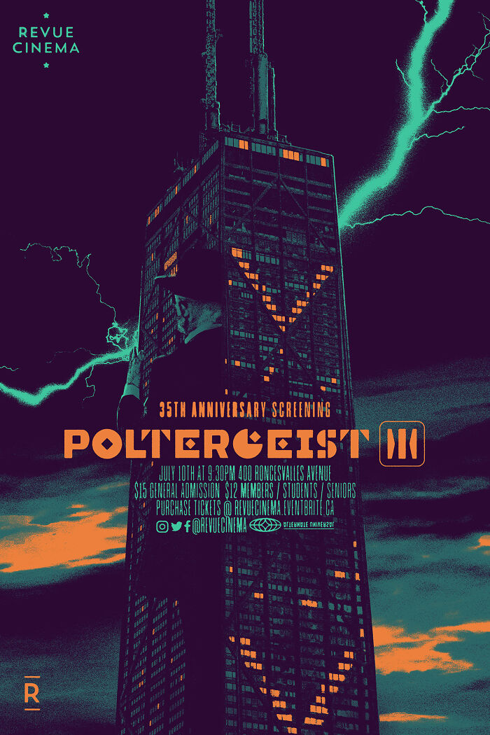
"Poltergeist III" Movie Screening Poster
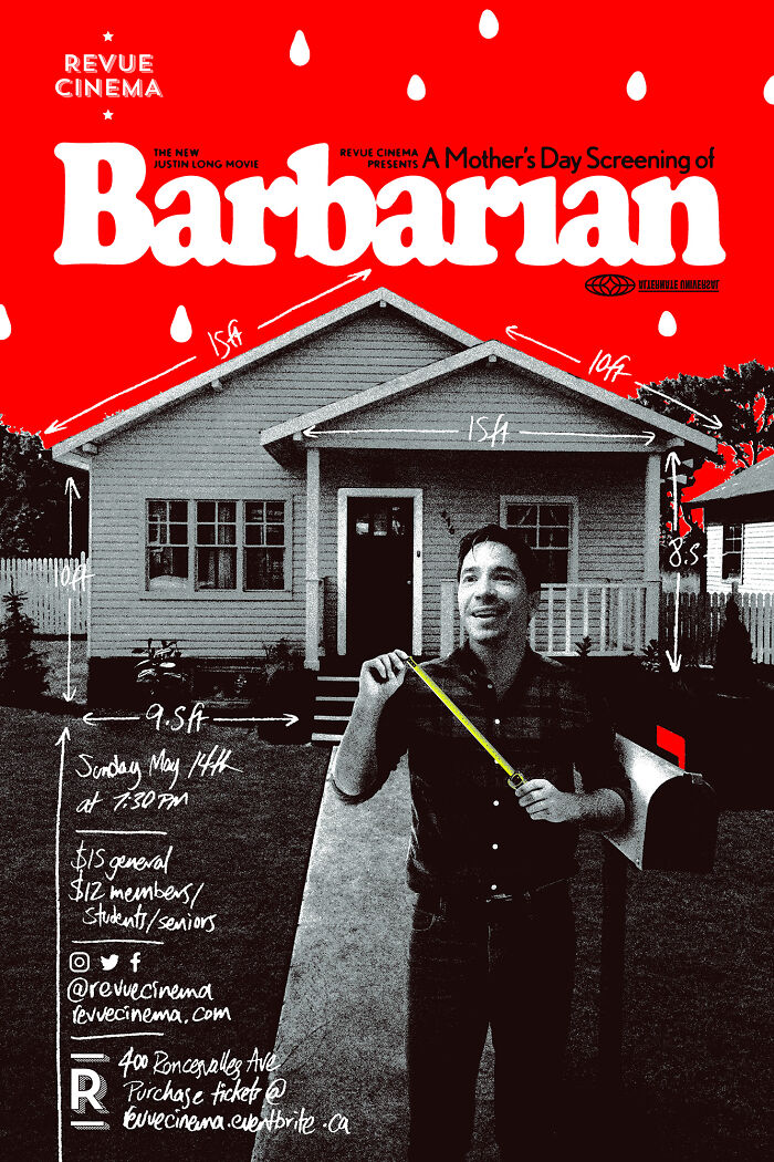
"Barbarian" Movie Screening Poster
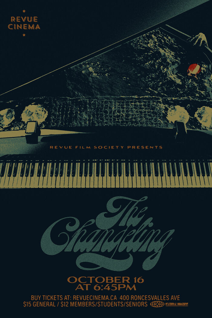
"The Changeling" (1980) Movie Screening Poster
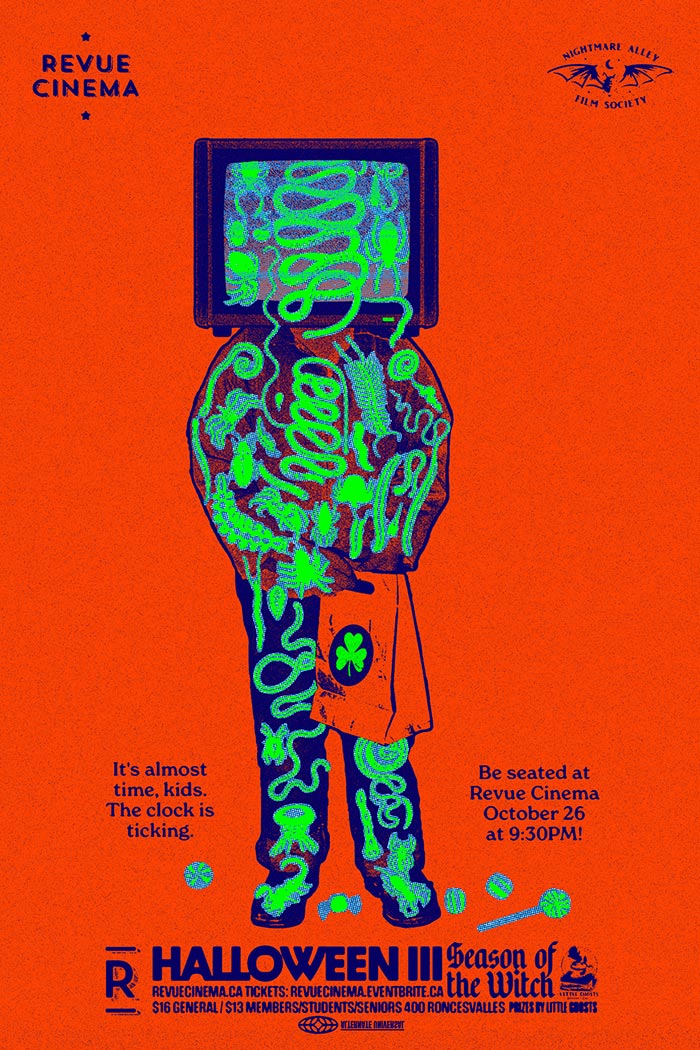
"Halloween III: Season Of The Witch" Movie Screening Poster
I love how most of these actually make the font of the rating actually match the theme of the poster!
"The Holy Mountain" Movie Screening Poster
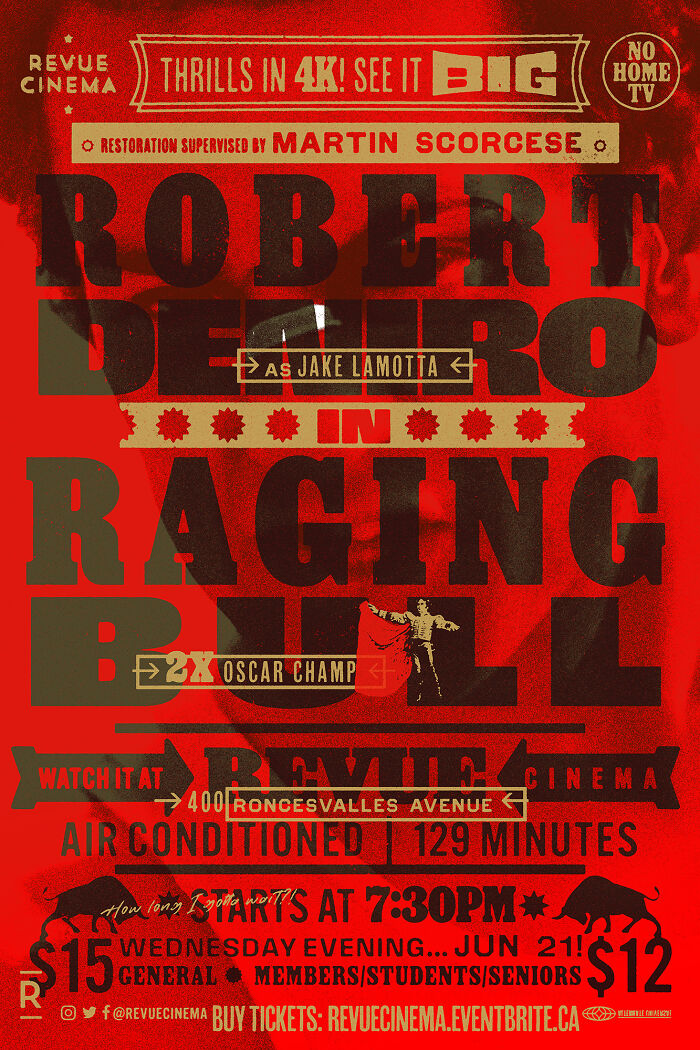
"Raging Bull" Movie Screening Poster
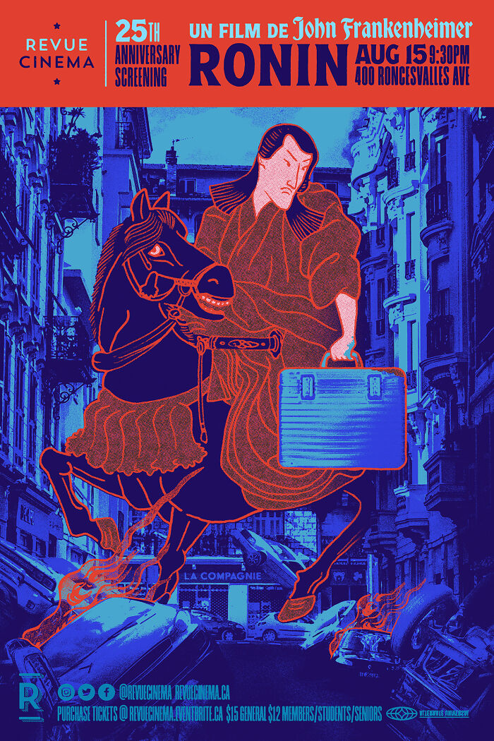
"Ronin" (1998) Movie Screening Poster
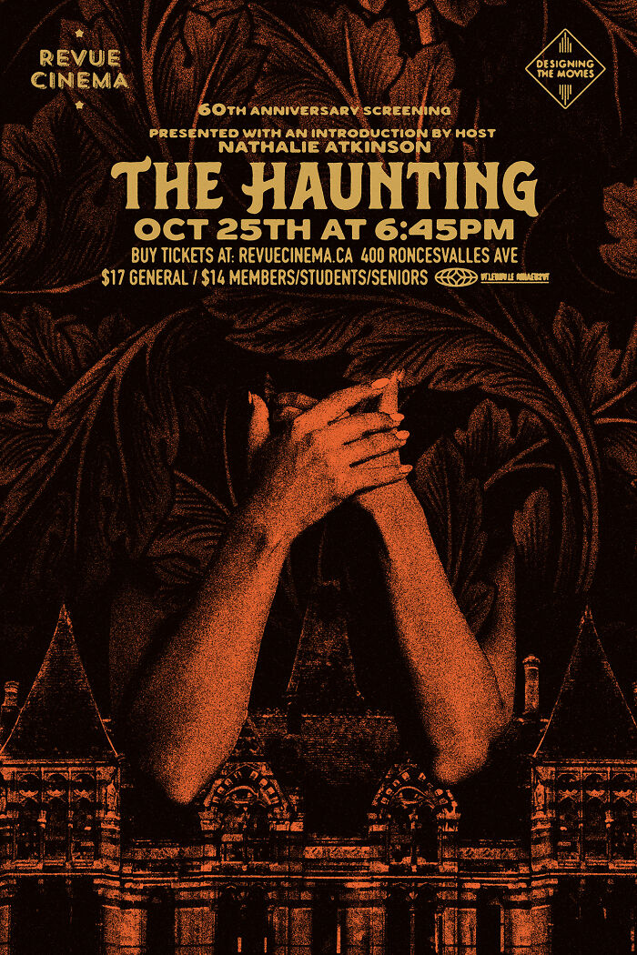
"The Haunting" Movie Screening Poster
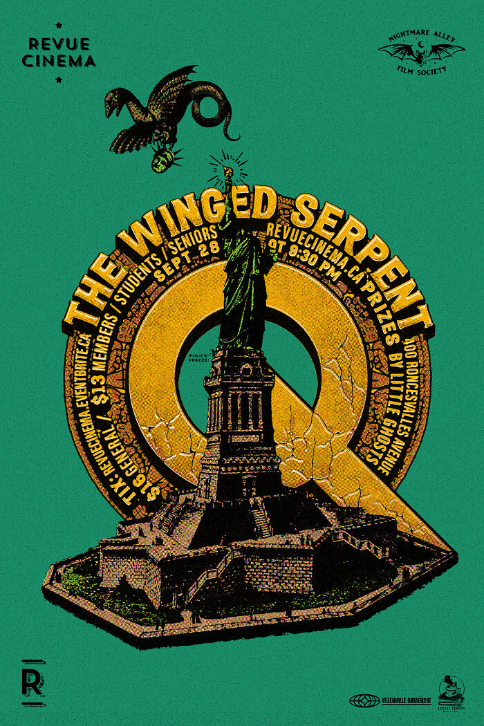
"Q: The Winged Serpent" Movie Screening Poster
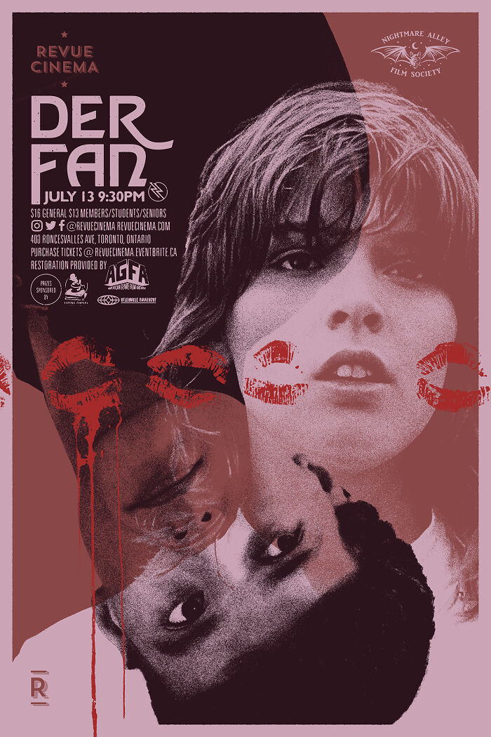
"Der Fan (The Fan)" Movie Screening Poster
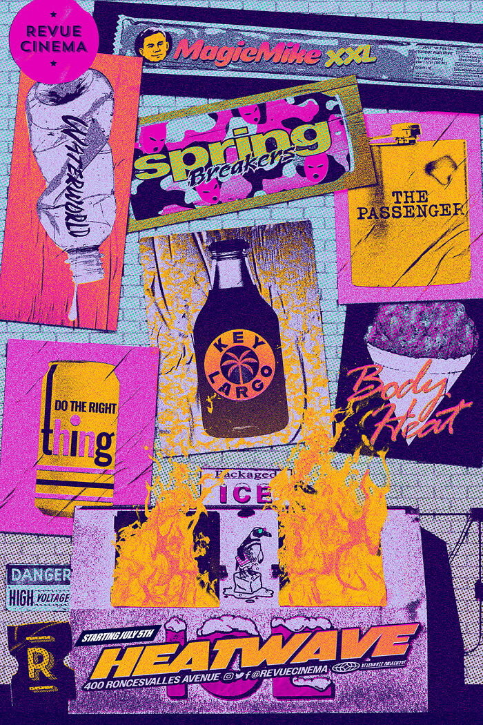
"Heatwave" Screening Series Poster Includes: "Magic Mike Xxl", "Waterworld", "Spring Breakers", "The Passenger", "Do The Right Thing", "Key Largo", And "Body Heat"
"Carlito's Way" Movie Screening Poster
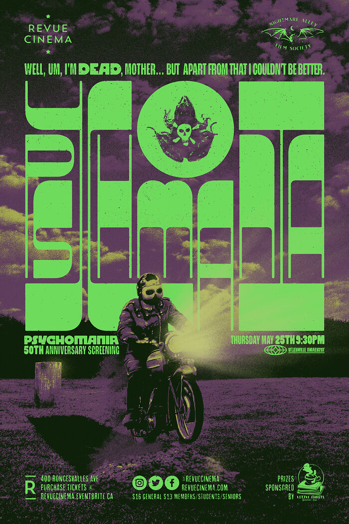
"Psychomania" Movie Screening Poster
Hey, have u done any Kaiju or other monster movies? If so I would love to see them if thats ok!
I'm actually planning a small art series (not exactly movie posters) surrounding that theme in the next couple of months!
Load More Replies...Hey, have u done any Kaiju or other monster movies? If so I would love to see them if thats ok!
I'm actually planning a small art series (not exactly movie posters) surrounding that theme in the next couple of months!
Load More Replies...
 Dark Mode

 No fees, cancel anytime


