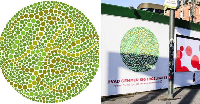
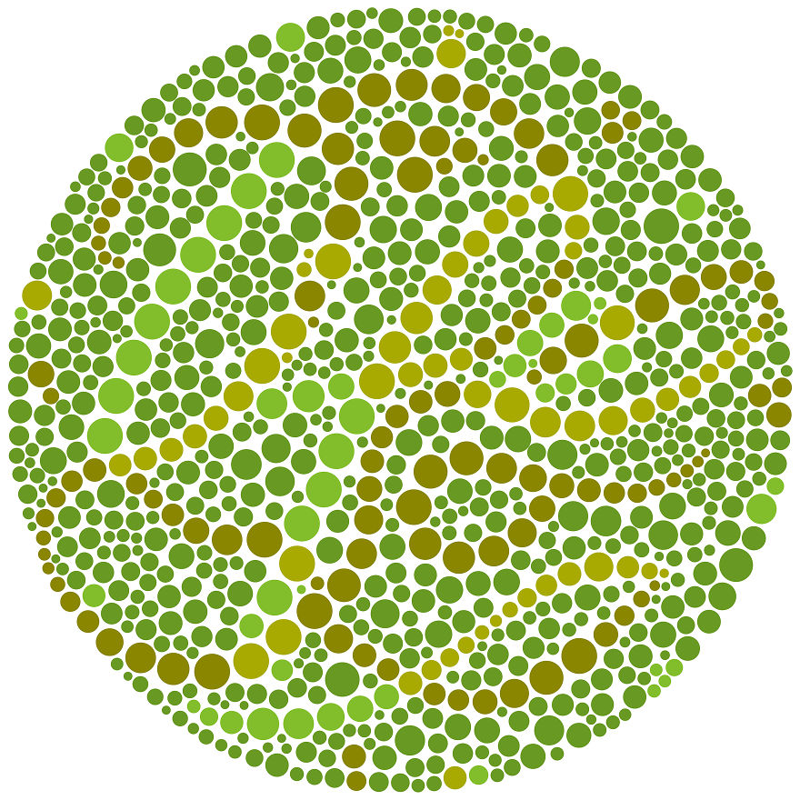
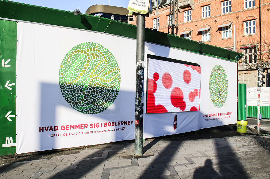
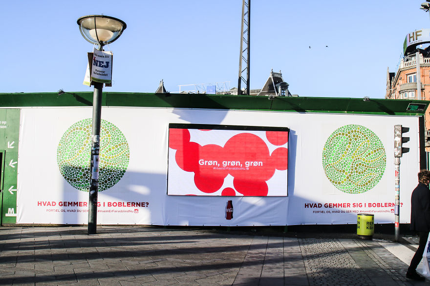
To most viewers these images just look like greenish-brown bubbles. But the images are pretty unique because there is a clear message nestled in the design and you can only read it if you are color-blind.
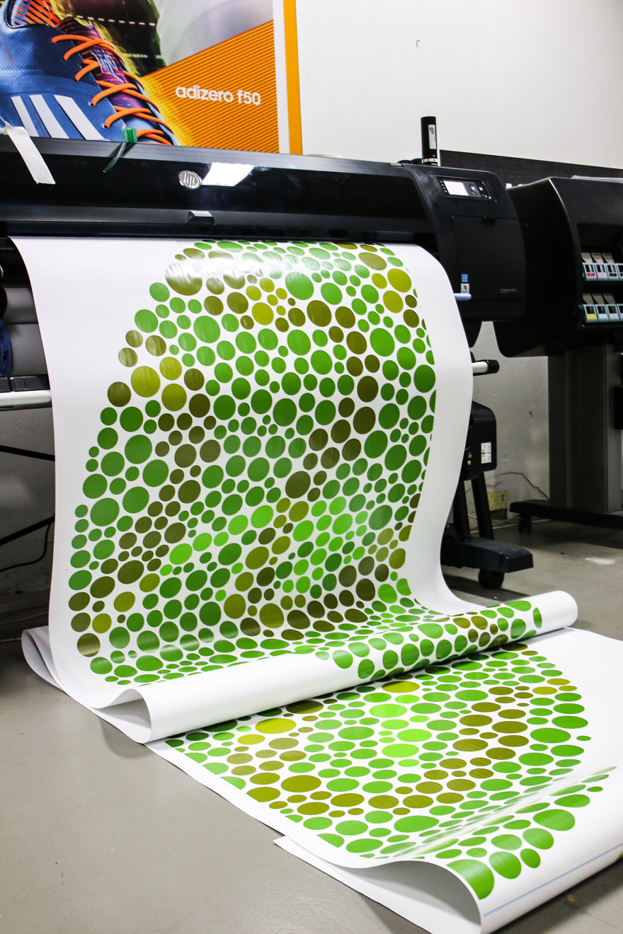
We were inspired by the so-called Ishihara images that only people with normal vision can read. They are normally used to test color-blindness. To make images that only color-blind people can decipher, we had to master the technically complicated task of developing reversed Ishihara images.
So, what is the message that color-blind people can see? The message is the word “life”, which is the name of Coca-Cola’s stevia-sweetened drink, and these images were part of a campaign activated in Denmark. With the images we wanted to surprise people and get them curious about this new member of the Coca-Cola family.
Usually, Coca-Cola is associated with the iconic red color but the color of green is added to the Coca-Cola universe with the green-labelled Coca-Cola life. The red and green colors gave us the idea of focusing on people that are red-green color-blind, and we decided to favor them – and to turn everyone with normal vision color-blind instead. As far as we know, this is the first campaign directly targeting color-blind people.
More info: essencius.dk
5Kviews
Share on FacebookThis is a wonderful commentary on the pervasiveness of ableism in our society! Brilliant work!
I've been told I am red-green color-blind by ophthalmologists and optometrists but can only see a faint image of "Life" in the final street photo... whichever type I am I definitely cannot pass those Ishihara tests...
This is a wonderful commentary on the pervasiveness of ableism in our society! Brilliant work!
I've been told I am red-green color-blind by ophthalmologists and optometrists but can only see a faint image of "Life" in the final street photo... whichever type I am I definitely cannot pass those Ishihara tests...

 Dark Mode

 No fees, cancel anytime






























28
6