Bill Gates Posts Data Of Causes Of Death In The US, Is Amazed By The Disconnect Between News And Reality
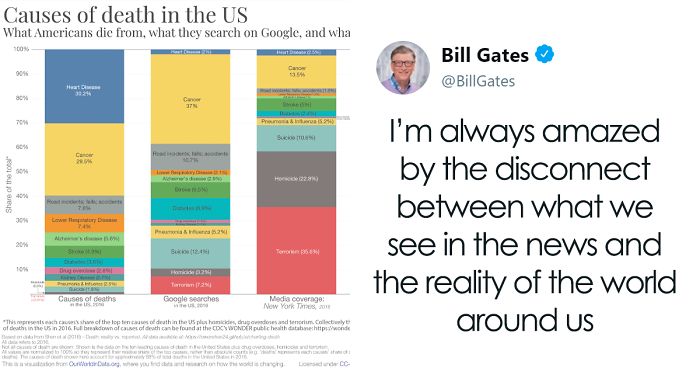
Bill Gates has 47.4 million Twitter followers, so when he tweets something, it gets noticed. Recently, the billionaire Microsoft founder has directed everyone’s attention towards an issue he’s been seeing for a while. The media isn’t accurately reflecting what we’re dying from, and Mr. Gates thinks this disconnect shows that the news is trying to spin a story instead of addressing the real causes of death.
More info: Twitter
The media isn’t accurately reflecting what we’re dying from
Image credits: BillGates
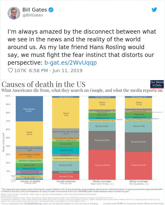
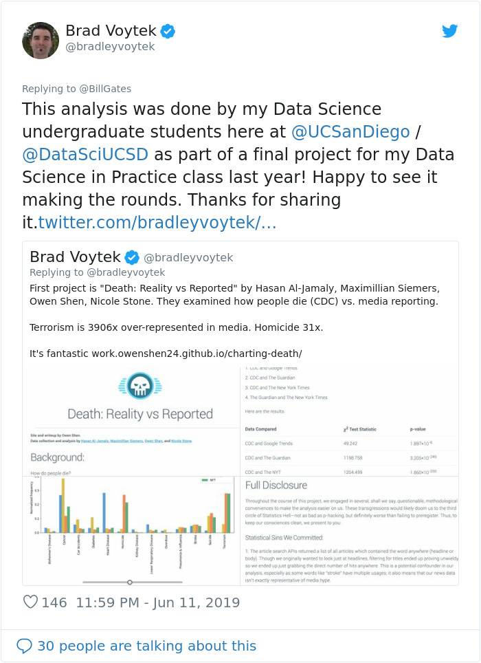
The statistical graphs that Bill Gates tweeted comes from a project, titled Death: Reality vs. Reported, by students of the University of California San Diego. The researchers attempted to answer these questions: how do people die, how do people think they die, and is there a difference. To get some answers, they set out to investigate if there’s a disconnect between what one sees in news sources and the real ugly truth.
For their project, the students look at four sources: The Center for Disease Control’s WONDER database for public health data (1999-2016), Google Trends search volume (2004-2016), The Guardian’s article database, and The New York Times’ article database. “For all of the above data, we looked at the top 10 largest causes of mortality, as well as terrorism, overdoses, and homicides, three other causes of death which we believe receive a lot of media attention,” they wrote. For each, the relative share of deaths, share of Google searches, and share of media coverage, were calculated.
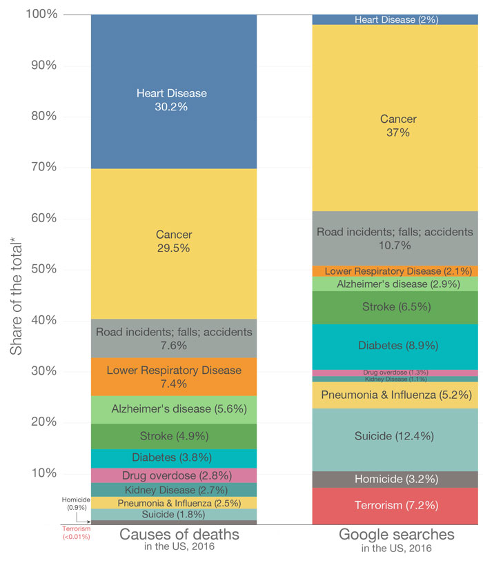
Actual causes of death vs. Google search trends for causes of death
Image credits: ourworldindata
“Immediately, we can see that terminal illnesses like cancer and heart disease take up a major chunk of all deaths, each responsible for around 30% of the total death count,” the researchers wrote. “On the graph, everything is visible except for terrorism, which is so small it doesn’t show up unless we zoom in.”
Next, the Google Trends data. “The two major changes here seem to be that heart disease is underrepresented, and terrorism is very much overrepresented. Suicide also looks like it has several times more relative share here than compared to the actual death rate. The rest of the causes look like they’re within the right order of magnitude as the CDC data.”
Actual causes of death vs. death coverage in the media (The Guardian)
Image credits: ourworldindata
Actual causes of death vs. death coverage in the media (New York Times)
Image credits: ourworldindata
“Here, we see that terrorism, cancer, and homicides are the causes of death that are most mentioned in the newspapers. Though the share that cancer occupies seems largely proportional, the share given to both homicides and terrorism appears grossly overrepresented, given their respective share of total deaths.”
“After looking at our data, we found that, like results before us, the fake news given by media outlets and Google searches does not match the actual distribution of deaths,” they concluded. “This suggests that general public sentiment is not well-calibrated with the ways that people actually die. Heart disease and kidney disease appear largely underrepresented in the sphere of public attention, while terrorism and homicides capture a far larger share, relative to their share of deaths caused.”
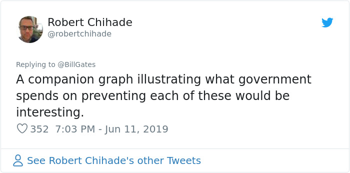
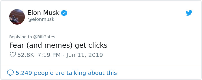
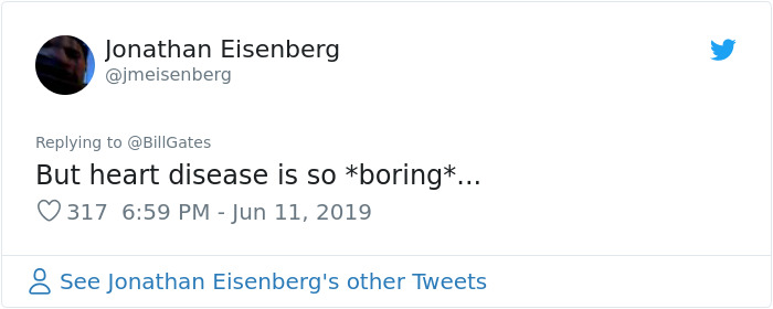
People had a lot to say about this
Image credits: ZacksJerryRig
Image credits: bradleyvoytek
Image credits: robertchihade
Image credits: elonmusk
Image credits: jmeisenberg
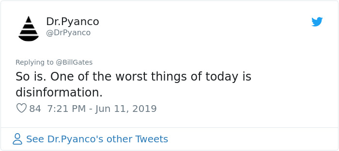
Image credits: DrPyanco
Image credits: mohtab
399Kviews
Share on FacebookKing of fear and distrust must be Hitler and now trump. So scared of the "others" you'd follow them.
Load More Replies...Media companies are heavily involved in politics, so their stories will reflect things that further the interests of their goal. On top of that, sensational stories sell. So you're slowly seeing certain rights or laws changing, all because people are just to dumb to vote with their brain most of the time.
Yep. The Sinclair Group owns everything. It's frightening.
Load More Replies...What is also interesting is that we kill ourselves more often than we are killed by others....I certainly would not have guessed that from media coverage....
Just because someone kills him/herself doesn't mean it's not someone else's fault.
Load More Replies...I have no research to back me but I think this is true about a lot of things. I feel the media, mainstream and social, searches for the most horrific things to air and we're starting to think it's normal. I realize the mundane doesn't sell but still.... The only choice you have is horror stories, what the latest "celebrity" is wearing , or turning it off. It takes a brave person to start your day out with the news and still find the courage to leave your house.
"If it bleeds, it leads." I got rid of TV about 18 months ago and that helps a lot. I still read the paper. Now I want to clean up my internet consumption.
Load More Replies...The news should cover death from heart disease the way they cover homicide and terrorism. Make people more afraid of it than anything else.
You know that a report on someone who died of a heart disease isn't sensational or shocking. So do the newsagencies. Besides that: The major causes for heart diseases are living a sedentary lifestyle and not getting enough physical exercise, eating an unhealthy diet that’s high in fat proteins, trans fats, sugary foods, and sodium, smoking and excessive drinking. If all people would change their lifestyle, a lot of big companies would suffer tremendous financial losses. Which would mean the have to cut their advertising budget, which would mean that the newsagencies would suffer financial losses. And that's why they don't cover deaths from heart diseases.
Load More Replies...You are absolutely right. It does. Heart disease at an advanced age is one thing, but an inactive, obese smoker with heart problems in mid-life is quite another.
Load More Replies...We should be concerned about this. Actually, we should be quite alarmed because it feels like the same hyperinflation of alarming statistics is happening on many hot button issues. Political disharmony Immigration Gun violence Rich/Poor divide Me Too Armed conflicts Helicopter parenting Etc. If it has potential to cause controversy, help an organization push their agenda, generate more viewers, likes, and shares, or sell more advertising, it's going to get skewed then shouted from the proverbial rooftops. I'm concerned an issue I am most passionate about, suicide among veterans, is not being accurately reported. The widely reported number of 22 veterans a day killed by suicide on average has been disputed, ironically as being both too low and too high. Perhaps with enough voices sharing accurate and solid research, such as this, we may have a statistically significant chance of making a difference. But then, we could be guilty of skewing data to our advantage.
King of fear and distrust must be Hitler and now trump. So scared of the "others" you'd follow them.
Load More Replies...Media companies are heavily involved in politics, so their stories will reflect things that further the interests of their goal. On top of that, sensational stories sell. So you're slowly seeing certain rights or laws changing, all because people are just to dumb to vote with their brain most of the time.
Yep. The Sinclair Group owns everything. It's frightening.
Load More Replies...What is also interesting is that we kill ourselves more often than we are killed by others....I certainly would not have guessed that from media coverage....
Just because someone kills him/herself doesn't mean it's not someone else's fault.
Load More Replies...I have no research to back me but I think this is true about a lot of things. I feel the media, mainstream and social, searches for the most horrific things to air and we're starting to think it's normal. I realize the mundane doesn't sell but still.... The only choice you have is horror stories, what the latest "celebrity" is wearing , or turning it off. It takes a brave person to start your day out with the news and still find the courage to leave your house.
"If it bleeds, it leads." I got rid of TV about 18 months ago and that helps a lot. I still read the paper. Now I want to clean up my internet consumption.
Load More Replies...The news should cover death from heart disease the way they cover homicide and terrorism. Make people more afraid of it than anything else.
You know that a report on someone who died of a heart disease isn't sensational or shocking. So do the newsagencies. Besides that: The major causes for heart diseases are living a sedentary lifestyle and not getting enough physical exercise, eating an unhealthy diet that’s high in fat proteins, trans fats, sugary foods, and sodium, smoking and excessive drinking. If all people would change their lifestyle, a lot of big companies would suffer tremendous financial losses. Which would mean the have to cut their advertising budget, which would mean that the newsagencies would suffer financial losses. And that's why they don't cover deaths from heart diseases.
Load More Replies...You are absolutely right. It does. Heart disease at an advanced age is one thing, but an inactive, obese smoker with heart problems in mid-life is quite another.
Load More Replies...We should be concerned about this. Actually, we should be quite alarmed because it feels like the same hyperinflation of alarming statistics is happening on many hot button issues. Political disharmony Immigration Gun violence Rich/Poor divide Me Too Armed conflicts Helicopter parenting Etc. If it has potential to cause controversy, help an organization push their agenda, generate more viewers, likes, and shares, or sell more advertising, it's going to get skewed then shouted from the proverbial rooftops. I'm concerned an issue I am most passionate about, suicide among veterans, is not being accurately reported. The widely reported number of 22 veterans a day killed by suicide on average has been disputed, ironically as being both too low and too high. Perhaps with enough voices sharing accurate and solid research, such as this, we may have a statistically significant chance of making a difference. But then, we could be guilty of skewing data to our advantage.

 Dark Mode

 No fees, cancel anytime
























340
123