“That’s It, I’m Architecture Shaming – Burn It To The Ground Edition”: 29 Of The Best Pics From This Facebook Group
People make mistakes, and some of these mistakes happen on the job. Usually, the incident is corrected and the whole thing can be forgotten in a few minutes. But if it was an architect who messed up, the "hiccup" can be a lot more noticeable.
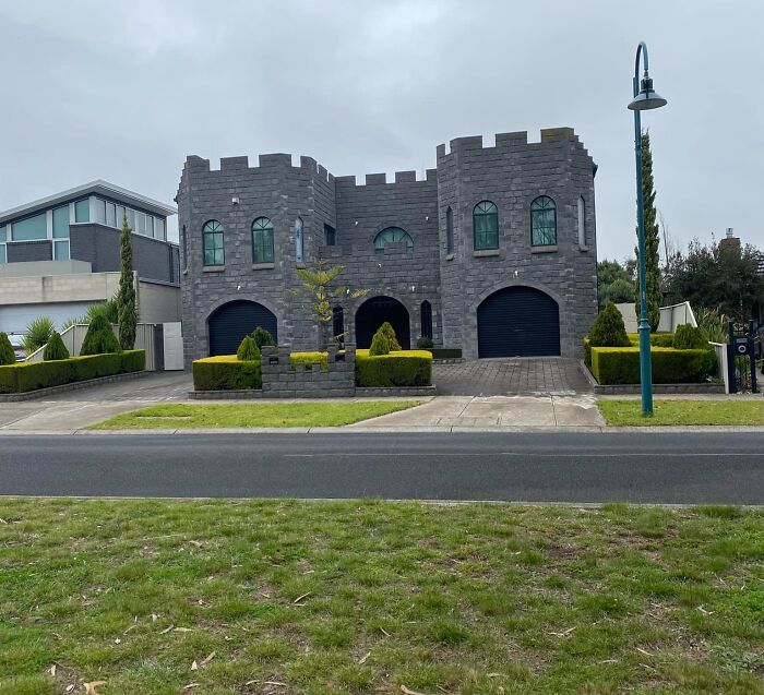
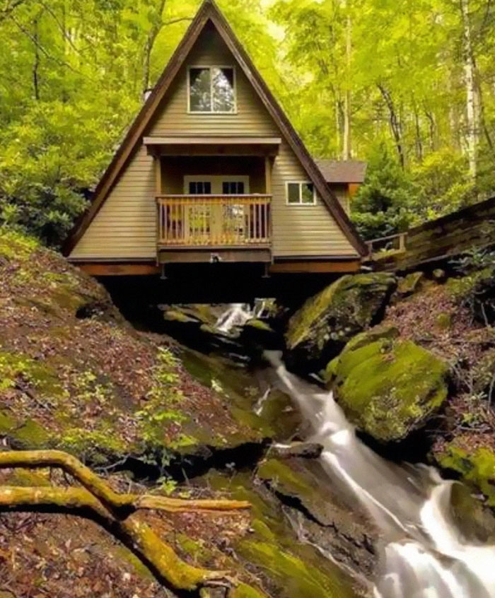
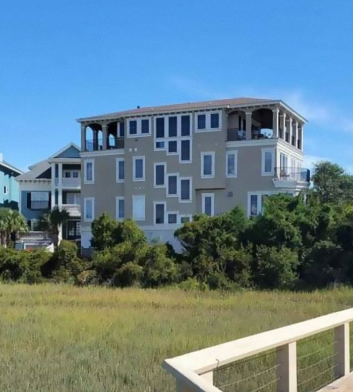
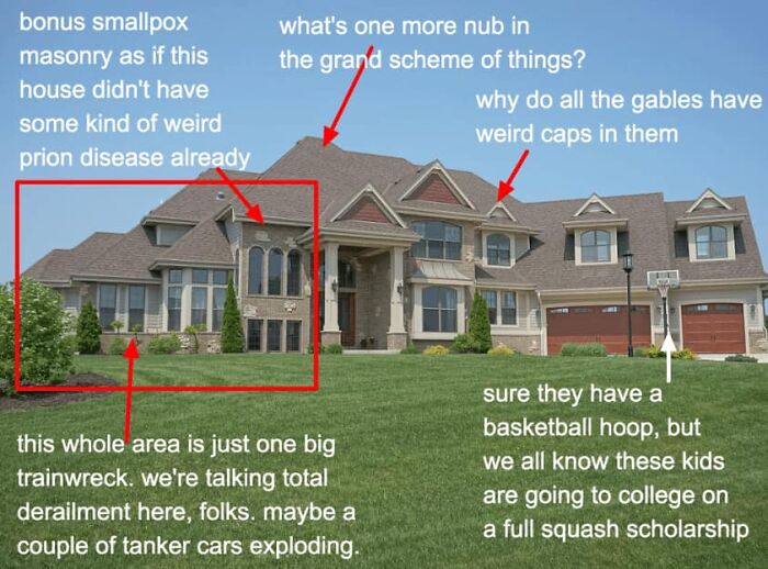
There's a Facebook group called 'That's It, I'm Architecture Shaming - Burn It to the Ground Edition' and it's dedicated to calling out every building that its members believe shouldn't have seen the light of day.
Of course, if there aren't objective negatives (like structural damage), a lot of it boils down to taste, igniting heated discussions, but it makes scrolling through the content a lot more interesting.
More info: Facebook
This post may include affiliate links.
It’s High As A Kite
When You Open Like 8 Tabs By Mistake
According to Associate professor Melonie Bayl-Smith from UNSW Built Environment, architecture today suffers from an originality syndrome.
"When architects try to do something completely original, they don’t necessarily produce a better building," she said, adding that originality shouldn’t necessarily be the highest value of an architect.
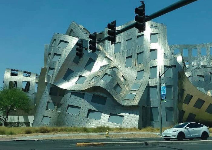
My Friend Posted This From Vegas… Not Sure The Name Of This Building- I Kinda Dig It- His Comments Were, “It Sure Is Hot In The Desert!”
Architecture Shaming
"I see that architecture today, in some cases, has become a very form-based exercise, often at the expense of the quality of space or other crucial aspects of architecture. It doesn’t matter anymore whether it responds to anything to do with site or place or people — apparently, we just want it to look different," Bayl-Smith said.
Architecture Shaming
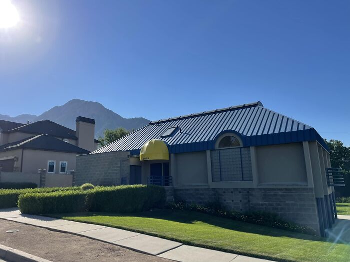
Client: What I’m Looking For Is A 1990’s Strip Mall Aesthetic. Think Blockbuster
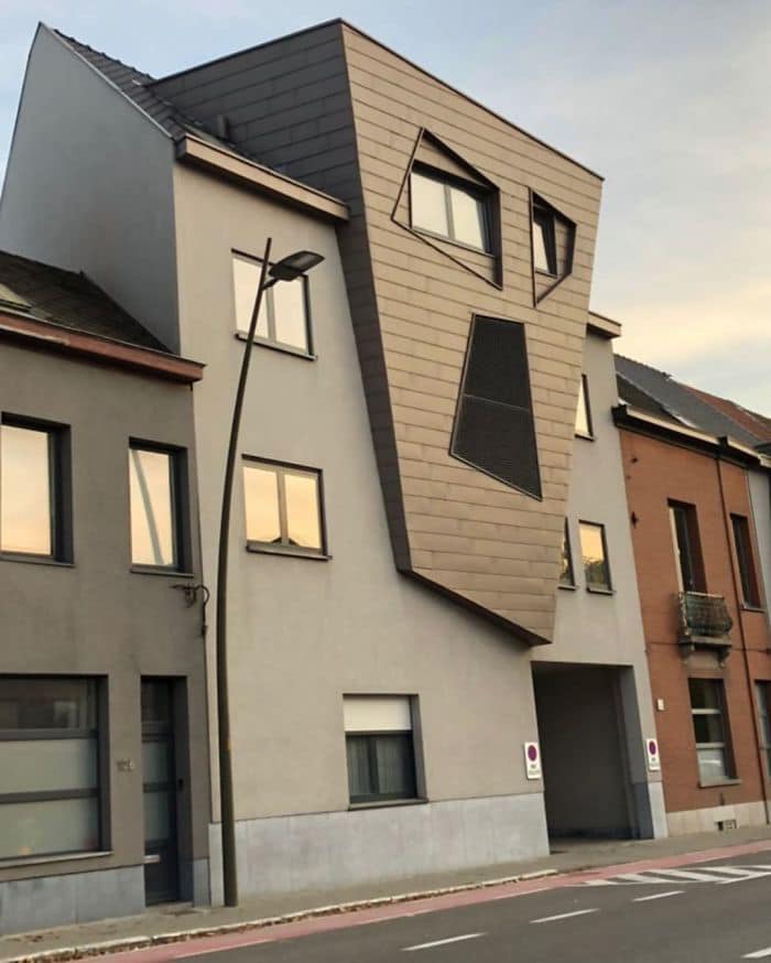
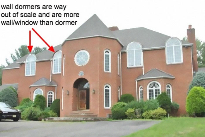
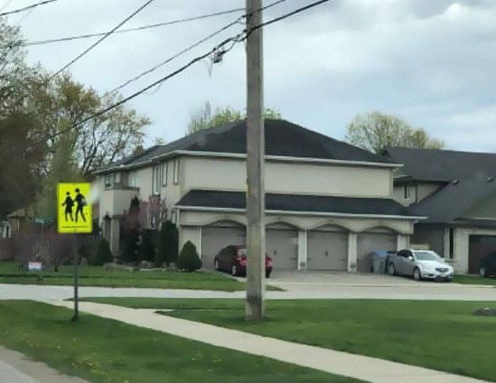
Everytime I See These Windows I Do A Double Take. Not For A Good Reason
The professor argued that creating a well-thought-out product is more important than doing something for the sake of its novelty.
"I think we as a profession need to do a better job of recognizing what does work well, and developing and enriching those approaches, whether it’s spatial design, material design, the processes of building assembly, sustainable practices — all the different things that contribute to making a great, long-lasting building," she said. "There are enough poor buildings out there; we don’t need to keep 'inventing' more of them just to try and be 'original'."
Architecture Shaming
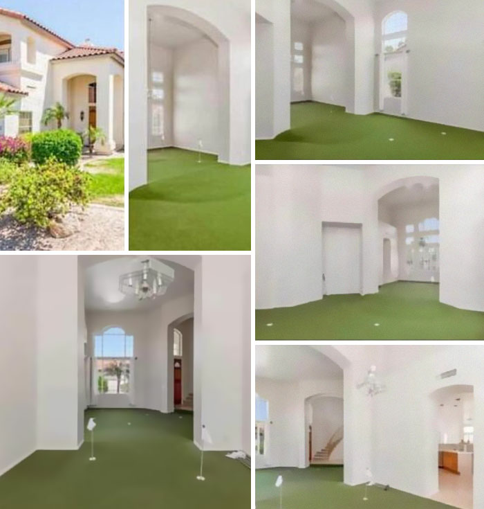
When You Live In Arizona & Hate The Heat, But Love Golf. Here Is The House For You!
Architecture Shaming
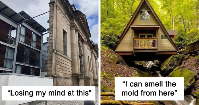
I Can Smell The Mold From Here
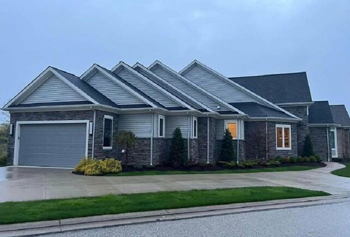
There are a few basic architectural concepts that explain why some buildings just look off. First, we need to look looking at their mass.
"The primary mass is the largest shape in the building block. The secondary masses are the additional shapes that form the facade of a building." So if there are too many of them, the house has no concept and looks bizarre. Also, buildings need balance. Good-looking houses are usually symmetrical or asymmetrical. Any other way of designing them could result in conflicting rooflines and other architectural elements.
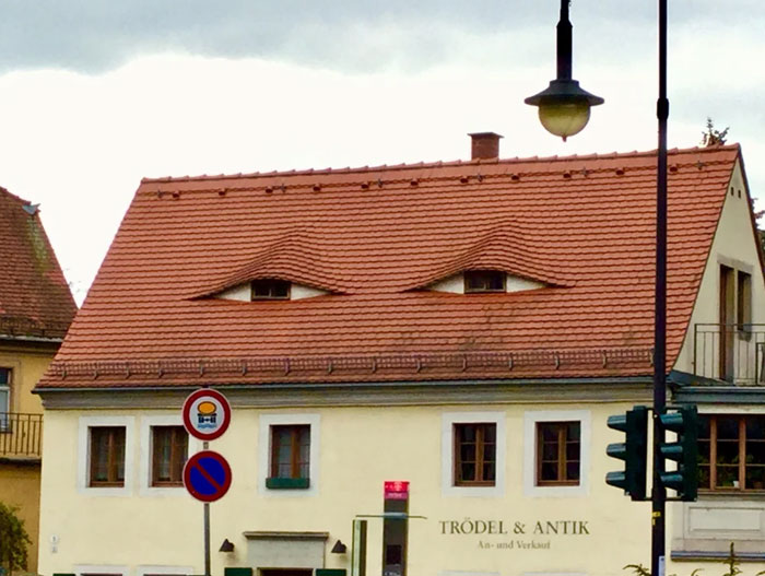
The Hills Have Eyes. And So Does This Hilton Head Condo
As someone who has lived in houses with too few windows, I don't hate this as much as I should.
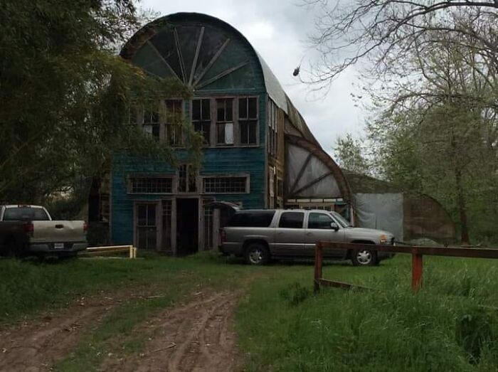
A Greenhouse In Lafayette, LA. I Love It And Hate It At The Same Time. Weird Feeling. What Do You Think Of It. (Yes It's Old And I Hear It May Not Be Around Much Longer)
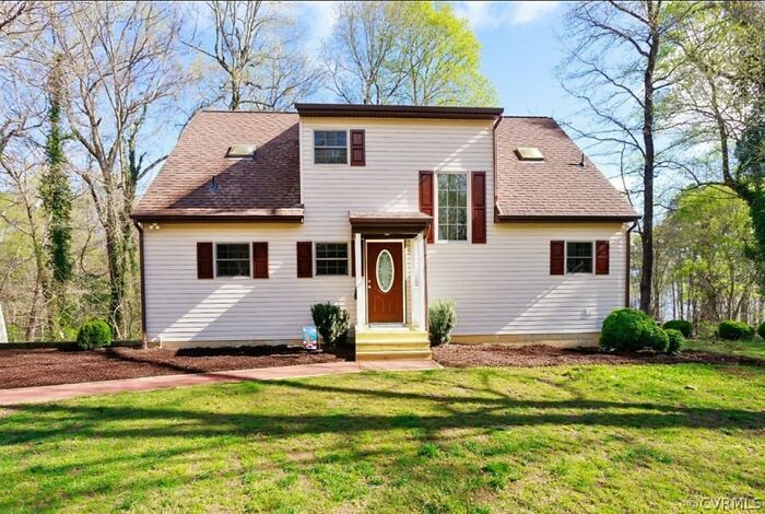
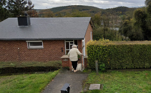
I Found This Just North Of Petersburg
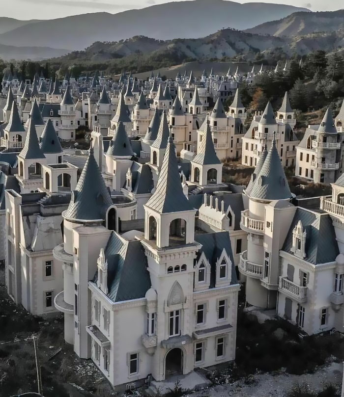
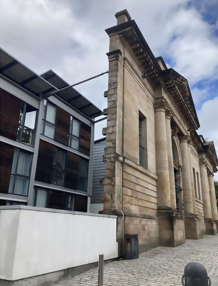
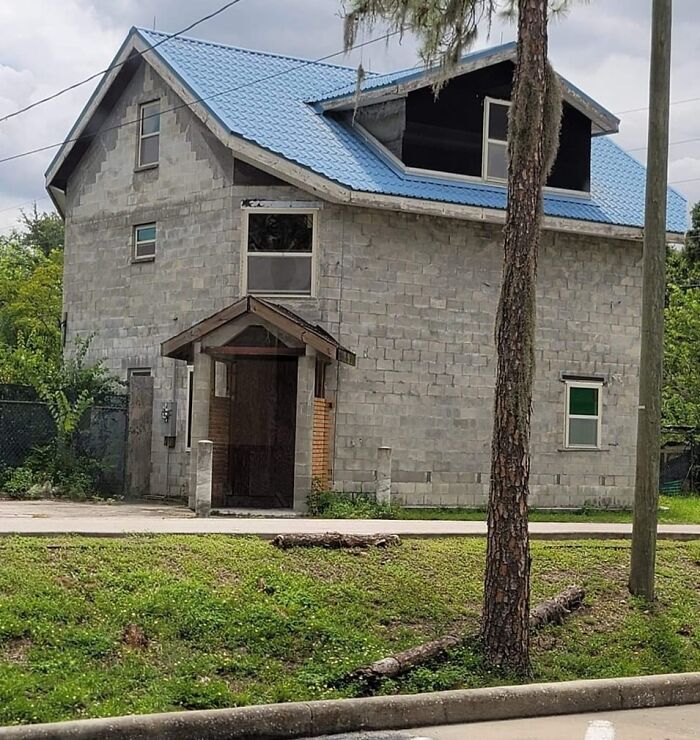
Losing My Mind At This
It's called "facadism". It's a massive problem in London. Perfectly good historic buildings get pulled down and replaced with horrible modern structures simply because it's more profitable for a developer to do that than make an old building work for them. As a concession to the planners they retain just the facade. Not only is it cultural vandalism in pursuit of greed, but it is also a disaster for the environment- destroying perfectly good buildings releases the building's embodied carbon and requires vast quantities of carbon-emitting steel and concrete production.
Even though today we have countless tools to make a design work, a few mistakes still end up getting made quite too often. According to Build It, it's not a good idea to save some money on parts of construction that will be difficult to upgrade later, like bricks or roof tiles. Also, employing too many different materials could be one of the reasons a house turns out wrong. It can make it seem overly "busy" and distract from other features.
Architecture Shaming
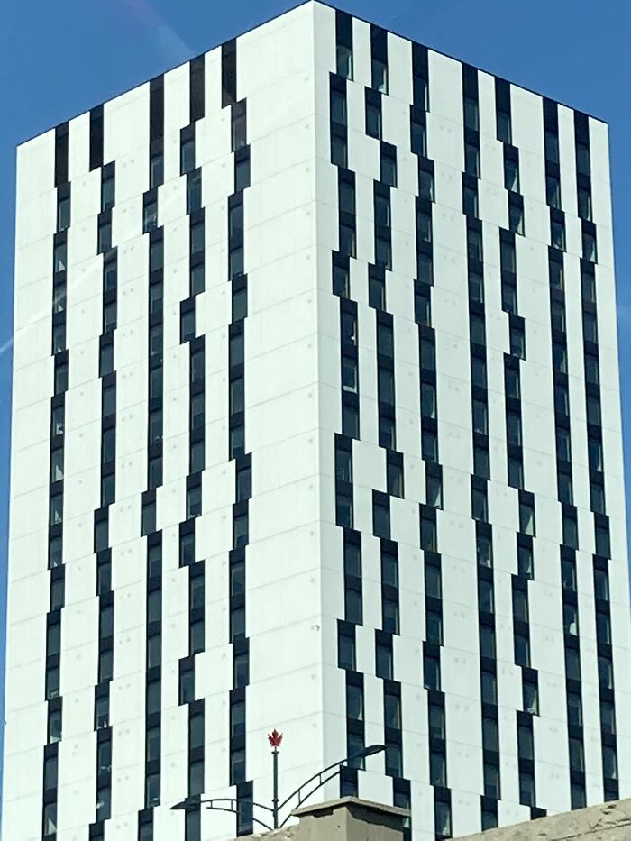
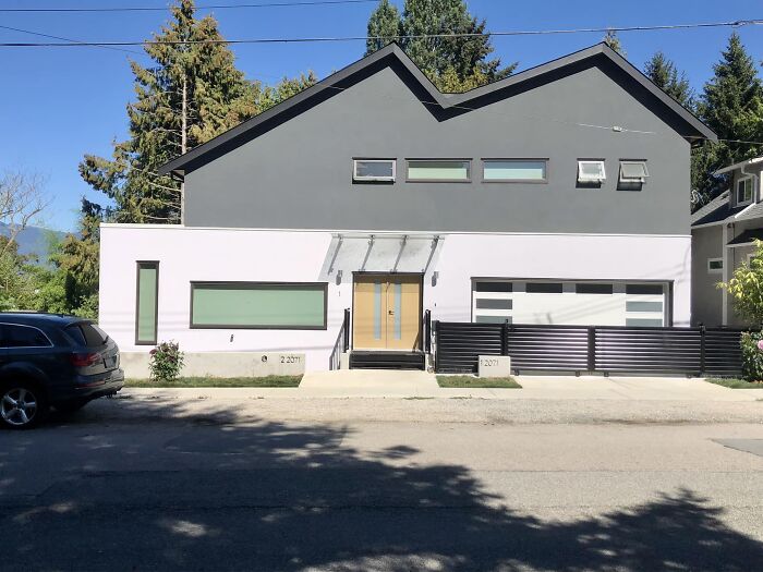
Spotted In Vancouver. Windows Look Funny That’s Not Just Me Right
Architecture Shaming
Architecture Shaming
Architects have the power to make our lives much easier and new buildings and public spaces need to accommodate and protect society, not confuse us.
After all, a report by the United Nations (U.N.) stated that 55% of the world’s population lives in urban areas today. A number that is expected to increase to 68% by 2050. Our environments are changing at an incredible rate, so designers, urban planners, and architects have to face the challenges to ensure they serve the people who live there.
A Lot Going On Here
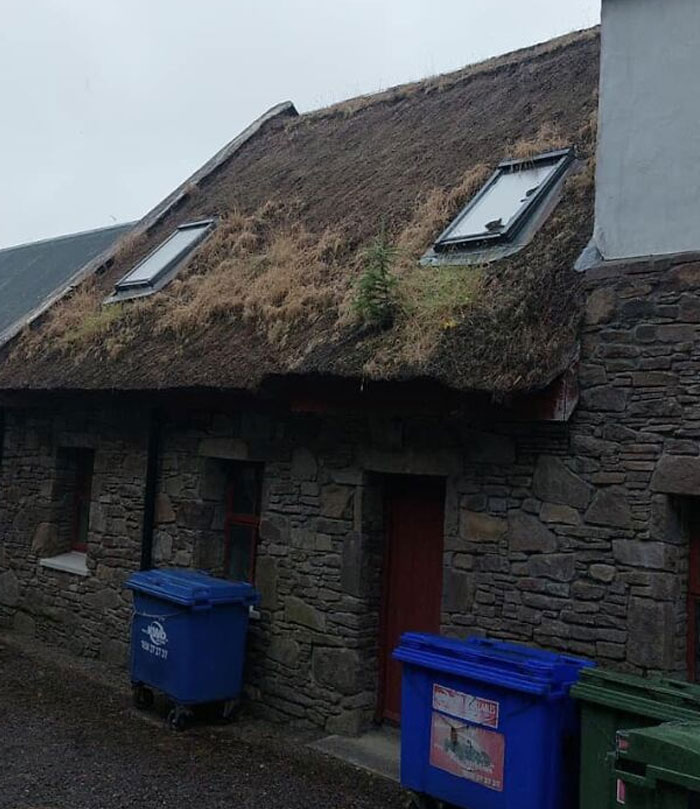
"Nothing says rural Kerry like Velux windows in a thatched roof."
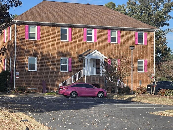
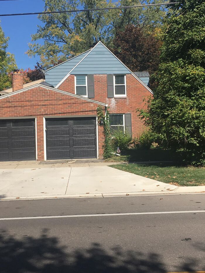
Was There A Half-Off Sale On Shutters?
The International Bank Of Settlements In Basel, Switzerland. With All That Cash Flowing Through, One Would Think They Could Skim Some To At Least Give It A Good Paint Job Or Make The Windows Consistent
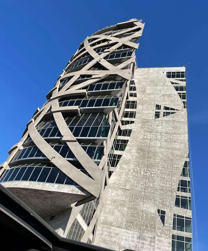
All I Know Is It’s In LA County And Has Been Under Construction For More Than 5 Years
So I Was On Google Maps... Our Lady Of Fátima Church, San Jose De Costa Rica
Architecture Shaming
Architecture Shaming
Windows Shmindows
My BF Sent Me This
Architecture Shaming
Yeah, a lot of them were actually pretty cool!
Load More Replies...Yeah, a lot of them were actually pretty cool!
Load More Replies...
 Dark Mode

 No fees, cancel anytime


