How Do You Know if a Logo is Good or Bad?
The first feature of a good logo is that it can immediately grab the viewer’s attention. Your logo’s visual elements should have an impact and captivate your potential customers. However, make sure you haven’t caught the viewer’s eye for the wrong reason.Â
While creativity is key in design, overly complicated logos have a higher chance of ending up as a logo fail. Simple doesn’t equal boring, and the worst logos often turn out this way because the design is too intricate. On the other hand, if your logo is too simplistic or vague, it also belongs to the failed logo category.Â
Below you’ll find some pretty crappy designs that are definitely design fails for the designer, but at least they make us laugh. Take a look at our collection of bad logo design examples.
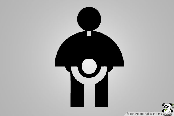
Maybe The Worst Logo For A Catholic Church
This is an actual logo designed in 1973 for the Catholic Church’s Archdiocesan Youth Commission. Although it’s a hilariously bad logo when we think about it, this logo won an award from the Art Directors Club of Los Angeles.
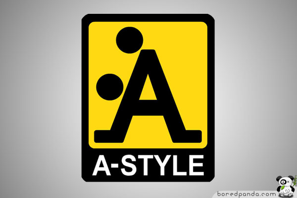
A-Style Dirty Logo
Image credits: wikipedia.org
The A-style logo was born well before the line of clothing—designed in 1989 and marketed in Italy since 1999. It was, in fact, an invention of its creator, who began to attack Italian cities with stickers on a yellow background with the A-Style logo (an example of guerilla marketing), followed by other cities, including Miami, Moscow, and London. The newspapers and television began to be interested in the sudden appearances of the strange logo, and soon, the company started marketing its products under the brand A-Style.
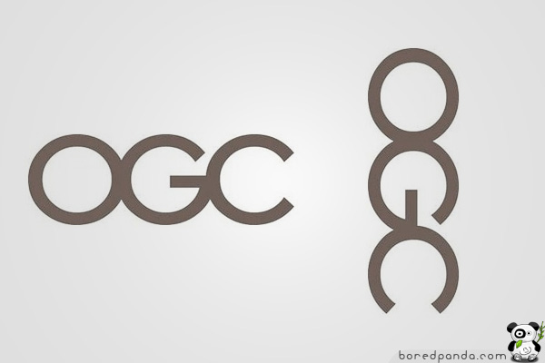
Office of Government Commerce
Image credits: commons.wikimedia.org
The Office of Government Commerce (OGC) is an independent Office of the Treasury. Sometimes, you need to shift your view to realize the error.
How to Avoid Bad Logo Design?
While hidden messages and pictures in logos are pretty cool, sometimes they appear unintentionally. And more often than not, they happen to be so inappropriate that you’ll wonder how no one noticed them before approving them.Â
To make sure your logo is really good, ask yourself a few simple questions. Does it clearly convey your company’s identity? Is it simple yet catchy enough to be remembered? Does it still look good when looked at from a different angle? If the answer to any of these questions is no, you need to go back to your workstation.
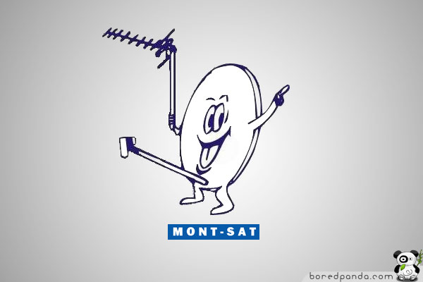
Mont-Sat Funny Logo
Image credits: mont-sat.pl
Now you know why Mr. Satellite looks so happy.
Arlington Pediatric Center
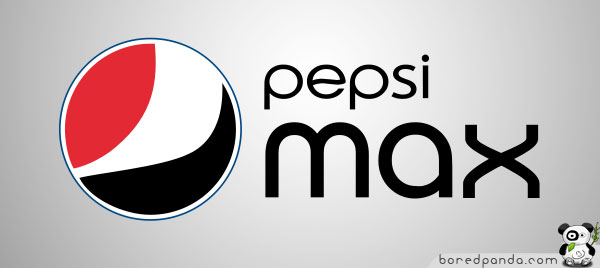
New Pepsi Logo
Image credits: Lawrence Yang
While all this might look like a joke, it gets even funnier when you look at the Pepsi Max logo. It has nearly twice the caffeine of Pepsi’s other cola beverages. We’re not sure what drinking Pepsi Max is supposed to do for you, but based on what it did to this guy’s tummy here, we’d suggest staying away from it. Probably, Pepsi realized this logo wasn’t doing their reputation any service, so they changed it again in late 2023.
You’ll never look at the Pepsi logo the same again.
Clinica Dental Design Fail
Computer Doctors
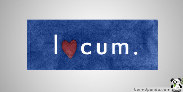
Locum
CatWear
Institute Of Oriental Studies
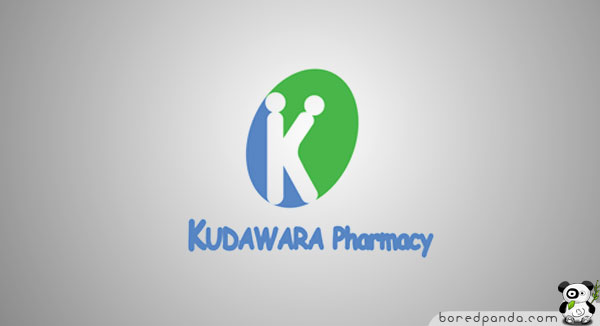
Kudawara Pharmacy
Kidsexchange
Junior Jazz Dance Classes
Image credits: tootsybird
Olympic Logo of London 2012
Image credits: underconsideration.com
Designed by Wolff Olins at an expenditure of £400,000 (almost $800,000), the logo has been met with expected ambivalence and, in some unavoidable cases, hatred. It is perhaps the worst logo for the Olympics to date.
FAQ
Who Has the Oldest Logo?
Belgian beer brewery Stella Artois has the oldest recorded logo in history, which can be traced back to 1366. While it underwent certain changes throughout six and a half centuries, its signature horn and star are still a part of it.
What Logo Has Never Changed?
British tea company Twinings introduced its logo in 1787 and has been continuously using it ever since. The design is based on the founding family’s crest and includes a reference to China, from where they imported their tea.Â
Who Designed the First Logo?
It’s difficult to name the first person who introduced logos as a way of branding, but the origin of this custom goes as far back as Ancient Egypt, where people used hieroglyphics to brand their belongings for easier identification. Â
1.7Mviews
Share on Facebooki think im missing smth... can u point it out to me?
Load More Replies...i think im missing smth... can u point it out to me?
Load More Replies...
 Dark Mode

 No fees, cancel anytime































31
18