When it comes to design, getting caught up in the latest trends is very easy. After all, many of us feel overwhelmed by endless decorating possibilities, so interior designers try to lend a helping hand — they collectively predict what’s in this year to steer us toward the next big thing. But if there’s one thing we’re pretty sure of, many solutions that have become almost alarmingly ubiquitous tend to age fast. And not in a graceful way.
Several threads over on Ask Women and Ask Reddit opened the floodgates after inviting people to share the current interior and home design trends they would just love to toss immediately. What followed was an onslaught of responses rightfully tearing apart the latest things we would already wish to forget.
From all-white everything to tropical print overload, masses of people found plenty of answers to agree on. So if you’re moving to a new home or simply looking for ideas for renovation, grab a pen and take some notes to avoid opting for questionable interior choices. Below, we gathered some of the most illuminating replies from the thread, so upvote the ones you can sign off on and share your own design pet peeves with us in the comments!
This post may include affiliate links.
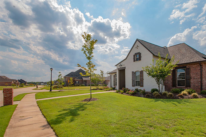 I live in an older subdivision in a suburb that is seeing a ton of development. Mostly McMansion type subdivisions are going up everywhere. There's two things about these areas that drive me nuts.
First off, why do these developers hate straight roads so damn much? Trying to navigate through a newer subdivision is the biggest pain in the a*s because roads always seem to turn back on themselves. That s**t is dumb.
Second: why cut down every single goddamn tree you see and then plop down a bunch of big, ugly-a*s houses with zero personality and THEN plant a bunch of little baby trees? Why would anyone want to live in a house with no trees anywhere? If they spent any amount of time planning what they're actually trying to build they could very easily leave large trees and patches of nature in yards or between houses. Instead they treat the development like a kid playing The Sims.
I effing hate new housing developments. They all look horrible and since most of them have HOAs it's probably a bigger pain in the a*s to live in one.
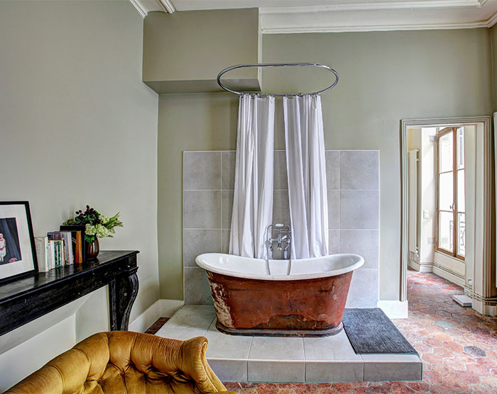 Open concept bathrooms.
I don’t want to see my toilet from my bed.
I once stayed in a B & B in Vienna that had a tiny circular shower in the middle of the room. In order to get completely wet, you had to cross your arms over your chest and turn in a circle. Granted, in was in an old building...LOL
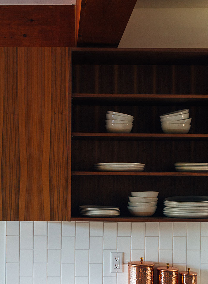 Open shelving in kitchens.
The reason for cabinets is so that no one can see your s**t. Also dust.
Kim and Jo are a Canadian and Australian duo who set out on a mission to inspire the world, one room at a time. The self-proclaimed interior design junkies are running the blog Desire To Inspire filled with clever solutions and endless tricks and tips to help anyone lost in the world of decor to create jaw-dropping designs. We reached out to them to get some insight about the questionable trends that won’t age that gracefully, and they were kind enough to have a little chat with us.
When it comes to building your home from scratch or organizing a renovation, the bloggers are firm believers that focusing only on what’s considered in this year is not such a great idea. "In the 15+ years we have been blogging we have always advocated against being too trendy with interiors," they told Bored Panda.
"We very much appreciate creativity and individuality when it comes to décor. Sticking to trends means in a couple of years when the trend is oversaturated and you see it all over social media, it will be a very expensive mistake when you’re sick of seeing it and need to redesign your space that you’re now bored of," Kim and Jo explained.
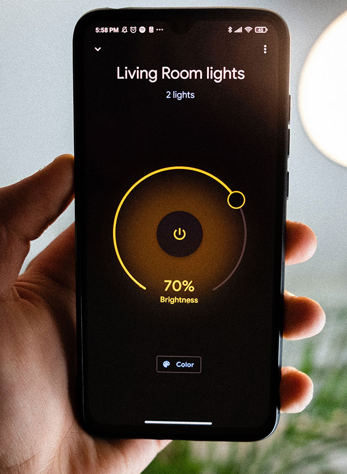 I love smart tech in a home, but most of it is horribly implemented and just bad. You shouldn't need touch screens everywhere to control your lights, or have to pull out your phone.
Pulling out your phone to change the colour of your lights isn't "smart" that's just making your lights dependent on your phone. Having your lights auto dim when you start a movie; that's smart.
Also; my refrigerator doesn't need to connect to the internet, ever.
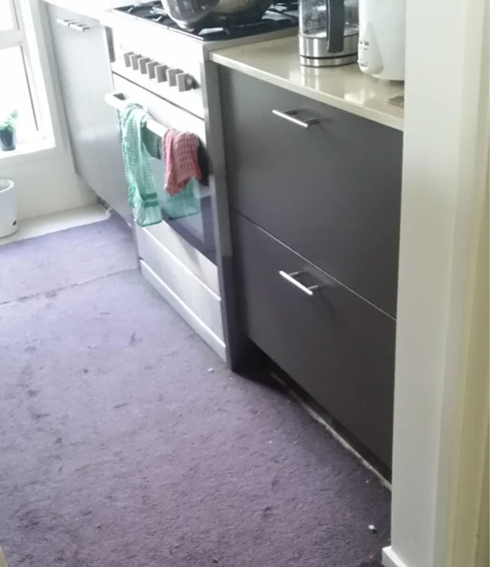 Carpeted kitchen. I have it and it's THE ABSOLUTE WORST
 Floating stairs without banisters. That looks scary as hell. Bonus points if the stairs have no texture, good luck walking up and down a narrow, slippery stairway with no support
These are against the building code used by most US states as minimum safety requirements. No reputable contractor would build these.
In the last few years, we spent more time in our own place than we have ever before, and it became clear to many that interiors need to speak to our lifestyle. What became even more evident, as you can read in the examples in this thread, is that certain design solutions are simply not cutting it anymore.
When asked about the trends we should immediately say farewell to, Kim and Jo had a few design solutions in mind they were eager to share with us. "A trendy color that is not here to stay is grey," they mentioned. "Due to people being at home more these days, warmer, more inviting colors that are earthy are definitively beating our cool colors like grey."
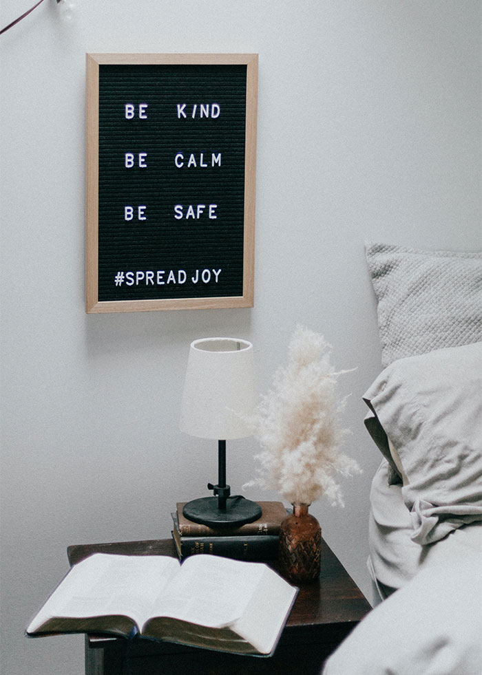 I hate words in my house, in basically any form, hate the f*****g live laugh love signs, hate it even more when people do it like my mom and plaster everything in a combination of bible quotes, motivational quotes, and the worst of all the names of our family members.
Also hate anything that is clearly supposed to have a practical use that is only around for decoration, pillows, chairs, tables, if it's something that anyone has to be told not to use because their first instinct is to treat it like any other thing of it's kind then it's stupid and I hate it.
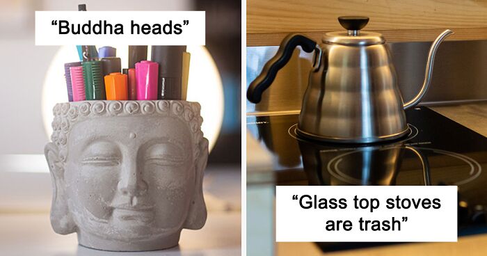
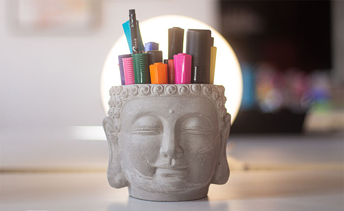 Buddha heads. Buddha heads became fashionable because American soldiers decapitated many statues in Laos and Thailand during the Vietnam War and smuggled them out. They were sold to museums across the world and people copied them to stick in their living rooms/bedrooms because "it's so peaceful /I'm open to Buddhism"
Now when you go to Thailand you'll see decapitated statues all over the country, statues that had remained intact until recent history.
There are actually huge signs near the airport reminding you not to get a Buddha tattoo/garden ornament/etc.
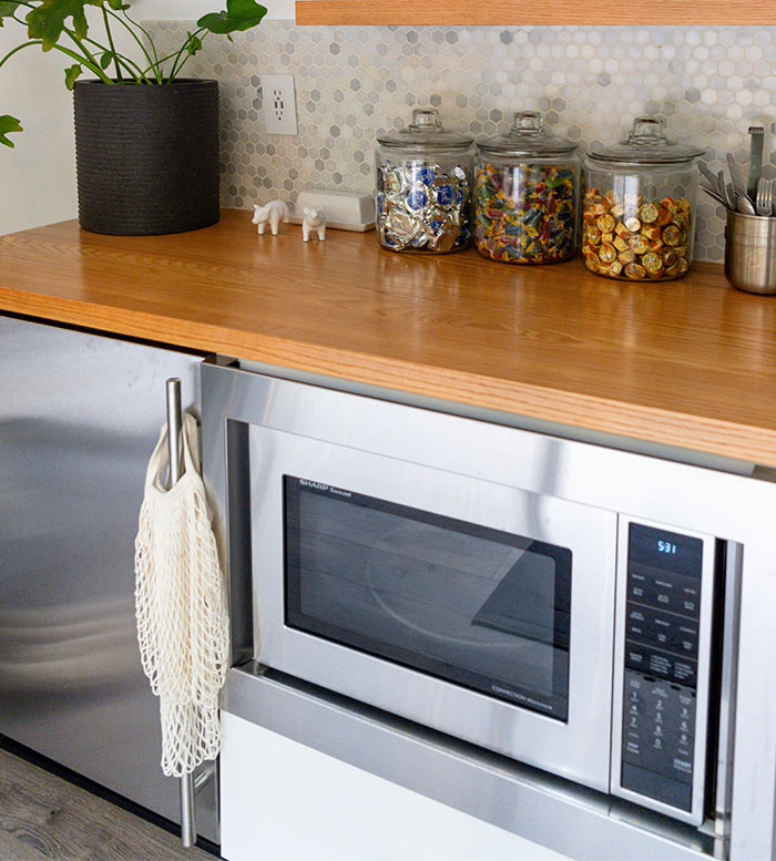 Putting the microwave hideously low to the point where you have to crouch in order to move things in and out of it.
Almost as unsafe as microwaves you have to reach up and bring down a large container of boiling hot food.
Another interior fad that the bloggers would love to see gone is farmhouse style. "This trend is sooooo overdone it needs to politely disappear never to return again," they said. "If you live on a farm go for it. If you don’t — STAY AWAY!"
Moreover, "Terrazzo is a material that while it has a fun graphic quality, has been a bit overused in the past couple of years. Don’t go there," Kim and Jo suggested.
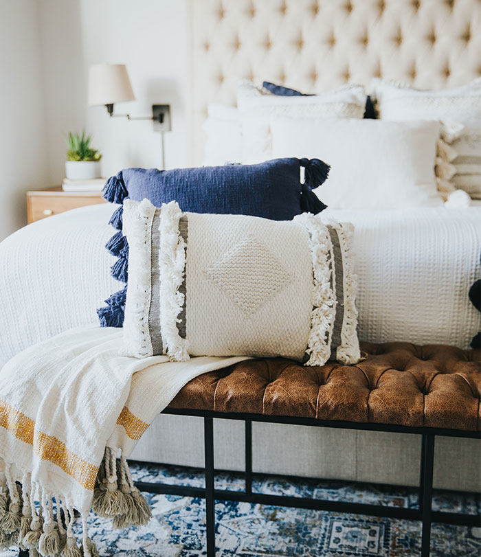 Millions of pillows and cushions on a bed. It makes the room look instantly messy when you have to move them and stack them on the floor to get in.
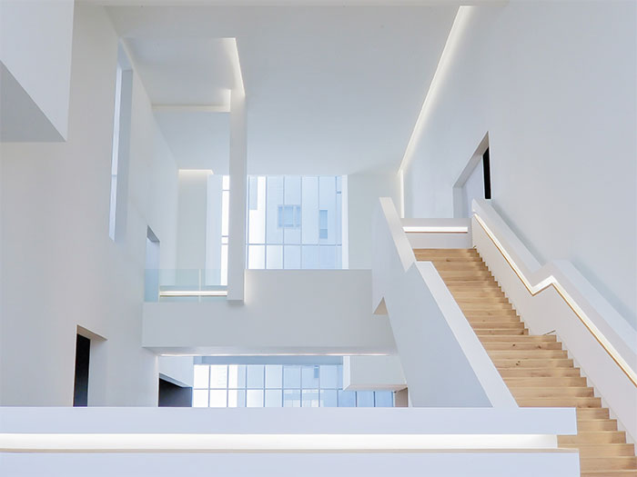 All white everything. I have so many friends (20-25ish) doing the all white furniture in an already white room with white or silver accents and I just don't get it. Any little bit of dust shows up and it's so stark that it's borderline painful to look at if the room is sunny.
It's totally personal, though. My partner and I do all black everything in white rooms. A lot of people absolutely hate it.
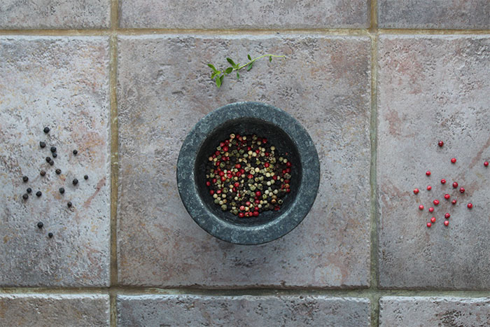 I’ve been an interior designer part time for multiple years and I could go on for hours about all the design choices many people make that just deserve to be kissed by a sledgehammer.
But if I had to narrow it down, I’d say these three things:
1. Tile Countertops. The look is massively dated and it’s impractical. You’d have to scrub the cracks a lot to get water stains and other substances that will be trapped inside. And when the tiles get damaged and loose your counter will be a pain in the a*s.
2. Popcorn ceilings. I was working with a crew to renovate a house and the ducking bathrooms had popcorn ceilings. The steam from the shower was making it fall to the floor. Ridiculously tacky. Avoid popcorn ceilings and just paint it.
3. All white interiors. Just writing that irritated me. An entire white room psychologically bothers me. No color whatsoever. Unappealing to the eye and mind as well as near impossible to maintain from stains. All white is only good for rooms you never use which will never happen.
But the duo also went into detail about timeless design solutions that are making us feel emotionally at ease, the ones they can’t simply get enough of. "Marble will always and forever be something we advocate for. It is classic, absolutely beautiful and has such a wide range of colors and can be very graphic and bold if need be. Or on the other hand, it can be very subtle."
They continued: "Polished chrome or nickel is here to stay also (nickel preferably). Brass has been very popular for some time but it has been too on trend and we’re loving the comeback of chrome. Also very classy and looks great with marble. Win-win!"
"Warm woods will always be high on the list of things to gravitate towards that always look great. Stay away from yellow and red tones," Kim and Jo added. "Those can very easily look dated."
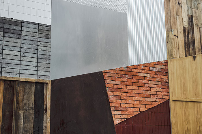 When they use too many different materials on the outside. This wall is brick,this wall in vinyl,and none of it matches.
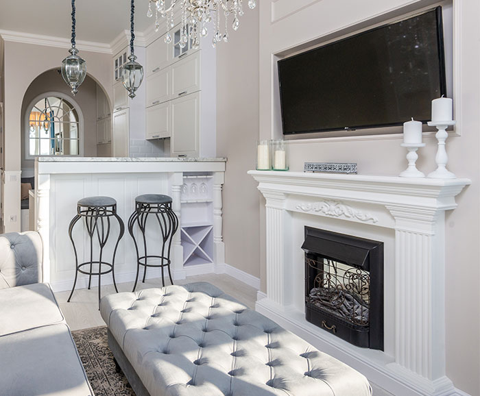 TVs above fireplaces. Yeah, that's a great height and angle if i wanted to watch while standing up
Honestly I don’t mind this. If the sofa is far enough away it shouldn’t be a problem.
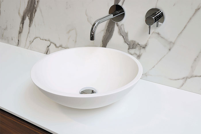 Those sinks that are a bowl on top of the counter. It's like they didn't install the sink, and glued it to the bathroom counter.
Seems like you'd always be slopping water down the sides of the bowl so it'd always be wet under the bottom and start growing pink or black mold.
No, not really. Unless you get a really small one, water doesn't splash out. I've had more issues like that with regular sinks, the countertop is constantly wet. My bowl type sink catches all of it and the countertop is perfectly dry.
Load More Replies...Yes, but… Have a friend who is a glass blower. All of his bathroom sinks are of this type, but he made and installed every one of them, himself. They all function properly as sinks, and they are freaking gorgeous.
Hopefully, he installs them with cleanability in mind (see comments about narrow crevices, etc.)
Load More Replies...Bathroom faucets that barely project over the sink. I have seen them all over for 60 years. WTF?
I have one and I love it. I've never had an issue with cleaning it or with water splashing out.
I think they look pretty, especially if the bowl is decorative (unlike the one in the photo). But in practice, they just provide yet another surface to clean.
Some of these are very beautiful, but not very practical. The narrow angle between counter and basin are often difficult to clean, and if the vessel isn't deep enough, or the tap is mounted too high, they splash. On the other hand, if you need to fit a hand washing basin in a tiny space, they are often the best choice.
I have one in the powder room and I love it. I guess it’s a matter of taste and style.
I love vessel sinks. Bathroom counters are too low and these save my back.
I'm only 5 feet tall. I almost need a step ladder to use those awful sinks
I disagree with your opinion entirely due to the fact you will never lose your jewelry because you accidentally knocked it down the drain. And besides, it doesn't take yo and more space, reduces splashing, you don't have to bend as much to wash your face and heck, it actually saves some room near the base for like tiny like skin care products. YOUR OPINION IS INVALID!!
I think these can look incredibly beautiful. Smaller basins help reduce water waste 😊
I’m sure they are hard to clean too. I don’t need more work thank you.
A totally unfinished look. It contradicts the credo of "form follows function".
I did one of these in my half bath, it was on a pedestal. I used to soak the front of myself if i turned the water up too high. Running late for work, gotta brush my teeth, damn now i gotta change too.
Yeah - I never really understood "vessel" sinks. Just more area to clean, IMHO
And why have his and hers bowls? does one or the other have a disease?
It doubles the surface to clean and eats up the countertop space we all need.
Love these! Especially the blown glass types. As long as the bowl is big enough. And as a tall guy, these are easy on your back.
It was a cool trend when they first came out, but like all trends it’s getting dated. I’d love to buy a pedestal sink with the huge lip around the sink like my grandma had in her home. You could set almost anything on that sink’s edge with no danger of it falling off.
It was cool at first but nowadays is more outdated or dated oldie but not goodie.
Pretty sure unless they make one's specifically for smaller people, that they are not ment for short people.
I have one of those and it's horrible. It always looks dirty, the black counter top its on shows the least little bit of dust. I'm going to replace it as soon as I can affford to.
Actually, I love them because they are easier to reach for taller people, better to reach for those with a bad back (me) AND I'm not constantly knocking shite into them, like you do with a regular sink. Less mold and hair around the edges too, if you get one with a bit of a curve to it.
I've one of these, they're actually quite practicle. I like them because they remind me of victorian times.
I think this started in Taiwan, with beautiful thrown ceramic bowls, wooden bowls, or stone bowls.
Always set too high so if you wash your face in it, the water runs down your forearms and drips off your elbows. Nice.
Also if you're short suddenly u need a dang stool to wash your face. Back to 3rd grade...
Of course, taste is a matter of preference and everyone has the right to make their place look the way they want. While we’re not the ones to judge you on what makes you happy, there are still many things to consider to make sure you wouldn’t end up with impractical and regrettable choices.
To help you out, Kim and Jo had a few suggestions. "Add your own personality," they said. "Do what makes you happy not what’s on trend. You have to live with your design choices so make it speak to you on another level. Where you walk in the door and feel comfortable and at ease."
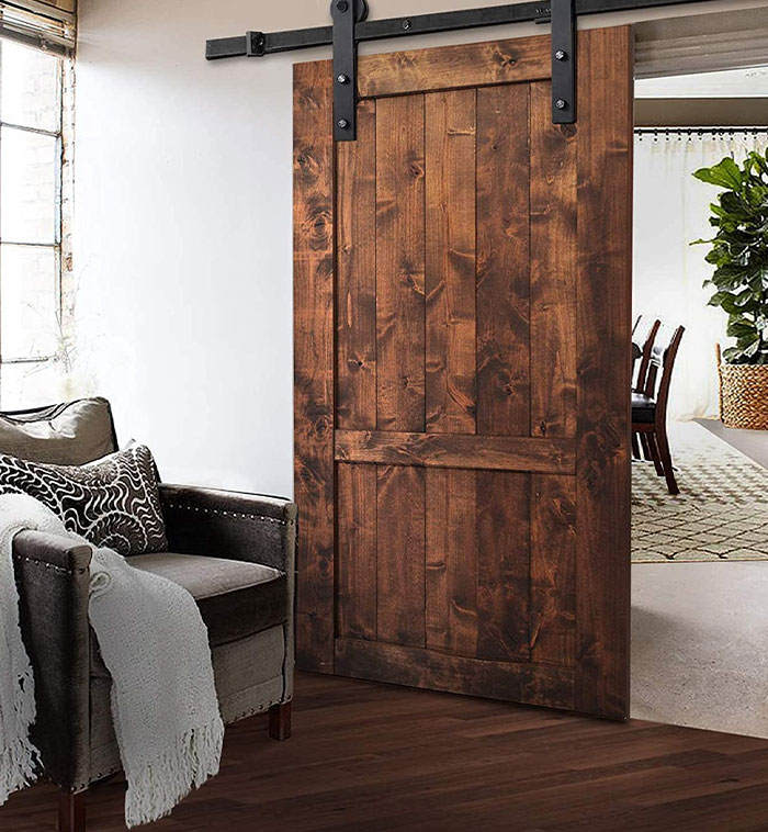 Those stupid "barn doors." Absolutely HATE them!
Also, those "Eat" "Sleep" "Sit" "Gather" signs people like to put around their house. It's as if common sense is nonexistent to the point where people need reminders of what they need to do in said rooms on their walls.
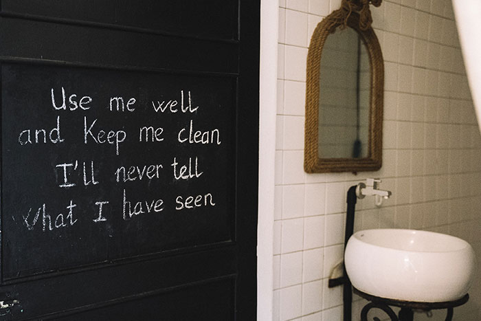 Mirrored furniture and crushed velvet cushions. I also hate crude prints in the bathroom that have "cheeky" quotes about bowel movements or urinating. It's very tacky to me.
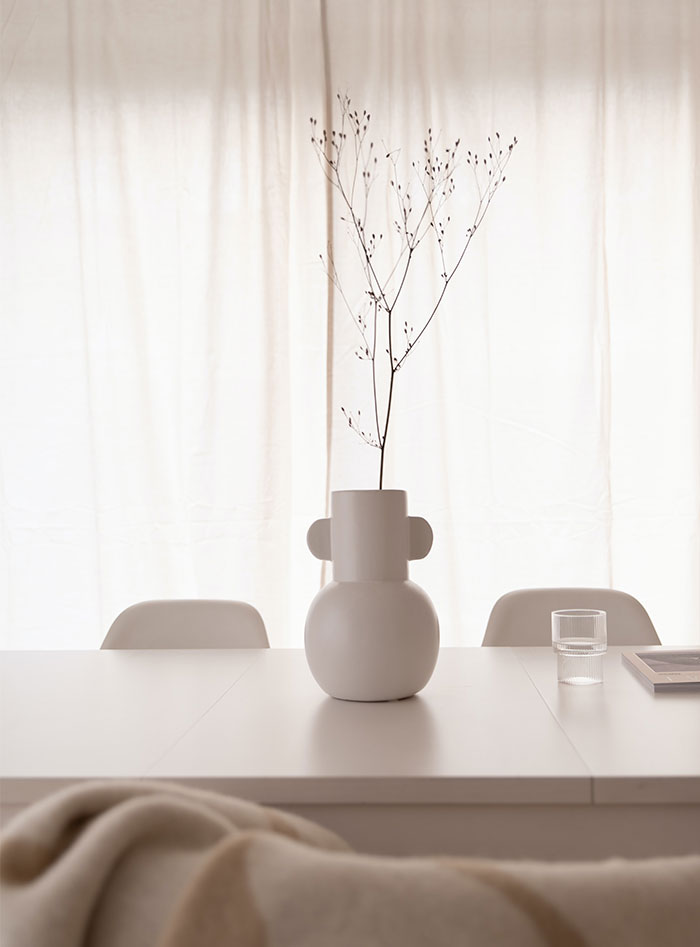 Having all white walls and all white furniture and then like a single potted plant
I love plants though! Plants are the new pets and pets the new children!
Moreover, they suggested avoiding too much of the same thing. "Having cohesive elements throughout each room can add to the relaxed nature of a home but too much of the same thing can get boring really fast. Think about adding an accent color that can be found in small doses in each space and then maybe done in a big way in one room."
Then, think about scale and placement because they add a lot of value to your dwelling. "Don’t feel that if you have a small space all the furniture needs to then be small," Kim and Jo said. "It will only make your space look smaller! Adding a large piece or two will trick the eye into thinking it’s bigger than it is."
"And placement keeps things interesting and dynamic. Don’t think you need to place all furniture up against the walls. BORING! Try angling pieces or floating them more in the center of the room. It makes the space feel less stuffy and formal too," they noted.
Mason jar decor. Need a new light fixture? Mason jar! A place to store your extra writing utensils? Mason jar! Flower vase? Mason jar! Tealight holder? Mason jar! Porcelain toilet bowl too boring and normal? BIG mason jar!!!
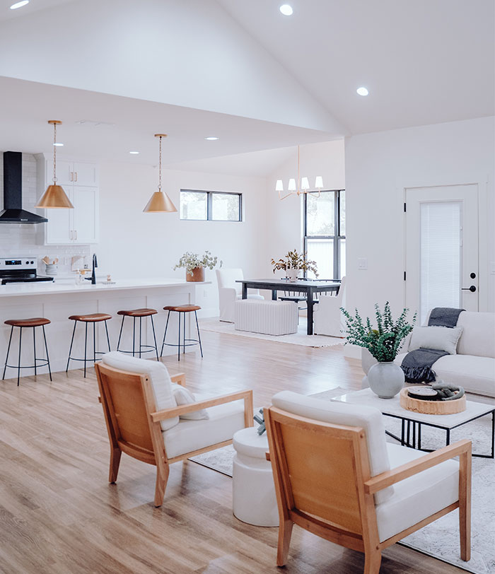 Full open concept - especially when people take all the walls down in an older home with a traditional layout. I like seperation of space and defined rooms. I can handle partial open concept but that's about it. We actually extended a wall in one of our house to create a more defined den and living room
Floor to ceiling windows in the private rooms of the home like bedrooms and bathrooms. Or giant window at the bath tub. If you in the middle of no where and have no neighbours I guess, but in a subdivision or city the curtains or build have to be closed most of the time.
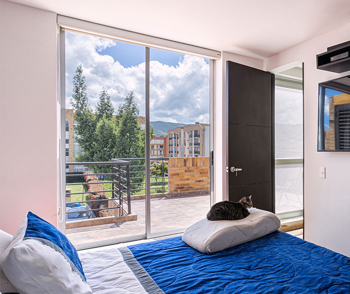 Big windows in the front with no curtains or blinds. Who does that? What type of weirdos are like yeah what if all the neighbors and whatever strangers happen to be walking by can see into our living room at all times? I usually see this on homes that have that modern minimalist architecture thing going on, which tend to be ugly anyhow. They're trying to look futuristic but in the near future they will be considered lame and out of style.
Lastly, the bloggers suggested it’s always a good idea to add in some vintage pieces. "We loooooove vintage. The thrill of the hunt is an added bonus. Also, Facebook Marketplace is an absolute treasure trove of awesome at often great bargains and it helps keep décor items out of landfills," Kim and Jo said, adding that it’s another win-win.
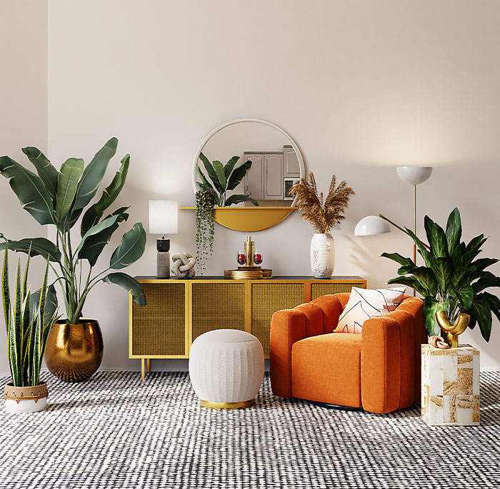 I've noticed this weird trend recently of dolling up your house like it's supposed to be some sort of studio example home or something instead of just making it a comfortable living space for you and your family and I absolutely hate it it just feels so fake and paper thin
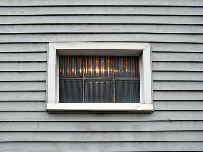 I hate it when the front facade of a house has like nice siding, expensive stonework or brick, good quality windows with nice trim, windows and door sizes and arrangement are aesthetically pleasing, etc., but then the sides and back of the house are cheap vinyl siding with different, cheaper, uglier windows and trim, and the fenestration layout is hideous chaos. Like...you know people can see your house from angles other than directly in front, right?
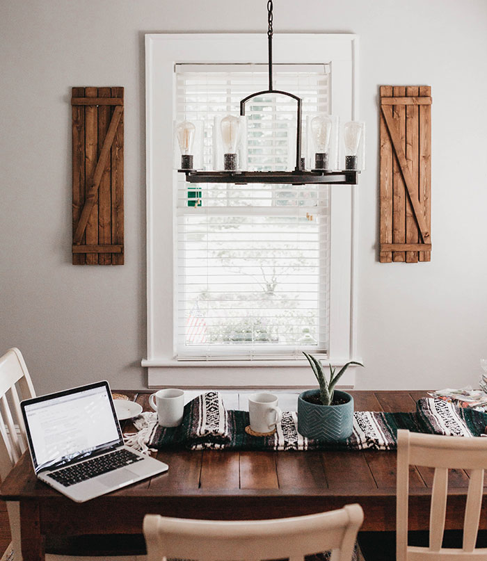 Farmhouse design makes me cringe. Putting up shiplap, and barn doors in your suburban home is dating the hell out of your house. Like a tribal tattoo in the 90s, I'm going to know exactly when you decorated. Gag.
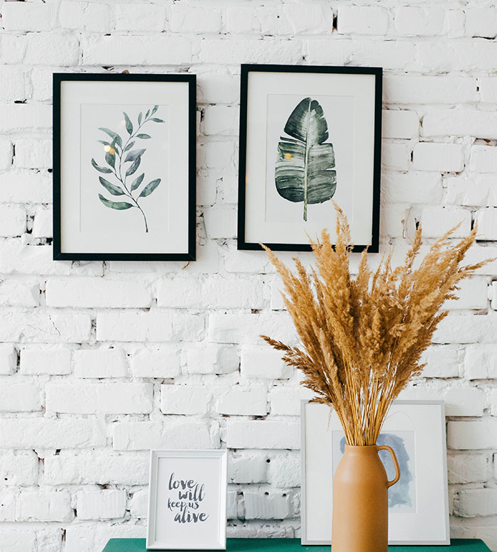 PAINTED WHITE BRICK. It feels like it's on every HGTV show I watch; they ruin beautiful classic brick with white paint. It has to be repainted constantly to maintain the "look," shows way more dust, and doesn't age as well as regular brick.
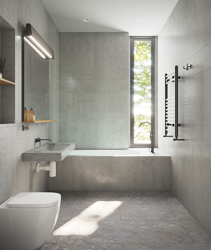 Having to pass through the master bath to reach your closet. Or on a similar note, having a door to separate off the toilet, but not the shower.
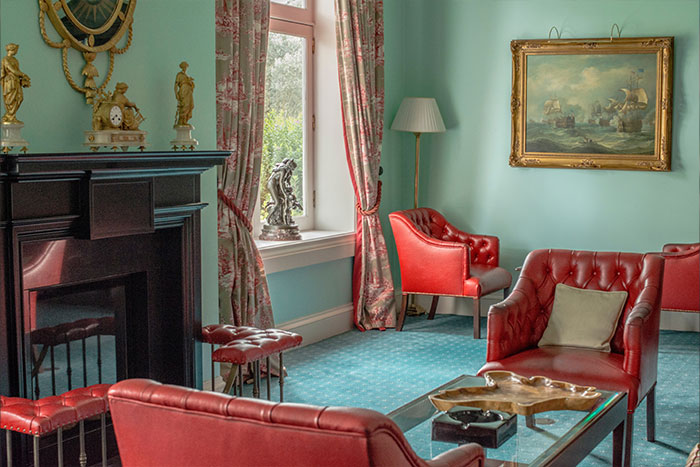 Using fancy fabrics and materials for everyday items that have to be treated like museum art pieces.
Too many rooflines. This trend has to stop. It's over-architecting to the degree where there's nothing of substance anymore.
And roofers will hate you. My father had so many peaks and things on his roof that they legit told him it would be double cuz it was a pain in the asterick. Plus he had a lot of water damage due to improper draining. Its in Michigan and winter weather, ice, will destroy those types of roofs. So what did he do, put a flat roof on. Wanna guess what happened in a few years lol (if you read my fireplace post above, now you know where i get the duh gene lol)
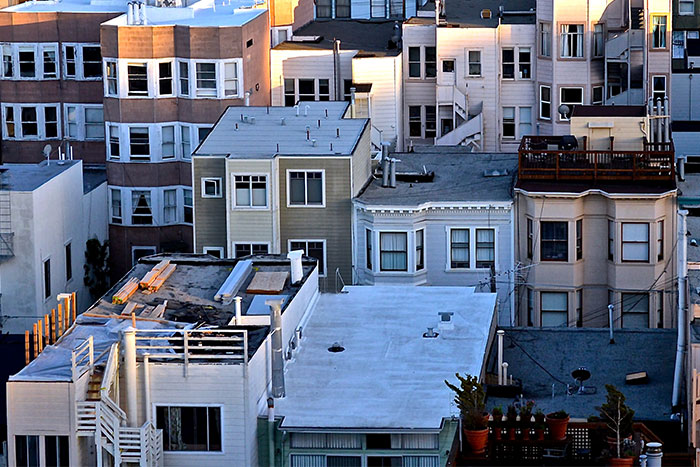 Flat roofs. The buffer area between the roof and the room inside is an absolute breeding ground for mold, and whenever it rains, water pools on top of the roof and leaks in. In some cases, it looks modern, but for some houses built in this style in the 70s or 80s, it looks stupid, and is insanely impractical.
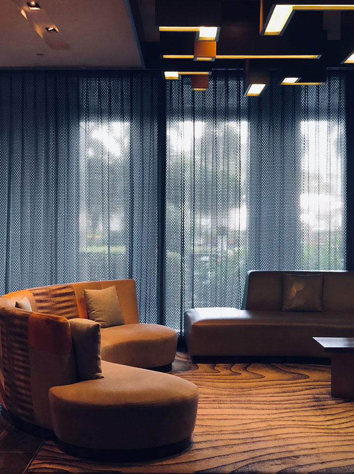 I know it's popular rn but the sort of minimalist modern furniture in rich people houses, especially one's that need a remote to unfold or something. How is that better than a normal chair. Also why make these big sitting rooms no one wants to hang out in
Neon lights, are you trying to make your house
look a convenience store.
Any kind of pillars... why? Just why..? It always looks gaudy.
I doubt the house/building would be there for you to say anything if there were no pillars.
Shiplap
I like shiplap ! I also like painted paneling ! The texture looks cool to me ! I guess I’m a weirdo ! Hey I hate live laugh love so there’s that
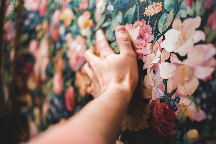 Wallpaper getting back in style. After nearly a month of steaming and stripping down old wallpaper in a house, I cannot for the life of me understand why you would put that s**t up.
Also, it looks horrid. Yes, that includes "that" design, and also "that" design.
I know, right? Most of the people here are like "Your house, your circus" but then go instantly to trash other people's tastes, ironical hypocrisy lol
Load More Replies...Don't hate on people's preferences in THEIR OWN HOUSE, not yours. Some of these were nice. And even if you don't find them nice, big deal, don't do them in your house. Everyone needs to be free to do whatever they like with their house. About decorative words (or any other thing you don't like), they aren't gonna attack you in any way. If some people feel good having them, let it be.
Particle board...I hate it. I know solid wood isn't practical, unless things are very high-end anymore, but at least use plywood. A little water exposure and particle board swells and shreds and falls apart.
People should mind their own damn businesses and let others live as they please
Didn't we have an article just like this one very recently? The content was pretty much identical too. If it's not your home, stop complaining.
There have been approximately 437 articles like this in the past 3 months. They're f*****g stupid
Load More Replies...Who cares what design you use unless you are planning to sell your house. I am planning to live in mine, and it suits my style. I live here and I am the one who has to pay for it. What do I care what some realtors or designers think?
When you're starving to death, rancid and moldy food is a gourmet meal
Load More Replies...Some of these aren't recent trends at all. I haven't seen carpet in any kitchen since the 70s and the last tile countertop I saw was in an early 80s vintage house.
These hall lights have been in every house I've lived in since 1976 when they were first bought and I LOVE them. I will never part with them. I was born in 1975 and I don't remember ever being without them. They remind me of home and I inherited them from my parents. I am sure that the people in this post will think they are a terrible reminder of 70's decor but each to their own. If you like a certain style or whatever you like in a house then you should have it and enjoy it. Your house, your home, your choice. You should live with whatever makes you happy, not anybody else. 😊 hall-lamps...412c0f.jpg 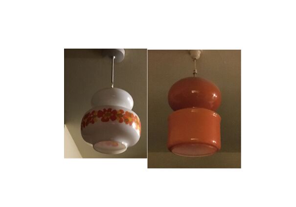
Those actually look really cool, and I like the color
Load More Replies...If you like it, great! Put it in your house! If you don't like it, great! Don't put it in your house! The ONLY examples of these stupid god damn posts that I can stand are the ones that provide reasons such as sanitation or longevity or safety. Ie. carpet in the bathroom can easily grow mould and becomes a health issue. All the rest? You people can eff off with your stupid little opinions. You don't get to tell other people how to live their lives because it doesn't affect you.
I mean, goodness, if you hate someone's decor so bad, stay home. Who do these opinionated people think they are - the dictators of fashion?
Not hating on anyone's preference I personally hate pocket doors...don't see the point unless there's no other way
Load More Replies...Just people bitching about other people’s preferences. No one is forcing you to have these styles in your own home. Get over yourself and your perfect opinions
Am I the only one who's fine with literally all of these? White rooms are an eyesore, yes, but this is all based on somebody's preference. Though, a few are a little odd, (like the furniture used as decoration, etc.), but otherwise? I don't feel the need to comment on somebody /else's/ home. You don't like it? Then don't go lmao. Edit; I changed my mind a little. If it poses a safety concern or something, then that should be looked at.
What bothers me most about these new "trends" is that they aren't trends at all. Open concepts rooms, bannisterless stairs, open cabinets, etc are all just methods used to reduce construction costs and maximize construction profits.
I never thought about it that way, but I think you're right. Less construction. Banisterless stairs are an accident waiting to happen.
Load More Replies...a lot of the people bitching about how awful McMansions look are posting from the UK or EU.... the average size house in the UK is 900 sq. ft., while the average McMansion is 1600 sq.ft with an attached double garage... and the UK house costs about double what the US house does... and the UK house has a postage stamp back yard compared to a full-size back yard... Hey Brits, maybe these benighted bleedin' colonials with their unfortunate house choices are on to something you people should figure out.... admittedly they don't look like a proper Georgian style country house on a large estate, but they don't carry that size of a scary price tag either..
The difference in price is because houses in the UK and EU are built with brick, concrete and steel, which is much more expensive and durable than the paper houses in the US. Space is much more limited too, so land is very expensive. It's a silly comparison to make. Personally I prefer smaller houses, as the upkeep is cheaper and easier.
Load More Replies...Who ever wrote #29 has never been to India. We sont have stanted roofs and its impractical for US to have slanted roof.. I am unsure why but I have seen those only in hilly areas in India.
Farmhouse style isn't going anywhere soon. You appear to be the odd man out because folks living in all styles of house are continuing to buy the farmhouse decor.
I'll be adding all white furniture white bricks open section apartment with no walls making my home look like a studio having those bowl sinks millions of pillows on my bed stairs with no support but texture an open bathroom smart tech on my phone mason jars EVERYWHERE and glass stove tops. In which all will be based in Manhattan where it'll cost 5k a month to live in.
Ok so design your home the way you want and don't stress over other people's homes.
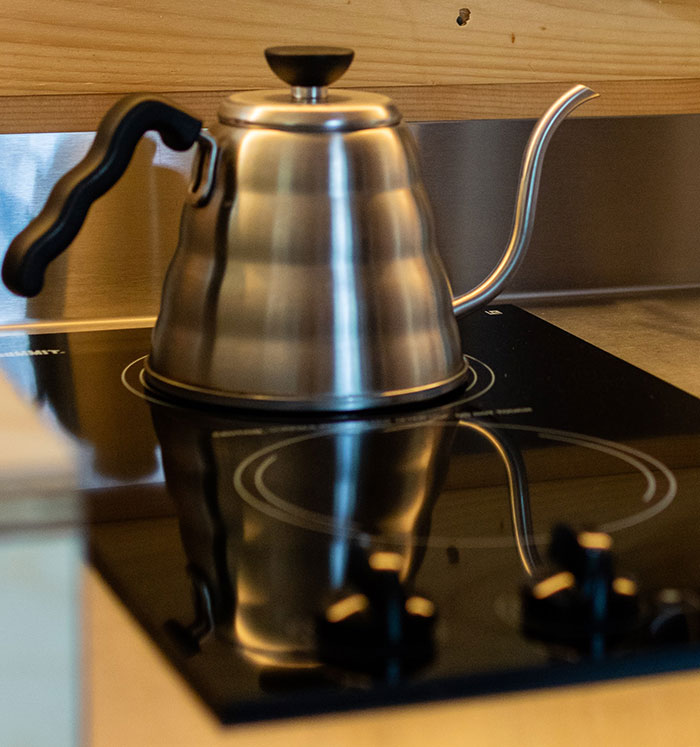
I love my flat stovetop, otherwise it's a matter of personal preference. I will share something truly disturbing I encountered once during my recent house hunt. House was clearly a man cave, which is fine. Unfortunately, the wall separating the master bath and bedroom had been removed. Immediately adjacent to the sleeping area is the toilet hidden by a partition only hiding the toilet itself; the person using it would be completely visible whether standing or sitting. Next was the vanity and then a shower/tub combo, all visible from the bed area and the whole thing carpeted.
This entire thread is full of the hottest takes I've ever seen. If you're boring, just say so. I'm studying to become an interior decorator, and part of my job is to see the value in everybody's style, no matter what it is
I am not by any means a prude and I can swear with the best of them, but it's extremely unprofessionly to use words that can't be printed. Once maybe, but the number of times it is done here is annoying as f**k.
I still don't get the point of having the closet in the bathroom. Do people actually like this? I feel like it was an architect move that no one asked for.
Crazy concept here, but what if people decorate how ever the f**k they want?
I'm going to add my bugbear here since it wasn't mentioned in the article. White subway tiles everywhere. Makes me think of horrible hospitals and evil medical experiments. You can all slam me now. Do you see the contradiction? You're slamming people who slammed other people's choices. Which means you are slamming in just the same way. It's pretty damn funny when you step back and rather than react, actually think first. Plus ca change, plus ca la meme chose.🤷
This article was a little too shady imo. Too much criticism towards things that people like. Like the farm doors by the window? What if that person was raised in a barn, and that somehow makes her/him feel more at home? I gotta agree about the carpeted kitchen. Thankfully never seen one, but who came up with that brilliant idea? Didn't know that was a thing.
I don't even want any decorations or stuff outside of my bedroom, give me an apartment with a small kitchen with the essentials, a bathroom that the washing machine can go in (I'd live alone anyway), and a bedroom that I can put a bunch of posters on the wall. As long as I have a bed, computer, and things to live I guess.
I know, right? Most of the people here are like "Your house, your circus" but then go instantly to trash other people's tastes, ironical hypocrisy lol
Load More Replies...Don't hate on people's preferences in THEIR OWN HOUSE, not yours. Some of these were nice. And even if you don't find them nice, big deal, don't do them in your house. Everyone needs to be free to do whatever they like with their house. About decorative words (or any other thing you don't like), they aren't gonna attack you in any way. If some people feel good having them, let it be.
Particle board...I hate it. I know solid wood isn't practical, unless things are very high-end anymore, but at least use plywood. A little water exposure and particle board swells and shreds and falls apart.
People should mind their own damn businesses and let others live as they please
Didn't we have an article just like this one very recently? The content was pretty much identical too. If it's not your home, stop complaining.
There have been approximately 437 articles like this in the past 3 months. They're f*****g stupid
Load More Replies...Who cares what design you use unless you are planning to sell your house. I am planning to live in mine, and it suits my style. I live here and I am the one who has to pay for it. What do I care what some realtors or designers think?
When you're starving to death, rancid and moldy food is a gourmet meal
Load More Replies...Some of these aren't recent trends at all. I haven't seen carpet in any kitchen since the 70s and the last tile countertop I saw was in an early 80s vintage house.
These hall lights have been in every house I've lived in since 1976 when they were first bought and I LOVE them. I will never part with them. I was born in 1975 and I don't remember ever being without them. They remind me of home and I inherited them from my parents. I am sure that the people in this post will think they are a terrible reminder of 70's decor but each to their own. If you like a certain style or whatever you like in a house then you should have it and enjoy it. Your house, your home, your choice. You should live with whatever makes you happy, not anybody else. 😊 hall-lamps...412c0f.jpg 
Those actually look really cool, and I like the color
Load More Replies...If you like it, great! Put it in your house! If you don't like it, great! Don't put it in your house! The ONLY examples of these stupid god damn posts that I can stand are the ones that provide reasons such as sanitation or longevity or safety. Ie. carpet in the bathroom can easily grow mould and becomes a health issue. All the rest? You people can eff off with your stupid little opinions. You don't get to tell other people how to live their lives because it doesn't affect you.
I mean, goodness, if you hate someone's decor so bad, stay home. Who do these opinionated people think they are - the dictators of fashion?
Not hating on anyone's preference I personally hate pocket doors...don't see the point unless there's no other way
Load More Replies...Just people bitching about other people’s preferences. No one is forcing you to have these styles in your own home. Get over yourself and your perfect opinions
Am I the only one who's fine with literally all of these? White rooms are an eyesore, yes, but this is all based on somebody's preference. Though, a few are a little odd, (like the furniture used as decoration, etc.), but otherwise? I don't feel the need to comment on somebody /else's/ home. You don't like it? Then don't go lmao. Edit; I changed my mind a little. If it poses a safety concern or something, then that should be looked at.
What bothers me most about these new "trends" is that they aren't trends at all. Open concepts rooms, bannisterless stairs, open cabinets, etc are all just methods used to reduce construction costs and maximize construction profits.
I never thought about it that way, but I think you're right. Less construction. Banisterless stairs are an accident waiting to happen.
Load More Replies...a lot of the people bitching about how awful McMansions look are posting from the UK or EU.... the average size house in the UK is 900 sq. ft., while the average McMansion is 1600 sq.ft with an attached double garage... and the UK house costs about double what the US house does... and the UK house has a postage stamp back yard compared to a full-size back yard... Hey Brits, maybe these benighted bleedin' colonials with their unfortunate house choices are on to something you people should figure out.... admittedly they don't look like a proper Georgian style country house on a large estate, but they don't carry that size of a scary price tag either..
The difference in price is because houses in the UK and EU are built with brick, concrete and steel, which is much more expensive and durable than the paper houses in the US. Space is much more limited too, so land is very expensive. It's a silly comparison to make. Personally I prefer smaller houses, as the upkeep is cheaper and easier.
Load More Replies...Who ever wrote #29 has never been to India. We sont have stanted roofs and its impractical for US to have slanted roof.. I am unsure why but I have seen those only in hilly areas in India.
Farmhouse style isn't going anywhere soon. You appear to be the odd man out because folks living in all styles of house are continuing to buy the farmhouse decor.
I'll be adding all white furniture white bricks open section apartment with no walls making my home look like a studio having those bowl sinks millions of pillows on my bed stairs with no support but texture an open bathroom smart tech on my phone mason jars EVERYWHERE and glass stove tops. In which all will be based in Manhattan where it'll cost 5k a month to live in.
Ok so design your home the way you want and don't stress over other people's homes.
I love my flat stovetop, otherwise it's a matter of personal preference. I will share something truly disturbing I encountered once during my recent house hunt. House was clearly a man cave, which is fine. Unfortunately, the wall separating the master bath and bedroom had been removed. Immediately adjacent to the sleeping area is the toilet hidden by a partition only hiding the toilet itself; the person using it would be completely visible whether standing or sitting. Next was the vanity and then a shower/tub combo, all visible from the bed area and the whole thing carpeted.
This entire thread is full of the hottest takes I've ever seen. If you're boring, just say so. I'm studying to become an interior decorator, and part of my job is to see the value in everybody's style, no matter what it is
I am not by any means a prude and I can swear with the best of them, but it's extremely unprofessionly to use words that can't be printed. Once maybe, but the number of times it is done here is annoying as f**k.
I still don't get the point of having the closet in the bathroom. Do people actually like this? I feel like it was an architect move that no one asked for.
Crazy concept here, but what if people decorate how ever the f**k they want?
I'm going to add my bugbear here since it wasn't mentioned in the article. White subway tiles everywhere. Makes me think of horrible hospitals and evil medical experiments. You can all slam me now. Do you see the contradiction? You're slamming people who slammed other people's choices. Which means you are slamming in just the same way. It's pretty damn funny when you step back and rather than react, actually think first. Plus ca change, plus ca la meme chose.🤷
This article was a little too shady imo. Too much criticism towards things that people like. Like the farm doors by the window? What if that person was raised in a barn, and that somehow makes her/him feel more at home? I gotta agree about the carpeted kitchen. Thankfully never seen one, but who came up with that brilliant idea? Didn't know that was a thing.
I don't even want any decorations or stuff outside of my bedroom, give me an apartment with a small kitchen with the essentials, a bathroom that the washing machine can go in (I'd live alone anyway), and a bedroom that I can put a bunch of posters on the wall. As long as I have a bed, computer, and things to live I guess.

 Dark Mode
  No fees, cancel anytime


