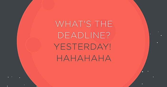
Fuckilarious Bullshit: We Turned The Worst Client Comments Into Posters
We, at SERIAL KOLOR, are a creative agency, operating on interdisciplinary levels. We are passionate about telling stories – through integrating compelling designs, motion and sometimes live actions.
Although we believe in the German variation “der Kunde ist König” (the Customer is King), but at times we are left with no choice, but to hope that some of the people of this category known as “customers” were a little lesser than clowns.
In the business of creating artwork illustrations and motion graphics, we often come across comments that leave us spellbound, and definitely wondering which planet have these clients come from. I mean, why do aliens choose people of the Earth to design artwork for them? Is there a scarcity of reliable designers up there? Or those designers in the outer world are way too expensive for our buddies?
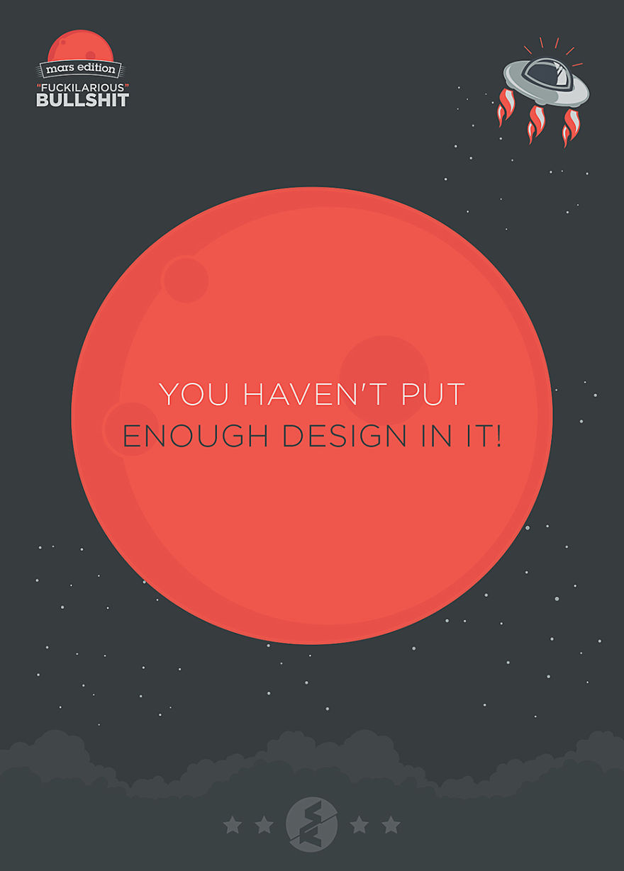
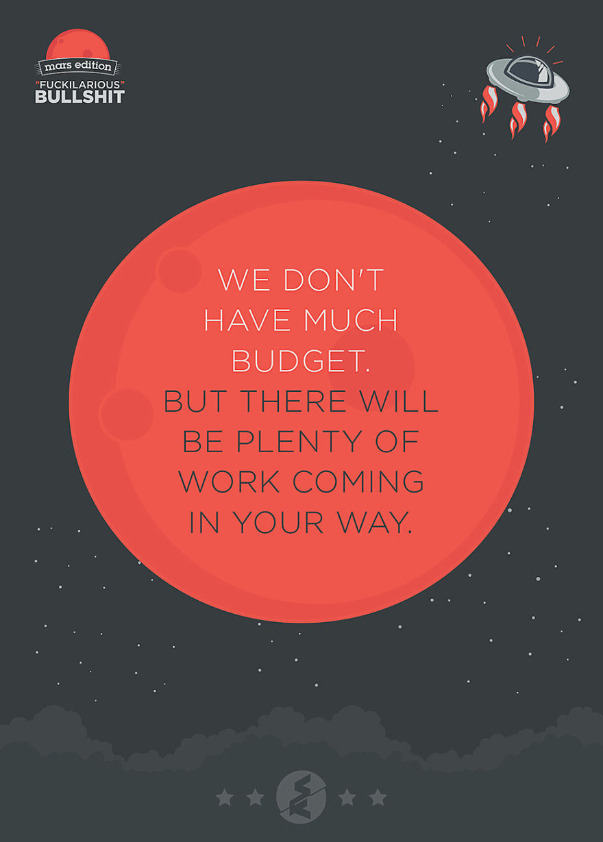
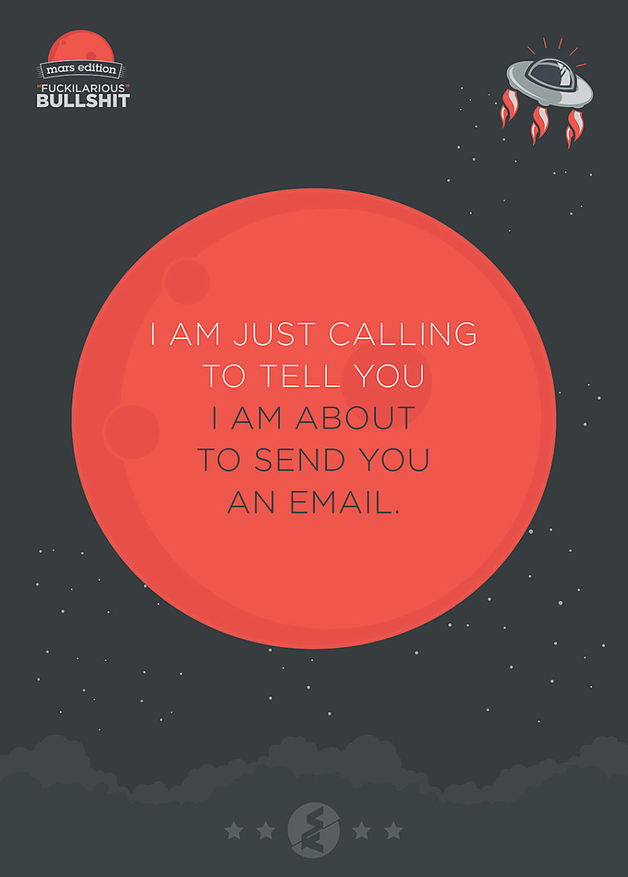
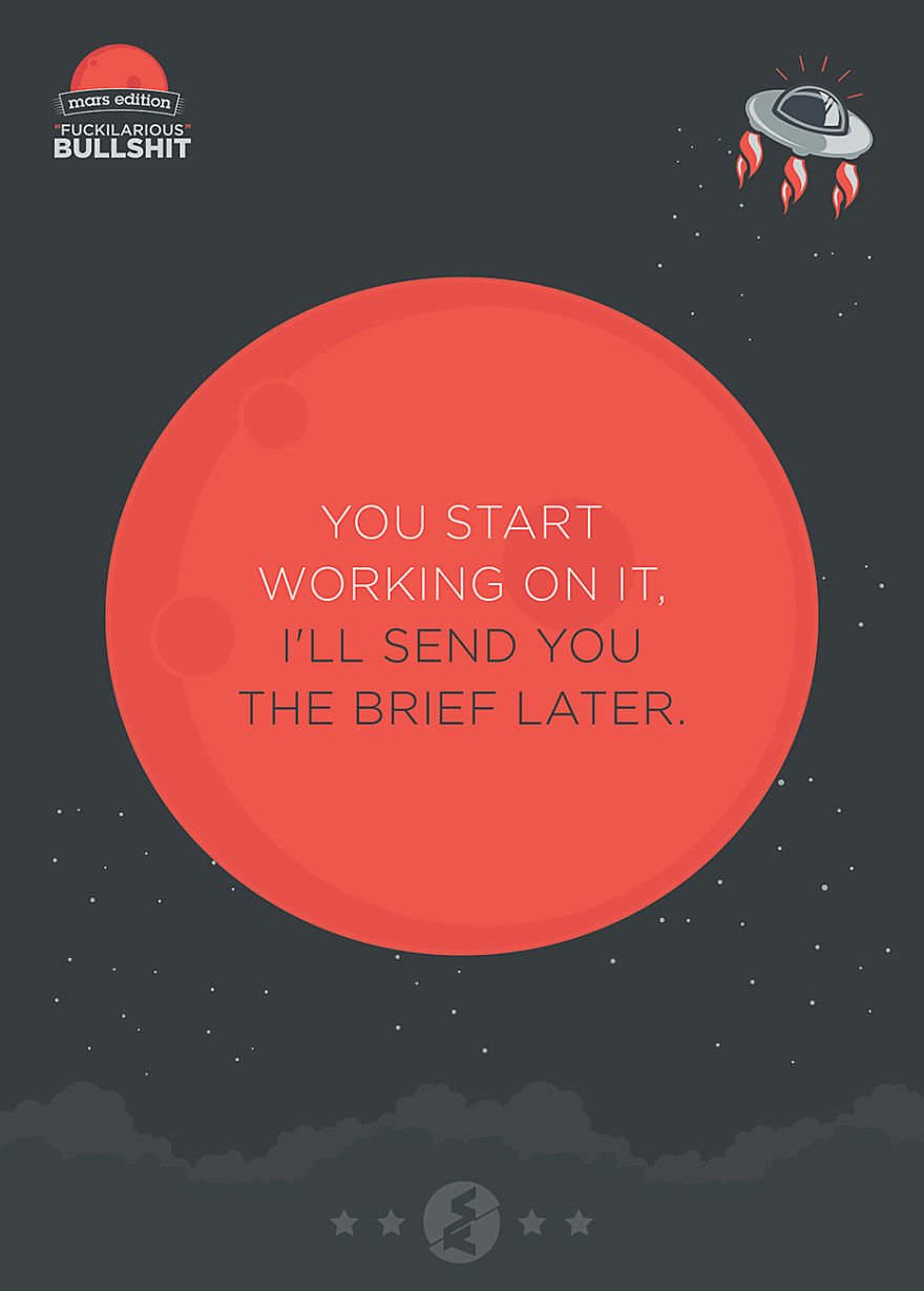
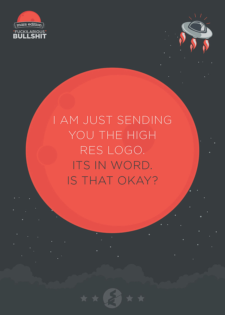
But guess what, we have just figured out they could only be practicing idiocracy. Check our compilation of some of the worst comments turned into posters and fill up your brain’s dosage for “what the fuck!?” compartment.
More info: serialkolor.com
249Kviews
Share on Facebook"I send you the logo!" - it is a bad scan of a 2x2 coat-of-arms-style logo badly printed (with moved layers) on a paper handkerchief...
Load More Replies...Oh I could add thousands of moronic comments coming from customers but my favorite remains: Lets start working first then we talk about how much. :)
We hear "CAN YOU SEND ME MORE OPTIONS?" ... and after all the job, the client finally decides for the very first one.
hahah this is just hilarious, start working i brief you later lol hahah i living that right now hahah or good old "make it pop"
Once there was a customer who called a guy at my work and asked him to change the view of her house in Google Maps Steet View..
"I have no idea what I want right now but I want you to read my mind what I would like it to look like"
Load More Replies...Okay, one last minor change... "put this there, change this color, I don't like that font, can we add more flare?" AAAAHHHHHHHH!!!!!!!
Holy c**p, I've heard ALL of those! Each one made me wanna put my head through a wall.
So, my cousins nephew had a go at a logo in paint, do you think you could do something like this...
"How come you charged me for six hours of time on revisions?" Because you approved the layout & copy already.
Load More Replies...I can't stand it when people make fun of liking Comic Sans MS. I feel like some people do that not because they don't actually like it but just because it's a "design thing". I hate Helvetica
I've had a thankfully brief work relationship with someone who used a few variations of those. Whenever I wanted any clarification, it was "I don't undertsand what your question is." Lol
I hear this a lot: "It was great! Of coarse I added a bunch of other c**p in it."
Oh, I hear this a lot: "It was great! Of coarse I added a bunch of other c**p in it."
bahahahah ill brief you later lol hahaha, or "make it pop!" lol hahahaha
Another one "You've sent me an email requesting information for my urgent website build, I'll get on to it when I have time."
join their facebook page: www.facebook.com/serialkolor
It is truly amazing how universal these comments are. Thanks for making cool posters out of them!
I'm calling you to tell you I'm about to send you an email... I'd be a MILLIONAIRE if I could find a cure for that!!!!!
You missed the one that makes me look for: 1) a sword to fall on, or 2) a tall building to jump from: "Make the logo bigger."
I think half of these were perfectly normal comments and anyone who thinks they are stupid is just providing bad costumer support. Not to mention that if people were experts in this field of work, they obviously won`t call someone as rude and lazy. And if the client doesn`t like it and he doesn`t know why it means that you did a s**t job, not that he is stupid.
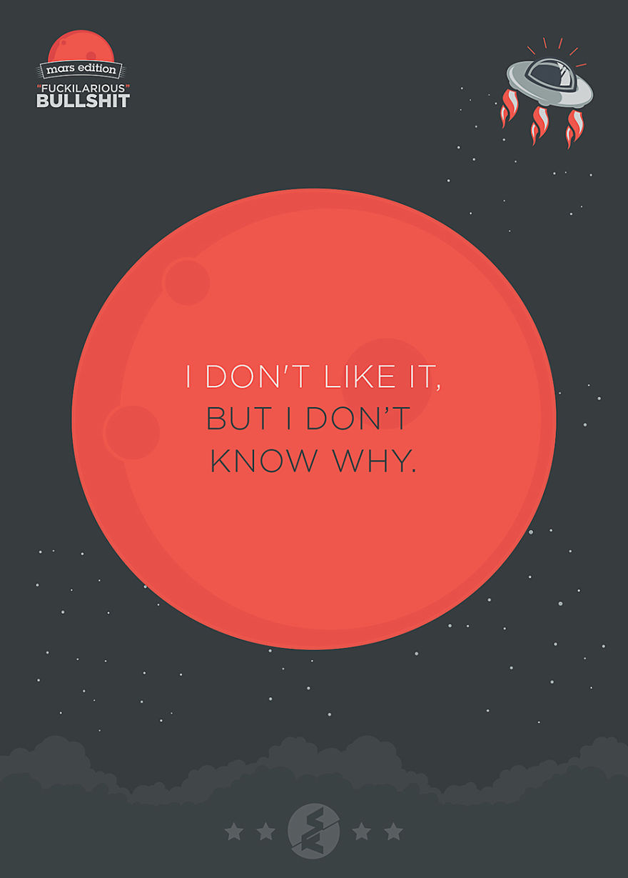
your comment is sucks.. and i dont know why. feels not appropriate. could you revised it, and give me some more alternatives...
Load More Replies..."I send you the logo!" - it is a bad scan of a 2x2 coat-of-arms-style logo badly printed (with moved layers) on a paper handkerchief...
Load More Replies...Oh I could add thousands of moronic comments coming from customers but my favorite remains: Lets start working first then we talk about how much. :)
We hear "CAN YOU SEND ME MORE OPTIONS?" ... and after all the job, the client finally decides for the very first one.
hahah this is just hilarious, start working i brief you later lol hahah i living that right now hahah or good old "make it pop"
Once there was a customer who called a guy at my work and asked him to change the view of her house in Google Maps Steet View..
"I have no idea what I want right now but I want you to read my mind what I would like it to look like"
Load More Replies...Okay, one last minor change... "put this there, change this color, I don't like that font, can we add more flare?" AAAAHHHHHHHH!!!!!!!
Holy c**p, I've heard ALL of those! Each one made me wanna put my head through a wall.
So, my cousins nephew had a go at a logo in paint, do you think you could do something like this...
"How come you charged me for six hours of time on revisions?" Because you approved the layout & copy already.
Load More Replies...I can't stand it when people make fun of liking Comic Sans MS. I feel like some people do that not because they don't actually like it but just because it's a "design thing". I hate Helvetica
I've had a thankfully brief work relationship with someone who used a few variations of those. Whenever I wanted any clarification, it was "I don't undertsand what your question is." Lol
I hear this a lot: "It was great! Of coarse I added a bunch of other c**p in it."
Oh, I hear this a lot: "It was great! Of coarse I added a bunch of other c**p in it."
bahahahah ill brief you later lol hahaha, or "make it pop!" lol hahahaha
Another one "You've sent me an email requesting information for my urgent website build, I'll get on to it when I have time."
join their facebook page: www.facebook.com/serialkolor
It is truly amazing how universal these comments are. Thanks for making cool posters out of them!
I'm calling you to tell you I'm about to send you an email... I'd be a MILLIONAIRE if I could find a cure for that!!!!!
You missed the one that makes me look for: 1) a sword to fall on, or 2) a tall building to jump from: "Make the logo bigger."
I think half of these were perfectly normal comments and anyone who thinks they are stupid is just providing bad costumer support. Not to mention that if people were experts in this field of work, they obviously won`t call someone as rude and lazy. And if the client doesn`t like it and he doesn`t know why it means that you did a s**t job, not that he is stupid.
your comment is sucks.. and i dont know why. feels not appropriate. could you revised it, and give me some more alternatives...
Load More Replies...
 Dark Mode

 No fees, cancel anytime



















204
46