ADVERTISEMENT

Companies put a lot of effort into distinguishing themselves from others and establishing their unique brand. Over time, people get used to everything businesses associate themselves with, from their values to their logos and slogans. So when a brand introduces some changes, a lot of their customers feel apprehensive about them, especially if the rebrand completely misses the mark. 

Many instances of questionable redesigns await you in the list below, and while you’re scrolling through them, don’t forget to express your opinions on whether a rebrand for these specific logos and designs was a good idea or not.

Bored Panda also reached out to Lauren Diana Scalf, a certified business strategist and founder of Empowered Marketing Co, and brand strategist Alicia Nagel, who kindly agreed to chat with us more about rebrands.

#1

Diagram comparing old and new Jaguar logo designs in a Twitter post on worst redesigns.

destroynectar Report

ucp
Community Member
8 months ago Created by potrace 1.15, written by Peter Selinger 2001-2017

It’s the random capital G ( to stop the descender from ruining the line presumably) that makes me irrationally angry. The rest of it just makes me rationally angry.

Lyone Fein
Community Member
8 months ago Created by potrace 1.15, written by Peter Selinger 2001-2017

They axed the cat. Always a bad move.

zatrisha
Community Member
8 months ago Created by potrace 1.15, written by Peter Selinger 2001-2017

Looks like you ordered the car on TEMU.

April Pickett
Community Member
8 months ago Created by potrace 1.15, written by Peter Selinger 2001-2017

Go back to the old one. The old one looks powerful and sleek, like the cars. The new one looks like an old, beat-up VW bus.

Cuppa tea?
Community Member
8 months ago Created by potrace 1.15, written by Peter Selinger 2001-2017

If they want to boost sales in USA, they should return to original name.

Leonard Hamers
Community Member
8 months ago Created by potrace 1.15, written by Peter Selinger 2001-2017

simplification of designs, it is a trend, but it's a s**t trend.

SMC
Community Member
1 month ago Created by potrace 1.15, written by Peter Selinger 2001-2017

What were they thinking? The jaguar lost its power…

Quinn
Community Member
4 months ago Created by potrace 1.15, written by Peter Selinger 2001-2017

Looks more like "joguor" now.

Paulina
Community Member
8 months ago Created by potrace 1.15, written by Peter Selinger 2001-2017

From sporty and classy to kids toys 😂

Geoffrey Scott
Community Member
8 months ago Created by potrace 1.15, written by Peter Selinger 2001-2017

The 'Detroit 3' drive me nuts. Got a crappy car? Change the name with the next one. Hmmm..how long has the Camry or Accord been on the market? Instead of pretending it never existed, they refine the vehicle until it's acceptable.

View more comments
RELATED:
    #2

    Scooby-Doo characters in original and redesigned versions, highlighting horrible redesigns.

    destroynectar Report

    Lost Panda
    Community Member
    8 months ago Created by potrace 1.15, written by Peter Selinger 2001-2017

    Look what they did to my Scooby!

    zatrisha
    Community Member
    8 months ago Created by potrace 1.15, written by Peter Selinger 2001-2017

    Now they look just weird, like every „modern“ Cartoon.

    zzbc6m22fq
    Community Member
    8 months ago Created by potrace 1.15, written by Peter Selinger 2001-2017

    Why are Fred's and Shaggy's kneecaps on the wrong side?

    RamiRudolph
    Community Member
    8 months ago Created by potrace 1.15, written by Peter Selinger 2001-2017

    Those are probably creases from their pants.

    Load More Replies...
    PunchinelloTX
    Community Member
    Premium
    8 months ago Created by potrace 1.15, written by Peter Selinger 2001-2017

    What? What even is the point of doing such a redesign? Who is the target audience?

    Roger9er
    Community Member
    8 months ago Created by potrace 1.15, written by Peter Selinger 2001-2017

    Scooby-Dooby-dooo, they fůcked up yoouu

    glowworm2
    Community Member
    8 months ago Created by potrace 1.15, written by Peter Selinger 2001-2017

    This series was called "Be Cool, Scooby-Doo! and aired from 2015-2018. In other words, these redesigns were only used for this one particular show and it is no longer currently running at this time.

    Stannous Flouride
    Community Member
    8 months ago Created by potrace 1.15, written by Peter Selinger 2001-2017

    Skinny Velma? Is she alright? Has she developed an eating disorder? Or is she not well?

    Laughing Orc
    Community Member
    8 months ago (edited) Created by potrace 1.15, written by Peter Selinger 2001-2017

    Jinkies! This is awful.

    Uncle Panda
    Community Member
    8 months ago (edited) Created by potrace 1.15, written by Peter Selinger 2001-2017

    What amazes me about Scooby Doo is that the show has had one plotline since the early 60s.

    View more comments
    #3

    Two Warner Bros logos compared, showcasing a controversial redesign.

    destroynectar Report

    Debbie
    Community Member
    8 months ago Created by potrace 1.15, written by Peter Selinger 2001-2017

    Was the ink getting too expensive?

    JoNo
    Community Member
    8 months ago Created by potrace 1.15, written by Peter Selinger 2001-2017

    It seems the GOLD ink was definitely too expensive.

    Load More Replies...
    Zoe Vokes
    Community Member
    8 months ago Created by potrace 1.15, written by Peter Selinger 2001-2017

    That’s a very generic font in the new one. Reminds me of an intro before a cartoon starts.

    April Pickett
    Community Member
    8 months ago Created by potrace 1.15, written by Peter Selinger 2001-2017

    Bad, bad, bad. You look at the old one and are comfortable. It's well done and interesting because someone cared about the finished product. All they did was take off the banner and the gold, and did a little north-south stretch. Boring.

    Lyone Fein
    Community Member
    8 months ago Created by potrace 1.15, written by Peter Selinger 2001-2017

    So flat………like so many movies these days.

    Forrest Grump
    Community Member
    8 months ago Created by potrace 1.15, written by Peter Selinger 2001-2017

    The new one looks like a kindergarten student's first drawing.

    Kallo Fox
    Community Member
    8 months ago Created by potrace 1.15, written by Peter Selinger 2001-2017

    This one looks perfectly fine.

    jasper
    Community Member
    8 months ago Created by potrace 1.15, written by Peter Selinger 2001-2017

    Less is not always more.

    Data1001
    Community Member
    8 months ago Created by potrace 1.15, written by Peter Selinger 2001-2017

    It's not... terrible. Many brands are going for a simplified logo these days, and it has a lot to do with all the places where the logo will be used, including when it needs to be very small.

    View more comments

    Lauren Diana Scalf, a certified business strategist and founder of Laurea Consulting, tells us that she's been with many businesses through big shifts, such as new offers, audiences, and seasons.

    "And a rebrand is often one of the most exciting (and risky) moves they make. It’s not just about fresh visuals. It’s about clarity, connection, and creating a brand that actually supports where you’re headed next. When strategy and design work together, it can be a game-changer. When they don’t, it shows," she explains.

    ADVERTISEMENT

    "A successful rebrand represents an authentic evolution of the brand and company. This means that the brand is flexing up and evolving to authentically reflect who the company is, their market positioning, personality, etc.," adds brand strategist Alicia Nagel.

    #4

    KIA logo redesign criticized online, showing a comparison of old and new logos.

    destroynectar Report

    RiceRiceBaby 929
    Community Member
    8 months ago Created by potrace 1.15, written by Peter Selinger 2001-2017

    This one. I can't unsee the K and backwards N. I read that a lot of people googled KN, thinking it was a new car brand 😅

    Cynthia Mangold
    Community Member
    7 months ago Created by potrace 1.15, written by Peter Selinger 2001-2017

    Yeah, that's what I did too.... appeared to be KIA. Not a very smart logo if ppl don't even know the name of your brand that way.

    Load More Replies...
    Boris Long-Johnson
    Community Member
    8 months ago Created by potrace 1.15, written by Peter Selinger 2001-2017

    Might be in the minority here but on the actual cars I think the new logo looks good and suits their new more upmarket design.

    PunchinelloTX
    Community Member
    Premium
    8 months ago Created by potrace 1.15, written by Peter Selinger 2001-2017

    Nine Inch Nails

    Daniel Atkins
    Community Member
    8 months ago Created by potrace 1.15, written by Peter Selinger 2001-2017

    that was my thought when i first started seeing the logo.

    Load More Replies...
    Data1001
    Community Member
    8 months ago Created by potrace 1.15, written by Peter Selinger 2001-2017

    I actually like this new one.

    JL
    Community Member
    8 months ago Created by potrace 1.15, written by Peter Selinger 2001-2017

    Not that the original logo was all that great, but they certainly didn't improve on it. Plus whenever I see the name, I think "killed in action".

    person (i think)
    Community Member
    8 months ago Created by potrace 1.15, written by Peter Selinger 2001-2017

    I wonder if they chose to obscure it for those reasons

    Load More Replies...
    SMC
    Community Member
    1 month ago Created by potrace 1.15, written by Peter Selinger 2001-2017

    I think it’s much, much better the new one, it is fluid, technological and modern. The old one looks a bit archaic and too “Fordy”. There’s no point in trying to sell a history and old prestige KIA really does not have when compared to other more tradicional car brands (i.e. Ford), better to position itself as new and technologically updated.

    Just stopping by
    Community Member
    3 months ago Created by potrace 1.15, written by Peter Selinger 2001-2017

    Actually I like it. The first one looked so basic and just generic.

    Phantom Phoenix
    Community Member
    8 months ago Created by potrace 1.15, written by Peter Selinger 2001-2017

    If they only went from the bottom right of the A up to the middle of the left of it - I think that one little line would complete the A and suddenly the whole logo would make sense. Just saying

    View more comments
    ADVERTISEMENT
    #5

    Redesign criticism of Pringles logo showing old and new versions with text: "Look how they ruined my boy."

    destroynectar Report

    Roger9er
    Community Member
    8 months ago Created by potrace 1.15, written by Peter Selinger 2001-2017

    Pringles being singles soon

    Grape Walls of Ire
    Community Member
    8 months ago Created by potrace 1.15, written by Peter Selinger 2001-2017

    Why? Because he's bald now? What do they have against bald people?

    Zoe Vokes
    Community Member
    8 months ago Created by potrace 1.15, written by Peter Selinger 2001-2017

    I assumed it was hair but the fact they replaced it with eyebrows makes me think the original design was maybe supposed to be bushy eyebrows.

    Load More Replies...
    Dolevaal
    Community Member
    8 months ago Created by potrace 1.15, written by Peter Selinger 2001-2017

    It looks to latzy in the second pic for me.

    #6

    WWE logo redesign compares old and new versions highlighting changes criticized online.

    destroynectar Report

    Rick Murray
    Community Member
    8 months ago Created by potrace 1.15, written by Peter Selinger 2001-2017

    Started with attitude, now it's commercial.

    Dolly_of TheCowboy
    Community Member
    8 months ago Created by potrace 1.15, written by Peter Selinger 2001-2017

    Looks a bit like the Wonder Woman movie logo

    Lost Panda
    Community Member
    8 months ago Created by potrace 1.15, written by Peter Selinger 2001-2017

    Because we took all the attitude with our era XD

    ADVERTISEMENT

    When a redesign is unsuccessful, it confuses people, feels disconnected from the original identity, or loses the emotional connection that customers had with the brand, says Scalf. "It doesn’t matter how 'cool' it looks if it doesn’t feel aligned."

    Nagel also notes that a rebrand usually fails when a company spontaneously decides it is something that it isn't. "Just like with people, this breeds distrust. When someone misrepresents who they are or simply reinvents themselves in a way that feels inauthentic, we are turned off and distrust them. The same goes for brands," she explains.  

    #7

    Old McDonald's play area vs. modern redesign drawing online criticism.

    destroynectar Report

    Enuya
    Community Member
    8 months ago Created by potrace 1.15, written by Peter Selinger 2001-2017

    I know nobody agrees with me, but I like modern design better

    Forrest Grump
    Community Member
    8 months ago Created by potrace 1.15, written by Peter Selinger 2001-2017

    The new interior is better, and the new food is worse.

    Daniel Atkins
    Community Member
    8 months ago Created by potrace 1.15, written by Peter Selinger 2001-2017

    It was like they said the clown was drawing too many kids, but kids are the reason most people go there.

    Kat Alison
    Community Member
    8 months ago Created by potrace 1.15, written by Peter Selinger 2001-2017

    The newer stores look like concrete bunkers.

    ORSOrama
    Community Member
    8 months ago Created by potrace 1.15, written by Peter Selinger 2001-2017

    Are we going back to the Brown Age, like in the eighties when (in my country at least) everything was brown?

    Dolevaal
    Community Member
    8 months ago (edited) Created by potrace 1.15, written by Peter Selinger 2001-2017

    I love that they had actual different characters wirh the first design.

    TheForrestGreene (he/they/it)
    Community Member
    8 months ago Created by potrace 1.15, written by Peter Selinger 2001-2017

    yeah, the old one had a red roof and stuff, now its all black and gray and looks like a post office. the red roof one was McDonald's, the gray one is the galarian McDonald's (please tell me someone gets that reference)

    jasper
    Community Member
    8 months ago Created by potrace 1.15, written by Peter Selinger 2001-2017

    Soul-less corporate design.

    View more comments
    #8

    Cartoon redesign comparison showing original vs new style, highlighting controversial changes discussed online.

    destroynectar Report

    glowworm2
    Community Member
    8 months ago Created by potrace 1.15, written by Peter Selinger 2001-2017

    Actually, as far as reboots go, I've heard that this one is pretty good. The main character is a genuinely sweet kid and Cosmo and Wanda have returned to being a loving couple rather than becoming "The stupid whiny guy" and the "angry nag".

    Kallo Fox
    Community Member
    8 months ago Created by potrace 1.15, written by Peter Selinger 2001-2017

    At this point, I think we're just putting random things in this article and calling them "bad."

    B
    Community Member
    8 months ago Created by potrace 1.15, written by Peter Selinger 2001-2017

    The new kid has the Human's shirt from Undertale

    ADVERTISEMENT
    #9

    Disney Channel logo redesign comparison, before and after.

    destroynectar Report

    Jane
    Community Member
    8 months ago Created by potrace 1.15, written by Peter Selinger 2001-2017

    I'm surprised they didn't replace the mouse ears with a princess crown.

    Rick Murray
    Community Member
    8 months ago Created by potrace 1.15, written by Peter Selinger 2001-2017

    Subtle thing, but the new logo drops the mouse.

    Data1001
    Community Member
    8 months ago Created by potrace 1.15, written by Peter Selinger 2001-2017

    With Disney losing their copyright on Mickey Mouse eventually (the original "Steamboat Willie" cartoon is already in the public domain), this may be part of a strategy to move away from relying on the Mickey ears as part of their corporate iconography.

    Load More Replies...
    Silje Olsen
    Community Member
    8 months ago Created by potrace 1.15, written by Peter Selinger 2001-2017

    This is now closer to the original?

    hwqtb75cyp
    Community Member
    8 months ago Created by potrace 1.15, written by Peter Selinger 2001-2017

    This doesn’t belong on this list.

    ADVERTISEMENT

    An example of an unsuccessful redesign that Scalf provides is GAP. "The new look felt generic, corporate, and totally disconnected from what people associated with the brand. The backlash was immediate, and they switched back in less than a week.

    Another big one was Tropicana’s packaging redesign. They made everything so minimal and abstract that customers didn’t recognize the product on the shelves. Sales dropped by $30 million in just a couple of months. That wasn’t a design issue—it was a strategy issue," she suggested.

    #10

    Bandai Namco logo redesign comparison, with old and new logo side by side.

    destroynectar Report

    LillieMean
    Community Member
    8 months ago Created by potrace 1.15, written by Peter Selinger 2001-2017

    Oh no, my memories, my dear memories! Now it feels like I've lost some of my game saves.

    #11

    Teen Titans animated characters lined up, showcasing possible redesign critique.

    destroynectar Report

    Wang Zhuang
    Community Member
    8 months ago Created by potrace 1.15, written by Peter Selinger 2001-2017

    I agree, I don't like how the newer Titans look

    Vinny DaPooh
    Community Member
    8 months ago Created by potrace 1.15, written by Peter Selinger 2001-2017

    This one makes sense though. Left is the more serious comic book version. Right is the funny comical styling

    Lost Panda
    Community Member
    8 months ago Created by potrace 1.15, written by Peter Selinger 2001-2017

    I grew up with Teen Titans. My children grew up with Teen Titans Go! It is insane how different they were

    BeesEelsAndPups
    Community Member
    8 months ago Created by potrace 1.15, written by Peter Selinger 2001-2017

    I like teen titans go. They are the most useless super heroes and it's hilarious

    Load More Replies...
    Eric Shinn
    Community Member
    7 months ago Created by potrace 1.15, written by Peter Selinger 2001-2017

    Two VERY different shows, targeting two separate audiences.

    TheForrestGreene (he/they/it)
    Community Member
    8 months ago Created by potrace 1.15, written by Peter Selinger 2001-2017

    bruh, I've been trying to find what this show was called for AGES, now I found it

    Peter Bear
    Community Member
    8 months ago Created by potrace 1.15, written by Peter Selinger 2001-2017

    Quality animation vs. mass-produced c**p.

    Daniel Atkins
    Community Member
    8 months ago Created by potrace 1.15, written by Peter Selinger 2001-2017

    The left was a comic book cartoon with a good story, the right is four morons that live together or something couldn't stand watching it enough to figure it out.

    Debbie
    Community Member
    8 months ago Created by potrace 1.15, written by Peter Selinger 2001-2017

    Noooooo I thought this was part of the episode where they all change styles. They just look too mature :(

    View more comments
    #12

    Two BMW M3 models, labeled "NEW M3" and "OLD M3," highlighting redesign comparison.

    destroynectar Report

    ucp
    Community Member
    8 months ago Created by potrace 1.15, written by Peter Selinger 2001-2017

    The M2 suffered even more. I traded my old one in last year, and left the brand

    Igor914624
    Community Member
    8 months ago Created by potrace 1.15, written by Peter Selinger 2001-2017

    That grill is really UGLY.. with a capital UGH!

    Dolly_of TheCowboy
    Community Member
    8 months ago Created by potrace 1.15, written by Peter Selinger 2001-2017

    What is it with car designers having these massive multi-storey grills on every car and truck?? Is there a functional airflow reason because if it appearance only then for me they definitely looks worse

    Load More Replies...
    L H
    Community Member
    8 months ago Created by potrace 1.15, written by Peter Selinger 2001-2017

    The big new grills make them look like angry pigs - especially the X series

    Boris Long-Johnson
    Community Member
    8 months ago Created by potrace 1.15, written by Peter Selinger 2001-2017

    I don't mind the look of the new BMWs - some are a bit rough, the new X3 for example, but it’s the interior that’s taken the worst of the spanking. No buttons for stuff that really should have, cheap plastics replacing metal and leather etc.

    ucp
    Community Member
    8 months ago Created by potrace 1.15, written by Peter Selinger 2001-2017

    The loss of the click-wheel on the ConnectedDrive system is immense. I used mine over the touchscreen almost entirely.

    Load More Replies...
    Dolevaal
    Community Member
    8 months ago Created by potrace 1.15, written by Peter Selinger 2001-2017

    The second one looks way more boring.

    Trashy Panda
    Community Member
    Premium
    8 months ago

    This comment has been deleted.

    Stephen Lyford
    Community Member
    8 months ago Created by potrace 1.15, written by Peter Selinger 2001-2017

    The giant nostrils are soooooooo ugly.

    Chris the Bobcat
    Community Member
    8 months ago Created by potrace 1.15, written by Peter Selinger 2001-2017

    They never recovered from Chris Bangle's bungled designs.

    View more comments
    ADVERTISEMENT
    ADVERTISEMENT

    Meanwhile, Nagel adds Pepsi to the list of unsuccessful redesigns. "Soft drink Pepsi is notorious for continuously redesigning their logos over the years, and for a while there they had an odd arrangement of swooshes in their circular logo that were not very memorable or impactful.

    In 2023, they brought back the retro logo, and, in my opinion, it's about time. It's memorable, visually arresting, is an honest presentation of their swoosh in the circle, and says their brand name loud and proud," she says.

    #14

    Comparison of Pepsi logo redesigns with red, white, and blue circle beside bold black text.

    destroynectar Report

    Mr. Karate
    Community Member
    8 months ago Created by potrace 1.15, written by Peter Selinger 2001-2017

    I liked it, in fact, more than a redesign, it's a retro design... trying to look like the 80s logo. Pepsi_bi_1...7f-png.jpg Pepsi_bi_1980svg-6801ee185be7f-png.jpg

    PataSata
    Community Member
    8 months ago Created by potrace 1.15, written by Peter Selinger 2001-2017

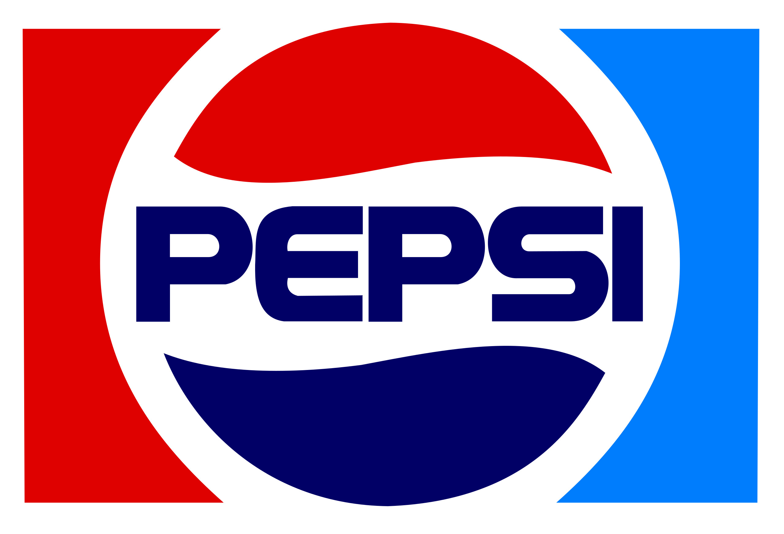
    The image You linked was the Pepsi logo I knew from my childhood.

    Load More Replies...
    Trashy Panda
    Community Member
    Premium
    8 months ago Created by potrace 1.15, written by Peter Selinger 2001-2017

    It's the old logo

    Paulina
    Community Member
    8 months ago Created by potrace 1.15, written by Peter Selinger 2001-2017

    Any logo that removes the shiny bits of poorly done "3D" is instantly a better logo 🤷‍♀️

    Joe Publique
    Community Member
    8 months ago (edited) Created by potrace 1.15, written by Peter Selinger 2001-2017

    You mean they've changed it back to resemble the original after ruining it in 2006, right?

    JL
    Community Member
    8 months ago Created by potrace 1.15, written by Peter Selinger 2001-2017

    Don't knock it, it a helluva lot better that the previous mess of a logo.

    Michael Melfa
    Community Member
    8 months ago Created by potrace 1.15, written by Peter Selinger 2001-2017

    If the logo doesn't say Brad's Drink, it's inferior!

    View more comments
    #15

    Comparison of two Ben 10 designs, highlighting controversial redesigns.

    destroynectar Report

    PataSata
    Community Member
    8 months ago Created by potrace 1.15, written by Peter Selinger 2001-2017

    Like with Teen titans, this became also not just disfigured, but (along with tt) boring idiotic mish-mash.

    Debbie
    Community Member
    8 months ago Created by potrace 1.15, written by Peter Selinger 2001-2017

    Again from a kid to a teenager.

    ADVERTISEMENT
    See Also on Bored Panda

    These redesign failures often happen because changes are introduced based on preference or trend, not strategy or data, says Scalf. Some other common causes that she mentions include:

    1. Not talking to customers first.
    2. Making changes for the sake of change.
    3. Confusing a visual refresh with a full strategic rebrand.
    4. Letting design trends lead instead of brand values.
    5. Failing to explain the why behind the change.
    #16

    Sprite logo redesigns from 1995 to 2019, criticized for poor changes online.

    destroynectar Report

    justagirl
    Community Member
    8 months ago Created by potrace 1.15, written by Peter Selinger 2001-2017

    In my opinion, this one isn't as bad as some of the others.

    B
    Community Member
    8 months ago Created by potrace 1.15, written by Peter Selinger 2001-2017

    Right? The 2004 one looks like a kitchen cleaner logo

    Load More Replies...
    L H
    Community Member
    8 months ago Created by potrace 1.15, written by Peter Selinger 2001-2017

    It bothers me they are not in chronological order. I don't care if the right 3 were below the left 4 originally.

    Otto Katz
    Community Member
    8 months ago Created by potrace 1.15, written by Peter Selinger 2001-2017

    What's with that timeline? it's all over the place. Fixed it Screenshot...d3-png.jpg Screenshot-2025-04-18-at-33626PM-6802ab0c242d3-png.jpg

    Magenta Blu
    Community Member
    8 months ago Created by potrace 1.15, written by Peter Selinger 2001-2017

    Looks like any random dishwasher

    Skullface VonHornhelm
    Community Member
    8 months ago Created by potrace 1.15, written by Peter Selinger 2001-2017

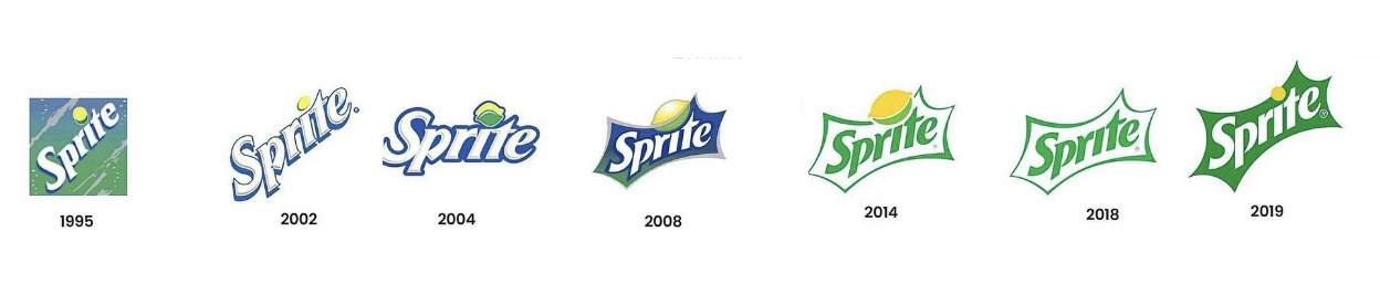
    The one I like isn't even in this picture. It had kind of a green and yellow ☯️ shaped like a 🍋.

    Roger9er
    Community Member
    8 months ago Created by potrace 1.15, written by Peter Selinger 2001-2017

    DiSprite all the designs, still ugly.

    ADVERTISEMENT
    See Also on Bored Panda
    #17

    Horrible redesign comparison of HBO Max logo change, old and new side by side.

    destroynectar Report

    S. E. in Indiana
    Community Member
    8 months ago Created by potrace 1.15, written by Peter Selinger 2001-2017

    HBO was always the brand channel not Cinemax. They need to change it back to HBO. This is the brand more people are familiar with. Home Box Office

    Jumping Jellyfishes
    Community Member
    Premium
    8 months ago Created by potrace 1.15, written by Peter Selinger 2001-2017

    I always thought "Home Box Office/HBO" was a cool brand name. "Max" is boring, uninspiring and the word "max' is overused in brand names.

    AshDenver
    Community Member
    4 months ago Created by potrace 1.15, written by Peter Selinger 2001-2017

    And just like that, HBO MAX is back.

    Trashy Panda
    Community Member
    Premium
    8 months ago Created by potrace 1.15, written by Peter Selinger 2001-2017

    They renamed it because it has more than just HBO.

    ADVERTISEMENT
    See Also on Bored Panda
    #18

    Split-screen of old and new TV show hosts sitting with a blue cartoon dog, illustrating a notable redesign.

    destroynectar Report

    April Pickett
    Community Member
    8 months ago Created by potrace 1.15, written by Peter Selinger 2001-2017

    They changed people, guess they needed new background, but.....

    Nagel adds that a rebrand has a higher chance of being unsuccessful if it's done too quickly and is changed too much.

    "I never advise a complete rebrand, but a careful re-evaluation of whether the current brand and brand visuals are still an accurate reflection of the company. Often, they could use a little bit of a refresh if it's been a while since they were designed or if it was a low-cost design job to get the company started up. But it's best if a company can keep the brand story and keep some visual aspects of their existing logo," she says.

    #19

    Powerpuff Girls redesign criticized online; original vs. new style comparison.

    destroynectar Report

    ucp
    Community Member
    8 months ago Created by potrace 1.15, written by Peter Selinger 2001-2017

    Because the old ones look so natural

    glowworm2
    Community Member
    8 months ago Created by potrace 1.15, written by Peter Selinger 2001-2017

    THey were made with Chemical X--how "natural" can one get?

    Load More Replies...
    Hahahi18
    Community Member
    8 months ago Created by potrace 1.15, written by Peter Selinger 2001-2017

    kind of hard to tell since they have such simple designs 😭

    glowworm2
    Community Member
    8 months ago Created by potrace 1.15, written by Peter Selinger 2001-2017

    Believe me, the redesigns were the least of the porblems with this show! Sincerely, an original diehard PPG fan.

    glowworm2
    Community Member
    8 months ago Created by potrace 1.15, written by Peter Selinger 2001-2017

    Giant soft bow instead of one that could poke somebody's eyes out as a weapon.

    Load More Replies...
    Dolevaal
    Community Member
    8 months ago Created by potrace 1.15, written by Peter Selinger 2001-2017

    The second one looks konda weird. First is way better.

    ADVERTISEMENT
    See Also on Bored Panda
    #20

    Comparison of old and new Apple iOS designs, illustrating a questionable redesign.

    destroynectar Report

    Hahahi18
    Community Member
    8 months ago Created by potrace 1.15, written by Peter Selinger 2001-2017

    actually that looks better compared to others on this list

    Skullface VonHornhelm
    Community Member
    8 months ago Created by potrace 1.15, written by Peter Selinger 2001-2017

    Does it bother anyone else that the fourth row is out of order?

    Bruce Johnson
    Community Member
    8 months ago Created by potrace 1.15, written by Peter Selinger 2001-2017

    Old one was bad. Good design doesn't mean "put glossy and shadows on everything".

    Angus McCoatup
    Community Member
    4 months ago Created by potrace 1.15, written by Peter Selinger 2001-2017

    Apple just do what Samsung do but 5 years later and claim it as new

    Trashy Panda
    Community Member
    Premium
    8 months ago Created by potrace 1.15, written by Peter Selinger 2001-2017

    Huge improvement over the old shiny icons

    Vilis Lacis
    Community Member
    8 months ago Created by potrace 1.15, written by Peter Selinger 2001-2017

    No, Windows 8 did it one year earlier, with their ugly flat Metro interface… it was in 2012 and we’re still suffering from this awful trend!

    Michal Pifko
    Community Member
    8 months ago Created by potrace 1.15, written by Peter Selinger 2001-2017

    Actually an improvement. Still too cluttered compared to other phones.

    James016
    Community Member
    8 months ago Created by potrace 1.15, written by Peter Selinger 2001-2017

    The safari icon is still pants.

    Kallo Fox
    Community Member
    8 months ago Created by potrace 1.15, written by Peter Selinger 2001-2017

    The old one is so much better that it's insane. The new iOS looks so bad.

    View more comments
    ADVERTISEMENT
    See Also on Bored Panda
    #21

    Reddit logo redesign comparison, left original and right new version, causing online critique.

    destroynectar Report

    Shary Bobbings
    Community Member
    8 months ago Created by potrace 1.15, written by Peter Selinger 2001-2017

    Bored Panda's favorite source

    JL
    Community Member
    8 months ago Created by potrace 1.15, written by Peter Selinger 2001-2017

    Does the one on the right have five o'clock shadow?

    Peter Bear
    Community Member
    8 months ago Created by potrace 1.15, written by Peter Selinger 2001-2017

    NGL I like the new one better. Maybe it's just me.

    PoutDragon
    Community Member
    8 months ago Created by potrace 1.15, written by Peter Selinger 2001-2017

    I like it too, the little robot-guy looks way happier.

    Load More Replies...

    "If a brand or brand visual identity is changed too much, too quickly, the company risks jeopardizing the positive brand equity they've built over time through their hard work and reputation, and they risk causing distrust in their brand amongst their customers and target audience," she further explains.

    ADVERTISEMENT

    "Also, the itch to change for change's sake—this can cause a rebrand failure because it's mostly to do with ego and little to do with an authentic representation of the company."

    #22

    Discord logo meme showcasing two different Spongebob characters for comparison, highlighting a horrible redesign.

    destroynectar Report

    #23

    Redesign of Staples logo sparks online criticism.

    destroynectar Report

    The Other Guest
    Community Member
    8 months ago Created by potrace 1.15, written by Peter Selinger 2001-2017

    There seems to be some confusion on this one. The bottom logo with the bent-staple L is the *old* logo, not the current one. You can see the top version if you go to their website: https://www.staples.com/

    El Cucuy
    Community Member
    8 months ago Created by potrace 1.15, written by Peter Selinger 2001-2017

    It's easy to get confused on this one. The top one is indeed their new logo, but many of the product shots on their website show the old logo.

    Load More Replies...
    Skullface VonHornhelm
    Community Member
    8 months ago Created by potrace 1.15, written by Peter Selinger 2001-2017

    I like how the L is a bent staple in the new one.

    #24

    Coca-Cola logo redesign comparison, showing old and new versions side by side, highlighting a criticized change.

    destroynectar Report

    Cooking Panda
    Community Member
    8 months ago Created by potrace 1.15, written by Peter Selinger 2001-2017

    At least they're consistent with the font

    April Pickett
    Community Member
    8 months ago Created by potrace 1.15, written by Peter Selinger 2001-2017

    They're back to basics. Ink must be pretty expensive.

    ADVERTISEMENT
    ADVERTISEMENT
    See Also on Bored Panda

    Scalf seconds that an unsuccessful rebrand can cost customers' trust. "If people don’t recognize you or feel like you’re not 'you' anymore, they pull back. That hesitation impacts everything, sales, loyalty, engagement, and even team morale.

    A confusing or misaligned rebrand also makes it harder for people to describe or refer to your business. It muddles your message. And in a crowded market, clarity is everything."

    #25

    Burger King logo redesign comparison, showing before and after images, criticized online for being unnecessary.

    destroynectar Report

    Lost Panda
    Community Member
    8 months ago Created by potrace 1.15, written by Peter Selinger 2001-2017

    I was going to say the new one looks like they were going for retro, then read the note

    JL
    Community Member
    8 months ago Created by potrace 1.15, written by Peter Selinger 2001-2017

    The new logo isn't the same as the original, the font is slightly different. It's better than the round one they had for too long. The logo looks like a burger again, and that's a good thing.

    Carl Roberts
    Community Member
    8 months ago Created by potrace 1.15, written by Peter Selinger 2001-2017

    i Love that they got community noted

    Trashy Panda
    Community Member
    Premium
    8 months ago Created by potrace 1.15, written by Peter Selinger 2001-2017

    Gen Z has no appreciation of how good the retro logos are

    roddy
    Community Member
    8 months ago Created by potrace 1.15, written by Peter Selinger 2001-2017

    I like it. Simple and effective.

    Huddo's sister
    Community Member
    8 months ago Created by potrace 1.15, written by Peter Selinger 2001-2017

    I prefer the original, but I'm more used to it saying Hungry Jacks :)

    #26

    Dr Pepper logo redesign comparison criticized online.

    destroynectar Report

    Kallo Fox
    Community Member
    8 months ago Created by potrace 1.15, written by Peter Selinger 2001-2017

    Who cares about the difference here?

    Gossameringue
    Community Member
    8 months ago Created by potrace 1.15, written by Peter Selinger 2001-2017

    Still never a period after the Dr

    Data1001
    Community Member
    8 months ago Created by potrace 1.15, written by Peter Selinger 2001-2017

    I take it the new one is on the left? Because that's the one I don't recall seeing before.

    ADVERTISEMENT
    See Also on Bored Panda

    To increase their chance of a successful rebrand, companies should carefully plan for it, keeping the customer and their people in mind, says Scalf. "Start with the strategy, not the visuals. Know your people. Know what they value about you. Know where you’re going and how the brand needs to evolve to support that.

    Before launching anything, test and get feedback. Ask your most loyal customers what they associate with your brand. Find out what feels essential to keep and what feels outdated. That insight is going to be what's most valuable," she suggests.

    "And when it’s time to launch, bring your people along for the journey. Share the story behind the changes. Let them be part of the evolution. People support what they feel connected to. Airbnb did this well when they unveiled their new logo and brand identity. They didn’t just present a new symbol, they shared a story. They explained the deeper meaning, invited the audience into the mission, and made it feel like a movement rather than just a design swap."

    ADVERTISEMENT
    #27

    Luxury brand redesigns with minimalist logos, showing updated brand names in bold typography.

    destroynectar Report

    ucp
    Community Member
    8 months ago Created by potrace 1.15, written by Peter Selinger 2001-2017

    WTF is “woke” about this?

    Edda Kamphues
    Community Member
    8 months ago Created by potrace 1.15, written by Peter Selinger 2001-2017

    It's not woke. It's plain boring.

    Lady Eowyn
    Community Member
    8 months ago Created by potrace 1.15, written by Peter Selinger 2001-2017

    Downvote for using "woke," the way that word is usually used has no relationship to this. This is just dumbing down. No longer anything distinctive.

    Lyone Fein
    Community Member
    8 months ago Created by potrace 1.15, written by Peter Selinger 2001-2017

    Why does everyone want to look so generic and boring?

    antoinette maldari
    Community Member
    8 months ago Created by potrace 1.15, written by Peter Selinger 2001-2017

    Same with people painting the interior of their home gray and white.

    Load More Replies...
    zatrisha
    Community Member
    8 months ago Created by potrace 1.15, written by Peter Selinger 2001-2017

    It's a trick of the graphic designers to make everything Tahoma-ish, which is supposedly what most people like best. There are hardly any individual font designs anymore.

    Hell'n Damnation
    Community Member
    8 months ago Created by potrace 1.15, written by Peter Selinger 2001-2017

    They all look the same now; before they had individual character.

    Kat Alison
    Community Member
    8 months ago Created by potrace 1.15, written by Peter Selinger 2001-2017

    This sucks….all the old ones are better…but “woke” does not apply to fonts.

    Stannous Flouride
    Community Member
    8 months ago Created by potrace 1.15, written by Peter Selinger 2001-2017

    Tell me you don't know what 'woke' means without telling me...

    PataSata
    Community Member
    8 months ago Created by potrace 1.15, written by Peter Selinger 2001-2017

    Car manufacturers do the same. For a while now, every car model looks like any other. Individualities are lost.

    View more comments
    ADVERTISEMENT