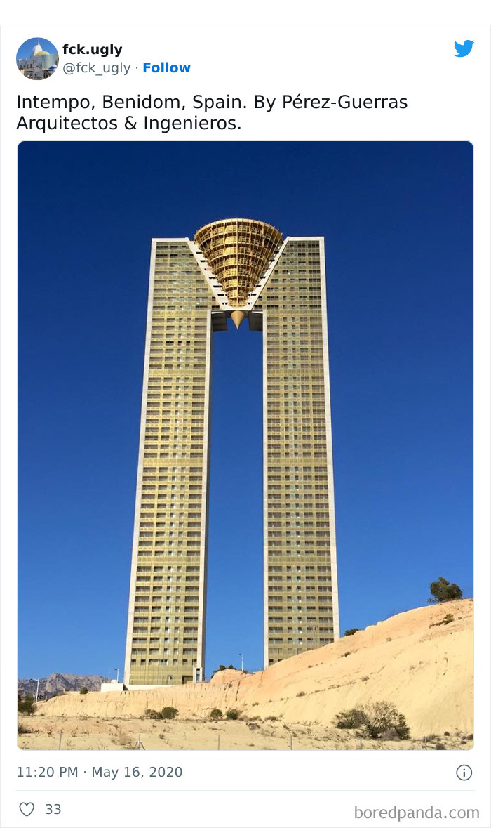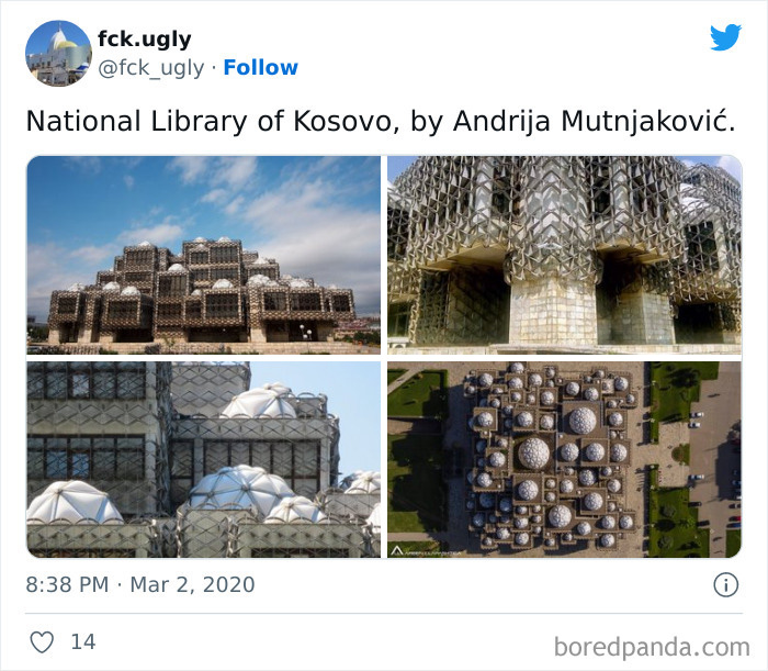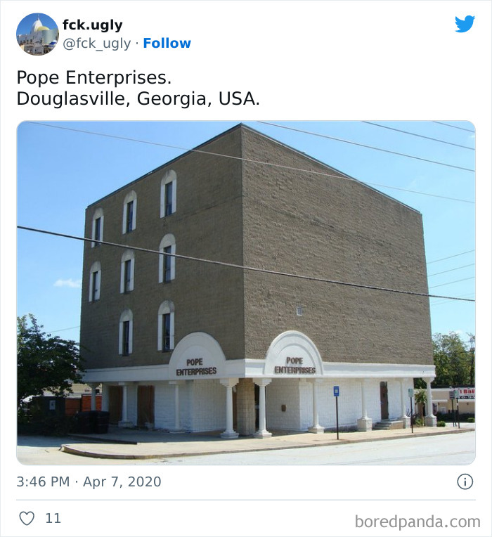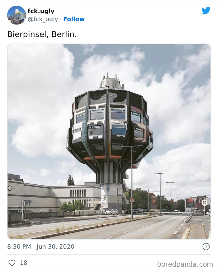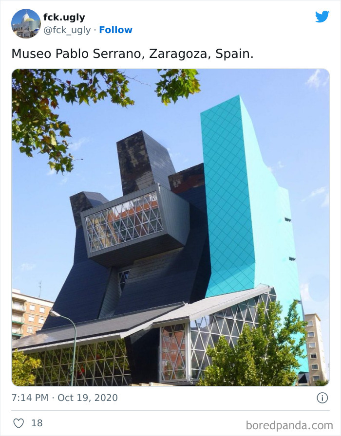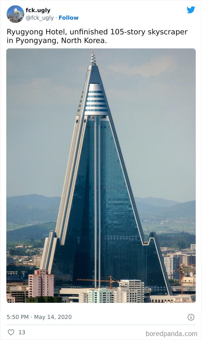
430Kviews
30 Times Architects Failed At Their Job, As Shared On This Twitter Page Dedicated To Ugly Buildings
Every now and then, we grab the opportunity to praise architects who consistently outdo themselves and surprise us with their marvelous creations. Because designing impressive and remarkable structures that leave everyone in awe is far from an easy task. It requires years of hard work, dedication, and understanding of seemingly endless aspects of human life. But far too often, we stumble upon places that tell us one universal truth — some pieces of architecture are utter disasters.
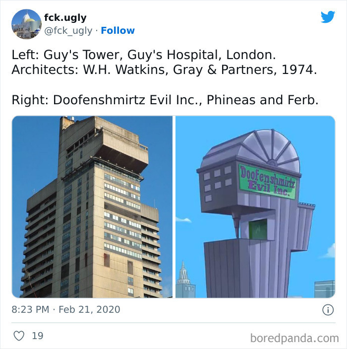
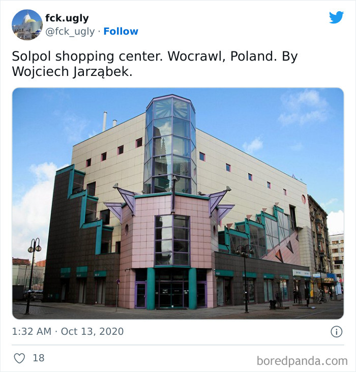
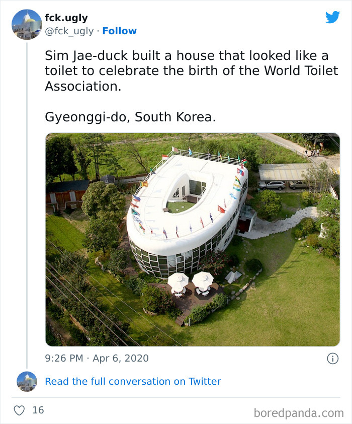
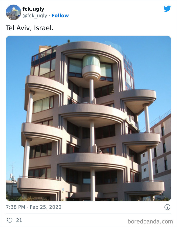
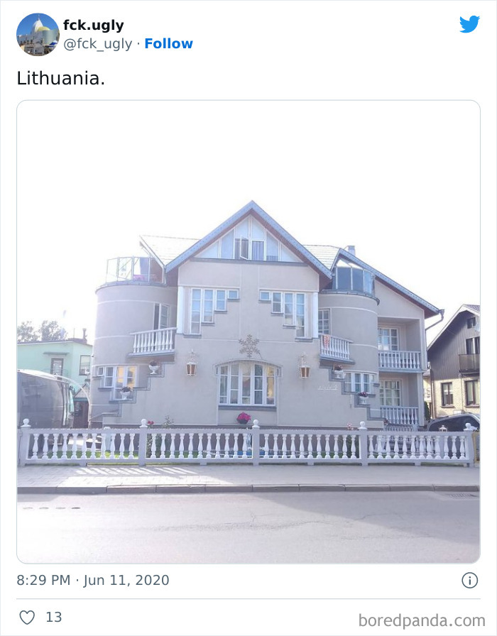
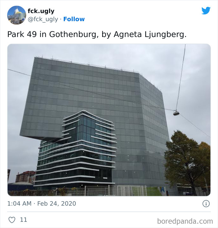
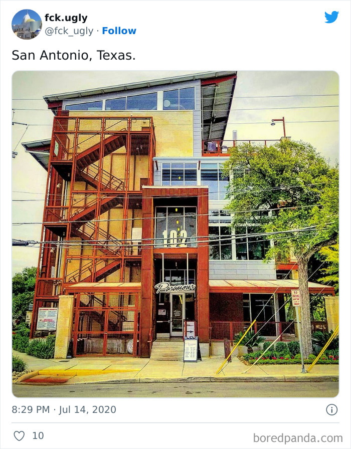
Here’s where 'The World's Ugliest Buildings' Twitter account comes in. This social media project is dedicated to pictures of some of the most visually displeasing architectural examples found across the world, and it shares the worst of the bunch. Though, even when they are the most unattractive fiascos ever discovered, they definitely leave an impression.
We at Bored Panda have gathered some of the most memorable pictures from the page to share with you all. So sit back, buckle up, and get ready to go down the rabbit hole of architectural hiccups. Be sure to hit upvote as you go, and let us know which of these places you’d love to see IRL in the comments!
More info: Twitter
This post may include affiliate links.
For your entertainment, the Twitter account in question has been documenting terrible building examples ever since it was created in 2020. As the creator writes in the description, this social media account is a virtual gallery of some of the ugliest buildings found across the world, from China to Belgium to the United States. And they certainly deliver.
The page currently has over 3k followers, but its Latin American version has gained a strong foothold on the platform by amassing over 31k devoted fans eagerly waiting for a new ugly creation to grace their feeds. They are both well-known for shaming buildings or public spaces that were designed without a dash of love or talent, and a brief scroll through their accounts shows a variety of wacky designs and spaces that are just begging to be poked fun at.
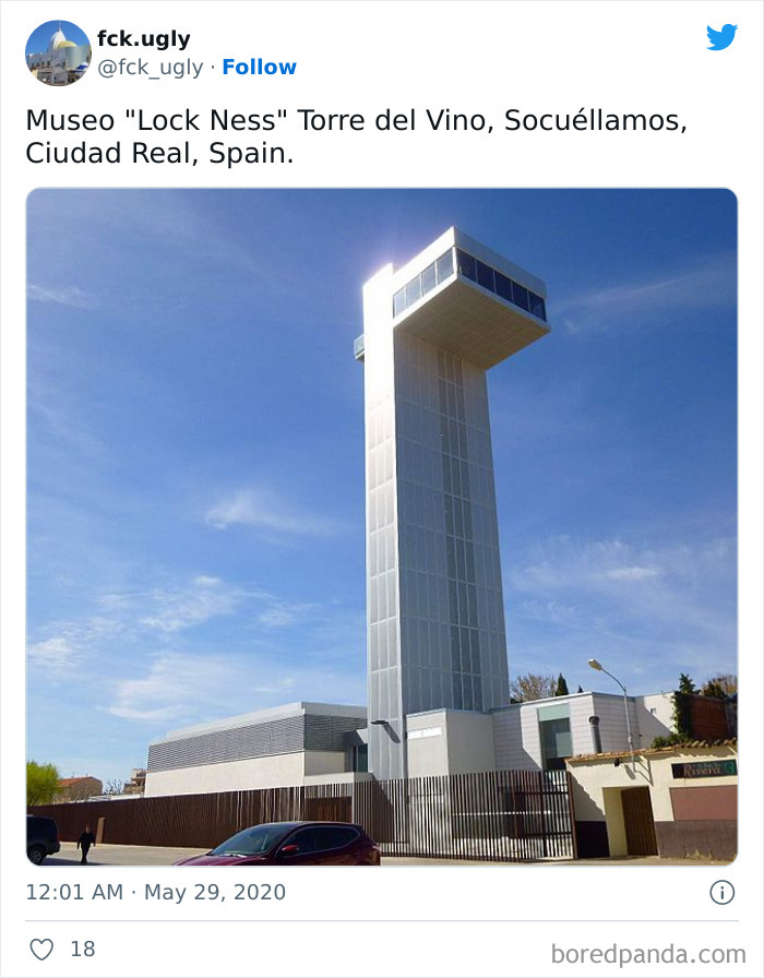
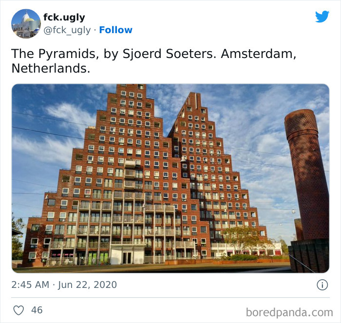
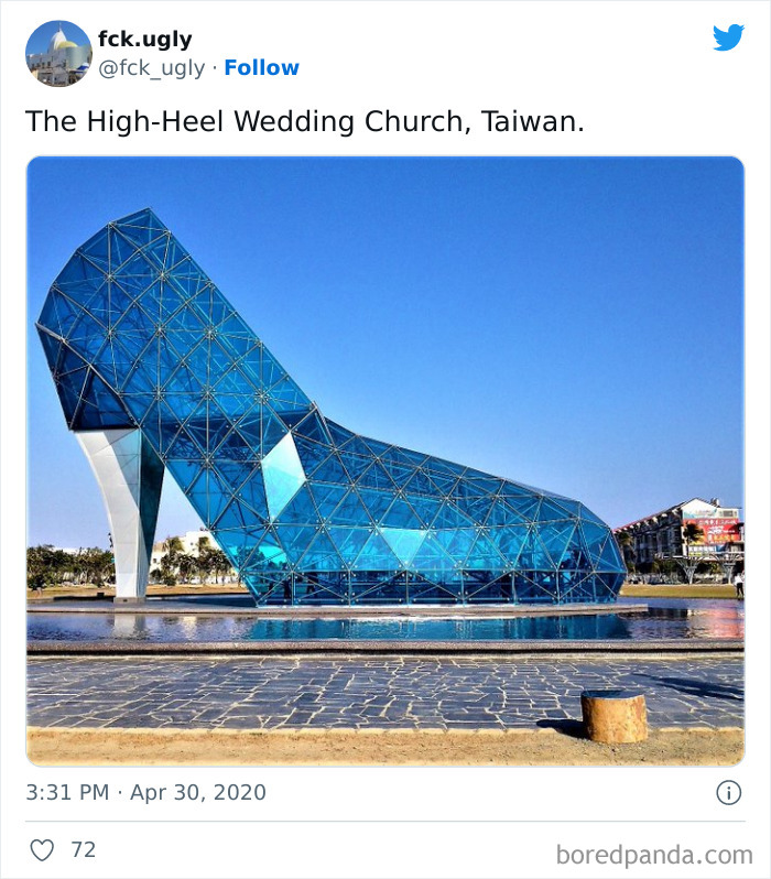
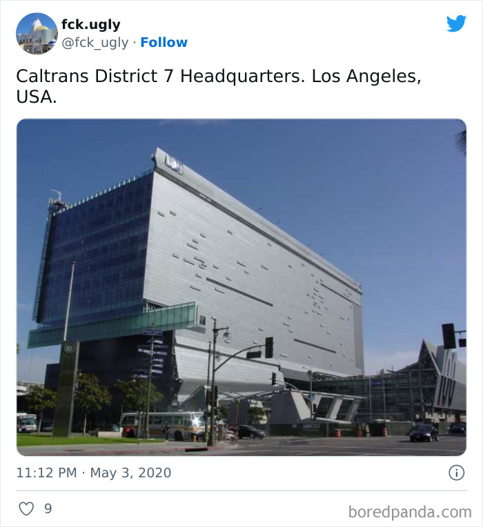
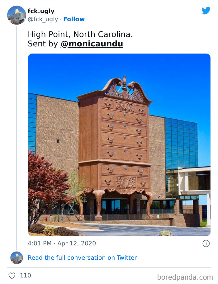
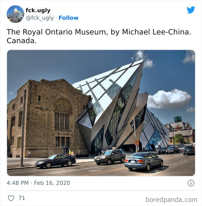
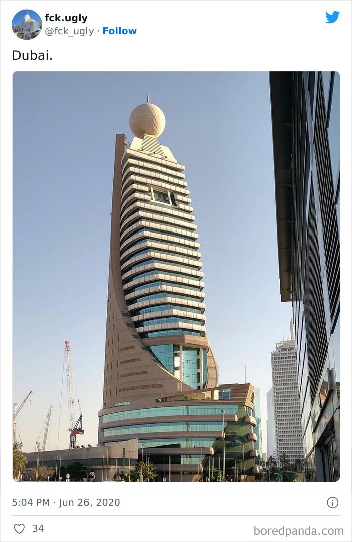
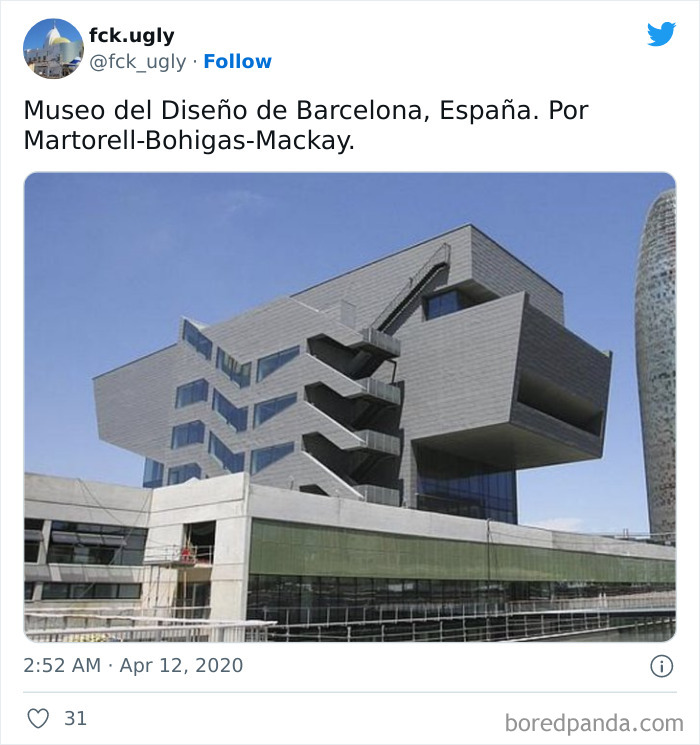
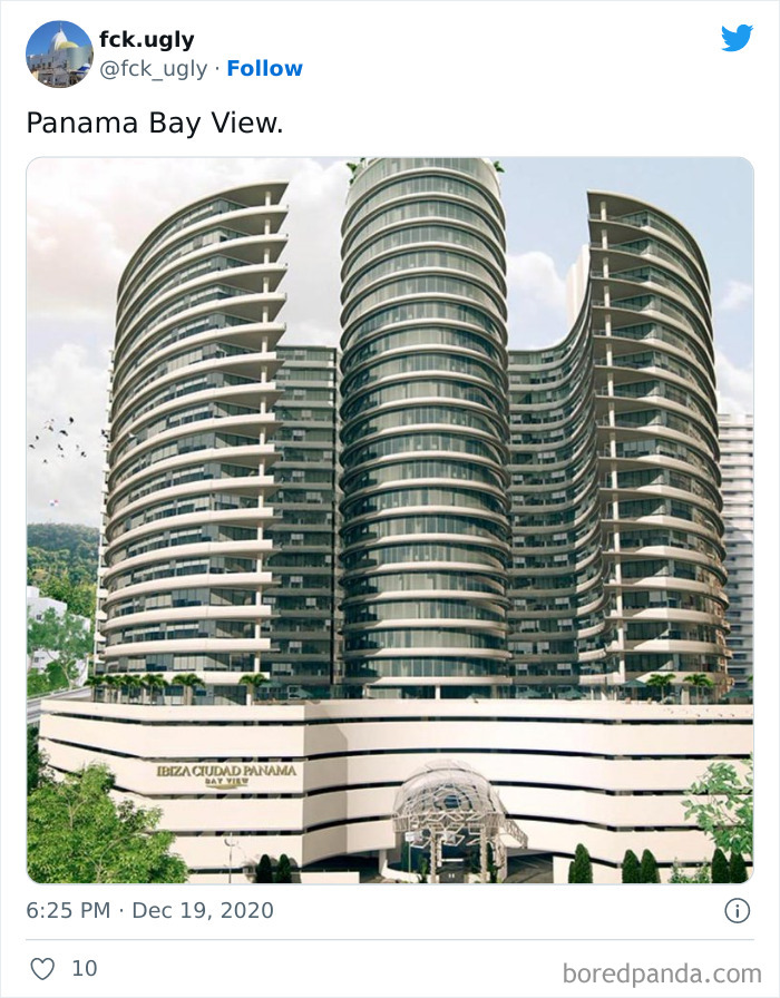
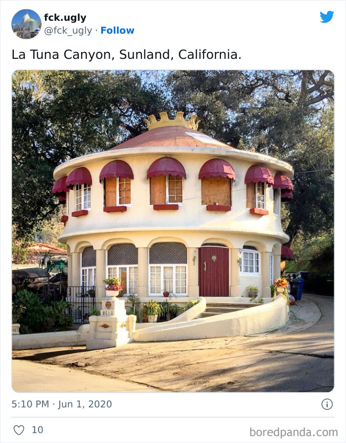
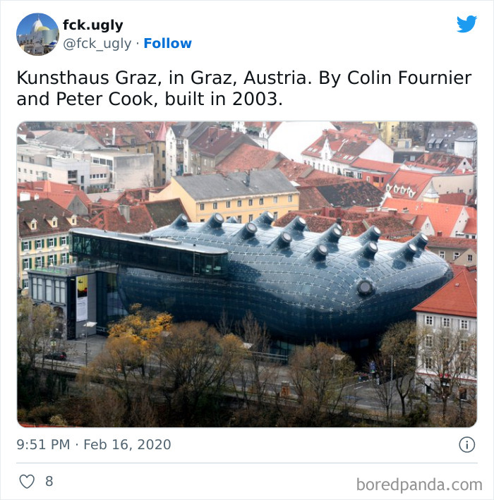
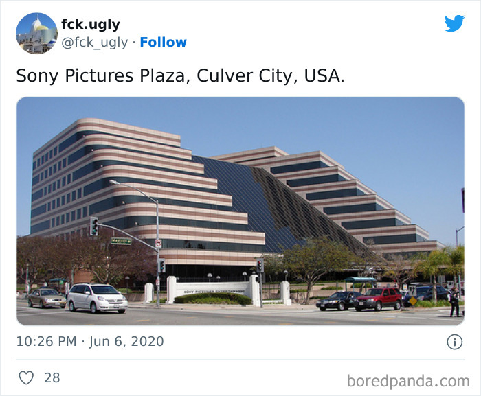
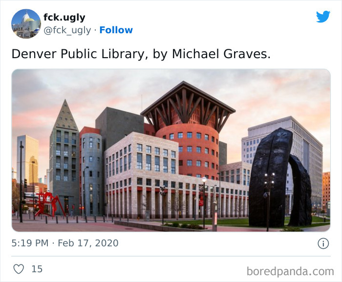
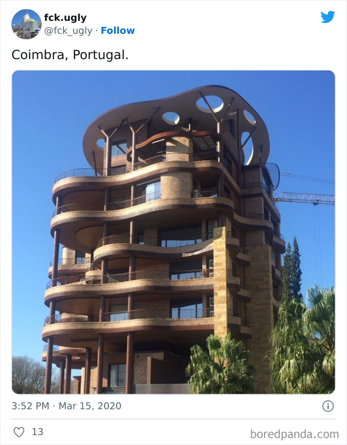
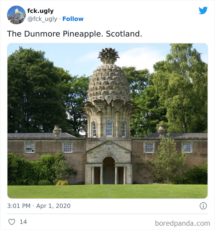
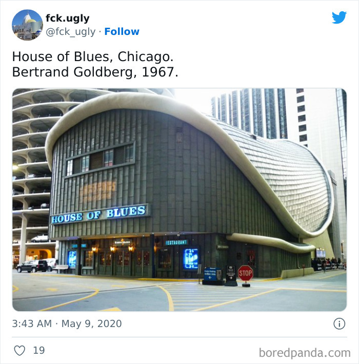
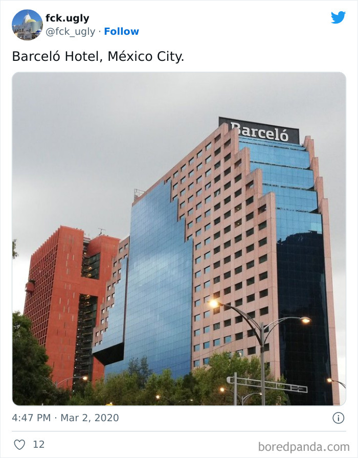
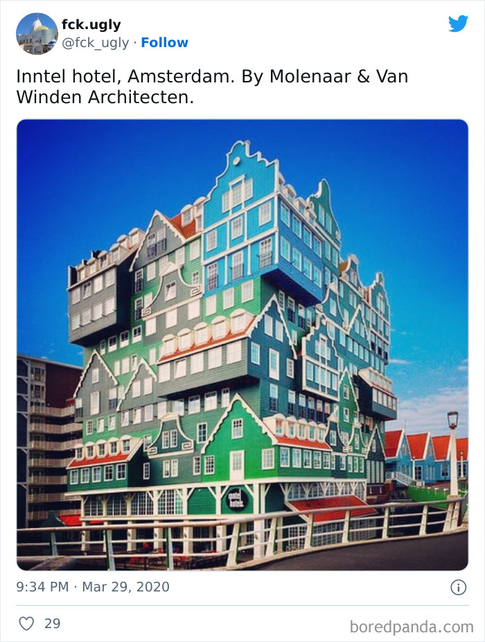
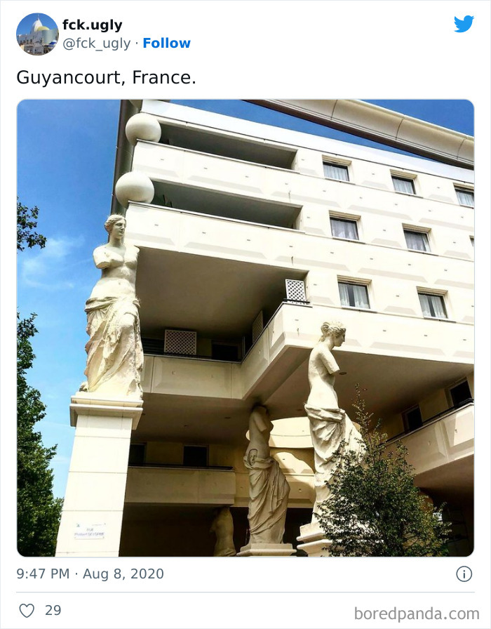
Moreover, each photo has a caption with the location of the building, and some offer more information like its name, construction date, and architect. So if some of these pictures left you scratching your head and wondering "What on earth were these people thinking!", this makes it much easier for you to look them up.
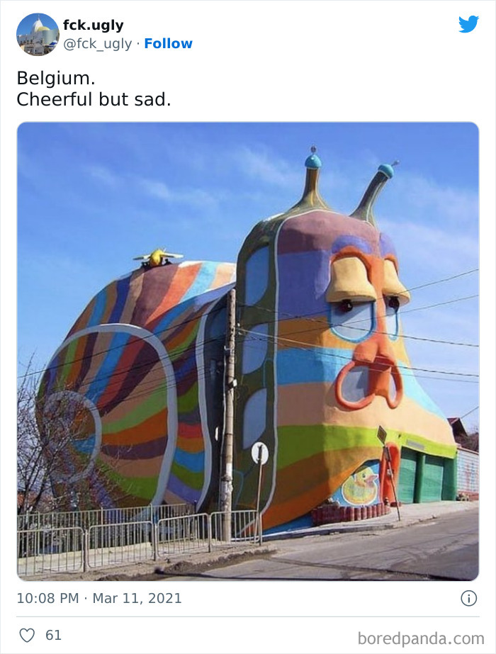
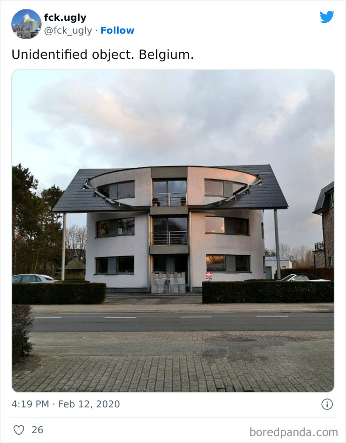
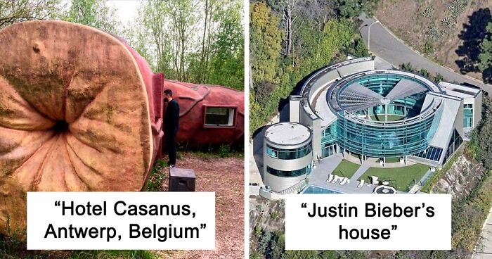
It's not in Belgium, but in Bulgaria : https://www.atlasobscura.com/places/snail-house-sofia
Speaking of architectural novelties, some ideas may (or may not) have once looked good on paper, but they probably should have just stayed on paper. Especially when architects have so many different ones, but they end up choosing them all at once. Of course, like any other art form, architecture is subjective, but this list offers proof that some buildings truly deserve all the strong opinions, criticism, and mockery they receive.
After all, when it comes to designing things for city living, you expect they are made with people in mind. Unfortunately, many creators wish to leave a mark and design buildings so unique that they will be remembered for years. Well, it's crystal clear that even with the best intentions, this desire for individuality does not always bring wanted results.
According to Associate professor Melonie Bayl-Smith from UNSW Built Environment, architecture today suffers from an originality syndrome. "When architects try to do something completely original, they don’t necessarily produce a better building," she said, adding that originality shouldn’t necessarily be the highest value of an architect.
"I see that architecture today, in some cases, has become a very form-based exercise, often at the expense of the quality of space or other crucial aspects of architecture. It doesn’t matter anymore whether it responds to anything to do with site or place or people — apparently we just want it to look different," Bayl-Smith added.
As the associate professor argued, creating a well-thought-out product is more important than doing something for the sake of its novelty. "I think we as a profession need to do a better job of recognizing what does work well, and developing and enriching those approaches, whether it’s spatial design, material design, the processes of building assembly, sustainable practices — all the different things that contribute to making a great, long-lasting building," she said. "There are enough poor buildings out there; we don’t need to keep 'inventing' more of them just to try and be 'original'."
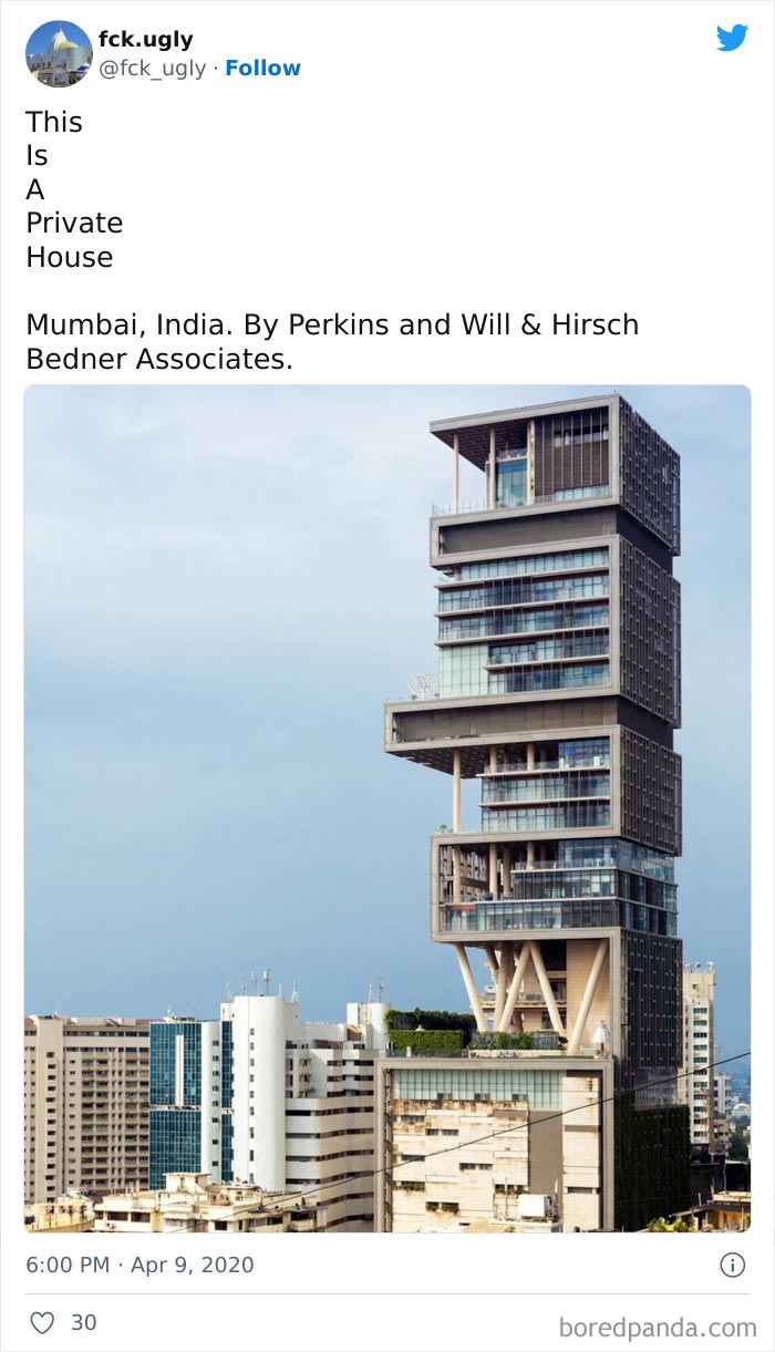
Nobody should have this much money, while hundreds of millions live in abject poverty.
Architects have the power to make our lives much easier, they have the ability to create a sense of calmness and safety. New buildings and public spaces need to accommodate and protect society, not make us feel uneasy and confused. After all, a report by the United Nations (U.N.) stated that 55% of the world’s population lives in urban areas today. A number which is expected to increase to 68% by 2050. Our environments are changing at an incredible rate, so designers, urban planners, and architects have to face challenges to ensure they serve the people who live there.
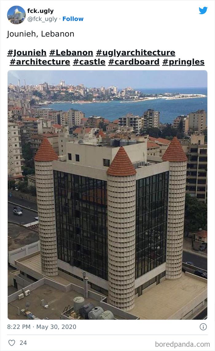
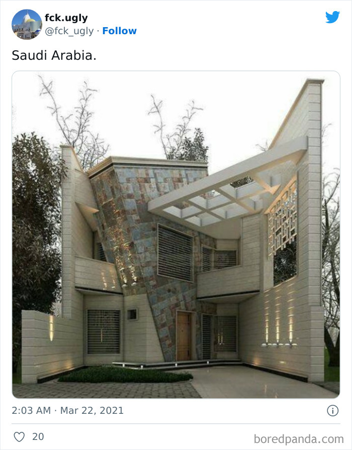
The middle east has such beautiful castle designs. Modern office building is not one of them
More often than not, however, they choose to make the modern world extremely ugly. In the last few centuries, humanity has made huge strides in technology, medical advances, and overall quality of life, but contemporary architecture still somehow manages to give us the jitters. As it’s explained in an article on Current Affairs, most architects will defend themselves by saying you simply don’t understand architectural principles.
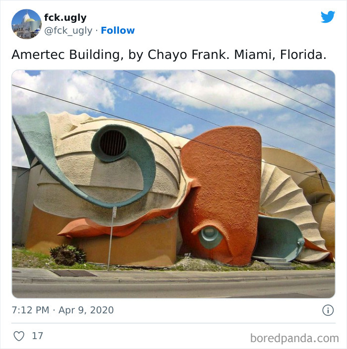
It was in Hialeah, FL (surrounding city to Miami) and was painted white, sold to produce company & then demolished in 2017
One typical excuse they use is that the buildings that look like atrocities to the public eyes are actually incredible feats of engineering. Take 'blobitecture', for example, a real school of contemporary architecture in which buildings have an organic, amoeba-shaped, building form. Usually, architects justify these examples because they were created using complicated computer-driven algorithms.
Another thing you’ll often hear is that contemporary architecture is honest. This means that it doesn’t rely on the forms and usages of the past, and it’s definitely not interested in "coddling you and your dumb feelings".
The Commercial Center Cita has even more stuff on it! Eiffel Tower, Brandenburg Gate, Tower Bridge, Little Mermaid and even a set of the Avengers :D
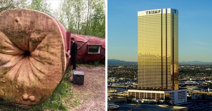
I don't think it's terrible. Probably wouldn't even be in this post if Trump's name wasn't on it.
"That’s the world we live in! Get used to it! Fans of Brutalism — the blocky-industrial-concrete school of architecture — are quick to emphasize that these buildings tell it like it is, as if this somehow excused the fact that they look, at best, dreary, and, at worst, like the headquarters of some kind of post-apocalyptic totalitarian dictatorship," the journalists Adrian Rennix and Nathan J. Robinson wrote in the piece.
"There’s an easy test for whether a building is beautiful or not. Ask yourself: if this building could speak, would it sound like the Rubaiyat or the works of Shakespeare, or would it make a noise like 'Blorp'? For nearly 100 years, we have been stuck in the Age of Blorp. It is time to learn to speak again."
No way I'm gonna find my room if I can't even find the entrance.
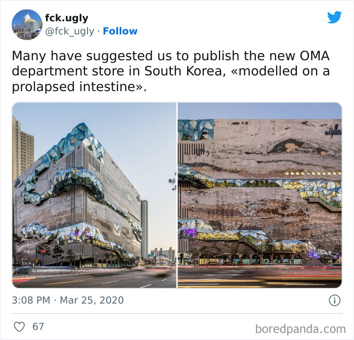
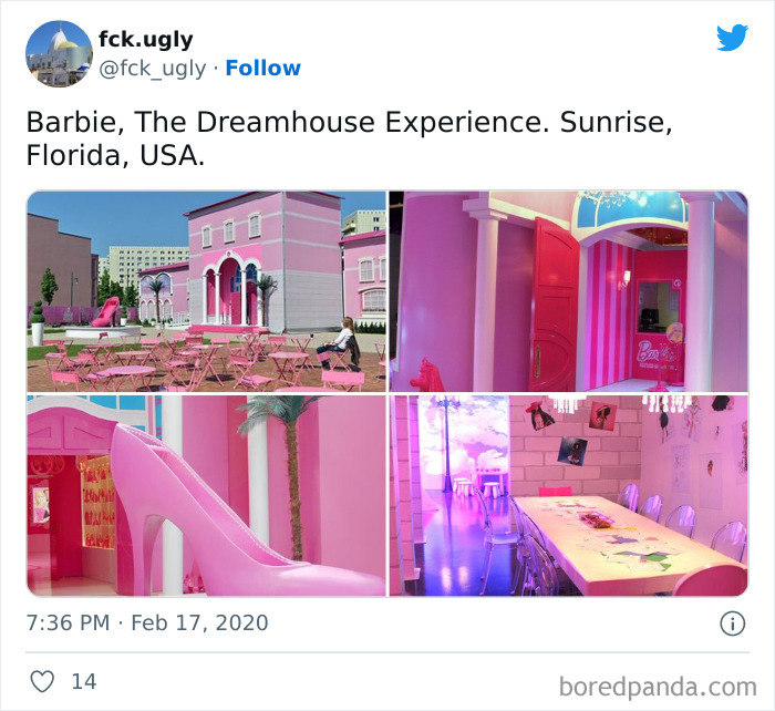
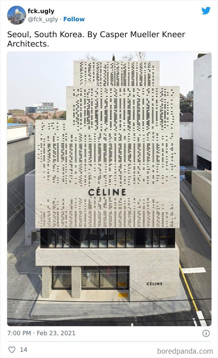
Really irritating. Some of these buildings are beautiful but taken at a crummy angle or with power lines in front (like Celine in South Korea). Others are perfect for their use: like the Barbie Experience or the Rock 'N Roll Museum should have been subtle and classy?
Agree, some building listed here are considered already classic architecture and are being taught in schools. It's just clumsy photography that did the damage.
Load More Replies...I’m very confused. This said design fails…but most of these buildings are just absolutely beautiful, maybe a bit weird, but beautiful! Can someone please explain why these are failed designs???
My take is that since it came from twitter it probably is a group of people who seem to believe that nothing unique or new should be made and that a proper aesthetic is one you can find in a magazine or something.
Load More Replies...fck.ugly proves that some people only have taste in their mouths! LOL! While many of these structures don't appeal to cultural aesthetics, some are still beautiful works of art.
At least these are all designed intentionally, and most of them are interesting to see.
Yeah i like this type of content but maybe we should not call them design fails? Yes some are ugly to my eyes but tbh I’d rather have something edgy and out there and I’m not sure I like it than some boring cracker box. A building that stands out and adds spice and icon is miles ahead of its peers, even if some people do find it “ugly”. Interesting architecture but mostly not ugly
Some of these are really cool. And the glass slipper from the thumbnail wasn't even included because it's so pretty lol
So the only building they don't show is the one used as the article opener? I wanted to see the shoe building!
It is there. You must click on the link at the bottom of the list where you can see it full length
Load More Replies...You're all amateurs. Boston City Hall. Charles F. Hurley Building. 'nuff said.
it's likely because people are upvoting and downvoting as you scroll down, so the position of each picture keeps changing
Load More Replies...Really irritating. Some of these buildings are beautiful but taken at a crummy angle or with power lines in front (like Celine in South Korea). Others are perfect for their use: like the Barbie Experience or the Rock 'N Roll Museum should have been subtle and classy?
Agree, some building listed here are considered already classic architecture and are being taught in schools. It's just clumsy photography that did the damage.
Load More Replies...I’m very confused. This said design fails…but most of these buildings are just absolutely beautiful, maybe a bit weird, but beautiful! Can someone please explain why these are failed designs???
My take is that since it came from twitter it probably is a group of people who seem to believe that nothing unique or new should be made and that a proper aesthetic is one you can find in a magazine or something.
Load More Replies...fck.ugly proves that some people only have taste in their mouths! LOL! While many of these structures don't appeal to cultural aesthetics, some are still beautiful works of art.
At least these are all designed intentionally, and most of them are interesting to see.
Yeah i like this type of content but maybe we should not call them design fails? Yes some are ugly to my eyes but tbh I’d rather have something edgy and out there and I’m not sure I like it than some boring cracker box. A building that stands out and adds spice and icon is miles ahead of its peers, even if some people do find it “ugly”. Interesting architecture but mostly not ugly
Some of these are really cool. And the glass slipper from the thumbnail wasn't even included because it's so pretty lol
So the only building they don't show is the one used as the article opener? I wanted to see the shoe building!
It is there. You must click on the link at the bottom of the list where you can see it full length
Load More Replies...You're all amateurs. Boston City Hall. Charles F. Hurley Building. 'nuff said.
it's likely because people are upvoting and downvoting as you scroll down, so the position of each picture keeps changing
Load More Replies...
 Dark Mode
  No fees, cancel anytime


