50 Informative Maps People Shared On This Group That Might Change Your Perspective On Things
Interview With AuthorI was lucky enough to be born in a time where I’ve never had to use physical maps to get places. And while I do find paper maps to be charming, I have to admit that I’m glad I can rely on Google and a robotic voice with questionable pronunciation to tell me where I need to go while driving. But if you're not behind the wheel, maps can be so much more than simply tools for navigation.
We took a trip to The World in Maps Instagram account and gathered some of their most informative and fascinating posts below. As you scroll through this list, we hope you’ll learn something new about our planet, and perhaps even your own country. Enjoy diving into the wonderful world of maps, and keep reading to find a conversation with the creator of The World in Maps, Xavier Ruiz!
This post may include affiliate links.
To learn more about maps and find out how The World in Maps started in the first place, we reached out to the account's creator, Xavier Ruiz, who was kind enough to have a chat with Bored Panda.
"The origins of The World In Maps trace back to 2017 when, after years of being a passive user on X (formerly Twitter), I decided to become more active and build a following," Xavier shared.
"I spent time brainstorming how I could bring something unique to the platform, combining my two main passions: history and international politics, along with my love for maps," the creator explained. "This combination felt like the perfect way to present complex global issues and historical events in an accessible, visual way. Today, the X account (@xruiztru) has over 70k followers."
Interesting Fact
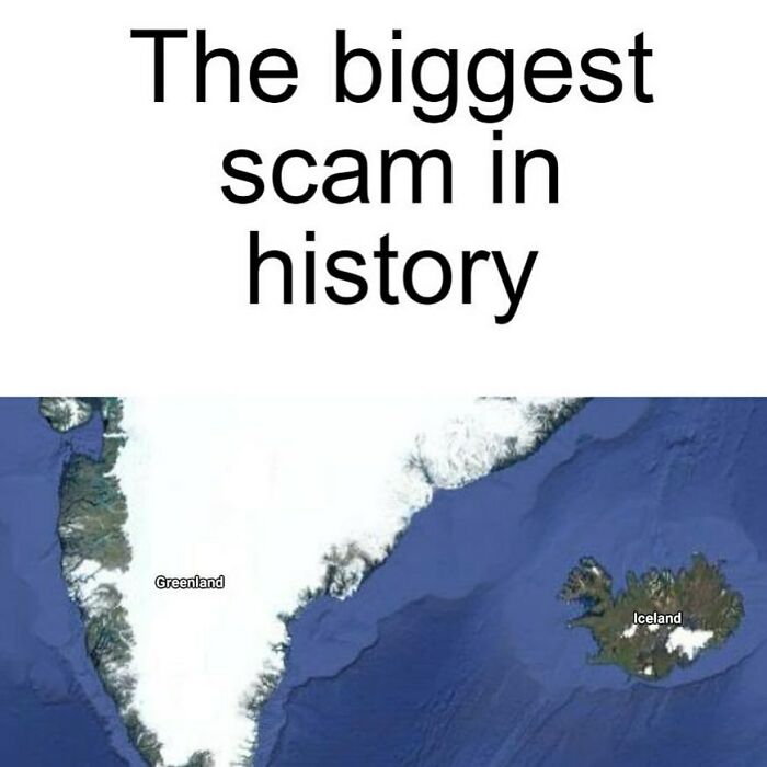
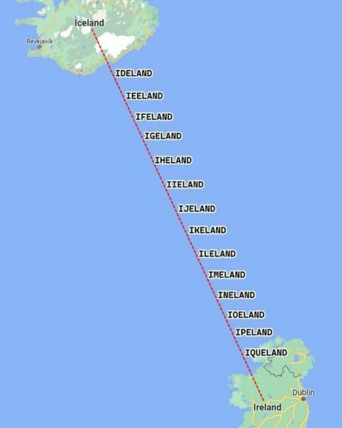
Yup. You don't want to live here. It's all ice. In fact, we call it Ice Land. You want to go to Green land. Much nicer.
"In 2021, several friends suggested that the content I was posting on X could be just as successful on Instagram," Xavier continued. "Initially hesitant and not quite comfortable with the platform, I decided to give it a try in June of 2021 when I had more time at work."
"At first, I kept the Instagram page a secret from family and friends, feeling a bit embarrassed," he admitted. "However, the growth was almost immediate. The page gained momentum quickly, and now we have more than 270k followers. There are some times that we grow more than 3k followers a day!"
35 Years After The Fall Of The Wall, Divide Between West And East Berlin Can Still Be Seen From Space Due To Different Lightbulbs Used On Each Side
And it's no secret to Xavier why his account has become so popular. "The rapid success of The World In Maps is a result of the clear, visual presentation of topics like history and international politics, which resonate with a wide audience," he explained.
"I believe many people are interested in these subjects, and the visual format makes the content both engaging and easy to understand. Additionally, our ability to post about timely topics and current events has helped us stay relevant, contributing to the page’s ongoing growth."
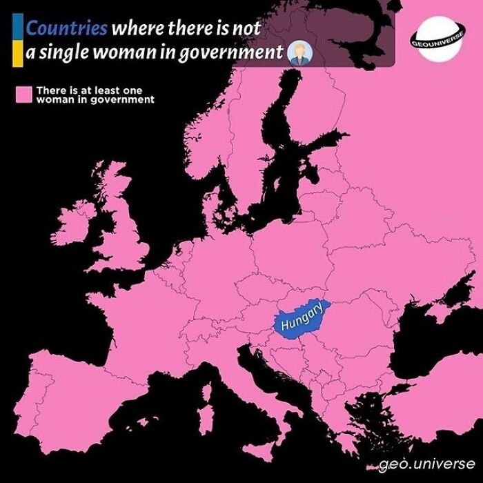
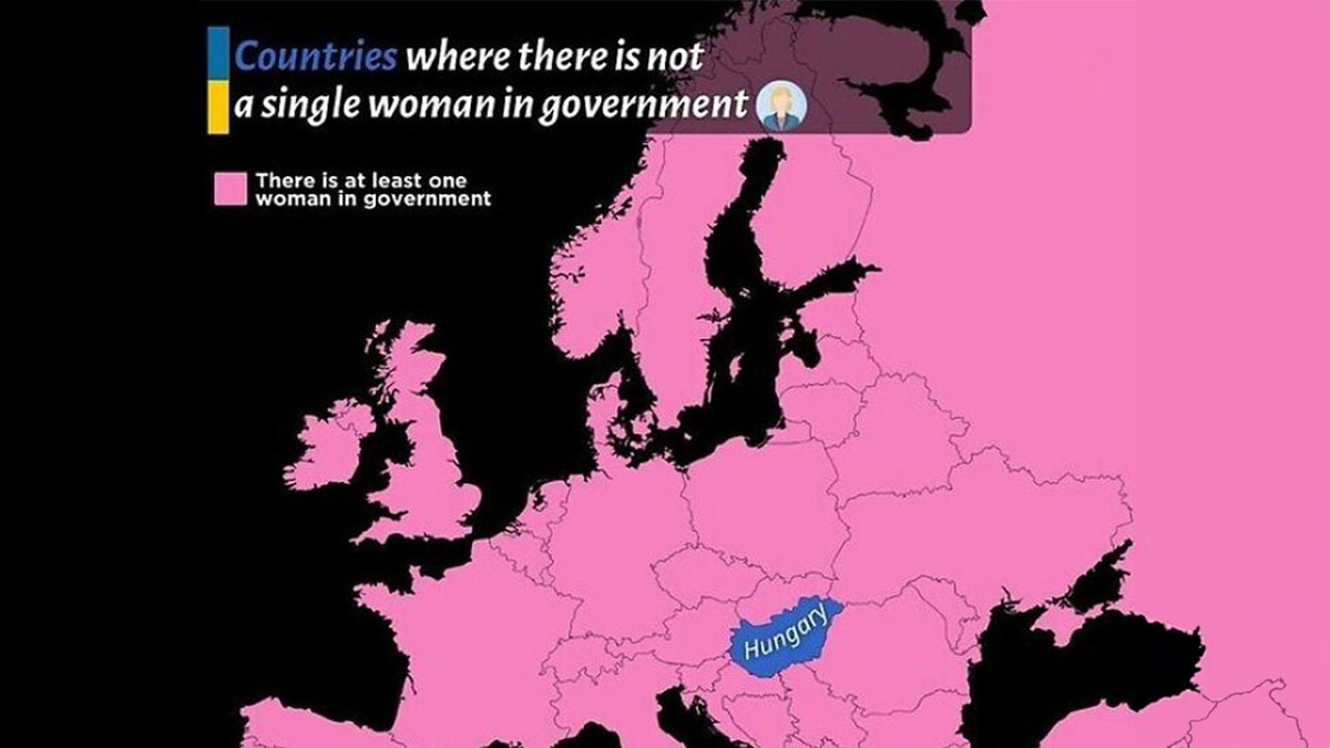
What A Shame For Hungary
Hungary should be ousted from the UE, stat. They are clearly siding with Putin's imperialistic plans, leech off EU subsidies (which are often "mishandled" or straight up appropriated by Fidesz's -the governing party- officers) without following their obligations, and openly campaign against the Union's equity, freedom and integration policies. Orban is an authoritarian despot who was kept in power through two very debatable and likely rigged elections. If they don't get their s**t together they have no place in a modern European society.
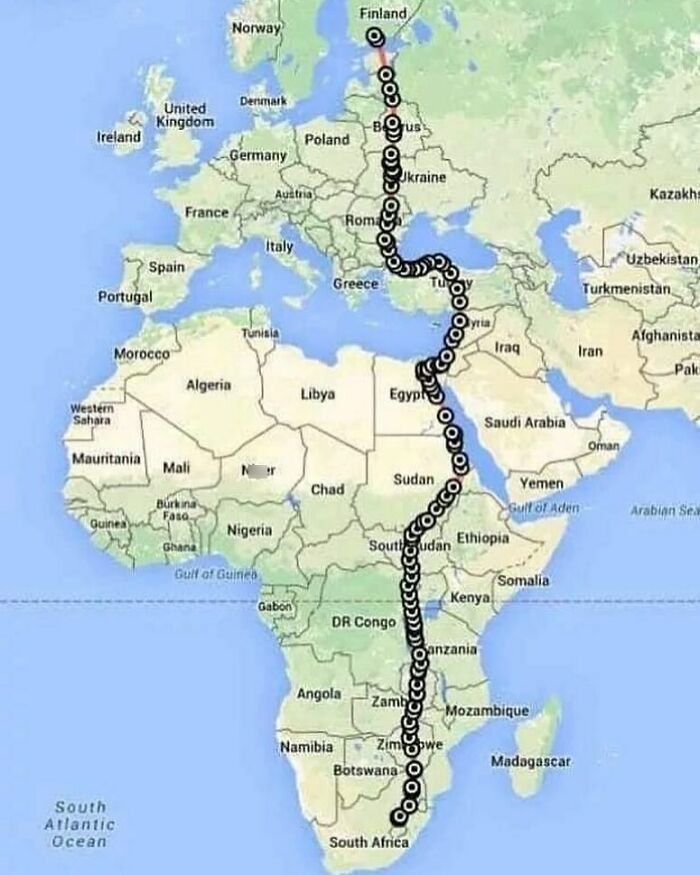
A Female Falcon Was Equipped With A Satellite Tracking System In South Africa Before Migrating To Finland
When it comes to why maps are so fascinating, Xavier says, "They provide a unique, visual representation of the world, turning complex concepts into something tangible and easy to understand. As both a historian and a fan of international politics, I appreciate how maps offer a way to explore connections between places, events and cultures across time and space. They can tell stories, reveal hidden patterns, and even change the way we perceive the world."
"What I find particularly captivating is how maps don't just show locations but also embody the power dynamics, histories, and cultural shifts of different regions," the creator added. "Whether it’s a map tracing the reach of ancient empires or a modern political maps illustrating shifting alliances, maps serve as lenses through which we can understand the complexities of the world."
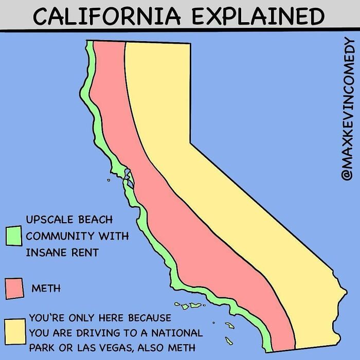
California Explained
This is 100% not true for the northwest corner of the state. No upscale beach communities up there. Just lots of pot & meth
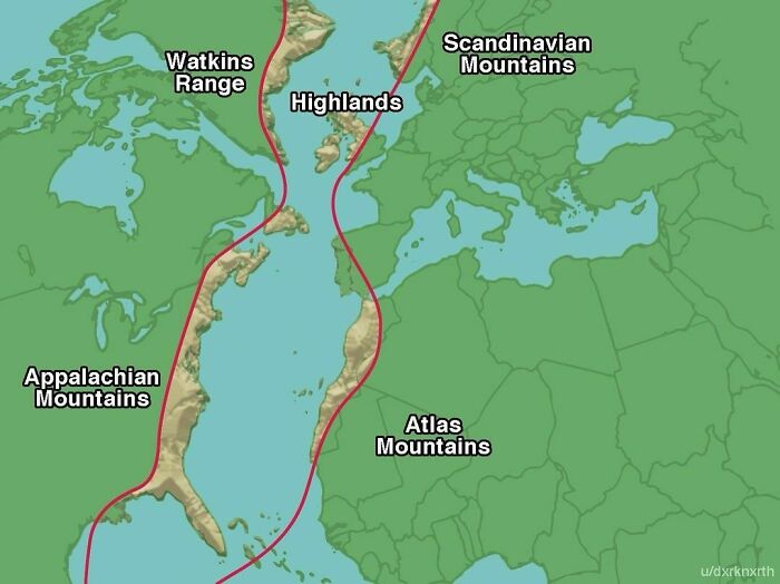
All Were Once Part Of The Same Ancient Mountain Range, The Central Pangean Mountains
This range formed over 300 million years ago during the Paleozoic Era when the supercontinent Pangaea was assembled. These mountains are now separated by vast distances due to the drifting of tectonic plates over millions of years.
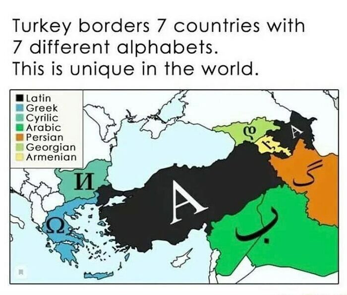
Did You Know That Turkey Borders 8 Countries With 7 Different Alphabets? This Map Shows How Turkey Is A Bridge Between Different Cultures And Civilizations
And next week, Turkey will border mash potatoes, stuffing, and green bean casserole.
Xavier also says maps are dynamic, as they evolve the same way the world does. "Borders shift, populations change and new discoveries unfold and maps constantly reflect these transformations," he noted. "For me, they are a perfect intersection of my interests in history and global affairs, offering endless opportunities for exploration and understanding how the world once was as well as the world we live in."
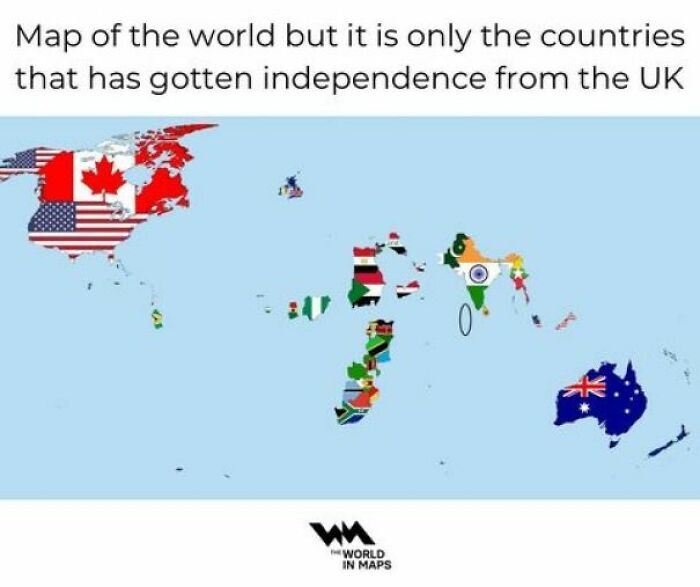
A World Map Showing Only The Countries That Have Gained Independence From The UK
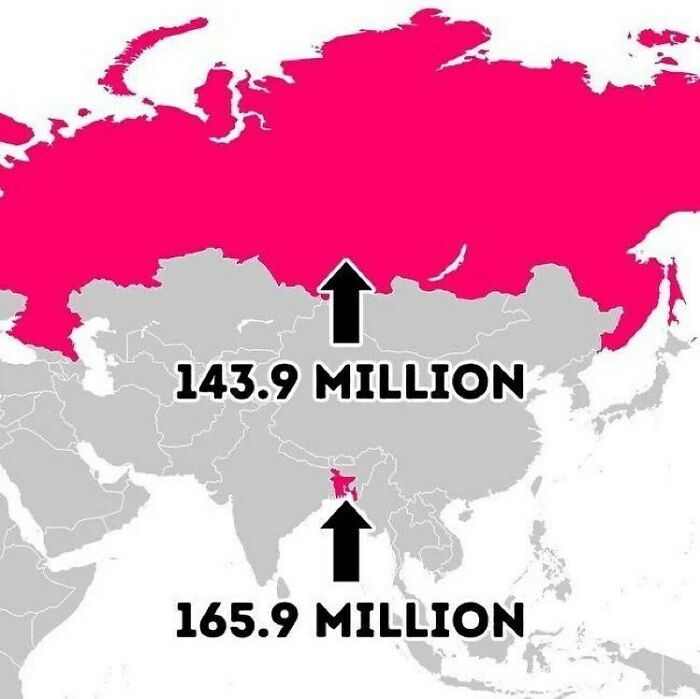
Tiny Bangladesh Has More Population Than Russia
And the Russian population will keep shrinking until the invasion of Ukraine is over with.
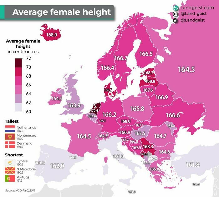
Dutch Women Are The Tallest Women In, Not Only Europe, But In The Whole World!
They are followed by Montenegrin and Danish women
So how does Xavier decide which maps to post? "I always consider current relevance. I aim to share maps that are connected to trending topics or global events, helping to explain ongoing situations in a visually engaging way," he told Bored Panda.
"For example, if a major geopolitical issue is being discussed, I might post a map that clarifies the geographic context or highlights interesting facts about the country or region involved," Xavier explained. "For historical events, I like to mark important anniversaries with the hashtag #OnThisDay, providing maps that shed light on key moments in history."
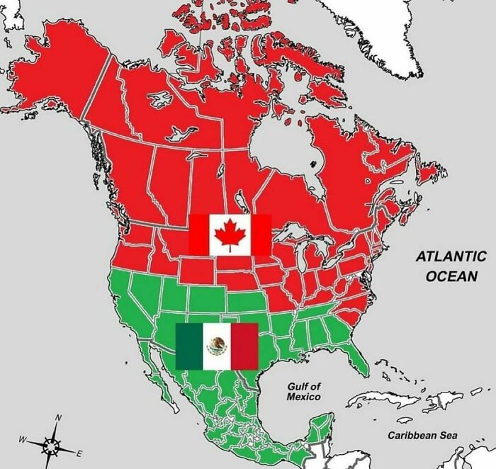
What If Canada And Mexico Split The United States Between Them?
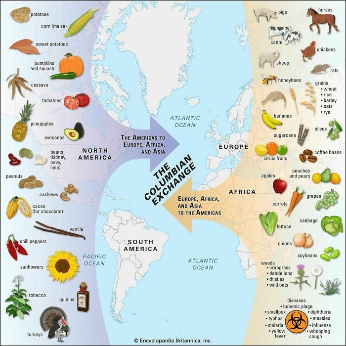
The Columbian Exchange
So weird that tomatoes and potatoes are so essential to many cuisines in Europe and a couple of hundred years ago they were unknown.
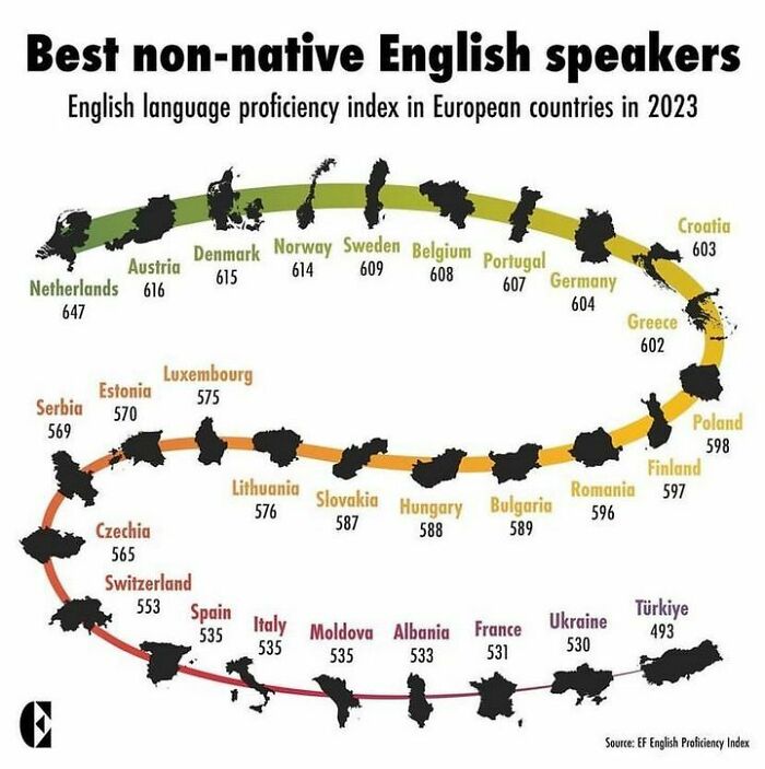
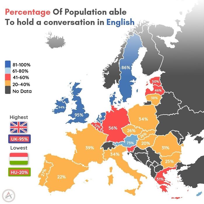
Which Countries Actually Speak English The Best As A Second Language?
I grew up at the border to the Netherlands and we received Dutch television. The one thing I remember vivdly was that the Dutch didn't dub English movies and TV shows but just had subtitles, which I think is a big advantage. Here in Germany everything gets dubbed and I absolutely hate it. In fact I stopped watching that s**t altogether.
We were also curious where these fascinating maps come from. "Sometimes I find maps online that are well-designed and fit the topic at hand, and I always make sure to credit the original source. Other times, I create my own maps, adding a unique perspective or offering more in-depth analysis," Xavier shared. "Other times, I just create maps that are more like memes. When I design my own, I include the World in Maps logo, so it's clear they are original creations. This approach allows me to offer a mix of curated content and custom visuals to keep the page fresh and engaging."
The Land Between Iceland And Ireland
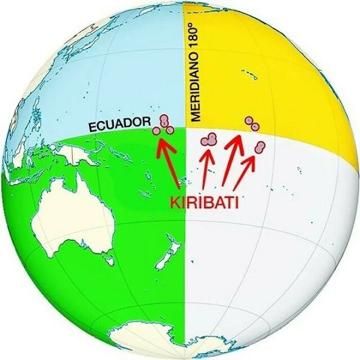
Kiribati Is The Only Country In The World To Straddle All Four Hemispheres
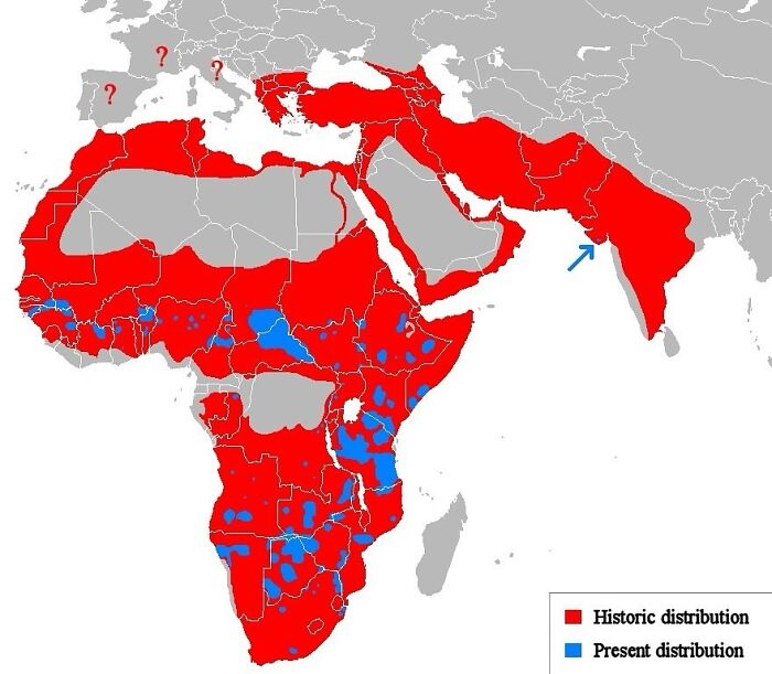
The Lion, Once Widely Distributed Across Most Of Africa And Parts Of Europe And Asia, Is Now Confined To A Number Of Isolated Areas
Amounting to only about 20% of its historic range.nn#WorldLionDaynnvia wikipedia
Finally, we wanted to know if Xavier was partial to any of the maps he's ever shared. "One of my favorite maps that I’ve created is one showing the population density of the 'tiny' island of Java in Indonesia compared to the rest of the world," he noted.
"It’s truly fascinating how densely populated Java is—despite being just one island, it’s home to more people than many entire countries! This map is especially striking because it highlights the stark contrast between Java and other nations, making the scale of its population size even more surprising," the creator said. "The fact that Java is one of the most populous islands in the world, but still relatively small in geographical size, makes this map both eye-opening and thought-provoking."
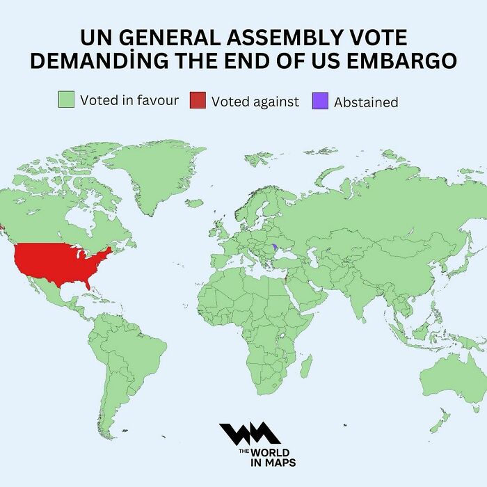
For The 32nd Year In A Row, The United Nations Votes Overwhelmingly To End The Us Embargo On Cuba
Civilization vs. Barbarism
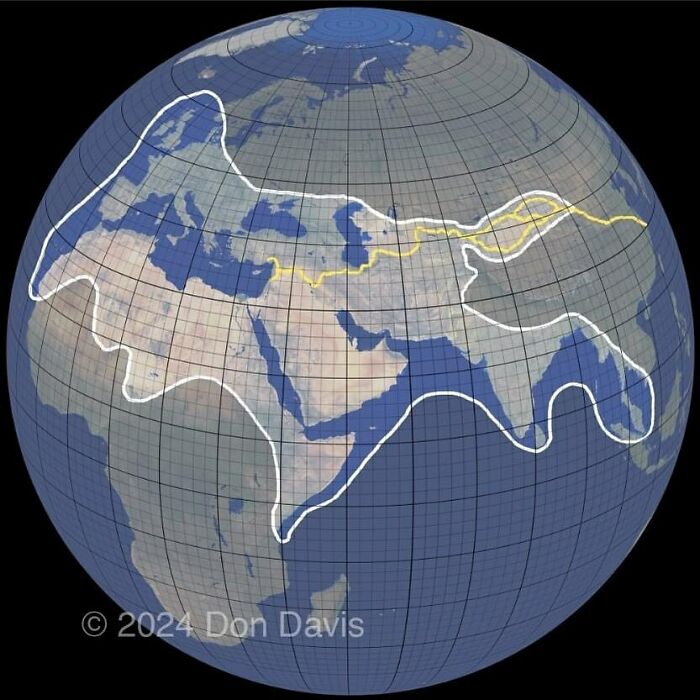
A Lovely Overview Of The Approximate Limits Of The World Known To The Romans, Around 150 Ad
The Romans were ware of China, and China was aware of them, just no direct contact, though Roman coins have been found as far away as Korea. Also huge parts of Russia, the Romans knew Scythia, and the ancient greeks knew of Islands to the West of Ireland, which we know at least one is Iceland, so the Romans knew about it too.
We hope you're enjoying this list of informative and entertaining maps, pandas! Keep upvoting all of your favorites, and let us know in the comments below what kind of map you'd like to see featured on The World in Maps next. Then, if you'd like to check out even more maps that might teach you something new about our planet, look no further than right here!
Denmark?!
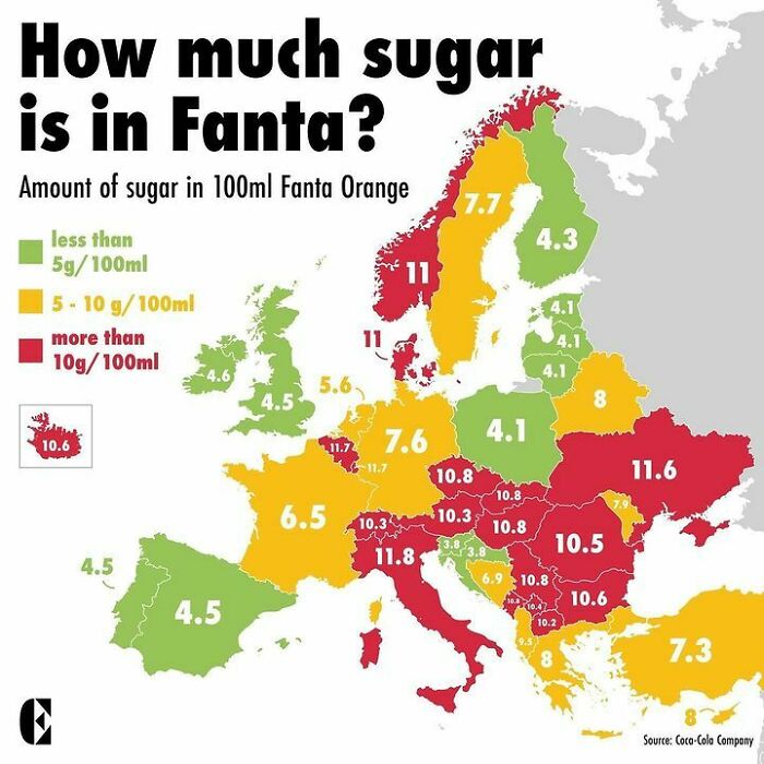
The Amount Of Sugar In Your Fanta Varies Widely Across Europe
So does the amount of actual ornage juice. Fanta in Spain is really good
So Accurate
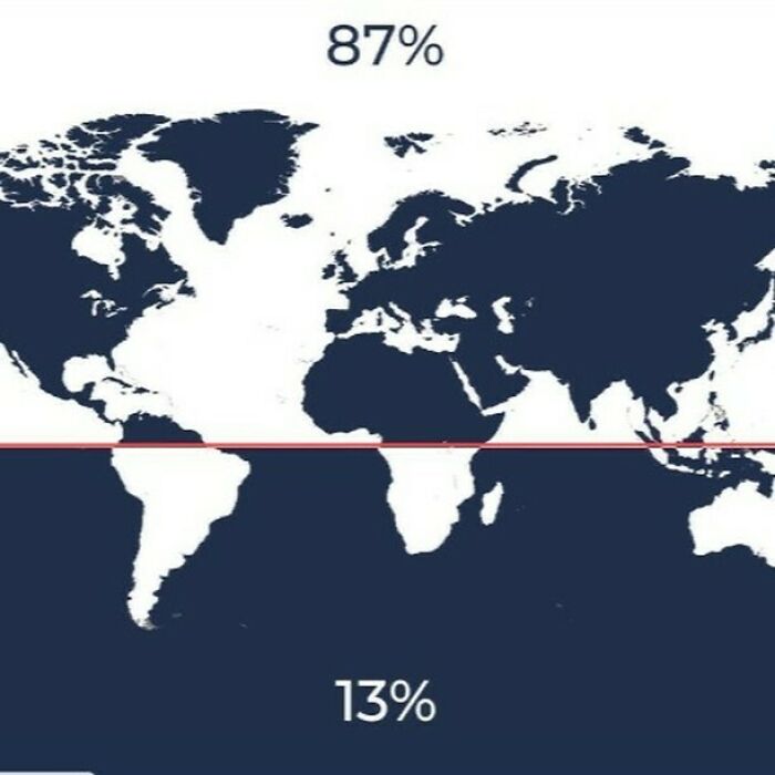
87% Of The World Lives In The Northern Hemisphere, And Only 13% Of The World Lives In The Southern Hemisphere
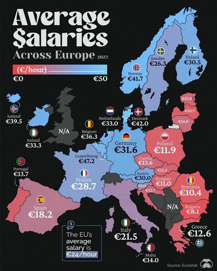
In Case You Were Wondering Why More Firms Are Setting Up Camp In Poland After Leaving Germany
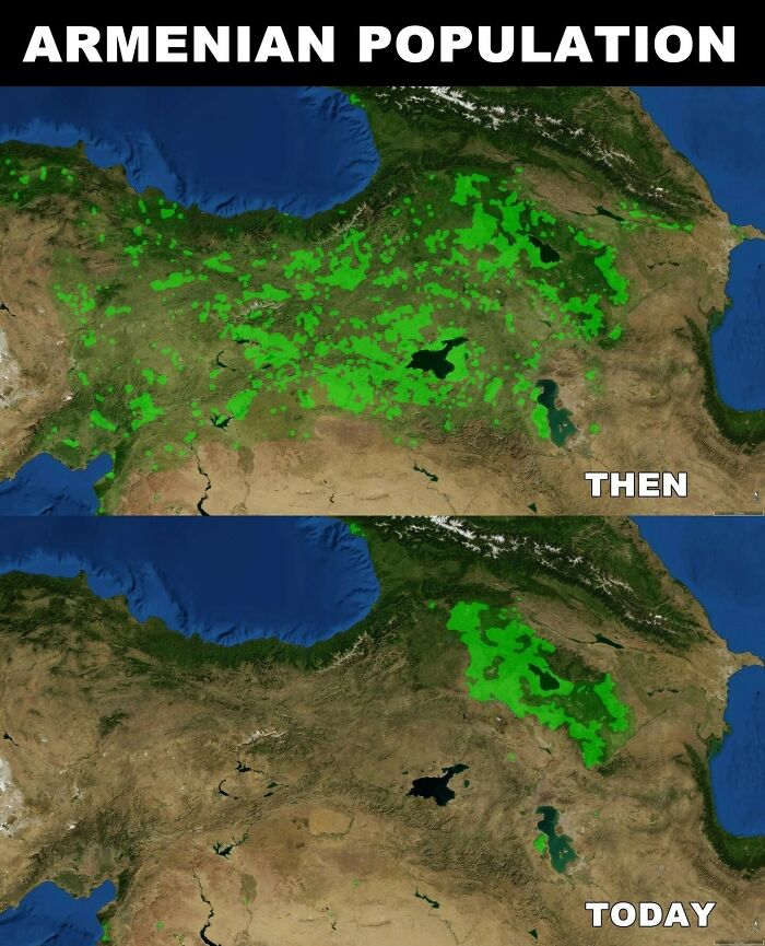
Map Shows The Roots Of The Death March Into The Syrian Desert. Approximately 1.5 Million Armenians Were Systematically Deported, Massacred, Or Marched To Their Deaths By The Ottoman Empire
Armenian Genocide Remembrance Day
Map Shows The Percentage Of Population Able To Hold A Conversation In English In Each European Country
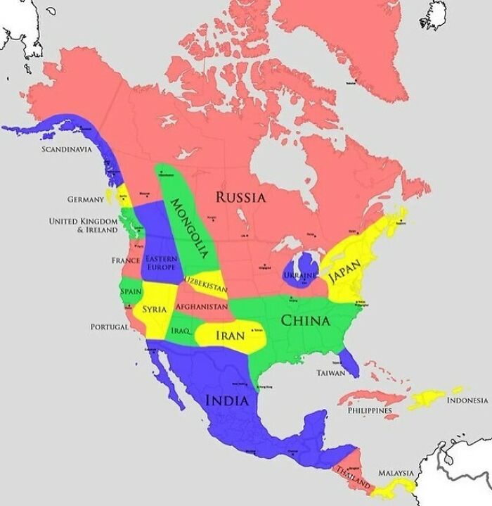
Map Compares North American Climatic Zones To Eurasian Regions
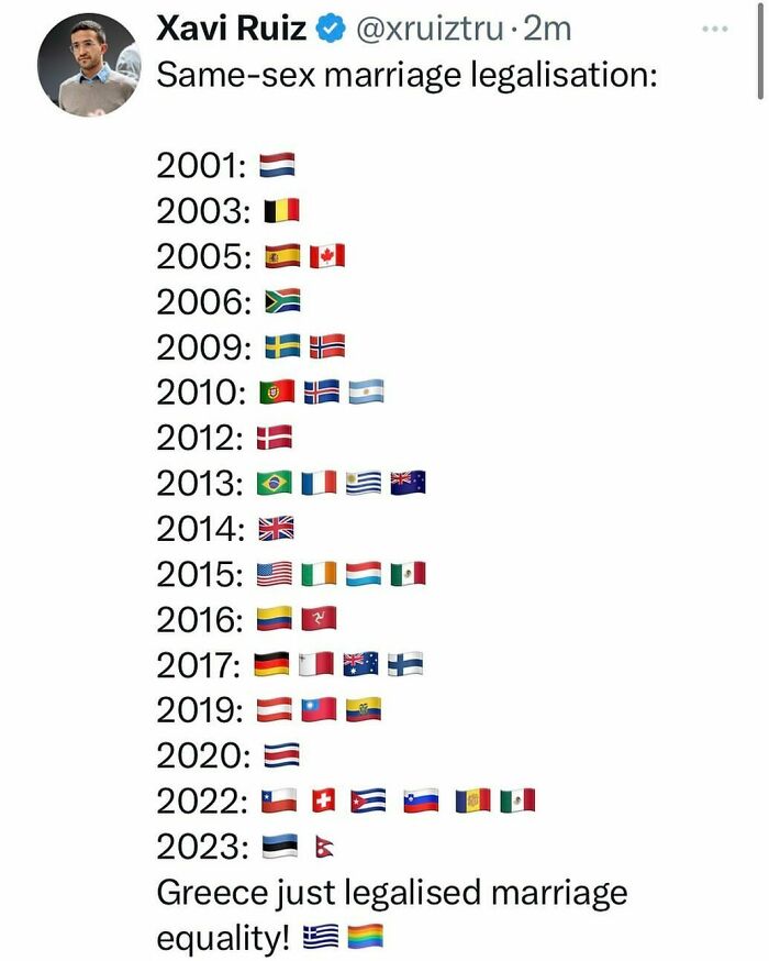
Again something ,I as a straight male, will never understand how people can protest this? Same sex marriage has no effect to my personal life whatsoever. I believe those idiots think that sharing privileges is the same as losing them.
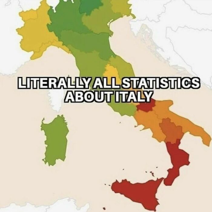
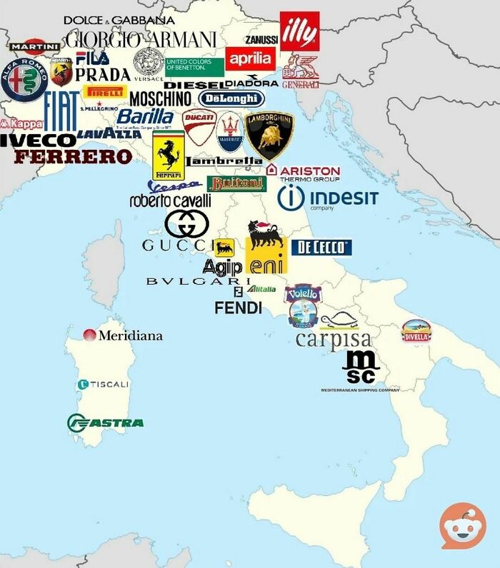
This Map Showing The Most Valuable Italian Brands Starkly Highlights The Divide Between Italy’s North And South
Several of those brands have a roots in the late XIX century, where the North was remarkably industrial and the south was mostly agricultural. Others are industrial companies that started in the early XX century, benefiting from the growing rail and road connections with Central Europe, while the South was lagging behind in infrastructure investment.
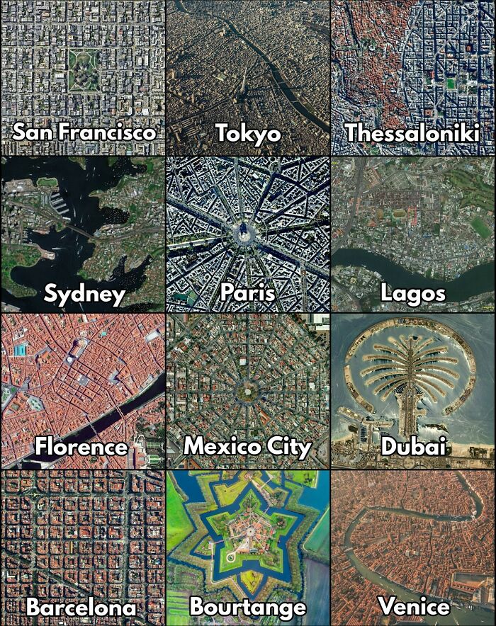
What's Your Favorite One?
Dubai took the shittiest city design in the world and made copy. They had all the possibilities to make something unique and just built another soulless glass and steel car-centric place with huge dividing highways. and on top of that built unnecesarry artifical islands while destroying marine life...
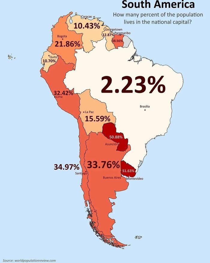
Map Shows What % Of South American Countries’ Population Resides In The Capital
It's 100% for Vatican City, Monaco and Singapore. Aside from micronations/city states, Kuwait is probably the country with the largest population living it the capital, 70.3% and in Europe, Iceland has the largest percentage of population in the capital, 36.0%, followed by Estonia and Latvia.
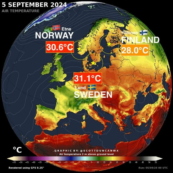
Until This Heatwave... Sweden 🇸🇪 And Norway 🇳🇴 Had Never Hit > 30 °c
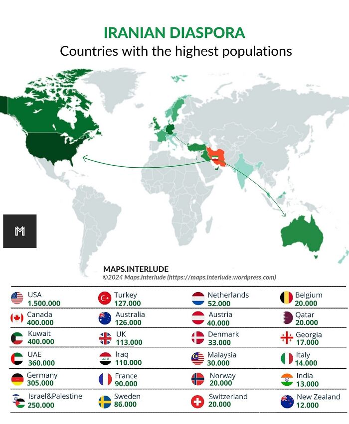
Iranian Diaspora ; Countries With The Highest Population
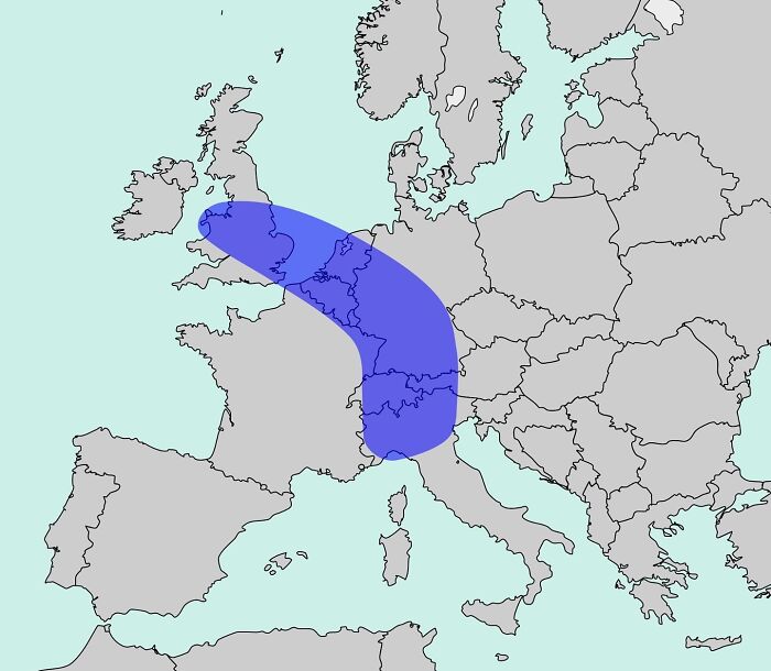
The “”blue Banana”” Is A Term Used To Describe Europe’s Most Densely Populated And Industrialized Belt
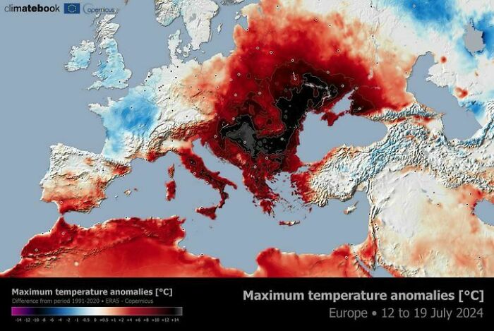
A Powerful And Prolonged Heatwave Is Affecting Eastern Europe And The Balkans
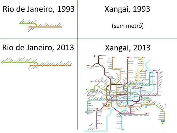
Subway Line Comparision: Rio De Janeiro 🇧🇷 vs. Shanghai 🇨🇳
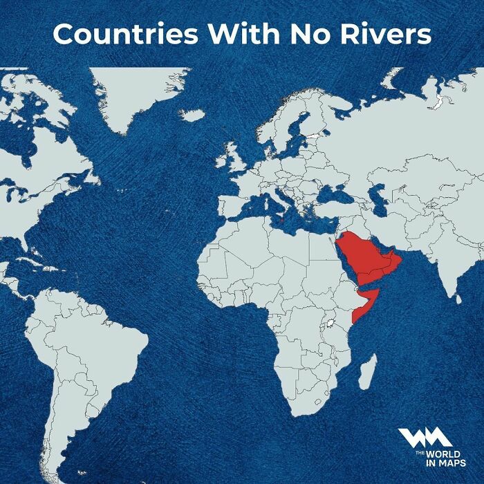
Several Countries Around The World Have No Rivers
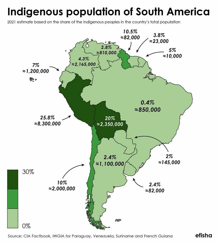
Percentage Of Indigenous In The Americas By Country/Region
For comparison: The U.S. has 3.3 million (or 1% ) people who identify solely as American Indian (the term preferred by most American Indians) and 8.8 million who identify as mixed-race including American Indian. A much larger portion of white Americans have at least one American Indian ancestor.
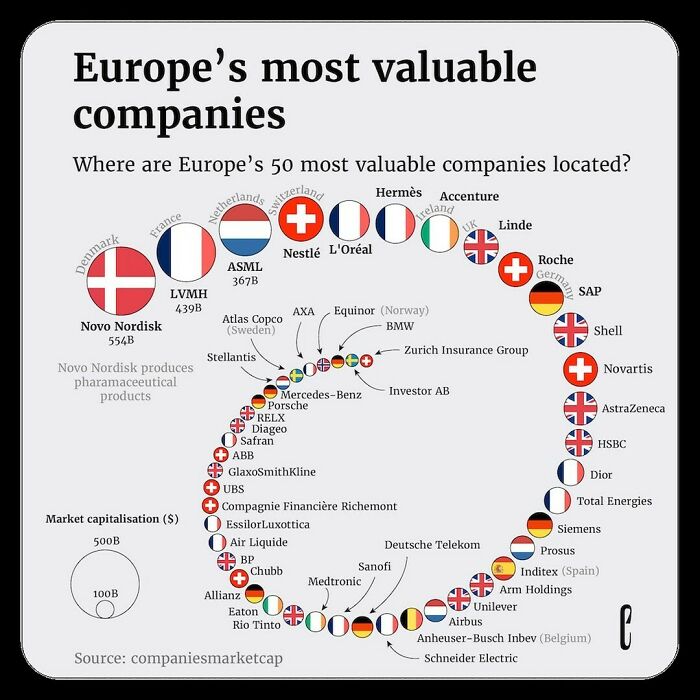
50 Most Valuable Companies On The Continent. Visual By The European Correspondent
Just because their headquarters is in the Netherlands, that doesn't make Stellaris Dutch (Fiat-Chrysler and Peugeot-Citroën) Same goes for Prosus, wich is South African. Not to mention that Linde is German and not from the UK
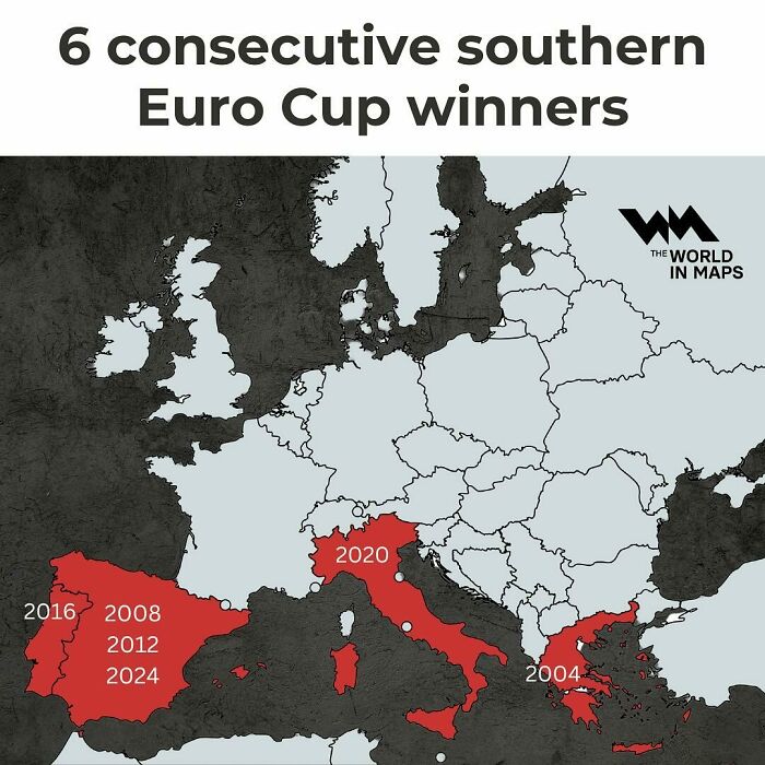
With A Stunning Victory, Spain Extends The Streak To 6 Consecutive Southern Euro Cup Winners!
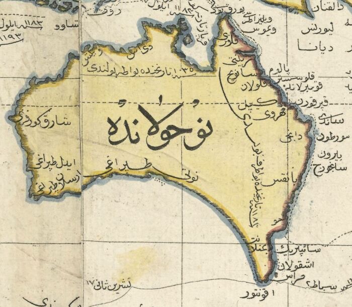
This Is A Really Cool Ottoman Map Of Australia From The Year 1803
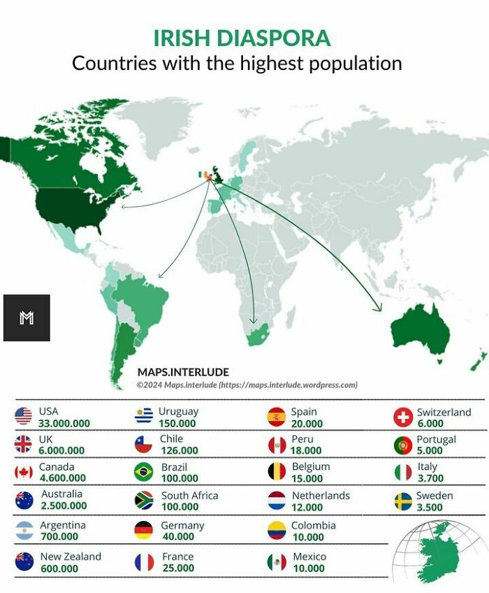
Irish Diaspora | Countries With The Highest Population
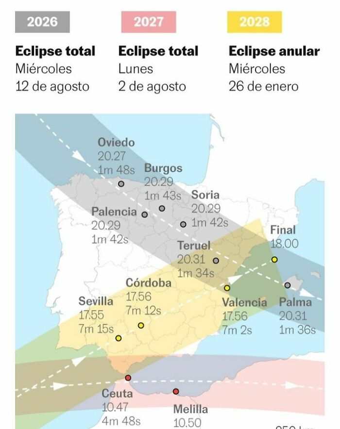
How The Next Three Solar Eclipses Will Be Seen From Spain
Note: this post originally had 100 images. It’s been shortened to the top 50 images based on user votes.

 Dark Mode
  No fees, cancel anytime


