Carpenter Mocks Ridiculous Window Shutter Solutions On His Instagram, So Here Are 30 Of The Funniest New Pics
Interview With OwnerThere ain’t no denying that window shutters are an amazing accessory to your house, both on the practical and aesthetic side of things.
But, as is often the case, you’ve got to know how to pull it off. Otherwise, your masterpiece of a window might end up on the Craftsman Blog.
Yep, ladies and gents, we’re revisiting this lovely page once more with part 2 and diving deep into what’s new in window shutter fail town.
So, scroll down to see the best (worst?) window shutter fails to date in the curated list below. And while you’re at it, upvote and comment on the fails you enjoyed the most.
More Info: The Craftsman Blog | Instagram | Facebook | Patreon | Part 1
This post may include affiliate links.
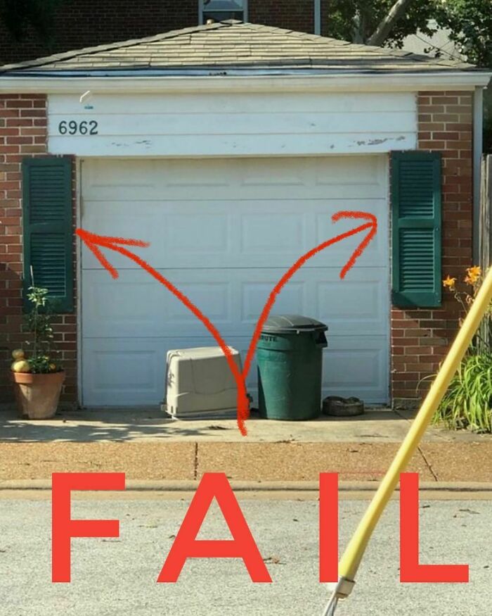
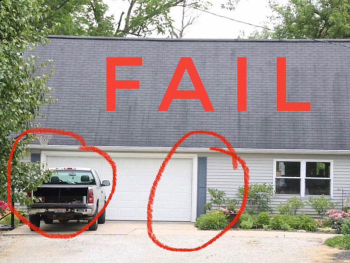
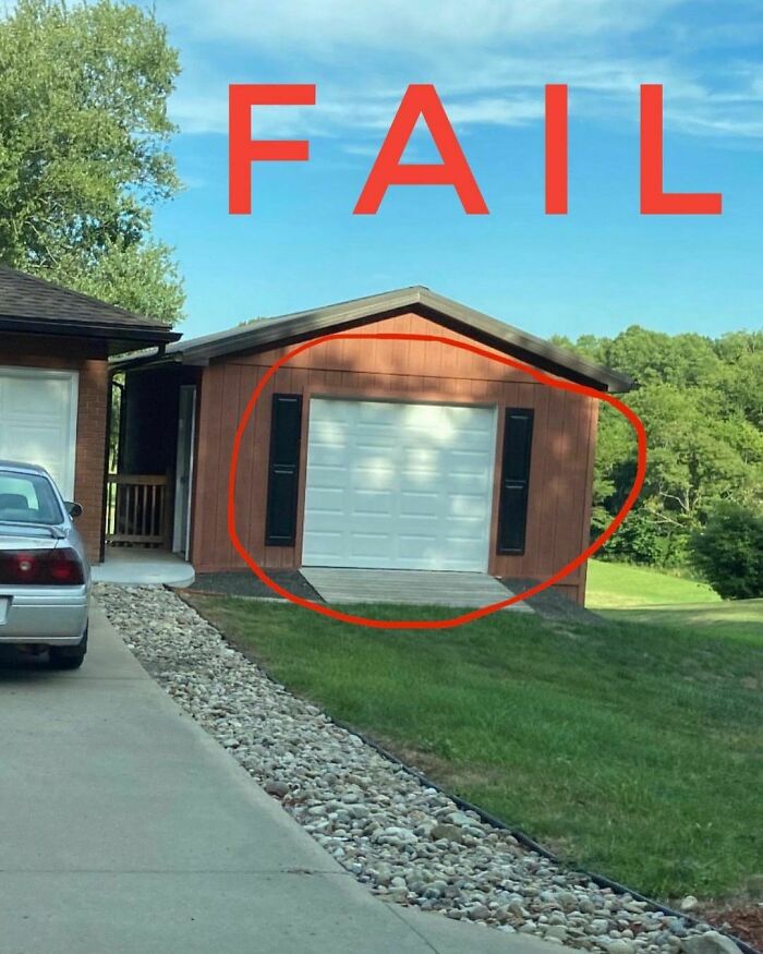
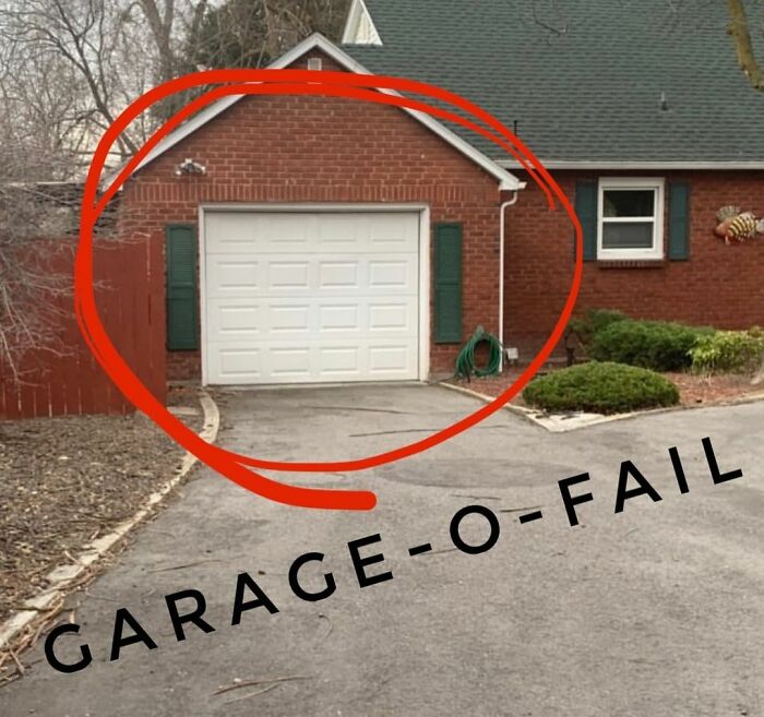
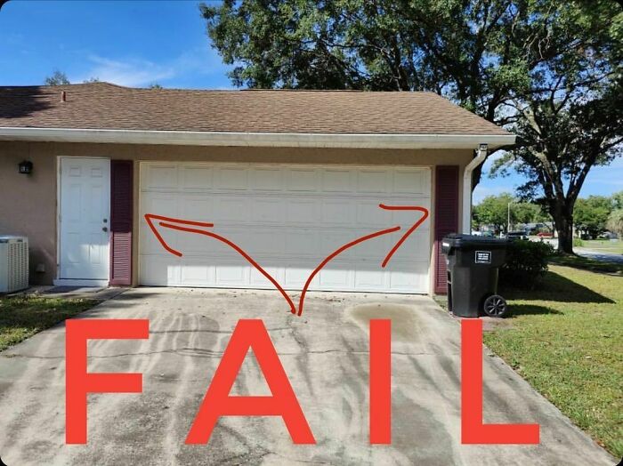
Another happy shutter customer who took advantage of our half off sale. Naturally, you send us the measurements and we give you half the shutter you need, but then again did you really need shutters on the garage?
Now, if you’ve ever seen a house, you might have noticed these things on windows called shutters. You know, those wood (and wood-like) side-flaps for windows that serve a lot of purposes, including security, protection, and aesthetics?
Well, sometimes form takes precedence over substance and people end up with some interesting results that also end up on the Craftsman Blog. Scott Sidler is a historic preservation contractor and the man behind the Instagram page, and aims to teach people through example. Very failed example. Bored Panda got in contact with him for an interview.
I’m rarely without words and yet...today... *sigh*
I can't imagine why people put shutters on windows that don't fit the window - looks stupid!
When you’re on the fence about what size shutters to use I suggest using the “straddle method”. It’s the best way to let us know you’re aware of the problem but still too lazy to do something about it.
Sticking with our theme of garage door shutters today I found this one extremely troubling. It’s as if the faux strap hinges and one pair of shutters didn’t quite cut it and as they stood back someone actually believed that the solution was yet another pair of shutters. Hmmmmmm...
As a preservation contractor, Sidler is often called in to fix mismatched windows and poor replacement shutters. At one point, he started snapping pictures to be used as educational material on what to do or not to do, all the while having some fun along the way.
You see, most people misunderstand shutters as an aesthetic accessory to the house, like a flower box. And though it can be that, it still needs to follow certain laws of pragmatics.
"In general, I feel like people have completely lost site of what a shutter is? Today, they are treated like an exterior window dressing so they are never installed with the proper sizing in mind. Very few people realize that a shutter shuts. It’s in the name after all," explained Sidler.
I hope you guys are ready for some hardcore shutter education today!
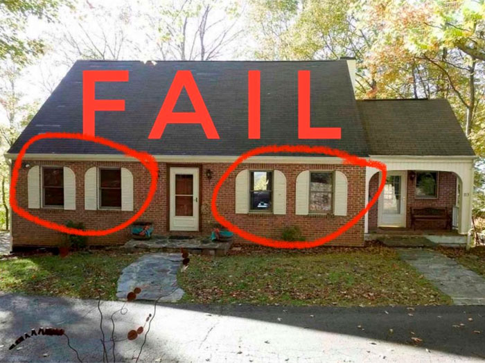
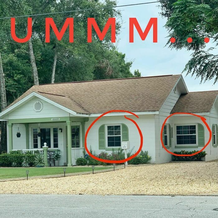
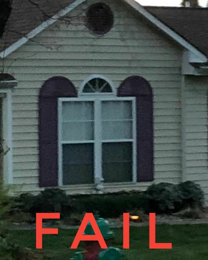
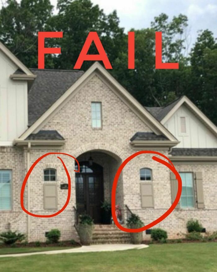
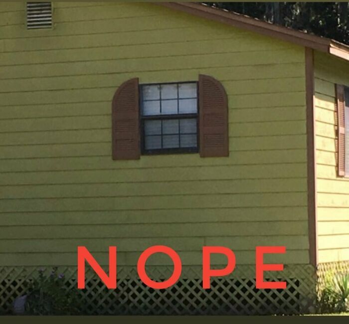
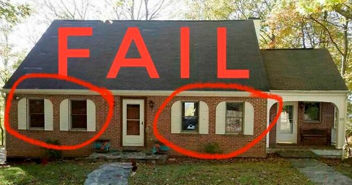
Rule #3 Shutters should be the same shape as the window they cover. If you’ve got rectangular windows then there is no need to add arched shutters.
Sad because other than the arch they seem to be the right width and height for the windows.
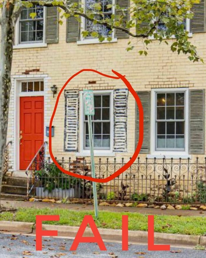
Real Shutters = $$$$
Fake Shutters = $$
Hand-drawn Shutters = Priceless
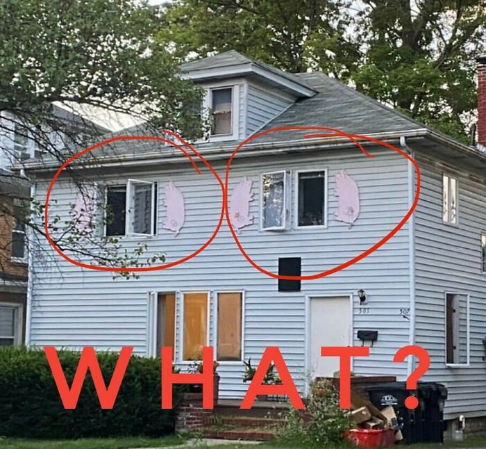
Remember all those things you said you’d do when pigs fly? Surprisingly that time has come. Better get busy!
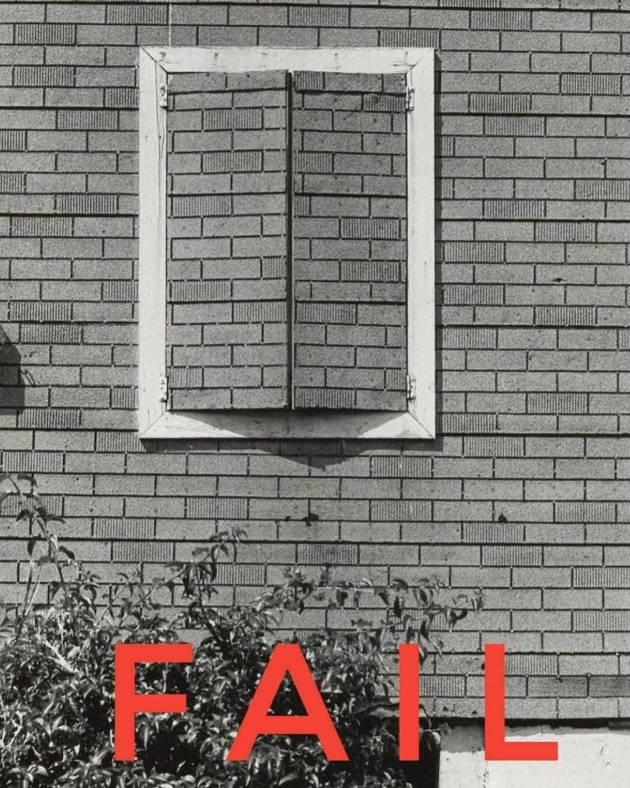
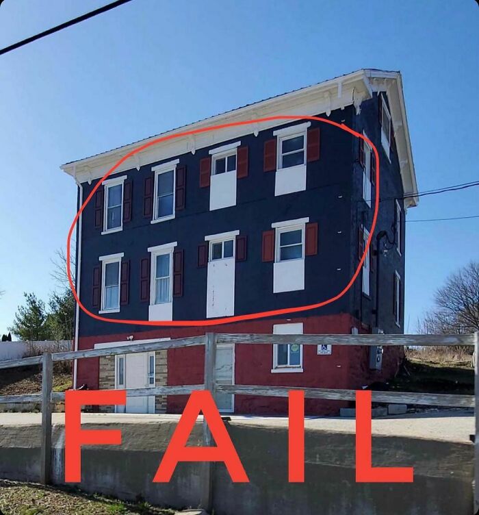
Budgets are tight these days. Just because you can afford to remove a window and brick it in doesn’t mean you have the money to pull the old shutters down too!
A+ for not doing anymore than is absolutely necessary.
"I think most shutter fails stem from wanting something to dress up the outside of the house. Maybe it looks too plain and so people reach out to the simplest and cheapest way to add a pop of color that usually end up being a stock vinyl shutter at the local home store" elaborated Sidler.
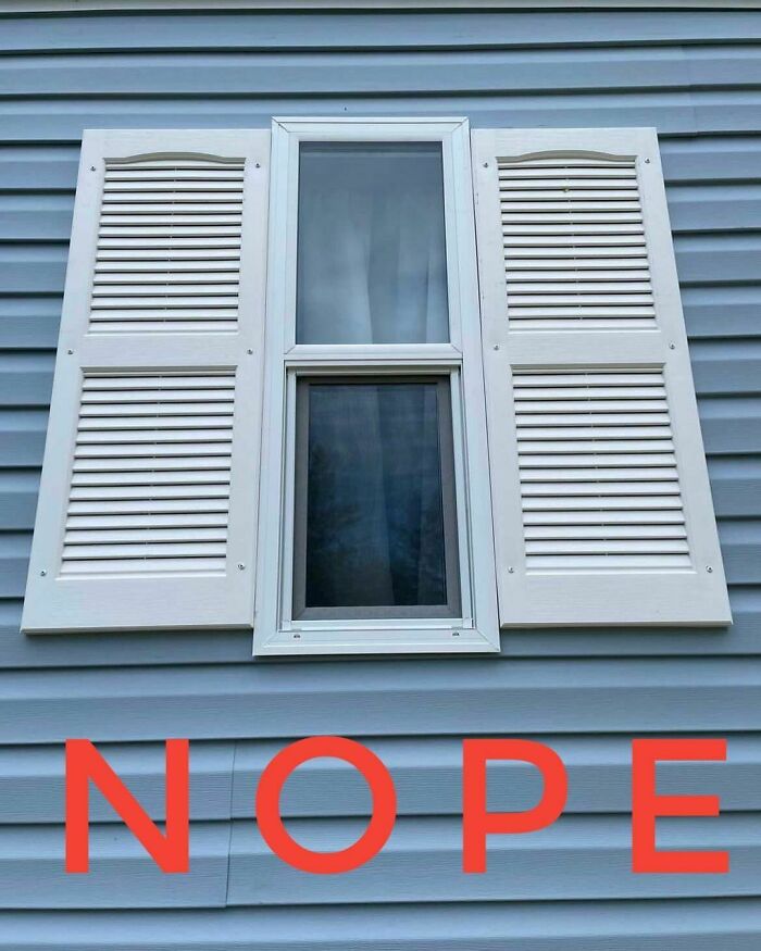
"They often get the right height shutter (or at least close to it) and completely forget to measure the width. Honestly, most of the vinyl shutters on the shelves are a standard 18” so they don’t have much choice in the matter even if they did know what to look for without having custom shutters built."
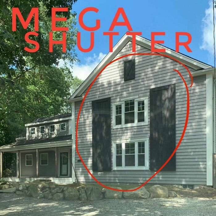
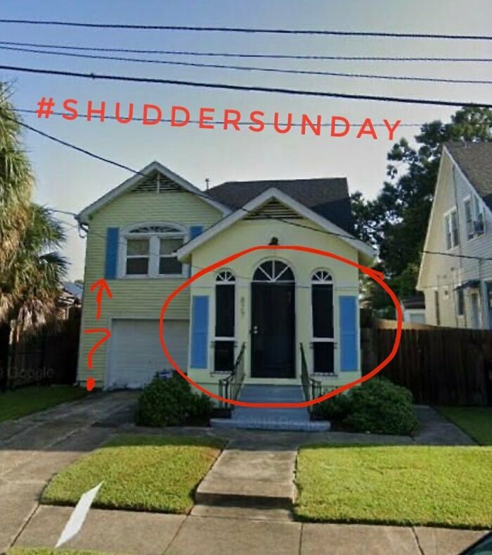
It’s a Texas size Shudder Sunday this week! Go big or go home, right?
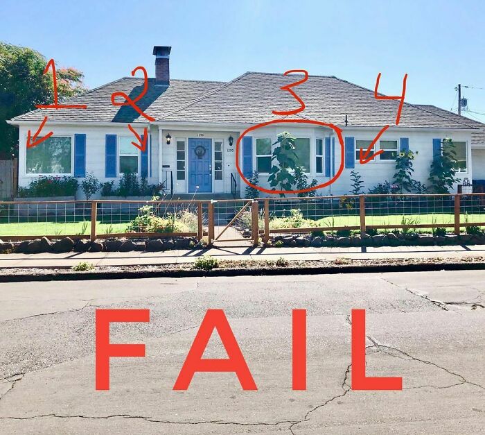
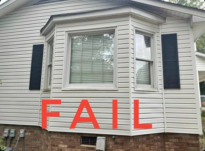
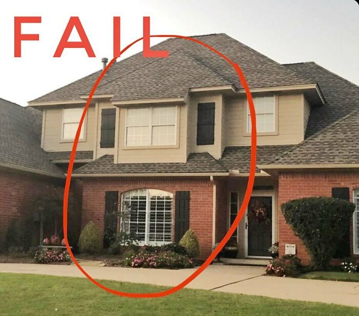
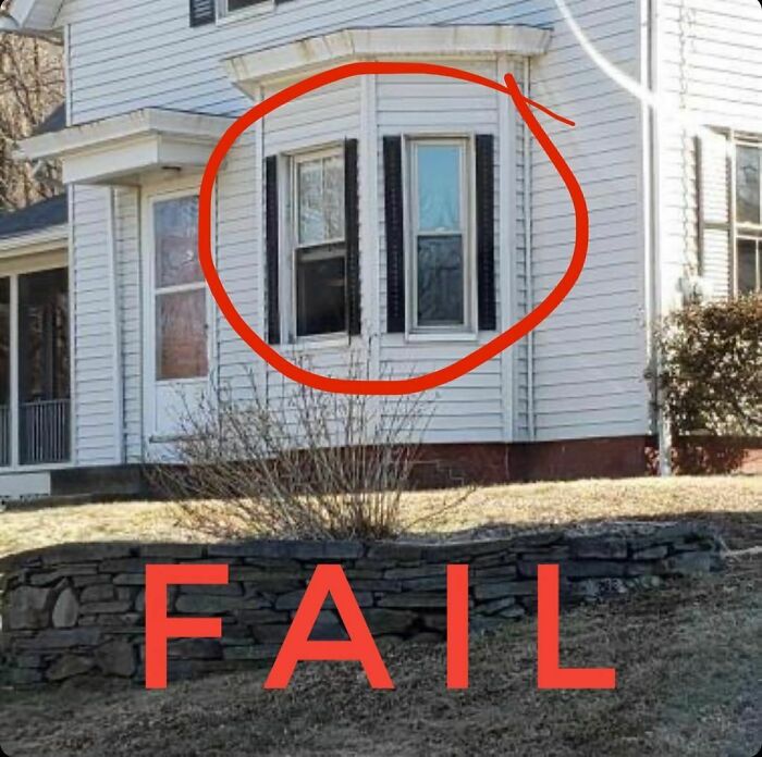
So much going on here it’s difficult to know where to start. Let’s make a list.
1) Don’t put shutters on a corner window...ever.
2) Shutters vs. Downspouts: As the song says, “You gotta keep ‘em separated. Ohhhh-ohhh!”
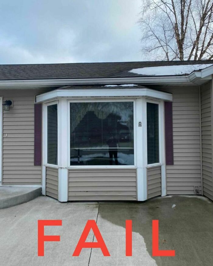
3) Shutters on a bay window need careful planning. This was not careful.
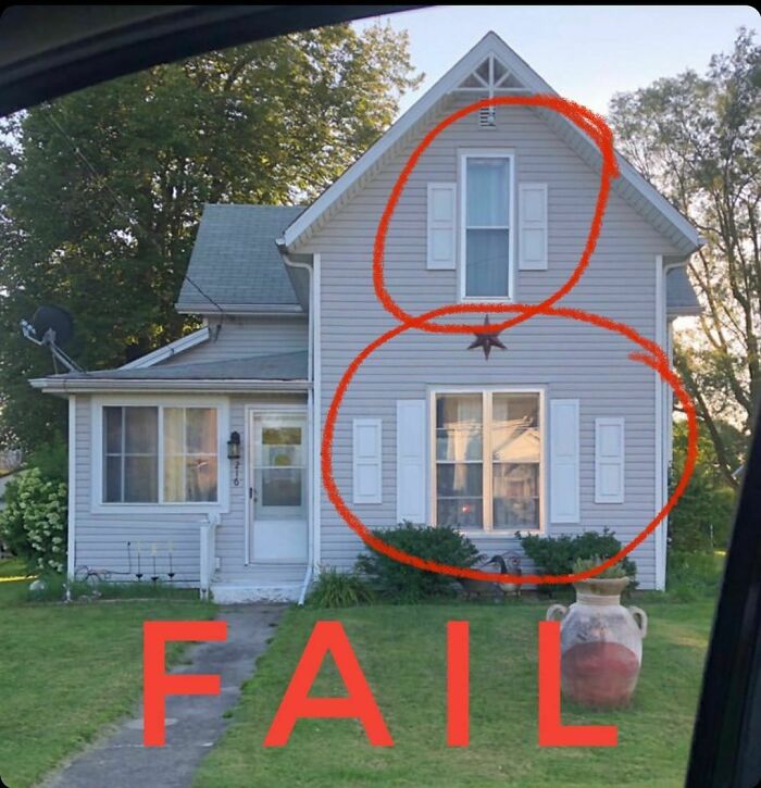
4) Shutters and windows should ALWAYS be the same height...Always!
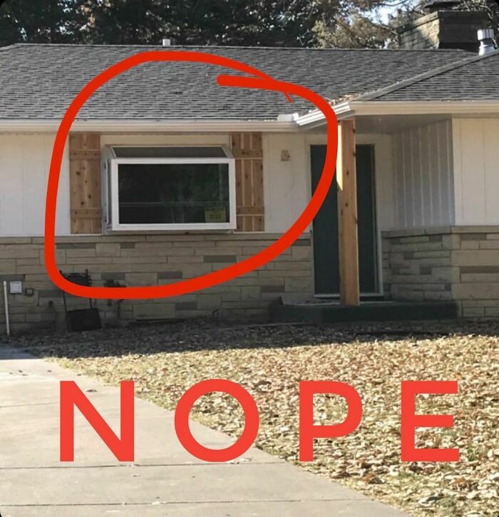
Soooooo many issues I decided not to circle anything because I would have to circle everything.
As a side note this house is available for sale for $179,000 if you should feel up for a project and want to fix those shutters to keep my head from exploding.
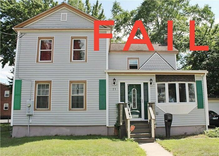
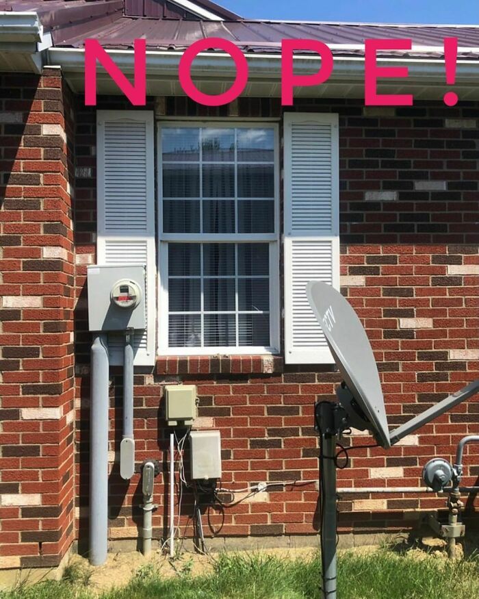
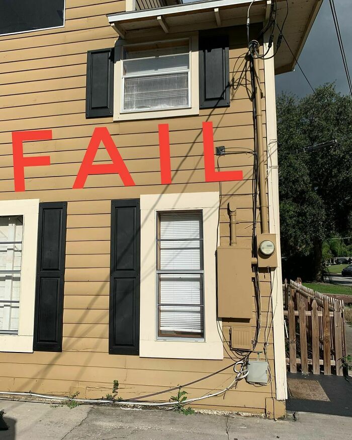
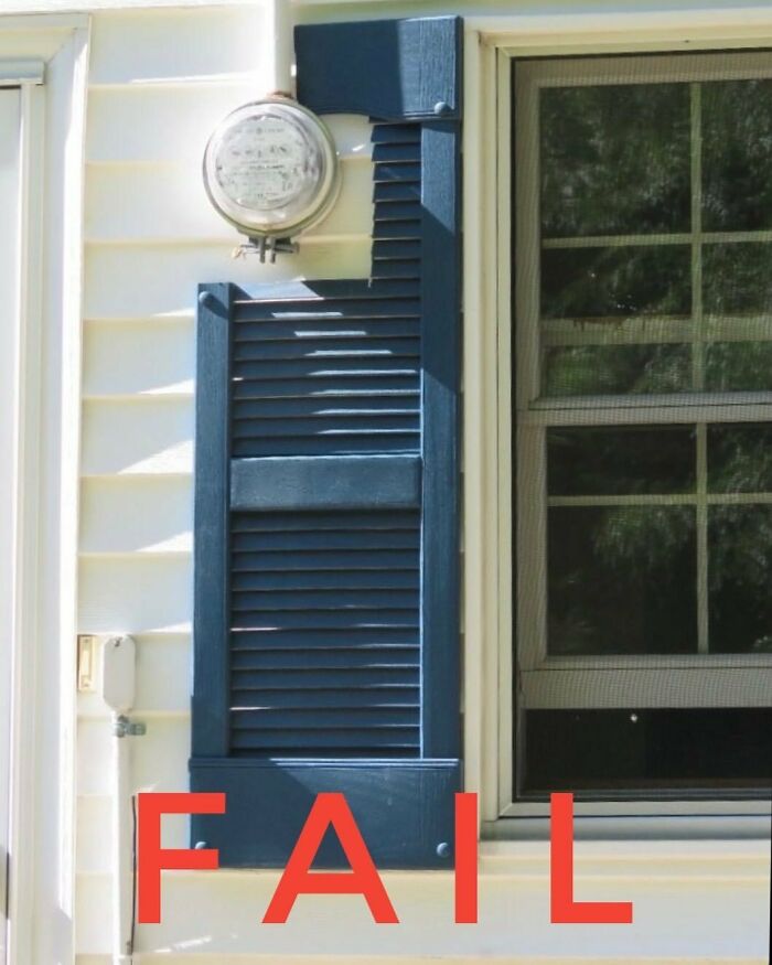
One thing I want to point out is that the electrician really worked his magic to get that power meter right next to the windows and avoid the shutter.
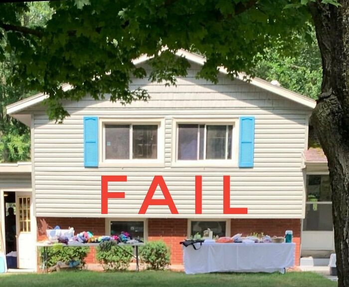
When things get tight you can either sell a kidney or sell a couple unnecessary shutters in your yard sale.
Since the page has over 1,500 posts, with many of them being examples of window shutter don'ts, we've asked Sidler to describe a text-book example of a shutter fail that ends up on his Instagram more often than it should. And he had this to say:
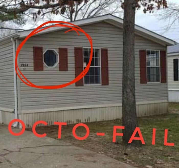
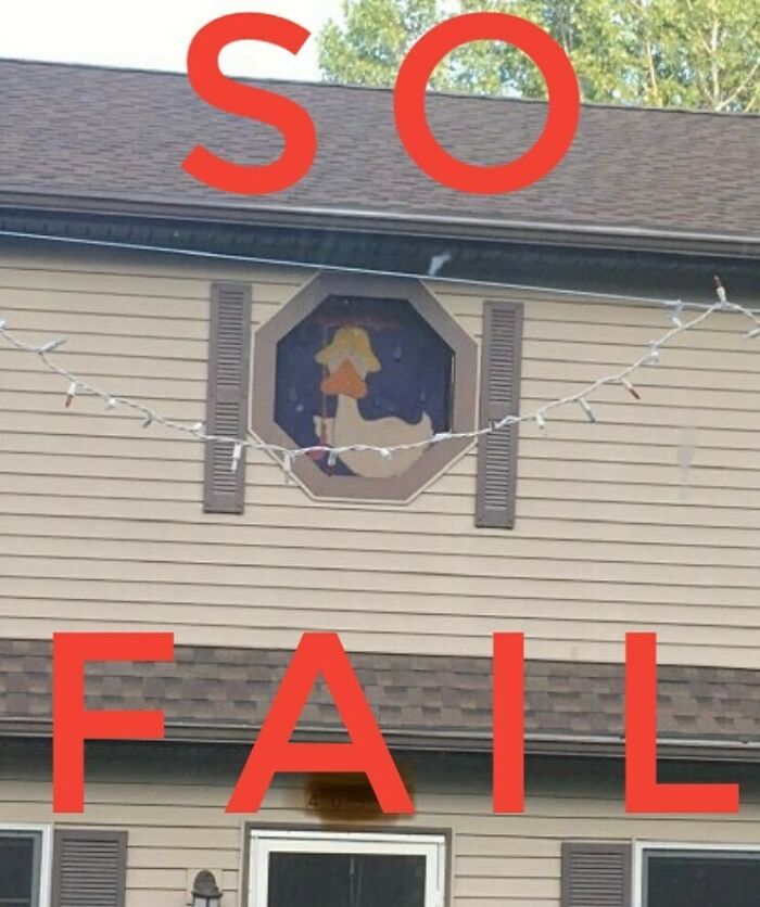
"The simplest shutter fails are usually too narrow for the window. Most people don’t even notice it like I do. The next level ones are the fails that have rounded shutters on square windows or vice versa. The really crazy ones seem to be purposefully finding different shapes or sizes for their shutters. Seriously, how does a rectangular shutter work on an octagonal window?"
I hope you guys are ready for some hardcore shutter education today!
Rule #3 Shutters should be the same shape as the window they cover. If you’ve got rectangular windows then there is no need to add arched shutters.
Sad because other than the arch they seem to be the right width and height for the windows.
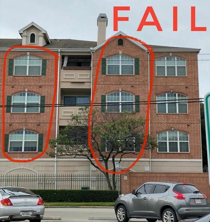
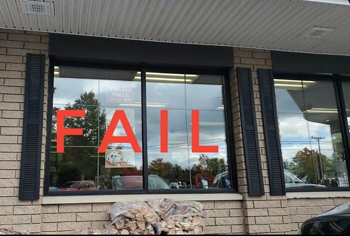
Ahhh corporate shutters. Even the apartment complexes can get in on shutters sunday I can hear it now. “Hey Bob, how do we dress up the building to get higher rents?”
“How about adding shutters?”
“For those massive windows? That’s gonna be too expensive.”
“Hold my beer...”
Because shutters can come in lots of fun shapes and sizes!
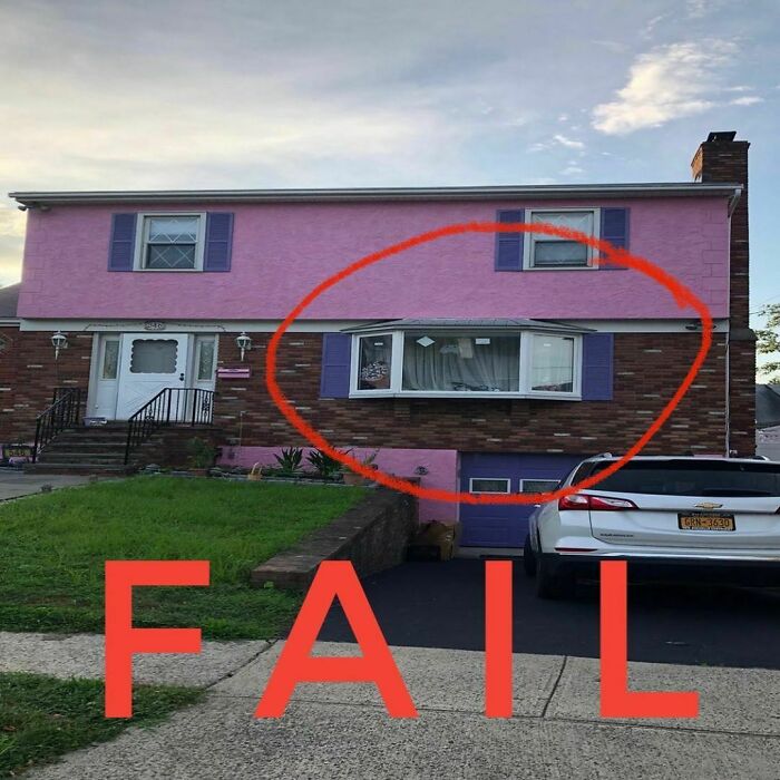
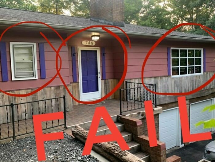
Maybe pink and purple don’t mix well with brick.
Maybe a mid-century split level tract home doesn’t need shutters.
Maybe that bay window...oh who am I kidding? There are no maybes here, just more mistakes in one picture than I made my whole college career (and that’s saying something!)
So, if you don't want to end up featured on the Craftsman Blog, here's what Sidler says you have to do... or if you want to end up, do the opposite!
"It’s so easy to avoid showing up on my Instagram page. Pretend your shutters would open and close (even if you plan on making them fixed). When they are closed they should fit to cover the window opening perfectly. If they don’t fit, you’ve got the wrong size or shape. And for the love of God don’t ever, ever put them on your garage doors!"
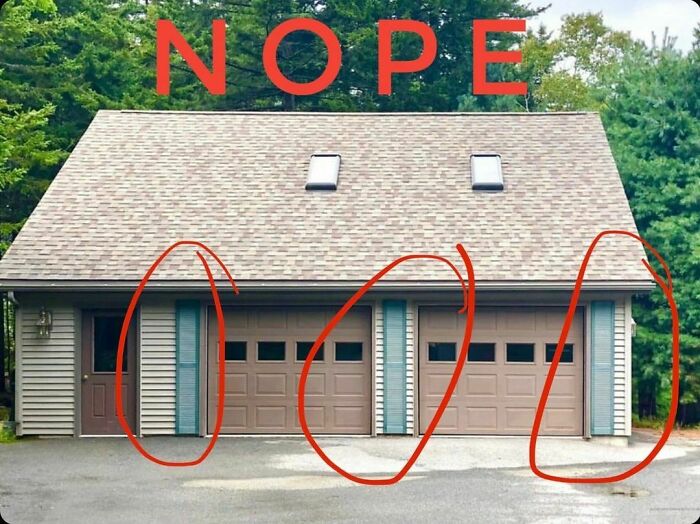
When you can’t decide if you should should add a paved driveway or shutters to your garage I would always recommend the driveway first and the shutters NEVER.
If you scroll alllllllll the way back a few years ago in my feed you’ll see a picture of the garage on this house which was the very first house that made me crazy enough to post shutter fails. So, yes, this is the first Shudder Sunday house.
The crazy part is that I drove by it yesterday and noticed that they took it a step further and painted their shutters.
For the life of me why do the shutter a garage what a waste of money!
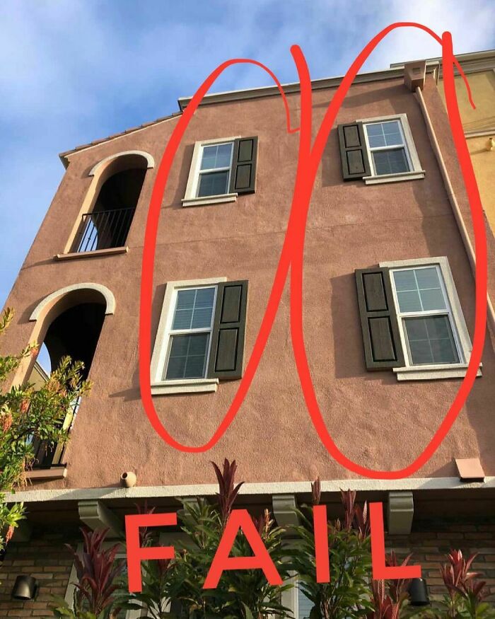
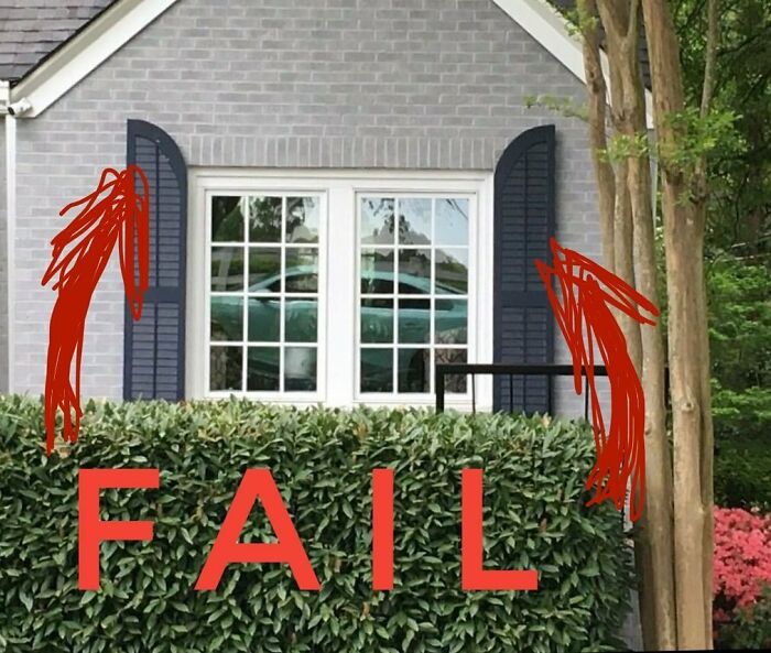
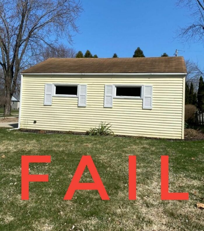
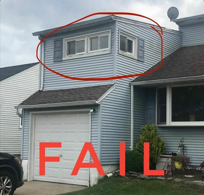
This picture makes me feel like these 2 windows are hiding in the corner at a dance because they are embarrassed at how their homemade prom outfits don’t fit. Someone should bring them some punch and cookies and tell them they will grow out of this phase.
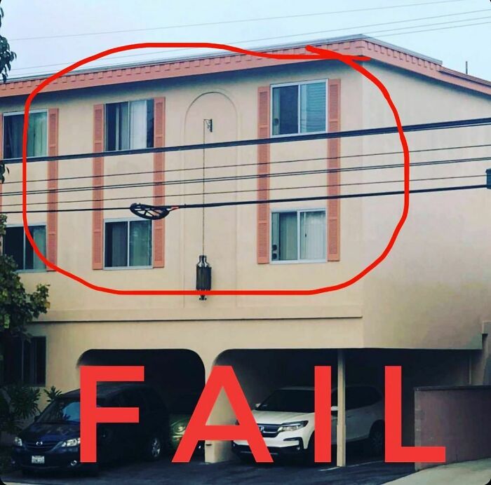
Remember, there is a fine line between shutters and parentheses, architecturally speaking.
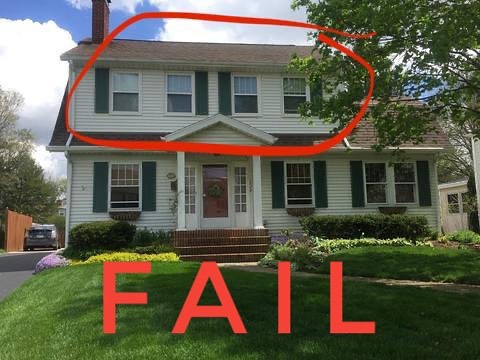
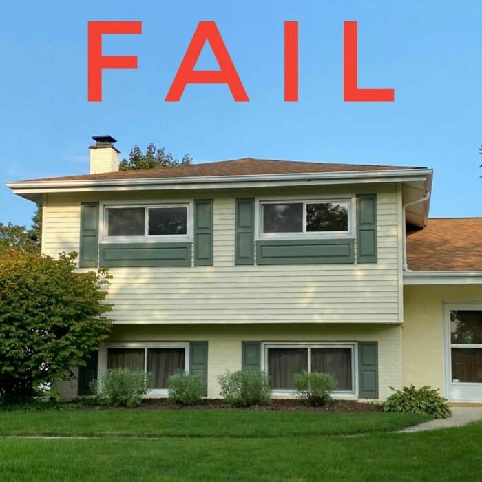
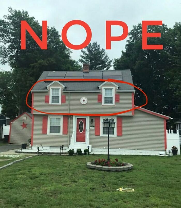
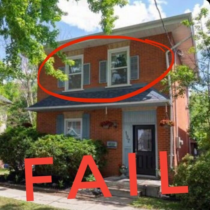
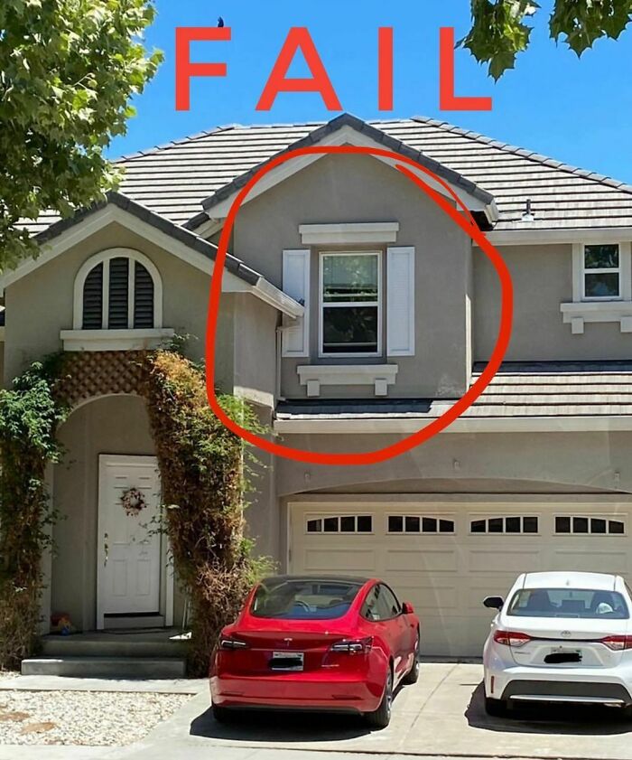
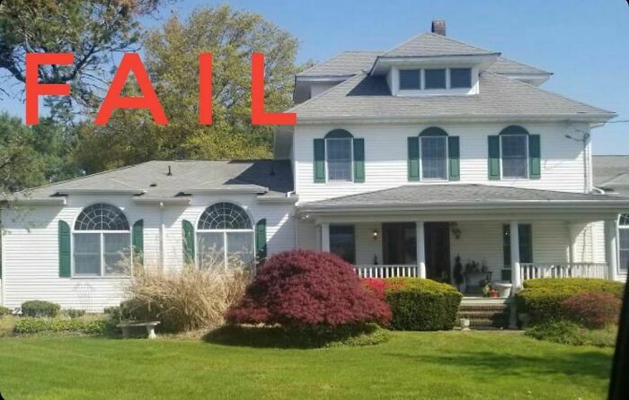
Windows upstairs are too close together for shutters so they just should have left them without.
"Bad design knows no bound in our world today and if I can make a few people laugh and learn something new at the same time then that is a huge win in my book," concluded Sidler.
The page has grown exponentially, currently boasting over 55,100 followers and over 1,500 posts. And it’s no longer the case that Sidler has to collect all of his content on his own, as there are loads of dedicated users who send pictures of shutters they happened to stumble upon that fit the page’s idea.
Bay window, bay window your shutters are awful. Bay window, bay window this ought not be lawful.
I think no one seems to know the purpose of shutters, much less the fake purpose of them.
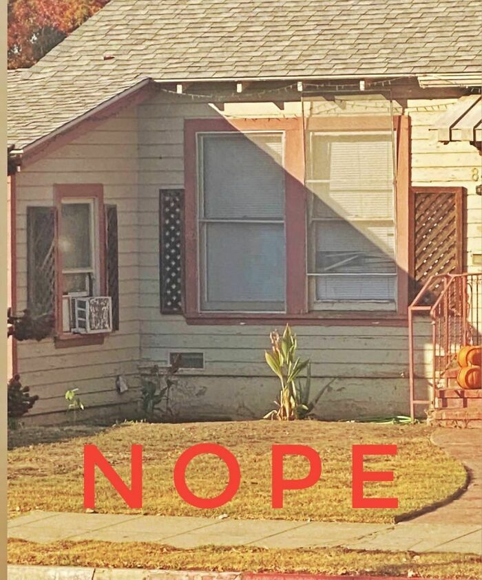
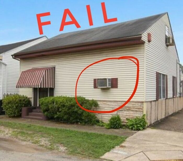
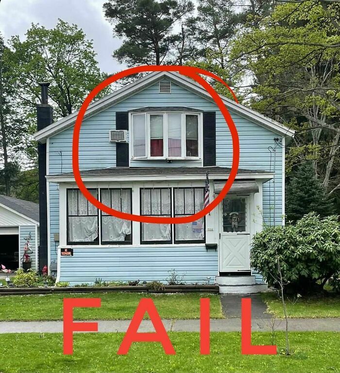
In case of inclement weather you want to make sure you have shutters to protect your precious window AC.
.
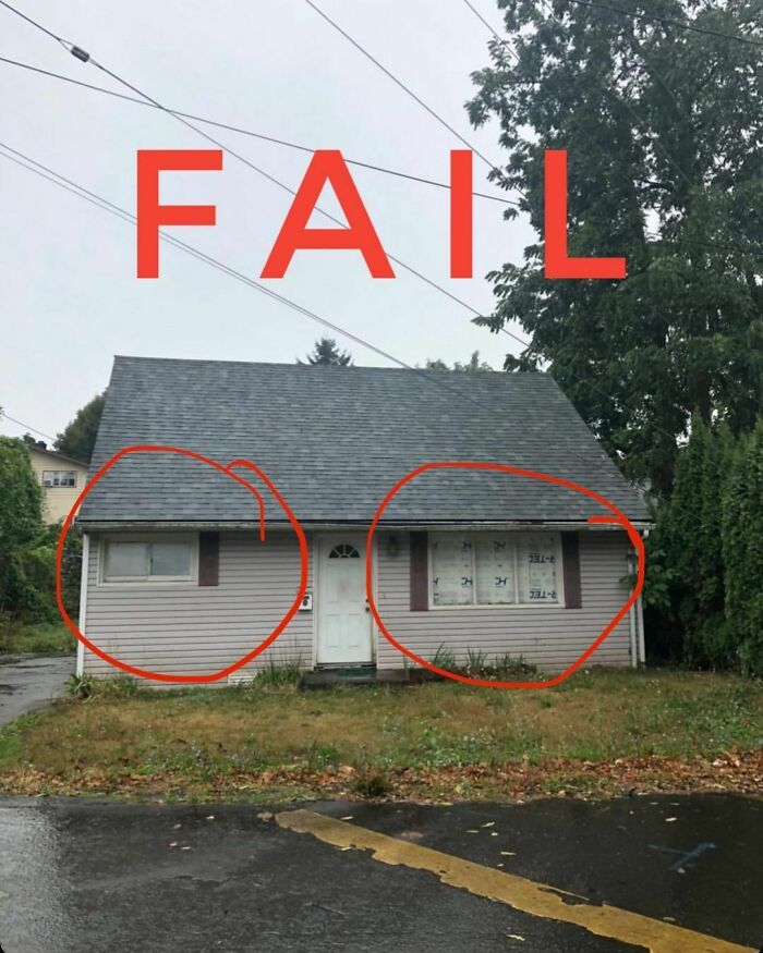
In fairness, rarely are the shutters the least of my concern. This house has a lot of things working against it. Someone must really hate sunlight!
Always the poor middle child that gets forgotten!
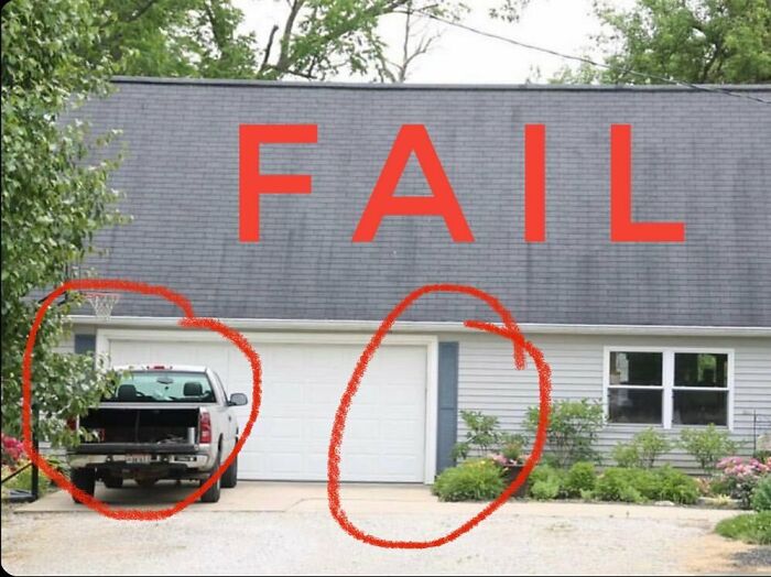
About as useful as the "garage" that clearly won't fit a truck in it
There are a lot of things that you could do to fix up this house, adding these shutters is not something that would have made my list.
If you haven’t had your fill of ugly shutters, why not check out part 1 right here. And you can also take a look at The Craftsman Blog, his Instagram, Facebook, or Patreon.
Or you can check out house design fails here. Regardless, do let us know what you thought of all of these in the comment section below, or share your window shutter (or any piece of a house) fail stories!
Since I began this Shudder Sunday journey I have been on the hunt for the “over-shudder” and this week it has finally revealed itself like an unexpected plumber’s crack at Sunday brunch. Enjoy your mimosas!
The Under-shudder making a strong appearance today. Good to see it still going strong in the suburbs!
This is a “shockingly” bad shutter installation.
Let’s start the year of right with a double header Shudder Sunday today!
I call these “Danny Devito Shutters”. Very short and very entertaining!
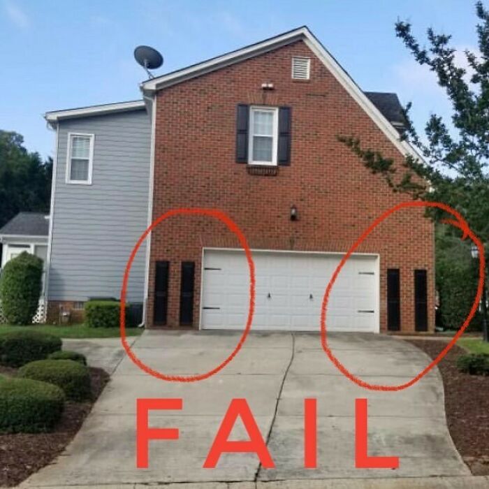
I understand that sometimes garage doors need some dressing up, but landing strips are never the answer. Save the shutters for the windows.
The major fail in this is that someone felt the need to circle every one...
Please don’t put your vinyl shutters in the dryer! This whole situation could have been completely avoided if people would read the care instructions that come with each Shudder purchase.
They allllllmost had it with the 2nd story windows and then someone went and had a stroke before they finished the first story.
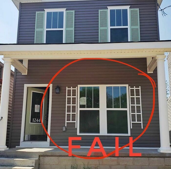
They look like they're a trellis rather than shutters? Maybe they plant to get some ivy up the wall in the future
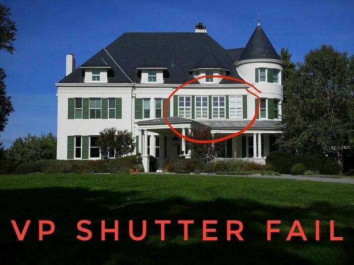
I’m sad to say that it just came to my attention that even the 2nd highest house in our country cannot understand how shutters work, which considering it was done by the government it shouldn’t surprise me.
This house with atrocious shutters is One Observatory Ln and was built in 1893. Since Walter Mondale it has been home to the sitting Vice President of the US.
As if being VP isn’t punishment enough you also get exposed to these shutters everyday for 4 years.
3 shutters, 2 garage doors, and 1 dismayed craftsman...*sigh*
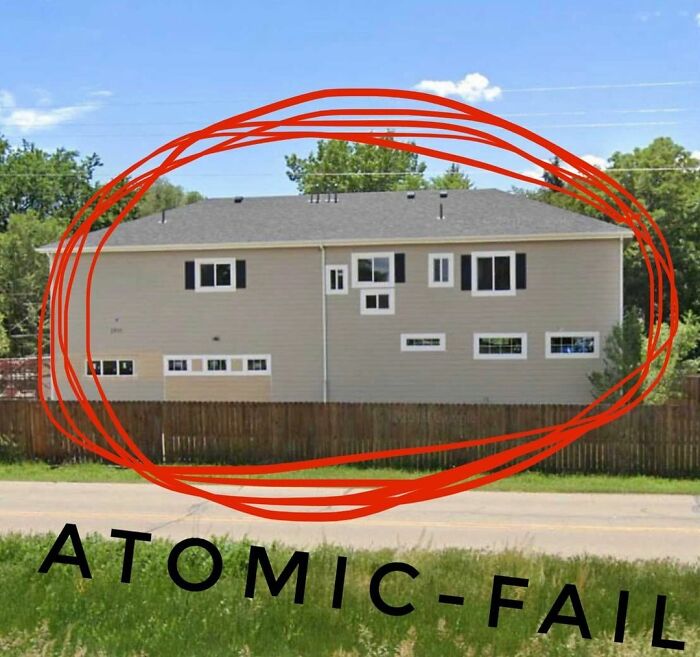
Imagine you took a dozen windows and shutters tossed them in a blender and then poured them out on a building. This is the only explanation I can think of. That’s not true, this may be a case of an architect losing a bet. Yeah that’s probably it.
I’ve seen a lot of misdemeanor shutter charges but this one is clearly a felony. So very wrong in so many ways!
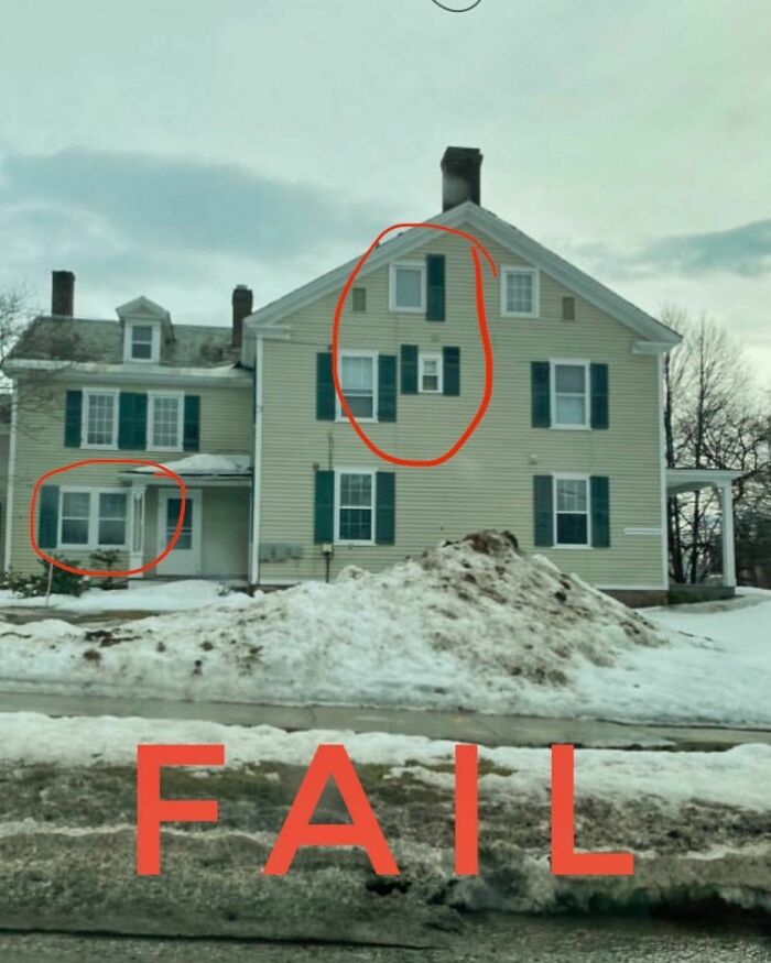
Can someone please explain to me why these two windows so desperately needed shutters when the others did not?
And why are the shutters separated like they have been put in timeout?
And lastly, why are there rectangular shutters on this curved window? Did these people not see my earlier post today?
If the window ain't on the same wall please no shutter on adjacent walls!
Earl: I’ve got some extra shingles leftover from our siding extravaganza. What should we use ‘em for?
Harlan: We could dress up those plain ol’ shutters we got.
Earl: Hold my beer!
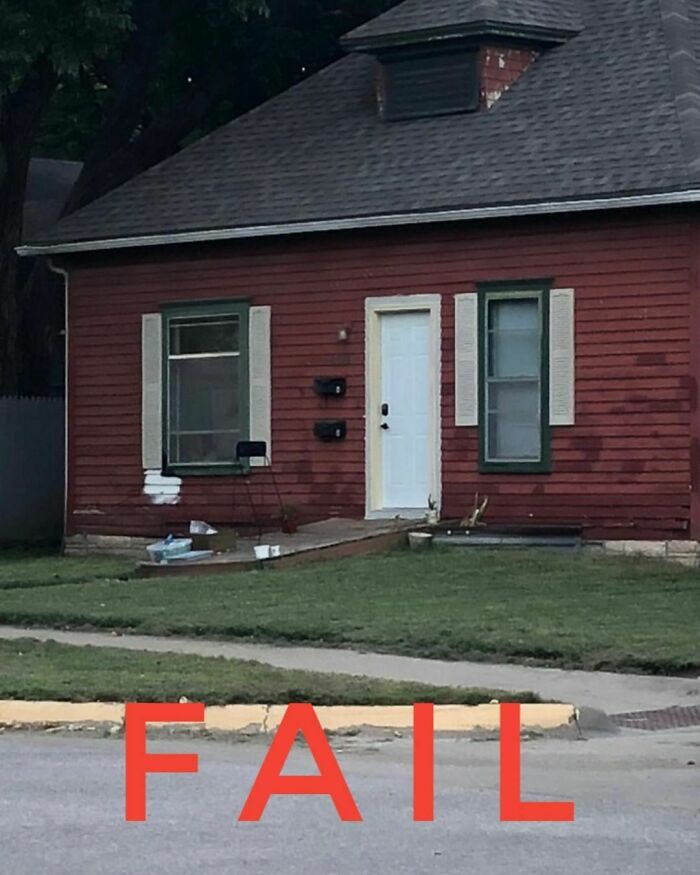
*sigh* At least the shutters fit...Happy
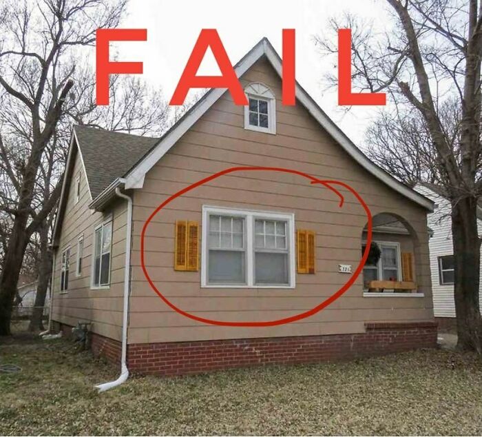
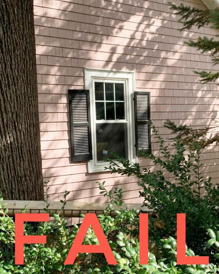
Technically there is room for the right width shutters here, but as to why this sliver of a window even exists on this big wall is perhaps the greater mystery!
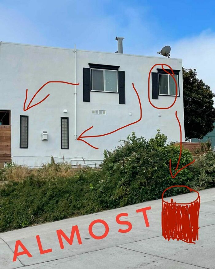
While I’m not a fan of this building this one is so close I’ve decided to mark it up and return it to the wild so that hopefully the owner can make some corrections and resubmit. The red bin is my attempt at drawing a trash can which is where the lone shutter above should go, FYI.
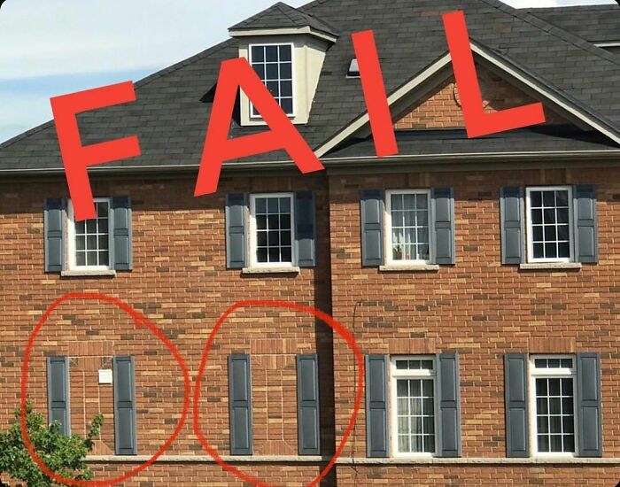
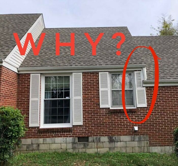
If you don’t have room for one shutter then you don’t have room for either shutter.
Curved shutters. Very important for curved windows! Less necessary for square windows. Just a quick FYI in case people were wondering because apparently there are questions on this topic.
Let’s a play a little game of “Never Have I Ever” I’ll go first!
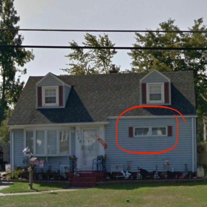
Never have I ever...seen a slimmer shutter on a window so wide.
Now your turn!
This is some top notch shutter customization by a vinylworking professional.
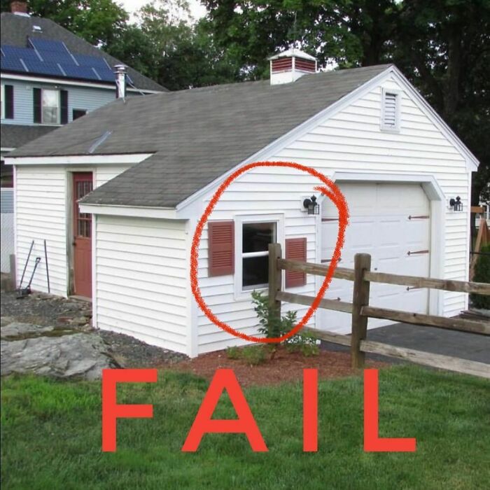
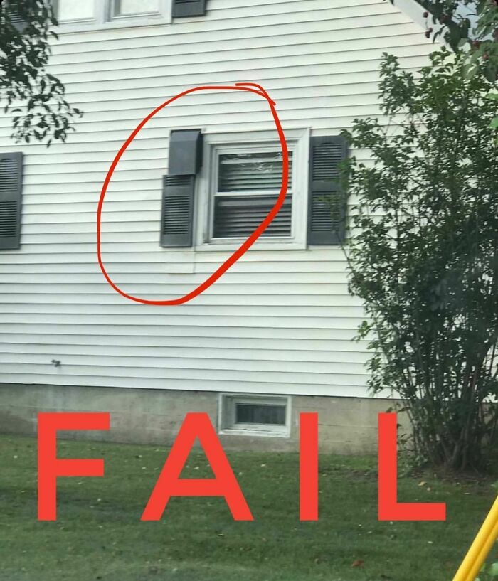
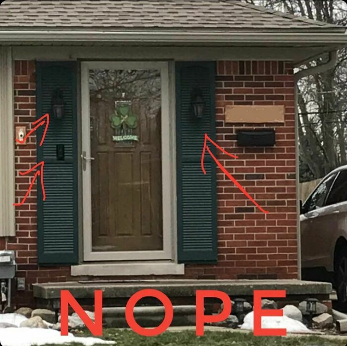
Good thing you modified that shutter to avoid the gutter or this could have really looked awkward!
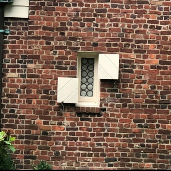
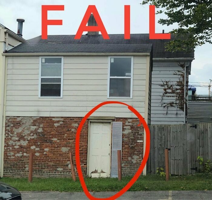
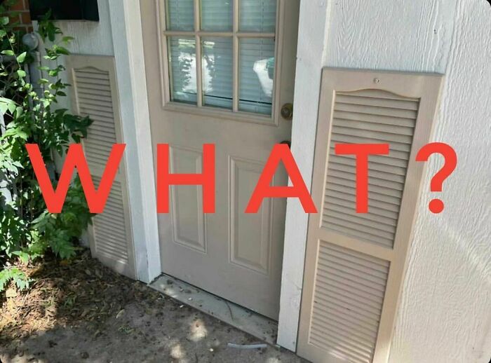
There’s a lot of things this little old house could use but a single door shutter on a brick wall is not one of them.
Here a shutter, there a shutter, almost everywhere a shutter but rarely a rhyme or reason.
So many windows to measure for shutters I can understand how they might have mis-measured a couple...or 100%
If you really can’t afford shutters this is probably not the best work around. Just a suggestion.
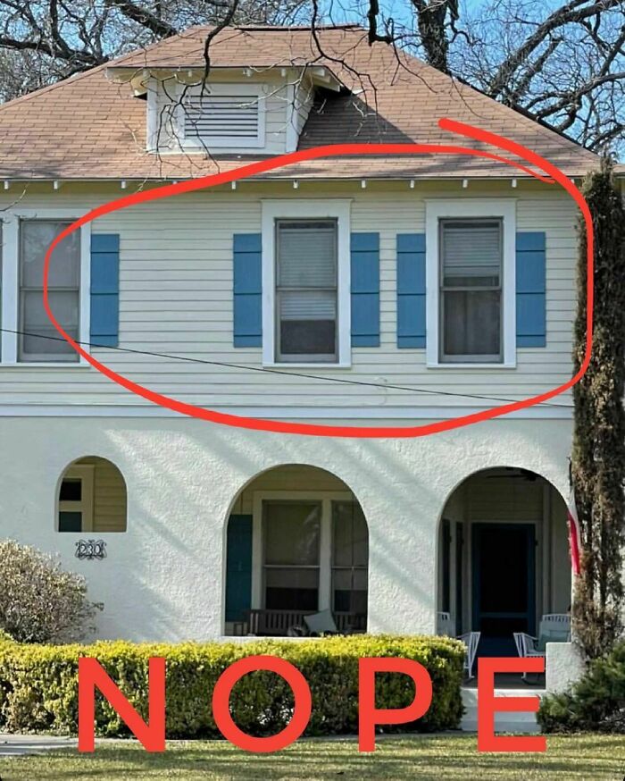
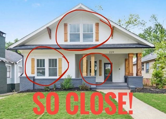
This week I’m giving an honorable mention. Sure technically it’s a fail because who are they kidding, but if they hadn’t tried to save some money and skipped the other half of the pair then these would be perfectly sized, shutters properly placed!
You guys were sooooooooooo close, but alas...fail.
I think this Sunday should be a double header and what other picture could I choose other than this one!?
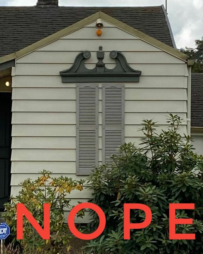
You’ll have to excuse the graininess of this as it was taken undercover with our spy camera to ensure safety. Rarely do we find such a stunning example of the transom-ware like this.
Apparantly this transom is so important that it must be double shuttered. Save the transom, save the world!
The Anti-Symmetry! For my OCD friends please enjoy.
Easter Sunday and all of our sins are forgiven...we’ll mostly.
Happy Easter! May the bunny bring you all proper shutters!
Back again for one week only the Under-Shutter is making a big statement this week!
And don’t miss the double coverage down below on that first story window!
The under shutter, explain - looks like it should be like underwear - not seen by all!
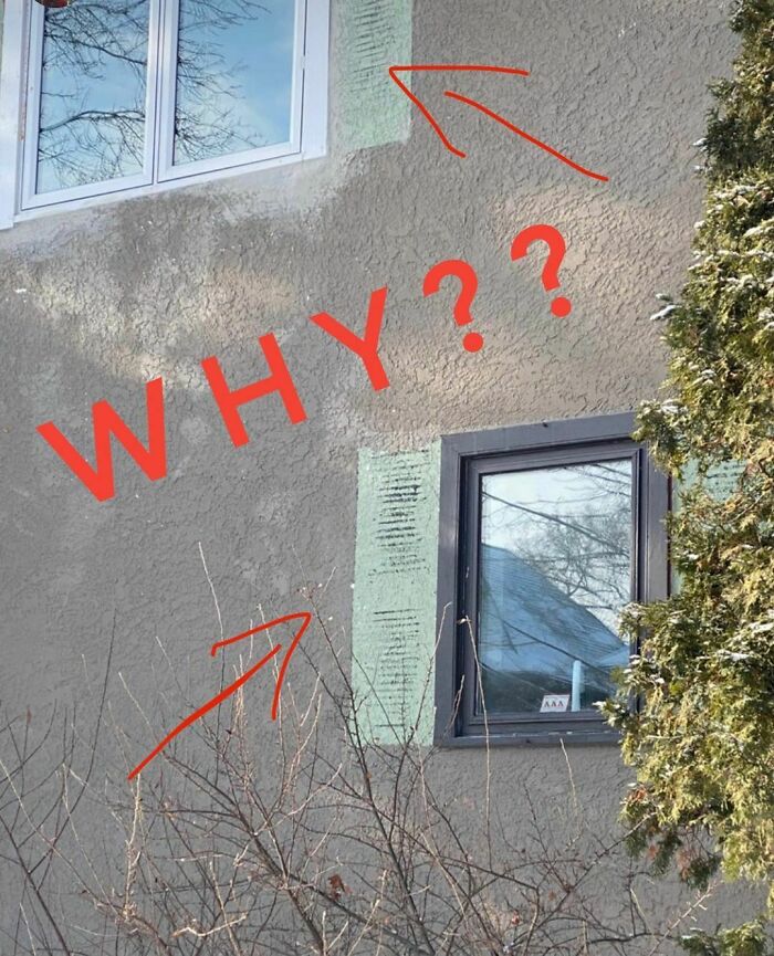
Sideburns or shutters?? If they look like this I’m not a fan of either.
One way to hide vents is to cleverly disguise the as shutters. Such resourcefulness!
That pesky roof got in the way of what would have been a beautiful shutter detail I’m sure. Yep, that’s what happened!
I think we all know what’s hiding beneath those shutters, don’t we?
Whatever the question was in this scenario, the answer should have been “No!”
Always wash shutters on cold and tumble dry low to avoid shrinkage. Common mistake!
My lawn is perfect. My roof is perfect. What could I do to make my windows perfect too? Hmmmmm…I’ve got it!
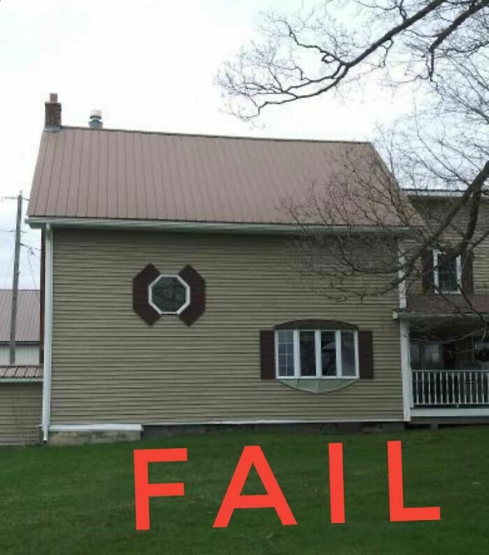
I acknowledge that octagon windows are hard to shutter, but are they this hard?
Anyone else think "tie fighter" when they see this? ("advanced" model [ Darth Vader's ship])
My children did pretty well playing that game where you have to fit the different shape blocks into the matching holes once they turned 12 months. I can only assume this was done by someone who didn’t have one of those games growing up.
When your windows are just boring rectangles you can always add curved shutters to spice them up…right? Right?????
You know that guy at the gym who wears a child medium shirt to show off his muscles? This is his house.
I may be on vacation but this pic was enough to get me off candy crush to post for today! Last #shuddersunday of 2020 and it certainly fits the bill!
This guy is very excited for what must be a new home purchase! I however would not post a pic like this on Instagram until I climbed a ladder and pulled those shutters off.
Ding dong!
Who’s there?
Someone who can’t close their shutters.
Gotta protect those bay windows! Don’t drink and shutter please.
I have to give a little credit on this one for the incredible work this shutter installer did to cut this shutter so perfectly around the roofline and gutter. Well done! F+
They say black is slimming, but unless it is also magically these shutters are nowhere near large enough.
This one is such a nice house that I might forgive the atrocity that is these shutters…ummm…nope I can’t do it.
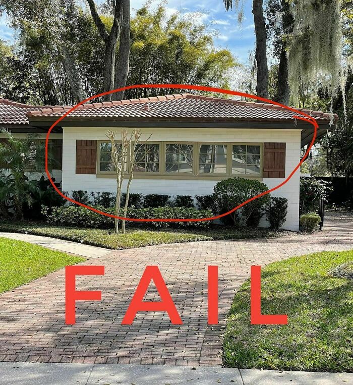
Congratulations Orlando, you’ve made the list again!
Arched windows are tricky to shutter. And by tricky I mean, “Dear God, don’t do this!”
My caption bucket is empty on this one...I’m gonna need your help to caption it for me!
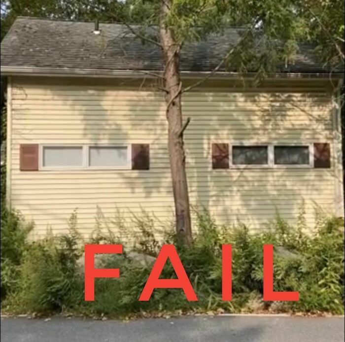
Anyone else see a couple of Tron Recognizer vehicles on the side of this shed or am I the only@dork who remembers these? Google it and tell me if I’m wrong.
There no ducking responsibility for this one. This is so fowl that when I saw this picture I was literally quacking up!
There was clearly serious planning involved here, no one was just winging it. Enough duck puns, please don’t do this ever again.
Happy Labor Day Weekend! I’m sure many of us have projects for our homes this weekend, but please let one of those projects not be coat hooks on purple door shutters
I say there is a .002% chance there are perfectly sized windows behind these shutters and I’m wrong about this week’s
These shutters are actually not that bad other than the fact that they are installed on a window that has no business having shutters.
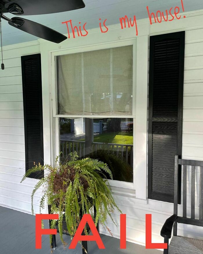
I bought a Fail! You guys have been so supportive of my new house purchase, but I have to admit it is a shutter fail! I can’t call out other houses without first calling out my own.
I will remove the ugly plastic shutters this week and start building some new shutters ASAP but for now...I...AM...
A rare day when I find shutters that are too big for the window, but here we are. If there is a mistake with shutters then you will find it here.
So glad I’ve got amazing followers who find hilarious stuff like this!
Here we see a rare glimpse in a remote woodland setting of the American Pygmy Winged Window. Note the undersized louvered wings unlike the full sized European variety.
This variety is, sadly, flightless and has no means of protecting itself. Strangely they have flourished across the fruited plains of North America.
You can find this house on Long Island at the corner of So Wrong St. and What Was I Thinking Blvd.
Stop by anytime!
Taking it back to my childhood with some Hall & Oats who apparently have a song for everything, even.
Normally it’s the shutters that are the main problem but this week the whole house is as terrifying as the weather.
Note the unique variety of shutter issues at each and every window.
Initially i've enjoyed it but after a while i have came to the conclusion that: A) Many people seem to treat shutters as decorations and don't give a damn about their functionality B) The Author seems very salty about it and is, in a way, condescending and so all the fun from reading the captions disappeared.
Also, way too many entries. Got the point after the first 10 or so.
Load More Replies...Initially i've enjoyed it but after a while i have came to the conclusion that: A) Many people seem to treat shutters as decorations and don't give a damn about their functionality B) The Author seems very salty about it and is, in a way, condescending and so all the fun from reading the captions disappeared.
Also, way too many entries. Got the point after the first 10 or so.
Load More Replies...
 Dark Mode

 No fees, cancel anytime


