50 Ridiculous, Bizarre, And Downright Cursed Shirts People Actually Wear Out In Public, As Shared By These Twitter Accounts (New Pics)
If a picture’s worth a thousand words, the clothes you wear can speak entire volumes about who you are as a person. Sometimes, all it takes is one well-chosen shirt to let the world know exactly who you are—someone with a great sense of humor and the courage to break normal social boundaries… or that you simply enjoy weird stuff.
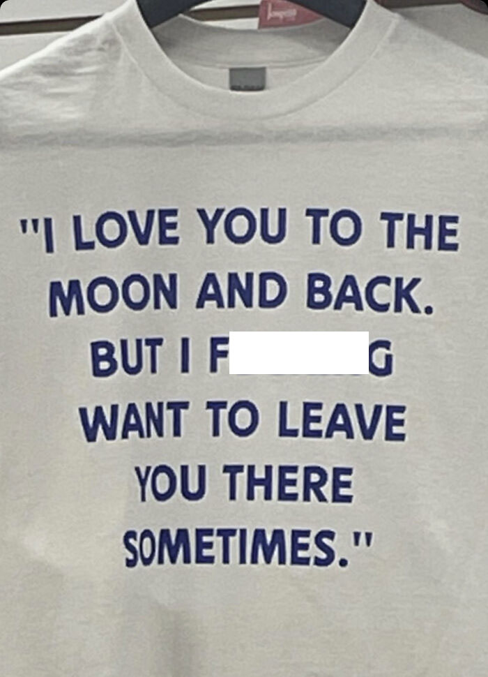
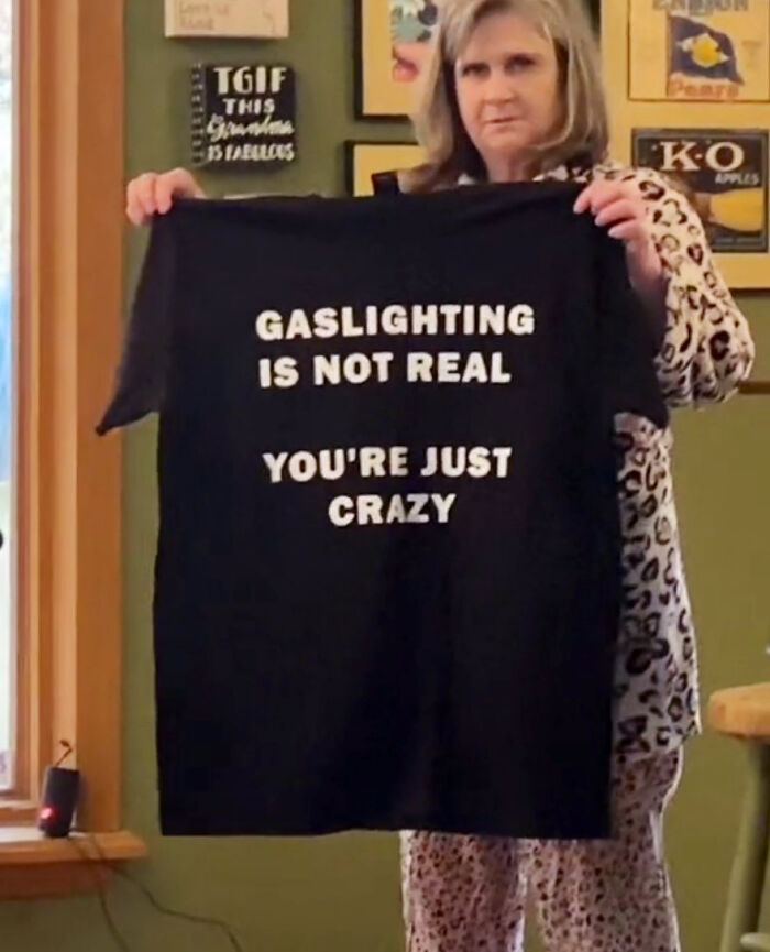
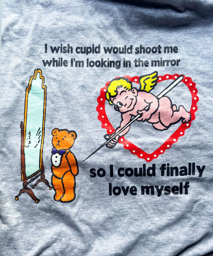
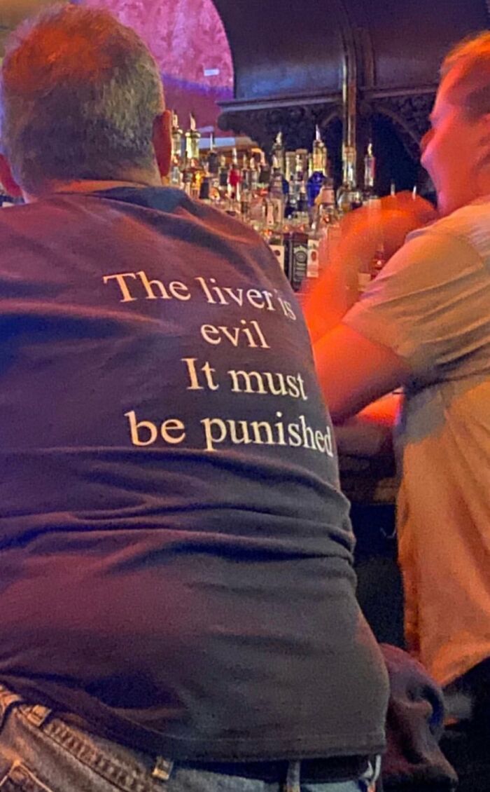
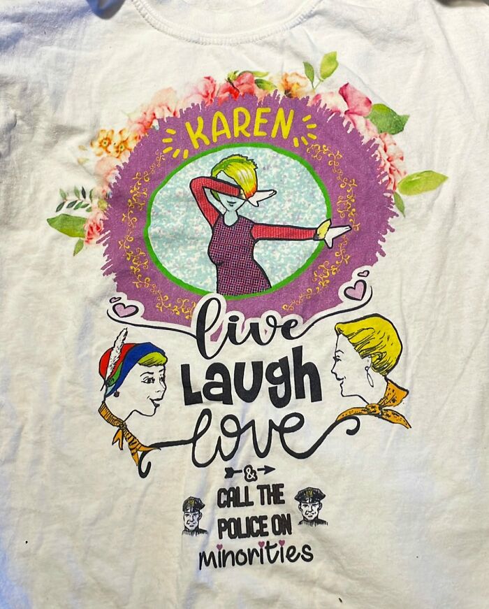
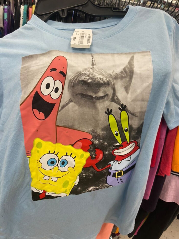
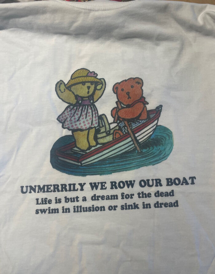
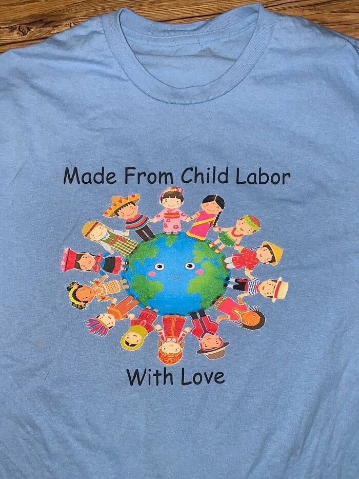
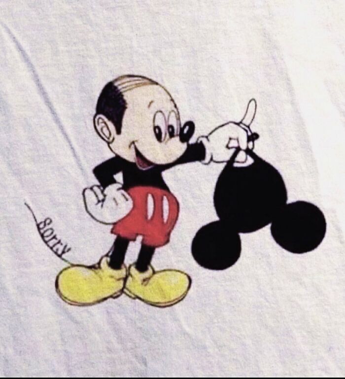
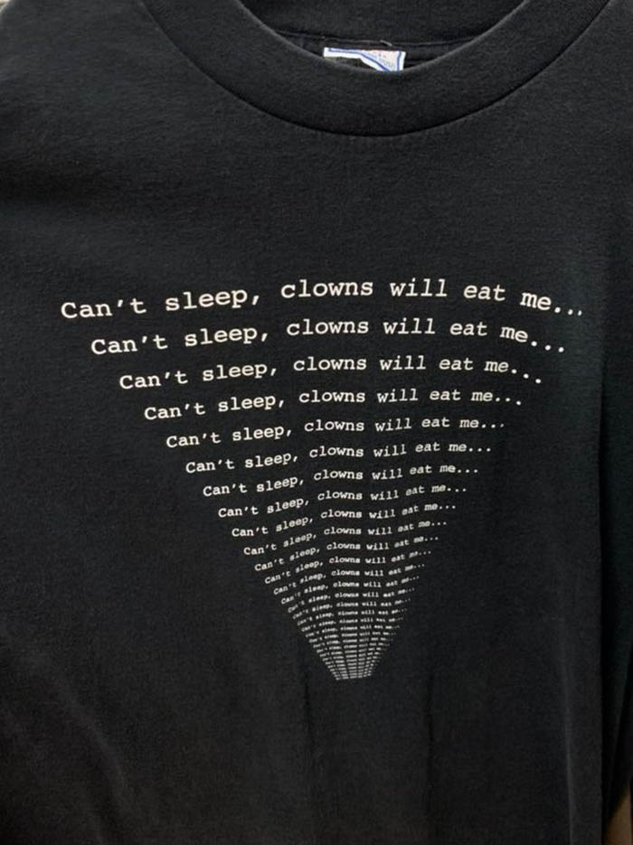
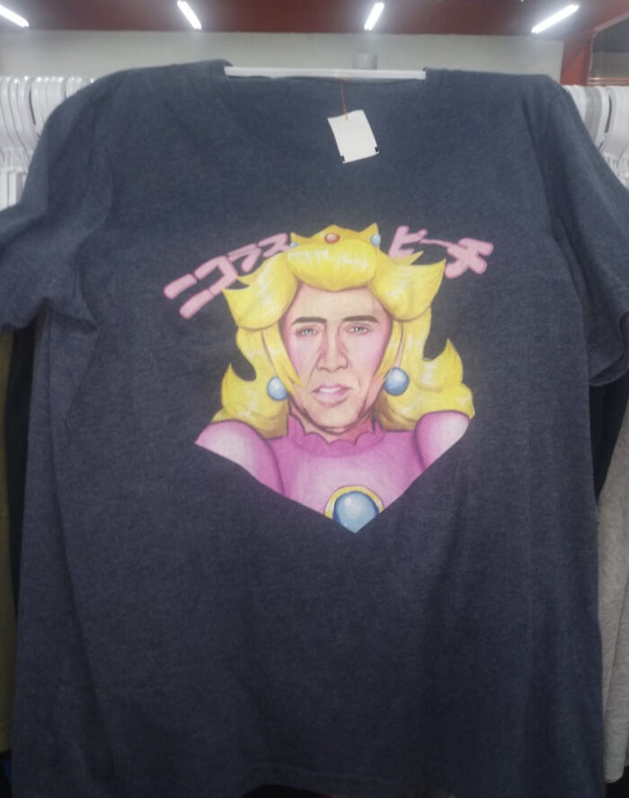
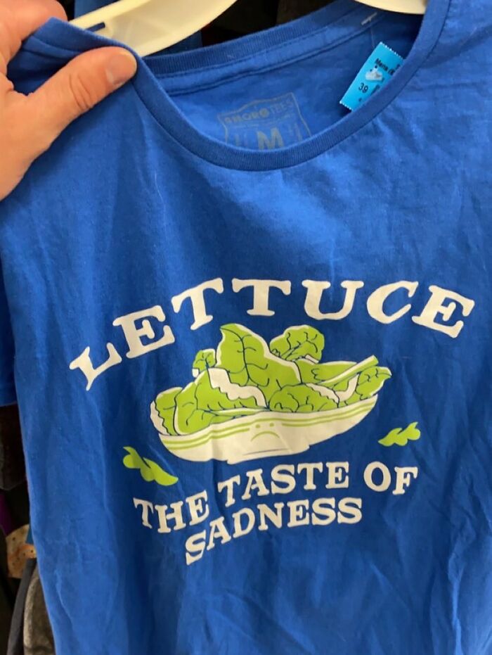
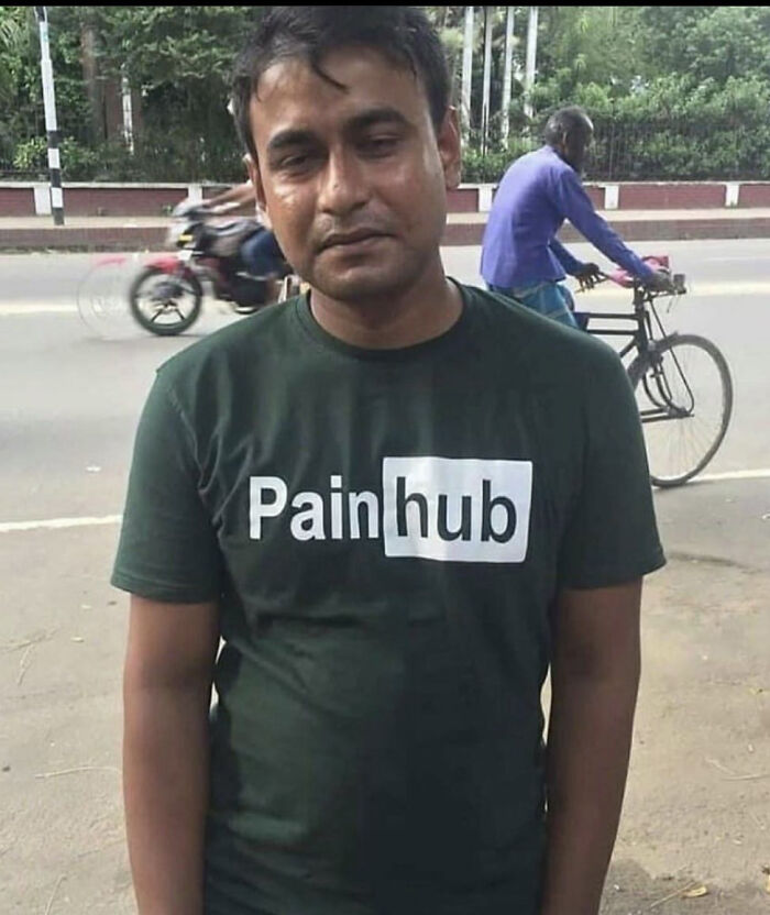
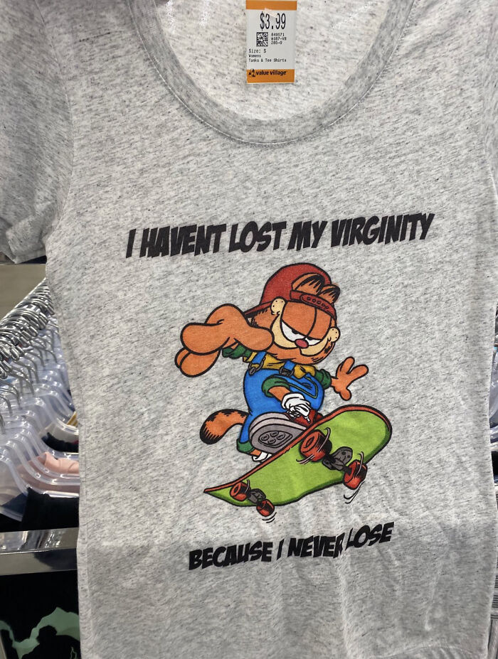
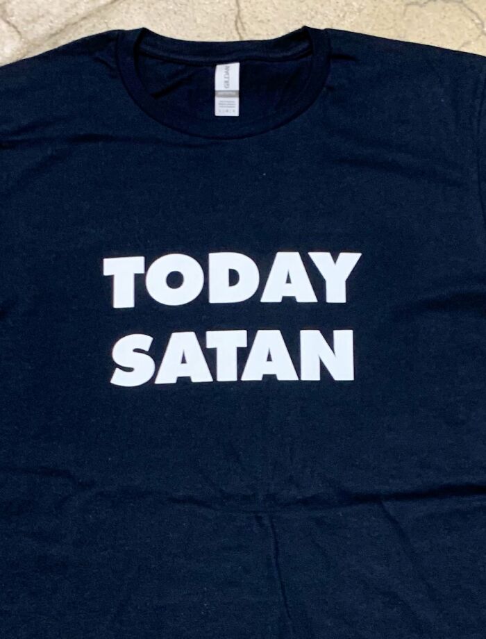
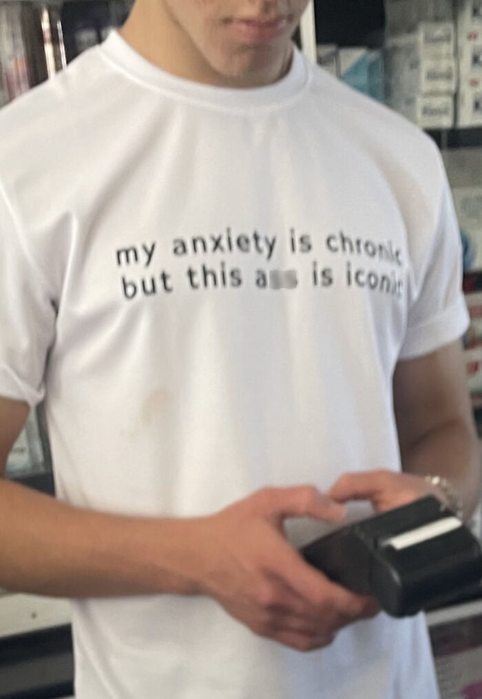
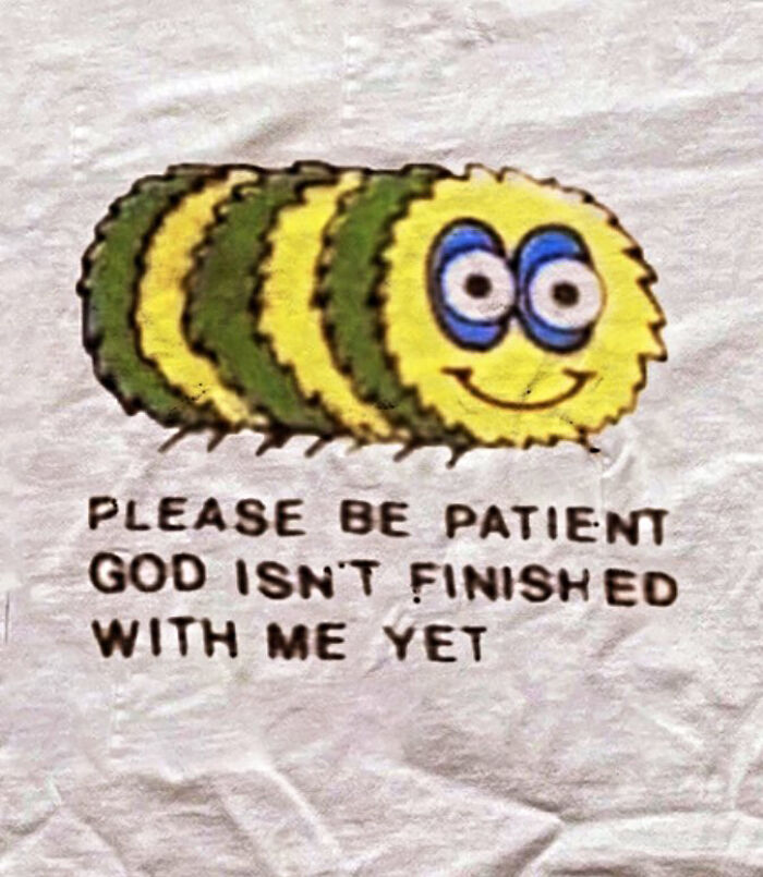
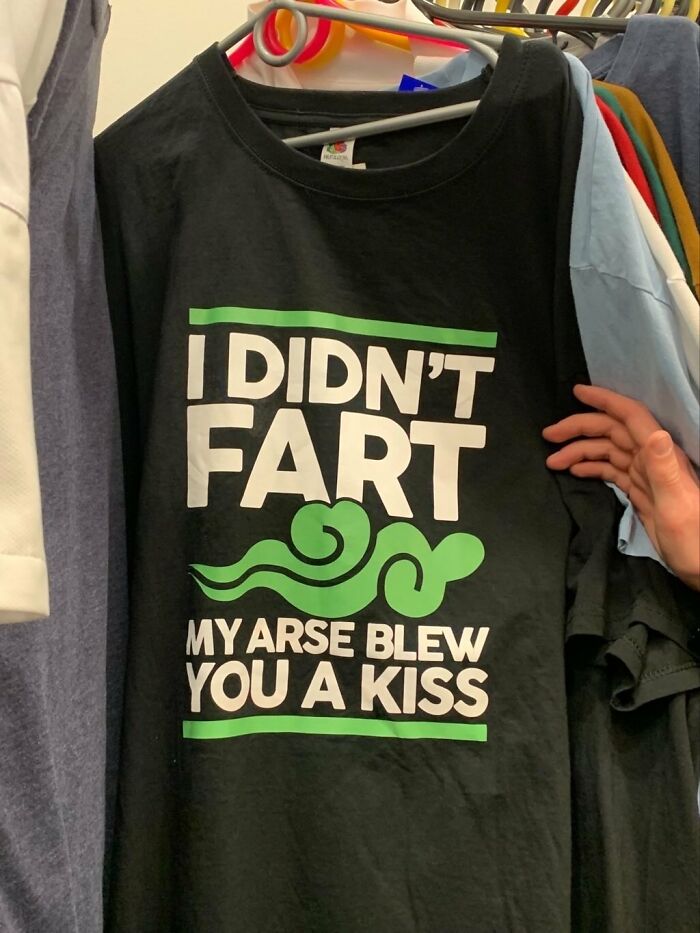
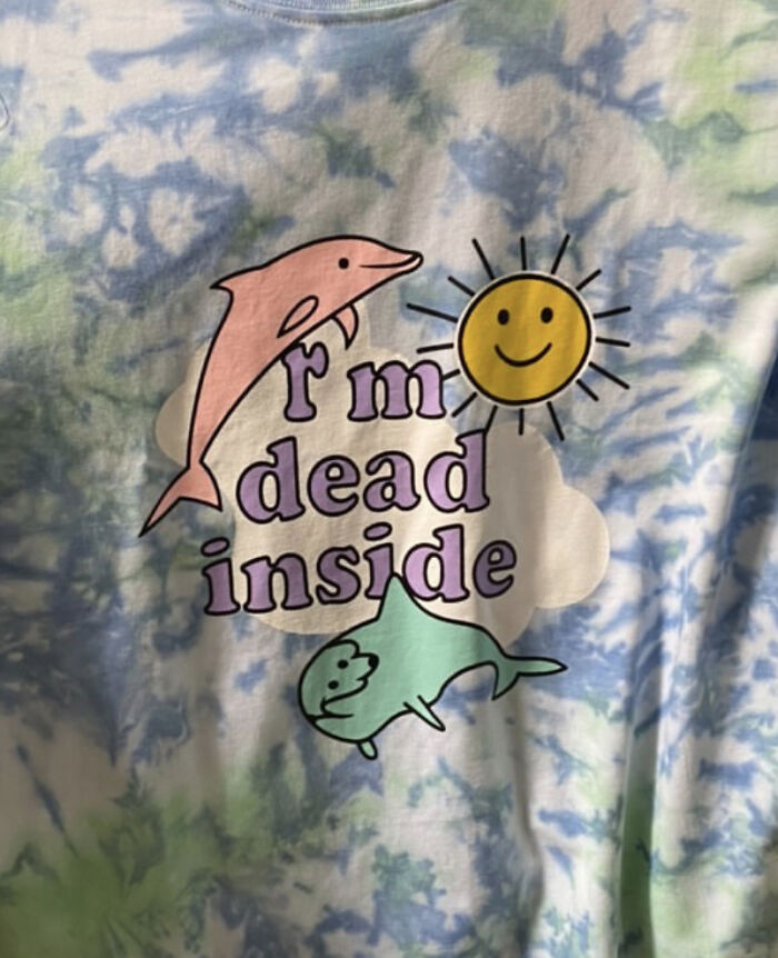
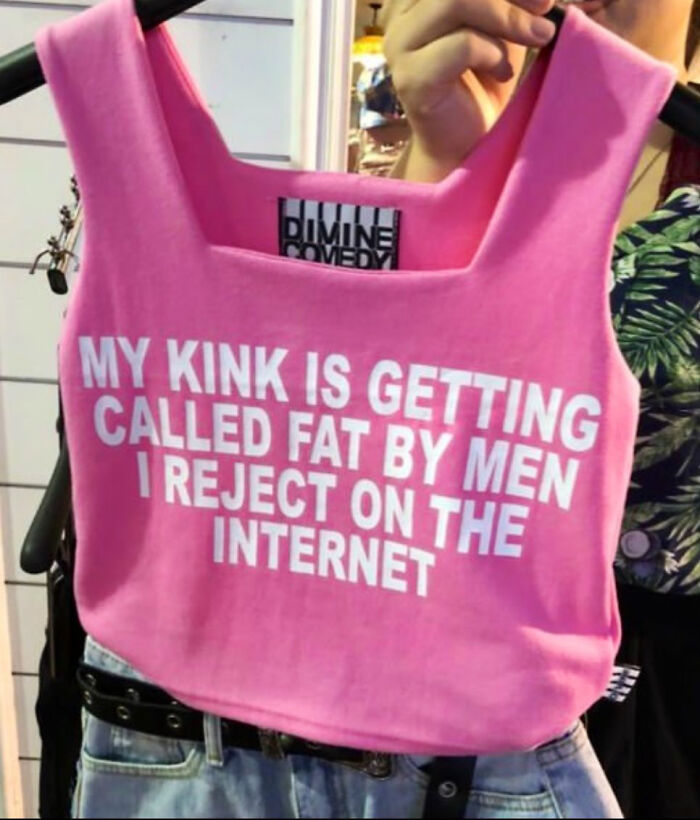
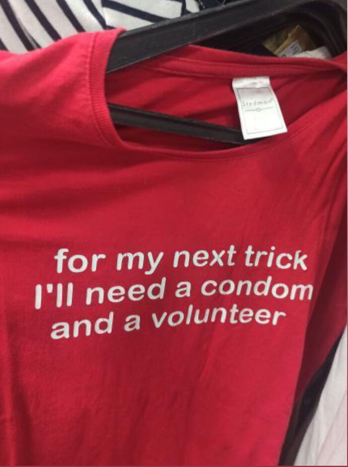
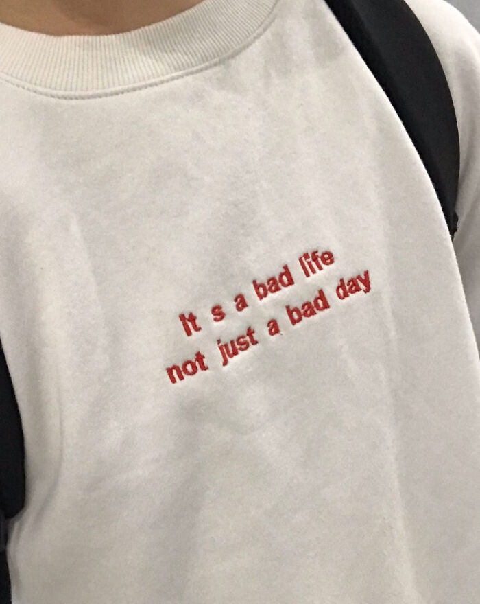
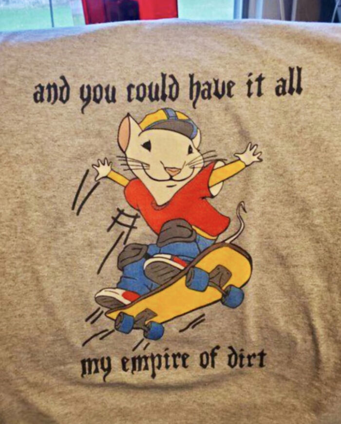
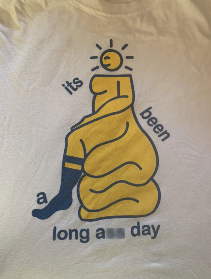
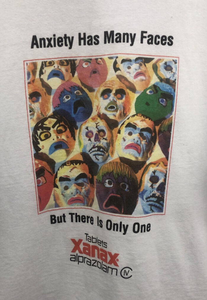
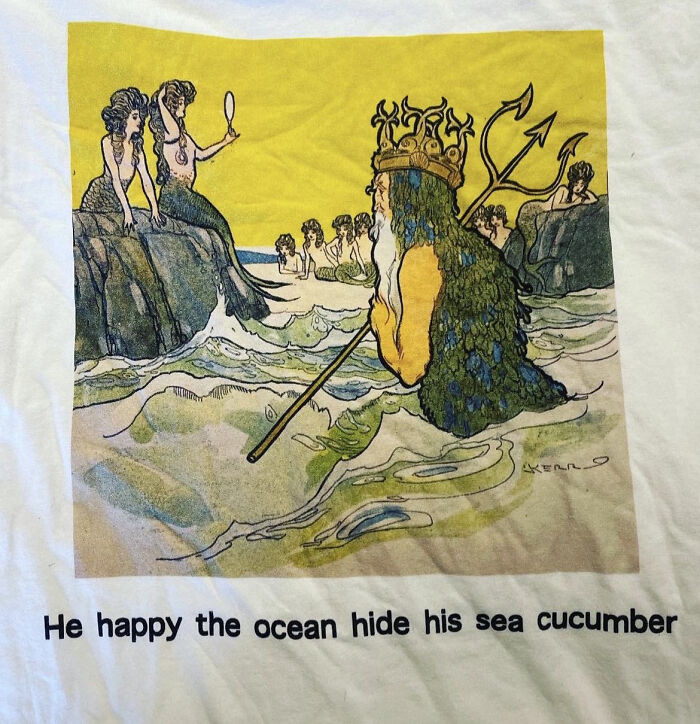
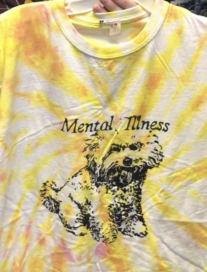
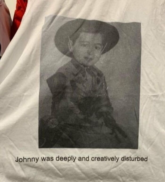
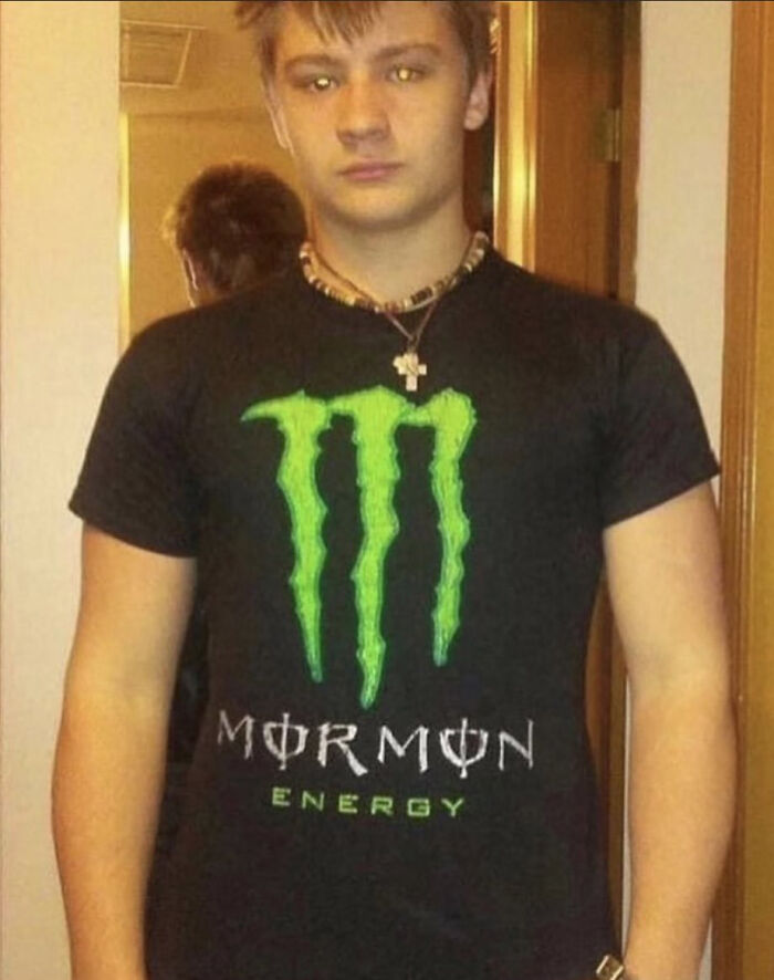
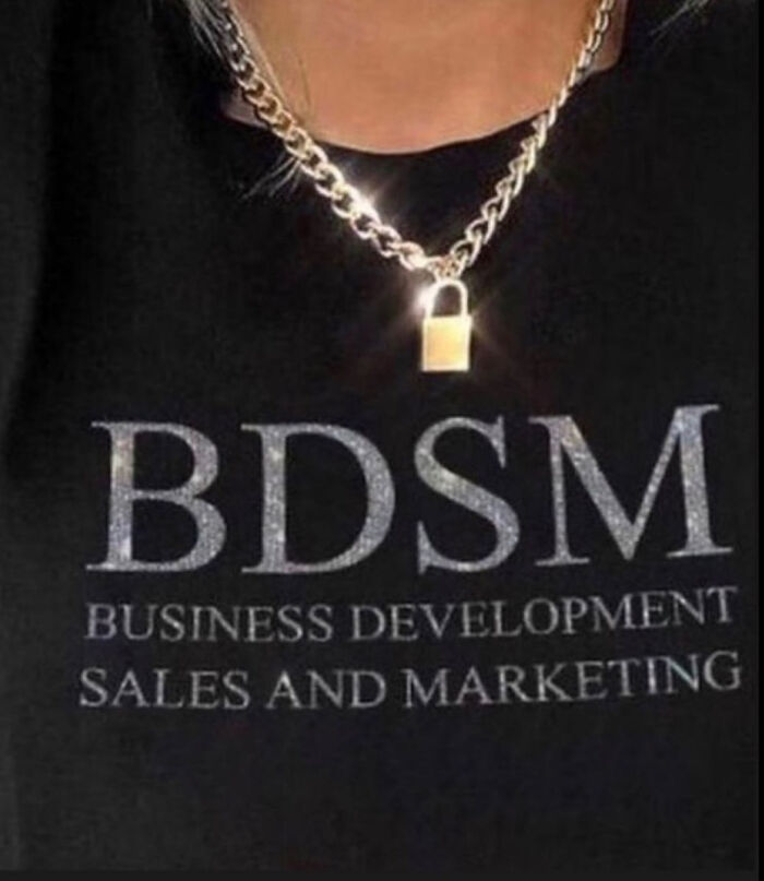
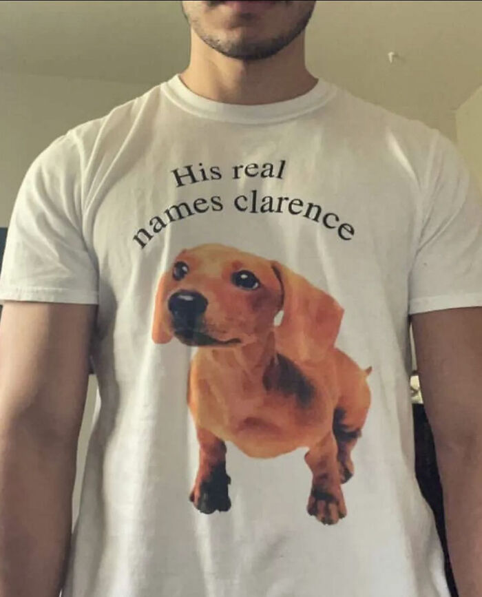
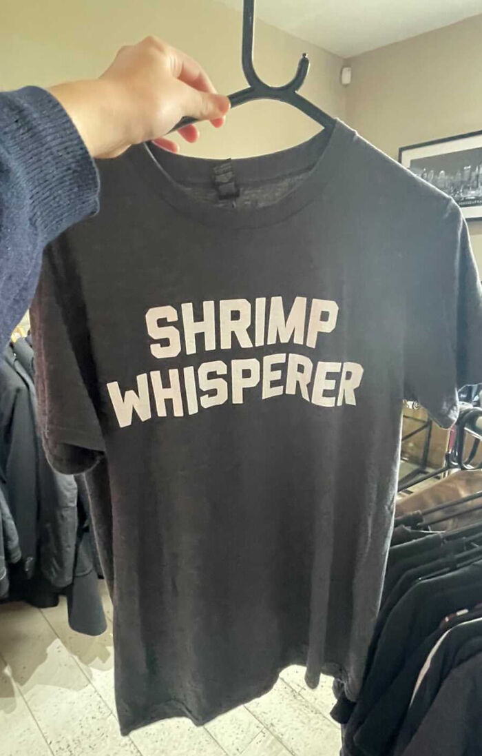
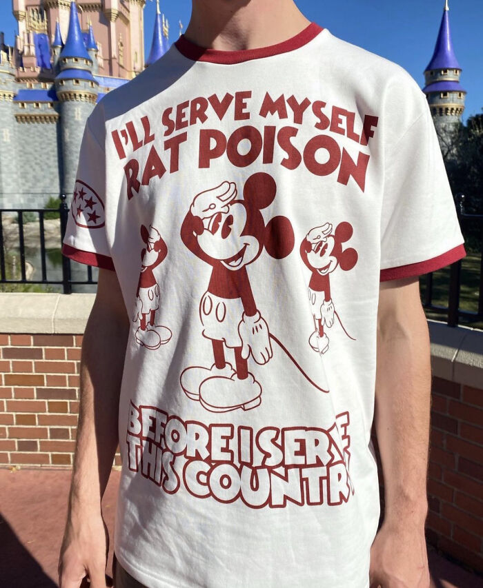
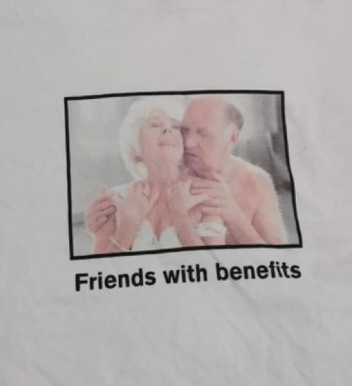
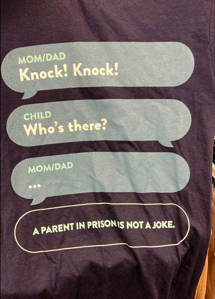
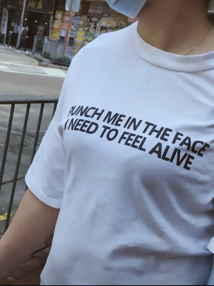
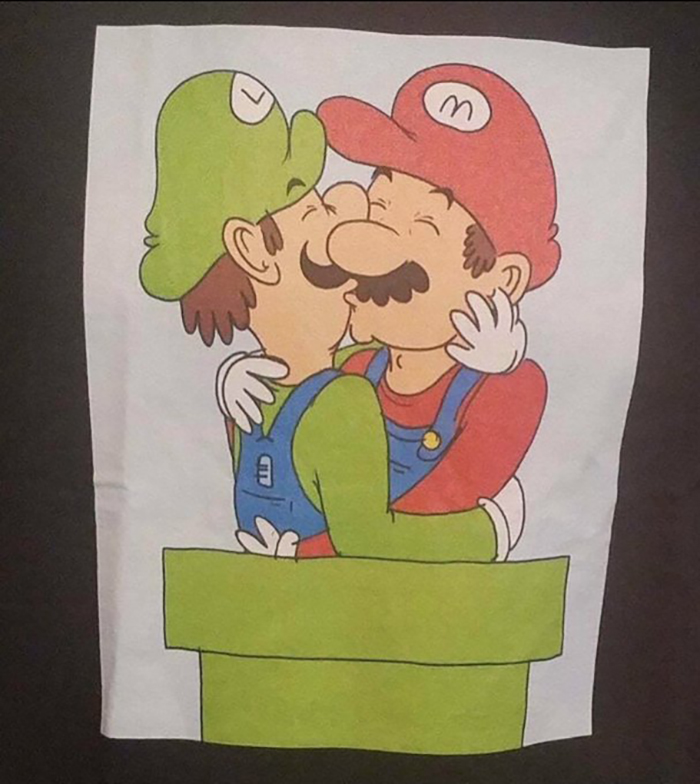
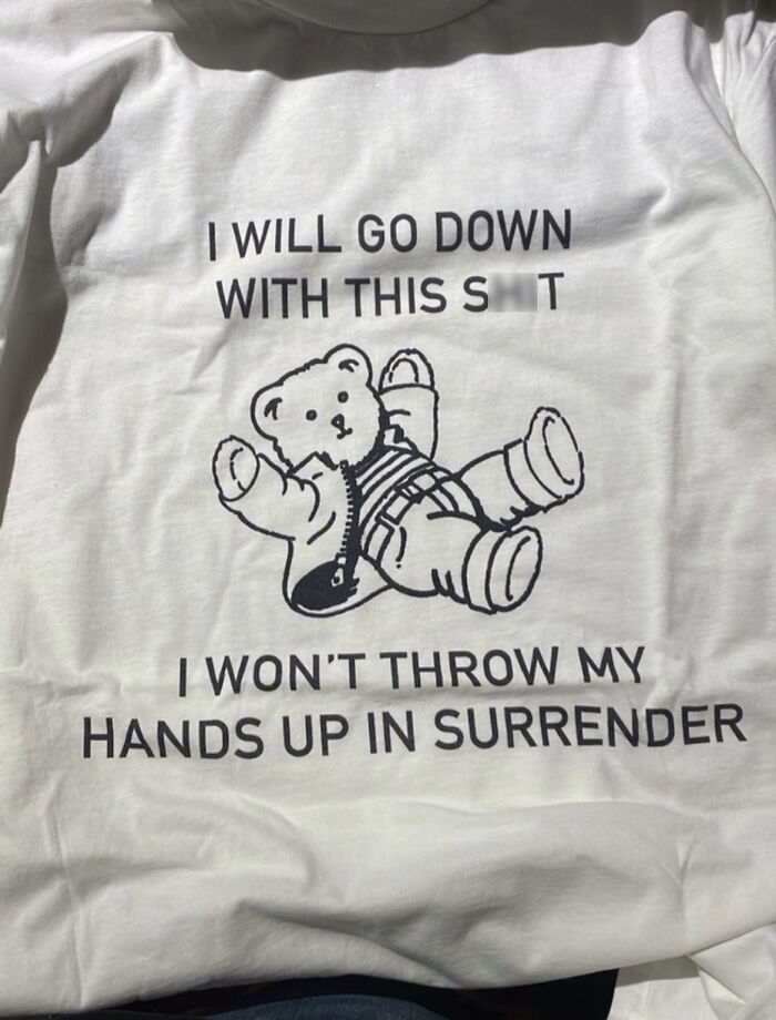
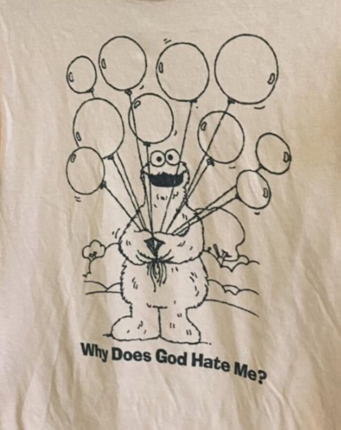
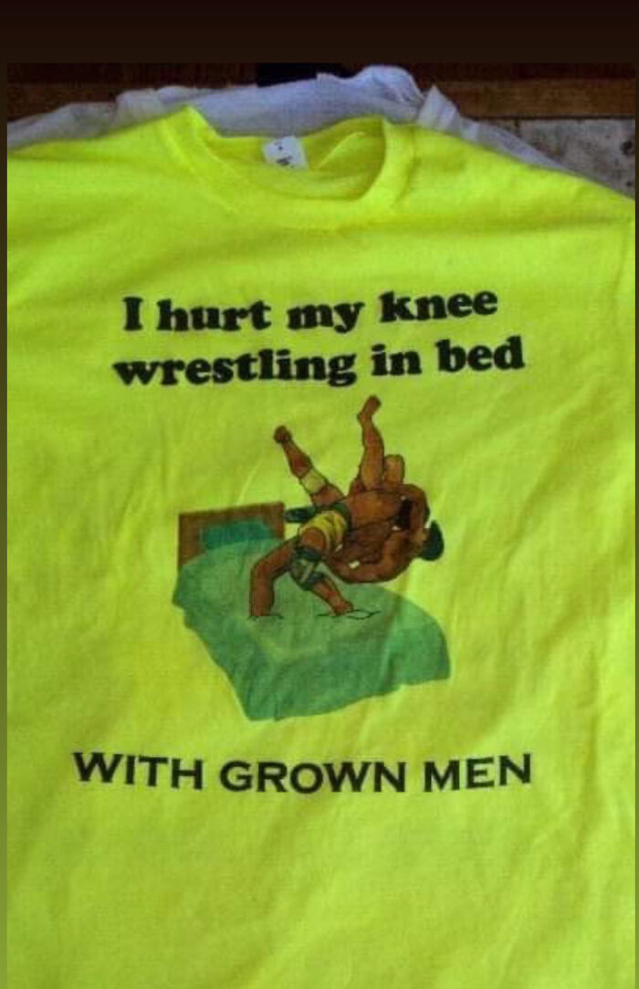
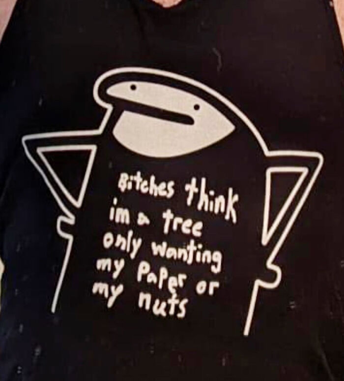
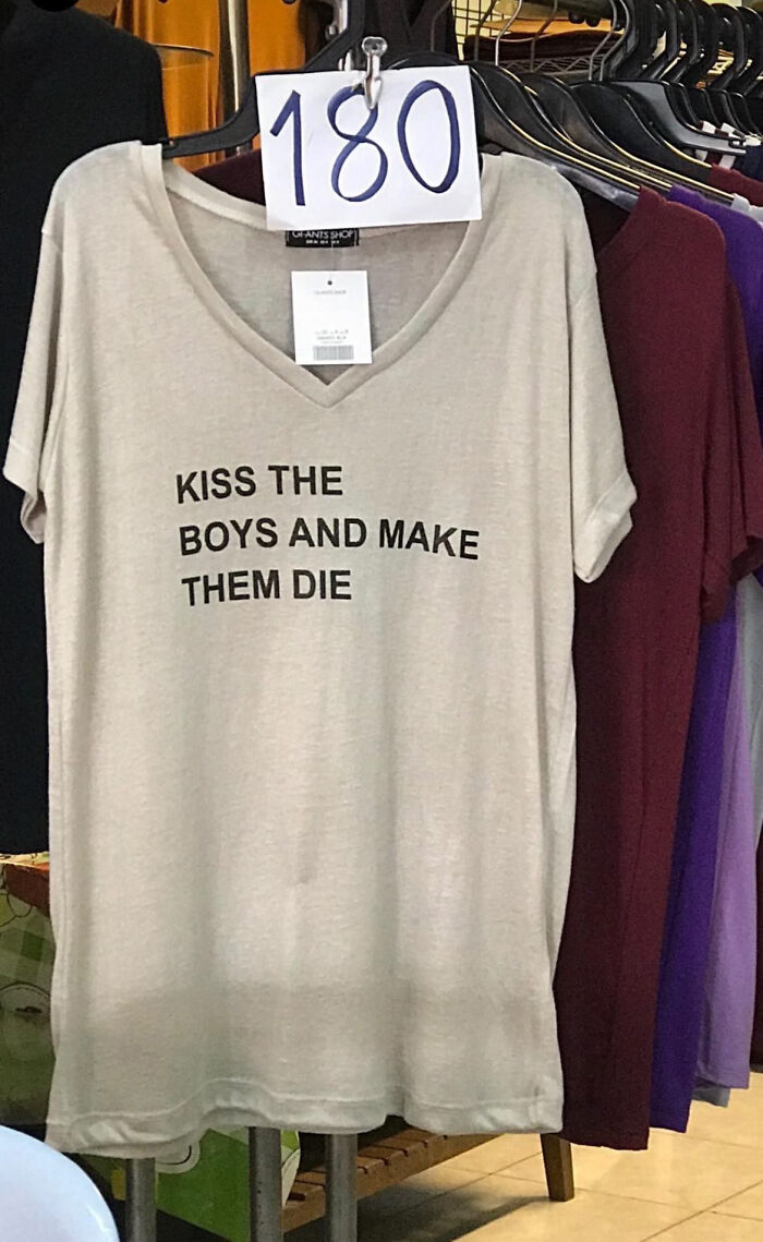
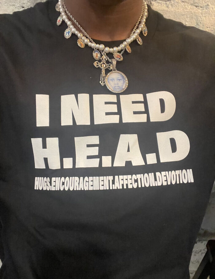
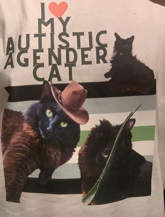
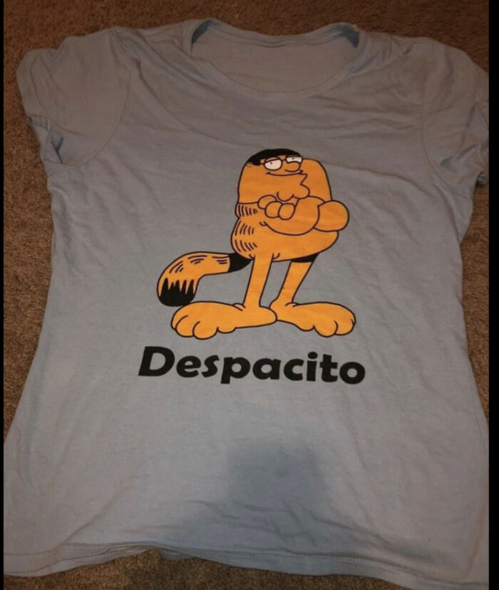
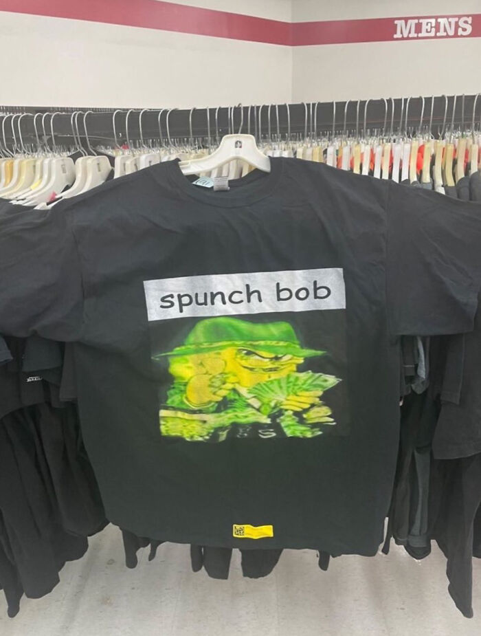
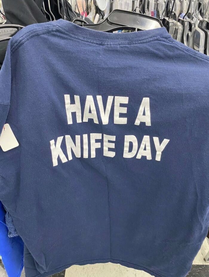
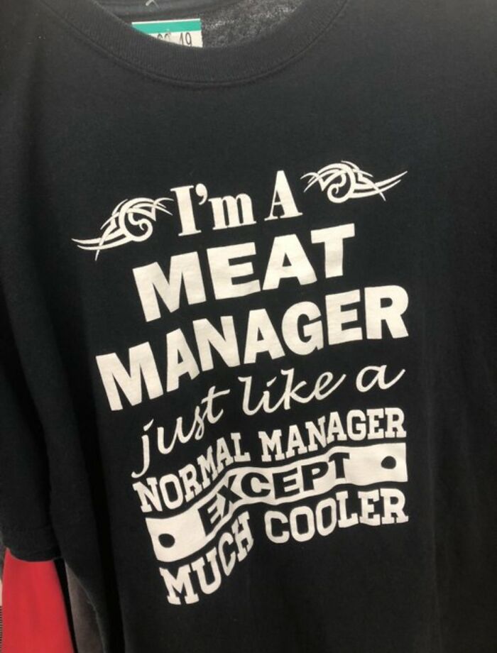
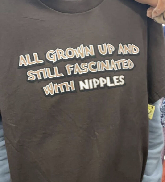
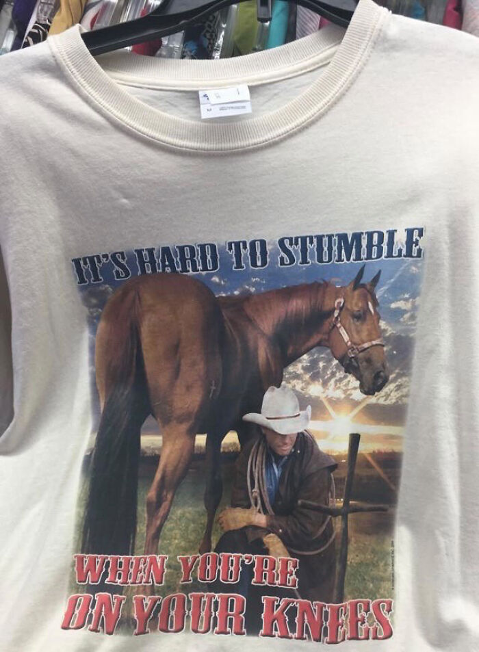
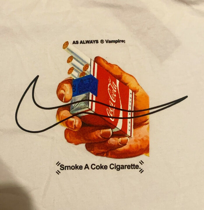
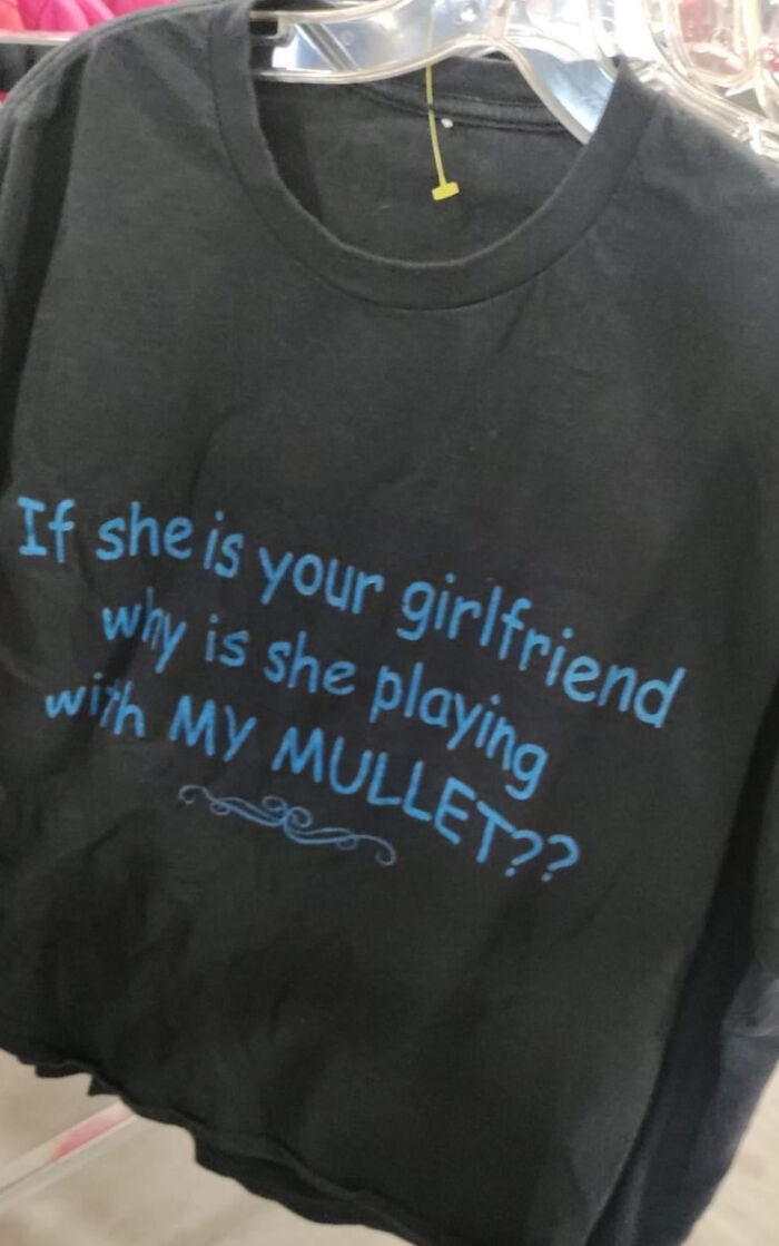
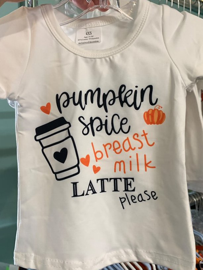
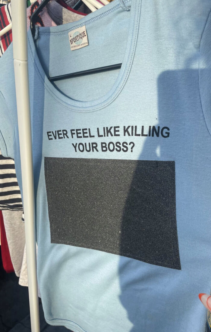
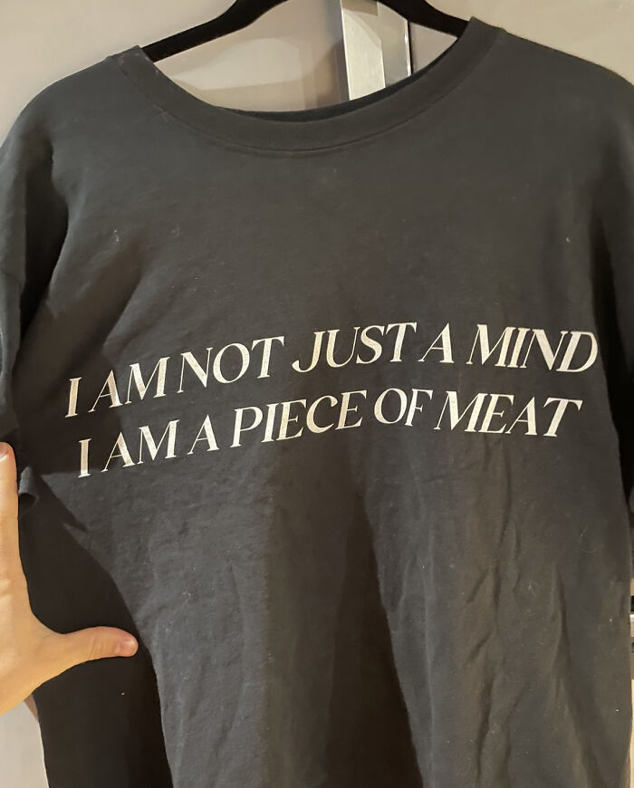
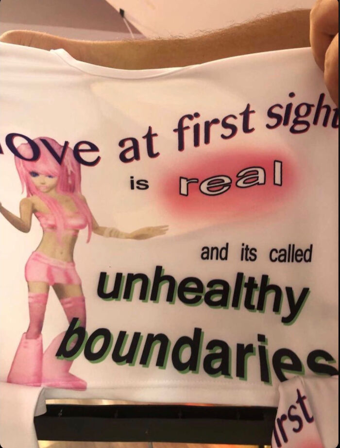
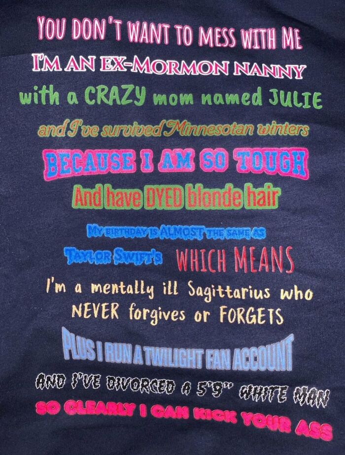
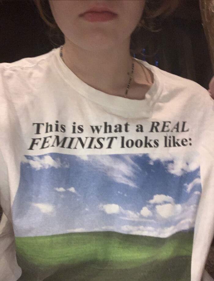
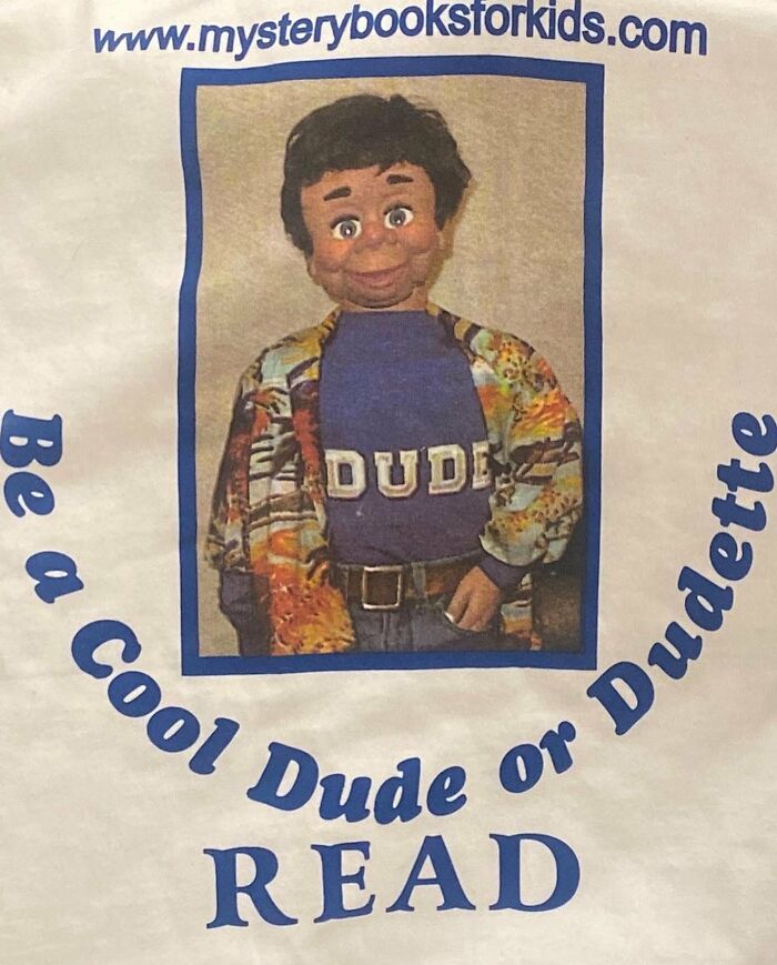
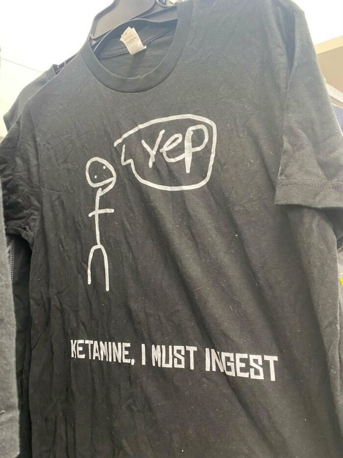
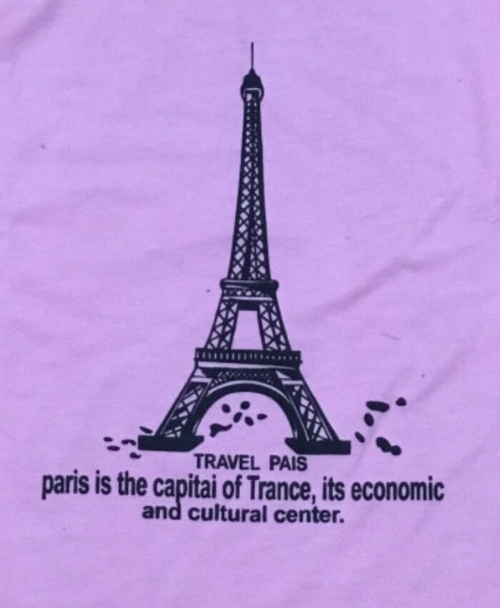
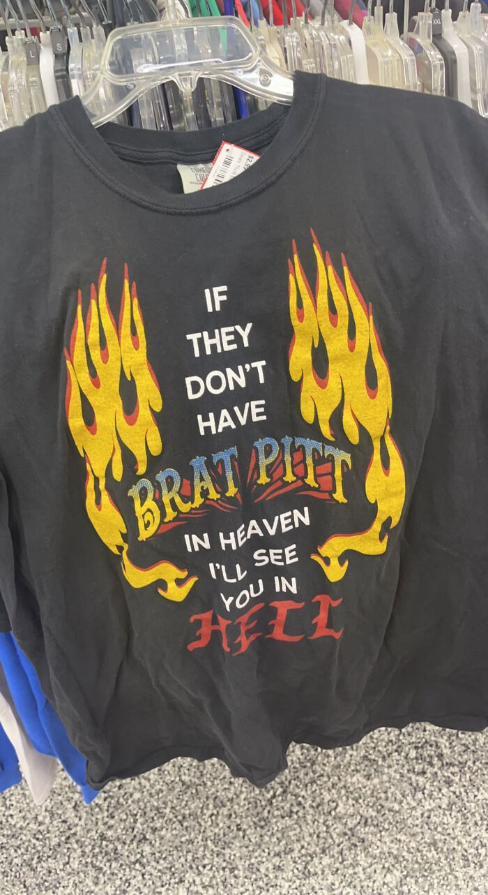
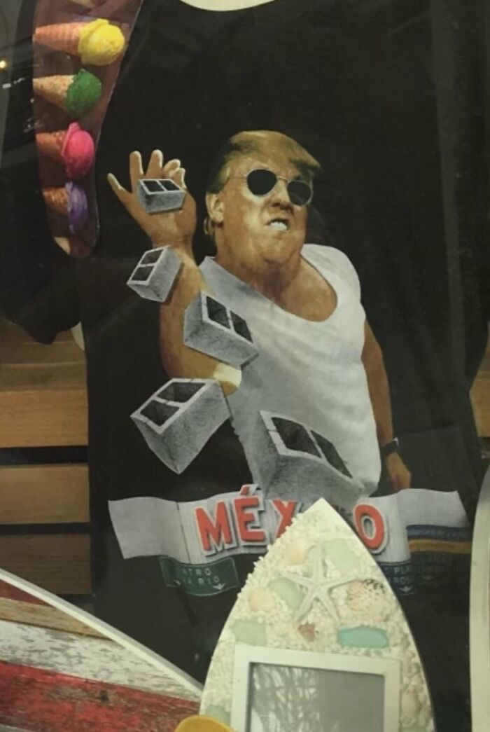
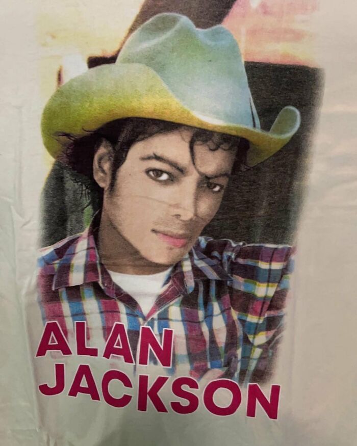
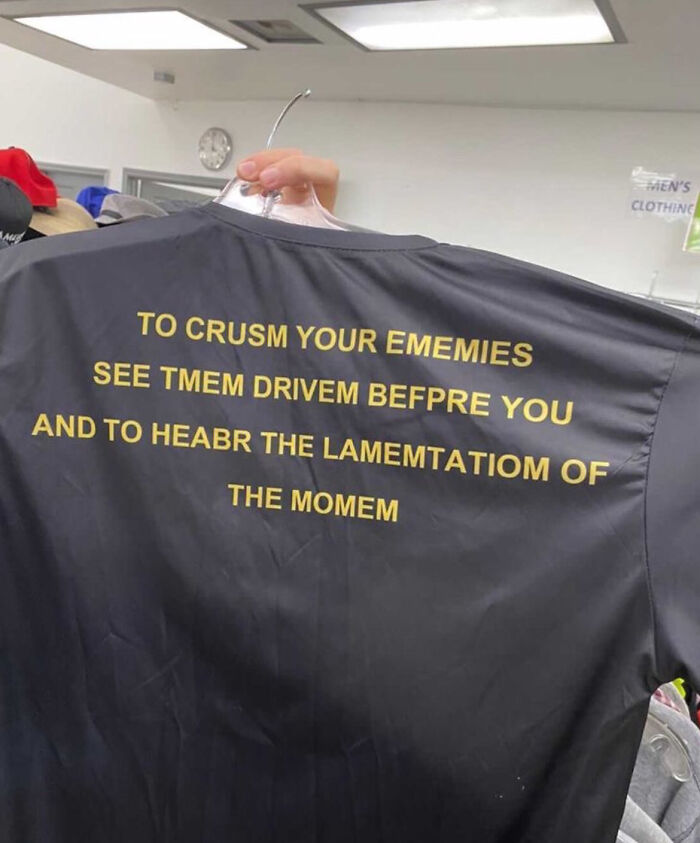
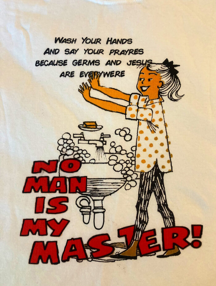
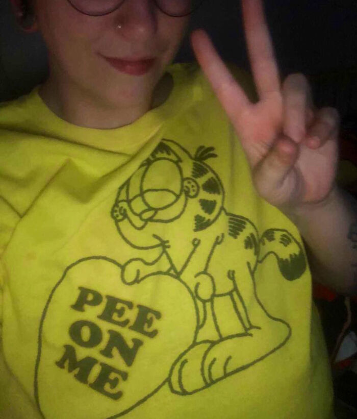
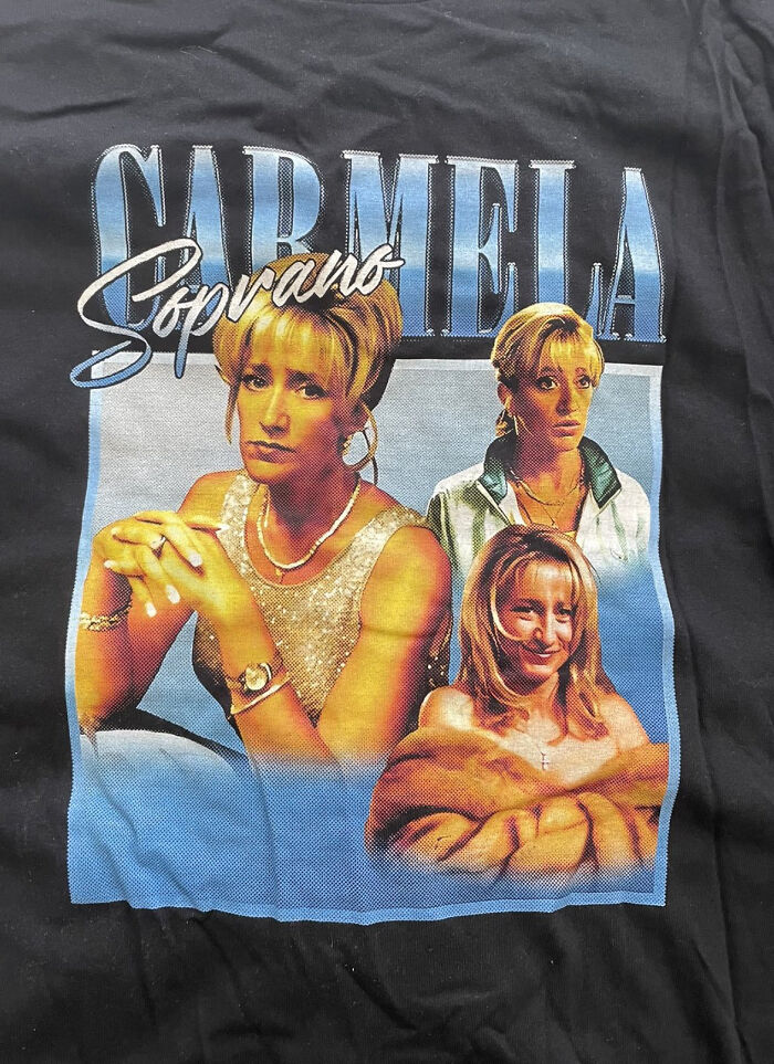
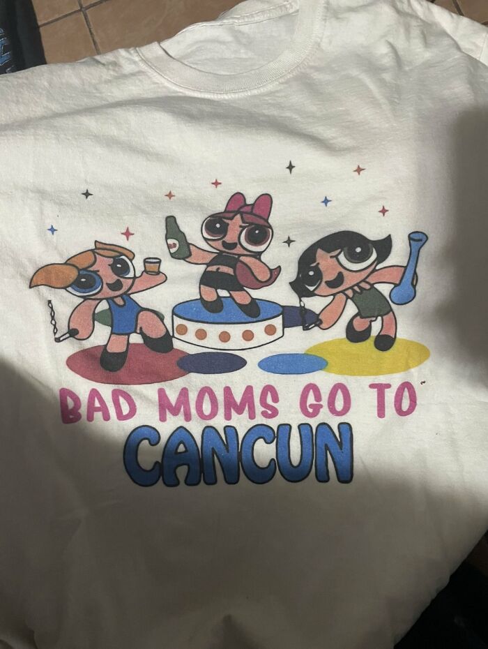
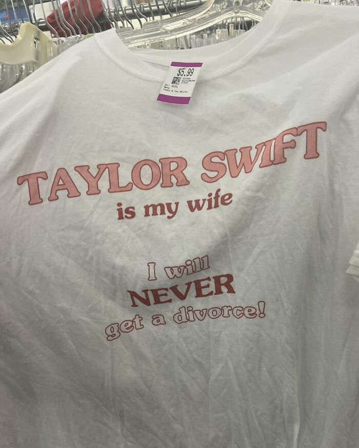
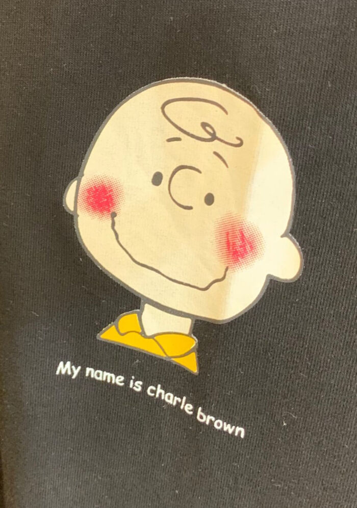
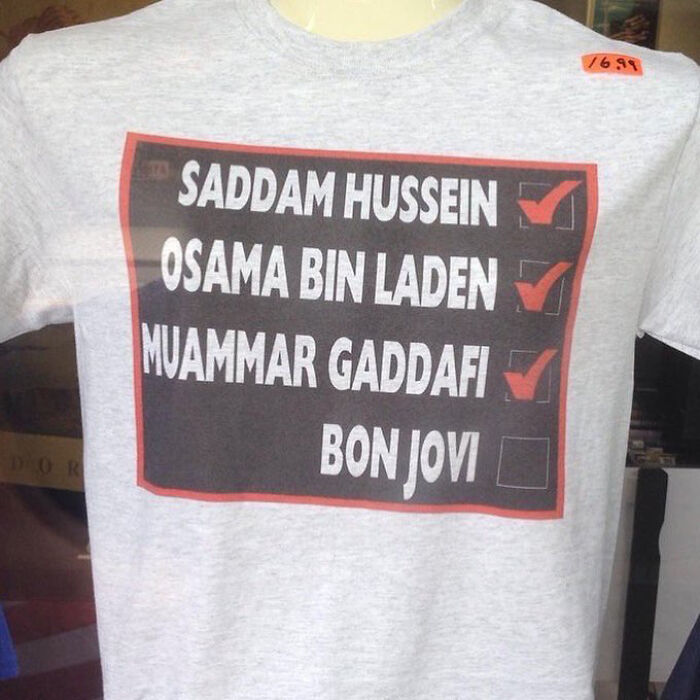
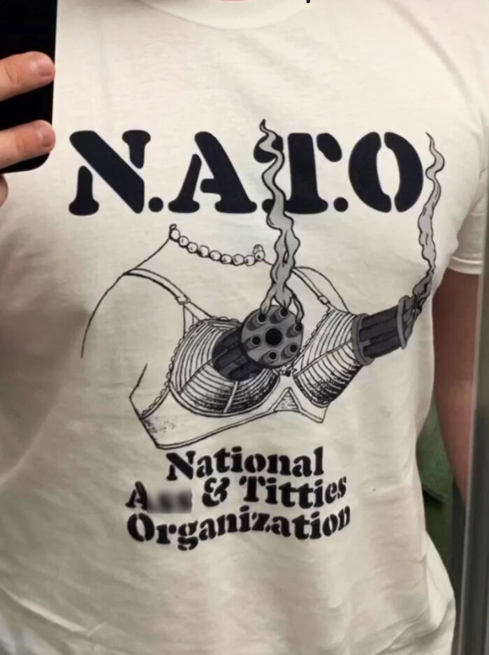
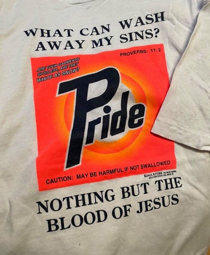
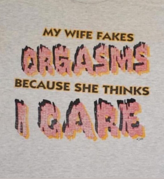
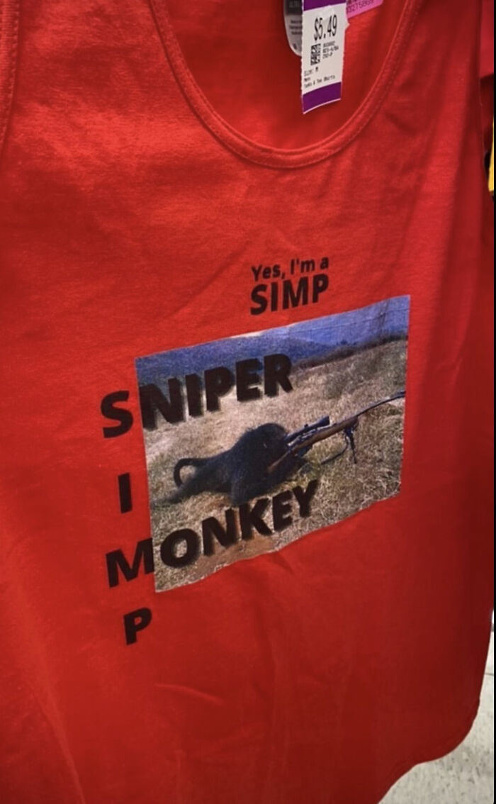
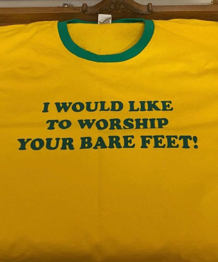
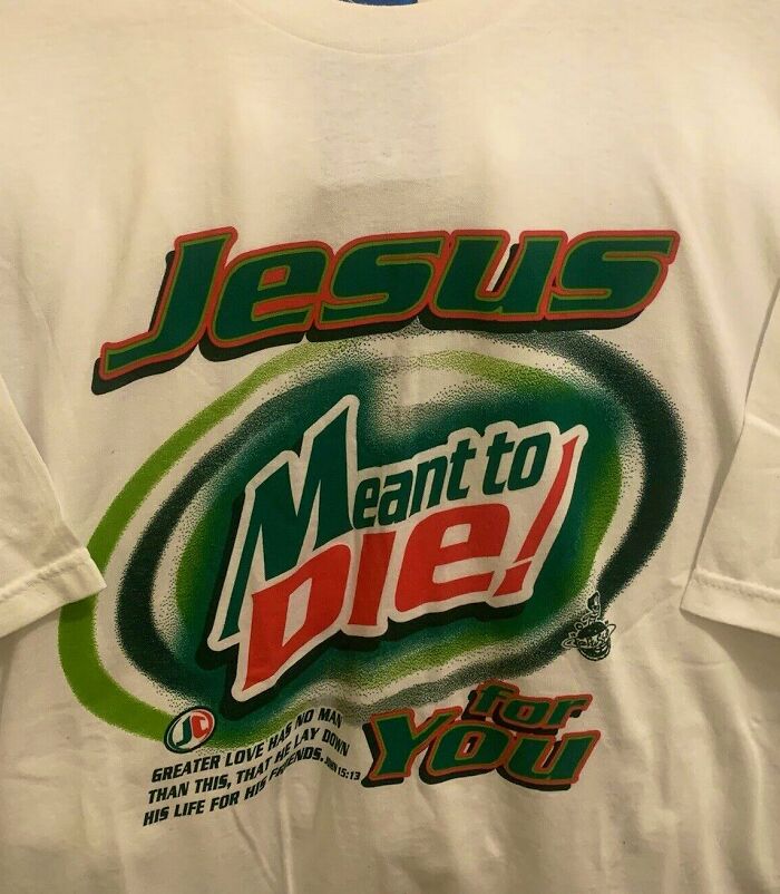
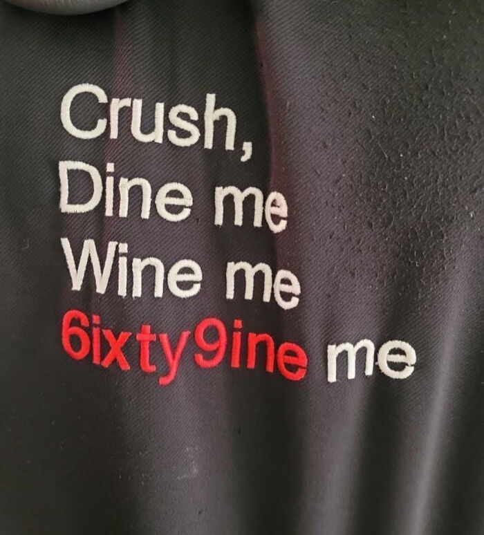
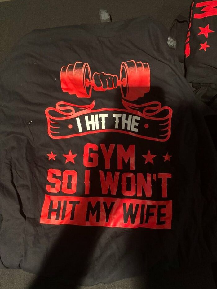
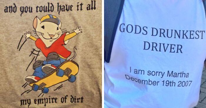
That’s where the ‘Shirts That Go Hard’ and 'Shirts With Threatening Auras' Twitter pages come into play. A celebration of the bizarre, disturbing, and nonsensical, the accounts share pics of shirts that really think outside of the box. From simple wordplay silliness to phrases and logos that feel practically cursed and have a really threatening aura. One thing's for sure, the designs are pretty darn unique. Though whether or not that's a good thing is up to you to decide.
Check out the worst and funniest that the world of shirts has to offer, and upvote the pics that you wouldn’t approach even with a ten-foot pole, Pandas. On the flip side, are there any shirts that you’d actually love to try on? Let us know in the comments.
For some more incredibly bizarre and outrageously funny shirts, check out Bored Panda’s earlier post about ‘Shirts That Go Hard’ and 'Shirts With Threatening Auras' right over here!
More info: Twitter | Twitter 2 | ShirtsThatGoHard.com
This post may include affiliate links.
Comedy writer and expert Ariane Sherine, from the United Kingdom, shared some of her thoughts with Bored Panda about jokes on shirts, and how to make them impactful, as well as help them stand out from the crowd.
The mark of a good joke is that it's short, to-the-point, and instantly captures the attention of passersby. Similar rules apply to whether you're designing a hilarious T-shirt or getting ready to go on stage for a round of stand-up.
"They say 'brevity is the soul of wit' and they're right. Keep phrases short and snappy—the punchier and simpler, the better," comedian Ariane told Bored Panda.
"But make sure you've included enough information for the joke to land," she added.
According to the British comedy expert, the limited amount of space available on a shirt can actually be an upside, rather than a downside, as far as hilarious phrases are concerned. It forces the designer to go for snappy, legible jokes rather than long, rambling anecdotes that you'd need a microscope to read properly. Sometimes, limits can help when it comes to creativity.
"It definitely works to the comedian's advantage and stops you from writing too much. Remember, with T-shirts, people generally have limited time to read them (for instance, if the person wearing the T-shirt is walking down the road) so the phrase needs to be short and have impact quickly," the comedy expert said.
Meanwhile, whether or not we end up wowing or insulting the people around us with what we wear really depends on the jokes written. Ariane said that what the reaction might be should all be evaluated on a case-by-case basis. Depending on the shirt, we might get a lot of smiles or raise a lot of eyebrows.
"Clean T-shirts shouldn't embarrass or offend anyone. Risque T-shirts might, so the ruder the T-shirt, the funnier the joke has to be to make up for it," she said.
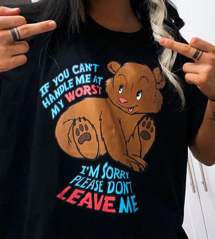
Never in my life have I seen something so relatable. I should probably tell my therapist 🤔
A whopping 979.8k people follow the ‘Shirts That Go Hard’ Twitter page, and it’s easy to see why—their focus is on weird content, mixed together with a heavy dose of humor. With a bit of fashion-policing sprinkled on top (though, let’s be honest, over half of these shirts are absolutely amazing).
To get nearly a million followers in just over a year of being on Twitter is an impressive achievement in and of itself. As long as people will dare to put weird stuff on their clothing in writing, there will be something to post on ‘Shirts That Go Hard.’ We really don’t see that changing in humankind’s future any time soon.
Meanwhile, the 'Shirts With Threatening Auras' page, created in June 2022, already has 121.2k followers.
A few ways to leave an impact with your shirts is to combine them with interesting pictures and logos, play around with phrases of varying length, and consider adding a bit of wordplay in there. Throwing a pun (or two, or three) and some rhythm can yield some great results. Either that or just pick the weirdest words you know.
When it comes to logos everywhere, we’ve been seeing a definite trend toward more homogenized, legible, perhaps even ‘soulless’ designs. Whether or not a logo or a phrase is readable online is a huge factor for companies. So logos that don’t adhere to this new trend tend to stand out from the crowd. The sad thing is, this homogenization has been affecting designs pretty much everywhere: from everyday architecture to how products look.
During an earlier interview, consumer psychology specialist Matt Johnson, Ph.D., shared with Bored Panda some of the reasons why logo homogenization is happening.
“The first [reason] is that as we move towards a more digital environment, there’s a need to make brand logos as legible and as easy to identify as possible. The consumer’s attention is strained even more in the online world, so logos can’t afford to be disfluent or challenging to process,” the Hult International Business School and Harvard University professor told us.
“Secondly, there also may be a growing realization of the ‘fluency effect’: the relatively robust behavioral science phenomenon that the more fluent a font is written in, the more likable and trustworthy the message. As more brands become familiar with this phenomenon, they may want to test new, more fluently written logos to capitalize on this effect,” he said.
“While this logo trend is seen across a wide array of industries, there may be only one or two within each industry that may make this change, since if everyone did, they would not be differentiating as well. There may be a broader implication of this: if companies begin to recognize that consumers, at least in digital environments, prefer more basic logo designs, brands will rush to be the first in their industry to do so to plant their flag first. While all brands want to be at the razor’s edge of consumer preferences, no brand wants to be seen as the copycat of their competitor,” the professor told Bored Panda.
“I imagine the general trend will persist, especially in the digital environment. If it turns out to be the case that more basic, legible logos are more suitable for online preferences, we may also move to a system where each major brand has at least two distinct brand logos: one in the digital world, and one for the physical world. This is already happening to a certain extent since many brands that have gone to a more basic font haven’t completely jettisoned their originals and retained them for specific uses,” he explained.
“Since branding is fundamentally about differentiation, there will be an upper limit to how much brand logos can homogenize and go together on a single dimension. It’s great to adapt to new consumer preferences, but if every brand does that in the same way, it fails to differentiate in a significant way. This is why I think there is a ‘race’ within each industry to be the first to do so, which then makes things more difficult for their competitors: should they persist in making their logo more basic, at the risk of looking like a copycat? Or should they cede that positioning and devise a way to differentiate by some other means?”
The professor noted that brands can also differentiate themselves in other ways, like using “tighter taglines,” exclusive product features, and “fluent soundmarks.” That way, the legibility of the logo is no longer the only important thing.
I was wondering...do you have any experience with oysters as well? 🥺
How many of this shirt really needs to exist though? I mean...is there more than one of this person? o.O
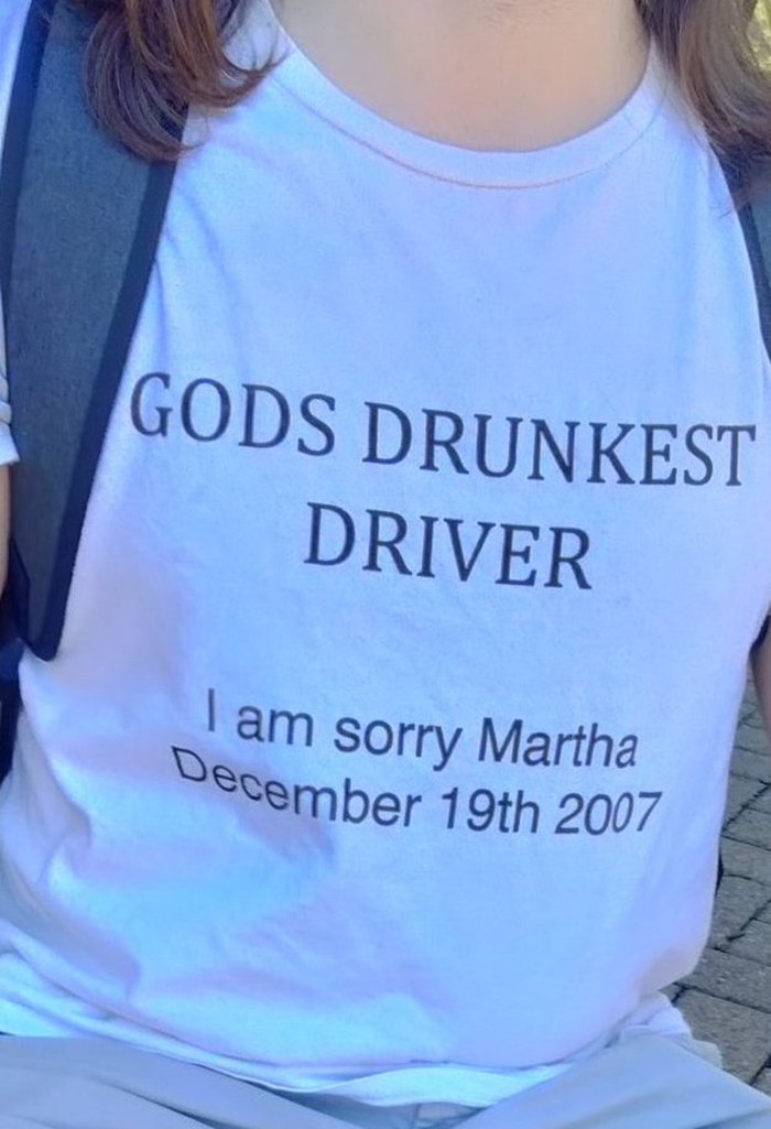
wow, that just sucked all the fun and funny out of this page, Dang..... this looks like one of those punishment shirts, cause it doesn't look like a memorial one...
I cannot convey with words just how much I *intensely* dislike this shirt.
There...there are more than two options here; You do know that, right? I feel very concerned you don't know that
A fair number of these are photoshopped. But I'm disturbed by some of the ones that aren't.
t-shirt had a mushroom cloud on it... caption: "It only takes one nuclear detonation to spoil your whole day"
A fair number of these are photoshopped. But I'm disturbed by some of the ones that aren't.
t-shirt had a mushroom cloud on it... caption: "It only takes one nuclear detonation to spoil your whole day"

 Dark Mode

 No fees, cancel anytime


