ADVERTISEMENT

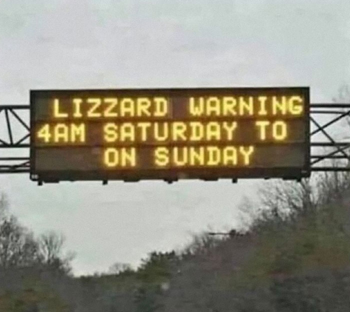
It’s common to see signs everywhere we go. The uninspired welcome board at the entrance of a restaurant, the classic ‘no smoking’ sign, or the black and white ones that say ‘park here’. But if you look around carefully, the world is full of silly signs that are anything but boring. And the r/signs subreddit is proof of that. This light-hearted online community shares some of the most entertaining signs out there. Below, we’ve compiled our favorite bizarre and witty signage from them. Keep scrolling to check out some eye-catching signs, and don’t forget to upvote the ones that make you smile.
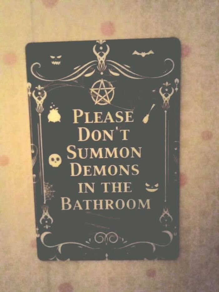
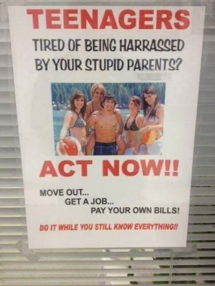
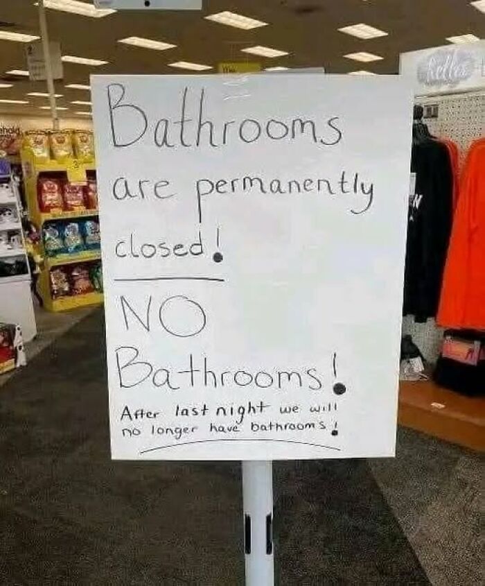
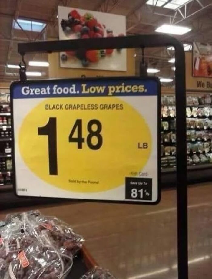
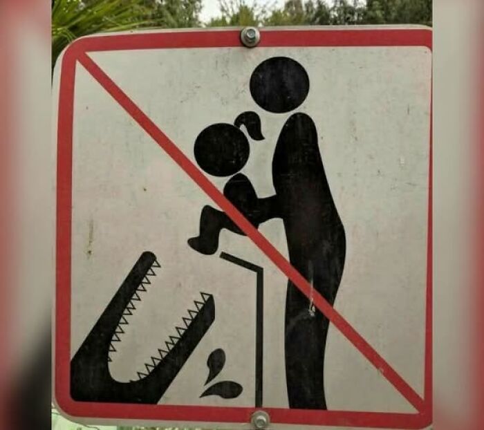
#2

Sign Local To Me

Sign Local To Me

pompousjunk Report

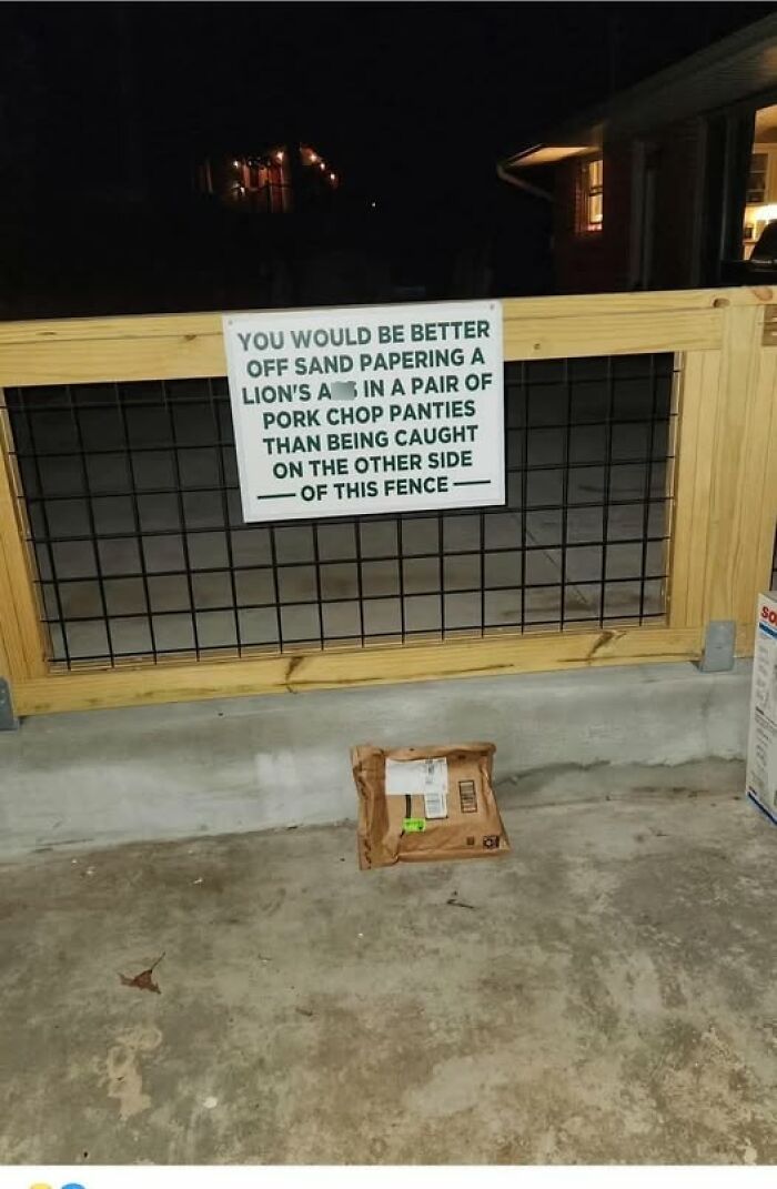
#3

Sorry

Sorry

ChrisMMatthews Report

Add photo comments
POST
Nicky
Community Member
5 months ago DotsCreated by potrace 1.15, written by Peter Selinger 2001-2017

This needs to be higher. (I once went to a zoo in Egypt and everyone was ignoring the white rhinos, zebras, lions, and giraffes but were crowded around one exhibit featuring a raccoon, an exotic animal from North America.)

View More Replies...
View more commentsArrow down menu

You will find signs not just in public spaces but also in businesses and even on roadways. While these signs provide us with all the details in a very unappealing way, it’s intriguing to see creative signs like these ones.

When you visit a park and need information about trails or picnic areas, all you need to do is look for a sign board indicating the name and distance of the spot. Similarly, they also point out the rules for activities such as swimming and fishing.

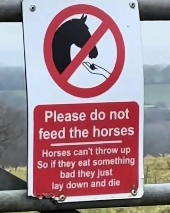
#4

GryphonSK Report

Add photo comments
POST
CaliCoast
Community Member
5 months ago DotsCreated by potrace 1.15, written by Peter Selinger 2001-2017

If I didn't already have a dog, I'd adopt one just so I could use this groomer!

View More Replies...
View more commentsArrow down menu
ADVERTISEMENT
#6

Understatement?

Understatement?

arcticbronco Report

For visitors and residents alike, being able to find clear directions and accurate opening and closing times is important. Regardless of their familiarity with the area, people might be able to navigate public spaces comfortably thanks to wayfinding signage.

These signs help tourists orient themselves, and locals might just discover new areas. In order to improve accessibility, signage can also include features like Braille and tactile elements to ensure that everyone can understand the information provided.

ADVERTISEMENT
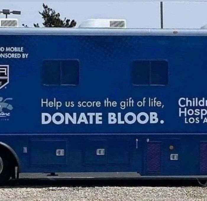
#9

Artist Unknown

Artist Unknown

Tosscraft Report

Add photo comments
POST
Simona M.
Community Member
5 months ago DotsCreated by potrace 1.15, written by Peter Selinger 2001-2017

Smart owner saved a lot of money by printing that little sign. Very smart🙂👍

View More Replies...
View more commentsArrow down menu

A blog by the Merson Group, who are known for place branding and digital signage, points out the significance of signage being consistent and clear. They mention that popular points of interest, such as historical monuments, should be precisely signposted.

ADVERTISEMENT

For instance, there should be interesting signs alongside heritage buildings sharing details about the site. According to them, signage can be integrated to pay homage to a city’s past.

#11

Good Neighborhood

Good Neighborhood

lostproton Report

#12

RedditRocks2021 Report

Add photo comments
POST
AlienatedCheeseStick
Community Member
5 months ago DotsCreated by potrace 1.15, written by Peter Selinger 2001-2017

I would, if I liked coffee… and if my ADHD brain would actually let caffeine keep me awake instead of almost knocking me out lol

Jaya
Community Member
5 months ago DotsCreated by potrace 1.15, written by Peter Selinger 2001-2017

Plot twist: every customer after drinking: "The Tripadvisor woman tried to warn me, why didn't I listen?"

stephanie gillies
Community Member
5 months ago DotsCreated by potrace 1.15, written by Peter Selinger 2001-2017

I didn’t say it was the worst coffee I had in my life, I said it was the worst tea I had in my life. It tasted exactly like coffee.

ConservaDave
Community Member
5 months ago DotsCreated by potrace 1.15, written by Peter Selinger 2001-2017

Tripadvisor should change its name to TrippinAdvisor. That would explain everything.

Catharina Geerts
Community Member
5 months ago DotsCreated by potrace 1.15, written by Peter Selinger 2001-2017

I might be asking why that lady said it was the worst coffee. Was it too strong? Or just the opposite? I like coffee, but not all sorts. For many years, I hated espresso, and still I can only drink it if I'm in the mood for it, e.g. after a copious meal.

Mary Peace
Community Member
5 months ago DotsCreated by potrace 1.15, written by Peter Selinger 2001-2017

Did the woman leave the rest of her coffee on the counter then?

Maria Maria
Community Member
5 months ago DotsCreated by potrace 1.15, written by Peter Selinger 2001-2017

Jokes aren't funny if you tell the same joke twice. This is a ripoff of a pizza place in Reykjavik, Iceland.

Papa
Community Member
5 months ago DotsCreated by potrace 1.15, written by Peter Selinger 2001-2017

How do you know the sign in Iceland isn't a ripoff of this one?

Load More Replies...
ShaZam
Community Member
5 months ago DotsCreated by potrace 1.15, written by Peter Selinger 2001-2017

Yes, I would love to do that ... Next, I want to try outdated milk to see if it's ok.

Kaedyn Walsh
Community Member
5 months ago (edited) DotsCreated by potrace 1.15, written by Peter Selinger 2001-2017

The sign means that they get rave remarks about their coffee so they're making fun of the person who didn't. Also (at least in the usa) milk is perfectly fine a week or so past its due date. Some say up to 2 weeks. I can vouch for that but I start feeling very iffy after 8 days past tbh. I'm sniffing the jug soon as the lid comes off, haha

Load More Replies...
View More Replies...
View more commentsArrow down menu

In the retail space, unique messages on sign boards help attract walk-in customers. People can also know about sales, discounts, and deals that a shop offers. For instance, when you visit a mall, you see a sign on a store that says, "Warning: trying on clothes may lead to unexpected purchases." Reading such ingenious signs may instantly put a smile on your face.

#13

The Ultimate Six Word Story

The Ultimate Six Word Story

hechima_tawashi Report

ADVERTISEMENT

Attractive signs not only help brands create a lasting impression but also encourage shoppers to visit their store. When designed properly, they help people get an idea of what to expect from your shop.

For small businesses, signs help create awareness by letting customers know what products and services you offer.

#16

Absolutely No Parking

Absolutely No Parking

irblrb84 Report

#17

Barber Shop Sign Tells It Like It Is

Barber Shop Sign Tells It Like It Is

micasa_es_miproblema Report

#18

My Local DQ

My Local DQ

reddit.com Report

Add photo comments
POST
Watermelon
Community Member
5 months ago DotsCreated by potrace 1.15, written by Peter Selinger 2001-2017

I read "Scream 'Daddy' until he stops the car." Interpret this any way you would like to.

View More Replies...
View more commentsArrow down menu

On the other hand, signs that are badly designed turn customers away. They are either confusing or just plain ugly. To begin with, they might have poor fonts, making it nearly impossible for people to read them. The color combinations could also spoil the way signs turn out. Imagine using a white font on a white background.

ADVERTISEMENT

The worst ones are the signs that lack crucial information. If you are looking at a bookstore’s sign, you would want to see their opening hours. Signs that don’t reflect the company’s overall visual branding don’t leave a good impression.

#19

Hes An Optimist

Hes An Optimist

Devistator16 Report

#20

He Sleeps With His Legs In The Air

He Sleeps With His Legs In The Air

Conscious_Valuable90 Report

Add photo comments
POST
Ray Ceeya (RayCeeYa)
Community Member
5 months ago DotsCreated by potrace 1.15, written by Peter Selinger 2001-2017

I'm not sure which is more confusing. The message on the sign or the complete lack of font consistency.

View More Replies...
View more commentsArrow down menu
#21

They Don't Like Americans Very Much

They Don't Like Americans Very Much

lostproton Report

Businesses can use different types of signs to make their establishment stand out. It’s all about getting creative these days. Imagine that you are passing by a restaurant that has illuminated signs: the ones that use lighting elements such as LEDs or neon tubes. They will not only attract attention during the day, but they will also increase visibility during the night. Some billboards also have illuminated signs.

ADVERTISEMENT

Another unique selling point could be pylon signs. You can usually find these tall displays near roadways or highways. They include names and logos and are often used to advertise shopping centers or new attractions in town.

See Also on Bored Panda

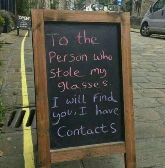
Restaurants, cafes, and bars can also use outdoor signage to attract more customers. They can use puns and make vibrant drawings on sidewalk signs using chalkboards. Imagine you are having a stressful day and you suddenly see a sign that reads, 'Our cafe is a latte fun—come sip, relax, and enjoy!'. Chances are, you might go in to unwind and have a cup of cappuccino. Owners should make sure to place the signage where it is visible to as many passersby as possible.

ADVERTISEMENT

While we are used to seeing signs that convey important messages, provide directions, and ensure safety, there are also these unique ones that are either very clever or just bizarre or hilarious. When advertising and sales teams put effort into creating quirky signs, they often stand out.

Many brands even use their logos on sign boards. For instance, the iconic golden arches are the primary signage for McDonald's restaurants all over the world.


#25

Found This In A Toilet In Japan

Found This In A Toilet In Japan

lu_c_fur Report

Add photo comments
POST
Sky Render
Community Member
5 months ago DotsCreated by potrace 1.15, written by Peter Selinger 2001-2017

To be fair, it's not unheard-of for someone from Japan to have never seen a sitter toilet. The standard model in many places is a squatter!

View More Replies...
View more commentsArrow down menu

Not all signs are meant to serve a purpose. Many of these weird signs defy logic and common sense. But they surely make you smile. Whether it’s a genuine mistake or a carefully drafted sign, these posts remind you how a little creativity goes a long way.

ADVERTISEMENT

Which one of these signs do you want to see in person? Tell us about hilarious sign boards in your neighborhood!

#29

Guess We Go Naked

Guess We Go Naked

thatlady729 Report

#30

Figured It Fit Here

Figured It Fit Here

goblinoidfleshbag Report

Note: this post originally had 57 images. It’s been shortened to the top 30 images based on user votes.