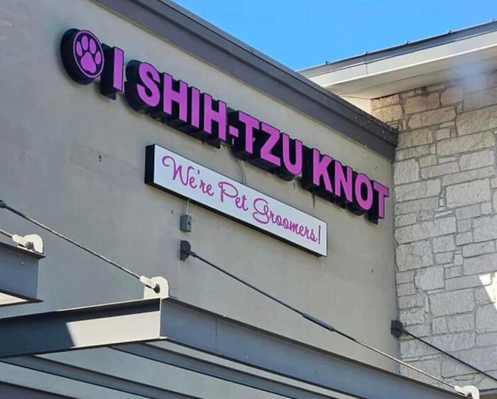
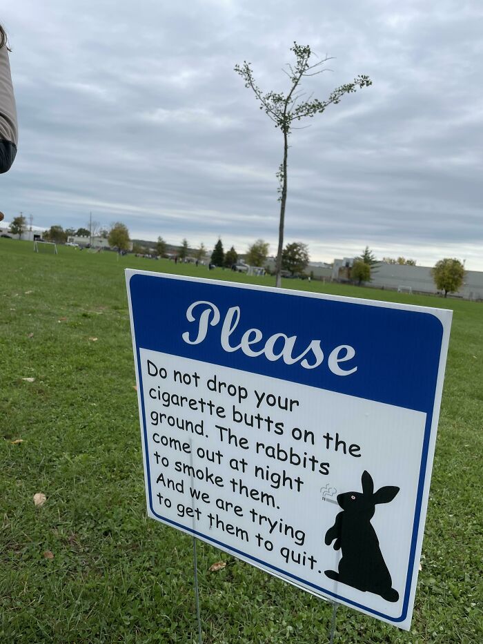
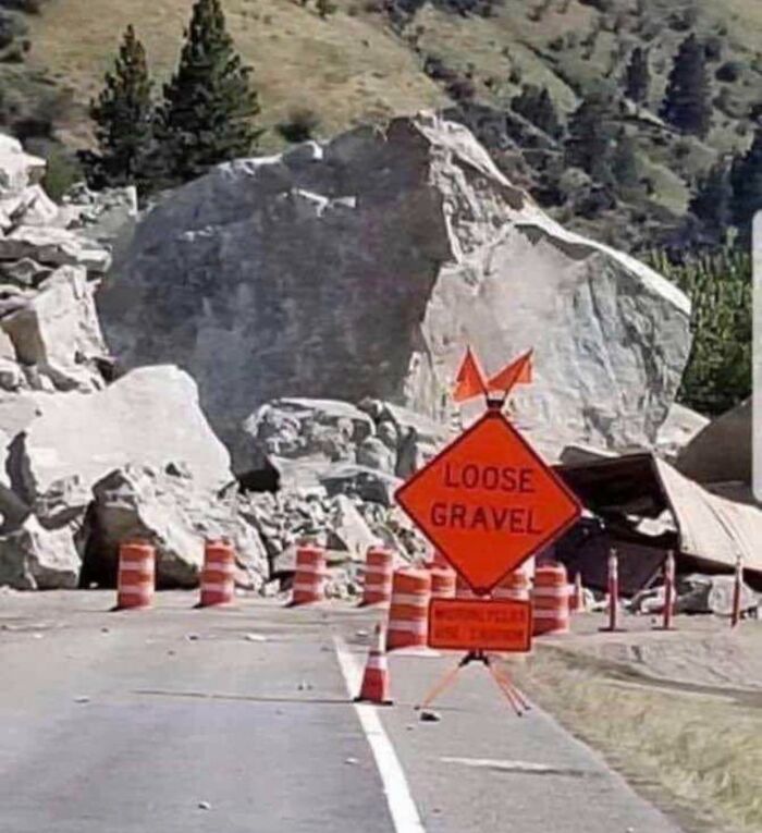
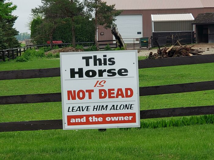
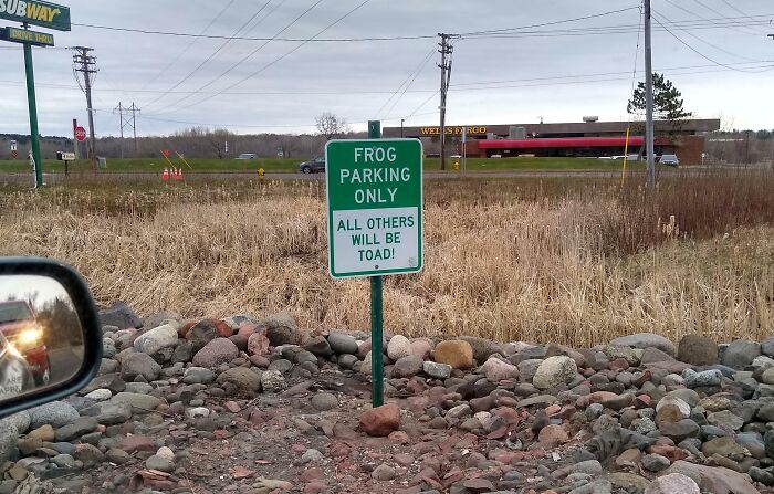
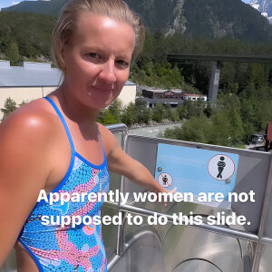
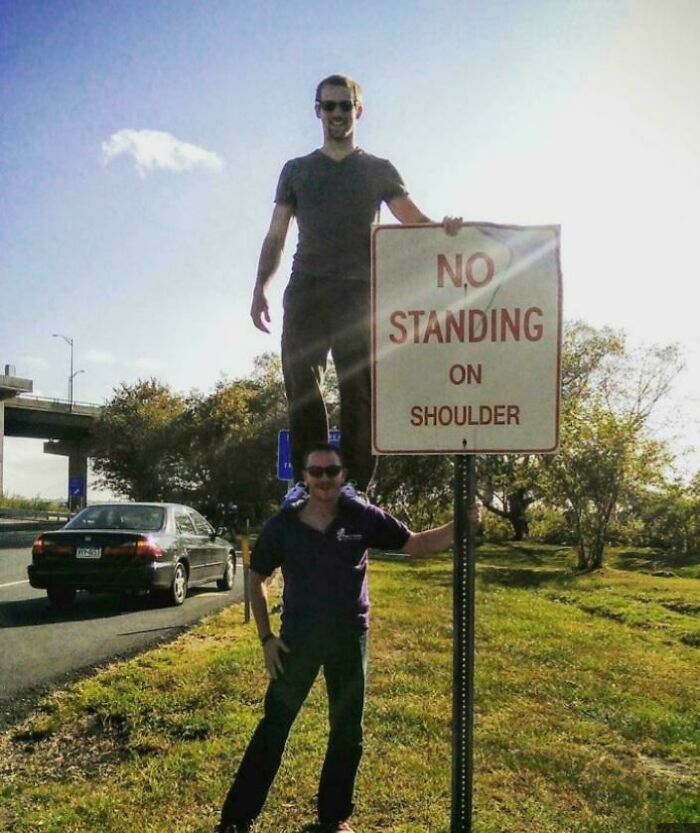
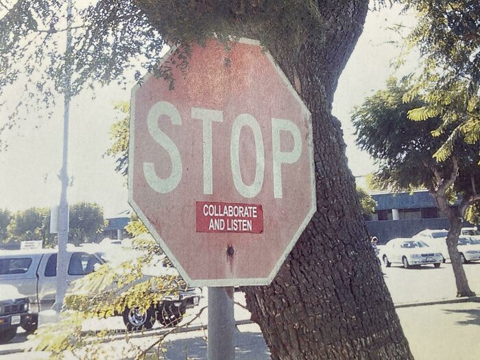
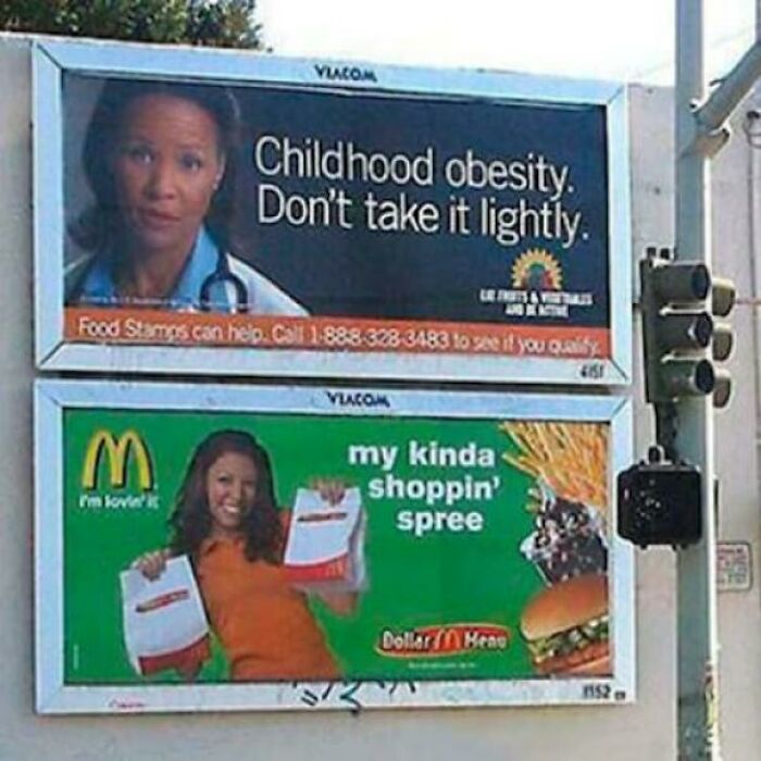
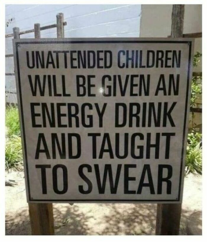
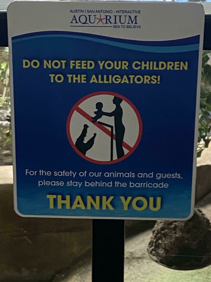
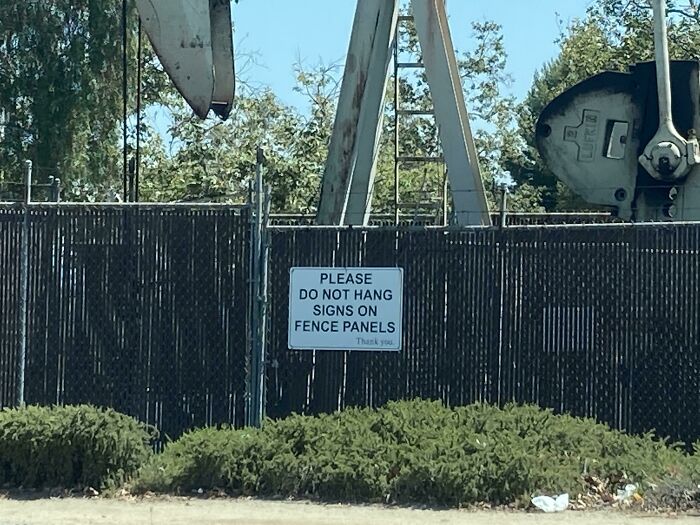
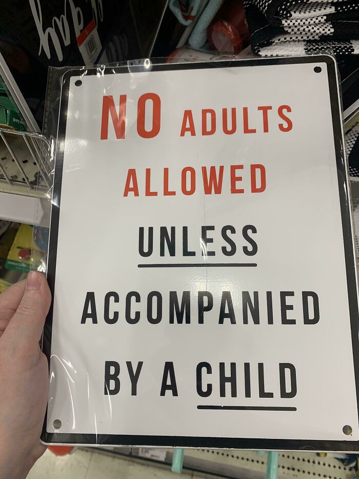
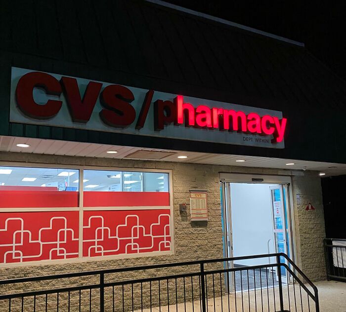
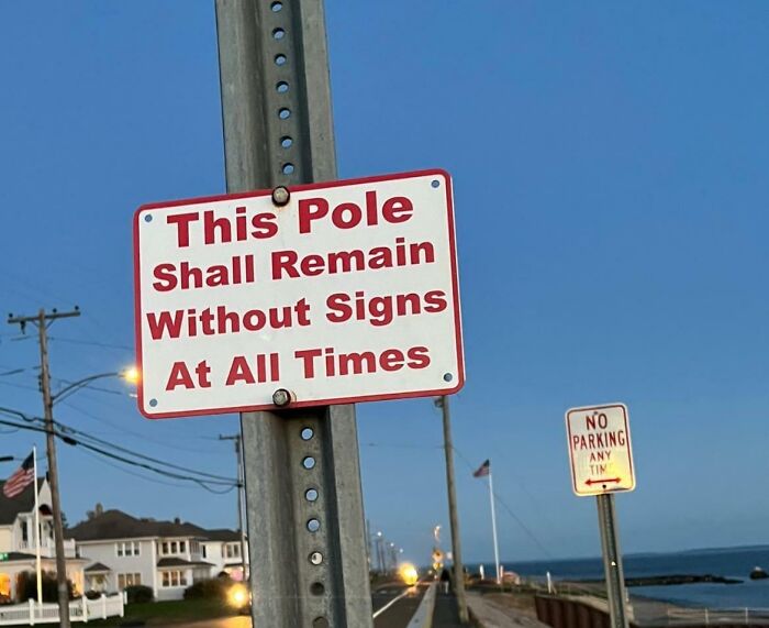
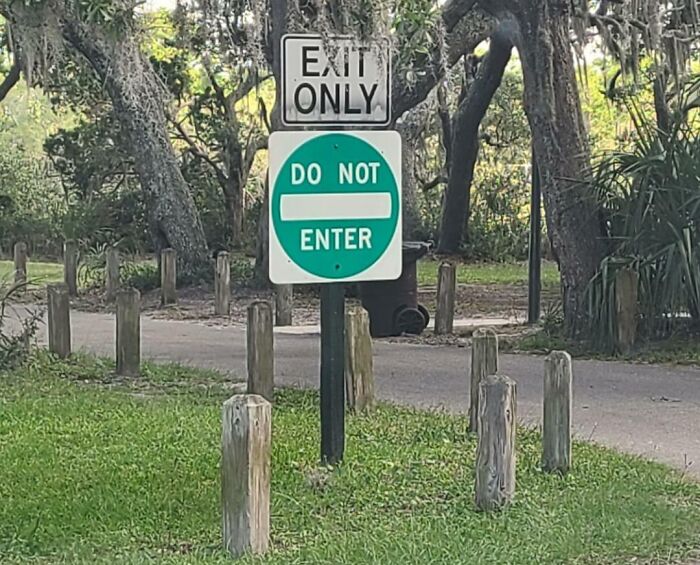
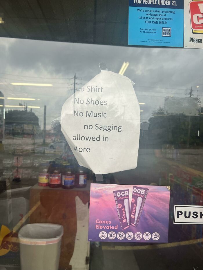
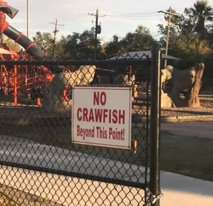
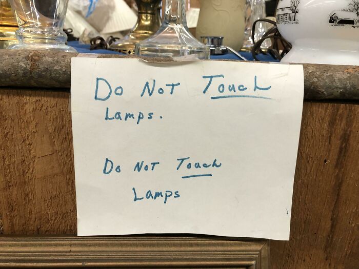
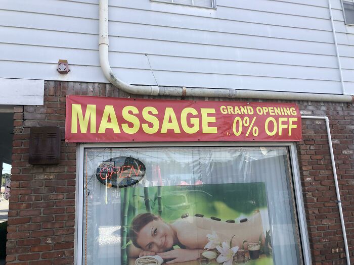
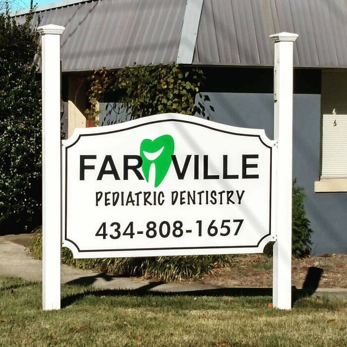
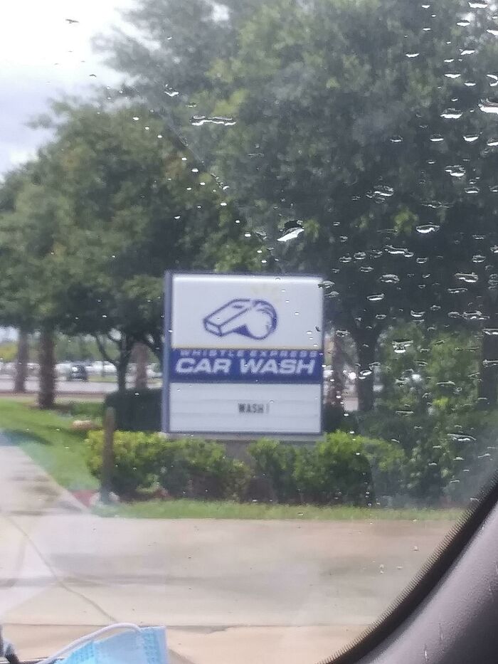
It’s common to see signs everywhere we go. The uninspired welcome board at the entrance of a restaurant, the classic ‘no smoking’ sign, or the black and white ones that say ‘park here’. But if you look around carefully, the world is full of silly signs that are anything but boring. And the r/signs subreddit is proof of that. This light-hearted online community shares some of the most entertaining signs out there. Below, we’ve compiled our favorite bizarre and witty signage from them. Keep scrolling to check out some eye-catching signs, and don’t forget to upvote the ones that make you smile.
This post may include affiliate links.
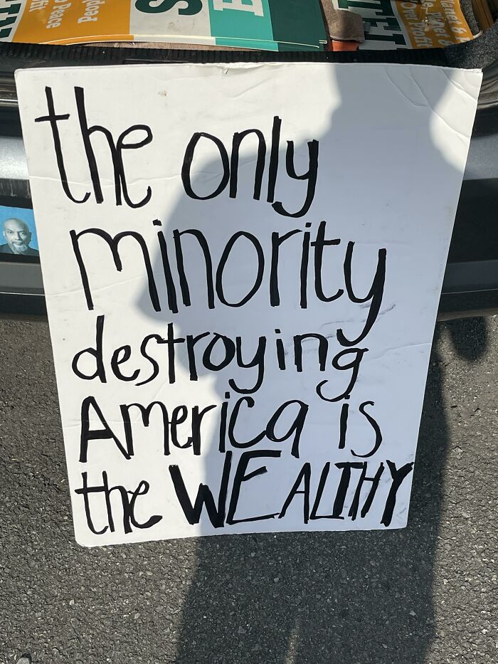
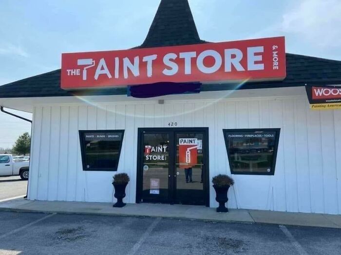
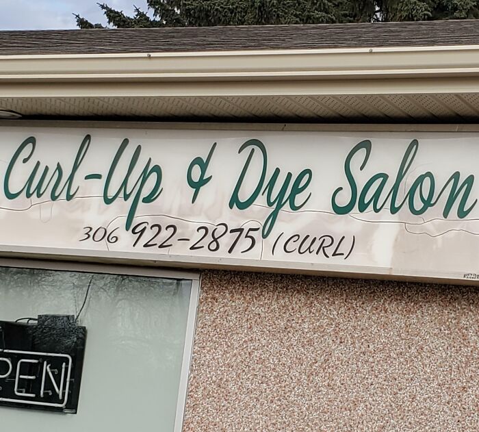
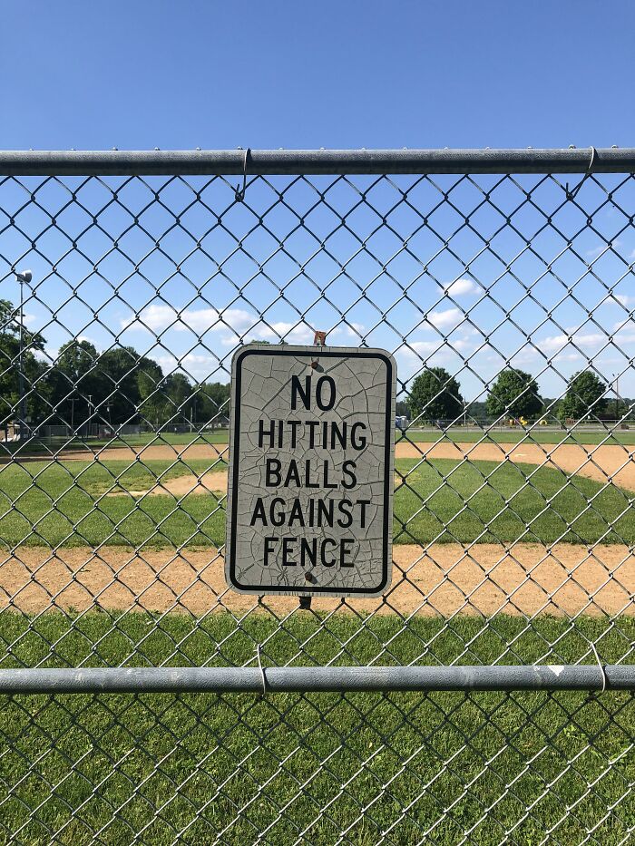
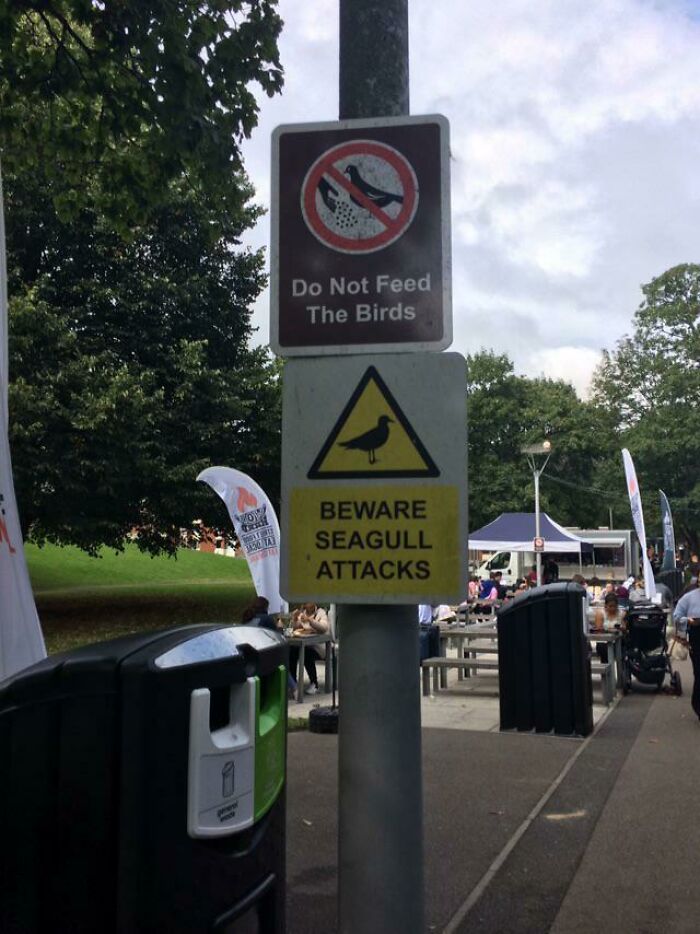
Found In Abandoned Car
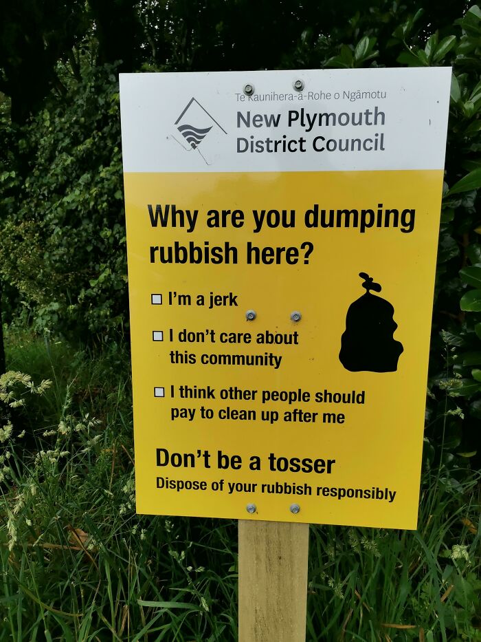
Sign Local To Me
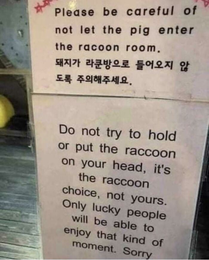
Sorry
You will find signs not just in public spaces but also in businesses and even on roadways. While these signs provide us with all the details in a very unappealing way, it’s intriguing to see creative signs like these ones.
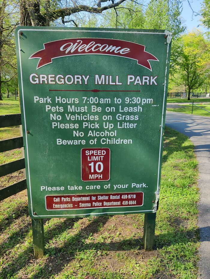
When you visit a park and need information about trails or picnic areas, all you need to do is look for a sign board indicating the name and distance of the spot. Similarly, they also point out the rules for activities such as swimming and fishing.
That’s One Way To Look At It
Understatement?
For visitors and residents alike, being able to find clear directions and accurate opening and closing times is important. Regardless of their familiarity with the area, people might be able to navigate public spaces comfortably thanks to wayfinding signage.
These signs help tourists orient themselves, and locals might just discover new areas. In order to improve accessibility, signage can also include features like Braille and tactile elements to ensure that everyone can understand the information provided.
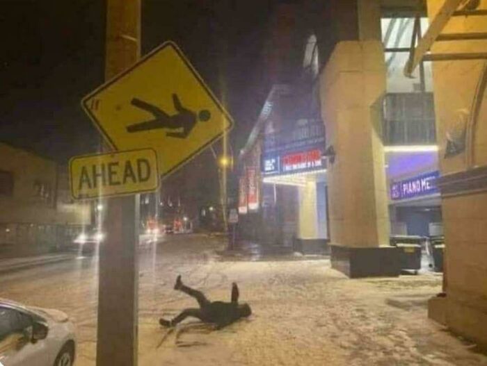
Man Down Ahead
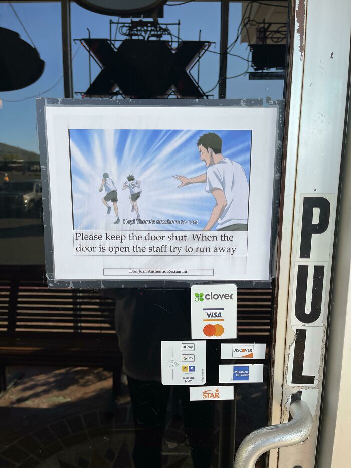
Kidnapped Employees
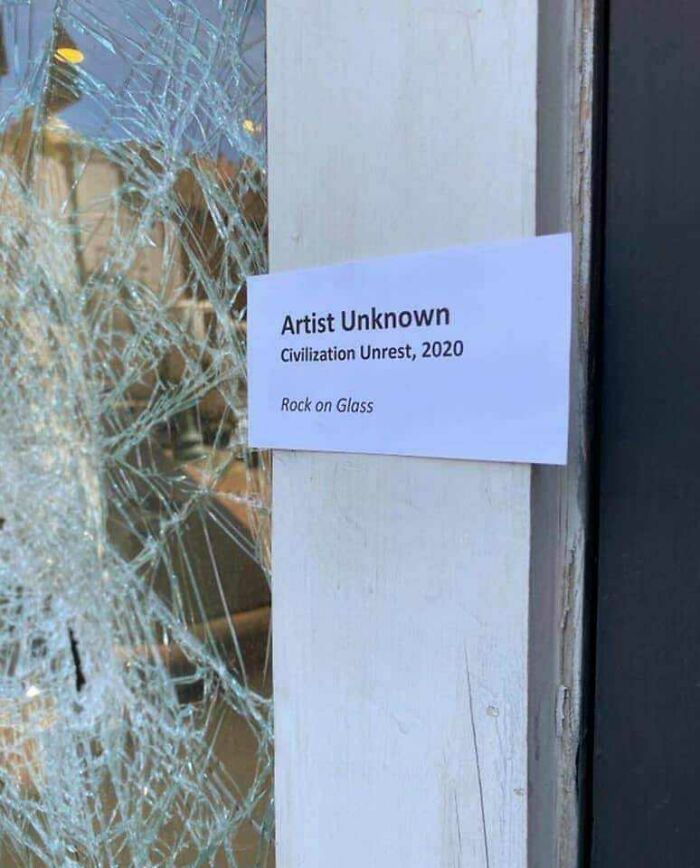
Artist Unknown
A blog by the Merson Group, who are known for place branding and digital signage, points out the significance of signage being consistent and clear. They mention that popular points of interest, such as historical monuments, should be precisely signposted.
For instance, there should be interesting signs alongside heritage buildings sharing details about the site. According to them, signage can be integrated to pay homage to a city’s past.
Perfect Instead Of "Beware Of Dog"
Good Neighborhood
I would, if I liked coffee… and if my ADHD brain would actually let caffeine keep me awake instead of almost knocking me out lol
In the retail space, unique messages on sign boards help attract walk-in customers. People can also know about sales, discounts, and deals that a shop offers. For instance, when you visit a mall, you see a sign on a store that says, "Warning: trying on clothes may lead to unexpected purchases." Reading such ingenious signs may instantly put a smile on your face.
The Ultimate Six Word Story
Hm
Oh Oh
Attractive signs not only help brands create a lasting impression but also encourage shoppers to visit their store. When designed properly, they help people get an idea of what to expect from your shop.
For small businesses, signs help create awareness by letting customers know what products and services you offer.
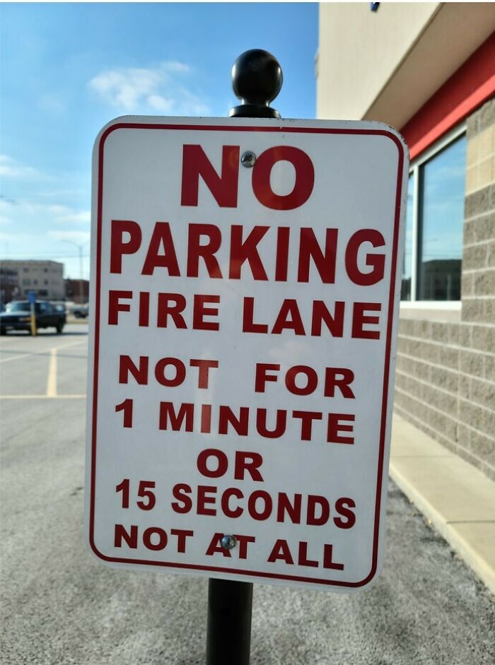
Absolutely No Parking
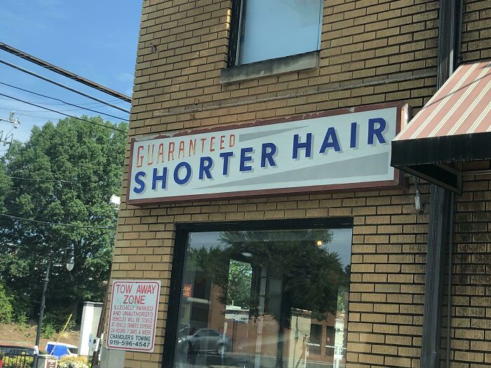
Barber Shop Sign Tells It Like It Is
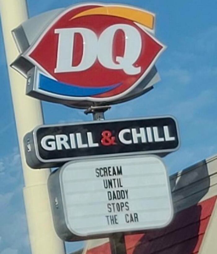
My Local DQ
I read "Scream 'Daddy' until he stops the car." Interpret this any way you would like to.
On the other hand, signs that are badly designed turn customers away. They are either confusing or just plain ugly. To begin with, they might have poor fonts, making it nearly impossible for people to read them. The color combinations could also spoil the way signs turn out. Imagine using a white font on a white background.
The worst ones are the signs that lack crucial information. If you are looking at a bookstore’s sign, you would want to see their opening hours. Signs that don’t reflect the company’s overall visual branding don’t leave a good impression.
Hes An Optimist
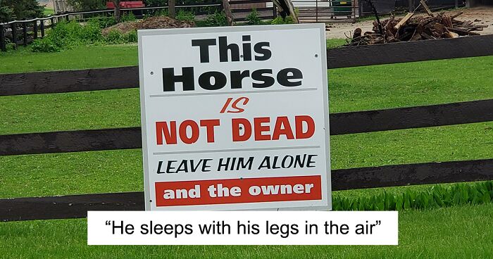
He Sleeps With His Legs In The Air
I'm not sure which is more confusing. The message on the sign or the complete lack of font consistency.
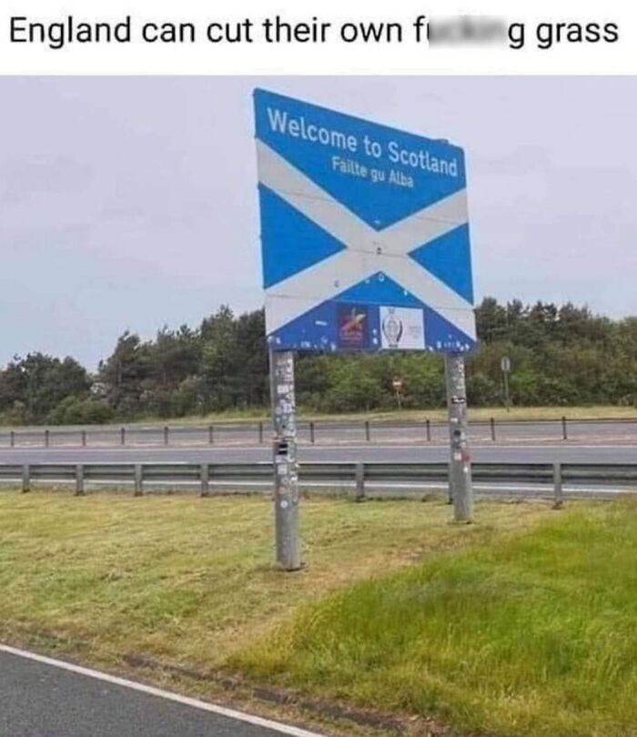
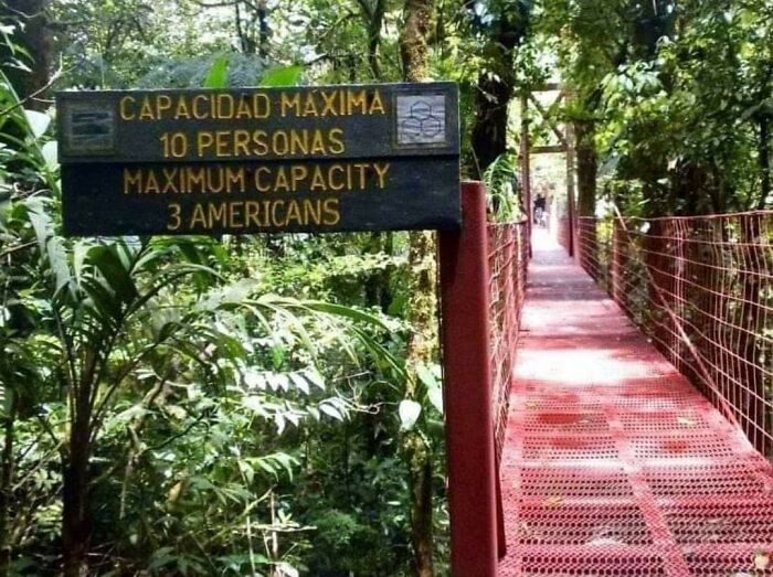
They Don't Like Americans Very Much
Businesses can use different types of signs to make their establishment stand out. It’s all about getting creative these days. Imagine that you are passing by a restaurant that has illuminated signs: the ones that use lighting elements such as LEDs or neon tubes. They will not only attract attention during the day, but they will also increase visibility during the night. Some billboards also have illuminated signs.
Another unique selling point could be pylon signs. You can usually find these tall displays near roadways or highways. They include names and logos and are often used to advertise shopping centers or new attractions in town.
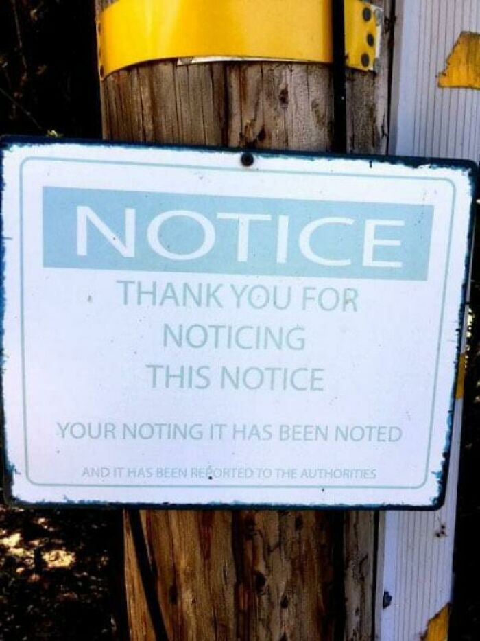
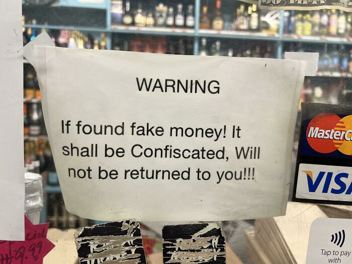
Notice
This Is In The Drive Through At My Local Dairy Queen
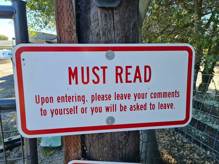
Must Read
Putting this comment here, I am not leaving this to myself.
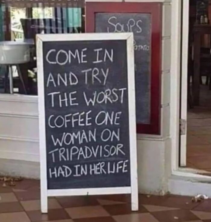
Restaurants, cafes, and bars can also use outdoor signage to attract more customers. They can use puns and make vibrant drawings on sidewalk signs using chalkboards. Imagine you are having a stressful day and you suddenly see a sign that reads, 'Our cafe is a latte fun—come sip, relax, and enjoy!'. Chances are, you might go in to unwind and have a cup of cappuccino. Owners should make sure to place the signage where it is visible to as many passersby as possible.
While we are used to seeing signs that convey important messages, provide directions, and ensure safety, there are also these unique ones that are either very clever or just bizarre or hilarious. When advertising and sales teams put effort into creating quirky signs, they often stand out.
Many brands even use their logos on sign boards. For instance, the iconic golden arches are the primary signage for McDonald's restaurants all over the world.
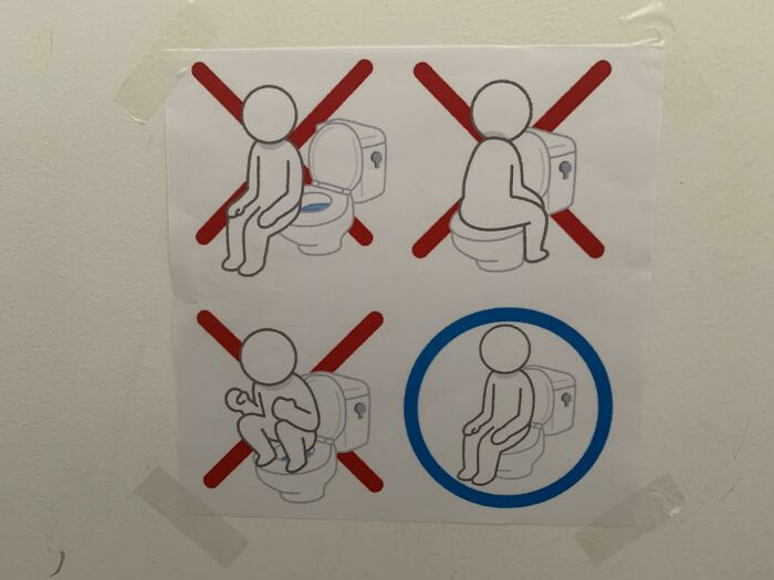
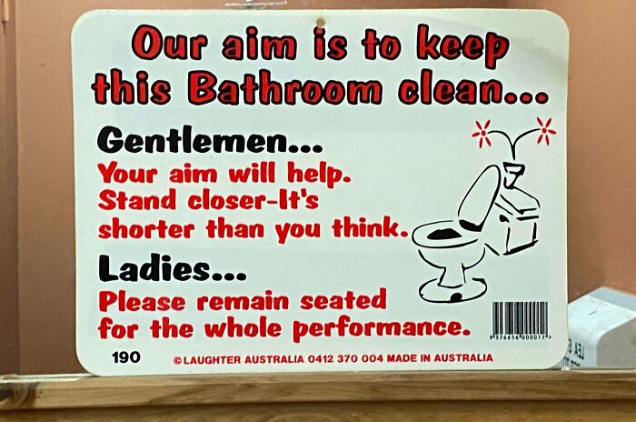
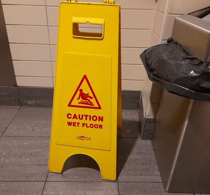
Found This In A Toilet In Japan
To be fair, it's not unheard-of for someone from Japan to have never seen a sitter toilet. The standard model in many places is a squatter!
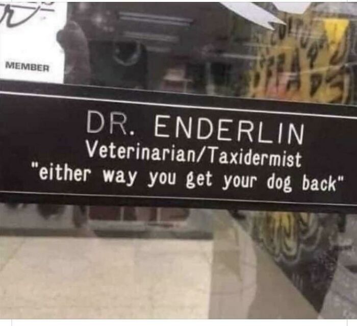
Efficient Business
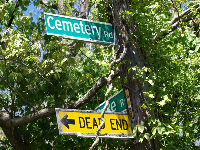
Deadend
Not all signs are meant to serve a purpose. Many of these weird signs defy logic and common sense. But they surely make you smile. Whether it’s a genuine mistake or a carefully drafted sign, these posts remind you how a little creativity goes a long way.
Which one of these signs do you want to see in person? Tell us about hilarious sign boards in your neighborhood!
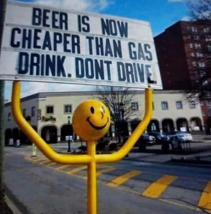
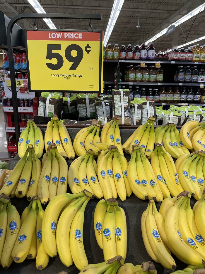
Long Yellow Things
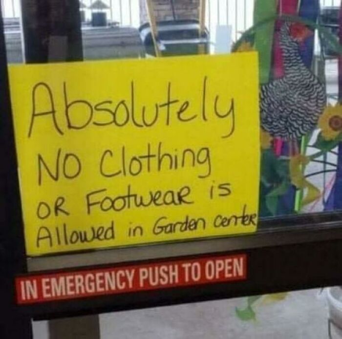
Guess We Go Naked
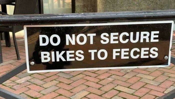
Figured It Fit Here
this has to be my favorite sign in the entire world. Spotted near Lake Tahoe Nevada: Stop! We Beat Everybody! we_beat_ev...242bd7.jpg 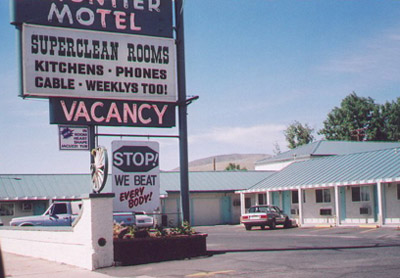
Most of these were just cool, funny and true, not 'logic defying' or 'against common sense'
Not funny at all, but still post-worthy. The hippo warning is for folks to stay clear when they have a potty break...it ends up spraying for more distance than you think! Funny-sign...d897b3.jpg 
A sign on a county road out side of lake havàsu city in Arizona read "Caution" "Slow children" "Playing" "In road with" "No shoulders" I do wish I still had the picture of the sign,. The image that it creates I wish I could get rid of that Those poor slow shoulderless children forced to play in The road
The sale price vs regular on this chicken: chicken-ok...c99aba.jpg 
this has to be my favorite sign in the entire world. Spotted near Lake Tahoe Nevada: Stop! We Beat Everybody! we_beat_ev...242bd7.jpg 
Most of these were just cool, funny and true, not 'logic defying' or 'against common sense'
Not funny at all, but still post-worthy. The hippo warning is for folks to stay clear when they have a potty break...it ends up spraying for more distance than you think! Funny-sign...d897b3.jpg 
A sign on a county road out side of lake havàsu city in Arizona read "Caution" "Slow children" "Playing" "In road with" "No shoulders" I do wish I still had the picture of the sign,. The image that it creates I wish I could get rid of that Those poor slow shoulderless children forced to play in The road
The sale price vs regular on this chicken: chicken-ok...c99aba.jpg 

 Dark Mode
  No fees, cancel anytime


