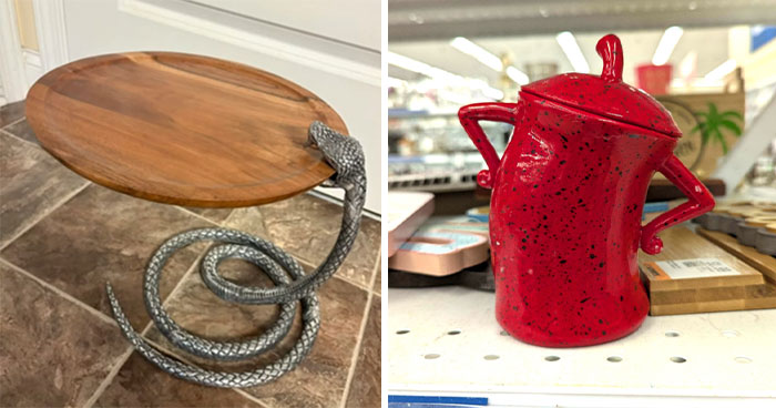
I guess it's safe to say no designer (or anyone else) wants to see their work shamed on the Internet. But to have it featured on the subreddit r/CrappyDesign you must've really done something wrong.
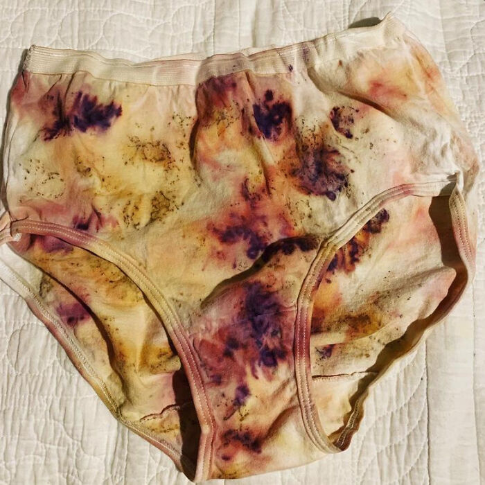
Maybe you created plant-dyed underwear that looks like it has just gone through a messy disaster. Or maybe you decided to use Comic Sans and useless quotation marks on actual police cars. Point is, if a picture of something you made ended up going viral in this online community, it wasn't by accident.
Continue scrolling and check out the times designers messed up so mad, it's like they don't even know how to use common sense! After you're done, fire up Bored Panda's earlier pieces on sub-par design here, here, and here. They're just as good. Err, I mean, bad. You get the idea.
This post may include affiliate links.
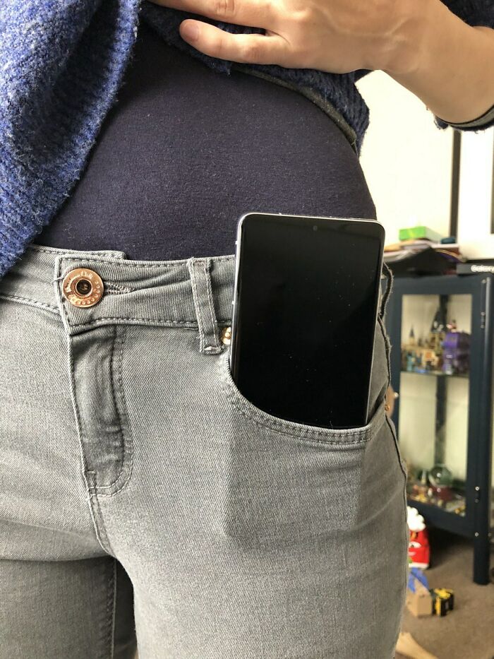
The Pockets On Women's Trousers
They say that the purse industry is behind this, to have women buy purses because their pocket won't fit anything.
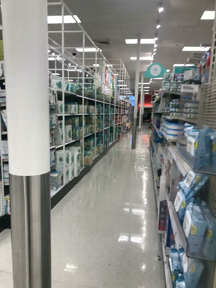
I Was Having A Good Day Until I Went To The Supermarket
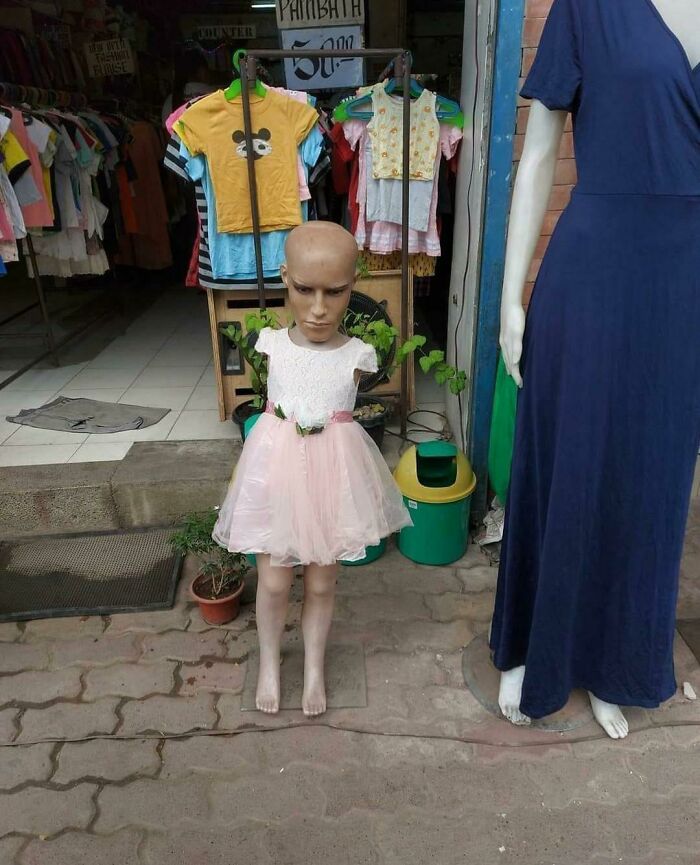
This Kid Mannequin
When Bored Panda reached out to Crappy Design's community to learn a bit more about the community, one of its moderators said "the original motivation for the subreddit was to point out [bad] designs. Nowadays, most subscribers probably come here for entertainment. However, it is common to have a meaningful discussion here on why or why not something is crappy design."
The subreddit was created back in 2011 and it currently has over 2.5 million members. On Reddit, that's a lot.
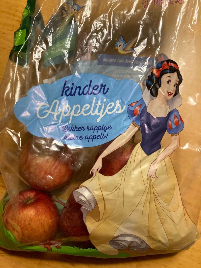
A Bag Of Apples With A Character On It That Got Poisoned By An Apple
One Armed Mother And A Demon Child
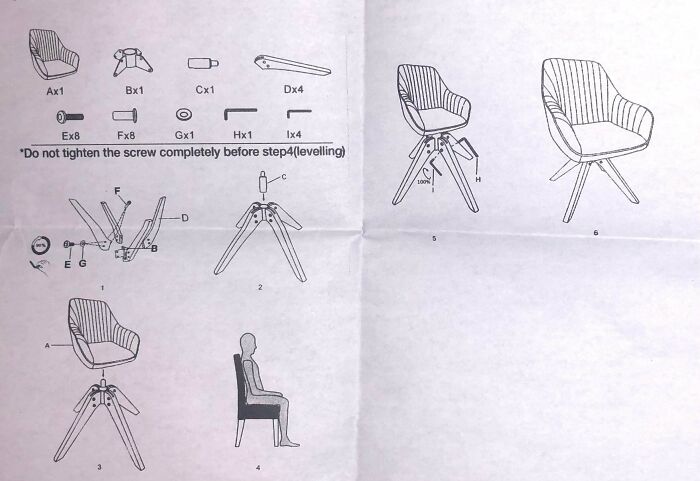
Step 4: Just Go Sit In Some Other Chair
Akshayta Rao writes that we all intuitively notice badly designed items but find it difficult to explain why good designs are, well, good. According to her, a well-known example of bad design would be USB cables. And it's hard to argue with her—we’ve all tried plugging them in the wrong way more than once. Some of us maybe even hundreds of times.
The Interaction Design Foundation explains that bad designs are overloaded with information and force the user to do more work than is necessary.
This One Was A Real Brain Teaser
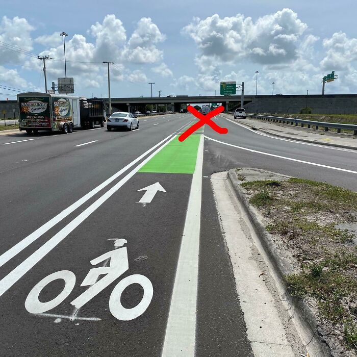
Our Municiplaity Made Bike Lanes For Us Finally!
My High School Commissioned A Bulldog Statue! This Is The Result
According to a spokesperson of BeraTek Industries, a company with expertise in design, prototyping, and manufacturing, there are 5 characteristics that (in their opinion) define a bad product design.
The design is not self-explanatory. "Of all things a design could do wrong, this is possibly the worst," the BeraTek Industries representative writes.
"Customers should be able to, fairly quickly, determine what the product is and does and how to use it. Long instruction manuals are necessary from a technical standpoint, but a product should strive to be as intuitive as possible. Some products are designed with too many unnecessary features which detract from the product’s primary use and user-friendliness. If a product is not self-explanatory enough, it will do more harm than good in the consumer’s eye."
Hey High School Bulldog, Meet My High School Wildcat
At least the bulldog sort of looked like a bulldog...
Load More Replies...After budget cuts they let the kindergarten class make the mascot as an art project.
W-T-Freak? I'm not in high school and the wildcat in my school looks better than whatever that "wildcat" is.
Maybe the same artist, as the one who created the bulldog statue?
As a teacher, I can say that we also have ugly animals all over our campus. The ugliest one is in my hallway. I'm told it was the artist's first one that she painted....... it looks like a panda in a carnival mirror.
When mom says the guests are gone and I can finally be a resident of my own house again
FFFFFFFFFFFFFFFFFFFFFFFFFFFFFFFFFFFFFFFFFFFFFFFFFFFFFFFFFFFFFFFFFFFFFFFFFFFFFF
Looks like the middle age drawing of a large cat & that taxidermy lion. "Yea I totally know what a wildcat looks like...."
I thought it was a giant muscular rat... or maybe something from Ghostbusters
Toilet Seat Makes It Looks Like Someone Didn't Quite Make It
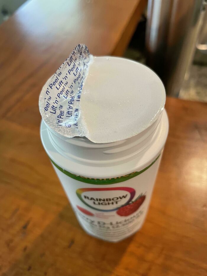
These Pull Tabs That Never Come Off
The design is distracting. Yes, a captivating design is always a good thing, but there is a difference between captivating and distracting. "A distracting design tries too hard to capture the user’s eye. Instead of seamlessly integrating itself into the user’s life, it is constantly calling out for attention through obnoxious aesthetics or arbitrary functionality. The designs which pleasantly impact consumers subconsciously are generally better than those which impact consciously," the spokesperson explains.
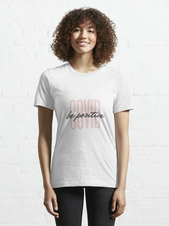
Be Positive?
These Benches At My University Are Tilted Back And Have No Drainage System, So The Water Just Sits There For Up To Days After A Rainstorm
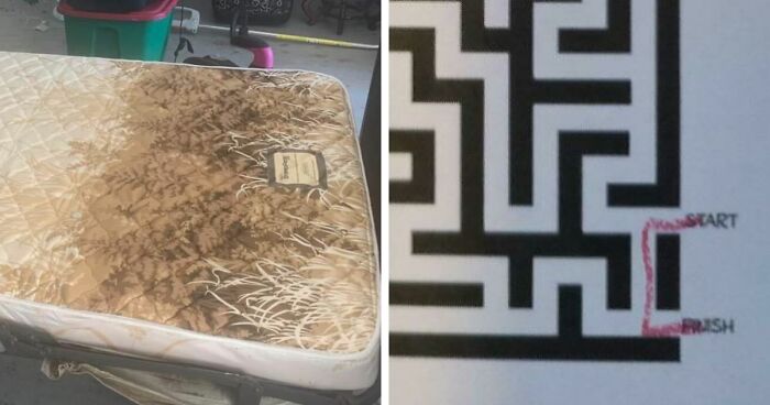
I Thought It Was A Horribly Stained Mattress Until I Focused On The Details
The design is difficult to use. This characteristic differentiates from the first one in that it may be an intuitive product, but the actual act of using it is difficult.
"The coffee mug in the accompanying photo has a small 'handle' that not only looks nearly impossible to grip comfortably, but also has a groove which allows hot coffee to flow freely towards your fingers. Ergonomics is a key factor in well-designed products. If a user cannot physically connect with a product in a satisfying manner, that product is a bad design."
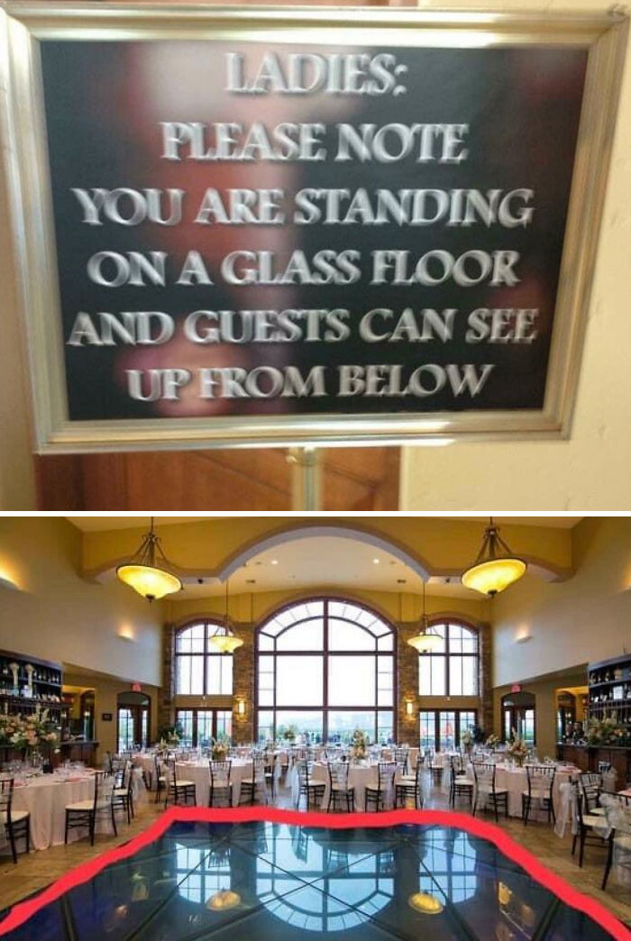
Ballroom Where Everyone Downstairs Can See Up Your Skirt
Plant Dyed Underwear On Etsy
I Wonder How Many People Have Backed Into This Fire Hydrant
The design is forgettable. "How often do you use badly designed products? Probably not very often because that product has been sitting in the back of your closet since you got it," the BeraTek Industries representative says. "Whether it be poor aesthetics or mediocre performance, thousands of products fall into the same forgettable trap. Instead of being a product that is useful or enjoyable to use, these products are so bland or useless that they leave no psychological impression on the user. Product design heavily relies on psychology, and the connection humans have with objects."
"To leave no psychological impression at all is to almost not even exist."
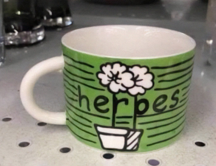
It’s Supposed To Say “Heroes” Lol
I thought it tried for 'herbes' (e.g. correct french for herbs), with the plants (which aren't herbs, but closer than heroes)!
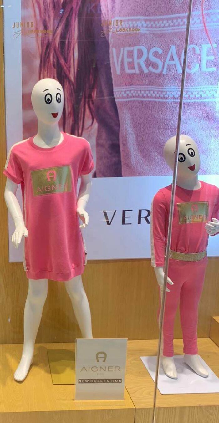
These Mannequin Faces That Look Like They Want To K*ll You
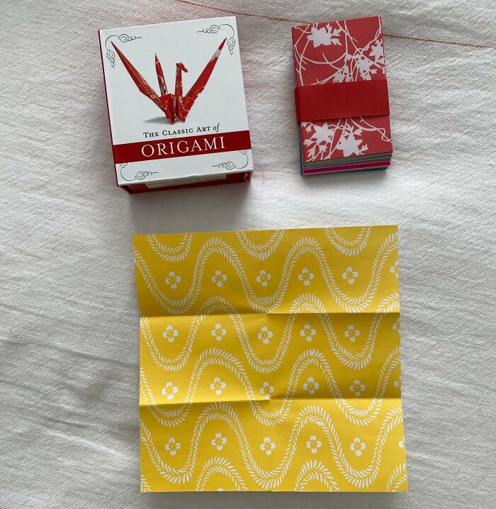
Origami Kit Where The Paper Has Already Been Folded To Fit In The Box
The design is short-lived. Industry professionals measure a design's quality not only by aesthetics and usefulness but also by its lifespan.
"A bad design will have faults which render it useless quicker than a consumer would like. Many companies will purposely design products this way through planned obsolescence, however, I believe this is the wrong way to approach product design. My favorite products to use are ones that I have inherited from family or have been in my possession for years and still perform as well as when they were first bought. I believe the best products are those which can be used for a lifetime."
No design is perfect. But some are obviously crappier than others.
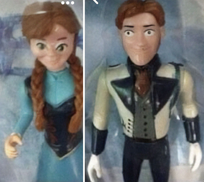
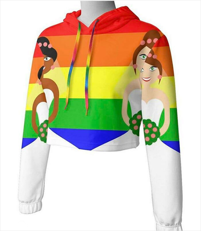
Anna Had A Bit Too Much Botox And Hans Has Seen Some Stuff. Wouldn’t You Agree?
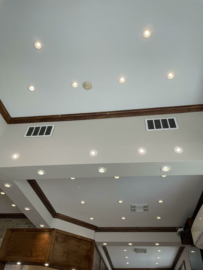
10 Year Old Me Lighting Up Any Room In The Sims
Lol Yes! But my sims only had the ceiling lights with fans, so lots of simulated breezes 😂
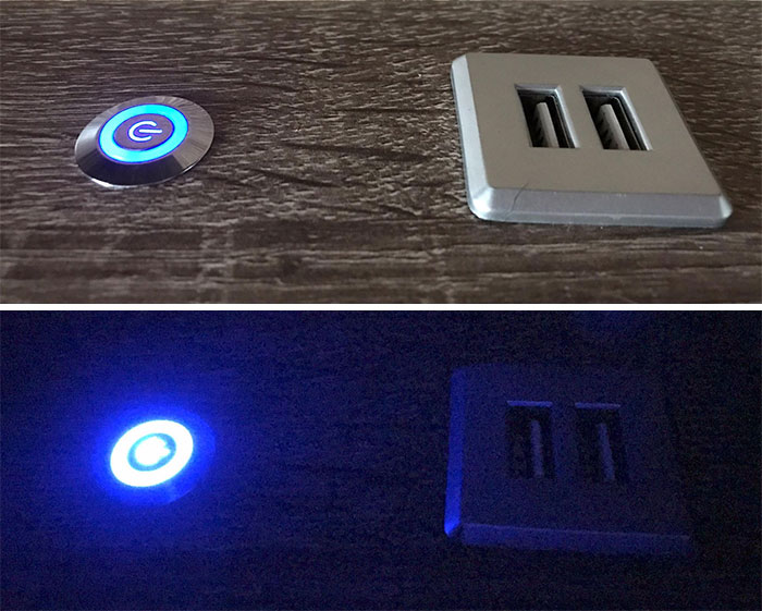
My Bedhead Has A Constantly Lit LED Built Into The Light Switch That Is Bright Enough To See The Entire Room With At Night. Fun Fact, Blue Light Is Most Likely To Mess With Your Brain's Ability To Sleep!
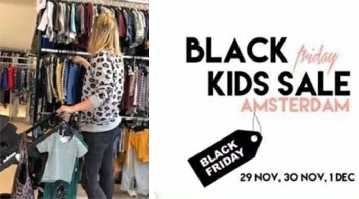
Black Kids Sale Friday Amsterdam
In the 1950s, Philadelphia police used the "Black Friday" term to refer to the day between Thanksgiving and the Army-Navy game. Huge crowds of shoppers and tourists went to the city that Friday, and cops had to work long hours to cover the crowds and traffic
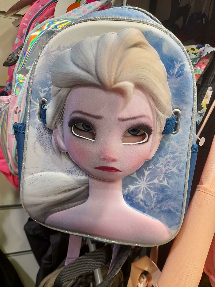
This Elsa Backpack Has A Mask On It So You Can Wear It... But If It's On The Backpack, Elsa Looks Dead On The Inside
How Do You Like Your Windows?
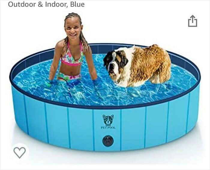
Can’t Decide If This Pool Is For Giant Children Or Miniature St. Bernards
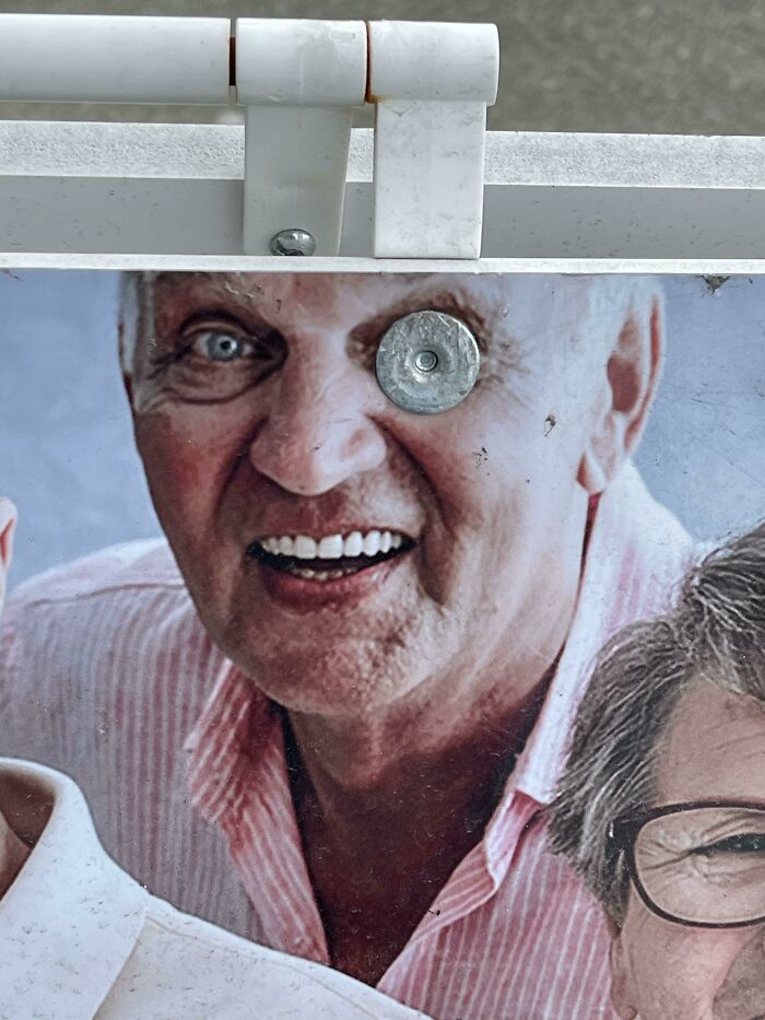
Sandwich Board Advertising Seniors Day - Unfortunate Fastener Placement
My Oven Uses A Touchscreen, So Whenever I Open It, Steam Gets On The Touchscreen And Messes With The Settings
That reminds me of the touchless stereos in The Hitchhiker's Guide to the Galaxy. They have control field in the general area around them that are activated by gently waving your hands. They are the pinnacle of audio technology, where the goal was to improve the responsiveness of the controls. Thus they are incredibly difficult to set as every slight movement activates something else. While listening to music, you have to sit absolutely still.
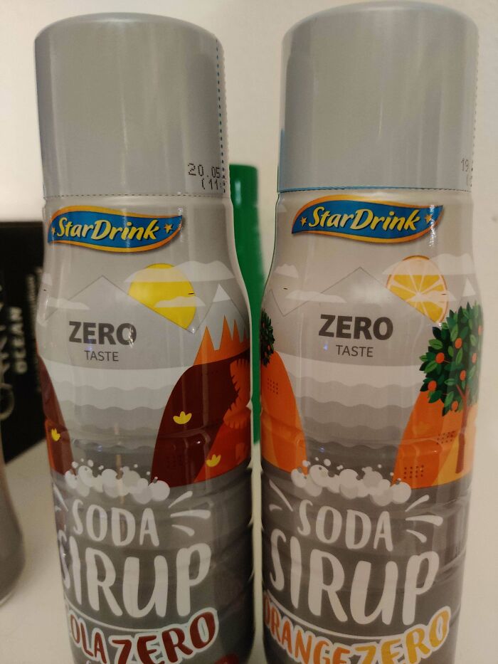
My Soda Sirup Has This Much Taste
Modern Living Condo For Sale. 2 Bedrooms 2 Bathrooms 1/4 Kitchen
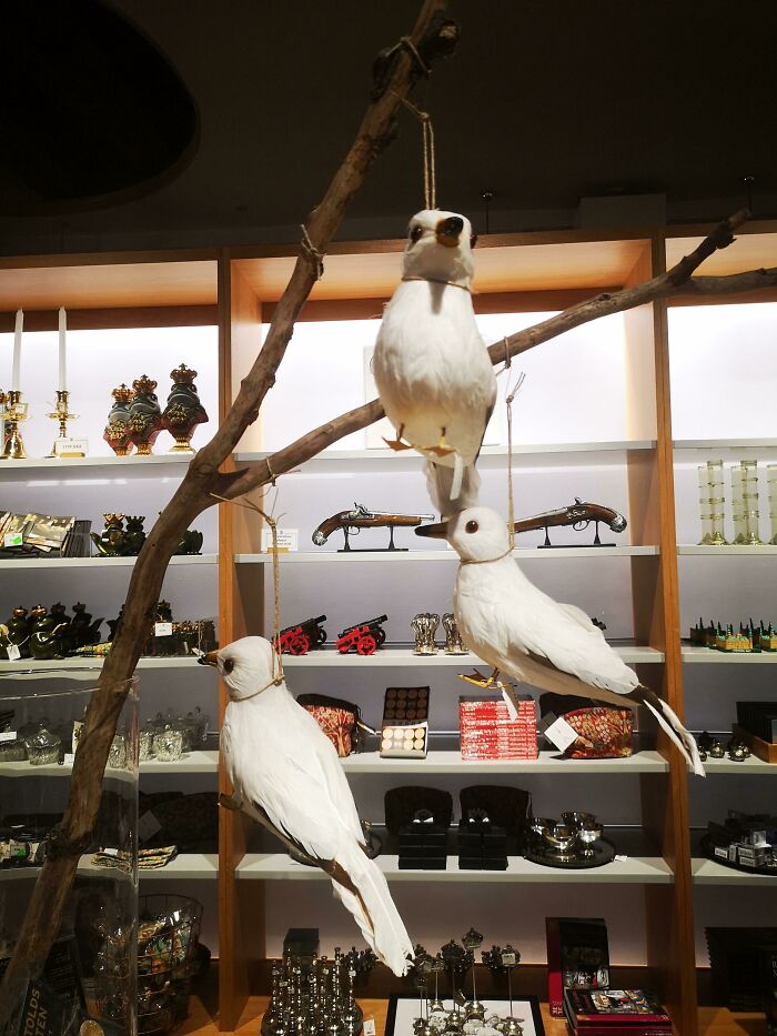
How Not To Sell Birbs In A Museum Shop
A Moment Of Silence For All The Lost Correspondence And Keys
All The Privacy You Need
Dead End Sign At End Of Path
This Guy In A Training Video At My Job Has 2 Moustaches
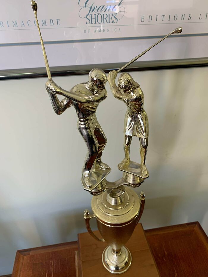
Is This Trophy For Golf, Or Assault?
Don't Come Stumbling In This House Drunk At Night. As Seen On Zillow
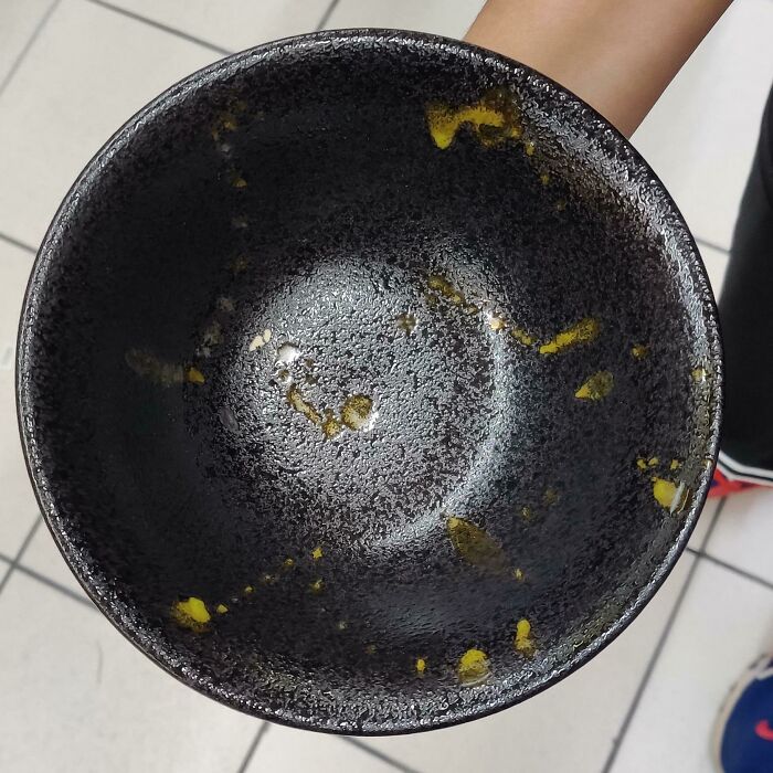
This Bowl Looks Like It's Perpetually Dirty
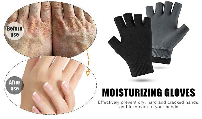
"Moisturizing Gloves" Turn Your Hairy Elderly Hands Into Hairless Young Woman Hands
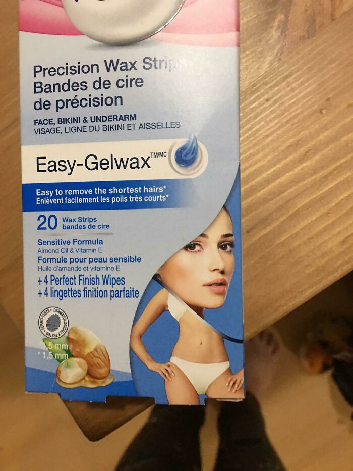
The Placement Of The Pictures Makes It Look Like She Has A Giant Head
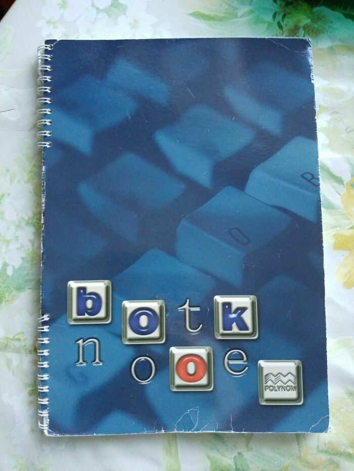
Botk Nooe
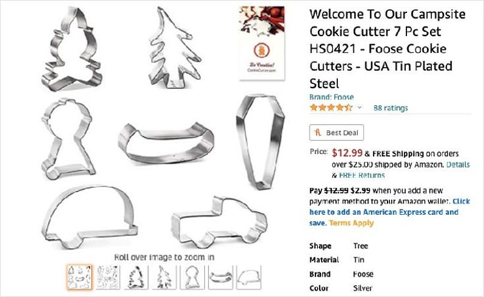
Nothing Says "Welcome To Our Campsite" Like A Coffin-Shaped Cookies
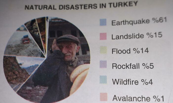
Color Indicators In This Graph Doesn't Do Anything
Healthy Smoothies For Everyone
People Will Never Learn To Not Put Faces In Corners
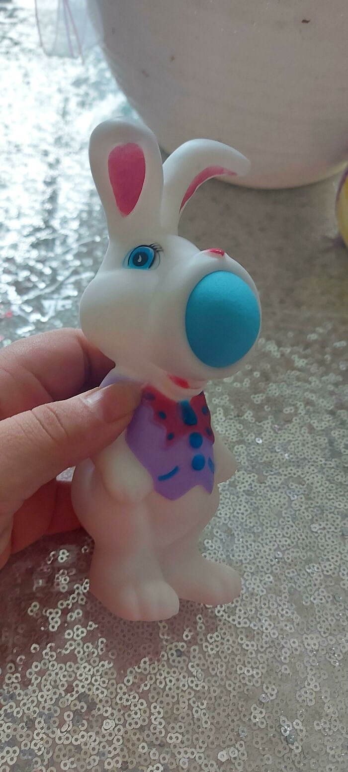
A Dollar Store Easter Toy That Shoots Foam Balls. But It's Not His Mouth, And It's Not His Nose
This Rayquaza Figure That Looks Like It's Projectile Vomiting
How They Think This Man's "Before" Chin Should Look Like
Why Do Women Need 2 Legs Anyways ?
She just has her legs crossed to hold in her pee, since ladies bathroom always full
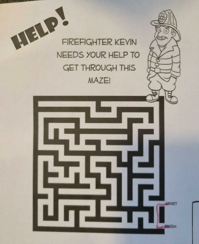
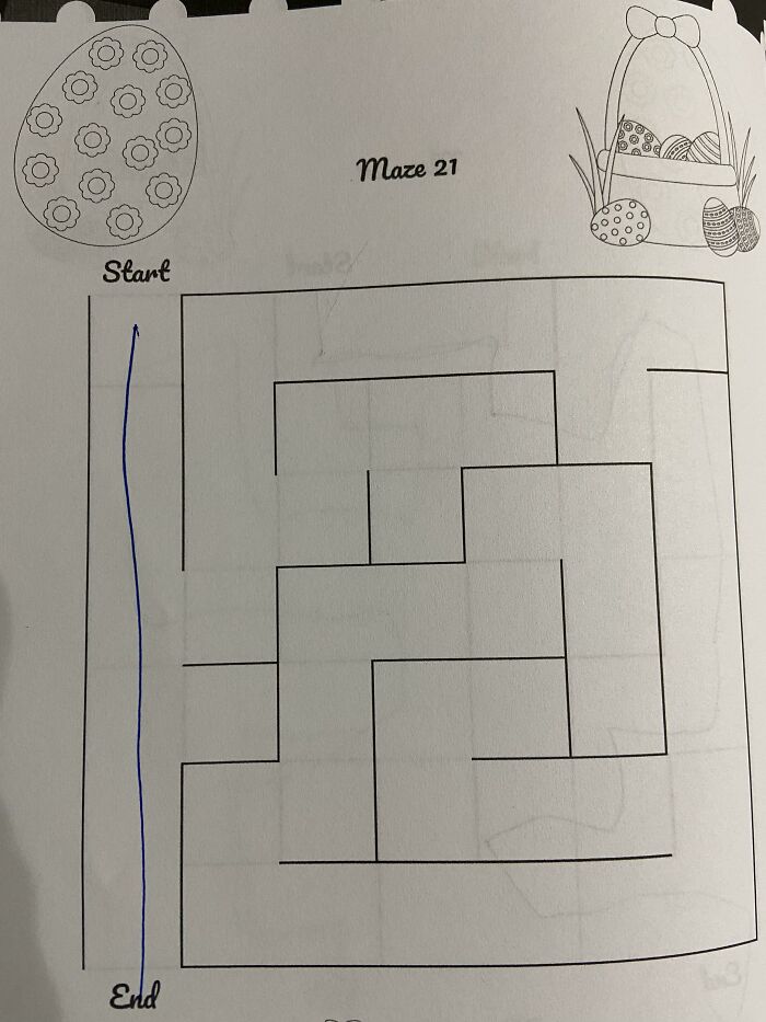
This Maze Solution
Im No Expert On Beaver Butts But I Know Somethings Off
The Cop Cars In Orange Country Florida All Say Making A Difference In Comic Sans With Useless Quotation Marks. Makes It Seem Like They Aren't Making A Difference
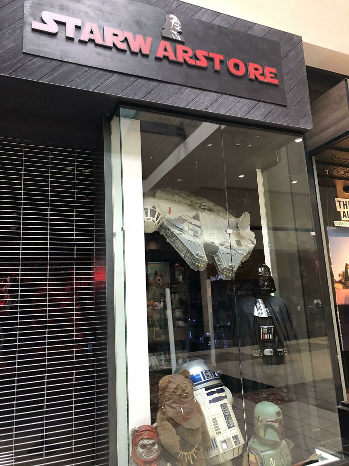
“Hey Mom, Can We Go To The Starw Arst O Re?”
You Cant Even See The Country Lines
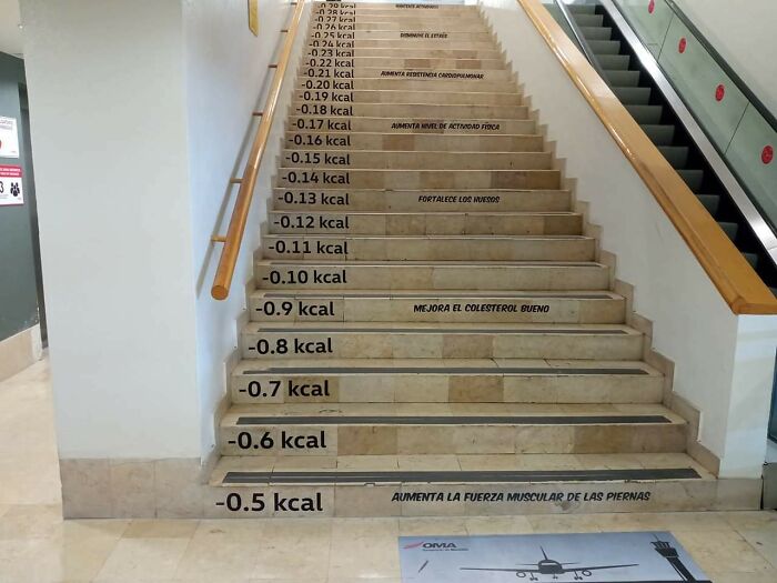
Just When You Thought You Were Reaching 1 Kcal
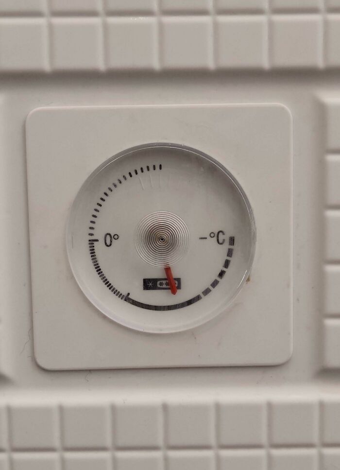
The Built-In Thermometer In My Freezer Doesn't Include Numbers. It Goes From 0° To -°c
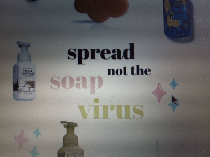
Spread Not The Soap Virus
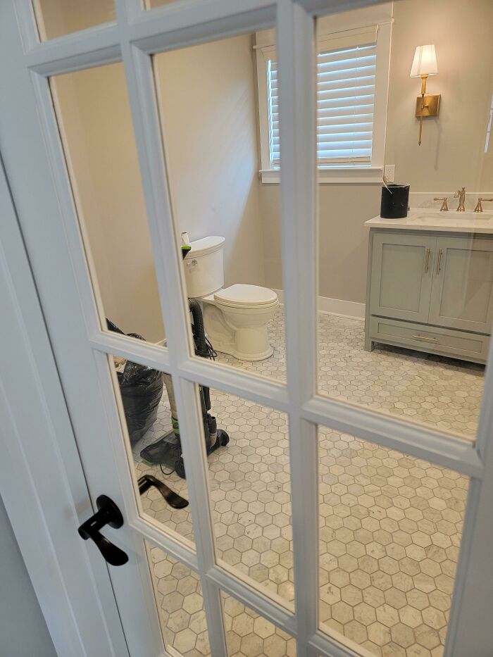
This Door To The Restroom
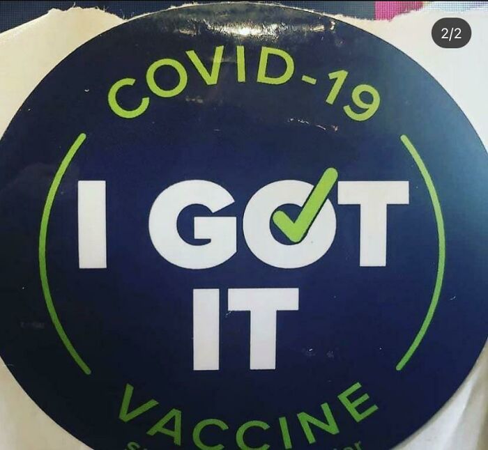
Covid-19 - I Got It!
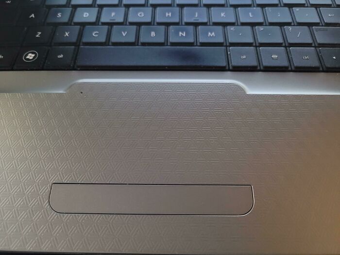
Hp Made The Track Pad The Same Texture As The Rest Of The Laptop So Its Awful To Use
Hungry Anyone? Cafeteria Name At My Work
For Brushing Your Teeth In A Few Extra Dimensions
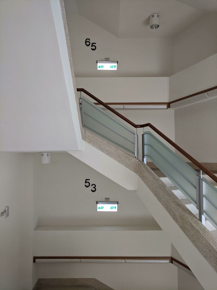
I Have No Idea What Floor I'm On
This Guy's Glasses Make It Look Like He's Bleeding Out Of His Eyes
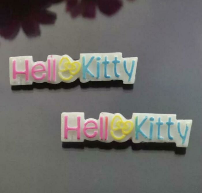
Hell Kitty
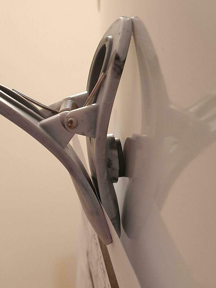
This Fridge Magnet Clip Where The Magnet Can't Make Full Contact
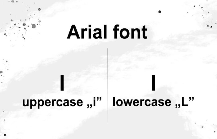
"Arial" May Be Simple, But It Has One Significant Flaw
Spange Boob Square Pants And Pitrick Strar
Let’s Make This Look Edible
This Apartment In Munich (Price Around 500000$) Has A Sloping Floor Because It's Right Above The Underground Garage
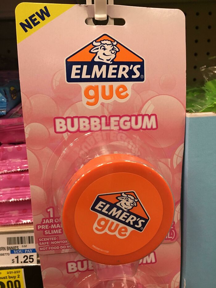
Good To Know, Substance
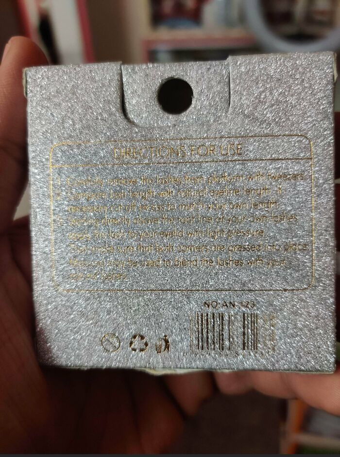
Can’t Even Read The Text On The Back Of These Eyelashes Packaging
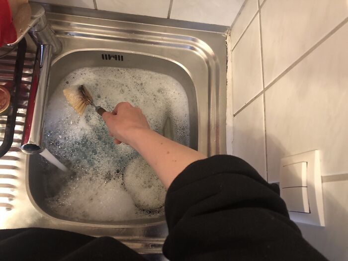
Every Time I‘M Doing The Dishes I‘M Switching The Light On And Off
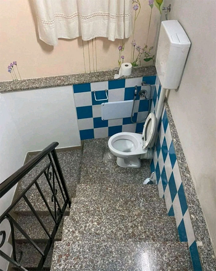
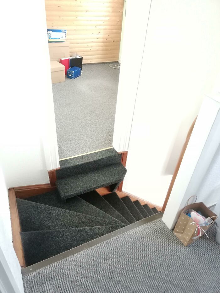
May I Present To You: The Weird Stairs At My House. I Never Actually Realized How Weird This Are Since I Lived With Them All My Life
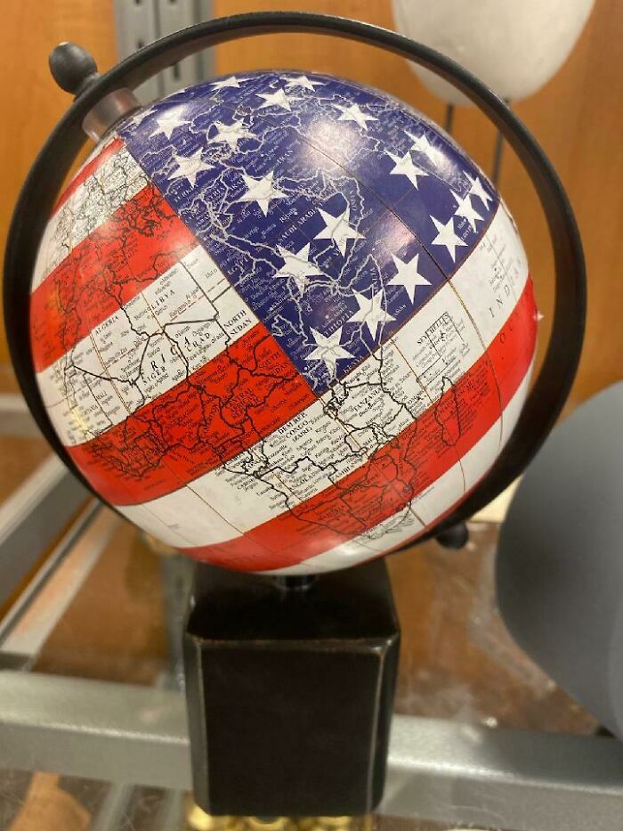
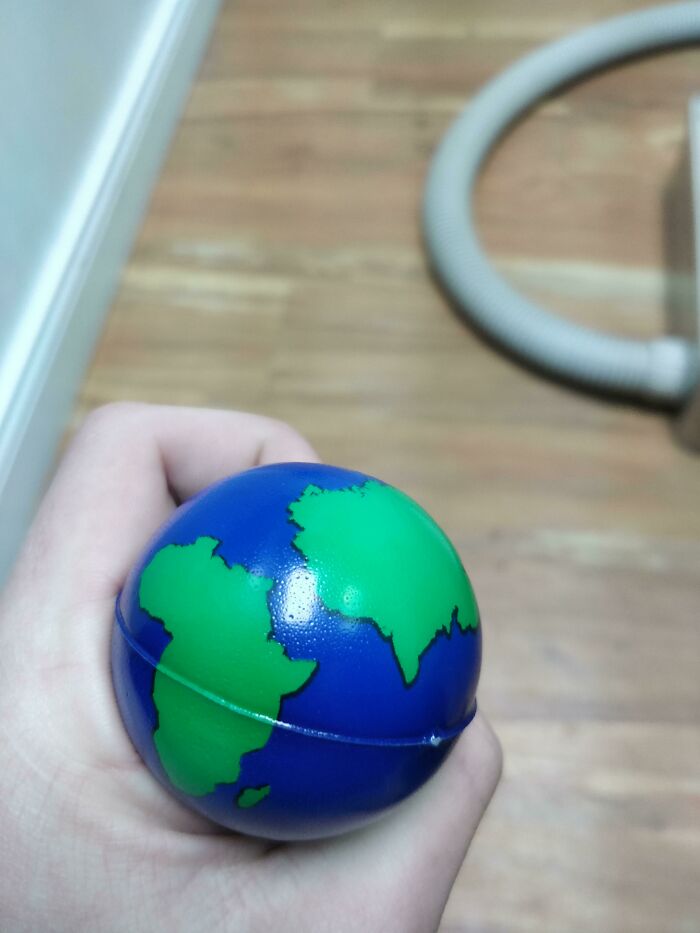
Globe Bouncy Ball Says Europe Doesn't Exist
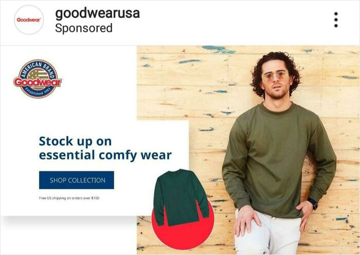
This Instagram Ad Celebrating Your Crippling Debt
We can offer you a loan of £6000 which you repay in 200 easy monthly installments of just £65.
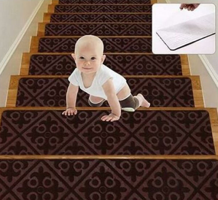
Inception Baby Carpet Tiles
Who Thought It Was A Good Idea To Put An Image Of 7 Churros For The Sign Of 3 Churros
This Acronym For Some Student Association Plastered All Over The College
This Symmetrical Pump Head Made Me Laugh
Door? No! Window? Also No!
Trejo Wants You To Buy Corn Chips
Danny Trejo ALWAYS looks scarily menacing --- this is the first time he looks less intimidating!
Totally "Not" Photoshopped
It Would've Cost $0 To Flip That Pizza Around
A "Secure" Bike Shed In Cambridge, UK. The Gaps Are For Ventilation, Apparently
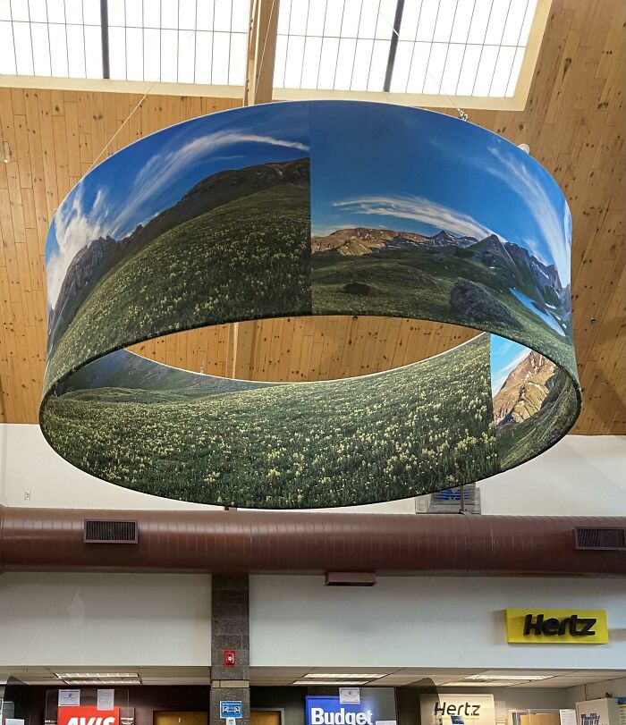
360 Panoramic Design Fail
Life After Disney Wasnt Easy
Thanks For Vjsjtjng
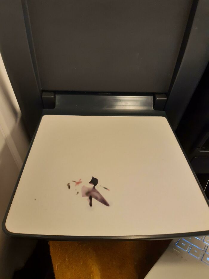
This 'Art' On A Train Table Just Looks Like A Disgusting Stain
Made by the CEO's daughter who always wanted to do something with design....
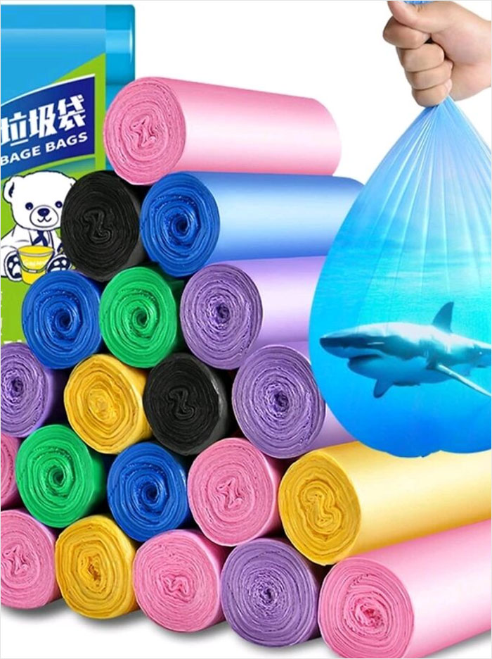
Fit The Ocean And A Great White In These Bags!
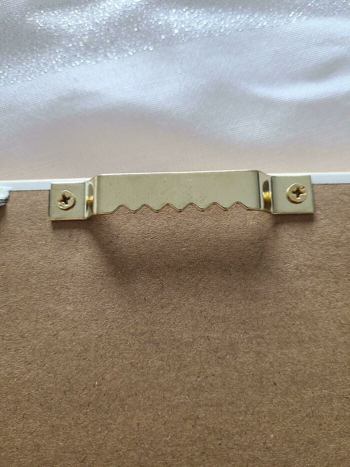
Picture Cannot Be Centred Level Because Of Even Number Of Notches
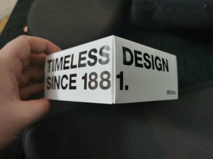
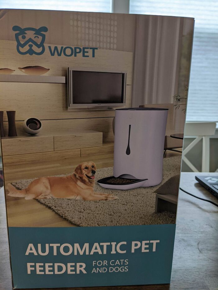
Timeless Design, When They Can't Fit The 1 On
I used to work for that company. Finnish. I never noticed how awful the box is.
Walked Up This Then Had To Turn Around Because Of These Useless Railings
A Desk/Sofa Combo That Doesn't Work Because You Have To Remove Everything From The Desk Everytime Want To Lay In It
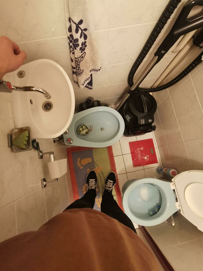
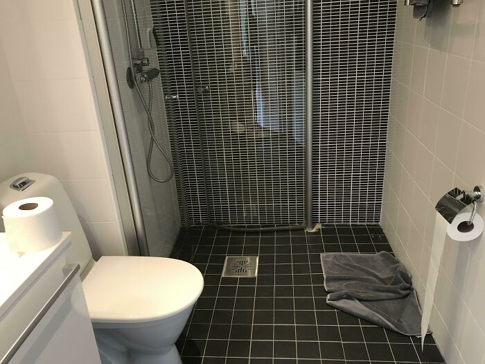
The Ridiculously Tiny Bathroom With Everything You Need (Or Don't)
You do need to change your diet, when you need to have the vacuum cleaner at hand in the bathroom.
Instructions: Gray Goes To Gray, White Goes To White. Both Plugs Are Both Colors
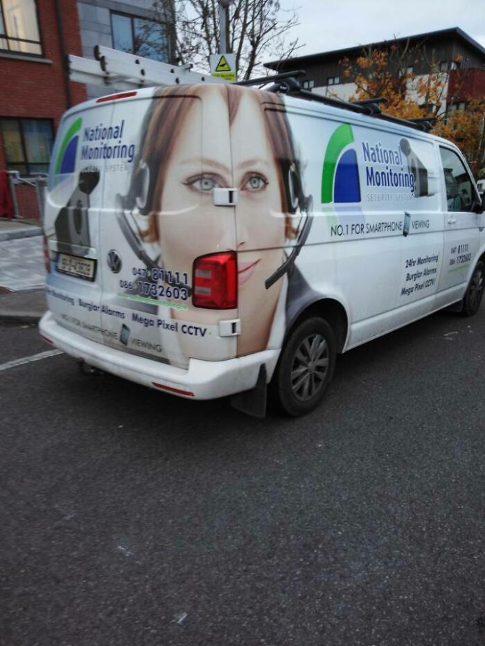
Saw An Interesting Van Coming Home From School
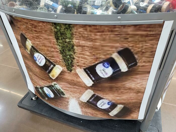
Low Resolution Printouts In Walmart. (I Can Barely Read It, Lol)
Many things enlarged beyond normally-acceptable equals great pain for the consumer.
Think Bog
They Just Pasted The Same Image Into The Camera Screen Without Even Cropping Out The Camera
Someone Will Die Right About X
Solved With Grace
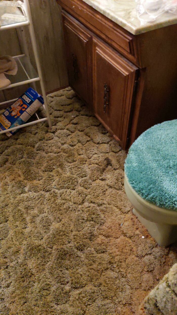
Again With Carpeted Bathrooms
The texture is an innovation though. Imagine after someone's been sick, chasing the bits between the ridges of the carpet islands.
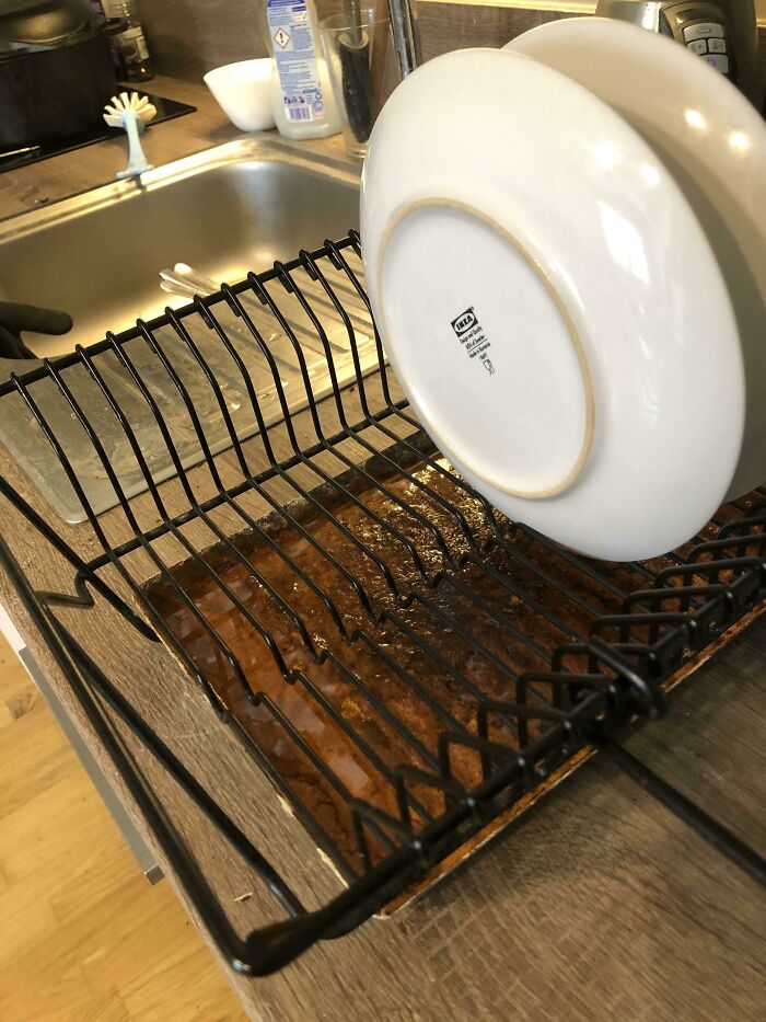
This Drying Rack’s Water Collection Tray Rusts On Contact With Any Water
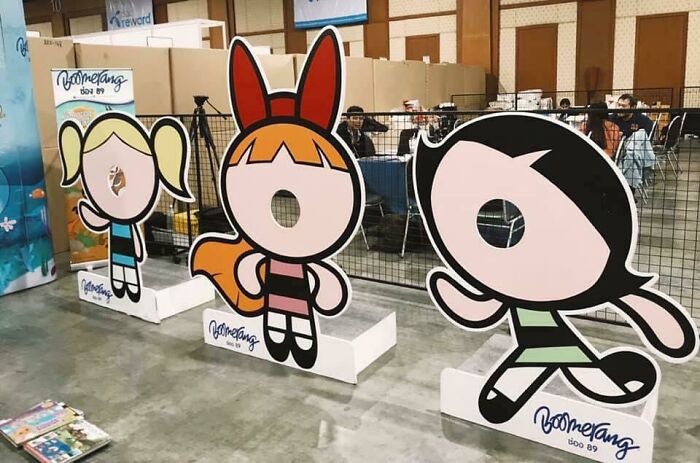
Who Told The Employees The Make The Holes Small
XDDDD I can just imagine a tiny child's face (with the same exact skin color and everything) in those tiny little face holes
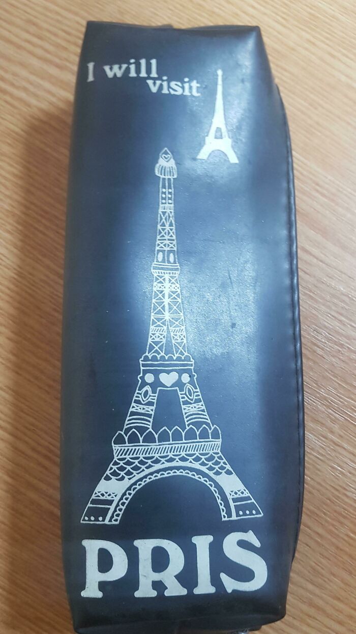
Not Just The Spelling, But The Two Eiffel Towers Too!
3 Inch Deep Pool That Blocks The Entire Staircase Entrance To This Building
This Building Right In Front Of Our Apartment
I Had To Search Google Maps To Find What This Store Is Actually Called
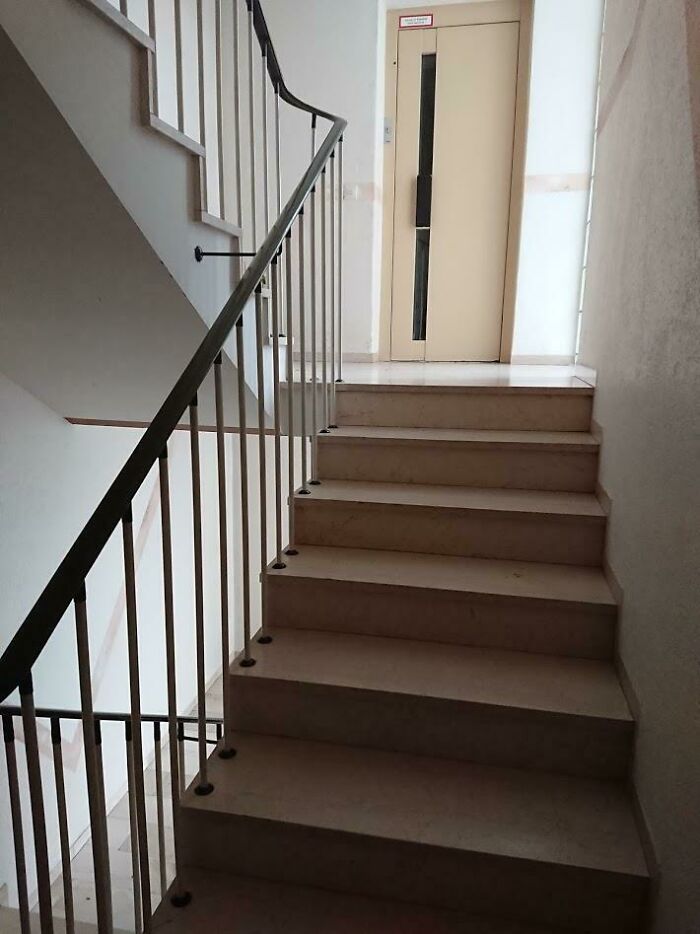
These Stairs Leading Up To An Elevator
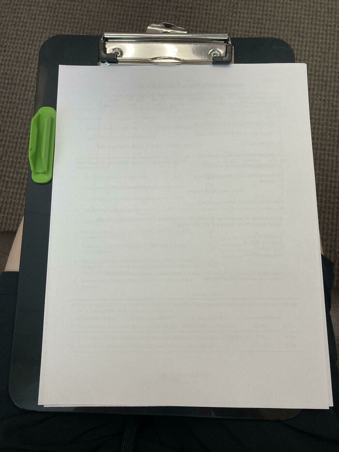
Oddly Placed Pencil Holder Prevents The Paper From Completely Fitting On The Clipboard
Some dumbass just stuck an aftermarket pencil holder to the clipboard in the wrong place. That's all.
They've Massacred My Boi
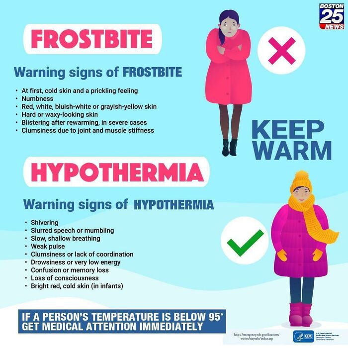
Frostbite = Bad. Hypothermia = Good
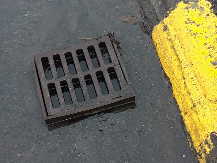
A Drain Water Can't Flow Into
No It Is Not Dumpster Sized!
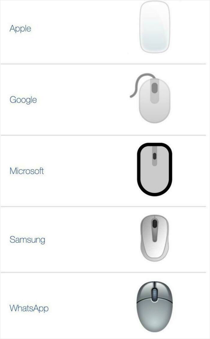
Thanks Apple For Making The Mouse Emoji The Magic Mouse, Making It Look Like A Bar Of Soap
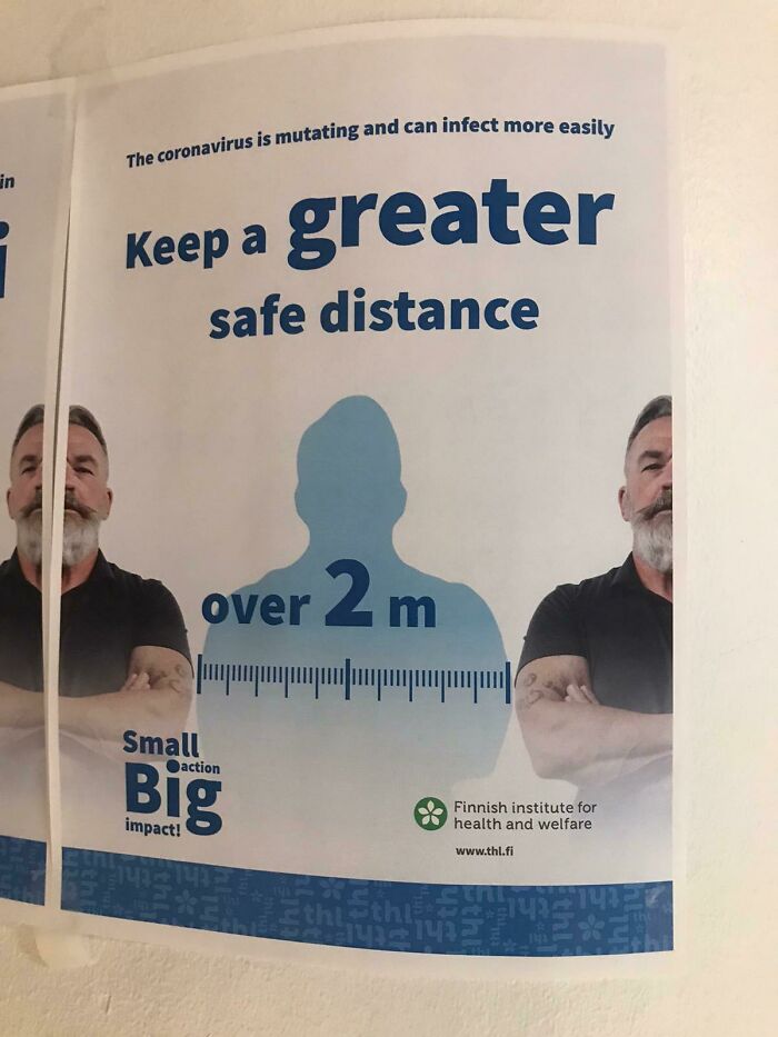
I Don't Think That Dude Is 2 Meters Wide
This Amazon Ad For A Faucet Attachment Has The Worst Photoshopped Water
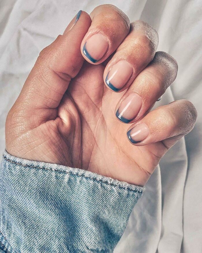
Nail Varnish That Makes Your Nails Look Dirty
Taco Bell Drive-Through. Intercom Before Menu
Great Paint Job, Especially That Last “Step”
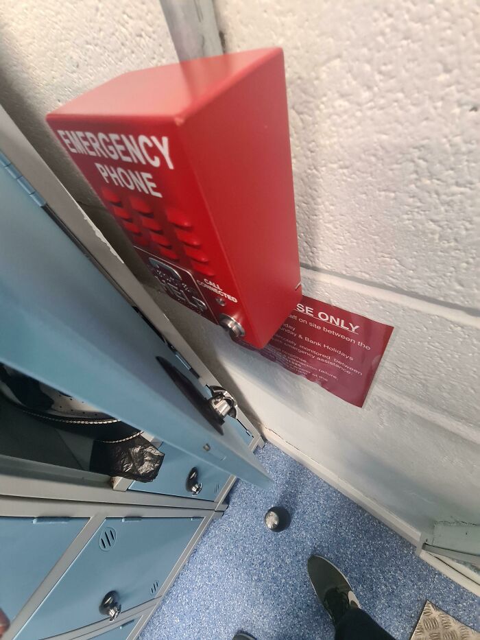
I Called The Emergency Phone By Accident
This Ramp In Front Of A Bank Office
According to the regulations we have to have a ramp. Nothing says that we can't block said ramp with a door.
This German Pills Ad
I Pass By This Covid Sign Every Day And Still Have No Idea How To Read It
Please Please reduce covid death together. Take care. Don't give up now? But what does Naas stand for?
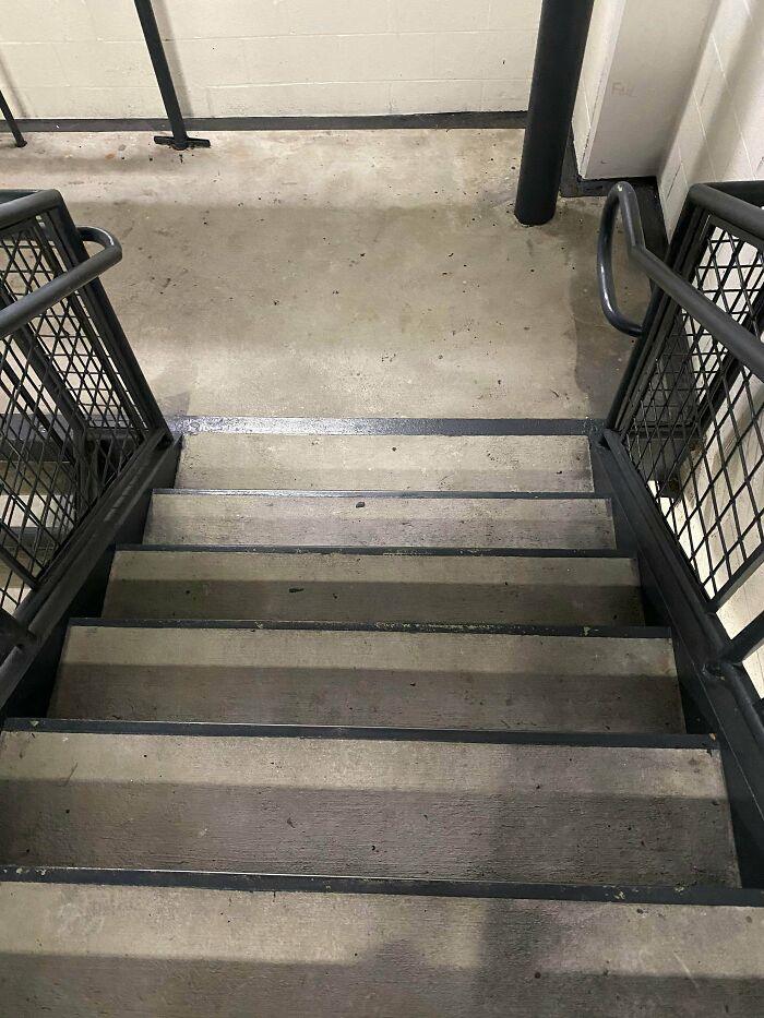
Thanks For The Stairs (On Both Sides Of The Bridge)
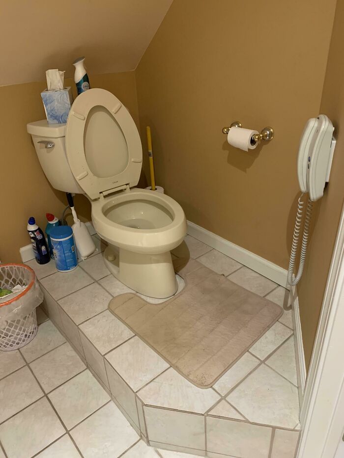
My Parents Bathroom Is On A Platform Next To An Angled Ceiling So You Hit Your Head Every Time... And It Has A Telephone
The telephone is there because the parents heard that a lot of people spend their time in the bathroom looking at their phones.
Saw This At My Local Car Dealer
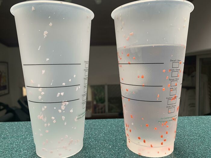
This Starbucks Cup’s “Design” Just Makes The Cup Look Dirty. The One On The Right Is With Water
The Toilet And The Paper Being On The Opposite Side Of The Room At A Hotel I’m Staying At
I'm Pretty Sure 4k Doesn't Increase Contrast
Just In Case You Fall In The Wall
That's just legal requirements to have a railing; absolute minimal and ineffective compliance.
Yes Put The Pole Right In The Middle Of The Isle
This Paper Bag Looks Wet
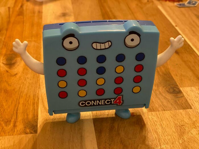
Mcdonald’s Toy My Kid Got Today. Red Made 9 Moves. Yellow Made 5
The Lift In This Building Is On Every Alternate Half-Level From Where The Doors To The Houses Are
This is quite common in some European countries, Half the lift doors and you have only half a floor's steps to climb. Saves a lot of money for developers/builders and the buyer as well, Not so nice for wheelchairs.
Their Faces Look A Little... Different
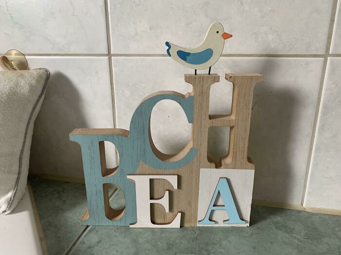
My Mum Bought This At A Home Decor Shop Years Ago. I Never Read What It’s Intended To Say
This Poor Photoshop Design
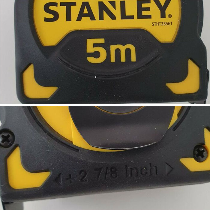
Metric Tape But With An Imperial Tape Holder Length
I Guess This App Couldn’t Realize She Is Playing The PC
This hand santiser label - looks like someone has tried to wipe of blood from the bottle and it's stained. Erisan-60a...96b9f0.png 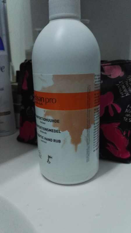
This is how rumors get started & become ugly. CLAIM: The term “Black Friday” originated with the practice of selling off slaves the day after Thanksgiving. AP’S ASSESSMENT: False. The term was linked to a financial crash in the late 1800s, and in the mid-1900s became associated with shopping the day after Thanksgiving. THE FACTS: In the runup to the Thanksgiving holiday false claims tying the term Black Friday to the sale of slaves recirculated on Facebook and Twitter. Some of the posts included a photo available through the State Library of Victoria in Australia that shows a group of indigenous prisoners in neck chains in Western Australia. The photo is dated from 1898-1906.
A business runs 'in the black' Black ink was used for profit. -or it's 'in the red' means losing money, noted in red ink. 'Black Fridays' indicate money for the store and savings for the customer.
Load More Replies...Here’s a Laughable “Fail” to enjoy! Even BEFORE scrolling on to see the 1st “Designers Fail” … I found an “Editorial Fail“! 😲😅🤷🏽♀️ It’s in the last paragraph … 2nd line … It Should have said “messed up so *BAD* “ … However instead, it’s written “messed up so *MAD* “ 😲😬😑 There really shouldn’t be any misspellings in a post.. And I do understand that mistakes are made! But having such an easy slip up like that, in the opening paragraphs for a post such as this?? I couldn’t help but have an extra laugh at this “Editorial Fail” !!! 😂😂 ((All in good fun and no malice intended!))
A fromer girlfriend, still a good friend, who suffers from incontinence and isn't very much into disposable stuff recently bought a few cloth diapers. Pretty similar to those for children, but designed to take them on and off yourself ... she had three colours to chose from: white, real actual white, which will develop stains in no time that won't come off again ... and stainy yellowish darkwhite, that looks like they're in service since a few years, although they're new ... and a pale shade of pink, in german called "Alt-Rosa". She chose the white ones, and after the first use, of course, they never again looked clean. Although they are. TBH, everything else is totally fine about them, it's just the colours that suck, or that they cannot possibly add a layer that isn't that likely to pick up colour, as innermost layer. She had a few that were made that way, but they aren't made anymore ... still uses 2 or 3 of them, which look cleaner than the new ones.
This hand santiser label - looks like someone has tried to wipe of blood from the bottle and it's stained. Erisan-60a...96b9f0.png 
This is how rumors get started & become ugly. CLAIM: The term “Black Friday” originated with the practice of selling off slaves the day after Thanksgiving. AP’S ASSESSMENT: False. The term was linked to a financial crash in the late 1800s, and in the mid-1900s became associated with shopping the day after Thanksgiving. THE FACTS: In the runup to the Thanksgiving holiday false claims tying the term Black Friday to the sale of slaves recirculated on Facebook and Twitter. Some of the posts included a photo available through the State Library of Victoria in Australia that shows a group of indigenous prisoners in neck chains in Western Australia. The photo is dated from 1898-1906.
A business runs 'in the black' Black ink was used for profit. -or it's 'in the red' means losing money, noted in red ink. 'Black Fridays' indicate money for the store and savings for the customer.
Load More Replies...Here’s a Laughable “Fail” to enjoy! Even BEFORE scrolling on to see the 1st “Designers Fail” … I found an “Editorial Fail“! 😲😅🤷🏽♀️ It’s in the last paragraph … 2nd line … It Should have said “messed up so *BAD* “ … However instead, it’s written “messed up so *MAD* “ 😲😬😑 There really shouldn’t be any misspellings in a post.. And I do understand that mistakes are made! But having such an easy slip up like that, in the opening paragraphs for a post such as this?? I couldn’t help but have an extra laugh at this “Editorial Fail” !!! 😂😂 ((All in good fun and no malice intended!))
A fromer girlfriend, still a good friend, who suffers from incontinence and isn't very much into disposable stuff recently bought a few cloth diapers. Pretty similar to those for children, but designed to take them on and off yourself ... she had three colours to chose from: white, real actual white, which will develop stains in no time that won't come off again ... and stainy yellowish darkwhite, that looks like they're in service since a few years, although they're new ... and a pale shade of pink, in german called "Alt-Rosa". She chose the white ones, and after the first use, of course, they never again looked clean. Although they are. TBH, everything else is totally fine about them, it's just the colours that suck, or that they cannot possibly add a layer that isn't that likely to pick up colour, as innermost layer. She had a few that were made that way, but they aren't made anymore ... still uses 2 or 3 of them, which look cleaner than the new ones.

 Dark Mode

 No fees, cancel anytime


