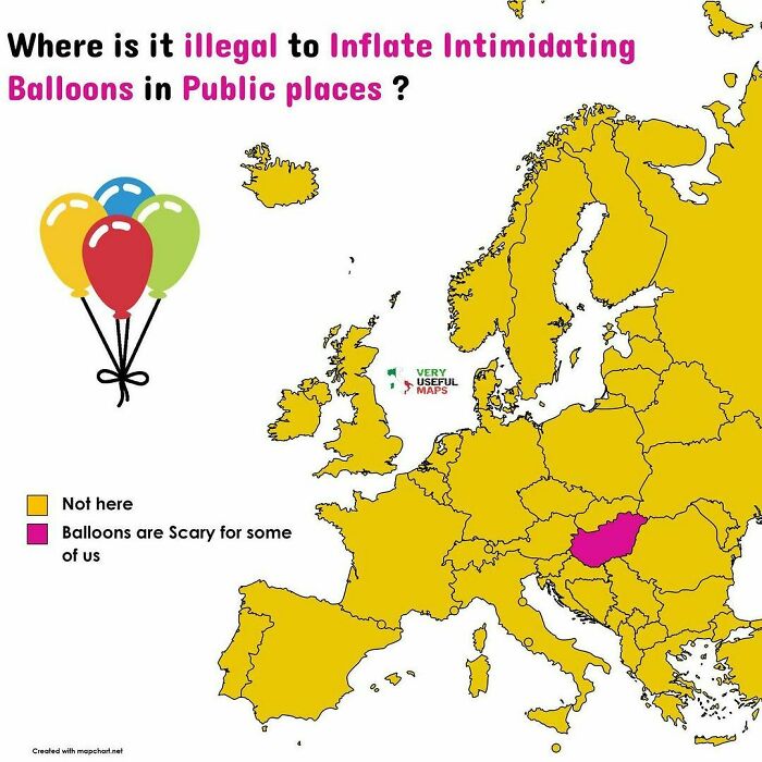
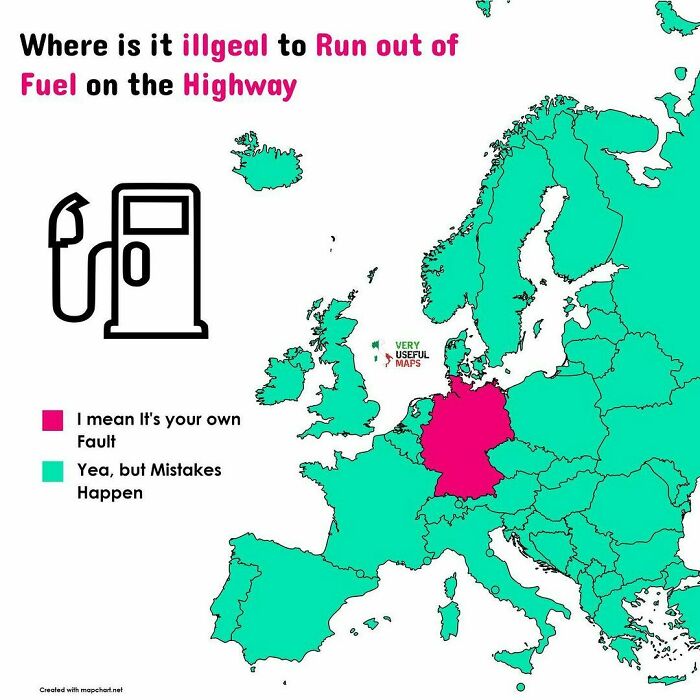
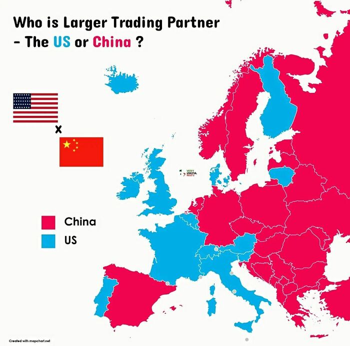
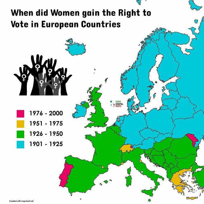
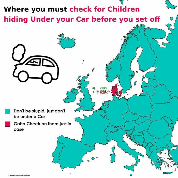
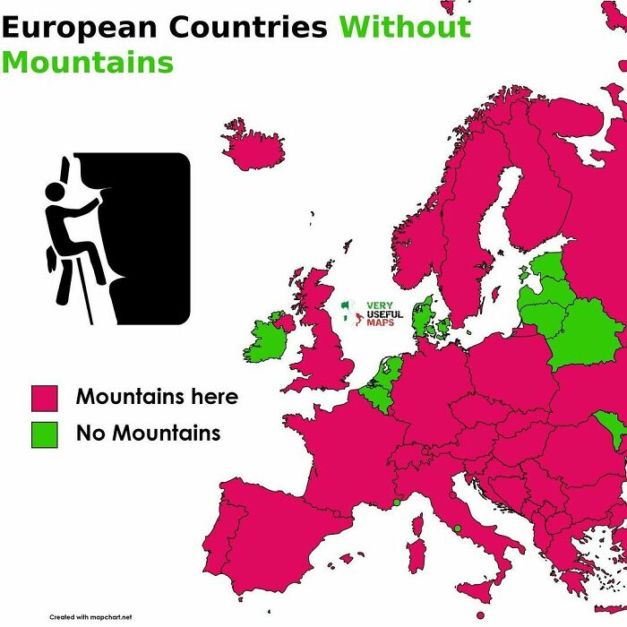
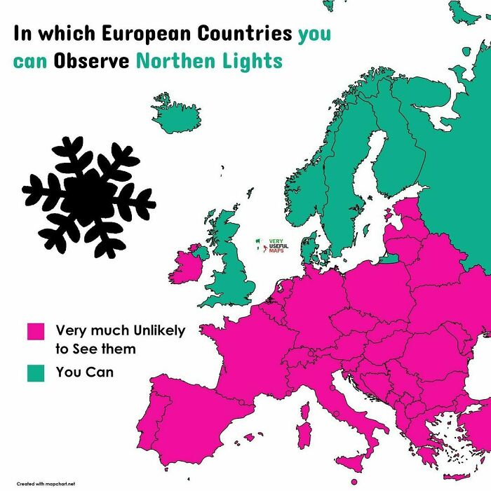
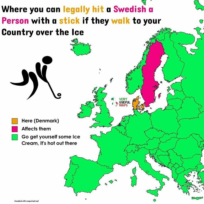
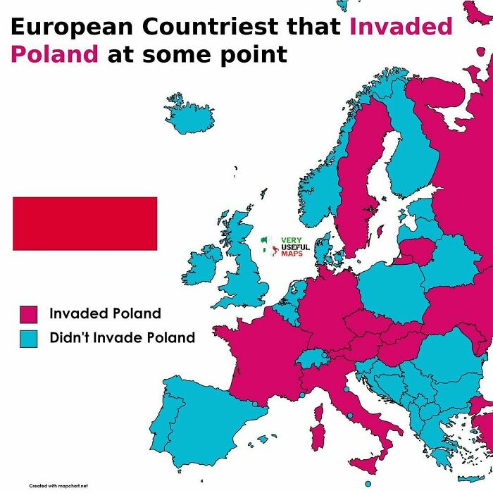
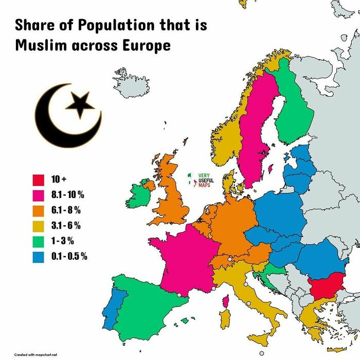
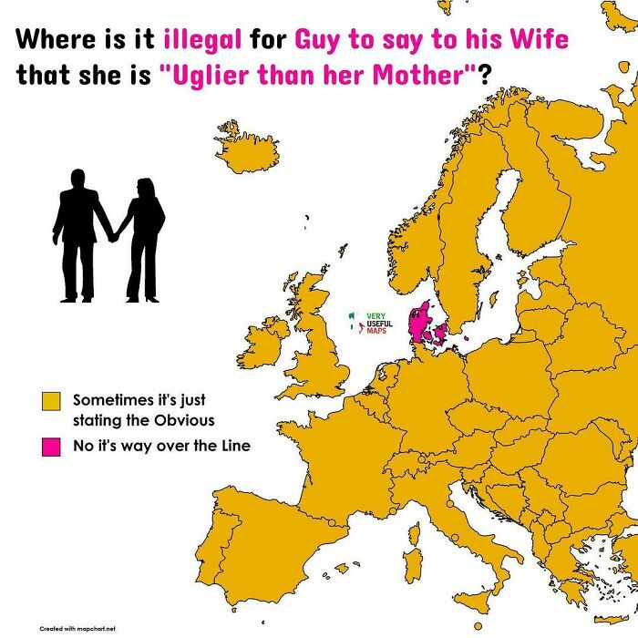
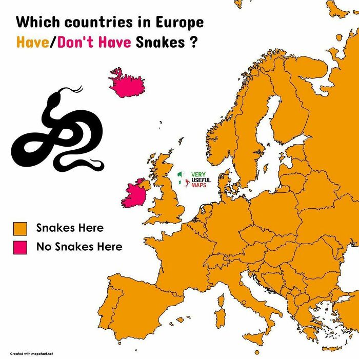
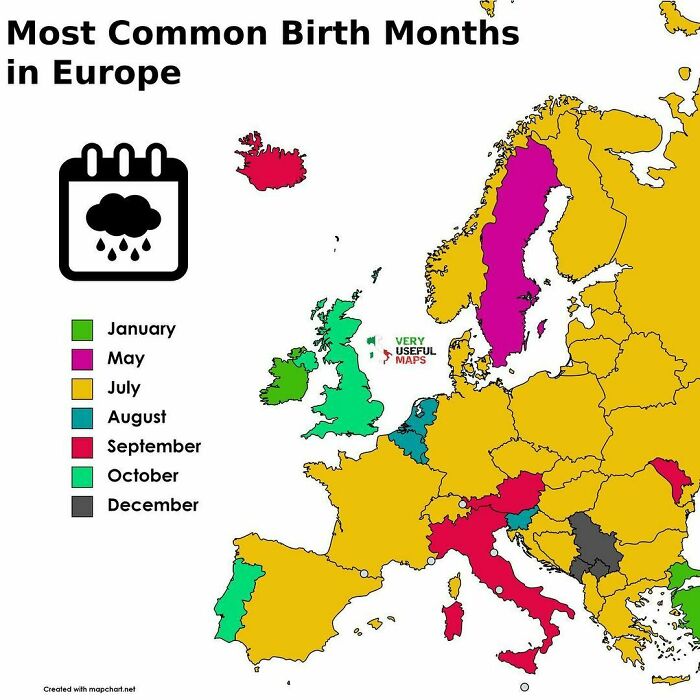
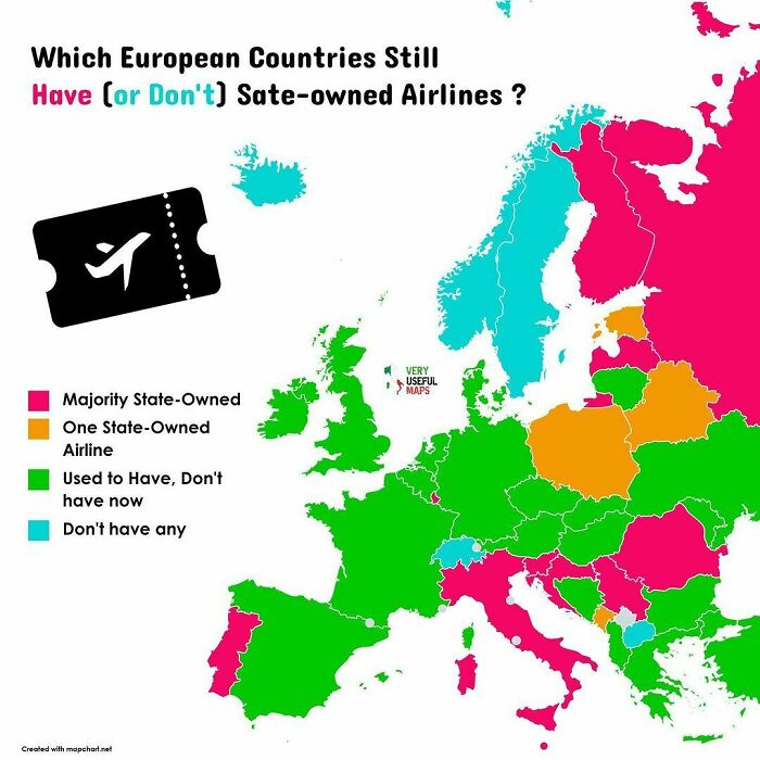
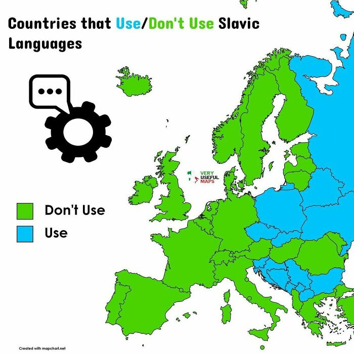
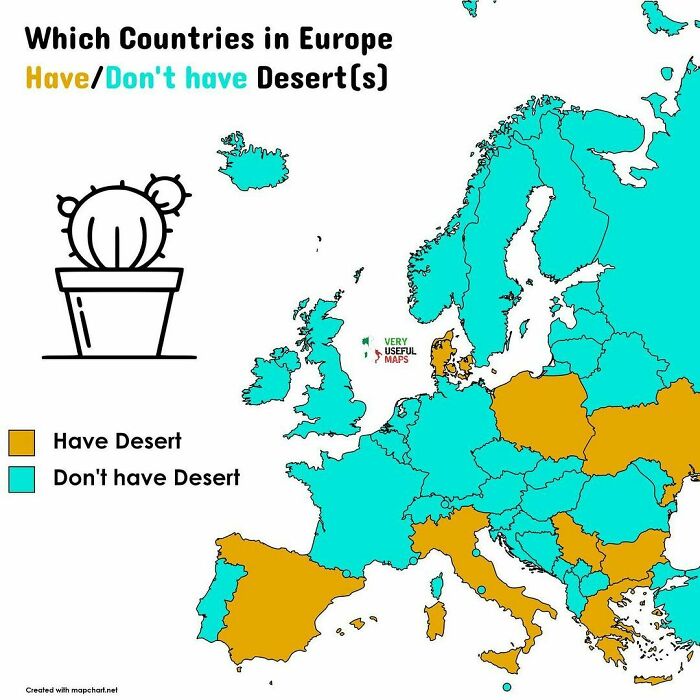
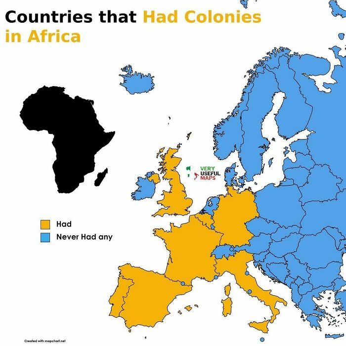
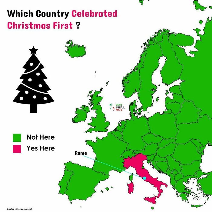
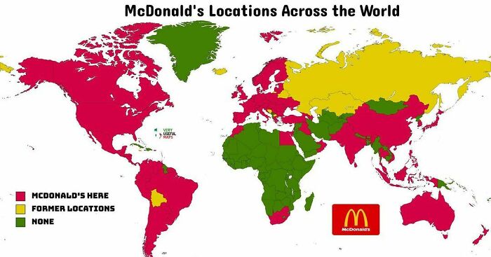
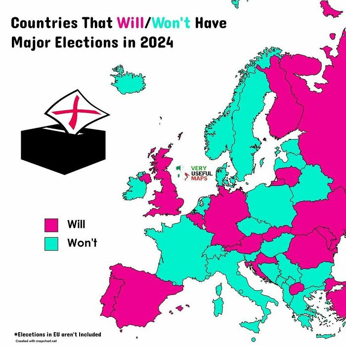
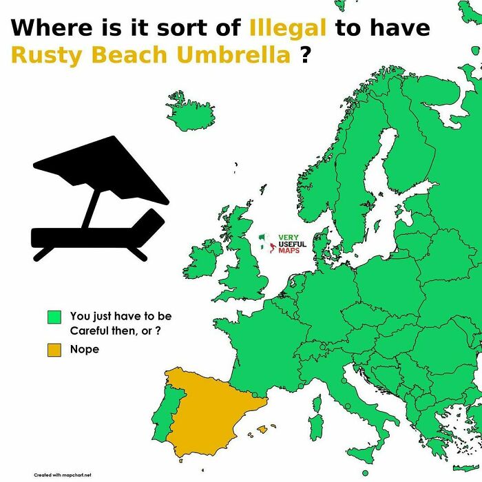
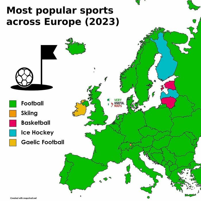
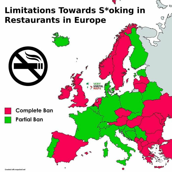
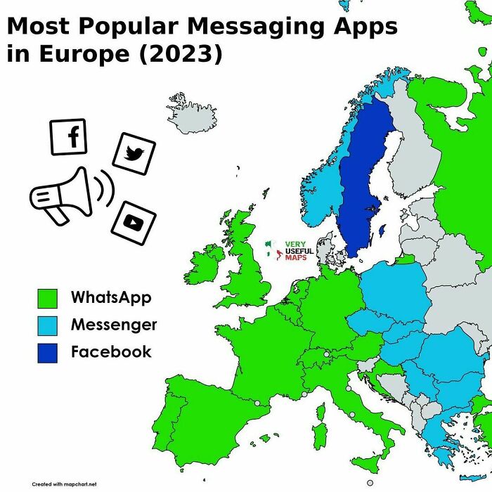
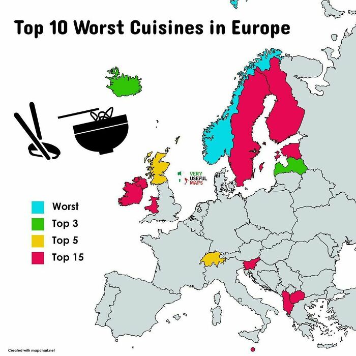
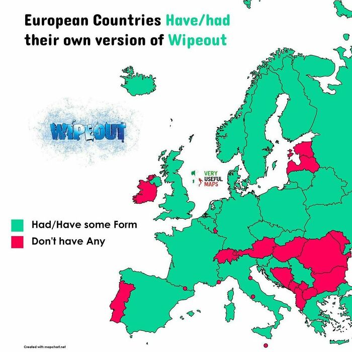
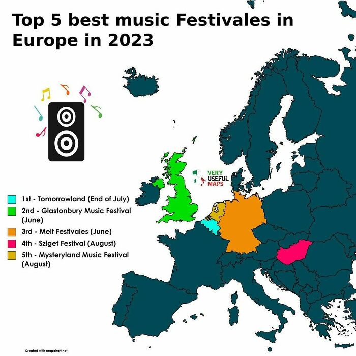
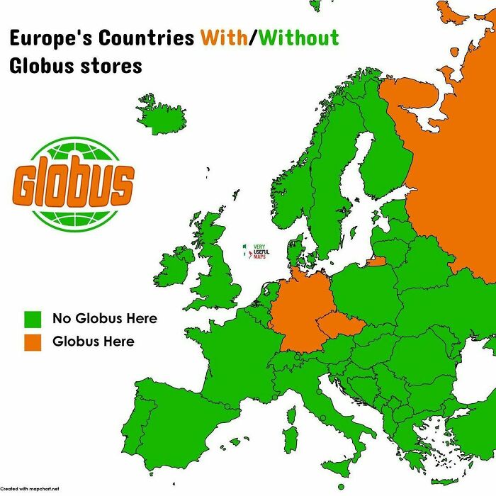
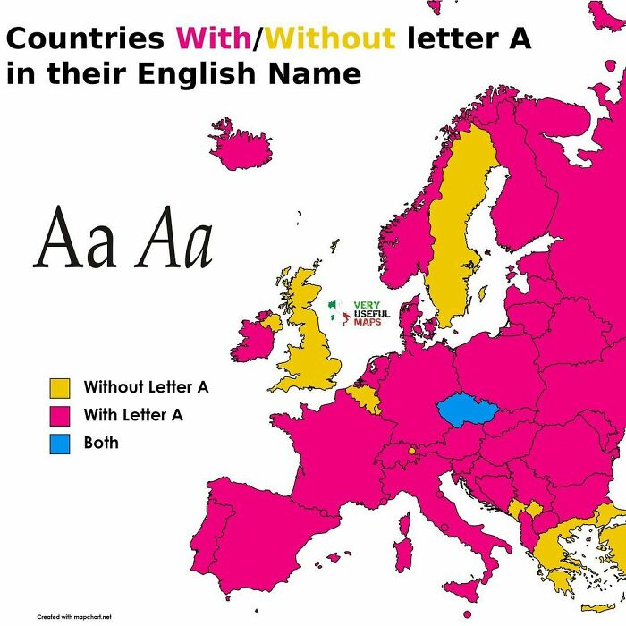
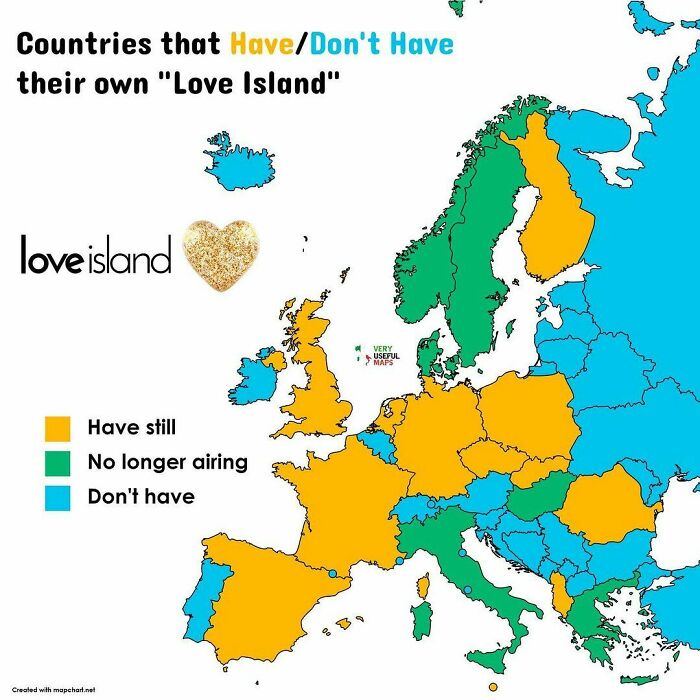
Some believe that geography is boring or ‘dry’, and think that looking at a map will never catch their interest. Well, chances are that their mindset can be changed with the maps on today’s list.
Created by the mastermind behind the ‘Very Useful Maps’ account, these images are not your regular markers of geographic areas; they are mirrors of cultural phenomena, eating habits, all things nature, and so much more, so scroll down to find them and see for yourself just how amusing and fun geography can be.
If you scroll down, you will also find Bored Panda’s interview with assistant professor of geography at University of Oregon and an academic expert in climate change communication, cartography, map design and mapping environment-society interactions, Carolyn Fish, who was kind enough to delve deeper into the topic of maps with us.
This post may include affiliate links.
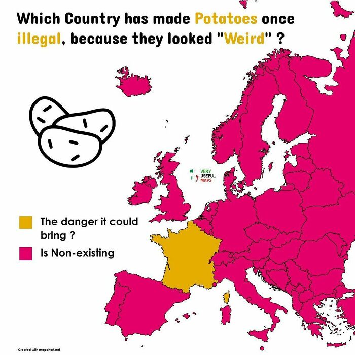
The potatoes (same as tomates) belong to the solanaceas. Most of the plants in that family indigenous to Europe are poisonous - belladona, mandragora, etc. They were being careful.
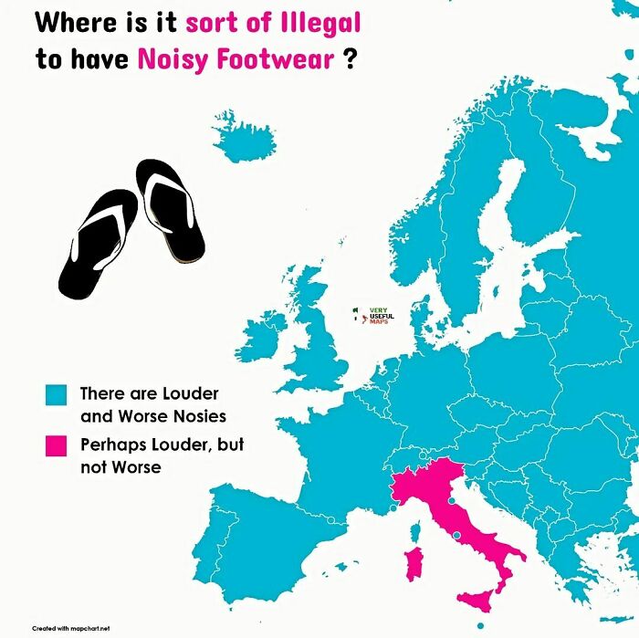
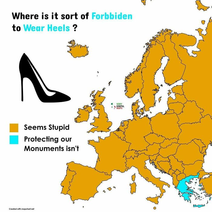
Enter Capri, an island and popular tourist destination in Italy's Gulf of Naples. Noted as one of the world's strangest laws, it's illegal here to wear excessively noisy footwear (particularly flip flops ) as locals value their 'peace and quiet'
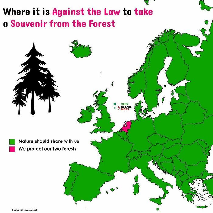
It's against the law in many countries to take anything from national parks (and there are so many in France)
Started in the very end of 2021, ‘Very Useful Maps’ has already amassed nearly 100k followers. In the Q&A section of the account’s Instagram highlights, the creator—a person with Czech and Italian roots—shared that there was nothing in particular that inspired them to start the account, they simply wanted to give it a go.
“I knew that map accounts existed and, well, on New Year's Eve, I decided ‘yeah, let’s do it and see how it will go’,” they wrote.
Discussing where they draw inspiration from for their maps, the mastermind behind the account revealed that it varies; sometimes an idea would pop up randomly and they would note it down for later use, but sometimes they would have to try and come up with something as they were working on the project.
“Sometimes it’s hard to come up with something, so I go for something that has been done [already], but I try to expand it,” they shared.
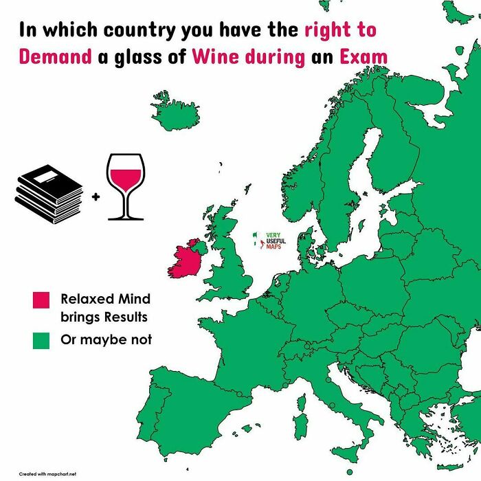
Only at Trinity college though and according to their own laws
Well , at Cambridge in the UK there was a man who found an ancient law demanding he be provided with cakes and ale to sit an exam. However he was fined for not wearing his sword so win some and lose some
Seeking to learn more about maps and their significance, Bored Panda turned to an academic expert in cartography, map design and mapping environment-society interactions, Carolyn Fish, who agreed to share her insight on all things maps, starting with a little bit of history.
“There are a lot of arguments about when the first maps came to be, with some scholars arguing that maps in some form have existed since ancient Mesopotamia and others arguing that they are a more recent invention that goes back still hundreds of years, but not millennia,” she told Bored Panda.
“There are generally two types of maps: reference and thematic,” Fish continued. “The maps on the ‘Very Useful Maps’ Instagram account are thematic maps which are focused on showing data about a particular topic or theme, while reference maps are more general and are designed to help people navigate a place or identify where places are in relation to other places.
“The old road atlas you might have kept in your car, or the newer Google or Apple maps on your phone, are both examples of reference maps. Reference maps, I would argue, have existed for millennia. People have been taking their own mental maps of their world and putting that spatial information down in the dirt or later on paper for thousands of years.
“Thematic maps are considered far more recent inventions, and these maps have grown in popularity, especially in recent decades because we have access to so much data that it makes sense to represent that in a spatial form, i.e., a map,” the asst. prof. of geography explained.
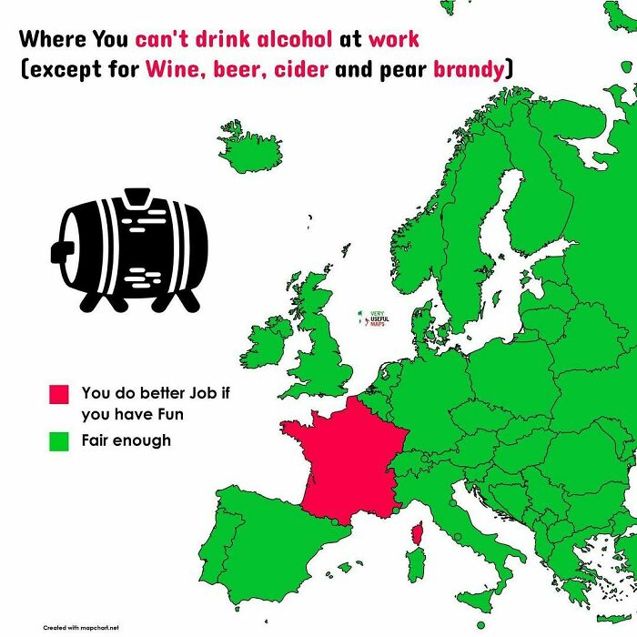
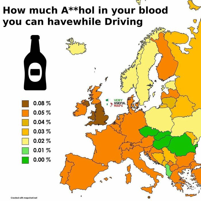
This is misleading. You can't be drunk at work in any of those countries, it would lead to dismissal at fault. In France, you are allowed to drink one dosis of wine or the equivalent in beer, cider and pear cider (not Brandy) and it woult not be considered when you being impaired, thus no reason for dismissal.
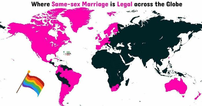
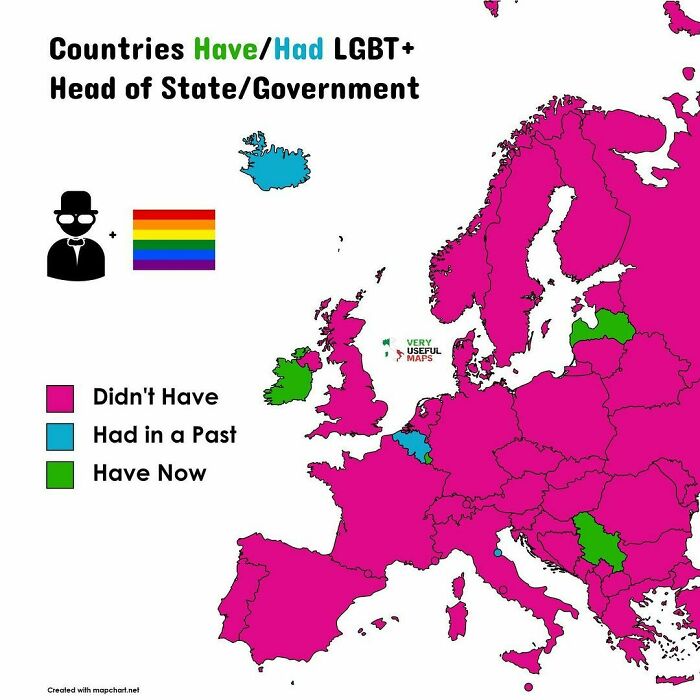
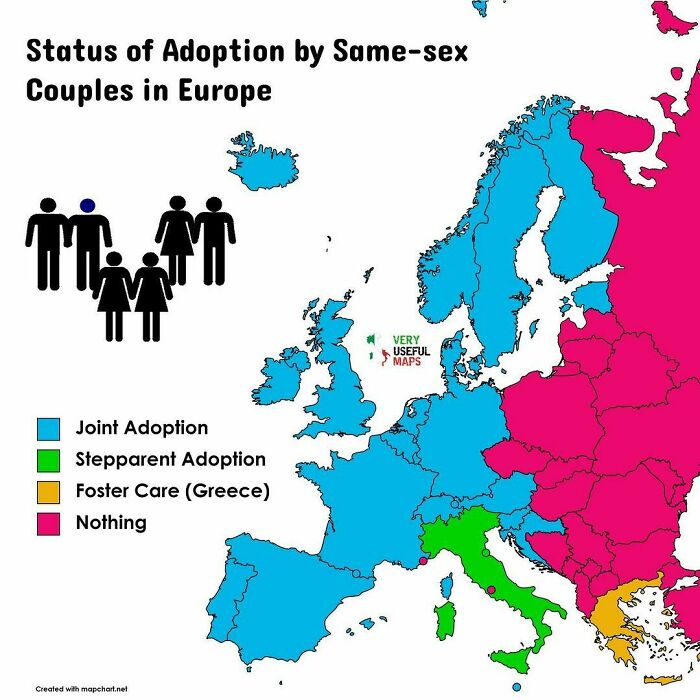
Very sad that so many countries legally discriminate against people who weren’t born straight. 🥺💔🏳️🌈 Love is love!
We also discussed what makes people interested in such content as shared by ‘Very Useful Maps’, and according to the map expert, there are likely several factors at play here:
“First, the data needs to be interesting. In the ‘Very Useful Map’ Instagram account the maps are primarily of thematic data, so assuring that the data that you are showing is something people would be interested in knowing is important,” Fish suggested.
“Second, aesthetics are really important, especially on platforms like Instagram. While the platform has changed a lot over the years from moving away from static photos, the accounts that still focus on those static images have always been thinking about how aesthetics are key to getting followers. Maps can be beautiful and I think focusing on sharing beautiful maps is vital to growing a following.”
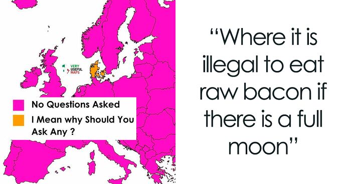
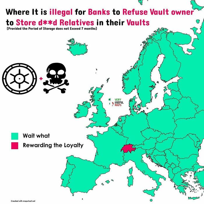
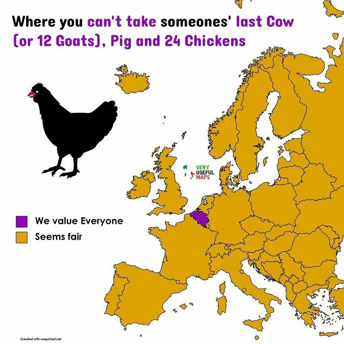
Probably some court ruling that the law said they can store *anything*.
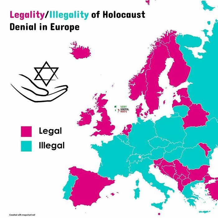
Legal in the USA too. Just expect to get socked in the face if you get too loud about it. #punchNAZIs
“I’m definitely biased, but I love learning how all sorts of topics vary across space. And how something varies across space is typically best represented in a map,” Fish told Bored Panda. “I also think that one of the more interesting things to map is the connection between human geography (how things involving people vary across space) and physical geography (how the natural world varies across space). For instance, human settlement often follows natural features, and I think that is fascinating.”
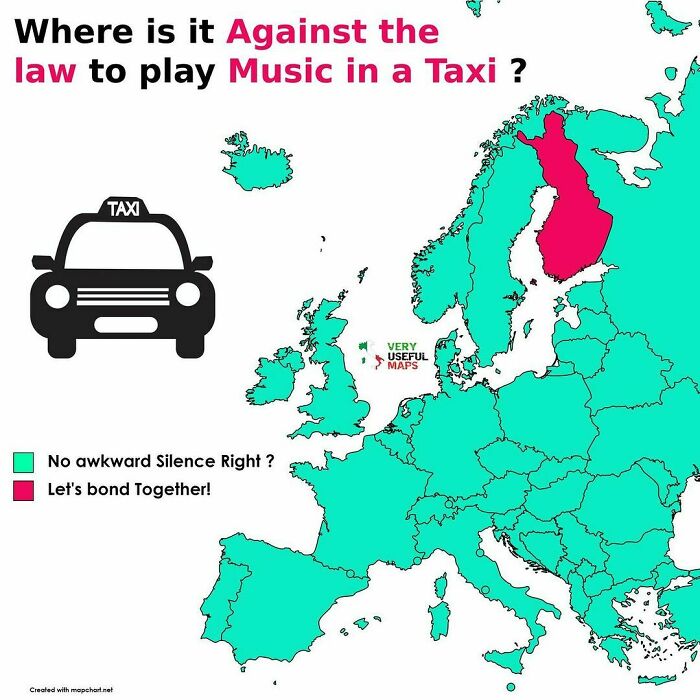
The reason is copyright. TEOSTO operates in Finland and collects compensation for the use of music for artists, composers, lyricists and publishers. They sell music licenses to operators in various fields. There are permits for many kinds of situations: events, radio and TV channels, municipal activities and digital services. You can be fined for playing music without a permit in a public place where there are customers, even in a taxi. I went to their website to get reliable information. Sometimes it's really nice when the radio isn't blaring everywhere.
“Whenever I tell people I study maps, I usually hear one of two responses. Sometimes it’s ‘Hasn’t the whole world been mapped already?’, but more often it is ‘Whoa! That’s cool! I love looking at maps!’ I think this tells me that there is a large untapped population out there who would love to follow accounts on social media that show spatial information in a beautiful way,” the expert said, addressing the popularity of map-related content online.
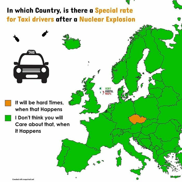
Czech 🇨🇿 taxis have three rates: the average level 1, level 2 which is usually used for tourists and level 3 which is the Government’s rate that must be used for all taxi rides after a nuclear e*plosion
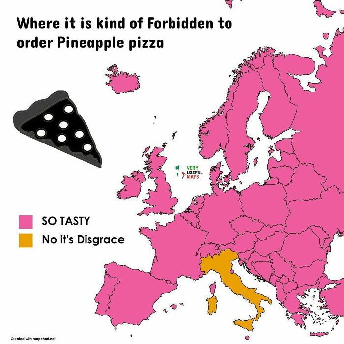
While some of the maps on this list, such as the one depicting Europeans’ views on pineapple pizza, for instance, are more of a source of entertainment rather than geographic knowledge, information presented in fun ways can actually be a pretty great way to learn.
Thanks to technology, people nowadays have access to all sorts of engaging ways to learn new information, from games to cartoons, and beyond. While for some people, reading a book can be equally exciting, for those finding it easier to focus on something more colorful, vivid or interactive, it can be a game changer in learning.
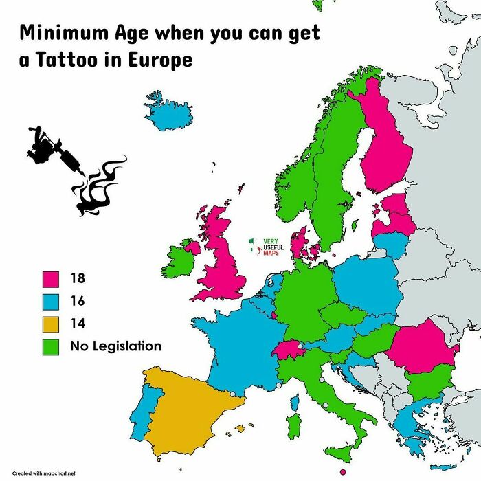
You mean I can get a baby tattooed in Germany or Italy?!? Come on folks, let's make this happen. I just need a baby and a plane ticket to one of those green countries.
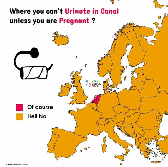
In the UK, I believe you are still allowed to urinate in a police helmet if you are pregnant.
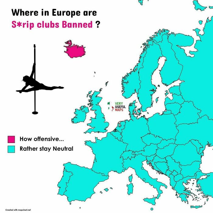
I was wondering why Iceland would be the only country to ban strip clubs, but then I thought, "ever lick a frozen pole?"
Be it in a digital form or not, maps can help people learn not only all about certain geographic areas but about links between different cultures, too.
“While personal experience with other social groups and cultures is the pinnacle of building mutual understanding between groups, maps are a great way for people to begin to understand the world around them, including the differences (and similarities) across different cultures and groups. And getting access to maps, especially for those of us in the Global North, is easier than traveling all around the world, nevermind that it is more climate friendly,” Asst. Prof. Carolyn Fish suggested.
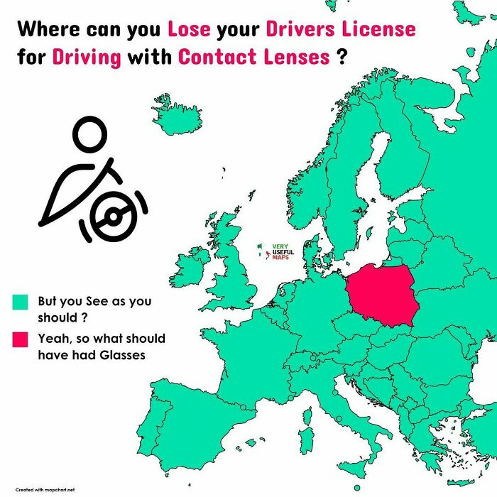
It may sound strange, but it’s true that a driver can face a fine of 500 zlotys or even the revocation of their license if they are caught driving with contact lenses instead of glasses, despite their driver’s license indicating that they should be wearing glasses. This is because police officers can stop a driver with a significant visual impairment from driving if they don’t adhere to the restrictions on their license, which are indicated by numerical codes on the back of the document
I thought I'd check the law in Australia. If your licence says glasses and you're not wearing glasses then police have the right to check your vision. And if you fail, contacts or no contacts, it's a fine or revocation of your license.
While all sorts of maps can clearly be great ways of learning new information, according to Fish, it’s important to view them with a healthy dose of skepticism. “Just like we need to have a healthy skepticism of the news we read, we also need to maintain that skepticism with maps as well.
“There is a great book called ‘How to Lie with Maps’ by Mark Monmonier which talks about the ability to easily manipulate data and information to tell different stories in maps. A lot of my recent research has explored how people might be doing this with climate change maps. Humans have this tendency to trust maps more than they trust other information, so just being cognizant of our biases is helpful when viewing maps these days.
“My research has shown that typically there is not ill-intention on the part of the mapmaker, but we, as map readers, should all be looking at maps and thinking: about where the data comes from, who had a stake in creating it, what mistakes could have been made in the creation of the map, and how was the data made into information that is viewable in this type of graphic.”
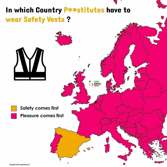
Asking builders "how much?" gets confusing in Spain unless you specify exaclty what you want.
So the ones that are the most north are the one where you see the NORTHern lights? 🤨
Damn. Don't let me get too drunk in Croatia. That's gonna be hard because according to another pic in this thread, the beer is very cheap there.
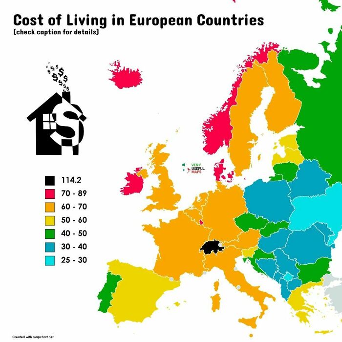
How is Cost of Living Calculated:
Cost of living is calculated by comparing the prices of a range of goods and services on which consumers spend their money.
Costs are broken down by categories, like health care, food, and housing, and weighted based on spending patterns and individual budgets
Well technically the "cost of living" in Ukraine would be better described as the cost of staying alive these days. I suspect this map may be a bit out of date.
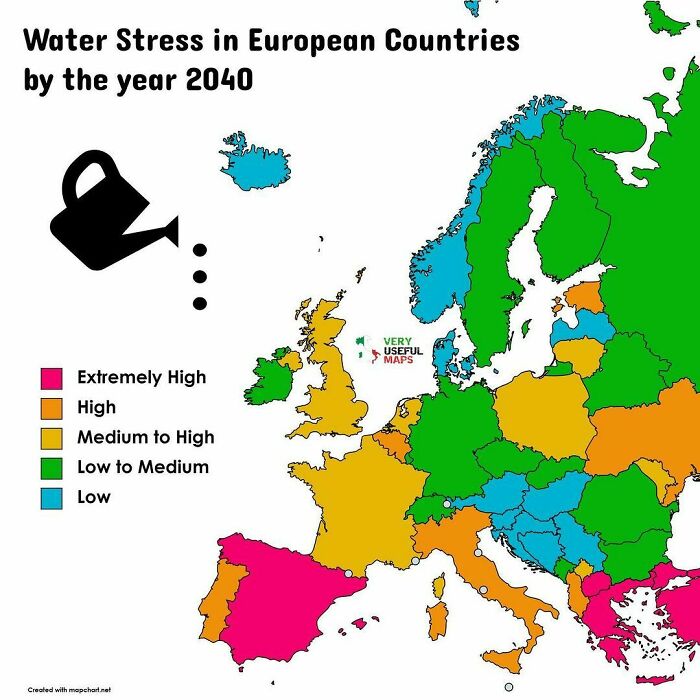
Globally in 2018, just 18.4 percent of total renewable freshwater resources were being withdrawn. Regionally though, there are already places experiencing serious issues. Northern Africa has critical water stress levels, while Central and Southern Asia were classed as having high water stress. On the other end of the scale, 31 percent of the global population remained at the “no stress” level
Flooding can also cause "water stress" - just in a different way than intended! So here in northern Germany, drought might be less of an issue but flooding will probably be a big problem with rising sea levels.
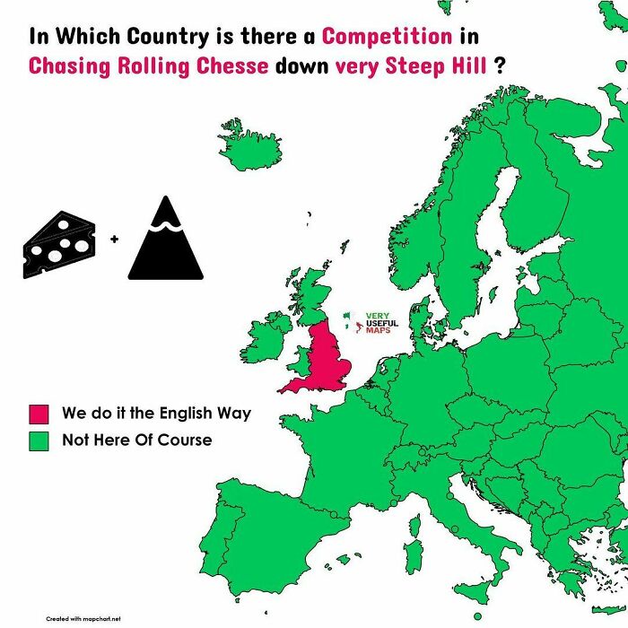
England for the batshit crazy win! We also have competitions for eating nettles, throwing pies over houses, snail racing, welly wanging and my personal favourite, the Dorset K**b Throwing competition, I know you’ll look that up 😀👍
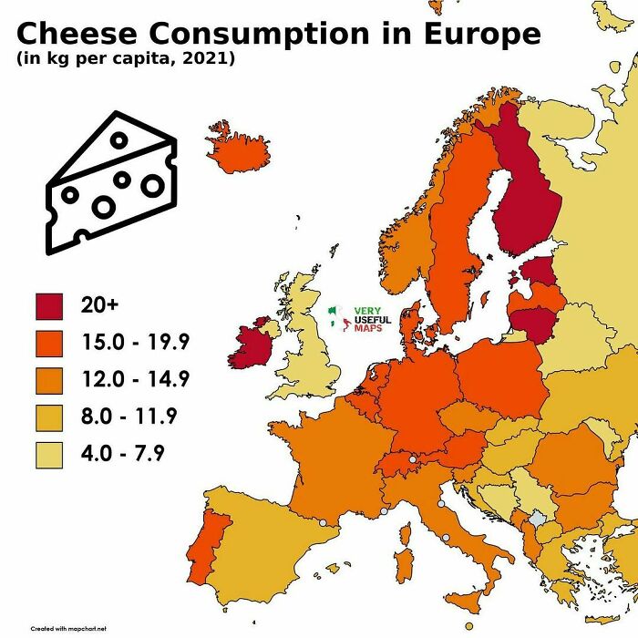
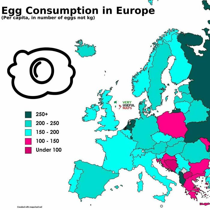
Disappointing showing from the U.K., my Lancashire / Cheshire / Cheddar consumption clearly isn’t enough!
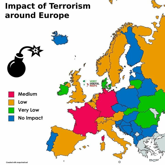
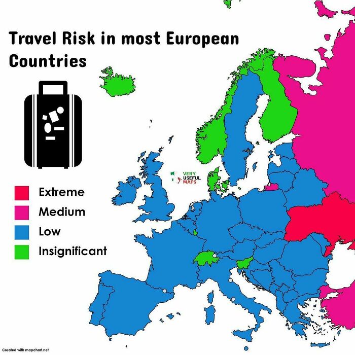
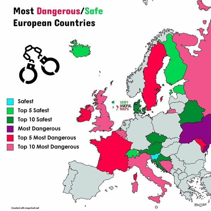
The Travel risk rating evaluates the threat posed to tourists and citizens by political violence (including terrorism, insurgency, politically motivated unrest, and war), social unrest (including sectarian, communal, and ethnic violence) as well as violent and petty crime
Other factors, such as the robustness of the transport infrastructure, the state of industrial relations, the effectiveness of the security and emergency services, and the country’s susceptibility to natural disasters are also considered where they are of sufficient magnitude to impact the overall risk environment for tourists and citizens
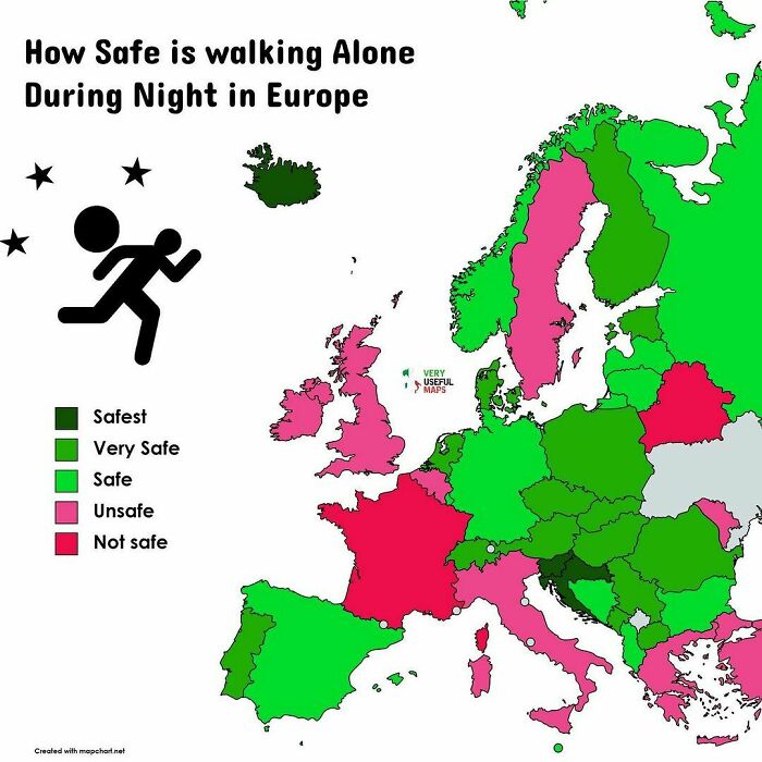
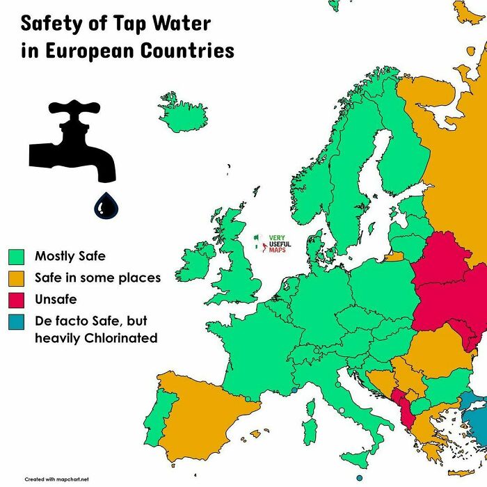
Mostly safe for the U.K.? It’s as reliable as a pint of milk. Not ‘mostly’ safe, it’s safe, keep your bottled water!
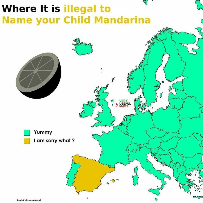
I actually think this might be true for Iceland. Not sure mandarina is on the approved list of names. Anyone?
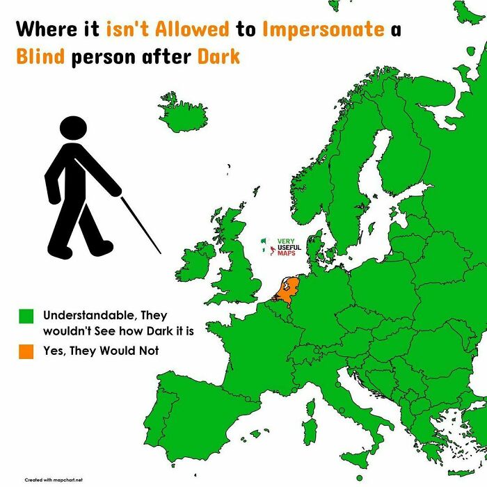
This strongly implies you can impersonate a blind person during the daytime.
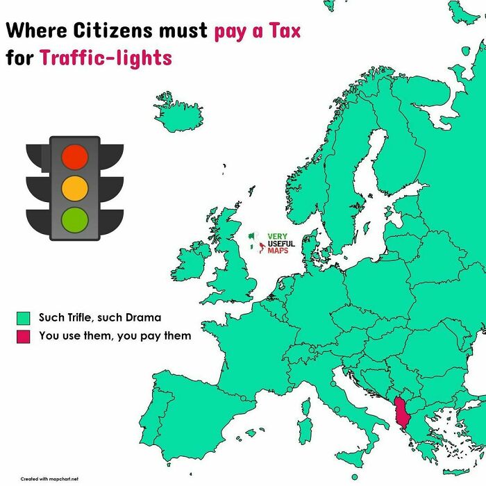
n 1995, the Albanian Parliament 🇦🇱 passed a law requiring all citizens to pay taxes on traffic-lights in their home towns. You may discuss the soundness of such tax but the story goes even more absurd: once adopted, the residents of Shkodra – one of the oldest cities in Europe and the fifth largest in Albania – staged a protest. Their reason? Shkodra has no traffic lights
Everyone ignores them anyway in Albania. Plus the roads are... an adventure!
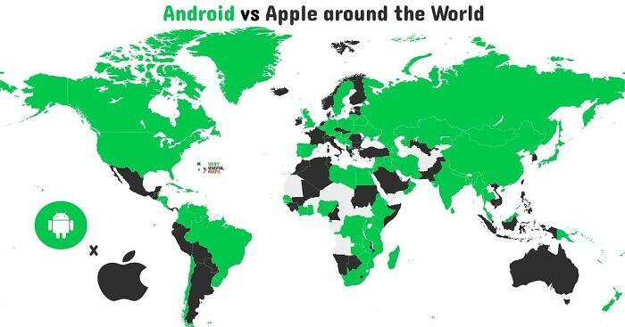
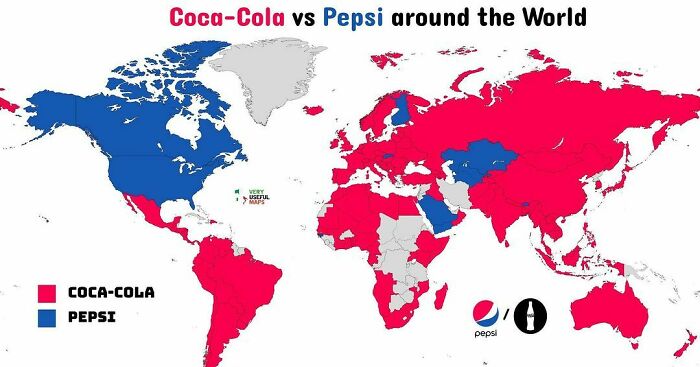
Although not in my own fridge, Coca-cola is way more popular than Pepsi in the US
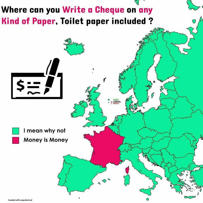
Technically, you can write a cheque on any support in France as long as all the required legal data is written on it. Fun fact: a cheque worth nothing because the account of the payer is not enough provided is called "cheque in wood". So in France, you could make a cheque in wood with real wood which is legally worth something. You'll just be in trouble to find a shop which will accept it. :-)
What happens if you are a same-sex couple who legally adopted a child in one country who then wants to move their family to one of the red states? Is that adoption still considered legal?
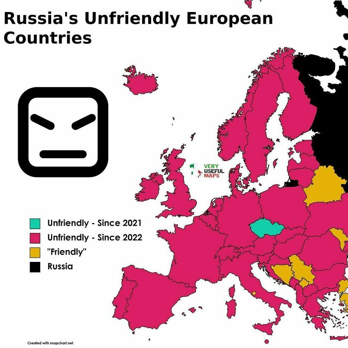
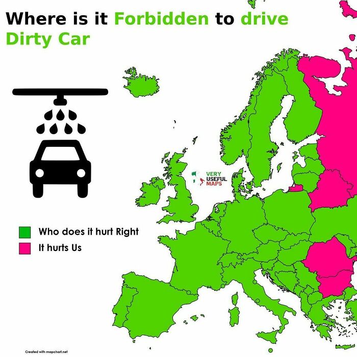
It hurts russians to see / drive a dirty car? Wow, then do not visit Ukraine, there is a lot of dirt everywhere after all the bombing...
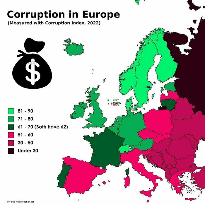
The 2022 CPI, published in January 2023, currently ranks 180 countries "on a scale from 100 (very clean) to 0 (highly corrupt)" based on the situation between 1 May 2021 and 30 April 2022. Denmark, Finland, New Zealand, Norway, Singapore, and Sweden are perceived as the least corrupt nations in the world, ranking consistently high among international financial transparency, while the most apparently corrupt are Somalia (scoring 12), Syria and South Sudan (both scoring 13)
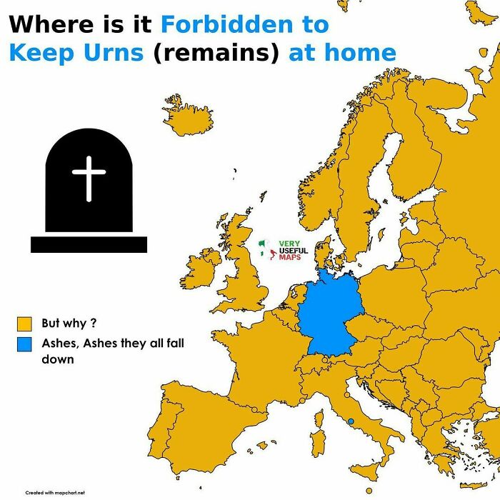
I don't think this is true for Poland, there are laws that forbid it. You can't scatter the ashes either.
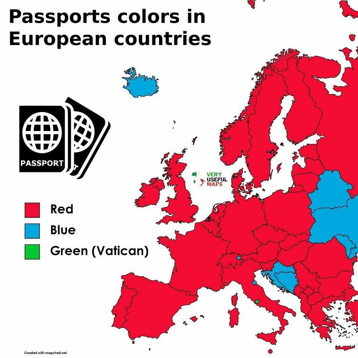
I thought the UK passport was blue now. We had a vote about it and we wanted blue.
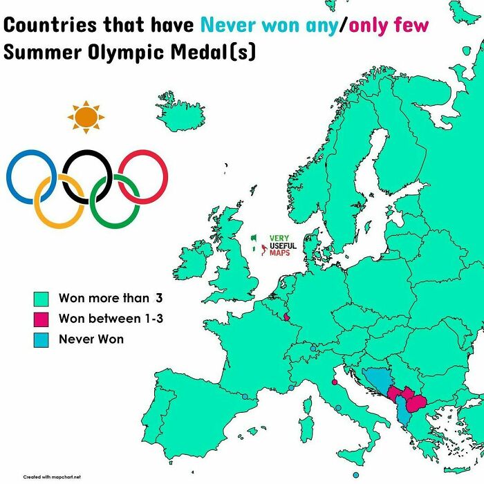
Canada (my country) has the humourous ignominy of being the ONLY country to host the olympics and NOT win a gold medal. And we did it twice, 1976 and 1988. ¯\_(ツ)_/¯
In 2022, the aftermath of C19 and the war ⚔️ in Europe brought the highest rates of global inflation since the 1990s, widespread fuel protests, and food insecurity across the developing world
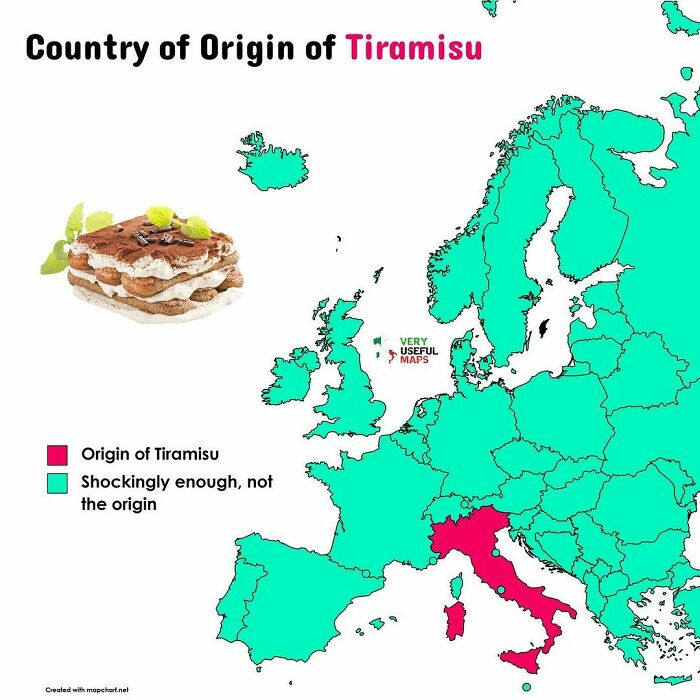
Best dessert in History. Yeah, I'm Italian, how could you tell? :-)
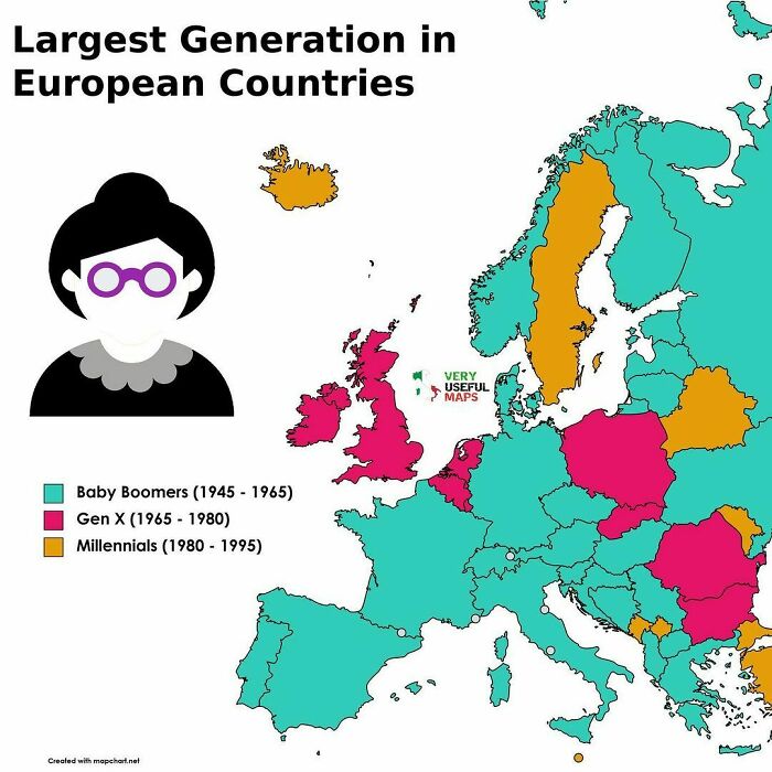
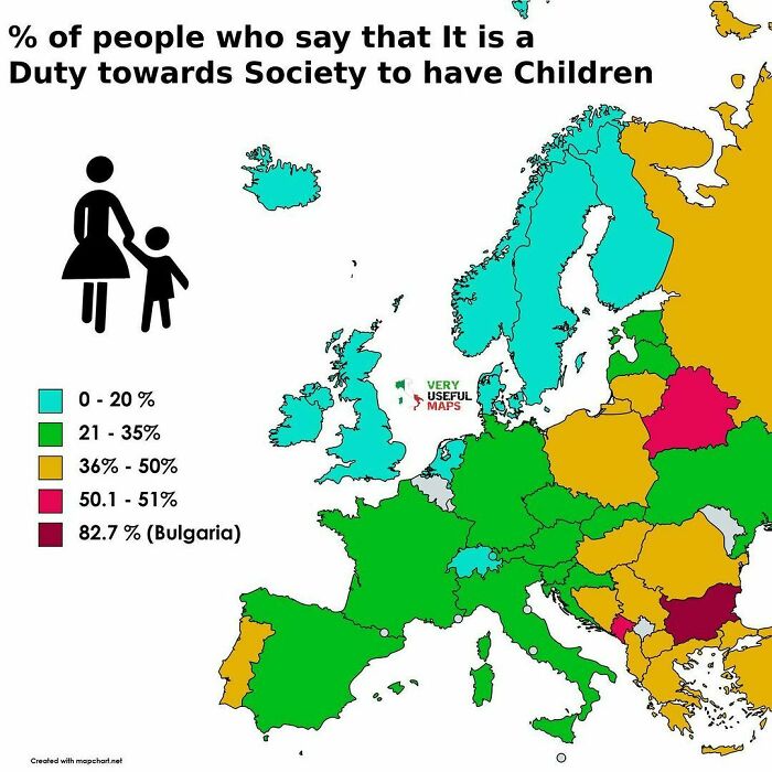
What a weird question! I would prefer to know the answer to "What % of people believe it is society's duty to care for all children?"
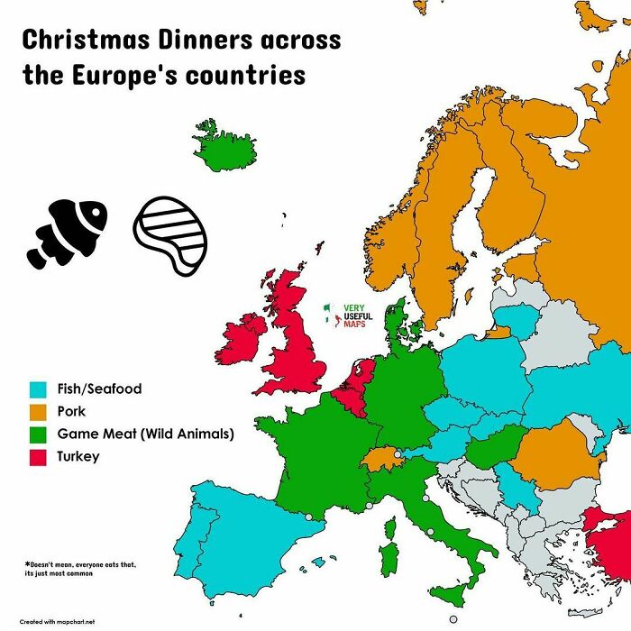
And here we see why these maps are useless, they assume countries to be monolithic blocks where actually traditions, languages and cultures give way less of a hoot about borders than, say, tax policy. So, while this may be true for parts of Germany, it's definitely not true for my neck of the woods.
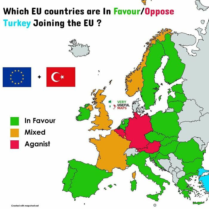
this doesn't seem right... one of the reasons it can't join the EU is because of the situation in cyprus. Also Sweden pretty famously opposes (its constantly in the news and if you google it you can see 60% of the people oppose)
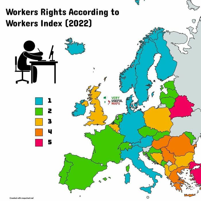
I am assuming that in this case the higher the number the more the number of rights a country has, versus it literally meaning the number of rights they have?
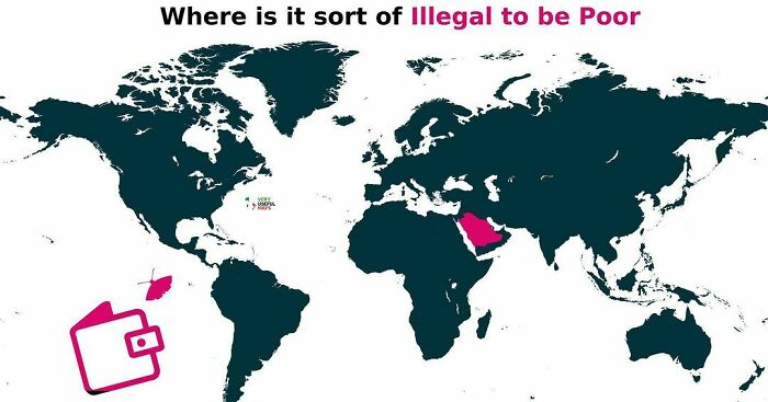
This seems profoundly reasonable. If someone is in debt to you, how could you hope for them to satisfy that debt if you confiscate 100% of their capital resources?
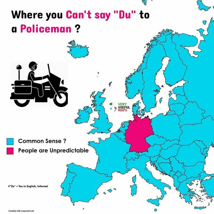
Technically, "you" would translate to "thou". English lost the informal and made the pluralis maiestatis the informal way of speaking.
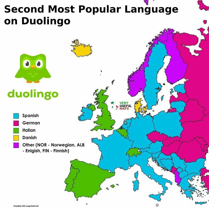
Surprised that my daughter learning Korean so she can understand K-pop isn’t featured. 😂
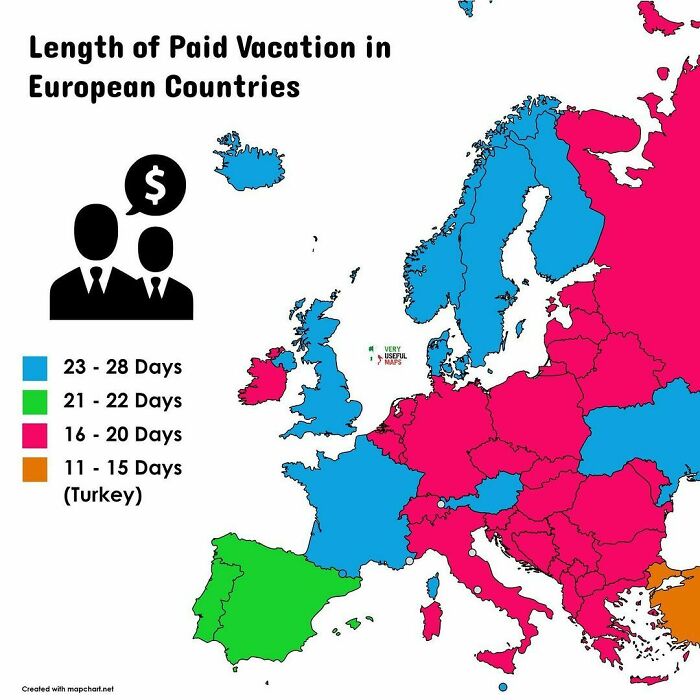
This is wrong. Germany has legally mandated at least 24 days of vacation per year (most people have more). I assume, a lot of other information on this list is as wrong as that.
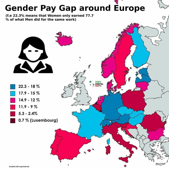
I'm so very tired of seeing this BS spread around. There is not a "wage" gap. A woman doing the same job as a man, is not being paid x% less, and if you thought about it for any length of time you'd realize that companies everywhere would be motivated to hire only women so as to save x%. That's not how this factoid was ever calculated. This figure is arrived at by comparing the lifetime earnings divided by the number of years worked, without accounting for different jobs, different salaries, level of education or gaps in employment due to, say deciding to be a SAHM, medical issues or going back to school. This is old hat, that has long been proven false. Modern studies have found a 2.6% difference between men and women working the same jobs, with similar education levels, and that difference can be chalked up to how men and women differ in advocating for themselves during salary negotiations.
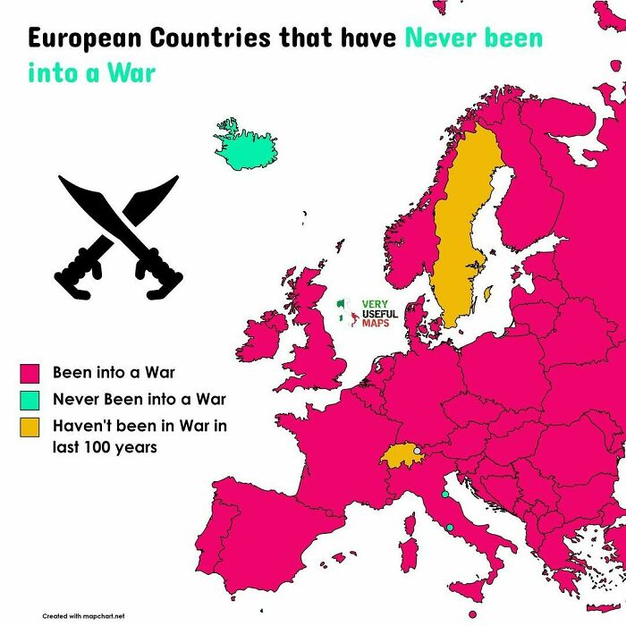
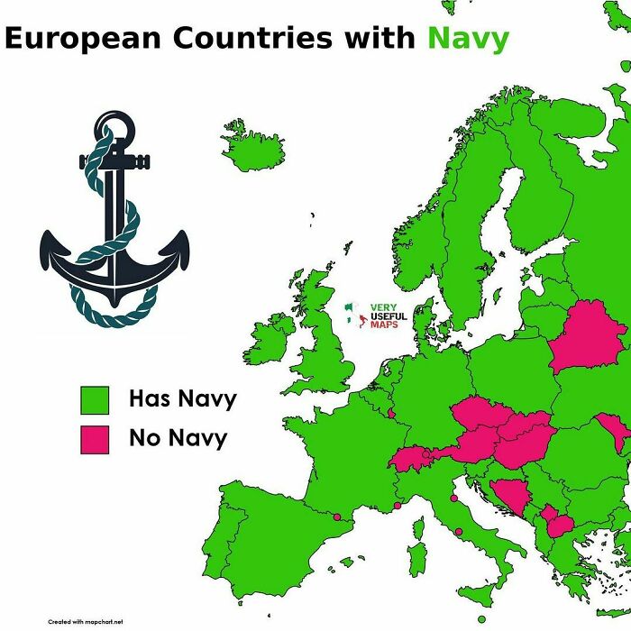
The Swiss only want you to believe that they have no Navy, because the surprise is the strongest element in combat! /s
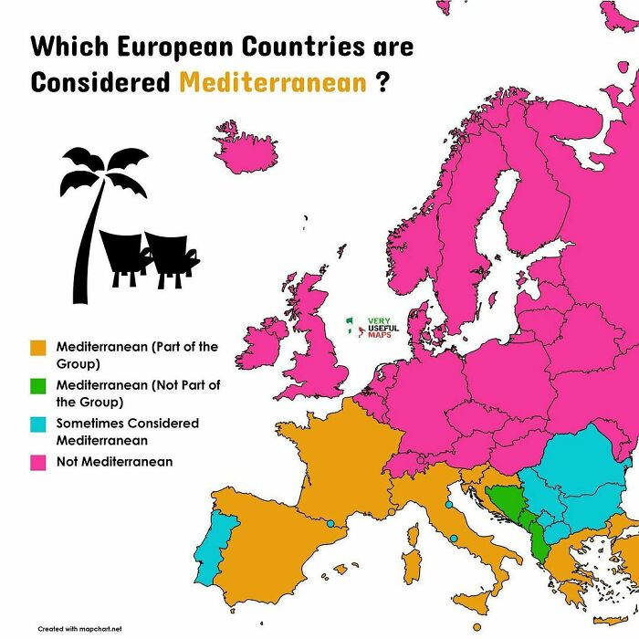
I'm guessing land that is adjacent to the Mediterranean (and Adriatic, ionian, tyrrhenian...etc) sea?
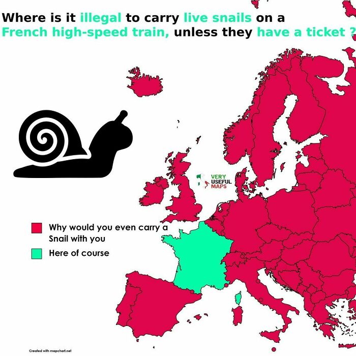
It is not illegal - it is not a law. But you need a ticket for live animals on the train. This particular case made the news and everyone found it funny - except the person who got fined for not buying the ticket.
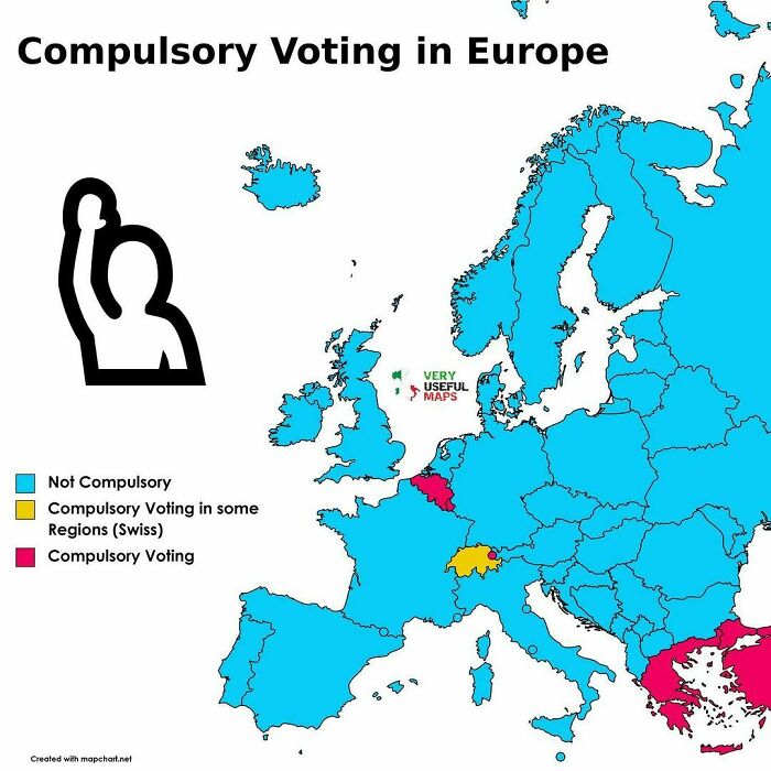
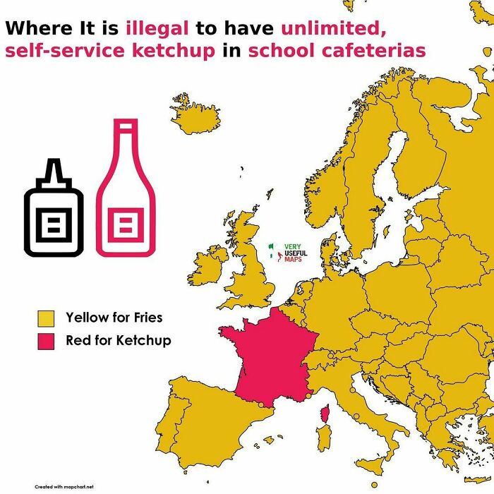
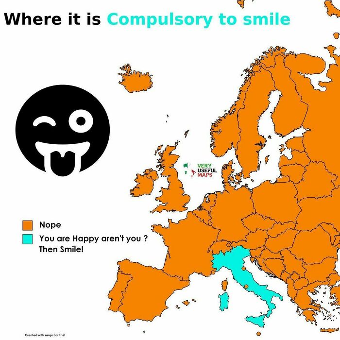
If I was fed Italian food all the time, there would be no need for compulsion.
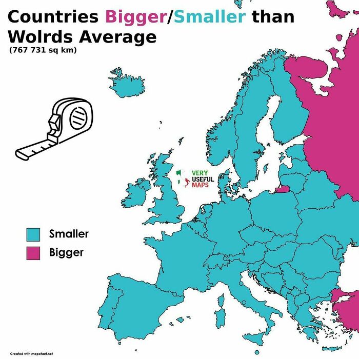
In case anyone is wondering about the little pink bit that doesn't look like it's a very big country, it's Kaliningrad and is part of Russia.
The legends on some of these maps is so poorly worded/badly translated that they're hard to parse.
On some, the colours can't be identified by red-green colourblind people.
Load More Replies...Usually I find interesting this kind of lists. This one is often poorly worded, so not always understandable and with not really properly sourced information, at least in my knowledge, so not exactly reliable (I'm European, so I know for a fact that some of those maps are at best ambiguous). Maybe checking syntax and facts before posting would have made a good article (EDIT: typo)
I didn't even get that far. I only looked at the first three. They weren't "interesting maps". It was just saying something like "France banned potatoes because they were funny-looking," then happened to have a map that shows France.
Load More Replies...I usually highly enjoy these sorts of maps, but these were confusing and in some cases incomprehensible. Perhaps if someone had taken the time to clean them up a bit and make them easier to comprehend I would have enjoyed it more.
I love your maps with hour country names. I could identify probably 99% correctly. I wonder how readers did.

 Dark Mode

 No fees, cancel anytime


