40 Unfortunate Designs By People Who Had No Clue What They Were Doing, As Shared By This Online Group
Design follows us everywhere we go — from billboards, ads, and signs we see while driving down the road to pretty much everything in our kitchen cabinets. It’s an integral part of life that should make everything easier. If it's any good. Because the sad truth is that very few design concepts are actually great. Far too many creators make glaringly obvious mistakes that stand out like a sore thumb, turning a blind eye to user experience, logic, aesthetics, and common sense as a whole.
But believe it or not, most of these cringe-worthy fails are not full-blown disasters of epic proportions, but rather... disappointing attempts that are almost begging to be poked fun at. So allow us to introduce you to one entertaining corner of Reddit, which seems to be still growing, called 'Unfortunate Design'. This online community features an impressive collection of not exactly bad, but plain under par solutions that are bound to raise some eyebrows.
Below, our team at Bored Panda has gathered a list of some of the most regrettable examples of "when the design is just not right," so continue scrolling to check them all out! Be sure to upvote the pictures that made your inner critic all fired up and ready to go, and let us know in the comments which of these were your least favorite.
Psst! After you’re done, treat yourself to some more horrendous design madness from our previous posts here and here.
This post may include affiliate links.
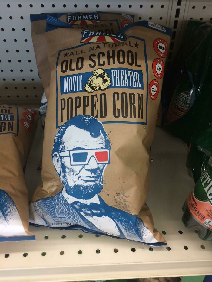
Was Lincoln Really The Best Example For A Movie Theater?
uhh yeah it’s a good example! he had one of the most action packed theatre experiences ever!
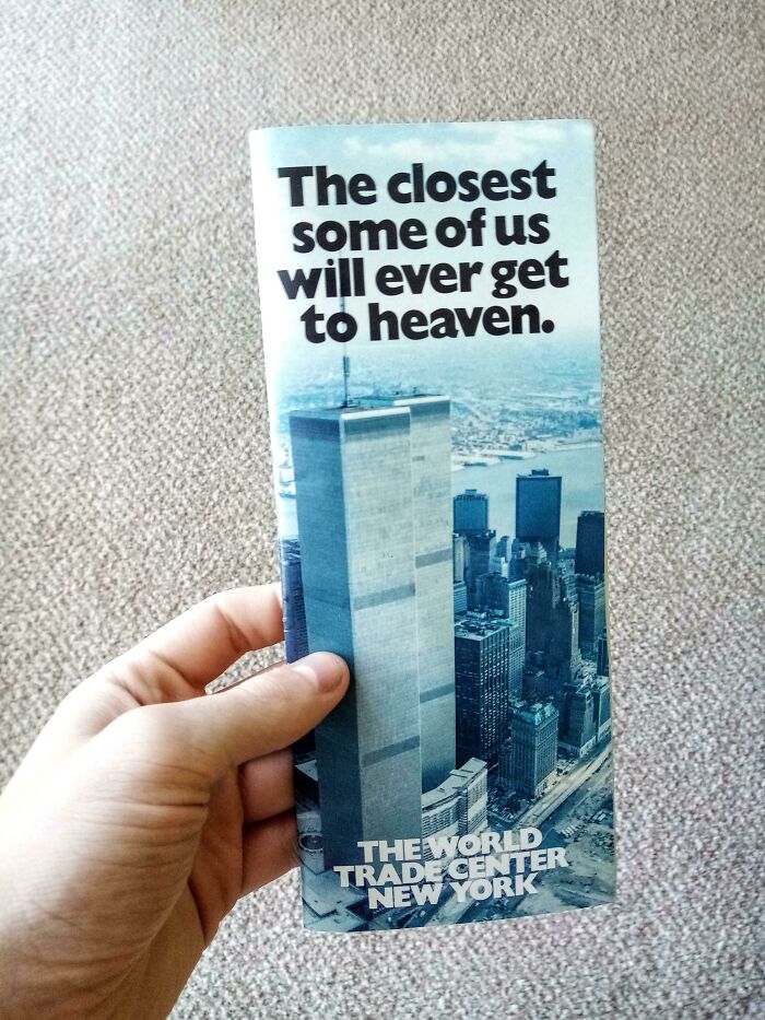
Marketing Lesson
Okay, I highly doubt this was made after 9/11, but some years before. It is only unfortunate, in hindsight.
What intuitive insight you have. What was your first clue, that the Twin Towers didn't exist after 9/11?
Load More Replies...I have a stack of these that I snagged as a kid at the WTC in 1980. So it's not an unfortunate design. Just a bad coincidence after 9/11.
Well, it certainly turned out to be an awfully prescient phrase, but what is the lesson? Are marketers supposed to anticipate that terrorists might fly planes into a building, then the building will collapse and thousands will die? I'm trying to see what the lesson is here . . .
What we know of it in Belgium, it was a big deal if you could work there. Tragic how many lives were affected by what happened to those people. But you have to admit the add sounds compelling for ambitious companies.
This was a brochure from the 80s, so it's not poor design by any means.
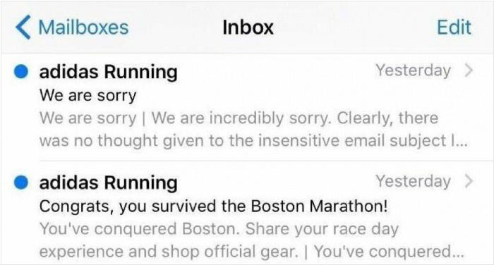
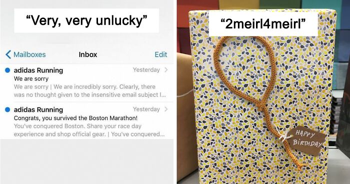
Very, Very Unlucky
I know it is horrible, but it is also hilarious. You know they did not mean it like that so you can totally understand their embarrassment.
Thank you finally someone else that finds it funny tragic but I mean you gotta laugh a little
Load More Replies...An acquaintance of mine from Northern Ireland was in a cocktail bar in Boston around 2016. Going through the list of cocktails he spotted one called a "Belfast Car Bömb" and asked the barkeeper what it was. "Oh!" he exclaimed, "We have the self same drink in Belfast but we call it the Boston Marathon!" The barkeeper's face clouded over and my friend said "Too soon? No, it's not fecking funny when it happens to you, is it?"
The 'Unfortunate Design' online community welcomes all fellow design aficionados eager to ridicule and discuss the examples they find online or in real life that are not necessarily horrible but somehow managed to miss the mark. If this is your cup of tea and you already have some pictures of disappointing designs in your camera gallery waiting to be shared with the world, don’t be shy!
But before joining the group, though, there are some important rules you have to be aware of. The first and most important one is already in the name — posts must feature an unfortunate design. Or, as the moderators clarify in the sidebar, "Posts must display an unfortunate design that was not intentionally made to appear misleading or be misunderstood."
Needless to say, people looking after the group ask its members to be civil and avoid name-calling or fight-picking. And, obviously, there’s no place for racism or violence on the sub. Furthermore, low-effort or irrelevant titles are simply a no-go. "The title of your post must be descriptive and relevant to the post contents," the mods added.
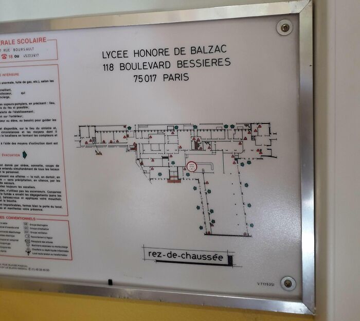
Design Of A College Building
This is very misleading, because this blueprint only shows part of the building and it actually looks nothing like a gun. Besides, it's in France: 48°53'45.1"N 2°18'55.7"E
BWAHAHAH!!! You're right! The ENTIRE building looks more like an AR-15. I'm afraid of it, because the AR-15 seems to point the opposite way.
Load More Replies...Ballsaack High school? Forgive me, I couldn't resist
Load More Replies...That’s Either A Sick Joke Or A Sales Ploy😂
Google ads after talking to someone you're next to, about some random store....
I worked in newspapers for years and this sort of thing just happens. One time, a local kid of a well-known family was killed in a weekend car crash and it was on front page of the Monday paper. Inside the same paper was a huge ad for a car dealership that showed the kid's dad (the dealership's owner) smiling and inviting customers in. Ad was placed on Friday by ad dept, crash happens on weekend and is covered by news dept, and the two depts don't talk. Another day there was a huge plane crash off Nova Scotia and our paper had a big ad for an airline on the same page as crash coverage.
If this were a website, I'd say this is just context aware advertising...
So did he know she was in there? Or he didn’t realize? They don’t phrase it like he killed her
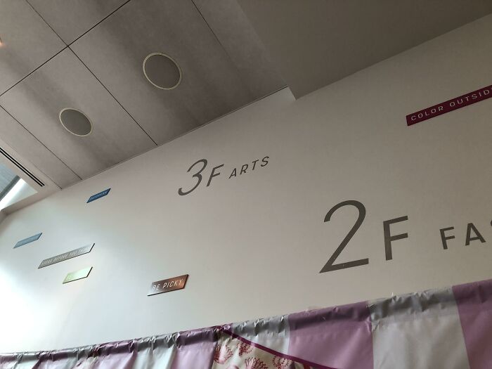
3f Arts
As Billy Connoly said, "Watch out for the 5th, it's not a fart" ;o)
Load More Replies..."2F Arts, two hearts that beat as one. I need you, I need you" (with apologies to Stacey Q.)
Okay, umm I will try 3 or 4 farts just to be sure...haha
Consequently the Taco Bell is located in the 30th floor, so you can comply with the regulations while you go down.
As you take a brief scroll through these regrettable and obnoxious objects featured in the list, be prepared to feel your toes curl. Whether intentionally or not, this online community shows us that some designers opt to completely disregard every single principle of good design by making the end users suspicious, annoyed, and even frustrated. And let's not forget the confusion, something that inevitably builds up when unfortunate solutions create more problems than they solve.
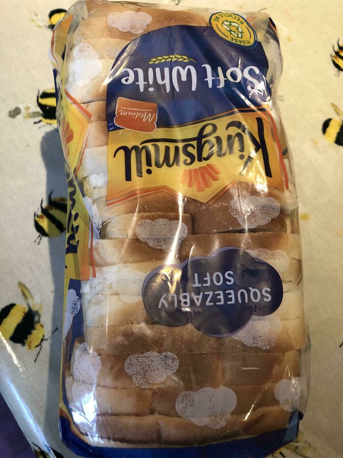
How Many More Times Will I Think The Bread Bag Is Suffering From Condensation?!
Look on the bright side, you don't have to wait a week to get such beautiful mold - it's already there!
Load More Replies...This is the only one not upside down for me. Finally.
Load More Replies...This should be higher, it isn't just an unfortunate timing of words, it actually worries consumers.
Been there, done that. Don't think same brand, but many times I've had to inspect my bread to discover was the print on package
What lovely little rain clouds, just what every bag of bread needs to elicit visions of mold...yummy yummy yummy 😋
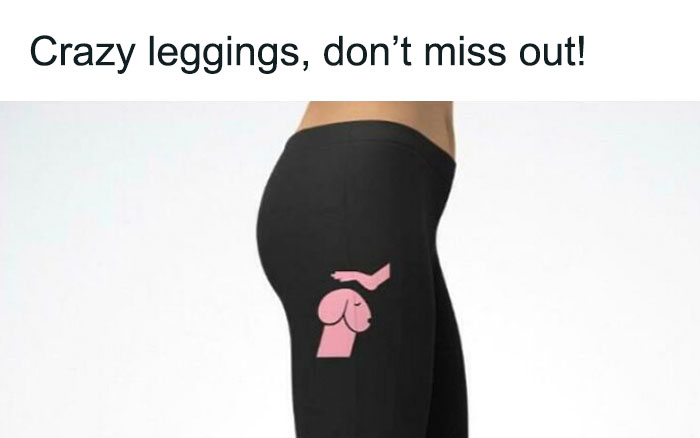
From “Love Dachshunds” - Promoted Ad On Reddit
What else can be senn there... Whait... What.. Oh...
Load More Replies...I’m surprised this made it past the BoredPanda censor fairies 🧚♂️
I'd still buy the hell out of this. LOL Actually I am wondering if they still sell it. *heads to Google*
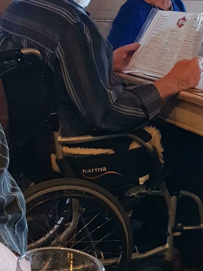
This Wheelchair Logo
if it’s Greg Abbott, he did a LOT to deserve that…
Load More Replies...My wheelchair is made by a company called Quickie, you can imagine all the jokes I get about that!
There is a company that makes carriers for babies called Boba. In my language boba means "stupid".
"From its Sanskrit origin, KARMA primarily means “action.” KARMA is an eastern philosophy that emphasizes that individual actions determine the future consequences of the individual- “what you give in life, you will get in return. ” We named ourselves KARMA because we want to bring positive energy into the lives of all KARMA wheelchair users. We understand that losing mobility is a scary life challenge, but as long as we strive and spread positive energy, we will overcome our challenges. We believe hard work and a positive attitude will bring good things. For us, because of “KARMA,” we take action to help people with disabilities. We do our best to provide quality products to fit everyone’s need and to help them lead a fulfilling life, regardless of the disability. The word, “KARMA,” reminds us not to be idle, but instead take action and make a positive contribution to people’s lives."
Great. Now consider the typical usage of the word in modern day English-speaking society, given language and meaning constantly evolve. When we use that word outside of a spiritual or philosophical context, we almost always mean the negative retribution people suffer because of their negative actions. In other words, justice served. Just because they can be pedantic about the historical & textbook meaning doesn’t change the social usage and meaning.
Load More Replies...All jokes aside, it is the best wheelchair out there! We've used several different ones and this is by far the best.
But why do these examples stand out like a sore thumb? Well, there's a plethora of information stating that one of the main reasons we believe badly thought-out design is all around us is because it is simply more evident.
Just think about it, we often manage to miss examples of good design, even when they’re staring us right in the face. This happens because it usually follows us around like a friendly invisible ghost, quietly improving lives while not getting in the way of the user. But as you've already noticed, bad designs do the exact opposite.
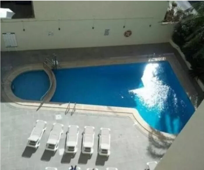
This Oddly Shaped Pool
yeah! they totally told him he needed to separate the shallow end AFTER he built the entire pool. as you can see from the highway divider they used.
Load More Replies...Oh my, that's unfortunate. Just how deep is the deep end...balls deep?
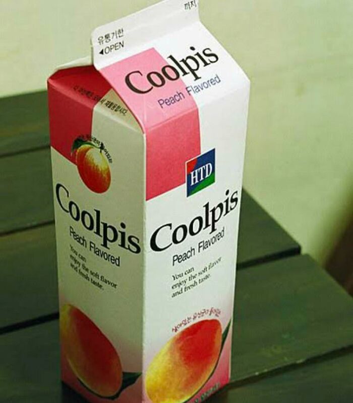
This Is Actually A Much Enjoyed Korean Drink
In Japan we have "Calpis" which is, of course, pronounced sounding like "cow p**s".
There's a Japanese sports drink called Sweat which is also really popular in Japan, makes me laugh so much
yes… it’s also served just slightly colder than room temperature.. it’s “coolpis” not “coldpis”
Load More Replies...I first read it as "Cool Lips" then realized... funny what the brain does. Mine anyway.
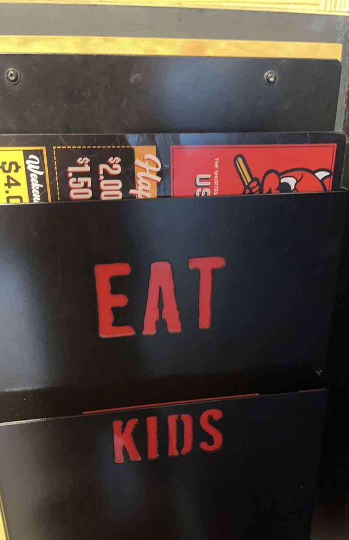
Menu Holders Suggesting A Questionable Diet
I know, right? It's like, you take one bite out of an especially tasty kid, and all of a sudden your'e a cannibal!
Load More Replies...back in my good old day we would eat kids and play dodge ball with the bones and if your hit, you'd be the next meal
Alice Rawsthorne, world-renowned design critic and author of books Hello World and Design As An Attitude, believes there’s simply too much of the not-so-good, the bad, and the ugly. She said while taking to the stage at the Design Indaba conference in 2019: "Very little design is actually great, very little of it is even any good, most of it is mediocre, and an enormous amount of it is damn right bad."
According to her, it’s only by better understanding how badly executed results happen in the first place can creators find it easier to avoid making mistakes when thinking of their next big project. Rawsthorne outlined 8 main categories that would help people identify failures: pointless, useless, lazy, thoughtless, ominous, untrustworthy, offensive, and good intentions but…
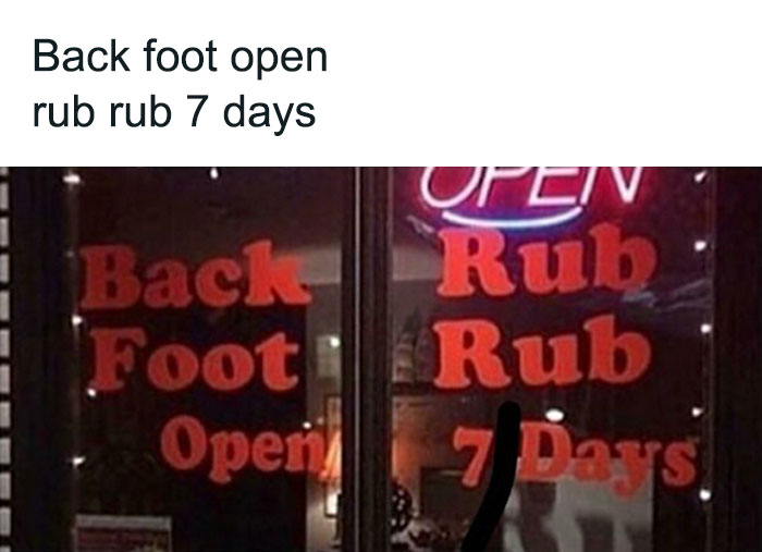
What
Nah, your back foot’s open, gotta stitch stitch it up first
Load More Replies...Wait, what happened to A Dub Dub and the 3 men in a tub?
If I read the author's title the same way they read the sign. It says "back rub foot rub open 7 days". Who reads up and down and not left to right?
2meirl4meirl
Is this for someone on death row? Hope the gift giver didn’t spend too much!
The Amount Of Characters Makes It Seem Like Canada Is Funding Coronavirus
1.1B sounds a bit much I only gave covid its $20 monthly allowance
It looks like the government pays money for creating COVID instead of fighting it
Load More Replies...In an interview with Design Boom, Rawsthorne explained that bad design in itself doesn’t have value. However, she believes that there’s also the magnifying glass effect at play — poorly executed solutions can be called out and used as a cautionary tale.
"Apple did overhaul its relationships with subcontractors after the exposes of supposedly exploitative employment practices, it has made recent efforts to improve its environmental record," the critic said, adding that companies will start thinking much more carefully about the products they launch in the future. "And that can only be good."
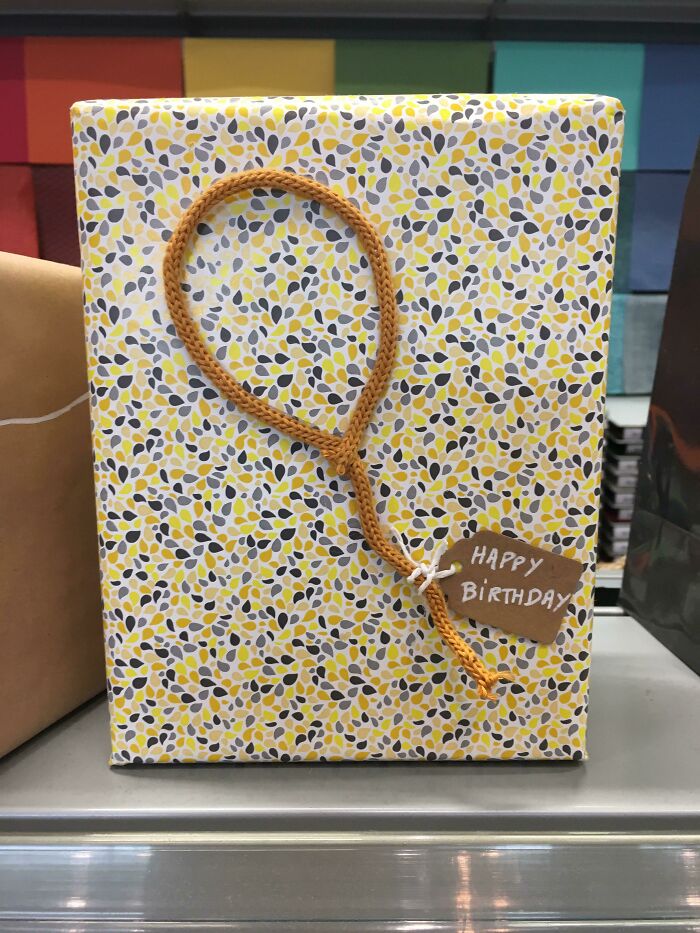
Someone Has A Sense Of Humor
Youtube’s Character Limit On TV App
Oh No
The kid is covered in kisses and there are two pastors below him. Que the pedophilia jokes.
Load More Replies...Exhibite A: the lipstick that was found in the PASTOR's pocket...Chanell's 'simply delicious'.
Not sure touching little boys has ever been a big thing for baptist preachers but I wouldn't put it past them.
But another problem designers seem to face today is that too much stuff gets released into our vast world. "[Design is] an industry that was driven by production and demanding consumers. And undoubtedly most people still see design as a source of all the plastic trash that’s clogging up the pacific, rather than a genius way of removing it, and enabling us to live more responsibly."
"Designers now have an opportunity and I think a responsibility to challenge that," Rawsthorne continued. "But that will be determined by the quality of the solutions that they develop. Design is instinctively and inherently a resourceful and resilient field that’s constantly evolved over time to adapt to new challenges and changes. So there are commercial opportunities, as well as personal and moral opportunities in all these new areas."
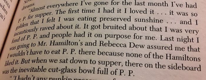
This Book Abbreviating "Pumpkin Pie"
This is an extract from “Anne of Windy Poplars” by L.M. Montgomery, a later book in the famous “Anne of Green Gables” series. The photographed passage is actually a letter that Anne was writing to her fiancé, in which she described being invited to supper with several families in the town. “P.P.” actually refers to preserved pumpkin. Montgomery has Anne specifying “pumpkin preserves” (spelled out fully) the first time it is mentioned, and only abbreviated afterward. It makes sense that in private correspondence a frequently repeated phrase would be informally abbreviated. At the time the book was written, “peepee” was not a euphemism for anything. So the humor in this example comes from the present-day mindset of the reader and not from the original text.
Ahhhh the Anne of Green Gables books. Good times. She's typing a letter to her fiancee and discussing how much she's sick of pumpkin preserves. Not pie. Still funny out of context though. 🤣
I'm on the wrong side of 50 and still read the Anne books. Great writing never grows old. Unlike me, dagnabbit.
Load More Replies...Perhaps they can comment on the Coolpis drink further up? Does it taste of Peach?
This is horrible. And if there's an audio version, the narrator must have had a hard time trying not to laugh.
Never put cut glass bowls of pp near the dinner table. It's bad manners and pretty damn disgusting.
“Bruited about” is an English-language temporal idiom meaning “discussed” or “gossiped.”
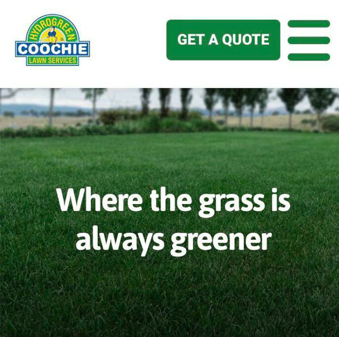
Load More Replies...When Your Company Name Becomes Slang For Vagina 20 Years After You Start It
Hahaha holy s**t how is that not censored? They really cunted that up
Load More Replies...Per Ancestry.com, the last name first shows up in a 1880 US census record. Per etymonline.com, the word was first used as its current slang version at either the 1893 World's Fair (coochie) or in a 1856 song (Hoochie Coochie) widely sung in minstrel shows that are confirmed prior to the name showing up in a census record.
Mr. Poontang's Lawn Care Services didn't really have the same ring to it
Guess they could've gone with Vijayjay where the grass is always greener in the valley.
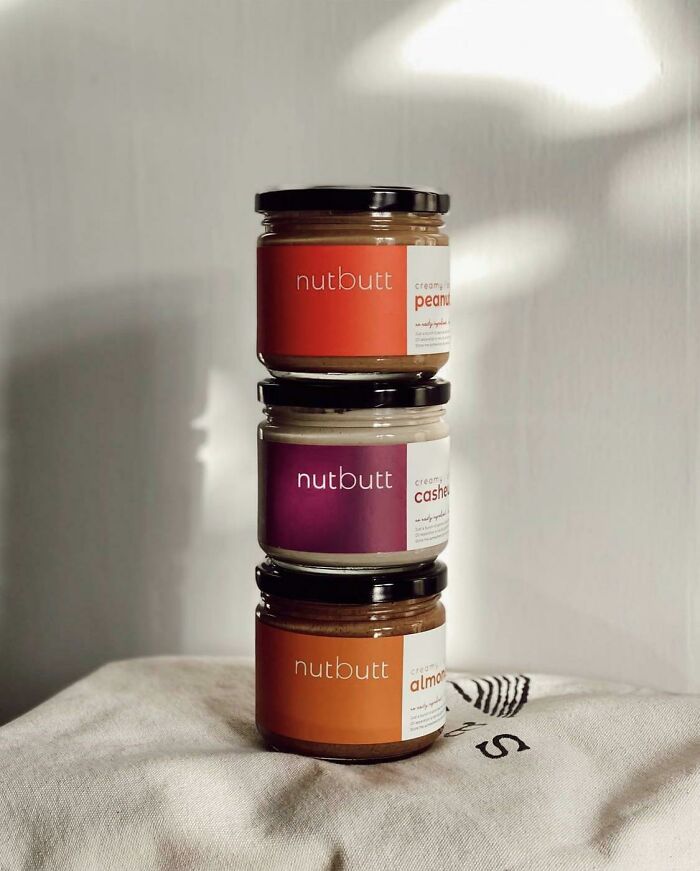
This Unfortunate Choice Of Name For A Nut Butter… They Didn’t Think This One Out
Agreed. For a cute abbreviation they could have just used the balanced “nutbut”, but someone, somewhere, made the conscious decision to add that extra “t”.
Load More Replies...There’s also a anti-chaffing cream for athletes called “Squirrel’s Nutbutter”
Load More Replies...A summer camp kitchen uses "butt noods" rather than buttered noodles.
At the end of the day, it’s up to creators to come up with intelligent, appealing, effective, and efficient ways of dealing with issues that arise in the modern world. And as critic Rawsthorne added, the one thing they need to stop designing badly, it’s to think.
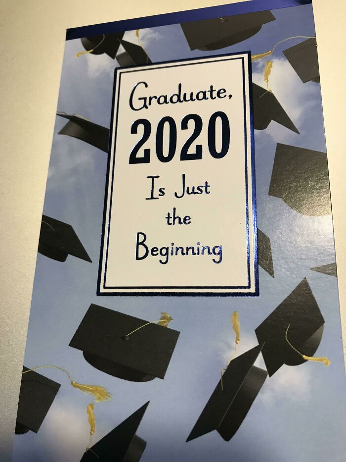
Seriously Tho
Can someone send the graduate in the marketing Dept back to English class?!
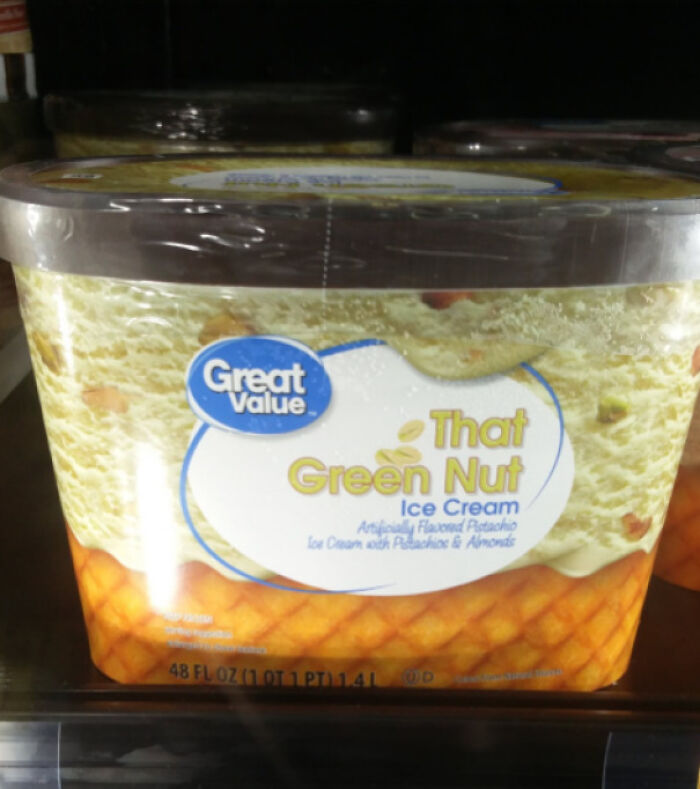
The Best Flavor If You Are Shrek
I guess it's because there's no real pistachio in it, they're not allowed to call it pistachio ice cream.
Unless they call it "I can't believe it's not pistachio ice cream" ;-)
Load More Replies...Potentially gross comment: My smoothie has just about come out of my nose.
Load More Replies..."Artificially Flavored Pistachio" and then right below "Ice Cream with Pistachios". MAKE UP YOUR MIND, WILL YOU
“artificially flavored pistachio ice cream” there wasn’t enough room on the first line. the pistachios are real because you can’t fake those yet.
Load More Replies...Walmart is just trying to advertise in the language of their customers: trailer trash Esperanza
Sign At Universal Grad Bash Implies A Very Different Kind Of Party
Well it does say Universal Studio Hollywood's Grad Bash.... could be intentional. LOL jk jk
"This is an extraordinary period when design really has an exciting opportunity to play a much more powerful role in our lives. But that will have an impact on the design solutions that are developed or have a quality that proves that designers deserve to do so."
Rawsthorne believes it’s absolutely vital for designers who are embracing the challenge and aiming to work on very important problems in today’s world "rise to the challenge by dealing with them with intelligence and sensitivity because otherwise if they fail, it will be much, much more difficult for design to convince people that it should be entrusted as part of the solution to such issues in future," she concluded.
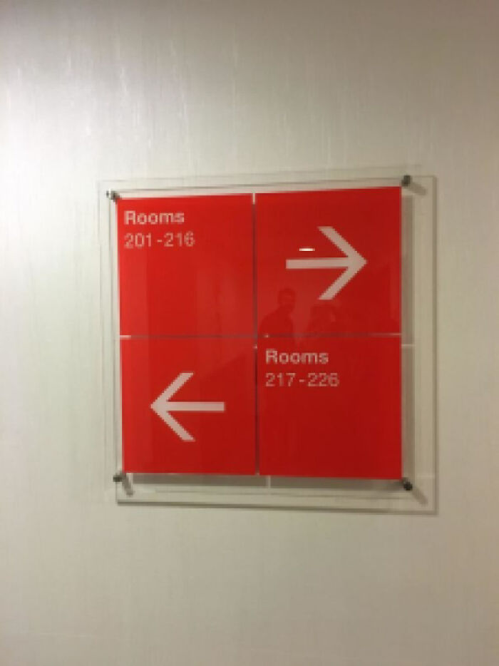
I'm Lost And You're Not Helping
It is unclear if the arrows are meant to be read as above/below their perspective room number range, or to the left/right. Depending on if you read top to bottom or left to right, you’d take opposite directions.
Load More Replies...I just checked Chicago manual of style and you should read both left boxes, top to bottom, before reading both right boxes. Rooms 201-216 are to the left. However, since most of us don’t know this we would not consider the boxes and read left to right then move down. Thus, rooms 201-216 are to the right.
This is seriously bad design and an unnecessary waste of space. This could easily be fixed by printing the arrows on the same squares as the room numbers instead.
Obviously, those designers had never read the book "Room Signs, Bathroom Signs and Street Signs for Dummies."
I stayed at a hotel in Myrtle Beach that was marked this way. Only problem was some of the signs the corresponding arrow was above the numbers and some were beside. Constantly being half drunk for a solid week didn't help matters either.
Are you certain which direction 216 is? Are you?
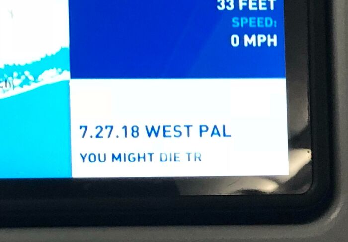
Load More Replies...On My Plane Ride Back Home
A new legal obligation to warn you? Some airline lost a battle there
You might die trying... is a Dave Matthews Bang song... That's all I can think
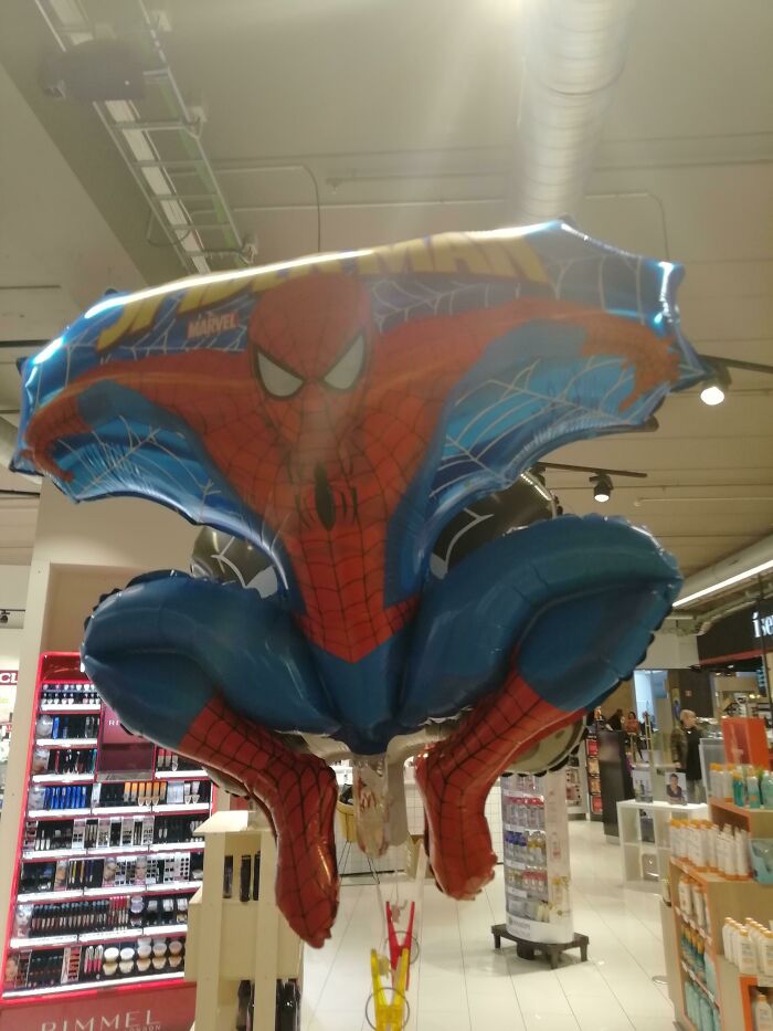
Spider-Man, What Are You Doing
that would unfortunately cause the balloon to be a bit tilted once it's full of helium... they just shouldn't have gone with this design
Load More Replies...Sort of like the inflatable co-pilot in the "Airplane" movie.
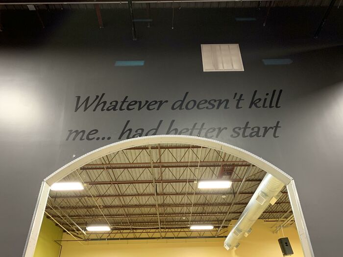
Load More Replies...Gym’s Recent Renovation = Inspirational Quote Gone Wrong
I would like to think its incomplete and maybe a word like 'running' is not visible. Nut if this is the full quote then same.
“Running” very well could be hidden at the bottom. obstructed view = obfuscated interpretation
Load More Replies...It reads like they copied it from a cubicle worker's motivational poster.
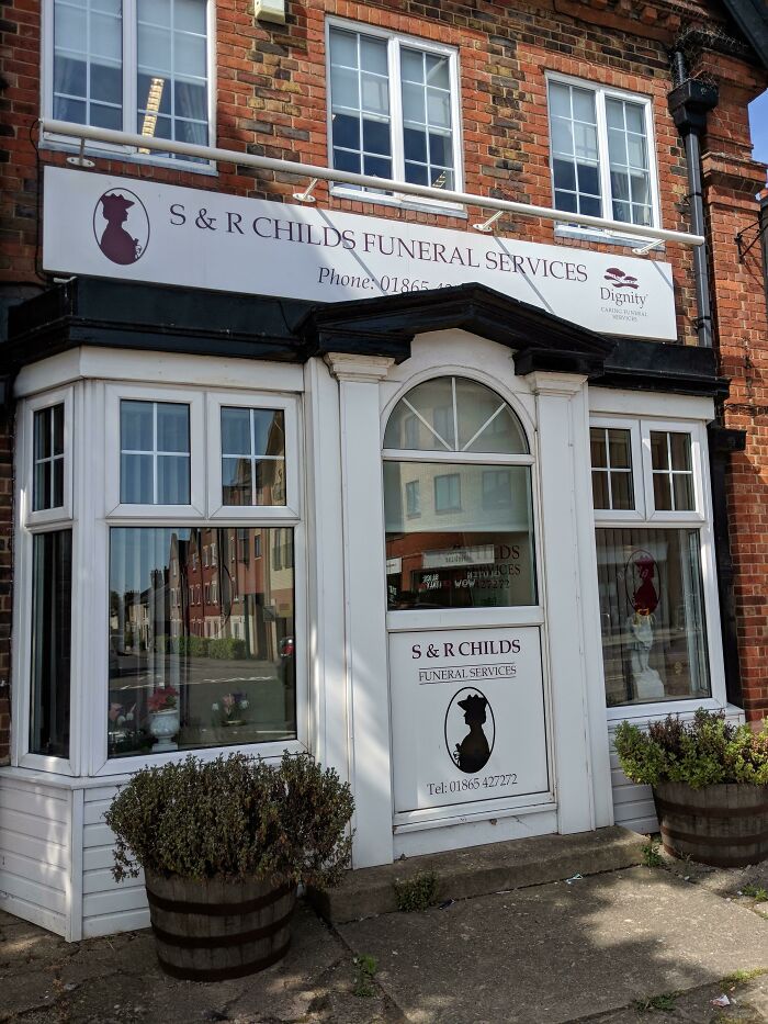
I Always See This On The Way Home And I Just Think, 'Damn, Thats An Unfortunate Name For A Funeral Service'
Honestly, a funeral home/service that specialized in the funerals of children wouldn't be all that awful, because it does happen, and extra care is needed in these scenarios. For instance - being strong enough to do it in the first place. I'm in mortuary studies myself but I fear the day I have to be the working mortician/embalmer for a child's funeral.
That's got to be a rough job. I was in geriatric care for almost 2 decades, but (usually) my people were already aged and 'of natural course'. Children, I couldn't have handled it.
Load More Replies...Like you've got Dr B.Gee, a throat specialist, Dr S.Cars, the plastic surgeon and Dr Sisheisho to help you with that lisp.
Not a bad name of you specialize in kiddy funerals. But you bet yer sweet a*s you'd be gettin hate for it.
Sometimes, in situations like this, I think "I know you're proud of your family name but ..... business doesn't NEED to be your family name." Well, I gotta go hit up "D**K'S Sporting Goods" real quick will be on later...
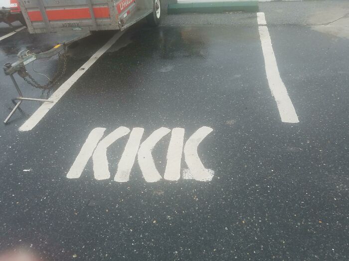
What An Interesting Name For A Parking Space
I feel like this was intentionally done. It looks spray painted and it's all out of proportion.
Take the damn sheet off your head Rodney and figure out how to park BETWEEN the lines!!
Great idea, now we know what to do with all these socks full of quarters
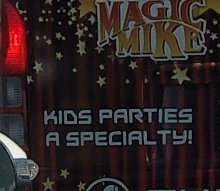
Oh No
Yeah, how else can you survive kids party if not with booze
Load More Replies...True Story I was 12 yes 12 and invited to a birthday party for another 12 year old and mom...got a male stripper for this thing!! I ran outta there when his g string appeared. And I swear the night ended by us LITTLE GIRLS listening to mom bang her boyfriend all night. And I swear to god..when I was watching Cinemax soft porn 15 years later the girl who the party was for....well yes she was the star😂😂😂😂 so just saying...Dont order MAGIC MIKE FOR YOUR CHILD'S PARTY!!!!
About eight years ago Aaron Brothers Art and Frame store was doing a summer kids program like they did every year. Someone in marketing had the unfortunate idea to use the slogan ‘Drink the Kool-Aid’ as a tie in with the Kool-Aid sponsor. They’d probably heard it and didn’t really know where it came from. I opened the box of merch and literally gasped. I knew we weren’t going to use it so I grabbed a couple of pieces before they sent the memo to either get rid of it or send it back. The memo came within a day or so. I always wondered what happened to that marketing person
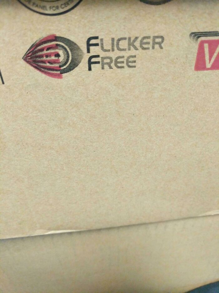
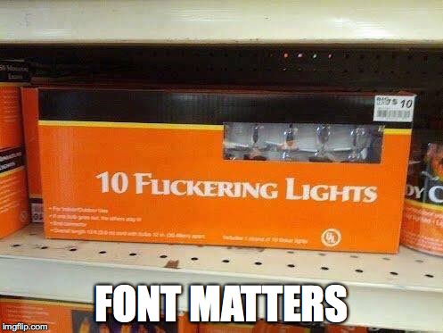
Unfortunate Lettering
Congrats to BP for not censoring this like the last post i saw with "Flick" in it.
For quite a while, in the early days of Superman and other American comics, FLICK was not allowed to be used because of the possibility of this confusion.
If you don't pay enough attention when reading, it looks like "Fu©ker Free" - fu©k her free
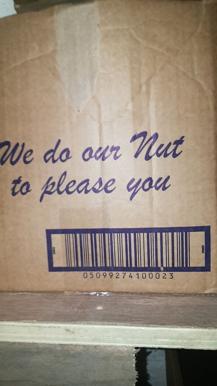
Load More Replies...Found This In Work 🤣🤣
Right? I would also like to know lol. It doesn't make sense.
Load More Replies...Sorry to break the bad news ladies but any dude that tells you he's gonna nut to please you isn't being honest with you. After he gets his nut you outta luck.
"We do our nut to please you". "Nut" is an old slang term for "head", and to do one's nut meant to go crazy. However, in modern US parlance, "nut" is a slang term for orgasm.
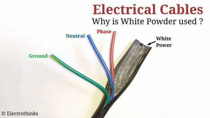
Load More Replies...Unfortunate Spelling In This Simple Diagram
An occasional sniff on the lamp cable keeps me running
Load More Replies...No guys, the fail is that the arrow pointing to the cable says "white power" instead of "white powder"
No, it's supposed to be white powder. It's there to help the conductors glide. "White power" is a hillbilly-racist thing. That's the fail.
Someone who is trying to get people banned??? Or they just don’t understand the purpose of downvoting is for inappropriate comments, not difference of opinion.
Load More Replies...It pointing to the shield. That’s for isolation purposes. MRF most. And, yes it contains a white powder !
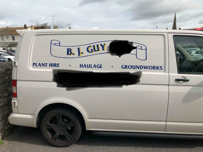
Unfortunate Initials For The Company
Wonder if he partners with the construction company that boasts of their "magnificent erections"
There was a local scaffolders near where I used to live who guaranteed their erections!
Load More Replies...I mean... There's a huge warehouse store called BJs. And it's HUGE. I mean really big. The sales will suck you in and the deals will blow you away. (I'm sorry) Let's not talk about D**k's Sporting Goods.
For those of a non-UK disposition, BJ is slang for bl0w j0b. If you don't know what that is kids, go ask your mum
I saw a floor cleaning company in Florida that was A. S. S. first initial of his girls.
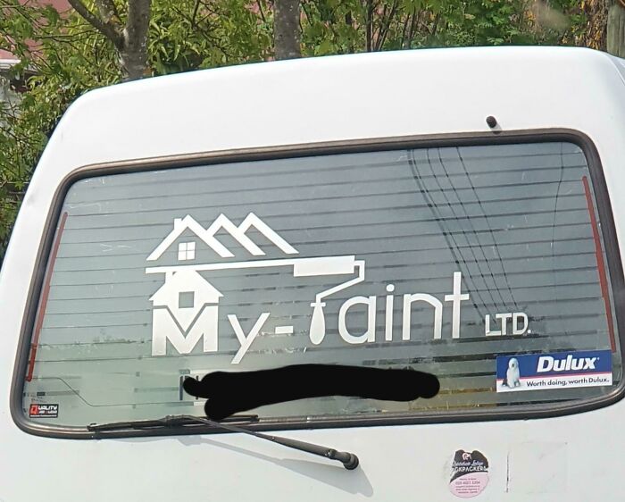
My What?
I just can't keep up with these rapidly changing fashion trends anymore.
My mother-in-law (75 y/o) described this at dinner last week for my 13 y/o daughter: "Taint the front, taint the back"
It'd be hard to sit through a taint painting considering how ticklish it is.
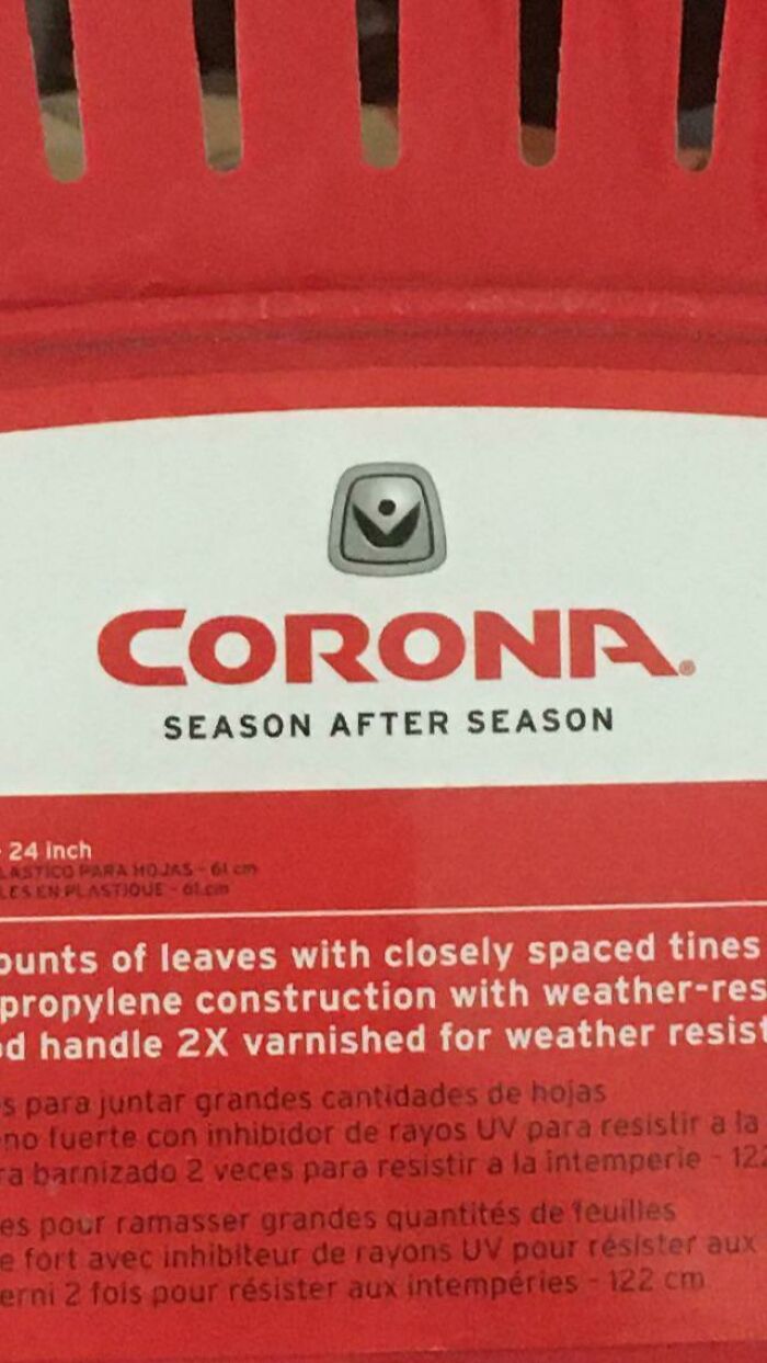
The Most Unfortunately Named Garden Tool ~ever~
Well, on my planet we have a beer company named Corona
Load More Replies...Corona is crown in Spanish. Corona viruses are so called because they look like a crown seen through the electronic microscope
am I the only one who remembers the kingdom of Corona from "Rapunzel"
Cool I didn't know that. (Living quite close to Denmark)
Load More Replies...eh, it's not unfortunate, it means "Crown" there's a beer named Corona, and it's not so uncommon to see it as a surname in Spanish speaking countries.
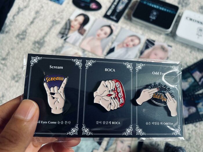
Kpop Group Dreamcatcher’s Infortunate Merch Design
i've been enlightened with the word foo foo, i've never heard anyone refer to a vagina as a foo foo.
Load More Replies...What's wrong with this? Edit: that was such an unfortunate design
If it isn't what it looks like, what on earth is it supposed to be?
During the chorus of their song “Boca”, as part of the dance to the song, they do this hand motion where they make their hands look like they are opening and closing. This is an interesting way of representing that hand motion though
Load More Replies...Ok....I know where all our minds went but second glance and number 2 looks like the face hugger from Alien
Was Browsing Through Snapchat When I Saw This Gem
It's not meant to be funny. This is a thread for poor/unfortunate designs. I would say this ranks as unfortunate. (Edited for typo)
Load More Replies...Kobe Bryant, a basketball legend, died in a helicopter crash along with his daughter.
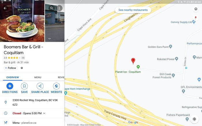
Load More Replies...That's A Tough Break On The Name Of Your Restaurant
That's been there forever. There's a Boomers in Bellingham too. It's an old fashioned drive-in hamburger spot. Never associated it with the generation. Also - I know there is the joke "ok Boomers" but I don't think the whole generation has been cancelled ??!!!???
We're still here. Rolling our eyes at the folly of youth.
Load More Replies...Holy damn I did not expect to see Boomers on Bored Panda - there’s only 2, I worked at the other Boomers over in Delta until a couple years ago 😅 it’s a hockey bar inside a hockey arena, so they’re using the term in some kind of hockey way but I couldn’t tell you what it means 🤷♀️ Also edit: why are y’all downvoting Hazel for saying the exact same comment as Nathaniel? Can we maybe not do that?
Load More Replies...Gen z trippin. There's a mini golf snd go-kart place named Boomers and since it's been there forever, that's still what I associate
Lol, all of the ones here have closed down...But that was my first thought too.
Load More Replies...Ha! Coquitlam, again. Amazing how often Coquitlam or Port Coquitlam pops up.
I find the fact that the marked business on the map is planet ice funnier. I thought it was a Snow Dogs reference at first. Coquitlam is pretty close to the name of the town in that movie (Kolketna iirc).
Interesting Way To Describe An Almond Joy
Why is almond milk called almond milk? Because nobody would buy it if it was called nut juice.
5. Nut Goodie, 6. Looking for) Mr. Goodbar, 7. ?, 8. Bar None or Zero, 9. Good & Plenty
Load More Replies...There is actually a chocolate bar named Galaxy so I would’ve put galaxy next to galaxy 🙃
Bees make Malthesers...it's honeycomb middle that weighs so little????
fine & abundant is good n plenty.. between the comments we have everything except 6. i can’t remember a “tall, dark and handsome” candy bar.
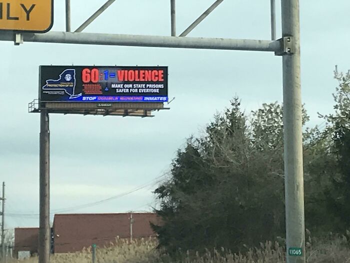
Load More Replies...Go Violence?
It’s a push to hire more guards, with the idea of increased supervision will lead to fewer problems.
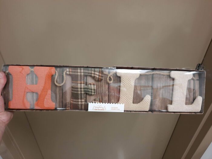
Load More Replies...Hell
The tag makes the E look like an F, so their algorithm probably didn’t catch it.
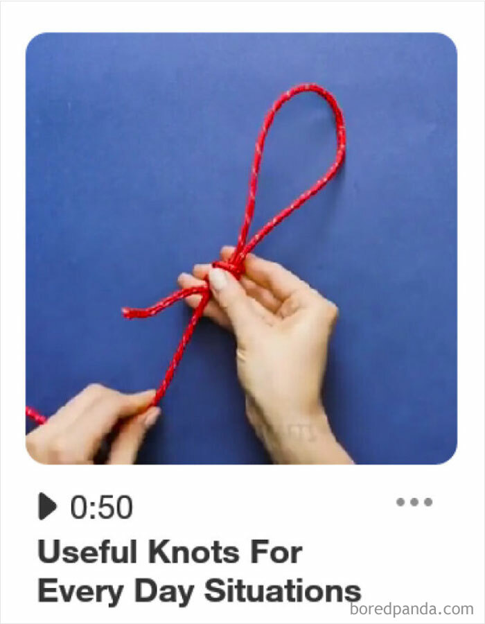
Load More Replies...Scrolling Though Pintrust And Saw This In The Wild
Other than death, nooses can actually be very useful for other things
Yeah like tying your shoes, making bananas fly, stirring a mixture, or hanging a picture /ref
Load More Replies...It looks like a bowline or simple slip knot to me. I would be willing to bet I use them about a much as I use simple square knots
Load More Replies...They Didn’t Think Their Mask Image Placement Through. (Sorry For The Pixelation, It’s How It Was Sent To Me, Cropped For Privacy)
With Consent, Of Course!
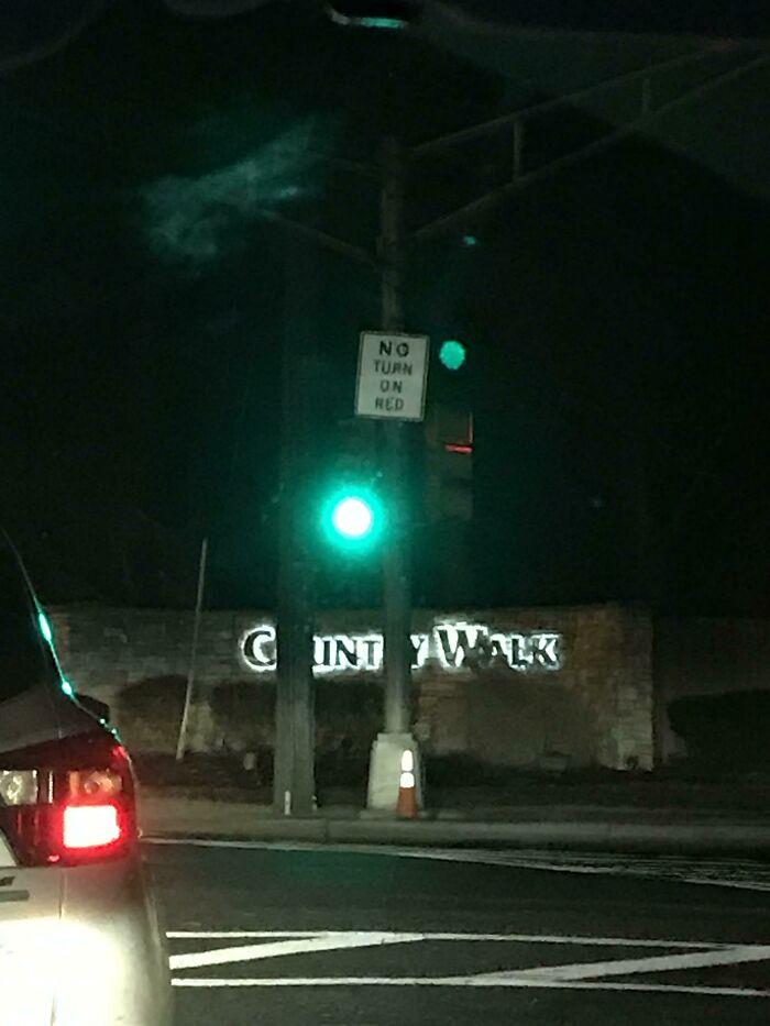
The Placement Of This Stoplight In Front Of This Development Entrance Is Quite Unfortunate
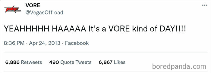
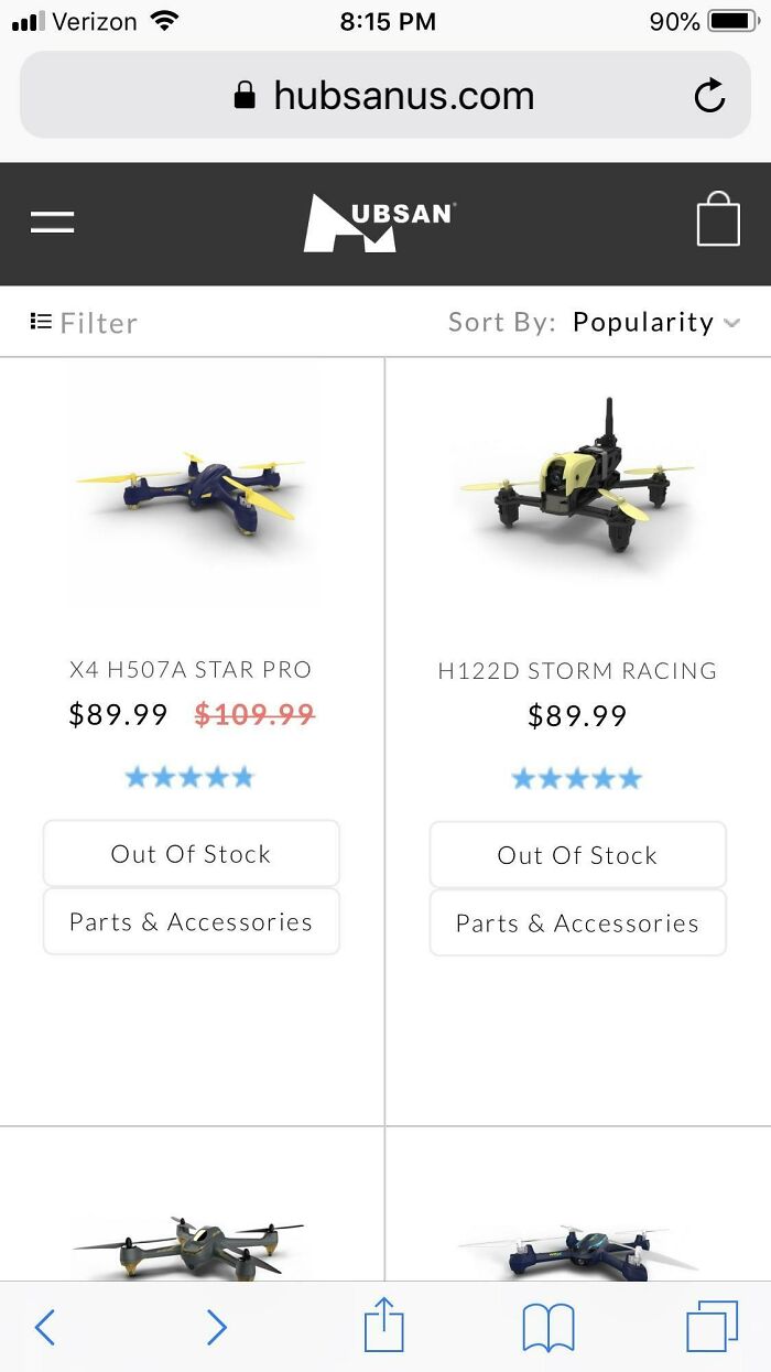
Very Unfortunate Company Name
I'm going to save some googling for you here. Vore is a usually sexual desire to be eaten whole. you're welcome.
Aah, little Wonder, hence the name! I think I'm going to keep away from googling this...thanks.
Load More Replies...From Urban dictionary. vore Short for "voraphilia" or "vorarephilia": a fetish in which one fantasizes about being eaten alive or eating another creature alive (sometimes known as phagophilia). The most common type of vore is "soft vore", being swallowed or swallowing whole with no bloodshed. There is also the less common "hard vore" which involves the tearing and chewing of flesh. Other types of vore include macrophilia and microphilia, in which one character involved in the vore is larger or smaller than normal.
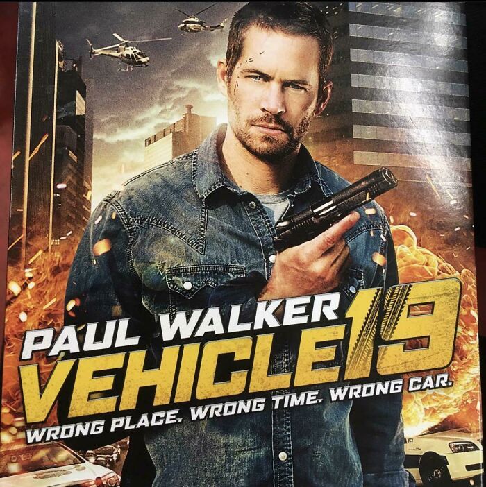
Bad Taste Or Unfortunate Foreshadowing?
https://www.google.com/search?q=paul+walker&rlz=1CATMUU_enUS1065&oq=&aqs=chrome.0.69i59i450l8.986j0j15&sourceid=chrome&ie=UTF-8
Unfortunate Web Address
Reminds me of the episode of Packed to the Rafters I just re-watched yesterday, where one of the characters made an online business exchanging car parts but used the web name partsexchange!
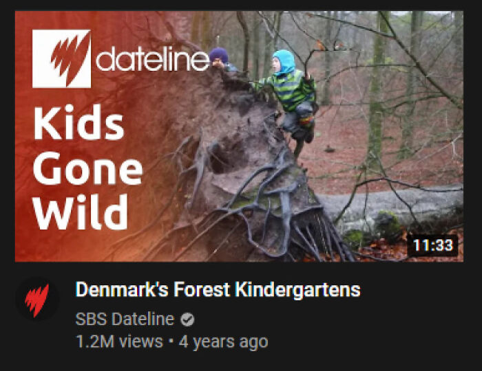
This Unfortunate Title That Found Its Way Into My Recommendeds
what's wrong with this?? edit: thank you for the explanations! as a gay guy, i'd never heard of girls gone wild before lol
"gone wild" is a term applied to something once it's gone sexual, for example, the foul company called girls gone wild that would sell videos of girls stripping for a free tshirt
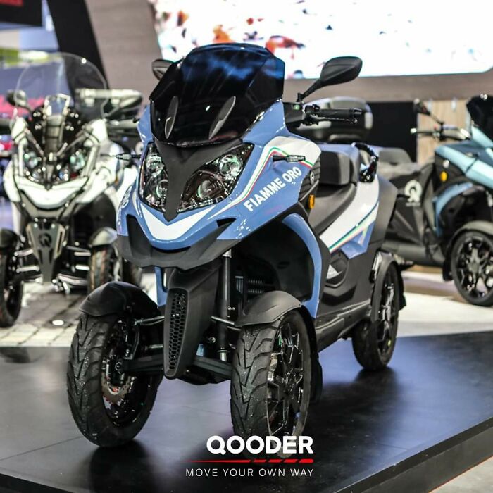
Load More Replies...Qooder (Pronounced Like Cooter, A Slang Term For Vagina)
When did they stop calling it "Quad"? I had a yellow one! But it looked much better than the vehicle in that pic 🙄 this looks like a toy
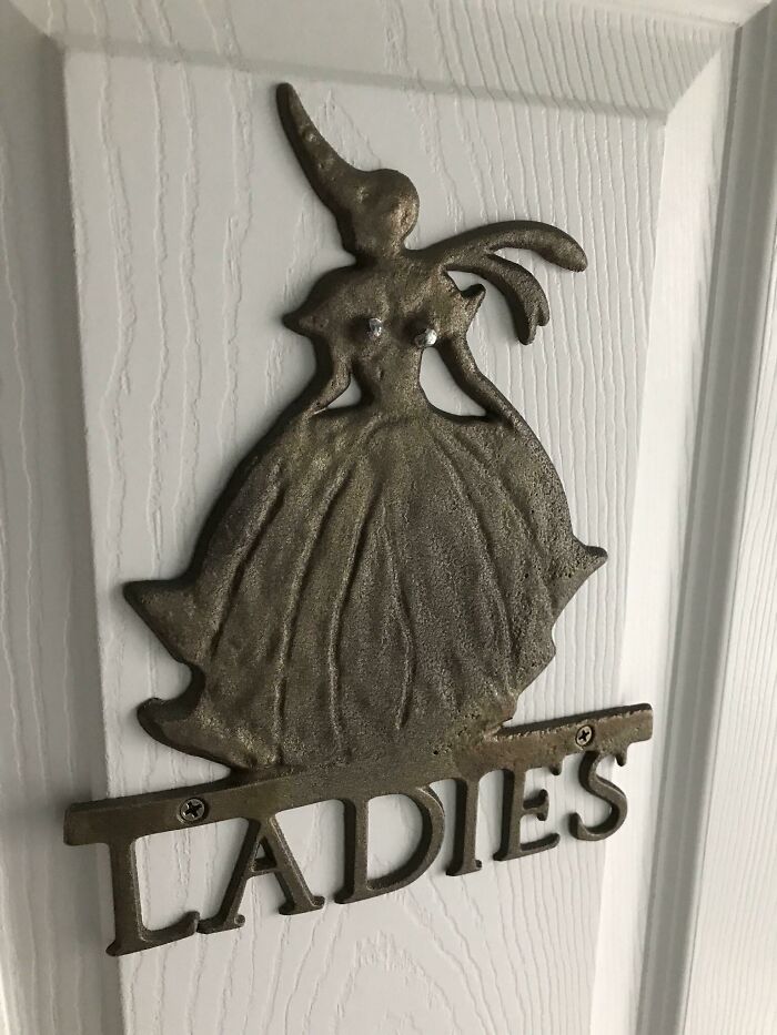
Load More Replies...This ‘Ladies Room’ Thing With Two Specific Spots For Tacking It To A Door
Oh yeah that's the first thing I see. Definitely not the unicorn horn and one monster wing.
And they’re crooked to boot. One’s also almost under her arm. Wonder who the model for this was?
I believe she's supposed to have fairy wings, but the lack of contrast makes her look... Like that
Load More Replies...The two screws right above the word Ladies are attaching this sign to the door. I think the patina was rubbed off certain body parts.
Imagine being a 14yr old and passing this before the internet...youl'd be in the restroom for a full five minutes. 😂
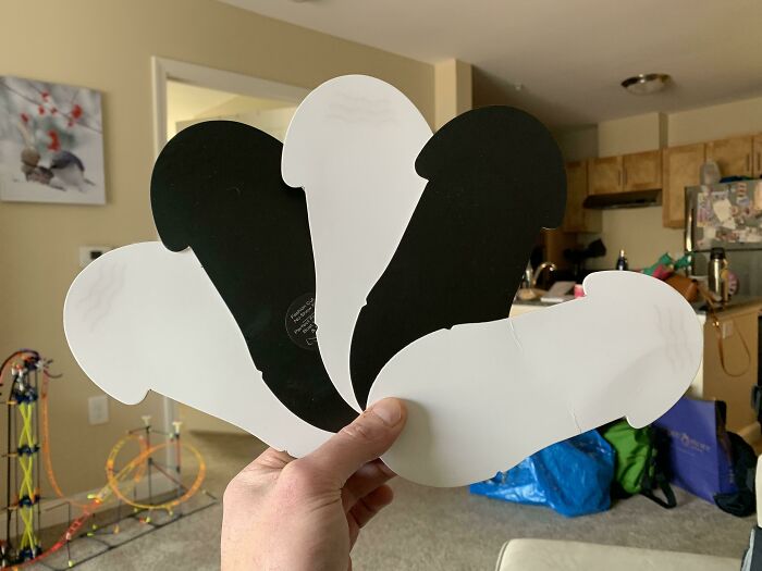
These Inserts For The Socks I Bought
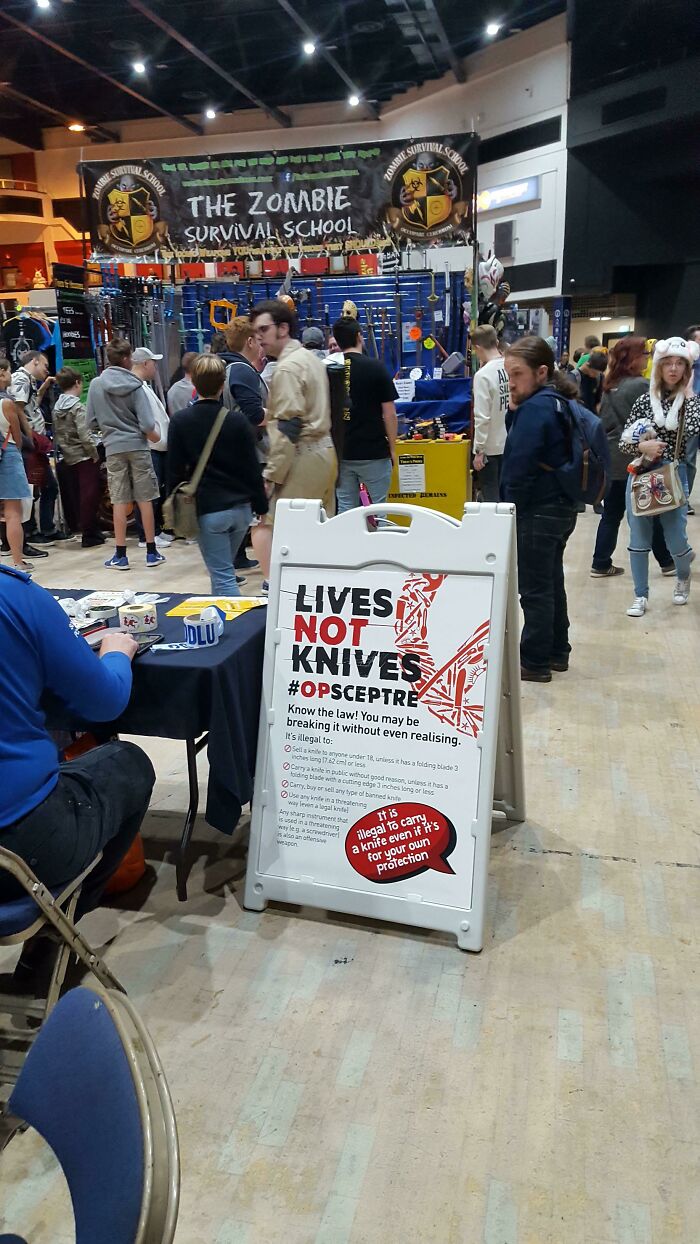
(I Thunk This Belongs Here) At A Local Convention, It Seems Nobody Is Interested In Knife Crime Prevention
When I was in the navy we our port brief almost always included "your Leatherman or Gerber is considered a weapon in this country. Leave it on the ship" we would get used to just having it in our pockets because they are so incredibly handy (like a Swiss army knife had a baby with a pair of pliers for those who aren't familiar) that we would forget we even had them on our person
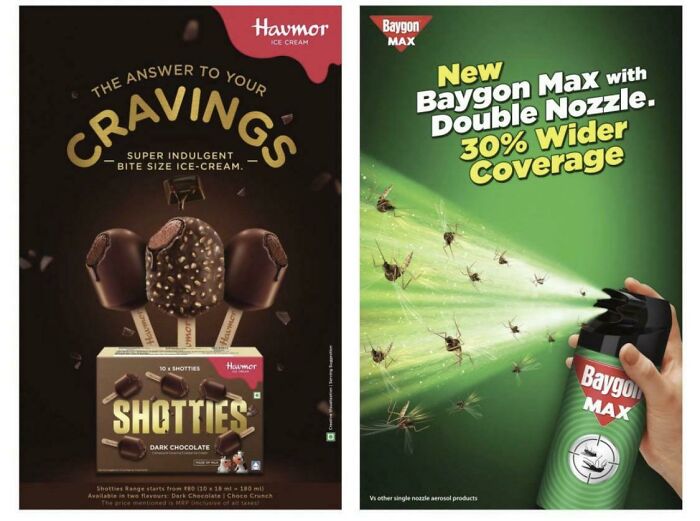
Ice Cream….with Bug Spray
Does no one else see how the popsicles are called shotties
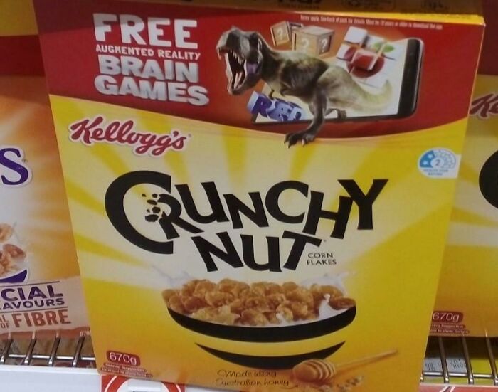
I Would Rather Not Eat Some Crunchy Nut, Thanks
Might wanna look up the origin of Kellogg's corn flakes
Load More Replies...Hey, that's a popular cereal in the UK! I can't function without my morning Nut.
its a popular UK cereal, its not unfortunate that you can only read the word nut and assocaited it with the busting of one
So it's only the one of each...I would have loved a whole sack...sorry folks. 🤞😟
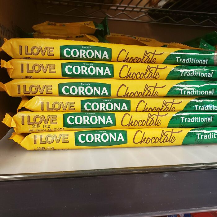
I Love---What?!
am I the only one who remembers the kingdom of Corona from "Rapunzel"
Considering “corona” is literally The word for center in several languages….. it’s no wonder that the marketers would want to present their chocolate as the center of the universe if only one would give it a try!
I thought "corona" literally meant "crown" whereas "centre" could be centrum, keskus, centro, merkez . . .
Load More Replies...Fart
the lettering above product size looks like it spells fart.
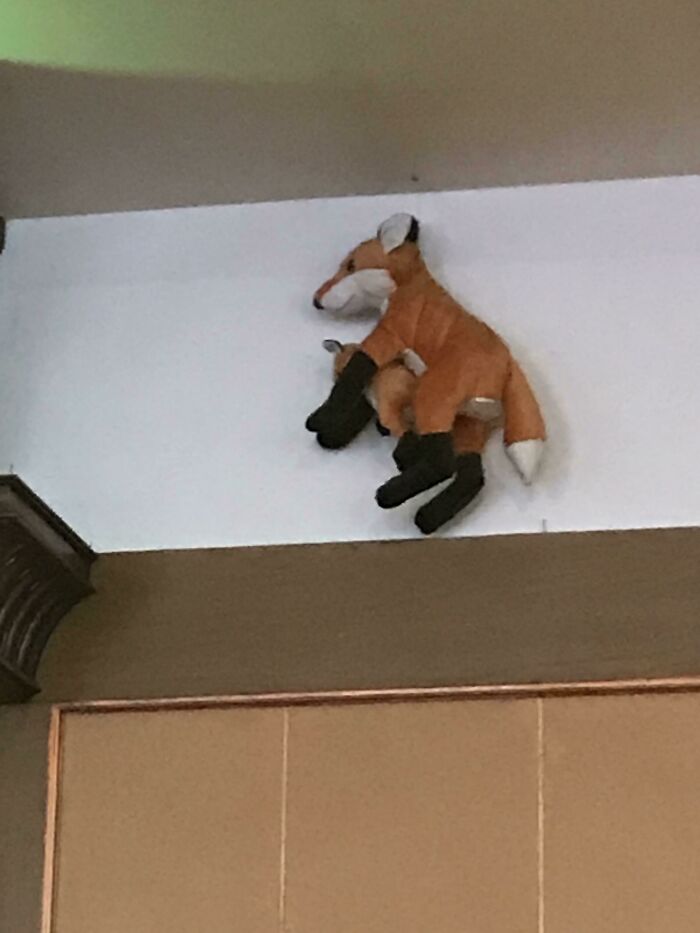
Load More Replies...This Unfortunate Design Of A Kangaroo And Its Baby In A Hotel In India
Regardless of what animal it is, the placement is still unfortunate and hilarious
Ha,ha. Adorable stuffed duo but wrong breed. Idd a fox. Shout out to 'Karen Fernley' for getting this right. 10/10.
Not A Good Name Choice
A dyke(more commonly spelled dike in my experience but I've seen both) is a retaining wall built to prevent flooding in an area. A pumping station near one of these makes a lot of sense....
A dyke is an older less used name for a wall - in Scotland dry stone dykes are very common, in fact there’s a town called dyke. My guess this lane (street) is on the side of an embankment.
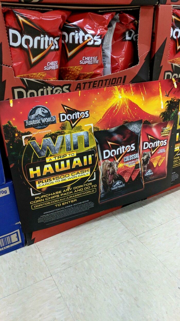
Too Soon Doritos
For those who don’t understand, Hawaii has volcanoes. Which are active.
Unsure how this is problematic. I live on the side of a volcano in Hawaii. There are active volcanoes here. Pele, Poli'Ahu, etc volcanos are part of the birth and spirit of the islands
Load More Replies...Uhm so in my area there’s a plumbing company called “IBS Plumbing” I do think it’s supposed to be a funny name but it’s too good not to share. :))
Ha! "Securing your property, whether you want us to or not..."
Load More Replies...There's a lot of down votes through out this article for no seen reason. I upvoted on almost every one of them.
Some of them are reaching. Or they're only relevant to certain countries.
Load More Replies...Funniest sign I have ever came upon was in Washington, it was a store selling vacuums and their sign in front said "Everything We Sale Sucks"
I really wish this article didn't include the one with Kobe and his daughter. I feel like that was beyond tasteless and it left me feeling queasy.
Uhm so in my area there’s a plumbing company called “IBS Plumbing” I do think it’s supposed to be a funny name but it’s too good not to share. :))
Ha! "Securing your property, whether you want us to or not..."
Load More Replies...There's a lot of down votes through out this article for no seen reason. I upvoted on almost every one of them.
Some of them are reaching. Or they're only relevant to certain countries.
Load More Replies...Funniest sign I have ever came upon was in Washington, it was a store selling vacuums and their sign in front said "Everything We Sale Sucks"
I really wish this article didn't include the one with Kobe and his daughter. I feel like that was beyond tasteless and it left me feeling queasy.

 Dark Mode

 No fees, cancel anytime


