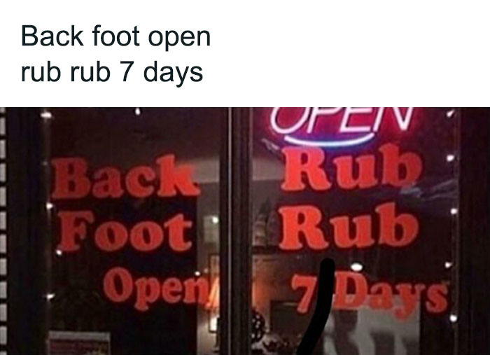
40 Unfortunate Designs By People Who Had No Clue What They Were Doing, As Shared By This Online Group
Design follows us everywhere we go — from billboards, ads, and signs we see while driving down the road to pretty much everything in our kitchen cabinets. It’s an integral part of life that should make everything easier. If it's any good. Because the sad truth is that very few design concepts are actually great. Far too many creators make glaringly obvious mistakes that stand out like a sore thumb, turning a blind eye to user experience, logic, aesthetics, and common sense as a whole.
But believe it or not, most of these cringe-worthy fails are not full-blown disasters of epic proportions, but rather... disappointing attempts that are almost begging to be poked fun at. So allow us to introduce you to one entertaining corner of Reddit, which seems to be still growing, called 'Unfortunate Design'. This online community features an impressive collection of not exactly bad, but plain under par solutions that are bound to raise some eyebrows.
Below, our team at Bored Panda has gathered a list of some of the most regrettable examples of "when the design is just not right," so continue scrolling to check them all out! Be sure to upvote the pictures that made your inner critic all fired up and ready to go, and let us know in the comments which of these were your least favorite.
Psst! After you’re done, treat yourself to some more horrendous design madness from our previous posts here and here.
This post may include affiliate links.
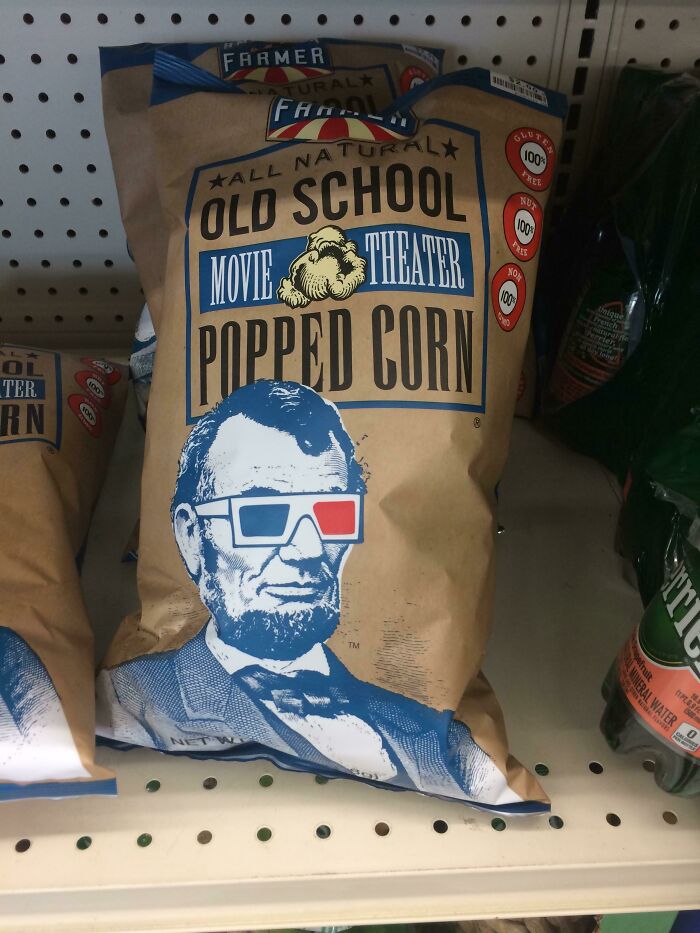
Was Lincoln Really The Best Example For A Movie Theater?
Marketing Lesson
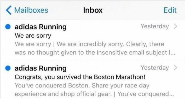
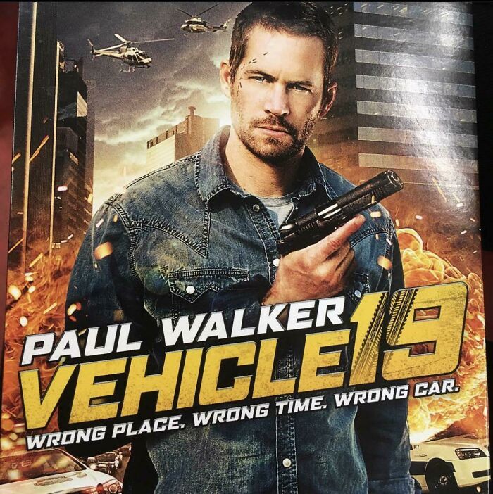
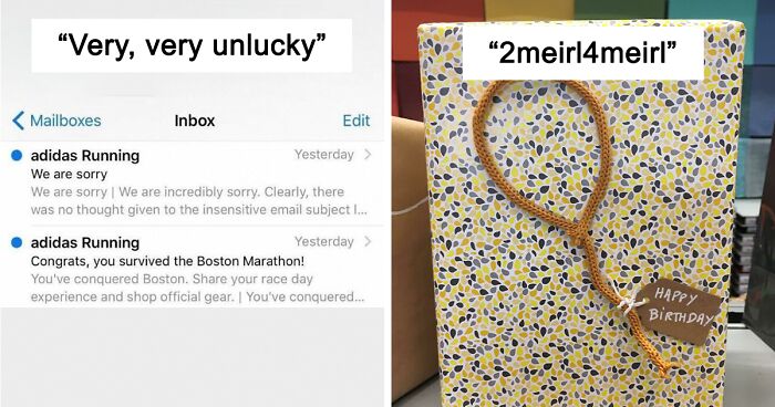
Very, Very Unlucky
The 'Unfortunate Design' online community welcomes all fellow design aficionados eager to ridicule and discuss the examples they find online or in real life that are not necessarily horrible but somehow managed to miss the mark. If this is your cup of tea and you already have some pictures of disappointing designs in your camera gallery waiting to be shared with the world, don’t be shy!
But before joining the group, though, there are some important rules you have to be aware of. The first and most important one is already in the name — posts must feature an unfortunate design. Or, as the moderators clarify in the sidebar, "Posts must display an unfortunate design that was not intentionally made to appear misleading or be misunderstood."
Needless to say, people looking after the group ask its members to be civil and avoid name-calling or fight-picking. And, obviously, there’s no place for racism or violence on the sub. Furthermore, low-effort or irrelevant titles are simply a no-go. "The title of your post must be descriptive and relevant to the post contents," the mods added.
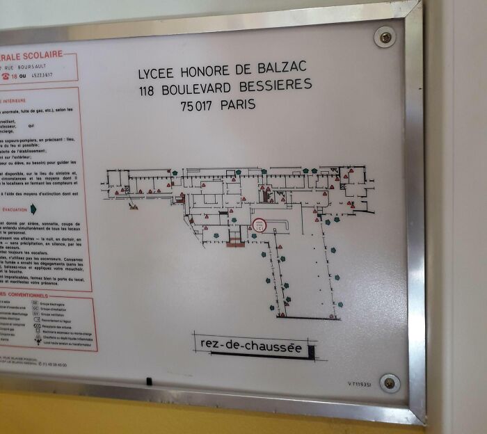
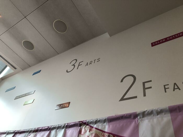
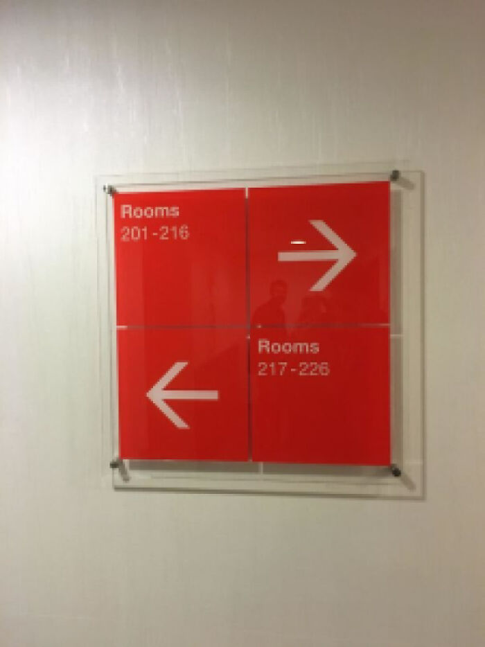
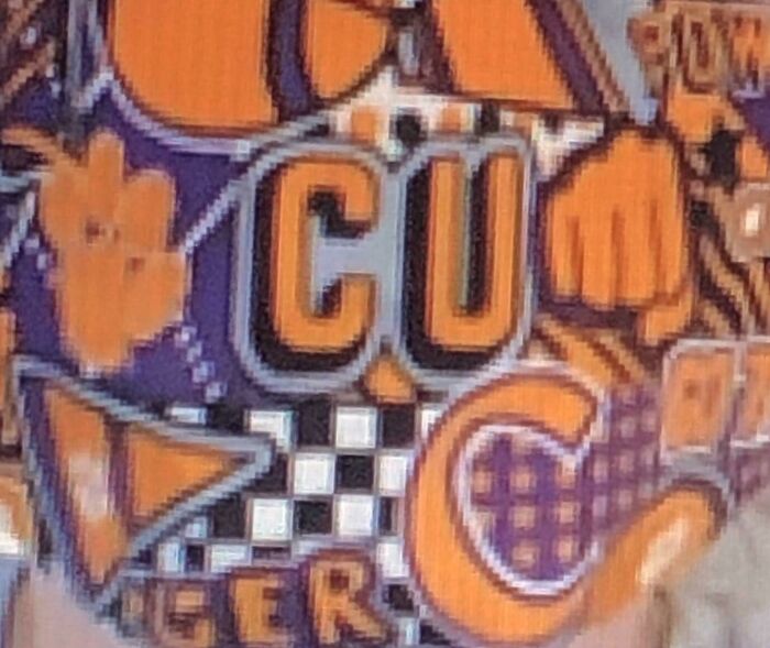
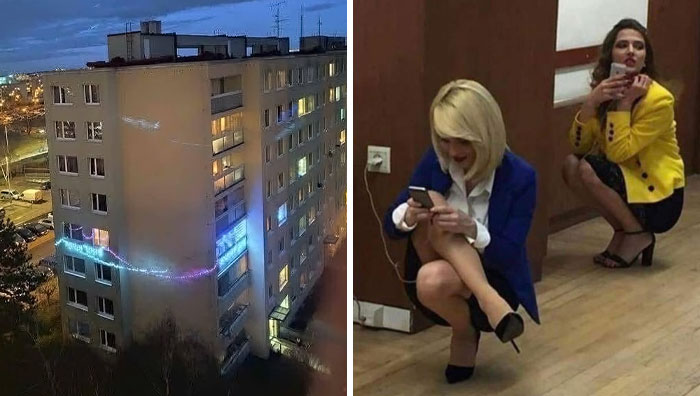
Design Of A College Building
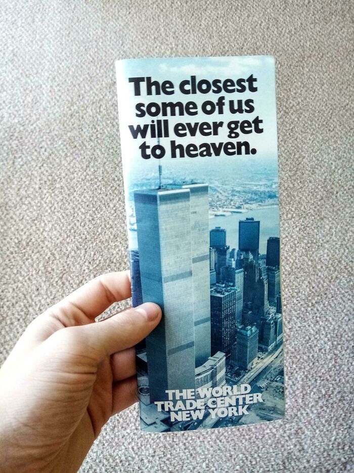
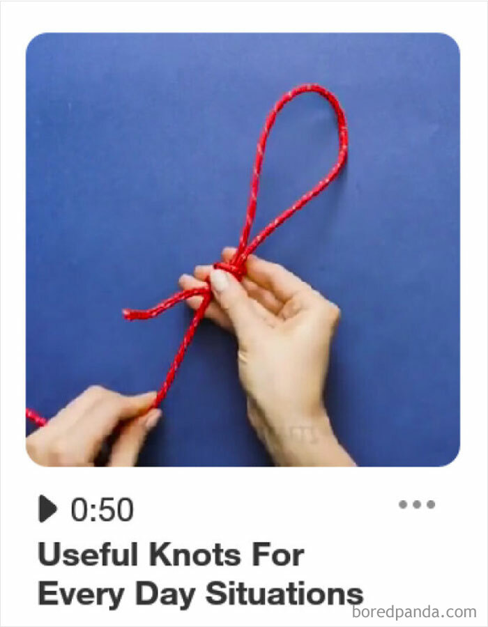
That’s Either A Sick Joke Or A Sales Ploy😂
3f Arts
As you take a brief scroll through these regrettable and obnoxious objects featured in the list, be prepared to feel your toes curl. Whether intentionally or not, this online community shows us that some designers opt to completely disregard every single principle of good design by making the end users suspicious, annoyed, and even frustrated. And let's not forget the confusion, something that inevitably builds up when unfortunate solutions create more problems than they solve.
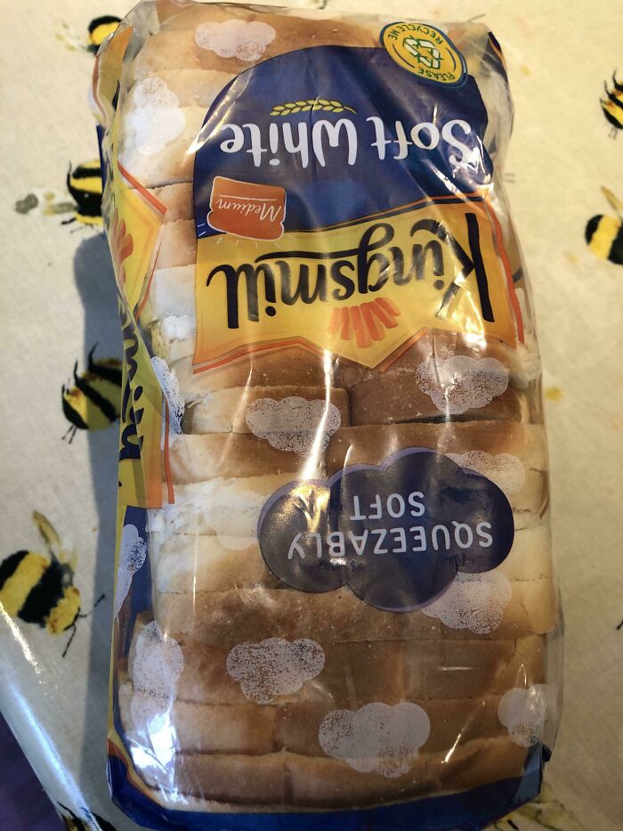
How Many More Times Will I Think The Bread Bag Is Suffering From Condensation?!
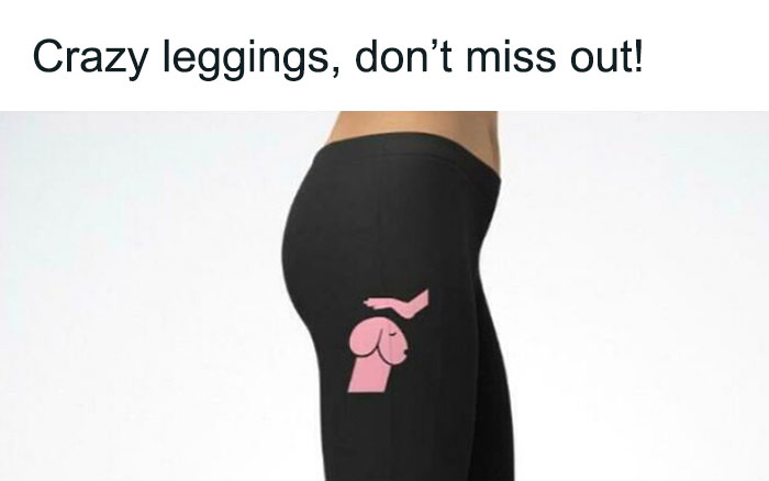
From “Love Dachshunds” - Promoted Ad On Reddit
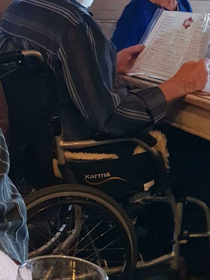
This Wheelchair Logo
But why do these examples stand out like a sore thumb? Well, there's a plethora of information stating that one of the main reasons we believe badly thought-out design is all around us is because it is simply more evident.
Just think about it, we often manage to miss examples of good design, even when they’re staring us right in the face. This happens because it usually follows us around like a friendly invisible ghost, quietly improving lives while not getting in the way of the user. But as you've already noticed, bad designs do the exact opposite.
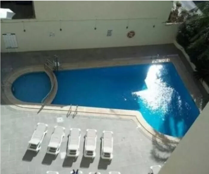
This Oddly Shaped Pool
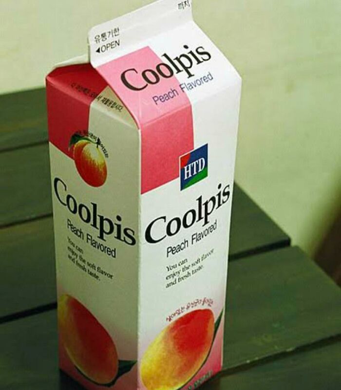
This Is Actually A Much Enjoyed Korean Drink
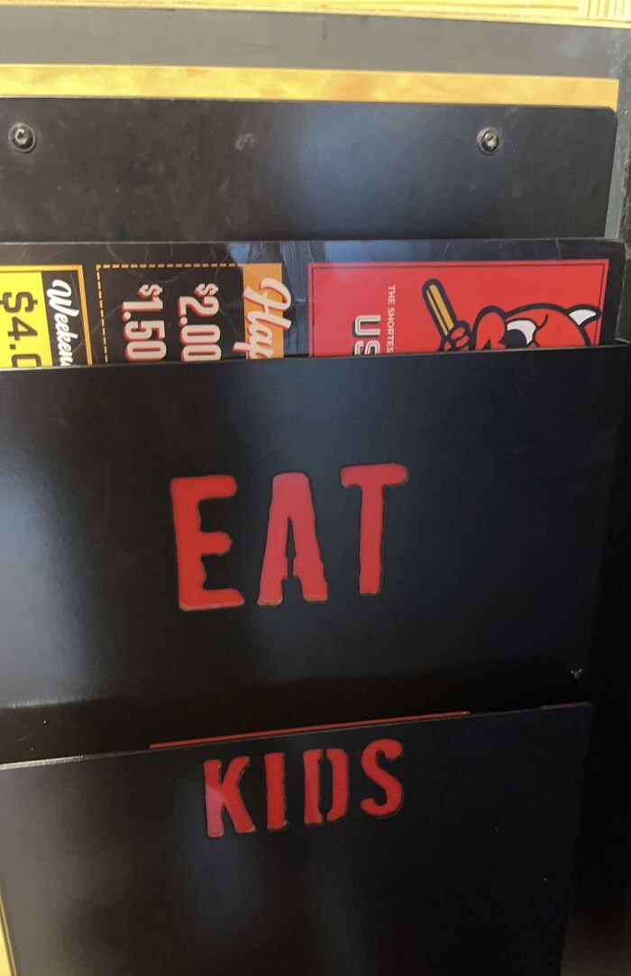
Menu Holders Suggesting A Questionable Diet
Alice Rawsthorne, world-renowned design critic and author of books Hello World and Design As An Attitude, believes there’s simply too much of the not-so-good, the bad, and the ugly. She said while taking to the stage at the Design Indaba conference in 2019: "Very little design is actually great, very little of it is even any good, most of it is mediocre, and an enormous amount of it is damn right bad."
According to her, it’s only by better understanding how badly executed results happen in the first place can creators find it easier to avoid making mistakes when thinking of their next big project. Rawsthorne outlined 8 main categories that would help people identify failures: pointless, useless, lazy, thoughtless, ominous, untrustworthy, offensive, and good intentions but…
What
2meirl4meirl
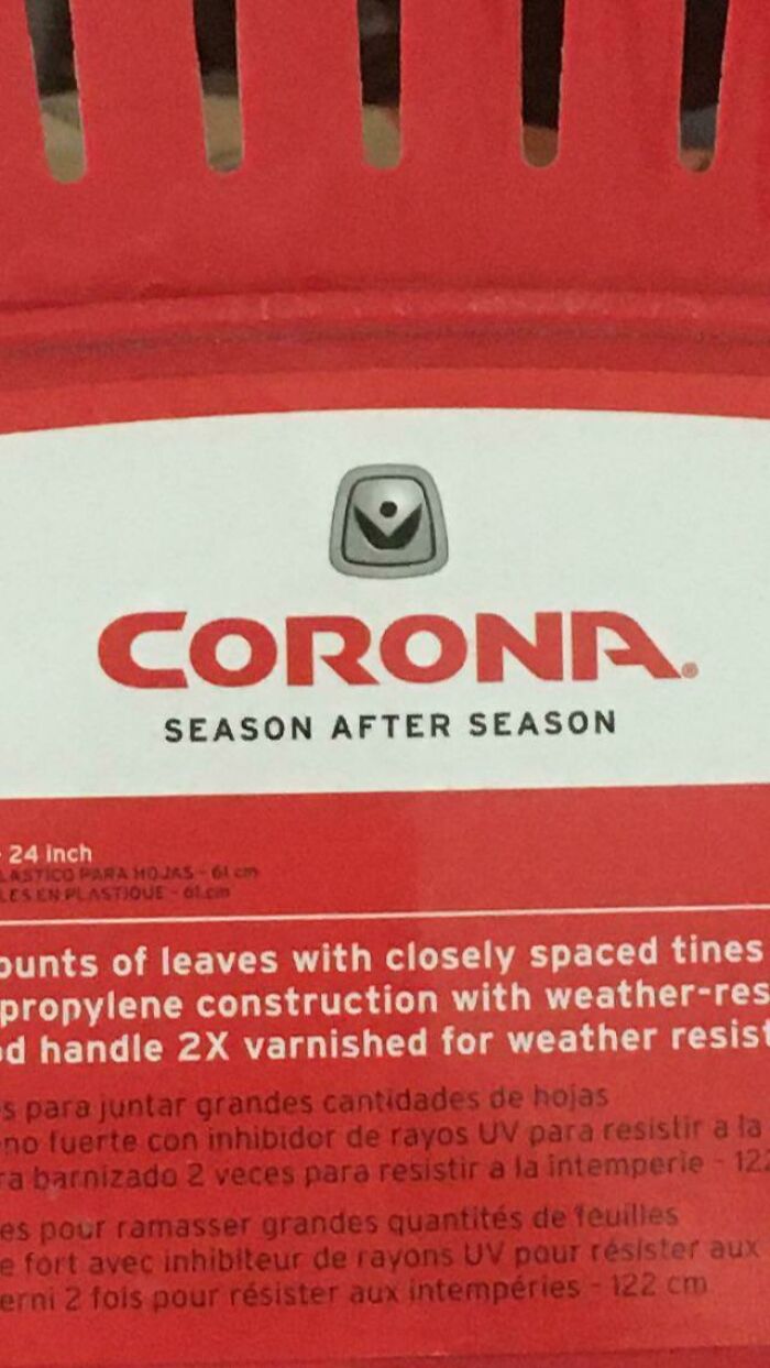
The Amount Of Characters Makes It Seem Like Canada Is Funding Coronavirus
1.1B sounds a bit much I only gave covid its $20 monthly allowance
In an interview with Design Boom, Rawsthorne explained that bad design in itself doesn’t have value. However, she believes that there’s also the magnifying glass effect at play — poorly executed solutions can be called out and used as a cautionary tale.
"Apple did overhaul its relationships with subcontractors after the exposes of supposedly exploitative employment practices, it has made recent efforts to improve its environmental record," the critic said, adding that companies will start thinking much more carefully about the products they launch in the future. "And that can only be good."
Someone Has A Sense Of Humor
Youtube’s Character Limit On TV App
Oh No
But another problem designers seem to face today is that too much stuff gets released into our vast world. "[Design is] an industry that was driven by production and demanding consumers. And undoubtedly most people still see design as a source of all the plastic trash that’s clogging up the pacific, rather than a genius way of removing it, and enabling us to live more responsibly."
"Designers now have an opportunity and I think a responsibility to challenge that," Rawsthorne continued. "But that will be determined by the quality of the solutions that they develop. Design is instinctively and inherently a resourceful and resilient field that’s constantly evolved over time to adapt to new challenges and changes. So there are commercial opportunities, as well as personal and moral opportunities in all these new areas."
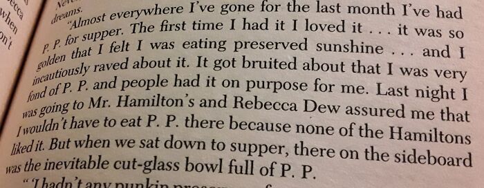
This Book Abbreviating "Pumpkin Pie"
When Your Company Name Becomes Slang For Vagina 20 Years After You Start It
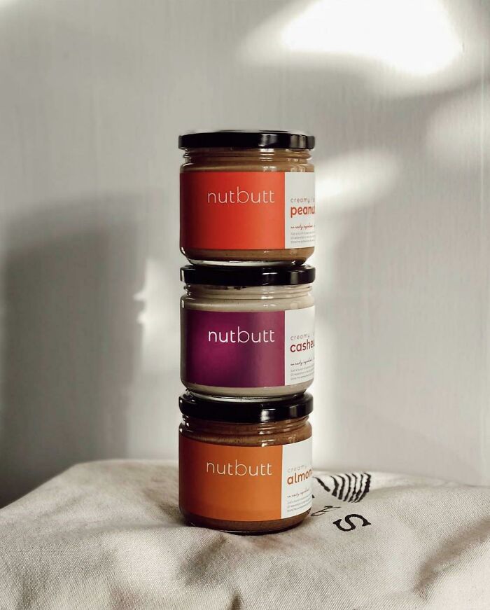
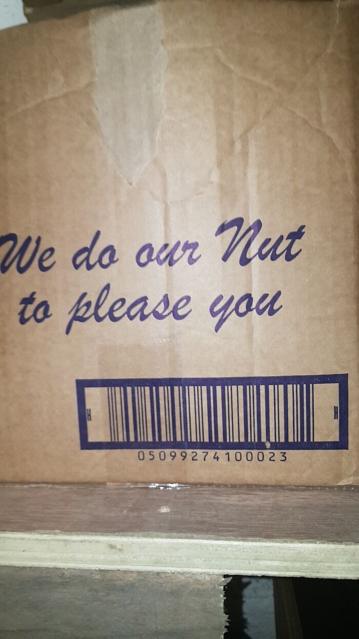
This Unfortunate Choice Of Name For A Nut Butter… They Didn’t Think This One Out
At the end of the day, it’s up to creators to come up with intelligent, appealing, effective, and efficient ways of dealing with issues that arise in the modern world. And as critic Rawsthorne added, the one thing they need to stop designing badly, it’s to think.
Seriously Tho
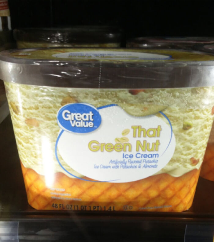
The Best Flavor If You Are Shrek
Sign At Universal Grad Bash Implies A Very Different Kind Of Party
"This is an extraordinary period when design really has an exciting opportunity to play a much more powerful role in our lives. But that will have an impact on the design solutions that are developed or have a quality that proves that designers deserve to do so."
Rawsthorne believes it’s absolutely vital for designers who are embracing the challenge and aiming to work on very important problems in today’s world "rise to the challenge by dealing with them with intelligence and sensitivity because otherwise if they fail, it will be much, much more difficult for design to convince people that it should be entrusted as part of the solution to such issues in future," she concluded.
I'm Lost And You're Not Helping
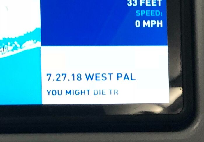
On My Plane Ride Back Home
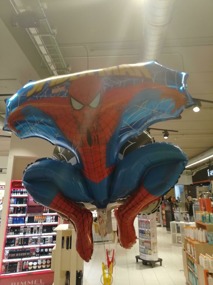
Spider-Man, What Are You Doing
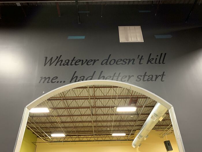
Gym’s Recent Renovation = Inspirational Quote Gone Wrong
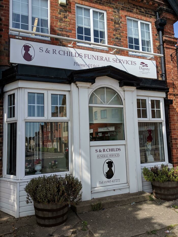
I Always See This On The Way Home And I Just Think, 'Damn, Thats An Unfortunate Name For A Funeral Service'
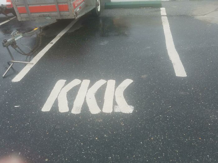
What An Interesting Name For A Parking Space
Oh No
Unfortunate Lettering
Found This In Work 🤣🤣
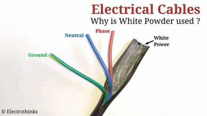
Unfortunate Spelling In This Simple Diagram
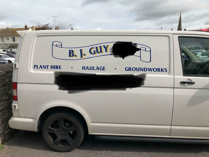
Unfortunate Initials For The Company
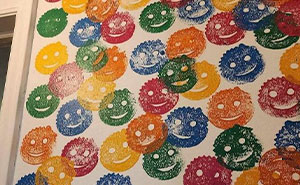
My What?
The Most Unfortunately Named Garden Tool ~ever~
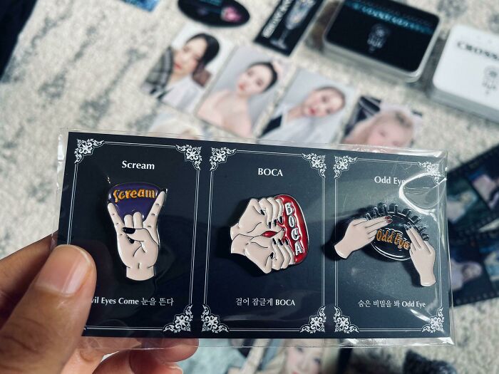
Kpop Group Dreamcatcher’s Infortunate Merch Design
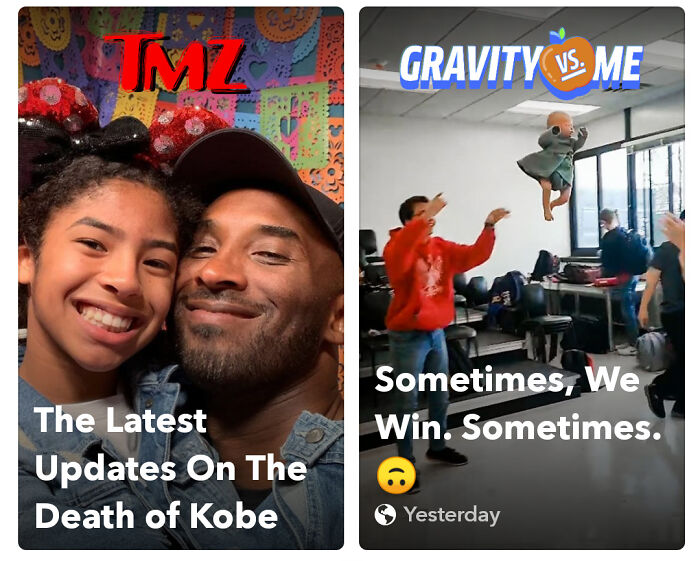
Was Browsing Through Snapchat When I Saw This Gem
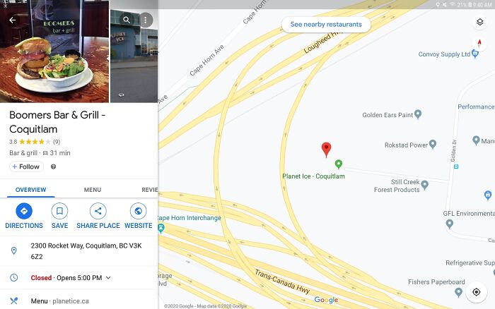
That's A Tough Break On The Name Of Your Restaurant
Interesting Way To Describe An Almond Joy
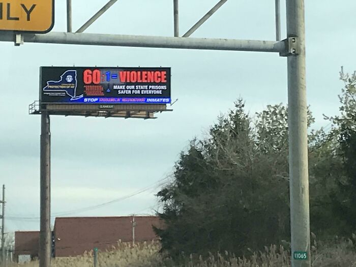
Go Violence?
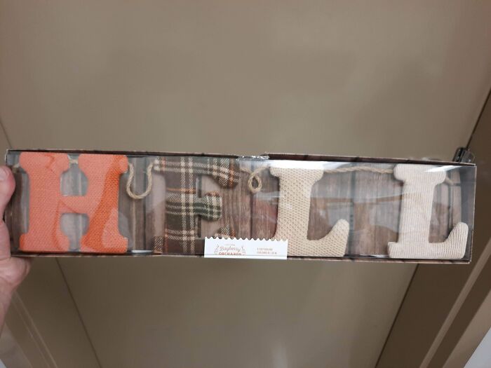
Hell
Scrolling Though Pintrust And Saw This In The Wild
They Didn’t Think Their Mask Image Placement Through. (Sorry For The Pixelation, It’s How It Was Sent To Me, Cropped For Privacy)
With Consent, Of Course!
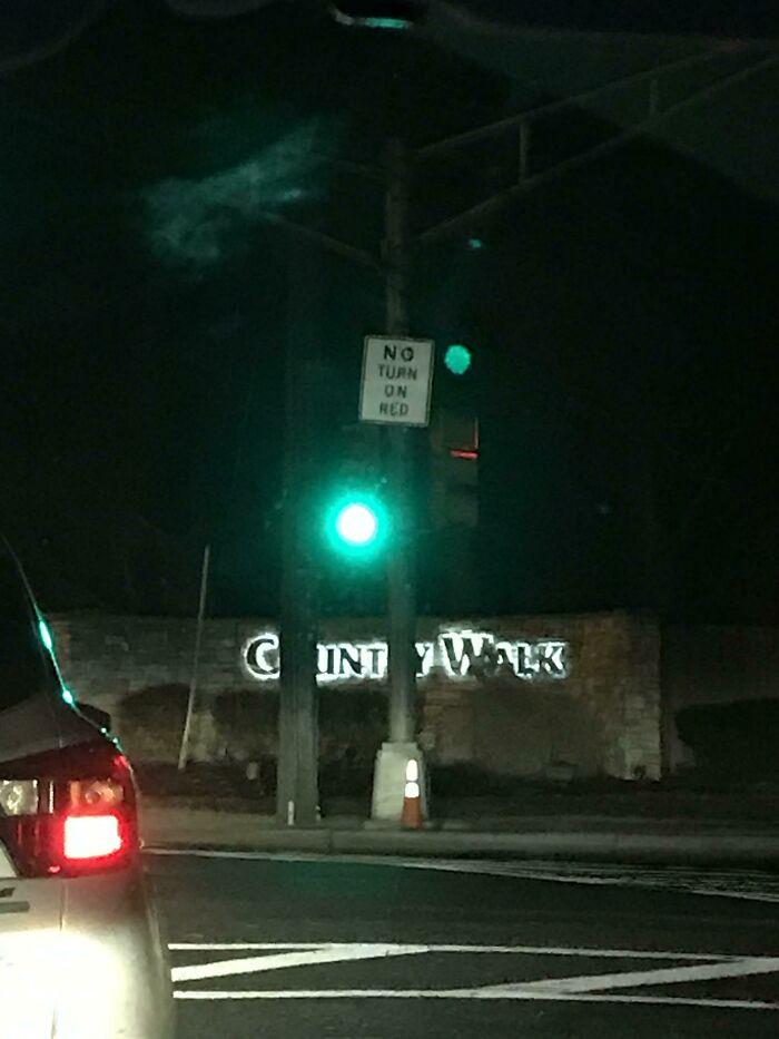
The Placement Of This Stoplight In Front Of This Development Entrance Is Quite Unfortunate
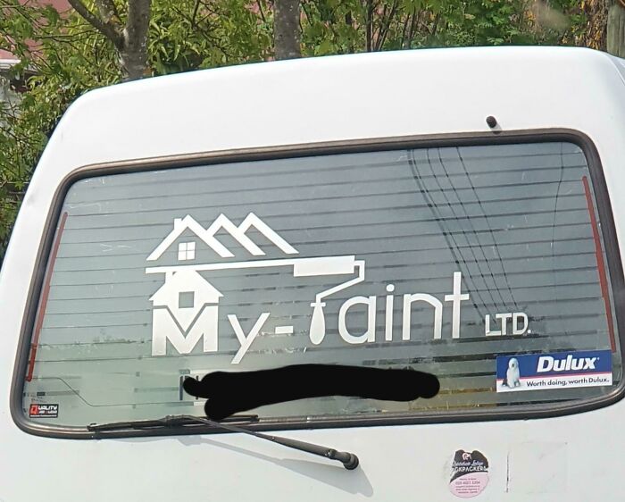
Very Unfortunate Company Name
I'm going to save some googling for you here. Vore is a usually sexual desire to be eaten whole. you're welcome.
Aah, little Wonder, hence the name! I think I'm going to keep away from googling this...thanks.
Load More Replies...From Urban dictionary. vore Short for "voraphilia" or "vorarephilia": a fetish in which one fantasizes about being eaten alive or eating another creature alive (sometimes known as phagophilia). The most common type of vore is "soft vore", being swallowed or swallowing whole with no bloodshed. There is also the less common "hard vore" which involves the tearing and chewing of flesh. Other types of vore include macrophilia and microphilia, in which one character involved in the vore is larger or smaller than normal.
Bad Taste Or Unfortunate Foreshadowing?
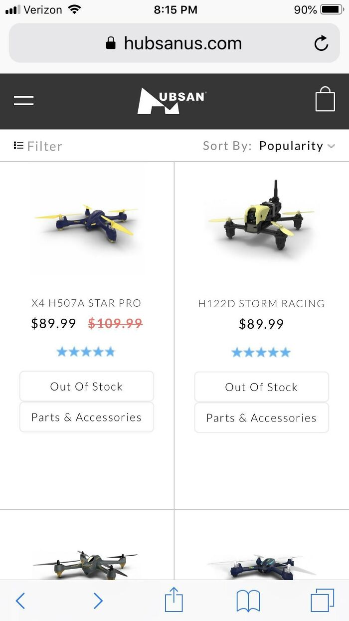
Unfortunate Web Address
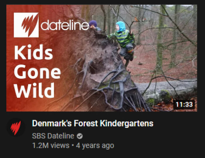
This Unfortunate Title That Found Its Way Into My Recommendeds
Qooder (Pronounced Like Cooter, A Slang Term For Vagina)
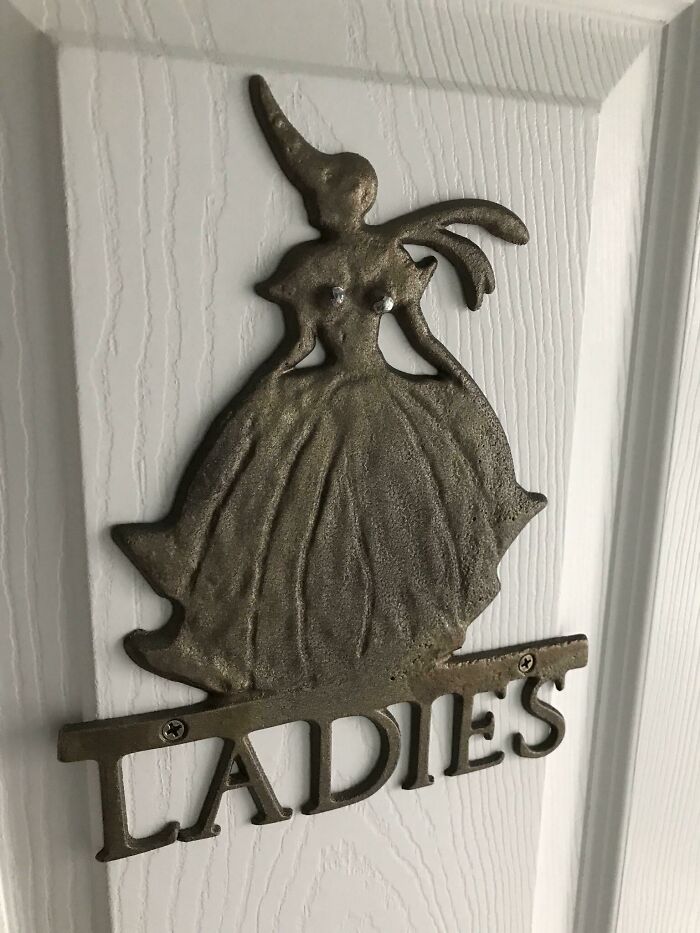
This ‘Ladies Room’ Thing With Two Specific Spots For Tacking It To A Door
Oh yeah that's the first thing I see. Definitely not the unicorn horn and one monster wing.
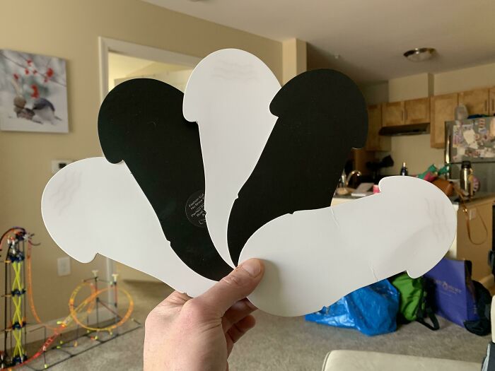
These Inserts For The Socks I Bought
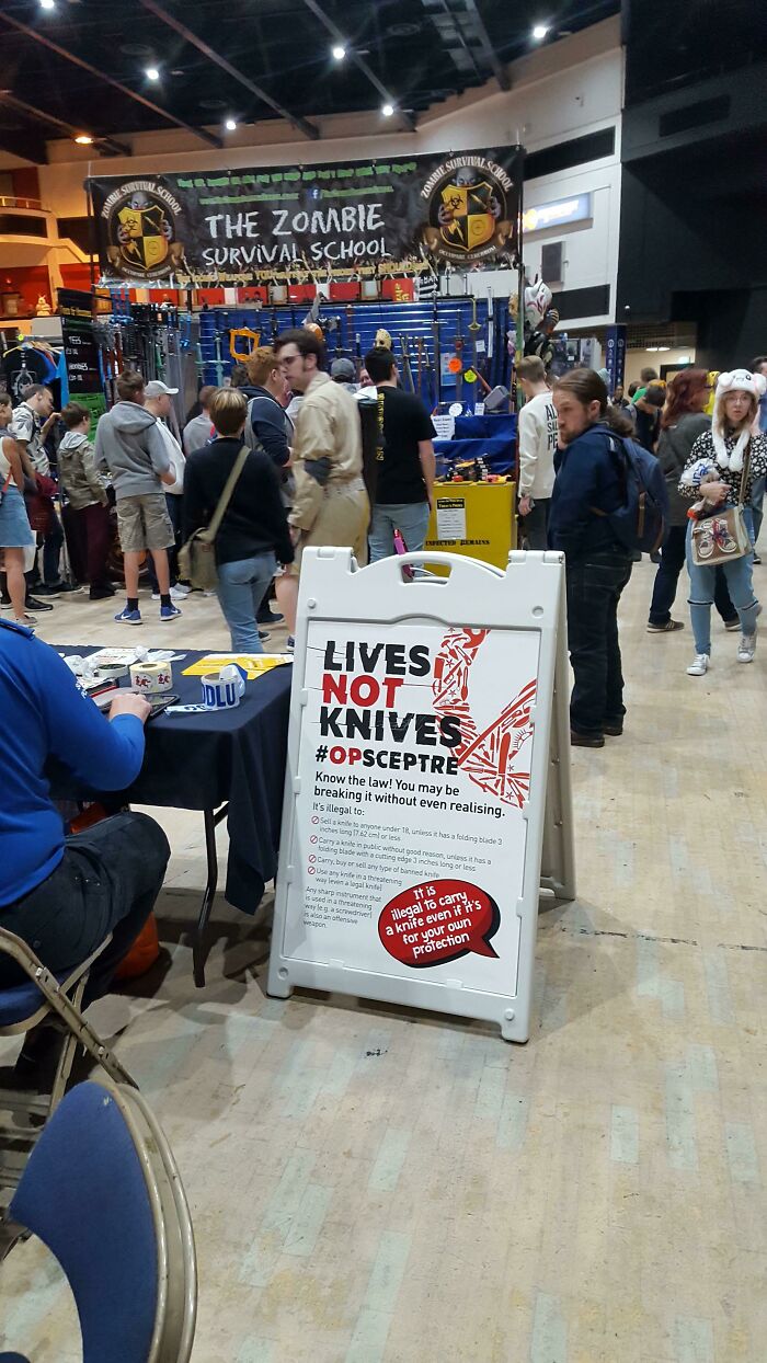
(I Thunk This Belongs Here) At A Local Convention, It Seems Nobody Is Interested In Knife Crime Prevention
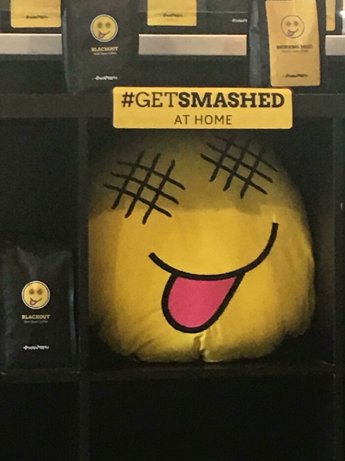
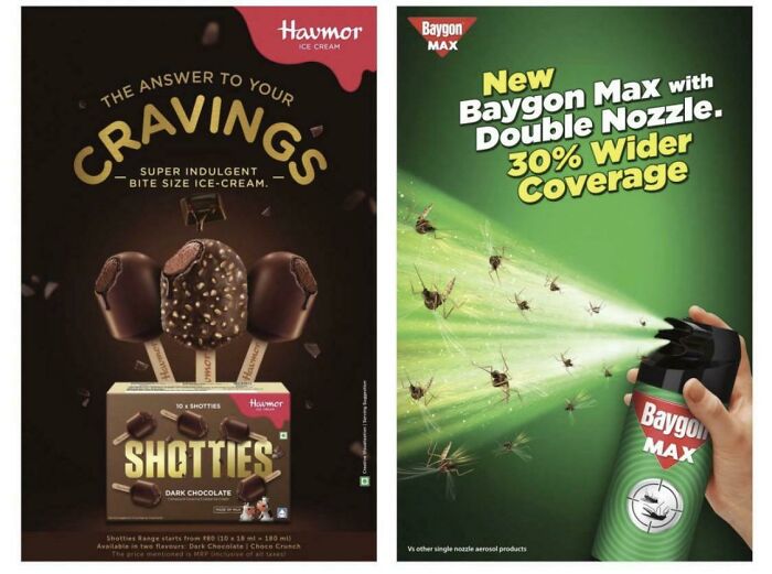
Ice Cream….with Bug Spray
Does no one else see how the popsicles are called shotties
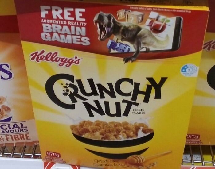
I Would Rather Not Eat Some Crunchy Nut, Thanks
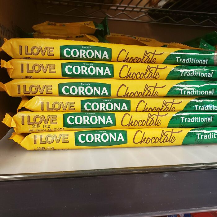
I Love---What?!
Fart
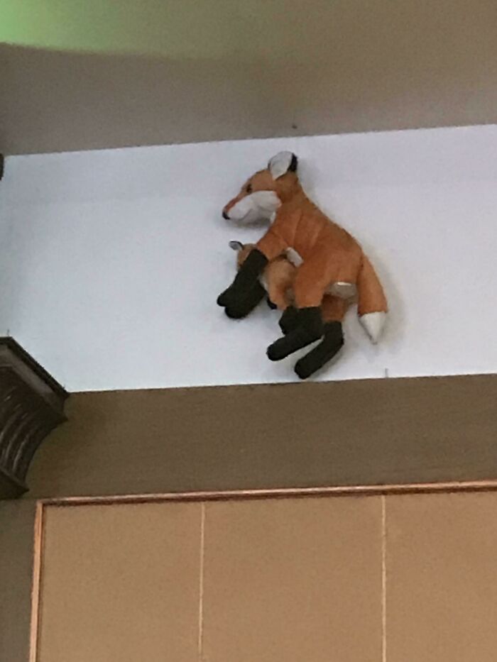
This Unfortunate Design Of A Kangaroo And Its Baby In A Hotel In India
Not A Good Name Choice
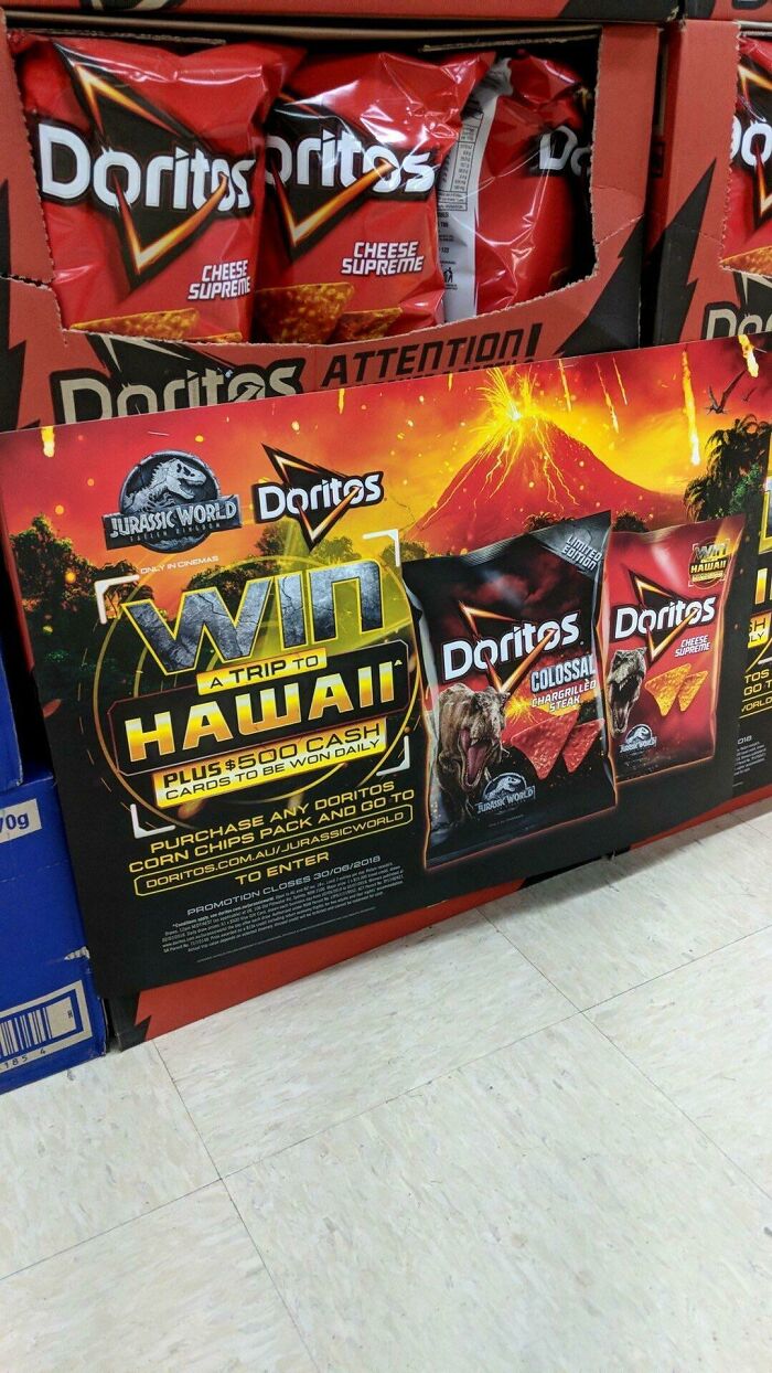
Too Soon Doritos
Uhm so in my area there’s a plumbing company called “IBS Plumbing” I do think it’s supposed to be a funny name but it’s too good not to share. :))
Ha! "Securing your property, whether you want us to or not..."
Load More Replies...There's a lot of down votes through out this article for no seen reason. I upvoted on almost every one of them.
Some of them are reaching. Or they're only relevant to certain countries.
Load More Replies...Funniest sign I have ever came upon was in Washington, it was a store selling vacuums and their sign in front said "Everything We Sale Sucks"
I really wish this article didn't include the one with Kobe and his daughter. I feel like that was beyond tasteless and it left me feeling queasy.

 Dark Mode

 No fees, cancel anytime


