362Kviews
‘Ugly Design’ Instagram Is Full Of Things To Make You Laugh And Cringe And Here’s 35 Of The Best Pics From It
InterviewPrepare to feast your eyes on the crème de la crème of ugly designs that are so cringy that they’re good. Well, almost. The Ugly Design Instagram page has over 572k followers who wait for the newest posts, curated by Swiss founders Jonas Nyffenegger and Sébastien Mathys.
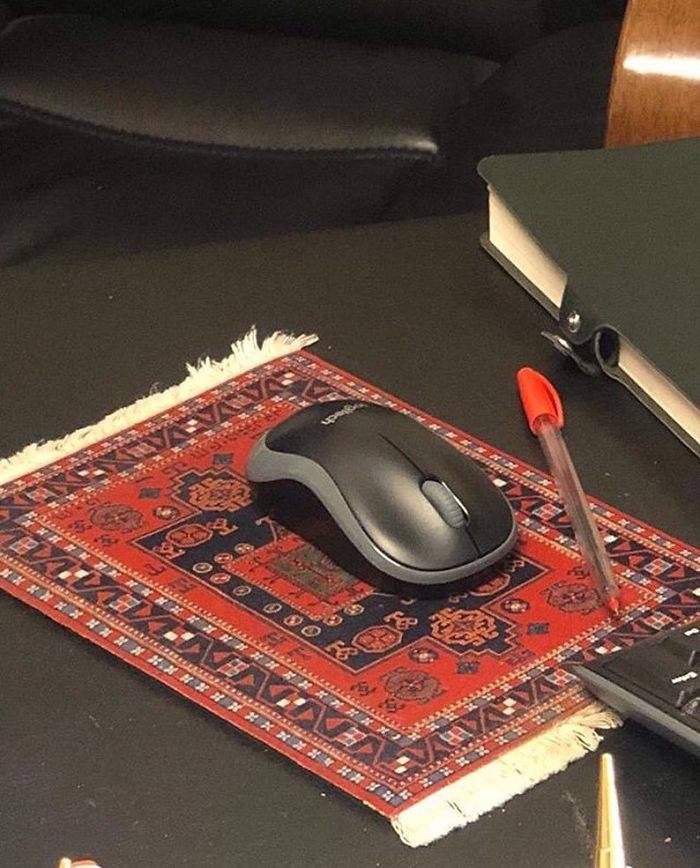
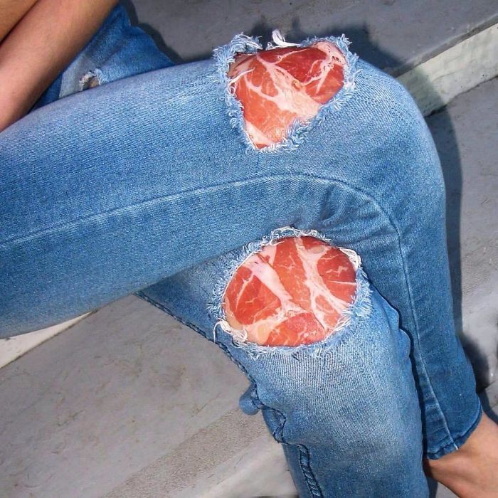
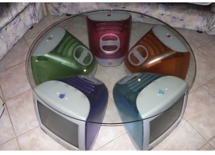
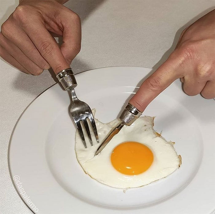
We’ve collected some of the ugliest designs you’ve probably seen all week (and all month, we’re hoping), so scroll down, upvote your fave pics, and let us know in the comments which of these designs left the biggest impression on you.
The founders of the IG account told Bored Panda that they believe they found so much success over the years because of the contrast between their posts and the many pictures on Instagram that are “norm-perfect.” Read on for the full interview!
More info: Instagram | Tumblr | Ugly.Design
This post may include affiliate links.
“When seeing an ugly design rather than perfect aesthetics (as defined in the 21st century)—scrollers takes notice. Also, @Uglydesign never gets predictable—that is key to maintain and grow followers in our opinion.”
According to the founders, what keeps them inspired to keep on posting ugly designs is that they enjoy the unexpected. “We find it crazy that this theme can still surprise us and make us laugh so much after having dug into it for so long,” the said, adding that they feel that ugly designs feel like a bottomless, never-ending pit.
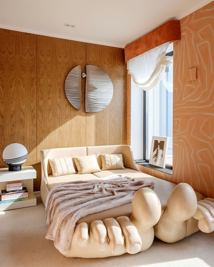
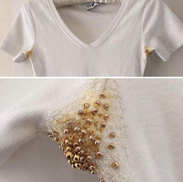
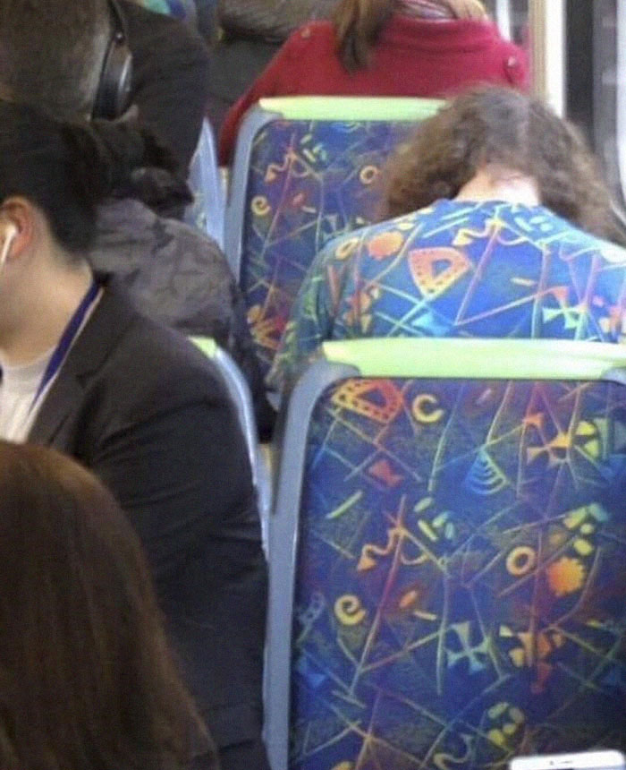
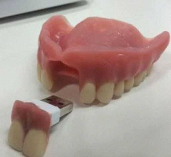
“We are posting various topics under the theme of ugly design, from maximalism to design fails, covering everything from luxurious furniture, jewelry, fashion, nail art, architecture, to upcycling… And except for some designs fail, we believe it is an incredible source of inspiration and joy,” they said, pointing out that ugly designs can be beautiful and inspirational, too.
The main mission of Ugly Design is to find unexpected, extraordinary, and strange design pieces and then share them with the world. Or, as the creators of the page put it, “minimalism is a dead end.”
One of the founders, Sébastien, who calls himself a “professional Googler,” is a partner at a small graphic design and type studio, as well as the team lead of a screenprint workshop. Meanwhile, Jonas studies product design at ECAL in Switzerland, is a “trash digger,” and works as a designer at a furniture company in Stockholm.
According to Sébastien, he considers ugly to be beautiful. “I would cry if there weren’t any ugly designers anymore, if all our surrounding objects and items looked the same,” he told Artsy.
He has a great point: imagine how boring life would be if everything was beautiful and there were no contrasts with ugly things. Even worse, there wouldn’t be anything that we could point at while shouting, “Oh my God, look at that! What is that?!” It’s an important part of being human and it’s not something that we’re willing to give up. That’s why Ugly Design is so beautiful.
The roots of Ugly Design stretch back to 2013 after Sébastien and Jonas met while studying design in Switzerland. They went to an international furniture fair in Milan where they saw a bathtub that was reimagined as a sofa. They then started a friendly competition to see who could come up with the ugliest design.
The idea behind Ugly Design was fully realized in 2015. After spending a year on Tumblr, it hopped on over to Instagram where it found lots of popularity and became fully-fledged while “disrupting people’s perfect feed.”
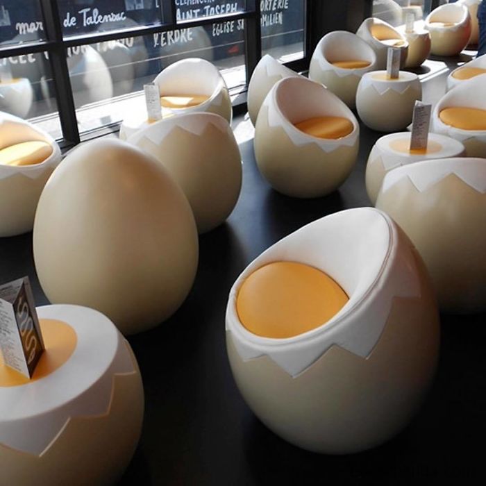
It looks like some insect eggs or something... and it must be very comfy...
Can the priest/pastor or whatever actually hear themselves over the beach sounds.
“We want to share an alternative aesthetic, something different from most Instagram design curators who more or less post the same content. The uglier the better,” the pair told i-D.
Jonas added: “In the beginning, we considered ugliness in design as a negative phenomenon and were trying to highlight designs that we were taught to think of as bad. Slowly, we started to see a lot of nuances in this ugly aesthetic and we no longer consider ugly as negative or pejorative.”
Most of these are works of art, a joke, or intentionally weird. Whether they succeed is debatable but ugliness is in the eye of the beholder.
Most of these are works of art, a joke, or intentionally weird. Whether they succeed is debatable but ugliness is in the eye of the beholder.

 Dark Mode

 No fees, cancel anytime