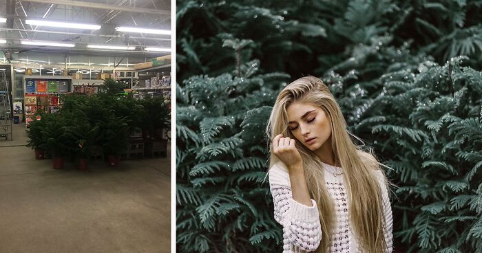
Photographer Challenges Herself To Shoot In ‘Ugly’ Location, And Results Prove That It’s All About The Skill
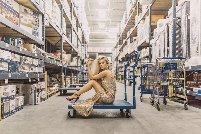
Pro and amateur photographers see different things when they look at the same place, and this story proves that professionals can work wonders even with minimal resources. To challenge herself, Jenna Martin took her camera and her portrait photography model to Lowe’s: “Instead of searching out the usual beautiful locations around where we live, I had the idea to do just the opposite,” she wrote on PetaPixel. “I wanted to go somewhere ‘ugly’ by all conventional photography standards and then see what we could do with it. Lowe’s seemed like the perfect option.”
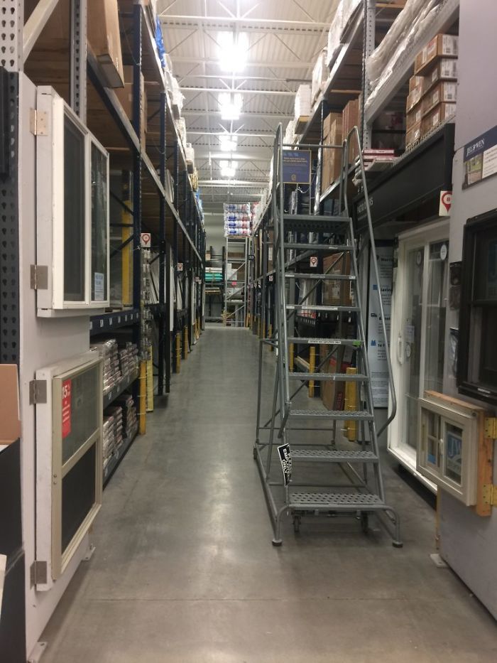
“For this ugly location challenge, I wanted somewhere with horrible lighting and limited backdrops. Somewhere that made absolutely no sense for a photoshoot idea.” Before she started shooting, Martin set herself some rules:
1) They had to work with whatever was already there. The photographer brought just her camera, without any artificial lighting or props;
2) They couldn’t rearrange the displays or make any big changes to photo backgrounds;
3) They’d stop shooting if anyone else was in the background.
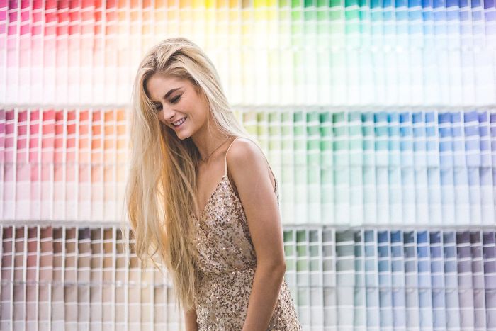
“As soon as we walked in an employee asked if they could help us and I asked, “We were just going to take a few photos, is that okay?” He replied, “Of course! I was just wondering why she was so overdressed for a trip to the hardware store!” Martin and her model had about an hour before the store closed, so they began their photoshoot in narrow and wide aisles, against paint samples and trees.
“Overall, this was a really fun challenge! Not that I’d invite an actual client to ever do a Lowe’s photoshoot (I mean, never say never), but I was pretty happy with these cool photos! Horrible location for the win! Next time you see an awful spot, maybe give it a chance, you never know what you might end up with.”
More info: jennamartinphotography.com | Instagram | Model’s Instagram (h/t petapixel)
“Instead of searching out the usual beautiful locations around where we live, I had the idea to do just the opposite”
Image credits: Justin Sullivan/Getty Images
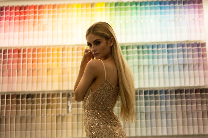
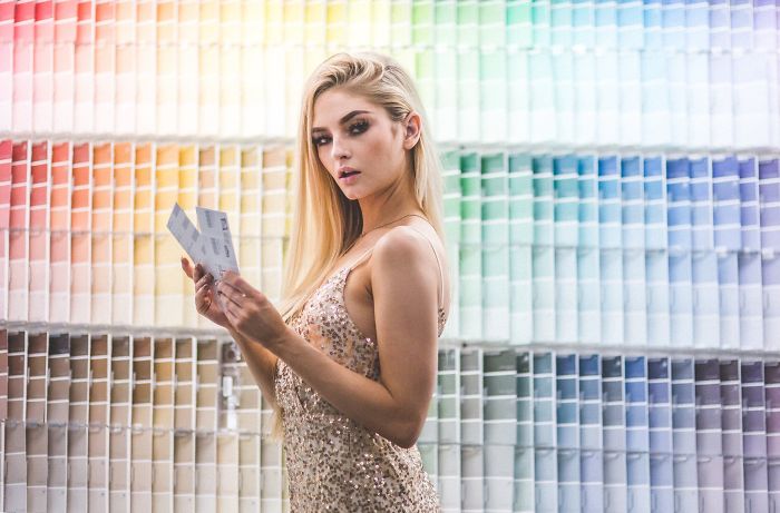
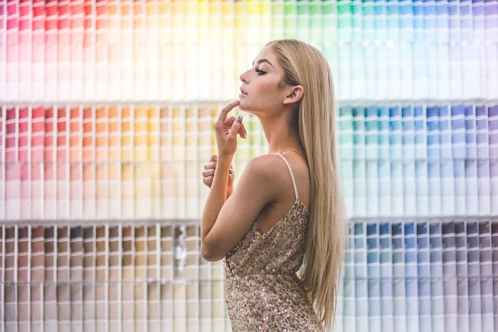
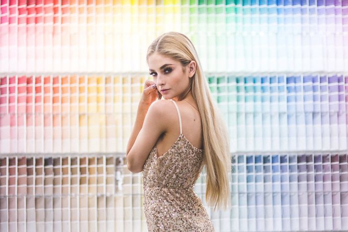
“Lowe’s seemed like the perfect option” Location 1: The Paint Samples
Not edited
Edited
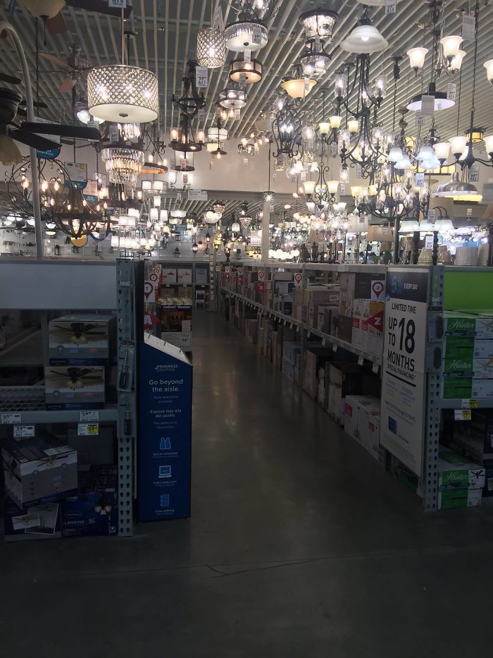
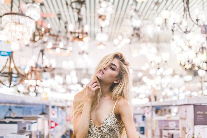
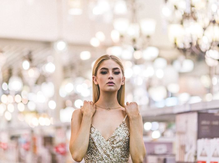
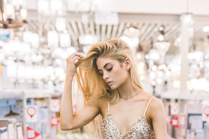
Lowe’s Location 2: The Lighting Section
Not edited
Edited
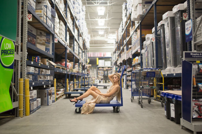
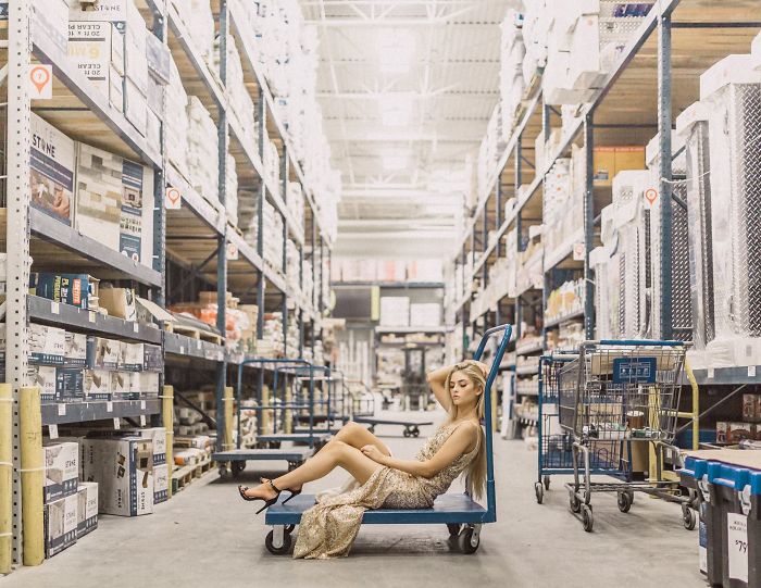
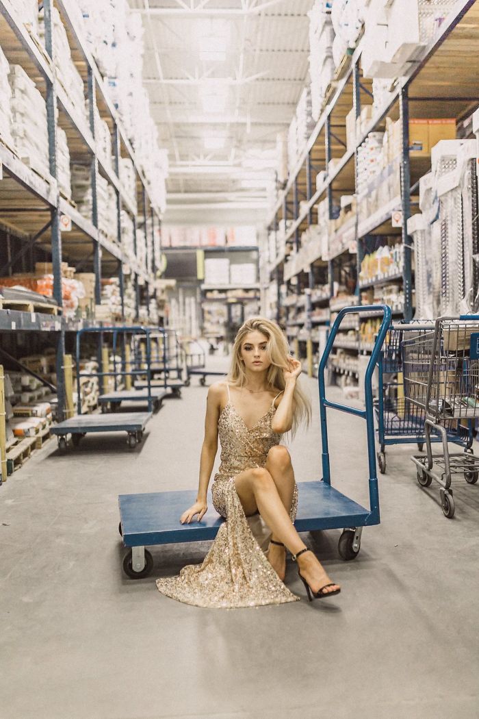
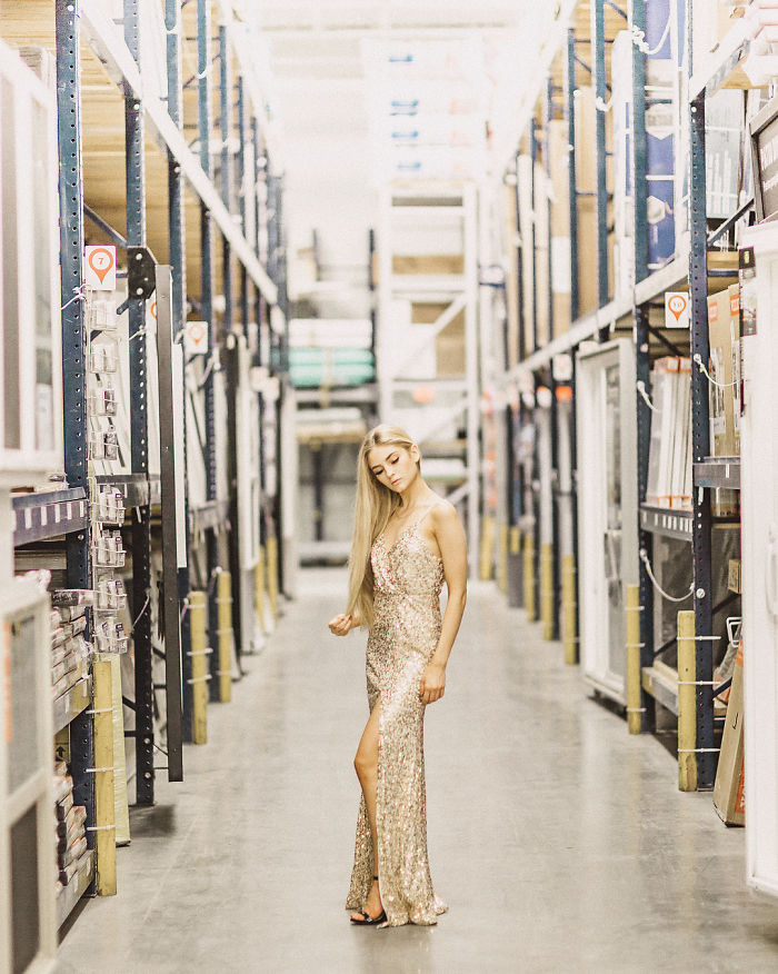
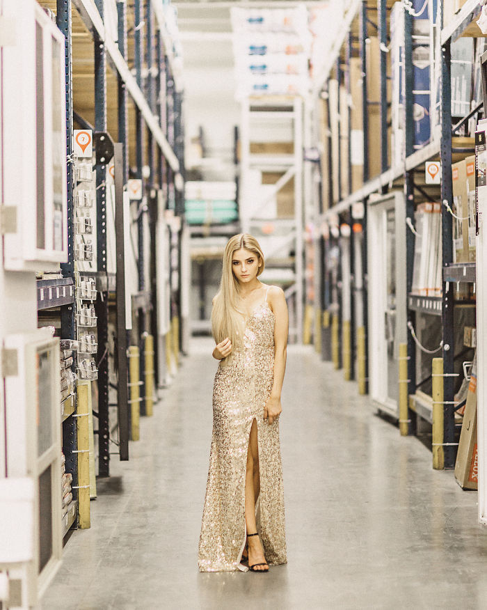
Lowe’s Location 3: The Aisles
Not edited
Edited
Location Shot: Aisle 2
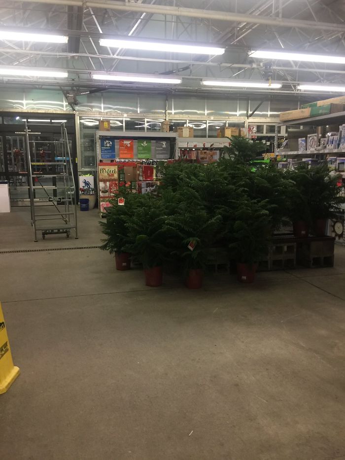
Lowe’s Location 4: The Garden Section
Not edited
Edited
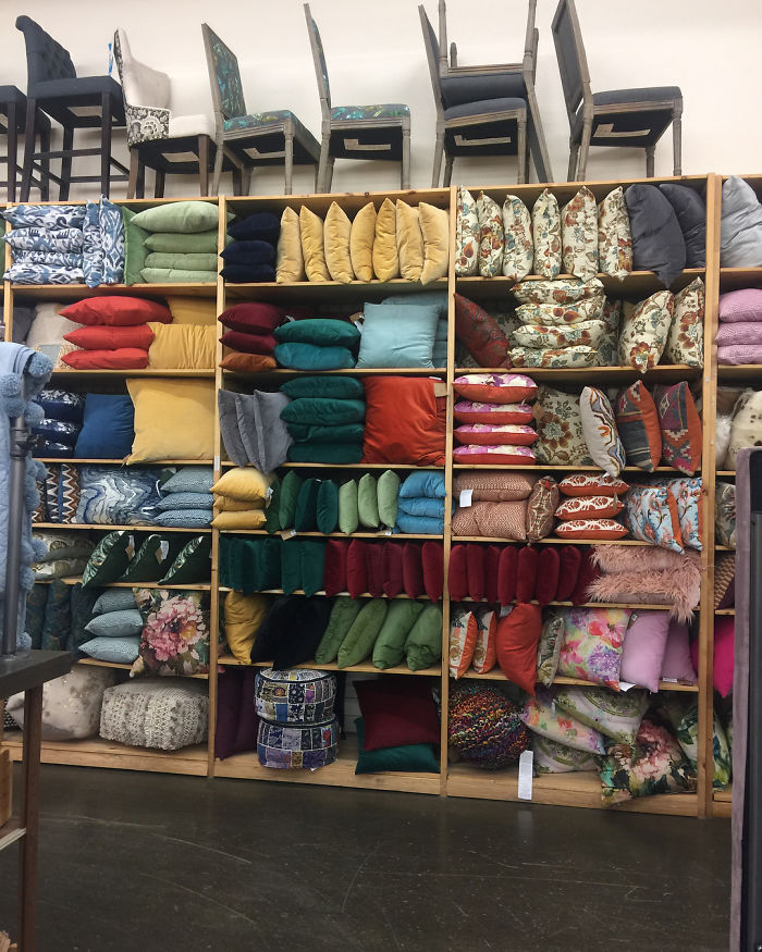
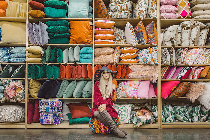
Lowe’s Location 5: Pillows Section
“Horrible location for the win!”
The locations are beautiful ? And also, I liked some of the unedited versions more than the edited ones.
yeah... don't forget the beautiful girl are big part of beautiful portrait. even at a ugly place a beautiful girl do the trick
So all you need is a gorgeous girl to take professional good-looking pictures? If that's you're trying to say, you clearly haven't seen enough pictures. Besides, she's not even that pretty (sorry, but beauty is subjective). She's definitely photogenic and she has nice poses, but her beauty is not universal. There is much more to be said about the photographer's skill in a "dull location" (and if it doesn't look like it it's because of his experience on picking spots and angles), the editing and the camera itself than the girl/model.
Load More Replies...Absolutely no surprise that the photographer could create nice photos anywhere using good framing skills and photo editing software. You can make anything look magical! And the only location I would consider "ugly" is the warehouse. All the others have beautiful color and light patterns, so they were great places for photos. Now, my question is... Why does the model grab her hair all the time? It looks like she's checking it for lice...
Ugly location. The only reason this can just about be pulled off is thanks to the good looks of the model. You could probably stick her on a mountain of rubbish and it would look ok. [Oh after shooting with a small aperture to get a hell of a lot of bokeh so you can't even figure out what it is]. Stupid article.
And that. But carefull of the White knight army here. If your opinion isn't in line with the one in the article then you usually get downvoted. :p
Load More Replies...Actually... these aren't really all that good.. It is true that many locations which to the average person seem uninteresting can be made interesting by framing correctly using a different angle/height. Like this: 2c4aac837d...graphy.jpg 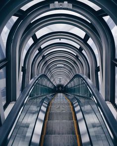 Or 6ad85756bb...graphy.jpg
 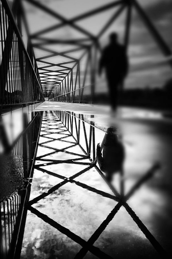 But these are like THE worst examples of that. It's like his best try is with the paint labels. And even that one is unimaginative. If it's practice he or she should continue.
You are missing the point of the article. The point is the point (decent backdrops are everywhere), not these specific photos themselves. Also, the examples you gave have zero to do with the point of the article since both locations you show could not possibly be more standard when it comes to locations and this article was about doing the exact opposite. Also, instead of constructive criticism you are just being an a*****e. Capitalizing "THE"? Seriously? That says way more about you than it does about these photos and this photographer.
Load More Replies...So much negativity. I liked the pics, and kudos for just posing at Lowes haha they came out beautifully:)
You make it seem as if not liking something is a mean and bad thing. It's NOT. It's an opinion and you are allowed to have and voice one if you don't curse or threaten people. Same as you are allowed to voice this praising opinion of yours. It's not right or wrong. It's an OPINION.
Load More Replies...Wonder what they thought when they saw some lady in a sparkly dress and heels walking around the store?
Load More Replies...I don't see horible location. A photographer see the beauty in every place. Plus... the model is a pro ;-)
The aisle shots impress me the most. No tight cropping and narrow depth of focus (blurring the background), just choosing an angle, framing the shot and getting the exposure right. Cinematographers are masters at this, making any set look interesting and creating a mood.
Beautiful work...I LOVE HER GOLD DRESS! She's a great model for your work.
I agree that is all in the skill. But if she wanted to challenge herself she could have chosen someone other than one of the most beautiful women i've ever seen. Could photograph her covered in excrement and she would still be appealing.
Yeah, I agree. I'd like to see this done with a more intriguing subject instead of someone so obvious
Load More Replies...Reminds me of something on the front of a classy catalogue. Maybe a Christmas one or something. Lowe's should buy these pictures maybe. And yes the model is so gorgeous she would look good anywhere. I like these pictures though as it's good to see the art all around us even in the most ordinary places.
I think these are an imaginative use of a location lots of people would consider pretty dull, but let's not forget the choice of subject matter. The girl featured is gorgeous, and if i took self portraits of myself in my jeans gurning at the same locations I'm sure some the drama would be lost. In fact these play pretty well to the idea of contrasts - banal location/beautiful model etc...
Only the Tree Section (#4) edited looked like it still wasn't a Lowe's or a hardware store and who knew Lowe's sold pillows? I'm on my way!
They are actually leaving out the fact that the pillow wall pictures were taking at a store called World Market 😅
Load More Replies...The photographer has kind of missed her whole point here by putting an extremely glamorous model as the focus of each of her pictures. Could do better.
As an amateur photographer, this hurts me to see. Like, I'm not anything special, but when you cop out by using an attractive person to make mundane scenes look better by redirecting the viewer's attention, you really miss the whole point of the project or point you're making an attempt at. This is lazy and unimpressive.
I think she's imagining taking a client (like a bride) to a location to shoot, and showing how even a location that a client might not expect to be beautiful can result in amazing photos.
Load More Replies...f/1.8 - f/2, underexposing then cranking up the highlights. Not impressed at all...
I am on the old school that says a photo should come out of the camera looking good. Photoshop can make anythlng look better. Photoshop skills do not equate with photography skills.
It helps that you have a beautiful model some what seductively dressed too. Any photo with her in it would look good.
If one is showcasing their photographic “talent” I would think using the store’s employees would be more keeping with the challenge than a drop-dead-gorgeous bottle-blonde 20something underfed model.
Drab Locations Made to Look Better by Photographing Pretty Model and Liberal Use of Photoshop. Internet Loses its MIND. Gone Viral & Hilarious
I feel the edited version are just too blown out and almost bleached out.
I thot the aisle ones were just plain ugly, but lovely model. I wouldn't pick "ugly" locations for anything important....or anything at all!!! Lol
Sure it looks good but ninety percent of it is the model. She could glam up Wal-Mart check out line.
The only reason this can just about be pulled off is thanks to the good looks of the model :-P
I feel like more interesting posing would have made this way more interesting, especially the paint chips! I feel like the model is bored.
Fail. The model is beautiful, the setting is.... Lowe's. Saturday chores.
Wow..I thought ALL of the "unedited" pics were better than edited. And that the ONLy semi-apprpriate pic was the U EDITED version of her in the lighting dept. I thought the original was actually beautiful.
Very nice, but I think I would have backed up the lighting a bit in the edited photo of the model in front of the paint samples. Unedited it was obviously too dark, however, after editing, the paint samples are too blown out and I would have liked seeing her skin tone a little darker.
I have nothing against those locations, and frankly, adding a model isn't at all clever.
I thought your objective and your point was well made. I would have like to have seen the same done with a regular person though. Some of your unedited shots did look nicer than the edited ones. In particular in the lighting section. I liked the golden cast. You got some great results!
I think the aisle location would have looked better if she had changed clothes it seems like the dress doesn't seem right for the picture. A overall would have seem more appropriate ;)
The photographer may be good but I still find the locations uninteresting and uninspiring.
Which Lowe's is this? I might have to transfer. It looks far better than the one I work in.
I don't think some people realize what a challenge this really was. My hubby is a shutterbug and I often do the styling for his shoots (as well as acting as a carbon based light stand). Believe me when I say this wasn't easy. The lighting at Lowe's is like a low budget B movie set. Not everyone will appreciate the skill involved with NOT using lights or reflectors, but I do. I also like the unedited version and then the progression of edited ones. I live in the shadow of Photoshop! Well done.
Wow. I'm impressed. All you had to work with was photoshop and a knock down gorgeous model.
Nice pics. But they hardly prove the point that it’s all about skills. Shops like Lowes are styled too. Lots of places to find there that are decorated to seduce buyers to make their houses more beautiful. Off course putting a beauty in front of that works. Could have guessed that without seeing or trying it. However, if he would try his at a technical shop for electronic parts e.g. or a food discounter, there would be a challenge.
I don't Think I've ever seen a pillow section at Lowe's before is it possible that it's world market?
I'm I the only one who like unedited versions better? Too blown out for my taste. Plus it is all about a beautiful girl on a twinkly background. I don't really find it interesting at all. Where is the story in all of this?
I'm unimpressed with this one. Try a not beautiful model as well and let's have a do over.
It can be hard to segment the environmental context to envision the final composition. These are good examples that encourage such creative imagination.
The lighting in a warehouse like that has got to be horrible for photography - the color temperature, the starkness - and photography is all about the lighting! I would like to see a photo of her taking the photos and how she set up for it- what kind of equipment did she need to set up.
It's all about the skills. Yeah. And the great camera too, probably. Still, nice shooting :)
These are fantastic and brave. The model really knows how to pose interesting, it's not all about her face or body. A good looking person just standing straight and facing the camera isn't going to have the same affect and one of the photos did have that, which is the one I liked the least. The shallow depth of field also blurred out some of the backgrounds so much where 'ugly location' no longer matters. I kind of think photography cheated with the experiment there lol
I kind of think photographer cheated with the experiment there *
Load More Replies...This is just Photoshopping? Everyone can do this.. Get a pro model, shoot anywhere and edit some "magic" in there to get the "ugly" to awesome. This is btw awesome locations, far far far from ugly.
This os really cool. I think shooting in these all too common areas adds a dreamy effect as if I was walking and daydreaming about a beautiful girl.
These locations are far from ugly. They are visually compelling due to repetitive lines, shapes, and colors. In fact, they make perfect backdrops. Also, the model is really beautiful.
A few of these suggest that it's ALL about the gear. A 1.4 tele lens can make a lot of messy backgrounds look acceptable. That, and you can fix a multitude of sins with Photoshop. And guess who became an industry giant by shooting commercials in a Lowe's? (Answer: Lowe's)
Hmmm. Nice photos. But pillow scetion, World Market though right?
Yes, Cost Plus World Market or Peir One. Definitely not Lowe's.
Load More Replies...Can you imagine fat ugly guy in this photos? It will be still s**t locations...
You just happen to have really good model... i cannot give credit to photographer ... your technical skill still has to improve , if you learn the temp manipulation on flash this should had come out really good.
What about the lighting? Did the photographer bring his own lighting or not?
The last grouping in the pillow section is not Lowe’s it’s world market
The last photo grouping pillow section was not Lowe’s, it’s World Market
lets do this whole shoot allover again but with a regular person, or even better, a Lowe's employee!
..when you compare things/places/people between "ugly" or "beautiful" - that's all you will ever see in that. Just enjoy every moment, every atmosphere and feel- theres more to everything than just the visual aspects. In my opinion a warehouse with good sales and price offers makes the place a whole lot beautiful than it actually is. And that is seeing the beauty of it through money, think about friendships, help, a smile or celebration. Beautiful is everywhere, visually and* more.
The photos look really good, I'm impressed. However, you don't have to try very hard when you have a stellar supermodel helping... I think your point would have been clearer had there been no supermodel and you just used editing and photography to get your message across. Just my thoughts.
Ditch the girl. Come on...all the elements of photography are there in Lowe's...but this woman did not look at the setting through the lens of the camera. She saw it through the eye of a fashion magazine....did not work. Why didn't she try black and white or sepia tone? She went cliche with the girl. I'm tempted to go to Lowe's and ask if I can take photos - I teach basic photography in a journalism class, and the visual beauty of Lowe's with repetitive patterns, contrast, negative versus positive space....you get the picture.
Hey Boredpanda staff, what's going on? I tried to make a reply but there was no room to post it. Any editorial trouble?
The locations are beautiful ? And also, I liked some of the unedited versions more than the edited ones.
yeah... don't forget the beautiful girl are big part of beautiful portrait. even at a ugly place a beautiful girl do the trick
So all you need is a gorgeous girl to take professional good-looking pictures? If that's you're trying to say, you clearly haven't seen enough pictures. Besides, she's not even that pretty (sorry, but beauty is subjective). She's definitely photogenic and she has nice poses, but her beauty is not universal. There is much more to be said about the photographer's skill in a "dull location" (and if it doesn't look like it it's because of his experience on picking spots and angles), the editing and the camera itself than the girl/model.
Load More Replies...Absolutely no surprise that the photographer could create nice photos anywhere using good framing skills and photo editing software. You can make anything look magical! And the only location I would consider "ugly" is the warehouse. All the others have beautiful color and light patterns, so they were great places for photos. Now, my question is... Why does the model grab her hair all the time? It looks like she's checking it for lice...
Ugly location. The only reason this can just about be pulled off is thanks to the good looks of the model. You could probably stick her on a mountain of rubbish and it would look ok. [Oh after shooting with a small aperture to get a hell of a lot of bokeh so you can't even figure out what it is]. Stupid article.
And that. But carefull of the White knight army here. If your opinion isn't in line with the one in the article then you usually get downvoted. :p
Load More Replies...Actually... these aren't really all that good.. It is true that many locations which to the average person seem uninteresting can be made interesting by framing correctly using a different angle/height. Like this: 2c4aac837d...graphy.jpg  Or 6ad85756bb...graphy.jpg
  But these are like THE worst examples of that. It's like his best try is with the paint labels. And even that one is unimaginative. If it's practice he or she should continue.
You are missing the point of the article. The point is the point (decent backdrops are everywhere), not these specific photos themselves. Also, the examples you gave have zero to do with the point of the article since both locations you show could not possibly be more standard when it comes to locations and this article was about doing the exact opposite. Also, instead of constructive criticism you are just being an a*****e. Capitalizing "THE"? Seriously? That says way more about you than it does about these photos and this photographer.
Load More Replies...So much negativity. I liked the pics, and kudos for just posing at Lowes haha they came out beautifully:)
You make it seem as if not liking something is a mean and bad thing. It's NOT. It's an opinion and you are allowed to have and voice one if you don't curse or threaten people. Same as you are allowed to voice this praising opinion of yours. It's not right or wrong. It's an OPINION.
Load More Replies...Wonder what they thought when they saw some lady in a sparkly dress and heels walking around the store?
Load More Replies...I don't see horible location. A photographer see the beauty in every place. Plus... the model is a pro ;-)
The aisle shots impress me the most. No tight cropping and narrow depth of focus (blurring the background), just choosing an angle, framing the shot and getting the exposure right. Cinematographers are masters at this, making any set look interesting and creating a mood.
Beautiful work...I LOVE HER GOLD DRESS! She's a great model for your work.
I agree that is all in the skill. But if she wanted to challenge herself she could have chosen someone other than one of the most beautiful women i've ever seen. Could photograph her covered in excrement and she would still be appealing.
Yeah, I agree. I'd like to see this done with a more intriguing subject instead of someone so obvious
Load More Replies...Reminds me of something on the front of a classy catalogue. Maybe a Christmas one or something. Lowe's should buy these pictures maybe. And yes the model is so gorgeous she would look good anywhere. I like these pictures though as it's good to see the art all around us even in the most ordinary places.
I think these are an imaginative use of a location lots of people would consider pretty dull, but let's not forget the choice of subject matter. The girl featured is gorgeous, and if i took self portraits of myself in my jeans gurning at the same locations I'm sure some the drama would be lost. In fact these play pretty well to the idea of contrasts - banal location/beautiful model etc...
Only the Tree Section (#4) edited looked like it still wasn't a Lowe's or a hardware store and who knew Lowe's sold pillows? I'm on my way!
They are actually leaving out the fact that the pillow wall pictures were taking at a store called World Market 😅
Load More Replies...The photographer has kind of missed her whole point here by putting an extremely glamorous model as the focus of each of her pictures. Could do better.
As an amateur photographer, this hurts me to see. Like, I'm not anything special, but when you cop out by using an attractive person to make mundane scenes look better by redirecting the viewer's attention, you really miss the whole point of the project or point you're making an attempt at. This is lazy and unimpressive.
I think she's imagining taking a client (like a bride) to a location to shoot, and showing how even a location that a client might not expect to be beautiful can result in amazing photos.
Load More Replies...f/1.8 - f/2, underexposing then cranking up the highlights. Not impressed at all...
I am on the old school that says a photo should come out of the camera looking good. Photoshop can make anythlng look better. Photoshop skills do not equate with photography skills.
It helps that you have a beautiful model some what seductively dressed too. Any photo with her in it would look good.
If one is showcasing their photographic “talent” I would think using the store’s employees would be more keeping with the challenge than a drop-dead-gorgeous bottle-blonde 20something underfed model.
Drab Locations Made to Look Better by Photographing Pretty Model and Liberal Use of Photoshop. Internet Loses its MIND. Gone Viral & Hilarious
I feel the edited version are just too blown out and almost bleached out.
I thot the aisle ones were just plain ugly, but lovely model. I wouldn't pick "ugly" locations for anything important....or anything at all!!! Lol
Sure it looks good but ninety percent of it is the model. She could glam up Wal-Mart check out line.
The only reason this can just about be pulled off is thanks to the good looks of the model :-P
I feel like more interesting posing would have made this way more interesting, especially the paint chips! I feel like the model is bored.
Fail. The model is beautiful, the setting is.... Lowe's. Saturday chores.
Wow..I thought ALL of the "unedited" pics were better than edited. And that the ONLy semi-apprpriate pic was the U EDITED version of her in the lighting dept. I thought the original was actually beautiful.
Very nice, but I think I would have backed up the lighting a bit in the edited photo of the model in front of the paint samples. Unedited it was obviously too dark, however, after editing, the paint samples are too blown out and I would have liked seeing her skin tone a little darker.
I have nothing against those locations, and frankly, adding a model isn't at all clever.
I thought your objective and your point was well made. I would have like to have seen the same done with a regular person though. Some of your unedited shots did look nicer than the edited ones. In particular in the lighting section. I liked the golden cast. You got some great results!
I think the aisle location would have looked better if she had changed clothes it seems like the dress doesn't seem right for the picture. A overall would have seem more appropriate ;)
The photographer may be good but I still find the locations uninteresting and uninspiring.
Which Lowe's is this? I might have to transfer. It looks far better than the one I work in.
I don't think some people realize what a challenge this really was. My hubby is a shutterbug and I often do the styling for his shoots (as well as acting as a carbon based light stand). Believe me when I say this wasn't easy. The lighting at Lowe's is like a low budget B movie set. Not everyone will appreciate the skill involved with NOT using lights or reflectors, but I do. I also like the unedited version and then the progression of edited ones. I live in the shadow of Photoshop! Well done.
Wow. I'm impressed. All you had to work with was photoshop and a knock down gorgeous model.
Nice pics. But they hardly prove the point that it’s all about skills. Shops like Lowes are styled too. Lots of places to find there that are decorated to seduce buyers to make their houses more beautiful. Off course putting a beauty in front of that works. Could have guessed that without seeing or trying it. However, if he would try his at a technical shop for electronic parts e.g. or a food discounter, there would be a challenge.
I don't Think I've ever seen a pillow section at Lowe's before is it possible that it's world market?
I'm I the only one who like unedited versions better? Too blown out for my taste. Plus it is all about a beautiful girl on a twinkly background. I don't really find it interesting at all. Where is the story in all of this?
I'm unimpressed with this one. Try a not beautiful model as well and let's have a do over.
It can be hard to segment the environmental context to envision the final composition. These are good examples that encourage such creative imagination.
The lighting in a warehouse like that has got to be horrible for photography - the color temperature, the starkness - and photography is all about the lighting! I would like to see a photo of her taking the photos and how she set up for it- what kind of equipment did she need to set up.
It's all about the skills. Yeah. And the great camera too, probably. Still, nice shooting :)
These are fantastic and brave. The model really knows how to pose interesting, it's not all about her face or body. A good looking person just standing straight and facing the camera isn't going to have the same affect and one of the photos did have that, which is the one I liked the least. The shallow depth of field also blurred out some of the backgrounds so much where 'ugly location' no longer matters. I kind of think photography cheated with the experiment there lol
I kind of think photographer cheated with the experiment there *
Load More Replies...This is just Photoshopping? Everyone can do this.. Get a pro model, shoot anywhere and edit some "magic" in there to get the "ugly" to awesome. This is btw awesome locations, far far far from ugly.
This os really cool. I think shooting in these all too common areas adds a dreamy effect as if I was walking and daydreaming about a beautiful girl.
These locations are far from ugly. They are visually compelling due to repetitive lines, shapes, and colors. In fact, they make perfect backdrops. Also, the model is really beautiful.
A few of these suggest that it's ALL about the gear. A 1.4 tele lens can make a lot of messy backgrounds look acceptable. That, and you can fix a multitude of sins with Photoshop. And guess who became an industry giant by shooting commercials in a Lowe's? (Answer: Lowe's)
Hmmm. Nice photos. But pillow scetion, World Market though right?
Yes, Cost Plus World Market or Peir One. Definitely not Lowe's.
Load More Replies...Can you imagine fat ugly guy in this photos? It will be still s**t locations...
You just happen to have really good model... i cannot give credit to photographer ... your technical skill still has to improve , if you learn the temp manipulation on flash this should had come out really good.
What about the lighting? Did the photographer bring his own lighting or not?
The last grouping in the pillow section is not Lowe’s it’s world market
The last photo grouping pillow section was not Lowe’s, it’s World Market
lets do this whole shoot allover again but with a regular person, or even better, a Lowe's employee!
..when you compare things/places/people between "ugly" or "beautiful" - that's all you will ever see in that. Just enjoy every moment, every atmosphere and feel- theres more to everything than just the visual aspects. In my opinion a warehouse with good sales and price offers makes the place a whole lot beautiful than it actually is. And that is seeing the beauty of it through money, think about friendships, help, a smile or celebration. Beautiful is everywhere, visually and* more.
The photos look really good, I'm impressed. However, you don't have to try very hard when you have a stellar supermodel helping... I think your point would have been clearer had there been no supermodel and you just used editing and photography to get your message across. Just my thoughts.
Ditch the girl. Come on...all the elements of photography are there in Lowe's...but this woman did not look at the setting through the lens of the camera. She saw it through the eye of a fashion magazine....did not work. Why didn't she try black and white or sepia tone? She went cliche with the girl. I'm tempted to go to Lowe's and ask if I can take photos - I teach basic photography in a journalism class, and the visual beauty of Lowe's with repetitive patterns, contrast, negative versus positive space....you get the picture.
Hey Boredpanda staff, what's going on? I tried to make a reply but there was no room to post it. Any editorial trouble?

 Dark Mode

 No fees, cancel anytime
























693
158